By John Ekdahl
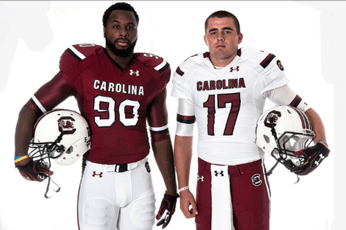
Both are Under Armour outfitted schools. First up, South Carolina:
Under Armour and the University of South Carolina have partnered to design a new look for the Gamecocks for the 2013 football season.
In developing the new look, Under Armour focused on creating “something timeless that fits in with the power and tradition of SEC Football and linked specifically to South Carolina.”
According to Under Armour, “Coach Spurrier has established a tradition of excellence at South Carolina and we worked together to create a uniform that would be viewed in the same light and would instantly be known as the South Carolina design for years to come.”
Full gallery is available at this link.

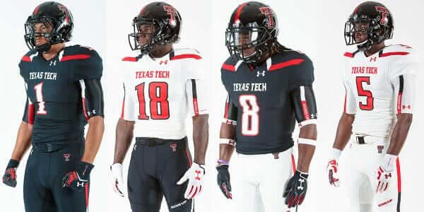
Texas Tech also unveiled their new uniforms. VivaTheMatadors.com offered their thoughts on the changes.
The biggest news is that there is no gray or red in the uniforms, but I wouldn’t bet that this is it. Under Armour typically has a special uniform, so we know that’s going to be on it’s way at some point. I’d also add that the leaked jerseys from Red Raider Outfitters ended up being 100% accurate in terms of what the jerseys would look like and that leads me to think that this might also mean that the gray will be accurate as well.
Video of the event is available below.

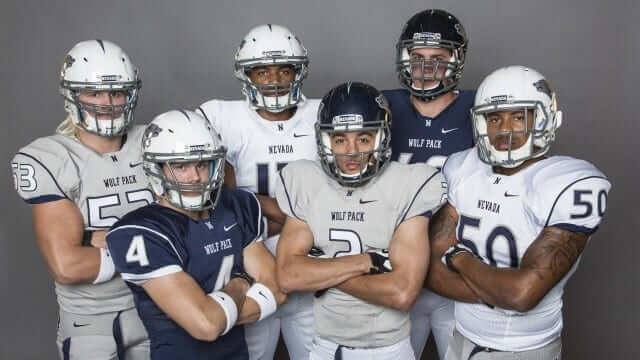
Nevada unveiled their new uniforms on Friday night. Full gallery available at the link.
The Nevada football team unveiled its 2013 uniforms to the public on Friday night at the inaugural Football 101 for Women event hosted by Brian and Laura Polian.
The event, which featured informative talks by members of the Wolf Pack coaching staff and football clinics for the attendees, also included a fashion show by the players, showing the new uniforms.
The Wolf Pack now has six different uniform combinations with three different jerseys ”“ navy, silver and white ”“ to go along with both silver and white pants.
Way to fail, Texas Tech. When you’re called the RED Raiders, you should be wearing fucking red.
Um….I’m confused. There seems to be a lot of red in Texas tech’s new unis. The quote seems a bit off, “the biggest news I stat there is no gray or red…” I would classify this as a “fail”.
I’m confused, that South Carolina uni set looks really good. Did UA forget to Under Armour it up?
I agree that they look good overall. They should’ve scrapped the tapered pants stripe, though.
They unfortunately can’t do that due to the forked panel at the back of the pant legs.
Has Nevada been wearing Miami’s number typeface for a while now? Anyway, as long as Tech has gotten rid of the bass boat glitter on the helmets everything else is golden as far as I’m concerned.
Nevada and Utah State look really similar at first glance
Nevada’s silver setup doesn’t do much for me. I tend to not favor the “dishwater greys” (see UConn women’s BB).
But my bigger query is sorta a football v. basketball thing: In closeup you can see the white numbers trimmed in navy on pale grey. On a football field, will that still work?
What confuses me is, if silver is one of their primary colors, in this era of GFGS, why do they not have a single silver/grey helmet option? I would have thought they’d have gotten one to wear, in the very least, with the silver/grey pants.
That’s the best South Carolina has looked in about a decade, fix the pant stripe and its solid all around.
I like TTU’s black/white/black look.
At least that gray is in Nevada’s color scheme and they would also have a nice set if not for those awful pant stripes.
No coverage of yesterday’s Detroit Tigers’ “Tigres” jersey? I was all set to comment that if they had spelled it correctly and called this Auburn baseball ripoff an “alt” everybody would say how sacrilegious it would be for Detroit to have a third jersey. Yet, if you misspell it and call it a “Hispanic tribute” then it’s fine. This is basically a Hispanic version of a third jersey for a team that doesn’t want to break the tradition of not having third jerseys. (except for that week in 1995)
Guess it could have been worse, they could have gone with “Los D.”
It’s no more a “third jersey” or even like a third jersey than any Memorial Day, July 4, Memorial Day, or Negro Leagues throwback they’ve worn. Each is an example of a one-off jersey, like the Tigres jersey.
South Carolina looks good. Now if they’d only use a more traditional block number font.
…and what’s really that different about the Gamecocks uniforms? They changed the striping pattern on the pants and the shoulders? To the casual fan it’s practically the same thing. They could have at least gone back to the black helmet. (considering the chrome one was a smokescreen)
They’re gonna be good, though… I’m hoping the Clemson-USC game this November will be a meeting of two undefeateds. (I can dream, no?)
The new Miami Dolphins uniforms look terrible in an actual game.
The Dolphin’s number font is obnoxious…individual numbers have straight edges one side and rounded on the other.
Agreed. I also don’t care for the fat stripe right down the middle of the helmet. Or the logo.
Or the pants stripe.
I like the old unis better, but these are not too bad! The new logo looks good.
How about that tramp stamp?
Is the black outlining on the Cowboys’ arm stripes new this season, or did I just not watch any Dallas games last year?
It’s always been like that.
I’m still waiting for the serifs to come back on the numbers on these, like on the blue throwbacks.
Would be nice.
THIS.
Dolphins unis : well, I don’t hate ’em.
PS—–Will Jerrah EVER update the Cowboys?
Chalk me up as a fan of the new shade of Aqua for the Dolphins. They actually look like a team from Florida now, compared to the almost dreary Aqua that they’ve been wearing for 16 seasons. The white facemask will take some getting used to, but it’ll probably grow on me. More
orangecoral would be nice. Now if you’ll excuse me, I gotta find out how to make cheesecake french toast for the reg. season.Agreed. I liked them anyway but was more pleased with them than I thought I’d be. Just needs minor tweaks to the numbers, thicken the coral and navy slightly, add the aqua facemask back, and drop the tramp stamp. Now I’m just crossing my fingers the auqa pants will see the field on the road this year.
I have mixed impressions on the Dolphins’ uniform, now that it’s been seen on the actual field of play: I like the shade of aqua, and the uniform has a clean, open look. But the lack of orange is a problem, and what little orange there is around the numbers tends to look yellow, to my eyes anyway. Overall, they remind me of the Boston Breakers of the USFL, which isn’t necessarily a good thing, though it’s not terrible either.