By John Ekdahl
The A’s and Angels wore throwbacks for last night’s game in Oakland.
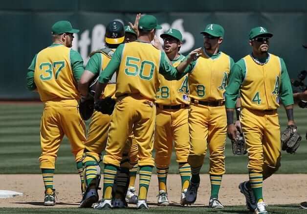
The A’s sported throwback uniforms in Saturday’s 1969 Turn Back the Clock Day at O.co Coliseum.
The legendary green-and-gold look was a unique change of pace with a shot of nostalgia that embraced the franchise’s past, but it was quite a contrast to the Angels’ modest gray throwbacks from 1969.
Vests, a trend that began when the A’s were still in Kansas City, are involved in deep California gold and match the trousers, which if worn properly are hiked at the knee to display striped stirrup socks and white cleats. Beneath the vests are lime-green undershirts, and etched on the front is the A’s logo — 1969 was the first year the Athletics adopted an apostrophe S beside the traditional A — and on the back are numerals without names.
MLB.com’s article is available here and some good galleries are available at SFGate and Yahoo, which I always find to be the best for sports images.
Dayn Perry over at CBS Sports thought the A’s throwbacks were “tremendous“.

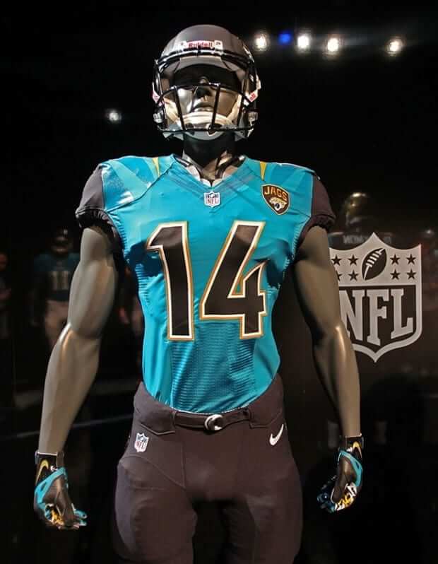
A bit of some speculation about the Jaguars uniform schedule and their alternate teal jersey:
According to Long, the team plans to wear white through the first six games, including at home, to deal with the heat. The team then plans to wear their teal alternate uniform against the San Diego Chargers in Week 7, white against the San Francisco 49ers in London, and then finish out the season wearing black.
This may not be set in stone yet, as it might be tricky for the Jaguars to wear black on the road at the back end of their schedule. The team plays two teams who usually where white at home in the Browns and Titans, but also play the Colts and Texans. The Texans plan to wear “blue steel” and the Colts typically wear blue at home.

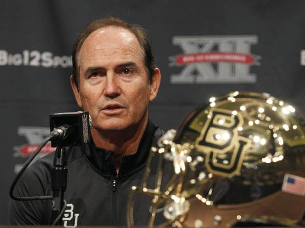
The Oklahoman had some things to say about Baylor’s new “show-stealing” helmet.
Some Big 12 teams retain the classic uniform look. The Sooners and Longhorns come immediately to mind.
Others ”” OSU, Texas Tech, West Virginia, Baylor ”” have embraced the Oregon style of myriad uniform combinations and trendy fashions.
And Baylor’s new neon gold helmet was a show-stealer at Media Days.
Business Insider has a good roundup of the new English Premier League uniforms here.
The University of Houston unveiled their new football uniforms for their first season in the American Athletic Conference earlier in the week, but the Houston Chronicle wrote about it yesterday.
Finally, this is absolutely awful: Quilt made of deceased soldier’s clothing, wedding mementos stolen from Davenport widow’s home
It’s such a shame that the Jags had to make the teal jersey the alternate. It looks so much better than the black one.
That teal jersey is THE EASIEST TWEAK EVER away from being above average. White numbers.
Eh, I like the black numbers. They’re different. If there is a readability issue, I’d prefer they switch to gold. I think we need more teams with non-white numbers, actually.
Yeah, I’m craving readability on that one. I wouldn’t quibble with gold numbers, actually. Might be nice. Just didn’t think of that, at first.
Agreed on the need for more use of color for NFL team numbers. Obvious candidates: Niners, Saints, Panthers, Steelers, Packers, Redskins.
There’s so much going wrong in that 1969 A’s uniform, and yet that’s easily one of the best-looking uniforms I’ve ever seen on an MLB field. Man, if only the A’s would adopt the key elements that define the uni: monochrome gold, real vests (not just sleeveless shirts) with contrasting undershirt, striped stirrups. Get the number off the front, switch the font to what the A’s currently use, move the number up on the back if NNOB, put any patches high on the right side instead of below the chest logo.
While the A’s/Angels uniforms were impressive — the Angels unis were NOT from 1969. By 1965, the Angels were wearing hats that had C A intertwined, rather than the L A intertwined seen last night. They changed when moving from Dodger Stadium to Anahiem Stadium in 1965.
You are correct Matt. The Angels were using the CA logo in 1969 (see Dressed to the Nines site)
Other than that, those uniforms were pretty darn cool.
The Angels wore hybrids yesterday. The LA caps were not worn after 1965, and the “ANGELS” on the road uniforms were not worn until AFTER 1965.
The jerseys were correct for 1969. The caps were not.
Is it me, or is the A’s logo waaaay too low on the vest? it feels like it should be up higher
Here’s the Okkonen picture:
link
The top of the A is even with the second button, and there’s a small overlap between the bottom of the A and the top of the number.
Looks about right.
(Note: Okkonen shows white sanis with the gold uniform, while today’s players are wearing yellow sanis.)
would smaller cut jerseys from that time period mean closer button placement, resulting in higher A placement? It seems like the baggier jersey leads to this sort of thing
The New York Red Bulls vs Real Salt Lake game last night (which was an absolute classic, New York scoring a last-minute winner to take it 4-3) had an odd uniform note: both teams wore red shorts. They weren’t identical, New York’s were scarlet and Salt Lake’s more maroon, but even so it’s highly unusual to have so little contrast. Ever since the television era began, it’s been just about universal for soccer teams to wear distinctive shirts, shorts, and socks.
I monitor the Bundesliga VERY closely for uni matchups and this past season (2012-13), of the 306 matches played in the BL, only once was their a common color between the opponents. In Week 30, both Werder Bremen and VfL Wolfsburg wore white shorts in the game played at Bremen (Werder in green shirts and socks, Wolfsburg in all white).
Originally teams only changed shirts for a colour clash, but around the time I started watching, in the 70s, sock clashes were subject to change. The argument was nothing to do with TV, but that players passing to feet didn’t have to look up to identify their own team’s players.
Recently shorts have also come into the equation, presumably for the same reason.
In the same way goalkeepers of both teams used to have, usually, green jerseys for both teams, but now they have to be distinct from each other, presumably with the increased occurence of goalkeepers coming upfield for late corners etc.
I heard graham poll say once teams wore different socks to make it easier for the officials to know who last had possession if the ball goes out of bounds.
“The team plays two teams who usually where white at home in the Browns and Titans”
The Titans usually wear white at home only for their home opener. They wear dark jerseys (light blue primary, and navy blue alternate) at home the rest of the season.
Not a huge baseball fan, but I caught the last 5 minutes of the game – damn, those were some nice unis the A’s were wearing.
From Perry’s article:
When former A’s boss Charlie O. Finley decided to change the team’s colors from the staid duds of Connie Mack’s days, he settled on, as he put it, “Kelly Green, wedding-gown white and Fort Knox Gold.”
Don’t forget link!
How can we forget Vida Blue? He not only threw out the first pitch, he along with Catfish, Rudi, Campy, Captain Sal, and Fingers were featured on a very sweet giveaway shirt. (Still ticked off the A’s ran out of shirts by the time I got to the park 90 minutes before the game, however!) link
Yeah, they looked sweet. I’d keep an eye on eBay if you’re really jonesing for one …
The folks who made the T (Oaklandish) are a great outfit — they make the only T-shirt I’ve found with link(excepting himself …).
The Chris Creamer board has someone who watched the game and got more info:
Before the complaint pops up (the A’s equipment manager) explained during the pregame that he tried to get batting helmets, but when MLB changed to the new helmets right before the season. He was told there wasn’t enough time to get throwbacks helmets even though he requested it 6 months ago.
He also talked about how much he loves vests and thinks the A’s may experiment with it sometime in the next few seasons. His idea is a green pinstriped vest. So he mentioned who knows we might see that some time.
Not sure how I feel about pinstripes, but the occasional vest would be welcomed.
If it’s a white uniform with green pinstripes, I’d love to see a mockup of that. Sounds awesome at best, and “not so great, but it’s unique, therefore slightly redeemed” at worst.
If it’s a green or gold uniform with contrasting pinstripes, no thank you. Color is good, but not when it looks like pajamas.
Only if it’s an actual vest, like yesterday, not a sleeveless shirt.
I kind if like the idea of green pinstripes for the A’s, but my two rules of punstripes would have to be observed: Pins on pants & jersey both; and Home uni must be either pins or not, no mixing like Houston used to do or the Mets.
Too bad about the lids. I loved the yellow ones a few years back and the link would have looked great.
I went to a twi-light doubleheader at Yankee Stadium in early 1969 just to see the As cool unis. The weather wasn’t that nice, light drizzle, so instead of the white spikes, they wore their “mudders”, black shoes with white shoe laces. I always thought that was a pretty cool look. I don’t think they wore gold either, it was the gray vests which looked like they had a faint green tint to them.
THE BOTTOM LINE ….
The FIRST ten matte football helmets were new, neat, and looked a bit OK. Now, they are played out trendy and most of them look like crap.
The FIRST Chrome helmet looked like crap, and every single succeeding version by each new team looks worse than the last. ENOUGH ALREADY.
Miami of Ohio new football uniforms look like insane crap. The helmet is perhaps the very worst football team helmet ever adopted by any team – withy the possible exception of non-service academy teams wearing non-military color camouflage patterns. But I’ll go out on a limb, and just declare Miami of Ohio to have the WORST helmets EVER worn by an actual team.
Please people, Let’s go back to the day when cat-piss weak Vegas Gold and the Saints’ East Mississippi Panhandle State Jackass-Junior College-inspired Thug-assed Wannabbee Black Leotards were are worst uniform offenses ….
Matte helmets look fine, and they provide better color matching with the uniforms. I’d have no problem with every non-metallic colored helmet being a matte finish.
I will agree with you on the chrome thing, but I’m not so quick to dismiss Miami(OH)’s helmets. While they do remind me of a bowling ball, I think the concept could work for some teams.
Matte helmets look like shit.
There was a slight error in the A’s uniforms. The coaches during that time (and in fact until at least the mid-70’s as I remember) wore Wedding Gown White caps with Kelly Green lettering and bill.
See: link
I think Dimaggio’s hat is all white in that pic, I have the white/green version, love that hat. My first live game was in Oakland in ’75, pretty sure the coaches were still wearing them.
You are right. I blame my mistake on being up for 24 hours straight driving from LA to the A’s game and then going to the Giants/Cubs game in SF.
Nice trip, get some sleep.
The UCOTD (uniwatch comment of the day) goes to NICKV!!!!!
“cat-piss weak Vegas Gold and the Saints’ East Mississippi Panhandle State Jackass-Junior College-inspired Thug-assed Wannabbee Black Leotards were are worst uniform offenses ….”
So the coach’s didn’t wear white hats? I’d say that was the only real glitch. Otherwise, the game looked great. Of note: both teams correctly sported the McAuliffe (Red Sox) number font that was more prevalent in decades past. It does appear the front numbers on the A’s vests should have been placed about an inch or so higher. My question: did the A’s wear NOB’s in 69?
From the article quoted at the top:
“… 1969 was the first year the Athletics adopted an apostrophe S beside the traditional A …” Ok, so this was supposed to 1969 right? Then either 69 was NOT the first year with the apostrophe S, or the team got it wrong. A check of the DTTN’s site and the 69 Athletics have a not too subtle patch of white or gold covering where the ‘apostrophe S’ is placed in 1970’s illustration. In my estimation, the writer meant to write “1970” but who edits anything anymore?
The Angels looked great also – except – no one could put on a pair of fucking stirrups? Even with the “LA” caps, I liked that the navy blue of the wool caps never quite match the nave blue of the jersey lettering, especially in day games. The caps seem a shade lighter, a trait prevalent in many dark blue clad teams of the era: Twins, White Sox, Tigers, etc.
Someone mentioned that Finley did away with the staid colors of the old Athletic’s when he introduced the green and gold. But, don’t forget these link (One of my favorite forgotten uni’s!)
I’d say throwback games are much more pleasurable to watch now that Uni-watch is nearing world domination! Or at least making valid points over the past few years.
Looks like 1969 was the last year without the ‘s. Here’s a good shot of Reggie Jackson from ’69 (note the 100 year mlb patch). link
Using this picture as a point of comparison, the number placement on the retro vests looks about right.
As for NOB in ’69, here is a NNOB Catfish Hunter vest from that year. link
Here we go:
link
Rays pitcher has to switch his belt out in the 9th against the Yankees…interesting reason for a delay…(it broke while pitching)
Watching the last game of the Braves-Cardinals series … And even though it’s looking like a Braves sweep, I feel weirdly bereft. Looks as if the Cards really have chosen, for whatever godforsaken reason, to abandon the best-looking cap the team has ever worn, the road navy (which, for a few blessed seasons in the ’50s-’60s, was also their home cap). On the road, St. Louis now looks like a second-rate version of the Phillies. If they were going to lose one of their caps, why not the home version?
Those A’s jerseys were available for a couple days for purchase on mlb shop for about $220 but I don’t see them listed anymore, yet the Angels jerseys are still available. Possible the A’s sold out in 2 days?