Greetings from upstate, where some friends and I are spending a long weekend eating, drinking, thrifting, lake-swimming, bowling, attending a lumberjack festival, and so on. Drove up last night, will be coming home on Sunday night. I don’t plan to be spending much time on the internet, so Monday’s Ticker may be very, very small. Thanks in advance for understanding.
But I have something really wonderful for you today: A few weeks ago I wrote about Marty Hick’s awesome Uni Watch-themed pinewood derby car and invited readers to send in photos of their own and/or their children’s pinewood derby cars. Several readers responded, and it’s no exaggeration to say this is some of my favorite content on the site in months. Here’s a sampling (for all photos, you can click to enlarge):
1. Sam Chandler had a lot to say about his pinewood derby activity:
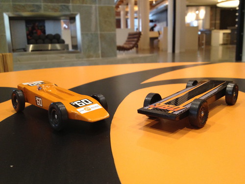
Here in St. Louis, some of the advertising agencies put together a pinewood derby each year. I love making them because I love racing and I get to build something cool. Last year my design was based off the Lotus Turbine Indy car from the ’60s:
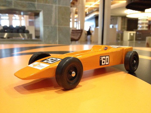
I said it was due to the orange being similar to our company’s branding, but mainly it’s because I love that era of Indy cars and that’s one of the most iconic designs. Plus it lends itself perfectly to a pinewood version. We ended up finishing fifth out of around 65 cars.
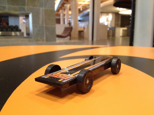
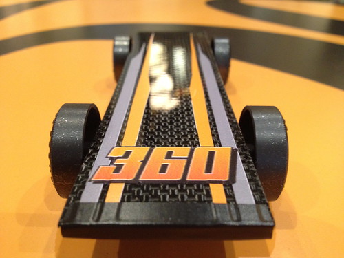
This year I went a bit more radical with the body design being minimal and simple but incorporating real carbon fiber as an element to see how it affects the car. Plus, I got to make some graphics similar to my favorite race cars: SPRINT CARS! Here are some photos:
2. Matthew Walthert made this Edmonton Oilers-themed car with his dad for Scouts competition in the ’90s:

“My dad brought home his postal scale from work and we loaded the bottom with lead weights to make it as heavy as the regulations allowed (adding ballast, as the F1 engineers say),” says Matthew.
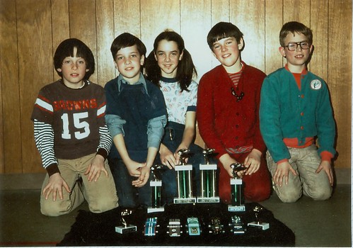
3. “In the late ’70s my sister (third from left) and I (second from left) won the top two spots in the pinewood derby run by the AWANA club (a religious version of Scouts),” says Douglas Ford. “What makes this pic even better for Uni Watch is the Browns jersey and the sweet Dolphins jacket:
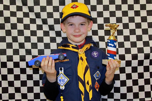
4. Excellent submission from Tris Wykes, who writes:
My eight-year-old son Easton was pretty darn excited when he wound up third in the Boy Scout pinewood derby held in Lebanon, N.H. If you look carefully, you can see the washers glued on to his car. The idea is to get your vehicle as close to the weight limit (5 ounces?) as possible without going over it. His mother built it with him because I am all thumbs:
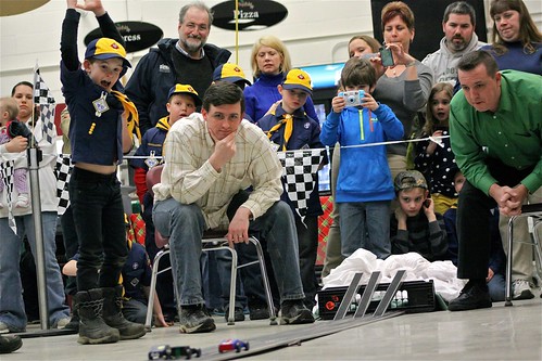
He then qualified for a regional derby, where a scoring error knocked him out of contention. It was a good teaching moment about how life is not always fair and how to handle unexpected disappointment with grace. Here’s the scene itself, in the local high school cafeteria. Those are the judges sitting down and they took their job VERY seriously:
5. I could do an entire entry based just on the photos and information Ron Ruelle sent in. Take it away, Ron:
At a pinewood derby in my parents’ town a few years ago, they put out a call for vintage cars to display:
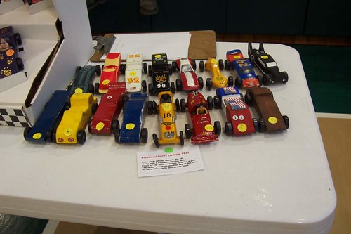
In the back row, cars 32, 90, and 9 are all by my younger brother, Rich, from the late 1980s. In the front row, the yellow 18 car is by my older brother Russ from 1973. It is styled to resemble a classic 1950s Indy car. Note how skinny the stock wheels were back then! The silver grille in the front of the car was cut from a dinner fork. My dad put the dismembered utensil back in the drawer to await my mother’s reaction. I think he slept on the couch for a few nights. The red car next to that, number 21, is mine from 1975. More on that later.
Fast forward to 2009. My nephew Connor and his dad built his first car at my house since they didn’t have a workbench available. This one goes for the look of an early-1960s Indy car:
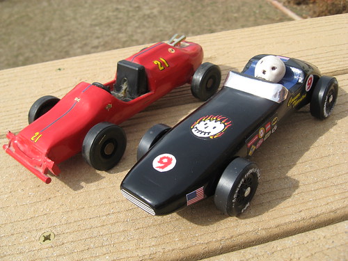
The flaming skull logo became my nephew’s trademark and showed up on future cars. As you can see, while I still have the keys to number 21, the driver from my car disappeared over the years. More on that later, too.
The original driver for my car came from a Hot Wheels Rrrrrumblers motorcycle. I eventually found an identical replacement for him on eBay for $30. Here he is in the driver’s seat:
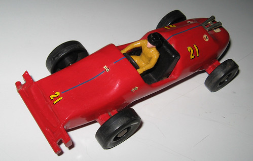
Yes, his uni includes a top hat. He is permanently glued in now. The front bumper/grille for this car was part of the hinge from an old Timex watch case. Somehow my dad saw that shape and had a vision.
Next: Another year, another new car for Connor. Still going old-school, this time with experimental twin engines:
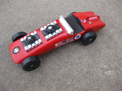
The car was way below the maximum weight, so putting those engines on the hood and decorating them was the easiest and coolest solution. The back end is designed to resemble a 1971 Buick Riviera. Note the return of the Flaming skull.
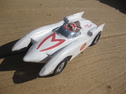
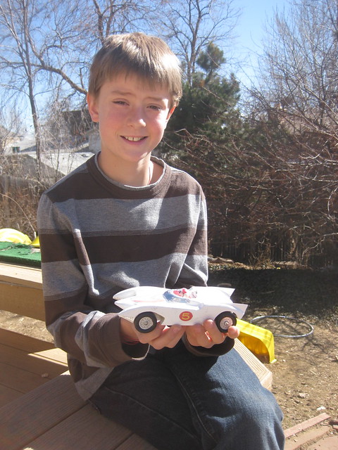
For Connor’s final car the next year, he went for a late’60s GT theme –specifically, the Mach 5 from Speed Racer. Despite the lack of auto jacks, sawblades, and periscope, he was very proud of the effort. It performed quite well, finishing second in the races:
6. Probably the most unusual entry came from Joshua Johnson. I’ll let him explain:
Here are some photos of the pinewood derby car — er, truck — that my father and I made over 20 years ago. I confess, the truck concept and most of the work were his. As you can see, one of his ideas was to add a set of monster truck tires we stole from some plastic toy that had been laying around the house:
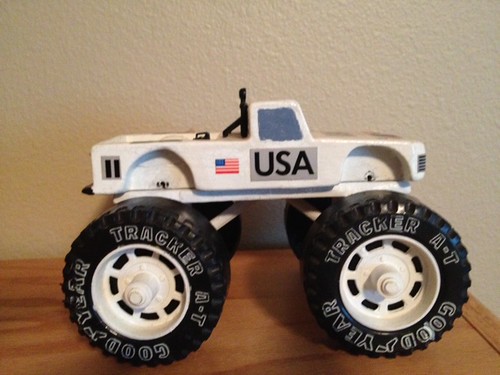
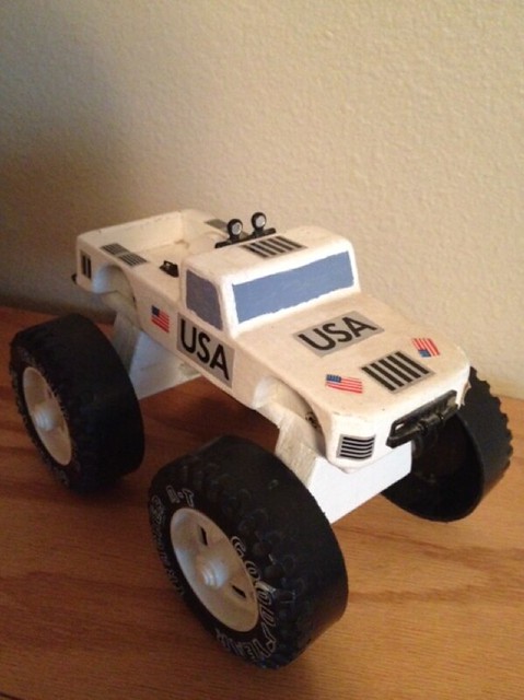
And here’s the real genius: these tires couldn’t be used for the race, so dad created a “plate” that allowed the tires to be easily detached and replaced with standard derby tires. Sadly, wear and tear was causing the plate to fall apart, so it is now glued permanently in place and I have no photos demonstrating how the whole system worked.
———
Pretty awesome stuff! My thanks to all of these contributors for sharing this great content with Uni Watch. If I was the sort of person who said things like “You’re all winners in my book,” this is where I’d say it.
All-Star helmet update: Yesterday I mentioned that reader James O’Hare said he recalled seeing Reggie Jackson wearing an Orioles helmet in the 1969 ASG. That prompted a note from A’s equipment manager Steve Vucinich, as follows:
In 1969, Sal Bando and Reggie Jackson both wore Senators helmets [in the ASG], as the visiting batboy in Anaheim put their helmets in the wrong bag. We didn’t know about it till game time on Wednesday (the game was originally schedule for Tuesday but was rained out).
So now we just need to get a video of this game. I’m working on it.
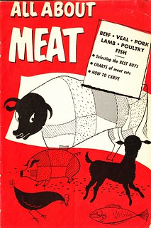
Meaty reading: As some of you know, I collect vintage recipe booklets with the word “Meat” in the title. A bunch of them were featured yesterday in this piece on Grub Street. Enjoy.
Correcetion: Yesterday’s entry about glove re-lacing incorrectly stated that Pecard’s Glove Conditioner is “a lanolin-based conditioner that contains no oils.” Pecard President Phil Wadzinski set us straight, as follows: “None of Pecard’s dressing or leather conditioners contain lanolin, or any other type of animal byproducts such as neat’s-foot or mink oils, fats, or tallows. Although the actual formulations are a trade secret , I can tell you that they do contain a combination of USP-grade (good for incidental food contact) petroleum products, along with a mixture of waxes, one of which is bees wax.”
I removed the incorrect wording from yesterday’s post at about 2:15pm Eastern, but I wanted to run this correction for those of you who had read the entry earlier in the day than that.
Uni Watch News Ticker: The Charlotte Hornets are officially back. … Here’s a comparison of the Blackhawks’ 2010 and 2013 championship caps. … Grand Canyon University has a new logo with an apostrophe catastrophe. … Good article about a new that looks at what happens to former Olympic villages (from Adam Hainsfurther). … Buried within this article about Ultimate Frisbee is the following: “In 2009, the University of Oregon’s Ultimate team, then ranked third in the nation and a favorite to win the national championship, had its season cut short after the school discovered they had played Oregon State wearing nothing at all.” Never heard that one before (from Adam Kowalsky). … Here’s Oregon football in solid yellow. “They haven’t gone all-yellow for the last couple uni designs, and it’s always bothered me that they always wore black or grey pants with the yellow jerseys,” says Chris Aquino. “Last all-yellow were these things.” … Dan Kennedy watching that episode of The Brady Bunch with Joe Namath and, well, there’s a lot to discuss here. … Here’s an animated GIF showing what AT+T Park would look like if sea levels continue to rise. Expect to see more stadium animations like this one as global climate change continues apace (from Adam Herbst). … Todd Radom sent along this great team portrait of the American League squad from the 1967 MLB All-Star Game. Note the batboy at the end of the front row! The league-specific jersey is great, natch, but I’m also curious about his striped stirrups — what colors were they, and which team were they from? That game was played in Anaheim, but they couldn’t be Angels stirrups, because the Halos didn’t wear striped hose in the late ’60s. (Indeed, you can see an Angels player at the far-right end of the back row — no stripes.) And they don’t match up with the striped Bosox, Chisox, or Orioles stirrups that are visible in the photo. Hmmmmm. … New football uniforms for WKU. Further details here (thanks, Phil). ”¦ Also from Phil: The Diamondbacks have a new mascot — and he’s a Mexican wrestler! ”¦ Rory McIlroy’s shirt at the British Open yesterday had this weird little black dots on the shoulders. “I have not seen that on any other Nike shirt, including any style worn by any of their other tour pros,” says John Agre. ”¦ Incoming UNLV freshman Kendall Smith appears to have leaked the school’s new basketball uniform (from Ahmad Billal Samady). ”¦ Holy moly, look at this 1912 shot of Sens skipper Clark Griffith wearing an amazing plaid coat! (Great find by Bruce Margulies). ”¦ New gold chinstraps for Baylor (from Jimmy Couto). ”¦ The Altoona Curve and Erie Seawolves played a red-on-red game last night (from Dan Rerko). ”¦ Great story from Joshua Johnson (one of today’s pinewood derby contributors): “I work for the local communications company, and it turns out we used to have a slick-looking mascot known as Teddy Telephone. He appeared on our trucks, uniforms, letterhead, etc. He died an unfortunate death in the ’80s. I assume the corporate bigwigs felt he’d become dated. Your blog inspired me to launch a campaign to bring him back. To support my cause, I made my own retro Teddy Telephone T-shirt to wear on casual days. The old-school employees loved it. I even fulfilled some requests for additional shirts.” Very cool. I think Teddy might have been the inspiration for Phoney McRingRing in the “New Springfield” episode of The Simpsons. … The Orix Buffaloes are calling this “shining red,” but it sure looks fuchsia (from Jeremy Brahm). ”¦ Also from Jeremy: Hanshin Tigers pitcher Shintaro Fujinami will be using a purple glove for the All-Star Game. ”¦ New football uniforms for Memphis (Phil again). ”¦ To commemorate NAIDOC (National Aborigines and Islanders Day Observance Committee) week, all of the teams in the Western Australian Football League wore jumpers featuring indigenous designs (from Graham Clayton). ”¦ Rob Neyer has written a very good analysis of baseball stadiums in general and the Mets’ ballpark in particular. He left out my biggest gripe about the latter, namely that you can’t get to the escalators to the upper decks without walking past all the food vendors and shops, which is both inconvenient and transparently manipulative, but it’s still a good piece. Recommended (from Chris LaBella).
The local electric utility in Cleveland (the Cleveland Electric Illuminating Company) used Reddy Kilowatt as their cartoon mascot when I was a kid, along with a bunch of other electric utilities.
I found this 1960s Cleveland Indians scorecard ad from the Illuminating Company online; here’s the link to the blog posting containing it:
link
ed
link
Ed, for some reason, your comment didn’t show up on my computer until about 5 minutes ago.
Sorry for repeating the Reddy Kilowatt info further down…
So glad Russell took WKU’s nice looking traditional uniforms, wadded them up and wiped their ass with them to produce this gimmicky piece of shit. Full time chrome dome…WHY? Lettering down the pants…WHY (guess Bobby P. liked that look on his Hogs)? The school logo within the numbers is kind of cool and I like the red towel logo on the pants, but come on!!! This really is a cold shower on the excitement that has been building up for this coming season.
“In 2009, the University of Oregon’s Ultimate team, then ranked third in the nation……”
1st: Oregon Sate
2nd: U. of S. Oregon
3rd: Oregon
4th: NW Oregon College
5th: Oregon Tech
6th: Howard Hesseman Univ.
7th: East Oregon C.C.
8th: …..
Lucha Libre mentioned twice in Uni Watch today! (briefly in Olympic article and D-Backs mascot) This is going to be a good day!
Boy, what a great lead article. A couple of weeks ago, I was pig ignorant about the whole pine box phenom; thank you, Uni Watch. Everything was excellent this morning, but that shot of Connor with his Mach 5 is beyond great. Throw out those wheezy American Gothic prints and we’ll make the Connor this generation’s great Americana totem.
Love the Mach 5! Go Speed Racer, Go!
link
“Melange still races…”
link
I love that Mach 5 car! Props to that kid!
In my first Pinewood Derby my Dad and I created what could only be described as a glorified door stop. However, it was fast. Good enough for 3rd place. Next two cars were crap so I brought the original out of retirement in my last year of Cub Scouts and won the whole thing! It was then used about 6 years later by a family friend, who we let re-paint it, and took another 3rd. Fish weights set in the middle of the car helped it make the weight limit and I think the speed was due to the fact that only three of the wheels touched the ground.
My guess is the ‘dots’ on Mcilroy’s shirt is a sealed seam. If you look at the USA Centennial soccer jersey (link) and some of the other team issued soccer jerseys for Britain (link) or Brazil they have similar construction on the shoulder. Would assume it reduces stitching in that area ‘minimizing’ weight and/or chafing? Nike claims their soccer jerseys are “crafted with bonded T-bars to support the seams at key points and inner welded seams with a clean finish to give a more striking appearance, while also increasing comfort and performance.”
I took 2nd place in my Pack’s Pinewood Derby, key was graphite on the axles. Still have the trophy someplace, the car too.
Cub Scouts was a lot of fun back in the 70s.
My car always got last in the Boy Scout races because my dad absolutely refused to let me put graphite on the axles or add weight to the front. He said it wasn’t the right thing to do so I watched my car slowly creep along the track every year.
Your dad seems like a man dedicated to fairness and equity.
For most kids, Pinewood Derby is the first time they learn how readily their dads will cheat to win, and how utterly inconsequential the stakes have to be to justify the cheating.
I’ve seen enough underhanded stuff happen at Pinewood Derbies — tampering with scales, sabotaging opponents’ cars, messing with the track — to make International Cycling yearn for a long, cleansing shower.
“… … Todd Radom sent along this great team portrait of the American League squad from the 1967 MLB All-Star Game. Note the batboy at the end of the front row! The league-specific jersey is great, natch, but I’m also curious about his striped stirrups – what colors were they, and which team were they from? That game was played in Anaheim, but they couldn’t be Angels stirrups, because the Halos didn’t wear striped hose in the late ’60s. (Indeed, you can see an Angels player at the far-right end of the back row – no stripes.) And they don’t match up with the striped Bosox, Chisox, or Orioles stirrups that are visible in the photo. Hmmmmm. …”
Well, since the batboy is wearing a special, made-for-the-occasion AL uni; since red-and-blue is the default color combo of almost anything with the word “American;” and since the stirrups feature two different colors besides white, I’m gonna say those stirrups are red-white-and-blue. There are readers of this site who are really smart about chromatically de-coding old b&w photos, and I think I remember learning from them that (counter-inutitively) red is darker than blue.
1967 remains my favorite baseball memory year. I was a Yankees fan as a 1950s kid in the NYC suburbs (talk about front runner), and always AL over NL. Moved to Boston in 1964, when the Red Sox were drawing something like 600,00 fans per season to Fenway. Each year I liked them more and more as I became more self-identified as a New Englander. The Sawx started the 1967 season W2-L4 and I settled in for another year of disappointment. But then, led by the three guys in that All-Star photo — Yaz, Rico, Lonborg — those ’67 Red Sox provided more fan joy than ever before or ever since. Sniff.
As you know Connie, the Red Sox and Twins were tied for first entering the season finale in Boston. Yaz goes 4 for 4 and Boston beats the Twins and wins the pennant. (Detroit was a half game out but split a double header with California).
3 Twins giants in that All-Star pic: Killebrew, Oliva and Carew.
I found link purely by accident this morning.
This is from the Jets’ 1991 season finale against the Dolphins. ’91 was Pat Leahy’s last year kicking for the Jets, and when he got injured they signed ex-Giant Raul Allegre to replace him.
Note in this pic that holder Louie Aguiar (#4) appears to be wearing Leahy’s helmet (#5).
Am I going crazy or does Mike Miller only have one show on in the ad that Miami placed in the paper after letting him go?
link
I did the Pinewood Derby once. Despite my dad being a pretty skilled carpenter, he never had any knack for finer details, and as a result my car was a total piece of shit. Basically a doorstop dipped in pale blue wall paint. I might’ve drawn a “10” on it with Bic marker.
Back when I played Ultimate for a few summers, you would hear long time players tell stories of “naked points” and “land sharks” (involving a naked player and a disk used as a fin). Apparently it is something of a tradition, but not something you see in organized leagues like college. Never saw it myself, though.
Our team played a few nearly-naked points at Wabash. Then again, we never entered any of the “official” tournaments, either.
Cub Scouts also does a boat thing, The Raingutter Regatta. It’s not nearly as well known as Pinewood Derby, but in some parts of the country, it’s pretty darn popular, sort of RC Cola to Pinewood Derby’s Coke.
Found this Boys Life article which lays out the basics. I’d never heard of the Raingutter Regatta.
link
It appears GCU have rolled out some new logos. That avatar is also unfamiliar.
Also, GCU’s old logo was worse: link
I’m intrigued by Teddy Telephone. did he always have a pusbutton body, or in an earlier iteration, was he equipped with a rotary dial?
Lots of power companies used to employ a mascot named Reddy Kilowatt, who was all electric bolts and light bulbs. He was charming, too, albeit in a “touch me and you’ll be fried to a crisp” way.
So glad you asked. Yes, Teddy T used to be rotary dial. He was updated in the late 60s or early 70s I believe. I’ve got a photo of the original (and quite awesome) rotary Teddy T, but I don’t have a good way to attach it here for your viewing pleasure.
Joshua, I e-mailed Paul asking if he could forward my e-mail address to you. My father is a huge telephone nut, and some Teddy would be right up his alley.
Thanks, Joshua.
I’d love to see rotary Teddy T…
I’m not sure if it is just a cache issue for me, but this article is not showing on the homepage. The re-lacing article still shows at the top.
Same here, but only in Firefox on a PC. On Safari on a tablet, I’m seeing everything as it should be.
Those little dots on Rory’s shirt are external seam reinforcements. Nike has them on a lot of their golf polos. They may be more decorative than functional.
They are indeed seam reinforcements. They do provide pretty incredible strength for their weight, but to make them black on a white polo does seem to steer their decision toward aesthetic. Seams are being replaced by adhesives/overlays for reduced weight and increased comfort in everything from shoes to underwear to ski jackets. Bemis is one major manufacturer – link
Those Aussie jumpers would look so much better if the aboriginal designs weren’t obscured by the hideous gaggle of advertisements.
Shiga,
I agree – but clubs in the “minor leagues” such as the Western Australian Football League and the South Australian National Football League need to get every possible dollar from sponsorship, hence the mish-mash of advertising logos.
Glenelg in the SANFL have received some negative publicity for having their sponsors name written across the yellow sash of their jumper:
link
Some fans think that the sash is an integral part of the uniform, and should be exempt from advertising.
The KBO had their All-Star game on Friday night in Korea. Lotte’s Shin Bon-ki decided to use a Spiderman batting helmet for his at-bat
Pic: link
Video: link
“In 2009, the University of Oregon’s Ultimate team, then ranked third in the nation and a favorite to win the national championship, had its season cut short after the school discovered they had played Oregon State wearing nothing at all.”
THAT would’ve been an interesting shoot for ESPN’s The Body Issue.
Being that you’re from Brooklyn where do you consider ‘upstate’?
I’ve heard people from NYC consider Yonkers ‘upstate’ which is technically true but also absurd.
Coming from a displaced native Lawn Guylander (born in Queens, though), anything north of the Tappan Zee Bridge is considered “upstate”.
And Nassau and Suffolk are “out in the country” if you’re from Brooklyn or Queens. Fuhgeddaboudit.
What? There’s the City? Rockland and Westchester and then Canada, right?
Anything north of the Bronx is “upstate”.
Anything east of Queens (despite being physically on the same Island) is Long Island.
The City is the 5 boros, collectively, but if one says “I’m going to The City” they’re speaking only of Manhattan Island. I’m pretty sure no one in the other 4 boros even considers Staten Island part of The City either. You go “out to Queens” or “up to the Bronx”.
My girlfriend’s from Middletown. No way in hell is Orange County upstate. I live in the Berkshires and we’re more upstate than that. And we’re in Massachusetts.
I couldn’t disagree more. Upstate begins at Albany. New York is a big-ass state. Hell, I’m an hour away from NYC right next to a famous prison called ‘Downstate’.
Hooters has a new logo:
link
Yes, because the LOGO is what men look at on a Hooter’s shirt…
i like it! they didn’t go too simple. has a bit of charm. doesn’t look like it followed a trend. they went off and created a really decent re-do of the owl. tip of the hat to them
Back in the late 80’s, it was still fairly hard to get Buffalo style chicken wings in Houston. I’d never heard of Hooters before, so when the billboards started popping up, advertising the chain’s arrival in Texas and trumpeting their award-winning wings, I suggested to my wife that she and I and our six-month old son should have a nice, wholesome family night out at Hooters, and enjoy some good ol’ wings, like they make back home.
A few days later, I was stopped at a light, in front of a one of those Hooters billboards. I could not figure out why I found that owl so…mesmerizing. Then it hit me: THOSE AREN’T EYES!!!!
We never went to Hooters.
There’s an owl in the Hooters logo?
You gotta love the kid on the far right in Douglas Ford’s photo: the dishveled hair, the glasses, the expression and, yeah, “the sweet Dolphins jacket.” Framed so nicely by the exquisite faux wood paneling found in every American home in the ’70’s.
Had to comment over on that site that compared 2010 vs. 2013 Stanley Cup champion hats…..Just because the old model fit a huge dome doesn’t make it superior!
My comment:
I have to disagree with you on Quality, specifically snap back vs. one size fits most….I have a head on the smaller side – I typically have to find youth hats – ones that don’t look child-like. I cannot wear the 2010 model, it is too big, it covers my eyes and falls over my ears. At least you can adjust this year’s cap to accommodate your noggin. You can’t do that with the 2010 model. Mine’s sitting at home, brand new. It stinks that I was never able to wear it.
“meat for men” ….and the two heads depicted!!
Just saw on twitter that UConn made some minor tweaks to their new helmet design… The helmet is now glossy white instead of matte, and red piping has been added to the stripe. I think the facemask may have changed colors but im not entirely sure. This will be their primary helmet for this season, and they have a blue version that they will use a couple of times this year. No picture for the blue helmet though.
Heres the link: link
Ugh…. WKU went from one of my favorite unis to looking like everyone else that’s bringing out a “new look”
Paul, my brother was a quite prolific pinewood derby “racer” in his scout days…. I’ll see if I’ve scanned some of the pics of his cars.
I just saw a clip of Sidney Crosby practising wearing #37.
After realignment in the NHL there is now a division called Metropolitan Division:
Carolina Hurricanes
Columbus Blue Jackets
New Jersey Devils
New York Islanders
New York Rangers
Philadelphia Flyers
Pittsburgh Penguins
Washington Capitals
Adams, Patrick, Norris, Smythe, and put a page up on NHL.com explaining them.
Or pick some new builders to name the divisions after. (The “legendary players” route has its own logistical issues.)
This approach is lame and stupid, and to me, the way the NHL pushes it (geographical names work better with the casual fans) offends me greatly, because it comes off to me that the NHL considers the “casual fans” to be lazy and stupid!
I was a casual fan once, back when the NHL had those names. I wasn’t turned off by them – quite the opposite, as I wanted to learn about them! Which I did, the old-fashioned way!
They did, they named an entire division after journeyman Glen Metropolit.
Regarding Citi Field, you CAN get to the upper deck via escalator without walking past all the shops if you enter via the LF gate. You just can’t do it if you enter through the rotunda.
Sea levels are rising? Sure, the media has published countless PREDICTIONS, but where is the evidence?link
I remember hearing that the Oregon issue was that their A team had to play their B team at some tournament, so they played Tops vs. Bottoms, meaning that you were either only wearing a shirt or only shorts. Still a good story.
Why has there not been posts on monday and tuesday? Just wondering