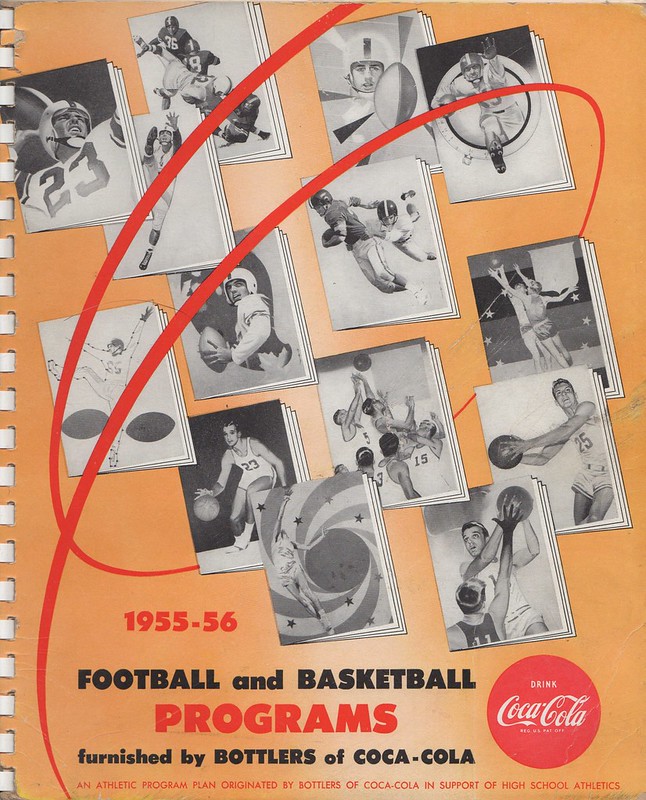
Click to enlarge
Today we’re going to take a look at another catalog that I recently acquired from the late Mike Hersh’s collection. This time it isn’t a catalog for uniforms, but I think you’ll still like it.
Here’s the deal: We’ve all seen those old high school and college program covers with beautiful but generic cover illustrations. You the ones — the cover designs have nothing to do with the teams that are playing but are still plenty nice to look at. Now I’ve acquired a catalog from a dealer that sold those cover illos.
There are a few surprises here. For starters, it turns out that the catalog was produced by Coca-Cola, which apparently sponsored these programs. Secondly, as you can see above, the catalog cover is a bit of a snooze, with very little range of color.
Happily, the program cover illustrations are much better than the catalog cover, as you can see below (for all of these, you can click to enlarge):
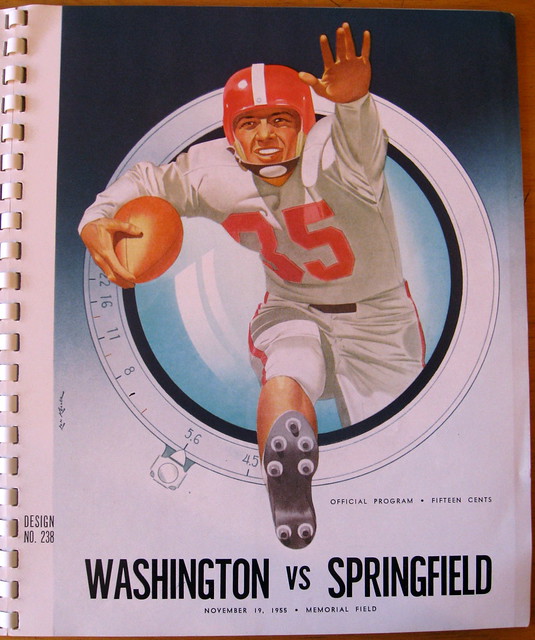
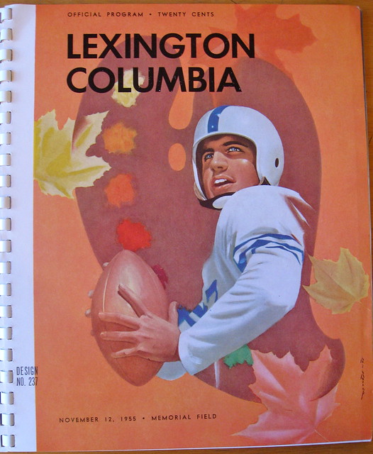
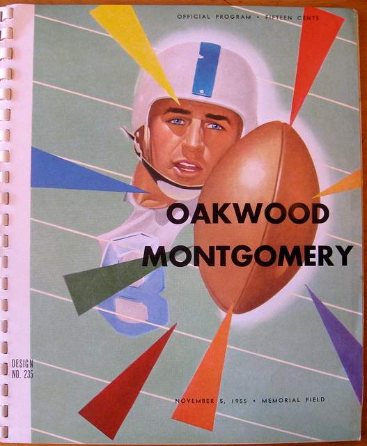
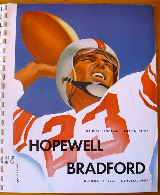
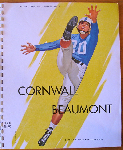
Nice, right? There’s also one illo that’s kinda weird — sort of a connect-the-dots approach:
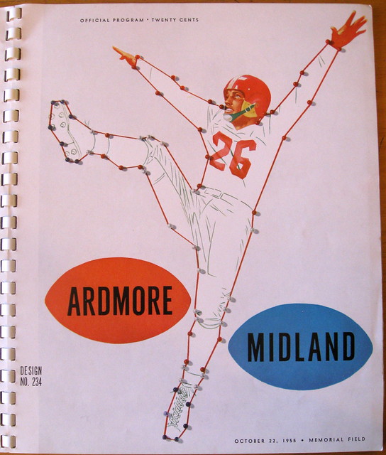
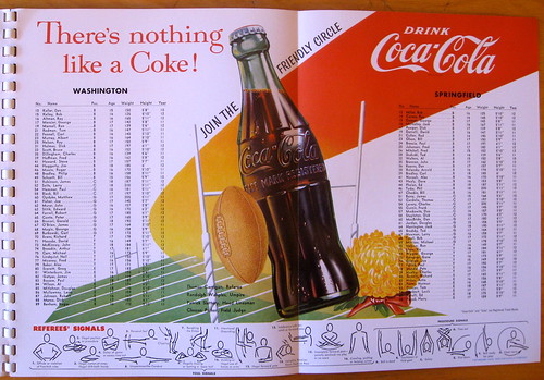
There’s also a gatefold page showing how the center spread of the program could feature the two teams’ rosters:
———
But wait — the catalog has more than just football program cover art. There’s also a series of cover illustrations for basketball programs:
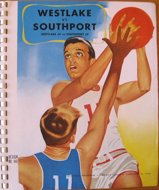

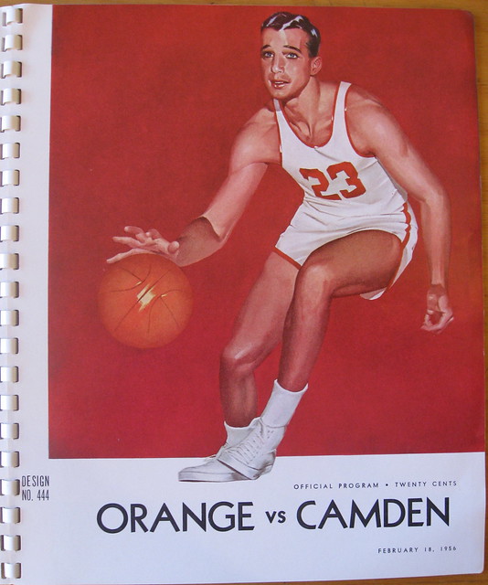
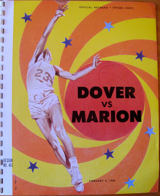
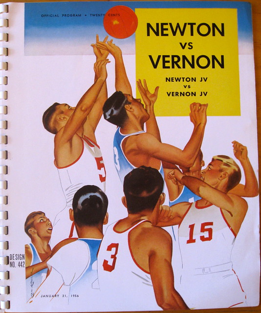
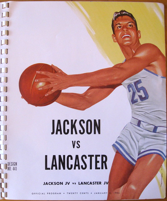
The catalog also includes some rather underwhelming pages about why you should have a nice program (look here and here), along with some technical information on how the program should be laid out and printed (here, here, and here).
Two final thoughts: I’d love to know the names of the illustrators and designers who produced this cover art. And it’s pretty sobering to see that out of all the players depicted on in the illos, there isn’t a single black face.

Show & Tell update: Photos, stories, and participants from this month’s installment of Show & Tell are now available for your enjoyment on the Show & Tell web site.
Uni Watch News Ticker: If you thought Notre Dame’s uniforms looked bad two nights ago, check out what they wore last night. I’m sure some of you think that should have been today’s lead entry, but honestly, what’s left to say except that the Fruit Stripe designs suck and that everyone involved would no doubt be ashamed if they hadn’t already gotten their shame glands surgically removed? That’s pretty much the whole story. … Wait, no it isn’t: Notre Dame’s Fruit Stripe jerseys have this jock tag. “Kind of contradicts the uniform, doesn’t it?” says John Okray. … Haven’t heard or seen much regarding green spring training uniforms for St. Paddy’s Day, but here’s what the Orioles will be wearing (from Dawn Murphy). … St. Paddy’s Day warm-ups for the Blue Jackets, too (from Mark Krugman). ”¦More info on the “more aggressive” UConn mascot logo here. ”¦ Good spot by Stewart Small, who noticed that Alexander Semin’s jersey number and helmet number didn’t match the other night. … Joey Potts was watching some old NFL footage and spotted Bill Walsh wearing a 49ers jacket with a North Face logo. … Very nice striped stirrups being worn by North Buncombe High in North Carolina (from Charles Allison). … Stephen Colbert was talking about Pope Benedict’s retirement a few weeks ago and said, “As with all departing Popes, the Vatican raised his vestments to the rafters” (from Jeremy Brahm). … Who’s that tyke in the leatherhead helmet? A very young JFK, that’s who (from Matthiew Mitchell). … While looking for something else, I came across this photo of Ron Blomberg. What’s that white tape on the back of his helmet? … New 100th-year rugby kit for the ACT Brumbies (from Josh Jacobs). … LSU and Nicholls State wore light-blue batting helmets on Wednesday night, to raise awareness of prostate cancer (from Chris Mycoskie). ”¦ New third jersey for Sporting KC (from Tyler Moody). ”¦ A Japanese politician who also happens to be a former pro wrestler has refused to stop wearing his Mexican-style wrestling mask at city council meetings. ”¦ Laynce Nix, now with the Phillies, is blaming his recent foot injuries on Nike (from Sean Robbins). ”¦ Danny Garrison’s latest set of NFL teams recast as soccer teams is for the NFC North. ”¦ Reprinted from yesterday’s comments: Here’s a Wichita State player wearing gold stirrups over black sannies. ”¦ Note the inconsistent sleeve patch placement in this photo of the New Zealand team at the World Softball Championships. “I don’t know anymore if it’s a curse or a blessing that I notice these things,” says Jim Pericotti. … “I was at the Oregon Historical Society on Wednesday for the opening of an exhibit my wife curated,” says Michael Orr. “While I was wandering around beforehand, I came across an exhibit for Esco, a metalworks company based in Portland. Their complex is currently on the site where the Portland Beavers played from 1901-1955 (Vaughn Street Park). As such, a small part of their 100th-anniversary exhibit focuses on the Beavers, including two jerseys and a cap. One of the jerseys, as you can see, features a baseball centennial patch from 1939.” … “I’m a longtime reader and film archivist at the Academy Film Archive,” says Charles Edward Rogers. “On Wednesday I was inspecting some footage of Hazel Laugenour, the first woman to swim the Golden Gate. The ‘SE’ stands for the South End Rowing Club, which I believe still exists in San Francisco.” … Braves had a weird uni protocol for yesterday’s Grapefruit League game: The coaches wore white, but the pitchers wore red and the fielders wore blue. “It was especially confusing because they were playing the Phillies, who were also wearing red,” says Tim Burke. … Interesting timeline of Ohio State logos through the years (from Ethan Sheets). … New Sunday cap apparently on tap for the Toledo Mud Hens. “Probably to wear w/ their throwback alts they introduced last year,” says Jacob Kubuske. … New road soccer kit for the Republic of Ireland. “What screams ‘Emerald Isle’ more than solid black?” asks a nonplussed Yusuke Toyoda. … The Reebok wordmark on the back of the Rangers’ jerseys is normally flush against the yoke striping, but Brian Boyle’s wordmark has a white outline (good spot by Diego Bauzá). ”¦ Wil Myers, a top prospect in the Rays’ organization, doesn’t wear batting gloves (from Kyle Speicher). ”¦ The Canadian WBC team has an unusually high number of players who throw righty and bat lefty, and the reason for this may be hockey (from Jason Hillyer). … Going out to see my Mom today (last week’s visit was snowed out), so play nice while I’m away, okay? Okay.
Buffalo & Kent State went color vs color last night in the MAC tournament. Both teams actually wore different shades of blue.
link
Kent State’s were BFBS.
ah – couldn’t tell if it was Black or Navy Blue. I assumed because their colors are Navy and Gold that it was Navy.
Why would you assume they would wear blue just because their colors are blue…That’s silly!
As a person who was at the World Series of Softball (would have been an awesome uni project to write about if I had the time and photos) I can tell you they were on the arms on the one facing the pitcher (and therefore the cameras)
heck I am even umpiring games on the same diamonds that hosted the world championships this weekend
That was the protocol of the Detroit Tigers’ road jerseys in the 1968 World Series. They wore the uniform number on the sleeve facing the pitcher.
Son of a gun, I didn’t know that (about the 1960s Tigers road jerseys, I mean)! All this time, I just assumed it was the same sleeve for everyone, regardless of whether they batted right or left. Thanks for that info!
The haka on a softball diamond?!? Not sure if that is cool or pathetic.
There’s no link for the NFC North soccer uniforms.
Thanks. Now fixed.
Those are my favorite yet. I’m a born and bred Vikings fan, but the Packers and Bears tops are pretty sweet.
Key Lime is all that counts. Leave a legacy, ND.
Good stuff.
ND really looked bad last night with those costumes. It has such a great uniform history in basketball. It’s a shame that the school embarrased itself last night, and for no good reason. I had to turn it off, the visuals were so bad.
So sad. I’m going to save that picture and pull it from the archives whenever I hear anyone ever talking about ND tradition/pride etc. Everyone involved should be embarrassed.
ESPN’s PTI had a quick segment on Cincinnati’s fruit stripes and they were brutal. Ended with Kornheiser saying Oscar Robertson should have taken them out to center court and berated them for embarrassing a program he worked so hard to create… then made them change.
Anybody else catch Mike Brey’s halftime interview where he joked that ND was able to come back from their early deficit because Marquette had to put on sunglasses?
Jock tag:
“…destiny favors the dedicated Blue and Gold…”
who are wearing anti-freeze snot green
There were previous wrestler turned politicans in the 90s and 2000s whobhsd same problem, perhsps the Great Sasuke was the best known.
The biggest wrestler turned politican was probably hiroshi hase, who didnt wear a mask, but did have a great 80s moustache.
Would Notre Dame’s jock tag get an F from professors due to a lack of punctuation?
Hard to say. If it’s a paragraph, it would need punctuation. But a collection of phrases, arranged for motivation? Probably not.
Maybe it’s just me, but that Semin photo looks more like glare hitting his helmet at just the right spot to make the “8” look like a “3”.
1955 was only eight years after Jackie Robinson’s MLB debut. I’m a bit ashamed to say I don’t even know when the NFL or NBA integrated or who their pioneers were.
So I don’t find it astonishing that the players depicted are all Caucasian, maybe sobering. It does serve as a reminder just how recently things were much different.
So I don’t find it astonishing that the players depicted are all Caucasian, maybe sobering.
Well stated. In fact, I’m going to change the wording accordingly!
I’m not surprised either — when producing art like this, the over-representation of the majority tends to become even more extreme, because if the illustrator is one of the majority, he’ll naturally draw people like himself, and if he’s in the minority, he’ll still have to get it past editors, who, if they’re majority-members, will either notice that the person in the illustration is “wrong”, or will unconsciously just feel that something is off about it.
Case in point: with the possible exception of the shooter in the Westlake-Southport picture, every action in every picture is by someone who’s right-handed or right-footed.
(Paul, how is it that you noticed the lack of black people without noticing the lack of left-handers? And you even have a ticker item about lefties today!)
Wow! I wrote a journal entry yesterday that was germane to this topic. I draw a lot of cartoon characters, but I have a “better angel” who nudges me to curate an image of an ideal world. If I only followed impulse, the figures would all be white males: my conscience has to intercede and add a bit of deliberation to the process. Color-blindness doesn’t come as easily to me as I would have hoped.
Brown v. BOE was not ruled upon until 1954 and the SCOTUS did not lay out a timetable or instruction for when and how desegregation was to be implemented; they were not exactly specific in 1955’s “Brown II” decision either.
Yet the Troy v. Newton Gay Pride cover is progressive even for today.
+1
The color line in both the NFL and NBA had been broken by 1955, the NFL by Jackie Robinson’s UCLA backfield mate Kenny Washington (I think a year earlier than MLB, even) and the NBA by Chuck Cooper & Earl Lloyd. But inasmuch as these programs would’ve been marketed to high schools, where there was still de facto segregation throughout large swaths of the country, their lily-white quality isn’t all that surprising – it’s unlikely that an underfunded black high school would’ve devoted its limited resources to something as (relatively) extravagant as a glossy game program. Black society as a whole was marginalized in virtually every walk of life back then (think TV, magazines, movies, etc.).
For anyone interested in this era, I heartily recommend “Black Magic,” a documentary about the desegregation of basketball that aired on ESPN a few years back. It’s an amazing tale, told wonderfully:
link
Another point in the racial makeup of those athletes is the sponsoring company. Coca-Cola was and is based in Atlanta, Georgia. Need I say more?
My local high school in Livonia, NY used those stock four-page program sheets as provided by the Rochester-area Coca-Cola bottler. The school secretary would mimeograph the pages with the competing teams and date on the cover, the line-ups on the middle pages and the team’s schedule on the back. They were given away free of charge at our games. Free! Imagine that today.
For the record,
Coke hired their first black female model in the mid-1950’s:
link
NY(Baseball)Giant Monte Irvin did some ad work for them in the 1950’s too:
link
paul, i’m pretty sure that ACT brumbies thing is not for the 100th year of the rugby team, but the 100th anniversary of the founding of the city, which was founded march 12, 1913.
the brumbies only started playing at the start of the super12, in 1996. if you want to go back even further then you could say the ACTRU was founded in 1938. either way, that 100 is not for the team but for the city itself.
I didn’t realize spring training games were again being played at Al Lang Stadium in St. Pete. Perhaps being a neutral site game made the Braves do something different with their uniforms.
The games at Al Lang this year are featuring “Prospect Squads” from the Braves, Phillies and Orioles. Not “regular” spring training. link
Eagles WR Riley Cooper was at Phillies “regular” spring training yesterday.
No pics, but I doubt he was issued a #14 jersey.
That was my first thought too. I didn’t know it was Al Lang specifically, but I did immediately notice that neither the Braves nor Phillies Spring parks sit on the water near a picturesque marina. The Braves are landlocked at Disney World and the Phillies are on a busy retail street, next to a Toyota dealer and a Best Buy.
LSU has worn four different uniforms already.
As a Canadian, I fit the stereotype of throw right bat left. I have no idea why, but trying to play hockey right handed is impossible; but I’m very ambidextrous. Whatever it is that I did to my ring finger on my right hand years ago playing football is turning me into a lefty anyway…
As a Canadian, I don’t fit the stereotype of throw right bat left, but my hockey shooting probably influenced other sports.
I am right handed but shoot right in hockey (maybe from being taught by my left handed dad?), bat and throw right handed and golf, bowl, etc. right handed.
The ND jock tag is infuriating me because of its mish-mashed use of the slanted “A” (which leans left, right and straight) and “V”.
Some ill-conceived kerning attempt???? I’m stumped.
The link showing ND’s uniforms (first link from the ticker) also shows another example of zero guarding zero.
Paul – I know of at least three of the illustrators in the Coca-Cola program series; the artists were all part of the “Mayonnaise School” of illustration, that being the kind of artwork where everybody’s skin in these pictures is smooth and glowing, and the artistry evokes emotions of desire and happiness and excitement. Lon Keller was the person who also designed the logos for the Mets and Yankees, while Larry Tisdale was also a famous illustrator. The most famous of these illustrators was Fred Fixler, who not only illustrated many of these covers, he also taught illustration at the Brandes Art Institute and the California Art Institute. Fixler was also responsible for several cover art illustrations with Brandon House, a publisher of “after hours” adult paperbacks.
link
Huh! My bad for not realizing/recognizing that! Thanks for filling me in.
Absolutely Huh! Big thanks to Chuck and MP. And I gotta say, “Mayonnaise School” is right up there with Impressionism, Cubism, and Abstract Expressionism. Hey, without these guys and other brethren in 1950s-1960s commercial illustration, late 20th Century painting would have been completely different, and a lot less involving. Great feature.
True enough.
Plus, “Mayonnaise School” is a fantastic turn of phrase.
Paul thank you for the post on program illustrations. As an illustrator and sports artist I always loved those covers as a young boy. I still have a few in my files from when I played and from my Dads coaching days. Hopefully you can show us more someday. Chuck thanks for the information on the artists.
Lon Keller did create the logo for the Yankees, but he actually didn’t create the logo for the Mets. The Mets logo was done by Ray Gotto. From the New York Times (Nov. 17, 1961): “Official emblem of the city’s new National League baseball club was selected from among more than 500 submitted in the $1000 contest…done in orange and royal blue, official colors of the new club, won the top prize for Ray Gotto, a cartoonist.” Lon Keller did create the logo for the New York Giants (baseball), though. Even Lon’s obit credits him with creating the logo for the wrong N.Y. team!
Which Giants logo did he create?
If it was the c. 1950 cap logo, then he could make a claim to the Mets.
Oh, I was just talking about the Mets “skyline” logo (not the NY on the cap). I have a 1948 Media Guide for the New York Giants and the logo on the cover is classic Lon Keller (it looks a ton like the Yankees logo he did–minus the bat and top hat).
I have many programs from the 50’s-70’s from my alma mater that feature Lon Keller’s art…I truly love them, and I do own one that features an African-American from either 1952 or 1954…Great post on the old cover art. BTW there is a website, link that features alot of his art…great stuff!
I haven’t had my coffee yet, so I might be missing something here, yet shouldn’t Lon Keller’s name be mentioned somewhere regarding those cover illustrations?
See preceding comment thread. Mea culpa!
It kind of drives me nuts how the news outlets aren’t making the connection that several schools are wearing the “same” Fruit Stripe design. It’s all just “Could you believe Cincinnati’s uniforms?” or “Could you believe Notre Dame’s uniforms?”
Adidas isn’t the first school to promote a template, ugly as this one is. Nike has done it in the past, and other companies use it for other sports as well. They’re just this year’s poster child for the trend.
You’re right, but I mean the media pundits (like ESPN anchors) don’t seem to realize that multiple schools sport a similar style.
The schools probably prefer it that way, while Adidas does not.
That’s a good point YPC
RE: Sporting KC’s third kit:
Ivan Lendl actually was a pretty good soccer and ice hockey player before he got into tennis.
And it reminds me of the mid-80s Belgium uniform, which also had the Adidas argyle pattern across the chest.
I’m not so sure that the Sporting Jersey is legit. It isn’t on their website, and the image posted for this new jersey features Kei Kamara, who is no longer with the team.
The argyle definitely reminds me of the Team Garmin cycling jerseys.
link
Well, Kamara left during the January transfer window, and it would make sense that they did a photoshoot/editing work earlier in the year.
Still, yeah, I couldn’t find it in the Sporting KC store.
And as a Carolina fan, I like the use of argyle in a sports uniform.
I’m the person that originally found the picture of it while browsing MLS Gear for one of the new beanies. Was surprised to see it after the team guarded the new home kit so well til the very day it came out.
I can confirm that I’ve spoken with one of my friends who works for the team that this is indeed the third shirt and it will debut in May, either during the first game that Kei Kamara has returned or in another way if he doesn’t.
Thanks for the clarification. We all want one here in KC. We’re glad to hear that the are for real.
One item that maybe you could help clarify, this leaked shirt has been referred to as the third jersey. Right now SKC only has been wearing their new split light/dark blue shirts. If this new shirt is a third jersey, what is the second?
The indigo blue second jersey is unchanged from last year.
Since the light blue is reasonably unique in MLS, I believe they only wore it four times in 2012, and I doubt it gets used much more than that this season.
A couple of things:
– the Columbus Blue Jackets are wearing the exact same uniforms that link. These are generic warm-ups that the teams can sell off via auction.
– Hockey had nothing to do with me batting left, throwing right. I’m right-handed. If approximately 10% of the world is left-handed, that means that 9-in-10 hockey players are like the Canadian ball team. This shouldn’t be a shock. What should be a shock is that the Canadians carry almost no lefties on a team of 25 players (2-3 should be average). And my brother is left-handed, so it’s not like my parents influenced our sporting handedness either.
– Gotta agree with Andrew above re: glare on Semin’s helmet numbers. It looks link.
– Boyle’s “Reebok” tag on his uniform is probably being used to cover the old Reebok vector. If you’ll notice, the tags on the Rangers’ white uniforms contrast the red stripe as link and on link from last night’s game in Winnipeg. If you look at the size of the link, you can see it’s much larger than the red stripe. Hence the extra white space on Boyle’s “patch job” – it probably covers the blue vector hiding underneath.
A few of things:
1. Columbus’ St. Patty’s day warm-up jerseys are generic to NHL teams who just want to play along. The link before their game.
2. I have to agree with Andrew re: the glare on Semin’s helmet. It looks like link.
3. Pretty sure that my right-handedness is why I throw right and bat left. Hockey had nothing to do with it. Furthermore, my brother is left-handed, proving that my parents (both righties) also had little influence on our handedness when it comes to sports. He bats left and throws left.
4. Brian Boyle’s patch job appears to be a vector cover-up. As seen on link against the Jets, the Reebok wordmark is inline along the red stripe. Boyle’s huge white patch would cover the massive vector on the back of the uniform link.
Good call on Boyle’s jersey, Teebz. Reebok also places their logo at the end of the left sleeve – although it’s usually covered up by the players’ glove. They also switched this from their vector logo to the wordmark last year. I wonder if it is an old jersey, if the Rangers changed the sleeve logo too.
The Reebok logo on the left sleeve is only used on replica/”Premier” jerseys. That goes back to at least the CCM/Koho days. Can’t remember if Starter did it in the 90s.
Shane –
Actually, Starter was the first to put the logo on the sleeve on replica jerseys. Became standard practice since.
I just had two comments go nowhere after I hit submit. Consider this a test. :o)
Roger wilco, Bravo Teacup. Over.
Should be Tango Bravo Zulu. Sorry.
“What’s your vector, Victor?”
Tennessee was offered the opportunity to wear the Fruit Stripe uniforms and Cuonzo Martin turned them down. Thank goodness.
Alright, screw this. Let’s do this piecewise instead of one big email.
First, Columbus is using a generic template for the St. Patty’s uniforms. The link before their game last Saturday.
I wrote a little ESPN piece about teams wearing green for St. Paddy’s Day:
link
And with that, I’m off to Long Island for the day. See you next week.
Tomorrow we celebrated that most hated of colors. St. Urho’s Day is March 16th, and you celebrate by wearing purple and green.
link
Second, I agree with Andrew in that Semin’s helmet is experiencing glare. It link.
those catalogs are pretty much just the whitest things ever.
Lon Keller did paint this awesome link Aside from that, yea quite white back in those days.
Third, Brian Boyle’s large white wordmark is most likely covering up a Reebok vector. As link, the wordmark contrasts the red stripe with a blue background. The vector also did this, but link. Judging from the size of the white wordmark on Boyle’s uniform, it appears to be a cover-up job, meaning that Boyle is wearing an old uniform.
After reading the (what I can assume are going to be all) F1 reports, it would have been nice if someone that knew what they were talking about was discussing the cars. Mercedes is using a vanity panel (the rounded area atop the nose is the vanity panel), as is Sauber (the gentle sloping portions on the outside edges of the nose are the vanity panel).
The fact that the two teams left off the report include the three-time defending champions (Red Bull) who have possibly the second biggest livery change to a team this season (with Infiniti becoming a title sponsor), nevermind all of the helmets that could be discussed just with Vettel alone; and a team with a fantastic and historically based livery (Williams), added to the blatant mistakes made in discussing the one technical aspect actually pointed out, makes the entire report series a disappointment.
I don’t mean this as a direct attack on the two gentlemen that wrote them, but I can’t think of a better way to describe how disappointed I am.
Hello Ryan
Red Bull and Williams were left out due to a couple mistakes on our side:
Red Bull’s link seemed to be broken though we checked them and with Paul’s busy week (I think he made 3 ESPN columns + the Madden thing) it was impossible to get these out. We obviuosly mention the purple sidepods.
Williams on the other side, was no copied by me on to the final document where all the other were merged into 1 big column (idiot mistake). We realized this very late but we still have those two files done.
Regarding the vanity panels, Mercedes indeed has one and Sauber’s is not entirely a vanity panel as they hide the step partially and kept part of the edges.
The Sauber thing is kind of funny as the panels are supposed to have no aero advantage whatsoever and yet Sauber is playing with the aerodynamics clearly (you should have the panel or the step nose but not both). Also, Lotus is not using one but Boullier said they would if it proved to give an aerodynamic edge.
Sorry to hear it was a dissapointment for you and we’ll keep our eyes keener to next year’s changes.
Re tOSU logo timeline: It’s interesting to see the athletic tail wagging the academic dog.
I wouldn’t mind seeing the more artistically inclined (or at least those who can use more than MSPaint) have a go at some college uni concepts incorporating the respective schools’ academic logos. I did one for Furman for a Chris Cramer board contest back in 2005-06 but can’t find it anymore, maybe on a long-gone PC that didn’t get backed up or some such.
Harvard’s football jerseys used to have “Veritas” emblems on the shoulders. Do they still?
Both Harvard football – link -and Harvard hockey – link – have the Veritas shield on the shoulders.
Princeton’s hockey jerseys have a slightly modified version of the school emblem: link
A lot of the academic logos look very similar, and are finely detailed. They don’t really distinguish themselves when you’re looking at them from further than arm’s length.
I’ve noticed the use of shield-as-logo in the Ivies before, mostly in hockey but also on Brown and Columbia football helmets in the past.
As a Georgia alum I’ve often wanted to see the link expanded into athletics, rather than the oval “G” expanding from football into all the other sports.
here’s a fun little aside.
looking at the Creamer page for Harvard (the UConn thing got me there) and their logos are hilarious.
their ALT logo (the crest) “1636 – present”. now THAT is old school.
Paul (or anyone else) can you explain to me why Notre Dame has gotten so far away from tradition when it comes to uniforms (in both football and basketball) in the past few years. I’m an Auburn fan and both us as well as Alabama would get murdered if they even tried introducing alternates. I read one article one time that said Under Armor came to Auburn with ideas for alternates, but Auburn turned them down. So why Notre Dame?
That’s a real good question. I keep asking myself that too. And why UCLA too? Kudos to Alabama and Auburn.
My guess is that adidas has way more clout, no, money than Under Armour.
Also, SEC fans and boosters are probably more vocal and influential than their ND/UCLA counterparts.
I think some schools, especially ones with strong programs in football or basketball, look at the “other” sport as being the one that can experiment. Obviously Notre Dame would never change their football unis (I’ll forget that Miami game ever happened), but probably feel like the fanbase won’t be as upset with changes in basketball or other sports. Likewise, UNC keeps a pretty traditional uniform set in basketball, but lately their football program has been branching out with different uniforms (like the chrome helmet that has been shown here).
I’m actually a Bama fan, and the funny thing is, neither Bama nor AU really get too crazy with the football OR basketball uniforms. But then, the SEC as a whole has remained pretty traditional in both sports.
I agree with your general point, but UNC has had one-off uniforms the last few years, like the NC crest jersey this year, the gray look last year (?), the camo look for the Carrier Classic and the throwback from 2010.
Yeah, UNC may not have been the best example. I guess when it concerns basketball, you have 3x the number of games as football, so a lot more opportunities to do a “one-off”. I’m totally fine with a team changing their uniform for one game in a 13-game season, or two or three times in a 30+ game season. Obviously, what we are seeing in a lot of cases nowadays is excessive.
Good point about the number of games. A football team only wears its home or away uniform about 6 times each.
Thanks to Digger Phelps, Notre Dame fans have more of a tolerance for unusual men’s basketball uniforms than they do for other sports. They’ll even grudgingly accept Mike Brey’s teams wearing BFBS, to the extent that they accept “the kids love it” as a valid reason.
They’re less accepting of change to the football uniform (excepting a green jersey). Lots of alumni and fans despised that Miami one-off. But as it was a one-off, they were able to endure it. At least until this summer’s Football Media Day, when Adidas will probably unveil a new monstrosity that will be worn when ND plays Arizona State at Cowboys Stadium.
(Not trying to sound smart-ass-y) Is money the answer?
So we have the Blue and Gold of Irish wearing neon green and the Smiling Green Eyes of Ireland wearing black.
Another note about the Republic of Ireland soccer jerseys – the Irish are the only national team that I know of that sells replica jerseys with a sponsor logo.
Most other federations sell what players wear on the field, without the sponsor logos. Training gear almost always has some sort of sponsor signage, though.
I believe you are correct. And it’s really annoying. It’s enough to keep me from buying a shirt. Especially now, given that their sponsor is “3,” which I believe is a mobile service company. The logo, which as you can see from the photos Paul linked to, is more or less just a number 3 – which results in every jersey looking like it’s for the player that wears that number.
Yeah, my first thought was “Wow, that’s a terrible font”. My second thought was “Wait, why is everyone wearing #3?”
Why is it “Paddy’s” day and not “Patty’s” day?
I don’t think there’s a good reason for it, except that “Paddy” has always been a common Irish term of endearment for people named “Patrick”, while “patty” refers to ground meat packed into a flat, disc-like form (also, I don’t think “Patty” quite rolls off the tongue in an Irish accent).
I think the Irish/Gaelic form of Patrick is Padraig. So calling it Paddy instead of Patty references the Irish history.
I think Paddy was also a derogatory term for the Irish. That’s how the term “Paddy Wagon” got started. I heard it came from police had to arresting a large number of drunk and disorderly people in predominantly Irish sections of American cities, they put them into the Paddy Wagon.
Either that, or most cops back then were of Irish descent, and they named the police van after the term they gave themselves.
Let’s not forget that tomorrow is St. Urho’s Day.
Right – I forgot about the “Padraig” thing. Anyway, I don’t think “Patty” has ever been a common nickname for “Patrick” (though “Patti” shows up as a short form of “Patricia”).
I think “Paddy Wagon” refers to the Irish-Americans driving them, not riding in the back, though I haven’t been able to a find definitive word on the etymology.
Paddy isn’t really a common nickname for Patrick here in the US, but my extended family in Ireland use that nickname quite often. Cultural anomalies, I guess.
Kinda like some regions in the US use the diminutive Pauly for the name Paul. It’s much more common in the Philadelphia area, for example, than in the Midwest.
Being someone who grew up in Ireland as “Paddy” and is now living in the U.S. where introducing yourself as that is often greeted with confused stares I am far too familiar with this particular issue. It makes me weary sometimes having to explain why I’m “Paddy”, but luckily I can just direct them to this link and save myself shiteloads of time and effort:
link
Also, another Paddy related term worth knowing:
Plastic Paddy – members of the Irish diaspora (usually American) who assert their “oirishness” through outdated, often stereotypical, ideas of Irish identity and who generally know very little about actual Irish culture and are therefore deserving of ridicule and public shaming.
Thanks, Paddy. That link is pretty good. I especially like the talk about the shamrock. A bunch of guys I play softball with decided to get all green caps one winter (our team colors are green and black) just in time for St. Patrick’s Day. They came in with a four leaf clover on the back…and everyone was confused why I didn’t like it.
Both of my maternal great-grandmothers were Irish immigrants, and I’ve been researching my family’s roots in Ireland. Not as close to it as you, of course, but it for sure means a lot more to me than green beer and stumbling amateurs every March 17th.
St. Urho’s day was a BIG DEAL where I used to live
link
Though I don’t recall any of the local teams wearing special jerseys for the occasion.
Geezus. Didn’t realize the Fruit Stripe unis have Fruit Stripe SHOES to match. (Should have known.)
Is it easier to get onto the ticker by emailing him or posting it onto the comments.
Email.
It’s not only easier, if you simply post something in the comments, you’ll might not get mentioned by name (if that’s your concern) at all if the item appears in the next day’s ticker — it may just read “Reprinted from yesterday’s comments: ______”
So yeah, like The Big Teebowski says, shoot him an e-mail.
Thanks Phil & Teebz
Stephen Colbert may not have known it (though based on the fact he teaches Catholic Sunday school and is more well-versed in his Catholicism than most), there is somewhat of a precedent for raising the vestments to the rafters, at least for cardinals:
link
Galeros are the tasseled hats cardinals (used to) wear, and many cathedrals worldwide have galeros raised to the ceilings to honor cardinals who have died.
First-ever uniforms for Phoenix FC (USL Pro):
link
And it’s pretty sobering to see that out of all the players depicted on in the illos, there isn’t a single black face.
isn’t #26, the punter, black?
This guy?
I don’t think so. But I could be wrong.
I’m pretty sure that’s a white guy, but why is he doing a crane kick?
Before I looked at the comments, I thought, “Wow, number 23 is a Black. guy, and they’re. Showing him throwing a pass. That’s pretty progressive for the mid-Fifties,”
Also, the bug-eyed kid driving for the basket has obviously ingested something psychoactive;: Did Kerouac play high school basketball?
And the scared-looking point guard in the heavy black eyeliner appears to be a young Iggy Pop.
Mayonnaise my eye. This is clearly hippie work!
I don’t know why my keyboard inserted all the extra punctuation. If you read it like it’s written, you’ll sound like William Shatner.
Really enjoying the Show & Tell feature, Paul.
Look like Michigan is going “Fruit Stripe” for their game against Sconnie today:
link
It’s a dark blue version, and the camo look is rather subdued. Not bad at all, actually. Certainly better than the other Fruit Stripe uniforms.
Still wish they hadn’t done it at all.
Granted, the uniforms don’t have anything to do with their failure to compensate for Wisconsin’s adjustments… but they should still burn them along with the “Bleed-Out” set.
Dont forget that old punchline
Paddy O’ Furniture
Stock illos much like those from today’s catalog were used for the covers for Green Bay Packers game programs in the 1950s and 1960s. NFL teams didn’t have in-house artists back then, so I wouldn’t be surprised if they used a sponsor’s art, if Coca-Cola was a sponsor.
They sure were – here’s link on that connect-the-dots cover.
And link is just bizarre. I really don’t know what they were going for.
Thank God they connected the dots! I would’ve gone crazy trying to figure out what it was going to be!!
Cowboys v indians on ice
Via puck daddy
link
Dude, that’s pretty cool. And I’d have to think that, from an “intellectual property” standpoint, this is perfectly fine. The natives are wearing the headdresses and ribbon shirts and the white folks are wearing the cowboy hats and chaps.
I especially like the Mountie ref swapping out his zebra stripes for the traditional red coat.
So, here’s a thing:
link
I will be there is some disagreement on having the Tequila Sunrise uniforms on SI’s list of “Ugliest Uniforms in Sports History.”
These things are always ridiculous, mainly because they decontextualize the uniforms. That Astros uniform is a perfect fit for the fast, rich, dirty, crazy glory of Houston in the mid-Seventies, and is therefore beautiful. The Padres uniform is of its era, and while not exactly beautiful, is not ugly. The Habs throwback is gorgeous, a masterpiece that transcends its era.
Someday, men will evolve into higher creatures, stronger, more compassionate, better able to recognize and appreciate Truth and Beauty. Then and only then will The Angry Fisherman be given its due as a work of genius.
I look forward to that day.
Anyone else getting an 1882 vibe from the Braves?
I play men’s fastpitch and have competed against some of the guys in the picture with the inconsistent sleeve patches on the New Zealand team, the patches with the lettering (which says the jersey is from the 2013 ISF Championships) appear to be oriented based on is the hitter is right or left handed, the guy crouch in front is left handed and number 15 and 14 are right handed. Just a theory though
Legit theory. I remember reading on this site that the Women’s College World Series (women’s softball) does the same thing, so that the pitcher (read: camera) always sees the patch.
On ESPN, there was a decent segment with Digger Phelps discussing the ugly Notre Dame uniforms. The added bonus is Jalen Rose discussing how the Michigan baggy shorts look got started. link
BTW…I hate this post-season uniform trend. At the post-season I want to see the traditional school colors, not colors invented by shoe companies. Just shameful.
Digger’s teams, which were the best ever at ND, may have stretched to the limits at times for the stanard of the day. But, except for the lime green game in 1991 that Paul wrote about here last spring, they were still excellent and classic, now and then.
ND should build off that legacy and not wear key-lime pie. It’s great for ND to break out green once in a while, especially in March, but the color you saw last night has no place in their wardrobe.
Having an Irish kit in all black is stupid. But the stupidest part of it is that just a matter of months ago the Irish rugby team released an away kit which is the EXACT SAME! link