.
Mike Hersh, the longtime Uni Watch contributor who recently passed away, was a big collector of many things, including uniform catalogs. That’s how we met, in fact — he would frequently outbid me for old uni catalogs on eBay. In the weeks since Mike’s death, I’ve been in touch with his widow, Allison, who’s looking to sell off his collection (she could use the funds) and asked if I might be interested in acquiring some of it.
I figured I’d be proud to add some of Mike’s uniform catalogs to my library, so I recently went over to Allison’s place in upper Manhattan to have a look. Obviously, there was a sad cloud hanging over the occasion, but it was still great to see all of Mike’s old stuff, which reflected his great design sensibility and his obsessive collecting habits. In the end, I went home with nine catalogs, which I’ll periodically be sharing with you here on Uni Watch.
The one I want to start with, whose magnificent cover is shown above, is a 1935 Umbro soccer uniform catalog from the UK. I’ve never owned a soccer uni catalog or a British uni catalog, so this is a unique item for me.
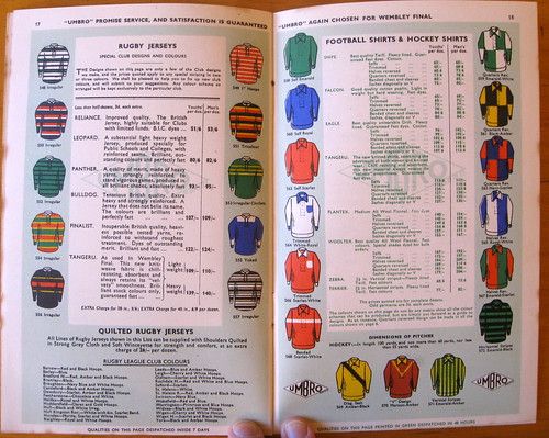
The first thing that’s apparent upon opening the catalog is that the colors really, really pop. It’s hard to believe this thing is nearly 80 years old. Check out these pages (for all of these images, you can click to enlarge):
The lack of sponsor logos (or any other graphics) is striking, right? In fact, if I didn’t know these were soccer jerseys, I’d guess they were thoroughbred racing jockey silks. I also love the names of the various quality levels: Nipper, Kudos, Tangeru, Bulldog (“Tenacious British quality”), etc.
The catalog also includes rugby jerseys, as you can see in these next three spreads:
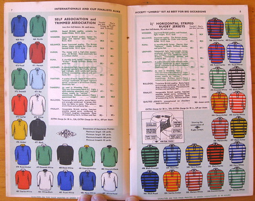
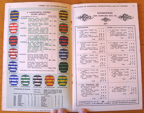
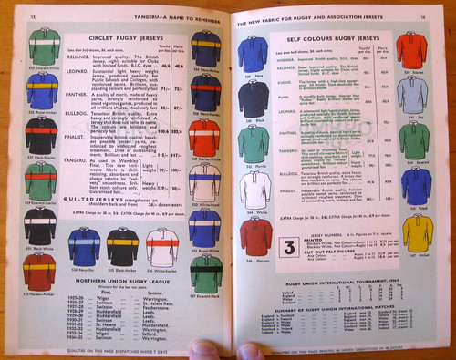
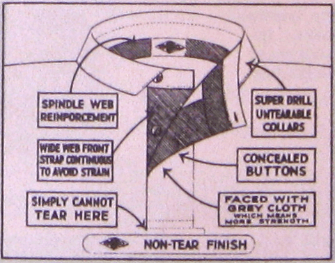
If you look at the top spread in that last batch, you can see that the right-hand page has a little inset about the jerseys’ “non-tear finish.” Here’s a close-up of that great little graphic:
There are also some listings for “Hockey Shirts” and “Ladies’ Hockey Blouses.” But as you can see on the next two spreads, these don’t look anything like 1930s hockey sweaters (and besides, hockey wasn’t popular in the UK in the 1930s, was it?). I believe these jerseys were for field hockey. Take a look:
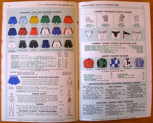
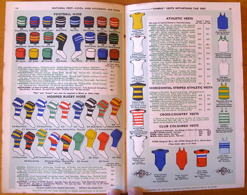
Naturally, I’m particularly geeked out about the hosiery page, which looks like a row of Christmas stockings hanging from the chimney:
And as a bonus, the catalog included this spectacular poster insert, which was apparently designed to be used as a souvenir of a big match:
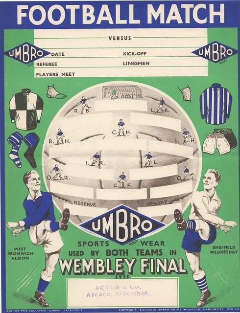
Gorgeous, right? I don’t even care much about soccer, but I still love this catalog. My thanks to Allison, and of course to Mike, for the privilege of being able to have it in my collection.
Uni Watch News Ticker: Wanna win $1000? It’s easy: Design a winning sock. ”¦ Looks like a possible slight adjustment to Ohio State football’s number font (from Chris Connelly). ”¦ UCLA is set to roll out a white version of its Fruit Stripe uni (from Chris Cruz). ”¦ In a related item, the Fruit Stripe uniforms are prompting a Zubaz revival. ”¦ Ladies and gents, your 2013 Tour de France yellow jersey (from Julien Papachristou). ”¦ Ladies and gents, your 2013 WNBA uniforms. “Tulsa and Indiana have added uniform sponsors, while Los Angeles, New York, and Phoenix no longer have theirs,” notes Kevin Brown). ”¦ Here’s the latest chapter in the debate over NHL visors. The league wants to make them mandatory, but the players’ union is resisting. ”¦ Here’s something I’ve never seen before: a T-shirt-shaped frame (from Ryan Perkins). … I’ve previously featured lots of old photos of MLB players bowling — look here and here — but I hadn’t seen this shot before. Here’s all info on the back of the photo (big thanks to Todd Radom). ”¦ “I was watching this video previewing the Minnesota State High School Hockey Tournament and noticed a few things I wanted to point out,” says Tony Tengwall. “At the 0:35, you can see the Breck School ripping off the Bruins. At 0:54, St. Thomas Academy has two different white sweaters going on at the same time. Then, at 2:06, you can see Champlain Park using the Flying Elvis patch on their jerseys.” ”¦ A man in Topeka was arrested and booked while wearing a Spurs jersey (from Bob Beatty). ”¦ New uniforms for Rutgers lacrosse (from Jared Buccola). ”¦ Reprinted from yesterday’s comments: New mask for Flames goalie Joey MacDonald. ”¦ Here’s a good shot of the Upton brothers’ NOBs, neither of which has an initial (from Preston Feiler). ”¦ For reasons mere mortals can only guess at, the Spurs are getting on the rally towel bandwagon. Further details here. ”¦ USRowing (which might be better known if they put a space between “US” and “Rowing”) is letting fans vote on a new logo (from Kevin Mueller). ”¦ Interesting article on whether white goalie pads provide an unfair advantage (from Roch Smith). ”¦ Big League Chew is changing its packaging to feature active big leaguers instead of cartoon drawings. Note that the Dodgers script has been airbrushed off of Matt Kemp’s jersey, presumably because the product isn’t MLB-licensed (from Josh Claywell). … Yesterday was the 90th anniversary of the Cardinals adding uni numbers to their jerseys, and the team marked the occasion by posting this photo. Look at those socks! (Tasty stuff from Sam Leverenz). … Mmmmm, mud (from Jerry Wolper). … “We are doing a murder mystery dinner fundraiser at our church,” says Aaron McHargue. “One suspect is a baseball player who has recently been traded to the ‘Chicago Wet Sox.’ I was charged with designing a logo to be printed on a shirt for the actor playing the suspect. This is what I came up with.” ”¦ Michigan basketball wore last year’s uniform style last night against Purdue (from Matt Bernini). ”¦ Lots of good info on the uniforms from Rollerball here (from Timmy Steffes). ”¦ Someone at the Oklahoma/WVU game was wearing an Adrian Peterson frankenjersey — half Vikes, half Sooners (from Garrett Holt). ”¦ “I was watching the Blackhawks game tonight and noticed that Brandon Saad was wearing mismatched gloves,” says Ryan Mandel. “After looking at photos from past games, I see he has done this multiple times this year. Maybe it has something to do with the streak?” ”¦ Here are the most popular Padres, as based on the jerseys chosen by San Diego Little Leaguers (from Jeff, who didn’t give his last name). ”¦ I’m making a guest appearance at an NYU journalism class this morning (maybe I’ll talk about the great pay scale in our industry), so I’ll be off the grid for a few hours. Play nice while I’m away, yes? Yes.
In that Umbro catalog(ue), they certainly mean field hockey not ice hockey when they say hockey.
Certainly, and even now, “hockey” in the UK and Australia only refers to field hockey. If you were talking about ice hockey in these places, you would explicitly have to say it. Moreover, considering field hockey is a summer Olympic sport, this is clearly not an obscure reference.
Third that, though it bears noting that field hockey barely escaped the IOC chopping block.
link
Beyond inexplicable that one of the world’s most popular & widely-played sports, which plays to sell-out Olympic crowds, can’t even garner as much support for its retention than taekwondo or canoeing. Or not, given the IOC’s involvement…
Field hockey is also one of the most disgustingly-prejudiced sports in existence — this may be different internationally, but as I recall, it can only be played by right-handers.
Back in the day Umbro and Bukta competed for the English market much as Nike and adidas do today for many sports. I don’t believe there was any financial incentive for teams but you never know. It was almost 80 years ago.
Attention to Paul and Phil. Did you notice that all references to colo(u)rs are capitalized? Do you know of anyone else who does this? (hint, hint) When you think about the practice it makes sense, right?
And I love the English colour names. Here are a few:
Red=Scarlet, Kelly=Emerald, Columbia Blue=Sky, Light Gold=Amber, Cardinal Red=Claret. There’s also a rugby color called “Cherry.” Could be either a really bright or slightly darker shade of Scarlet.
And did anyone notice that the top shirt size appears to be 36? Right up your alley, Paul. LOL And that there was an extra charge for shirts sized 38 and 40? I last wore a size 40 in Sixth Grade.
Rugby teams have always been pedantic in colour naming.
Wigan wear “cherry and white” – ie red and white
Warrington have “primrose and blue” – yellow and blue
and so on
The funniest I recall though was only a few years ago when a radio match broadcast was commentated by a woman – totally unknown in such a mysoginistic sport. She happened to say – absolutely accurately (I’ve seen them) – that Huddersfield were in their “purple and orange jerseys.”
You’d have thought the World had ended. A few minutes later her male co-presenter took his turn, and commenced by apologising to Huddersfield fans as they were clearly in their “traditional claret and gold.”
The odd thing about the WNBA uniforms is that almost every team has changed colors for the numbers on their road uniforms. Only Phoenix and Tulsa have the same color road numbers as last year. LA went from white to gold, Seattle went from red to yellow, and everyone else went to white.
I’ve never really taken a good look at the WNBA unis before, is there a reason for the crisscross “straps” on the back aside from aesthetics?
The contrasting colors, probably aesthetics. The construction has to do with making them better fit the female body (similar to the cut of a sports bra). A number of women’s college teams sponsored by Adidas (Notre Dame, Texas A&M, Wisconsin) wear similar uniforms.
The overall look of the WNBA uniforms says “intramurals” at best. Exact same style for all 12 teams. Same numeral font too. And Atlanta and Chicago have the same home jerseys, save for the graphics. I see WNBA replica sales going through the roof! NOT!!!!!!
I looked at the uniforms for a while and I still don’t know if one of those sets was for the Washington Mystics. Do they still exist? Who would know? At least the Sparks and a couple others have team names or cities prominently displayed, but who is the Bing team? More importantly, who cares?
There’s a problem with the tags in the NHL visor entry.
Thanks. Now fixed.
The font used on that Ohio State football uniform got it’s inspiration from here: link?;c=bhl&ei=1&quality=3&view=entry&subview=detail&cc=bhl&entryid=x-bl001055
Eeek, screwed that up. Lets try this:
link?;c=bhl&ei=1&quality=3&view=entry&subview=detail&cc=bhl&entryid=x-bl001055
Here’s a TinyURL-ed version:
link
Re: Padres jerseys. I think the selection says more about the dads than the kids, since presumably the coaches are the ones who choose the jerseys.
Some funny commentary in that article. Dumb kids of today, don’t even realize the greatness of Padres brown/gold.
-Jet
I’ve been supporting a return to brown/yellow for a while, but I doubt that’s ever going to happen.
I wonder if they’d consider navy/yellow – which would harken back to most of their previous designs but allow them to have a unique (for MLB) color scheme.
Hmmm…you mean like this?
link
Definitely not.
Something more link <a href="link link but with Padres “SoCal” styling.
Well that’s ugly. These along lines:
link
link
link
The colorization on that catalog threw me off for a bit. Both clubs where vertical strips. West Brom white/navy blue and Wednesday white/blue.
link
link
I can’t find away kits for both of them but I wonder if the FA instructed one team to wear their away shirt and the other to wear a solid color. I know in the 1950 FA Cup final Arsenal wore a gold shirt, oddly, as the home team (white was their away shirt color that year) and Liverpool wore their white away shirt.
I think the catalog will be of great help in colorizing some of the 20 to 30’s teams. I had no idea how wildly colorful (since all I have seen in soccer was B&W) and distinct the jerseys were. “Seamless Elastic Hosiery”?
@El T of DC > The best site for all of this information is at
link
Along the top menu you can select any club back to teh Victorian era, and down the side are particular tournaments including all teh FA Cup Finals and World Cups.
“I think the catalog will be of great help in colorizing some of the 20 to 30′s teams. I had no idea how wildly colorful (since all I have seen in soccer was B&W)”
~~~
George was far too modest to say it, but you really need to check out UW on the weekends when I (about every other week or so) have the “Colorize This!” segment — George is always colo(u)rizing old UK/Europe football matches. In fact, there are either one or two on tap for this weekend.
If the home jerseys clashed in the Cup Final then the FA used to make both teams change. This was the case as early as 1909 when Bristol City played Manchester United. (link)
This continued until 1968 when Everton wore gold and West Brom wore white.
link
Three years later Liverpool wore red and Arsenal wore gold. As this page indicates the Liverpool away jersey of the time was white (link) both teams could have worn their away jerseys without a clash, as per the tradition.
So it seems the FA must have changed their policy some time between 1968 and 1971.
Interesting, good research.
Looks like in ’69, Manchester City wore their away shirt as the home team and Leicester City wore their home shirt as the away team.
Looking at the League Cup finals, when they switched to a one match final in 1967 both QPR and WBA wore their away shirts. Not sure about ’68, Arsenal and Swindon both did in ’69.
City’s change shirt in the late 60’s (which has become iconic among the club’s fans) was inspired by AC Milan’s home kit. Club manager Malcolm Allison thought dressing like AC Milan would inspire City to play like AC Milan.
It worked.
Both teams changed if there was a colour clash in the FA Cup.
Oll has covered most of the points, but in 1963 Man U (red) played Leicester (blue) and Leicester had to change to white because the teams would be indistinguishable on black-and-white TV.
Until 1989-90 the FA’s rules stated “Where the colours of the two competing clubs are similar, both clubs must change unless alternative arrangements are mutually agreed by the competing clubs”. As has been said for many years it was usually agreed that the away team changed, but I certainly remember both teams changing.
I am in the middle of a goddam Board meeting. but here’s a lunch-break shout of excitement and appreciation for that catalogue. Wow. Wow? Wow!
Those historical uniform charts really bring into stark relief just how much a uni ad takes a perfectly awesome kit and ugly-s it up.
Rollerball….
Man, the placement of the “face”masks on those helmets has bugged the crap out of me since I was a kid!!!
Maybe they wanted to be sure to see Jimmy Caan’s purty face real good.
That film was the beginning of Caan’s decline IMO and it had nothing to do with those ill-conceived “futuristic” modified motorcycle helmets. I’m glad that Jimmy was able to revive his career later.
It’s been a while since I last saw “Brian’s Song” but looking back, for being a ‘football’ movie (male-bonding themes notwithstanding), he and Billy Dee sure spent a lot of time on the field without helmets. Perhaps I’m mistaken?
Captain West Bromwich Albion
Captain Sheffield Wednesday
Are those names? Towns? Teams? Randoms word pairings???
I don’t get it.
Clubs.
West Brom Albion:
link
link.
Sheffield Wednesday:
link
link
The goalie pad article is more of Reebok bitching about how they can’t make their pads with their logos look different than anyone else’s pads because goalies prefer all-white pads.
While the complaint about white on the pads is true in being deceiving to the eye, the larger complaint I got out of that article was “boo hoo, we look like everyone else”.
Reebok has a valid merchandising point, but they lose this argument based on function.
“Simply Cannot Tear Here”. Brilliant.
Yeah, I loved that too. That specific line is why I posted a close-up of that diagram!
Agreed. Love it.
I had an Umbro rugby jersey in the late 1980s & the design was virtually identical to the diagram.
Haha. The teams involved are West Bromwich Albion (based in West Bromwich, a town 5 miles from Birmingham. Albion is ancient Greek for Britain and is used as a suffix for a few sports teams, and is also a popular pub name) and Sheffield Wednesday (Sheffield is a city in Yorkshire, once known for it’s steel industry, the Wednesday part is because the team were founded by market traders who played on Wednesdays, a non market day).
That catalogue is wonderful, and makes me wonder if my team, Hull City, wore Umbro kits at that time as they played in black and amber striped jerseys much like those on page 2.
One of the pro rugby teams in Hull wear black and white irregular hooped jerseys like those shown on page 17. Irregular hoops is how ‘Northwestern stripes’ are described in the UK.
It is interesting that the more professional a team, the heavier the garments got, which is a reversal of how it is now.
Page 17 of the Unbro catalog – the “irregular” jerseys are the best ones.
Speaking of English football, most teams only have a small crest on the chest for identification. Looking at the WNBA jerseys, I did not know two of them (Indiana and Tulsa) because of the sponsors – and their identities were only in that same small logo.
1:39 of the Minnesota hockey video – I thought the jerseys said “Bill Murray”
Speaking of English football, most teams only have a small crest on the chest for identification. Looking at the WNBA jerseys, I did not know two of them (Indiana and Tulsa) because of the sponsors — and their identities were only in that same small logo.
Indeed. This is exactly why jersey ads are, ahem, FUCKING STUPID.
Right, because it is common to go to a game or watch it on TV and need the jersey identifier to tell you who is playing.
Most teams didn’t even wear a crest on their jerseys, unless they were playing in a championship match.
And for lots of clubs, the crest they wore was not a team logo; it was their home city’s coat of arms. That’s why the shirts that Manchester United and Manchester City wore in their various pre-1960’s FA Cup and League Cup appearances bore near-identical crests.
Was just reading about some of Arsenal’s uni-history, apparently up until the ’90s if they had anything on the jersey it was an “AFC” monogram or simply a cannon.
Seriously, what’s better than a cannon?
Seriously, what’s better than a cannon?
Two cannons?
For the 1937 Final Sunderland players were given badges to put on the shirt by the local council.
But they asked for them back after the game!
The thing that catches my attention from that Umbro catalogue is the Pre-Decimalisation pricing, exrpessed as shillings/pence.
Just imagine the kind of mathematical gymnastics the British had to do back then; 12 pence in a shilling, 20 shillings in a pound, not to mention all the intermediary value coins, such as florins and crowns. Of course, back then, a British penny was worth more than an American penny; at $3.96 per £1 circa 1940, that would come out to 1.65¢ per 1d.
I noticed that too; it reminds me of how we sometimes say “71 inches” rather than convert it into feet.
The value of the pound has fallen much more than that of the dollar since those days; it’s worth $1.50 US as of today. I say the governments should intervene until it reaches $1.67. If that happens, the British phrase “two a penny” and the American phrase “a dime a dozen” will be equal financially as well as culturally.
Had to do mental arithmetic in £sd (pounds-shillings-pence) in school of the type “If sweets are 5d for 3 ounces how much would 1 lb 3 ozs cost”. And woe betide you (a favourite phrase of teachers back then) if you got it wrong :)
Recently was at the thrift store till with a keychain; was told they were two for a dollar. Went back to get a second one and found on a old plastic wheel keychain that converted old english money to decimal.
Looks somewhat like this: link
Love the link in that vintage Umbro catalog. Simply, eye candy. Thanks for sharing Paul.
Everything about that catalog is stunning.
You’re very welcome, Mike. Glad you like!
Oh man, Big League Chew is awesome. I’m surprised there’s not more of an outcry against by this point, though, since it’s essentially getting young ballplayers hooked on the idea that chewing tobacco is cool and fun.
Do you recall “Big League Plug?” A wad of soft chewy chocolate (rather like a Tootsie Roll), in a foil pouch, resembling plug tobacco.
I’m shocked that never caught on.
Or perhaps it did, just in another industry.
Paul, re: your last item in the ticker, I feel your pain. As a designer, our industry is constantly being devalued by companies like 99 designs and, worse, corporate “logo design contests.” They prey on entry-level designers who don’t understand the damage being done to the industry by doing work for free or on the cheap. Search engine “image” functions don’t help either. Companies think they can just search for an image/graphic and use whatever they find without remuneration or credit to whomever created the piece.
Interesting that you mention companies using images without crediting the creator, and also 99designs.com… 99designs held a Dolphins logo design contest last month (about a couple weeks before Paul announced the Uni-Watch Dolphins logo/uni contest), as did the Miami Herald and another online site (fansided.com). When Paul posts the entries next week, it’ll be interesting to see if any logos from those contests appear in any of the Uni-Watch entries. (Incidentally, I wish I knew who created that bulldog head logo that appeared on the sleeves of my Cleveland Browns uni concept… I’d like to credit that person.)
It appears that Michigan has been wearing last year’s version of it’s blue road uniforms since a couple players had the “new” road jersey tear in the Minnesota game in early January (that was the game Trey Burke had to play in a #12 jersey with NNOB). I went through the game photo archives in the Detnews.com website and confirmed that this was the case for the games at Wisconsin and Penn St. when they also wore the blue roadies.
So much to love about the Umbro catalog. Halves Reversed. Quarters Reversed. And you’re right, it’s amazing how vibrant the colors are for something almost 80 years old.
Another interesting minor thing in this catalog: when they show league standings, the draws come after the losses, like they do in American-style standings. Today in British papers they list the draws in between the wins and losses. When did this change? Is this connected to how they unilaterally changed the order of month and date and then tried to pretend that the Americans were the weird ones?
Not sure when it changed, but to me W-D-L makes more sense than W-L-D, since it’s descending order of points. I also prefer their way of displaying game scores, with the scores between the team names and the home team listed first.
Arsenal 2-3 Everton, for example, is much easier to read at a glance than Everton 3 Arsenal 2, and it not only tells you who won but also who was the home team.
Oh, I don’t mind the W-D-L order when every team is sure to have multiple draws; it only fails to make sense if you’re playing a sport where ties/draws are rare and nearly every team has a zero there.
Japanese sport scores are also reported with the “Hanshin 4-3 Hiroshima” style. It’s easy to read, as you say, but is hard to pronounce naturally. Either way is fine with me.
Part of the reasoning behind the format of Arsenal 2 – 3 Everton is that it makes it easier to discern score draws or other permutations at a glance in a long list of results.
It’s all to do with “Football Pools” – something that many a working class man took part in for decades before the National Lottery arrived in the UK. The value of that score permutation in the context of football pools would be placed after the actual result in the classified scores in some places. A score draw was worth three points for example, and if you correctly picked 8 fixtures that did indeed turn out to be score draws when played, you could reach the magical 24 points and receive a cash windfall.
So this kind of notation was common; the last numeral usually in bold to highlight it in print for men “checking their coupon”
Tottenham Hotspur 2 – 2 Liverpool 3
link
I agree with everything you’ve said, but don’t forget that in American sports scores the home team information is still included.
The second team listed is the home team, owing to the fact that baseball was the first widely popular American team sport and the home team always bats last in baseball. The format just continued into all the other major sports.
Annoyingly for American soccer fans, there seems to be some confusion between websites, TV networks, and fans about which format to adopt. The one we all see on the Premier League or La Liga broadcasts each weekend, or the format we use in all the other American sports? But this is just another situation where the American soccer fan is screwed coming and going. Rejected by American sports fans for liking footy and rejected by footy fans for being American…
Wow, super color in that Umbro catalog. What’s interesting about that brand is that it was THE premier soccer clothing brand throughout the mid-80s to the early-90s.
Then Nike jumped in (just as they did with skateboarding and golf) and usurped their reign in the soccer world.
Kind of like Russell Athletic, which I hope continues making its minor comeback. It’s a shame that these boutique brands got knocked off their games.
I’m all for celebrating a gold glove … but a golden bobblehead?
link
I prefer link.
The new National Collegiate Hockey Conference (NCHC) has released their logo and new website: link
Logo looks really sharp!
The battle over the Washington Redskins name heads to court again today:
link
Yeah, because forcing the team to change their name via lawsuit won’t piss people off and make the fans that much more likely to continue using the name out of spite.
Well, that’d be the best solution for everybody — the ones who want the change would have their change, and the ones who don’t want it would have a loud spiteful following that would continue to use it.
Oh wait, we don’t want the best solution for everybody, we just want the best solution for those who are right.
This story was also on Wolf Blitzer’s show on CNN around 6:30 tonight. This is at least the 2nd or 3rd time it was on CNN recently, which would indicate a growth in national recognition of the issue.
This Umbro catalogue is one of the best things I’ve ever seen on here. Lovely stuff. Rea;l shame that Umbro have lost the gig for England football shirts; it was good to be a little different to all the Nike and adidas countries.
That soccer uni catalogue is beautiful, simply beautiful.
Also, love the W-M formation on the insert.
At the risk of being pedantic, that actually appears to be the W-M’s precursor, the 2-3-5. Perhaps if Arsenal had been in the final…
link
Curiously – or more accurately, pathetically – some 35 years after the W-M had supplanted it the 2-3-5 remained the standard formation U.S. junior soccer teams employed when I first began playing in the (very) early 1970s.
seriously. i love this fucking site.
been coming here every day for years.
never gets old.
fantastic content, all the time.
thanks for doing it, paul & the weekend crews
the best.
Seconded. Though I am missing me some culinary corner. What gives Paul? Fair weather griller/smoker? I find if I stay away from the grill too long, I lose my touch. That, or I always forget to write down how long it takes to cook something to perfection.
If you have to write it down, you’re not doing it right. A true master can tell purely by smell. ;)
Thanks Emeril.
Agree with Paul’s title above.If modern soccer teams wore these,I would be a lot more interested. Really love the horozontal stripes shirts for Rugby. With Unique bright colors and simplistic design, I might be able to actually differentiate the various clubs and know who was playing.Great catalogue.
Many soccer teams still do. Any European fan would instantly recognise Celtic, Barcelona, Ajax, Feyenoord to name but a few just from the colours and patterns alone.
Seconded. My uncle was telling me about a guy he saw wearing a white shirt with a red and black horizontal stripe in the center and I knew instantly it was a Sao Paolo shirt.
I could do the same with dozens of European teams. It’s like recognizing pinstripes as a Yankees jersey.
I’ve died and gone to Heaven :)
Brandon Saad is actually using the same pair of glove, it’s just a really bad cover-up job of the real gloves he’s using.
For some reason one glove is painted up to be a Reebok 9000 Pro 4-Roll and the other is painted to be a Reebok 11k.
Both of them look the same shape and size as the pro-stock Reebok TI 4-Roll gloves. Different glove with a different look from the regular 9000 4-Roll and 11K gloves.
That kind of customization is common with players who have endorsement contracts but want to use a competitor’s equipment. For instance, Joe Thornton uses Eagle gloves, but they are “dressed” as a CCM product, with the CCM branding.
That seems really, really dishonest to me. I mean, if you’re a player and you actually prefer a certain brand, why would you endorse another product that you don’t actually like? It’s not like you actually *need* the money once you make it to the professional level.
You are correct, Mike. Both gloves are the 4-roll. His top hand just has thicker striping than his bottom hand. Can you be sure that this pair isn’t a Bauer 4-roll? It has similar cuffs.
Repeated from yesterday’s comments – a sad day for hockey fans in Canada. RIP Stompin’ Tom Connors
link
The two sweaters for St. Thomas academy seemed to be the result of something along the lines of “Senior Night”. JV and Varsity teams usually don’t share the same jersey designs and they play JV followed by Varsity. So I would assume both teams were on the ice before the Varsity game.
Now Boise can wear blue…but numbers can only be one color.
link
…but numbers can only be one color.
link
I wonder if the part about the contrasting numbers is a reaction to all these hideous basketball jerseys we’ve seen this year.
In the second link, the forth point is:
To preclude multiple players from the same team from wearing the same uniform number (for example, two quarterbacks on the same team are not allowed to have the same number).
We know double numbers are usually split between offensive and defensive players. The example makes sense, but the rule doesn’t allow the defensive/offensive use. So… three digit college jerseys?
Teams may have around 100 players, but do they generally have that many that actually get to play in games?
Fox Sports is starting implement “RefCam” into it’s Rugby broadcasts. These are basically GoPro Cameras mounted on the Ref’s headset, it really does give an awesome perspective on the action (it looks the way they’re looking, so you can judge their calls for yourself in real time). The big thing (literally) uni-wise is the microphone, which straps underneath the Ref’s shirt, and creates a pretty obvious bulge. Here’s a video of some footage and self-congratulations:
link
The Umbro catalog is wonderful. I’m wondering what goalies did back then – where the jerseys reversible? When did goalies begin wearing different colors? And what would happen if two schools, say, had both purchased the same color of kits, had only one set for all matches and wound up playing each other? I would think changing to different color shorts would be an easy solution for a local amateur game.
Goalies wore different colours from 1909 – before then they wore the same as the rest of the team. I don’t understand why you think they may be reversible. You would have 10 shirts in colours, and one goalie jumper (usually green).
As for schools, amateur teams etc – there was always another choice shirt available. Most teams would have two sets, and even if they didn’t someone would know someone from another team that they could borrow, or a school would have white gym shirts.
I don’t know that most amateur or school teams would have two sets. Seems that most American football teams had one set (or one color) until the 50’s. Hockey teams also. And I remember when playing soccer in high school, we had reversible jerseys.
The Spurs towel thing is kind of organic, the 3rd back up point guard, Patty Mills, came up with all those towel waves and most Spurs fans have noticed him do them in the game. It’s become a fun thing.
Wow, Paul. I’m so sorry I couldn’t check this out yesterday. What a find – and to your headline, it explains a little why I’m a fan not only of soccer, but also of the English.
In regards to Saad’s gloves, typically the palm of the top hand on a glove will wear out before the bottom hand. I have gotten holes in my left gloves merely weeks after purchase. Odd that Saad didn’t get a new bottom glove too. Most equipment managers will sew new leather into the glove or get the kid a whole new pair.