Last month I ran an entry from reader David Byrne’s father, Dick Byrne, who was making David a Detroit Tigers jersey from scratch. As you may recall, this wasn’t a typical DIY project, because Dick wasn’t starting with a blank shirt or jersey — he was actually sewing the jersey pieces from scratch, using fabric and a pattern.
Today we have the second installment of this project. Dick, take it away”¦
Building a Tigers Jersey: Part Two
By Dick Byrne
At the end of Part One, we had cut out the various pieces of the pattern. Now it’s time to sew them together.
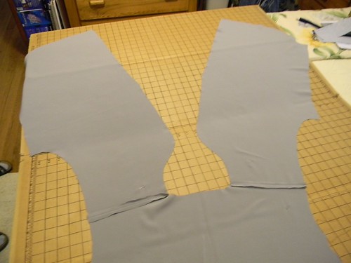
The first thing to sew is the front pieces to the back at the shoulder seams using a straight stitch about 3mm long. This is done with the good sides together and a ¼” seam allowance so the raw edges wind up on the inside of the garment. Press the raw edges flat with a dry iron with temperature set for the proper material for about 10 seconds. These steps are described in detail on the back of the pattern sewing instructions under “View B ”“ Shirt.” When you’re done, it should look like this (for all of these, you can click to enlarge):
The facings [this is Dick’s term for the placket — PL] are strips of fabric that stiffen the collar and edge of the shirt where the buttons attach. The pattern shows it on the inside of the shirt, but we’ll put it on the outside, since that is how a typical jersey is made, and it will give us a place to attach the navy blue piping.
Once you’ve cut out the facing shape, cut iron-on interfacing to the same shape as the facing and collar pieces and iron it to the back of the material in the same way as above. Inter-facing comes in 20” rolls with names like “Sheer Delight.” I was told to buy a yard of Pellon 880F Sof-Shape, which was more than I needed. Attach the interfaced facing pieces to the collar similar to the way we did the fronts to back:
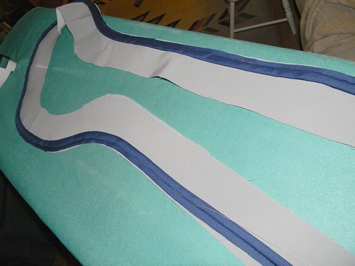
In that last photo, the piping has already been attached to the placket and collar, so let me back up and explain how I handled that. The piping on baseball jerseys appears to be rather flat and ¼” or a little more wide. Good luck finding that anywhere locally! And regular fabric won’t work for the piping, because it needs to be cut on the bias (45 degrees to the direction the threads run) so it will bend around the collar curve and still lie flat. So Ruth, my sewing instructor, had me purchase a three-yard package of 7/8” Double Fold Bias Tape Quilt Binding for $2.90 and wrap it around two old Venetian blind cords (stitched together side-by-side with a zigzag stitch). The binding is then pinned tightly every 2” against the cords and sewn with a zipper foot and straight stitch:
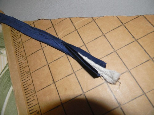
This is where my lack of skill shows. One must not push material into the machine ”“- the machine pulls it in with moving feed dogs. It’s hard to keep the cords tightly bound in the binding as the stitches start drifting away to the side. Ruth didn’t have any trouble, but the only way I could do it was to set the foot down directly on the cords. Ruth gave me a slight smirk when I told her.
The piping is then basted to the outside edge of the facings and collar on the good side. The reason for this will become clear in a minute. Basting is the use of big stitches about half an inch long, done by hand in and out to take the place of pinning when it’s important for the material not to shift. Baste the piping along the whole edge keeping the ¼” seam allowance on the gray material and using the iron to press it into the sharp curves of the collar while keeping it lying flat. Sew the piping to the facings and collar using a straight stitch. Notice we are sewing our piping onto the opposite side of the facing from piping in view A of the pattern for the other style of pajama (which you’re not supposed to be looking at anyway). If you look at this next photo, you’ll see the reason we sewed piping on the good side: so that the piping edge will be turned under, as shown to the left of the canister, to hide the raw edges and leave just the piping exposed:
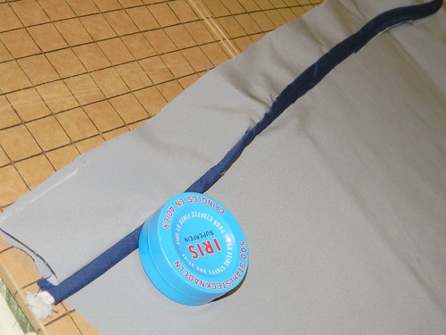
Now it’s time to attach the placket and collar to the rest of the jersey. Baste and then sew the facings and collar to the fronts and back all the way around, keeping the ¼” seam allowance. Don’t just sew the edges together the way the material lies in the last photo. Instead, flip the facing over upward and to the left at the edge (away from the piping), so the good side of the facing matches to the bad side of the front (and back) piece.
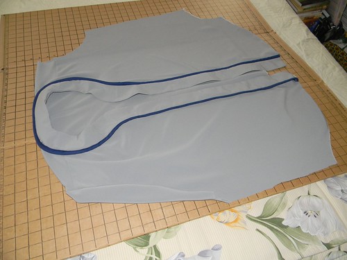
After joining the above, run a blind stitch all around the fronts and back 1/8” from the joint. A blind stitch is just a straight stitch on the bad sides of the fronts and back ,applied using a blind stitch foot on the sewing machine. The foot just has a little tab that rides directly above the line where the facing and front come together when opened out, so the raw edges are underneath and can’t be seen. The blind stitch doesn’t allow the material next to the joint to lift up, so it lies flat. It’s “blind” because it’s on the inside of the finished garment and can’t be seen. Turn the piping under and pin as shown in the last photo and use a similar blind foot straight stitch with blue thread at the joint between the piping and the facing to sew the piping down to the good side of the front (and back). The shirt should now look like this:
———
Paul here. I don’t mind admitting that I’m pretty lost on most of this step-by-step stuff, so I hope it’s making sense to you sewing enthusiasts out there. Dick will be back with the next installment soon.
ESPN reminder: In case you missed it yesterday, my latest ESPN column is about an Indian tribe that’s largely okay with the use of Native imagery in sports, at least under certain conditions. People seemed to like this one a lot — thanks for all the nice feedback.
Uni Watch News Ticker: Superb article on MLB’s new mandatory batting helmets. The best part about this is that we won’t have to see the Cool-Flo anymore. ”¦ If Michael Jordan had played in last weekend’s NBA All-Star Game, the patches on his warm-up top would have looked like this (from Jay Sullivan). … The Terrible Towel will now be made by a Pittsburgh-based company, which seems like something that should have been happening all along, no? (From Chris Weber.) … If NFL teams were British, the league might look something like this. ”¦ Ever wonder why Georgetown wears that kente cloth pattern? It’s spelled out here. ”¦ Here’s something I didn’t know: In 2006, the Spokane Indians revised their logo in consultation with the Spokane Tribe. Ben Hill wrote an article about it at the time. ”¦ FSU baseball is putting Twitter handles on the bases on Tuesdays (Jay Sullivan again). … Fun DIY project from Chris Edwards, who transformed a plain bench into a showcase for his ticket stubs. … This is interesting: Ron Hextall wearing a Flyers uni and what appear to be Islanders pads. Particularly odd since he was never traded from the Isles to the Flyers in the middle of a season (from Travis Souders). … Some good eBay finds from Michael Clary, including an Orioles usher’s cap, a KC Chiefs “Chiefs Club” blazer, and an amazing Pirates beanie.
If Michael Jordan had played in last weekend’s NBA All-Star Game, the patches on his warm-up top would have looked like this.
I’d really like to see the hypothetical all-star warm-ups for a few other legendary players… Bird, Magic, Russell, Wilt, etc.
A uni-centric daily comic strip, today: link
Like
Wouldn’t it be interesting if one of the teams with “Indians” as their nickname struck up a deal with the government of the Republic of India to use the name? The mascot could wear a dhoti and travel around in a rickshaw and halftime dance shows could be Bollywood-style spectaculars.
Love it! Sounds like an event the old St. Paul Saints would have pulled with Mike Veeck at the helm.
Let’s have a team called the Indians and it’s insignia can be an old motorcycle.
Those British NFL logos are pretty dire.
At first funny, but by the 4th monocle it kind of got boring.
Cheap, drab, ill-informed stereotype(s).
Seconded. But something like two dozen people emailed that link to me yesterday.
I sorta agree. A few of the names were amusing, but the logos were lacking.
“Cheap, drab, ill-informed stereotype(s).”
~~~
I believe that was the point.
link
The trouble I had with it is that they weren’t English at all: they were an American’s version of English, like Arthur Treacher’s Fish and Chips, or Dick Van Dyke’s accent in “Mary Poppins”.
English football club crests are very traditional, often drawing on the local community’s coat of arms. With a few exceptions — the modernistic ballons of Bolton Wanders comes to mind, and the “grinning” Leeds logo of the 70’s — they look like they were designed a hundred years ago.
Football mascots are a different story. They’re hip, and contemporary, and universally awful. Even Moonchester, Man City’s answer to Orbit, and Arsenal’s ridiculous Gunnersaurus are more clever and less awful than any of these designs.
As Hunter S. Thompson once said of the XFL, they left my heart “swollen with Hate.”
Nice article on the new S100 helmet. I’ve actually worn the Minor League version of that style, and compared to the single-flap Cool-Flo helmet I wear in my adult league, the S100 felt like an old diving helmet. It’s amazing what a few ounces will do to the sense of balance.
When goalies are traded during a season there’s really no time to get a new set of pads ready for their debut with the new team.
Prior to the 2001-02 season, the Islanders claimed Chris Osgood off waivers. For a few games, Oz not only used his red Detroit gear but also his red Detroit pants. The league allowed this due to time constraints for acquiring proper gear in Oz’s size.
link
Felix Potvin, traded from Toronto to Long Island, exact same deal. You can see the change in blue from the jersey to the pants.
link
Whoa, I have never seen #55 on a goalie before! That’s…different. Wonder if Felix Potvin’s choice had anything to with that other Potvin who played in Uniondale. No, not Jean, the other one, I think he was a fairly big deal…
Been an Isles fan for 20 years and that JUST dawned on me this morning, too.
“Wait a sec. You’re a Potvin….I’m a Potvin….IDEA!”
/obvious homage is obvious
Kind of sad that the thing that comes to mind when seeing “IDEA!” is link. Not sure if it’s better or worse that there’s one regular contributor who’s likely to think the same thing.
Come to think of it, I haven’t noticed any Moono posts lately…
I was at the Islanders first game of ’01-’02 in Tampa and have a few shots somewhere of Osgood in the red get up. Everything was red except for the blue jersey.
Hextall was traded right before the season started which explains the pads and white mask.
link
link (stupid comments program changing x’s to multiplication signs…)
Ooooh, very cool!
Yeah, I remember seeing highlights of Ozzie still in his red gear for the Islanders. Definitely very odd.
Though he missed out on Detroit’s 2002 Cup, it seemed somewhat poetic that he ended up taking over for the guy who replaced him on that team (Hasek) for the 2008 Cup run.
Plus, it’s interesting to me that Osgood was the last player to regularly wear the SK-2000 helmet.
If I recall correctly, Rick DiPietro actually broke out an old Ozzie Islanders-era SK-2000 when he came back from one of his numerous injuries a couple of years back…
Rob S:
When those helmets and cages were at their peak of popularity among NHL goalies, did the league have a rule that netminders had to wear the same color helmet as the rest of the team (white at home, color on the road)?
I’m also left wondering why Hexy paired a black blocker with an Isles-colored glove.
ChrisH:
Blockers and catchers are easier to break in on short notice than leg pads. Wouldn’t be surprised if those were someone’s backup gloves.
After his December 1995 trade to Colorado, and through the SCF, Patrick Roy wore his old red/blue Montreal pads with his new burgundy/navy blocker and catcher.
For reasons that I don’t think I want to know, the Isles still had Ozzie’s old helmet…which was his Detroit helmet, just painted blue. We can thank Brent Johnson’s left hook for seeing that again.
What was even better about Osgood’s acquisition is that the 01-02 home opener was against Detroit. Most surreal sight ever.
I have no idea if the following has ever made the rounds before or if Paul & the Staff have seen these, but I thought I’d share.
NFL Teams, if they were British.
link
!!!!
Guess I should read the ENTIRE site first… My bad.
“The Day Uni Watch Became Fark.com!”
If we add up (a) the number of times that page was linked in yesterday’s comments, (b) the number of times it’s linked in today’s comments, and (c) the number of emails I got about it, it’s easily the most reader-recommended link in many, many months.
Which is kind of sad, because it’s really not that good.
Hey! Ever wonder what all the NFL logos would look like if they were in Great Britain?
link
Cool! Where’d you find that?
Everybody’s right. They are SO lame.
I think the answer to the Ron Hextall question lies when he was traded. If memory serves me right, the NHL did play a preseason in 1994 before the lockout, which would have been start of October. According to the link below, he was traded back to the Flyers on 9/22/94, which would’ve been around the time of preseason games. Just speculation on my part, as I’m going off of 19-year old memories.
link
This is correct. There was an NHL preseason in September 1994. This photo was probably taken during one of those games.
I have a thing for “goalies wearing the wrong equipment” as some people do for jersey tears. I think it started with Andy Moog wearing his Bruins gear with the Stars when I was a kid.
That Hextall picture is glorious. There should be a compilation of this stuff.
“You AND your pants are going to Long Island.”
“WHYYYYYYYY”
link
Agreed. IMO, serves to humanize the NHL. Kind of like how you realize you’re short a goalie for your beer league game, so you call a goalie agency, they send a guy over, you throw him a game jersey, and it doesn’t match, but it’s all good because you have a goalie.
This is my favorite such picture. Guy Hebert.
link|1;d|lH7mruI1v_MuFM:
A classic Original 6 uniform, epically clashing with those Mighty Ducks colors. Ell oh ell.
Add “the kid signed straight out of college and forced to wear the Zamboni driver’s gear and the GM’s old catcher” to the mix.
Don’t teams know when they sign a guy?
link
Good job with the Chippewas story. I went to Eastern Michigan and graduated in 1986 when we were the Hurons. They changed the name to Eagles in the early ’90’s. Its too bad they did not go the way that CMU did.
Chippewa Pride!!
Fire Up!
Aw, and I was just getting used to the coolflo helmets.
As a proud Brit, I’m offended ;)
What nationality produced 4 of the 5 biggest selling albums in the US last year?
What nationality is the men’s singles champion of your Open tennis tournament?
Even on your TV, you need British actors to play Americans. Dr. House, Brody in “Homeland”, Jimmy McNulty and Stringer Bell in “The Wire”… what nationality are those actors?
Alas, even Superman is going to be played by a Brit.
That fact almost makes me want to root for General Zod…almost.
You’re right. Limeys Rule!
;^)
(Hey, that might make a great offensive team name!)
Uhhh…
… You’re proud of the pop crap from the likes of One Direction? Aren’t a couple of them Irish anyways?
… Tennis? That’s like 11th on the list of sports we care about, and even then, it’s only for a week or two 4x a year.
… Fortunately we have way more than 3 TV shows, and a couple dozen times more actors and actresses. And, heck, even if we steal ideas for TV shows (The Office), we still make them better. Even if it has sucked for like 4 seasons, it was still good for twice as long as its UK counterpart.
Some food for thought: when was the last time you heard the name of a Brit on a list of ‘Best Golfers Ever?’ Didn’t you people invent the game?
Basically, we’re just awesome at taking what you people produce/create and making it better. ‘merica! F*** yeah!
…aaaaaaaaannnnnd
the best tv show to come out of Britain in years just killed off its best actress and actor (granted, they wanted out of their contracts, but still)…
The Girl Who Waited and The Last Centurion?
Come on, Phil — killing Joe Handsome (I watch the show, but I can’t keep track of any of their names) was a Bold Move. Wouldn’t the final episode of Thirty Rock have been a lot more satisfying if at least two or three characters had died unexpected deaths?
One of the most beloved figures in recent English history is Robert Falcon Scott, whose claim to fame is freezing to death in an unsuccessful attempt to reach the South Pole. They English seem to be OK with disappointment, which is why they’re so admirable.
Mitch Benn has a great song about the English Football Team’s World Cup prospects. The chorus is “We’re gonna win one, lose one, draw the easy one, scrape into the knockout stage, and then go out on penalties again.” Like I said, they’re OK with disappointment.
“killing Joe Handsome (I watch the show, but I can’t keep track of any of their names)”
~~~
Matthew Crawley (Dan Stevens).
And he wanted to explore the stage, or some such. Pulling a David Caruso across the pond.
Well, I had the wrong series, then.
I thought Matthew Crawley was the Head Butler’s name. I get confused.
Is Jimmy the secretly gay butler, or the one the secretly gay butler loves? What’s the cook’s name? Is there a butler named Alfred, or is that bleed-over from Bat-Man? Is O’Brien the scheming maid, or the chauffeur who married the dead girl?
And the dying is just getting started. I still think that something dire is going to make Butler Ex-Con go haywire, and he’s gonna snap somebody’s neck. I don’t trust that guy.
The head butler is Alfred Carson. I’m not so sure what’s going to become of Jimmy — he may actually *like* Thomas Barrow, despite his protestations to the contrary. Guy took a beatin’ for him, he may need to show his gratitude in some way, ya know?
Bates scares me too. Hopefully he takes it out on O’Brien and not Anna.
Seriously confused for a second there….was I on UniWatch or the Downton Abbey fansite? Who knew, Phil……who knew?
Funny. I dont recall anyone in the main cast being killed off on Death in Paradise.
What about the redhead butler, the one who wants to be a chef? What’s his name?
It really is an entertaining show.
Alfred Nugent.
i wouldn’t say we always make British shows better, there’s a ton of shows that USA has ruined or is not up to par with their BBC counterpart.
off the top of my head
Top Gear USA
Coupling
Sherlock
Skins
The Inbetweeners
I thought the whole “monocle-and-moustache” thing was a bit too much.
Damien Lewis is English!!!!!
Don’t Canadians dominate American entertainment, though?
link
Just get the trim here next time and save yourself the trouble. Sew it on after the jersey is assembled! Will be much easier for you.
I’ve DIY’d a couple of jerseys. Sewing headspoon trim was by far the worst thing I’ve had to do. Never again.
Did anyone else notice the website for the link of”Jordan Patch” was apparently created as a result of some disagreement with Paul?
link
News to me, but I’m always happy to see new uni-centric web sites, no matter what inspired them.
Here’s a screen shot of the email thread Jimmy and I had regarding a Bleacher Report link he submitted:
link
If he felt I gave him “an asshole response,” that’s his prerogative, but it’s odd that he then said, “Fair enough.”
Bleacher Report runs so many idiotic rankings and lists, someone could (and maybe should) do a blog just linking to those and nothing else….
lol I dont think thats an asshole response at all. I find that to be one of the most truthful things ever written!
I take it the guy Paul responded to is not from New York ;) …there was nothing “asshole” about it…Pual writes as he speaks…
I realize that post comes off as angry pissed off blogger, but really it didn’t piss me off. Just thought that an attack at me wasn’t quite warranted, and that a post about not just unis, but throwback unis, would be a good thing to link to. But hey, it’s your site so you post what you want. Nothing but respect on this end, and maybe “asshole” response is a but too harsh.
bit*
So…piggybacking off of Uni-watch to get views and readers to YOUR site is ok because….Mr. Lukas…please don’t give this guy anyair time or link to his site…
How am I piggybacking? I didn’t even send in the link to UniWatch, Jay Sullivan did, and I have no association with Jay. Also, I explain on my site that I base my site off of UniWatch, and link to and credit UniWatch frequently. No need to bash my site.
He’s right. No harm, no foul.
As Paul has always said, it’s his blog, and things are done his way. If you want to do something different, start your own blog.
I look forward to reading both on a regular basis.
Also, before I forget, I loved the Saginaw Chippewa Tribe article Paul. I work for the Central Michigan football team, and we’re very proud of our namesake. Glad CMU finally gets some recognition! Fire Up Chips!
Just wanted to clear a few things so I wrote a post about this discussion link . Also, I thought about it, and deleted the unnecessary email comment, and have edited the About the Author. Again, nothing but respect on my end.
I’ve loved the kente cloth on Georgetown’s uniforms for years. For a couple of seasons, Florida State used a Seminole weave pattern on the cuffs of their football uniforms, but they switched to a feather texture when they went to the Aachen Bold numerals; a downgrade, if you ask me. Count me among the fans who want to see teams use more imagination with patterns.
Are you talking about this?
link
And yes, I think they (Noles) should go back to that a bit. And the Georgetown design is a prime example of good uniform design IMO.
Exactly! There was some good and bad experimentation going around, then. Good=University of Virginia’s colonnade stripe pattern. Bad=Brigham Young’s bib-fronted jerseys.
I just remember those patterns standing out as some unique designs at time when a lot of schools were going en masse with the drop shadow or with generic manufacturer templates.
The Georgetown and Florida State designs certainly stand out and made a lot of sense, but one I never fully understood was the significance of Texas A&M’s.
link
Any insight?
Add me to the list of people wanting to see more patterns. In these times of teams pushing the envelopes with varied stripes, different fonts, etc., patterns actually seem like an easy and tasteful (if done right) way to make a uniform unique. If it’s somehow relevant to a team’s mascot or name, even better.
Some corporate doucheness in Mexico. A player named Jesús Corona (like the beer) has the nickname “El Tecatito” (Tecate is another beer). The reason?
The team he plays for is owned by Cuauhtemoc Moctezuma Brewery -owners of Tecate and several other brands- while Corona is from Modelo Group so, to avoid “free” publicity, the higher ups decided to hand him that nickname
Sorry the link is in spanish: link
Today’s Catch of the Day froze me and then made my ears ring.
That’s one crazy bit there. Interesting to see, though, how people treated the album cover as a blank canvas…
Speaking of the COTD, with Spring Training now underway, I should think the link picture would be changing soon…
Indeed. Hopefully to this: link
Thanks for the Saginaw Chippewa interview, Paul. As a CMU alum (class of 2007), I think the university handles the situation as well as possible. The relationship with the tribe is very positive, and the school makes sure everything is done in a respectful manner.
Some of the British logos were okay ( Patriots, Ravens, Jets) but others (Chargers, Browns, Giants) were total crap. I also agree that the monocle was overused. Imagine someone redesigning the EPL logos to make them look Americanized. Would they all have sunglasses? Look like Homer Simpson?
Overweight, wearing cowboy hats, naturally.
“Nice castle, you got there. How much you want for it? What do you mean it’s not for sale? I’m an American, dammit!”
Nike severs ties with Pistorius.
Intersting quote from the article:
Paul, excellent job on the ESPN column. I found it interesting that you analyzed the “other side” of this debate. Mr. Cloutier’s insights were eye-opening to me. Thanks for the article.
Not sports related, but Summit Brewing just released an updated logo. Seems to follow the latest trend of simplifying and streamlining your image. The middle is supposed to evoke a street sign, for which Summit is named.
Not sure if I like it yet…
link
Summit is a weird looking word.
the new logo is OK. No big whoop.
The Suns traded for Marcus Morris who will now be playing with his twin brother, Markieff. It will be interesting to see how they handle the NOB situation.
link
If only there were some way to identify which twin is which without a FNOB or FIOB.
Thank you for the view from the other side yesterday.
Orioles memorial patch for Earl Weaver
link
Not really sure why it says “Hall of Fame.” He’s in the hall, but it still seems a bit random.