Back in early November, I got a note from reader David Byrne (no, not that David Byrne), who said his father, Dick, was taking a sewing class — the only male participant in a class of nine people — with the goal of making David a DIY Detroit Tigers jersey. He was planning to make it entirely from scratch. In other words, he wouldn’t start with a blank jersey; he would start with fabric and a pattern and build the jersey from the ground up.
Judging by David’s description, his dad is a bit of a character:
My father doesn’t march to the beat of a different drummer; he is the different drummer. He is a retired mechanical engineer but looks more like a biker. He has been confused with Santa Claus and compared to Dusty Hill of ZZ Top. He has always been very comfortable with himself and his interests and not really concerned with what other people think. He has built his own canoe, sails a boat, shops for antiques, and has taken classes to spin wool with my mother, just because she was interested in weaving. He has even been known to make some of his own clothes, sometimes to the embarrassment of his son.
Last year he beat cancer and is excited to get back to doing more than sitting around. So, when he came over and showed me the sample stitch patterns from the new fully-automated sewing machine he got for his birthday, I laughed, but I wasn’t surprised. His first assignment in his sewing class was to make pajamas from a pattern, but then he volunteered to make me a Tigers jersey, to my own specifications. Although the home whites with the old English D are unquestionably the best in baseball, I had an idea about having a road jersey, but replacing the script “Detroit” with an old English “Detroit.”
My father agreed. For fabric, he got a microfiber polyester that at Field’s Fabrics, a local chain based in the Grand Rapids area. He went with the microfiber because gray was surprisingly difficult to find in a double-knit polyester, except in large quantities. The mircofiber material is much thinner than the double-knit, and might be a little blouse-y, but I don’t mind because I always wear a T-shirt when I wear a jersey anyway.
Anyway, my father offered to chronicle his efforts. Are you interested?
Naturally, I said yes. About a month later, David sent along his father’s first dispatch. Non-DIYers will no doubt find it a little involved, but I want to run it anyway. Here it is.
Building a Tigers Jersey: Part One
By Dick Byrne
I’m going to explain what I’ve done in as much detail as possible, as if someone were attempting the same project using only these instructions.
The first step was to get a pattern for a baseball jersey, something I quickly found to be almost non-existent. On the internet, the one I liked was an old Simplicity pattern No. 5978 (Men’s and Boys’ Baseball Uniforms, All Sizes). A single copy sold on Etsy last August for $2.50. In desperation, I purchased a UNC pattern 6236 (Unisex men’s and misses S Baseball Jacket, Shirt, Pants, Shorts, Hat) for $4.75 on eBay. Unfortunately, that “S” before the word Baseball meant it was a size small. It’s also is stylish sportswear version of a baseball uniform, so it may not be true to an actual Tigers uniform.
When I got to class, my instructor said she didn’t have time to redraft the pattern and suggested getting Kwik Sew Pajama pattern 2388, which has a similar shirt, the neckline of which can be slightly redrawn to look like the baseball jersey from Simplicity 5978. The tuck-in shirttail was also transferred from Simplicity 5978. I traced the size Large lines onto tracing paper (Scott Project Paper, $3 at Hobby Lobby) and lay them out on the gray fabric using my wife’s cardboard cutting board on the bed (click to enlarge):
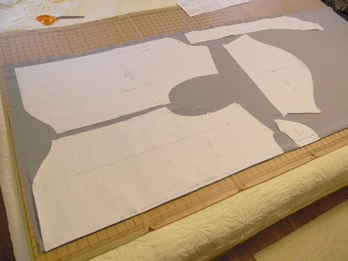
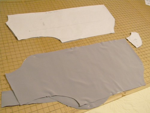
The pattern instructions showed a layout for 60” wide material. The fabric comes folded with good side out on the bolt, so fold the opposite way and lay the edge of the back piece identified as “Fold” along the fold, so you get both sides of the back with one cut ”“- don’t cut along fold line. The front piece is laid away from the fold, so you get two separate pieces with one cut. Pieces also have to be laid out with the “grain” arrows all pointing the same way and parallel to the fold. Pin the pattern pieces to the fabric around the perimeter every 8” or so, so that it stays put during cutting. Cut out all the pieces within about 1/8” of the pattern lines, with special care at the diamond shape tabs for joining, leaving you with pieces like so (click to enlarge):
That’s it for this round. Next time, we sew.
Redesign the Browns: As most of you are probably aware by now, the Browns are headed for a facelift in 2014, so I’m running a “Redesign the Browns” contest on ESPN. The only catch is that you have to use the current helmet design, since team owner Jimmy Haslam has made it clear that the helmets won’t be changing. For further details on the contest, look here.
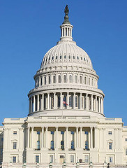
Uni Watch on the Potomac: As I’ve recently mentioned in the Ticker, the National Museum of the American Indian will soon be holding a symposium on racist and appropriated imagery in sports. I’ll be heading down to DC to cover the event for ESPN, so let’s have a Uni Watch get-together while I’m in town, shall we?
The gathering will take place on Wednesday, Feb. 6, 7:30pm. At present, I’m thinking that our venue will be the Post Pub, although that isn’t yet finalized. (If you have a compelling argument for a different venue, I’m listenin’.) Looking forward to meeting all you DC folks.
Show & Tell update: Photos and stories from last week’s installment of Show & Tell are now available on the Show & Tell web site.
PermaRec update: There’s also a new entry on the Permanent Record blog, about a really cool handwritten book of rules to live by.
Uni Watch News Ticker: In my ESPN piece about the new NBA All-Star Game uniforms, I mentioned that this was the first time that a year had appeared on an ASG uni. But that statement was incorrect: The year appeared on the 2010 and 2011 uniforms (thanks to Ben Hayden for setting me straight). … Someone on the Knicks was wearing houndstooth socks yesterday (from Christopher Falvey). ”¦ Here’s an article about hockey mask artist Dom Malerba (from Brian Codagnone). … Neglected to mention yesterday that Maryland basketball wore “pride” uniforms on Wednesday. ”¦ New brand design for American Airlines. … Indianapolis has been awarded an NASL franchise, and fans are being invited to name the team (from Patrick Runge). … Here’s a piece about British menswear designer Paul Smith, who designed the leaders’ jerseys for this year’s Giro d’Italia cycling race (from Sean Clancy). ”¦ “The Islanders held their Blue & White game on Wednesday, pitting the Isles (blue) against their AHL club the Bridgeport Sound Tigers (white),” says John Muir. “Evgeni Nabokov and injured reserve list mainstay Rick DiPietro broke out the season’s new pads for the game. While Nabby’s mask is essentially the same, DP’s mask can be considered ‘new-ish,’ since it’s his bucket from last season — when he participated in only nine games.” ”¦ New jersey sponsor for Sporting Kansas City (from Kyle Romine). … New women’s lacrosse uniforms for Northwestern. The seven stars on the back represent the team’s championships under head coach Kelly Amonte Hiller. … The Aussie Football League is experimenting for the first time with NOBs (from Craig Snyder). ”¦ Interesting article from 1968 about the debate over NHL players wearing helmets (from Jerry Wolper). ”¦ Svetlana Kuznetsova has switched from Fila to Qiaodan (thanks, Brinke). … Lance: Honestly, who gives a fuck. Like most megalomanial athletes, he’s an utter bore. … Te’o: Well, at least they didn’t wear a memorial decal for his dead girlfriend.
I’ll give you a heads up right now Post Pub is all kinds of terrible, probably one of the most disappointing dive bars in DC. DC has some amazing beer bars, that isn’t one of them.
Trying to stick close to down town, if I were you I would look into Church Key (about 5 blocks north of Post Pub), Beer Baron (Dupont), Iron Horse (south of Verizon Center). If you want amazing cocktails, the Passenger (across from the convention center).
In terms of local brews of choice, I would try and go after Chocolate City Brewery or Three Star, DC brau is most common but its all IPA and nothing more creative or complex.
Also if you want a bar that Uni-Watch types would probably dig, its off the beaten path on H street NE, the queen vic, the top floor is decorated with soccer scarves, flags and the like.
Post Pub is walking distance from my place, it’s so terrible it’s good. Reminds me of someone’s basement. (and there’s carpeting!)
Church Key and Passenger are way too pretentious and trendy for a bunch of uni-geeks.
A pro for Iron Horse is skeeball, pinball and bar shuffleboard. Con being they’re all in a windowless basement.
“Church Key and Passenger are way too pretentious and trendy for a bunch of uni-geeks.”
~~~
Can a bunch of uni-geeks really be all judgmental about stuff like that?
Seriously tho…
Think about what Paul will enjoy, not what a “bunch of uni-geeks” will enjoy — not that two are mutually exclusive, mind you. Having now been to my fair share of gatherings (some not in NYC), one of the more important aspects will definitely be a fairly large amount of either open space or unoccupied and adjoining tables or booths…
Any place that’s going to be mobbed or difficult for a crowd to comfortably gather won’t work that well.
And of course, if someone can reserve a whole room somewhere…well
bingo!
Yup. I think Post Pub’s a good call. Afterwork crowd should be thinning out by 7:30, doesn’t get crowds for “the game” and it’s got a 2nd room.
As well as the aforementioned carpeting, the wood paneled walls are covered with old beer mirrors and advertising.
Re: the Bier Baron. I’m still calling it The Brickskeller.
+1
Would be good for the after party, but the space isn’t great for big gathering, it’s a heck of a hike from literally anywhere (read: Paul’s hotel), and remember that Fearless Leader is OK with Bud on tap. The beer menu at I’m Still Calling It the Brick is superfluous to our needs.
NICE! A home-made, custom Detroit Tigers jersey. This will be a great read. Kinda surprised an all-Olde English “DETROIT” was chosen, but it will be fun to watch this unfold.
YES. I am also very excited about this one. I recently started my own jersey-from-scratch project (Rickey Henderson green v-neck pullover, don’tcha know) and I’m interested to see the similarities/differences in the process.
you better be taking pics along the way :-)
You know I am! Been dormant for a couple weeks now but I’ll be back at it soon.
Another DC option is the Science Club…
link
ed
Hey, that looks pretty good, Ed. And a mere saunter from my office. I’ll check it out (in the interest of science), but I’m a total ignorant newbie about such matters. Old DC hands (looking right at you, Scott) have to figure it out.
Con, I do almost all my drinking in the far Virginia suburbs these days, but I do sometimes work in an office on L St near the Post Pub, so I’ll ask my much more urban-lush colleagues about local spots. Key really is the space and volume, not so much amenities and highfalutin libations.
Been there as well, no complaints but again I think it may be a little less dive-ish than usual.
I’ll throw Solly’s on U and Duffy’s on Florida into the mix.
Oh, and Stoney’s on P Street. All unpretentious no-frills bars. Solly’s and Duffy’s both have dart boards as well.
From what I could see of the NBA London game pretty much all of the players were wearing the NBA London Live socks – link
Paul, regarding the year on the NBA All-Star unis – in ’97 and ’98, each player wore a star-shaped patch with the year on (these were the first 2 years players wore their team unis in the ASG). Don’t know if that counts though, since it was a patch and not directly on the uni…
Also interesting in the Pittsburgh article on helmets, is a picture of Terry Sawchuck wearing a #24 All Star jersey on the next page.
Those Northwestern lacrosse unis argue for the proposition that purple is a great color sometimes.
Was sort of hoping DiPietro would stick with the old school cage from a few years ago, but I’m guessing that was just when he was healing from Brent Johnson’s Fist Of Fury.
Did George Gipp really exist?
He did. He just didn’t tell Knute Rockne to have the boys win one for him, apparently.
The pop-up ads are really getting annoying, not only because it pops up on top of the browser, but also because it breaks the browser and I can’t click any links until I reload the page.
None of that should be happening. Please either take a screen shot or just give me the URL of the pop-over ad.
Using Chrome with AdBlock disabled and pop-ups allowed, I get no pop-up ads when accessing uni-Watch.
I have zero ads. There are browser extensions and ad blockers out there. Use them.
At the Michigan-Minnesota basketball game last night Trey Burke suffered a tear and for the rest of the game wore #12 NNOB, and in the same game, Jordan Morgan came out at halftime wearing NNOB #30
I was at the game last night. From my seats I could clearly see that Burke’s jersey was torn, but couldn’t see what the issue was with Morgan’s jersey. Did they say anything about it on TV? Regardless, it was strange to see two players from the same time having to resort to generic back-up jerseys in the same game. The following article mentions that Burke’s second jersey was also torn, which I didn’t see. Has this been a recurring problem with Michigan’s jerseys?
link
I was at the game also, they just said something like “Jordan Morgan will now be wearing #30” over the loudspeaker
Does MLS always give out scarves to draft picks? This looks pretty cool.
link
Since at least 2003, yes. Some photos here: link.
Yes. Soccer version of the draft day cap/hold up the jersey thing.
The Pittsburgh Press article from January 17, 1968 not only features the bit about hockey helmets, but stories on the expansion Bengals, and Connie Hawkins scoring 45 points in a Pipers loss to the Colonels!
Also stories about:
-Bob Gibson rejecting an initial contract offer.
-The availability of Lew Alcindor for an upcoming game against Houston (in Astrodome).
-Bart Starr receiving another automobile for being named MVP of Super Bowl II.
-Oakland Oaks trying to obtain Rick Barry.
-Ewing Kaufman hiring an executive vice president for the Royals.
Also in that Pittsburgh story – trainer Ken Carson.
He was later one of the Blue Jays first employees, was their trainer from day one until the 1990s, and then ran their minor league team in Dunedin. He’s still a Blue Jays’ senior consultant.
link
Nice to see he’s still around. Of course, when I came across references to him as the Jays’ trainer, I thought of him with the Penguins. It must have been culture shock to go from the Penguins’ hand-to-mouth existence to the much wealthier Blue Jays. In fact, if anyone’s in touch with him, Carson might be able to tell us why the Pens wore blue in their first three home games of October 1975.
RE: Show and Tell…..
Davison has a DISCman.
Fong has a Walkman.
(It’s OK. I’m old too. I call my iPod a Walkman sometimes!)
I’m still calling it a walkman?
>Davison has a DISCman.
Right you are. Thanks for that — now fixed.
New American Airlines logo….
I heard that AA doesn’t paint its planes cuz paint weighs a lot, and why add additional weight to an airplane? Not sure if that is true, but it seems to make good sense nontheless.
One main reason for the change is that AA is set to receive the new Boeing 787, which has a fuselage made of composite rather than aluminum, so it has to be painted.
“AA is set to receive the new Boeing 787”
~~~
Perhaps they may want to rethink that decision.
indeed, ha
I would wager that the Flag Logo on the tail fin would be palatable to future controlling partner U.S. Airways. I
You’re absolutely right – except that the newer planes aren’t just aluminium, they’re composite material and can’t be left unpainted.
Not painting might have soemthing from the old days, and they have just kept the aluminum look up til today. I guess they have to chrom-o-fy them!
Like……this
link
Trying to get the Friday Stirrup deal started with teachers and students at my school in Beggs (OK).
link
All players in the Knicks-Pistons tilt in London were wearing special “NBA London Live” socks. (This according to the SkySports commentary crew.)
The socks are available the NBA Europe online store. link
A memorial decal for Te’o’s girlfriend could just be an empty circle.
That’s fantastic right there.
ND had a memorial patch for her. You can see it on the left shoulder….it’s right there, you don’t see it? No, really it’s right there!!
link
I think Uni Watch needs to sponsor a contest to design a memorial decal or patch for her…
A. It was the request of Manti Te’o and the girl’s family that the decals reflect Lennay and also not exist.
B. The Maryland “pride” basketball uniforms are actually not bad (or as bad as I had feared). The patterns of the flag are represented correctly (unlike the football uniforms which only have one pattern on each side) and the patterns are not the predominant aspect on the uniform, more of an accent. I know we uni-versally hate the side panels in college football, but I think that that may be a a good alternative for future “pride” football uniforms – rather than have the pattern on the helmet and the shoulders, have it on the helmet and the alternate pattern as the side panel. Anything is better than what they’ve trotted out already…
Northwestern and Illiois went color on color (not a surprise since U of I wears orange at home, but…). Being that the game was Purple on Orange, it looked GREAT on TV.
link
The White Sox are bringing back the beach towel jerseys for Sunday home games this season. Harold Baines will have the distinct honor of wearing the jersey both 30 years ago (as a player) and now (as the White Sox’s Assistant Hitting Coach).
link
Maybe Baines will wear the super high rups too… link
Those uniforms had their detractors but I thought they were spiffy. Ever noticed the replica caps of that suit incorrectly have the bat-swinging character?
Not all of them do: link
Was recently looking through some old Topps cards (1987 with the wood border.) One of the many awesome things about that set are the number of different BP, warmup and softball tops on display. This is before marketing mania hit, so they were mostly “functional.”
Anyhow, noticed that the Sox had link different pieces of warmup gear, plus home/away jerseys, and manager Jim Fregosi wearing a link
A’s have a good variety too.
For DC it’s gotta be either H St Country Club (www.thehstreetcountryclub.com) or Star & Shamrock (the world’s only Jewish/Irish pub: link) Both are on H St NE not far from Union Station.
There wasn’t only one player classing it up with houndstooth socks in the Knicks-Pistons London game. Everybody was wearing them, which gave a kind of surreal and strange look to the whole affair.
link
And not only were the Maryland Uniforms “Pride” unis, but they were done according to the design of our flag (Photo 7 in the slide show is probably the best picture to use)
The old-school Tigers’ insignia always reminds me of boxes of Animal Crackers.
regarding afl nob:
the league is not moving on this idea currently…
this was a suggestion from north melbourne great brent harvey and iconic coach kevin sheedy (now at gws)…
don’t expect to see these…at least not in the near future…
unless afl fans inundate the afl with requests for nob’s…but even so, it wouldn’t happen for years, if it does…
cheers…
Didn’t the AFL pretty much have NOBs from the get go?
I know as of 1961, every team did.
At least according to Timmy B.
…
Wait, you’re not talking about the same AFL, are you?
I’m still calling it the VFL.
easily the worst logo in the HISTORY of american sports
link
Clearly inspired by the Lion of Gripsholm Castle
link
Holy cow, Tom. I stared at that logo for 60 seconds and still didnt know what I was looking at. When I finally scrolled to the left, only then did I realize it was supposed to be a tiger.