[Editor’s Note: Today is Black Friday (aka Idiots Day, Natural Selection Day, and Buy Your Own Weight in Electronics Day), so we have a guest entry from Trevor Williams on a particular chapter in black uniform history. ”” PL]
By Trevor Williams
Since the beginning, the color black has been part of the sporting landscape. The 1901 Baltimore Orioles wore a black jersey and black pants, and many other teams have forged black-based identities over the years — think Raiders, Bruins, the Pittsburgh franchises, and more.
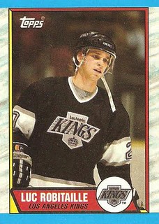
Over past 25 years, however, black has become a popular default option, even for teams who had no previous connection to it. One of the key reasons for black’s recent popularity is the Los Angeles Kings’ 1988 switch from purple and gold to silver and black. In a recent phone interview, former Kings owner Bruce McNall explained that after taking control of the team, he wanted to give the team a distinct identity from Los Angeles’s other purple and gold team, the Lakers.
After asking such Kings players as Luc Robitaille, Jimmy Carson, and Bernie Nicholls for their input, McNall received feedback that choosing black would make them feel bigger and tougher. Robitaille had the greatest impact, telling McNall he enjoyed wearing the black and silver of his junior hockey team, the Hull Olympiques.
“Lou probably had more influence on me than anyone else, but then again he should,” McNall recalled. “At that time he was our best player and had won the Calder Trophy.”
The Olympiques — Robitaille’s junior team — had changed their colors in 1985, soon after Wayne Gretzky had bought the team. While Gretzky and coach Pat Burns linked the color change to old Hull Volants of yesteryear, the Ottawa Citizen’s article about the switch was titled “Olympiques sporting L.A. Raiders’ colors,” which shows what black was associated with back then.
With this in mind, McNall reached out to Raiders owner Al Davis before giving the Kings a silver-and-black makeover. At the time, Davis gave the green light for the Kings having the same colors as the Raiders, but he later expressed some displeasure about it in ESPN’s documentary Straight Outta L.A.
“I didn’t like that any team was going to use black and silver — those were our colors,” Davis said in the film. “They did have beautiful uniforms. I will say that for them. It was classy.”
In an unusual twist of fate, hockey’s most famous trade brought Gretzky to the Kings just months after McNall had consulted with Robitaille about the color change. The Kings used Gretzky’s introductory press conference to showcase not only their new player but also their new home jersey. By late March of 1989, the Los Angeles Times reported that Kings merchandise sales were “mind-boggling,” as more Kings jackets had been sold in a year than in the previous decade.
The team received further exposure a few weeks later, when the gangsta rap band N.W.A. released their music video “Straight Outta Compton.” Band member Ice Cube later described how the band had originally decided to wear black as a way to be uniform and to show their passion for the Raiders. With the Kings’ color change, several members started wearing Kings caps as well.
“The black hats just matched with everything,” said N.W.A. member MC Ren in the documentary. “Purple and gold wouldn’t have looked good on us.”
In April 1991, the Los Angeles Times reported that the Kings constituted 30% of all NHL-licensed merchandise sales in North America. Other teams took notice: By the start of the 1992-93 NHL season, the North Stars, Senators, and Lightning had each issued a black jersey. By 2005, even the NHL’s logo changed from orange and black to silver and black.
The impact wasn’t limited to the NHL. My research indicates that between 1988 and 2012, approximately 45% of teams of the four major professional sports leagues either added black or made black more prominent in their color schemes for a period of time. Of those teams that made the switch, approximately 25% eventually ditched the black.
While black’s influence has begun to wane with major-level pro teams, its popularity has surged in college sports, racing and international soccer. These sports don’t have the lengthy process design-approval process that the “big four” leagues require, so they can change their jerseys yearly ”“- which many of them do — and black is always trendy option. It’s no longer the only option, however, as gray, pink, and camouflage have become, in some ways, the new black.
(Special thanks to Trevor Alexander for research assistance.)
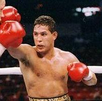
Body, love to pop my body: Paul here. As you’ve probably heard, Héctor Camacho is now brain-dead after a shooting earlier this week and will likely be disconnected from life support shortly. By most accounts, he appears to have been a jerk, which makes it easy to forget how good a fighter he was and, more pertinent to our discussions here, what a pioneer he was in boxing attire.
Most news accounts of Camacho’s shooting have mentioned the flamboyant costumes he wore when entering the ring. But I was always more interested in the trunks he began wearing in the latter part of his career, which looked more like loincloths. Can’t say I was ever a fan of this look, but it was definitely interesting, and I thought it was particularly intriguing that the self-described “Macho Man” was willing to wear something so functionally similar to a skirt.
I don’t know when Camacho started wearing this style, but I definitely remember when I first saw him wearing it: for his 1989 bout against Ray Mancini. Here’s some video that shows just how unusual Camacho’s gear looked during that fight:
I watched that fight in a bar in Brooklyn. I’d never seen anything like Camacho’s get-up, and I kept remarking about it to the people surrounding me, most of whom couldn’t care less.
One other note about Camacho: His 1996 fight against Ray Leonard was one of the first times (maybe the first time) I saw a bout featuring two fighters wearing white gloves. Didn’t like it then, don’t like it now, but noteworthy nonetheless.
Stitches, shmitches: My visit to the orthopedist on Wednesday afternoon went really well. The doc says the surgical wound and the breaks are all healing nicely, and there’s a good chance I won’t need physical therapy.
He removed the splint I’d been wearing since the surgery, which gave me my first look at the scar. I was surprised to see that there were no stitches:
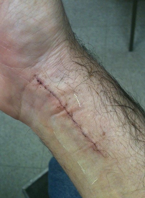
Instead of stitches, he used some sort of plastic adhesive on the inside of the wound, which will eventually be absorbed into my body. I’m not nuts about my body absorbing plastic, but I guess it’s not much different than eating a Twinkie or whatever.
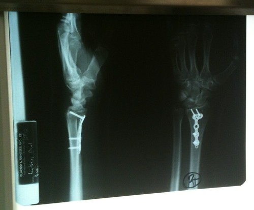
Speaking of things inside my body, the doc also took X-rays, which provided my first look at the metal plate and four screws I’m now carrying around inside me (click to enlarge):
Then it was time to give me a new cast. “You have a choice of colors,” he said. “Black, blue, or green.” I was surprised there was no white or beige. Anyway, you guys know what I chose:
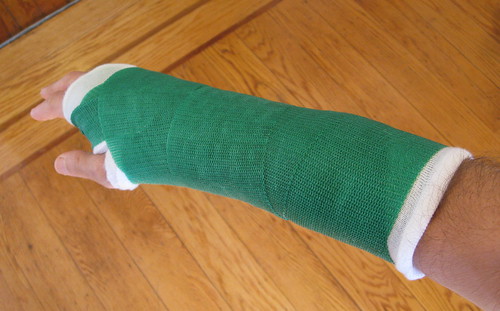
Now I just need to add some gold gold stripes and I’ll be all set.
The new cast is snugger than the splint was, and it leaves me with slightly less range of motion in my fingers, which means typing is once again a bit of a pain in the ass, but I’m adapting to it. On the plus side, the cast is a little less bulky than the splint was, so I can now wear a decent amount of shirts, sweaters, and jackets that I couldn’t wear before (because their sleeves didn’t fit over the splint but do fit over the cast).
Twenty-six more days.

50 Years Ago…Yesterday
Last year, Rick Pearson took us “back in time” to bring us his look at the featured television college football match-up from 50 years ago. (If you’re not familiar with it, this was the inaugural post of “50 Years Ago” from last year — after that, it became a recurring feature on UW for the remainder of the season). Last year, Rick looked at the 1961 season, and fortunately for us, he “uni tracked” the games from 1962 as well, documenting the game via his “kid cards”. Each week this fall, he’ll do the same, again.

Yes, Virginia, once upon a time there were just two games on TV on Thanksgiving Day, and for most of the TV era’s early years, only four teams were involved. The Packers played the Lions in Detroit every year, and the Longhorns and Aggies squared off in Texas…Anyway, this Thanksgiving (one year to the day before John F. Kennedy would be assassinated), Texas was the home team, wearing virtually what they wear today…The helmet, of course, had both a TV number AND a logo on the side…Not positive, but pretty sure the stirrups under the crew socks were a late-season thing…Texas A&M in striped crews …Two weeks ago we had an early cleat-spatter in Iowa’s Cloyd Webb, today we get the Aggies’ Ken “Dude” McLean…John “Sandy” Sand didn’t play pro football…Neither did McLean, though he WAS drafted by the Packers and Bills…Signed with Bills, but didn’t make the team.
Uni Watch News Ticker: The Cowboys wore their Thanksgiving throwbacks last night. Meanwhile, the Jets wore solid green. ”¦ New logo for the buffalo Bisons. … Holy yowza, check out this astonishingly awesome curling sweater label (from my pal Robin Edgerton). … Looks like this Colorado College cross-country competitor is wearing tiger-striped tights (as noted by Tris Wykes). … Our recent entry about John O’Leary’s Whalers neckties prompted Gary Moore to dig out this old St. Louis football Cardinals tie that his older brother handed down to him. “He and his wife were friends with Bill Bidwill’s secretary, who gave him this tie somewhere around 1965 or so,” says Gary. “It’s still my favorite tie.” ”¦ Images of some new Xavier sweatbacks have been circulating. “A newly signed recruit posted it on Instagram,” says Jason Martynowski. “XU gets new uniforms next year, so the theory on the XavierHoops message board is that these might be the deal. I hate it.” ”¦ Garrett Santoline, who plays football for Clairton High School in Pennsylvania, is also a member of the school’s marching band. So when the rest of the team goes to the locker room at halftime, he puts his helmet aside, grabs his trumpet, and joins the band — while still in his football uniform. ”¦ This season’s ECHL All-Star Game jerseys have been released (from Yancy Yeater). … New alternate logo for the Stockton Ports (from Damon Hirschensohn). … Chipper Jones and Adam LaRoche went hunting in Under Armour gear (from Marc Bauche). ”¦ This is fascinating: a 1950 letter from Ohio State coach Wes Fesler to Michigan coach Bennie Oosterbaan, informing him of the uniforms that the OSU players would be wearing (great find by Larry Bodnovich). ”¦ The U. of Washington’s season ticket-renewal page shows a gold jersey. “I wonder if they have this in store for the Apple Cup,” speculates Aaron Barlond. … Whoa, look how high Dan Dierdorf’s nameplate was.
Under Armour makes the best hunting gear around. Moisture wicking and light. I always wear it when I head out for bird or moose.
“Also great for hunting moose and squirrel.” ~ Boris Badenov
How in the world do they get those deer to look right into the camera?
Two things:
1. No link on Larry B’s Ohio State letter.
2. The 92-93 Devils changed trim colors from green to black, but they’ve never had a black jersey.
Thanks — now fixed.
Anything “Non-Sag” is fine with me!
I’m kinda surprised at the 45% figure. I mean, I knew it was quite the trend… but damn.
Its hard to see but a few things I’ve noticed from football yesterday:
1. I believe that is a sticker covering a makers mark on the front of Tony Romo’s helmet. I believe there was one on the back as well but couldn’t find a picture of that. Any help?
link
2. Also if you look closely you can see that Lion’s kicker Jason Hanson’s right sleeve is shorter then his left causing the black stripe to only be on the left sleeve.
link
first of all…congrats paul, you will now be the subject of pat downs whenever you fly…seriously, looks like it’s healing just fine…
second, and i’m sure this has been addressed before (and i just missed it because i hate dallas), but in the photos of wash v dallas, i noticed the big “C” patch (i assume, captaincy) on romo’s pic…it has two gold stars, two white ones below the “C”…
link
a few photos later, i noticed another “C” patch, obviously for the defensive captain, danny mccray…his patch only has one gold star, and 3 white ones…
link
why…?
Each patch has 4 stars under the “C”. Each year a player is voted captain of that team, an additional star is gold. This must be Danny McCray’s first year as a captain, Tony Romo’s second. Captains in their fifth year and on have 4 gold stars and a gold “C”.
On a related note: In previous weeks the patch had a camo motif, but I didn’t notice these yesterday. Was I imagining the camo motif before? If I wasn’t, do you think they didn’t do this gimmick because it’s a special game (i.e. Thanksgiving)?
thanks for that answer…wonder what happens if/when romo is voted captain for a 5th year…?
wait, i meant 6th year…not used to being up this early in the morning…ha…
I’m not an expert so if any other UW’ers know any different speak up, but I believe any year from their fifth year as a captain and on the patch is just the 4 gold stars and gold C. Nothing additional is added for the sixth year on. I believe Drew Brees is a 6th year captain, so you can check out his patch for reference.
just found a pic of brees, and his patch is now red…so, 6th year is all gold stars and “C” on a red patch (instead of blue)…
link
I think that’s just the dark pink cancer C, given the October date of that game, nothing related to 6 years of captain status. I’m pretty sure the Saints normal C has a black background, not blue.
ah, you’re correct, the jeff, good call…found a pic from earlier in the season which is not red (dark pink), but brees’ patch appears black in this photo…are the patches color-coordinated by team…?
(shows you how much i pay attn. to nfl, sorry…)
link
The Brees patch is pink for cancer. There’s no additional designation for the 6th year; the “C” just stays gold.
thanks, but what about the patch itself…are the color-coordinated by team…?
the reason i asked that is because brees’ patch is black prior to “everything is pink month”…but romo’s is blue…
Yes 1vox, they are, loosely at least. They’re a team color + white and gold. The Saints are black, the Raiders are black, the Cowboys are blue… I can’t recall offhand if the Panthers use black or blue… or possibly both depending on which jersey they wear… but yeah, generally speaking, the C patches are designed to not look *too* stupid on the jerseys.
snooped around and found the answer…like i said, i don’t watch nfl much, sorry…this may have been a no-brainer to some of you, but i had no idea…in case you don’t, the patches (apparently, in months other than october), are color-coordinated by team…
link
both drew brees and eli manning are 6th year captains this season…a first, since the nfl started using the “C” patch with the 4 stars…
link
oh, and thanks to gamma male, the jeff and paul for chiming in and helping me with this one…cheers…
*every team aside from the jets…they have no captains for 2012…
link
The number font the Cowboys use on those throwbacks has interesting serifs that give it a western feel, appropriate for cowboys. Older readers will remember that this font was used by the Cowboys on their standard unis up until 1982. I loved that font and it is an excellent example of a tiny customization a team can do to stand out a bit. Would it be so hard to go back to those an all their unis? Apparently link in the January 4, 1986 Dallas Cowboy Weekly to possibly return to the old font…apparently the old font lost. I have seen that font on some other teams jerseys from the 50s and 60s…must have been a standard font then.
I love that number font. The Packers used to use it too; wasn’t it very common in football decades ago?
Re: Xavier uniforms – I don’t mind sweatbacks when they are done nicely. Those can’t be the final design for X, looks like it’s just mesh hoop netting. Maybe a placeholder for a custom design that’s being developed? As an alum, I’d like to see a design more specific to the history of the university. And there’s no shortage of inspiration you can take from pretty campus buildings, nice university seal and the Three Musketeers.
When Michigan trotted out for the color vs. color Ohio State game in 1950, what they saw was WHITE! This was the “snow bowl” game of Nov. 25, 1950. The game featured quick kicks, blocked punts and a safety. Michigan won the Big Ten championship, 9-3. See it at:
link
and
link
Would have been a good game to see in color. The scarlet and blue in the white snow.
you have ray mancini lister as ray mancini jr.
his father was lenny “boom” boom” mancini.
his brother who died was lenny. in fact the LENNY across the waist band of ray’s shorts pays trbute to his brother.
i am from youngstown and ray was around our family a bit. he grew up a street over from my cousin’s, went to same high school (cardinal mooney)-and i am friend’s with ray’s priest fr. tim o’neil.
Thanks — not sure why I put the “Jr.” in there. I should know better. Will fix!
The sad thing is that if today OSU came out in lavender shoes with orange cleats nobody would think that it was weird. In fact, it would probably start a new trend. Sigh…
I also thought it was interesting that the letter was dated August 11th 1950. The idea that Fesler mentioned lavender cleats with orange cleats far ahead of todays craziness was funny.
Bidwill. Not Bidwell.
Probably the most misspelled surname in sports.
Got it. Thanks.
I misspelled in the original letter; my bad. But considering his decades of inept ownership, he deserves all the misspellings.
Thanks for the mention Paul!
I’m not sure how many of you were watching real football last night, but the Europa League match-up between my Liverpool Reds and BSC Young Boys was a very nice color-on-color match-up:link
Huge Mancini fan here, I do remember Camacho and his outfits and entrances well.
Comcast put up on the internet a great interview Dwight Jaynes did with Phil Knight…probably not many have seen it outside of the Pac NW. Has some insight to the Ducks football jerseys at the 5:30 mark…
link
Prince Naseem has Hector Camacho to thank for being a millionaire….If he indeed, still is a millionaire.
Macho might’ve been another word for the male reproductive organ, but he most certainly was an innovator for the sport, from an attitude, and fashion standpoint.
And EARLY ON in his career, (pre-Edwin Rosario) he was damn fun to watch.
I was trying to think of that boxers name. Prince Naseem was it.
Every time I see the Cowboy’s Pre-Black Friday Uniforms, it makes me just wish they’d go with the modernized 1994/94 alternates instead:
link
A little compare-and-contrast from Yahoo Auctions in Japan:
The Yomiuri Giants used to have a ridiculously-wide NOB font for players with short names:
link
(Scroll down until you see the three pictures, and look at the middle one.)
And a thinner one for players with long names:
link
These days the NOB font is different (and uglier) and not as contrasting, but the numbers still have some variation. Here’s an ultra-wide single digit:
link
…and here’s, in this era of three-digit jersey numbers, an extra-skinny set of digits:
link
Instead of gold stripes on the cast, why not have people sign it with gold pens only?
I must say, I rather like the ECHL All-Star Game jerseys. I didn’t know it was possible to not go over the top on All-Star Game jerseys now.
The Stockton Ports alternate logo immediately made me think of the Wilmington (DE) Blue Rocks of the Class A Carolina League with their alternate logo of secondary mascot Mr. Celery which even appears on their batting practice jersey: link
James A…
I’ll assume you’re from DE if you know ANYTHING about the Blue Rocks!!
Am I right?
Originally just across the border in Hook. I make it up there for a game with the family every year. Plus, I live not far from Northern Division rival P-Nats.
Props to Trevor for the great reporting on the Kings makeover. It suggests to me that the Kings should not be considered BFBS. Several reasons for the switch to black are advanced in Trevor’s reporting, but not chasing a trend for the sake of merchandise sales. Rather, it’s pretty much every subsequent use of black in the NHL that would count as BFBS, since teams like the Stars clearly were adding black to chase merchandising dollars.
Whether the intent is to sell some merch or to make your players feel “bigger and tougher” is irrelevant. It’s called BFBS, not BF$S.
YMMV.
That looks like a white huskie jersey, but the photo has a gold filter
When my oldest son was not quite 3 years old, he broke his foot. He was given 6 or 7 color choices for his cast. He chose white, but just as they were about to start wrapping him up, he changed his mind and went with purple instead.
Which is why I’ll never have kids. All they do is break your heart.
This awesome guy has a green version of the Big Red necktie.
link
In a phone interview with Bruce McNall, he mentioned how he hoped merchandise sales would increase because of a color change, but first was establishing a new identity away from the lakers, second was asking the players for their input and third was his own dislike for the purple and gold set. McNall had similar thoughts to MC Ren on how black matches with other colors before the switch. However at one point, a fan design consisting of blue and silver was being considered so it wasn’t a foregone conclusion.
Thanks for going to the source, and for passing it on.
yo paul!
why dont you use speech recognition software to do your typing for you? i.e. Dragon