Back in February I posted a bunch of “Collector’s Corner” columnist Brinke Guthrie’s childhood sports drawings and photos. He recently unearthed another big stash of goodies from his youth, so let’s take a look, beginning with this MLB illustration (for all of these, you can click to enlarge):
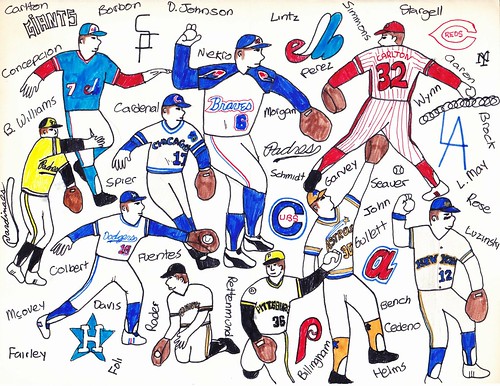
Lots of nice details there, especially the stars on the Astros’ stirrups. But Steve Carlton as a righty? With two different-colored shoes? Brinke, what were you thinking?
Here’s a corresponding illo for the NFL:
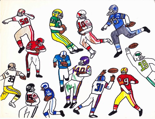
The lace-up pants closures for the Cardinals and Falcons players are particularly nice.
Brinke grew up in the Dallas area, and that’s reflected in a lot of his illustrations, like this Texas Rangers piece:
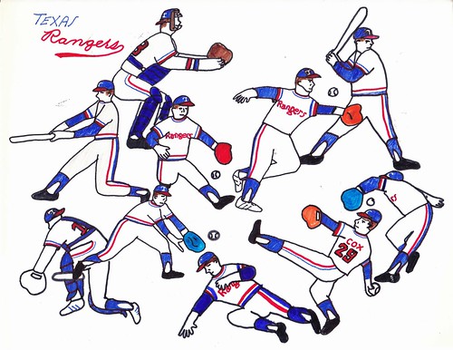
I especially like the hints of the blue drop-shadow on the chest insignia. Also, note all the different-colored gloves. But why is the catcher wearing white Adidas?
Here are two more examples from Brinke’s Dallas period, both devoted to the Cowboys:
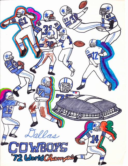
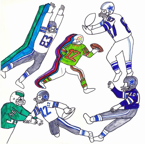
Note that the besieged quarterback’s NOB in the second illo is “Griese.” I guess Brinke didn’t have an aqua marker available. And he must not have had a silver one on hand when he did the top illo.
One more Dallas-centric piece, this time for the short-lived Chaparrals:
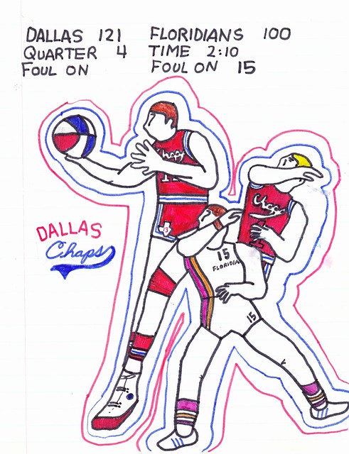
Very nice. But Brinke, you put the Floridians’ striping on the wrong side of the uni!
Brinke’s artistic talents extended beyond sports illustrations. For the 1976 bicentennial, he got to paint a fire hydrant for the town of Terrace Park, Ohio:
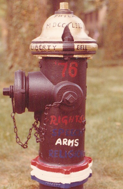
Turning the top of the hydrant into the Liberty Bell was pretty clever, no?
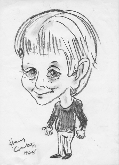
Brinke also sent along this charcoal portrait of himself that an artist did back in 1968:
And while digging up all of this stuff, Brinke also found a bunch of old NFL pennants, circa 1973:
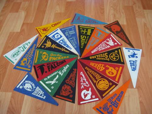
Very nice. A little odd that the Chiefs pennant is yellow, though.
That’s it for this round of Brinke-ology. I have a feeling there’s more where this stuff came from.
Gatoroddities, continued: Yesterday I went on a bit of a rant about Raul Ibañez being forced to drink his water from a Gatorade cup in Wednesday night’s postgame press conference. (If you missed the full rant, you can see it here.) That prompted several folks in yesterday’s comments to point out that the same thing had happened on Wednesday to Nats skipper Davey Johnson, who apparently was not amused:
Davey miffed as an official made him pour water in a Gatorade cup prior to presser. After he finished, he said, “Mmm this Gatorade is good.”
— Adam Kilgore (@AdamKilgoreWP) October 10, 2012
Kinda makes you wonder what’s in all those Gatorade jugs in the dugouts, right? Maybe some of them just have water, or Budweiser, or whatever.
Meanwhile, I also heard from reader John Lesnik, who had this to say:
I was once told by a tour manager for the band I Fight Dragons, which caters to a mostly teen-age audience, that Monster Energy Drink provides the band with cases of cans that look just like their product but are filled with water. So all those caffeine-starved teens think their heroes are drinking Monster, when they’re actually drinking water.
So this is the part where I’d normally say how this is the latest example of what people are capable of once their shame glands have been surgically removed, yadda-yadda, and then most of you roll your eyes and say, “Yeah, whatever,” and we all move on with our lives.
But seriously: Marketing your product by implying that people are consuming it when they’re actually drinking water? That’s not branding; it’s not even douchebaggery.
That’s fraud.
Uni Watch News Ticker: Longtime Ticker contributor Cork Gaines has written a fairly damning indictment of the NFL’s pink profiteering, which has in turn has inspired a rather devastating (and highly entertaining) rant from Jezebel. Both pieces are highly recommended. ”¦ Back in the mid-2000s, several MLB players experimented with tinted contact lenses, including Mike Timlin, AJ Pierzynski, and Brian Roberts. Hadn’t heard much about this topic recently, but now a new player is trying the tinted lenses: Bryce Harper. Of course, this is particularly amusing given Harper’s well-documented history with war paint-style eye black (from Tom Shieber). … In a related item, Caldwell Bailey was at yesterday’s Nats/Cards game and noticed that Harper switched from pajamas to stirrups in the third or fourth inning. Very unusual to see that kind of mid-game switcheroo. ”¦ The Grizzlies are adding a “DD” memorial patch for team executive Dana Davis. Further details here (from Ben Zoss). ”¦ The mayor and firefighters in Bristol, Connecticut — yes, the home of ESPN — are engaged in a fight over pink T-shirts. ”¦ Wait, update! The Bristol firefighters can wear pink after all. … As you know, Boise State is all about the blue — except when they’re all about the BFBS. They’ll supposedly be wearing that helmet, along with BFBS uniforms, this weekend (from Karson Kalian). ”¦ I’d never eat at Wendy’s, but I do think their new logo is a keeper. … As you may have seen, eBay has a new logo as well. Can’t say I’m as fond of that one. … Sad news out of Minnesota, where the last of Coca-Cola’s old-fashioned green glass bottles are being taken out of production (from Tom Mulgrew). … The Sugarland Skeeters have revived the bullpen buggy! ”¦ Some people look extra-ridiculous in golf attire — like, say, Mike Piazza. … Here’s a ranking of all 30 MLB ballparks based on how dirty they are. As you’ll see, Shea didn’t fare too well, but its ranking may have been hurt by the fact that I always make a point of scattering peanut shells underneath my seat. (For those unfamiliar with this story, read the first few grafs of this entry.) … New basketball uniforms for Marshall. “The road version just has the green and white reversed,” says Michael Misiti. ”¦ New hoops unis for Tennessee, too (from Luke Pellegra). ”¦ Good little piece about the meaning of the Atari logo design (from Kurt Esposito). ”¦ Some highly official-looking USC helmet prototype photos have been making the rounds, but — big surprise! — they’re not gonna be worn on the field. ”¦ Someone is engaged in a very entertaining guerilla stickering campaign in the London Underground (I can’t find the e-mail from the reader who sent me that link, but big thanks, whoever you are!). ”¦ 1980s basketball throwbacks on tap for the season opener at UTEP (from Mark C. Gutierrez). ”¦ Combine the MLB logo with the Grim Reaper and you get this (from Brice Wallace). ”¦ New hoops uniforms for Georgetown (from Patrick Haugh). ”¦ I’m still calling it the Pensacola Civic Center I don’t really give a shit (from Ryan Bohannon). ”¦ The New York Post responded to the news of Joe Girardi’s father’s death with a rather innovative headline. It was later corrected. ”¦ The latest product line from Left Field Cards takes a look at ballplayers who’ve shared their surnames with U.S. Presidents. ”¦ I’m pretty sure we’ve seen this before, but once more won’t hurt: Here’s the perfect beverage for Mets Grapefruit League games (as long as you pour it into a Gatorade cup). Levi Buck spotted that in Japan, where he’s currently attending school. ”¦ New corporate sponsor for the New Zealand All Blacks (from Caleb Borchers). ”¦ Gabriel Manga found a SportsCenter clip from 1994 that shows NHL commish Gary Bettman wearing what appears to be a collared shirt, a necktie, and a hockey jersey. This raises two questions: (1) Is that really the best photo of Bettman that was available, and (2) Has any other commish ever been seen wearing a jersey? ”¦ If you believe in the whole “red state vs. blue state” construct, then you may have noticed that the participants in this month’s presidential and vice presidential debates have all worn party-appropriate necktie colors. ”¦ Interesting Reddit discussion about the washing and re-using of jerseys (from Shane Schubbe).
In fairness to Brinke, I think Carlton’s left foot is supposed to be the bottom of his shoe.
GOOD GRIEF
didn’t know PL was planning an ambush this morning. (Must..plot..revenge…but how?)
Uh yes that’s the bottom of his cleat. And white adidas were the shoe at the time.
Adidas gave Michigan and Tennessee hoops the same smudge/stain look on their new shorts. Must be the new template. Turrible. Keep that crap out of Cincinnati, please.
I kind of dig it, but that’s only because I can never get enough Power T’s.
Not super thrilled with the Power T “smudge” but it is a massive improvement with black only being used as an outline. Much better than previous years Orange, White, and Black offerings.
In regards to cup douchebaggery, i was at an USF Soccer game. They are sponsored by powerade, with red coolers and cups, but were using powdered gatorade.
Well, if politicians really want to show bi-partisanship, then they would wear purple ties…we all know how you’d love to see that…
That’s usually what the TV broadcasters wear on Election Night, as I’ve documented here on Uni Watch several times in the past:
link
We’ll do that again next month.
What did you think of Paul Ryan’s “mine’s bigger” flag pin on his lapel? I think I’ll vote for any politician who boycotts flag pins… Just sayin’.
On that note I’m announcing my campaign to run for president…
“I think I’ll vote for any politician who boycotts flag pins… Just sayin’.”
We did have a politician, a prominent one, who link that he wasn’t going to follow the empty gesture any more.
Of course, his opponents on the other side of the aisle handled his decision with link and that politician wasn’t forced to make an empty gesture to link.
Barack Obama wore red ties – really just one red tie most of the time, until breaking out a new red tie for the Inauguration – frequently in 2008/09 for major events. Since then, he’s rarely strayed from blue or gray ties. When he came on stage last week wearing a blue tie, I knew it was going to be a disaster for him, because he clearly didn’t regard the debate as a sufficiently major event to break out the red tie. Romney not only wore a red tie, but one of the best red ties you’ll ever see. As opposed to Ryan last night, whose red tie was a lesson in how not to put contrasting stripes on red.
So far, the debate standing, tie division, is
Romney (I)
Biden
Obama (I)
Ryan
Ryan is probably a lock on last place, but looking forward to see whether debates II or III will show us any ties better than Romney’s in debate I. If Obama comes out Tuesday night wearing this:
link
We’ll know it’s “game on” for him.
Ah yes, the infamous Obama “Sunday Red” tie…
i like that BFBS BSU helmets
I do too.
Man that 5 on the Marshall uniform looks like Nike got lazy and turned a 2 upside down.
Actually, that’s a block font that’s been used for decades called “Athletic Block” (well, that’s what it’s called in Nike’s catalog. It’s also used by the link (since 1997), link, link, link, and link, just to name a few. It’s the worst block font in the history of existence, and your comment is just reason “2” out of a million of why Athletic Block sucks ass. It is to me as Bellotti Bold is to Movi.
Paul — Same issue today. Three copies of “Language Professors Hate Him” pop under appeared.
Does anybody ever actually click on those things? I would love to find out why the dude is so despised in the Language world.
Those NFL/pink takedowns are just devastating. Makes me think we need a good phrase to describe this sort of “issue” or “awareness” bullshittery. I nominate:
Pinky dink.
Sorry – no idea how this wound up threaded here. I suspect sabotage by that guy that language professors hate. He’s a sneaky SOB, obviously, else normally mild-mannered language profs would not hate him so.
Something I learned on the high school football field every team has either Gatorade cups or Poweraid cups which go with which soda brand they sell in the concession stand HOWEVER the jugs/cups/bottles are 99.9% water. In the past two years ONE team actually had Gatorade available on the field.
I can’t speak for the big leagues, but at the HS level it’s just corporate branding.
can’t speak for the big leagues, but at the HS level it’s just
corporate brandingtotal fucking douchebaggery that should not be tolerated, especially around kids.Fixed that for ya.
I remember having Gatorade branded coolers on the sideline when I played football in high school. We didn’t look on it as sponsorship, but rather, that was the cooler we had. I don’t know if it was free or not, but it was better than nothing, and my high school wasn’t exactly bursting at the seams with money.
The answer is usually a lot simpler than we think it is.
Yeah, I think this is two different issues. The bullying that Gatorade (PepsiCo) is doing to get their brand front and center… well, I absolutely despise the term corporate douchebaggery, but in this case, it’s correct(However, I would like to sneak into a dugout and steal a case or two of energy chews, you see how many these teams have, no way they’re using all those!)
However, Gatorade jugs and cups have been around for a long time at all levels of play. We never even had Gatorade on the sidelines of our football games but it was always an orange jug. I only actually remember using Gatorade on extremely hot days during baseball season and it was never something provided by the team, it was just something my parents brought to me.
I could be wrong, but a lot of times the jugs and cups are just sold in a supply store, team managers probably just pick them up without ever intending to use Gatorade drink. I had one of these green squeeze bottles growing up, always just used it for water.
We used Gatorade bottles because they sold them in bulk at the sporting goods store.
I know this because I purchased them.
Precisely Graham.
And I don’t understand this Gatorade Only marketing. I get they have a deal for the playoffs but why doesn’t PepsiCo just give them Aquafina bottles as well… seems stupid to be going over the top with this “put whatever beverage you’re drinking in this cup”
Regarding the “Mets” grapefruit soda from Japan: they also make a ultra-high-caffeine link. It tastes pretty good.
Aw man, I thought the MLB grim reaper link was going to involve Bud Selig. Very misleading, Paul >=(
Also, your full rant still leads to the previous Twitter link.
Thanks. Now fixed.
Happy Stirrup Friday! link
Thanks to that close-up of the Tennessee uniform, I now see how they made those “We run so fast our stripes can’t catch up with us” graphics. Expect to see a bunch of those this year. But I am digging the Georgetown uniform: the Kente Cloth pattern is one of the most unique and enduring trademarks in varsity sports, and I wish more schools would use their thinking caps in such a way.
The Chiefs pennant is weird? Try the Dolphins orange pennant. Should be aqua
It’s got that Blue/Orange optical freak out thing going too!
Also…. Did Brinke color in the eye on the Cardinal?
I’m guessing that they figured there were enough red/reddish and blue/bluish pennants in that set so they went with the secondary colors for those teams.
I’m more intrigued by the fact that the Eagles, Chargers and Cardinals pennants all feature the definite article.
I noticed that too. You are the man!
The “short-lived” Dallas Chaps live on as the San Antonio Spurs.
New Wendy’s wordmark: Bad
New Wendy’s Logo: Good
Baconator: Very Fucking Good
I agree with 1 & 2, as for 3: I don’t eat fast food burgers often but when I do it’s Five Guys on the East Coast and In & Out on the West Side.
link
In and Out burgers are okay, but their french fries are nasty as hell. If you want a burger, yall need to come to Oak Cliff, Texas and get a Wingfield’s Burger.
“In and Out burgers are
okaydelicious, but their french fries arenastyamazing as hell.”/Fixed ;)
INO FF’s nasty?
Uh……..no.
Spicy Chicken Sandwich, man. Wendy’s is my go-to if I have to do fast food.
No argument here, Holder. Spicy chicken is solid.
Best spicy chicken on the planet is the “hot and spicy” from McDonalds. Only place I know that has it is the New Orleans area, and even there it’s not on the menu. Gotta just know about it.
Ah! The hidden menu and McDonalds! My brother and brother-in-law are both former employees. They used to tell me some of the stuff they’d cook up like grilled cheese sandwiches (two bun bottoms), etc.
Coleman – you’ve probably heard by now, but WVU is going blue helmet/white jersey/white pants again tomorrow vs. Texas Tech.
Now this, via puck daddy, is some logo creep.
link
The boise BFBS are on the 20th. NEXT weekend. Not this weekend.
Brinke + Jurgensen = :^)
reading the post you wrote for your father never gets old. thanks for including the link again!
I’ll second that. One of the best things you’ve ever written.
Don’t think I saw it the first time (tho I do remember the time period, and Paul’s father passing)… Glad it was re-linked, and that I got another chance to read it.
Very well written, and moving.
Lee
And thirded. Read the first two grafs Paul says. Not possible. To borrow a phrase, I went down that rabbit hole. And I’ll second that a finer comment section, has never been known. This is a great place to sit a spell, and when you need something more, this is a soft place to land. Here’s to #23, who’s gone, but never forgotten.
I guess we have to change our thinking. “That’s not a can/cup/bottle of beer/soda/energy drink – it’s a can/cup/bottle with an ad for beer/soda/energy drink on it.”
Allow me to be the first … (ahem … mimimimimeeee)
We are one step closer to seeing an all black and orange World Series.
Imagine the possibilities (especially with Halloween approaching. You can almost hear MLB’s director of merchandising salivating … iffin’ salivating actually made a noise.)
Tigers don’t wear black; they wear dark blue.
But the Orioles do. (okay … so I jumped the gun a little bit. I’m an optimist.)
Re: Pro sports commissioners in the the jerseys of their league –
1,000 internets to whomever can Photoshop David Stern in a Toronto dribblin’ dinosaur jersey.
If seeing Gary Bettman in a hockey jersey which, from what I can tell is the black link when he was hired on February 1, 1993, link has shown that Gary Bettman’s tasks as commissioner have barely been met in the 20 years he’s been in charge. Most notably,
– Put a stop to labor unrest = worse under Bettman than it ever was under Zeigler.
– sell the product in television’s mainstream marketplace = questionable at best after losign ESPN and finally gaining NBC Sports.
– change the violent image of the game = fighting is down, butquestionable hits and concussions are way up.
– curb salary inflation = epic failure on this one as average salaries are higher than ever.
– force enlightened self-interest on reluctant, old-fashioned owners = this could be defined a number of ways.
– expand contacts with European developmental leagues and markets = there’s a working agreement with countries for the export of their trained players, but there’s no Euro developmental leagues endorsed by the NHL.
– settle the divisive issue of possible Olympic involvement = with Sochi already threatened and the owners whining about Olympic involvement, this seems to be heading towards the cliff of failure.
– help launch several new expansion teams = done, and seen bakruptcies and sales of those teams over and over again since they were founded, so barelu a success.
I get that jobs change over the years in terms of responsibilities, but there was a lockout in 1995, a season lost in 2004-05, and what appears to be another season lost in 2012-13. Bettman hasn’t even done what was tasked to him in 1993, and it’s now almost 2013.
For the reasons you’ve outlined, Bettman has to be the worst commissioner in sports. The fact that he sounds & looks like a weasel only adds to his charm.
Your mention of the “divisive issue of possible olympic involvement” is a reminder that the NHL just does not get it. When USA played Canada for the gold medal, so many non-hockey fans were watching with vested interest. But the NHL doesn’t want to attract new fans with skilled hockey. Bettman loves the fights and concussions… he wants WWE on ice!
I still play pick up hockey, yet I rarely watch the NHL.
Ok, let’s run down my mistakes I made while pretending to take notes on a laptop while in a meeting this morning. LOL
1. “In seeing” not “If seeing”.
2. “losing ESPN” not “losign ESPN”.
3. “butquestionable” needs a space.
4. “seen bankruptcies” not “seen bakruptcies”.
5. “barely a success” not “barelu a success”.
Spelling doesn’t count on Fridays. Let’s go with that. :o)
I was also at the Nats/Cards game yesterday as well, and there was NO switch for Harper. All the Nats were pajamaed except for Harper (who was stirruped) at time of first pitch. My friends and I pointed this out specifically. High sweet stirrups.
That’s a great testimonial — but there’s the pesky little problem of photographic evidence:
link
Pics or it didn’t… never mind. LOL
Love your Blog, Read it everyday, Got my card, but this was a pesky thorn in my side. I have no reason to lie. It only took me two hours to find Photographic Evidence:
link
link
I think someone just put a Game 3 shot next to a Game 4 shot.
Re: the ranking of ballpark cleanliness, I just had to check out my favorite parks (or at least the parks in my favorite cities).
“The UFE says Brewers fans — perhaps aptly — have “an unusually large variety and quantity of liquor cocktails, along with numerous traditional, imported, domestic and local beers.” This leads to great tailgating and great fun, according to UFE, which is why Miller Park’s relative cleanliness is impressive.”
Ah. My people.
It’s a great park, I still put my shells on the ground though. And my friend’s wife LOVES the Bloody Mary’s. Plenty of ways to get shitfaced in Miller Park!
We were there for the Uecker bobblehead day, it was awesome. Not too many stirrups around though.
Hey guys check out this NFL mural in Osaka. My friend posted this last night. I wonder when was that mural painted?
link
looks pretty cool. whoever did it is pretty talented
my question is how much crack do you have to be own to graffiti over that?
Bullpen cars make a comeback in the Texas League!
link
Someone didn’t read today’s Ticker very carefully.
DOH!!!
A GUD concept based on Brinke’s Dolphins & Cowboys:
link
Reminds me of the World League.
Found this on Sporcle today. It was pretty easy for someone like myself who frequents this page, but for some reason I couldn’t come up with the last one. Felt pretty stupid.
link
ABA doodling of long-forgotten marques from someone’s childhood? That is the coolest thing I’ve seen on this site, surpassing even the WFL’s magenta-orange-clad Sun photo.
I thank you and my massive collection of “Bic Banana” markers also thank you.
Bettman jersey obviously a “promotional” sweater with I assume an the old NHL orange and black crest on a orange silhouette.
Am I the only one who finds it odd that Georgetown would wear a jersey with the Michael Jordan Jumpman logo instead of a swoosh? I mean, I know that the 1982 Final Four was 30 years ago, but a Michael Jordan image on their unis? That’s remarkable.
New Uniforms for Mercyhurst Hockey. It’s too bad they got rid of the traditional kelly green and royal blue. They were the last team to hold out of switching to forest green and navy. Snooze. Bring back the old Whale look. I guess they wanted to rebrand now that its Mercyhurst U.
link
The most noteworthy element of Brinke’s illustrations? Those colorful “action” sprial/shadows on several of the football players.
Definitely a child of the ’70’s!
my favorite element! well done BG, thanks for sharing!
Looks like with the secred All Blacks jersey now sporting jersey sponsors ,that makes US sports the last bastion of pure unsponsored sports unis!
“As you’ll see, Shea didn’t fare too well, but its ranking may have been hurt by the fact that I always make a point of scattering peanut shells underneath my seat.”
Umm yeah, Shea Stadium doesn’t exist anymore, except as the parking lot for Citi Field. And Citi Field was NEVER going to be called Shea.
NEVER.
But let’s just explore Lukas logic on this. Going by Lukas logic, EVERYONE must call the Staples Center, The Great Western Forum. EVERYONE must call Heinz Field Three Rivers Stadium. EVERYONE must call Fed Ex Field RFK Stadium.
I’m wondering how many people who see Lukas wearing one of his queer I’M CALLING IT SHEA shirts at Citi Field or listen to his blathering about exactly why he’s wearing it think he’s a child molester or a gross wierdo. I think it must number in the thousands and I guarantee people see him coming and point and laugh and clutch their kids close to their breasts and tell them not to go near Lukas.
Piazza looked moderately goofy. But if you hadn’t said it was him, I’d say that was Meatloaf. And the rebirth of the buggy in the ticker was interesting. I had no idea that a major reason for their demise, was the fear of guys falling out of the things. If my pitchers started falling from them, I’m not too sure I want them to try to shut down the side in the bottom of the ninth either. What is it, 300 feet from the bullpen? Haven’t seen too many of these things at the Salt Flats. How fast can they really get moving? Please. Just saying it seems far-fetched. Apart from the litigious nature of society angle. Which probably trumps my logic.
“I’d never eat at Wendy’s,….”
Why so, Paul? (if you don’t mind my asking)
I’m opposed to chain eateries in general, and fast food chains in particular.
I make two exceptions: White Castle (maybe once a year, because it’s more a pop-culture thing than a food thing) and Waffle House (when I’m traveling in the South, also for pop-cultural reasons).
Brinke’s drawings are pretty cool. It’s neat to see vintage uniforms and players captured in time through the eyes of a kid.
I had (maybe still do) those pennants! I also had the baseball ones.
don’t like the new ebay logo. its too plain.
Makes eBay look like just another online retailer, not a quirky auction site with random used crap and obscure collector/hobby supplies. So in that sense, it’s perfect.
Paul – I sent you the link about the London Underground guerrilla stickers. Thanks for mentioning it!
– Mike Bisch
Tremendous work, young Brinke. Love the almost psychedelic ’70s vibe of it all. The first UW post did not convey that aspect in all its glory. Now where did I put those rolling papers?
Thank you! And something PL didn’t notice, if you look closely on the Pirates guy top photo, a small doodle on his sleeve. No doubt a ’21’ patch, Clemente died 12/31/72, so that makes these 1973- I had moved from Dallas a year earlier. Actually most growing up was in Cincinnati.
Great stuff Brinke. Bic Banana’s? Very cool as well. I’m guessing that’s the Vikings #40 Dave Osborn, no? Speaking of 40, sadly, 40 years from now, and predictably, a child’s baseball uniform doodles, will not include stirrups. And with the NFL shrinking sleeves and inconsistencies abound, it would be tough. Sad, but likely true. Have a nice weekend folks.
Reading the material and looking at Brinke’s drawings, plus the post about Paul’s father made me “D’awwww” harder than I have all week. I love reading and viewing things like this =)
Softball tops 0-2 in deciding game 5’s in LDS. Other than ’03 Marlins, what teams since ’79 Pirates became World Champion or won winner-take-all game 5 or 7 while wearing a dark-colored top? In World Series, ’84 Padres, ’95 and ’97 Indians all lost deciding games in their softball uniforms, but I assume some LDS or LCS teams won under those circumstances.
I believe Oakland wore green tops in ’72 game 7 at Cincinnati, and gold tops in ’73 game 7 at home against the Mets.
Skip Schumaker is wearing a jersey without the 2011 World Series Champions patch. He’s getting ahead of himself.
What would happen if Memphis tried to sneak a Dunkin Donuts ad onto their jersey in the form of a Dana Davis Memorial patch? Make one of the D’s pink and one of them Orange. And that’s not an apostrophe catastrophe by the way. That’s the correct way to pluralize a letter.