Christmas is a big day for the NBA, which has made an effort to “own” the holiday on the sports calendar in recent years. The league has no games scheduled for Dec. 24 (presumably so the players can have a sort of surrogate holiday) but has five games slated for Xmas Day. The league has used a snowflake patch for its Xmas uniforms over the past few years, and has also tried to create red-vs.-green match-ups when possible. This year, however, they have something else in mind.
I’m basing that statement on a bunch of video game screen shots that a source has provided me with. They show a new batch of uniforms to be worn on Dec. 25, most of them featuring outlined chest lettering, like in the case of these designs for the Heat, Bulls, and Thunder (for all of these, you can click to enlarge):
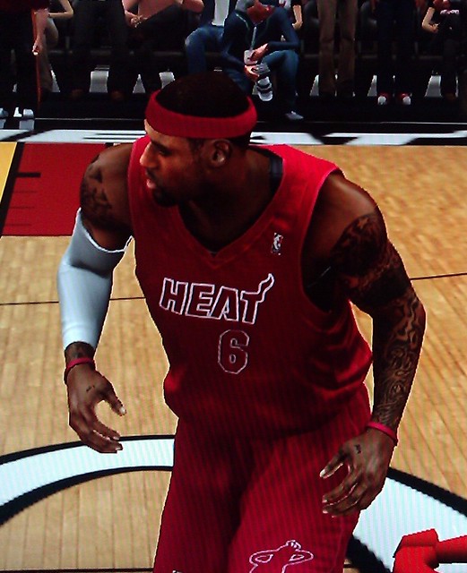
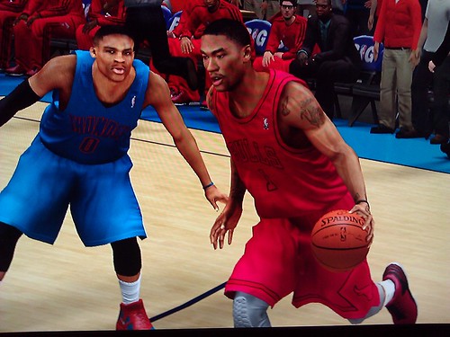
As you can see, these three uniforms take some mild liberties (I like seeing “Thunder” on the blue uni), but nothing too outrageous. The same can’t be said, however, for the Knicks’ Xmas design:

Yowza. Have the Knicks ever worn a solid-orange uni before? I’m trying to reserve judgment until we see it on the court, but I have a feeling that’s gonna be more like a lump of coal, not a fancy stocking-stuffer.
Next up we have the Nuggets and Lakers:
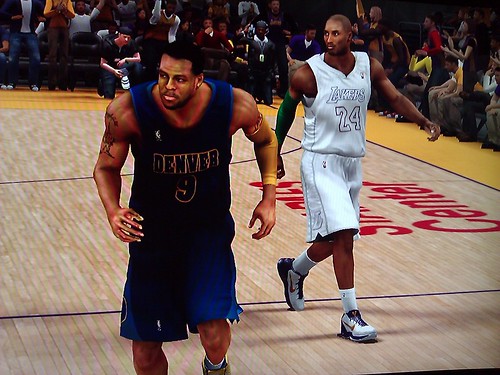
The L.A. design feels appropriate — a white Christmas and all that, right? And the Denver design looks fine.
Next up are the Celtics and Clippers:

Man, how many different versions of that green uni have the Celtics had over the past decade? There’s the standard white lettering, the black lettering, the gold lettering, and now the white-outlined lettering. Enough! As for the Clippers, that’s sort of a smudgy screen shot, so I’m reserving judgment, but I have a feeling that an outlined script isn’t gonna look so hot.
One last pair of teams — the Nets and Rockets:
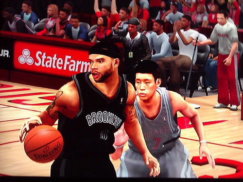
Again, I’ll reserve final judgment until I see it for real, but I think I really like the Nets’ look with the outlined lettering. Much better than the standard road version. As for the Rockets, I find it hard to care one way or the other about what they wear.
You can see additional images of many of these designs here and here.
Another big day on the NBA calendar is Feb. 17, 2013, when the All-Star Game will be played. My source provided images of those uniforms as well:
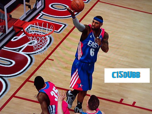
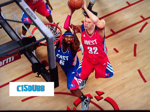
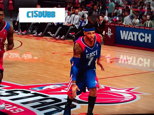
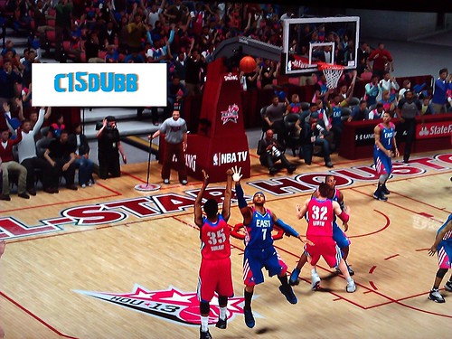
Not exactly a thing of beauty, and I really dislike the stencil font. But hey, it’s just an All-Star uni set, so whatever.
Will this be the final season of All-Star and Christmas uniforms that aren’t sullied with advertising patches? Hope not.
Update: Several readers are saying that these Xmas uniforms are actually the “Winterized” uniforms, which teams will supposedly be wearing for weekend games during the second half of the season. I had mentioned/linked to this in the Ticker back in July but had actually forgotten all about it.
However, note that the Rockets jersey in that last link does not match the one in the video leak. Perhaps the Winterized uni program will unveil on Xmas..? Hmmmm.

ESPN reminder: In case you missed it yesterday, my latest ESPN column is a look at the surprisingly wide-ranging history of the wishbone-C logo.
PermaRec update: A Permanent Record reader is facing a tricky decision regarding what to do with some artifacts, and he’d like to get some feedback and advice. Please check out the full scoop and feel free to offer your thoughts (either in the PermaRec comments or via e-mail, not in the Uni Watch comments). Thanks.

Signal Flare: Do we have any Texas Rangers fans here on the site? I’m sure we do, just by the law of averages, but I feel like I’ve rarely if ever heard from any of you. Anyway, if you are indeed a Rangers fan — and only if you’re a Rangers fan — I’d like to have a word with you, so please drop me a line. Thanks.
Rhymes with “swoosh haggery”: Got a note late last night from Dan Cichalski, with the following subject line: “You’re NOT going to like this tweet.” True enough:
Ibanez, on his way into the interview room, had a bottle of water. Some flack asked him to pour it into a Gatorade cup. See it to his left?
— David Waldstein (@DavidWaldstein) October 11, 2012
Now, it would be fair to say that Raul Ibañez is not exactly my favorite person today. Closer to my least favorite. But for fuck’s sake, after single-handedly driving a dagger through my heart rescuing his team from a very tough spot last night, can’t he be allowed to drink a bottle of water — a bottle of, you know, the purest, most elemental stuff on the goddamn planet — without some pathetic functionary transforming him into a marketing vehicle for whichever brand MLB has sold its soul to this week?
I’d love to know who that functionary was. Imagine his life: “How was work tonight, Daddy?” “Oh, it was fine. I told a man to use a Gatorade cup, even though he wasn’t actually drinking Gatorade. Good stuff.”
How do these people even look in the mirror? And by “these people,” I don’t mean the functionary and his ilk; I mean the people who give him his marching orders (presumably with a straight face), the people who negotiate these deals and then shake hands at the end like they’ve created something of value instead of something vulgar, the people who’ve created a world where there are “Gatorade Only!” posters in the dugouts and a man can’t drink a bottle of water in peace.
Douchebags. Total fucking douchebags, every last one of them.
Uni Watch News Ticker: Earlier this week I interviewed a guy who’s starting up a company called JerseySquare, which will be sort of like a jersey version of Netflix: They’re gonna rent out jerseys. Perfect if you want a jersey for one special occasion and don’t want to spend $250 on a polyester shirt, or don’t want to get stuck with the jersey after the player is traded, or whatever. This will be the subject of my ESPN column next week, but for now you can see JerseySquare’s beta site and their crowd-funding page. More details on all of this next week. … The MLB logo on the back of the Nats’ caps has been red, white, and blue for the past two seasons. But the logo on Craig Stammen’s cap yesterday was blue, white, and gold. Hmmm, did MLB come up with those “Postseason” cap patches just as a way of unloading a bunch of dead stock? (Great spot by Paul Gaiser.) … Fans were allowed to sign the final construction beam of the new Scranton/Wilkes-Barre minor league ballpark (from Art Savokinas, whose son was among those who signed the beam). … Buncha great NFL photo finds by Bruce Menard, including the Lions’ 1971 memorial armband for Chuck Hughes; a 1971 shot of a Raiderette cheerleader; some really great colors in a 1971 Oilers/Redskins shot; and a beautiful 1972 shot of Jim Otto (“I love the juxtaposition of the black/silver uni and the mod orange/pink striped drinking cup,” says Bruce). … “In the Milwaukee suburbs, two small schools — Shorewood (public) and Messmer (private/Catholic) — have merged their football programs into one, called Messwood,” says Ray Barrington. “But it’s under fire because they’re also using a combined logo — a greyhound for Shorewood and a cross for Messmer — which is causing controversy.” Insert all the obvious dog/god jokes here. … New road hockey jersey for Nebraska-Omaha (from David Westfall). … Great DIY project by Dan Taylor, who designed a Wild-themed jersey for his daughter, Marianna. “My wife made it into a reality with her sewing skills,” he says. … Jeff Flynn Jr. found a Raiders helmet with a logo I’ve never seen before before. I realize the helmet isn’t authentic or anything — I’m just curious about the logo. Anyone know more? … With the passing of Alex Karras yesterday, Ronnie Poore sent along some pics of Karras from his days at the U. of Iowa. … The Jags ran an online poll yesterday, and the background of the page featured a long-outdated jersey. “Makes you wish they’d bring back the gold number outline,” says James Comfort. Actually, lots of things make me wish that. … Some good background info on Stanford’s use of Native American mascot imagery back in the day (thanks, Kirsten). … Check this out: FNOB and HNOB in one shot! That’s Tom Brandt and Khary Bailey-Smith of UMass, whose roster also includes Tom’s half-brother, Tim (from Charles Norenberg). … Mike Park reports that the Chicago Fire supporters group, “Section 8,” recently hosted a Fire 15th-anniversary bash that included a cool display of old Fire jerseys. … Maryland’s new hoops uniforms aren’t supposed to be unveiled tomorrow, but they’re already on sale in the school bookstore. “I love them,” says Jeremy Schneider. “A nice mix of the new logo and an homage to the past with the sleeve trim.” … New women’s hoops uniforms for VCU. ”¦ O’s pitcher Miguel Gonzalez was wearing Luis Ayala’s glove last night (from Chris Wautel). ”¦ I think I’ve already run photos of Michigan’s new basketball uniforms, but definitely not from this angle (from Nick Sands).
Ugh ugh ugh. I don’t have a problem with some of the NBA Xmas uniforms on strictly aesthetic reasons — the Brooklyn one DOES look nice — but it’s revolting that they want every team in the league to wear the same thing, just in different colors and fonts. Such a painfully transparent and uncreative attempt at pushing merch sales at the expense of team identity. Plus, if the NBA wants to own Christmas, why not keep it traditional, the way the NFL does on Thanksgiving and the NHL does on New Year’s Day?
Great piece on the end of Umbro as England kit sponsor (Nike is taking over) in today’s Independent: link
Those are the NBA winterized uniforms – some retailers were provided with catalogues for ordering a month or more ago. As for the font on the all star game jerseys…time will tell – The 2K franchise is notorious for not paying much attention to fonts (both number and name fonts for the dream teams jerseys are incorrect in this years game.
Wow, Paul, chock full of great stuff today. I did spot a typo — 2nd sentence of 2nd paragraph should be “worn” rather than “won.”
Got it. Thanks!
Check this out: FNOB and HNOB in one shot!
(would be great if hyperlinked!)
Mea culpa — now fixed. Here’s the link, so you don’t have to scroll back up to the Ticker:
link
Why do you care less for what the rockets were? Are you allowed to be biased towards these nba teams? The nba is a joke because of the competitive advantage and publicity that these 4-5 teams get every year.
But honestly, why?
Paul, there’s no link for the FNOB/HNOB item.
…and it’s there upon page refresh.
Jerseysquare sounds like a very marginal idea. They should feel very fortunate to be the beneficiary of an article at this (or any) stage in the game.
I’m not sure on what basis you pronounce it “marginal.”
There are certainly people who won’t be interested in it (people who think of themselves as jersey collectors, not just jersey wearers; people who don’t want to wear something that someone else has worn; etc.). But I think it could have a niche market.
Either way, anything that provides an alternative to spending $250 on a polyester shirt is worthy of discussion.
Marginal defined as a mediocre to poor idea that doesn’t deserve attention until its business model is proven. People who would want to “rent” a jersey because of the expense of buying could:
1. Wear something else that’s affordable. You know, like a tee shirt.
2. Wait until the end of the year or season to buy on sale.
3. Buy the non-official version that’s always for sale at $35-70.
4. Gasp, not wear a jersey to the game/event!
Just a marginal idea all around. We’re not talking about ride share or rental cars. We’re talking about a sports jersey in which there are many alternatives, the 4 most obvious I mentioned. Like I said, they should feel fortunate to receive coverage, that’s all.
Adidas jumped on the Day-Glo bandwagon during the 2012 NCAA Tournament (and conference tournaments) when they foisted hideous neon costumes upon Baylor, Cincinnati, and Louisville.
Oh, right. I had blotted that out of my mind.
link
someone took the NBA logos and put a Pokemon spin on them
^^^THISTHISTHISTHISTHISTHISTHISTHISTHISTHISTHISTHISTHISTHISTHISTHISTHISTHISTHISTHISTHISTHISTHISTHISTHISTHISTHISTHISTHISTHISTHISTHISTHISTHISTHISTHISTHISTHISTHISTHISTHISTHISTHISTHISTHISTHISTHISTHISTHISTHISTHISTHISTHISTHISTHISTHISTHISTHISTHISTHISTHISTHISTHISTHISTHISTHISTHISTHISTHISTHISTHISTHISTHISTHISTHISTHISTHISTHISTHISTHISTHISTHISTHISTHISTHISTHISTHISTHISTHISTHISTHISTHISTHISTHISTHISTHISTHISTHISTHISTHIS
Give this guy a medal.
That Raiders helmet on ebay is SO lame, fake, amatuerish, ridiculous, (feel free to add more derogatory adjectives here if you wish)!
California is BACKWARDS on the right side of the helmet. Really???
No habla US geography???
Yeah, that thing is just off is so many ways… the guy selling it probably created that logo. It sure as hell doesn’t resemble anything official that I’ve ever seen.
Looking at his other helmets, the state of Massachusetts is also backwards.
link
Here’s a winner. The Chiefs logo of the Central States is only on one side, but the decal and striping are new – – – on a beat-up helmet.
link
Backwards with air bubbles in it. This guy is just ruining vintage helmets.
The seller should offer up another helmet with the star in Los Angeles.
Oh, and of course, put the same friggin decal on both sides.
No, he’s not ruining any vintage helmets; hell he doesn’t even know who really made the helmet as it’s clearly a Schutt Air Advantage with some kind of Riddell sticker on the back. It was probably some kind of high school helmet and the school used Riddell’s reconditioning/refinishing service. Nothing more than a bunch of ebay purchases with home-made decals.
The Raiderette with the parasol has white sleeves while the girls in the background are wearing black. She also has boots and short (not shoes and a skirt). Wonder if she is the squad leader, or if she is part of a different group alltogether. ???
Love the Oiler/Redskins photo–especially the Blue shoes!
PS: every time I see Elvin Bethea’s name I’m reminded of how many 7-11 Slurpee Trading cups I had of him. Seems every time I got a Slurpee as a kid I got Elvin. That not necessarily a *bad* thing–but I wanted Chris Hanburger!!
according to Michigan sources those shoes were only worn for media day. They, thankfully, will not be worn during the season. I guess adidas wanted them to wear the new Derrick Rose sneakers and that was the color they chose.
Judging by the court in the background of the screen shot the Knicks are home for their Christmas game. Couldnt they have gone with a white jersey with blue and/or orange outlines? They are going to look like Syracuse in solid orange…
Very rich UW today, including getting me to care about NBA uniforms. Well done, Paul! Couple of points.
First, Christmas Eve is not a “surrogate holiday.” For most Christians in the world, Christmas Eve is the more significant part of the nativity feast. In America, it’s more evenly split, with many American Protestant sects having abandoned their tradition’s earlier emphasis on sanctifying Christmas Eve. (I’m looking at you, Baptists, and also at my own Congregationalist tradition.) My own response to “Keep the Christ in Christmas” baloney is to say instead, “Keep the mass in Christmas,” and as a matter of doctrine, tradition, and liturgy, that means get your butt out of the shopping mall where you’re yelling at people for wishing you “happy holidays” and into church on Christmas Eve. And if one is not a Christian, then it hardly matters whether the whole gathering-with-family-and-exchanging-gifts thing that we do as a secular holiday happens on the 24th or 25th.
On Stammen’s cap, I have to suspect that the Postseason patch was applied to a hat he already had and was wearing. For two reasons. First, I pawed through a ton of empatched Nats caps last weekend, and none of the ones I saw at retail had the old gold logo on the back. I’d have jumped on one if It had – I miss the gold in the Nats scheme. Second, several players in the postseason, mostly pitchers, normally wear dirty caps and are still wearing dirty caps, and I just don’t believe they have the time to get new caps exactly as dirty as their old caps. So I suspect that players have the option of having the patch applied to their existing caps. It’s just heat transfer, right?
That Michigan b-ball uni may be the first use of day-glo that actually looks good to me. Feels like a slightly brightened version of their actual team colors, not an extraneous added color tacked on.
On Michigan, I’m judging the shoes as part of the whole uniform, is what I mean. It works for me here. But maybe it’s the angle and lighting distorting how incongruous it really looks.
Paul,
After looking a little closer, I’m nearly 100% sure these are not just Christmas Day uniforms, but Winter League jerseys – link
Then how come the 10 teams that were leaked are the 10 teams that are playing on Xmas Day?
I’m not saying you’re wrong; just asking for further explanation/elaboration/etc.
Can’t say why only the teams playing on Christmas had their jerseys released, but these are definitely the Winter League jerseys, which you’ve covered here before. See first item in the ticker here: link
And see other teams’ here:
link
Maybe the league is rolling out the winter league jerseys on Christmas day, and 2K has only prepared those uniforms. I see what you’re saying though. They just look too similar to the winter league vectors that Adidas released for me to write it off.
Other than sales, I don’t see a need for these. Monochrome for monochrome’s sake?
It’s fashion jerseys being worn on the court to boost merchandise sales. Nothing more.
I don’t understand this design direction for the NBA’s Christmas unis. For teams that are red or green (and playing each other), I guess I get the monochrome. But the Thunder? Knicks? Nuggets? Is this intended to make them look like Christmas lights? That’s all I can come up with.
Alright, well, after reading Jonah’s link above, and understanding now that these are “Winter League” unis… it makes even less sense. That’s a fucking joke. The NBA sucks. It sucks hard.
Damn you Paul! Even with the warning yesterday, I still looked into how the bears wishbone is asymmetrical. First thing I noticed when I saw your graphic this morning.
*bears’ wishbone
You weren’t the only one…
I will never look at a wishbone-“C” again with out looking to see if it is symmetrical or not. Thanks, Paul! :-)
He warned you that you couldn’t unsee it.
I’m unable to unsee that photo link, depicting a similarity to a certain seat in `el bano.
sigh… i second Adam. now i cannot unsee it! *cringes*
Regarding the Permanent Record Story: I agree with those that think that the family put the photos and medals in he estate sale in the first place. Since I would not be positive of this, here is what I would do. I would contac Andy and ask if he wants the items back without revealing that I knew the backstory behind them. If Andy says no, I would let everything go, juicy story and all. If he says yes, I would return the items in person, and then use my judgement wether or not to ask about the story. Hope his helps.
What kills me the most about the corporate douchebaggery is the fact that they actually, truly believe that seeing Ibanez drinking from a Gatorade cup will make consumers think, “Well, I’ve gotta have that product!” If I drink Gatorade, it’s because I like the taste and I’m thirsty. If I drink Powerade, it’s because it was cheaper at the grocery store that week and it tastes the same. I don’t care what famous person drinks either.
Ehh. Water’s better for you anyway.
Davey Johnson was also asked to put his water in a Gatorade cup at his pre-game presser yesterday. The beat writers reported on Twitter that he said as he got up at the end, “This Gatorade is good.”
Jason, a few quick searches have failed to turn up these tweets you refer to. Little help..?
Adam Kilgore â€@AdamKilgoreWP
Davey miffed as an official made him pour water in a Gatorade cup prior to presser. After he finished, he said, “Mmm this Gatorade is good.”
Thanks, Arr Scott
Apologies, Paul.
Yeah, it was yesterday (Oct 10) before the game. Do they even televise his pre-game presser? That’s what’s interesting. Fine, MASN shows the quick post-game presser and he has a Gatorade bottle or two in front of him. But I don’t think the pre-game is even televised and they still made him put his water in a Gatorade cup.
Here’s another:
Dan Kolko â€@masnKolko
Davey had to pour his water into a Gatorade cup before his presser. They pay for that right. As he got up: “Boy, this Gatorade tastes great”
(I’m blanking on other writers, but I was sure that there were 3 or 4 Tweets about it.)
I saw a screenshot of NBA2K recently that showed a Thunder uniform saying “Thudner.” Sorry, I can’t find a link right now.
link
How’d you come up with that link so quickly? You must be some kind of a googling savant or something.
Yesterday’s blog, yo.
Hey! How ’bout that! I knew I saw it somewheres.
In re: not caring about the Rockets —
That’s not an unpopular opinion. The Rockets, and Houston in general, seem to have a rather blasé public image around the country. People don’t seem to have an image of Houston other than the Astrodome (which, as has been covered here, is decrepit these days) and NASA (oooh, the scenic control room), and I can attest that when I was living in Houston, I got annoyed at the way the city and team were somewhat overlooked in the national media. Even as late as last Monday, when after the Texans beat the Jets, the first 3 to 5 minutes of the post-game coverage was on the Jets’ problems rather than the 5-0 Texans, even while you have Arian Foster waiting there to talk to them. You’d think the Texans hadn’t played in the game.(Granted, that might be general east coast bias toward the Jets) The Rockets these days are a pretty nondescript team with some of the worst uniforms in the league in my opinion. The Astros are the DisAstros these days. So I understand about not caring about the Rockets.
Then again, you don’t hear many people talking about the Indiana Pacers, either.
I actually like the Rockets uniform. Minimalism with just enough flash and very distinctive.
i’ll always have a soft spot in my my heart for the Rockets. The uniforms they wore during their championship years are very sharp. (Why they felr compelled to join the ’90’s bandwagon and switched to the clown suits, I’ll never understand).
And then there is this!…
link
…for which we should be eternally grateful.
Houston (the city) certainly has an image problem. Dallas is flashy, white collar, and a bit of an attention whore. The gulf city is more blue collar and git ‘er done.
When he said “road hockey jersey” I thought he meant “street hockey.” I thought, wow, what college not only has street hockey teams but street hockey jerseys too.
In hockey parlance I’m used to “home” and “away” but given the flip-flopping of jerseys “white” and “dark” seem to suffice. Can’t keep straight what leagues wears what color home or away.
how embarrassing for the Chicago Fire!
you have a relatively cool uni history set… and then it’s Best-fucking-Buy slapping you in the face.
if this doesn’t prove why corporate d-baggery is garbage, then i don’t know what will…
side note:
the NBA is TOTAL trash if they let those mono-jerseys hit the court…
!#@$!@!@#@!!!
Paul — I got the “pop under” three times today. When I minimized my web browser after viewing the site today, I had to clear three copies of the same ad from my screen.
Seth, what operating system and browser are you using?
Ive been getting it all week. Im running chrome on windows xp and windows 7
I’m getting it too. Firefox 15.0.1 on Mac OS X 10.6.8
Only on the first load.
Windows 7. Firefox most recent update.
For all of you: One pop-under per day, or multiple times per day (as Seth was saying)?
If it’s once per day, that’s gonna be par for the course for a bit.
If it’s more than once a day on the same computer, that shouldn’t be happening. If that’s the case, let me know.
To be clear, they all came from the first time I visited the site. I have not gotten any pop unders on subsequent visits today.
Using video game screen shots to discuss uniforms is silly. Please refrain.
Also, I’m getting an advertisement pop-up from Uni-Watch.com now. Please turn that off.
Thank you.
It’s not silly at all. Sports video games have a history of leaks if you knew a damn thing or two. Is it only silly because you find video games to be silly? That’s kind of your problem, not Paul’s.
Hey Paul, Love the college hockey uni updates! Keep them up!
Did anyone noticed the three stripes on the All Star Game jerseys look like a GIANT Adidas logo? Pretty disgusting
That’s SOP for All-Star jerseys… It’s also the only game jersey where you’ll see the maker’s mark. If the uniform ad vote passes, it wouldn’t surprise me to see an ad on the ASG jerseys this year too, just to test the water…
Sorry I don’t know what SOP means. I’m not referring to the marker’s mark but the stripes on the sides which weren’t there last year. It’s more like the three stripes on Adida’s soccer jerseys. Incorporating your logo to the uniform.
link
As for the lack of stripes link…
Come on, that was mean. haha.
I used to work on a factory and SOP mean Start of Procedures but I knew it was not the case. Thanks for pic of last year, I only saw from front and back earlier.
Paul I’m actually pretty sure the standard color of the MLB logo on Nationals’ caps is red-white-blue, not blue-white-red.
You’re right. My bad. Will fix.
I seem to be in the minority (what else is new) but I’m liking those monochrome NBA uniforms. They remind me of line drawings of the regular uniform, and I love a new twist on something familiar. And I’m glad you like the Nets’ jersey with the outlined lettering since that looks a whole lot like a vintage San Antonio road uniform- one of my all-time favorites.
Mega kudos to Adrienne K. and her Native Appropriations blog. It’s unfortunate this portion of our past is becoming vogue again. Stanford, you’re better than that!
The author of that piece has run up against an older generation, one with different (antiquated?) paradigms. My mom, for instance, laments the passing of the “Little Black Sambo” story from our lexicon; it was book she loved as a child. It’s true they were wearing new paraphernalia, but as they say, for every ass there’s a seat.
I sympathize with people who are offended by insensitive mascots, but my axe to grind is the shrinking palette of athletic iconography. Can you blame me for wanting conservation of energy and mass, while all my local high school teams get renamed “Huskies” and “Redhawks”?
It’s still a big world. There are many places from which to draw inspiration; losing this one little corner of the world won’t hurt the palette.
At what point will Michigan stop referring to its colors as Maize and Blue? It must be at least 20 years now that they have gone full on highlighter yellow. Maize is a native american word for corn. That color is not remotely corn like.
Well, it sure ain’t gold.
Yellow and Dark Blue just doesn’t have the same marketing appeal, I suppose.
Maize isn’t a native american word.
“At what point will Michigan stop referring to its colors as Maize and Blue?”
Ummm… never?
I just wish they would actually go back to a more maize color and stop with the highlighter yellow.
OK, so several readers are saying that these Xmas uniforms are actually the “Winterized” uniforms, which teams will supposedly be wearing for weekend games during the second half of the season. I had mentioned/linked to this in the Ticker back in July but had actually forgotten all about it:
link
HOWEVER… Note that the Rockets jersey in that last link does not match the one in the video leak.
Perhaps the Winterized uni program will unveil on Xmas..?
what kind of uni would you suggest for the celtics then? they’re just variations of the best uni the the league.
Well, the Lakers are going solid white. Maybe the Celtics could do the same since, as Paul pointed out, they already wear THREE different green uniforms.
and while I’m at it. The Lakers with another solid white alt? That’s criminal. They should wear gold as often as possible — both home and road.
They’re downgrades “of the best uni the the league”. No team needs an alternate uni, but the Celtics really don’t.
Count me as one who absolutely can’t wait to see link.
~
~
~
~
~
~
~
~
“This” of course being Derrick Rose on the court. The uniform itself is weak. They could have at least revived the script Chicago wordmark for it or something.
Wait… is that a silhouetted Bulls logo on the shorts? I hadn’t noticed that initially. Damn these Winter Weekend uniforms are *REALLY* stupid.
Screw it, let the NBA stick ads on the jerseys. Maybe we can get a kickstarter to start a new league.
I don’t know if you’d call that silhouetted or what since it’s red and not black. Actually a silhouetted (solid black) logo would probably be an improvement here.
Well, whatever it should be called (outlined? simplified? solid?) …it’s not good.
“outlined? simplified? solid?”
“Shite” is a word that comes to mind.
“How do these people even look in the mirror? And by “these people,” I don’t mean the functionary and his ilk; I mean the people who give him his marching orders (presumably with a straight face), the people who negotiate these deals and then shake hands at the end like they’ve created something of value instead of something vulgar….”
I’m reminded of an exchange in the first season of “Mad Men” — a beatnik type asks hotshot ad man Don Draper “How do you sleep, man?” and Draper replies “On a bed filled with money.”
nba picking favorites again…
Here are two high school football teams that use the wishbone “C”:
Catholic High School in Baton Rouge, LA (high school of Warrick Dunn and Travis Minor)
link
Carencro High School in Louisiana
link
Text the same color as the jersey doesn’t work. It just doesn’t.
Unless you’re the 70’s Spurs or the Oregon Ducks.
Those didn’t work, either. Numbers, at least, are supposed to allow viewers to identify players, and these will be even worse than the Celtics’ black-on-green atrocities.
“”Section 8,” recently hosted a Fire 15th-anniversary bash that included a cool display of old Fire jerseys.”
And somehow, the most ardent of Fire supporters forgot THE SINGLE BEST jersey in the history of their club. I am dissapoint.
link
That image was blocked for some reason, but I’m assuming you’re referring to the alt that was based on the city flag.
Yeah, blue with the white trim and red stars.
Maybe the NBA costumes are made of a material that rips and fades after several washes so they need to have several different options à la NFL.
I am slowly becoming brainwashed/convinced.
According to Jordan Kovacs Twitter Michigan will be wearing pink next week for Octobers breast cancer month.
Winterized Uniforms sounds luke what you wear to install your snow tires.
Seriously. “Winterized” basketball unis should at the very least have long sleeves and over-the-calf wool socks.
Dwayne Wade signs shoe deal with Chinese brand Li-Ning.
link
I would have to think that this move is just all about the money, but you have to think of a move from Jordan to Li-Ning as a major step down. The shoes look like something you would see on the discount rack at Walmart.
USC Helmets
link{%2210151434215039045%22%3A162945273829076}&action_type_map={%2210151434215039045%22%3A%22og.likes%22}&action_ref_map=[]
Another link if the first one doesn’t work
link
“How Sick Are USC’s Matte Black Helmets that Just Leaked Out to the Internet?”
Oh they’re sick alright, sick as in *barf*.
Matte black is fine for a team that actually wears black – I’d love to see the Steelers with a matte black helmet. For USC, it’s an evil abomination that should be killed with fire.
I think the more nauseating part of that page is the reference to “the bro universe.”
Sigh.
A couple years ago I volunteered at the NCAA women’s basketball tournament, in Cincinnati for the first and second rounds. I remember in the hallway that led to the court at the Cintas Center, there was a large placard that said “VITAMINWATER ONLY BEYOND THIS POINT” with a stack of Vitaminwater branded cups next to it so you could pour your drink into a cup. The NCAA apparently did not want any other brand of drink to accidentally appear on the TV broadcast of the game. Looking back, I wish I had taken a picture of the sign.
Talk about mailing it in on the Nebraska-Omaha hockey jersey. That design took maybe 1 minute to come up with. Awful……..
As someone who’s done a fair amount of uniform concepts, I can assure you that that design took at least 2 & half minutes to complete. ;)
Is anyone else having problems with links not working? (Chrome user here) Its been that way for about a week….
The sad thing about the Milwaukee Messmer logo controversy is, per the article, it’s an example of a school logo actually being designed by a student.
Perhaps they should just use an upsidedown Wisconsin logo…
I’m glad that they let the students design the new logo. But they should have given the students a better set of guidelines to work with.
Come on. They had to know the cross wasn’t acceptible.
The article indicates that the re-design will also be handled by students, this time with better supervision. Sounds good all around.
Yeah, my issue wasn’t with the seperation of church and state. Moreso the irony of a high school finally letting it’s students design something and they have to remove it.
They should know they are swatting a hornet’s nest by combining a religious school’s team with a sectarian one.
I think you mean “secular,” not “sectarian.”
My bad.
anyone see that new wendy’s logo?
guess the company that owns arbys and wendys is doing a total remake
link
Heh… another fast food logo downgrade. Awesome.
Her hair is beveled. Her hair. Sure, the new wordmark has ligature issues, but the beveled hair takes the cake.
Pretty sure that Wendy’s cut Arby’s loose sometime in the last year.
But yeah… must have the same marketing firms. That’s pretty horrible. Although Dan Gilbert might approve.
Meh. It doesn’t suck. Unlike some people, I’m able to deal with branding updates and tweaking. Part of rebranding is demonstrating you aren’t fast asleep.
Re: Jaguars Uniforms
My Inclination leads me to believe that they will introduce some sort of teal throwback uniform next year with the Nike redesign. The switch to black and owner Shad Khan saying that teal will be reserved for special games in the future sets up nicely for a throwback teal uniform. This will also be their first real opportunity to use a throwback, being two redesigns away from the original style.
These factors along with the pic of Justin Blackmon at a Topps photo shoot from May, leave me hoping that I am right.
Blackmon:
link
Google isn’t being very kind to me… but hopefully they’ll go to the teal version of this: link rather than the jersey in the Blackmon picture.
Owen Good of Kotaku (great guy) has just sent me a screen shot showing that the NBA leaks are indeed designated as Christmas uniforms, at least in the video game:
link
enjoyed the bone look, and love the maryland top as much as i can any new jersey.
re:functionality
over say the last week i have noticed when i open up UW, i can not click on the hypertext. well i can, but nothing comes up. so i open up UW again, and the hypertext does work. granted with the pop under, but i don’t notice they were there until i close my browser. are these two things related? has anyone else noticed this? at first i thought it was a glitch, and it isn’t the end of the world or anything, but it is for sure every day now.
Man that 1971 Lions jersey is awesome. It says…we mean BUSINESS. We mean FOOTBALL. Interestingly enough, the black armband makes it look a little like the Lions current BFBS striping system.
In reference to the Jim Otto shot, why are 0 and 00 no longer allowed?
In the mid-’70s or so, the league got a new stats-tracking computer system. The system glitched up whenever a player’s number was entered as 0 or 00, and they decided it would be easier to just ban those numbers than to fix the problem.
Also – Paul – I think you would find this story interesting. It’s about guerrilla stickers being placed on the London Underground that look like real signage. Check it out.
link
As an iU alum, i naturally hate michigan, but i like “maize and blue,” juat like iu uses/used “crimson And cream” tp describe their colors.
Why would any IU alum hate Michigan? There is no rivalry whatsoever to “naturally” hate them for.
NFL Pink a scam? link
NFL using Pink to sell products? Using Cancer Awareness as marketing!? For shame! I thought the NFL was better than the makers of link, link, and link!
Someone get me a pink barf bag.
Watching the Knicks pre-season game…remember the linkthey unveiled with the new unis? Well they must have come to their senses, as the numbers look like the Knick numbers of recent years…in fact, my eagle eye thinks the new numbers may even be a tad THICKER than last year’s, but I’m not sure.
Wow, WOW! Love that photo of the Oilers/Redskins. Just a thing of beauty. Houston had one of the best unis in NFL history, IMO. Too bad they moved to Tennessee and ruined it. Luv ya blue!
That Omaha jersey looks like there should be something under the wordmark. Definitely has the space for it.
Has Catch of the Day gone AWOL?
Has Catch of the Day gone AWOL?
Not if you understand the definition of AWOL.
I’ve taken it down for a bit because I’ve been too busy to find good stuff for it and have felt bad about neglecting it.
It’ll be back eventually.
Henrik Lundqvist, Brad Richards, Michael Del Zotto and Brian Boyle are in a fashion spread in this month’s Esquire. Great quote by Lundqvist on the beauty of his jersey: “Coming from Europe they advertise on the jerseys and it ruins the whole look. The uniforms here are so clean, and look so much better.”
Bingo!
I wish players would go back to wearing Starter jackets in the dugout rather than hoodies.
re: JerseySquare
Time magazine had an article a couple weeks ago about ‘Rental Nation’. Apparently technology is allowing rental agencies for cars, jewelery, haute couture, etc. to more easily find renters as well as helping renters find items they’d like to borrow but not own.
(I’d link the article but it’s behind a paywall.)
Looks like the JerseySquare guys have put a uni-twist on an emerging trend.
Watching Tulsa for the first time this season. I am really liking that new helmet. The flag/stripe down the center is a bit too extreme in regard to the amount of waves in it, but it’s a hurricane flag, so I can get over that.
All in all, that’s a kickass helmet. That uniform just shit the bed though.