Two good DIY projects today, beginning with one from reader Kyle Beaudoin. I’ll let him explain it:
I recently created a logo and subsequently a jersey as a gift for my father’s 56th birthday (’56 also happens to be his birth year). He’s a huge Portland Pirates (AHL) fan and is well known at the arena, sort of like an unofficial mascot. He also bears a striking resemblance to Salty Pete, the real mascot. So I wanted to make him a jersey of his own.
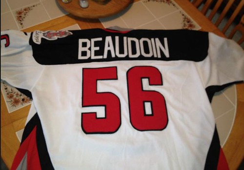
I purchased a blank jersey from a local hockey equipment store (only $5!) and some hobby felt. I found the font style the Pirates use through a quick Google search and printed a paper template. I cut each number and letter by hand. This took quite some time and was more difficult than I had anticipated (kudos to my brother, who helped me with the coloring and letter cutting). Once I was happy I used fabric glue to affix the top and bottom number layers. I affixed the lettering to a felt nameplate:

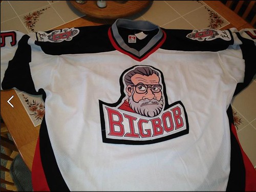
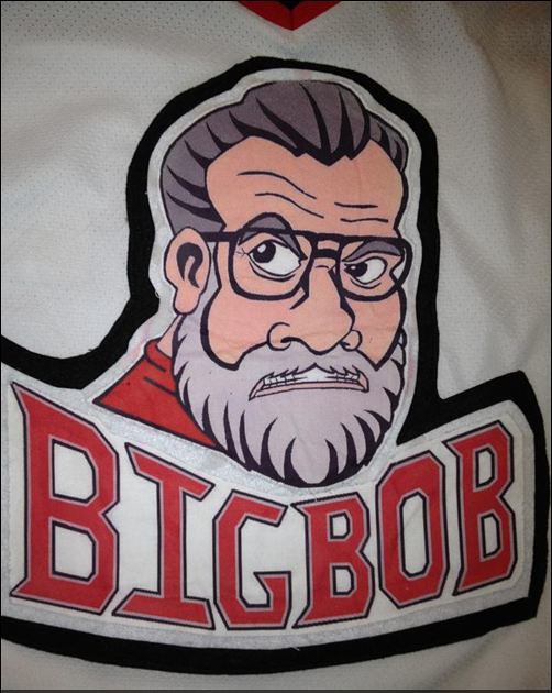
As for the logo crest, I did the initial design by hand and then touched it up in Microsoft Paint and printed it on white fabric paper. I attempted to hand-sew the logos on, but when I realized how terrible I was at this, I had my mother-in-law do it for me. I think the end result came out great. My Dad, better known as Big Bob, was thrilled.
———
Thanks, Kyle — nicely done. But here’s a project I like even better: Reader Timmy Steffes has made himself a pair of Redskins clogs (or as he put it in the subject line of his e-mail to me, klompen):
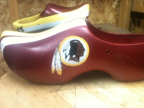
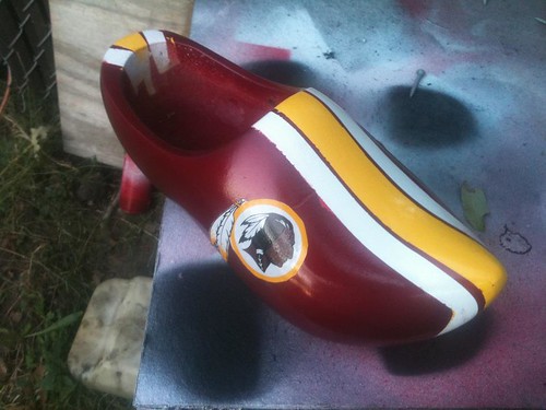
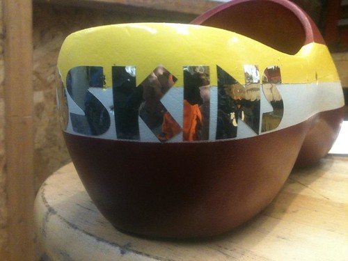

How great is that?! “My wife is from Holland and I got my first pair long ago and I wear them every day,” says Timmy. “If you get the right size, they fit like slippers.”
Now, as you know, I’m not a fan of the Redskins’ team name. But these clogs are so awesome, I think it might be worth keeping the name after all, just because the cross-cultural mash-up of Redskins clogs is so bizarre. Imagine 80,000 fans klomping their way into RFK Stadium in clogs — the mind reels. Now we just need to get the ’Skins offensive line to wear them: Clogs for Hogs!
Uni Watch News Ticker: As promised/threatened, ’47 Brand is now embracing logo creep. Disappointing (from Vincent Serritella). ”¦ Nice move by reader Tom Arnel who procured a Meats T-shirt for his favorite butcher. … Oooh, check out this gorgeous A’s spring training shot from 1973. I’m assuming that’s a big league jersey repurposed for a minor league affiliate. Also note the white-capped coach at far left (good find by Jack Nicolaus). … Polish pro wrestler and Buffalo native Beth Phoenix put a Sabres-themed spin on her usual Polish Eagle-themed attire on Monday night (from Jon Kuras). … Looks like Air Force is planning something really fucking ugly for this Saturday. … Kelly Clarkson and Cowboys RB DeMarco Murray recently did a Pepsi promotional shoot. One of them wore a Nike jersey and the other one wore Reebok — but not the way you’d expect (from Jeff Lee). … Rather underwhelming new logo for AIG. … New logo for Arby’s, too. … The Mariners are moving in the fences at Safeco (from Maks Skuz). … Good Wall Street Journal article about how the new Nike jerseys are not popular with NFL linemen, who think the jerseys are too tight and make them look fat. … “I recently started playing organized lacrosse in an adult league,” says Matt Powers. “My team is sponsored by a bar/restaurant called the Red Rock Cafe. We don’t have team helmets, so I went out and bought a Cascade CPX-R and then went online and had decals made. Here’s how it turned out.” Nice job! … Lots of Pitt football uni info here (from Chris Hilf). … Slightly revised basketball uniforms for Purdue (from Neil Strawmyer). ”¦ Very cool set of NFL bottle caps (from Bo Baize). ”¦ Did you know the Kansas City Star tries not to print the word “Redskins”? It’s true! I’m generally supportive of this move, except it means they can’t write about DIY Redskins clogs.
Gotta love it when even the WSJ starts commenting on the problems with Nike uniforms.
link
Already in the Ticker. But this other WSJ piece, about the Mets’ longstanding tendency to flourish when a Republican is in the White House and do poorly during Democratic administrations, is not:
link
Conversely, the Yankees enjoy the most success with a Democrat in the White House. You have to go back to Eisenhower to find a Yankee title during a Republican administration.
Talk about cognitive dissonance! What’s a Republican who hates both NY teams to do?
This was the topic of discussion on Soledad O’Brien’s morning show on CNN between 7:20-7:28am
today. Roland Martin,who went to Sunday’s Titans-Texans game,said something about the linemen
wearing the jerseys so tight that the front numbers were “bunched together”.
The motorcycle helmet link is asking me to sign into skydrive (whatever that is)
Always loved the A’s having the coaches wear White caps, while the team wore Green. There’s utility in being able to spot your coaches easily, and it also looks pretty damn good. I love White caps with dark brims, but I would not want the entire A’s team to wear them – the coaches wearing them is just about perfect ….
That field looks like a “cow pasture,” compared to what they play on today. Great old, freshly painted, wood fence surrounding the field.
Also noted the manually-operated scoreboard (appears to be a guy in a yellow shirt standing on a platform), complete with a roof for shelter.
That’s a Birmingham Barons (or I think it was the Birmingham A’s) jersey. Saw one on Ebay a few years ago get pulled down by the seller because it was “no longer available for sale.” Bummer…because I was ready to pounce.
The Burlington (Iowa) Bees also were an A’s affiliate in the ’70s and wore a similar uniform.
Who is the player in the A’s minor league jersey? Did he eventually play in the Majors?
I was wondering that too. Joe Rudi, maybe?
Oops, never mind. Not Rudi if it was 1973. He did play for Birmingham in ’67.
Is that really a blurjob (on the Reebok logo) in the DeMarco Murray photo??
arby’s logo = lame.
It looks like the first letter is missing. Like it should be Darby’s or Varby’s or something.
Agreed. I saw that on another blog I visit. It’s horrible.
Arby’s wants to increase sales? They should start with cleaning up their restaurants. It seems, in my experience at least, their stores are some of the filthiest of any fast food chain. I know a lot of that is perhaps up to the franchisee to change, but still.
Hell – they should improve their FOOD – tasteless sliced cardboard on a bun is not competitive in today’s fast food market. It has gone downhill fast in the last 10 years or so.
Our local Arby’s – which was around for over 30 years – just closed, and its business went noticeably downhill the last 5 years or so.
Wouldn’t hurt for them to switch to Coke, instead of Pepsi too…
Wendy’s is rolling out new lettering on their signs as well. The one near me has new signage and the font is dangerously close to comic sans. Not good
Is lowercase the BFBS equivalent in logos these days?
arby’s logo—–adidas typeface
Whenever I see all lowercase letters I think of the 1970’s. Way to look as dated as a Washington Capitals jersey.
As far as cleanliness, I haven’t had any problems with the (I’m still typing it) Arby’s restaurants in my area, so maybe that has more to do with lack of managerial control in other locations.
RE: Kansas City Star not using the word “Redskins”……
Using their search bar, there are 145 Results listed since 8/1/07. So they forget about 30 times a year.
Actually, it looks like some of usage is via AP stories and other things.
Pretty sure the Strib doesn’t use “Indians”.
When I worked for the newspaper in Olympia, WA, we were also given a mandate not to use Redskins or Indians in headlines, blurbs, captions, etc. We didn’t change the copy, but it was a pain in the ass trying to fit “Washington” into every headline, especially as the width of the paper grew smaller each year.
Not using the term Redskins in proper context (pertaining to the NFL franchise)seems to me to be absurd and problematic.
Redskins is, without question, the name of the team; having reporters ignore/editors remove the reference from their coverage of events surrounding the team is to ignore reality, create a false depiction of the present and calls into question their integrity as objective ‘journalists’ (if they consider themselves as such).
That issue has cropped up in technical manuals, too, when machines or computers are referred to as “slaves” and “masters”. Good intentions run amok, I’m afraid.
DC radio station WPFW (89.3 FM) also doesn’t use the word “Redskins”. It seems clear that it something that has come down from on high. I can recall one DJ who almost said “Redskins” and had to dance around it. All the on-air talent on the station consistently says “Washington football club”.
I wonder if that is due to strict restrictions by Snyder. I know 106.7 the fan isn’t allowed to use the name in official promotions, having to have an “unauthorized pre-game show”.
Wow, that new Arby’s logo sucks. “Yeah, let’s make the hat outline a crappy 3D effect, but leave the text flat and make it more plain.”
The apostrophe representing the meat slicer is the only “clever” element to the thing. Everything else about it just reeks.
The apostrophe is too clever by half. Or anyway it’s too big for the text by at least 50%, and so for me it’s the single worst element of a generally crappy logo.
Arby’s went the wrong direction here. Should have removed the text entirely and made the hat a standalone, language-independent icon.
Ever notice that things are never too clever by a third? Or by three-quarters? It’s always “too clever by half.” Also, there’s never any “too [something else] by half” — only clever.
Hmmmm.
Maybe half is also the amount by which one doth too much protest? I assume half is an approximation, since people are on average too clever by 58%.
Once spent the better part of a semester taking apart idioms, and the stunning thing is that most idioms don’t make literal sense even on their own terms and within their own context. The meaning is external to the actual words that compose the cliche. Not so much a sum greater than the whole of the parts, as a sum entirely unrelated to any combination of the parts.
I was too clever by a third once, but the teacher rounded it down to “not clever.”
As a kid there was extra small, small, medium, and husky. What happened to husky? Then came large and extra large. Why no extra medium?
The only logo the need.
link
That meatslicer apostrophe just makes me think they’d better serve Coke products.
Love the “Clogs for Hogs”!!! Thanks for featuring my Dad’s jersey. He will feel like a celebrity at the factory today!
PS- That Arbys logo is awful. Lowercase progressive lettering and the 10 gallon hat just do not mix. Bleh!
The Dutch clogs are off the charts. I like the way the left and right are subtly mismatched; it reminds me of a fashion shoe maker called “Twins”.
I wonder if Timmy Steffes used this for his DIY:
link
Nice work!
“Imagine 80,000 fans klomping their way into RFK Stadium in clogs – the mind reels.”
RFK Stadium?
At that, old RFK didn’t seat 80,000. Presumably, Paul, you meant (I’m still calling it) Jack Kent Cooke Stadium?
I love the Mirrored lettering on the clogs! If those were with “Cowboys” on the, man – I’d love a pair myself. Wonderfully done paint job on the Redskins clogs.
I don’t know if I’m the only one, but I love the Cattle guard wordmark for Purdue.
I love the “Big Bob” sweater Kyle made. Beautiful detail work.
Maybe it’s because I’m an IU fan (and alum), but it amazes me that every time Purdue tweaks their unis (in any sport) they manage to make them at least a tiny bit uglier.
Yes, that is great. Hell, *I* would wear it.
My dad’s 56th birthday was earlier this year (though he still has mostly black hair and probably looks 10 years younger than “Big Bob” – crazy). I now feel pretty crappy that I couldn’t/didn’t do the same kind of thing for him.
Nice to see a fellow Mainer on Uni-Watch today! And a French Canadien to boot!
Go Pirates! Funny thing is there was a Beaudoin on the Pirates last year, Matt Beaudoin. I thought my Dads head was going to explode when he found out the jersey was $280 to purchase. This cost me a total of $10! Outrageous what they charge for those things and I bet more labor went into this than your average Reebok jersey. Oh well.
I couldn’t see a clear picture in the Purdue uniform link but I read that the “B1G” logo sits “atop” the American flag patch on the front. If the American flag is supposed to be above the flags of every other state, shouldn’t it also be the preeminent detail in any and all cases. I feel that “corporate logo”<State Flag<American Flag is a pretty easy equation…
Hey Purdue. Now that we’ve seen your practice uniforms what do your actual game togs look like?
Although I prefer Air Force’s uni to be blue and white, or those sweet Thunderbird colors, I’m curious to see how they pull off the black. If any team should be going with a “stealth” look it is the Air Force. The shoulder have a houndstooth-ish pattern that looks to be in the shape of the B-2 Bomber.
I’m not exactly sure why black is automatically “really fucking ugly”. Don’t the Thunderbird pilots wear black?
link
If so, then it isn’t BFBS.
I’m fairly certain the Thunderbird pilots wear dark blue.
link
Thunderbirds are GO
yeah, those thunderbird unis were sweet:
link
I don’t remember those – but they are awesome. Well, maybe aside from the helmet, but I could probably let that slide if they kept the beautiful jersey. Navy and red doesn’t seem to be as overused in college football as it is in other sports.
BFBS and the Thunderbird look are both preferable to the crummy camouflage pattern.
With the limited variation of nike’s lineup, i think it’s safe to say AF is going to have a black variation of this: link
We’ll see on saturday i guess
If any team can get away with wearing a camo pattern, it has to be teams from USAFA, Navy, or West Point. All other teams merely pose in camo–service academy student-athletes are the real deal.
These uniforms are definitely designed to have the B-2 bomber on the shoulders. This is a screen grab from a video about the company that made them, Powers Manufacturing in Waterloo, IA.
link
I found the video from when the Hawkeyes wore their throwbacks against Iowa State about a month ago. There are also other uniforms noted in the video. Powers makes many high school uniforms here in Iowa.
link
I love the black on black. I hope they wear black hats as well.
With the Astros’ season ending officially today, has there been any word on when the new uniforms will be unveiled?
As was reported in yesterday’s Ticker, the new uniforms, logos, etc. will be presented on Nov. 2.
Thanks, Paul.
Sucks, since I’ll be at a ukulele conference all day on Nov 2 and won’t be able to see the unveiling in real time. On the other hand, I’m already expecting to be deeply disappointed, so probably no loss.
I’ll be at a ukulele conference…
This cries out for some elaboration, no?
Ukelele conference? Come on, Arr – we’ve got to know what that’s all about!
Come on now. Your ukelele conference will (without a doubt) be in Maui or Honolulu, right? So with the time difference I bet you’ll be able to see the unveiling at 4:30am (Hawaii time) or so–well before the ukes get rockin’!
Alas, UkeFest Virginia is in tropical Richmond, VA.
Going to the conference because after way too many years of learning ukulele, I only know the one song. It’s a good song, a Townes Van Zandt tune, but still.
One month from yesterday.
Ahhh…Paul beat me to it!
Saw this last week. I hope it’s true. I loved the blue uni tops. link
Excellent DIYs!
And a snarky nyah-nyah aside to the WSJ, showing Raji as an example of ‘bad, new Nike jersey’ doesn’t fly. The Packers didn’t change their fabric or tailoring.
No, but it does bring that unfortunate “Show me what you got, Raji” song from the commercials to mind.
um…most offensive lineman are fat.
maybe it’s a necessity, but it’s also a fact.
And they asked one lineman and he said the guys that are complaining just want to look pretty. I think that’s pretty funny.
whats a pirate’s favorite restaurant?
arrrrrrrrrrrrbys
Oh, we’re gonna be like that?
Okay then…
Wooden shoe love a pair of those Redskins clogs?
there we go
No. No. No. Pirate’s favorite kind of movie? Rated Rrrrr. Favorite Greek philosopher? Arrrrrristotle. Favorite mathematician? Arrrrrchimedes. Favorite restaraunt? Long John Silvers.
what a pirate’s favorite bowl game?
the RRRRRRRRRRRRRRRRRRRRRange Bowl
Probably they shop at Tarrrrr-get.
That’s a point of division among pirates; many prefer to shop at Wal-Marrrrrrrrt.
I’ve lived within walking distance of an Arby’s for eight years and have never eaten there. Truly the worst of the fast food.
But I love that their name is a backronym for “America’s Roast Beef, Yes Sir”.
link
(this post was mostly an excuse to use the word backronym)
You’ve never eaten there yet you claim they are the worst of the fast food chains? Makes sense.
Also, Arby’s is named after the Raffel Brothers who started the chain.
I’ve eaten there in the past when I was young and hungry – just not since I’ve lived within walking distance of one.
Ed Hochuli on the cover of this week’s SI wearing a plain white mesh hat with no NFL logo.
link
That’s just dumb.
He still has the NFL logo on his shirt pocket, if you look closely.
For all of us who can’t stand the bleacher report: link
I love that the article about the Kansas City Star’s resistance to the term “Redskins” noted that the Chiefs were named for a former mayor, “Chief” Bartle or whatever. Was Mayor Bartle a fan of link? Was he a DIY archer of some kind? Gimme a break…
No kidding. Didn’t they used to chuck a spear in the ground at midfield too? That’s a real mayoral action.
Professional sports teams choose names to convey an image of power and fearsomeness which command respect….not as a way to hurt the feelings of potential paying customers.
Chris, I agree, generally speaking. I’m an Indians fan, and I don’t really have strong feelings about Chief Wahoo one way or the other. I think the people who gripe about the logo – particularly the non-Native American people who gripe about it – are funny because they are getting all bent out of shape about a logo. On the other hand, I’m not the determiner of what people should and should not get all bent out of shape about.
Your opinion that “Professional sports teams choose names to convey an image of power and fearsomeness which command respect….not as a way to hurt the feelings of potential paying customers” is valid, though I’d counter that that is not always the case. Twins, Mets, Red Sox, Angels… those were four that immediately came to mind. There are lots of other reasons to pick team names, and I find it hard to believe that teams can’t come up with cool names that don’t offend. The city already has some cool names in its past, including Blues, Forest Citys, Spiders, Bronchos, and Naps. While “Bronchos” would make me cringe every time *visions of John Elway and The Drive* *cringe*, I’d be proud to support a baseball team with those nicknames.
My comment was just pointing out the obvious fact that the KC Star crusades for Native Americans selectively.
Nothing too shocking about pink for breast cancer showing up but MLS or maybe just the Colorado Rapids are taking it maybe one step too far. According to this article a pink ball will be used in this Saturday’s game. link
Catching up on Uniwatch today.
Paul asked on Monday if Buster Posey was using a bat knob decal on his shinguard (#28) and the answer is no, he is not. That is embroidered on the shinguard and has been on there since 2010 (see SI cover when Giants won the World Series). However, backup catcher Hector Sanchez has been wearing a bat knob decal (#29) in the middle of what I would call his forehead, on the hockey style catchers mask that he wears since about the middle of the season.
For the first half of the season Hector’s mask was all black and then it changed to black and orange with the decal right in the middle.
Nice to see a wrestling reference on here.
Oh yeah? Whomever dresses Air Force should receive a piledriver followed by a suplex drop. And I should suffer a figure four leg lock for having not purchased my butcher a Meats t-shirt.
Glad arby’s kept the uncircumcised penis shaped hat.
whew, glad im not the only one who thought arby’s logo was a dick
I’ll never be able to look at that roast beef the same again…
Somebody compiled a Braves uni-tracker for the season and posted it on the AJC blog today. So I’m reposting here.
Overall: 94-68
Home: 48-33
White: 25-18
Red: 8- 4
Cream: 15-11
Road: 46-35
Gray: 28-21
Blue: 18-14
Ugh. Why do we have to have FIVE uniforms. I love our simple whites and grays. I almost wish we would have been under .500 in the blues, in hopes they might get rid of them. God I hate that uniform.
How many times does it have to be said: If the Braves stick to the white and grey uniforms, they are close to the best-dressed team in the bigs. The alts drag them into the gutter.
The Braves should pretend it’s 1995. White and gray only, one single navy cap with the red button and brim, and VAL NOB’s. Hell, throw in the striped socks, if only to keep them in storage in case somebody requests them.
Fun game here: link
Name the player by their hair/facial hair
Question: Are the Oakland A’s gold tops home jerseys only? If not, they should wear them throughout the playoffs.
Alternates at home only. On the road, they wear either gray or dark green.
transformers that turn into New Era Caps
link
First look at Cabrera’s “official” MLB Triple Crown merchandise logo (H/T Darren Rovell):
link
Thanks for the wooden shoe love, Paul. “Klompen” is the Dutch work for clogs. One of them is a “Klomp”. Its funny you mentioned 80,000 fans in woodmen shoes, because I was stomping my feet on third down and I mused what it would be like if all the fans had them on.
“Klompen” is the Dutch work for clogs.
That sounds like a word the Swedish Chef would use when talking about them.
That’s awesome.
AFA should have went full “Stealth” Bomber and went with Black with darkest-as-possible (per NCAA regs?) grey or silver numbering and logo.