
[Editor’s Note: Today we have a guest entry from Greg Allred, who’s going to tell us about a very unusual project he recently undertook. Enjoy. ”” PL]
By Greg Allred
I collect sports memorabilia but am really collector of sports history when I can find it and obtain it. I was lucky enough to find some history in February of 2010, when I went to run an errand at the old baseball stadium here in Birmingham, Rickwood Field. While I was there I noted several pieces of turf lying around that had obviously come from an old football field. I inquired as to their origin and was told the history: The turf was originally installed at Legion Field in 1975 (when the Birmingham Vulcans of the WFL played there), removed in the mid-’80s and placed on a high school field for a few years, and then removed again, with most of it brought to Rickwood.
I asked about the possibility of obtaining a small piece and was told to call back in a couple of weeks. When I called back, I was told to stop by when I was back in the area to discuss it. When I returned a couple of weeks later, I was taken to a different area in the complex, to a building that was used for indoor batting and pitching. The floor of the building was covered in long strips of turf. When the gentleman showed me the turf, he informed me that the building was being razed soon and asked how much of the turf was I interested in. I replied that I wanted all of it, to which he responded, “Okay, but I don’t know how long it will take to get approval for you to remove it. It may take a few months.” I was fine with that and promised to follow up with him regularly.
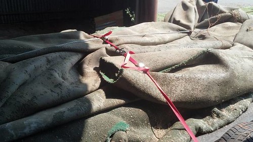
Well, regularly turned out to be an understatement. For two and a half years I would regularly check in with him to inquire about the turf. Finally, in early June of this year, I received the green light. So with the help of six friends — two of whom actually played on this turf — we cut the turf into smaller strips, rolled it up, and loaded it onto a flatbed trailer, all of this in 105-degree Alabama heat:
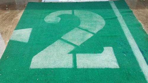
I hauled the turf about an hour north to my farm, where I stored it in a building. Then I would take a roll and move it with my tractor to another area where, with the help of two of my sons, I’d unroll it and cut it into smaller pieces, which I then stored in my barn. I cut this piece from the first roll I brought out, cutting the “2” and trimming it up for a frame that I built:
I took the piece to a local car wash, where I stretched it out and pressure-washed it thoroughly. Then I allowed it to air-dry in the sun:
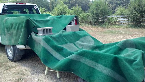
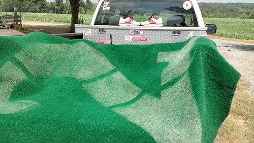
I returned to wash it a second time and allowed it to dry again before stretching it over the frame and securing it:
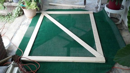
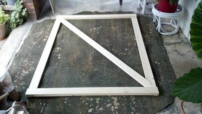
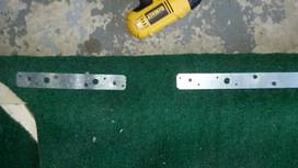
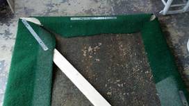
I then used “gorilla hooks” to mount it to the wall of my study, beneath Legion Field seats that came from the old East upper deck that was removed in 2005:
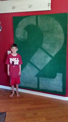
I have had several comments about how unique the piece looks. I’m making a somewhat larger version of the framed turf for my office, using a piece from the sideline with hashmarks. I’ll send along some pics from that frame once I finish it.

’Stros news: Chris Creamer, citing an inside source, has published some exclusive details on the new Astros uniforms, which will be unveiled in November. Mostly it confirms all the hints that have been dropped over the past half-year or so, but it’s still good to have something a bit more concrete. Details here.
Collector’s Corner
By Brinke Guthrie
The U.S. Open is underway this week in New York City, so we’re featuring tennis in this week’s edition of Collector’s Corner.
Bjorn Borg is my favorite player ever, and his look is pure class. The styles here were my favorites. Pair it with a jacket like this or this, and you’re set. Guillermo Vilas was the other big Fila dude back in the day, and he wore this style jacket on court, before he switched to Ellesse (pronounced “L S,” by the way). Bonus points if you know what their logo stands for.*
See these shoes? The story goes, John McEnroe was looking around the Nike lab one day, saw these on the shelf, and took ’em. They were designed as cross-trainers, but Mac made them famous on court. My favorite shoes ever. Mac’s initial Nike line in the mid-1980s had a checkerboard theme.
Ivan Lendl had a long-term Adidas deal, and his look changed every so often. This “IL” look was my favorite, but this one was just plain ugly. Stefan Edberg and Steffi Graf also had their own Adidas lines.
Actually. lots of other players had their own lines back then (not so much now). Jimmy Connors was mostly a Robert Bruce guy, and wore Converse, among other brands. Martina Hingis, Mats Wilander, Pat Cash, and Gabriela Sabatini were all with Sergio Tacchini at one point, and in the 1980s Boris Becker was with Ellesse, Fila, and Puma.
Rackets? For me, none better than the Fila Wud1One, the Head Vilas, and the Prince Woodie.
And we leave you today with this pair of Nike Agassi shorts. Yes, I wore them, and yes, they were comfortable. Remember…Image … Is … Everything.
*Ellesse logo = tennis ball, and either side of the center are the tips of skis.
Seen something on eBay or Etsy that you think would make good Collector’s Corner fodder? Send your submissions here, and you can follow Brinke on Twitter and Facebook.

Question Time: As you may recall, back in June I invited readers to ask me questions — uni-related, non-uni-related, whatever — and then answered as many of them as I could a few weeks later. Let’s do that again, shall we?
Same rules as before: You can ask me anything at all. Personal questions are fine, although I reserve the right not to answer if they’re too personal. Only one question per person, and I prefer that you sign your real name (although that’s not a requirement).
Send your questions (again, only one per reader) here, and I’ll address them soon-ish. Please do not post questions in the comments. Thanks.
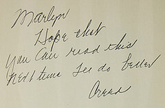
PermaRec update: An awkwardly written inscription in a 1963 copy of Gulliver’s Travels, shown at right, is the starting point for the latest entry on the Permanent Record Blog.
Uni Watch News Ticker: Rangers pitcher Derek Holland was once again wearing some serious stirrups last night. ”¦ Speaking of stirrups, Dave Rakowski reports that Yankees broadcasters Michael Kay and Al Leiter were discussing hosiery protocol during last night’s Yanks/Jays game. “They first mentioned that Blue Jays pitcher Brad Lincoln socks seemed lighter in color than the others. They continued their conversation and Al Leiter mentioned how the modern tube sock is more convenient, but both agreed that the old-school stirrups worn by Raji Davis look better.” ”¦ New football uniforms for UAB (from Jeff Hunter). … There’s a steakhouse in Lynchburg, Virginia, that uses the Lions’ helmet logo. “The old sign definitely did not feature that logo, or any kind of lion,” says Edward Lindsey Hall III. … Here’s a good site devoted to college football skeds (from Mike Hersh). … “I started wearing stirrupts in 1968,” says Don Conrad. “Now, at age 50, I play in an adult league here in Greensboro, North Carolina, and I still wear stirrups. By the way, wood bat and single to left!” … Interesting article on the current state of moisture-wicking technology (from Tom Mulgrew). … Reprinted from yesterday’s comments: Here’s a rundown of 10 unusual facemasks, most of which you’ve probably already seen. … Tillamook, Oregon, is a big cheesemaking town, so the local high school teams are called the Cheesemakers — which explains this awesome shot of their 1930 basketball team (great find by John Kimmerlein). … New alternate football jerseys for Penn (from Walt Mankowski). … I’m quoted in this article about Duke’s football helmets and in this piece about that company that’s making all the chrome-finish helmets. ”¦ People in my neighborhood are confused by the exterior of the new arena, which looks rusty. Personally, that’s my favorite thing about the place — I like that rugged feel of industrial decay. Much better than the shiny/gleaming approach. ”¦ Speaking of the new arena, here’s a leak of the nets’ new floor design that began circulating yesterday. … “It’s common for college rosters to have multiple players wearing the same jersey number,” says Matt Mitchell. “But here’s a twist: Texas senior Luke Poehlmann has two numbers. A tackle for two seasons, he was pressed into action at tight end in 2011. This year he’s listed at both positions as Nos. 77 and 82.” … After all the jokes about the Mets wearing the Domino’s-style stadium patch a few years ago, it’s now come full-circle: This Thursday the Mets’ single-A affiliate, the Brooklyn Cyclones, are giving away a jersey with a real Domino’s sleeve patch (from Dan Cichalski). … New matte-finish helmet for Ohio. … Fascinating piece on a study that revealed subtle but significant bias against foreign-born players by MLB broadcasters (thanks, Kirsten). … The White Sox did the travel dress-up theme thing the other day, and the them was bad golfer attire. “John Daly would be proud,” says Ryan Lindemann. … Lots of Maryland’s flag-based gear, in many different sports, is linked in this article (from Scott Leighty). … Did you know I’ve been cited as a reference source on the back of a baseball card? Well, it’s not truly a card — it’s this sticker. I had no idea about this until Alec Jokubaitis brought it to my attention. … Some design students at Kansas have won an award for their police car livery design (from Adam Jackson). … The Princeton hoops team will wear “Los Tigres” uniforms for an upcoming trip to Spain (from Andrew Borders).
Tomorrow: My annual college football season-preview column on ESPN. Biggest one yet!
Blessed are the Cheesemakers.
I don’t think it’s meant to be taken literally. All manufacturers of dairy products are equally blessed.
This just in:
A previous Twitter post, that I once linked to, had Josh Beckett claiming #30 for the Dodgers. Nope.
link
He’s wearing #61, which was his rookie number and a 180º rotation of his preferred (but in this case retired for Jim Gilliam) #19.
Fantastic job, Greg Allred. People will say, “I don’t know art, but I know what I like.” I kinda do know art, and I love this. Beautiful.
Agreed. Nice piece of work!
It would be an honor to take anything out of Rickwood Field. What an amazing place.
That’s really a great story, Mr. Allred. Wonderful piece of art, excellent execution.
The turf wall hanging look great! Most schools have gone to Field Turf; I’ll bet there’s tons of retired AstroTurf sitting in storage sheds all over the country.
Tearing down a vibrant, funky old neighborhood to build a brand new building that looks funky and old seems like the worst kind of sinister corporate cynicism.
The Astros are returning to the colors that Nature intended them to wear. Now if they’d only stop like a bland version of the ’62 Mets…
*leonardo servadio
and brinke, the kramer auto was the racket, not the woodie, not the vilas, and certainly not the wud1
The Wud1One was awesome. Later renamed to just Wood 1 I think. Strung about 10% above spec with VS Gut.
Spin-city.
Amazing how logo creep even sneaks in an innocent article like this (The swoosh is present under the kids ROLL TIDE text!!)
Playing like a bland version of the ’62 Mets is what I meant to say. The Meta had Marvelous Marv Throneberry and Choo-Choo Coleman. The Astros are a Brendan, a Brian, and a couple of guys named Matt.
Those two teams were such contrasts in ’62. Even where they played. One in old, dark, looming Polo Grounds with lots of seats. The other in wide open spaces in very small park. One managed by Casey Stengel, the other by Harry Craft.
Colts played just well enough to be interesting. Mets played bad enough to be legendary.
It’s been said before here, but a really funny read is Jimmy Breslin’s “Can’t Anybody Here Play This Game?”
link
Polo Grounds…
link
Colts Stadium…
link
no mosquitos at the polo grounds
They couldn’t fly high enough to get in?
Once Upon The Polo Grounds, by Leonard Schecter, is funny, too. He was a beat writer, covering the Mets.
link
Have I never seen a picture of the Polo Grounds!? Man, that is the coolest looking, strangest looking stadium. What’s the dimension at the left field fence foul line, 12 feet?
279 in left. Even shorter 258 in right.
But center? 483.
I have always been fascinated by the Polo Grounds
link
Probably the most bad ass (and weirdest) of the old parks. Every time I fly over New York I make a point to look for the location – just across the river from Yankee Stadium…
link
This photo…
link
…always was astounding to a kid from the Midwest (still is, sorta), but it sure helped us understand the passion and particular allegiances to teams in the northeast.
Two teams that close together was absolutely amazing to those of us in flyover country. Seemed like a different, but easier to understand, world.
Well put, Ricko.
With the Crown Vic shuffling off its mortal cylinder and cops switching to the Charger, that is a great design from the Kansas students.
i have to respectfully disagree. it looks like packaging labels you’d see at Target. really bland and generic
It may look bland, but it certainly screams “KANSAS” to me.
I see what you did there.
I like it, too.
That’s cool you were able to acquire some turf. Nice project Greg.
Anybody know what’s up with the football helmets in the White Sox photo?
link
wow greg, THAT is some cool stuff! great work!
If you compare the steakhouse Lion to the Lions logo side-by-side, you’ll notice that it’s very close, but not quite the same. Definitely some copyright infringement bait though….
Not exact, but the link is clearly a tweaked version of the link.
Maybe somebody’s still under the mistaken impression that the “change x% and I own it!” rule actually exists.
Good news on the Astros. Hope they follow the “modernized throwback” approach that the Blue Jays used — if they do, hard to see how they could go wrong.
Also, love those new Ohio helmets (although a white, green or grey facemask would have been better than black)…
The facemask is green…just a little darker and more glossy than the rest of the helmet. It should match or be white to look better. Gray would look horrible against that white lettering.
Good news on the Astros. Hope they follow the “modernized throwback” approach that the Blue Jays used – if they do, hard to see how they could go wrong.
I can see how – if they don’t include the shooting star on their jerseys.
Yeah, I’ll reservie judgment until I at least see an official mock-up, of course. But I’m now officially expecting the worst and hoping for the best.
reservie?
That’s reserved reverie, right?
Like, maybe, a chuckle and narrow smile?
the new Ford Interceptor looks like it could be a worthy successor
link
suppose to be a response to Arr Scott
The “Los Tigres” jerseys are a fail. If you’re already going with “Tigres” what’s the point of adding “Los”?
The “Los Tigres” jerseys are a fail. If you’re already going with “Tigres” what’s the point of adding “Los”?
So that everyone knows that Tigres is intentional, and not just a stupid spelling mistake?
They even spelled your name right, Paul!
Awesome work, Greg. I made a bunch of trips down to Legion Field in the early 90s as a kid to watch Bama games. It would be great to have a memento such as this. I’m a bit envious. Roll Tide, my friend.
Chris…Thanks for the compliment…I can probably make that happen. link and we can talk…many thanks & Roll Tide!
“wood bat and single to left”
In front of a SRO crowd!!!
Marty Smith recently reported a snippet of a conversation he had with driver Jeff Gordon about his first career start (Atlanta in 1992) which also happened to be the last career start for Richard Petty:
“I don’t remember too much about the weekend, but I do remember Richard walking through the garage with a huge number of fans with him. And he gave us money clips with our starting position during the driver’s meeting – something I still have to this day.”
How cool would it be to see what these looked like? Can anyone think of an instance of someone making a similar gesture?
The stirrups are a little high for my taste, but link certainly knows what he’s doing. Pants look to be tailored and cuffed just about perfectly. Nicely done, man!
Yup. Basic “rule” (as it were) is that the higher you hike up the the stirrups the more the pants should come down to meet them.
While we’re at it, let’s also appreciate the orange stripes on his adidas.
I wasn’t going to say anything, but they certainly caught my eye (and stole my heart) as well.
As a fellow MSBL’er, I appreciate anyone who wears the ‘rups. We are few and far between. Even those who are in their 40’s and 50’s wear pajama pants. Not a good look.
My only beef with the Don Conrad pic is not Don, but the assemblage of aluminum bats next to the dugout. Gotta break out the wood!
unlike this
clownguy … although it’s hard to tell from this photo, i think he’s wearing them backwards (and pulled WAAAAAAAAAAAAAY too high)still, any ruppage is better than pajamas…
Yeah, I think they’re backwards. Here’s another view.
link
During the pre-game show, Eric Nadel, the radio play-by-play guy for the Rangers, made a comment on how Holland had worn them backwards the previous time.
I like the ’70’s look ‘rups. But hopefully, Holland’s “lucky stirrups” get worn frontwards on his next start.
At first glance, the Jimmy Connors logo looked like the Vancouver Canucks
Wonder if the Ohio football players will have the same reaction to those that they had to the BFBS uni’s last year.
The ellese logo has something to do with a fusion between skiing and a tennis ball?
Great stuff today Brinkie! Super vintage wood racquets, especially the Prince Woodie. Dig the connection between the players and the racquets they used. In example, link, link, and those funky ass link.
Little known fact. Those adidas frames were…not adidas frames. Kniessel’s, (his former brand) painted to look like adidas, from what I understand. Common practice to this day.
Federer goes out on the USO court—with a frame that is painted to look like a current frame, when in fact it isn’t.
Looky looky what I link. Great information Brinke.
One of my ESPN editors, Dave Wilson, got a bunch of SEC football coaches to talk about the new wave of uniforms, whether they work as recruiting tools, etc.:
link
i am soooo looking forward to tomorrow.
Eric Lindros in a Blue Jays uniform and card
link
The author failed to notice the other Rams player with the homemade facemask w/ athletic tape on the left side of the of the #1 picture.
link
But Paul, wouldn’t you agree that natural urban decay is better and more aesthetically pleasing than that intentional rust on the Nets arena? I love the rugged look of urban decay as well (did a photography project on it when I was in school), but I find the forced rustiness of the new arena to be a bit tacky.
Sure. But I’m very opposed to the arena, wish it hadn’t been built, hate what it’s doing to my neighborhood, etc. So if it had been a shiny, gleaming beacon of “Look at me!”-ness, that would have been even more annoying.
Rust, however, I can deal with. It doesn’t make me like the arena, but at least I don’t hate it as much as I would if it were shiny and gleaming.
I don’t know. I am not a fan of gleaming, reflective glass-facade modern architecture. But bad as that style is, it’s better than the dystopic brutalism that the Nets’ new home seems to be going for. Looks like something built on a 1970s college campus as a reaction against Vietnam-era student protests. It may not be as morally ugly in the sense you describe, but it certainly is more ugly ugly.
Yeah, but I’m fine with something I hate being ugly ugly. It fits.
And Scott, weren’t you the one who said I should be glad it wasn’t designed by Gehry, and that that fact alone made you like the project? No fair trotting out terms like “brutalist” now! (Although I confess that I’ve always loved that term, even more than “quintile.”)
I’m still calling it the RustBucket
Gehry doesn’t do brutalism. That’s maybe the one thing I can say in defense of his work since about 1991.
Seems like with modern architecture, the question isn’t whether it will be good or bad, but just how bad will it be. When I saw renderings of the arena, I just assumed it was either stone or wood paneling. Not “protective rust,” which I sort of thought everyone already knew was a discredited sham.
With Gehry, the form would have been less imposing but more gleaming and intrusive on the landscape, and in its own way possibly even less humane than this rendition of Jabba’s barge.
Hopefully the arena doesn’t go the way of the US Steel Tower in my hometown of Pittsburgh. The Cor-Ten literally stained the sidewalks and neighboring buildings. The stuff is a menace.
But hey, it looks kinda cool!
Here’s a reaction to the Times article in Deadspin (link) Personally, I like the look (and hate the location of the arena; “RustBucket is a great nickname). There were also problems with Con-Ten at the Omni and the New Haven Arena as well as the parking garage at LaGuardia Airport. The Ford Foundation building still looks nice.
Checkout James Neal’s Altoona Curve baseball/Penguins hockey jersey.
link
Nice sleeves, eh?
Paul,
Have you read the deadspin piece on the weathered steel that adorns the Clay Court? It makes a pretty solid point as to why it may’ve been a terrible decision even though they aren’t using the steel as a structural feature.
Link: link
Meh… by the time that actually becomes a problem, the team will be asking for a new arena and threatening to move back to New Jersey.
Here’s a link to an Under Armour lacrosse shaft featuring the Maryland flag design;
link
I saw the lacrosse jerseys in person recently and they are much more appealing up close in comparison to the pictures.
Also, the football helmets in the background of the White Sox picture are interesting. Some cross-pollenation between the two sports I guess.
The Tillamook Cheesemakers! Wow.
We have found the final piece of the Great Sports Jersey Triumvirate.
First, the was the Smokeaters…..
link
Then, the Grand Street Boys……
link
And now, this…..
link
There is nothing left to do now but bring sleeves back to football jerseys, get the NHL to restore white at home, and straighten out the stick in the Canucks logo!
Make your own cheesemaker gear…too bad no wheel of cheese offered.
link
Oh, man. What a missed opportunity. Where’s the logo? All I see is boring wordmark.
I was listed with two numbers for a season in HS for the same reason. My regular number as a defensive lineman was 63, but because I had really good hands I was put in as a TE on goal line plays and extra points, so I also had to switch into 87 for those plays…
I actually posted my 2012 College Football Uniform Watch on AUFamily.Com yesterday.
link
This discussion of the Barclays Center makes me think we ought to reexamine some of the uglier stadiums and arenas out there. That’s still “athletic aesthetics,” isn’t it?
I’d have to think that whatever they’re calling the Oakland Coliseum these days would have to be pretty high up on the list of bad athletic architecture.
The Trop. Simply awful.
I second the Trop for being awful. Been there, terrible.
MetLife Stadium.
I definitely loved Collector’s Corner today. The US Open is one of my favorite sporting events. Also, props to Don for still wearing stirrups!
I was a big tennis fan in the ’70’s and enjoyed the look back. But no mention today of the great John Newcombe?
link
I guess Notre Dame is using gold in their facemasks this year. This is a pic from an Equip Mgrs twitter and you can just see a hint of gold reflecting in the mask.
link
yeah reflecting ONTO the grey face mask. I don’t think they would just add a hint of gold into a grey face mask.
I don’t think they would just add a hint of gold into a grey face mask.
Sure they would. I’ve been told that USC may be doing that this year, so it’s no surprise to hear that UCLA may be doing it as well.
Well that’s just silly. I guess it sorta works for Notre Dame or UCLA, but USC should have the same facemask color as the NFL team in Washington DC, not a gold-flecked gray one.
Yeah. It’s gold. You can see it a little better in this picture. The masks are clearly gold “reflective”
link
that legion field piece is the most creative thing i’ve seen in a while. looks really cool
war eagle
“I was lucky enough to find some history in February of 2010, when I went to run an errant at the old baseball stadium here in Birmingham, Rickwood Field.”
Greg, the word should be errand, not errant. LOL, Bama huh?
really?
Thanks for the gramatical pointers…My spellcheck obviously didn’t catch that one since errant is a legit word…ironic isn’t it…I was a Respiratory Therapy & Microbiology major, obviously not an English major.
From Tomahawknation.com – FSU gold shoes
link
Paul, do you know if the Bears actually have orange pants as an option this season?
If you answer yes, that only means that you know for sure if they have orange pants or not. If you answer no, then you know just as much as I.
I’m not trying to get you to break a story, just wondering what you know.
If the answer is no, then EA *really* fucked up with Madden this year.
Why can’t they throw in some bullshit or non-currently used uni elements? It’s a video game – fantasy – so why not?
Because at some point it would stop being recognizable as an NFL game. Let’s say I want the Steelers to instead be the Fish, and I want Julius Erving to play QB. It’s a fantasy, right? Or I want to add the 1985 New Jersey Generals to the league…
Being whimsical is fine, but if you’re going to have an NFL game, have it be an NFL game.
Seriously?
Their pants.
In Bears Colors.
In the Bears Style.
They’re so believable, people like me are speculating if they’re real. It’s not Julius Irving. It’s not a change of name and it’s, frankly, not unprecedented.
I really don’t see the issue with them putting something so believable in the game. It’s better than them not having certain elements in the game, like NCAA 13 (though, the uniform store will help that, hopefully).
They’re* [/grumble]
Dammit, I spelled Dr. J’s name wrong.
I’m not saying that they shouldn’t be in the game, even if they were a fantasy thing – but they’re in the game as the DEFAULT road pants, and that’s just wrong.
They’re in the style guide.
You know what *isn’t* in the style guide? The Redskins’ gold pants, which they’ve worn for every preseason game. All of which is to say that the style guide isn’t always the be-all/end-all.
Wow. link
AWESOME!
Great DIY article today. I never realized how HUGE the numerals are on a football field. Or maybe these ones were just extra-large? Anyway, that’s a great piece of work.
What’s with all the football helmets in the White Sox clubhouse?
Those Ohio U helmets look great but I think we’ve reached a tipping point insofar as matte finishes go. At first it was fun and refreshing to see this on a few teams. Now we’re getting to the point of saturation and where every team will have an alt helemet with the matte finish. MFMS I suppose.
I simply couldn’t depart your web site prior to suggesting that I really enjoyed the standard information a person supply on your visitors? Is gonna be again continuously in order to check out new posts