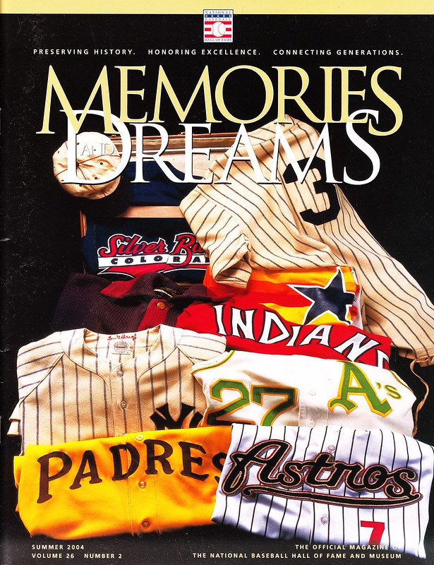
If you become a member of the Baseball Hall of Fame (not an inductee, but a paying supporter), one of your perks is a subscription to the Hall’s magazine, Memories and Dreams. The Summer 2004 issue of M&D had a uniforms theme, and Hall curator Tom Shieber recently provided me with a copy, the cover of which is shown above. About two-thirds of the issue’s articles are uni-related, so I’ve scanned those sections and will be sharing them with you here today.
One of the interesting things about the magazine is, frankly, how weak some of it is. I don’t mean that to sound harsh — a lot of my own uniform coverage was probably pretty weak back in the summer of 2004 (I hadn’t yet made the jump to ESPN, and this blog was still nearly two years from its inception). In the eight years since then, the availability of online information has grown exponentially, and the growth of web communities like Uni Watch has raised our level of knowledge and our standards for research and verification. We’ve also raised the profile of uni-watching in general. What was once viewed as a novelty is now taken seriously. I’m very happy about that, and you should be too — it’s something we’ve all accomplished together.
Okay, here we go, one article at a time, beginning with a small message on the inside front cover (for all of these, you can click to enlarge):

Not much going on here, but I included it for two reasons: First, it begins with the word “Fashion.” We never use that term here at Uni Watch, and I daresay that the magazine’s editors wouldn’t use it if they were planning a uni-themed issue today. It’s a good example of how the perceptions of uniform research and documentation have shifted.
Also, the text on this page mentions “the wool knits of yesteryear.” Actually, the old wool flannels were woven, not knitted. Again, this is the type of error that was common back in ’04, but less so today.
Next up is a note from the Hall’s then-president, Dale Petrosky:
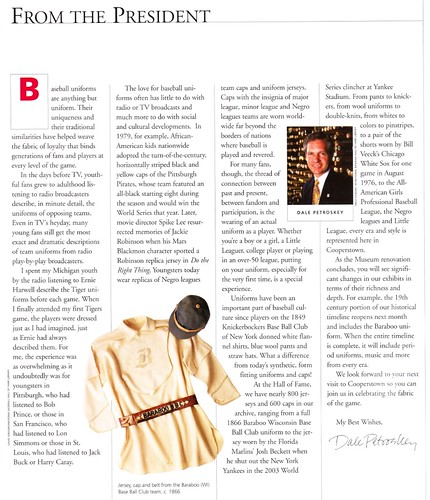
A nice enough essay, although it includes two bad factual error: Spike Lee’s character who wore the Jackie Robinson jersey in Do the Right Thing was Mookie, not Mars Blackmon (that was his character in She’s Gotta Have It), and the White Sox wore shorts multiple times, not just once. In 2004, however, I too believed that there had been only one Sox-in-shorts game. Again, we know a lot more now than we did eight years ago.
The next article is a piece on memorial patches and armbands by Tom Shieber:
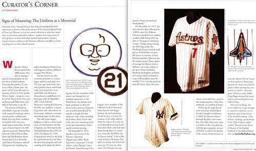
As usual with Tom’s work, this piece is very strong. Still, I bet he’d add some additional details if he were writing the same piece today, because we’ve discovered a few things in the past eight years. For example, we now know that the Pirates initially memorialized Roberto Clemente with a strip of black cloth during spring training before switching to the more familiar “21” patch.
Next up: an overview article about baseball’s evolving uniform styles:
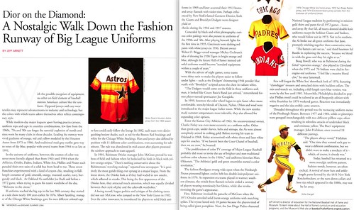
The headline, with its references to “Dior on the Diamond” and “the Fashion Runway,” is embarrassing — another measure of how uniforms weren’t really being taken seriously, even in an article devoted to them. The article is peppered with seamstress-themed groaners like “Threaded throughout this period…” and “the idea swiftly came unsewn,” but the basic information being provided is generally solid enough.
Next is an article on the history of women’s baseball uniforms:
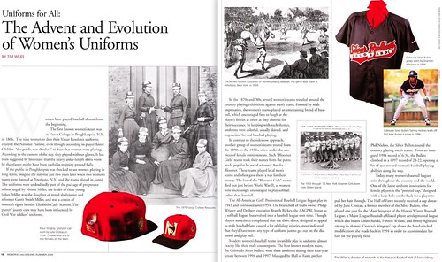
I was excited to see this one, since it addresses a topic that most writers have largely neglected, myself included. And while it’s not exactly a scholarly research paper (it’s hard to cover 150 years’ worth of history in 800 words), it’s still a good primer. I wish the magazine had included more treatments of niche uniform topics like this.
Here’s another niche treatment, and a good one — a look at Little League uniforms:

This is an excellent piece, full of good information and featuring one of the best photos in the entire magazine. Highly recommended reading.
Continuing with the youth uni theme, the next piece is a reminiscence by Hall PR director Brad Horn, about his first tee ball jersey:
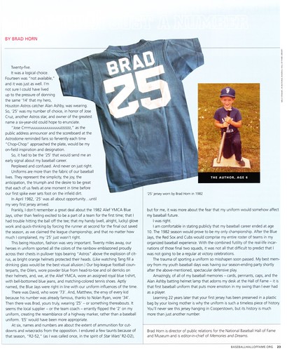
This is basically a heaping platter of goodness topped with awesome sauce. The story, the voice in which it’s told, the photos, the works — home run.
Finally, there’s a piece about what Jackie Robinson’s jersey represents:
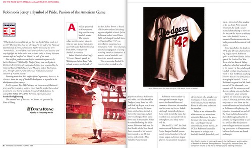
This piece was written several years before MLBers began wearing No. 42 on Jackie Day, so it doesn’t address the most obvious uni-related storyline of Robinson’s legacy. It’s basically a standard Robinson tribute — strong, powerful, but probably nothing you haven’t read before.
And that’s it. Well, that’s almost it — there was one other uni-related article in this issue, but I’m not sharing that one with you today, because it figures heavily in another piece I’m working on. More details soon.
Start ’em really young: Jon Springer, who runs the excellent Mets by the Numbers site, was recently a guest speaker at his son’s kindergarten class in Brooklyn. “I spoke to them about uniforms and why they have numbers on them, with the idea of teaching about organization and using numbers in a non-arithmetic way,” he explains.
Jon brought along a bunch of blank jersey-shaped cut-outs and some number cut-outs, which he invited the kids to use as the basis for their own uniform designs. “They had a good time with it,” he says. “For a bunch of five- and six-year-olds, they did pretty well!” True enough, as you can see in this slideshow (or, if you’re reading this on a device that doesn’t support Flash slideshows, click here):
Uni Watch News Ticker: Yesterday was Father’s Day, so MLB players wore blue ribbons and and blue accessories for prostate cancer awareness. ”¦ Reds skipper Dusty Baker took things further by wearing red, white, and blue wristbands. He had them on his other arm, too. … “My Atlanta-area adult baseball league has a team called the Eskimos,” says Steve Vibert. “An Eskimo in Georgia is rare enough, but a baseball uniform with purple pants? Now that’s rare.” And thank goodness for that. … Fun story about how the old Chattanooga Lookouts stadium is being repurposed as an Ebbets Field stand-in for the movie 42. “The city of Chattanooga is hoping this will attract other filmmakers to come use the stadium, as it was sitting in a pretty bad state of disrepair before being upgraded for the current film project,” says Chris Holder. … Italian midfielder Daniele De Rossi has been wearing one short sleeve and one long (from Ben Humphries). … New kits for Aston Villa (from Nick Popczun. ”¦ I see London, I see France, I see Denmark striker Nicklas Bendtner’s underpants, complete with the logo of a betting company printed on them. Key quote: “The Danish Football Association could also take action, because it had an exclusive deal with another company.” In other words, expose yourself all you want — as long as you keep it in the corporate family. Douchebags. ”¦ Speaking of branding douchebaggery, Adidas is the exclusive sponsor of Euro 2012, one result of which is that a member of the grounds crew in Donetsk had to put duct tape over the logos on his Nike footwear (from Christopher Peterson). ”¦ Here’s more info on Brian Roberts’s double-flap helmet. ”¦ The Lakeland Flying Tigers were rained out on Thursday — and how (from Wayne Koehler). ”¦ Small note at the very bottom of ths article explains that Rockies pitcher Alex White wears No. 6 because “it’s just always been what I wore growing up.” And while we’re at it, here’s why Kyle Drabek wears No. 4 (both of these from Stefan Fatsis). … Bob Gassel sent along this great shot of the White Sox Soxettes, from 1969. Can anyone tell what’s on their caps? … In a related item, here’s what the Redskins cheerleaders used to look like. “Maybe it’s an early pic of Elizabeth Warren?” quips Brendan Slattery. ”¦ Here’s an infographic on the colors of the shirts and shorts worn by French Open winners (from Jay Sullivan). … New basketball floor for Michigan State (from Mark Miotto). … Joe Caito points out that Arizona has two bare-handed hitters. That’s Seth Mejias-Brean on the left and Alex Mejia on the right. ”¦ This is interesting: On Friday night, Josh Reddick of the A’s was wearing either green stirrups over gold sannies or green socks over gold socks. We can’t be sure, because he’s a pajamist. Doesn’t make sense that he’d wear stirrups under his PJs, and even the two-sock format would be surprising. Either way, I love the gold undersock (from Mark Murkhardt). ”¦ Early last week I Ticker-noted that Daniel Murphy was using Tim Byrdak’s bat. By Friday he had switched to using Jason Bay’s bat, which is like getting a blood transfusion from an anemia patient (from Brooks Baker). ”¦ In a related item, Bryce Harper was using Tyler Moore’s bat on Friday night (from André Torres). … Terence Kearns’s girlfriend, Cynthia, looks sharp in her blue/orange hoop socks and Mets Chucks! ”¦ New away kit for Juventus (from Leo Thornton). ”¦ Cycling news from Bernie Langer, who writes: “Buried in this article it says that when Andy Schleck received the 2010 yellow jersey this May (since Alberto Contador was stripped of the title), it was the yellow jersey of the 2012 Tour, not from 2010. The noticeable difference is the new jersey doesn’t have a swoosh like the 2010 version did.” ”¦ Nike has unveiled the Olympic uniforms for China (from Leo Thornton). ”¦ Rafael Furcal went up to bat left-handed on Saturday while wearing a right-handed batting helmet. After one pitch, he realized the mistake and went to the dugout for the proper lid (from Jeff Scott). … Here’s something I’ve never seen before: a memorial on the cap brim. That’s Kent State, and the “CM” is for catcher Jason Bagoly’s mother, who died on Thursday (from Timothy Burke). … Dante Bichette showed up in Cooperstown for Saturday’s Hall of Fame Classic game in a TATC jersey (from Cooperstown Mayor Jeff Katz). … Terry Proctor used Ripon Athletic’s online uni builder to create a nice Uni Watch baseball uniform (we’ll forgive the hyphen). “You can access this feature yourself by going to Ripon’s site and clicking on ‘Uniform Designer’ in the toolbar,” says Terry. “You can do football, baseball, softball, and both genders of basketball among others. In the baseball section you can make the Astros’ ‘Tequila Sunrise jerseys and pants in any combination you want. The lettering and graphics choices are limited to the pull-down menu, but it’s great fun to play with. In the men’s hoop section under the “Concept Looks” the old favorite UCLA/Celtics uniform with just braid on the shorts is shown. Also the old 1950s’ NY Knicks barberpole-striped jersey and shorts look can be created.” … Tyler Greene suffered a torn pant leg for the ages on the last play of Friday night’s Cards/Royals game (from Caleb Yorks). … New uniforms for the Argentine national rugby team. “The new design is from Nike instead of Adidas,” says Benjamin Blum. “It gets rid of the horizontal flag-themed stripes (which I liked because it’s a classic rugby design and it’s a nice connection to the striped jerseys of the national soccer team) and replaces it with a generic design that has no connection to Argentinian sports. Thanks, Nike.” … Here’s a doozy of an ugly uniform. That’s the Binggrae Eagles, a Korean team from the late ’80s. You can see the uni in action here (from Scott Walker). … The Rangers wore 1980s throwbacks on Saturday night, including batting helmets with a red “T” logo. But Ian Kinsler’s helmet had a white logo (from Kyle Johnson). ”¦ Opening Day throwbacks on tap for the Billings Mustangs (from Kenn Tomasch). ”¦ Speaking of throwbacks, Southern Miss will wear this design for the homecoming game against Marshall and possibly one other game. Interesting that they’ll be wearing white at home. ”¦ The Beatles played Metropolitan Stadium in Minnesota on 8/21/65, which explains why Paul McCartney was warming up with a Twins footlocker in the background (nice find by Matt Harris). … Crocs are becoming popular among prison inmates (from Tris Wykes). … Willie Harris has always been a double-flapper, including his first stint with the Reds earlier this season. Then the Reds sent him down to minors before recalling him this past Friday, and now he’s going single-flapped. Might just be because the Reds are on the road and didn’t have a double-flapped helmet on hand for him, so I’m not taking his name off the list of double-flappers until I see him play in Cincy. … We’ve seen JrOB, but here’s a real rarity: SrOB. That’s Brandon Johnson, who plays for the Amarillo Venom of the Lone Star Football League, a small-time arena operation (big thanks to A.D. Fowler). … Elian Herrera of the Dodgers is usually a pajamist, but he wore some picture-perfect stirrups on Saturday (from Marcky Marc). ”¦ Ah, crap: The trademark symbol has reappeared on David Dejesus’s jersey. That photo is from Friday — two days after our blog entry about the symbol’s disappearance — and his jersey logo was ” ®”-adorned on Saturday and Sunday as well. Someone at Majestic must have been reading. ”¦ In a related item, John Sheehan took the ” ®” issue into his own hands over the weekend — literally. … A Connecticut high school is changing its Indian-based logo (from Kurt Esposito). ”¦ Japan’s wrestling uniforms for the Olympics have a tiger’s head (from Jeremy Brahm).
Looking ahead: I’m going to be off the grid for most of today, because I’m teaching a class at the School of Visual Arts. But I have something big slated for tomorrow (although it could be pre-empted if anything uni-notable happens today or tonight, of course). See you then.
typo in the ticker- Elian Herrera of the Dogers
Thanks — now fixed.
Herrera went 3-4 in Saturday’s game. Let’s hope he’s superstitious!
so what is uni-watch’s stance on Steve Vibert’s eskimos?
May I venture a guess that the Eskimos play in the Atlanta suburb of Duluth?
Most of them live in Marietta, GA, so they whine when they have to make the drive to our home park in Lilburn, GA. But boy, can they rake.
Wow, what a haul [/sarcasm]. I guessed Duluth as a play on/homage to the link of the NFL.
Having gone to a few metal concerts in Atlanta and being a passenger in Atlanta traffic, I think I’d complain too, even if it is only a few miles. Between the fun of attempting to cross 4 or 5 lanes of heavy traffic to get into an exit lane, and the ridiculous number of “Peachtree” streets (seriously, from Wikipedia: there are 71 streets in Atlanta with a variant of “Peachtree” in their name)… ugh. Driving in & around Atlanta sucks.
The, “From the President” piece was a mess. It was the 1971 Pittsburgh Pirates that had an all African-American starting 8, not the 1979 team. So to declare that 1979 Pirates inspired African American kids across the land to wear the Pirates “pillbox” cap is very strange. Thanks for posting the magazine.
Man, that is suck.
The 1971 Pirates had several Latin-American players.
They may have been of African descent, but they were not African-American.
Yes, the 1971 Bucs fielded the first all-minority lineup in MLB history in a 10-7 win over Philadelphia. This historic achievement was the subject of a book, “The Team That Changed Baseball”, published a few years back.
You are correct about that, I think I was distracted by the notion that there was wide spread pillbox hat wearing in the late 70’s. My apologies.
Roberto Clemente was African-American? Who knew (and why have they been telling us he was from Puerto Rico all this time)? Did anyone tell his parents?
Well, by virtue of the fact that he was born in Puerto Rico, he was a US citizen. And since he did have African ancestors, you could argue that he was, indeed, African-American.
Tying this in perfectly to Paul’s comments about the female ball players, I was asked to umpire a slo-pitch tournament this weekend and there was an all-female team playing. They fared fairly well against the co-ed teams, but the one item that had a couple of uniform-conscious people on my diamonds buzzing was the fact that they wore skirts like tennis players do instead of ball pants or shorts.
Needless to say, they looked quite good in their chosen uniforms as far as female ball players go, and I was impressed with their original idea for a uniform in today’s day and age. While they didn’t win the tournament, they certainly caught the eyes of a few of us.
How did they slide?
Long socks and biker/slider shorts underneath their skirts prevented them from tearing up their legs. It was like watching 10 tennis players play softball.
One of the women – I think it was their lead-off hitter? – was extremely fast. She may have been a sprinter in her former high school/college days in watching her run. Anyway, she was very slim from top to bottom, and she slid head-first a couple of times at second base when strecthing singles into doubles.
The Dante Bichette link doesn’t seem to work, as I get this message from Facebook:
This content is currently unavailable
The page you requested cannot be displayed right now. It may be temporarily unavailable, the link you clicked on may have expired, or you may not have permission to view this page.
Now fixed.
Last week, Japan Olympic Badmminton unis, this week it’s that country Olympic Wrestling uni, anticipation is building, there’s a certain electricity in the air, as we wait for Japan’s Olympic Fencing outfits?
Speaking of Eskimos, it’s sad to see the Green Bay Packers of the CFL look so much into uniform wilderness.
Benjamin Blum is SO right about the bad Nike-fication of the Argentina rugby team. To jettison one of the world’s great looks – horizontal sky-blue and white stripes – for a bland, nowheresville solid darker blue is, well, to quote our boss, really stupid.
That is Argentina’s change kit, apparently. Here is the home jersey:
link
No hoops either.
The jerseys on the ticker are apparently the warm-ups for the team.
If those weren’t warm-ups they would have a connection to Argentinian sports (unlike the claim made in the ticker). Argentina wears darker blue jerseys for their change kit, with typically only white accompanying them (usually the collar and the cuffs), recently Adidas has added more to them, including their 3 stripes, and in the past few versions light blue elements.
Now I definitely feel that going away from the stripes is stupid (the actual kit does not have the stripes, though it definitely has the light blue and white), but they are still very connected to Argentinian sports.
Big fan of those Japanese Wrestling “singlets”. Has a dash of “Pro” wrestling in them.
They should replace olympic wrestling with a “pro” style event instead. Each country would provide 2 competitors who would wrestle in a 10 minute choreographed match, which would be scored in a way similar to ice skating or gymnastics.
They’d probably also need to provide the ref to make something like this work.
And there’s really no need to replace the existing events. They can coexist.
They’d probably also need to provide the ref to make something like this work.
Good point. Might as well make it a 5 person team and a tag match to allow for possible illegal interference from either side. (You know, the “steel” chair to the head while the ref is distracted sort of thing.)
Eskimos?! You realize that Eskimo is no different than Indian, right? I’m sure we should all be offended. When is Uni Watch going to have the redesign contest?
Nice. Can I insert the eye-rolling emoticon here or what?
“A Connecticut high school is changing its Indian-based logo and nickname”
from the article:
“The school’s teams will still be the Warriors, but a new logo will be selected this fall”
Thanks — will change “logo and nickname” to just “logo.”
Great post, Paul. I went to high school with Brad Horn. He was a year behind me, but we had several mutual friends & acquaintances. It’s always cool to see someone you’ve known in the past working in a position like that.
Actually, that is Ian Kinlser in both 1980’s Texas Rangers photos, the red part of this helmet sticker must have come off.
I noticed he had the white logo when he was batting in the 6th inning. When he came up to the plate 7th it was back to red. Someone must’ve noticed…
Have these sneakers from Adidas received discussion on Uni-Watch:
link
At least Jeremy Scott gets the blame for creating them. Adidas should be to blame for allowing him to design so much product, though, and obviously, pushing this to production (seems like JS has free reign to do whatever the eff he wants, judging by the garishness of all his other pieces).
they’ve been scrapped.
enjoyed the piece by Brad. good to know he still has his Z5 jersey.
I think de Rossi is wearing one long sleeve under the short sleeve jersey so nothing unsual regarding the jersey itself. The unusual is wearing the undershirt uneven.
link
I’m sure I’m in the minority, but what they’ve done to Engel Stadium is a travesty. If you dig deeper, they’ve torn down the iconic outfield wall with the cola bottles on top, torn out the dugouts and replaced with wood facades, and more. Yeah, it was falling into disrepair and this is better than the bulldozer. But damn. Five years from now, the wood facades will be rotting and collapsing…then what?
Good luck at SVA – can’t wait to hear how it went.
Great shirt featuring the three numerical styles of Pittsburgh. Pretty cool.
link
that website is a fantastic collection the worst shit you could possibly wear on your back. it actually makes me a bit sad for the city.
Geno, thanks for the shout out, we can’t all paint hockey pucks for a living I guess.
Am I just missing something or is there no link to Terry’s Uni Watch baseball uni?
I was just going to post the same question…….
“We can’t be sure, because he’s a pajamist.”
If only someone here knew a member of the A’s organization…
Just playing devil’s advocate here, but why doesn’t it make sense that he would wear sanies and stirrups under pajama pants when guys will wear the same under their jeans to work on Fridays. Blouse those wranglers fellas :)
The guys who wear the stirrups under their jeans are not normal. (No offense intended)
Most people aren’t going to wear something special if they aren’t intending to (or at least hoping to, depending on the specifics of said special item) show it off.
“The guys who wear the stirrups under their jeans are not normal. (No offense intended)”
~~~
oh, no…im sure none was taken either
Most people aren’t going to wear something special if they aren’t intending to (or at least hoping to, depending on the specifics of said special item) show it off.
That idea may apply to strippers, Jeff, but it’s entirely false unless you’re an exhibitionist.
My girlfriend has no intention of showing off her sexy lingerie to anyone, but she wears it because she feels sexy in it. And I happen to think she is very sexy in it.
Unless, of course, that was what you were meaning with the “depends” portion.
I think stirrups at work are the same way. Not many people would get the idea behind wearing them to work, but the return to stirrups in baseball is a great concept.
FYI – one of the two other stirrupped individuals in my league can now be disqualified. He wears stirrup socks that look remarkably like the real thing due to the fabric. We hammered his team last Wednesday to improve to 7-0.
‘Unless, of course, that was what you were meaning with the “depends” portion.‘
Depends? Is that the sexy lingerie you were referring to?
dudes…please
we’re already past the WAY TFMI portion of this post
So, Korean teams use Korean script on their jerseys, but Japanese teams use English?
Loved the Macca pic…were I a Twins AND Beatles fan, I’d have to frame that.
Korean writing (called hangÅl by southerners and chosÅn-gÅl in the north; never reverse this) has fewer strokes per character and can be perceived a little more easily even at small sizes.
The Chinese characters that are used to write Japanese names are more visually complex and turn into black blobs if they arent written large enough.
But since a typical Japanese surname is two characters, you often see practice gear (for high school kids, for example) with the player’s name written vertically by hand and taking up the player’s entire back, with the character stacked on top of each other. Here’s a blog with some examples of players doing that on the front, where the team name would be on their “game” jerseys: link
Incidentally, Korean NOBs typically have the player’s full name. This is in part because three characters can fit on a player’s back as easily as two, and also because there are too few surnames in Korea (20% of the population is named Kim) to identify anyone without using a full name.
I love that the link you supplied for Memories and Dreams (link) has a “who am I?” (my plaque reads…) trivia questions with the answer literally on the plaque directly to the left of the questions. Scholastic Magazine had more difficult challenges.
“Still, I bet he’d add some additional details if he were writing the same piece today, because we’ve discovered a few things in the past eight years. For example, we now know that the Pirates initially memorialized Roberto Clemente with a strip of black cloth during spring training before switching to the more familiar “21″ patch.”
That’s in the article, just to the right of the fold…
Interesting anecdote about the A’s/Munich Olympics — did not know about that until today…
It’s amazing how much better the late 90’s Angel’s logo looks on a hockey sweater over a baseball cap. I guess context is everything.
link
Maybe the Anaheim Ducks can co-opt it, hey you can just say the wings are duck feathers….
That was (and always will be) a terrible Angels logo. Reeks of that Disney shit. Looks totally Minor League.
Apologies if it’s been mentioned here before but I just an email from that Nats that they will be hosting a link on July 5 v. San Francisco. The teams will be throwing back to the 1924 World Series with Nats v3.0 dressed as Nats v1.0 and the Giants dressed as their New York selves.
*just received an email
it’s nice how the nats appropriate the history of a franchise they never were and ignore the history of the franchise they came from
that being said, i’m psyched for the throwbacks…but i’d love to see them break out the best uni that franchise ever had
Yeah, I don’t know if the Twins were consulted first.
Nats v3.0 would have to wear those unis if they ever played a TBTC game against the Rangers, otherwise they’d tear a hole in the space/time continuum.
You don’t think the Rangers will pitch a fit over this since they own the Senators lineage and wouldn’t let the Nats be named the Senators?
We shall see. Nats v3.0 dressed as Nats v1.0 in San Diego last year and the Rangers didn’t stop that.
I’m guessing that if the MLB says it’s cool, the Rangers can’t actually do anything about it.
I agree about that Expos into uni…virtually flawless.
I could be wrong, but the franchise that ultimately became the Twins was known officially as the Nationals and that team did not become the Senators until sometime after Griffith’s death and the move to Minnesota.
Also, I think the present-day Nationals (former Expos) get away with throwing back to the pre-1960 DC team so long as “Senators” does not appear on thier uniforms (though the ‘curly W’ was given to the Nationals, the Rangers still own the rights to the Senators monicker)
The Twins (a/k/a Nats v1.0) adopted the Senators nickname link, after Clark Griffith’s death but before the move to Minnesota. They wore the name “Senators” on their link and link jerseys in 1959-60.
Viva Le Grand Orange!!
I think it’s understandable the Nats would be doing the 1924 throwback, since that history occurred in Washington. Let’s be real and ask a Nats fan how often they ever see Expos gear in Washington or inside the stadium.
And few Nats fans ever heard of Rusty Staub, even though he was a good player. By contrast, more Mets and Tigers fans have memories of Staub because he played in those cities.
Washington fans have some residual feelings for the Senators, not the Expos.
Buzzfeed.com has an interesting article today on the most ridiculous Olympic team uniforms/outfits of all time:
link
The photo of Ian Kinsler’s white T on his helmet looks kinda weird to me. It looks like there might just be a glare on the helmet. You can see a white outline in the T with a darker color inside. Maybe they didnt have a single sticker made, but put a red sticker on top of a white sticker and the red one fell off.
Also, the previous picture showing the red T is also a pic of Kinsler. He is only one of two position players on the Rangers that normally wear their pants up. David Murphy is the other, and his are normally not as baggy as Kinsler’s.
link
There are some other guys who occasionally go high cuffed, but these are the only two who saw playing time that day who do so. The rest of the Rangers are habitual pajama pantsers.
In this game Robbie Ross also wore his pants up showing some stirrup sock hyrbids. I guess thats better than his normal pajama pants. Plus, hes a pitcher so he wouldnt have been batting since the game was played in Arlington.
There is also another pic on the ESPN website that clearly shows Kinsler with a red T on his helmet.
link
Kinsler had the white T on his helmet the entire time he was batting and on the base path. When he returned to the plate in the 7th, it was a red T. I have more pics of this at other angles and it’s clearly white. Where should I send the pics?
The white T was during the 6th inning… Sorry, I forgot to mention that in my previous reply.
I just watched a video clip of Beltre’s 2 RBI double in the 6th, which brought in Kinsler. He is quite clearly wearing a white T. I watched the entire game and didnt notice this live. The pic I posted earlier is of him scoring in the 7th. I couldnt find any pictures or video of his earlier at bats, probably because the Rangers sucked until the 6th inning of that game.
If anybody has some earlier screen grabs or can find some pics of his earlier at bats, it would be interesting to see if he wore the white T his first two at bats or just in the 6th.
Good call on the Bendtner underwear-ad nonsense, but the bigger douchebaggery was that his fine well exceeds those given out for racist abuse, as you can see in this Guardian article: link
I’m curious to know both what the fans actually chanted and why exactly a team should be fined for actions of the fans which it doesn’t really have any control over. I mean, it’s easy enough to toss a drunk fan out of a game or whatever, but if half the damn stadium is chanting something, you can’t exactly stop it, can you?
You actually do stop it by fining the club, or more importantly deducting points.
By doing that you force ordinary supporters to start standing up to inappropriate chanting etc to protect their team and their own reputation.
Many years ago it was not unusual in England for bananas to be thrown on the picth if a black player was playing – such actions are now pretty well unknown, and because it has died out for most supporters the isolated perpetrators are clearly identifiable and are arrested.
The “chanting” was making “monkey noises”
I think tossing bananas was involved too…
Just in case any of you on the other side of the Pond are getting a bit confused about the Euro 2012, here’s the position for tonight’s end of group C games:
Spain – a win or a draw secures them qualification and top spot. If they lose, they could go out if Italy win.
Croatia – victory sends them through as group winners. A 2-2 (or higher-scoring) draw will also see them through. However, if it is 0-0, they are out. If they claim a 1-1 draw, Croatia will only be eliminated if Italy better or equal their 3-1 win over the Republic of Ireland. They are out if they lose and Italy win.
Italy – a defeat or draw means they are out. A win will send them through but only if Spain or Croatia win or it is 0-0 between them. If that game is a 1-1 draw, then Italy need to better or equal Croatia’s 3-1 win over Ireland. If they equal it, Italy will go through because they are ranked higher than Croatia by Uefa. However, if Spain and Croatia draw 2-2 or more then Italy are out.
Hope that clarifies things for you.
what’s this “Euro 2012” of which you speak?
Don’t worry your head about it Phil.
It’s something similar to a common currency but where Greece and Spain are doing well and aren’t looking for any help from Germany.
Croatia are back in their wonderful Checkerboards today, along with Spain in their meh change kit.
link
Ireland takes the prize for best kits, even though their performance has been subpar.
Viva Cassano! Fuerza Azzurri!
Great play by Ronaldo yesterday too.
This is more of a random question than anything in todays post and please forgive my ignorance but after watching some of the Euro cup recently I was wondering why don’t soccer cleats match the teams’ uni (kits) like most professional sports basketball, baseball and US football? BTW, I appreciate the non-matching look of all black, ‘old school’ boots but the neon and other bright colors seem a bit daft IMO.
Because each player makes his own sponsorship deals, so needs to stand out from his colleagues.
It isn’t a team thing – but individualistc.
So do the NFL and NBA players but they still match colors in their individual styles ?
Does anyone know why Darijo Srna of Croatia has blue tape(?) on his neck?
Kinesio tape.
link
I’ve seen people use the black-colored stuff, on shoulders, hamstrings, quads, etc.
Yep, his shoulder and ribs have been taped up throughout the tournament.
in regards to the Bichette TATC in the ticker- It’s been posted here a few times before. In fact, I posted back in June 2010 that when asked he said that the TATC jersey is the only one he has at home. As long as he does alumni games he’ll be wearing that jersey.
Is it just me or is ESPN or American media outlet trying to hype up the Euro 2012 by filming reactions of blonde female fans in slow motion after a goal or near goal? Gets pretty tiring after the 20th time.
Fred, noticed that as well. Not sure the average American is going to each 90+ minutes of Euro Cup for a occasional crowd shot. Pandering.
It’s not ESPN, they’re using the international feed for their video.
Not only that, but SI.com has a “Fans of Euro 2012” picture gallery that is mainly a pandering babe-fest. At least other sites have galleries with titles like “WAG’s of..” and “Babes of..” (I’m not too ashamed to admit I know this). You kind of expect more from SI and ESPN but oh well, they have to attract eyeballs somehow….
Nothing to do with the American market – the feed comes from the host production team.
Besides – there are actually some things that do NOT become tiring after a while. Roll on Brazil in the World Cup ;)
Wow. Guys complaining about too many babe shots???? I’m at a loss for words.
Some of us aren’t 17 years old anymore.
It appears there may be just one video feed for everyone as it appears the crowd reacts to seeing themselves on camera.
Also, according to this:
link
“The television signals from every venue in Poland and Ukraine will be delivered to the IBC for distribution to all broadcast partners.”
ESPN doing a cool Battle of The Ballparks. The outcome means nothing as it is voted on by the fans, but still cool. PNC Park #1
link
Just a question to all you obsessives.
Do I have a problem if I watch one match on my TV while having the other on my computer screen next to it?
I think this is a quite reasonable solution to a logistical problem. My wife just sighs and shakes her head.
:)
The only problem there is if the power goes out.
have you ever tried that with a third game on your iPad? and pixture in pixture on the tele?
yeah…
Looks like the year 2503 came a little early, as orange Crocs were being used by prisoners in Mike Judge’s Idiocracy.
link
I just added another reason to my “Why I Wouldn’t Last a Day in Prison” list.
oh, c’mon martay…you’d toss a mean salad
its a shame the nats didnt wear expos throwbacks last week wjen they aplayed in toronto.
there was also an expos 1981 reunion/ golf tournamt last week in montreal.
Two interesting things about the article from the ticker on the “42” film production in Chattanooga ( link ). First off, writer says “baseball outfits” in the article. But secondly and more uni noteworthy, it looks like the Dodgers are wearing grey road uniforms and the Cardinals are wearing their white home unis. It’s an odd juxtaposition in front of the Ebbets Field scoreboard. I wonder if they were filming from a different angle (i.e. home plate or the dugout)? Hopefully, for accuracy’s sake.
Those new Argentinian jerseys by Nike on the link look to be warm-up or training jerseys.
This is what their new (home) jersey looks like:
link
and here in action against France last Saturday:
link
Technically, the floor at Michigan State is not new, just a new paint job. See link