Click photos to enlarge
Wednesday was my birthday, so I celebrated the same way I always do: I threw myself a party at a local restaurant. For years my birthday party invitation has included the line, “Please, no presents — just your presence.” But this year I neglected to include that line (after all these years, I figured everyone knew the drill), and as a result several friends brought along some very nice gifts for me — nothing life-altering, but lots of small gestures that made me smile. Today I’m going to play a round of show-and-tell with them.
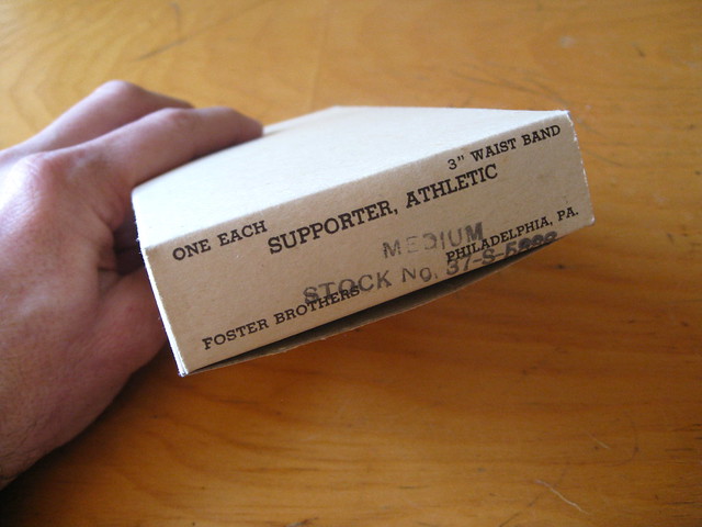
The closest thing to a uni-related gift came from my friend Liz McGarrity, who gave me the box shown above. It’s plain white on all sides, except for that one panel. I love so many things about it: the way it says, “Supporter, Athletic” (instead just “Athletic Supporter”); the misaligned rubber stamp; and the fact that dozens of these boxes were probably stacked up on a shelf in an old sporting goods store, all with their one printed panel facing outward. That’s a nice image.
The box also turned out to be a fine example of truth in advertising:
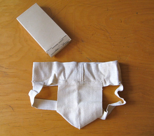
The truth-in-advertising trope continued with a colorful gift from my friends Jon Hammer and Karen McBurnie:
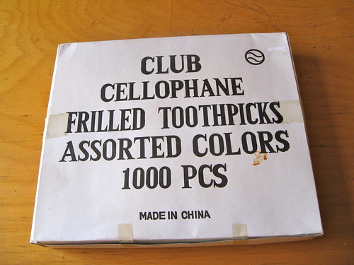
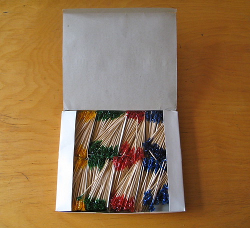
The box now containly only 900something of toothpicks, because we put several of them to good use in the course of the evening.
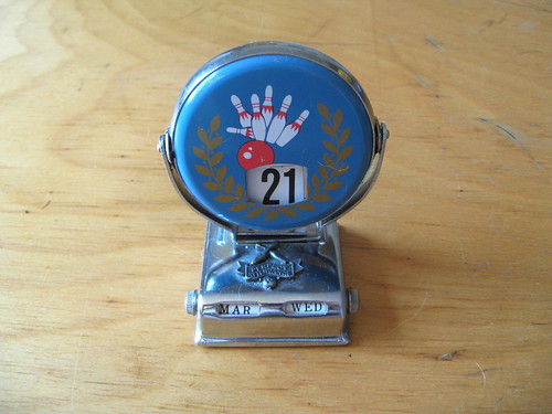
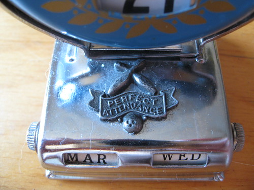
My friend Amy Fritch got me a cool bowling calendar thingie, set to the proper date — my birthday:
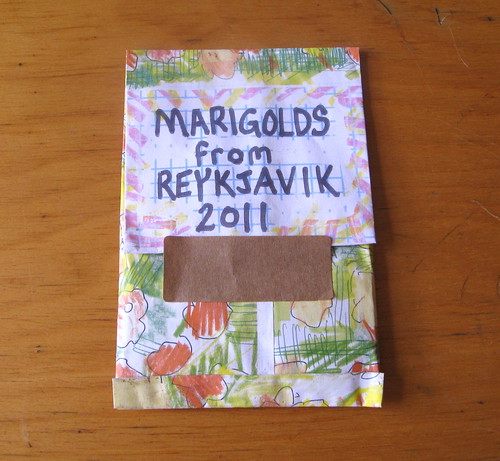
Last year my friend Aaron brought me a little houseplant (which I promptly killed — sorry, Aaron). This year, sticking with the green thumb theme, he brought me a bunch of flower seeds that he’d recently picked up in Iceland (!):
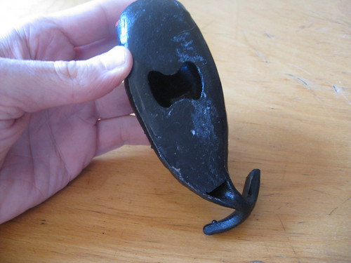
My upstairs neighbors Sam and Em are the best neighbors a guy could hope for — all the more so now that they’ve given me this groovy cast iron bottle opener shaped like ”¦ uh, what is it, exactly? A whale shark? Something else? Take a look:
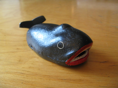
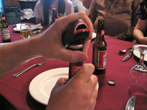
I can assure you that the bottle cap in that last photo never stood a chance.
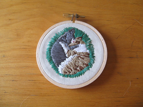
The lovely and talented Kirsten Hively used this 2007 photo of Uni Watch mascots Tucker and Caitlin (a rare shot — they’re buddies but almost never snuggle like that) as the basis for this beautiful little embroidery:
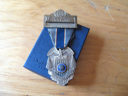
Kirsten also got me a very special vintage item — this badge from the American Legion’s 23rd annual national convention, held in Milwaukee in 1941:
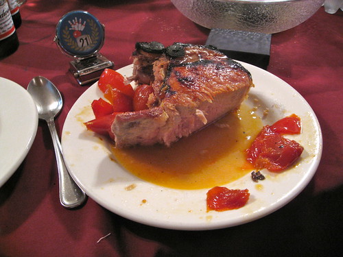
Not a bad haul, right? Lucky fella. My only regret is that I was having such a good time that I didn’t photograph much of the food except for this spectacular pork chop, which everyone got a piece of:
———
In some ways, the best birthday present of all took place the following day, when my friend Heather McCabe took me to a very special place: the Danish Athletic Club in Bay Ridge, Brooklyn, which is celebrating its 120th anniversary this year. It appears there will not be a 121st, as the club is likely to shut down at the end of the year due to changing neighborhood demographics and what we might politely call actuarial realities.
The DAC is precisely the sort of place I love, and I’m a little embarrassed — upset, even — not to have known about it until Heather recently told me about it (she was brought there during her youth by her great aunt Mackie, who lived in Bay Ridge at the time). It feels like a cross between a Wisconsin supper club and an Ohio VFW hall, which is another way of saying it’s pretty much Perfect. You can see photos and descriptions of our visit here.
———
My amazing extended birthday continued on Saturday, when my friend Robin and I drove up to Connecticut to interview a guy named Robert Rosencrans. He was hugely instrumental in the development of cable television (including a lot of sports-related programming — it you’re curious, there’s a massive interview with him here), but I was interested in him because I have his mother’s report card from when she attended the Manhattan Trade School for Girls nearly 100 years ago. She went on to design Mamie Eisenhower’s inaugural ball gowns in 1953 and ’57. It was a great visit and a great interview — you can learn a little more over on the Permanent Record blog.
Thanks for indulging me with all this non-uni content. Things will get back to normal tomorrow. Oh, and thanks to many, many of you who sent birthday wishes my way via e-mail, text, Facebook, etc. on Wednesday — you’re all aces.
Uni Watch News Ticker: New NFL gear — Nike T-shirts and New Era caps — is showing up at retailers. It’s all embargoed until April 1, but a few insiders who prefer to remain anonymous have sent me some photos of the new stuff. Now, I never buy any of this crap, so I’m admittedly not the target market here. But for those of you who do purchase this kinda stuff, is it OK by you that the T-shirts are just variations on the same Nike slogan? Is it OK that those two T-shirts with the hand holding the helmet are essentially the same illustration? I’m not trying to be a wise-ass here — I really want to know if that’s cool with you. ”¦ As you’ve probably heard by now, the Heat all wore hoodies on Friday as a gesture of support to Trayvon Martin’s family and in response to truly repellant comments by Geraldo Rivera. That gesture prompted a thoughtful article by Robert Silverman. Still waiting for the sports world’s preeminent hoodie wearer to weigh in, however. ”¦ In case you didn’t hear the backstory, Baylor was not allowed to wear its neon uniforms for yesterday’s game against Kentucky and had to wear neon-trimmed black instead. ”¦ You can see the Boeing douchebaggery patch that the Mariners will be wearing for their two games in Japan in this exhibition game shot (from Jeremy Brahm). ”¦ Here’s UND’s new Sioux-free hockey jersey. ”¦ Fun article about the history of No. 15 with the Jets. ”¦ Reprinted from Friday’s comments: Looks like Nike is getting on the neo-Zubaz bandwagon. … Check out the old Bullets socks being worn by Wes Unseld (from Matt Beahan). … Bruce Richards was at Thurday’s Hornets/Clippers game and saw a fan wearing a basketball-themed yarmulke. … Cross-dressing alert: Some Louisville hoops players have been practicing in MMA headgear (big thanks to Aaron Bernstein). … Katie Baker’s a fine hockey writer and a cool chick (I got to meet her last year at the ESPN Pop-Up Magazine thing, which we both participated in), but I’m not sure I agree with all of her hockey uni rankings. … “There are two different 5K road races that are using the same fun concept of covering runners with colored dust while they run,” says HHH. “The runners wear white T-shirts (essentially a blank canvas) and at different colors of dust are showered on them at various points in the race. By the end of the race, everyone looks like a Jackson Pollock painting. One race is called The Color Run and the other is Color Me Rad.” … For those who want more on the topic of Native American team names and mascots, it turns out there’s a whole book on the subject. “I used it when teaching a geography graduate seminar on Race and Ethnicity at Florida State University (which was certainly an interesting place to discuss the topic),” says Jonathan Leib. … The new album by the Columbus stoner-rock band Mount Carmel features a cover design based on a 1972 baseball card. … PJ Berry of the Pittsburgh Power (Arena football) was wearing some crazy hoop socks the other day (screen shot by Matt Watson). ”¦ Todd Densen was recently on vacation in Israel and met a Bulgarian fellow with some really interesting socks. ”¦ Attention DIYers: Here’s a nice set of authentic Bears letters and numbers. ”¦ There’s another new teevee show about the memorabilia biz (from Rocky Lum). ”¦ John Kenealy reports that the Norfolk Southern Railroad is honoring its predecessor railroads that it has annexed/merged with by painting some locomotives in the old paint schemes. Further details here. ”¦ UNC lacrosse has gone BFBS (from Garrett Schabb). ”¦ Kudos to Archibishop Santorum, who did something everyone should do at least once: go bowling in Wisconsin. ”¦ Look at the photo of David Garrard in the center of this shot. “In what situation would the Jaguars and Colts both be wearing white?” asks Stuard Kushner. ”¦ Man, striped stirrups don’t get any better than these Iowa beauties (big thanks to Jeff Funke). ”¦ Interesting coincidence in Saturday’s Frozen Four game, as the refs wore shiny helmets and the linesmen wore matte (from Jerry Kulig). ”¦ Not an ideal photo, but when Courtney Fortson played his first game with the Rockets after being signed from the D-League a couple of weeks ago, he went NNOB (from Jonee Eisen). ”¦ Kenn Tomasch reports that some guy in South Dakota has a buttload of hockey jerseys. ”¦ Hmmm, a team that represents the whole planet? “One of the schools playing in the Spring High School Invitational Tournament in Japan is called Earth Environmental High School,” explains Jeremy Brahm. ”¦ In case you were wondering about the little duck pins that Tiger Woods and other golfers were wearing this weekend, here’s the explanation (from John Okray). ”¦ Ana Ivanovic and Daniela Hantuchova played each other yesterday in the Sony Ericsson Open and wore identical outfits. “Doesn’t Adidas make any other designs?” asks Brinke, not unreasonably. ”¦ Sad news out of Mets camp, where super-stirruped prospect Corey Wimberly has suffered a broken hand and will be out five weeks.
Tomorrow: The 14th annual Uni Watch MLB season-preview column. Putting the finishing touches on it as we speak!
But for those of you who do purchase this kinda stuff, is it OK by you that the T-shirts are just variations on the same Nike slogan? Is it OK that those two T-shirts with the hand holding the helmet are essentially the same illustration? I’m not trying to be a wise-ass here – I really want to know if that’s cool with you.
Well, it’s hardly a new development. Team merchandize has been somewhat standardized for years.
Yeah, the merchandise has been standardized since 2001, but Reebok didn’t have the same kind of proprietary corporate slogan, so we’ve never seen anything with the double cookie-cutter feeling of this “Copyrighted Nike Catchphrase (plus) Name of Team Here” line.
Longer than that. Maybe not quite to the same extent, but still…
link
Same design for every team, just color/logo swapped.
Man, I had that Jaguars one pictured there with the original logo on it when I was a kid. I wish I could find that now.
I still have my Eagles one hanging in my closet.
True enough – what’s the year on that?
The first year I can remember standardized jackets in MLB was 1994.
That would be correct for when Jaguars merch would have come out, but I remember I was late hopping on the Starter jacket trend, so that makes me think it was ’92 or ’93 when they came out.
When we moved to SF, one of my first visits was to Nike town- where I promptly bought a couple of 49ers sweatshirts. Wearing one right now, a classic red with NINERS embroidered in white with gold trim, and ‘football’ underneath. Tiny swoosh @ the collar in front, embroidered NFL shield at the neckline in back. Fits perfectly even to this day..it’s really gorgeous. So I don’t know how much (if any) new Nike stuff I would purchase- I don’t see how they can improve this one.
Maybe that T shirt.
Anyone seen this before? Geek Hockey Jerseys. link
Love it!
Yup. Earlier examples been show here before. I’m expecting my Tardis jersey any day now.
I think the first batch of NFL Nike/New Era merch is pretty bland. I don’t really want crazy, but I’m just kind of in the “MEH” boat right now.
Also, have we discussed about Reebok selling Peyton Manning Broncos shirtsies? Guess they’re just trying to get those last remaining bucks…
Is that Reebok selling the Manning jerseys, or is it other entities (like the Broncos) taking advantage of the opportunity to sell off the last of their Reebok inventory?
Well I would have to think that would be more a Reebok thing. I doubt the Broncos had a plethora of blank vector emblazoned shirts that they had Reebok print up Manning’s name and number on.
Meanwhile, Reebok knows that plenty of people would clamor over owning the first piece of Manning/Broncos merchandise.
It would be just plain bad business for Reebok NOT to take advantage of the opportunity, whether they’re on the way out the door or not.
Maybe especially when they’re getting off at the next exit.
True, but even that is, I suspect, using up old inventory. His trip to Denver was just booked last week; it’s not like Reebok can magically will these jerseys out of the manufacturing ether.
We’re saying the same thing, I guess.
I don’t imagine they just let unused inventory lie there.
Yes, I don’t believe Reebok is printing more jerseys at this point. T-shirts, still, but not jerseys as far as I know.
Could that Garrard/Colts photo be from the Pro Bowl? Garrard was on the AFC team at the Pro Bowl in Miami a year or two ago.
No, because Garrard and the unidentified Colt are wearing their respective team’s uniforms, and the Pro Bowl uniform protocol (unfortunately) doesn’t call for that. If it were the Pro Bowl, they would have the same uniform.
A photo shoot for football cards?
Is it possible that Garrard was helping to call plays/give signals that day and was wearing a white jersey to help him stand out from his teammates on the sideline (who were wearing either teal or black jerseys) so that whoever was playing quarterback that day could find him more easily?
This would be similar to how a certain coach will wear a red shirt when their team’s colors don’t include red, just so he stands out from the crowd and players on the field can pick him out more easily and quickly.
I don’t think so, HHH. If he’s part of the active roster for the game, he’d need to be in standard uniform – to be able to go in NOW in the event an injury. If he was inactive, then why would he wear a jersey & pads instead of a polo shirt or whatever?
I’m thinking photoshoot is the most logical answer.
not to mention, they’re “professionals”… if they need a special jersey to spot on the sidelines during a game, then i want a free pretzel and beer when i pay for a ticket…
Wow. Can’t believe I forgot that. Maybe I was thinking helmets or something. I’ll show myself out.
Cam no worries, that was the first thought that came to my mind. I was just about to start looking for AFC rosters when I remembered the annual discussion about how bad the pro-bowl unis are.
I’m thinking we’re thinking too much into it.
Could that have been lifted from a previously used TV or web graphic?
Maybe a Pro Bowl Skills competition? Do they do those?
Is it possible that the colts jersey is actually a green jets jersey?
It’s clearly a white jersey with blue truncated shoulder stripes and a 5 as the second digit of the jersey. The only team it can really be is the Colts.
Having recently started watching hockey again, I wanted to take an informal poll. We all know who has the best jerseys in the NHL, but now that Atlanta isn’t around any more, I wondered who you think has the worst jerseys in the NHL. Rangers? Red Wings? (I’m kidding! I’m kidding!)
So: thoughts? Who’s got the worst? I’m leaning towards Ducks or maybe Predators (I just don’t like their shade of yellow). How about you?
Islanders 3rd jersey is really bad…
Non-3rd jersey: going to have to vote Dallas on this one
Ducks! hands down… across the board… Ducks!
the Preds isn’t THAT bad, really. save for the “Bettman horns” it’s a pretty sharp uni
I don’t like Nashville’s logo, but I do like their colorway (sorry Paul, couldn’t resist).
As for the Ducks, there is nothing horrible about their jersey, but seems like a LOT of missed opportunity.
I don’t watch a lot of hockey myself, but a team that I can think of that doesn’t get mentioned a lot as having nice jerseys are the Coyotes. IMO of course.
Lee
I kinda like the Coyotes home jerseys. They remind me of what the Red Army team used to wear when they would do their annual Super Series tour in the late 70’s and early 80’s.
All that’s missing is a “K” on Shane Doan’s jersey.
“As for the Ducks, there is nothing horrible about their jersey, but seems like a LOT of missed opportunity.”
nothing horrible? so… a tiny, lazy, wordmark across the front, above a “swash” of a stripe that doesn’t even connect, isn’t horrible???
wouldn’t “a LOT of missed opportunity” with anything, qualify as horrible? honestly…
“a team that I can think of that doesn’t get mentioned a lot as having nice jerseys are the Coyotes”
it’s a middle of the road uniform, neither great nor trash.
just to show i’m not a “homer”… the Penguins have one of the worst jerseys in the NHL. don’t get me wrong, the logo is easily one of the best… but that template it sits on (the same template as the Sens), is complete garbage!
that black & vegas gold scheme is thoroughly underwhelming as well. Maybe it looks good in person, but on TV/in photos, it just looks so washed out.
I would lean towards the Ducks. Followed very closely by the Stars.
I say the Florida Panthers with those ridiculous “apron strings”.
The Panthers removed the apron strings from the road whites this year to go with the stringless red, so they’re now clear of that charge. An okay set now, if not stellar.
In terms of a uniform set, it’s the Avs. When you think what they had and the success garnered with the mountain range jerseys, there’s no comparison to the ugly uniprons they are STILL sporting. Dallas comes close and the Islanders Third is an abomination but Colorado must ditch those Dawn of Edge things soon. Like the team, hate the uniform.
In college football, we know from USC’s experience that if you trot out in the wrong uniform you get a penalty and lose a timeout. What would have happened to Baylor had they thumbed their nose at the NCAA and wore the highlighter unis? Just curious.
5 year postseason ban.
Loss of charter.
Players to be fined 75% of their pay, all non playing members of the program to be executed
My guess is an intentional uni violation is a bench T and an order to change on penalty of further fouls/eventual forfeit.
Nike doing the Neo-Zubaz thing isn’t all that new. The goalkeeping uniforms they produced for European teams for several years had those hybrid lightning bolts/tiger stripes down the arms. Those uniforms definitely had a very Zubaz feel.
I actually saw the Duke version of these shorts at a House of Hoops around a month before Adidas announced the Baylor, Cincy, and Louisville Zubaz unis.
In regards to the NCAA Hockey tournament post, the referees are the ones wearing the matte black helmets, as they have the orange arm bands on their jerseys. The linesmen jerseys don’t have the armbands, thus they have the shiny black helmets on.
Alos, it wasn’t the Frozen Four (that occurs the weekend of April 6), but a regional championship game.
I’m not going to get into the debate about Native American imagery today, but I did want to point out that the Chicago Blackhawks were actually named after McLaughlin’s restaurant and bar, link. Dick Irvin Jr. wrote about how the team was named in a book I am reading, and it confirms the unconfirmed stories on the ‘net about how the team was named – after a restaurant and not after the Native American hero directly.
The restaurant and bar was actually a huge music scene that link and highlighted the Chicago nightlife in the dirty ’30s. The link was somewhat like themed restaurants today. There’s a link on Vimeo.
Of course, the restaurant and bar itself was named after the most famous Black Hawk himself, and there’s certainly a lot of things that are link, but the team, officially, was named after a restaurant/bar. link, and address, of the old Blackhawk restaurant and bar.
The link, although under new ownership and far less Native American-inclined in its imagery.
Shame they no longer have that big vertical sign.
Interesting. I don’t think it gives them a pass, but interesting.
The “Blackhawk” restaurant in the photo closed down back in the 1980s. I think there’s a Lane Bryant there now.
They opened up another one in Wheeling or something but that one closed a couple of years ago.
Good to know, Sam! I won’t have to look for it when I’m there this summer. :o)
The building is still there, at Randolph and Wabash. Go to Gold Coast Dogs instead.
Except that the restaurant was not owned by McLaughlin, but by Otto Roth, and later his son Don:
link
Beat me to it!
But while I accept that it’s possible McLaughlin could have been an investor in the restaurant, I’m still skeptical.
I’m very skeptical, unless his claims are well-sourced. What evidence does he have that the team was named after the restaurant?
That restaurant closed in 1984 (that’s an old photo), and at that time link that the restaurant was founded in 1920 by Otto Roth (the father of Don Roth, who later put his name on the marquee), six years before the hockey team first took the ice.
So where does McLaughlin fit in with the restaurant? According to link, the Major was in his family’s coffee business before helping organize the Blackhawks. Was he a minority partner in the restaurant? Even if so, is it not equally plausible that McLaughlin named both the restaurant and the hockey club after his old Army unit?
I’d love this to be true (I was tickled pink as a kid when I first learned that the local minor-league hockey team “Admirals” were named not for the sea-faring military heroes but a link in the club owner’s store), but these kind of “the real story” stories are best approached with a skeptical eye.
Dick Irvin Sr., former NHL coaching legend, was one of the first players signed by the Black Hawks in 1926. Dick Irvin Jr., son of Senior, is a CBC broadcasting legend.
There is also some credence to the story that McLaughlin named the team after the restaurant/bar as it facilitated a large ballroom dancing area. The woman he met there?
Future wife Irene Castle, silent film star and dancer.
With Barbara McLaughlin Kreutz being born in 1925, it is thought that McLaughlin and Castle began seeing one another in 1924 after she and former husband Vernon Castle were prominent in reviving modern and ballroom dancing in the early 20th century. After Vernon died in World War I (Feb 15, 1918 – age 30), Irene Castle went on to make a number of silent films between 1917 and 1924 and toured in many shows.
It was thought that her meeting with McLaughlin occurred in the Blackhawk Restaurant and Bar.
Again, no sources can confirm this, but the fact that the Blackhawk was known for (a) welcoming the Black Hawk troops into the bar, (b) having a very visible dance area that was filled nightly, and (c) being THE place to be in Chicago in the 1920s and 1930s makes this account much more plausible.
I haven’t found anything to link McLaughlin to the Blackhawk other than the nightlife yet. My search continues….
As per IMDB, link. :o)
Perhaps Dick Irvin Jr. is wrong.
link in a book entitled Vernon and Irene Castle’s Ragtime Revolution says that the team was indeed named for the battalion amongst other things.
Also, as per the text, McLaughlin and Castle had met in 1921, and possibly engaged in 1923.
Perhaps Dick Irvin Jr. is wrong.
Or maybe Senior was wrong when he repeated the story. Lots of lore that springs up around teams of that era, much of it just that.
Love the Norfolk Southern schemes. I always wondered what happened to some of those railroads, and now I know.
It’s neat that they’re doing that, and actually there is a uni-equivalent of what they’re doing, by painting new engines in old schemes is like throwback uniforms in todays cuts, pajama pants/baggy.
The railroad livery I miss the most is the Chessie System. CSX livery is just uninteresting.
I’d imagine Paul would like to see the link revived.
Throwback trains. Yes!
Or are they faux-backs?
*Nelson Muntz voice* “Ha ha, medium!”
Not sure what animal that bottle opener looks like, but I do know it appears to be making sweet love to the King of Beers..
“RAIDERS JUST DO IT” on a t-shirt seems right. If by ‘it’ Nike means ‘underperform regularly’.
I wouldn’t buy anything, but that’s just me. For some reason, I’ve got t-shirts and whatnot for all of my favorite sports teams, but nothing for the Pats, aside from a gifted AFL throwback.
Re Lukas Birthday Haul: Majestic. The bowling calendar, the supporter, the bottle-opener, the thousand “cellophane frilled” toopthpicks. Very cool friends you got.
Both the wonderfulness and impending death of the Danish Athletic Club break my heart. I share your happiness in such places (beyond appreciation), and I just hope a new generation will be able to fashion contemporary analogues. Maybe those friends of yours represent Hope For The Future.
PS Catch of Day pretty awesome.
link
Glad you have such good friends who actually know how to find singular gifts.
AND thanks for the @#%&*! drool on my already cruddy old keyboard. I almost licked that amazing pork. Stuff like that added 25 pounds to my light frame a few years ago. Luckily, I finally looked into a mirror ;-) but I miss that level of food.
That whale shark (or whatever it is) bottle opener would be a lot cooler if the mouth was the functional part. I love things that are both decorative and functional. Perfect example: not many people know that the adidas three stripes, the Puma formstripe, and the ASICS/Tiger crossed stripes were not just decorative but also had a function:
The adidas stripes gave extra arch support.
The Puma formstripe supported the ball of the foot.
And the ASICS/Tiger crossed stripes did both.
Over the years I think this functionality has been forgotten about by the companies, shoe salesmen, and consumers, but I find it extremely fascinating. Nike was the first major shoe company to have a “stripe” (the swoosh) on their shoes that did not have a function.
Nike was the first major shoe company to have a “stripe” (the swoosh) on their shoes that did not have a function.
Shocker.
I think that as people discovered that using leather stripes for support wasn’t the best way it could be done (debatable, of course), those type of trademarks became just that, marks, and no longer functional pieces of the shoe.
The adidas stripes helped when coaching beginning kids soccer. Taught to them to catch the ball with the stripes, usually on the inside of the foot but had application for the outside, too.
I know a number of kid coaches who used that technique.
Nothing to do with support, of course, just saying a kind of practicality developed around them.
Not wishing to reignite the Native American controversy, but even without the Sioux logo, those UND jerseys are gorgeous. I’ve said it before, the green-white-black-white-green stripe is super.
Still waiting for the sports world’s preeminent hoodie wearer to weigh in, however.
I thought you meant Matt.
link
link
Speaking of Mr. Powers, where has he been lately?
million hoodie march?
…the Rapid City Journal apparently doesn’t know how to use an apostrophe.
While I’m all in favor of vigilantly protecting the sanctity of the apostrophe, I think you jumped the gun here, Paul. Assuming you’re referring to the headline’s use of “Brink’s,” it’s you who have made the error, and not the Rapid City Journal, as the caption below the video says the man’s name is Greg Brink, NOT Greg Brinks.
And if you’re referring to something else, then you have a sharper eye for apostrophe abuse than I.
As of yesterday evening, when I put that item in the Ticker, the headline had “jersey’s”… Glad to see they’ve fixed it.
You got it all correct, except you only read the first half of the six-word headline.
Greg Brink’s collection of Rush Jersey’s
I just clicked on the link a second ago and it still said ‘Jersey’s.’
Refreshed. They fixed it. Disregard.
The Patriots posted this on their Facebook and Twitter page this morning: link
One thing Reebok did get right with its standardized fan gear was that the shirts were on team colors or a neutral color, like gray. If Nike is just going to slap a logo on a black t-shirt, it’s going to look terrible for a team that has only clashing colors, like the Browns.
I’ll stick to jerseys or gear that’s in brown, orange, or gray and only includes Browns logos or wordmarks.
link
Yeah…. Reebok used black shirts too.
They had the option of other colors though. I haven’t seen anything from Nike that isn’t black or white, except for that 49ers shirt. I guess since I’m not gonna be buying any of it anyway, it doesn’t really matter to me.
The Cowboys shirt looks navy to me.
Aside from the lameness of the Just Do It slogan, it looks like they’re pretty much doing the same type of things Reebok did.
I’m not about to rush out and buy anything either, since there’s nothing wrong with the Raiders shirts I already have. I buy them for the team logo, not the manufacturer.
i just bought a Penguins Joey Mullen shirzey… did my best to black out the Marks of the Devil
“Aside from the lameness of the Just Do It slogan, it looks like they’re pretty much doing the same type of things Reebok did.”
Which is, of course, because Nike does not yet have as much clout as it thinks or wants. Someday, Nike may be able to tell the NFL what to do, but I don’t think that day is quite here yet. The NFL controls its image very strictly, which is to say that it stifles creativity as much as possible with regard to its merchandise.
It’s also why, when you really think about it, there was no real reason to get worried about the Nike switchover. The NFL still runs the NFL.
I was excited about the Nike changeover. Their jersey templates fit both classic and modern designs, not just their in-house stuff.
one of the best signs economy / business cycle is turning better – sports memorabilia, like the tv show about a baltimore sports stuff store, is baaaack…
I am a ny giants fan. I wear licensed apparel all the time. To answer Pauls question I DO NOT want to wear crap with Nike phrases on it. I want GIants phrases or images. Beyond a small Nike logo that is standard I won’t touch any apparel with silly Nike phrases.
pretty sure i’m not the only one with this opinion (captain obvious):
wearing team apparel with team logos and slogans, you’re rooting for that team
wearing apparel with silly Nike phrases, you’re rooting for Nike
+1 to everyone. The only thing I like is the helmet shirt, but that is so generic.
What makes this generic crap, well… more crap, is that for MLB t-shirts, Nike use a very similar template; same font, style as this new NFL gear, but DO have the odd team-specifc slogan emblazoned on them. The Pirates have “We Are Family” on one for example. There is a generic “Spring Training” affair also available but at least that’s not a brand slogan.
I remember Nike had a cool Braves shirt that was basically a diagram on how to do the “Tomahawk Chop.”
“How To Chop” still available for twenty bucks from your online sports outlet of choice. It is quite cool I must say, all recent discussions on this website noted. Perhaps the guys in charge of the MLB brief were interested in the MLB that day?
RE: the Jock Box….
The stamp on the end of the box seques my brain to the old days when a grocery store clerk/stocker would use that self-inking stamp to price a case of cream-corn ( or some other canned good):
Sha-kunk, a-kunk, a-kunk, a-kunk, a-kunk, a-kunk, a-kunk, …..
My default noise for that is “ka-chunk.”
The ink on those pricing stampers was always purple. And I never minded.
How were you with mimeographs?
link
Or dittos, or duplicators, or whatever they’re called.
vilk…methinks you sniffed too many ditto sheets
Old days? I used one of those stampers at my first job, working in a DIY store back in the mid-90s. I still remember spending hot summer days in a warehouse, stamping prices onto the packs of screws & bolts, then having to stick blank labels over and reprice them a week later.
The sound of the stamper and smell of the ink still haunts me to this day…
Black print on the Niners shirt just ain’t looking right. Shoulda gone with a lighter color.
PS – Anyone know if Nike will venture into throwbacks for their NFL line in 2012?
“PS — Anyone know if Nike will venture into throwbacks for their NFL line in 2012?”
If you’re talking about which teams will wear throwbacks, then definitely the Steelers, and *maybe* the Seahawks. In terms of other retail, I have no idea.
There used to be a Champions outlet store in my neighborhood. The aisles were lined with bins, filled with overstocks, seconds, and cancelled orders, all sold at rock bottom prices.
Behind the counter, they sold stuff that would have been easy to shoplift, like elbow pads, elastic knee and ankle braces, and athletic supporters (which came in little white boxes).
I was 12, playing football. I was a pudgy, bespectacled kid, squeamish about nearly everything, but I needed a jock strap, so it was off to the Champions outlet. I went up to the clerk, and squeaked out,”One jockstrap, please.”
“What size kid?”
Long pause. “Um, medium?”
“Kid, it’s based on you waist size, not on what you’re puttin’ into it.” He threw me a large. This was highly entertaining to the other people in the store. the fact that I paid for it with pennies, nickels and dimes, and it took me about a half hour to fish all the change out of my pants pockets did not improve the situation.
That’s why, upon seeing the lead photo this morning, I felt a cold rush of Shame…
Great story, Cort. Thanks for making my day.
““Kid, it’s based on you waist size, not on what you’re puttin’ into it.””
Frickin’ LOL’d out of my seat XD
it was funnier when eddie murphy told it 25 years ago
NY Daily News has got a link of “Mad Men era” NY (no spoilers please.)
Some noteworthy shots include an aerial of link, Maris with a link, link and link under construction, the ’69 link looking stylish and (non-sport) an amazing shot of the old link. There’s also a couple of classic stewardess shots for those who are into that sort of thing.
(BTW slide 23 may be NSFW.)
link
Of course, Moses was himself link.
Jamie Moyer likes stirrups, says they’re fashionable. See item #44:
link
Lazy, or Hilarity?
link
actual screengrab or photoshoppery?
Showed up in at least one other story as well today, on Yahoo. Am guessing it’s the real thing.
In the Mets broadcast, Gary noted that he had absolutely no idea who #91 on the Cardinals was either.
Not really related to anything, but just wanted to say RIP Bert Sugar. Fun writer to read. Even better personality. Great boxing-man. Thought it would be appropriate to mention on a sports related blog.
link
link is the best part of the hats. I love that little detail. Otherwise, it’s not that cool.
The shirts–ugh. I fucking hate “Just do it”, because fuck Nike. I never wear Eagle’s shirts anyway, so it’s all good.
ian eagle?
Ed Belfour.
well played, sir
I would never in a million years have taken Paul for a Budweiser guy.
I found the Heat’s hooded ‘show’ of solidarity was as ignorant of the facts as Geraldo’s (and others) silly statements and Mr. Silverman’s “thoughtful(?)article”.
What facts would those be?
I’d prefer not to feed this troll. Let’s move on. Thanks.
Sorry. It was an honest question. But I shoulda known better.
Paul-
I respect your forum, your perspective and your decision. However, I’m disappointed and surprised by the namecalling and the lack of interest on your part in promoting further clear and honest elaboration of a viewpoint, especially when the subject matter was first brought up by you(then again, that is as it should be since it’s your blog). Thank you.
That guy was an obvious troll
Also, don’t forget that Paul has access to the IP addresses, so he knows the regular trolls no matter what they call themselves.
As a sign guy, I’m loving the hand-lettered coat room sign from the Danish Athletic Club
-Jet
Re: “the refs wore shiny helmets and the linesmen wore matte” — it’s the other way ’round. The guys in matte helmets have the orange armbands and are the refs.
Katie Baker’s a fine hockey writer and a cool chick (I got to meet her last year at the ESPN Pop-Up Magazine thing, which we both participated in), but I’m not sure I agree with all of her hockey uni rankings. …
Never let a woman do a mans’ job:
Top Five NHL Jerseys:
5.Calgary Flames Alternate (red). Like Red Wings, but better with the yellow.
4. New York Rangers (home) The royal blue version, not the navy alternate
3. Boston Bruins (home) Although Bobby Orr-era was even better.
2. Montreal Canadiens (home) Near perfect.
1. Chicago Blackhawks (home) red and (road) white. Dead heat.
Love the Flames alts too.
I think it would be more enlightening for hockey writers to pick their five favorite non-Original Six uniforms, as there’s practically universal agreement that those teams have the “best” uniforms.
“Aside from the lameness of the Just Do It slogan, it looks like they’re pretty much doing the same type of things Reebok did.”
I get the REAL MEN WEAR BLACK (color of your choice) slogan It makes sense.
However, the whole corporate branding message is simply a sellout of the licensee and the League should not approve the graphic which in fact they do with everything you see at retail or online. Blame Leo Kane at NFL Properties. He’s squarely involved.
Here’s some stirrup porn from the Dead Ball era for you people. I’m not sure what’s going on with the third base coach at the :45-:50 mark.
link
excuse me?
Fair play, sir.
My biggest question/concern w/ the ‘new’ Nike T-shirts is that they seem to be the exact same hand holding helmet shirts that they’ve been selling to college football teams for at least 3-4 years now. I remember seeing a Rutgers one 3 years ago.
No problem with the helmet image gear, but I do have one with the “just do it” shirts. Its lazy and isn’t as effective as simply saying Just Do It. Its always been used as a command (like stop complaining about how hard it is and just do it already) but now its a thing that the teams.
The formulaic apparrel thing isn’t new but for the most part it has been just the design that is repeated. Repeating the same design works, using the exact slogan for all 32 teams on a blank shirt does not.
It’s like how only a handful of teams would hold up 4 fingers as the fourth quarter started, because that was the quarter where they put things away. But now pretty much every team’s fans hold up the 4 and it has no meaning (its just a thing people do rather than a warning sign from the opposing team’s fans and players that this close game is about to get ugly). If everybody just does it, then is there really anything significant to just doing it? Sure, some teams do it better than others, but regardless they are going to be wearing the same shirts.
Almost every day, Page 2 at ESPN.com has a “Caption this” cartoon. Today’s image had a very familiar name as an airline company:
link
I would need an extra large. Just sayin.
Oh my god. Catch of the Day!
I’m surprised that none of Paul’s friends gave him anything gorilla or ape-themed for his birthday. Paul, you really got me going on the ape thing. Every time I see a cartoon ape now, I expel laughter. I recently saw a book of pulp magazine covers from the Golden age of “Manly Men” type of magazines, 1940s-1960s. Damn, I should have bought it when I had the chance.
Rockets by jersey number
link
I learned something newthis week now I’m fulfilled for this week. Best!
Re: the bulgarian guy with interesting socks …
I know a guy in our nation’s capital with 100 pairs of vertically striped socks, part of a swing dance troupe called The Jam Cellar.
I am sorry, that has interfered… This situation isfamiliar To me. I invite to discussion. Write hereor in PM.
From Darren Rovell’s Twitter:
link
That athletic support, wasn’t Foster Brothers the name of Reebok before they became known as such, or is it a different Foster Brothers?