[Editor’s Note: Today we have a guest entry from Steve Brookman, who recently converted a room in his house into his own personal Redskins sanctuary. ”” PL]
By Steve Brookman
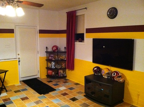
I recently bought a new home and decided to turn the downstairs area into Redskins room. I painted it to resemble the Redskins’ alternate away uniform — white jerseys with gold pants. The top two-thirds of each wall is white, with six-inch burgundy and gold stripes painted in the center to represent the sleeve stripes. The bottom third is wood paneling that I painted gold to represent the team’s awesome gold pants.
These pics were taken right after I bought the house and show the room in its previous state:
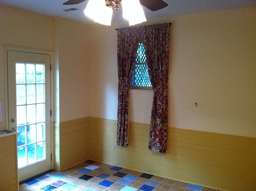
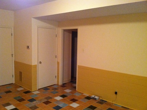
The top portion of the walls were a light buttermilk-ish color, while the bottom wood portion was the color of Gulden’s mustard. Not bad, but not what I envisioned as the ideal room for watching football.
These next few pics show what the room looked like while I was painting the stripes:
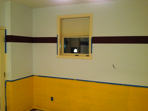
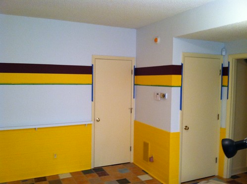
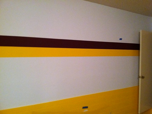
I wish I had taken more pics of this process. After painting the walls white, I used one of those Black & Decker laser levels that are typically used for leveling pictures. With the laser beam flashing across the wall, I taped off the top of what would become the red stripe, then the bottom. I used three coats of flat paint for each stripe. For the red stripe, I used standard blue painter’s tape. Bad idea — after pulling up the tape, there were lots of areas where the paint had bled under the tape. So for the yellow stripe, I used the green Frog Brand tape, which made a big difference — I think I had one little area where yellow paint slipped under the tape, but it took all of 30 seconds to correct.
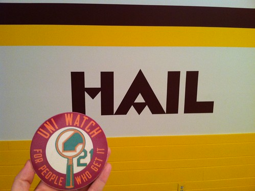
Here we have some shots showing the process of painting “Hail” on the wall:
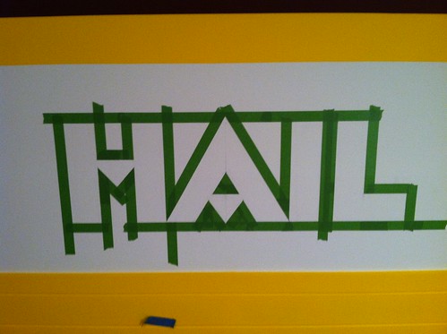
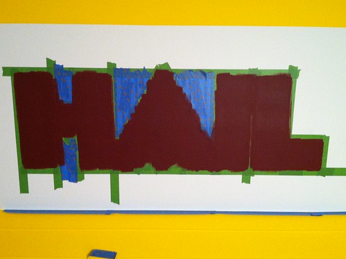
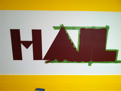
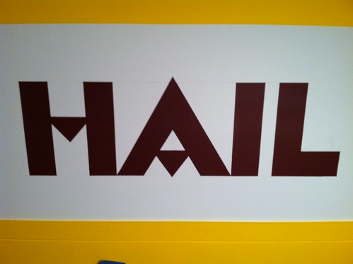
I started by creating a quick transparent png file in Photoshop, then projecting it ontp the wall with a computer projector I borrowed from work. I had a hell of a time getting the projector level, so I went back to Photoshop and got the measurements of each letter. I knew I wanted the letters to measure 14-1/4″ from top to bottom, so I used that as my benchmark. From there, I was able to get the scale of each letter. So after taping the “H” to the wall, I measured out how far the tip of the “A” should be, and so on. I used a razor to cut out the triangles that would make the crosses in the H and the A. I painted four coats, then peeled the tape off. It looked great! I spent about an hour after that touching up lines that weren’t quite perfect.
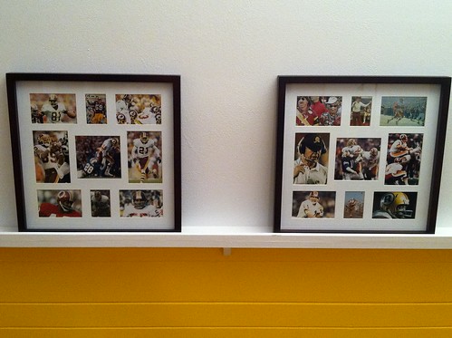
And here we have the finished product (well, it’s not entirely finished, as I’m having three jerseys framed as we speak):
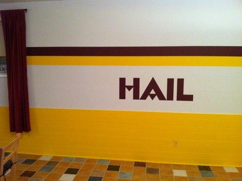
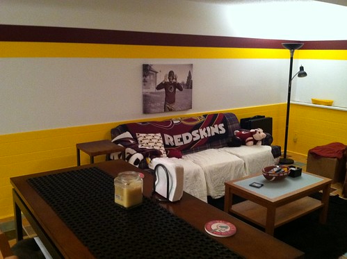
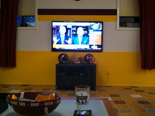
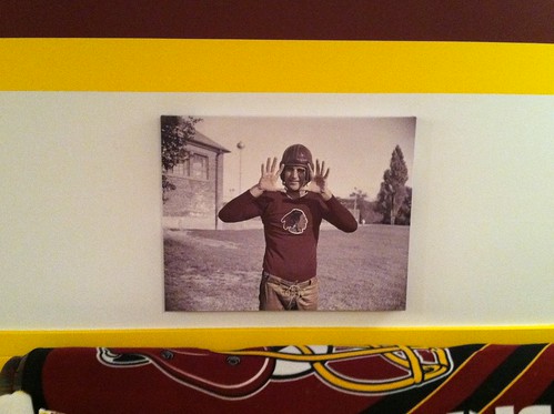
That last photo shows an old Shorpy shot of Sammy Baugh that I colorized, then had blown up and put on canvas. It looks much better in real life, honest.
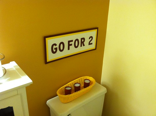
Finally, there’s this, which proves that I’m as immature as my wife thinks I am:
Watch the squatch, continued: Paul here. Remember last week’s entry about helmet squatchees, and how I said I liked the idea but thought they weren’t high enough?
Pro Helmet Decals honcho David Sulecki, who supplied the helmet squatchees to the Mets and White Sox, has now provided me with some samples of the product (all I had to go on until now were photos that he had supplied and whatever I could spot during spring training game broadcasts). So I got out a Mets cap and compared the helmet squatchees to a cap squatchee (click photos to enlarge):
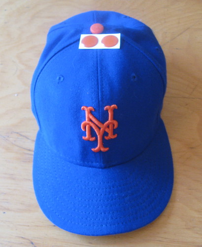
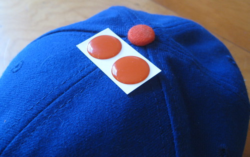
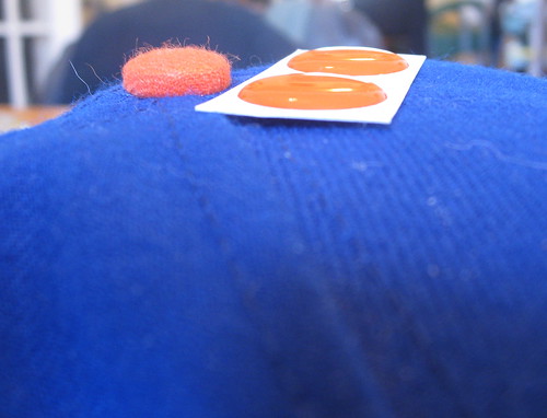
As you can see, the helmet squatchee is wider than its cap cousin (reasonable, since a helmet is bigger than a cap) but, as I suspected, sits much lower. A big part of the problem is that a cap squatchee is a true three-dimensional button — you can see its curves and the edge of its curved underside — while the helmet squatchee is really just a half-button, because it’s flat on the bottom.
In case you missed it in last Tuesday’s comments, reader Dan Fuller explained that making the helmet squatchees higher isn’t as simple as it sounds. Who knew designing such a simple-seeming uni element would prove to be so challenging?
Insert Jimmy Hoffa/Giants Stadium joke here: My latest vintage uni acquisition is this swell Teamsters softball jersey that I scored on eBay for $25 (click images to enlarge):
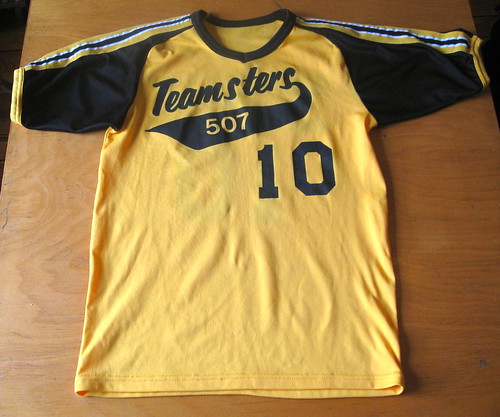
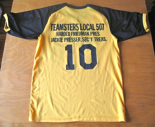
Lots of history in this one. Local 507 was formed in Cleveland in 1966 and helped launch Jackie Presser on the path that would eventually lead him to the Teamsters presidency (and also to a heavy involvement with organized crime, a role as an FBI informant, a Federal indictment, etc.). The jersey lists Presser’s title as Secretary-Treasurer, indicating that it’s from the late 1970s.
The jersey fits me just fine, which means it must have been worn by one of the smallest Teamsters in the organized labor history.

What does Calvin Klein (shown at left) have to do with a 90-year-old report card? Find out in the latest entry on the Permanent Record blog.
Meanwhile, in case you missed it on Friday, Robert Marshall is now taking orders for a new batch of stirrups. Ordering deadline is the end of tomorrow, so get crackin’.
’Tis the Season
By Vince Grzegorek
Hello, folks. The annual Uni Watch March Madness bracket competition is back for those of you who love college basketball and/or have interest in acquiring some of the stuff Paul has sitting around his apartment. You can join here (password: stirrups). There’s also a second group if the first one fills up, which has happened each of the last two years. Password for that one is the same as the first. Standard scoring: 1 point for correct picks in the first round, 2 points in the second, 4 points in the third, and so on. 32 points will be your reward for correctly picking the champion. Only one entry per person, please.
The top three winners will get to choose from some of the swag that Paul has accumulated since last December’s reader-appreciation raffle. Good luck to all.
Uni Watch News Ticker: As expected, the Astros wil wear the gun on their Colt .45s throwbacks after all. But ugh, they’ve totally botched the design — the “C” is all wrong. Should look like this. Is it really that hard to do this correctly? … Nike’s NFL uniforms will be unveiled in New York on April 3. … In what I believe is our first-ever chess item, the European Chess Union has enacted a new dress code for female players. Apparently those pernicious womenfolk were distracting the male players with their feminine wiles. How dare they! So now they’ve basically been told, “Stop flashing your tits and gams already.” And if they don’t like it, hey, they can go play beach volleyball instead. No word on whether the new rules apply to the Queen chess piece. … Love the “Rawlings Knit” tag on this old football jersey. … “I noticed that the recently unveiled statue of Mario Lemieux portrays him in a Cooper helmet, not the hemispherical Jofa helmet I always remembered him wearing,” writes Luke Rosnick. “A little digging revealed that he wore a Cooper lid in his early career and didn’t make the switch over to Jofa until the late ’90s. Jofa helmets are considered by a lot of young hockey players to be pretty ugly (“only Gretzky could pull that off”), so I’m glad the sculptor went with that helmet. One other interesting fun fact about the Cooper SK2000 helmet: It was used to make the illuminated helmets in the original Tron movie.” … New lacrosse helmets for Thailand (from Jeff Brunelle). … The Seattle Sounders wore their new “super cyan” kits for the first time last Wednesday in the CONCACAF Champions League quarterfinals against Santos. “Several players decided to play with collars flipped up,” notes Matt Glass. … Remember my ESPN column last week about the Padres supplying uniforms to local Little Leaguers? I mentioned that the team’s four current jerseys were among the program’s six most-requested designs, and that the camo design was the most popular option of all, but I didn’t provide the full listing of where all 20 design options ranked, because I didn’t realize such a listing existed. But it does. … Interesting note toward the bottom of this page: “[OSU coach Urban] Meyer recently apologized to a gay and lesbian rights group at Ohio State after it learned that he planned to distribute lavender shirts to players who are underperforming at practice. ”¦ The group said lavender is the predominant color associated with the gay and lesbian community” (from Jason Hillyer). ”¦ I’ve run this photo several times before, but once more won’t hurt: spring training Chucks! … Here’s a bizarre image: Paul Henderson of the Red Wings wearing a surgeon’s mask on the ice in 1966. “Apparently he had some sort of virus he didn’t want to pass on to other players,” says Kevin Wilson. Anyone know more about this? … Check this out: an Arena League game featuring white vs. gray — and both teams with black helmets! “I saw it while scrolling through the channels,” says Eric Klimtzak. “Really couldn’t tell either team from each other.” … Check this out: The ’84 Tigers had a bullpen catcher with TNOB (great find by Jeffrey Moulden and Gary Olson). … A high school hoops team in Illinois had to wear another school’s uniforms due to a uni mix-up (from Nick Yelverton). … Get this: It turns out that the first broadcaster to grace the airwaves of the very first Mets spring training game was — wait for it — Howard Cosell. The story behind that, including an audio file, is available here. … The very existence of the Euskaltel-Euskadi cycling team is being threatened by a logo issue (from Steve King). … It had already been announced that MLB umpires would be wearing a memorial patch this season for former ump Marty Springstead. They may end up modifying that patch, or adding another one, now that former ump Harry Wendlestedt has died. … Speaking of officials, zebras wore shoe-borne shout-outs to a colleague during the ACC tourney (from Rex Henry). … Interesting visual effect on Cincinnati coach Mick Cronin’s jacket. “Ironically, it matches the Bearcats’ new shorts design,” notes Paul Pass. ”¦ Good spot by Todd Kortemeier, who notes that the University of Alaska-Anchorage hockey team uses the same number font as the San Diego Chargers. ”¦ Omaha Central High’s basketball team wears some crazy-ass socks. ” They started doing it early in the year and ended up going 30-0 to win their sixth state title in seve years,” says David Ashby. ”¦ Anyone know why Ohio’s uni numbers on Saturday looked like crayon rubbings? Like, was that supposed to be a camo thing or what? ”¦ Anyone ever seen a New Balance undershirt before? That’s Hanley Ramirez, who’s been going seriously unbuttoned throughout spring training. ”¦ No photo, but several readers report that Bosox backstop Kelly Shoppach’s usual No. 10 jersey went missing prior to yesterday’s spring training game, so he had to wear a No. 96 NNOB jersey. ”¦ Rajon Rondo recently took a nasty poke in the eye and wanted to wear shades on the court yesterday, but the league said no, because the other players need to be able to see his eyes (thanks, Kek). ”¦ Tim Burke reports that Xavier’s Andre Walker blew out two pairs of shoes duringthe A-10 tourney, forcing him to wear a mismatched pair. ”¦ St. John’s baseball has a new alternate jersey that features the NYC skyline (from Dylan Jenkins). ”¦ All of this year’s NHL goalie masks can be found in this slideshow (from Ryan Mandel). ”¦ Sure hope Ozzie Martinez makes the Chisox roster, cuz he’s sporting a very nice lower-leg look (from Mike Braam). ”¦ Andrew Luck wears a brace on his left knee, so Arin Mitchell assumed Luck had had an injury to that knee at some point. But then he saw this photo of Stanford QBs in the latest SI. “Makes me wonder whether the Stanford training staff requires right-handed QBs to wear a brace on their left knee for protection/prevention,” he says. ”¦ Surreal case of douchebaggery playing out in Australian rugby, as Murray Conallin explains: “The Penrith Panthers have a new major sponsor Oak milk. They do flavoured milks. The idea was that a fridge filled with milk would make a good backdrop during press conferences, but the league has told them to get rid of it because the fridge doesn’t have enough logos for Telstra, the league’s main sponsor.” … It’s the end of an era up in Binghamton, as the mighty Union Hotel tavern — a sensational bar situated in a really cool little flatiron-ish building, has shut down. I’ve half a mind to purchase it myself (photo by my buddy Shane Arbogast, who discovered the sad news while passing through Bingoland over the weekend).
“As expected, the Astros wil wear the gun on their Colt .45s throwbacks after all. But ugh, they’ve totally botched the design – the “C” is all wrong. Should look like this. Is it really that hard to do this correctly?”
~~~
is majestic manufacturing it? because there is your likely answer
It’s not just the C, the whole thing is wrong. It looks like a cheap knockoff jersey.
I actually have a cheap knockoff jersey, and the script on it is in fact a better reproduction. Plenty else is wrong with it, but the script isn’t nearly as bad as on the actual throwback.
Since things have to be redone on such short notice, maybe Bob Halfacre can help the ‘Stros out? At least he’ll get ’em right.
pain in the ais
link
Love it. Awesome choice to base the statue off of an actual in-game moment.
Luke, just a minor correction to your commentary… it was specifically 1991-92 that Mario switched from the Cooper SK-2000 (shown link) to the Jofa 366 (shown link.
Mario continued to wear the 366 until his first retirement in 1997; when he came back in 2000, he wore a link (which was basically link with the swoosh on it instead).
Lemieux, or the equipment manager, also used to scratch or white out the “3” in “366”
link
there is STILL one Jofa 366 being used in the NHL today by Teemu Selanne. he’s pretty much the only player allowed to wear one because, well, he’s Teemu Selanne…
“Jofa helmets are considered by a lot of young hockey players to be pretty ugly (“only Gretzky could pull that off”)”
#99 & #66 wore completely different Jofa styles… however… Borque-y wouldn’t agree with the above statement:
link
Ah, the Ol’ Two-Niner…
Is he actually the only player allowed to wear one? Is that a safety thing? Or a Scandinavian thing?
Always happy to be corrected when it leads to tidbits like this one being discussed.
Good question about Selanne’s Jofa.
Is he truly grandfathered in by the NHL? or is he just wearing the helmet because he likes it?
How many players of his stature would forgo an endorsement deal with an equipment manufacturer to stick with a helmet from a company that, for all intents and purposes, no longer exists? It’s not as though he’s “representing” Jofa, since the logo link.
It was either that one, or the link in the Stanley Cup Final.
Either are a perfect choice for his legacy.
It’s the one against the Islanders. So that’s Jeff Norton and Rich Pilon who are also immortalized.
Pilon thinks link
nah. my idea was for his very first goal. i would have liked to see mario, the goale, and the moment when the puck was JUST about to cross the goal line. would have been cool to see the start of it all “first shift, first shot” in front of the brand new barn.
i have 2 MAJOR UW-style problems with the statue. been down to check it out twice, once in the daylight, and last night to see it lit up. 1) their jersey collars look like they’re wearing a t-shirt, 2) you can barely see the logo and 6’s
other than that, great statue IMO!
Thanks for the reminder, Teebz…….sigh.
Sorry. It was a beauty goal, even if you are/were a North Stars fan. Shawn Chambers is still looking for his jockstrap after all these years. Jon Casey? He was never the same after that goal.
About a year ago, I saw an auction for one of Lemieux’s Jofa helmets. (I wish I would have saved the pics.)
It showed the inside of the Jofa helmet and it had had the Jofa padding removed and the Cooper padding installed.
The Jofa padding was almost like a bubble wrap where the Cooper was like a one-piece memory foam.
One Night in Bangkok makes a *soft* man humble?
Nope, not buying it. I am DONE with Chess.
I get my kicks *above* the waistline, sunshine.
…or below the knee line?
Above the neckline, now…
I had that song on a 45 record at one time. Now I look back and say, “Why?”
Siam’s, gonna be the witness to the ultimate test of cerebral fitness.
…I’d let you watch, I would invite you,
but the queens we use would not excite you.
Gonna be stuck in my head all day now…
Hanley’s shirt looks like a regular New Balance wicking shirt, of which I have a few.
Mine look better on me (ok, it’s because they aren’t pumpkin orange).
Paul Henderson was diagnosed with “trachiatis”, an inflammation of the trachea.
The mask wasn’t used to prevent others from being infected. Howard Berger wrote that on his blog, and it’s entirely wrong (see article below). I remember saving this article a while back when looking for a story about Paul Henderson’s jump to the WHA from the NHL after the Summit Series.
link from the December 10, 1966 edition of the Windsor Star.
Good job, Teebz.
I have one of the black Ohio jerseys at home. I’ll get a close picture of the numbers so you can get a decent look at the design. Not exactly sure what it is though.
Looks to me like a printed circuit board — is there some high-tech “Silicon Valley” angle attached to Ohio?
I remember reading something about them, they are supposed to be Circuit Boards, I have no idea why though, and I thought the article originated on here so I have no idea where to look for it. Maybe it was linked to on a day when Paul wasn’t doing the writing, so he doesn’t remember the article, because the only place I get other uni news from (on a regular basis) is the Uniform Updates page for NCAA Football (the video game) and that is just for football.
I found some interesting tidbits about the Ohio Uniforms. For instance they wore a weird white design too (though there was no pattern on the number and the fanciness of it seems to be the use of many bobcat logos for the piping on the uniform). There was also a reveal video that wasn’t very revealing (couldn’t tell they were a uniform different from the normal ones for most of the video as the pattern is barely shown).
The Black jerseys were first worn during their match-up with Kent State in January. And were made available for sale for only a limited time afterwards (They apparently did the same thing for their black football jerseys).
Here’s the Video:
link
Gallery of the White uniforms I mentioned:
link
Info about the black jerseys and mention of sale:
link
Russel has rolled out a lot of things for Ohio recently, and it seems that they may be a candidate to replace Georgia Tech, who recently spurned RA’s design options in favor of the 2008/2009 design used. We’ll find out this season if that was just Tech not liking the available designs or if they have opted to drop the “Russel’s Oregon” label. They do continue to have like 50 baseball designs so at the very lease that will remain consistent (though Tech is a perrenial contender in College Baseball so they offer a higher profile than the Tech football team).
Weren’t there football jersies with that on them this year? I know I have seen it somewhere on the site this year.
*jerseys*… geez
Editorial congratulations to Paul for resisting the temptation to make today’s headline…
“What, No Life-Size Daniel Snyder Fat Head?”
And congratulations to Steve for choosing a room with an exit. In case, y’know, he has to live there.
Steve Bookman falls squarely into the category of “Creative Individual Whose Work Is Dismissed by Normal People as Disturbingly Obsessive and Frivolous At the Same Time But Is Regarded by Uni-Watch Readers As a Grand Master.” Congratulations, Steve. I just can’t stand the Resdskins, but you are way dope. Though your wife is right, too.
Paul, that Teamsters jersey… Wow.
“… St. John’s baseball has a new alternate jersey that features the NYC skyline (from Dylan Jenkins). …”
Good idea, underwhelming execution.
Thanks Connie for the kind words. You are dead on with your statement, “Creative Individual Whose Work Is Dismissed by Normal People as Disturbingly Obsessive….”. Most of my buddies are cool with this, but I’ve encountered more than a few that give me that “What the f**k is wrong with you?” look, or they tell me that I have too much time on my hands.
It’s good to know that there are others out there that appreciate my work.
Steve Bookman falls squarely into the category of “Creative Individual Whose Work Is Dismissed by Normal People as Disturbingly Obsessive and Frivolous At the Same Time But Is Regarded by Uni-Watch Readers As a Grand Master.” Steve Bookman falls squarely into the category of “Creative Individual Whose Work Is Dismissed by Normal People as Disturbingly Obsessive and Frivolous At the Same Time But Is Regarded by Uni-Watch Readers As a Grand Master.”
CIWWIDNPDOFASTBIRUWRAGM? Um… we really need a better acronym…
It’s good to know that there are others out there that appreciate my work.
We do. And admire the results!
Agree on St. John’s poor execution of the NYC logo. Since it appears to be a ripoff of the Mets’ logo, perhaps the Mets ought to see what they could come up with — I know, I know — be careful what you wish for.
Steve nice job on the room. I for one really enjoy seeing sports rooms like that. Also a great idea to put your colorized Sammy Baugh on Canvas. That helps make the room.
Glad you shared this today.
Also congrats to Steve for one of the most tasteful team-decorated mancaves I’ve ever seen. I hate absolutely everything about the Skins, and am not even much of a fan of their color scheme, but I like what Steve did there.
Steve, you just increased your home’s value by 100%.
“Fight for ol’ D.C.!”
Gotta agree. Don’t like the Skins or their colors one little bit, but I absolutely love what Steve did with ’em. Those letters are especially sharp!
One of these days my wife is gonna banish us to the ‘burbs so our kids can go to a better high school, and when she does, the only saving grace is gonna be the RIDICULOUS man cave I’m gonna set up in the basement. T’will be epic.
What’s strange about that Tigers bullpen catcher is that he’s wearing No. 13, which their regular catcher, Lance Parrish already wore. Is it possible that it’s a photo of Parrish in some kind of odd uni?
The Tigers used to sew a TNOB nameplate on old MLB Tigers jerseys and recycle them to their minor leagers in the lower leagues and extended Spring Training and the Instructional League. I know this as I worked for the Mets when they were still in St. Petersburg and the Tigers had an Instructional League team at Huggins-Stengel Field in St. Pete.
I had one of those jerseys and I guess it was easier and more economical to sew the TNOB nameplate than remove each letter that was sewn directly on the jerseys.
I thought it was AA prospect Fred Tigers (pronounced Tee-jzers).
;^)
Earlier this season at a tournament, our girl’s team was forced to wear those pullover jerseys that are commonly used in P.E. because they packed the wrong uniform. Ended up winning though so I told their head coach that they should make it their permanent road uniform.
pretty sure Stanford (as well as other righty QBs ) wear the left knee brace b/c of injury protection. Righty QBs step into their throws, their left leg/ knee is susceptible to contact from other players (defenders or O linemen, etc.) USC’s QBs have done this for a while.
Harbaugh had Alex Smith wearing a knee brace in training camp this year as an injury precaution, but he didn’t wear them in the games. Must be either a Stanford thing, or a Harbaugh thing that Stanford kept after he left for the Niners.
USC does the same thing. Matt Barkley actually started wearing a brace on his left knee in high school, which can be seen here:
link
(that play by the way ended up being a 97 yard TD pass that Matt got off in the midst of being brought down in our own endzone. Huge turning point in the game, but enough reminiscing about my high school days.
That Arenaball game DOES look confusing.
Must’ve been doubly confusing for players: link
I live in Orlando and try to pay attention to the local teams, so when I saw this game on SunSports, I decided to turn it on for a little bit. The ticker says gray vs. white but the gray was so light it looked white, even in HD. Both teams pants were white (or light gray) and like the ticker stated both had black helmets. It was so bad it was actually unwatchable. You couldn’t tell who was who.
Yeah, it was extremely confusing and painful trying to determine who was who. I watched most of the game and the only thing that helped were the Pittsburgh Power’s yellow socks and under sleeves, and even then only SOME of the Power players were wearing them.
To make things even worse, both the Predators and the Power had capital “P” logos with yellow in them on their helmets!
I still think that whoever allowed that game to be played as gray vs white should be fired, or maybe even executed.
Seriously AFL, a light gray uniform is meant to be worn in place of white, not against it.
I think the chess people are trying to avoid a situation where the female players smuggle in a couple of extra pawns by claiming it’s cold in the room.
The Teamsters jersey is just awesome. Wow, what a find.
“Omaha Central High’s basketball team wears some crazy-ass socks. ” They started doing it early in the year and ended up going 30-0 to win their sixth state title in seve years,” says David Ashby”
I think these might all be from Little Miss Matched link but don’t see all the styles on the website. My mom likes these.
Opponents actually have to be able to see player’s eyes during an NBA game? That’s actually a thing of significance? I guess, since I don’t play basketball, I wouldn’t know if that actually has some practical significance.
It would seem to me that the greater concern would be choosing any form of headgear that would be easily dislodged; glasses could be knocked off easily, or even slip off, creating a potential hazard, while goggles and facemasks are strapped on, and would require deliberate effort to dislodge them. Even if he had a strap on those Oakleys, they’re not designed to resist a blunt impact while being worn, and could potentially cause even more injury if struck by an errant elbow.
It would create a bit of competitive advantage. The anticipation of that sort of thing is predicated on the ball handler’s eyes. Covering up your eyes with dark glasses is a competitive advantage through the use of special equipment, but training yourself as a ball handler to ‘see’ without looking is a skill, which is perfectly acceptable to use in a game. Amar’e Stoudemire’s ‘goggles’ are basically the same thing Rondo was wearing, just with clear lenses.
I used to wear regular glasses whilst playing ball, and I can’t say I ever recall them slipping off, or even getting knocked off (and that was in 4 years of playing competetive basketball). The only problem I ever had was the time an opposing player threw the ball in my face at point-blank range, smashing the frames (I switched to a lovely pair of Horace Grant-style goggles after that)…
Wow…I hate the Redskins with the white-hot heat of 1,000 suns, but I have to admit that that is a badass DIY project. Job well done.
In viewing the slideshow of the current NHL goalies’ masks, is anyone else struck that their individualization makes them, well, less individual?
Recurring themes: 1) some nickname based on the first syllable of their wearer’s last name 2) tribute to past players from the team city (even in other sports) 3) some form of skull/teeth/jaws 4) skyline/architecture of team city.
Having not seen a close-up of it before (due to actually watching very few games, due to being on such a tight budget that I can’t afford cable), I was surprised to see an image of Chris Osgood’s SK-2000 on the side of Joey MacDonald’s mask.
Once upon a time, goalie masks were relatively constant! Patrick Roy basically had two paint jobs for his entire career: one for Montreal, and one for Colorado. Nowadays, it is completely plausible for a goalie to have two masks each month.
I won’t deny any of your rationales, but I think that ADD is the primary variable against goalie mask individuality.
Love the “Go For 2” sign in the bathroom – that got a big laugh in this immature household
GO FOR 2 !
awesome room. nice job.
Caught part of the Orioles Red Sox Game yesterday on tv. The Orioles were wearing their home jerseys and hats but their manager Buck Showalter was wearing the road hat. Anyone else notice?
Showalter always wears a distinct cap during spring training, so he stands out and is easy to find.
For most of spring training Buck has been wearing the road cap, the other coaches the home cap, and the players the BP caps.
Any word on whether the O’s will wear the white-front helmet at home to go with the cap? That would be a mistake if they didn’t. Their catcher wore it last year on the field and it wasn’t even one of their regular caps at the time.
I’d like to see the old orange-front cartoon bird cap as the alternate with the black and orange jerseys too, instead of that “O’s cap.
“Jackie Presser, Sec’y Treas.” Wow.
Also, the Union Hotel tavern must have landmark status, right?
Also, the Union Hotel tavern must have landmark status, right?
In Binghamton?! Yeah, right…
If anyone is curious – the asking price is $179,900.
Here’s the listing: link
3 stories, 8868 SF, built in 1890.
“Ironically, it matches the Bearcats’ new shorts design…”
Not to be “that guy,” but I don’t think this is irony. Sounds more like synergy, or some other terrible marketing term.
Vince has just set up our annual March Madness pool, and I’ve added it to today’s entry. Scroll up to see — it’s just above the Ticker.
Just a question: any hockey swag available in that collection of stuff, Paul?
Yes — some Winter Classic stuff.
I may have to put my bracketology cap on…
… which means I’ll win nothing. LOL
That Binghamton bar can be had for $179K. Pretty sweet look propoerty from the pictures. Can’t link directly to the listing due to the way the website is set up, but go here and search under Binghamton. For me the listing shows up on the 1st page. The address is 246-250 Clinto Street.
link
The photos barely hint at the majesty of that place. Really swell joint….
“Interesting visual effect on Cincinnati coach Mick Cronin’s jacket.”
The effect is called a moire pattern. I actually used the word “moire” on my final play in a Scrabble game once to win the game.
link
It looks like UNC Asheville will be the only team in tournament wearing uniforms by Crons.
You gotta love Crons.
Come ready or never start.
Since Binghamton is being talked about today, I might as well bring up the Binghamton Whalers, who arguably had the greatest logo in the history of minor league sports:
link
That is a fantastically clever and simple take on the logo of the big league team.
I attended many a Whalers game back in my college days.
Here’s the best part: Whalers games were broadcast on the radio by local station WAAL — routinely referred to as “the Whale.”
Paul, Wikipedia says they also played Brass Bonanza at Binghamton Whalers games. Is this true?
Possibly. I have no memory of it, but that doesn’t mean it didn’t happen. I didn’t know much about the Hartford Whalers back then, so I doubt I would’ve recognized or understood the meaning behind the song anyway.
The designer of the Sabres “Buffaslug” posted a whole slew of initial concepts and has been answering questions on the link the past couple of days.
Really interesting read, interesting to hear his post-game analysis of the project, it’s reception, etc. Good stuff.
Cool.
Personally, I think the biggest problem with the Buffaslug logo is that the team is called the Sabres, not the Buffaloes or Bison.
Sometimes logos can be about geography, though.
See: Golden State Warriors’ bridge, for example. Sonics had a skyline with the Space Needle. Packers footballer in front of Wisconsin. Been others, of course.
So it isn’t so much the buffalo, as the interpretation of it.
But I do agree with you, in this care their logos about “sabres” (even the shoulder patch) have beaten the Big Giant Head every way possible.
From the DC Sports Bog: link
Does anybody know what equipment Marty Turco was wearing yesterday afternoon for the Bruins? I only caught a portion of the game and none of the pictures I have found have close-ups of his mask.
It looks to me like he was wearing his old Dallas Stars pads and mask, which is interesting because he has played with two teams since his tenure with the Stars.
It probably was his old Dallas stuff.
He was wearing his link in Europe, but that would look pretty stupid with a Bruins uni.
It appears to be his old Dallas pads, the last version he had – link vs. link – Now weather or not they’re new or not, I have no idea, but the helmet isn’t any of the designs he wore over the past few seasons with the Stars of ‘Hawks – link – the “Turco” on the chin is new but he always has gargoyles on his mask.
I haven’t seen it posted, or even see on in general, but here is a pictorial Astros by the Numbers: link
Note the Astros had a 00, the wide spacing between the 4 and 5 on the Colt .45s cap, and Yogi with Rainbow sholders.
Man, I thought the Brewers had too many retired numbers. I know that they’ve had more than their share of active players dying, but still, the Astros are crazy.
The first two numbers retired were due to the death of the players wearing them. For the very young Astros team, it was done as a memorial more so then what those two men did on the field while wearing the number.
Mr Bookman’s room looks wonderdful. Funny thing about his “go for 2” picture. I saw it somewhere else today BEFORE I saw it here.
Here’s the link, some NSFW pics, but the “go for 2” is the very last one… link
Wow…I wonder how it got there? My guess is my brother-in-law passed the pic on and it eventually found its way to the site you linked to.
Somehow I missed the Padres little league story, and it left me… um, feeling good. And thinking of the possibilities on the south side of Chicago with White Sox jerseys.
If the kids wore the leisure suit uniforms, the wingspan of the collar points would be wider than the kids!
That’s funny!
There’s enough mullet wearing parents on the south side that would be proud!
What kind of horseshit comment is that? You a Cubs fan?
link
Watching the Arsenal/Newcastle game, they abbreviated Newcastle to three letters (“NEW”) while they used four letters for Arsenal (“ASNL”). Then I realized, perhaps that was a better option than going with “ARS”.
The best four letter abbreviation for Arsenal would have to ARSE, wouldn’t it?
Mike Wilbon of PTI perpetuated the, “Adidas is preventing Dwight Howard from going to Chicago,” rumor today…
I think D12 just doesn’t want to play in Chicago because he won’t ever be the #1 guy over DRose (though he probably has other reasons as well). But either way, he’s a fucking idiot. The Bulls would be better than Heat for years to come if the bulls could manage to trade Dwight for Noah – or even better, Boozer.
Don’t you want to win? If you do, go to Chicago.
Tim, even as a Bulls fan I’m appalled by your comment. Howard can play anywhere he wants for any reason. To think that all NBA roads lead to Chicago is just conceited. And nobody wants Boozer.
actually watched the last Q of the game, and even though i hate los bulls, i detest the heat and celtics even more, and i was thinking just how sweet it would be for superman to win a title in red…
but adidas would fucking shit themselves
You seem to be swearing more than usual, Phil =P
I find it rather unusual to be rooting for the lesser of the evils. I’m still waiting to see this “parity” thing the NBA talks about. 8 title teams in the past 27 years.
charles smith will forever haunt my nightmares, but i do have to tip my cap to that jordan fella
i don’t mind dynasties … in any sport … bugs the shit out of me that everyone is crying for parity…fuck that
Dynasties? Meh.
Oh, and sleep tight.
link
douchebag
Aw come on…I thought you’d come back with this:
link
nah man…i can do that one better
sleep tight
The Shot hurt worse, ’cause I was never a big LBJ fan.
Nice try, though.
worse than The Drive? or The Fumble?
Now you’re confusing me with a Browns fan. And I thought you knew me…
that’s right, you’re a bandwaggoner…
my bad
I’ve only been a bandwagoner when it comes to the laundry. Win-loss records mean nothing if you try hard and wear a good-looking uni.
Bulls in red at home against the Knicks in white… yeah, that makes sense.
Bulls are “Los Bulls” tonight vs “Nueva York.”
So they couldn’t hook up some white “Los Bulls” and blue “Nueva York” jerseys?
fuck
I wish there was a better way to conduct consumer outreach to the Spanish-speaking community in this country.
link
OK, it’s probably due to all the meds I’m currently on but I don’t get the “Go For 2” thing.
Think about it. You do #1 standing up….
speak for yourself
looks like Randy Moss is gonna be wearing a 49er uniform next season.
he’s still alive?
maybe he can catch passes from peyton
I wonder if Peyton is stuck on keeping his number.
In the picture of Omaha Central High’s crazy socks, the last photo at the bottom is interesting. The guy seems to have shoe laces in his socks. The (photo) left sock has the lace coming out the top, and the right has the sting in his hand.