With the Stupor Bowl right around the corner, reader Nick Schiavo didn’t want to leave any doubt regarding which team he’d be rooting for. So he decided to create a miniature Giants gridiron — or, rather, a part of a gridiron — in his back yard. Here’s how he did it.
My New York Football Giants Field
By Nick Schiavo
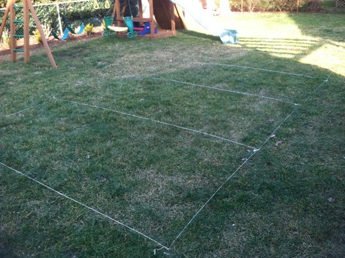
First I roped and staked out a field of 10 feet by 20 feet. Then I created four five-foot markers that would serve as the yard lines and goal lines and roped them off as well:
I began the painting process by spraying the end zone blue. This way the white boundary line, which I’d add next, would cover up any extra blue spray that went outside the lines:
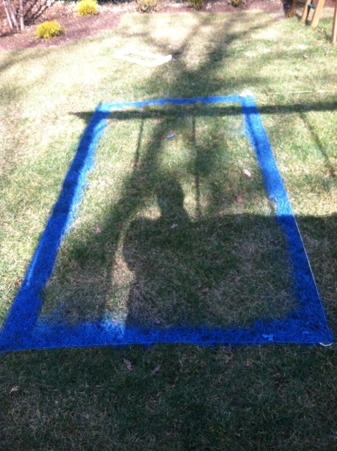
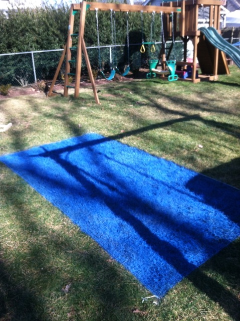
Then I went and did the white sidelines. I made wooden stencils so that I could keep the sidelines tight and straight while spraying them. I placed the stencils on the outside edge of the rope lines and began spraying in sections:
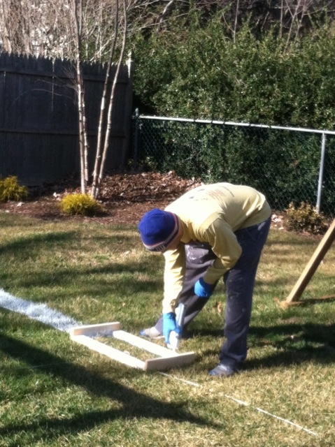
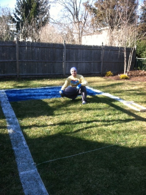
From there I came across the field and did the yard lines and the hashmarks. The hashmarks were a bit tricky, as I had to find the center of the field and the center of the stencil. After I got those numbers, I then I had to calculate how to fit four pairs of hashmarks within the yardage lines:
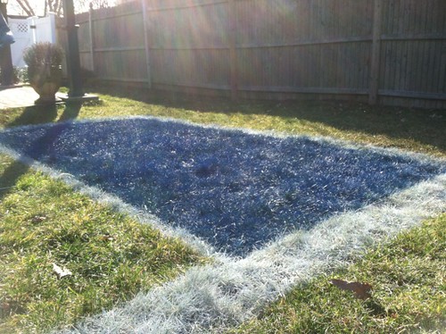
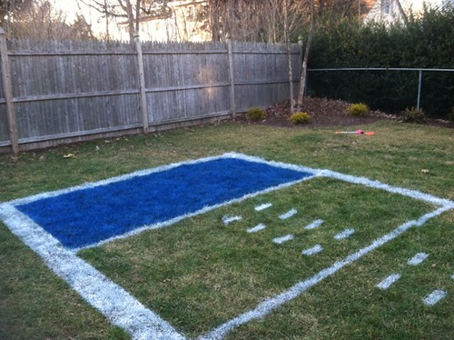
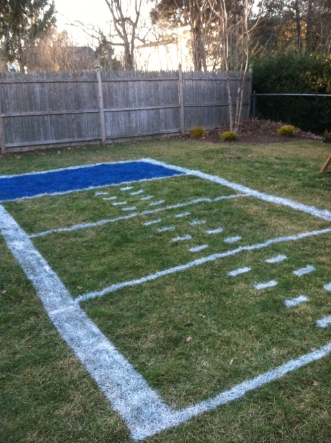
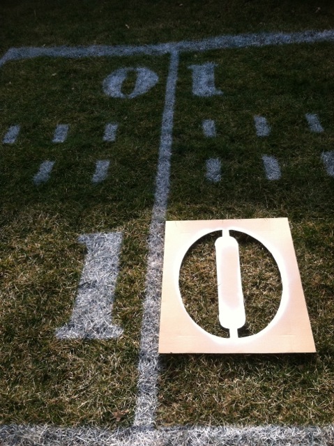
Now it was time to do the yard marker numerals and the end zone logo. I had a “10” and the Giants’ classic “ny” blown up to the size I wanted at my local Staples — 18 inches high for the numerals and 24 inches high for the logo. I transferred the images onto cardboard and cut out the shapes with an Xacto knife to create stencils.
In the end zone, I staked down the cutout of the “ny” and trimmed it with red:
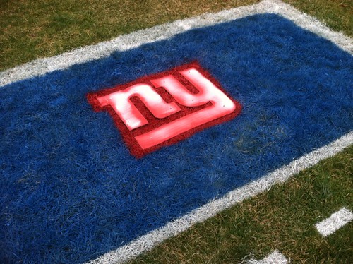
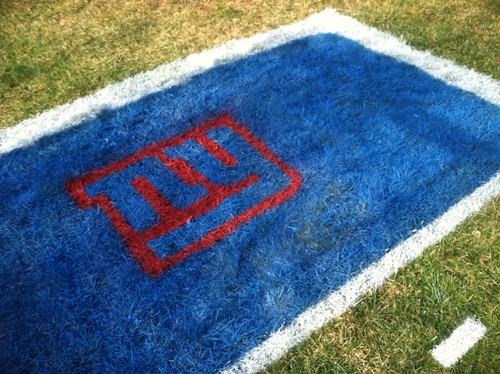
Next I took the rest of the “NY” stencil, laid it down over the red and filled it in with the white.
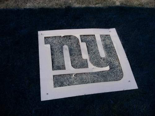
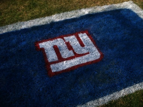
Then I did the yardage markers and added some directional arrows for good measure:
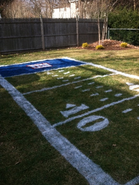
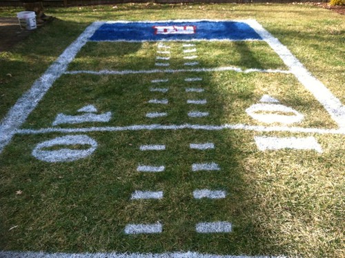
It was a lot of fun. I went through six cans of white paint, four Cans of blue and one can of red. I used Rust-Oleum marking spray paint, because it can be sprayed upside-down. I had to use the basic colors they offered, but luckily the blue looked very true to Giants blue when laid over the green grass.
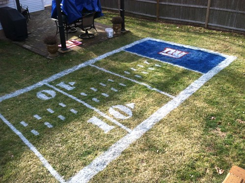
In case you missed it, I had two ESPN columns yesterday — one about the new NBA All-Star uniforms and another about the unusual character who used to be the Patriots’ live mascot.

Philly rocks: The 2012 USA Curling Nationals will take place later this month slightly outside of Philadelphia, and Phil and I have decided to head on down for the semi-finals and finals, which will take place on Feb. 17 and 18. Several people I know will be competing: Dean Gemmell, who gave me and Phil our first curling lessons, is part of the fifth-seeded team; Craig Brown, who was my skip two years ago when I participated in the House of Hearts bonspiel, is skipping the second-seeded team; and Tyler George, who invited me to come to House of Hearts in the first place, is skipping the top-seeded team. If they all make the semi-finals, I’m gonna have a hard time deciding who to root for. Anyway, if anyone wants to join us, tickets are very inexpensive.
After the finals, we’ll repair to the Devil’s Den for a Uni Watch gathering — hope all Philly-area readers will join us there on Feb. 18, 6:30pm.
Uni Watch News Ticker: The Giants are getting a new kind of helmet coating for Sunday’s game (from Terry Duroncelet). … Neglected to mention yesterday that the Timberwolves and Pacers both wore throwbacks on Wednesday night. ”¦ The Marlins have a strict short-hair policy, so Jose Reyes will have to cut his dreads — and his haircut is being televised on the MLB Network today. ”¦ This week’s New Yorker cover has a football theme. Naturally, the first thing that jumped out at me was the lack of TV numbers, but you’ve gotta like the striped socks and sleeved jerseys. … Here’s an excellent article, plus an audio report, on a shop that sells New York Police Department uniforms. ”¦ Good article about the nuances of spiking the football. ”¦ Illinois media relations guy Kent Brown did a live chat thingie the other day and was asked about those new helmet/uni photos that have been floating around. Key quote: “I know Coach is looking at several different options for both the helmet and uniform. We have to work with Nike on the uniform, and it may be too late to have something new for 2012, but you can expect changes of some kind on the helmet” (big thanks to Don Drever). … Camo has hit the world of wrestling singlets. That’s Elkhart Memorial High School in Indiana (from Steve Krah). … Dan Cichalski found an old New York Times article, from 2/25/44, about the Dodgers’ satin uniforms. “What stood out to me was the mention of a road cap that was supposed to be ‘light blue with white visors’ — nothing like that in the Okkonen illustrations for that era,” says Dan. … Hmmm, does Oklahoma State have orange helmets in the works? Could be (from Ryan Hartwig). … Totally love this new Peruvian soccer kit. Look at that collar! Very tasty (from T. Manfrass). … Longhorns coach Mack Brown had this to say about the two Malcolm Browns who’ll be playing on the team this fall: “We’ve got two really good Malcolm Browns now. So I don’t know what we’re going to do with the jersey names. Probably put ‘Ma’ on one. Figure out something to do with them” (from Ken Singer). … Good story on how the NFL will deal with the looming problem of Super Bowl L (from Aaron Rich). … Bill Murray wore a Giants uni on Letterman the other day (from Alan Tompas). … Here are some of New Era’s new NFL draft caps. “Much better then anything Reebok has put out in years,” says Spencer Seaner, damning with faint praise. … The ads-on-schoolbuses trope continues, this time in Houston. This is basically child abuse, and it’s horrendous civic policy to boot. Shame on everyone involved (from Paul B. Kennedy). … Reprinted from yesterday’s comments: UNLV added a memorial strip for former coach Charlie Spoonhauer the other night (from David Heit). … “I recently stumbled upon a tweet posted by a 2012 EMU football recruit showing a picture of new helmets and jersey templates, presumably for next season,” writes Scott Brockman. … “Chuck Hayes of the Sacramento Kings was named captain of the team in training camp but only started wearing a ‘C’ on his jersey on Saturday at Utah,” reports Dave Anderson). … Canadian remix: This music video shows a guy wearing a Blue Jays cap rendered in the old Expos beanie-cap colors — or, if you prefer, an old-style Expos cap with a Blue Jays logo. Either way, pretty cool (from Kellen Dargle). ”¦ Here’s the green BP jersey that the Mets will be wearing on St. Paddy’s Day. ”¦ New white football helmet for Southern University (from Prentice James). ”¦ Hey, it’s great that Nike can exploit Black History Month as a new way to sell sneakers. “All it really means is swooshie now has (what they consider to be a reasonable) excuse to do even more BFBS,” writes Jake Hurley. ”¦ Here’s your obligatory “Feds seize counterfeit Stupor Bowl merch” story that every media outlet is required by law to run this week (thanks, Brinke). ”¦ Bill Kellick was watching a Cowboys/Cardinals game from 1970 and saw something interesting: There was a moment of silence for the Marshall football team, which had just perished in that plane crash, but the moment of silence took place after the two teams had lined up for the opening kickoff. Odd timing. ”¦ Some clever felons working in a prison design shop managed to sneak a pig into the logo that adorns Vermont State Police cars.
As for Sunday, I’ll be watching the game with Phil, and at some point we’ll raise a glass to our late fathers, both of whom were big Giants fans and would have loved to see their favorite team playing for another title. Whatever your Sunday plans are, enjoy the game, and don’t forget to watch the Puppy Bowl during halftime. Go Big Blue!
What, no love for Regis dressed like the referee?
Regis reminds me of Ben Dreith (of “…he was giving him the business…” fame)!
The absolute best line uttered by a NFL referee. ‘Guns’ Hochuli can’t even come close. For those who need a refresher: link
never heard that before. outstanding.
I never realized how short Regis is.
“Hmmm, does Oklahoma have orange helmets in the works? Could be (from Ryan Hartwig)”
Better change that to Oklahoma *State*. You had this Cowboy quite confused as to why our biggest rival would go orange.
I swear I remember typing “State,” but obviously I didn’t. Anyway, now fixed — thanks.
Mizzou’s new look, for all sports, to debut on 4-14-12.
go big blue!
this one is for a couple guys who’d love to have seen one more super bowl victory for the g-men
This is in no way meant to tarnish the memories you fellas have. But consider this. And I’ll bet I’m in no way, the only one here, who has this experience. It’s too late for my Dad too. In our small market sports town (MLB, NFL, and 1 defunct NBA franchise), only once was a team able to claim that #1 title. And that team moved out of town. So cherish your father’s memories, but also cherish the fact that you won 3 Super Bowls, and now possibly 4. Not to mention the baseball and basketball rings. Unless one of them was a Nets fan. I guess I’m guilty of feeling way left out. I have successful sports entitlement issues, and yes, I’m bitter.
I did a quick rundown on my 6 favoutite throwback alternates form the 2011 NFL season
link
The post I mentioned here a few days ago on the best sites for NFL uniforms and design (link), with Uni Watch on top, is on pace to be the most popular post on the site so far.
Philly Uni Watch Party!? February is shaping up to be a good month!
love the football field..goodness, spring has sprung whereever those pics were taken
Schiavo rules. Where do you live, Nick? A busload of us are coming over.
That’s great that you are taking in some curling action this weekend Paul. As a Canadian, curling holds a special place in my heart.
If you enjoy watching curling, can I recommend that you take a trip up here for our national championships? After looking at the pictures of the facility where the US championships are being held, I think you would be quite surprised to see size of the facilities that they use here and the size of the crowds.
This year’s Brier (men’s championship) is in Saskatoon, Saskatchewan in a building that holds 14000 and it will be pretty damn full. Oh, and of course, the adult beverages will be flowing….
What’s the date?
March 3-11
link
I’ve been to a few Briers (in Winnipeg and Calgary)and its an absolute hoot.
Wow. A whole week!
There’s 12 rinks, they play a full round robin over the week, then the top 4 rinks play a Page playoff over the weekend.
link
(mostly I wanted to link to the Page playoff because its an awesome system)
Wow, I actually kinda like that tribute to Marshall. Sort of symbolic having the teams out on the field in formation, but freezing everything momentarily.
That was pretty cool. Never seen anything like that before.
Wow, the Burlington Free Press is particularly aggressive about their copyrights…
If the Giants went back to simple blue molded helmets, would they even need to worry about what “spaceage polymer” was used to coat them??
I’m kind of over the glittery, pearlescent helmet thing.
“I’m kind of over the glittery, pearlescent helmet thing.”
Me too! I cant stand the Patriots glittery metallic type silver paint.
Nice attention to detail on the New Yorker cover… Newt and Mitt’s helemts are flying off for no real reason….just like in the NFL!!
Shouldn’t Newt be pursuing Mitt? Romney was back ahead when that was published, right?
….and since they are both in white, I’ll assume that represents them both being GOPers. That said, why are they fighting each other? Fighting to get to the ball? Maybe to pad their “Fumbles Recovered” stat. Hey guys, there’s no “Me” in team. (well,… you know what I mean)
Obama with a college football….
“The Giants are getting a new kind of helmet coating for Sunday’s game”
Wow, one step closer to an Oregon type helmet for the NFL. Well, sort of. I just love the fact that they are now using the water transfer print process on football helmets, because as helmets evolve in the near future, the surfacing, for some, will become more complex; i.e. the Schutt ION. Hence, the need for a process to adhere the more complex decals/graphics on helmets; Bengals, Rams, etc… This process is becoming more affordable and readily available. A great thing in my opinion.
link
link
link
Bengals helmet stripes are still painted on.
“This process is becoming more affordable and readily available. A great thing in my opinion.”
That is until they start getting out of control with bad designs. I have the same fears here as some do with human cloning.
The helmets will raises difficult ethical questions about civil rights and intellectual property laws before possibly rising up and overthrowing the naturally born majority?
This is serious business for some.
link
Nice article about Super Bowl L. The 12 year old in me hopes they keep the Roman numerals, just so years from now I can read Paul’s article about “Super Bowl LIX balls.” :)
Keith – I spit milk all over myself reading that!
Wait until 2054 when Super Bowl LXXXVIII (88) comes around.
I just peed a little bit. Nice one Keith.
COTD.
While I’d be quite alright with the idea that the NFL will solve the perceived “L” problem by having the fiftieth game in the same city that hosted the first, Los Angeles, I’m afraid they’ll try something wonky, and have it in London.
If that’s actually a problem, though, that’s just sad.
I always figured the NFL would have a one-off “Super Bowl 50” instead of the relatively lame “Super Bowl L”.
I’m not sure “Super Bowl LI” is much better, but it’s better. “Super Bowl LII” is OK.
I’m just glad I won’t be around for Super Bowl C in April 2066.
I always figured the NFL would have a one-off “Super Bowl 50” instead of the relatively lame “Super Bowl L”.
Either that or just “Super Bowl 2015.” Frankly, I’d be grateful if they did that — it’d make it easier to remember when each one took place.
The year thing has always driven me batty. You know, the 1968 Jets won the Super Bowl, but the Jets won the Super Bowl in 1969. And you always have to qualify the answer to, What year did the Jets win the Super Bowl? You have to say, “1969, but it was the ’68 team.” Maddening. The only alternative is to number them and remember them by number, i.e., “The Jets won Super Bowl III,” “The Giants won Super Bowl XXI,” but that inevitably leads back to what year/season it took place.
I don’t know that there’s a good solution, except maybe to start the season in July and have the Super Bowl in December.
Yeah, there’s no good solution. For instance, I always remember 1980 as the year the Raiders became the first wild card to win it, but then I have to remind myself the actual game was January of 1981. Still, I like tracking them by years better than the Roman numerals. I don’t have the slightest idea who the hell played in Super Bowl XXIII, but if you give me a year I can at least have some point of reference.
Then you’ve got the stupid Wikipedia way, where a couple of their editors decided that they should refer to the playoffs as “2011-2012” like the NFL was a hockey league.
as one of the *fortunate* few to have been born in (very early) 1966, the # of the SB always corresponds to my age — since the first SB took place on January 15, 1967 (i was 1 year old at the time), and followed the 1966 season…so i not only always know my age based on either the number (roman or arabic) or the year of the SB…makes it a little easier for me to remember, anyway…
so…SB XXI, for example, giants vs. broncos, followed the 1986 season, and took place in 1987…i was 21 and it was SB XXI (21)…
now, if i can just remember where i was or who i was with for a good number of those SBs…
Sorry to interrupt the Asperger’s Syndrome convention here, but why worry about how to refer to a given team’s season? Seems like you are making a big deal out of something rather insignificant.
“Seems like you are making a big deal out of something rather insignificant”
you must be new here, right?
and let’s keep the asperger’s cracks to a grand total of one
/k? thanks
“as one of the *fortunate* few to have been born in (very early) 1966, the # of the SB always corresponds to my age”
… i always thought the super bowl was old as hell
;-)
Now that the NFL has moved away from a unique logo for each Super Bowl (maybe just me but could the generic Lombardi logo be more boring) makes no sense to me to keep going with the Roman numerals.
I totally agree about the lame logo.
It seemed the community here (myself included) beefed about the Super Bowl logos whether they were uniform or unique. If they trusted their designers to create an insignia as nice as one when Denver beat Green Bay, I could be happy with that.
1. I don’t like those New Era caps at all. I don’t find them better than what we’ve seen in the past. Something about them seems very ‘Walmart-chic.’
2. Umbro rocks the house when it comes to finely detailed athletic wear. Their kits just look to be so unique and well crafted every time without resorting to all the fast, tough, and innovative design markers that are hallmarks of the ‘other’ sportswear companies.
3. Eastern Michigan will look pretty great next year, except when they wear that grey ensemble, most likely.
4. The pig in the badge is absolutely hilarious.
I wonder how much Nike involves itself w/ Umbro design.
“Umbro rocks the house when it comes to finely detailed athletic wear. Their kits just look to be so unique and well crafted every time without resorting to all the fast, tough, and innovative design markers that are hallmarks of the ‘other’ sportswear companies.”
Uni fans generally feel this way. I wonder how many realize Nike owns Umbro. Jussayin’.
I wonder the same thing myself. Maybe they’re just an independent operator that is bankrolled by Nike.
I think I read that Umbro has its own design staff. It’s more of a boutique brand within the larger Nike empire.
The only thing that bothers me about Umbro is their caps. They only come in one flexfit size, far too small for my 7 5/8 melon.
I figured that. The creative direction is much too tasteful to be run by the same person responsible for Brazil’s outfit last season.
I’ve never seen their caps, though.
“All it really means is swooshie now has (what they consider to be a reasonable) excuse to do even more BFBS,”
Really Jake? Sneakers can’t be black now? You’re better than that I know there’s an issue w/Nike (I have my issues with them too) but calling non team merch like sneakers and hats BFBS is a little ridiculous? Since things can’t be black what color can they be, oh lord if the duck tracker?
of not if, and that extraneous question mark and probably a comma or two
Calm down, T’Challa. Not all of us have Asperger’s Syndrome and obsess over grammar.
Not cool, dude.
I don’t have an issue with things being black, plenty of things are black, especially shoes. So maybe I shouldn’t have used the term BFBS, but my point was just that Nike is exploiting Black History Month for profit, which they shouldn’t do. Releasing all their best selling products in black doesn’t honor African Americans in any way shape or form, it’s just a marketing stunt, and a stupid one at that.
Oh ok I just wasn’t sure what you meant with the BFBS crack, I’m with you on the marketing stunt thing as long as we both agree that veterans & memorial day sales and the like are just as stupid.
I don’t think anyone needs to fret so much over Super Bowl L. Yeah, ok, the L is associated with losses. It’s about context, though, people. I think the league needs to just keep going with the Roman numerals. I think it would be lame to just suddenly change. Not that we really have much of a use for knowing the Roman numerals for 50 and the higher numbers, but it would at least teach folks something. And we would maintain the continuity.
It’s a shame that Goodell and the NFL has already moved away from the custom Super Bowl logos. Sure, they had been getting lame lately. But it gave each one a unique identity. (Just get a new graphic artist who will put a little more thought into it, dang it!) But now they’re totally corporate and boring. Are they trying to be the NBA with the trophy sticker on the jersey? Lame!
The Roman numeral thing is a cool tradition. I hope they keep the L.
The L is appropriate.
Will signify 50 years of the NFL being pretentious about the name of its championship game.
A very insightful man once asked me, “Ever notice how some people are so full of themselves they don’t know how pompous they’re being?”
Always thought that applied to the NFL, in a lot of instances.
Super BowL
Done.
This… I like it.
It’s simple, and doesn’t emphasizing that this is THE Super BowL sort of fit into the NFL’s pomposity that Ricko refers to? Not that there are other Super Bowls, but you know what I mean.
Emphasize the L, put a big faded “50” in the background. That could work.
Will Elle McPherson be the official spokesmodel?
link
I would argue that, from a marketing standpoint, “Super Bowl 50” is a helluva lot more visually (and verbally) impressive than “Super Bowl L”, which both looks and sounds…dumb.
“The L is appropriate.”
~~~
“Super Bowl 50″ is a helluva lot more visually (and verbally) impressive than “Super Bowl L”
~~~
so it’s appropriate but unimpressive…
Appropriate as a reminder of 50 years of pretentiousness, was what I was driving at.
A TFPIC thing.
The matte finish on helmets was cool for a while. Now, it’s lost its novelty.
That being said, I don’t want to see the chromed out shiny helmet phase; i.e. Ducks Rose Bowl helmet.
Seconded.
Matte helmets and sparkly helmets are ok for a few teams, but chrome helmets should never be used on the field again.
You’re not looking forward to link?
Geez, why the constant bashing of Okkonen on here? If the Dodgers never wore a white brimmed cap with the satin roads, then he wouldn’t have depicted it in his book. And his original publication also shows more different uniform styles in the team-by-team sections than in the year-by-year sections, so don’t take the online depictions as all Okkonen knew at the time.
It’s not bashing. It’s just saying, “Hey, look, here’s something that isn’t listed in the most authoritative source available to us.” In other words, it’s news.
Yeah, I don’t know how that can be interpreted as bashing.
And where’s the “constant” bashing? Maybe some commenters have had unkind things to say, but I can’t really recall Paul (or Phil, for that matter) saying anything negative.
Has anyone ever tried to collect all the “revisions” that the UW community has spotted?
Only someone with Asperger’s syndrome would obsess over minutiae.
Re Okkonen, I agree that this isn’t “bashing”. I would like to point out that the second “d” in the Dodgers’ wordmark was on the right side of the chest until 1947. One problem, though, for some reason Robinson in many photographs, still wore the 1946 jersey in 1947. I wonder if anybody knows why.
Am I being paranoid on your behalf since I’m thinking you should have blurred your address on the cover of the New Yorker?
Yes.
I appreciate the concern (a few people have e-mailed me about this too), but my address is already listed on the membership sign-up page, in the phone book, on whitepages.com, etc. It’s not a secret, and I have no problem with that.
Incidentally, *your* address is probably listed all over the place, too.
link
But won’t your neighbors mind all the groupies?
When I first started played 55+ softball, I said that I’d wondered why they weren’t any Senior Softball groupies…”then I started imagining what a Senior Softball groupie would look like.”
Somehow, I find that same concept works in relationship to Uni-Watch groupies.
He already has his address on the site, it’s where you send the $$ for uni watch membership cards among other things.
Why are the labels upside down, anyway?
Never understood this line of thinking. What could someone do with your address? If someone wanted to find you to do something bad, it wouldn’t be that hard.
It’s the illusion of security.
As Paul notes, our addresses are already out there online. We rest secure in our ignorance.
If the cutting of Reyes’ hair is the highlight of MLB Network, Spring Training cannot start soon enough.
“… Totally love this new Peruvian soccer kit. Look at that collar! Very tasty (from T. Manfrass). …”
Right on. Everything about that new Universitario (Peru) soccer shirt is fabulous. And “Garra Crema” (inadequately translated as Cream-Colored Claw) is a great team nickname.
Louisiana Tech’s Lady Techsters have brought out the sleeves, a trademark of their storied womens basketball past.
link
Re: New helmet coating for the Giants for the Super Bowl:
What, are they outfitting ALL the receivers with Stickum helmet coatings this time?
Surprised this is the first comment about this. (read: Wish I would have thought about that)
Wow, what a Friday entry!! First I find out that the man, myth and legend and all that happy stuff: Mr. Paul Lukas himself will be in the Philadelphia area! Then you run a piece on police uniforms, which I work in here in Philly! Thanks Paul, Hope to see you in Aston. FWIW someone needs to interview me for an article! ;-)
why are the 3 easter michigan jerseys so different? No stripes on the gray, 3 stripes on the green, and correct me if Im wrong, but it looks like wings on the white one
why are the 3 easter michigan jerseys so different? No stripes on the gray, 3 stripes on the green, and correct me if Im wrong, but it looks like wings on the white one
…because you never decorate all your eggs the same way, silly.
/It is sorta annoying, but not uncommon for home & road uniforms to differ… just look at the NY Giants
well played
I’m pretty sure we talked about the white caps before – let me check, but I also seem to recall that we didn’t have a picture then either.
I was wrong – we did discuss these before, but I had forgotten that we found link of the Brooklyn Dodgers’ white caps.
Good one!
With an appropriate asterisk for it being a Spring Training or minor league camp photo, I assume?
We also know Dodger coaches have worn red caps at Vero Beach.
Doesn’t mean they went north.
True, but those red caps were never intended to be worn in games – the white ones were.
We’d need to find a contemporary account to know if they ever made it to Ebbets Field, or if they were left behind in Florida.
Excellent! Komen back on board with Planned Parenthood (I know this isn’t my place to do this since it’s Paul’s blog (apologies, Paul) but it was mentioned yesterday).
link
Providing health services shouldn’t be a partisan political issue, IMO.
I agree.
Unfortunately, I think Komen has now made it one.
Best we can hope for is that the pink gear will be too political for the NFL now. At least then some good can come out of all this.
A writer at the link makes the same point. And also uses the brilliant to the point of being Lukasian phrases “Conspicuous Compassion” and “Moralistic Therapeutic Bunting.” I’m just going to assume that Paul has already long ago coined both terms, because even if he didn’t, he would have if he’d gotten around to it.
Best we can hope for is that the pink gear will be too political for the NFL now. At least then some good can come out of all this.
Well, at least we can all agree on one thing. Back to unis, now?
Back to unis, now?
I didn’t agree to that.
On the link, they talk about Payton Manning’s future in stampede blue is in doubt. Since when it was “Stampede Blue”? link on the Colts says it was “Speed Blue”.
/none of this matters because blue is blue. This Crayola shit for team names is as dumb as the UCLA stripes the Colts are sporting.
I’m turning Seahawks Steel Blue in the face over this! Tho this is how it is in modern times; everything has to be customized / specially & specifically made because simple & direct doesn’t work anymore.
I think I’ll go get a spray-on tan, and when people remark, “Man, are you ever tan!”, I’ll rebuke them, saying, “Excuse me, this is ‘Scandinavian Bronze’.”
Y’know, make it my own.
pretty sure my nose and cheeks will be irish red at some point this weekend…
Does Paul still have a ban on “Forum Blue”?
-Walter
Not to mention “stampede” is usually associated with wild horses, mustangs.
The Colts took their name from horse racing. Y’know, Maryland. Thoroughbred stables. Pimlico. All that traditional, historical stuff.
Meaning “Speed” makes more sense. No less posturing, but more sense.
And “Colts” continued to work in Indiana owing to the state’s long tradition of harness racing.
“Pacers,” btw, refers to that, too. Not to the 500 and pace cars.
Now, Indianapolis “Racers,” that WAS the 500.
That’s crazy, I always thought “Pacers” was in reference to the Indy 500… learn something new everyday here.
I always thought it was a dual reference — both auto and harness racing.
At the time the ABA was formed, I’m not sure much of the Indy 500 was even on TV. Not live, anyway.
It was still the mid- to late-60s, remember. Relatively speaking, no one knew what a “Pace Car” was. There certainly wasn’t the whole business of it being a particular vehicle, or a sponsored vehicle. Perhaps it may have been, but the knowledge of same was not wide outside race circles. And those circles were much smaller in 1967.
Although I imagine a certain amount “dual meaning” probably is valid.
I think the greater point is that anyone who wants to proclaim on some website approaching 50 years after the fact that the team owes its name to the Indy 500—as if it has nothing whatsoever to do with harness racing—should have to answer one simple question: “Okay then, why didn’t they just go with ‘Racers’?”
“on some website approaching 50 years after the fact”
That’s in reference to a couple sites I found…not UW, or anyone here.
I have no idea how long “pace car” has been a household term, but when I was a kid playing with Hot Wheels and Matchbox cars in the early 70s, I sure as hell knew what the Indy 500 was even though I had no clue what an Indianapolis was or what the 500 signified.
As for the link…
“The Indianapolis 500 and ABC have been together since 1965 and we are very proud to extend the relationship with this new agreement…”
Matchbox cars… they were the best.
Matchbox were…fine. But it’s hard to argue against Hot Wheels.
So the 500 had been nationally telecast for two whole years when the Pacers were named.
And few knew of a “pace car,” from which we are supposed to believe Pacers was derived.
Hot tip. In 1967 a whole lot of people knew what a “pacer” was, and they likely didn’t even remotely think it was an extension of something to do with the car that set the pace at the 500…
link
I believe it wasn’t until 1975 that “pacer” entered our collective consciousness.
link
(I loved the looks of that car.)
Nice looking car… link
And there’s this world famous legendary athlete, the “King of Pacers”, born (you will note) in Indiana…
link
Interestingly enough, supposed he’s buried in an unmarked grave, now long grown over and forgotten on a country road that is, as the crow flies, about eight from me right now. I know, roughly, where it’s supposed to be, in Savage, Minnesota (which takes its name from someone prominently mentioned in that article).
If you thought Secretariat was a legend, read more about Dan Patch.
He’s even mentioned in the famous “Trouble” number from THE MUSIC MAN.
“Like to see some stuck-up jockey boy settin’ on Dan Patch?
Making Dan Patch relevant to recent history…
link
Wikipedia now says that the color is “Stampede Blue”.
Which is precisely link.
Didn’t watch the clip, but the point of Wikipedia is a community encyclopedia that grows and changes as we learn things, that can be edited by anyone, but still has a group that monitors things to make it as accurate as possible. Of course you get strange things that go on from time to time but those things get edited or deleted.
That’s sorta part of my point: it went from Speed Blue to Stampede Blue, with little or no difference in the uniforms.
Super dumb. Just call it blue and be done with it. Jeez.
Wow, they made Simpsons episodes after 1999? #formerfan
Wikipedia is just… pick up a real Encyclopedia, son. Don’t trust the Internets.
A comment/question on the counterfeit SB merch, I live by Flint, MI, and at our mall is a sports apparel store which sells obviously (at least to me) counterfeit “pro” jerseys (for full price, no less). I wanted to bring i up to the manager/owner, but it seems that every time I walk past, it’s the same high school girl manning the counter, and I don’t want to throw it on a poor girl that’s only there to make $7 an hour.
What is your recommendation? Let it be? Ask for an owners number? I’ve been thinking about it for a few weeks now, and finally remembered while on my computer at home.
As far as the hidden pig in the Police emblems, it sounds like “Where’s Waldo?” has become “Where’s Wilbur?”
In that article about the potential problems of the “L” in Super Bowl L, it says “This enormous American sporting event is the only spectacle of its kind that takes its nomenclature from the ancient Romans.”
By “its kind” I think the writer means “championships of the four major American sports leagues”, because using Roman numerals is not completely unheard of in other league’s events. For example, the Arena Bowl has always used Roman numerals, and most WrestleManias have incorporated Roman numerals as well (although this is technically “sports entertainment”).
Oh, well, if Arena Football does it…
And Wrestling does it…
(but I think that was your point, wasn’t it).
Who else thought that Nike Black History Month sneakers were Cosby Sweater tributes before reading the text?
Not to be a noodge but, no exactly a Blue Jays logo on an Expo cap as it is missing the back blue panel. That being said, still a pretty nice looking cap.
link
Milwaukee Admirals are wearing Brewers themed jerseys tonight. Does this happen anywhere else, where a team ‘pays tribute’ to another teams alternate/fauxback jersey?
The Milwaukee Admirals have done a Bob Uecker Night before. How about that! (No pictures on my end, but I’m sure Teebz has one or two.)
C’mon, Mike. You’re better than that.
I barely had to try to find link.
You’re right. So, to redeem myself, YES, the Admirals have paid homage to link before.
Attaboy.
Paul,
Why is there some obnoxious music starting to play after I’ve left Uni Watch open for about five minutes? I may start reading links in the links of a story linked to here, and suddenly: what sounds like a fucking commercial is playing! I go thru each open page- and the music only stops when I close Uni Watch! I can’t even see an ad playing in the sidebars- but I have to close the page to get rid of the fucking music. And doing so stops it! Just want to let you know since it doesn’t seem like something you’d approve of. The “make it stop!” reaction I have has prevented me from figuring out who the culprit might be.
And who knows, maybe you’re cool with it- my speakers on my computer are turned on for jazz, and npr and such. Any obnoxious noise on websites is unwelcome. (I’ve been typing for five minutes now, and it hasn’t returned. But it happened the other day, also.)
Happened to me too. I didn’t have a cow about it, but it was certainly a mystery as to why, where, why and why.
No sound here at work but the site still puts an annoying song in my head- currently I have a McDonald’s ad at the bottom. “great burgers start with great beef”.
Bud-up-bop-bop-bahhh… I’m lovin it.
That’s news to me.
If you haven’t already done so, minimize the ad banner at the bottom of the browser window.
New Brazil kit
link
I’m incredibly glad they got rid of that awful stripe on the chest of their last kit
New Canada Kit
link
I never realized that the NJ Devils continued to wear green breezers after they changed to red and black sweaters. Does anyone know more about this?
link
They didn’t. Time to adjust your monitor?
I’m guessing that’s a badly retouched picture. The trim on the jersey looks black but that’s the striping pattern of the red-green jersey (including an extra stripe on the sleeves and the white trim around the shoulder yoke).
Not even a question of re-touching. It’s green, as it should be from a color film photograph, end of story! Though I will grant that (a) sometimes, fabrics can look subtly different by nature (polyester jerseys vs nylon breezers), and (b) Sundstrom is a little sweaty, which makes all the colors a bit darker.
Seriously though, don’t let your eyes deceive you too much.
At first I thought it was the red/green jersey also (based on striping) that’s why it stood out with the really “black” hem stripe.
Case solved = Shaftman color blind.
Slightly interesting article here about the same logo, different name phenomenon in the grocery store:
link
Jags to black unis in 2013… I agree that most historic teams won’t make dramatic changes in the future – I’m just worried nike will start putting the team script in the front/ top of numbers & team logo on back /on top of the nameplates like all the new designs — for retail purposes
What new Nike uniforms have a logo above the nameplate?
Certain national hockey uniforms have, for one thing. Can’t find a good action shot example, but Jeff Barak’s TSG has a Chelios jersey which shows it:
link
But if we bring it back to football, every current CFL game jersey suffers from a maker’s mark above the nameplate. Witness it here:
link
I’m more accepting of makers mark above the nameplate, if its the only place its at. Reebok put makers marks on the sleeves and above the nameplate.
I feel bad for Canada, having to deal with three or more Reebok Vectors.
I’m pretty sure that the crown of that Blue Jay/Expo cap red and white. I don’t think it has the full Expo clown effect.
You are correct:
link
Peruvian kit. While Nike has become far too prevalent across the world of soccer/futbol, they do often make comfortable shirts. However, this Peruvian kit, highlights that Umbro also makes a great kit and doesn’t get the worldwide exposure that Nike gets. I love the Ireland home and away kits that Umbro has also made.
Sure they do since umbro is owned by Nike.
I’m in indy for the Super Bowl:
Some jesus group at the Super Bowl festivities is passing out flyers with a giant’s looking player in the template all the fake Nike NFL concepts use
link
Regarding odd moments of silence, at last year’s Harvard at Yale football game, the Harvard band was about to take the field at halftime when the Yale Bowl public address announcer asked the crowd to stand and be silent because there had been a fatal acident in the parking lot prior to the start of the game. There were the usual exhortations for prayers.
This struck me as bizarre beyond belief.
I think NBCSports (formerly Versus, formerly OLN) is doing a decent job on Friday nights with college hockey. Tonight it’s Cornell at RPI, nice to see these smaller colleges getting national exposure. Also they give out updates on other games, makes it easier to follow the sport of college hockey.
Not usually a big Budweiser fan, but this was nice.
link
That was actually pretty cool. Quite amazing Anheuser-Busch would go to that length, for what really just amounted to an unforgettable moment for 20+ guys and their friends and family who were there. Politely tips cap.