Click photos to enlarge
Over the past few days I’ve made repeated mention of the three-part New York Times series on the life and death of NHL enforcer Derek Boogaard. (If you haven’t read it already, start here, and then you can use the links at the top of the page to access Parts Two and Three.) The series includes some uni-related notes, including the disconcerting revelation that Boogaard’s helmet sometimes wouldn’t fit because of the welts that had been raised on his head.
Boogaard was a huge guy — 6’7” by the time he was 17, in 1999. That year he played for the Prince George Cougars. According to the Times series, “[The team] was not quite prepared. Boogaard’s jersey had to have extra bands of cloth sewn to the bottom and at the end of the sleeves.”
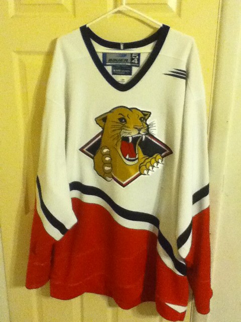
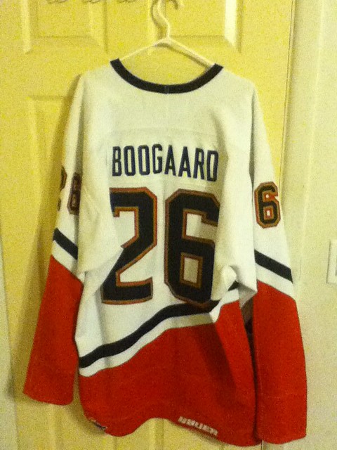
Rather incredibly, Uni Watch reader Shane Barnes owns that very jersey — or at least one of the jerseys Boogaard wore that season. Here’s what he posted in the comments on Tuesday evening:
Amazing reading about Derek Boogaard. When he was traded here (Prince George is my hometown), I remember the jersey he had to wear, and that it did need some tailoring. A year or two after he was traded, I noticed that his game-worn jersey was for sale. Since I am a big guy (6’4”³), I bought it. I still have it, and the stitching is pretty good, considering that they had to extend the sleeves and the length of the jersey to accommodate him.
What are the odds, right? I asked Shane if he could take some photos of the jersey, and he happily obliged. First, here are some basic shots of the front and back of the jersey:
The jersey was plenty big, but not big enough for Boogaard. Here are some shots showing where they had to add some extra material:
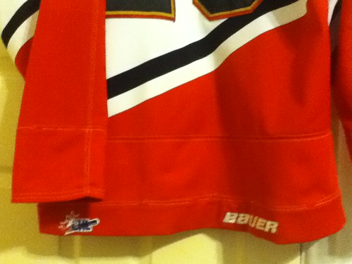
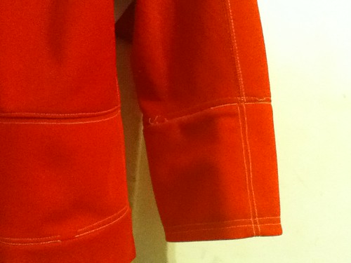
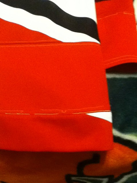
Just like Shane said, they did a pretty clean job. If you’re looking from a distance, there’s no hint that the jersey has been altered, except at the lower-left hemline, where a diagonal stripe was interrupted by the additional panel of fabric:
Big thanks to Shane for sharing these photos with us, and for providing such an amazing coincidence.

Boxing Day: I’m happy to report that my limited-edition Notre Dame promo box arrived yesterday at the home of its new owner (let’s call him John McDoe). John says he’s very pleased with his new acquisition, and the folks at Doctors Without Borders, who were on the receiving end of his generous donation, are extremely pleased too. Thanks again to everyone who participated in that auction.
In a vaguely related item, remember that Portland Timbers alternate kit that was unveiled on Tuesday? Reader Nick Orban got in touch yesterday afternoon with some additional details on that: “That kit is only available in a limited-edition boxed set with a new scarf that the Timbers have made. They have only made 2,012 boxes, all numbered, selling for $175.”
As if on cue, the FedEx guy showed up at my door about an hour later with my very own limited-edition Timbers jersey/scarf box:
What, no gold-plated chocolates? No Timbers-branded iPod? What a gyp! On the other hand, I’m a sucker for green and gold, so I guess I’ll let it slide.
Not sure what I’m gonna do with this one, although I think the scarf would look really cute on Uni Watch co-mascot Tucker. Hmmmmm….

Culinary Corner: Growing up in a nonreligious Jewish family that usually lit Hanukkah candles (reflexive cultural obligation), sometimes had a Christmas tree (suburban assimilation, plus I nagged for it), and always celebrated on Dec. 25 (it’s my brother’s birthday), I found myself awash in conflicting signals each holiday season. Contributing to the confusion, deliciously so, were the tree-, moon-, and star-shaped cookies that my Mom made each December — sweet, buttery, and topped with colored sprinkles. She always called them Christmas cookies, which I never questioned. The cookies were just one of those annual holiday rites that I learned to take for granted.
A few years ago I was writing a story on holiday treats and interviewed my Mom regarding these cookies. Here’s what she told me:
They’re actually Danish vanilla cookies. Or at least that’s what the cookbook called them. It was the first cookbook I bought after getting married in 1948 — The New York Herald-Tribune Cookbook, I think. I don’t have the book anymore, but I saved a few of the recipes, including that one.
Honestly, I don’t remember how I ended up deciding that they’d be our Christmas cookies. I think I liked the look of the recipe, but it called for cookie-cutters, which I had to buy. And if you go shopping for cookie-cutters, you end up with, you know, all the Christmas-y shapes. So I guess that’s how they became Christmas cookies.
By any name, they’re delicious — simple, elemental, addictive. Here’s how to make them:
1. Put 2-1/2 cups of sifted flour, a cup of sugar, and half a teaspoon of baking powder into a mixing bowl and whisk them together. Using a pastry blender, cut two sticks of room-temperature butter into the dry mixture, making sure the butter is well distributed throughout. At this point, you should have something resembling coarse cornmeal.
2. Add two egg yolks (reserve the whites — we’ll need them later) and 1-1/2 teaspoons of vanilla extract to the mixture. Using an electric mixer set on low, combine everything until you have a workable dough — it shouldn’t take more than about 45 seconds with a hand-held mixer, less than than with an automatic mixer. Wrap the dough in plastic wrap, flatten it into a disc about an inch thick, and pop it in the fridge for half an hour.
3. While the dough is chilling, preheat the oven to 375 and line a few cookie sheets with parchment paper. Also tear off a few large sheets of parchment, and dust them with flour — you’ll use these for rolling out the dough.
4. After half an hour, remove the chilled dough from the plastic and place it between the two floured parchment sheets. Using a rolling pin, roll the dough until it’s about an eighth of an inch thick (it may crack around the edges; if so, crimp the cracks). Use cookie cutters to cut out whatever shapes you like, transfer to the papered baking sheets with a floured spatula, re-roll the dough scraps, and repeat until you’ve all the dough is used up.
5. Beat the reserved egg whites slightly, so they’re more liquid-ish and less gloppy. Use a pastry brush to paint each dough cut-out with the whites and then add sugar sprinkles, nonpareils, chopped nuts, or whatever. The egg whites will help the toppings adhere, and will also give the cookies a shiny glaze.
6. Bake the cookies until the edges are just beginning to turn brown, 10 to 12 minutes, rotating the pans once about halfway through. Smaller cookies will cook a bit faster, so it’s best to cook similarly sized shapes together. Let them cool for about 15 minutes and then dig in.
Congratulations — you’re now an honorary member of my family, at least for the holiday season.
ESPN reminder: In case you missed it yesterday afternoon, the annual Uni Watch Holiday War on Xmas Gift Guide is up and running.
Uni Watch News Ticker: The Jazz will unveil an alternate uniform on Friday. … Major League Baseball has announced a dress code for members of the media. No word on whether pajama pants are allowed. … This video clip about the Cardinals Hall of Fame talks about Albert Pujols’s shoe design, which is also worn by Yadier Molina (from Caleb Yorks). … Lots of great old Browns/Steelers video footage embedded in this article (big thanks to Jerry Wolper). … Yesterday I asked about the history of championship belts. Marc Cavelli obligingly provided this article. … Look at this completely amazing chain-mail Sharks jersey. A new standard in DIYing! … Oooh, here’s a very cool magnetic NFL standings board. … New court design for the Wizards. … Check out the uniforms for competitive snowball fighting (thanks, Kirsten). … George Mason’s black alts debuted the other night (from Paul Barrett). … Too late for my gift guide column, but still pretty cool: a desk made from gym flooring (thanks, Kirsten). … As we all know, there’s no “I” in team — or in Miami (from Geoff Loughton). … Ryan Dunsmore notes that Texans quarterback TJ Yates was wearing an odd-patterned undershirt last Sunday. … Here’s a slideshow on the history of Princeton basketball. “It’s interesting that their uniforms didn’t have a wordmark or logo as late as 1950,” observes Eric Falcon. “Also, the accompanying article states that the Tigers alternate wearing their white and black jerseys during the conference portion of the season, both at home and on the road, to avoid the rush of having to wash them between Friday and Saturday games.” … Andrew McKillop found some pics of Stanford wearing 49ers-style pants in 1998. “I did a quick search in the newspaper archives but couldn’t find any reason for the pants,” he says. “I thought maybe they were doing a tribute to Bill Walsh but couldn’t find anything pointing to that.” Anyone know more? … Michigan State let a few walk-ons play at the end of last night’s game against Central Connecticut. Colby Wollenman, a freshman walk-on, scored the game’s final points — the first of his college career — in an NNOB jersey (screen shot by Matt Nuiver). ”¦ Monkey See, Monkey Do Dept.: Latest college hoops team to go gray is Missouri State. “It was part of a ‘Gray Out’ promotion that was led by the athletic department,” says Zach Brady. A gray out? That’s very, uh, original. ”¦ Mike Kramer has decorated his dorm room with a shitload of hockey jerseys. … A special shout-out to sporting goods historian Terry Proctor, who’s undergoing knee-replacement surgery today. Hang in there, Terry — hope you’re back on your feet soon. … I’ll be running errands for much of today. Everyone play nice while I’m away, yes? Yes.
Not sure if this has been covered, but the Seamheads blog has a piece this morning on the designer of the Kansas City Royals logo, Shannon Manning. Several logos that weren’t selected are featured as well.
Forgot to close tags to link sorry.
I’m pretty sure Paul would’ve wanted them to go with the link ;)
That cow is begging to be put on a t-shirt.
Second row at right looks like the kind of unofficial logo that would’ve been a sewn-on patch on a child’s baseball jacket of the period, no? It also looks like it uses the old link (and, hence, link) capital R.
To add to your discussion on Championship belts, you might be interested in this short video about the belt buckle awarded at the Leadville Trail 100 mountain bike race.
link
Shane,
Any chance you bought a game used Prince George Blair Betts jersey from his time there?
No, I do not have a Blair Betts jersey.
From one Shane to another, awesome find.
Sure is. Interesting visual to back up a very powerful series of stories.
The dorm room sounded cool until I saw the photos. With all those jerseys on the wall it looks like a store. I don’t know if playing Xbox in Dick’s Sporting Goods sounds like a great time.
1) Lots of Captains in that room. However, I don’t recall Kimmo Timonen wearing the C for the Flyers?
2) Then I asked myself, how the heck can these college kids afford all these authentics? Then I scrolled the entire photo blog saw good old U of P. ‘Nuff said.
I don’t have a game-by-game recollection of the Flyers, but Pronger and Richards have been the captains of the Flyers since Timonen has been there. Timonen has always been an alternate in Philly when wearing a letter.
The last time Timonen was a captain was back in Nashville.
It’s very possible that some of those could be customized. Yes, most are captains, and then most have a 7 digit. If every jersey were of a real player, that would be a heroic collection. But alas, the one tipoff is the blue ASG from LA jersey (in between Burger King and Wild Wing). That blue jersey is #7, captain, of an American person/player (I think, can’t quite see the flag), and for the Flyers. Does not compute. (At least, not for me. I would only wear a personal NOB jersey if I actually played on the team, went to fantasy camp, or got hot dog discounts at Lightning games. Just because personal NOB’s don’t float my boat doesn’t mean they can’t float yours.)
I’m interested to know whose on the back of that Habs jersey! Can I buy it, maybe?
There wasn’t a #7 at the 2002 NHL All-Star Game in Los Angeles, and the North American squad wore the blue uniforms. The only Philly player there was Jeremy Roenick, but he #97. Joe Sakic wore #19, and he was the captain.
Chelios also went to the game as a member of the North American team, but he wore #24 as a member of the Red Wings. Mark Parrish was there as a member of the Islanders and wore #37.
In short, you’re right, Mike, that it could be customized for Mike Kramer’s eyes only.
In fact, I’ll add even more to this. The Mooterus Stars jersey has a captain’s “C” on it, and has the #7. Unless that’s a Neil Broten jersey (which would be a major jersey foul since he never wore that uniform), I’m thinking the Dallas jersey and the 2002 NHL All-Star jersey have the same customization on them.
idk i mean we’ve collected these jerseys over the course of 13-14 years, it wasn’t so much a matter of money as one of that this was really the only present i wanted for a long time
I’m with you. Displaying just for displaying’s sake is lost on me. I’d like a little artfulness.
I typically have two and rotate them. Currently a Clarkson White (not one I really like, but team autographed, authentic, won in a raffle) and Philly Quakers. The Old style Thrashers white I pulled off e-bay is going up soon.
Coating the wall seems a bit much, but hockey jerseys, with big, bold logos laid on a visually balanced palette (the elements at the waist really do help, though I do have a yankees jersey in the summer rotation), make great display pieces. As for replica v. authentic, I couldn’t care less. The splash of color is what’s important.
The Blackhawks St. Patty’s Day jersey in the corner is a nice touch. Anaheim’s Wild Wing jersey and LA’s Burger King jersey appear to be replicas.
Overall, a solid collection!
I disagree. He has one Hawks jersey and it’s a green knockoff? Unconscionable.
OK, it’s not the only Hawks jersey on there.
Still…
He has a black Chelios ‘Hawks jersey. Not my first choice, but at least the team wore it during a game.
I more outraged that there are no Fishermen in the picture. That’s almost criminal!
Yeah, I noticed the black jersey later. That’s why I corrected myself.
By the way, I’m just ball-busting here. Overall, I like what I see.
Sure, the presentation could be a bit more artistic, but it’s a dorm room, for fuck’s sake.
Totally agree, James. And as for ball-busting, it takes a lot more than that to get me fired up today. :o)
Oh, its a Blackhawks St. Patty’s sweater. I thought it was a North Dakota sweater.
You can make out the Tomahawked C on either sleeve if you zoom in. ;o)
Visually oppresive. I wouldn’t last 10 minutes in there.
*oppressive
Yeah, but this way, he can rip one off the wall and wear it. It’s funtional and fun. Kudos.
As someone who had his (4) ‘hawks jerseys hanging on the walls of his senior year apartment bedroom, I like what I see, hater be damned.
Haters*
As a game worn collector with over 100 hockey and a few dozen baseball jerseys, I won’t throw stones at another jersey collector. But Mike, seriously, how do you have all those? Some are VHTF styles, and most all of them are new jerseys. My collection has been amassed in the 10+ years since I was in college. Impressive.
ok, to explain the jerseys, when i was little my dad always like to get customized jerseys with my or my brothers favorite number and our name on the back.. i personally like jerseys with players names on the back, so once i became old enough to decide, thats what we started to buy. this collection has been slowly building since the late 90s id say. we used to get 3-4 jerseys a year, and since then it has just added up
hard to believe it’s been 31 years since football became unimportant
Wow..hard to believe it was that long ago. I remember trying to skip school to go down to the Dakota Appartments and stand vigil with the rest of the people. (was unable to but did go to the memorial service in central park)
“…dead…on…arrival.”
Howard always knew sport was just sport, now matter how big or small the game or situation. Perspective was not lost on him.
“Mami, Mami. It’s me…..your little sonny boy. Don’t you know me?!”
The desk made from gym flooring reminds me of our college bar re-purposed from an old bowling alley.
Typo on “weather” pajama pants are allowed (Hope I’m not out of line mentioning it)
I always appreciate typo fixes. Thanks!
I think the Timbers kit is really cool, going with the “throwback” logo of Alaska Airlines.
Now, I’d like to see D.C. United go with a Washington Diplomats jersey with the old Volkswagen logo in the middle:
link
Well, that’s a little different. The Dips and United don’t have any connections whatsoever. If I’m not mistaken, the Timbers have are part of the legacy of the original NASL team of that name.
Personally, I’ve liked throwback stuff, but I’ve never been big on a team “throwing back” to a previous team just because they shared a city. The Detroit Red Wings can throw back to the Falcons and Cougars because it’s all the same club. The Detroit Pistons can throw back to the Fort Wayne Pistons, even though it’s a little wonky, because it’s the same club. But when the Toronto Raptors threw back to the Toronto Huskies, that doesn’t work for me.
The only time a non-connected thowback can work IMP is when it’s something like MLB teams paying homage to negro league sides. Then I’ll buy the “social statement ” aspect.
SB
I only wish that they had gone with the classic Adidas logo to complete the look.
love the new wizard’s scheme. wish they’d go back to the bullets, but the dc jumpball logo and colors are more than a fair compromise
What you said.
I noticed on Yahoo Sportacular app that they still use the Chargers white filled logo (and they use the Bengals tiger head logo).
“… Here’s a slideshow on the history of Princeton basketball. “It’s interesting that their uniforms didn’t have a wordmark or logo as late as 1950,” observes Eric Falcon. “Also, the accompanying article states that the Tigers alternate wearing their white and black jerseys during the conference portion of the season, both at home and on the road, to avoid the rush of having to wash them between Friday and Saturday games. … ”
Terrific feature. That 1951-52 uni, with no name on the shirt but a cool juxtaposition of orange and black, is a beaut. As I’ve noted here before, Princeton is a loathsome institution, but its uni history is glorious. Until recently. Now you get basketball Nike, which isn’t awful, but not particularly distinguished, and an all-black football look that brings tears to the eyes of sensitive souls who remember those awesome Tiger gridder looks of yesteryear.
Speaking of loathsome Princeton, the completely adorable Harvard men’s basketball team — now 8-0 and NATIONALLY RANKED — plays UConn tonight (ESPN2, 7EST) and will probably lose, but not definitely.
“We’ll probably lose, but not definitely!”
I’d love to hear a team’s fans shout that out sometime.
I’ve been to a couple of those games.
“We exceeded expectations.”
-Browns fan in downtown Pittsburgh after Thursday’s game.
Since most sports writers I’ve seen dress like they buy their clothes at Goodwill, it could have an impact. And you DON’T want to see most of them in sheer and see-through clothing or clothing exposing bare midriffs.
My sports related media work was incidental & not covered in glory. Luckily sports wasn’t my focus—though I probably wouldn’t have an issue with MLB’s new code. I did have a radio station general mgr. who didn’t like the way I dressed. But that was because he was a huge gaping ahole from the midwest who had pictures of Baron von Richtofen (a much better guy than that GM)on his office walls. And a .357 Magnum handgun in his desk. I pretty much dressed neo-Norton (Honeymooners Art Carney). As if that wasn’t good enough to stand in a parking lot handing out Mickey D coupons, doing one liners on remotes.
The extended jersey reminds me of Uwe Krupp, another big guy who had extra panels sewn into his jerseys.
Just thinking the same thing.
link
On anther note, while I can’t find a pic, Zdeno Chara also played for the Cougars. He also needed additional everything. No wonder the PG equipment manager did such a good job on Boogaard’s sweater.
SB
I enjoyed the embedded video footage in the Browns-Steelers article. Love those “Batman” Steelers uniforms and wish Pittsburgh would wear them as a throwback next season!
we already have one ugly throwback on tap for next season
(well, i actually like the design. but for football… not so sure)
We do? Are we talking about the Packers keeping that blue thing for next season or another team doing something ugly?
The rumor mill has the Steelers bringing back the 1994 throwback uniform, don’t know how it will be the same or different from ’94.
Liked the gold jersey with the stripes and city crest, but the helmet was simply plain black. Wouldn’t mind seeing the city crest on the helmet this time.
Eww.
Officially, the Packers have three more years with the blues – it’s their official alternate jersey.
They might decide not to wear them again, but they’ll stay on the style sheets. And frankly, given the fans’ reactions, I think we’ll see them once a year for the full five.
For my own part, I really like the Steelers’ current throwbacks. In a sport becoming dominated by miniscule piping and paneling, there’s something very refreshing about simple gold on black jerseys. Much better than the ’94 friction strips.
I wholeheartedly agree. There’s just something crisp about colored numerals on a dark jersey that really unique in today’s landscape. It works for so many color combos, but so few teams take advantage. It actually looks even better with grey facemasks and khaki pants. I love how the neutrals, like khaki and grey balance a jersey, sock and helmet that are enveloped in team color.
link
get a free bowl of soup with that card??? looks good on you though ;-)
sorry buddy… forgot about your love of that jersey
Somewhere out there there’s a church lady who’s gonna think a jersey with “ANGELS” on the front and “PUJOLS” on the back is just disgusting.
Come to think of it, might be a lot of Cardinals fans who’ll think so, too.
Although, if you think about it…
If the deal had to be 10 years, we should have figured it would be in the AL where he can end his career as a DH.
Agreed. Seems like a good fit between team (Anahei – er, Los Angeles is the place for decent fielding sluggers to spend their twilight years) and player.
“In the end, it came down to his little known, but deep-seated and fervent hatred of the Astros.’This gives me the opportunity to beat on poor Astros pitching for years to come'”
Okay, not really. Astros just don’t have anything going their way these days, do they?
You’re right, Rick. It’s a known fact that link.
sure enough:
Report: Albert Pujols will sign with the Angels.
Read more: link
I just wanted to say thanks again for linking to the Boogaard articles in the Times. Great journalism and a must-read for any hockey fan.
As a long-time hockey fan, I’ve come around in the last few years. When I was younger, I enjoyed fighting as much as the next Canadian (and owned a few Don Cherry videos on Betamax). Now the idea of guys who are 6-10 and 300 pounds punching each other into brain damage makes me sick.
The most interesting part of the articles was the utter denial of any responsibility by the Wild, the Rangers and Bettman.
I gave up the NHL about 15 years ago for pretty much the same reason. Bring on the college hockey, though…and competitive snowball fighting!
Speaking of hockey, there’s a Whalers hat sighting when you click on that George Mason hoops photo gallery.
link
Someone’s wearing it in the green-tinted crowd background. That to me was more interesting than GM’s BFBS unis.
MotherVilker, there’s a lot of good hockey being played in the NHL today. In fact, as good as NCAA hockey is, you see a lot of the guys you’ve been watching excel at the next level.
C’mon back… we’re an inviting crowd.
Perhaps, someday.
Just always felt weird being the only person seated while the rest of crowd was on its feet during a scrum. I will sneak a peak at some playoff hockey, since they really get down to business then.
Never stopped liking hockey fans though, buddy. ;)
Agree with Teebz.
However, I like fighting. It is hard to read an article like that and justify my enjoyment, but Boxing and MMA are still legal (in some places…). I wouldn’t be too disappointed if the NHL banned fighting, but I wont lie, I would miss it.
I feel that if the NHL takes a proactive stance and gathers data about concussions and headshots and their relation to dementia et. al., I think informed adults can decide weather or not fighting is for them, risks be damned.
But fighting in teenage leagues and teaching kids to fight seems pretty unconscionable.
OH, and Vilker, there are two whalers hats in that image and yankees and chargers hat. link
(the image repeats itself.)
Never understood this. Not making any judgements here! Just saying I’ve never understood the attraction of seeing hockey players fight. It’s boring to me. For one thing, even the best hockey enforcers aren’t actually very good fighters, plus they’re outfitted with too much equipment (and, oh, yeah, they’re standing on ice) to make for a good contest. But more importantly, all the stuff that’s interesting about hockey? The movement, the passing, the puck control, the defense, all of that stops for the duration of any fight. Might as well watch puddles collect in the outfield during a rain delay for all the actual action going on. A hockey fight is no more interesting to me than football players huddling during a time out. Once the fight starts, the hockey stops, and the hockey is what I tuned in to see.
Don’t know if it’s true or not, but the NHL seems to me to be much less fighty than a generation ago. I don’t seem to see nearly as many fights the last five years or so, even though I watch far more NHL games than I used to. I regard this as a good thing.
Afraid that Scott might be moved again to listen to Prairie Home Companion with the lights off, I would just say, in a gingerly kind of aside, that he’s not completely alone in his appreciations of NHL games and NHL fighting.
The best hockey (for me) is international hockey, played on big rinks that give an advantage to skating and passing skills. Thank God for the Russians! Who wasn’t thrilled at those big-stakes games at the Vancouver Olympics? And how many of those games had extended brawls?
Fighting in hockey used to serve a purpose. There is an unwritten code, much like the beanball in baseball, that extends far beyond the understanding of the casual fan.
The problem is that many of today’s fights are not as emotional and spontaneous as they used to be. I’m not condoning fighting, but the tension in the game can be cut in half with one good, emotion-filled scrap. The mind games that follow? Absolutely entertaining!
fuck that
bring back the fighting and i just might learn to love hockey again
Vancouver was NHL ice, Connie. That has more to do with the concentration of talent then it does with ice size.
Did some archive searching and found some info on the Stanford pants. From this article: link, it sounds like they were “Throwback” pants (doesn’t mention the year) that were actually worn first for the Big Game against Cal in 1997. According to the article, this throwback look was to be a permanent change for 1998 until Stanford dropped their first two games to San Jose St. and Arizona and subsequently dropped the throwback pants.
Per this article (link), “players from both teams appeared in 1930s-era football uniforms  emblazoned with the Nike swoosh.”
Thanks for the updated info. I actually found a b/w photo of the 1997 Big Game and can confirm they indeed wore throwback uniforms.
California (guessed on colors since it was a b/w photo)
A remake of their 1966-71 helmet. Blue shell, golden “C”, but a blue facemask.
White jersey, with sleeve stripes. Four of them blue, interlaced with three yellow/gold ones.
Couldn’t see the pants.
Stanford
A blank white shell, with a red facemask.
Red jersey, with no stripes, and small block numbers.
Pants, the tan ones already discussed.
If you’re willing to buy into the numbers, US swimmers will see 16.6% less drag than before with link!
“What you see is less bubble generation [in the water],” Tom Waller, lead designer of Fastskin3, said. “You see water separating from different parts of the body that you’ve never seen it separate from before.”
My question: how does water separate from the body when you’re surrounded and immersed in it?
Without suggesting there’s anything more than the usual tooth fairy BS behind the claims, bodies moving through water (fish, submarines, torpedoes, James Bond’s amphibious car, swimmers) often create little pockets of vacuum where water separates from the moving surface.
The problem is, these pockets of vacuum are a Very Bad Thing if your goal is speed, or if you goal is to have finely machined metal bits not fail catastrophically. Eons ago, I did a physics project that involved reading up on some of the hydrodynamic issues relating to ships’ screws and propellers, and dealing with the little pockets of vacuum so that a ship’s propulsion system wasn’t strained to the point of metal fatigue was a big deal in the studies I remember reading.
What you want is for the water to move smoothly out and back as the moving body passes through the water, without separating from the body and forming vacuum pockets, since those exert a strong drag force on the moving body.
It’s not BS. You do generate those pockets, and better streamlining and filling those gaps would really help.
Competitive swimmers wear the basic trunks you and I wear to train. Why? They call them Drag Shorts. They create a noticeable drag, and they have to work harder to make up for it, so they get stronger.
I don’t know how noticeable such improvements would be to you and me, but just like I can feel the difference in a $700 pair of hockey skates versus a $300 pair (and you probably can’t), if you’re at the high end of a skill set, you’ll notice, and it makes a difference.
As a Timbers season ticket holder it’s awesome that you got sent those. I have a suggestion for what you can do with the uni, you can send it to me, just kidding. Your like a small or a medium and I am a large or xl so that wouldn’t work. I already have a couple of scarves so you can keep that one too. If you’re ever in the great Pacific Northwest, Portland specifically(not a good idea to wear in Seattle unless you’re looking for a fight), you should wear the uni and the scarf and come to a Timbers game. If you did you’d want to get Timbers Army section tickets, that’s where all the action is. I know you could care less about soccer, but Timbers games in Portland are a pretty unique American sporting experience. My guess is that you’d possibly refuse to wear the uni because of the corporate sponsor on the front, but I could be wrong.
Every sports fan should watch a soccer match in person, preferably surrounded by fans like Portland’s. It’s an amazing experience.
One of these trips back to England I’m going to a lower-tier match, in one of the stadiums that’s still all-standing.
I think that post-Taylor Report, for an all-standing match you’d need to be in a real lower tier match that’s below the Football League (Conference or lower). Lower level Football League clubs still have terraces but they also have seated areas. I don’t think you can play in the Football League unless your stadium has at least some seats.
although I think the scarf would look really
cuteawesome onUni Watch co-mascot TuckerJim Vilk.(fixed)
Whoa, since when did the Winnijets has an inside-neck inscription?
link
For the record, I think that’s a fad that needs to get nipped in the bud, but I like that wordmark so much more than the “Jets” one. Hey Chipman, throw the Winnipeg mark somewhere visible, OK?
*Winnijets HAVE. I need another coffee.
I’ve noticed it ever since I picked up my game jersey in October. However, they should put a couple of maple leafs in there, just for good measure.
There’s a company in Eastern Europe that uses the clip art of the chef:
link
I am very pro Fenway Park and its centenary, but celebrations of one’s home ballpark do not belong on a team’s road jersey. Nice patch:
link
All I can say is, the quality of Paul’s swag definitely is improving (re: Timbers marketing kit).
Seems to be a green & gold/adidas theme running through it all, though.
Was gonna say he probably isn’t on Nike’s list.
But then again I’m pretty sure he is.
No, he isn’t.
Oh…I know.
Just set myself up with a straight line I couldn’t ignore.
Best wishes to Mr. Proctor, as he completes Phase One of his bionic transformation…
…just hope he spent more than link on his surgery.
Get well soon, Terry!
Listen to the Docs.
Do the therapy.
Take care, Terry.
what they ^ said
g’luck buddy
I guess someone at Adibok really likes you Paul.
I’ll take the Timbers promo stuff if you don’t know what to do with it!
So some college basketball teams still do the alternating white at home and then dark at home when they play consecutive nights in conference play? I remember years ago that division 3 teams did that, but didn’t know it extended to division 1.
Wish I were Jeff Mathis right now …
link
You know why Pujols must wear #5. It’s so he can easily remember his real age.
He takes whatever age he says he is, and then tacks on five more years.
Kind of funny to think that #5 for the Angels went from potentially the worst offensive player in recent history to the best. Just sayin’
Mendoza line = Mathis line (he is within a hundred at bats of Mendoza, I believe)
Good job on the dorm room hockey sweaters, although it fails without the Vancouver Vaders. What’s that? The VV doesn’t stand for Vancouver Vaders? Well if you say so…
link
Gallery of Basketball Game Marshall University vs Cleveland State from 1972.
Love the site, etc. And sorry to be a PC wet blanket, but I was surprised to see you use the racial slur “gyp”.