Back in February I did a post about how the 49ers’ infamous 1991 one-day helmet had appeared as part of a Duncan Hines cake promotion (if you missed that entry, or just need to refresh your memory, look here). At the time, I wrote, “I’d never seen the Niners’ one-day helmet design used on any NFL-licensed product.”
Now I’ve found the one-day helmet in another place I hadn’t been aware of. Check it out (you can click on the image, and on all the other images in this entry, to see a larger version):
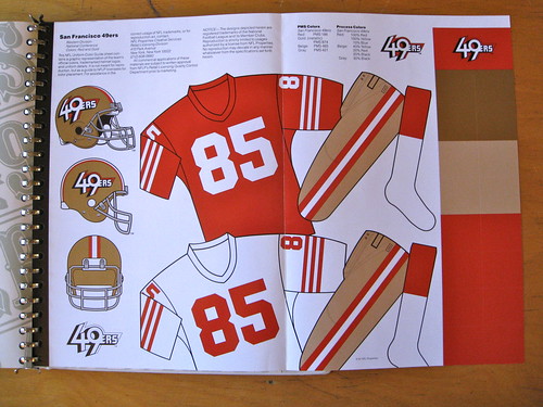
That’s a sheet from an NFL Style Guide that I recently scored on eBay. Unlike other styles guides in my library, this one isn’t from a particular year — it’s a mix of materials, mostly from the mid-’80s through the early ’90s. The guide’s previous owner was an NFL licensee, and he’d just add updated spec sheets to the multi-ring binder as they were sent to him by NFL Properties. In fact, the 49ers spec sheet was accompanied by this memo, spelling out the team’s new look:
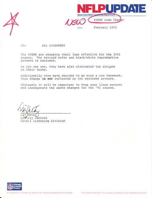
Presumably another memo was later issued, saying, “Never mind,” but the licensee apparently didn’t save that one — too bad. In any case, it’s interesting to see that the one-day design made it to the league’s style guide.
The Niners phantom design is the real prize here, but there are lots of other anomalies scattered throughout the style guide, beginning with the cover of the binder itself. Here, take a look:
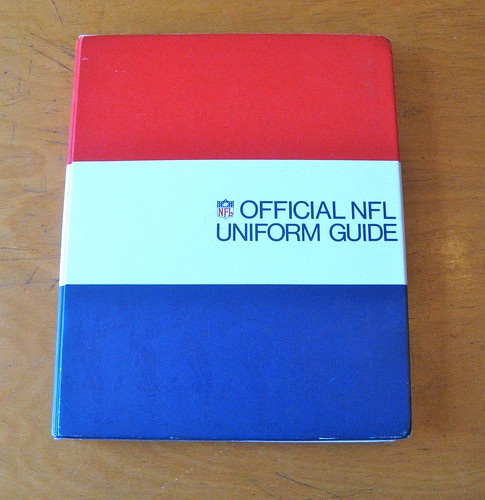
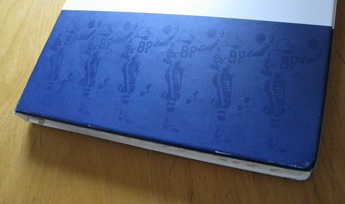
As you can see, the blue stripe has a tone-on-tone illustration of a receiver making a tricky catch. (The same illo also appears in the red stripe, but it’s hard to make out.) I’ve never seen this image used within the NFL’s branding program before.
Three NFL teams have worn TV numbers on their hips over the years — and all three of them are represented in this batch of materials. Dig:
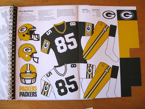
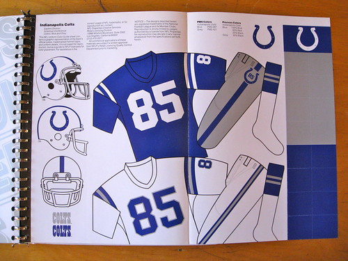
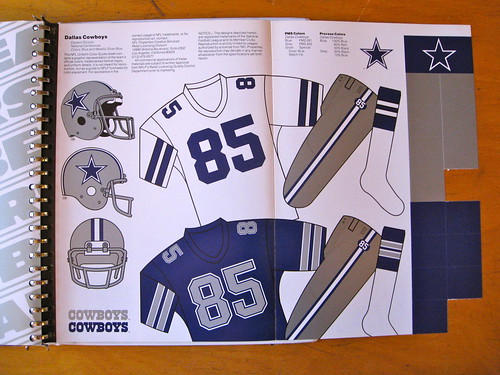
The big shocker there is that the Cowboys’ spec sheet only shows one shade of blue and one shade of silver. The spec sheet isn’t dated (and no, the “85” uni number doesn’t mean it was from 1985), but the Cowboys wore the hip numbers from 1982 through ’88, and the Gridiron Uniform Database shows them wearing two distinct sets of silver pants during that entire period. Hmmmmm.
The binder includes three separate spec sheets for the Dolphins — with three different sock designs! Take a look:
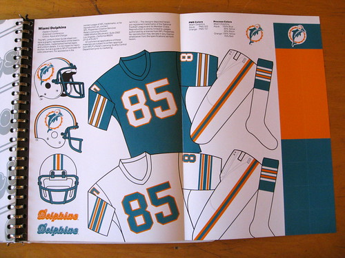
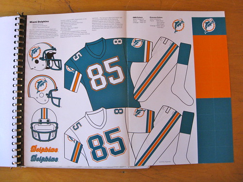
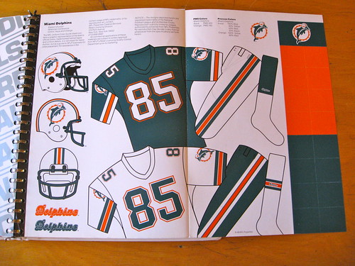
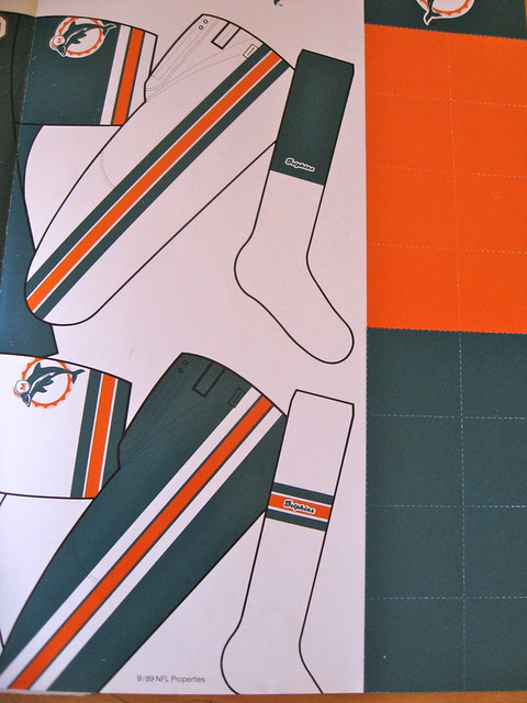
The first sheet is undated but clearly dates from the mid-1980s. The second one, with the simple color-blocked socks, is dated “6/87.” And the third one, with the script wordmarks on the socks, is dated “9/89.” The Gridiron Database doesn’t include the sock wordmarks for the ’89 Dolphins, but it looks like they’re gonna have to add them, because they were definitely part of the uniform.
(Also not included in the Gridiron Database: The Chargers had little wordmarks on their socks in 1992, and so did the Bengals. Unfortunately, those spec sheets aren’t included in the style guide binder.)
Speaking of socks, here’s something rare: a one-stripe sock design:
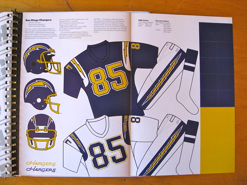
The spec sheet isn’t dated, butt the Chargers wore that design from 1985 though 1987. The only other one-stripe sock design I can think of was worn by the late-’80s Packers, although I imagine there were probably a few others.
Staying with the hosiery theme, some of the older style sheets show stirrups, a remnant of the era when football players wore white crew socks over stirrups:
I confess that I had completely forgotten about the Patriots’ inaugural Flying Elvis design, from 1993. So when I saw this sheet, for a second I thought it might be a phantom prototype that never made it onto the field:
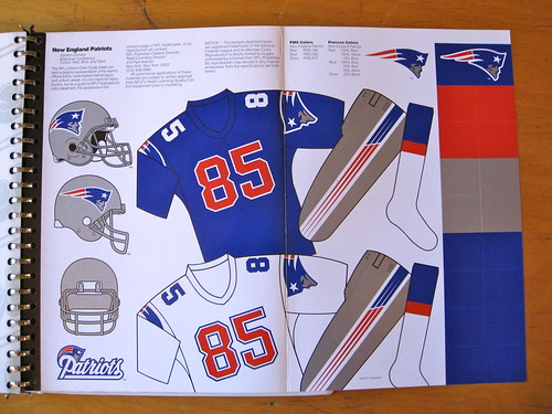
Has there ever been another case of the TV numbers being a different color than the main uni numbers? Also: Note that the NFL shield, which had been added to the base of the collar starting in 1991, isn’t shown on this sheet. Surprising.
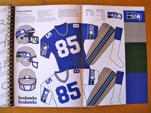
There’s nothing particularly noteworthy about this next image, but I’m including it as a reminder of how nice the Seahawks used to look:
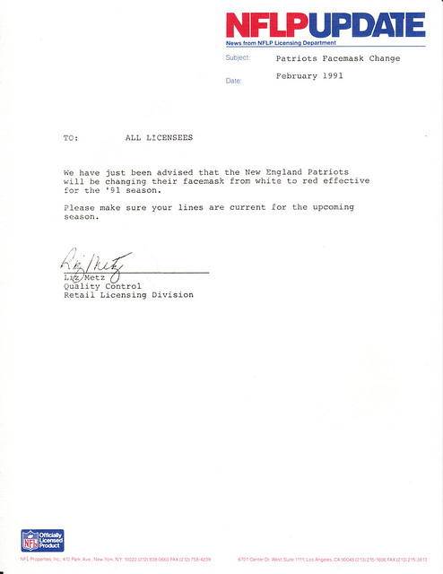
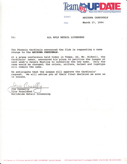
Finally, here are two more memos from NFL Properties to its licensees. The second one is particularly notable because of the sideways NFL logo at the top of the page — never seen that before. Here:
———
And so on. Oh, and in case you’re wondering, this thing cost me a little more than a C-note. Totally worth it.
Collector’s Corner
By Brinke Guthrie
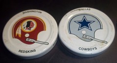
I pounded down a lot of Gatorade back in 1971 or so in order to collect these NFL bottle caps (and that was before they took out those killer cyclamates). More on these great collectibles here.
In other finds:
• Wake up to this 1970s 49ers helmet clock radio.
• What do we make of this 1920s football sticker? Unusual, yet oddly compelling.
• Here’s a great set of 1974 NHL stickers. Pair ’em with this 1970s NHL logo mug.
• Check this 1948 Boston Braves World Series press pin, submitted by reader Michael Clary.
• The Astros would be well served to return to this look when they move to the AL.
• From Matt Campbell, a 1960s Baltimore Bullets milk glass featuring “Alex the Bullet Dog.” Quoting Matt: “A wiener dog mascot is brilliant!” Agreed.
Seen something on eBay that you think would make good Collector’s Corner fodder? Send your submissions here, or tweet them here.
Notre Dame auction update: We are now in the final hours of the auction for the Notre Dame promo box. The auction closes today at noon Eastern. Bids received after that time will not be considered.
No bids were submitted yesterday, so the high bid is still $4301 and the minimum bid for today is now $4801.
Full details on how to bid, and everything else regarding the auction, can be found here. The Notre Dame auction is now over. I’ll announce the winning bid/bidder tomorrow.
With the holidays right around the corner, here are a few gift-related thoughts:
• If you want to buy someone a Uni Watch membership as a gift, full details on how to do that are available here.
• From now through the end of the year, if you order two sheets of stickers based on your membership card design (that costs $26), you’ll also get a free sheet of Uni Watch logo stickers (a mix of all three colors). Instrux for ordering stickers can be found here.
• Speaking of the Uni Watch logo stickers, the response to my recent offer has been so overwhelming that I’m fresh out of stickers and have ordered more. My offer still stands: If you want three of these stickers (one each of green, gold, and burgundy), send a self-addressed stamped envelope to Paul Lukas, 671 DeGraw St., Brooklyn, NY 11217. If you want to enclose a coupla bucks or a barter offering, that’d be nice, although it isn’t required. And my easily confused post office would prefer that you please send things to Paul Lukas, not to Uni Watch, okay? Okay.
• I’m still taking submissions and suggestions for my annual Uni Watch Holiday Gift Guide column, which will run next month on ESPN. If you have any tips, send them here. Thanks.
Uni Watch News Ticker: After all the bogus leaks, we finally know what the Flyers’ Winter Classic jersey really looks like. Eh, whatever — nothing to get worked up about either way. … The Royals will unveil some uniform updates today at noon Eastern. Live video will be available on the team’s web site. According to someone on the Chris Creamer board, they’re dropping powder blue cap, changing the script on powder blue jersey from royal trimmed in white to white trimmed in royal, and adjusting the script on the road grays. As I mentioned last week, a little birdie tells me they may also be adding powder blue pants, although I haven’t been able to confirm that. … Several readers have noted that some of Michigan’s football players have the “M” logo above their nameplate and some don’t. That’s because some players are wearing the new super-stretchies, which include the “M,” while some prefer the older, conventional jerseys, which don’t (big thanks to Alan Topolski for the photo). … Just what the world’s been waiting for: hashtags in the end zone. And we know they’re headed for NOBs soon. … In other Mississippi State news, they’ll be wearing a new uniform for the Egg Bowl. … Two notes from Sunday’s Liverpool/Chelsea match: Chelsea goalkeeper Peter Cech’s headgear now has a noseguard, and Liverpool wore black armbands in support of their back-up goalie, whose six-year-old son recently died of leukemia (from Nile Smith). … Nate Dion attended the Arizona Fall League Championship on Saturday and noted that each team’s first base coach had a rather lengthy NOB. … News from the Tooth Fairy Wars: Those annoying little bracelets that look like women’s wristwatches are on their way out, thanks to a class action lawsuit. … Fascinating contribution from Ryan Perkins, who writes: “During a trip to the Dominican Republic back in June, I spotted these two huge Packers and Steelers helmets tucked away to the side in our resort’s auditorium. My favorite detail, which you can barely see in one of the pics, is that they went so far as to include a front facemask clip on the Packers helmet. They were approximately 18 feet high and stretched with a light canvas and papier mâché over 2×4 framing and plywood. There wasn’t anybody around for me to ask, but my guess is that maybe they recover or repaint them each year before the Super Bowl.” … Yesterday I mentioned that Adidas schools participating in the Maui Invitational tourney would be wearing blue sneakers, but I didn’t have a photo. Now I do. Further details in this press release. … Not often that you see a taffy-pull jersey photo in the baseball world. “It’s from a high school game sometime in the mid-1990s,” says Brice Wallace. … Rick Liebling has written a piece about the clothing worn by on-air talent, managers, and coaches. … If you liked Permanent Record, you’ll love this story about a ledger showing who checked out which books from an Indiana library 100 years ago (major thanks to Dave Flapan). ”¦ More torn-jersey porn: Derrick Johnson, from last night’s Pats/Chiefs game (screen shot by Alvin Burk). ”¦ UConn women’s hoops wore an “OSU” patch last night, in remembrance of the victims of last week’s Oklahoma State plane crash (from Nick Phillips). ”¦ “I was sitting courtside prior to the BC Basketball Classic last weekend at the Rogers Arena in Vancouver,” writes Daniel Carroll. “I noticed that the court had been resurfaced around the center line for the new logo. I thought the shape was a little bit funny until I realized it was in the shape of the Vancouver Grizzlies logo. I did a little research and it looks like the NBA had an exhibition game there in 2009 on the same floor.” ”¦ Now here’s an excellent book title. ”¦ And maybe that book features this photo (big thanks to Matt Mitchell). ”¦ Not sure I’ve ever seen a vintage jersey with such a mish-mash of colors. ”¦ Here’s a completely magnificent Ohio State warm-up top. Look at that chain-stitched buckeye! ”¦ Interesting article on Michigan’s first scoreboard (from Tom Wilcox). ”¦ A giant of the frankfurter world has passed away. R.I.P.
Has there ever been another case of the TV numbers being a different color than the main uni numbers?
The Raiders white jerseys for part of ’63 and the Tennessee Titans navy jerseys are the only others I can think of.
/and it’s a shame the Patriots had to ditch that uniform. It’s the best uniform they ever had.
…and the Titans other blue jersey.
Also… didn’t Ohio State have black TV numbers for a season? Late 60’s-ish?
yes
The Michael Vick-era Virginia Tech Hokies too.
link
And if we’re talking hockey, that’s not too uncommon: Hawerchuk Jets, Esposito Rangers, 80’s Maple Leafs, and the current Philly Flyers all have that feature, just to name a few.
I never liked the red numbers on blue jersey. Did the NFL force the Patriots to change to white numbers because referees couldn’t make out the digits?
If I had to guess, I’d say they just couldn’t make up their minds. They had the overhaul in ’93, changed in ’94 and changed again in ’95. I just can’t see the league forcing that. In fact that seems like the type of thing that would have contributed greatly to the adoption of the current no-changes-for-5-years rule.
And DUH, the Jets!
The current Cardinals white jersey
The current Bengals white jersey
Both Cowboys jerseys from 1960-1963 & the current alt based on them
Both Cowboys “throwback” jerseys in 1994
The Cowboys blue jersey in 1995, which was used as an alt in 2001-2003
The Broncos white jersey from 1965-1966
The Patriots blue jersey in 1993
Both Jets jerseys from 1963-1977 & 1998-current
The Jets 94 “throwback”
Not quite the same but whenever the Chargers wore numbers on their helmets they were black except for 1960 when they were navy blue
Both of the Titans blue jerseys
To my knowledge that is every instance of this in NFL history
Well done. But almost all of these have one thing in common: The TV numbers are positioned on a contrast-colored yoke or contrast-colored sleeve that provides a different background color than the main body of the jersey.
What makes the 1993 Patriots example so unusual is that the main uni numbers and the TV numbers are different colors even though they’re on the same colored background.
True
I want that style guide so much I cannot stand it. How convenient Christmas is coming up, so Paul can gift it to me.
It’s rather endearing that Brinke still believes in Santa Claus.
You’re kidding, right? Those were the most bland, boring uniforms the Pats have ever worn. There’s a reason they only lasted one season.
They got the Steelers helmet wrong-that helmet decal shouldn’t be there. Poor showing. :)
Additionally, both facemasks are the wrong color.
As a Steeler fan, that is a BIG case of OCD for me. There should be no logo on the left side of the helmet.
One of the best artifact articles in a long, long time. Great find!
On the Cowboys, would we really expect the team to list different colors for its different uni elements? I always thought that officially, the Cowboys had one color of silver, that due presumably at first to differences in materials and manufacturing and later to adherence to this de facto difference was represented differently on different parts of the uni. Sort of like how many MLB teams officially designate a true navy as their color, but then wear a much darker Yankees midnight navy on their caps and a much brighter true navy on their jerseys and other elements. Have the Cowboys subsequently made the different hues of silver official and listed multiple silvers in their style guides?
By 1999 (and maybe sooner, although I’m not sure), the style guide did indeed list separate pants colors for the Cowboys:
link
That’s from the ’99 style guide, which the NFL was kind enough to give to me back when I was just getting started with Uni Watch.
some guy wrote a pretty good article about that (and other quirks) a few years back
That was my favorite comment section of all time.
I’ve never heard so many Brits refer to cigarettes in one sitting.
Interesting that none of the style guide pages appear to specify belt color…
Yes! I meant to mention that. Good call!
…or NOBs. You’d never know that the Rams & Chargers had white NOBs with their yellow numbers.
The Dolphins used to switch their belt color between orange and aqua fairly regularly…
I thought I heard somewhere that the Cowboys swithed to the blueish silver to wear with their white jerseys when color tv became available because it stood out more.
Dark navy caps in baseball look stupid to me. My Nats’ navy is way to dark. Their road caps would look less like the Braves if they switch back to the blue from their old patriotic DC cap.
That sounds a little bit off to me.
The gridiron database has them in bluish silver with both jerseys from ’64 to ’80. Maybe they switched from white helmets/pants to silver-blue because of color TV.
The pure silver with the blue jerseys doesn’t seem to start until ’81, which just happens to coincide with the blue jerseys going from royal to navy.
This does bring up the question of just how accurate the style guides are/were.
Actually you’re both correct in a way. The Jeff is correct that the Cowboys wore a silver-blue color with both their white jersey and their dark royal jersey from the time they changed uniforms in 1964 through 1980. Some years the silver-blue looked more blue, but for a few years in the early 70s it came off more grey – particularly in 1971 when they won the Super Bowl. I can also remember in 1977 (when they also won the Super Bowl) the blueish color faded to an odd almost purplish shade on the fronts. The “true silver” came in with the 1981 change to navy for the blue jerseys but the silver-blue pants were still worn with the white jersey.
I think that Davy301 is remembering something I also read a while back that the Cowboys changed to this current “metallic silver green” color for the pants as a function of the color TV technology of the 1990s – that is showed up “bluer” under the lighting in various stadiums.
I’ve seen that slanted-shield ‘Team NFL’ logo a lot of times. On NFL merch sold in the UK c. early 90s.
And in the US around that time as well. That Team NFL mark even made it to the cover of link.
I hated the gray facemask on the Patriots’ original Flying Elvis helmet. It felt felt oddly drab for a modern (for the time) uni.
Forgot to mention, AWESOME article, Paul. I realize you can’t run a feature like this every day (obviously), but this is the sort of think that got me hooked on this site in the first place.
Thanks, Graham. I wish they could all be like this!
Is there any place where massive quantities of these style guide sheets are scanned and uploaded?
I agree.
To quote Les Nessman from the Thanksgiving episode…
“What a site ladies and gentlemen! What a site!”
In the article about the history of Michigan scoreboards there is a great photo of a 1905 game. The goalposts are painted half in a light color, and the other half in a dark color (I assume blue & yellow). I’ve never seen that before: link
Also, I love the grid pattern on the field. I’d love to see that detail used in a throw-back game!
Great catch regarding the goalposts — love it!
Yeah, Jim, great photo. You probably already know (but I’ll just say it here for them who don’t) that almost all college football fields in that decade featured the same checkerboard “grid pattern” you noticed. Which resembled an old-fashioned gridiron, which gave rise to the anachronistic term we lovingly use today.
I remember that when the Patriots introduced those uniforms, the Boston Globe ran a “Reader Feeback” column in which they let people submit better designs for the Pats. Most of them were hand drawn (most people weren’t doing their own graphic design on computers even that recently). One of the best ones featured the patriot logo on a full Elvis body. Was one of the funniest things I have seen. Those uniforms were awful. Particularly the big logo on the shoulders which looked really goofy.
Regarding the Chargers style page – I believe that would be for 1985 only. I’m 95% sure they changed to white numbers with yellow outlines for 1986 and 1987 – a style they carried forward when they changed to the navy blue and white bolts in 1988.
“MLB MENS BATTING HELMET CAP HAT” has got to be my fave ebay descript in a while….”Mens”?
The point of eBay listing titles is not to be literally descriptive; it’s to cast as wide a net as possible so your listing ends up in someone’s search results.
“cap hat”?
Interesting that even the NFL spelled the name of the Cardinals’ owner incorrectly. That family must have the most misspelled name in the history of sports in this country that isn’t something like Gwosdz.
Always nice to see Doug remembered.
AKA “The Human Eyechart.”
I finally found some good pictures of the link that’s used ubiquitously for link but doesn’t seem to resemble anything that’s been worn on the field.
Looks like it was link in the link in the early ’90s.
Click through that slideshow. There were some pretty good unis in the early WLAF.
I have a few of those replica jerseys. London Monarchs, Barcelona Dragons, Frankfurt Galaxy and (the one I won’t give up) Orlando Thunder.
Your first two links got hotlink-blocked.
It’s the link that ALL graphics use. Not too busy o-line, not too simple kicker. All the templates use it (of course now, sad to say, we are seeing the new shells show up in graphics).
NFL examples: link and link.
Nope; those don’t match. Montana’s has only two bars instead of three, and the rear bracket attaching it to the sides of the helmet is a different shape. Same with Grossman’s, which has the extra bar across the forehead area but is otherwise the same as Montana’s.
link?
Nope. See below.
See below what?
See my comment below explaining the differences between the facemasks.
Looks like it’s under moderation; it should hopefully appear in a little while.
It was just a representative… I wasn’t trying match it exactly. No time to find a single brand of helmet facemask issued in the 70s.
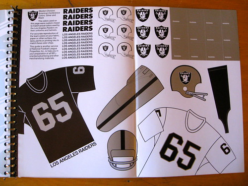
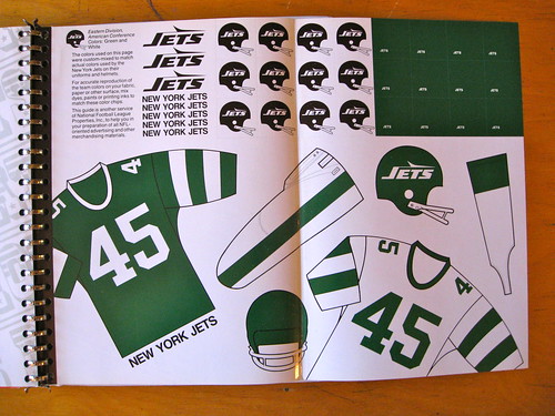
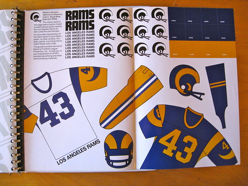
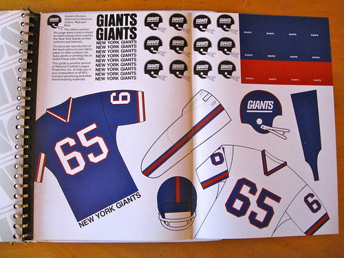
I’m talking about link. It also appears in the 49ers picture at the top of today’s Uni Watch post, and in the Patriots picture further down. This one came into use as the standard NFL helmet graphic around 1990-91 or so; prior to that, the “classic helmet look” was the one seen in the Packers, Colts, Cowboys, Dolphins, Chargers and Seahawks pics above. Before that, it was the 2-D profile image with the 2-bar facemask, like the one seen in the Raiders, Jets, Giants and Rams pics above.
The facemask seen in modern NFL helmet graphics saw only very limited use, if any at all, in actual NFL games; I have yet to find a picture corroborating such use. It looks like a cross between this and link; the former, widely used in the early-mid-80s, has thicker bars and a smaller, more rectangular rear bracket, while the latter, in ubiquitous use since the late-mid-80s, has its top two bars closer together and the rear bracket is a different shape.
I just find it curious that the NFL chose, and stuck with, for 20 years no less, a standard facemask graphic that didn’t match anything they were actually using.
Fixing links:
link, which is the same as link, appears to be a cross between link and link.
wow. I don’t remember Vinny as a Cowboy at all.
Since my explanations keep getting eaten by the moderation queue, I’ll try to explain without links.
The facemask I’m talking about is the one that appears in the 49ers graphic at the top of this article. This has been the standard facemask shown in NFL helmet graphics since the early ’90s. Now, compare that to the Vinny-at-Miami and Vinny-as-Cowboy pics I successfully linked above.
The Vinny-at-Miami facemask has thicker bars, and a smaller, rectangular rear bracket.
The Vinny-as-Cowboy facemask has a differently-shaped rear bracket, and the top two bars across the face are closer together.
The facemask in the graphic matches the ones in the WLAF pictures, but I haven’t found any photo evidence of that mask being used in NFL games. I just find it interesting that the NFL picked that mask as the boilerplate for its helmet graphics, when it was never widely adopted, if ever used at all.
[Reposting without links, pending moderation.]
The facemask graphic I’m talking about appears in the 49ers picture at the top of today’s Uni Watch post, and in the Patriots picture further down. This one came into use as the standard NFL helmet graphic around 1990-91 or so; prior to that, the “classic helmet look” was the one seen in the Packers, Colts, Cowboys, Dolphins, Chargers and Seahawks pics above. Before that, it was the 2-D profile image with the 2-bar facemask, like the one seen in the Raiders, Jets, Giants and Rams pics above.
The facemask seen in modern NFL helmet graphics saw only very limited use, if any at all, in actual NFL games; I have yet to find a picture corroborating such use, but it is a real facemask design. It looks like a cross between one type, widely used in the early-mid-80s, that has thicker bars and a smaller, more rectangular rear bracket, and another type, in ubiquitous use since the late-mid-80s, that has its top two bars closer together and the rear bracket is a different triangular shape.
I just find it curious that the NFL chose, and stuck with, for 20 years no less, a standard facemask graphic that didn’t match anything they were actually using.
Okay… how about link? I think the helmet projects started with college. So it is possible that the NFL never used this helmet.
Appears to be Riddell mid 80s.
Apologies; my explanations keep getting eaten by the moderation queue. Posting again without links:
That one matches the picture of Testaverde at U. of Miami; thicker bars, smaller and more rectangular rear bracket. These were used to some degree in the NFL in the early-mid-80s until the more familiar, thinner-barred masks with the more triangular rear brackets were introduced around 1986. There was another type that preceded and resembled the latter, but with thicker bars and an even smaller rear bracket, that came into use around 1980.
That one matches the link pic I posted before. The bars are thicker and the rear bracket is smaller and more rectangular. These were used in the NFL in the early-mid ’80s before the thinner-barred facemasks with the more triangular rear brackets (like link) were adopted, and around the same time as link, which you’ll note has thicker bars and a smaller rear bracket but the top two bars across the face are closer together. (link another example of the type.) Those, in turn, replaced link, which was used from the ’70s through the early ’80s and lacks the rear bracket altogether.
When I played high school football from 1984-87, we had all four of these facemask types at various times, and a few others.
Allright, I give up. Moderation queue, you win.
The Holy Grail! Congratulations.
And, yes, that Ohio State warm up is something special. A genuine work of art. And look: the only evidence of the manufacturer is found concealed nicely on the inside collar tag. As God intended.
Great style guide, Paul. I completely missed the figures on the front.
I think I can narrow down the Packers page based on the detailing. It’s definitely 1984-87, but those numbers look strange. I want to say that the Packers didn’t wear that number style in the mid-80s but will have to check.
That Chance Michaels has to report “…I want to say that the Packers didn’t wear that number style in the mid-80s but will have to check…” is akin to the pope saying “… Well, I think that’s a venial sin, but I’ll have to check with my guys in the Curia.”
If I can’t rely on Chance for infallible and instant recall of all things Packerish, then there’s just no hope. For anything.
*sigh*
or brewersish
I came across this cool Long Island (Hockey) Ducks link on this Facebook page of link, including this album of link. Enjoy!
Nice find! I grew up walking distance from Roosevelt Raceway, cool to see some old flicks of it.
But link is the gem of the collection.
There’s something very endearing about Joe DiMaggio in yellow pants.
Fabulous.
I attended a Long Island Ducks game — I believe at the Commack Arena — when I was very young. This was several years before the Islanders existed. I have only the vaguest memory of it. It may have been the first sporting event I ever attended.
Awww man, productivity has gone to zero. Nice shot of Shea set up for football floating around in there.
That looks like Super Drew Pearson on the NFL Style guide cover!!!!!
just who I thought it was, too. tho the socks & shoes appear off.
Why is that blogger so incensed that analysts dress in suits? Men need to upgrade from khakis at work to nicer threads. Sports analysts shouldn’t have to lower their standards because this guy is a slob.
He also missed Don Cherry, the all time king of crazy sideline clothes.
“***butt*** the Chargers wore that design from 1985 though 1987.”
Um, I think that’s with one ‘T’. haha
Helmet logos for the new Elite Football League of India, forming for the 2012 season:
link
link logo is beautiful. Kudos to whoever put that one together.
Swarm and Defenders, too. Good stuff!
Wow, GregB, what a contribution. Very cool work.
A little humble brag:
I called for the Royals powder blue uni change almost IMMEDIATELY back in 2007.
link
You said one purpose of making the wordmark white was to complement white pants, so what if they roll out powder pants this year?
They didn’t add powder blue pants, but if they had, it would have just made them look more like the uniforms they wore back in 1985.
link
I’m pretty sure the powder blue JERSEY will suffice as a complement those pants.
The two 1st base coaches features in the Ticker item on the Arizona Fall League are actually current players (see Baseball Reference page links below).
link
link
I just can’t get over how terrible those NOBs look, particularly Texas and its huge, ludicrously over-adorned font.
Shadows and extra layers look good enough when you’ve got link, (and not having pinstripes helps), but once you add a name, and the name also has the shadows, *and* the NOB lettering is big, *and* the player’s name is long, it just looks hideous.
The Rangers looked pretty good on Jackie Robinson day. Same for link. Those bevels and borders look a lot cooler with no big NOB cluttering things up.
Major buildup, minor tweak:
link
link
For the Royals, that is.
I still don’t like that the tail of the script on the road jersey cuts across the bottom loop of the Y.
They should have either changed the tail so it emanates from the Y itself (a non-looped version of the Y) or scrap the tail altogether.
Glad they switched to white lettering on the powder blues.
I’m just glad they got rid of that putrid powder blue cap. Jeez.
yes Ryan those two huge Packers and Steelers helmets you spotted during your trip to the Dominican Republic are used at the resorts Super Bowl party. I was there during the 2005 Superbowl.
Which resort? I lived in La Romana for 7 years growing up.
Magestic Elegance Punta Cana. How crazy is it that somebody else on UniWatch has seen these, too?!
Nice! I remember when Punta Cana only had one resort. This was in the 80s.
Is that a straight hem line I see on those Flyers jerseys? That would be somewhat notable.
You’re only lukewarm about those Flyers’ Winter Classic jerseys?! I think they’re killer. Classic elements: shoulder yokes, waist stripes and sleeve stripes. And the shoulder yokes are black, instead of white, which the Flyers have always employed in their full-arm yokes! The only fault I find is that the waist stripes should have a second thin black stripe, like the sleeves.
Grade: A
-Jet
To clarify: I think they look perfectly fine. But the Flyers *already* looked perfectly fine, and this isn’t a radically different look for them. Also not as throwback-y as Winter Classic designs usually are. I have no gripe with it; I’m just not excited about it.
These jerseys don’t hark back to a bygone era in Philadelphia hockey — at least not that I’m aware of.
To me, it just comes off as an excuse to roll out a new alternate jersey, which is fine. I guess. At least they’re not reintroducing one of their terrible black jersey designs.
I’m okay with the jersey not harkening back to a bygone era… because their early jersey design was intact for a good number of years before they began modifying it.
Whereas with the Penguins, they had that Rangers-style “PITTSBURGH” diagonally down the jersey in their inaugural season only, then changed it, so it was only around for one year. It’s not as if people got a chance to get used to it, so if they did a throwback to that design, I’d be more excited than I would if they recreated the original Philly jerseys
-Jet
I guess my only real gripe is that it seems “throwbackish” for no real reason. I think you and I have discussed this before, but if there aren’t any good Flyers designs to throw back to (there aren’t), then how about doing a Quakers-inspired fauxback?
Plus, you know that all the talking heads will refer to them as throwbacks.
Of course, if they decide to wear Cooperalls, then any jersey they choose is OK by me.
Seems to me that the occasion calls for doing something interesting. Interesting could be a throwback, or a fauxback, as we’ve seen time and again in recent years. But it could be an entirely new one-off design; it could be forward looking, or a what-if sidestep from current unis. If a team isn’t willing to commit to doing something truly interesting, then better to just wear normal jerseys with a nice event patch. This Flyers jersey is perfectly fine, and if I were a Flyers fan, I’d probably like it OK. But there’s nothing interesting about it.
As I was looking through those excellent NFL style guide images, I was thinking, “hey guys, remember sleeves?”
That Indiana library site is pretty cool. Unbelievable that those records lasted in such complete form all the way to today. Great find.
Just saw this on Twitter. Anyone know more about it?
@srabe Bryan Srabian
RT @SFGiants: #JustAdded Sat 6/2 #SFGiants vs. #Cubs: Turn Back the Century Game (both teams will be wearing uniforms styled from 1912)
And my easily confused post office would prefer that you please send things to Paul Lukas, not to Uni Watch, okay? Okay.
Really? I’ve never heard of that. Especially when it comes to a city with a lot of renters.
I get mail addressed to at least 10 previous renters to my house (I own it, but it was apartments before me). As well, I get mail addressed to my business.
And beyond that, my house technically has 2 addresses (929 and 931) from when it was split into two apartments.
Guess my mail guy is on it.
I’m glad the Royals (at least so far) didn’t introduce powder blue pants. It doesn’t work as a home set and that’s who only really wants to see it.
Since the Astros are destined for their ill-fated & completely Selig idiotic move to the American League, I’d rather they abandon all previous National League ties & looks and go for something radically different. And we know we don’t need another black, red, royal or navy team. I know some of us are thinking navy blue with orange & stars, but it’s a new league with different rules (an old man gout disease DH & moot bench) and new opponents & philosophy.
I tend to agree with the general sentiment. But I’d like to see the Astros stick with black, what with that being the only actual color of space. Black and orange is kind of done in MLB at the moment, and black and yellow is pretty well owned by Pittsburgh. So I’d say go with black and red, but a bright red, and in about the same proportions as orange in the Giants’ unis, or black and royal blue with moon-rock cream accents.
Though there’s also a good open space in MLB for dark navy and either orange or yellow, as long as the Astros are willing to not look like a team that has anything to do with astronauts and outer space or anything.
Off-the-wall idea: link.
so…they need to get outta the
bluebrick and into the black?How about link?
That…guide…..is…..AWESOME! I’m not surprised my Fins have three different sections. There were things I would notice as a kid, like the #2 was different when Champion, before wilson, outfitted the team. Notice the change in Aqua. Love the blue-er aqua. Always have. 1991 is my fav!
I was hoping Thanksgiving would bring about tgrowbacks since Dallas is (alternate) doin so but Radio stations here, believe it or not, asked the question and got a no from officials.
I hope one day we switch to one of the old uni’s or at least get rid of that tertiary Navy color :/
The “1970s 49ers helmet clock radio” is from 1979 and is just a digital clock – no radio. I have my still-working Steelers clock on my desk at work. Used to have a matching helmet lamp.
I want to see images with the new Royals uniforms (baby blue and road grey) side by side with last year’s version. It’ll be interesting to see how noticeable (if at all) the fabric color changes are.
link // link. Don’t know if that’ll help in comparing the colors since the old photo is w indoor lighting. Don’t think I’ve seen anybody mention that they reversed the #OF color as well. Definitely an improvement, but I’ll mourn the loss of the powder cap. I dug it.
White script is an improvement, but the front number just looks off to me on the new one. I don’t think making it white would actually be an improvement, though.
The new MLB Labor Agreement contains a bit of uni-related news…
VIII.. HEALTH AND SAFETY
d. By 2013, all Major League players will wear a new batting helmet developed by Rawlings that protects against pitches thrown at 100 miles per hour. The new version of the helmet is significantly less “bulky” than prior versions of the more protective helmet.
No phase-in period for the veterans?
Beat me to it. In other equipment news, according to Maury Brown of bizofbaseball.com: “The parties agreed that no new players will be permitted to use a low density maple bat during term of the agreement.”
and in other human news:
“Non-discrimination protections based on sexual orientation were added to Article XV.”
So if you’re a bigoted veteran with a weak neck, poor peripheral vision, and you’ve waited until now to try a maple bat, you’re just straight-up screwed under this CBA. Unless you’re that guy and you play for Houston, in which case hello DH!
Joking aside, it would appear that 2012 is the phase-in period for the new helmets. Players/teams have their choice in 2012, but the new helmet is mandatory in 2013.
A city with a gay mayor is probably a bad place to be a homophobe on an underperforming baseball team.
is there a good place?
Nah, just pointing out it wouldn’t fly on the Astros.
Do you have any New Orleans Saints style sheets in that NFL Style Guide of yours? I’d like to see if those sheets have chips for the uniform and helmet golds.
Good Lord. The Cowboys never wore pants of that color at any point during the 1980s, home or away.
check out this photo of Grover, Carmello and Amar’e. You can see that the Adidas logo is covered on each of their shirts.
link
Perhaps Grover has a exclusive Nike deal?
I have one of those NFL Uni guides. Great fun.
Can’t remember what year mine is, though. I know the Patriots were in red, and there still were Houston Oilers.
that narrows it down to a couple decades then
Checked. Doesn’t have a year on it (have only the pages, not the binder). Sometime in the early 90s, I’d guess, cuz that’s when I was doing the paintings for Green Giant, and that’s how I got hold of it. Pats red pants, Bucs orange pants, Saints have state of Louisiana on pants and sleeve. Giants have “GIANTS” on helmet.
Got me.
The Philadelphia Union uniforms for 2012 have been released at link
Downgrade in my book. The Union home jerseys were one of the most unique soccer jerseys around (barring maybe UNAM Pumas in Mexico). Those, not so much.
I have a memory as a little kid, around 1981, of a strange stripe on the shoulder of the New York Football Giants uniforms. I’ve never been able to find any evidence of this until stumbling across the 2:12 mark of this Lawrence Taylor clip- link Does anyone know what the story is with that? Maybe it was some kind of memorial? Very odd
It was just on the right shoulder I should also add.
Probably 1983. The Giants played the Chiefs that year. Memorial stripe? I’ll try to find out.
Sure enough, look here:
link
nice.
Additional photos:
link
You’re the man.
A GREAT lead story for today, Paul. Thanks.
I will get my fellow executives at the “GUD” (Gridiron Uniform Database) to make those sock revisions ASAP. Only thing is, they may be out of Dodge due to Turkey Day.
But, we’ll fix it soon!
Early nomination for the 5&1…Miami,OH and Ohio U. Bobcats finally realized what their school colors are and this is a gorgeous game.
I always thought the Colts should go back to having a horseshoe (sans number) on their pants. It looks kinda cool. It’s a little quirk in an otherwise (in my opinion) simple uniform.
Also, striped socks, but I’m just sayin’.
ESPN just showed UCLA players playing some video game that featured the Heat in their Miami Floridian alts.
Started me thinking, I’d probably like the new Marlin uniforms in that Floridian color scheme.
To be honest, I’d probably like the Heat in that color scheme full time. If they ever play again.
“If they ever play again.”
~~~
bite your tongue
it’s all good right now