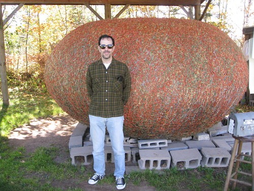
I’ve met a decent number of outsider folk artists over the years, but few have been as engaging or likable as Mr. James Frank Kotera of Lake Nebagamon, Wisconsin — or, as he prefers to call himself, JFK (“and I ain’t been shot yet”) — who I had the privilege of meeting last Sunday. What you see behind him is his giant ball of twine, which he’s been working on for over 30 years and believes — knows — to be the world’s largest. To be fair, there are other claimants to that title, but I bet none of them are as gracious as JFK.
Meeting JFK was the highlight of my recent Wisconsin getaway, which Kirsten and I spent in the state’s northern region. I’ll have more to say about him in a minute, but first here’s a quick rundown of the trip’s other high points:
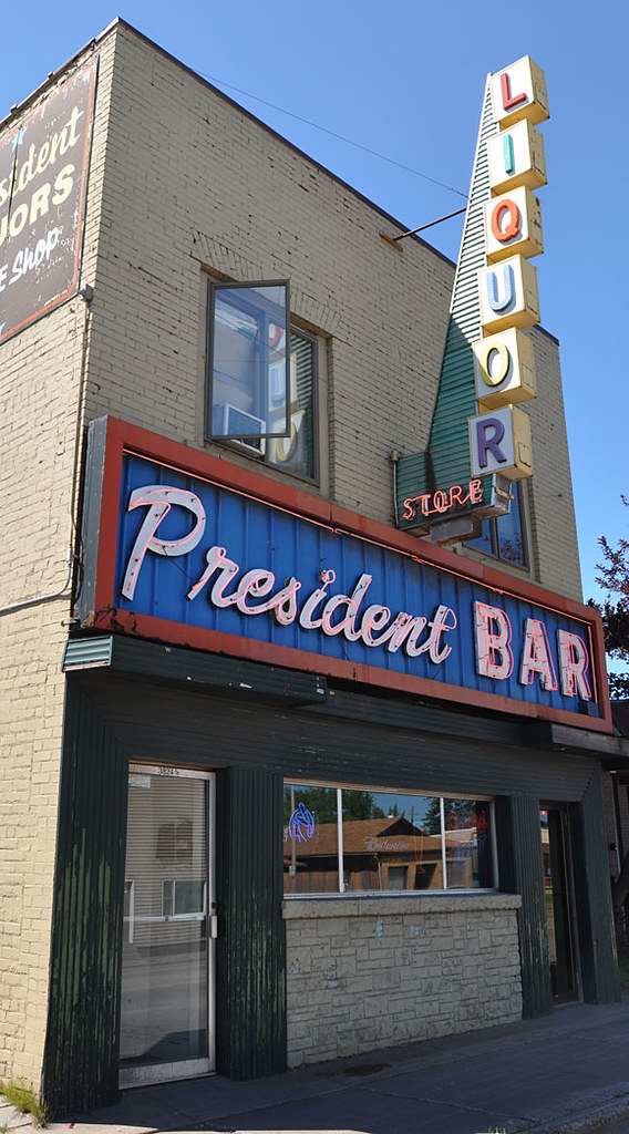
• Taverns. Ah, Wisconsin bars — the best of the best. Must have stopped in nearly 20 of them during the trip. Yes, that’s excessive, but you can’t beat the mix of cheap beer, friendly folks, and time-worn fixtures, plus it’s hard to resist a sign like this (for all of these photos, you can click on the image to see a larger version):
.
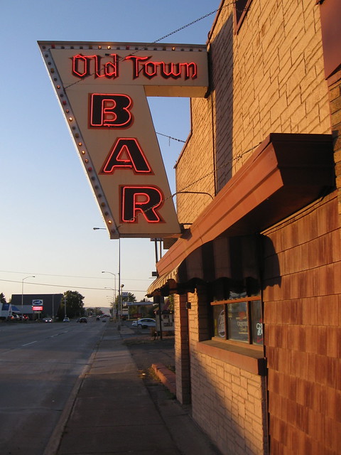
That’s the President Bar in Superior, where we watched the first half of the Packers game on Sunday (and yes, I was wearing my Packers dickey for the occasion). For the second half, we moseyed down the road to the Old Town:
.
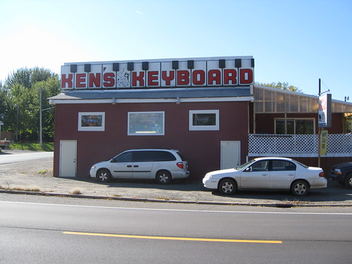
Another standout was Ken’s Keyboard in East Farmington, owned by a now-retired accordionist who used to lead polka bands in the area:
.
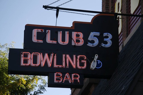
Later that day, we arrived in Amery, home of the excellent Club 53 (whose interior is featured on the cover of this great new book about Wisconsin taverns):
.
While heading out of Amery, we spotted this sign. Although we’d already spent most of the day barflying, I’m a sucker for VFW halls, so we went down a back road and found this lovely spot:
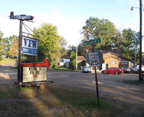
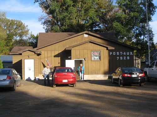
.
Kirsten had never been to Michigan before, so on Monday we decided to cross the border and explore Ironwood, gateway to the U.P. That’s where we found the magnificent Olkie’s:
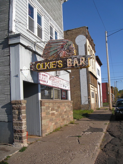
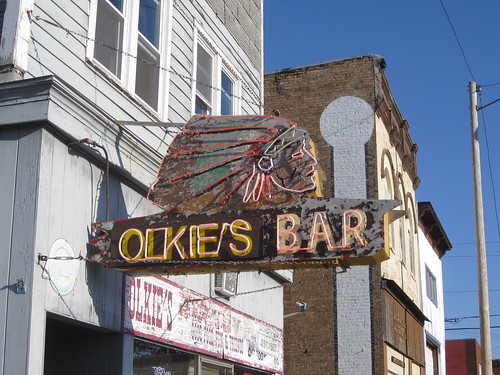
.
We meant to head straight back to Wisconsin after that, but we got sidetracked by the siren song of the Midway Bar:
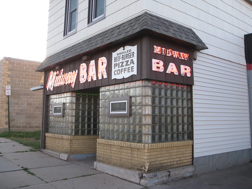
.
And although the bar was only so-so, it’s hard not to love the sign at Bob Smith’s in Hudson:

.
There were more — the Blue Room in Ashland, Sunset Junction in Rhinelander, the Moccasin Bar in Hayward (which boasts an impressive array of wildlife taxidermy), a few more that I’m probably forgetting — but we didn’t photograph all of them.
• Lodging. An embarrassment of riches. On the first night we stayed at the Black Bear Motel in Cameron (that’s the best photo I could find online; neglected to take any of our own). On the second night we were at the lovely Edelweiss Motel in Hayward:
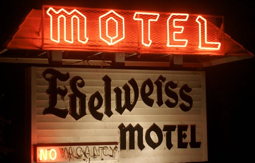
.
On the third night, we were driving through a fairly remote area — no motels, no cell phone service, no nothing. We thought we might be fucked, but there was a gas station in the tiny village of Port Wing, so we stopped to ask for advice. They were just closing up for the night, but they said, “Well, we have a few cabins, if that works for you — $30 for one night.” And that’s how we ended up staying here (the one in the foreground was ours):
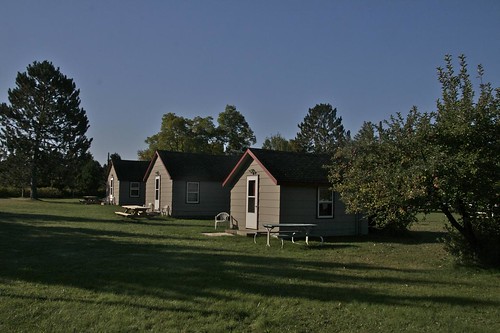
.
Pretty damn adorable, right? And then it was back to a classic motel — the Arbor Vitae, in Woodruff — for our final night’s stay:
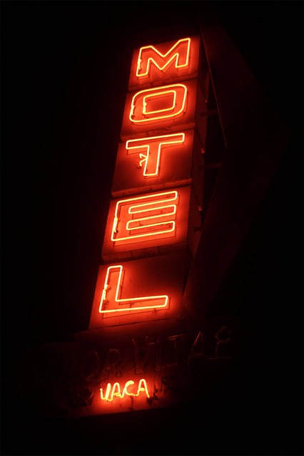
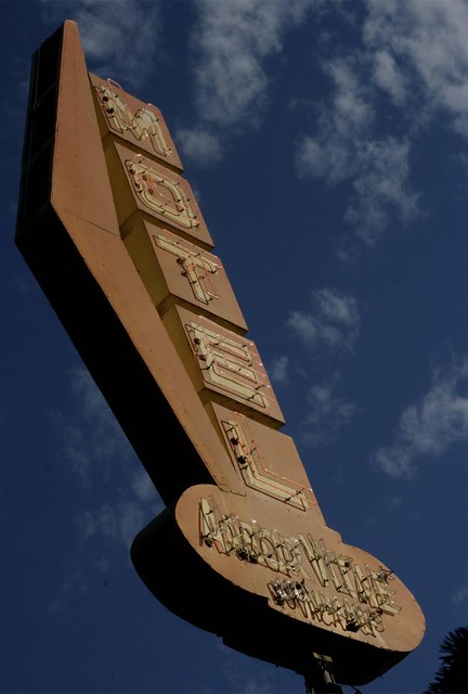
.
• Food. Mostly unremarkable, frankly. We did have a bizarrely entertaining (if not particularly tasty) dinner at the surreal Turk’s Inn in Hayward:
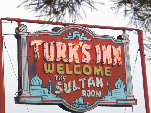
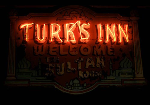
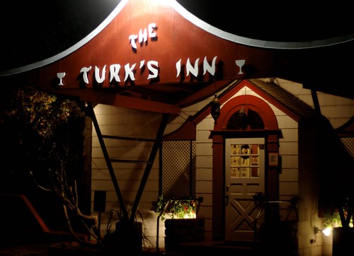
.
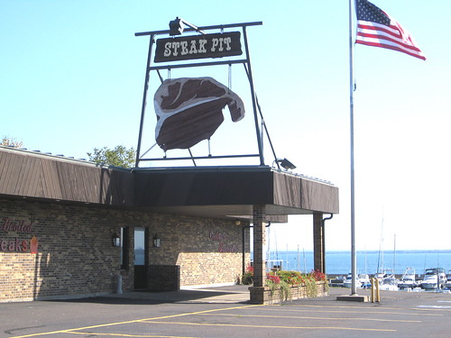
Somewhere between Bayfield and Ashland we followed a roadside sign to a restaurant that was, unfortunately, closed for the afternoon. I’m sure you can see why I reallyreallyreally wanted to stop there:
.
Our most interesting breakfast took place in Hayward on Sunday, when we attended a Knights of Columbus pancake breakfast to benefit some local kid’s college fund (we had seen a sign advertising the breakfast the day before). We had thought this would be a fun way to meet some local folks, but we made a fatal miscalculation: The breakfast was held in a room at a Catholic church, and we arrived at 9:50am — just prior to the ten o’clock mass. As we walked in, all these other people were just finishing their breakfasts, and then they got up and walked over to the mass, leaving us to sit by ourselves. We continued to sit there, all by our lonesomes, as people poured into the church, walking right past us on their way to mass and giving us this look that even a blind person could have easily interpreted as “Hmmm, why aren’t you going to mass?”
There were three men serving the breakfast — a swell server-to-customer ratio, since we were the only ones eating — and they were super-nice to us. Still, it was an odd scene. And it got a bit odder when the mass started and the audio was pumped into the room where we were eating. Excellent pancakes, though. A good meal and an enjoyably odd experience.
Meanwhile, here’s a little local specialty I hadn’t been aware of: In the town of Chetek, there’s a luncheonette called Bob’s Grill, which serves something called a Spudnik. It’s basically a round donut fritter — think of a slightly oversized Dunkin Munchkin — made with potato flour. The interesting thing is the backstory, which is described on Bob’s menu like so:
The Soviet Union stunned the world by launching Sputnik, the world’s first artificial satellite, on Octoboer 4, 1957. … It had a profound effect on the world. The “Space Race” was on!
In retaliation to the Russians, Gert Pabich, owner and operator of Bob’s Grill, did her own part to boost America’s spirits in the space race. If the Russians could invent a Sputnik, she could invent a Spudnik! The potato-based donut hole was born and has been part of the fare at Bob’s Grill for over 50 years.
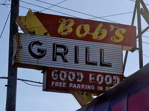
How awesome is that?! We tried one (35 ¢) — tasty! Didn’t photograph it, though, which is a shame, because all the usual roadfood web sites appear to be Spudnik-unaware. We did get a shot of Bob’s sign, though:
.
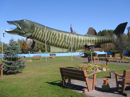
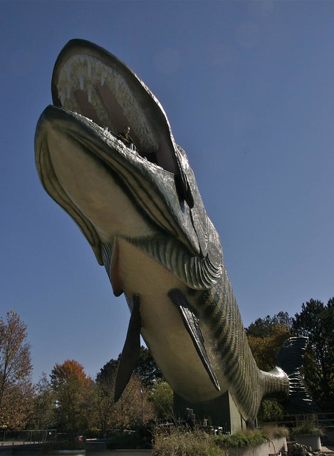
• Attractions. You can’t go to northern Wisconsin without stopping at the Freshwater Fishing Hall of Fame in Hayward, whose centerpiece is the world-famous walk-through fiberglass musky:
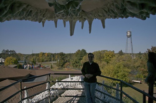
.
The giant musky gets all the attention, but the rest of the FFHOF is a surprisingly decent museum, with all sorts of informative exhibits about lures, rods, reels, lures, ice fishing, lures, outboard motors, lures, bobbers, and did I mention lures? You can see a few photos here.
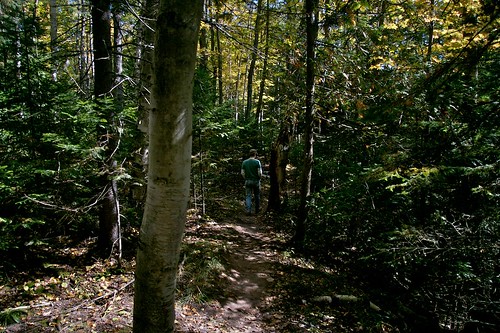
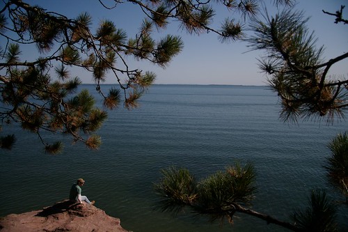
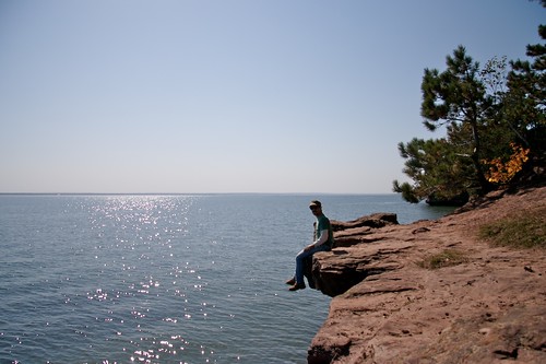
But the biggest attraction was just being in the upper Midwest in early October. Fall colors were all around us, and there were tons of rivers and lakes to drive alongside — autumnal perfection. At one point, slightly outside of Bayfield, we took a nice hike up to some cliffs overlooking the big lake they call Gitche Gumee:
So those were the basics of the trip. But now I want to get back to the big ball of twine. It took a little doing to find the right house, which is pretty deep in the woods, but we eventually spotted the giant twine ball (which is more ovoid than spherical) sitting in someone’s side yard under a carport-style enclosure. There were no “Public Welcome” signs, no enticements to attract visitors — just your basic rural house with a giant ball of twine in the yard. Were we allowed to go look at it? Should we knock on the door first? What if the owner wasn’t home?
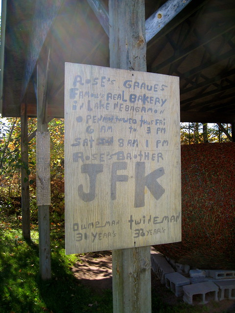
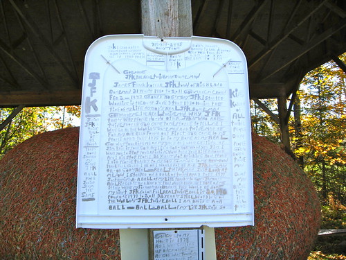
All those questions became moot as we approached the house and a man emerged to meet us. He introduced himself as JFK and handed us two handwritten note cards — part visitors’ program, part personal manifesto. (If you want to read the whole thing, which I strongly recommend, look here.) He happily fielded all our questions whilst philosophizing on a variety of subjects, most of them having to do with God and twine, usually in that order. The Cliff’s Notes version breaks down like so:
• God told him to stop drinking in 1975, so he did. He started the ball of twine soon thereafter.
• He adds twine to the ball every single day.
• He knows how much the ball weighs (over 20,000 pounds at this point) because he weighs the loose twine before adding it to the ball.
• He’s aware that there are other giants balls of twine out there, but “mine is the only real one, because I’m the only real JFK.”
• Despite all the twine work, his hands are free of blisters and calluses — proof that they’re really God’s hands, not his own.
• For the past 31 years he’s managed the local town dump, a career of which he’s extremely proud. He’s the only real twineman and the only real dumpman. (We were lucky to have visited during the weekend, or else he probably would have been at work.)
• He also has a much smaller ball — “Junior” — which weighs 47 pounds (and which we neglected to photograph, unfortunately). He takes Junior to work with him, “because lots of people have never seen a ball of twine before, and I can’t roll a 20,000-pound ball around to show them.”
All this information was imparted without a shred of bravado or ego. Just an aw-shucks deadpan leavened with a hint of Asperger’s-ish tunnel vision. I suppose some folks might find him annoying, but I thought he was really charming.
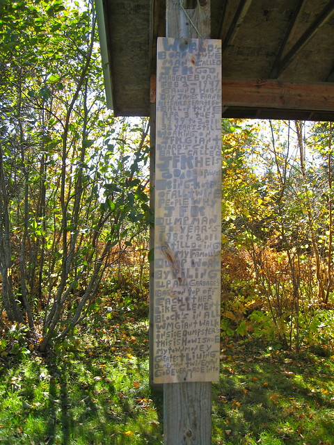
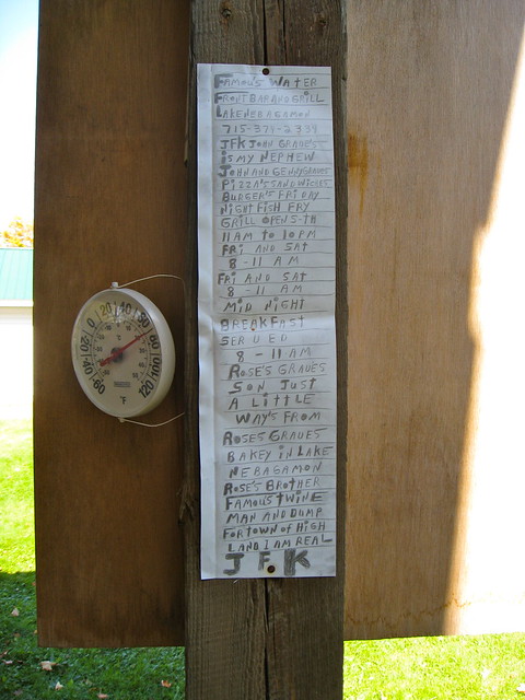
Meanwhile, the carport was festooned with all sorts of handwritten signage:
.
If there’s one thing I can appreciate, it’s a guy with an obsession. I kinda wanted to stay there all day with JFK, but we had to keep moving. Still, it was a really wonderful encounter — one I won’t soon forget. Thanks for listening.
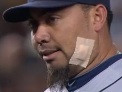
Bring to a boil: Surreal scene during last night’s Yanks/Tigers game, as Detroit reliever Joaquin Benoit entered the game wearing a massive bandage on his face, the result of an ingrown hair that he’d unsuccessfully tried to excavate with a pair of tweezers. The umps, prodded by Yanks skipper Joe Girardi, had him remove it because it could supposedly have distracted the hitters. Benoit reluctantly complied, wincing a bit as he puuullllled off the bandage, revealing a nasty-looking boil. I spent the rest of that inning yelling, “C’mon, give ’em that ol’ pus ball!” (Benoit got the last laugh, pitching effectively enough and getting rebandaged for the postgame celebration.)
The funniest thing about this is how ESPN’s Yankees beat reporter, Wallace Matthews, described the incident: “Benoit [removed the bandage] with evident pain. Disappointingly, all it revealed was a patch of slightly reddened skin.” Not sure how Matthews missed the boil (it was roughly the size of a Spudnik), but I love his use of “Disappointingly.” Apparently he was hoping to see some serious gore. You’ll have to go back to covering boxing if you wanna see that, Wally!
Uni Watch News Ticker: In a move that had not been previously announced (at least to my knowledge), the Bruins wore Stanley Cup championship banner patches last night. ”¦ So Oregon wore the jersey with the funny duck on the shoulders and Cal wore the white helmets with the funny stripe and they all lived happily ever after. ”¦ Here’s a Notre Dame style guide (good find by Brian Wysocki). … Douglas Ford’s Mom was looking through her Bible and found some old NFL helmet drawings that Douglas had done in 1977, when he was eight years old. … The Knicks just posted a little uniform gallery on their Facebook page (from Alex Melendez). … The new Marlins logo has now been spotted on the seats at the team’s new ballpark (from Alan Chewning). … Here’s a rundown of why various Florida Panthers players chose their uni numbers (from Ryan Connelly). … The latest development in concussion prevention: padded strips on the exterior of the helmet. Hmmm, didn’t they already try that back in the 1960s? Further details here (from Larry Bodnovich). … Mike Hersh found some cool stuff in the new Classic Auctions listings, including an official Bobby Orr wristwatch, an excellent Edmonton Eskimos cheerleaders outfit, an old NHL official’s sweater (so much better than zebra stripes!), and an interesting Hartford Whalers alumni jersey. … Fairly unusual to see a 1940s leather helmet with a logo, or at least an initial. That’s Thomas E. “Shanty” Hogan from the 1948 Arizona team (nice find by Calvin Farris). … Good interview with Nebraska’s equipment manager here. If you don’t have time to read the whole thing, just search on the word “Cody” for a good story about a jersey alteration (big thanks to Brian Hansen). … The Saints used two different number fonts in 1967. Tom Marcotte decided to DIY a Jim Taylor jersey with the “fat” numerals. “I started with a blank Durene jersey (which took quite a while to find),” he says. “I was going to hand-cut the numerals, but then on a whim I asked the good folks at Eastern Lettering if they had what I call the Southland/Cowboy numerals. Even though it’s not shown on their web site, they were able to provide the numbers. The front are 10″ and the back are 12″. The stripes are 1″ old gold twill (also from Eastern) sewn onto black polyester material, and then that is sewn to the 3/4 sleeve.” … The sweater-vs.-jersey debate refuses to die (from Andreas Papadopoulos). … The NBA lockout has led Bill Simmons to propose an alternate league with really lame-o uniforms (from Robert Silverman). ”¦ Just what the world needs: corporate douchebaggery proliferating on college football zebras (screen shot by Ross Hazlett). ”¦ According to a note in this story, Giants defensive lineman Justin Tuck is trying “a different facemask and shoulder pads in an effort to limit the pain in his neck.”
awesome
Yep! Thanks for sharing Paul! It reminded me of my childhood family vacations. We didn’t stay at the Holiday Inn’s of the world (there weren’t that many to begin with)…which is what stands out most to me.
Of course, nowadays, most “Motels” aren’t places you want to find yourself.
JFK seems like…well interesting (especially after reading the manifesto).
I knew the band-aid would make U-W. I like Joe Girardi, but his insistence on the removal of the band-aid seemed like a punk move.
I like Joe Girardi, but his insistence on the removal of the band-aid
seemed likewas a punk move.Fixed it for ya. Didn’t the Yankees used to have class? That was an A-Rod move by Girardi, and the Yankees got an appropriately A-Rod result.
a BIG part of the game… especially baseball… is to get into your opponents head… ESPECIALLY a pitcher… “punk” move? could have been a damn good move if you ask me.
Jeter trying to command the pace of the at-bat with his imperial “hold up there, ump” gesture and increasingly Nomarian glove-fidgeting is one thing. Making an injured man remove a bandage from an open wound to psych him out is something else entirely. Gamesmanship is doing whatever you can. Class is doing whatever you should. So yes, it was a punk move, and the Yanks got the outcome they deserved. More and more, it’s clear that Girardi:Torre::A-Rod:Jeter.
Though full blame goes to the umpire, who had full discretion to examine the bandage and the wound and decline Girardi’s request.
“… and the Yankees got an appropriately A-Rod result.”
Considering he whiffed on the final pitch, that statement is oh so apropos.
link It looks like he borrowed Chris Canty’s stormtrooper facemask. That also looks like an ION 4D. Has he been wearing it all year or was he still wearing the Revo when he kep getting facemasked?
1. That is a Schutt Ion 4D helmet.
2. That is the same mask that Canty wears albeit on a Riddell VSR-4.
link
3. Those handwritten JFK manifestos read like Marshalls’ posts!
Neat twine egg.
…and “really lame-o” is not even close to describing how bad those hypothetical basketball jerseys are. I think my eyes are still bleeding.
the klondike & waffle house jersey had some potential though, IMO anyway… LOL
I don’t know – I really like the waffle net for that Atlanta Waffle House team…
I haven’t scrolled all the way down yet, but Paul…Did you see you got a shout out under the Pittsburgh 5 dollar footlong jersey?
As mentioned by me further down in the comments, the Baltimore one is the only jersey that has any potential. The Waffle House one was *cute*, but doesn’t quite cut it.
Can Kirsten offer any tips for photographing neon signs in daylight? (Other than “shoot the shaded side using an iPhone with HDR on,” which works shockingly well but I’m unable to reproduce with a real camera, and besides who wants to be the guy standing outside a grand place like Olkies peering through a dinky little iPhone.) Just awesome photos today, and from a part of Wisconsin I’ve never really been to. (Draw a line from Superior to Oshkosh and then to Milwaukee; everything below and to the left, I’ve spent a lot of time tooling around, while everything above and to the right, I’ve never been there.)
Several of the neon shots are mine (Old Town, Olkie’s, Midway). I took them with a simple point-and-shoot.
Excellent itinerary, wonderful photographs of a democratic aesthetic zest. Way to go, Paul. Really cool to see non-corporate signage (I’m sure it’s there, but that the older, more indigenous stuff hangs around is such a plus). And the Spudnik!
Probable helps to be far from a hub airport and feature a challenging climate.
This tradition of — this penchant for — DIY design can still be found in many places of our fine country, but not anymore on the scale and breadth you’ll find in Mexico. A Send-Paul-to-Sonora fund is currently in formation.
“and besides who wants to be the guy standing outside a grand place like Olkies peering through a dinky little iPhone”
If you want the shot, you do what you have to. Life is too short to pass up opportunities, simply because you are worried about somebody you don’t even know thinking vaguely “what a dork”.
I’m a dork, if I must be.
Lee
Forgot the Falcons in the Helmet Drawings.. sad day
If you look closely at the the Edmonton Eskimoes cheerleader’s hat, you can see where it originally said ’54’ below the ’55’.
With his writings JFK strikes me as a Wisconsin version of Howard Finster.
I’m very familiar with WI bar culture as my wife is a native; she once lived near the town where the Hayward giant fiberglass muskie was made. I spent a Christmas there once, where I was introduced to the Tom and Jerry cocktail. Still bar-hopping on foot in -15F weather and with a head cold was a bit too much for this boy raised in the South so I now schedule my visits between May and September.
JFK is TOTALLY cast from the Finster mold.
Great story, Paul. I come here for unis of course, but damn it if I don’t love most of the days you go off-topic. As a guy who works in a field that deals with history and geography, your travel stories always appeal to me. Keep up the good work!
Thanks, Chris. Between my various side projects and assorted travels, I realize I’ve been presenting a lot of non-uni content lately (and leaning heavily on Phil and John to cover for me). Glad you like! But I expect to be getting back to uni basics in the weeks to come.
I have to agree with Chris. Uniforms may be one of your passions and how you created a niche in the market, but if people leave this site without realizing that there’s a lot more layers and projects, each equally fascinating, then they’re just not paying close enough attention.
AMAZING travelog Paul!
Looks like neon signage is alive and well in our great midwest. JFK was extra icing on the cake.
Cheers!
~B
Are Nike refs prohibited from officiating Adidas, UA, or Russell games?
Does anyone out there know how to get my hands on one of those Bruins banner patches?
Give it a couple of weeks. The Bruins store may have them, and other licensed retailers will probably have a supply at that point as well.
River City Sports often gets a hold of those patches.
I hope no one from the NHL is reading this, but they get those patches done by a non-NHL licensed company.
The quality is excellent, but they are technically counterfeit since they aren’t NHL approved.
I’m really not minding the front helmet numbers that the NHL mandated.
Plus, the Bruins are wearing black numbers with a white outline on their black helmets, so they’re barely noticeable.
And in other Bruins uni-releated news, here’s a breakdown of the second A this season:
Chris Kelly and Andrew Ference are splitting it. Ference gets it at home for the first half of the season, on the road for the second half. Kelly’s got the reverse.
(Personally I would have just given it to Ference)
Great signs, great pics. About 10 years ago I photographed about a dozen or so of the old neon I could find in the Baton Rouge area, and almost all of them are gone today.
Plenty to geek on, today. JFK’s signwork is inspiring (it goes without saying the twineball is a work of art), Douglas Ford’s helmet sketches remind me of my own obsessive sports (and everything else) drawing, and why don’t the people who design the neon signage in the Midwest get the job to do Bill Simmons’ b-ball uniforms?
link
The players wore the ducks on their shoulders, and the duck wore the coach on his. (thought I’d said this with the link)
I am just glad the duck didn’t wear Mr. Nike’s profile…
Brad Marchand of the Bruins was sporting the Rbk vector rather than the wordmark logo last night.
link
Can anyone find a better photo?
He wasn’t the only one. Andrew Ference also was vectored last night.
Didn’t see this until just now: Benoit was rebandaged for the clubhouse celebration:
link
As I watched that, I realized what was going to happen and tried to fathom a way he could keep the band-aid on…perhaps they could have painted it with eyeblack.
Good call on visiting the North Woods, though you should have kept going into the U.P. – it’s a wonderful place (I’m biased, because I live there.)
Also, you weren’t far from the home of the famous Watersmeet Nimrods (less than an hour from Ironwood), and Hurley, Wis., home of the Midgets.
Spudnuts still exist in Charlottesville, VA. They are awesome.
Oh yeah, as to Spudnik, it’s clearly related to link – which I’m always surprised that more folks don’t remember. Haven’t had one of those in a while, but those were some fine donuts in the day.
Hey, there’s one in Mentor, Ohio! We’re heading up that way this weekend…I may have to stop in and have some.
What is the small piece of fabric on one side of Cal’s helmet that looks to be stretching between the chin strap buckles?
Good question. It doesn’t look like all of the players had it, so possibly something related to the specific helmet?
not sure if this will be seen, but i’m just looking at the comments from yesterday. Those strips are elastic bands, kind of the “livestrong” type material, that are designed to hold a guy’s mouthpiece. some guys like them, some dont so they remove them.
Wow, Paul. Looks like a great trip.
Been waiting for my kids to get a little older so we can take a family roadtrip up to northern Wisconsin – my wife has been gamely flying out to visit Grandma and Grandpa in Milwaukee for years, but we’ve not yet been able to get away.
Beautiful country.
I love the cabin picture and how you ended up there. That is so Midwest.
I have to believe that 75% of us look at those wonderful Douglas Ford drawings and think of our own youth.
Absolutely. I tried to draw the NFL helmets and logos all the time when I was little. That picture brought back great memories.
With the NHL season underway, I just want to reiterate what I’d said previously that I SIGNIFICANTLY prefer the maker’s word logo to the previous slanted box, mainly (ok, ONLY) because on my 27″ non-HDTV, the logos are now hardly anything but a blur. If I didn’t know who the maker was before I watched this morning’s highlights on Sportscenter, I don’t think I would still know now.
I honestly hardly noticed last night while watching all three games in hi-def. The only time I even noticed it was when they went close up on a goalmouth scramble or something. Otherwise, it made almost no difference in viewing the game.
However, I’m still not convinced that Reebok needs to have anything there. But the vectors on both Marchand and Ference were noticeably different when you saw them on TV.
put it on the bottom right hem, like CCM, starter, nike, etc had, and i really have no problem with it
teebz, would you say koho was the first team to put their mark up on the shoulders?
Of course, they’d have to straighten out the hemlines…
CCM and Koho both had the marks below the collar; that was introduced in the 2000-01 season (CCM on all white jerseys, Koho on all dark jerseys, since both were divisions of The Hockey Company).
Nike had previously done it with their swoosh below the collar on international jerseys (World Cup, Olympics) but not their NHL jerseys.
It depends on what you mean by “first” when it comes to logo placement.
Tackla was the first company to start putting their logo on the front of the jersey at international competitions. The Finns wore a diamond-shaped Tackla logo as far back as the 1987 Canada Cup.
Adidas has their logos on the chest of the CCCP team at the 1987 World Championships. SC Bern also had an adidas logo on their uniforms in the mid-1980s.
The 1998 World Championships saw the Nike logo on the chest as well as on the rear neckline, marking one of the earliest neckline appearances of a logo.
As for KOHO, they jumped on the necklines when CCM bought them. CCM won the league-wide contract and began putting KOHO on the dark jerseys and CCM on the white jerseys. This was back in the early-2000s IIRC.
Just to add to my thought, the officials got Jofa – the other division of CCM/Koho – on the neckline of their uniforms at the same time.
i was just asking about the NHL. not the other leagues
Ahhh, the Edelweiss in Hayward.
Great little place right on the river.
And you can see the giant muskie from there, too.
The taverns in Wisconsin are serving cheap “bear”?
Well, they do get a lot of hunters…. Best typo I’ve had in a while. Now fixed.
The same article on the Nebraska equipment crew notes that quarterback Taylor Martinez wears last season’s pants, instead of the new ones. My girlfriend wisely noticed during last week’s game that his pants were shinier than all of the other players’, and I had no explanation for it. Mystery solved.
Here is a pic in which you can see his older, shinier pants.
link
I think the boil would be more distracting than the bandage. Gross!
Ah, good ol’ Woodruff. Did you happen to visit S.A. Loon’s while you were there? They have what they claim is the world’s largest (real, non-fiberglass) muskie, which wasn’t caught by a fisherman but allegedly washed up dead after choking on a duck. We used to head up there when I was a kid (my grandparents have a cottage in nearby Lac Du Flambeau), though we stopped going to S.A. Loon’s when they repainted the place green and gold after the Packers won the Super Bowl in 1996. No self-respected Bears fan could patronize a place like that!
Cheap “bears”?
Choking on a duck?
Wow, amazing how the imagery relates to last night, huh.
lake wobegon?
I was floored this morning. My wife’s (I typed fiance first, gotta get used to that) family spends the better part of a month in Chetek every year, eating at Bob’s every morning. I recognized a good part of most of this post. Never really thought it would show up here!
JFK’s handwriting on that plastic lid is mesmerizing (in a good way).
love the trip recap paul!
That’s what I imagine Comrade Marshall’s handwriting looks like.
When you say “Wisconsin”, you’ve said it all.
What a fantastic trip that looked like. You highlighted so many great things about the Dairy State. Those reasons, and many more, are why I love telling people I am from Wisconsin. Great people, great food, great ambience, amazing sports teams, and just a wonderful experience.
I am glad you had a great time among the Cheeseheads, Paul. What kind of local brews did you have while here?
I wouldn’t have minded the ol’ puss ball. That thing was kinda gross.
While watching the yankees/tigers game last night, my wife said, they should have to show some of their socks, it looks more professional.
You think the new Marlins logo is bad? Wait until you see what will happen when they hit a home run:
link
Dear Sunday Aug 7th 2011,
This garbage Marlins home run display makes me happy to be a Pirates fan again!
Your friend,
RyCo
21st Century kitsch, thy name is South Beach.
Abso-frickin’-lutely perfect for that market.
Exactly. My only quibble with the linked article is this sentence: “It’s what Bernie Brewer thinks he’s sliding down after a couple buttons of peyote.” I don’t think peyote gets you anywhere near that display. A hit of mescaline, maybe, or a mouthful of Guatemalan Insanity Peppers, more like. It’s just that awesome.
Hahaha… that rules.
Rendered in white on a dark blue background – like on the seats pictured – that logo isn’t too bad. When rendered on a cap with a way-too-many colors, then it’s an abomination.
Agreed. I like it 2-color.
I don’t think anything has been said about the colors that will be used on the hat. We can only hope they don’t try to cram ALL those colors on there.
Did the Marlins announce that they were playing inside a casino this year yet? Home run = jackpot!
That’s what I meant.
It’s perfect for that market.
Overdone, shallow, pretentious, self-defined cool.
South Beach is the image of South Florida these days.
No longer oranges, palms trees, sunshine and blue water.
Damn, that was supposed to follow Chris’ comment.
I agree Ricko. And FWIW, I think the aquarium idea is actually VERY cool. I know they say the glass is “unbreakable”… but you can’t tell me that a morbid side of every fan watching a game there won’t be just waiting for a foul ball to spring a gusher.
You know, we can all make fun of it. It looks incredibly… well, fabulous. But at least the Marlins will finally have some fun design elements in their stadium, even if they might be incredibly stupid. The dump they are coming out of was just awful (as a baseball stadium). At least they’re trying.
yeah but will anyone go to the games?
Agreed. If I were to tell you that Denver was going to put bury a giant kiwi in center field that would come out of the ground with each home run, you’d call the idea insane. Is it any less ridiculous than an apple, and is that any less ridiculous than a gigantic music box that would have been right at home next to a ceramic dalmatian on Wheel of Fortune?
It’s all about perspective. I’ve been to Miami, and at least in the touristy parts, that display is going to fit right in!
I think the Brewers should have a giant ball of yarn pop up with each home run…
It’s really gonna be a purple keg.
Actual Pro Combat puts those crappy uniforms in perspective…
link
Hi everyone,
With the Australian (and New Zealand!) A-League starting tonight, here’s a breakdown of all the latest kits for the 2011/12 season. Plus comparisons to what they wore last year. Up through 2010/11, every club was required to wear Reebok kits (in the same way every MLS club has to wear adidas). But starting this season, clubs could choose which manufacturer to use, with varying results:
link
Cheers,
mao
Lovin’ those Douglas Ford helmet drawings. That’s my childhood, in a nutshell.
-Jet
I used last night’s Band-Aid incident as an excuse to go back over some previous oddities that have taken place on the mound:
link
Hilarious stuff. Do players still wear those dotted sleeves that had to be cut off? It seems they lasted for only part of one season.
The AHL’s Grand Rapids Griffins will wear a patch all year long at home to link who perished in the Lokomotiv airplane tragedy.
38 = Pavol Demitra
29 = Karel Rachunek
1 = Stefan Liv
link.
link just has a certain link quality to it. My favorite in a great batch of photos. Glad you had a good trip, and welcome back!
/now I want a spudnik…
The Spudniks are awfully good, but the breakfast skillets are the reason to keep coming back. Not sure what Paul ordered, if you ever find yourself at Bob’s, go for the BEC (bacon-egg-cheese) browns. With a side of Spudniks.
I watched “Kurt Warner: A Football Life” on NFL Network last night and it got me thinking: in addition to all his other records, does Warner hold the record for most different uniforms worn in the Super Bowl, not counting home and away jerseys? I know in 1999 and 2001 he was on the Rams, but the team’s uniforms in those two seasons were drastically different so I consider them to be different uniforms. So two different uniform sets with the Rams, and then one with the Cardinals, for a grand total of three.
I thought this may be the record but then I remembered Warner’s teammate on the Rams, Ricky Proehl. He wore FOUR different uniforms in the Super Bowl, not counting home and away jerseys: 1999 Rams, 2001 Rams, 2003 Panthers, and 2006 Colts.
But what about when you DO count home and away jerseys? After some brief Googling and searching on Wikipedia, the record also seems to be four, and it’s been done by several different players. Can anyone think of a player who wore more than four?
Bill Romanowski. 49ers home and away. Broncos home and away. Raiders away.
Paul, will you come talk at my cultural landscapes class? I think you would give our class a much needed different perspective.
Just say when!
Ha ha. My landscape seminar at the University of South Carolina is on Wednesdays from 3:00-5:30.
Also, next time you’re in Wisconsin, you should head to the Chicken Chasers bar in my hometown of Fall Creek, just outside of Eau Claire.
Bill Simmons, and the person who designed those uniforms for him, have lost it.
Although, remove the “Barbasol” from the back of link and you’ve got something there. The Waffle House one almost pulls it off, but no. The rest fail miserably.
Isn’t that kind of the point, though?
The Atlanta Waffle House one, though, is just freaking hilarious.
I don’t think Simmons had anything to do with the actual designs – just the column that inspired them.1 Yes, those are his fans.
1. There were no footnotes, for one thing.
Okay, I know that Douglas Ford was only eight at the time, but it irritates me when I see a Steelers helmet with the logo on the LEFT side of the helmet. This is one area I don’t mind being politically correct.
On a related note, the Steelers are wearing their gold throwback helmets in practice this week. I’m wondering if the throwbacks will be out this Sunday against the Titans. They usually wear them in their second home game of the year and whenever they play the Ravens at home. (Last year their second home game happened to be against the Ravens, so they pushed it back two weeks against the Browns.) They’re at home against the Ravens in week 9 on NBC Sunday Night Football, so I’m guessing that will be their other game with the throwbacks.
link
I emailed Jamison Hensley, the AFC North blogger on ESPN.com, hoping to get some insight on when the Steelers will be wearing the throwbacks this year.
Instead, try calling the Steelers Equipment manager of someone in their PR/Marketing department!
Rodgers Freyvogel, Equipment Manager
Pat Noone, Field Manager, Assistant Equip. Mgr
Burt Lauten, Communications Coordinator
Nathan LoCascio, Public Relations/Media Manager
Michele Rosenthal, Community Relations Manager
Ryan Scarpino, Intern
Administrative offices
Pittsburgh Steelers
3400 South Water Street
Pittsburgh, PA 15203-2349
Phone: (412) 432-7800
Fax: (412) 432-7878
(resumes can be sent to Human Resources at above address and will not be accepted via email – we do not have an online listing of openings – for positions at Heinz Field please visit link)
Marketing offices
Pittsburgh Steelers
100 Art Rooney Avenue
Pittsburgh PA 15212-5721
Phone: (412) 697-7181
The latest development in concussion prevention: padded strips on the exterior of the helmet. Hmmm, didn’t they already try that back in the 1960s?
Don’t think it worked then, and I don’t think it will work now. Oh, it might lessen the severity a *bit*, but unless you put those strips between your brain and your skull, you’re still going to get concussions. A speeding body that is brought to an abrupt halt, courtesy of a de-cleating hit, will stop, but the brain inside will continue to move until it hits into the skull. Same thing when linemen square off repeatedly.
It’s the biggest reason out of many that I’ve soured on football. If even repeated mini-or-micro concussions can be so damaging, you have to tinker with the rules of the game to lessen the risk. Technology alone isn’t going to solve the problem.
Here’s the website for those helmet pads:
link
It looks like they’re actually separate pieces you apply to the helmet (rather than something that comes attached to the helmet from the manufacturer).
Assuming that these actually work, and become popular, consider the uni-related consequences… you can see from the pictures of the local pee wee team how their helmet decals are stuck in between the stripes, while in the picture that Paul posted, the sticker is just applied on top of the strips (that’s the Struthers Wildcats of Struthers, Ohio, by the way).
BINGO! Since there is no way to keep the brain from hitting the inside of the skull on a severe impact, there is no technology out there that can truly prevent concussions. I know there is a lot of technology that can protect the skull on impact, but I don’t think it can do much more than that.
NASCAR is one example where the equipment was altered around the head AND neck to minimize the movement of the brain. Unless football goes to some type of inclusive structure (which will never happen), concussions are going to be part of the game.
Ya I missed these posts and said the same thing below. I noted that placing decals would be difficult. PC I went to Hubbard long long ago. The Eagles.
I spent a weekend on Madeline Island this summer. There is something amazing about the rocky & rugged Superior coast.
never before published pics of Don Larsen’s perfect game……
link
link
Oregon students now have their own shoe. Imagine that.
With laces.
Hmmm…
I’d have bet on Velcro.
i bet the allday glob stopper has a pair
link
You got me. Nice.
But, everyone knows Texas still sucks. :)
Is it game time yet?
pfft…that clock is off by an hour
Hey, Tom Marcotte! That Jim Taylor DIY is f@#&in’ AWESOME! Well done, sir!
Saint Paul Academy and The Blake School played each other for the 100th time in Minnesota high school football.
Both teams wore throwback uniforms.
link
Another interesting item from the Classic Auctions collection: never seen this Toronto Argonauts jersey before.
link
Isn’t that what the NFL’s gonna look like after Nike takes over?
Right around the time the CFL experimented with an American Division, they put a few of their teams in those asymmetrical jerseys. I think that the Pro Bowl unis went with a similar design around that time, too.
Yep. A few of the US teams did something similar.
link
link
That jersey brings back bad memories.
First of all, the bizarre decision to put logos on the front. Like some kind of “turn ahead the clock” scheme.
Then there’s the logo itself. The Argonauts of Greek mythology were NOT centurions or gladiators. They were sailors.
Then there’s the colour scheme. Bear in mind, the football team began as an offshoot of the Argonaut Rowing Club, and were owned by the ARC until 1957. And when the rowing club chose its colours, they were Oxford blue and Cambridge blue, after the traditional rivals in the sport of rowing. There is no effing way the Toronto Argonauts should have had grey on their uniform, let alone fucking teal!
Dressed in those unis, the Argos deserved to go 4-14 that year.
And I’m still holding out for the return of the football-with-oars helmet decal!
link
Re: the Knights of Columbus pancake breakfast. As a late-blooming Catholic, I found it interesting that all those folks were eating pancakes, and then going to mass at which they would presumably receive Communion. The “rule” as I understand it is that you are supposed to FAST for an hour before Mass, or at least for an hour before receiving communion….. I dunno, I guess maybe their priest gives really long homilies.
That is the rule: no food for an hour before communion. Though there may be some dispensation for elderly parishioners.
One thing about those Shockstrip helmets. I remember reading about the padded helmets in the 60s that they were found to be less safe because the padding stuck on other helmets when hit and did not give? Or something like that. Maybe since these are strips they work better.
Does make a strange looking helmet though and for decals it will be a mess for big logos.
I believe that the Helmet Hut website (a MUST for UWers – loads of good stuff) explains that the “shock strip” helmets were phased out for exactly that reason. When the helmets would collide, the leather/padding would stick to the other helmet, and all shock and of the movement would transfer to the neck, resulting in many more neck injuries.
Nonetheless, for years after they were no longer worn in games, the Oklahoma Sooners wore them for practice(?) I have seen films with OU wearing them in practice well into the Barry Switzer era.
Cool trip for Paul. It is fun to see other states. I have not been to Wisconsin. One day I hope to see a game at Camp Randall.
Wisconsin fans have a lot going for them with the Badgers being one of the best teams in the country. The Packers and the Brewers.
Tom Marcotte, Nice Saints DIY. That looks sharp. Thanks for sharing it.
Ditto. I love the Jim Taylor DIY. For years I have procrastinated in having some of those made – someday …….. Good tip on the numeral font – now I know where to go.
Agreed. Great work, Tom.
Cool pic of the Arizona helmet too.
I think Purdue also wore a “P” on the leather helmet fronts during this era also.
Those are almost as cool as the 1920s-1930s “Friction Strip” jerseys where some companies would offer drawing the friction strips in the school initials on the fronts of the jerseys. Nebraska had a pretty cool “N” on the chest, and lots of smaller programs did the same …
Yep there were a couple teams that had an initial on the helmet. Not a lot but Purdue was one of them.
That Matte Black GT helmet posted on this site earlier this week is a mock-up from outside GT (someone is trying to get GT to consider wearing them, as opposed to GT seeing how they would look).
Meanwhile white helmets were apparently delivered last week, you can be skeptic about the reality of the white helmets (can’t say I would blame you), but the 2nd to last post on the page of the thread I’m linking to, proves that the black helmets are not happening this year (hopefully never).
link
46/49
Watching Ottawa vs Red Wings tonight. Pregame ceremonies had Brad McCrimmon’s family on the ice to receive his framed jersey, not sure if his number will be retired. I noted the jersey had the CCM logo above his name as well. Also, Detroit has some sort of patch above the numbers on their left shoulders. I’m assuming it’s a memorial for McCrimmon and Salei but damned if they haven’t shown a close-up of it yet!
It’s the initials of the 3 Red Wings that were killed. It reads BM-RS-SL. BM for McCrimmon, RS for Salei, and SL for Wings draftee Stefan Liv.
boise in their stormtrooper combat with combat blue helmet tonight…
Not often that they’re the better-looking team, huh?
link
NotQuite oftenthatthey’re the better-looking team, huh?(fixed)
only when they go monoblue on that smurf-turf are they unwatchable…but the new combat unis are actually pretty nice…they need to break out the orange trou again, tho
Those “shockstrips” would just ruin a helmet design. It’s for safety I guess…
What that page showing the Knicks uniforms shows is how beautiful their unis were when they were winning championships and how ugly they are now.