By John Ekdahl
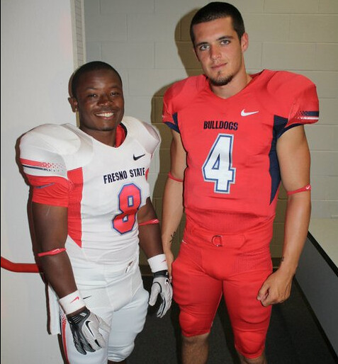
Fresno State unveiled their new Nike Pro Combat Elite Uniforms yesterday (their first new uniforms in fourteen years). Coach Pat Hill’s reaction to the uniforms and the “football fashion show” video is available below. The Facebook gallery is available here.

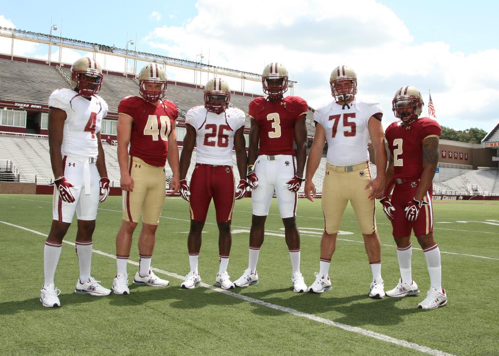
Boston College revealed the six different combinations of their new football uniforms for this season made by Under Armour. They had some complaints about the readability of the previous unis’ slanted number font and they’ve definitely improved upon that. BC also carried over the “Jesuit Stained Glass” effect that they’ve used on the numbers over to the helmet stripe.

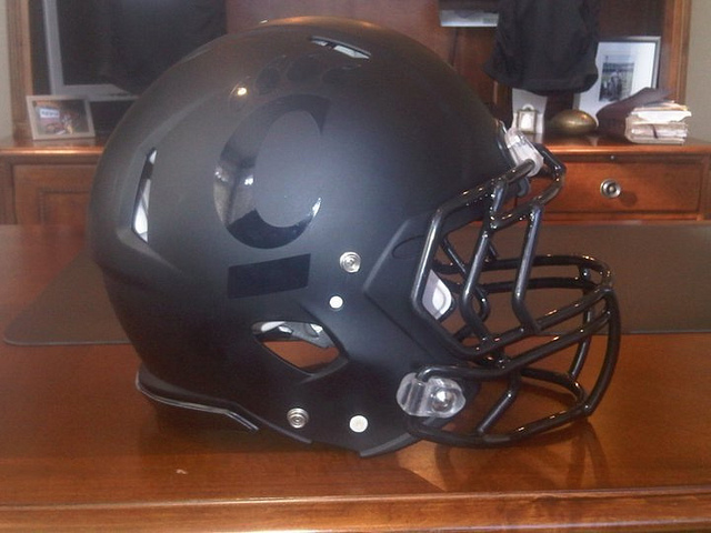
Cincinnati looks like they’ll have a gun-metalesque all black helmet next season. Adam Kramer over at Kegs N’ Eggs thinks they are trying to create some post Brian Kelly buzz:
After a lackluster season, the Bearcats are looking to establish themselves once again, this time without Brian Kelly. Although headwear won’t impact how they fair in 2011 whatsoever [OR WILL IT?] Cincinnati appears to be testing out some all-black helmets that will likely generate a good amount of positive and negative buzz.

Anyone watching the PGA Championship this week may have noticed those ball marker belt clips being worn by a fair amount of the players this year. It’s difficult to get a good close-up, but they do have the Atlanta Athletic Club logo on them. Just for the record, I’m assuming these are ball markers. Please set me straight if I am mistaken.
Update: These are player badges that are given out for all major championships except the Masters.

Benchies
by Rick Pearson
Who knows when those years of training will pay off…

And, of course, your full-size strip.
Those aren’t ball markers that the participants of the PGA Championship are wearing. They’re player badges that are given out at every major except for the Masters.
Thank you, Todd. Updated.
That is not a ball marker clip at The PGA champ. It is a money clip that doubles as the players badge for the week.
It looks different than the money clip, link?
Fresno looks ok, hate the pitstains. BC looks much better than previous.
I don’t know if this is the right place to post this and I’m not sure if anyone else has brought it up so I apologize if I’m wrong to do it here. . . but look at the pants that OSU is wearing for practice. They are shorter and don’t even have a place for a kneepad. And I like that Cincinnati helmet, btw.
link
link
That picture is from Thursday when Ohio State was practicing in shells, (Helmets and shoulder pads), but not full pads. So, I believe they were just wearing shorts, not the real pants
Fresno’s side panel things look goofy.
BC has a couple good combos and a couple bad combos.
I kinda like the Cincinnati helmet, but I’d really like to see the rest of the uniform to go with it before I really judge it.
have to agree with freno looking a mess, the arizona fade, gigantic side panels, and a massive triangle stripe for the helmet, not to mention a change in red shade. i didn’t much care for it when the bucks changed to a faded shade of red either, i only like the stripe width variation when it makes sense like to emulate the msu spartan’s plume, and silly stripes are fine if you are doing something like the U and creating an abstract state of florida. but it is like their AD sat down and said okay give me the works. it’s like a pinto having a stupid custom hot rod flame paint job.
i also agree some of the BC looks are better then others, but we might not see all the combos, maybe they are just showing the possibilities. let’s hope(although we may like and dislike different combos). on the positive side the numbers are better, and they didn’t add any out of place racing stripes. i am neutral on the new pants stripes in that i don’t really like pattern, but i don’t think it looks corn awful either. but where i personally feel they failed is the helmet. while i don’t hate the subtle stained glass effect on the centre NFL stripe, i do dislike that they changed to the nfl stripe, i liked the single stripe they started using post-flutte. i guess i will have to get used to this, but i bet it doesn’t even last a student body class.
the bearcat helmet. i guess i can see why some people like this flat mat, but i don’t care for it in the least. it looks like a helmet worn in military service to me, not on the gridiron, especially with the current face mask types, the peripheral helmet cutaway, the diamond ear holes with raised edge, and the concussion bumper on on the back side. i also think it also looks silly with the shiny helmet logos. to be honest, i am not a big fan of this helmet style anyway, but when you add the matte, it becomes more pronounced. maybe if it was painted with a semi-gloss, and just not given the uber glossy finish with sparkle, i would like it more. but the matte finish almost looks sticky, as if when to helmets had contact they would rub together roughly a smidge and skid. i know this can’t be the case, it just looks like that to me.
Right on, Moose. But that stripe pattern on the pants and sleeve is actually the link, not the link.
Also looks like BC is going maroon/white/maroon on the helmet stripe, where it just used to be a single maroon stripe I believe.
Oh and nice bullshit dot matrix sleeve stripes, Fresno. Awful.
Yes- used to be no stripe until Tom Coughlin changed that (wanted a different helmet than ND). The cough in era also saw them change from a yellow gold to the true gold they have today.
The BC uniform changes are definite improvement – I hated that italicized font or whatever it was. But the “stained glass” on the helmets look awful. I wish BC would get it right for once!
Eh. I can live with it…it’s an effect that won’t be noticeable unless you’re really looking for it. From a distance it’ll just be a white stripe.
Yeah. It’s not like it’s distracting. I’m not annoyed by it.
Major improvements for BoCo, though it seems weird to evoke glass on a helmet. I guess it’s good they didn’t put it on the facemask to give the “glass jaw” effect. Would be better if they’d lose the red pants.
Fresnoids are a mixed bag. If they’d drop the pitstains and the fade on the stripes, they’d have a unique look with some “California contemporary” flair. Those two bumperstickers ruin it IMO.
I really like all the BC uni concepts except white jersey/gold pants and monochrome maroon.
UConn unveiled new unis too, which are pretty similar except for an NOB. You can see them on facebook at link.
via from media day.
Geez BC, you’re slacking! They could have made 3 more uni combos with those colors. I’d like to see a gold shirt ( with white numerals) over red pants. Their previous numeralification was unique for sure but this is an upgrade. The red over gold echoes the classic SanFran 49ers look.
Fresno State: I kinda like the fading stripes on the shoulders. Reminds me of a 1980’s video game for some reason. Pitstains have to go. Please no monochromes but if they must, at least wear a contrasting belt.
Well loookee here – another team wearing black in the Rugby World Cup. Wales debuted their new change kit today. link
England were wearing the latest version of their white gear for the first time. link Gone are the grey side panels and garish stripes of recent years. Just plain, simple, classic all white – spoiled by a that hideous squared outline font.
Is it me, or is the trend in new football uniforms to be one extreme or the other? Fresno and BC are the perfect examples. Either teams go with as many bumper stickers as possible or they go minimalist. No middle ground anymore?
Apparently not. The middle ground seems to be populated only by holdovers. USC and Auburn are two that come quickly to mind…as long as Auburn doesn’t succumb to the feeling they simply MUST have navy road pants. Then they’ll just be getting on the bandwagon. Being unique like everyone else.
And LSU. (but for truncation). And Ohio State. And others. Didn’t mean to say there were only the two.
You may not see them for a while, but the Colorado Buffaloes have gone back to a more classic look. It’s welcome after fifteen or so years of wackiness.
Fresno was overdue for a uniform update, and their old one has no particular charm to it, but… yuck.
I actually hate BC’s new duds. I wasn’t a huge fan of the twin-stripe gold-letter outfit the last couple of years, either, so I guess it’s just a step sideways, but I think the new unis are just plain bad. BC never should have put stripes on its pants. Now they’re putting a triple stripe on the helmet, which looks clunky to me. I don’t mind the “stained-glass” effect, but three stripes is excessive on a helmet that’s otherwise blank.
Chalk me up as a contrarian if you want, but BC’s slanted number font was unique, and it was consistent across multiple sports (the hockey team in particular looks good with it), and I’m sad to see it go. It hurt that they used gold instead of white on the home jerseys, though.
yeah their font was never easy to read but it was a lot easier when they had the black accent, which made the gold and maroon pop more.
they appear to be using the same font, except its no longer italicized/slanted.
Posted this latge last night. Its an article about the creator of the swoosh and story about how Phil Knight didnt even like it at first. As I said then, Im sure most of you have seen it already.
link
Fresno State seems to have borrowed a page from Oklahoma’s uniform history–with the nickname being on the home jerseys and the school name on the road ones.
Okay, it hasn’t taken the Bills long to discount Lee Evans jerseys (although I had to check out to see if they had any available in the new style, to no avail). But I DID find TO jerseys still for sale on NFLshop.com. Ummm….didn’t TO play for them TWO YEARS ago?
link
Look at the original price, that’s an authentic TO jersey, its hard to unload expensive gear featuring players that played for only one season.
That being said Bills fans should take advantage of this, DIY project here, you can make yourself a Marcus Easley (81) uniform or switch the numbers and the name to create your very own Naaman Roosevelt (18) jersey, or you could have a personalized 81/18 jersey. It may be better to stick to the 81 though if there is any kind of evidence of the numbers still showing.
I wish Nick Barnett’s jersey was available in an Authentic look, so I could turn that into a Rodgers jersey (I’m still rocking a Favre jersey pre-NFL logo update).
I don’t have a photo, but Zack Grienke is wearing the Bierbrauer jersey when everyone else is wearing the normal home softball jerseys.
The game was on Fox, and they noticed after Greinke pinch-bunted in the fifth. They had one nice still of Greinke with his “Bierbrauers” standing next to Roenicke in “Brewers”.
link.
Here is the story and video…
link
Best-looking game tonight: Bills @ Bears
Interesting helmet move for BC. Teams with logo-less helmets are reluctant to change. It reminds me of Syracuse. They went from an old-school helmet (logo-less with blue-white-blue stripes) to another old-school design with numbers on the side. That move broke the seal and allowed them to put a logo (S) on the side without much controversy. I bet this move by BC will cause a similar domino effect. Look for a BC logo within 10 years.
It looks like newlywed Big Ben link in Friday’s game.
Might be why he lost.
Were you really that unimpressed by the five plays he was in for?
Me gusta on the Boston College uniforms. Just, I wish they would have full sized socks, but y’know; I’ll take what I’m given in college football.
Just so everyone knows, the superiorly-uniformed SOCAL team just pulled ahead of the horribly clad NOCAL team in the Little League playoffs. Whomever wins will represent in the LLWS. The link lead the Red Bluff All Stars 2-1 in the 6th.
That said, the Red Bluff’s red socks are quite endearing, too.
link which somehow got lost.
Man the Bills looked good in their new uniforms
I have one BC alum on my Facebook list. His comment on the new unis: “Too 49ers”.
The Bearcats helmet looks like an University of Cincinnati Annual Report cover. Yes please give me the dull varnish helmet shell and the high gloss varnish logo C bearclaw. Some how the print designer got to design the equipment. Not legible on TV folks.
This is really great written content. Thank you with this.