Absolutely EPIC Uni Watch party last night in St. Charles. Didn’t have time to upload photos or videos for today, but soon.
Now then: Back when Buck Showalter managed the Rangers, he wore a red cap in spring training while everyone else wore blue, presumably so he’d be easy to spot. And during his first spring camp with the Orioles, he wore an orange-brimmed game cap while everyone else wore a black BP cap.
Now Richard “Ricko” Pearson has turned up some old Sports Illustrated photos showing that the Dodgers did something similar back in the mid-1960s. The images show certain Dodgers personnel — presumably the coaching and instructional staff — wearing red caps and also red stirrups. Take a look:
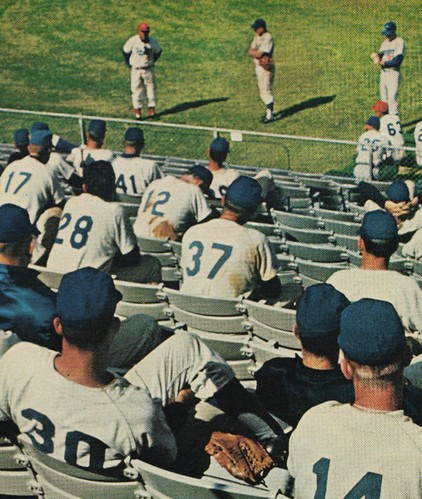
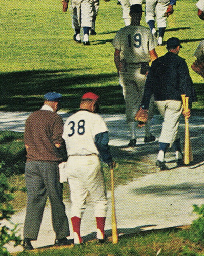
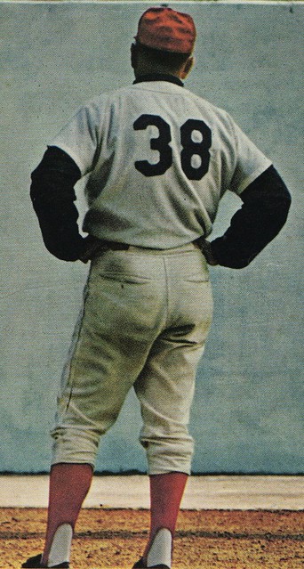
(There are also some red-cappers in the background of this shot, although it seems more notable for the unusual sight of someone keeping a bat in his back pocket.)
Interesting, right? Ricko notes that this shot of manager Walter Alston, from the same photo shoot, shows him wearing blue stirrups, so Ricko theorizes that only the minor league instructional staff wore the red.
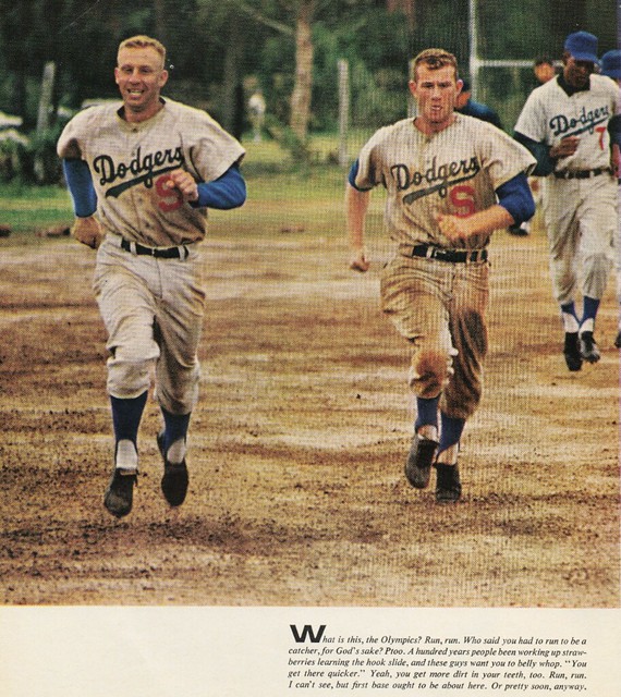
Meanwhile, longtime readers may recall that I once wrote about a 1965 spring training photo that showed some Dodgers players wearing the letter S instead of uni numbers (plus I later found a shot of a Dodgers jersey with an X, although the photo links no longer work and I idiotically neglected to download them to my personal archive). Ricko has now found the original color photos of the “S” jerseys:
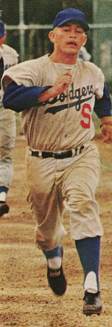
In addition, Ricko found another lettered jersey — this time it’s an H:
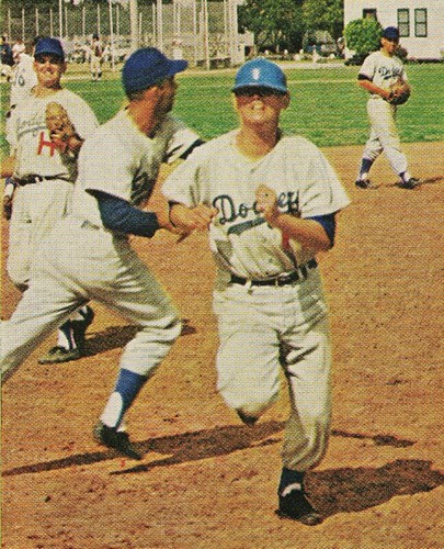
Note that Mr. H doesn’t have a logo on his cap. Now scroll back up and look at the first Mr. S — no logo on his cap either. The other Messrs. S weren’t wearing caps, but look in the background of that photo — another no-logo cap. At first glance, that guy is wearing No. 7, but let’s take a closer look:
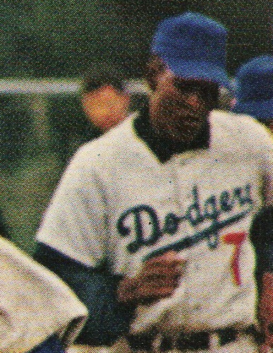
Could be a 7, but it could also be a T, depending on how the fabric is draping. Given that all the players wearing logo-free caps appear to be wearing letters instead of numbers, I’d bet it’s a T.
So we now know various Dodgers wore S, H, X, and possibly T. What we don’t know is what these letters stood for, although I’m fairly certain it had something to do with their farm system designations. Ricko has his own speculation for one of the letters:
X might have for someone not under contract — “Xtras” brought it to pitch BP, run bases, catch pitchers, be bodies for hot box drills, whatever. Could have been local college kids or ballplayers. Would have keep staffers from wasting time coaching them, correcting their mistakes.
All very interesting, no? Great work on this one, Ricko.
War is hell just another day on the promotional schedule: Yesterday I mentioned that the Pirates were wearing a really unfortunate cap design for Armed Forces Day on May 15. What I didn’t realize was that they’re actually on the road that day — they’ll be in Milwaukee, where the Brewers will be playing dress-up soldier too.
Notice anything about the caps in those photos? They have the New Era retail sticker on the brim. Kinda makes you wonder if this is all about feel-good Band-Aid “patriotism” or just about selling a bunch of caps (not that those two aims are mutually exclusive, of course).
For the umpteenth time: If you want to do something uni-related to show support for the military, have your team wear a throwback based on an old military baseball uniform. That way, you’re telling a baseball story, not just a military story. (For those who haven’t read my full thoughts on camouflage on the field, you might find this edifying.)
It might also be nice to stop trotting out these events so frequently. By trying to convince us that every occasion is special, the net effect is that none of them are.
Uni Watch News Ticker: Sunday is Mother’s Day, which means MLB players will be wearing pink ribbons and accessories. But according to an item at the bottom of this page, this year they’ll also be wearing pink shoes. I believe that’s a first. ”¦ Might be worth bidding on this just for the stirrups. ”¦ Check out the swoosh on Brennan Boesch’s undershirt collar. Either he blacked it out or else Nike is now making tone-on-tone logos. ”¦ You know what baseball needs more of? Teams sponsored by furriers, that’s what! ”¦ I’m not sure if this is a sign of progress or a sign of the world going down the crapper, but the Nebraska equipment room now has its own Twitter feed (with thanks to Dana Czerwinski). ”¦ Not sports-related, but Mike Hersh came up with this really good site devoted to brand logos. “I really like the search feature,” he says. ”¦ Someone on last year’s Tri-Cities Valley Cats squad was wearing a football-style facemask (with thanks to Kyle Ostendorf). ”¦ Steven Wyder notes that Bosox infielder Marco Scutaro and coach Tim Bogar are both listed as No. 10 on the roster. Is that possible? Or legal? I remember the Mets had a similar situation in 2008 when Trot Nixon was briefly with the team. He wore No. 6 for about two weeks and then went on the DL. While he was disabled, someone else — I think Nick Evans — was assigned No. 6, even though Nixon was still on the 40-man roster as No. 6. I pointed it out to team officials at the time, but of course you can’t tell them anything. ”¦ Speaking of uni numbers, some numerical negotiations have been brewing among the Ravens (with thanks to Andrew Cosentino). ”¦ Lots of really good Cubs photos from Wednesday’s throwback game here (big thanks to Michael Smith). ”¦ Ralston Valley High School in Colorado has a very interesting stirrup/sannie combo (with thanks to Shane Nelson). ”¦ Still more military imagery: The Rays are paying tribute to the Navy SEALS (with thanks to Kyle Speicher). … New identity system Western Oregon University — “That’s my alma mater!” says Jeremy Brahm.
Regarding Bogar/Scutaro both being 10… that listing is wrong or old.
From April:
“Third-base coach Tim Bogar willingly gave up his No. 10, switching to Manny Delcarmen’s old No. 17. Scutaro hasn’t yet offered compensation for the number, but that might be forthcoming.”
link
And a pic of Bogar from this year: link
I think I read about that on uniwatchblog!
First thing I thought of when I saw the new Western Oregon logo was the Loyola University (Chicago) Ramblers logo. The wolf is not identical, but pretty similar… link
Also looks pretty close to the logo for the link, a team my alma mater plays. Of course, the real crime is that these poor schools are getting stuck with bland, generic logos that DO all resemble one another. Paul often makes the argument that high schools would do better by allowing their students to create the school’s logos instead of ripping off one already in existence… well, it seems to be reaching that point on the Division 2/smaller college level in the NCAA, as well.
Not just Div 2. The only valid excuse for any school not doing its own logos and branding work is that it doesn’t have a design or marketing/communications program on campus. What I’d ask a university president is, if you don’t trust your own professors and students to design your marketing materials, why should I hire your graduates to design my marketing materials?
That’s a great argument.
The “Split-face Gus,” Pittsburg State’s Gorilla logo was designed by a student (he may have already graduated by the time the process was complete. If a new “identity system” were being developed today (assuming Split-face Gus had never been created), some corporation probably would have come up with some lame interlocked “PSU” and script “Gorilla” wordmark because they wouldn’t have been able to conceive a good logo with a depiction of a gorilla.
So you’re telling me there aren’t any designers or corporations in the sports industry that could create a nice logo of a gorilla, but students are somehow inherently gifted with the talent that professional designers aren’t? Please.
On top of it, Pitt State’s logo may be unique, but it’s not all that original, and being unique doesn’t automatically qualify it as good.
I’d say it’s a double-edged sword. While professional designers/corporations are no doubt talented enough to do great work, often they have secondary motivations behind their work. Using Western Oregon for an example, would they rather put a lot of hard effort into it and come up with a TOTALLY unique design that will remind a person of nothing else, or would they rather design it so that everybody knows “XYZ Design Studio” did the work? Who knows how the thought processes really go, but we are always railing on this site about companies that would rather phase out a school/team’s identity to push their own agenda. I don’t see any reason why the same couldn’t apply here.
Sorry. I do know where WOU is. Just making a feeble attempt at a joke.
Keep in mind that the team or school writes the brief and makes the decisions, though. If you have a style to your art, the school comes to you because they like that style. It’s not about pushing an agenda. Every designer brings a different idea, approach and nuance to the table, and the client chooses the one they like the best.
first thing i thought of… Western Oregon U found this guys dog:
link
try that link again:
link
Are you OK with this negative feedback, Jeremy? Not that I disagree with it: another lost opportunity for campus creativity. It’s just that I’m a little worried that one of the premier contributors to UW is wearing his new red-and-block hoodie and fighting back the tears. Hang in there, buddy.
By the way, Jeremy, why the hell are you guys called Western Oregon when the goddam campus is in the Willamette Valley? Can’t you move operations a little closer to the Pacific? Or at least change the name to Western Central Oregon? Sheesh.
If you look at a map of the state of Oregon, the location of Western Oregon is appropriate for the name of the school. Monmouth is only about 40 miles east of the Pacific.
South Florida does fall into the question you raised about location. USF is more centrally located in the state than the name implies. One would assume a school named South Florida would be south of Tampa.
Western Oregon has had many names over the years.
Oregon State Normal School
Oregon Normal School
Oregon College of Education
Western Oregon State College and finally
Western Oregon University
I was a graduate in 1996 and the last one with the WOSC acronym. The school has kept changing the logo over the years and hopefully they can stick with it. I like the look of it.
However, remember this used to be a NAIA Division II and now a NCAA Division II school. Oregon State and Oregon get most of the press in this state and Western has not won much outside of the NAIA years in volleyball and women’s basketball (1995 champs).
By the way, Jeremy, why the hell are you guys called Western Oregon when the goddam campus is in the Willamette Valley?
Well it is west of the state capital, so it is on the Western side of the state. Actually the only other State Universities are in La Grande (Eastern) and Ashland (Southern). The populations on the coast have never been big and even Monmouth was small and still is.
Or at least change the name to Western Central Oregon?
Nope, can’t do that, because in order to get to Central Oregon you have go over the Cascade range to Bend/Redmond.
Monmouth was unique when I was there because it was a “dry town”, which ended after the residents voted to change the law in 2002. It had been the city with the longest designation as a dry town in the USA.
Did people drink in Monmouth? Yes, but if the cops caught you or you were caught on campus it was doubly bad. I did not drink but had friends who did and got caught. Plus you could not recycle bottles either, you had to go to Independence, which sold the beer you would drink.
Monmouth was and is a good learning environment because there is not much to do and Salem and Portland are just far enough away that you can focus on your studies. However, it is weird to go from farmland to Tokyo and back within one year.
Is it possible that the letters on the Dodgers Spring Training jerseys stood for their actual minor league teams. In the 60s, the Triple A affiliate was the Spokane Indians, hence the letter ‘S’. The single A team was (from 66-68) the Tri-City Atoms, hence the ‘T’? Doesn’t explain the ‘X’ or the ‘H’ (Double A team was Albuquerque Dodgers) but maybe this could be a clue?
Great minds think alike. I thought of the farm system as well but I’m also confused by the “H” and “X.”
I’m not sure the Dodgers would have given AAA players (some of whom would have been former major leaguers) logoless hats and letters instead of numbers.
More likely they’d have grouped all the lower level teams/players together and issued them that kind of gear. I also wondered if the jerseys might not be fairly old, reused from spring to spring.
I did some checking. For a season or two in the ’50s, the Dodgers’ had four D League teams. Three of them were: Shawnee, Hornell and Thomasville.
These H/S/X/T jerseys didn’t also have those letters on thebacks, did they?
I’m guessing that they had numbers, and that they were a way of separating the players on each of the affiliate squads from each other. The Dodgers used to have huge numbers of players in their camp, didn’t they? I can’t imagine them assigning numbers over 100, so my guess is that they had one series of numbers for Los Angeles, then H-1 to H-whatever for the H team, X-1… for that team, etc. I’d even guess that they just pulled the red number off the soon-to-be-recycled LA Dodgers shirt and stuck a letter on, leaving the back number intact.
If we had some front and back shots of the same players, it would be really helpful.
Hornell High School now uses the same field that guys like Don Zimmer and Maury Wills played on. The City of Hornell replaced the original wooden grandstand with a concrete block and steel one. It’s lighted and is one of the best high school stadiums in Western New York. Hornell High School is in the same league as Livonia, my high school.
Hornell also has a summer collegiate league team called the Hornell Dodgers, what else?
Interesting. For 1958, Dodgers still had “Dodgers” on their road grays. In 1959, they switched to “Los Angeles” and it stayed that way through the ’60s.
Which means they could possibly have been using equipment for spring training that went as far back as their Brooklyn days (both from the big club and their assorted lower-level farm clubs called “Dodgers”).
The move to LA didn’t necessarily force them to throw anything away, that is.
Well, except for hats with a “B” on them, of course.
I’m almost certain the Dodgers recycled their uniforms. While doing some research on their satins, I found a mention of recycling uniforms in Vero Beach. Just a thought, but it’s also possible the letters could be positions.
The Dodgers absolutely recycled uniforms – Dodger coaches wore satin uniforms at Spring Training for years after the Brooks retired them, so they would stand out among the sea of Dodger uniform-wearing prospects.
Minor league assignment makes most sense.
If I’m an instructor I can see what position a kid is playing. What I can’t see is to which of the four D league teams he’s assigned.
Or…
“Hey, hold it! ‘H’ has got three catchers today. One of you ‘H” catchers go over to ‘S’ and send back an infielder. And don’t forget to switch jerseys with him.”
As absurd as that might sound, it doesn’t sound impossible, either.
I can never get enough of those old saturated baseball photos. Brilliant.
Concerning the Ravens first round pick wanting someone else’s number; it always annoys me when players think they should have a certain number when they haven’t even earned it. If the other player is willing to switch that is fine but trying to buy or beg for a number is pathetic.
Those Pirates military caps are bad, but wow the Brewers version is among the worst MLB on-field hats I’ve seen!
Even if I didn’t object to the wearing of camo by athletes who could be serving in the military but aren’t, I’d object to what the Bucs and Brew Crew are doing on the simple grounds that it’s the wrong camo pattern. Also that it’s not actually Armed Forces Day. Wearing the military-themed stuff on May 15 is exactly comparable to celebrating the Fourth of July on June 27. But anyway, the camo. It’s been years since any branch of the armed forces wore that woodland pattern. Since the heroes of the moment are sailors, link.
Again, putting aside any consideration of the propriety of wearing camo at all, the military’s modern camo patterns are by and large much more attractive than the old Vietnam-era camos, such as woodland, tiger stripe, and whatnot. The new camos give a much flatter, less busy appearance, and function more like a color than a pattern. If you’re going to make a sports uniform out of a camo print, the modern digital camos are a much better choice than older camo patterns. Team logos and numbers will show up much better on the new camos than on the old.
I’m pretty sure that the current military camo patterns are copyrighted (or patented) and that New Era/MLB would need permission (and pay for the use) to use the modern camo.
I’m pretty sure that the current military camo patterns are copyrighted (or patented) and that New Era/MLB would need permission (and pay for the use) to use the modern camo.
If so, isn’t this all the more reason to use that camo? For one thing, wouldn’t paying money to the military be a more concrete form of “support” than, you know, not? For another, if anyone is concerned that the military might not approve the use of camo by a sports team, wouldn’t asking permission resolve the question? If I ask you not to wear my special pattern, but you do so anyway, then you can’t very well claim to be “honoring” me, can you?
The blue pixilated Navy Working Uniform (NWU) Type I you linked is not a camouflage uniform. It was never intended to be camouflage. Continuing to refer to it as camouflage just contributes to the overall ignorance of the citizenry’s knowledge of the US military.
The US Navy still utilizes NATO Woodland camouflage for it’s Combat Utility Uniforms (CUU/BDU). The same pattern mimicked on the Pirates and Brewers caps. The Navy is currently transitioning to a new temperate/woodland pattern (AOR2) camouflage uniform. which is designated as NWU Type III
link
If not for camouflage purposes, what’s the reason for the pixelated pattern? Is it so they don’t look as bad if they get dirty or something?
(serious question, not being a smartass)
JTH,
The blue pixilated NWU pattern was designed or “branding” and yes, to hide stains.
The Air Force’s Airman Battle Uniform (ABU)originally was to have blue in it for the same “branding” purpose, and, hiding stains was a consideration. But, instead it was eventually produced using the same colorway as the Army’s Universal Camouflage Pattern (UCP)
link
Continuing to refer to it as camouflage just contributes to the overall ignorance of the citizenry’s knowledge of the US military.
I’m not sure we should blame civilians for misunderstanding when we’re dealing with a service that once called link “camouflage.” ;-)
But you’re right: That pattern is designed to camouflage stains on the uniform, not to camouflage the sailor on a battlefield. Though I’m not sure that’s a semantic battle worth fighting. I mean, I know that it’s a magazine, not a clip, but I regularly hear security professionals refer to “clips,” because that’s the common term. Just as “camo” is the word our language uses to describe that kind of pattern, whether it’s designed to hide a person in a forest or to hide paint stains on a shirt.
oops LOL posted below by accident:
dazzle print is different than camouflage…
but the camo pattern the bucs and brewers are using is a classic look. i actually like it better in that context (just on the visor), than the digital print.
that pirates hat is pretty sick, by the way. the green “P” with gold outline makes it!
dazzle “paint”
damn… is it friday yet?
And to be fair, that dazzle-painted ship I linked to is actually a Royal Navy vessel.
But dazzle is not “different than camouflage” – both are simply patterns designed to conceal. That’s what the word “camouflage” means. Dazzle just went about it differently than camo prints. And interestingly, modern “digital” camo patterns are actually closer to dazzle in approach than older camo prints like woodland. The digital patterns are about breaking up profiles, shapes, and edges, not about attempting overtly to blend in to one’s immediate surroundings. Which is exactly what dazzle was all about – break up the lines of the ship, making it harder for a submariner to fix the ship’s size, distance, and orientation.
I’d love to see a team wear dazzle as a uni pattern. That would be camo I could get behind!
Air Force wears Army’s camo pattern?
Doesn’t Army’s copyrighted digicamo pattern have Army identifiers worked into it, as the Marines’ copyrighted digicamo pattern does?
whoops – screwed up the link. Here’s the Marines’ digicamo: note the link.
“But dazzle is not “different than camouflage” — both are simply patterns designed to conceal”
i have to respectfully disagree. even though, technically, it’s called “dazzle camouflage” (i always called it dazzle paint), it was meant to confuse more than to conceal.
So Joe Maddon had “SEAL Team Six” t-shirts made up for his players, and they’re all wearing the shirts when they travel on a road trip, but wearing their regular uniforms when they actually play the games? If I’m reading that right, then that’s a good example of how to do that sort of thing.
Only problem: There is no SEAL Team Six. And not in the “you don’t talk about Fight Club” sense, but in the they-changed-their-name-many-years-ago sense. It’s no longer SEAL Team Six, it’s United States Naval Special Warfare Development Group, or DevGru. Although “SEAL Team Six” sounds like an action movie, while “DevGru” sounds like a fancy cheese, so I can see why that’s not going on anybody’s t-shirt.
I can see why that’s not going on anybody’s t-shirt.
~~~
are you sure about that?
Oh, I know it was actually going on somebody’s shirt. But apparently not on the Rays’ shirts.
What we really need is a craft beer called Dev Brew. Ideally, an insanely hoppy American-style pale ale.
Bummed that I didn’t make it out to St. Charles last night … darn those family obligations … can’t wait to see the pictures, though!
RE: Western Oregon’s logo
Is there any other score whose acronym is a rough representation of the sound its mascot makes?
At Marshall, it’s a rough representation of the link their cheerleaders make.
I like this guy.
link
Oops, that should be “school”
I love the idea of the military uniform throwbacks! And there are plenty to choose from…
link
It’d be great to see the Indians in Bob Feller’s Navy uniform. Or even the Great Lakes training center, because that is a sharp look!
link
link
That Great Lakes uni would be great for Cleveland, on account of the Feller connection, but also for the Cubs, White Sox, or Brewers, owing to the Naval Air Station actually being just north of Chicago.
link if they ever want to honor the troops with a military baseball throwback.
link in highest-res. Great candidate for colorization. Also, that Third Army patch with the 3 forming the crossbar of the A appears to be a “prototype” logo. link actually wore once it transitioned from leading stateside infantry training to entering the European combat theater. The logo in the Fort Snelling photo is closer in style to the link insignia. The Third Army also appears to have issued link for snowmobile troops. How about that as a shoulder patch for Armed Forces Day?
The Third Army had a great motto, by the way, which is best translated from the Latin as, “The Third: Always First.”
That’s “Showmobile.” Something to do with Special Services and entertainment, possibly. Or the USO. Or both.
Weren’t many snowmobiles around during WWII.
link (looks like that image you linked to may have even come from this page).
Great Lakes is also the only remaining Basic training location for the Navy. I would love to own that jersey.
Scott, as Coleman pointed out, Great Lakes is the only boot camp the US Navy has left, but it’s not an air station.
You’re probably thinking of the base that used to be in Glenview but closed in the mid-90s. Great Lakes is in North Chicago (which is a lot closer to Kenosha than it is to Chicago).
Thanks! I had thought that the current Great Lakes facility was institutionally descended from the early 20th century naval aviation training facility.
EFF has both the home and road…
link
Those would look great with a pair of Bad News Bears stirrups.
they’d look even better if they were about $110 cheaper. hahaha
Every once in a while EFF puts select jerseys on sale for $99. Just gotta keep checking. That’s the top end of what I’d spend, and the only time I’ve ever bought from them.
Wish it could be more.
Maybe when I win the Powerball.
Old, West Point baseball, that’s Omar Bradley second from the left
link..jpg
Love all this stuff. Thanks, guys. Omar Bradley was the man.
Paul, had a great time last night! Finding out about the history of those lanes made playing on them that much more cool.
As for thosr Cubs pictures, the throwback looked great…but the best shots are the last two. ;-)
After the last to photos, I forgot about everything else. Very nice!
*two photos
I wonder if that’s what the kid in the first picture is looking back at, as well.
The Cubs stripped socks with white at the bottom predate stirrups and are comfortable. They look great and maybe players would wear them.
What exactly do you mean when you say that they predate stirrups?
Also, despite what it said in that blog post, I’m fairly certain the 1944 team wore white-bottomed stirrups over white sannies, not 1-piece socks.
In the pictures I see of 1920 or 30s players they’re wearing socks with white above the shoes, not stirrups.
Sure they did — stirrups with white above the shoes over white sannies give the appearance of a solid sock, which was the idea.
Examples:
link – hard to tell, but it sure looks like stirrups to me.
link – I’ve always wondered why the White Sox even bothered with stirrups.
link – this one is the clearest picture. Look at the players (and the batboy) in front.
Jimbo’s correct.
Stirrups were solidly standard by the 19-teens, but generally cut so low it’s sometimes hard to realize they’re there, especially white over white sanitaries.
How important are stirrups if the players won’t wear them? The Cubs throwback socks looked like the old pictures so I’d be thrilled if all the teams swithed to that style sock.
Because the white crew socks look is FAR more associated with football than it’s ever been with baseball.
Different sports, different paradigm.
In the second photo in the background, it looks like no. 19 is wearing sannies only, no stirrups.
Entirely possible.
And, should we think that’s not minor leaguers with lots of number duplication, that sure isn’t Junior Gilliam, either. He wore #19 for the Dodgers at the time (1965, according to SI’s rerunning of the “S” photo recently…but I can find this photo spread in the SI Vault that year). The images here today are scans from the Ricko Files, tear sheets from an SI on which I did not note the year. Idiot.
“Idiot” meaning me for not noting the year.
Speaking of the Dodgers, what about the unusual change they made to the 1971 road uniform? It had blue striping the size of the Phillies home uniforms on both the jersey and pants. This was a one year experiment, like the much larger Nebraska football jersey/pants striping roughly two decades later.
Wasn’t quite as thick as the Phillies…
(beginning on thumbnail p. 23)
and wasn’t used on the homes…
(see cover, same issue)
link
Roads weren’t powder blue, either. Between it being night game color and a bad SI scan, it just looks that way.
(not that you said it WAS used on the homes, just pointing to the cover as having photos of the homes.)
Also note Maury Wills (cover), Willie Davis (#3) and a few other Dodgers being early wearers of Adidas that weren’t team issue (as with White Sox, Senators, Phillies and others).
Also on the Giants hitter who got drilled.
Notre Dame has the backup QBs wear red caps during the game on the sideline.
“The backup quarterbacks signal in the plays to starter Dayne Crist. They wear red, so they stand out on a sideline of blue and gold — so Crist can find them easily. If the bookstore folks are smart, they’ll make sure to have some on the shelves soon.”
Interesting stirrup/sannie combo indeed. I don’t remember the last time I saw a team wear colored sannies that were darker than the stirrups other than teams wearing white stirrups.
link maybe?
Those stirrups are white.
I should’ve re-read your post, “other than teams wearing white stirrups.” Apologies.
No problem, obviously I didn’t see this post before responding.
Suggested new MLB slogan:
“Anything to take your mind off baseball!”
“… and welcome to PNC park”
dazzle print is different than camouflage…
but the camo pattern the bucs and brewers are using is a classic look. i actually like it better in that context (just on the visor), than the digital print.
that pirates hat is pretty sick, by the way. the green “P” with gold outline makes it!
ignore most of the please… see above. LMAO
Of all the teams to have a twitter page why Nebraska? I would follow Oregon or TCU, but not Nebraska. Who is next…Penn State? Booooooring…..
Because Nebraska folks can’t get enough of Nebraska ‘stuff’. They sell dvd’s of the Spring game in the bookstore. The girl at the register when I was there a couple of summers back told me this was their ‘second pressing’, first one sold out.
I can’t figure it out either. But if I did twitter I’d sign up for the equiptment room thing. My son worked there.
Speaking of stirrups, the members of the Krista’s Cantina softball team (at least the ones that Get It™)will look link for the remainder of the season, thanks to Comrade Marshall!
Stripe alert!
Great link on the front page of the Seattle Times today.
And quite likely purple, too.
True. But Paul can pretend they’re some other color, and the general stripeness does tilt towards the awesome side of the ledger.
I note the length of the shorts and thickness of the sock stripes are the opposite of uniform.
Good bet sock stripes are same thickness.
It’s the amount of turned-over sock that’s determining how much stripe shows.
OK, now explain the shorts ;)
On that I got nuthin’.
MLBers wearing pink on Mother’s Day… you know who won’t be wearing pink on Sunday? My mother! And my sister, for that matter (she’s a mother as well). Both of them hate pink clothes, and do their best to avoid that color whenever possible.
(I won’t be wearing pink, either, though that *should* go without saying.)
tbh, I’m really getting tired of all the pink. The LAST thing my Mom, sister, or I want to think about is them having cancer. We see it on Mother’s Day and then all October. It’s played out.
Another promotion with absolutely no acceptable exit strategy.
I’m having get-back-to-work issues with the flood of extremely cool graphics-and-design sites that have been linked by UW over the past week or two. “Brands of the World” spells nothing but trouble.
You and me both…
Whoever that was that linked to the Sporcle.com site the other day succeeded in making sure that I got nothing done for the rest of the week. I bet I’ve played every sport themed game on the site. Pretty stinkin’ addictive.
I may be in the minority, but I think the Bucs’ camo look great. I think it’s because the cap is black and that works very well with the brim. Plus the “P” is the same colors as the brim too. The idea isn’t so great, but the execution of it I think looks nice. I already bought this cap and I will floss it.
And also, the A’s took Cinco de Mayo to their jerseys
link
Non of that “LOS” nonsense
Nice
¡MagnÃfico!
On those Dodgers photos – tip o’ the hat to Ricko for today’s batch of awesomeness – did the red caps have an LA insignia, or were they plain? In only the first photo is the front of a red cap visible, but it seems unclear. Looks like a tiny white splotch where a white LA logo should be, but it’s small and indistinct enough that I’m only about 80 percent certain it’s a cap insignia.
My guess would be that they did have the logo, as that bit of white in the first photos appears to show.
Whoever those guys were, they were authority figures in camp. Couldn’t very well have them walking around Dodgertown with blank, off-the-shelf-at-the-Esso-Station logoless caps like the D Leaguers.
That’s what I figure. Makes sense, and the photo is consistent. Just not completely definitive. Still, if I were a Dodgers fan, I’d totally want one of those.
Take your pick. cardinal red or “regular” red. Just have to deal with the new era flag logo, but pretty similar. I know these hats aren’t made to replicate what’s being worn in today’s photos but it has got to count for something, right?
link
link
Didn’t we see a photo of one of those, some time back? Red cap, white “LA”? Had something to do with these link?
Pink on Mother’s Day:
I don’t necessarily see the point, but you’re right about shoes making an appearance on the scene. Sam LeCure, Reds pitcher, twittered this photo earlier today. link
He later said it’s not him modeling, but obviously a teammate will be wearing those.
I don’t know why they are wearing pink cleats. They will just pull their pants down over them and they won’t be seen.
Just as well. Who wants to see pink high tops, anyway.
On Hannah Montana, maybe.
Here is a picture I took yesterday. Note the use of the Angels “A”.
link
good catch!
Last night, I went to the Texas A&M vs. Dallas Baptist University baseball game last night, and noticed that DBU had some pretty sweet socks. It was too bad that only a couple of the players had their socks showing.
link
And sort of updated NY Knights pants, too.
Could your ESPN P2 people set you up with Tommy Lasorda somehow? I’m sure he could answer any and all of these semi-obsvure Dodger history questions.
btw, this shouldn’t go un-noted…
link
I just noticed this, in the…
“Is that a bat in your pocket,
or are you just glad to see me?”
photo…
link
He’s wearing Riddells…with the white snug-ties around the ankles. In 1965, for pete’s sake. Good bet for regular season they have been polished or dyed black.
Re: the Dodger coach’s in red cap during spring training.
Remember these photo’s?
link
link
link
link
If you compare it to the “12” on the left, it looks like the jersey on the right has a letter on it as well (H?).
I’m referring to picture #4, of course.
Well, it isn’t a number, that’s for sure.
No logo on Davis’ hat, either.
thought y’all might like this;
link
Richard Marx the rock star posted this on his page- and that would be me, far left, in the banana.
“Welcome to the big-time, you’re bound to be a star…”
That’s why I left radio. I was lucky enough to work at a free form “progressive” station. When they reduced me from five nights a week to weekends, I quit. I could have stayed in radio, but I’m way too cynical to be in a costume in the same room as a teen heart-throb.
Ok, there was a time I was starring in a play in Austin, and had to wear my “angel” costume to an interview at KVET. Delbert McClinton walked into the room and casually said, “How y’all doing.” So I guess I did end up in the same situation. I hate it when I disprove my original premise.
More radio nonsense (sorry y’all):
When I drove around the country doing stand-up, I had to do early morning interviews on various radio stations, usually in small markets with really annoying DJ’s. In North Dakota, I did one at a station named KOKK. I swear – it sounds like I’m making it up, but it really was KOKK. Their FM station was automated, so the other comic and I were on the AM station, literally going on after farm reports and Paul Harvey. The kid running the board went thru a long list of things we couldn’t say or discuss. Finally, I asked, “Can we say the name of the station?” NO!
I was on the “Greater Tuna” circuit.
Like the WKRP Carp?
Had a friend whose first job was being the overnight man in Bemidji, Minnesota.
One night at 1 a.m. he went up on the roof and did traffic reports.
“Nothing much going on at the mo—oh, wait, here comes a car headed south on Beltrami Avenue. Might want to avoid Beltrami for the next couple minutes.”
In the early 90s, the Yankees also went with white hats with blue bills and NYs for the coaches during spring training.
Tweet from Amy G, the Giant’s in-game field reporter on TV; Panda, Buster & Romo will be sporting pink cleats Mom’s Day to promote breast cancer awareness.
Don’t know about Romo, but Panda (on DL) and Buster are both UA cleat wearers.
link
Panda with his shoes
Didn’t Dr. Seuss write that?
Honoring Willie Mays on the field–and he’s wearing their old BP hat, with the old script G.
Can’t we get the greatest player of all time a current cap?
We have discussed before that very likely that may be his preference, in order to favor neither New York nor San Francisco, just “the Giants.”
Makes sense. In somewhat equal measure, his extraordinary career played out with both the East and West Coast versions of the team.
And he’s pretty much the only Giant or Dodger we can say that about. The move to the California didn’t come “mid-career” for very many players on either team.
I remember, for example, that 3/4 of the Giants’ 1958 starting infield (Orlando Cepeda, Eddie Bressoud, Jim Davenport) and the catcher (Bob Schmidt) had been with the Minneapolis Millers in 1957.
No one ever writes much about the curious bit of timing on the move to the Coast. Both teams’ most fabled players (except Mays) were on the downside of their careers, but both teams also had some real talent about to come into their own, either already with big clubs or at AAA. Koufax, McCovey, Marichal and so many others had, within a few short years, become West Coast stars who’d made little or no dent in New York.
Or did perhaps both O’Malley and Stoneham sense that about their teams, and it maybe was just one more reason the time to move was right? Who knows. Whether they did or not, that’s the way it turned out.
About military appreicaiton unis:
I’ve never liked ’em. However, have always liked the idea of military throw backs. Until that happens, I think MLB should institute a patch-only rule for that sort of thing. Each team could customize the patch as hey saw fit, and it would cut down on the camo debates :)
Now, what I would really like to see is for MLB to do a Negro League appreciation throw back incorporation all the MLB teams. Make it for one weekend in the summer, and each team takes on the name/uni of the closest NLB team. That would be a uni change that would make sense to me.
Nice post, thanks for sharing this with us. We at Papa China offers many different kinds of customized promotional products at competitive prices.For further query contact us.