Back in October I ran an entry about my jersey collection. Today we’re gonna take a look at one of my other uni-related apparel collections: vintage varsity-style team jackets, along with a few related items that aren’t quite team jackets but are still in the same spirit.
Just as with my jerseys, I’ll only buy a vintage jacket if it fits me — I’m looking to wear it, not just own it. But as is often the case in New York apartments, I have very limited closet space, so this collection has sort of rotated over the years — as I acquire new ones, I often end up selling some of the older ones. Here are the ones I have at the moment, beginning with a real beauty:
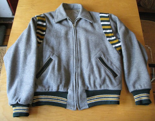
Got that on eBay for about $40 in 2009, I believe. The shoulder gussets and color scheme pretty much make this a Paul Lukas slam-dunk before we even get to the spectacular rear design, which features magnificent chenille graphics. I didn’t know what “Lane” referred to when I got the jacket, but many people (including a few who’ve stopped me on the street) have now informed me that the jacket is from Lane Tech in Chicago.
Next:
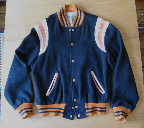
Picked this up at a Brooklyn vintage shop last fall. I forget the price — $35-ish, maybe..? Love those leather shoulder stripes. The name on the back apparently refers to this school, which I’d never heard of until I got the jacket. Tucked inside the collar are a nice label and the name of the original owner (“Chuck Campbell,” although it’s hard to read in that photo). True story: When I came down with chickenpox last year, I grabbed this jacket and ran off to the doctor to get some meds. As I was crossing the street on my way out of the doctor’s office, some douchebag yakking on the cell in his SUV nearly ran me down. Cell-ing while driving is illegal in this state, so I yelled at him to get off the phone. His response: “Go back to Ohio, asshole!” Took me a minute to realize why he’d said that.
Next:
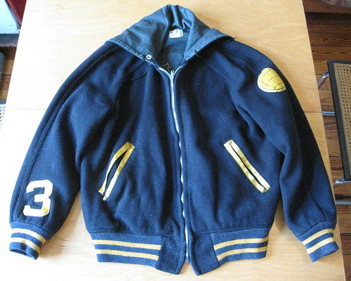
Scott Turner gave me this jacket for my birthday in 2008. I love the uni number on the sleeve, and beautifully arched rear lettering. And what kind of ball is this? Water polo! Yes, really — it’s a water polo jacket. Best one (okay, only one) in Brooklyn, I’m pretty sure.
Next:
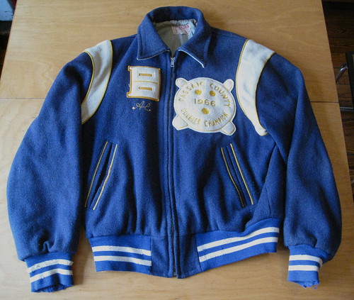
Bought this magnificent bowling jacket at a shop in Brooklyn in late 2008. Price was about $65-ish and worth every penny. The patches on the front are nice (look at the chain-stitched finger holes!), as is the tag, but the real prize is on the back. And here’s the best part: Berles Carton was located in Paterson, New Jersey — which is where I go bowling! The operation still exists in Paterson today as the Accurate Box company.
Next:
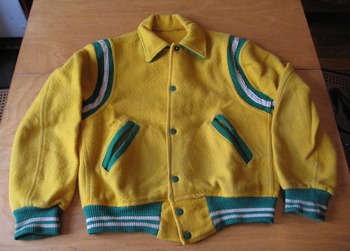
Got this on Etsy a few weeks ago for $24. Love the colors, natch. Turns out it’s rather lightweight and unlined, so it’s almost more like a flannel shirt than a jacket, but that’s fine. I have no idea what the logo on the back is for. Anyone..?
Next:
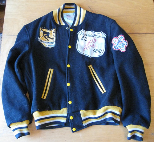
Just got this last week on eBay for $31. Couldn’t resist the Ohio-shaped speed skating patch, although I also like the other chest patch and the sleeve patch. Rube Adler Sporting Goods not only sold the jacket — they apparently sponsored the skater too. And they’re still in business today.
Incidentally, after I sent in my eBay payment for this jacket, I got a note from the seller, a guy named Peter Thompson: “I am shipping out the jacket today and you should have it by the end of the week. Also, I wanted to let you know that I am huge Uni Watch fan. I love the blog and will be a lifelong supporter.” First time I’ve stumbled upon a Uni Watch reader in an eBay transaction.
Next:
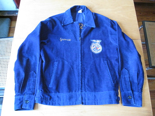
If you do any thrift/vintage shopping, you’ve probably seen plenty of these great blue corduroy FFA jackets. I got this one a few blocks from my house about four years ago for $12. Not a team jacket per se, but the awesome logo and vertically arched chain-stitching on the back make it a close cousin (here’s a closer look). And who makes a Future Farmers jacket? Future Farmers Supply Service, natch. My favorite detail: If you look at the front-view photo above, you’ll see that the zipper doesn’t zip all the way up to the collar. Why? Duh, so your necktie will show. I love that.
One more:
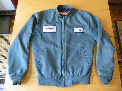
While working on a travel article in the summer of 2003, I drove from San Francisco to L.A. with my friend Karen Eng (who published the great food zine PekoPeko). At some point along the way — I no longer recall where, but I’m pretty sure it was closer to L.A. than to SanFran — we stopped at a thrift store, where I picked up this jacket for $5. I still remember how it felt when I tried it on — “Holy shit,” I thought, “this is the single most comfortable, best-fitting jacket I’ve ever worn.” More than seven years later, it still is. It’s blank on the back, and the two front patches aren’t anything special, but the jacket has a quilted lining that makes it much warmer than you’d expect, plus it’s my favorite color. An indispensable piece of my wardrobe.

I realize some of you don’t have the patience and/or the inclination to go hunting for vintage clothing. And that’s fine (esp. since it means there’s more left for me), but you should still get yourself a varsity-style jacket — they’re warm, they look cool, and one of the best sources for them happens to be one of our advertisers.
Got any gift ideas?: I’ll soon be starting work on my annual holiday gift guide column for Page 2 and would like to include as wide a range of offerings as possible. If you know of good uni-related gift ideas — or if you’re offering some product or service yourself that you think might be appropriate — please let me know. Thanks.
Uni Watch News Ticker: Oregon State basketball will be wearing turquoise uniforms on Sunday, as part of a promotion celebrating Native American heritage. As gimmicks go, this one seems better than most, especially since Oregon State’s roster includes a Native American player who’s the first member of his tribe ever to earn a full scholarship to a D1 program. Further details here. ”¦ Double-decker FNOB alert: Russ Washington of the Chargers (with thanks to Eric Stangel). ”¦ Everything’s coming up orange in Denver, where Broncos coach Josh McDaniels says he likes the orange jerseys, sports columnist Dave Krieger is lobbying for a full-time switcheroo, and some fans have started a petition (with thanks to George Scordo). ”¦ Here’s the full uni set for the newly renamed Omaha Storm Chasers (with thanks to Patrick Runge). ”¦ New hoops uniforms for San Francisco and Seton Hall. ”¦ And a new gray alternate for St. Joe’s (with thanks to Joe Schmidt). ”¦ There’s a new Aussie-rules football team: the Great Western Sydney Giants (with thanks to Drew Douglas). ”¦ On Saturday I mentioned that Texas Tech wore red pants for what I believed was the first time. As Susan Freeman and several readers have pointed out, I was wrong about that. ”¦ St. Francis, a prep school in Buffalo, hasn’t taken the most creative approach to their football uniforms. ”¦ Yesterday I mentioned that photo of Cy Halladay on the cover of MLB 2K11 showed the Phillies’ chest insignia with red stars instead of blue. Cork Gaines was curious enough to contact the video game company about this, and he got a response. ”¦ How do you serve arrest warrants on people who won’t come out of their houses? If you’re in western Pennsylvania, you just drive up in a Steelers van (thanks, Kirsten). ”¦ New identity set for the New Hampshire Fishercats (with thanks to Richard Kennedy). ”¦ While looking for something else, I came across some wonderful vintage softball sleeve patches. Look here, here, here, and here. ”¦ And speaking of vintage softball gear, if you scroll down to the very bottom of this auction listing, you’ll see something very rare: vertically striped stirrups! ”¦ Several readers noted that Michael Vick began Monday night’s game wearing a visor but then removed it once the rain started. ”¦ Several good submissions from Jake Doyle: a look at the Winnipeg Jets’ rarely seen one-season inaugural uniform; the Red Wings’ odd diamond-shaped “A” designation from, I believe, the 1950s; and an old Keds ad for the ages (dig that arrow!). ”¦ You know, it’s vulgar enough that Nike uses military-style Humvees to promote their college football designs, but now they’re bringing this marketing approach to high schools. That shot was taken in the parking lot of St. Edward High in Lakewood, Ohio, yesterday morning. This isn’t your standard corporate douchebaggery — it’s marketing war to kids, and it’s disgusting.
You know, it’s vulgar enough that Nike uses military-style Humvees to promote their college football designs, but now they’re bringing this marketing approach to high schools.
Yeah, that’s bad. Really bad. Their bad taste is at least offset in other areas — the “N7” brand for their charitable project addressing American Indian issues is (according to Sports Illustrated’s article on the Iroquis Nation’s lacrosse team) representive of the Indian belief that each person’s decisons and actions should be made with regard for the next seven generations.
I may have missed this since it’s dated Nov 5th on the Ohio High School Athletic Association’s (OHSAA) website, but yesterday while browsing the OHSAA website for updated football playoff brackets I noticed a submission form to try to win Nike Pro Combat uniforms for your high school’s football team next year. (Link is clean, I promise)
link
Lakewood St Edward is one of the eight schools remaining in Division I (aka the big-school division) and is traditionally a contender in all boys’ sports…and since it’s an all-boys school, no wonder Nike’s humvee (not to mention the actual US Army) have St Ed’s in their cross-hairs!
That truck looks a lot more like the International RXT or “World’s Largest Pickup Truck” than the Humvee.
link
It certainly does, looking at the pictures for comparison. My first thought on seeing the Nike vehicle was that it looked like some kind of converted commercial truck.
In any case, I agree with Paul that it’s disgusting. I don’t like comparing football players to soldiers. It’s not war, no matter how you play it up.
New Hempshire Fisher Cats? Now that would be an interesting name change for both the team AND the state. :)
So the Fisher Cats went from green-and-gold (always a fave around here) to being another red-white-blue team. Meh.
Though the Fisher Cats did do a lot of BFBS with their uniforms, so maybe this will at least put an end to that.
Hey Paul, where is “Dever?”…as in the “Dever Broncos.”
The Oregon State player was the first from his particular tribe to earn a D1 athletic scholarship, not the first Native American to do so.
I was going to say, aren’t J.P. Losman and Sam Bradford Native American, too? Maybe they’re just a portion Native American, but I remember hearing about that particular tidbit of their histories a few years back during TV broadcasts.
Jim Thorpe also comes to mind as possibly the most famous of all Native American athletes, but I don’t know if they had athletic scholarships back then.
Thorpe’s school (Carlisle) was also an Indian school.
Got it — thanks.
Paul,
Great job on the NFL network’s Top Ten Uniforms. One glaring mistake was when they were discussing the curse of the dreaded blue Dallas Cowboy Jerseys, they had a brief highlight of the 1980 NFC championship game in Philadelphia. The score that was shown was Philadelphia – 21 Dallas – 17. The actual score of the game was Philadelphia – 20 Dallas – 7. Sorry, no screen grab
I enjoyed the show too, except for the number one uni being the powder blue chargers, leaving out the Packers and Steeler home unis.
Also could have done without the cheerleader and pop warner entries…
Another great entry, Paul.
Just one suggestion, you may want to tweak the item about the Oregon State uniforms. Joe Burton is the first member of his tribe – the Soboba Band of Luiseno Indians – to earn a full scholarship while the wording suggests he’s the first Native American to do so.
Now fixed.
I love that article about the Steelers van. If the police showed up to my house in a Browns van I’d cuff myself just to get a ride in it.
The Hudson County Prosecutors Office in Jersey used to go looking for fugitives and other “persons of interest” in an old Mister Softee truck.
It would pull up infront of a house or building with the Mister Softee music playing. When the “person of interest” was spotted, a team would burst from the back!
ah…. Hudson county. Jersey City? Pride of the Garden St. :)
Just to clear up a couple of historical Steeler items from yesterday:
The Steelers DID make the playoffs prior to 1972. They hosted a tiebreaker Eastern Division game against the Eagles. They lost 21-0.
Before the 1962(season)/1963(calendar) Playoff Bowl game with the Lions, the Steelers for sure wore a black leather lid in 1942, a 9/13 game hosting the Eagles, which the Birds won 24-14.
Dang those Eagles!
Frogot the year of the Eagles-Steelers playoff game. It was 1947.
Well I’ll be…
My old Steelers book didn’t mention the ’47 playoff. It just listed the regular season schedule. Thanks for clearing that up!
And yes, dang those Eagles.
This isn’t your standard corporate douchebaggery – it’s marketing war to kids, and it’s disgusting.
I wouldn’t mind “promoting war to kids” if it were dealing with actual war – like, you know, a military recruiting campaign. This is promoting a warrior ethos to kids with no connection to actual military service, which devalues that service, and it’s doing so at a time when the nation is at war and we need more of our fittest and brightest young people to consider military careers. So what troubles me is not that it’s disgusting, but that it’s anti-patriotic.
I wish every kid who’s exposed to Nike’s douchebaggery would have the chance to link of Staff Sgt. Salvatore Giunta.
“I wouldn’t mind “promoting war to kids” if it were dealing with actual war — like, you know, a military recruiting campaign”
Right. It’s perfectly fine to send the kids off to actually face death in a war that not everyone agrees we should have even started. But God forbid we use a little bit of the war image to hype up a sport. THAT’s just horribly wrong.
I get what you’re saying, The Jeff, and despite the fact that I probably come off as a warmongering, flag-waving redneck sometimes, I’m actually a flaming liberal. But you know what? Using warrior rhetoric to encourage kids to consider a military career is honest. Soldiers actually do prepare for, and engage in, combat. People who go to war are warriors. “Combat” and “Warrior” are not, in that regard, symbols for something they are not. Using the rhetoric for that purpose therefore does not devalue the actual thing. But when Nike uses the same rhetoric to gussy up a marketing campaign for sporting goods, it is using the very serious symbols of combat and war for trivial ends. It is, therefore, devaluing the things themselves. Nike’s conduct here is not so different from people who compare every little thing they disagree with to lynching or the Holocaust: the fundamental problem isn’t that it’s wrong to speak of lynching or the Holocaust to children; the fundamental problem is the cheapening effect of using serious rhetoric for trivial ends. To call, say, President Obama “Hitler” is to make a joke of actual Hitler and the very serious record of things actual Hitler did. And that’s what Nike is doing with regard to war in its Pro Combat campaign. One need not approve of actual war to disapprove of the cheapening trivialization that Nike is perpetrating against the nation’s military during wartime.
Did you watch the 60 Minutes interview/profile of Staff Sgt. Giunta I linked? If not, do. I challenge anyone to watch that and then look at the slogans on the Nike hummer without being angered almost to the point of being physically ill.
war that not everyone agrees we should have even started
we started it?
‘Combat’ also is very broad as a term itself. The fact that one person automatically associates it to war, while another person may associate it with martial arts, while another person may associate it in the most general terms, as any sort of conflict, isn’t totally Nike’s fault. Yes, it’s a risky marketing move because of all that, but that’s pretty much the status quo for Nike these days, isn’t it?
Except Nike very much doesn’t leave room for this sort of ambiguity. I mean, when you start driving around a hummer tricked up to resemble a military humvee, when most of your uni designs include military-style camo patterns, when you tout how your use of flag patches follows “Army regulations,” when your promotional videos feature players running through video-game-style simulated combat scenarios, we can be pretty sure you’re not talking about sweeping the leg down at the local karate dojo. Nike is being very specific, and very consistent in its specificity, with regard to what it wants us to think of when we experience the Pro Combat campaign.
You’re a video game and retail warrior, Jeff. Sleep tight under that blanket of security the military provides you. Not everyone is serving in wars you don’t you like.
really?
Nike should really go to war with Reebok. Like the Bloods v. Crips, US v. Muslims, and Law v. Potheads the war would be bloody and stupid at the same time. Bloody + Stupid = Macho. Macho is cool because it makes the chicks think you’ve got a bigger Johnson than you really do.
Go back to Ohio- classic!
Ohio Northern… the only thing that would make that jacket better is a chenille patch of their mascot: the Polar Bear!
Yeah, I wasn’t expecting to see D3 apparel. I had a semi-relative (not actually related, but family friends close enough they could’ve been) play basketball at ONU. Also one of the few schools to beat Mount Union lately, but they couldn’t go to the playoffs that year because of some practice violations. Rich Rod might’ve thought a little harder about that if Michigan would be kept out of bowl games for it. . .you know, if Michigan still qualified for bowls.
Michigan is qualified for a bowl game this year.
I still think if you asked most Wolverine fans, 3-3 in the Big Ten isn’t exactly meeting expectations, no?
Still have my ONU letter jacket …. from the late 70’s …. no polar bear though…..just my big orange “N” … no lettering on the back either ….. leather sleeves…. and it almost fits! My HS jacket? That’s another story.
That is a blacked out International CXT modified to look military-ish. It’s a really, really big truck. Looks like it came out of a video game. If they actually showed up in a humvee, that’d be a little different in my book.
But the intention is to portray it as a military vehicle. They’re trying to play off of the military feel.
FYI, we’re having some trouble with the comments this morning. Every comment — including mine — is going into the moderation queue. Not sure why. Phil approved the first batch and I’ll be approving them as they continue to come in, but things may be choppy for a bit. I’ve asked Ek to investigate.
Wait a minute! I hate that military-as-commercial-pheromone shtick more than anybody, or almost anybody, but first things first. Awesome, tasteful and cheap collection of varsity jackets, Paul. Great curating.
Now. May I interest you in some estate planning?
Imagine the sensitive kid that just fretted for a week over having to sign-up with the Selective Service, only to pull into school one morning and find an armored vehicle telling him to “PREPARE FOR COMBAT, SUCKA!”
Seton Hall should go back to this look:
link
“Who wears short shorts?…”
Well…minus the short shorts! But bring back the look of 88-93 when the Pirates were relevant….
Those aren’t that short. I mean, they’re certainly not John Stockton short…
link
Never mind, I was looking at the wrong uniforms! The Seton Hall guy is the one in blue… oops! Yeah, that guy is wearing Stockton-length shorts…
O_O;;
What do Vets say about Nike’s combat styled gear? What about the guys on the front lines? What about the guys sitting at home suffering from PTSD?
I would like to know and have an honest opinion from actual combat troops as to what THEY think– Not our opinion of good or bad taste.
Is it a nice distraction for them? Do they consider it an honor? Are they horrified that some ignoramuses in Nike HQ believes football is anything like war base on his own limited experiences on the football field, in boardroom or participating in a paintball game?
As a combat veteran, I wish Nike would find another term for their promotion. Football has absolutely nothing to do with combat. The other thing that drives me nuts is when ESPN and others blather on incessantly about “war rooms” during the NFL draft every year. Deciding which college football player to give millions to has absolutely nothing to do with war. Please just leave the war/combat/warrior/soldier references out of sports, please …
Late to the party, but how about Nike Pro HyperStrong?
>>I would like to know and have an honest opinion from actual combat troops as to what THEY think— Not our opinion of good or bad taste.<< Our opinions of good or bad taste don't matter? I beg to differ. Also, this isn't just a matter of taste -- this is at a HIGH SCHOOL, which means it's promoting war imagery TO CHILDREN. That's not bad taste -- that's just bad.
Tell that to… um… hell, everyone.
Ever play with GI Joes as a kid?
No, actually.
But at least that’s not drawing a false connection between war and football.
Yeah, I can assure you that Nike’s “Prepare for Combat” tagline should be the least of peoples’ worries as far as “promoting war imagery” goes. Ever hear of the Call of Duty franchise? Even though that game is rated for 17+ year olds, it’s marketed and played by much younger people than that. You don’t see any commercials for the Nike Pro Combat line starring Kobe Bryant shooting an assault rifle like the Call of Duty ads. I think the hatred of Nike is causing people to fail to put things in perspective here.
Well, link…
And I also think those Call of Duty commercials are in extremely bad taste (Did I see Jimmy Kimmel in there as well?).
So this isn’t the only example of selling war imagery to kids. So what? Doesn’t make this right.
Call of Duty isn’t marketed to kids, or at least not with the consent of the designers or retailers. The designers are on record as saying that any parent who allows their kid to play M rated games is a bad parent and retailers risk getting blackballed by the ESRB if they violate the ratings layouts.
I don’t think you could make the same argument with regard to the Pro Combat system, since it carries that name in both the adult and youth sizes.
That being said, I don’t necessarily equate the word ‘combat’ with war unless it is explicitly juxtaposed against a war background. Nike is definitely guilty of that here.
NOW WAIT… TELL ME WHERE I SAID OUR OPINION DOESN”T COUNT?
What do honest to god combat troops think of this promotion? Go ask them.
Their opinions may be interesting, but are in no way more valid than yours or mine.
Those are our kids that are being sold the soldier-boy myth. Gives us a pretty high stake.
Vets opinion in this case is worth more than yours and mine because they are involved in armed conflict.
As war is the business of the military, they are better equipped with the arguments (pro & con) that connect sports with actual armed combat. Enough vets speaking up about the issue could turn that tide against this type of promotion.
No, they aren’t.
Their opinions as active duty military are valuable because of their perspective, but no more valuable than mine as a parent.
I’m sorry, just to clarify:
I would hope that their opinion would be against such shameless marketing of war. If so, that might be sufficient PR to stop the practice.
But if some troops don’t have a problem with it, that doesn’t invalidate our opinions or make it right.
That’s what I was trying to say.
Well, I’m not a combat vet — but I am a vet (10 yrs AF). I don’t like what Nike is doing one bit — not at college level, not at high school level. The ‘sports as combat’ metaphor has been used for years, but it is just a metaphor. Sports is NOT combat, shouldn’t be confused with combat and shouldn’t be promoted as such.
From Nike (or any other corp) this is not an ‘honor’ to our troops — just a way to make money off the ‘imagery’ of combat. (for the record, I also don’t like any of the camo tribute uni’s that seem to be the thing in sports these days).
The definition of combat does go beyond war, as well, and I think it’s important to keep that in mind. This truck is the first overly militaristic image I’ve seen from the Pro Combat marketing campaign, i.e., one that I thought might be in poor taste, especially considering the audience.
That truck was the very first Pro Combat image Nike used, at the VA Tech campus a few years ago. They also used a WWII background in the Ohio State print ads.
Right about now, I’m pretty glad Michigan is no longer with Nike.
Loved the jackets..I went to school in Ohio in the early 80s..high schools and colleges produced some of the neatest stuff. Too bad I’m too big for vintage clothing. The military campaign that Nike is waging is pure corporate evil. I’m surprised the bigger news outlets have not picked up on it. It’s subliminal brainwashing at it’s worst.
Paul,
I love the vintage Ohio Northern jacket. My sister went there. Ohio Northern University (go Polar Bears!) is located in Ada, OH, as is the Wilson football plant, which I believe UW has profiled previously. Very cool!
I have a bunch of vintage jackets, but not of the athletic variety. I wish Paul and I were the same size so he could rotate some of those into my closet. I have big midwestern closets.
During my senior year (89-90) of high school, I wore my brothers varsity jacket. It was from the late 70’s, but it was the same model that the athletes were wearing while I was there. It was really comfortable and surprisingly warm.
Unfortunately, one could not letter in skateboarding. Instead, I wore a Bad Brains button where the letter should be. I thought that I was pretty neat.
More on topic, thanks to Paul for sharing those jackets. Some really terrific coats, and the breadth of significant deco among them demonstrates why, even when one doesn’t share Paul’s taste, one never doubts Paul’s judgment.
I think UW readers need to start entering Stewart & Strauss’ monthly jacket giveaway, and take and post screenshots of the jackets we design each month. I bet there’d be a lot of terrific jacket designs, both retro and forward-looking. Maybe something for Phil to organize on the weekends?
Thanks for the kind words, Scott (and to everyone else who’s had nice things to say about the jackets).
I was gonna ask: Is it really a “collection” if one wears the jackets? I like to think not, because I’d much rather have a closet shelf full of ballcaps I wear from time to time than have a ballcap collection.
It’s still a collection. But yeah, I’m with you – I only collect what I can wear. Same with when I used to buy comics. I actually read them instead of keeping them in plastic.
And yes, great jackets, Paul. I’d wear those.
I’d also wear that Oregon State Turquoise jersey.
” I have no idea what the logo on the back is for. Anyone..?”
Wicked Good Bacardi & Coke, Man?
Does anyone know which NBA team introduced alternate uniforms? My first guess would be the Detroit Pistons in the early 1980s with the silver uniforms, I thought Detroit used those unis in conjunction with white and blue. Thoughts?
I was going to say the Pistons, but I don’t remember silver unis for them. I was thinking of the red alts they introduced (during Grant Hill’s rookie season?).
I think that was also the same year the Kings came out with those idiotic half black/half purple alts.
Oh, shit. Weren’t the lime green unis the Hawks wore in the early 70s actually alternates (the primary road uni being blue)?
Yes. They wore them maybe ten times. Not including Don May during the NBA one-on-one tourney.
link
I’d love to see that one-on-one tourney return. I know why they won’t do it now, but that doesn’t stop me from wanting it to return.
I always thought the silver unis just looked silver due to the Silverdome’s lighting. But after this picture,
link
apparently I was wrong.
I recall the silver actually replacing the white homes for a few seasons.
” I have no idea what the logo on the back is for. Anyone..?”
Just a guess here based on the color scheme Wisconsin Green-Bay something, something????
That patch is a link, right?
As far as I know, UWGB has never had a varsity football program. But I suppose it could have been a jacket for a club team (the C on the patch = Club?)
SPORTS=WAR never a good idea! Enough said.
Sports = War is the second most common metaphor in sports, after Sports = Theater. Football = War is probably the most common for football.
There’s nothing wrong with using war metaphors in sport or vice-versa. The problem is when you blur the distinction between the two. Calling a quarterback a field general isn’t the same as driving a military looking truck up to the door of a high school.
Anent linking football and combat: When Bear Bryant was conducting his take-no-prisoners pre-season Texas A&M camp in Junction, Texas, a player’s father inquired why he was so hard on the team. Bear said, “you don’t understand, this is war.” The father said, “I understand war. Football is a game.” The father had lost an arm in World War II, and as far as I know, Bryant had never heard a shot fired in anger.
Also interesting to see the Ohio Northern jacket is blue. Their colors now are black and orange. Any idea when they changed?
It may have faded over time.
It isn’t blue — it’s black! If it looks blue on your computer, adjust your monitor!!
link masquerades as Uni Watch for a day.
link
ND wearing Green into Yankee Stadium…
I wish they’d come out with these the next time they wear “green”
link
Thoughts?
A quick note — the Charger with the double-decker NOB was five-time Pro Bowl tackle Russ Washington. He was 6’7″ and around 300 pounds, and at the time that made him one of the biggest guys in the league. I remember when I was a kid seeing him arrive at a game driving a VW Rabbit and taking maybe 10 minutes to get out of the thing. Obviously they didn’t make as much money then.
Speaking of St. Ed’s… I found a video that shows their helmet stripe inconsistencies from this past weekend
link
As a vet of Desert Storm and OIF I am mildly offended by the constant comparision between sports and combat, although I know it will never change. In other news, has anyone seen the “Nike Pro Combat” prototypes supposedly linked in the below message board thread. If they are true, looks like someone at Nike listened to Paul about compression shirts with stripes and logos, to replace sleeves on unis.
link
If any of those are true, I’m not looking forward to 2012.
Luckily, odds are they’re just someone playing with photoshop.
i don’t know much, but i know this
they’re all completely fake
and awful
There were a couple of neat-ish concepts… I thought the take on Denver with the faux-cowboy belt on the pants was interesting… but, yeah… mostly bad.
Agreed. The best looking one is the Browns one mistitled “Cribbs”. It’s unchanged with compression sleeve-stripes.
The Denver one is interesting, but wow – they are all ubelieveable busy! Too much for me.
yeah – I actually emailed the links to Uniwatch last night. No idea whether or not those mock ups are official, but it’s interesting/entertaining nonetheless.
I wonder if anyone from Uniwatch can get in touch w/ anyone from Nike who can confirm or deny that these were done by Nike. I’ve seen these links a few places in the last day or so and usually there’s something along the lines of – Nike may have used these during its bid to get the NFL deal.
No clue if anyone knows the real story though.
there was a guy who did mockups on the creamer boards, i wanna say … over a year ago — and they were actually pretty good … for what the 2010 college unis would be (that is were we got the pitt concept everyone was hoping for)
i’d imagine it was he or someone with similar talents that just threw these together…pretty good job with the p-shop, but godawful designs
if you look closely at a few of them, they still have the “college socks” (meaning, they were taken from a college mock) — not the full socks the NFL requires — some the artist gave full socks to … that was the first and easiest giveaway
Yes, that Pitt mock up is awesome. If only…..
I wonder what a white Pitt Script Helmet would look like.
White, with Gold Blue Gold Stripes and Script Pitt that is Gold with navy outline….hmmmm. Anyone want to try? I don’t have the talent.
here’s a tipoff (college socks)
Nice work, Uniwatch sleuths.
And a collective sigh of relief.
nother tip off is the nike logo on the front on the jersey (ala college unis). Thank God.
Lots of people have e-mailed these to me. I haven’t run any of them because they’re just someone’s Photoshop concepts.
They are definitely fake, because I made the Browns one. These are random concepts from I think many different people.
you did this one?
Andy – That Browns one looks great – if that’s your handy work – it’s time to get to work on some other UNI TWEAKS!
That Browns one is the best of the bunch. Love the use of TV numbers on the sleeves with compression stripes. Well done.
It’s link that Nike makes exactly that change to the Packers’ uniforms next season.
i think we’ve ALL been hoping for that change since even before ricko concepted them on UW …
interesting how close andy’s concept is to what ricko proposed over a year ago
Could it finally happen, after years of hoping?
That’s all it is, really. Beside bringing the striped socks back to complete the look, it’s just a mockup showing how the concept that Ricko suggested and that Oregon State’s throwback utilizes might work out at the next level. The Browns’ uniforms are perfect as long as they wear stripes on their socks.
I still don’t love the idea of the sleeves being separate from the jersey. I think they should just have elbow length sleeves attached to the jersey with the same tight fit, which I think is possible with today’s ultra stretchy, engineered fabrics. On top of that, would the elbow-length undershirt become mandatory? I don’t see all the players necessarily buying into that, especially in hot weather.
Speaking of Ricko, I have not really been around a lot lately but noticed this week that he has not really been in the comments….did I miss something?
Roger that, thanks for the clarification Paul. Needless to say, if they were true, it would be a long first year for nike from some NFL fans.
link
that’s an easy one!
link
gort! klaatu barada nikto! hut! hut! hut!
isn’t it ironic we’re talking about war and combat, and the guy on the back of paul’s jacket can melt tanks and guns!?!?
link
(6:54 mark)
lol
glad mcdaniels is in support of the orange jerseys, they need to bring back the orange glory they had all their years despite winning two super bowls in navy.
Here is a gallery of Wrigley field for the Northwestern game
link
Awesome. And the goalpost is attached to the brick wall? Stuff like that reeks of coolness. No matter how dangerous it is to have the wall that close to the field. I llllllllike it.
I saw on ESPN.com where Northwestern will have two red zone offenses one going into the end zone with the wall and one for the other end zone.
Everytime I see pictures of where that wall is I start imagining how recievers and DBs might try to use it to their advantage.
I also remember that there’s a good reason baseball installed warning tracks.
Just heard that the Rangers will be wearing darker helmets tonight with the Heritage sweaters. Also, they will be wearing matching breezers.
The Rangers new alts look good. They look like they are black on my tv though.
Well, my Red Wings will be adding Amway ads to their practice jerseys.
link|DET|home
Well, I can’t get the link to work but here is the gist.
he Amway logo patch will appear on the upper right front of the Wings practice jerseys beginning with Nov. 17 morning skate. Reebok’s logo will remain on the upper left of the jersey front.
here…
lemme fix that for ya
Kinda funny, the article neglects to mention anything about the Wings’ AHL affiliate, the Grand Rapids Griffins, who not only are wearing Amway patches on their game uniforms this year, but play in an arena named after one of the founders!
link
Thanks Phil.
I am a junior high school teacher- that Nike van makes me want to puke.
I thought you were going to say you got hit by the car and later woke up in the hospital under the name “Chuck Campbell”!
That’s a better story than what actually happened, for sure…
Paul,
As was reported the other day the Kansas City Wizards Re-branded to become Sporting Kansas City and with that came new uniforms terrible pictures but one is navy and one is light blue link
link not great but better picture of the new Sporting Kansas City Jersey
Finally the best pictures I’ve found of Sporting Kansas City’s New Uni’s for 2011… link
link
Players Top Jimmy Conrad (dark Jersey) New Player Omar Bravo (Light Jersey)
One final pic of the new unis, blank front most likely for a jersey sponsor…link
From the Ohio State Buckeyes’ Facebook page: “#12 Buckeyes’ (wrestling) match vs. #13 Nebraska Sunday has a “Buckeyes go Pink” theme. Supported by Honorary Coach Chris Spielman, OSU will don pink singlets for breast cancer survivors & those battling the disease.”
Pretty cool jackets today
I agree. I loved everyone of those jackets but the Lane one was my favorite.
And the thing is most of those jackets were found at very good prices. Heck around 30 bucks or so is darn good I would say.
I was watching a couple minutes of tonight’s Vancouver Canucks vs. Pittsburgh Penguins on TSN – I saw something-while relatively insignificant – I had never seen before. The Penguins are wearing their retro powder blues tonight – with the lace tie. TSN had a close up of one player – no string period – it looked quite sloppy.
Pascal Dupuis was photographed with that, as seen on UW before.
Tuukka (sp?) Rask of the Bruins also always removes the lace in his collar. And agreed, it looks like crap.
Don’t know if these are new, but check out Alcorn State’s basketball unis:
link
I definitely don’t like the way that #1 looks on the 13 jersey. Other than that, it’s definitely an interesting uniform.
Here’s another look:
link
At least the #0 looks nice in that font.
Really properly written.
love that hand thing. its so retro vintage thrift chic.