Good Sunday Morning, Uni Watchers. I hope everyone had a good Saturday.
As most of you are aware, a couple months ago, guest author Chris Diamond embarked on the first of a multi-part think piece in which he imagined every American city giving its sports teams a “Pittsburgh” treatment — that is, what if all the major sports teams from a given city were to adopt the colors of their city flag as colors for all their sports teams, much the way Pittsburgh does today? Following that initial article, Chris returned with Part Two and Part III. Those three articles detailed teams with (usually) four major sports teams — baseball, football, basketball and hockey. Reader feedback was positive, and several folks asked Chris if he’d apply the same “treatment” to cities with only three major sports, which is what today’s installment details. With that, once more unto the breach, here’s Chris asking…
by Chris Diamond
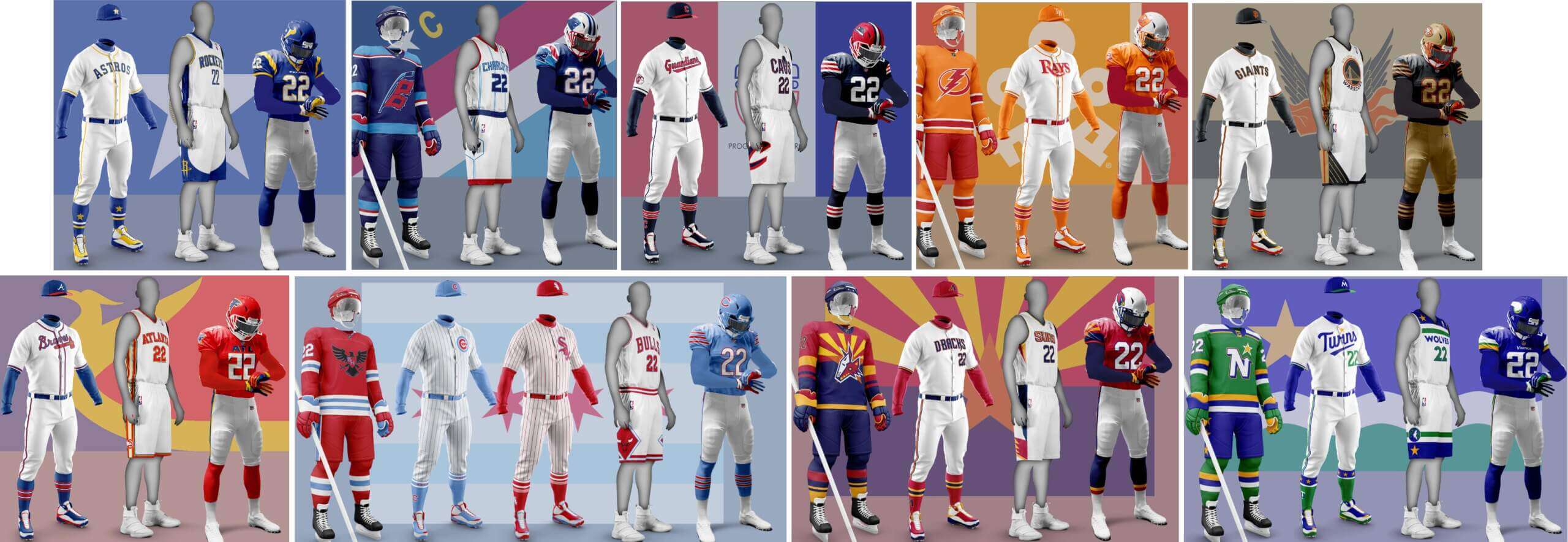
In previous parts I looked at what other city’s teams would look like if the all shared the same colour scheme of their host city. Here in the final Part 4, I look at six cities that have three of the “big four” sports teams – Atlanta, San Francisco, Tampa Bay (Tampa/St Petersburg), Cleveland, Carolina (Charlotte/Raleigh)and Houston. I also look at Chicago who got missed out last time. But first up are redux versions of Arizona and Minnesota from Part 3 that are inspired by UW comments.
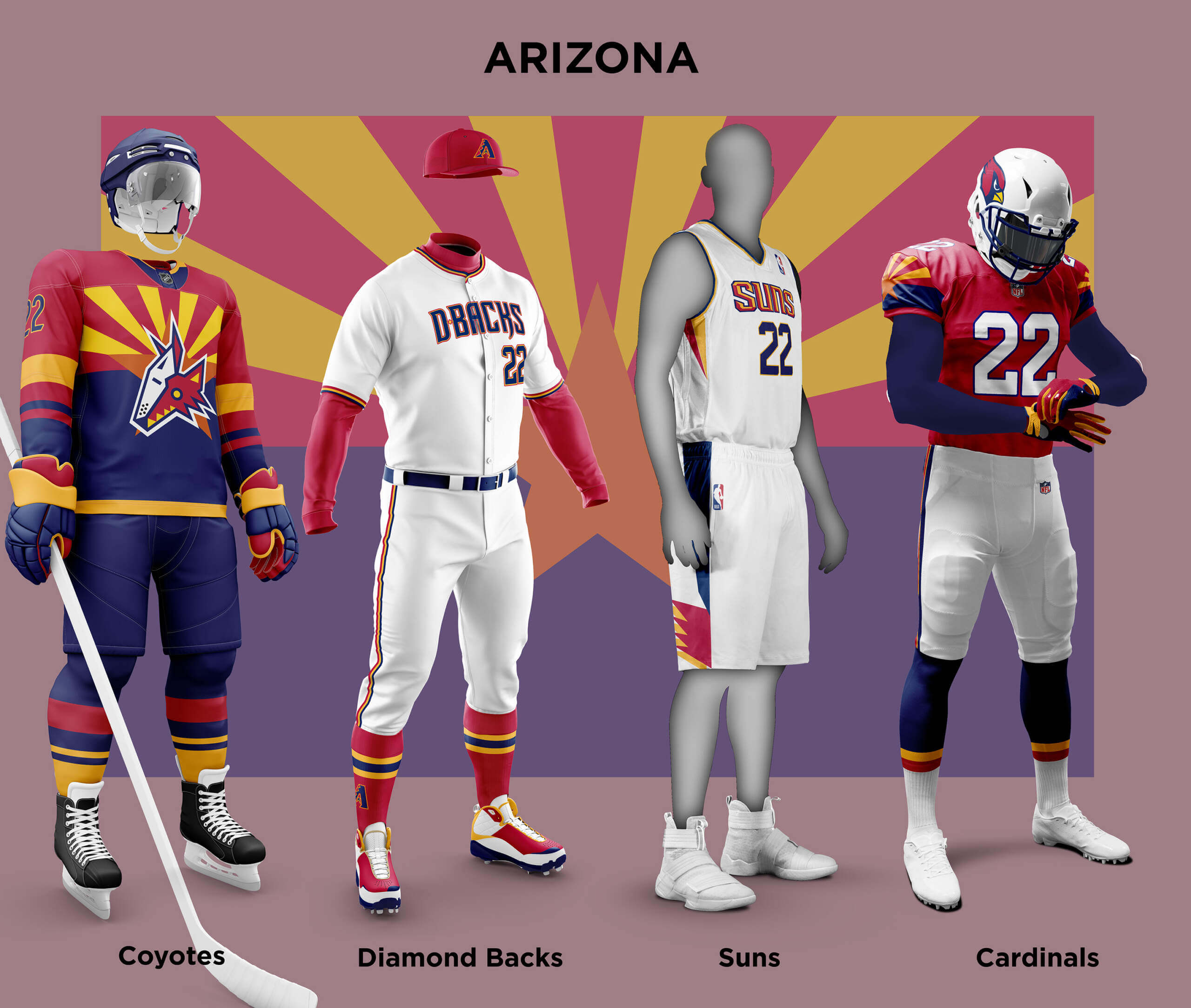
When I did my first go at Arizona/Phoenix I used colours based on the flag of Phoenix alone. RICKAZ suggested an alternate treatment would be to use the Arizona Flag colours instead. I thought that might look a bit too busy, but I think it’s come out really well! For the Cards I re-used some of the elements of the design I did for the Arizona Outlaws in another of my pieces for UW. I think the D-Backs look great in the state colours and the flag looks amazing on the Coyotes jersey!
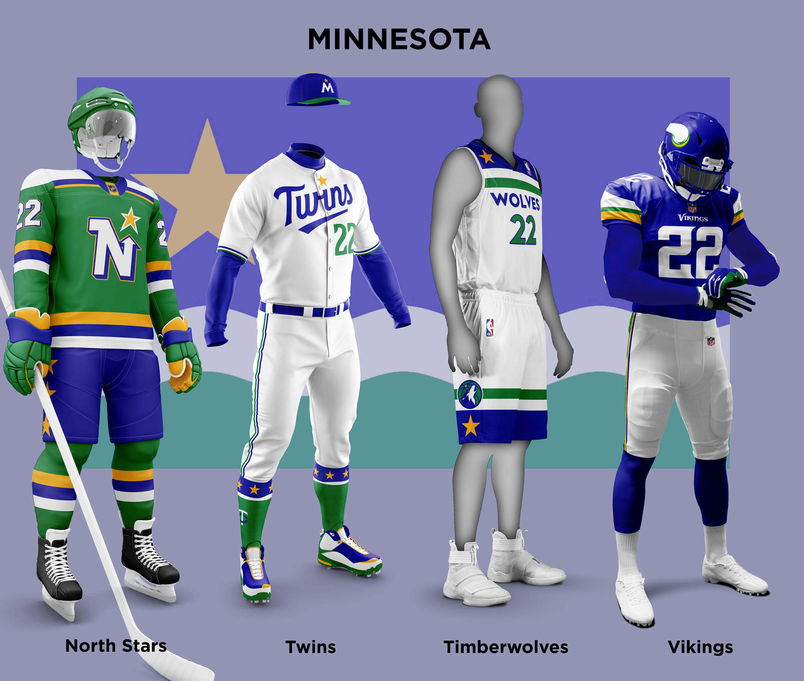
When I did Minnesota in Part 2, I used a prospective replacement for the state flag in blue and gold. But R. Scott Rogers noted that another new flag is actually more widespread. So I’ve re-done the teams using its blue, green, yellow and white colours. I think it makes for a set that’s at least as good the one using the other colours, and the North Stars especially look good!
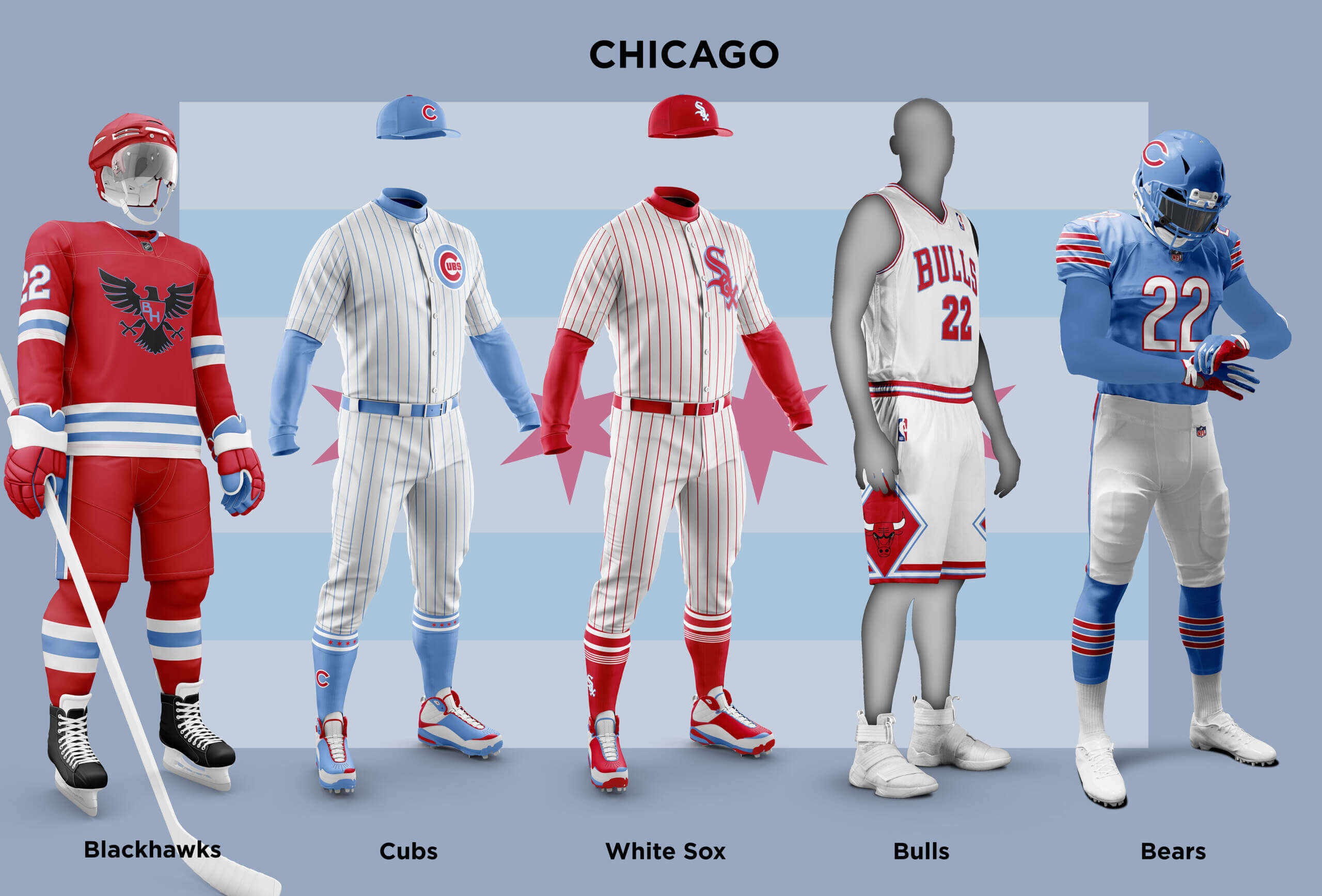
I had previously missed out Chicago because of the indigenous appropriation issues around the Blackhawks. But after talking with Phil, I found a way around it. The Flag of Chicago is one of the most well known designs around. For the Bears, it’s simply a case of swapping out navy and orange for pale blue and red. Because of the similarities in colour hues it looks sane, even though it makes me think it’s like a Bears uniform in the afterlife might look like. Like with the Bears, the Bulls similarity in colours means they also look fine in the city colours. The Cubs and White Sox easily fall in to opposing Blue and Red teams, and of course the White Sox used a similar set in the 1970s. Finally the Blackhawks. Given the team is actually named after the 86th Infantry Division it made sense to have a team logo based on that design.
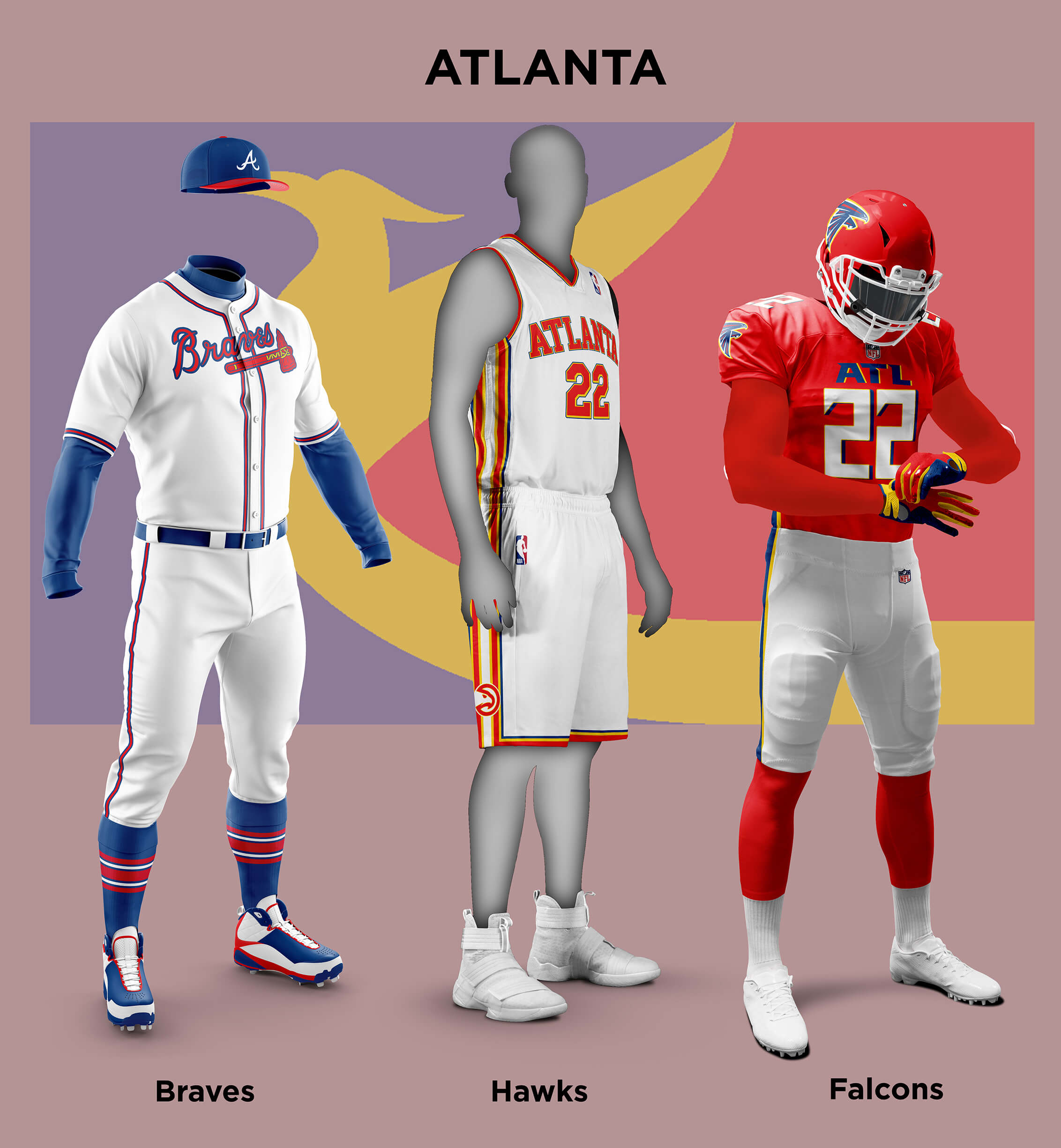
The current Atlanta Flag is one of the seal-on-a-blue-field type so isn’t that unique. Like with other cities with flags in need of replacement, there are plenty of competing designs. I chose the one that looked best to me on the Atlanta City Flag website (I wait to be corrected if there is a more popular candidate). The red, gold and blue scheme lends itself nicely to restoring the Falcons red uniforms. The Hawks already use Red and Gold so the addition of the blue fits in well. And of course they are already almost the same as the Braves colours anyway. All-in-all a nice set I think!
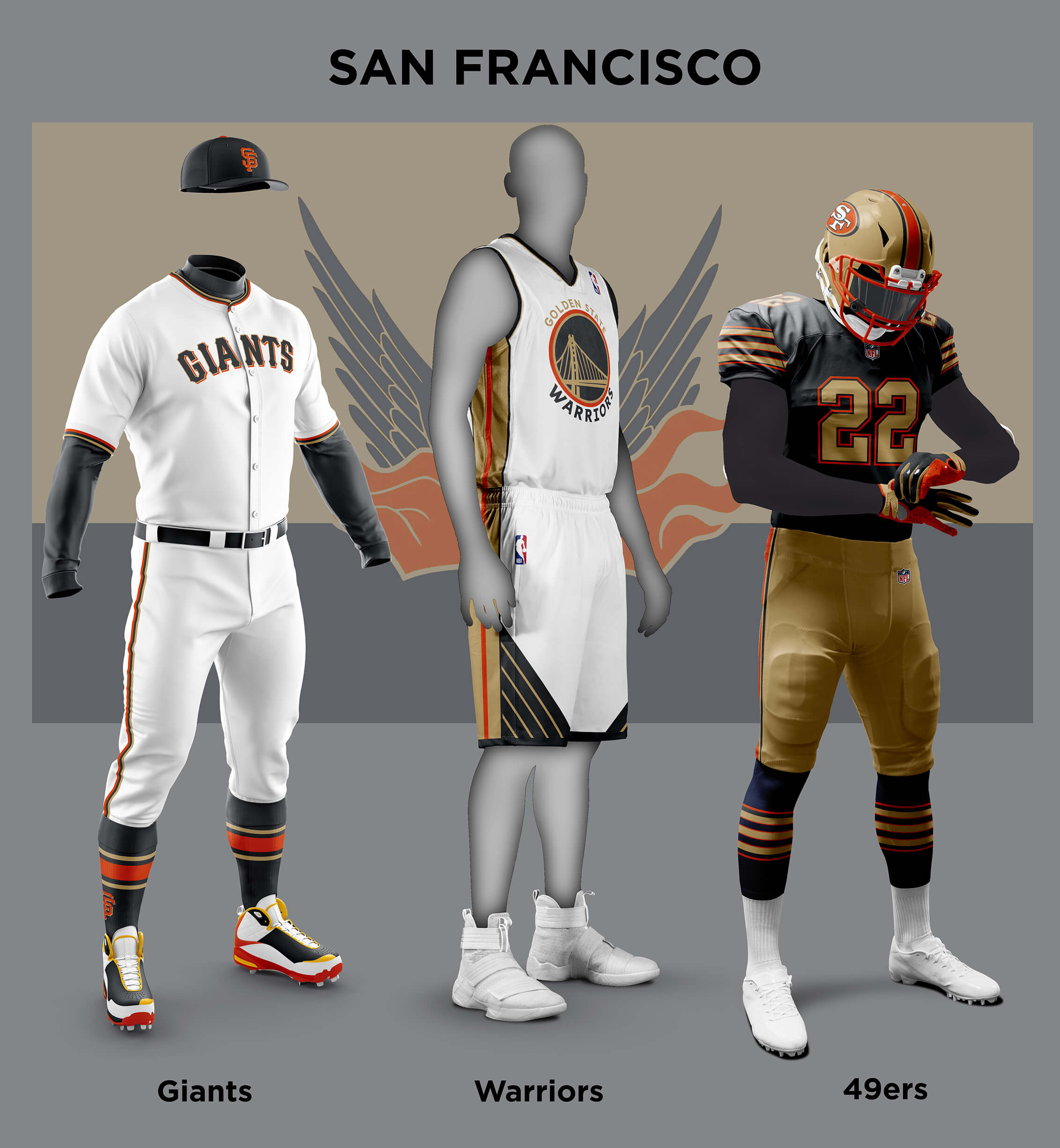
San Francisco is a very interesting case. The current flag is another one where there is ongoing effort to find a replacement. One in particular has gained some traction – the Fog and Gold Flag. Now I think it’s a good design, but the field colour choices are a bit wishy-washy, something others agree with. The motto of the City is “Oro en Paz, Fierro en Guerra” (“Gold in Peace, Iron in War”), so it seemed to me the obvious flag field colour choices are iron (grey) and gold which is what I have gone with. The 49ers look strange in iron grey, but once you get over that I think it’s a great look. Likewise the Warriors (yes I know they are based in Oakland, but they are a bay area team and sort of represent the city). Finally the Giants colours are very similar already so addition of gold kind of makes it look like a World Series Winning team special uniform.
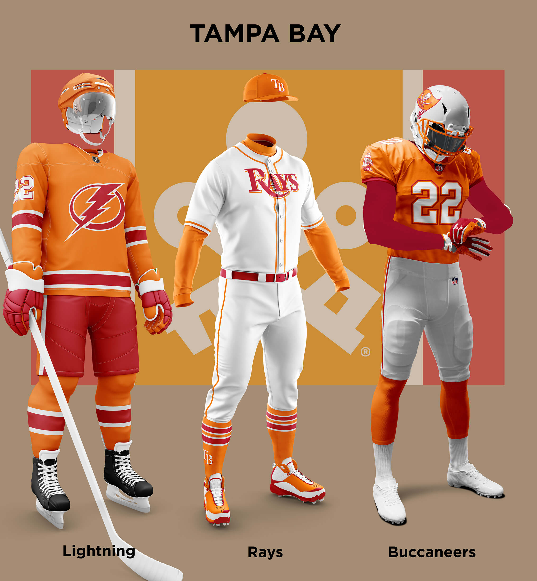
Tampa Bay is another tricky one. A bit like the Minnesota teams, the area includes two large cities so the flag of either isn’t really right. But unlike Minnesota they aren’t the teams in the state, so using the a Florida Flag is not right either. So what are Tampa Bay’s colours? Well, there is a Visit Tampa Bay organization who have a rather cool logo in blue, yellow and black versions. Blue is already the main colour for the Rays and Lightning, so I could have used those colours, but they really didn’t feel right to me! I don’t know if it’s my age or being from the UK, but whenever I think of Tampa Bay, the colours I think of are the original Bucs “creamsicle” colours of Florida Orange, Red and White. So for this time only I created my own flag based on the Visit Tampa Bay logo and the Bucs Colours. Of course the Bucs themselves look splendid in those colours, even without Bucco Bruce. But I think both the Rays and Lightning uniforms look a lot better than their rather dull blue ones.
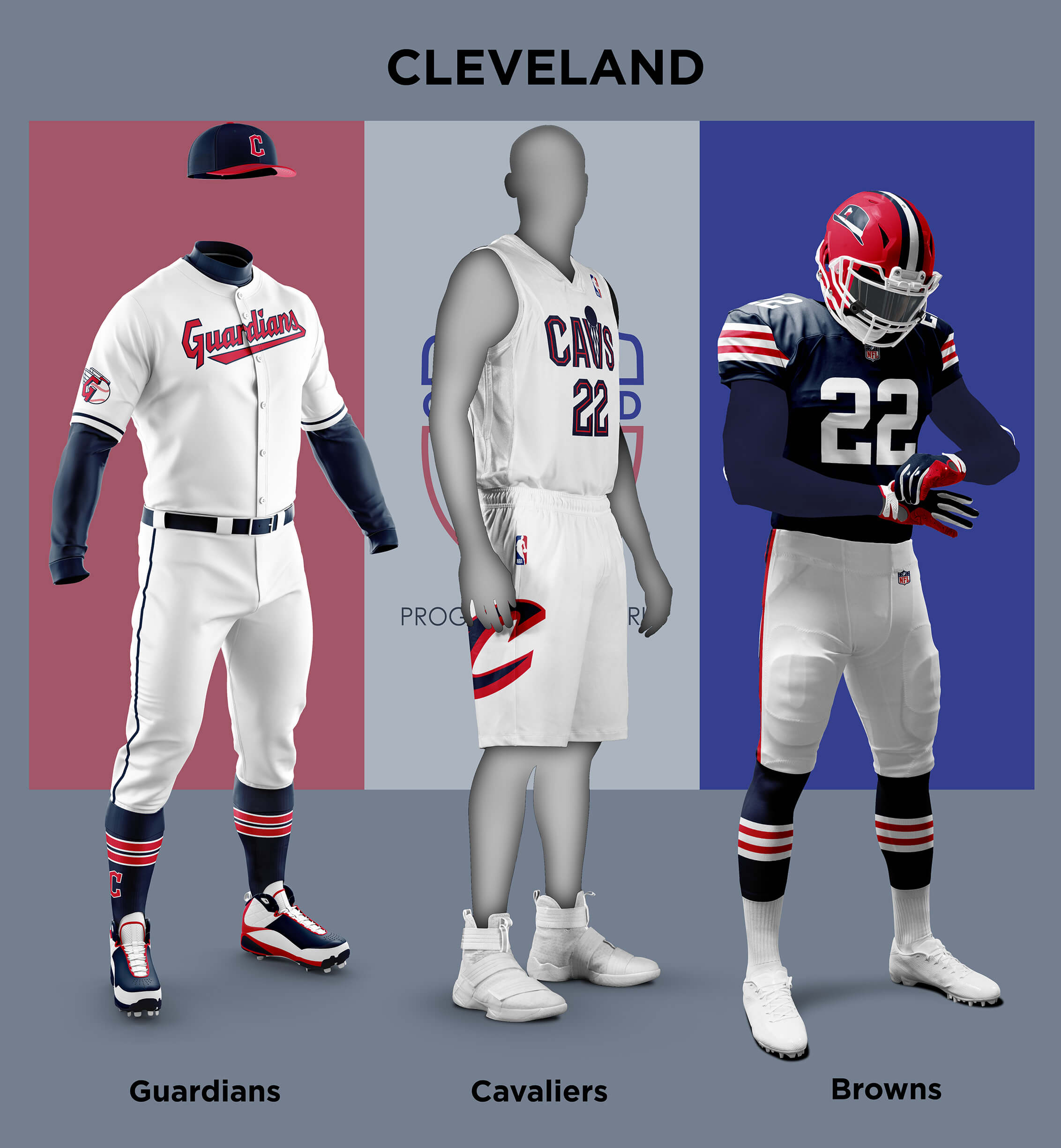
The Flag of Cleveland is a red/white/blue tricolour and so is already in Guardians colours. The Cavs uniform translates quite easily to the scheme and I think it looks sharp. The Browns present a problem though. Swapping out brown/orange for blue/red gives a nice looking uniform, but what about the name? Of course the team is named after Paul Brown, but they are synonymous with the colour Brown too. I sometimes wonder if it’s one of the reasons that they alone have never added a logo to their helmet – they *are* brown (at least in the NFL) so need no other identifier. But here they aren’t wearing brown so how else could they identify themselves as being named after Paul Brown? I decided one thing that always seems to identify Brown is his hat so I created a logo based around that. I imagine this may have Browns fans howling in rage, and I promise I didn’t do it just because I am a Steelers fan! There are already concept logos featuring a hatted Brown that Browns fans like. And it’s not as if having a hat as your logo is weird!
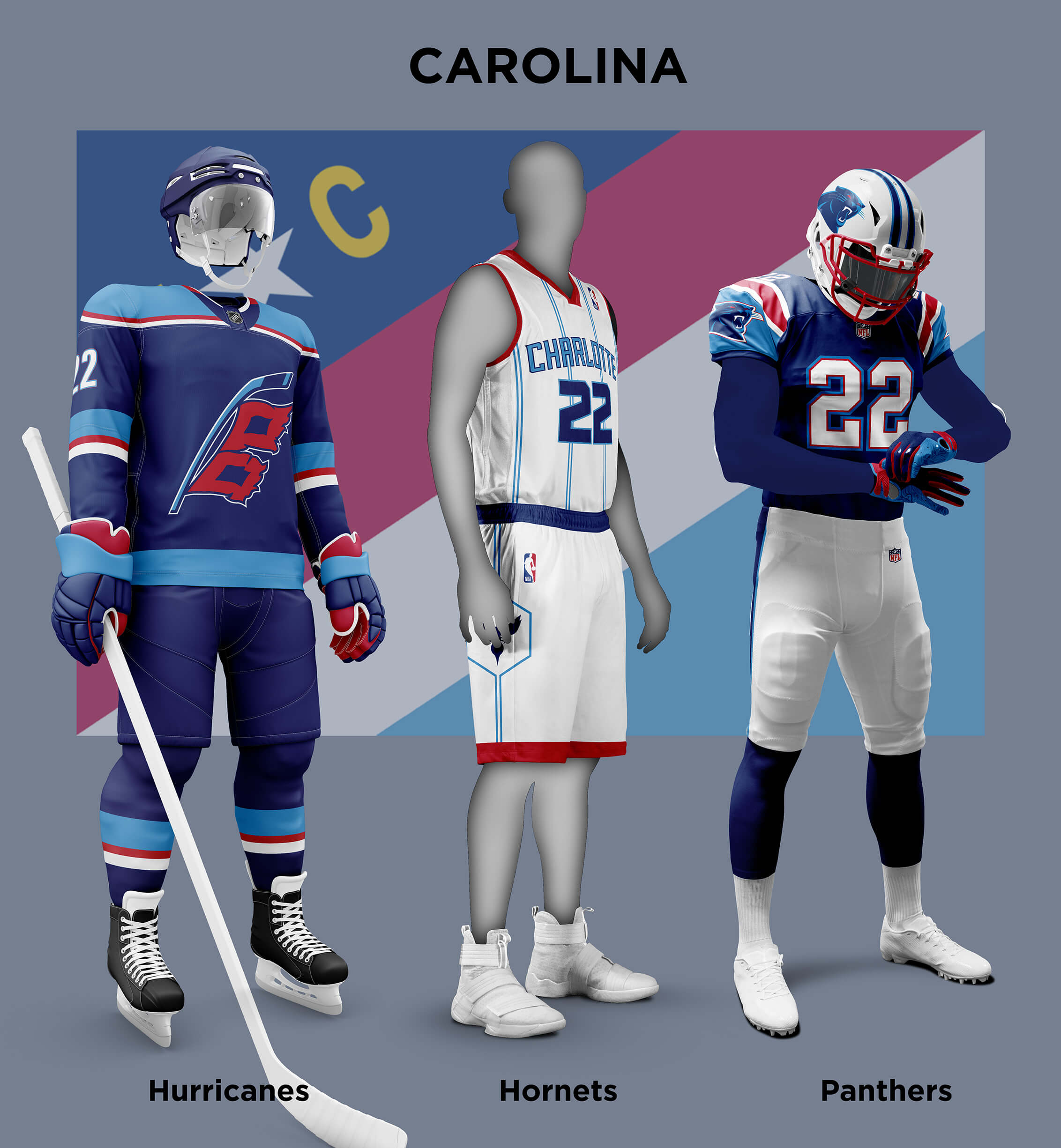
The Charlotte/Raleigh/Durham area is another one where a single city flag isn’t suitable. Here we can use (North) Carolina as the identifier, but the current flag is another red/white/blue effort. As with other flags there are efforts underway to redesign it and I chose one of these as I liked the way it brought the UNC light blue and NC State red together with the blue and N*C from the current flag. Having said that, the resulting uniforms for the Panthers and Hornets have a bit of a Franken-uni feel to them! But I much prefer the Hurricanes version to their existing red/black colors.
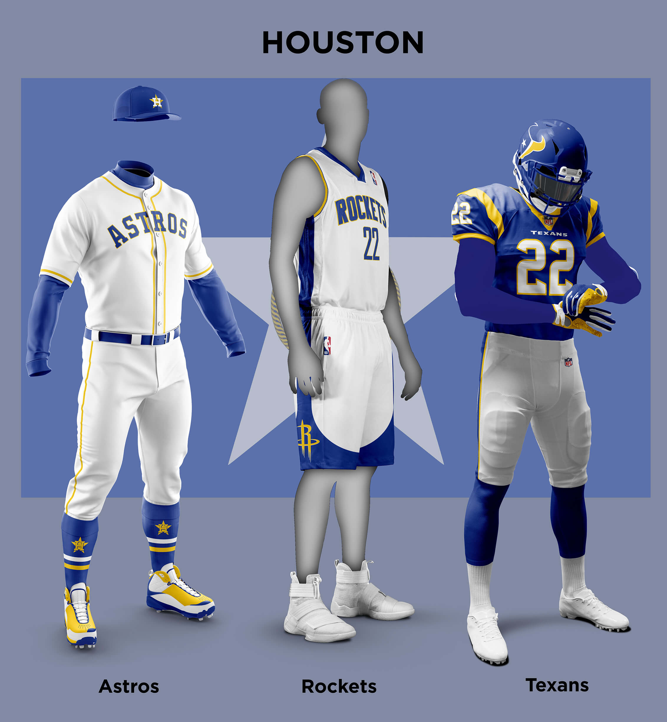
Finally we come to Houston. Like Texas and Dallas, the Flag of Houston incorporates a star, but in this case the field is just blue with a mainly yellow crest. I did check out some re-designs but they came across a bit Eastern Bloc so I stuck with the current flag and colours. I was sorely tempted to give the Houston teams an across-the-board tequila sunrise look, but in the end I felt that was too Astros specific. The Texans already use blue so it’s really just replacing red with yellow. Inevitably the new uniform has LA Rams vibes to it, but the design is solid so it looks good. Likewise with the blue based Astros, it is swapping out orange for yellow. But in this case it feels weaker for the loss of the orange. Finally the Rockets in blue and yellow look respectable enough.
Readers? What say you?


GTGFTU is April 10 2011 Penguins 5 Thrashers 2.
The NHL debut of Carl Klingberg and the last game in Thrashers history.
Correct!
Still scratch my head at why they would promote a player for the last game of the season…and the last one ever in Atlanta.
Injury? A ‘what the heck, why not?’ move?
Phil and Chris, I enjoy these treatments, but Cleveland is a football town first, foremost, and always, so the three Cleveland teams have to all wear brown and orange. This is non-negotiable. There’s no compelling reason why the Guards and Cavs have to wear red, white, and blue, and we can change the city’s flag if that’s a sticking point.
Thanks Marty! Obviously the theme of this piece is teams changing to city colours. And of course I did *exactly^ what you suggest for Cleveland for Tampa Bay :) But you make a good point – I wonder if other Clevelanders feel the same way?
I’m a Northeast Ohioan who roots for teams other than Cleveland’s.
But I agree…all the teams can and should wear brown and orange.
The Warriors moved back to San Francisco
Great work again, Chris!
The Chicago Bears “What If” uniform is something I would love to see in reality.
What a beauty!
Of course it’s the Titans ‘belong’ in Columbia blue and red…hoping the Texans redesign steers clear of those.
I find it ironic that your take on the ‘Yotes puts them in ‘Thrashers’ colors. Winnipeg NHL could have kept them but no, they liked the leftovers much too much when they jetted north from Atlanta.
PS-The Rays should 100% stay put if they wore those uniforms!
Thanks Chris! It’s hard not to see echoes of other teams colours in these alternates, isn’t it? I guess it re-enforces the idea that team colours are a big part of their identity at least for now. I wonder in a few years time with the proliferation of colours for each team whether this will still be the case?
Nice job on this, Chris! There are some great redesigns in there. The Arizona/Phoenix teams, in particular, look very sharp in state flag-themed colors.
My one point of frustration is that so many state and municipal flags are primarily red and blue that it effectively limits the color palette available to you. Maybe that’s more of an indictment of the people responsible for those various flag designs than anything. Come on, people! Get a little more creative with your flag colors!
Thanks! Yes, as I found out during this project most state and city flags seem to be quite conservative in design. I think that’s why many have been re-designed and others are in the process of being.
Awfully hard to justify putting a team named the Texans in something other than the colors of the Texas flag. Change ’em back to the Oilers, though, and it’d be good (albeit a little less nice than the Columbia blues of old).
1952 NFL Texans – blue/silver/white.
1960 AFL Texans – red/yellow/white.
1974 WFL Texans – green/yellow
1995 CFL Texans – teal/gold/black
I like the way Chris treated the Houston NFLers, but really prefer the colors/uniforms they’ve worn for the past 2 decades.
Thanks for doing my suggestion of incorporating the Arizona State Flag for the AZ teams. They look great. Especially the Coyotes and Cardinals. I believe if the Cardinals changed to this now it would be overwhelmingly approved. Of all the teams that this flag goes well with is the Suns, even though they are the one team named Phoenix. The AZ flag actually has a sun, star, in its design. I would have liked to have seen this flag design used in their uniform, maybe merged with something like the Charles Barkley era sunburst uniform.
It was my pleasure Rick! Yes, I struggled a bit with the Suns to make the design as bold as the other two. I now think I should have just gone for it like you suggest!
Back in the day when Jerry Colangelo owned most of the AZ franchises (Suns, D-Backs, Rattlers) he did ask that each team had one of the base colors in a specific color palette. Purple (Suns, D-Backs) Copper (D-Backs, Rattlers) Turquoise (D-Backs, Rattlers). Almost all of those have changed at some point. But it was a fun thing to see when it was connected to their uniforms.
That Youppi Habs jersey?
Yes please.
Another great effort, Chris. If you are looking for future “What If” ideas, I nominate college rivalries. I know not every school has every sport, but you could use the same template (baseball, football, basketball, and possibly hockey) just for fun. Imagine Auburn in Alabama colors, USC in Notre Dame colors, or Michigan in Ohio State colors. Even smaller rivalries, like Purdue in Indiana colors or Vanderbilt in Tennessee colors. And with some schools having multiple rivals, the options would be endless.
“Imagine Auburn in Alabama colors, USC in Notre Dame colors, or Michigan in Ohio State colors.”
link
Thanks! Your idea is an interesting one from an aesthetic viewpoint, but I think Phil’s reaction is on the mild end of what it would stir up! It’s a dangerous thing changing team colours at all, but putting your team in a “hated” rivals’ colours is guaranteed to rile more people than entertain them. And in the end it’s the latter we are trying to do :)
Great project, but no need to shoehorn in the Canes with the Panthers and Hornets. “The Charlotte/Raleigh/Durham area” is not a thing. It would be like saying the “Houston/Dallas/Ft Worth area.”
Amen! They’re like four hours apart. Plus Charlotte already does a matching thing with the Hornets, Panthers, and the MLS team, Charlotte FC.
On reflection, I think this is one case where the city thing is stretched just a bit too far. But without the Canes, Carolina wouldn’t have made the list!
Point of fact: they’re 2 and a half hours apart and it is all high-speed highway driving. Your point is valid but let’s not exaggerate.
Have to agree with this sentiment, though it’s also easy to see that there was no other way to realistically qualify the three major sports in North Carolina.
IMO, if you were going to go there, though, stick with red, white and blue … maybe gold as strictly a trim sort of color, given the “N” and “C” and ribbons above and below in the blue field of the state flag are gold.
Also, given that Raleigh and Charlotte are still rivals – this state can be entirely too territorial, to its detriment if you’re asking me – it makes the stretch just too much. But Chris’ effort is appreciated, even if I completely disagree with going away from red and black as the Carolina Hurricanes’ primary colors.
Nice work, but a couple of comments from a Bay Area resident:
– Warriors used to play in Oakland, but moved to the Chase Center in San Francisco a couple of years ago, so no need for the disclaimer.
– The San Francisco flag, albeit not so striking, is quite prominent in the City, so I’d suggest using an alternative design, is risky. The colors of the two bridges that lead to the City, however, are very distinct and their colors and iconography are already in use among some, but this is a flag based project, so I’ll shut up about that.
This is why they should have changed their name back to the San Francisco Warriors then I wouldn’t have made a mistake! I didn’t realise the fog-and-gold flag was actually being flown around SF that much! I think if you kept red as the primary colour and just used fog and gold as secondary it might work, although it wouldn’t be as striking.
I’ve worked up many a Twins concept in blue and green, but this is better looking than any of them. And the proportions of the North Star Flag show the Twins how they should have incorporated yellow, back when they were trying to incorporate yellow. Nicely done!
Thanks Scott! Yes I think if the Twins were to go away from navy, red and white that blue/green/yellow is the way to go.
I like the picture at the top of Harold Carmichael and Roman Gabriel from Week 14 of the 1973 season, Dec. 16, 1973 Washington vs Philadelphia, Redskins 38 Eagles 20 on a snowy Sunday afternoon at RFK.
Nice work, Chris, I like a lot of your concepts, especially in Arizona and Tampa. But to have the White Sox play with red stirrups and barely any visible part of a white sock is making it too much like a Red Sox or Reds uniform. White stirrups with a little red and all is well. But a great job on all four parts of this project!
Nitpicky fact about Pittsburgh that I recently learned and found interesting: The Penguins and Steelers wear the same shade of yellow, but the Pirates’ is a bit paler. What I don’t know is which (if either) matches the official yellow on the Pittsburgh flag.
Yes it’s true that by eye the yellow twill on the Pirates jerseys is a paler shade than the Steelers and Penguins (I have all three to compare). According to the TrueColor site, the Steelers and Penguins use Pantone 1235C and the Pirates 123C which is a touch lighter. The flag is only specified in heraldic tinctures in the city ordinances.
Although Cleveland does not have a NHL team, they do have an AHL team, which is one step below the NHL, and similar to MLB’s AAA and the NBA’s G-League. I wonder what Cleveland’s hockey team’s outfit would be like. Or maybe go back to the late 1970s when Cleveland did have a NHL team to see how that would look with this concept.
The Hurricanes play in Raleigh, not Charlotte. C’mon man.