Tired of seeing annoying ads (like this one!) on Uni Watch? There’s a simple solution: Join Uni Watch Plus. You’ll get an ad-free site experience, plus exclusive access to our UW+ discussion forums, push notifications whenever a new blog post has been published, a special UW+ badge accompanying all your comments on the blog, and a 20% discount on our Teespring merchandise.
Greetings and a good Sunday morning to all. I hope everyone had a great (and warm) Saturday.
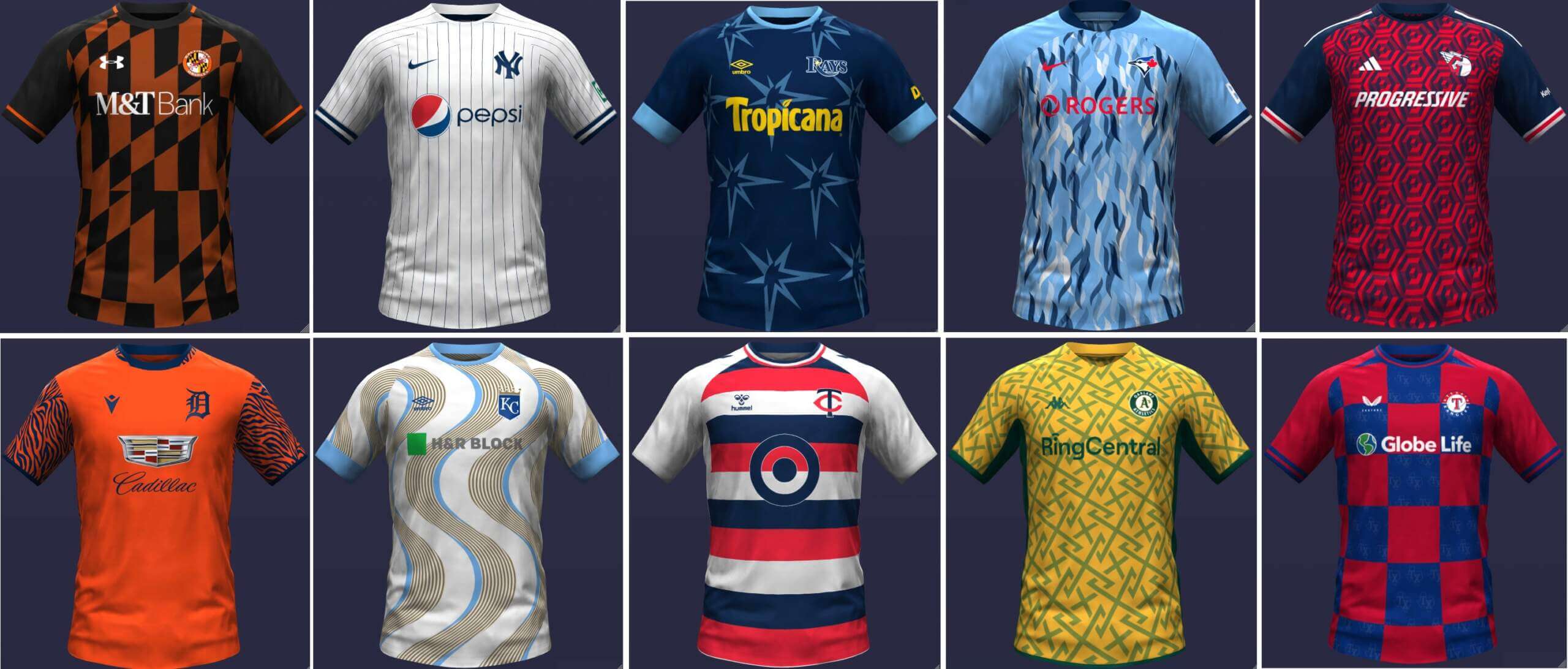
I recently received a pretty neat set of crossover concepts from today’s featured graphic artist Danny Kaufmann, in which he has concepted an entire league of Major League Baseball clubs reimagined as soccer teams (and in soccer kits), with both home and road versions of those kits. The first set, which you’ll see below, is for the American League.
Before we go any further, I want to note that each and every jersey contains an advertiser. I struggled with actually running these, but obviously there was a lot of time and effort put into each concept kit, and the advertisers selected seem to make sense for the teams. That’s not an endorsement of the advertiser (and I wish Danny hadn’t included them); however, in light of the fact that soccer kits have contained giant advertiser logos for decades (and might even look “funny” without the ad occupying the prime real estate), I’m going to share them as they were sent. If we can look past the ads, I really like a lot of these designs and it’s a fun “What If” set of concepts. I’d appreciate it if you’d keep any comments to the kit designs themselves. Thanks!
And with that, here’s Danny:
• • • • •
Imagining Soccer Kits for MLB Teams by Danny Kaufmann
For the past few months I have been working on imagining soccer kits for MLB teams. As soon as I started, I knew the goal was to share them on Uni Watch since I have been reading for a while but never submitted anything major. I hope you enjoy!
AL East
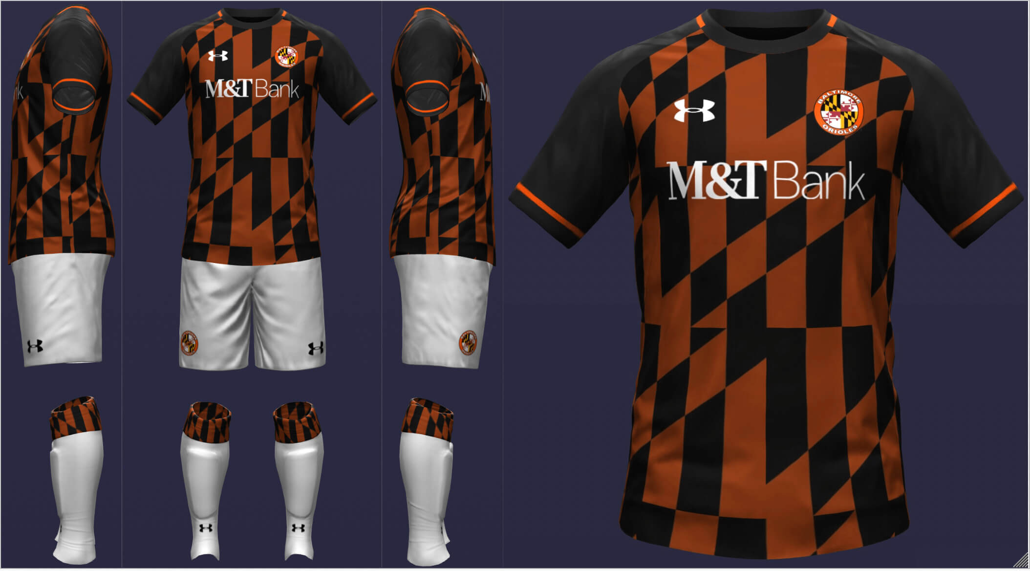
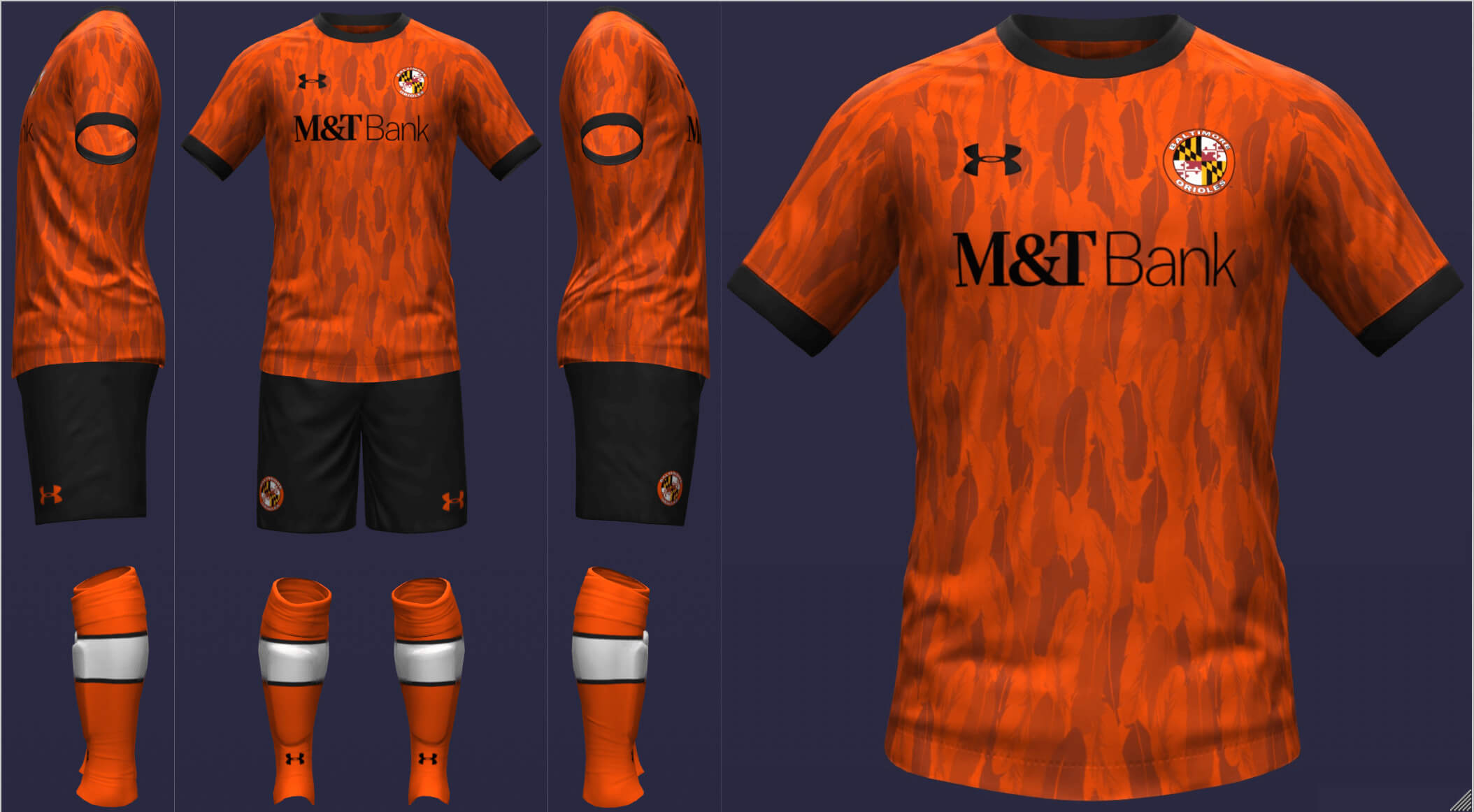
Baltimore Orioles
I based the home uniform on the Flag of Baltimore (which is also the first and fourth quarters of the Flag of Maryland). For the away kit, I made sure to include Oriole qualities, orange and feathers. I opted for the roundel logo because I felt it resembled a typical soccer logo and of course, features the Maryland flag.
__________
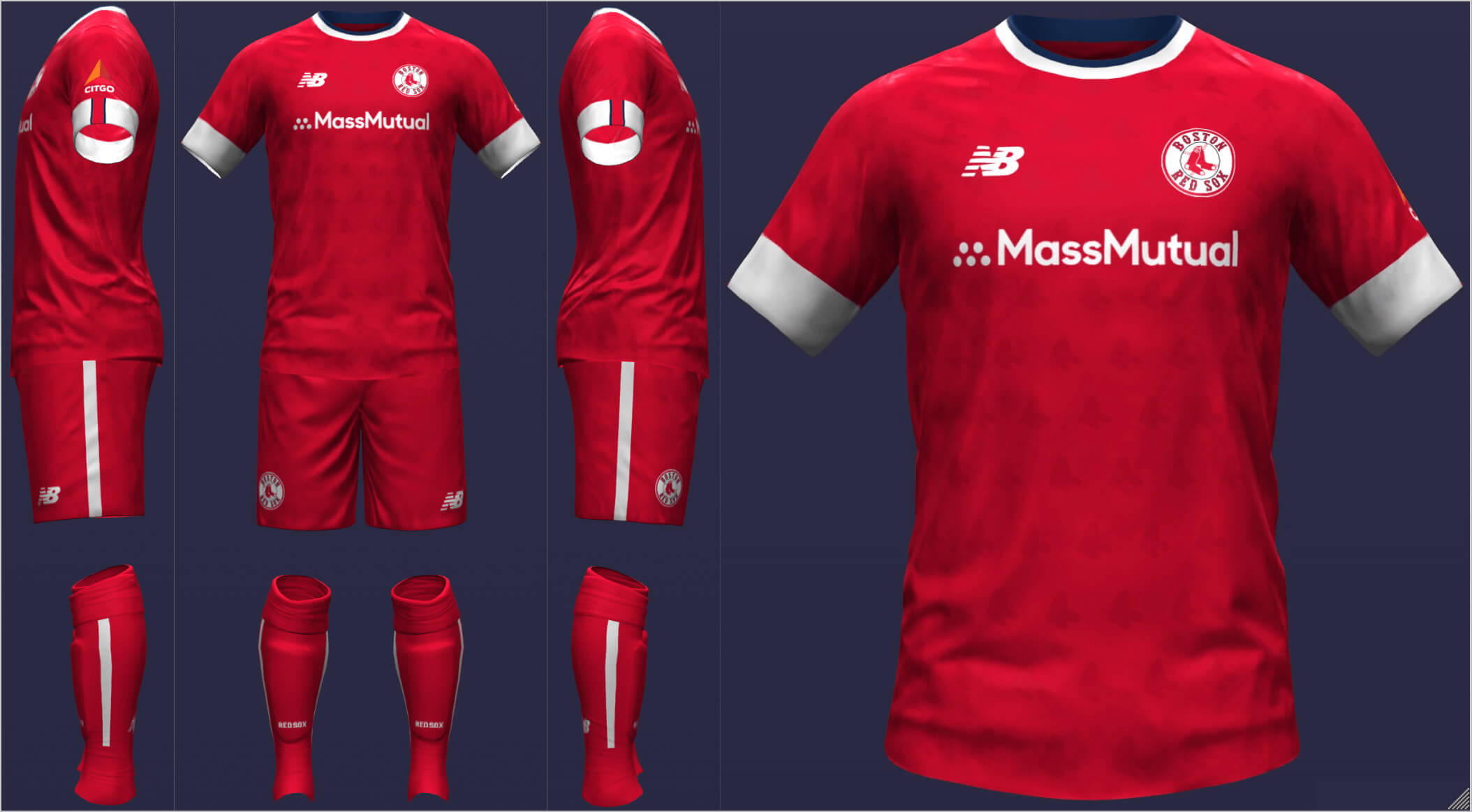
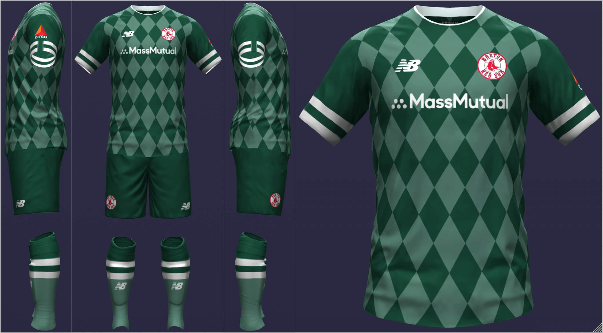
Boston Red Sox
I again went with a roundel, which enabled me to save the primary logo for the pattern, which is just the right amount of subtle. For Boston’s away strip, I used the two shades of green from the 100 years at Fenway Park logo and the diamond pattern on the exterior of the park.
__________
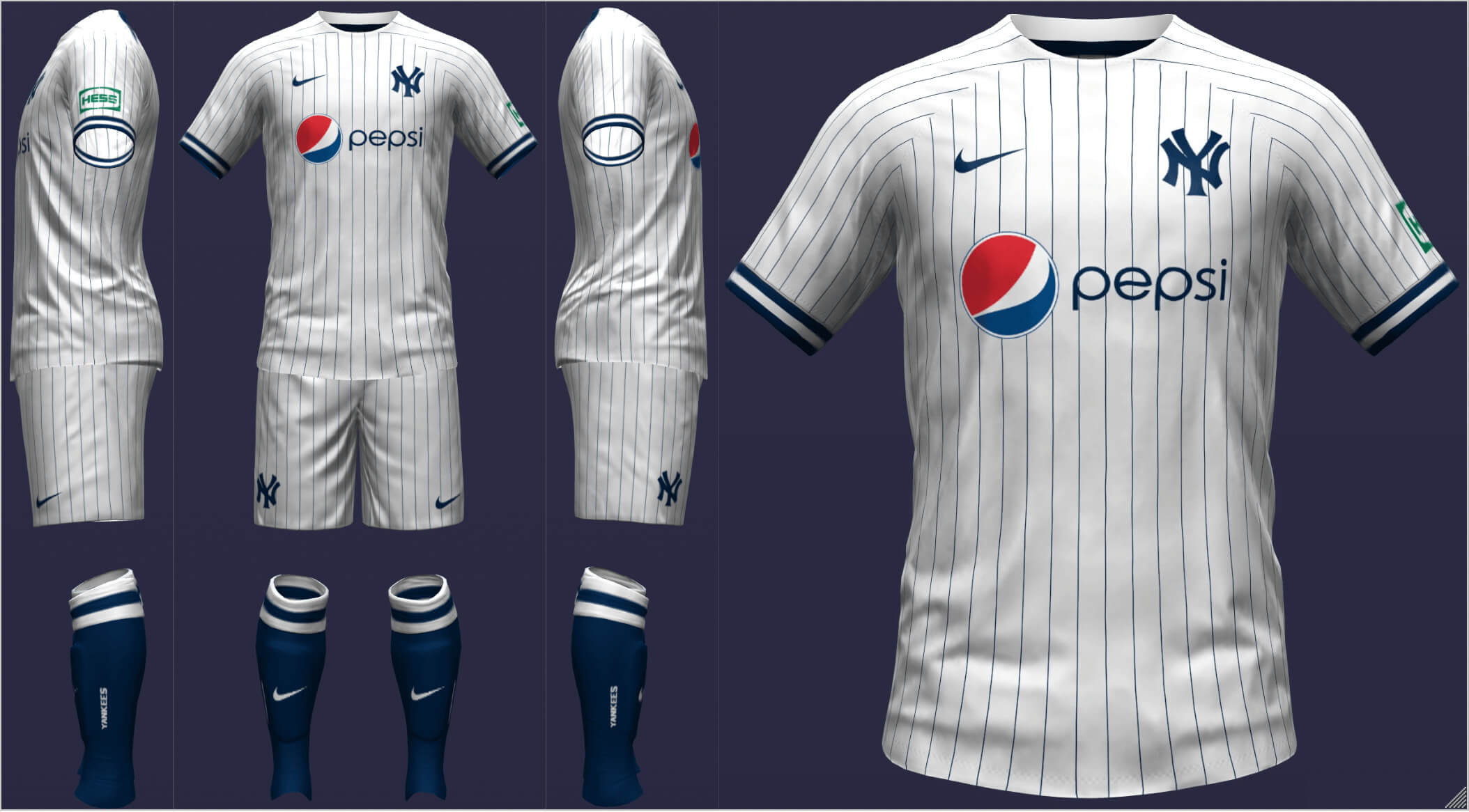
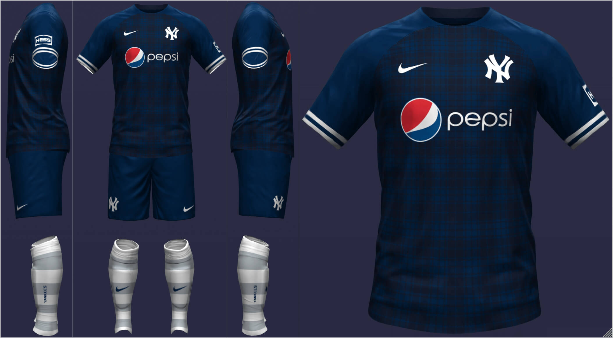
New York Yankees
The Yankees have, on occasion, worn pinstripes and continue to do so here. On the road, the Yankees recall their days as the Highlanders with a classy tartan pattern.
__________
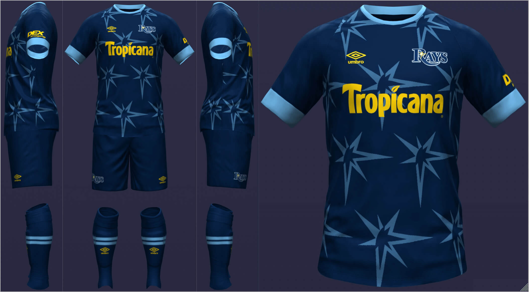
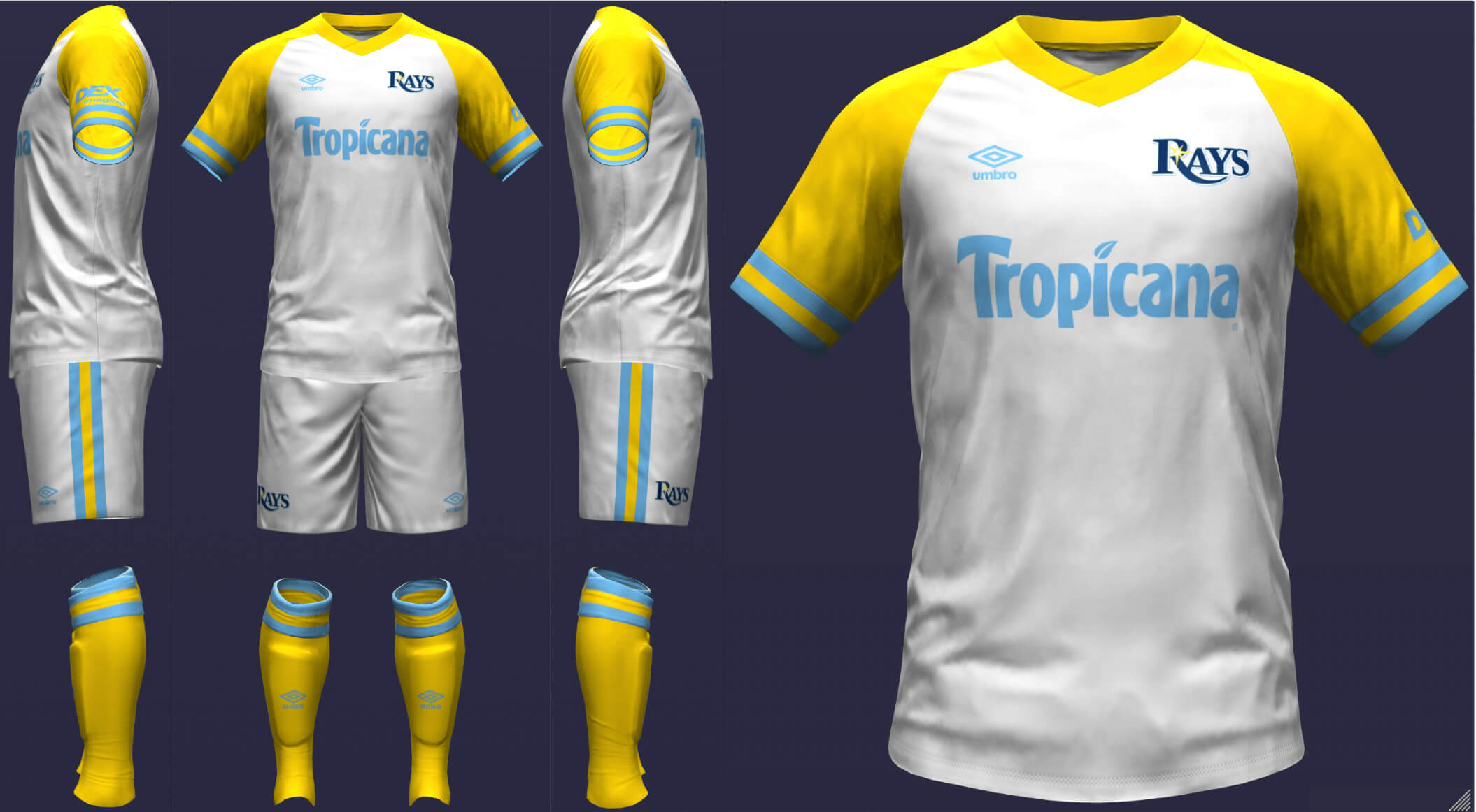
Tampa Bay Rays
I figured the Rays would continue to lean into the sunburst logo so that’s what I did here for the home. Even though I prefer the aquatic adaptation of the name, I still think this look works well. I drew on the (in)famous fauxback looks for the away, this time making white the dominant color (for contrast) with yellow and light blue.
__________
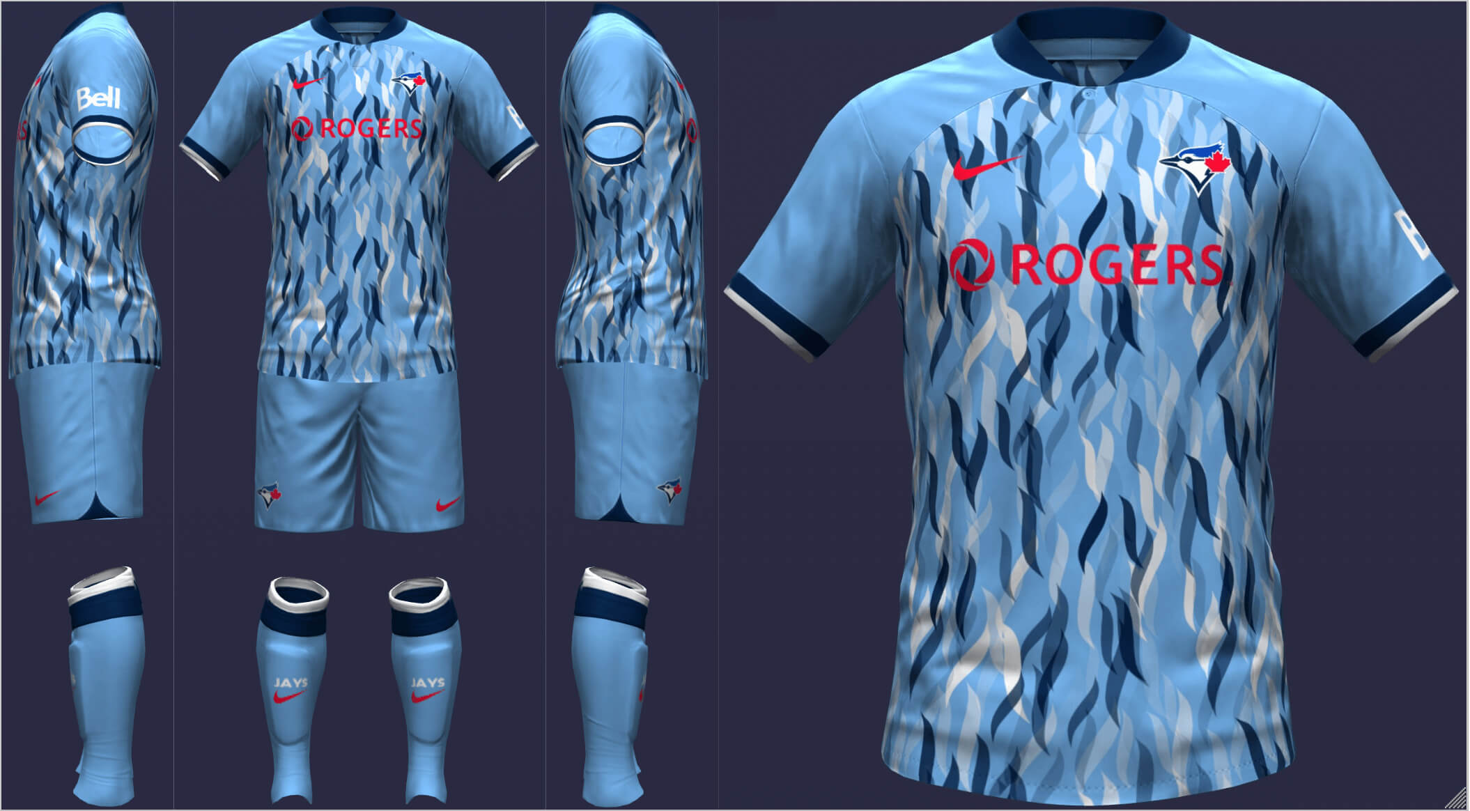
Toronto Blue Jays
The home kit uses a pattern that can either be seen as maple leaves or birds. I chose powder blue for the road, with just a touch of red. The design is fairly standard and is really more about looking cool than symbolizing something (though I imagine Nike would say something about the streaks of color on a Blue Jay’s wings and how that relates to the elite performance of the team).
====================
AL Central
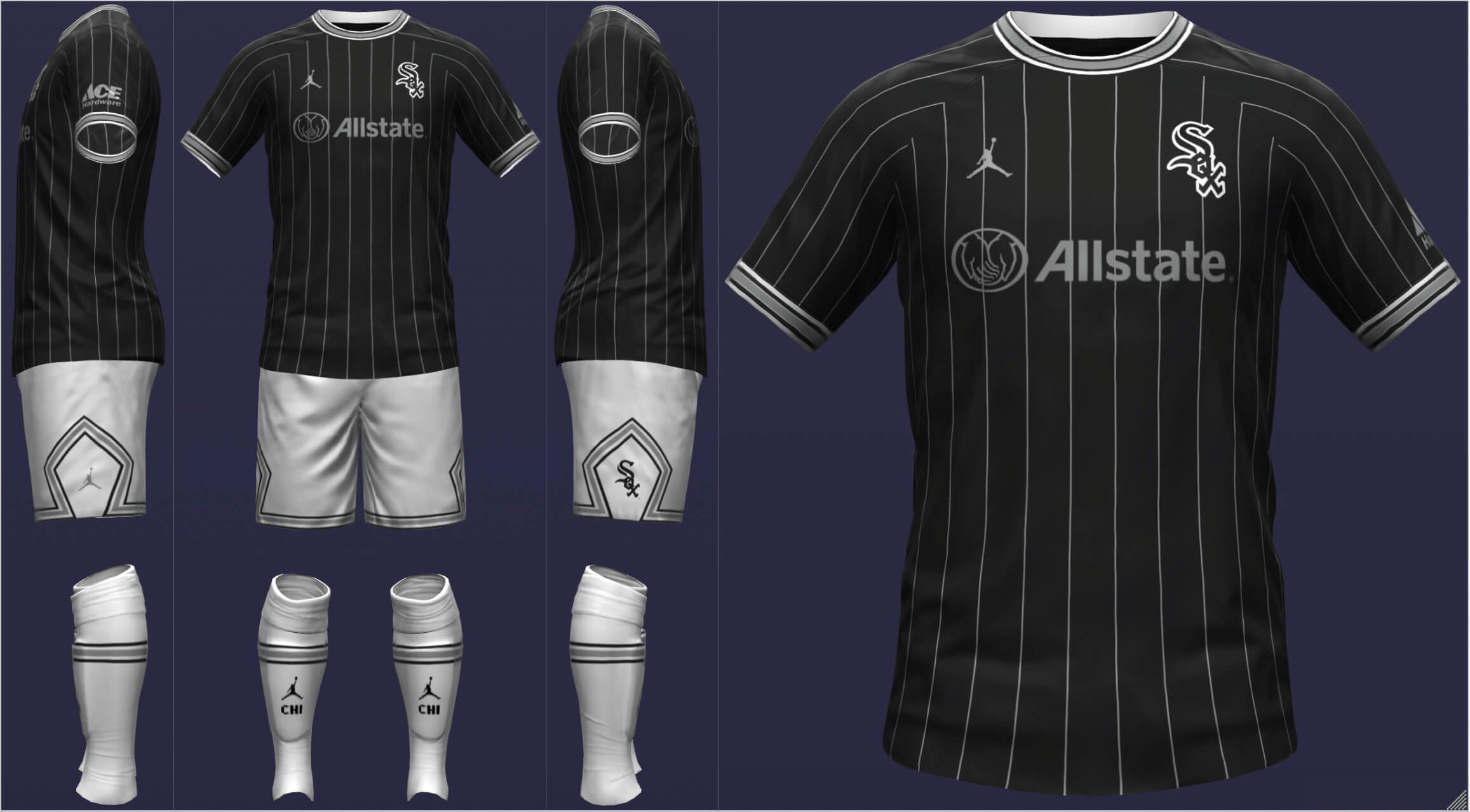
Chicago White Sox
Taking inspiration from Paris Saint-Germain (who took inspiration from the Chicago Bulls), the White Sox wear a black pinstriped shirt and finally, white socks. I was weary of tying the White Sox to the Bulls, which could alienate Cubs fans, but I figured it was okay given a certain two-sport athlete. I always felt the South Siders’ 1950s look was their best and thus, called upon red for their change strip.
__________
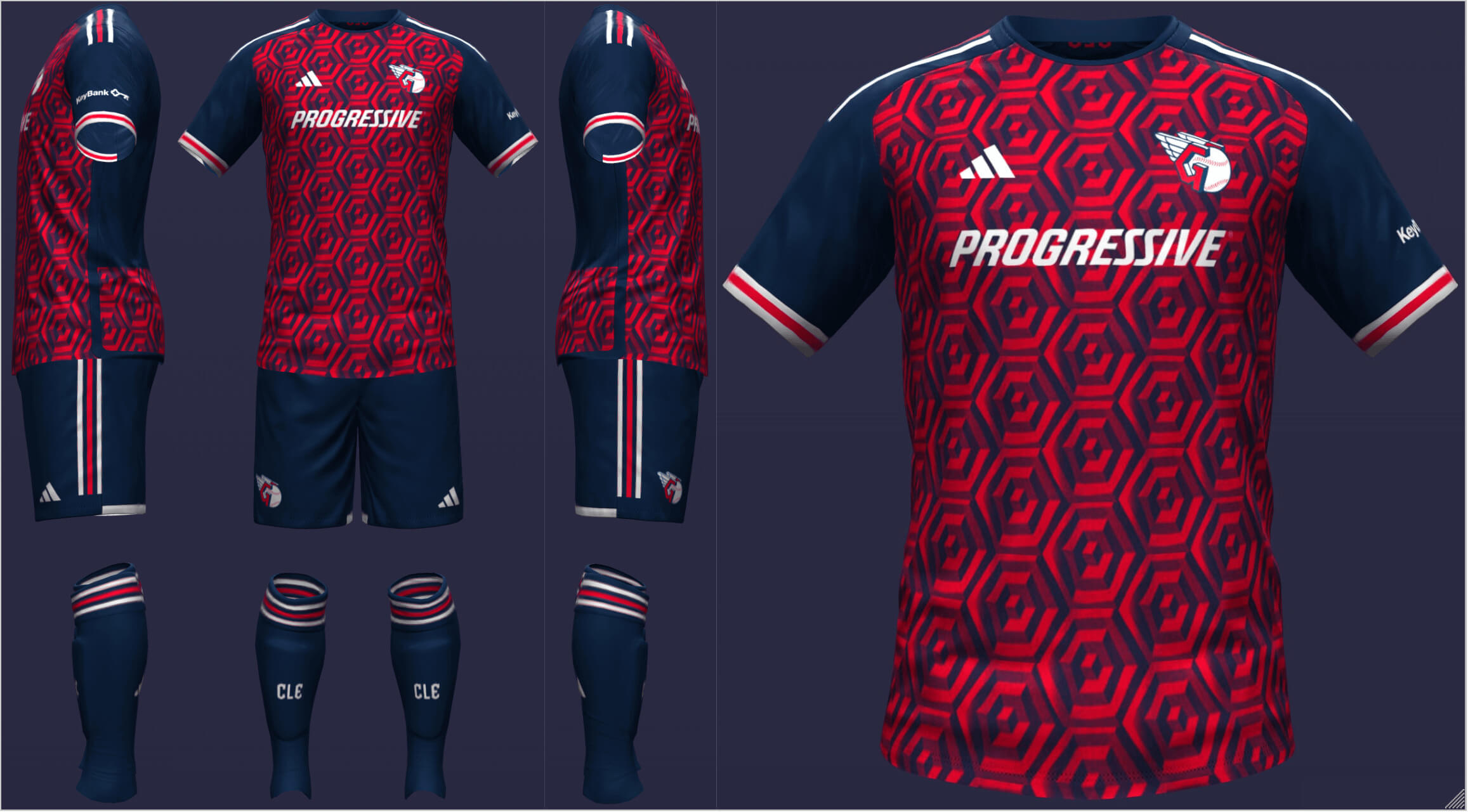
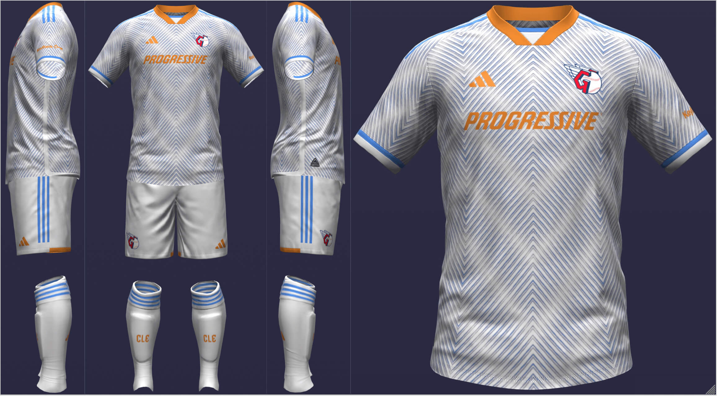
Cleveland Guardians
I was very pleased with this hexagonal geometric pattern since the G in the Guardians logo and the top of the Guardians of Traffic are similarly shaped (the team would probably say that the shape represents the team’s six AL Pennants). I chose sky blue and light orange to vaguely reference the Cavs and Browns but the blue is more for the Cuyahoga River and Lake Erie.
__________
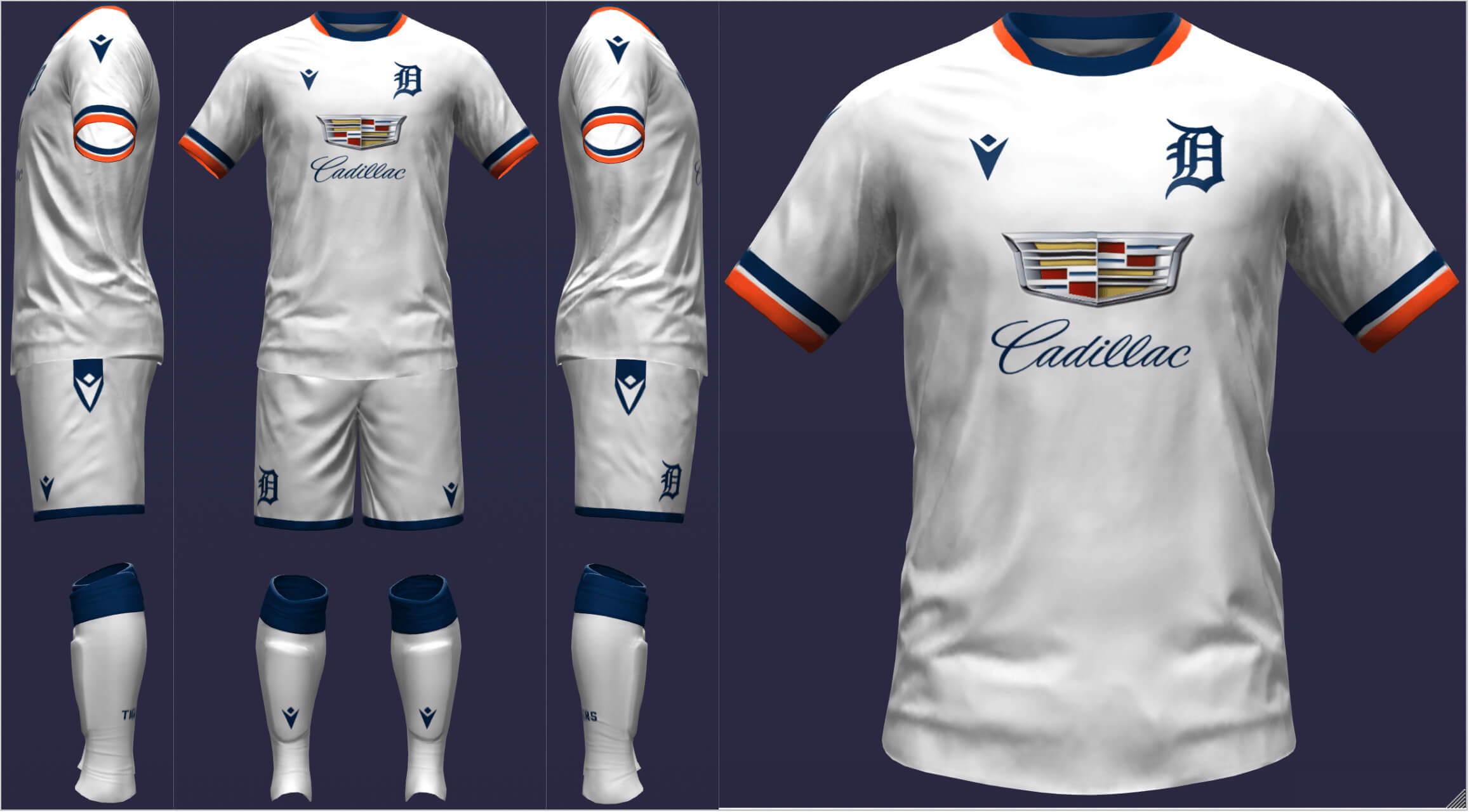
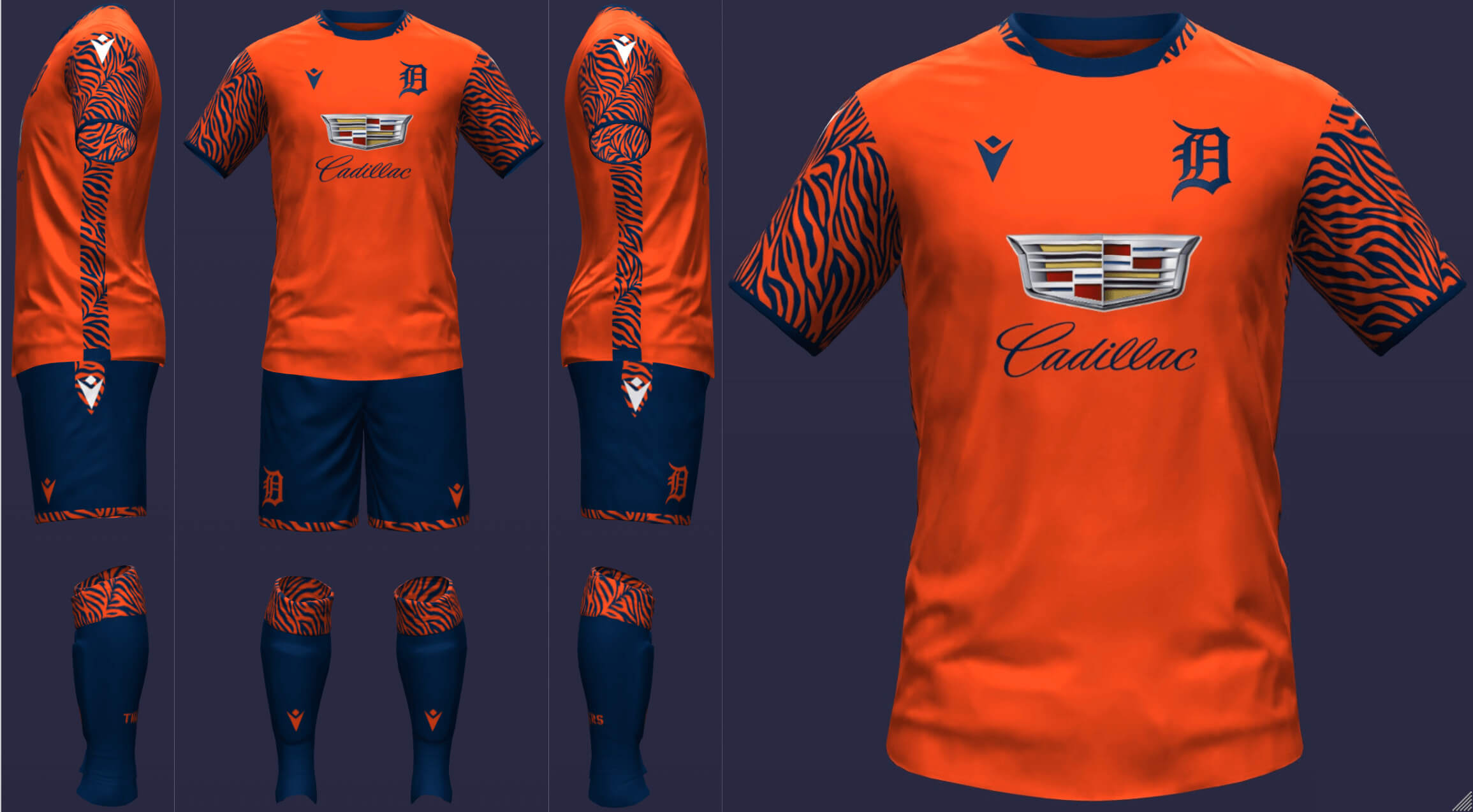
Detroit Tigers
I kept the Tigers’ home kit quite simple but did add the sleeve cuff pattern of the 70s and 80s road look. On the road, the Tigers don orange and tiger stripes, two design elements that are oft discussed for the team but tricky to execute. I spent a lot of time going back and forth on this one but ultimately, I think I made them the right amount of flashy.
__________
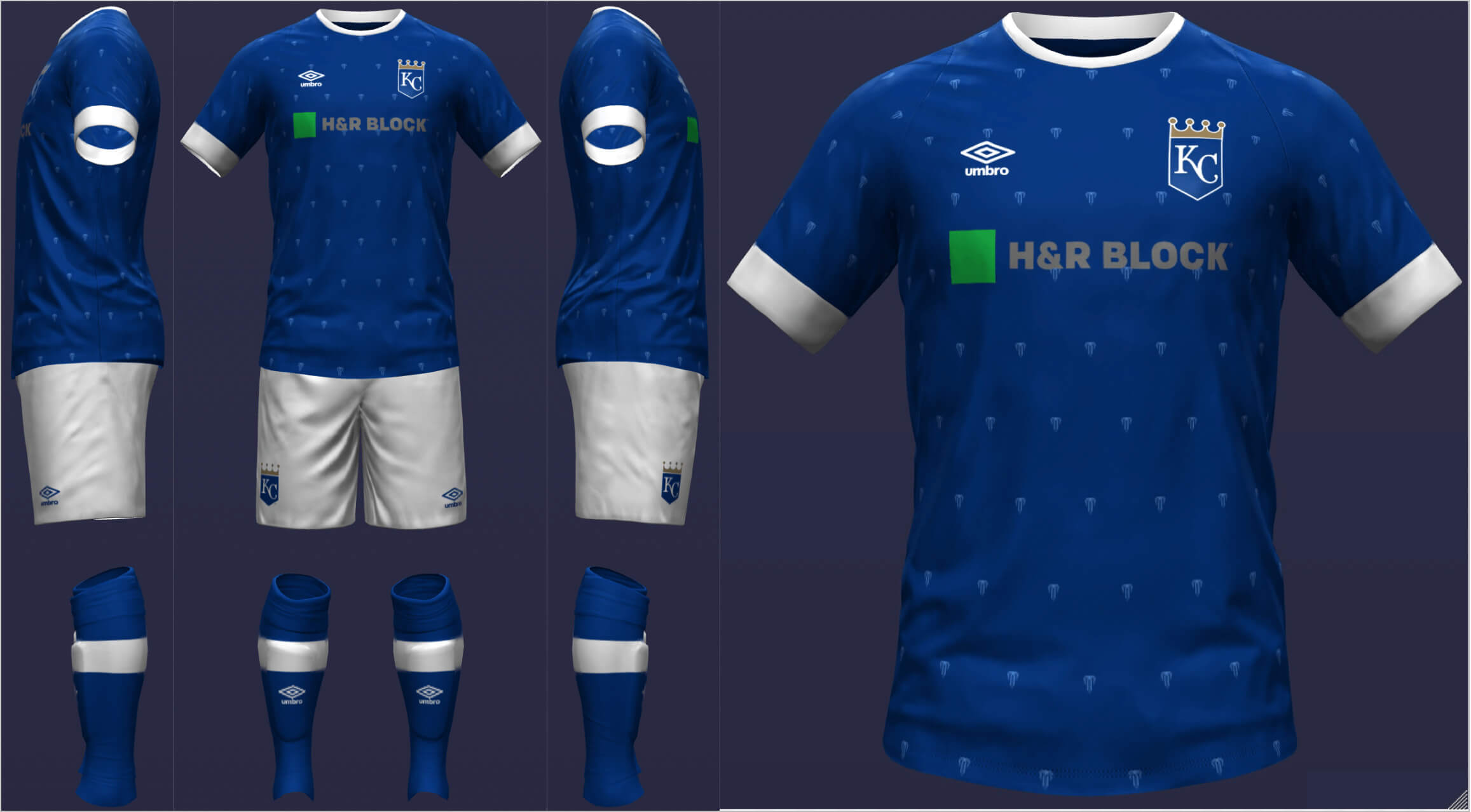
Kansas City Royals
The soccer uniform medium allowed KC to aesthetically distance itself from other teams (especially given that the most recent rebrand felt like a step back to me). I used Kansas City’s seal, which is featured on the Royals’ City Connect unis. The Royals’ away kit is one of my favorites. The gold waves give the appearance of some sort of royal banner or garment, plus powder blue!
__________
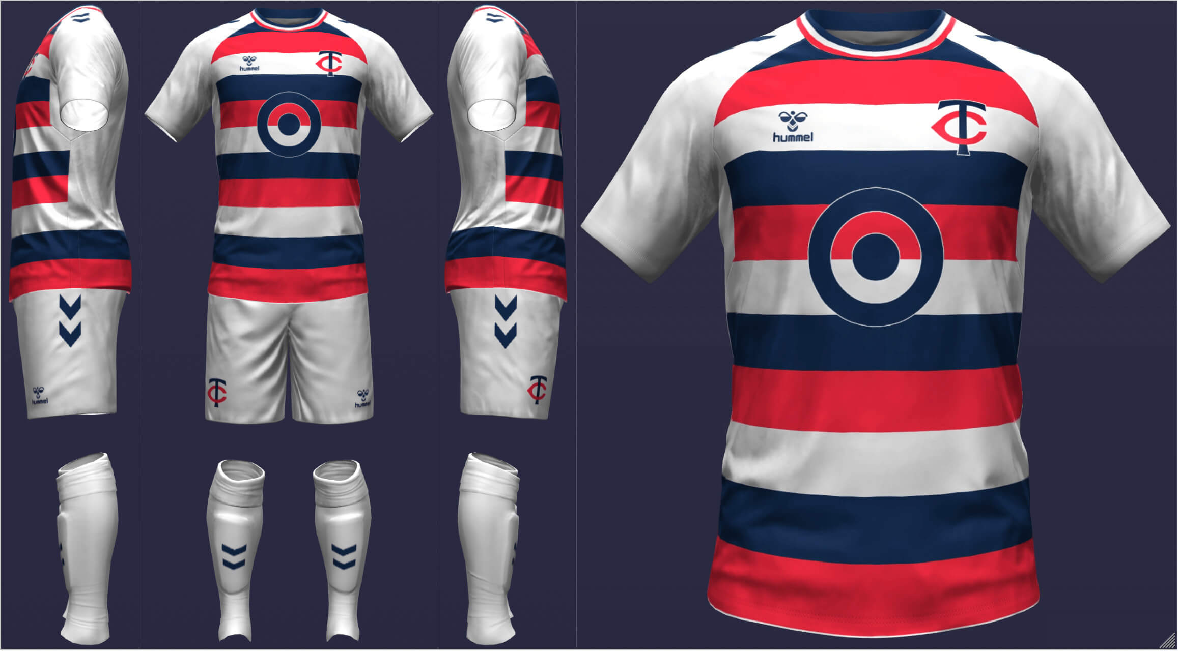
Minnesota Twins
I put the Twins in two-tone hoops so the color balance is slightly more navy-dominant but still has enough red. Similar to Boston with green, purple frequently gets mentioned for rebrands of Twin Cities sports teams. Purple helps the Twins, who have such a standard color scheme, to stand out a bit more.
====================
AL West
Houston Astros
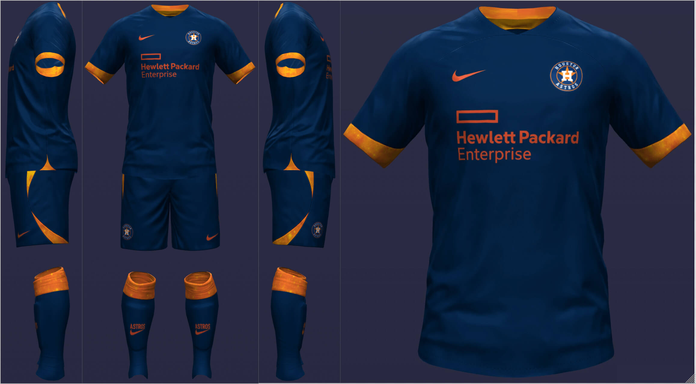
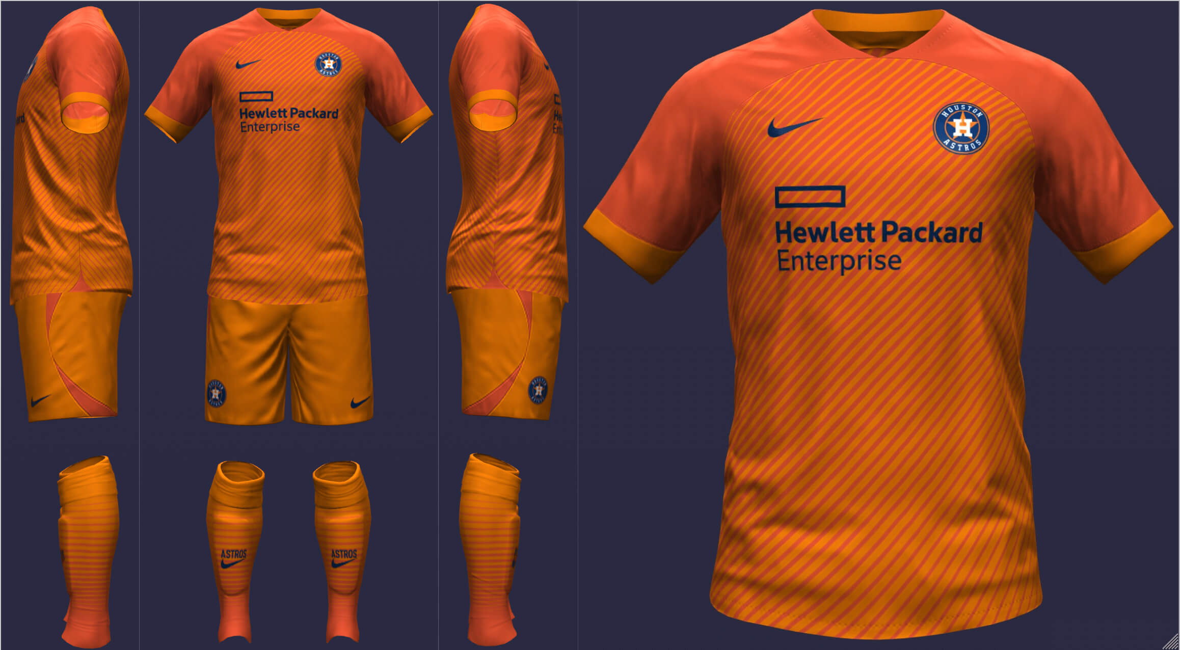
At home, Houston sports navy trimmed with a yellow and orange galaxy design. For the Stros’ road unis, I wanted to make use of the two shades of orange as a subtle nod to Tequila Sunrise without being a cop-out. The lined gradient felt in line with the Astros’ designs without being too unoriginal.
__________
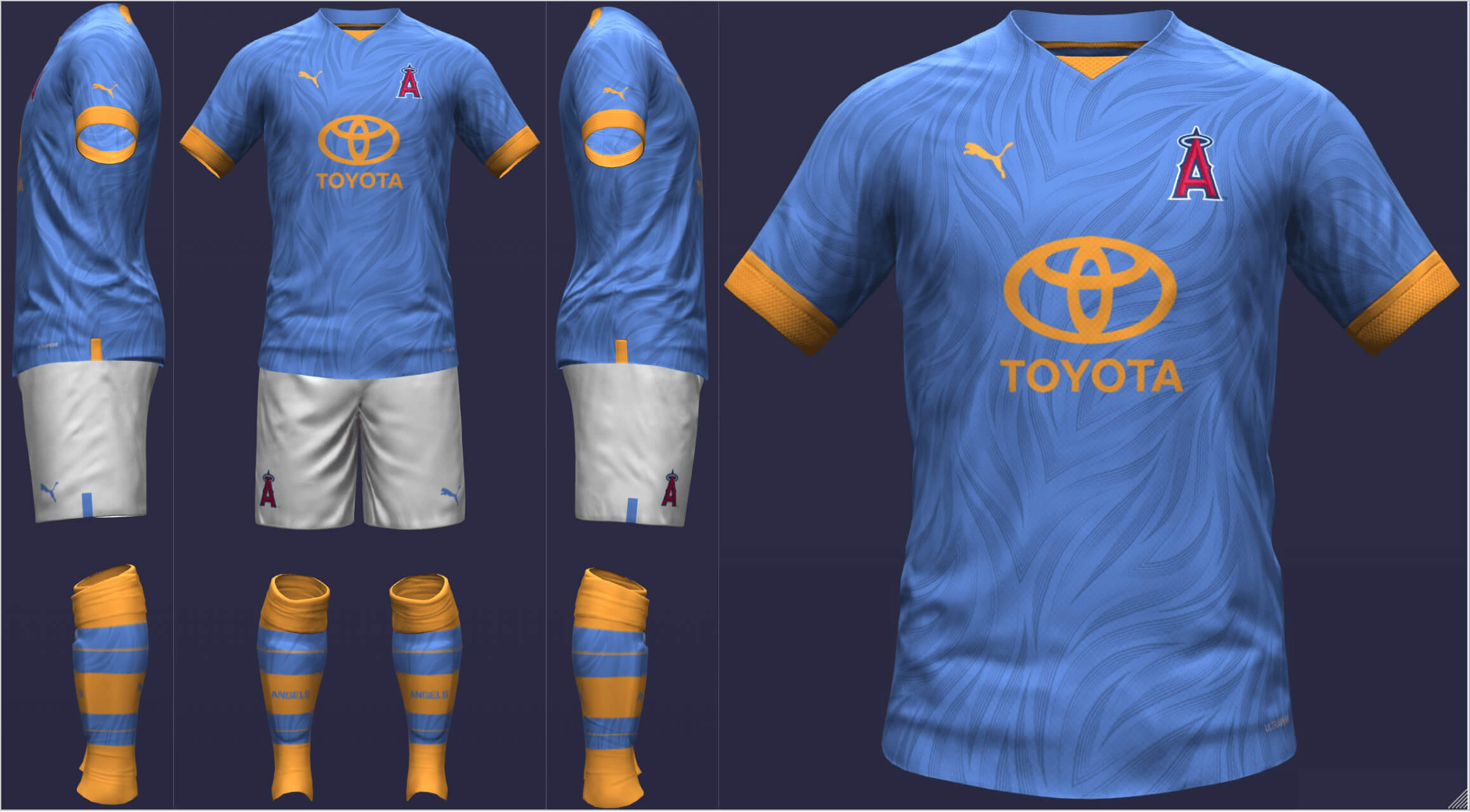
Los Angeles Angels
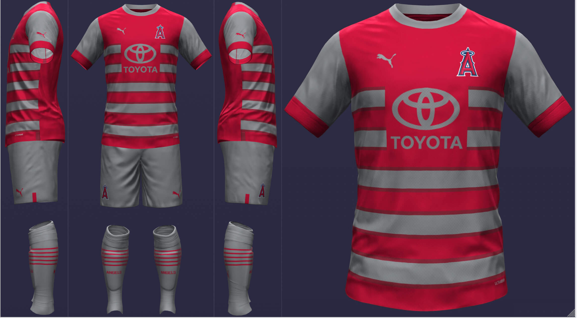
When I was beginning this project, I had to consider who would retain white at home and who wouldn’t. The Angels are an interesting case with gray but I wanted them to stand out (especially since I knew the other LA team would wear white). Since I feel like the Angels should distance themselves from LA and claim Anaheim, I wanted to feature sky blue and yellow-orange to conjure images of blue skies, surfing, citrus, etc. The pattern also reminds me of an angel’s wings.
__________
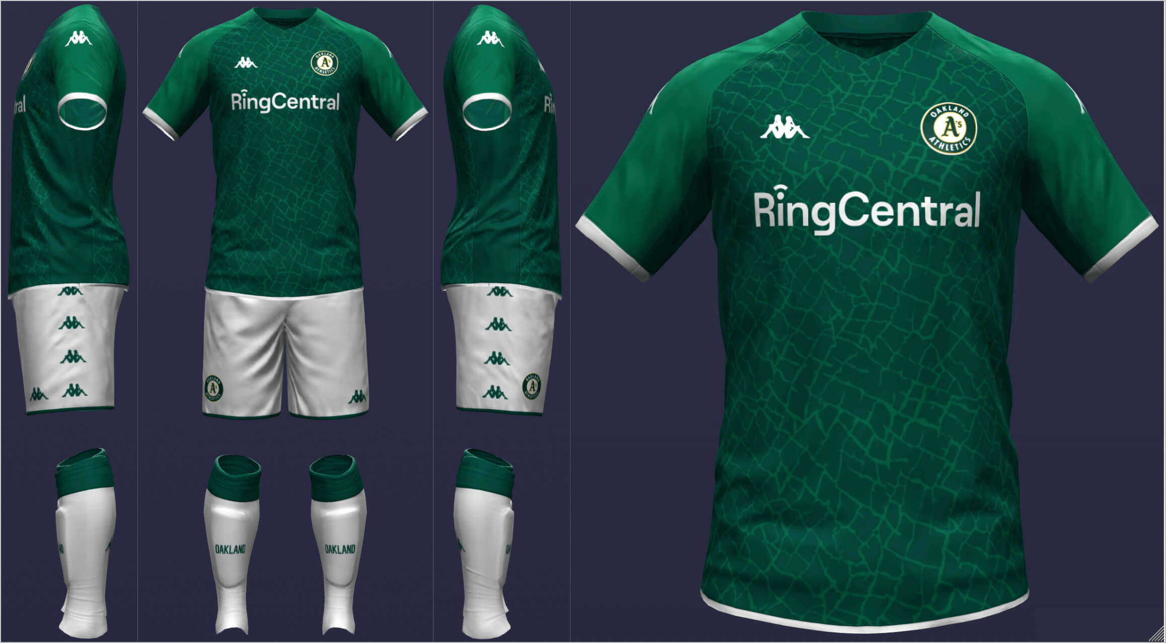
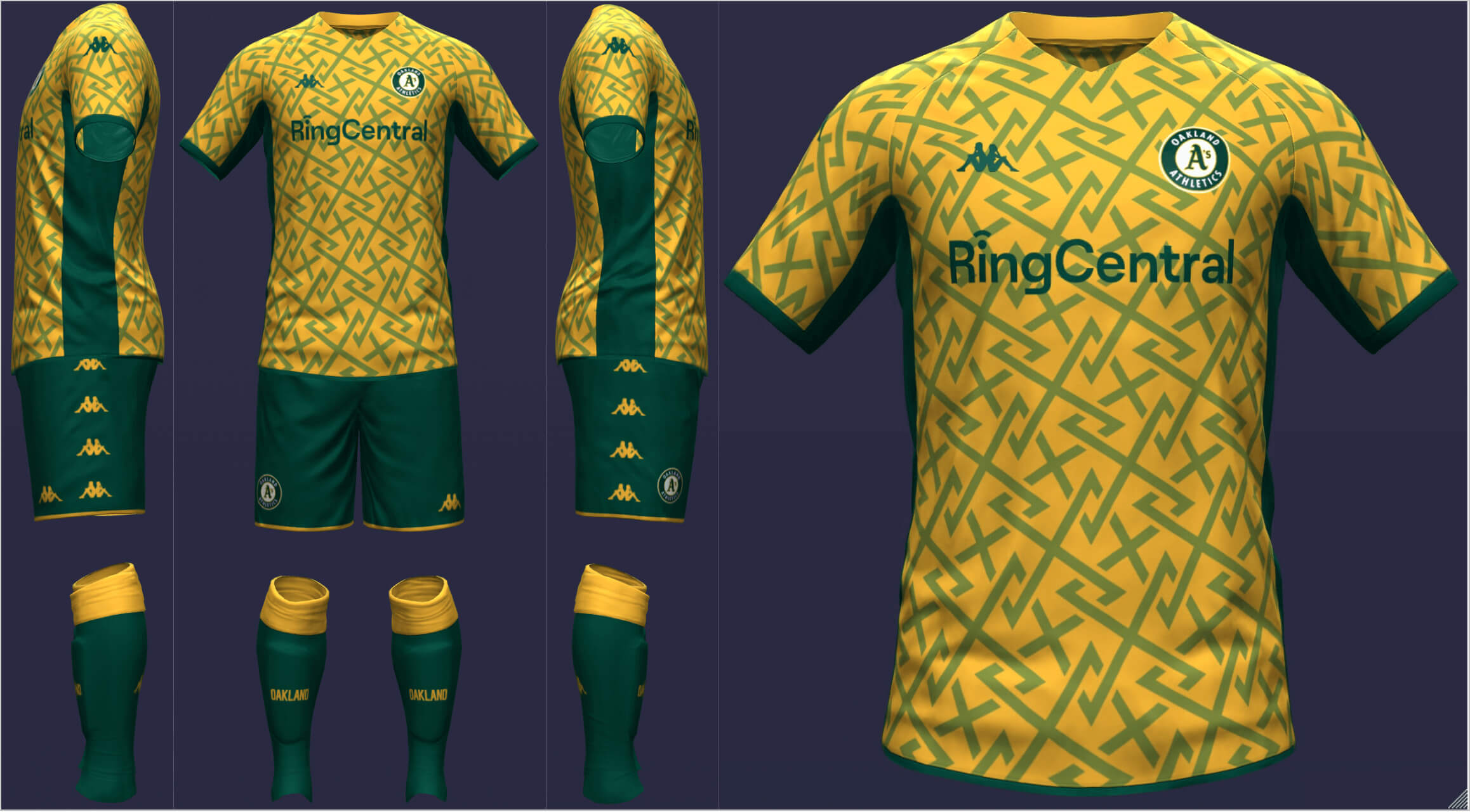
Oakland Athletics
There is no need for the A’s to stray from the classic green and gold color scheme. Living in Oakland, most of the A’s fans I know seem to prefer the kelly green look so I incorporated it here. At home, Oakland gets an elephant pattern. For the road, I went with something bold and fun, with the zig-zags somewhat resembling an A.
__________
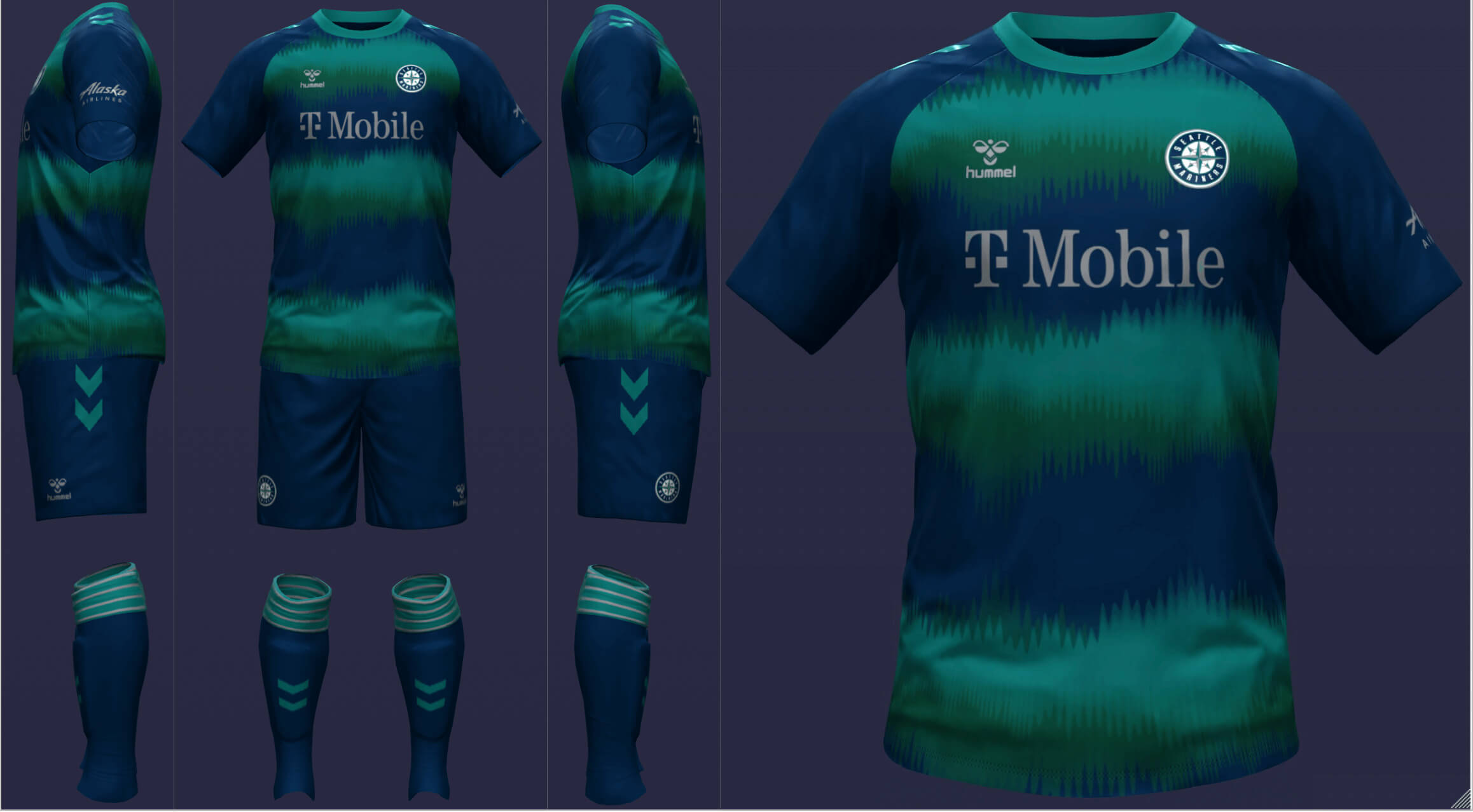
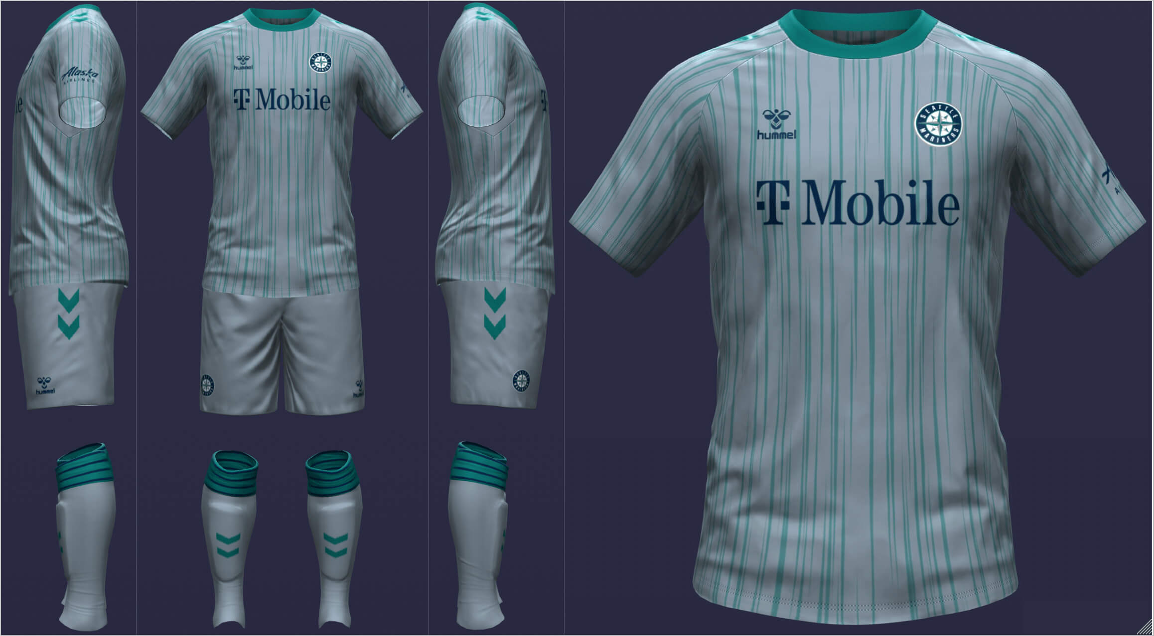
Seattle Mariners
In the alternate universe that I imagined, the Seattle Sounders would not exist, allowing the Mariners to play with sound waves (which works on multiple levels). A blue-gray change strip gives the appearance of rain.
__________
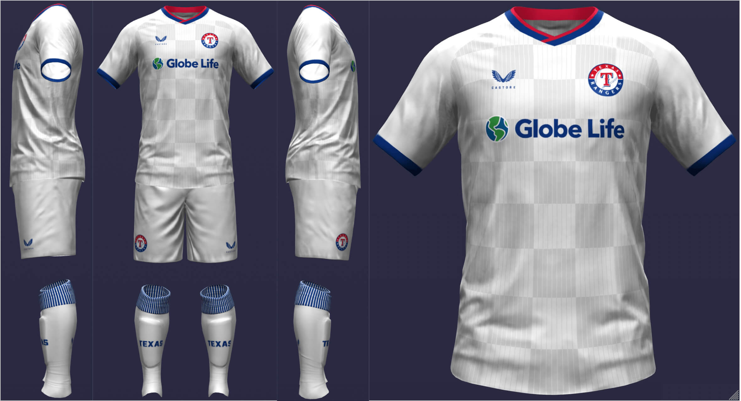
Texas Rangers
I thought that checkers would be a good way to address the red-blue balance issue that has plagued this franchise since its inception. I added the Texas silhouette logo to make things a little more interesting. I kept the checks motif on the road, this time with tonal pinstripes.
• • • • •
Thanks, Danny. We’ll check out the National League reimagined as soccer kits sometime following Supe weekend.
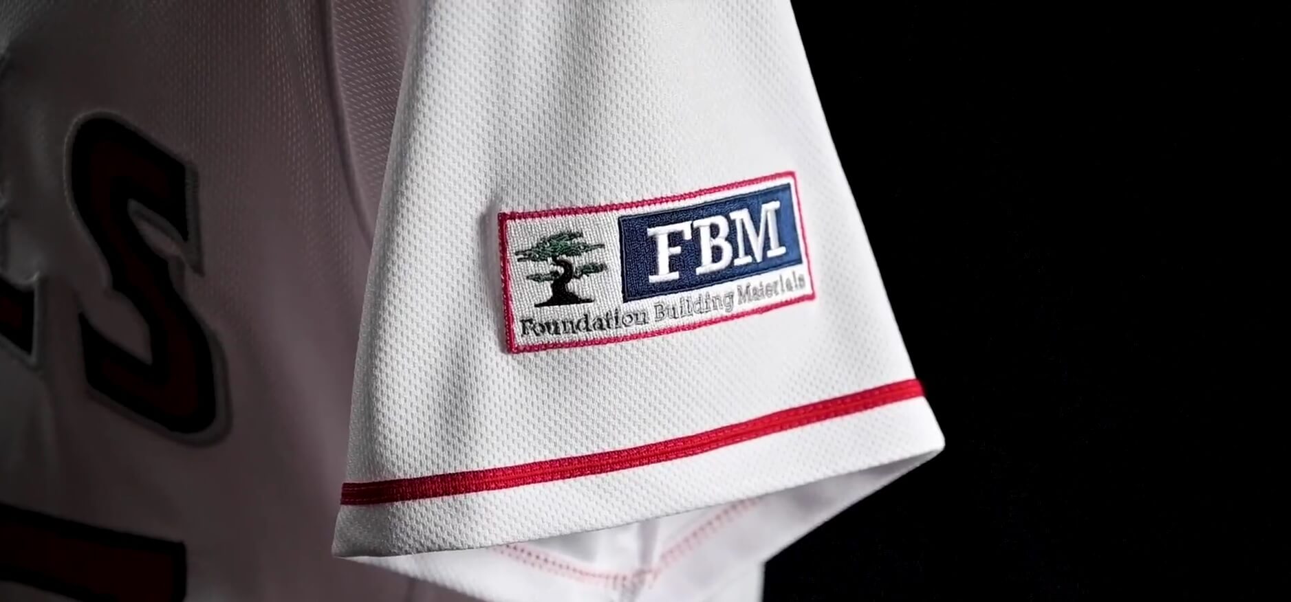
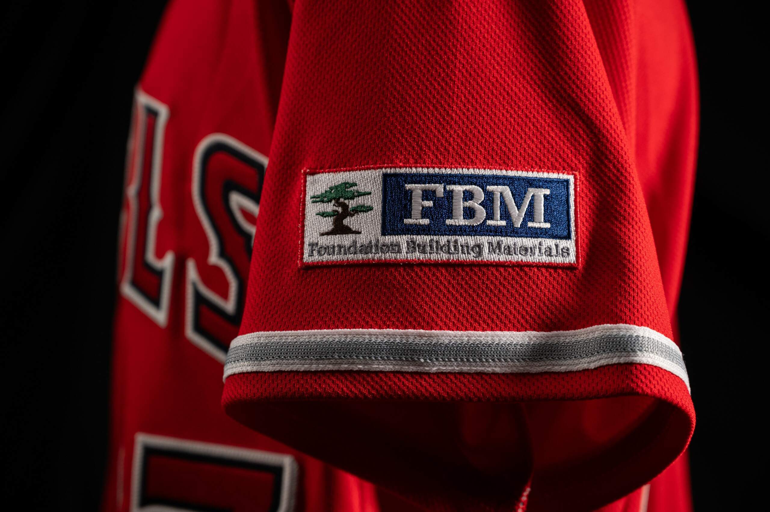
GROSS! Angels become latest team to announce jersey ad
The LA Angels yesterday became the fourth MLB franchise to preview a jersey ad for the upcoming 2023 season. As you can see above, the ad is for a corporation which is a “construction materials distributor focused on exceeding the expectations of the commercial construction and residential building trades.” Not exactly a household name (nor particularly local to the Angels).
The ad will appear on all four jerseys the team currently wears: white, gray, red and CC.
It’s hard to tell exactly, but this ad appears smaller than the “permitted” dimensions (4″ x 4″).
Three other teams have officially unveiled their jersey ads, and those all appear to fit that maximum: D-backs, Red Sox, and Padres.
While some might view the smaller size ad as a “positive” development, it’s STILL. AN. AD.
As you’ll see in today’s ticker, the Reds have announced their uni advertiser, but haven’t yet shown the ad on a jersey yet. The Astros are also expected to soon announce their own jersey advertiser. It’s expected that by the start of the season — perhaps as early as the start of Spring Training — about half the teams will have deals in place for jersey ads.
Pretty soon I expect we’ll be just adding “Mr. Yuk” to these — but we’re not quite there yet. If you care, here’s how the ads will look on the white, red and CC jerseys:
The Angels kinda low-keyed the announcement on social media. Their announcement video features only very fleeting shots of the ads on the jerseys, instead using their tweet as an ad for their new advertiser. Or rather, their “new jersey patch partner.”
“You approach each day with the goal in mind, laying the foundation for what’s to come.”
Of course the screen grabs show the jersey ad on only the left shoulder, but that will surely change depending on the “handedness” of the player wearing the jersey.
Of the four teams to show jersey ads, none have gone the route of the Jazz, whose maiden ad was actually more of a “public service” featuring “5 For The Fight”, which seeks to fund cancer research. In fact, of the three major sports (NHL, MLB and NBA) to announce jersey advertisers, none have “donated” space for charitable causes other than the Jazz. The only slight exception were the New Jersey Devils, who accepted ads supporting black owned businesses on their helmets for 13 games.
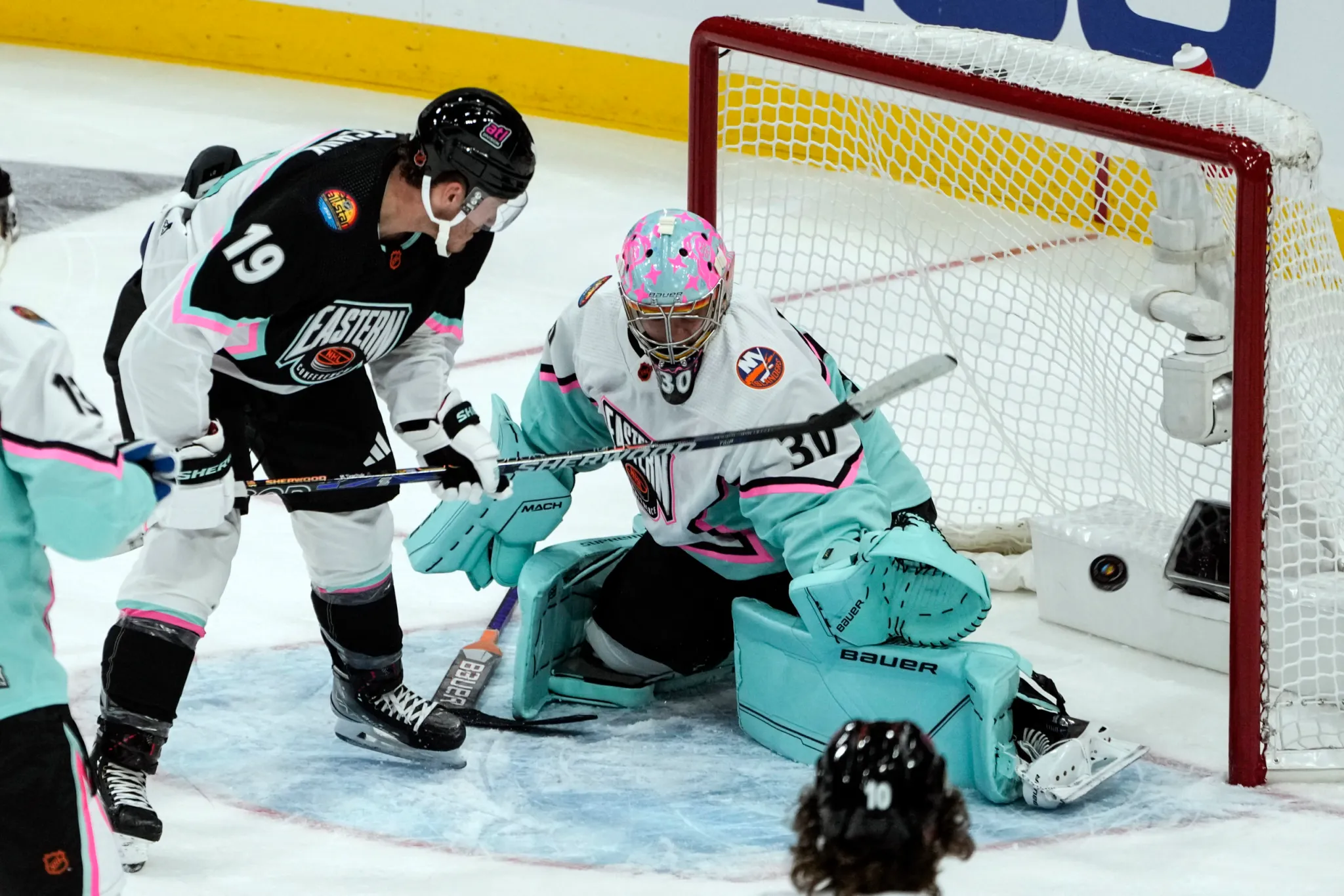
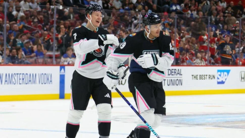
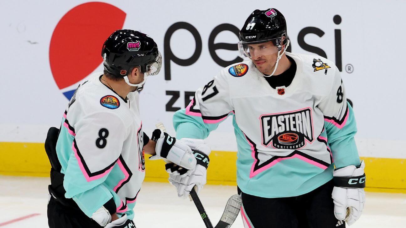
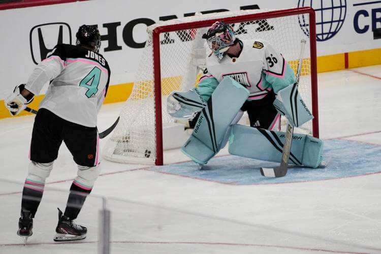
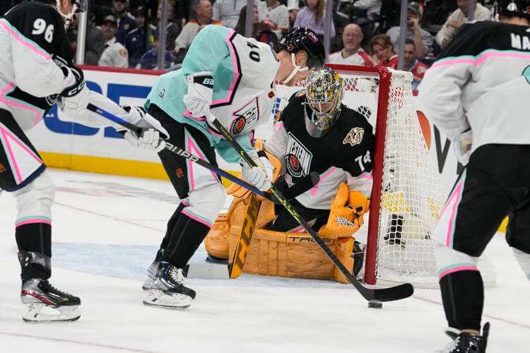
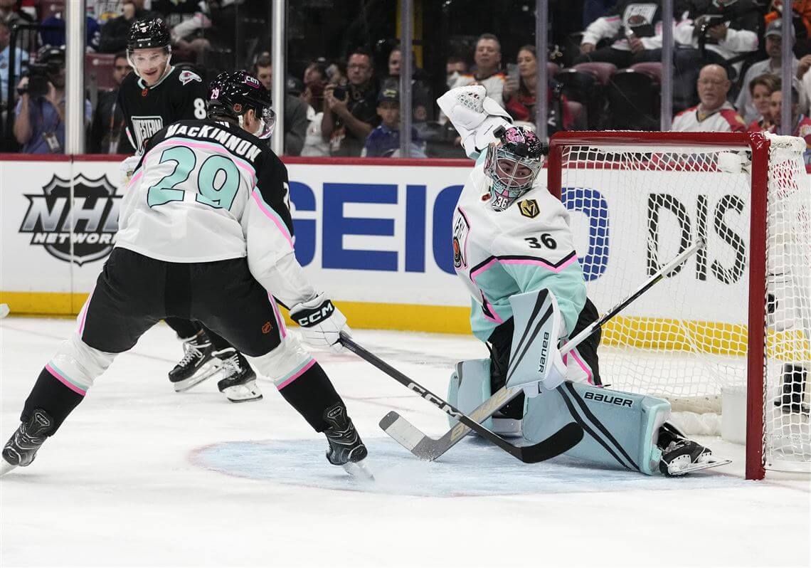
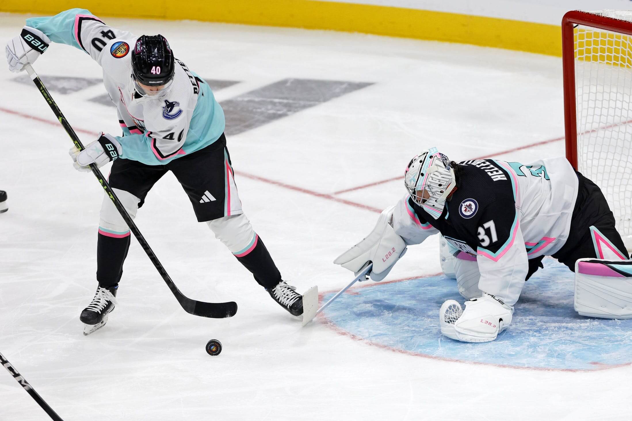
NHL All-Star Game Uni Roundup
The NHL played its annual All-Star Game yesterday, and as you can see above, the blissfully ad-free jerseys harkened back to those worn in 1994. That’s not a coincidence. If you hadn’t seen or read Paul’s preview of the jerseys, please click here. The “Reverse Retro” uniforms of 2023 are all explained in that article.
Being basically shut in yesterday — due to the brutal arctic conditions affecting the Northeast — I watched almost the entire game. And while I can’t say I love (or have ever loved) the 3-on-3 format the ASG has used the past six years, I thoroughly enjoyed the uniforms.
Prior to today, I don’t believe the full uniforms for the game had ever been revealed (you’ll note in Paul’s post his annoyance with this all-too-familiar “uniform” [but really only jersey] reveal). Because of the format, the Eastern and Western Conferences were both given the “light” (white with seafoam) and “dark” (black with white) jerseys.
The games were divided into three segments: In the first game, the two Western Conference Divisions (Pacific and Central) squared off, with the Central squad wearing the dark jerseys. In the second game, the Metropolitan (light) and Atlantic (dark) Divisions were represented. Winners of each game met in the finals. Interestingly, in both Intra-Conference games, the team in the dark jerseys won. The same thing happened in the finals.
Since we hadn’t ever seen the full uniforms, yesterday was a bit of a revelation. Both squads wore identical black helmets, black pants with a diagonal wedge of hot pink and white down the sides, and black and white socks with pink/seafoam stripes. Gloves were white:
I was wondering if the similar outfits might cause some confusion, especially since the backs of the “dark” jerseys were predominately white, and the “light” jerseys also contained a good amount of white.
Interestingly, just as the game was starting, the announcers also wondered if some players might have difficulty in finding teammates versus opponents. Since the game was 3-on-3, I didn’t notice any real mistakes, although there was some sloppy play and turnovers early in the first game.
Of course, the reason both teams wore identical buckets, breezers and socks is because they might be required to wear different jerseys if they advanced to the finals. Indeed, since both black-shirted teams advanced, the Atlantic (wearing black in their first game) and Central (also clad in black in their first game) met, with Central players switching to the white jerseys for the finals.
As you can see from a couple photos here, most of the goalies wore special color-coordinated blockers, gloves and pads for the game. But the Predators’ Juuse Saros went what looked like his regular set.
As is tradition at All-Star games, all players wore the official ASG patch on their right shoulder, and a team logo patch on their left.
All in all, I enjoyed the uniforms; I didn’t have much (if any) difficulty in telling the teams apart, and I particularly liked the “Miami Vice” color scheme used on both sets of unis.
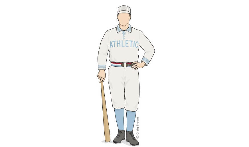
Got an e-mail earlier this week from the great Craig Brown, who runs the fantastic Threads Of Our Game website. If you’re not familiar with it, the primary focus is on pre-1900 baseball uniforms and related ephemera.
He wrote:
Blue ribbons or beer? The struggles of the 1889 Athletics
Hello baseball historians,
On June 22, 1889, the Athletics of Philadelphia trotted onto the Jefferson Street grounds with an added element on their uniforms. Each man wore, according to the Philadelphia Record, “a band of blue ribbon on his left arm.”
Today, blue ribbons represent a variety of causes — but in the 1880s, blue meant temperance. Why then on this very same day in June did the rival Philadelphia Times report that the Athletics were “in a beastly state of intoxication?”
The after-hour habits of the 1889 Athletics don’t seem to have much of a digital footprint today and are not often included with other irreverent tales of the American Association (1882-1891). However, recent finds by researcher Ed Morton have revealed new depth and detail to the problem of the A’s. Morton’s discoveries come from the Philadelphia Record, available on the often-overlooked Google News Archive, and make this a story worth sharing.
Based on the suggestion of long-time reader/contributor Jimmy Corcoran, we’ve introduced a new “game” on Uni Watch, which is similar to the popular “Guess the Game from the Scoreboard” (GTGFTS), only this one asked readers to identify the game based on the uniforms worn by teams.
Like GTGFTS, readers will be asked to guess the date, location and final score of the game from the clues provided in the photo. Sometimes the game should be somewhat easy to ascertain, while in other instances, it might be quite difficult. There will usually be a visual clue (something odd or unique to one or both of the uniforms) that will make a positive identification of one and only one game possible. Other times, there may be something significant about the game in question, like the last time a particular uniform was ever worn (one of Jimmy’s original suggestions). It’s up to YOU to figure out the game and date.
Today’s GTGFTU comes from Chris Hickey.
Good luck and please post your guess/answer in the comments below.
And Now a Few Words from Paul
Hi there. In case you missed it earlier this week, my latest Premium articleis an epic interview with letter carrier Jimmy Lonetti about his vintage/throwback postal uniforms. Jimmy is already somewhat Uni Watch-famous because of his longtime excellent work in the field of baseball glove repair, but the way he customizes his postal uniforms with vintage patches, buttons, and other throwback details is nothing short of heroic.
I don’t mind saying that this is one of the best Uni Watch articles ever. It’s long — about 5,000 words — and is studded with lots of photos, links to lots of additional resources for people who want to learn more about postal aesthetics, and a very special surprise at the end.
You can read the first part of the article here. In order to read the whole thing, you’ll need to become a paid subscriber to my Substack (which will also get you full access to my Substack/Bulletin archives, of course). Honestly and truly, I can’t imagine a better reason to sign up than to read this piece.
But don’t take my word for it. Check out some of the comments posted on the article by your fellow Uni Watch readers:
If that doesn’t convince you, I don’t know what will! Again, you can read the beginning of the article here.
Now back to Phil!
Uni Tweet of the Day
Not a fan of the KC in green…but I’m kinda diggin’ the Eagles wings on red
…that’s all for today, and for me for this week. Big thanks to Danny for sharing those soccer kits for baseball teams (and we’ll have the National League in the near future). Fun stuff.
Everyone have a good Sunday and a better week, and I’ll see you back here next Saturday for Supe Weekend!
Peace,
PH
Comments (51)
Have to say, Danny Kaufmann’s kit designs are pretty awesome. Better looking than a lot if real soccer kits. Can’t wait to see the NL set.
As a British soccer fan..
I’m not sure the Orioles have enough contrast between kits; if their away kit is too similar to the home team (Red Sox, say), I think the home kit is too… (this is why clubs have the scam of a third kit)
Similarly Blue Jays away at Rays is probably okay, but only just.
There’s nothing wrong with the Yankees pinstriped shorts, but they just look weird..
Continuing a shirt’s stripes onto the shorts is rare in my experience, so it looks odd..
Twins’ home jersey is a beaut… but I think it works even better as a rugby jersey. Specifically for Hawaii..
Best individual kit is Rangers home
Best set is the A’s..
Was thinking the same thing about the O’s and the Jay’s designs–both are very good, but the change kit doesn’t contrast enough–Celtic had this issue a few years back, if I recall correctly.
That said, the designs are great! Well done, Danny!
I’m normally not a big fan of the whole ‘what would (this sport) look like if it was (that sport’ crossover thing. But those Orioles and Blue Jays kits are just perfection. Not a fan of either team, but I would buy both of those.
Just to add, Brighton and Hove Albion carried on thicker stripes on their shorts in the early 90s
Those soccer jersey advertisements are really, really hard to get past, but I can at least say that Minnesota’s, in not having any words and using a generic symbol that happens to be a corporate logo but doesn’t *have* to be, is the least-bad of the lot. (I also like their purple!)
The NHL All-Star sweaters bring back memories for this ’90s hockey fan. One element I like about them is that there’s a contrasting-color shoulder yoke, and the NOB goes inside it, separating it from the number. When teams have shoulder yokes but put everything below it and nothing (except perhaps an obnoxious manufacturer logo) it doesn’t look good, compared to this. The Sabres did this with their red-and-silver-themed jerseys in that era.
I doubt that Target would let a team with red in its color scheme and on the uniform render their logo in blue, nor let the white strip be bisected by red and white so as to resemble a Pokémon ball. But I do like both uniforms.
Chicagoan here, no problem tying the Bulls and White Sox together, they’re owned by the same owner.
Right. And the Sox have their own history with red, both in the black/red of the 50’s and the all red if the early 70’s, (my favorite Sox uni set ever)
I agree that the kits HAVE to contain an advertiser because even the random ones chosen make a difference in the kits. I really like Kansas City, but that green square of the advertiser doesn’t work at all. Also, the Pepsi logo desecrating the pinstripes is absolutely the sort of thing that MLB would do. The other thing that’s really nice about the kits is that even without the team logo, you can figure out who some of them are.
Do they though? They are imaginary soccer kits from an alternative universe where baseball teams are soccer teams. Must even our fantasies contain advertising?
lose the orange on the white tigers uni. it looks really good and i really like it, but the tigers dont wear orange at home
Honestly really like seeing crossovers like these, its just fun imo; Red Sox away is probably my favorite one, that pattern works so damn well (shoutouts to Vissel Kobe), especially with these colors. Orioles and Astros kits are great too, Hewlett-Packard sponsor works pretty damn well here imo.
Also – just rambling a bit here – i can’t even tell if i like or dislike sponsors on soccer shirts specifically. On one hand, yeah, often feel like certain designs would blossom even more without them – especially when you see national teams kits, which dont have sponsors at all – on the other hand god im a huge fan of J-League shirts which have a *ton* of them and yet they often oddly feel like some sort of controlled chaos. Hard to explain, just clicks for me both ways.
*advertisers, not sponsors
Tbh weirdly enough i’d instinctively use this word with the MLB ad patches while my brain switches to “sponsors” *specifically* when talking about soccer shirts.
Nice job, Danny! Several really nice kits in this set. It’s interesting to see how well most MLB teams’ logos work as soccer shirt badges.
I suppose switchhitters will have ads on both sleeves.
We can debate the aesthetics of the FBM ad on the Angels’ jersey, but it is “local to the Angels” as the company is headquartered in Santa Ana.
As Paul has written about before, some teams are “Pepsi” and some are “Coca-Cola”. The Yankees are a “Coke” team. Mind you, I’m not knocking the designs; in fact I think they’re all really well done. Just an observation on my part. Which leads me to my next rabbit hole: which arenas/stadiums serve Coke vs. Pepsi. Would love to see an infographic of this.
Google is your friend.
On another note…the cola brand depicted on Danny’s Yankee shirts is indeed the brand of cola to be sold at the Stadium link
If any team is going to have Coke advertising, you’d think it would be Atlanta.
I actually think about which places serve Coke/Pepsi a lot, as I am a Diet Coke drinker who can’t seem to find a Pepsi product that I enjoy (the root beer is fine, but it’s not served at a lot of places). I live in Columbus, OH, and all of the professional stadiums/arenas around here serve Pepsi products (one of the largest PepsiCo distributors is headquartered here in the city). I love attending Clippers games but it drives me up a wall that I have to choose water at a ballgame because I hate their soft drink options and I don’t drink alcohol.
Baltimore’s shirt sponsor should definitely be either Under Armour or McCormick Spices. M&T is a Buffalo based company.
*advertiser
Old Bay.
This is the answer.
I tried McCormick but thought it was too busy. Under Armour wouldn’t make sense since it is not common for teams to have their kit supplier also be their advertiser. I only did M&T b/c they have the rights to the Ravens’ stadium name, which isn’t necessarily the best logic but then again, shirt advertisers suck anyway.
Or the Natty Boh guy! Though the circular logo of Mr. Boh might look weird with the Roundel logo on the chest, but a swap to their cartoon bird instead might be an easy fix, or the most recent ornithological bird.
“the screen grabs show the jersey ad on only the left shoulder, but that will surely change depending on the ‘handedness’ of the player wearing the jersey.”
Is this a thing they’re doing just for the ads? Don’t tell me it’s been going on with sleeve logos forever and I didn’t notice.
No. This is a new thing. Ads will change shoulder/sleeve. Actual team logos/patches have always been in one location until now.
GTGFTU: April 9, 2015, Red Sox at Phillies
What caught my eye was the throwback hat, so with a little googling I found a Sportslogos article which showed they only wore that for one day, against the Red Sox, who also supposedly wore throwback hats, but I wasn’t able to find any pictures to corroborate that
Correct. According to CC, the Sawx were supposed to be wearing “a plain grey cap” (link)
However, they ended up wearing what I believe were their regular caps (link)
Found some highlights for the game on Youtube (link). The announcers actually mention “both” teams in throwback caps at the onset of the clip. But that cap isn’t what was described by Chris, and it definitely wasn’t what they wore in 1915 (the year the caps were throwing back to).
Good job, Allen!
The throwback hat with present-day uniform was an odd pairing/half measure, but it kinda worked.
I hope I’m around to see what the Phils wear for the 100th anniversary of their 1950 WS appearance!
Guess the game…is it 4/9/15? Justin Masterson and Ryan Howard on opening weekend in Philly?
It was…oh so close chiming in before Allan.
Warm-up jacketed pitchers are now a thing of the past, and I’ll guess that Masterson is wearing a borrowed batting helmet.
These kits are awesome! A’s away might be too swastika-esque? Thanks for eternally ruining a shape/pattern, assholes :(
I was thinking that as well, unfortunately.
Love these. And I appreciate the thoughtfulness of the kit manufacturers too. Something that has always bothered me about MLS is their exclusive partnership with adidas. Every teams kit looks to have come from the same generic catalog. Giving each team autonomy to pick their own kit manufacturer forces more creativity and individuality. You captured that beautifully.
My only complaint on that front is that I don’t think Detroit would choose Macron as their manufacturer. I’d match them with something that feels a bit more scrappy like Puma or New balance or Under Armour.
Well done Danny! Those are very cool concepts. That’s coming from a non baseball fan.
NHL All-Star games are fun and all. We can’t replicate when it really meant something like in 1979 and 1987. NHL All-Stars vs. Soviet Union when the Soviets did not play in the NHL.
NHL had some really great All-Star uniforms for those years.
What amuses me about the Rendez-vous ’87 NHL unis is that their striping was basically that of the New Jersey Devils’ red jerseys, just color-swapped (white for red, orange for green, and black for white).
Yeah I wonder the reason behind that decision about the design. Stars on shoulders a nice touch.
Love the AL / soccer jersey crossovers, however, the jerseys are missing something.
Where are the championship stars?
These concepts are great – beautifully conceived and executed. But, as was said above, there needs to be more contrast on the Orioles’ 2 sets. I would hate watching a game where they played the Astros or Tigers, unless their opponents promised to wear the navy or white primary kits for every game. A clash kit is meant to provide contrast.
Danny – super job on those kits. I’m an Astros fan, and I would definitely get those.
“As you can see above, the ad is for a corporation which is a “construction materials distributor focused on exceeding the expectations of the commercial construction and residential building trades.” Not exactly a household name (nor particularly local to the Angels).”
The patch is still an affront to God and nature, but FBM is in Santa Ana, which is basically next door to Anaheim.
The MLB Soccer Teams remind me of the “Soccer Out of Context” ( link ) design exercise from a decade ago by Mark Willis ( link ). Really loved his designs and ideas but, sorry kids, they now appear to be behind a paywall.
Instead of responding to everyone individually I just wanted to say thank you to everyone for all of the great feedback and appreciation. I will weigh in on the advertiser issue by saying that I myself hate uni advertisements and went back and forth on what to do about them. I ultimately wanted to go the realism route and really tried to pick companies that I thought the teams would pick. Since the consensus is that the orioles kits needed to contrast more (I agree), here is a link to an update: link
I’m a Seattle sports fan. I love these soccer redesigns. The rain stripes on the gray shirt is very clever.
1. Great concept. The Blue Jays kits are PERFECT.
2. The red Eagles helmet is literally my high school’s football helmet – or at least it was when I went there
Well executed (my favorite is the Twins set) but I am glad the teams do not carry such big ads on their baseball uniform chests. For the time being…


Have to say, Danny Kaufmann’s kit designs are pretty awesome. Better looking than a lot if real soccer kits. Can’t wait to see the NL set.
As a British soccer fan..
I’m not sure the Orioles have enough contrast between kits; if their away kit is too similar to the home team (Red Sox, say), I think the home kit is too… (this is why clubs have the scam of a third kit)
Similarly Blue Jays away at Rays is probably okay, but only just.
There’s nothing wrong with the Yankees pinstriped shorts, but they just look weird..
Continuing a shirt’s stripes onto the shorts is rare in my experience, so it looks odd..
Twins’ home jersey is a beaut… but I think it works even better as a rugby jersey. Specifically for Hawaii..
Best individual kit is Rangers home
Best set is the A’s..
Was thinking the same thing about the O’s and the Jay’s designs–both are very good, but the change kit doesn’t contrast enough–Celtic had this issue a few years back, if I recall correctly.
That said, the designs are great! Well done, Danny!
I’m normally not a big fan of the whole ‘what would (this sport) look like if it was (that sport’ crossover thing. But those Orioles and Blue Jays kits are just perfection. Not a fan of either team, but I would buy both of those.
Just to add, Brighton and Hove Albion carried on thicker stripes on their shorts in the early 90s
link
Widely compared at the time to a supermarket carrier bag..
link
Those soccer jersey advertisements are really, really hard to get past, but I can at least say that Minnesota’s, in not having any words and using a generic symbol that happens to be a corporate logo but doesn’t *have* to be, is the least-bad of the lot. (I also like their purple!)
The NHL All-Star sweaters bring back memories for this ’90s hockey fan. One element I like about them is that there’s a contrasting-color shoulder yoke, and the NOB goes inside it, separating it from the number. When teams have shoulder yokes but put everything below it and nothing (except perhaps an obnoxious manufacturer logo) it doesn’t look good, compared to this. The Sabres did this with their red-and-silver-themed jerseys in that era.
I doubt that Target would let a team with red in its color scheme and on the uniform render their logo in blue, nor let the white strip be bisected by red and white so as to resemble a Pokémon ball. But I do like both uniforms.
Chicagoan here, no problem tying the Bulls and White Sox together, they’re owned by the same owner.
Right. And the Sox have their own history with red, both in the black/red of the 50’s and the all red if the early 70’s, (my favorite Sox uni set ever)
I agree that the kits HAVE to contain an advertiser because even the random ones chosen make a difference in the kits. I really like Kansas City, but that green square of the advertiser doesn’t work at all. Also, the Pepsi logo desecrating the pinstripes is absolutely the sort of thing that MLB would do. The other thing that’s really nice about the kits is that even without the team logo, you can figure out who some of them are.
Do they though? They are imaginary soccer kits from an alternative universe where baseball teams are soccer teams. Must even our fantasies contain advertising?
lose the orange on the white tigers uni. it looks really good and i really like it, but the tigers dont wear orange at home
Honestly really like seeing crossovers like these, its just fun imo; Red Sox away is probably my favorite one, that pattern works so damn well (shoutouts to Vissel Kobe), especially with these colors. Orioles and Astros kits are great too, Hewlett-Packard sponsor works pretty damn well here imo.
Also – just rambling a bit here – i can’t even tell if i like or dislike sponsors on soccer shirts specifically. On one hand, yeah, often feel like certain designs would blossom even more without them – especially when you see national teams kits, which dont have sponsors at all – on the other hand god im a huge fan of J-League shirts which have a *ton* of them and yet they often oddly feel like some sort of controlled chaos. Hard to explain, just clicks for me both ways.
*advertisers, not sponsors
Tbh weirdly enough i’d instinctively use this word with the MLB ad patches while my brain switches to “sponsors” *specifically* when talking about soccer shirts.
Nice job, Danny! Several really nice kits in this set. It’s interesting to see how well most MLB teams’ logos work as soccer shirt badges.
I suppose switchhitters will have ads on both sleeves.
We can debate the aesthetics of the FBM ad on the Angels’ jersey, but it is “local to the Angels” as the company is headquartered in Santa Ana.
As Paul has written about before, some teams are “Pepsi” and some are “Coca-Cola”. The Yankees are a “Coke” team. Mind you, I’m not knocking the designs; in fact I think they’re all really well done. Just an observation on my part. Which leads me to my next rabbit hole: which arenas/stadiums serve Coke vs. Pepsi. Would love to see an infographic of this.
Google is your friend.
On another note…the cola brand depicted on Danny’s Yankee shirts is indeed the brand of cola to be sold at the Stadium link
If any team is going to have Coke advertising, you’d think it would be Atlanta.
I actually think about which places serve Coke/Pepsi a lot, as I am a Diet Coke drinker who can’t seem to find a Pepsi product that I enjoy (the root beer is fine, but it’s not served at a lot of places). I live in Columbus, OH, and all of the professional stadiums/arenas around here serve Pepsi products (one of the largest PepsiCo distributors is headquartered here in the city). I love attending Clippers games but it drives me up a wall that I have to choose water at a ballgame because I hate their soft drink options and I don’t drink alcohol.
Baltimore’s shirt sponsor should definitely be either Under Armour or McCormick Spices. M&T is a Buffalo based company.
*advertiser
Old Bay.
This is the answer.
I tried McCormick but thought it was too busy. Under Armour wouldn’t make sense since it is not common for teams to have their kit supplier also be their advertiser. I only did M&T b/c they have the rights to the Ravens’ stadium name, which isn’t necessarily the best logic but then again, shirt advertisers suck anyway.
Or the Natty Boh guy! Though the circular logo of Mr. Boh might look weird with the Roundel logo on the chest, but a swap to their cartoon bird instead might be an easy fix, or the most recent ornithological bird.
“the screen grabs show the jersey ad on only the left shoulder, but that will surely change depending on the ‘handedness’ of the player wearing the jersey.”
Is this a thing they’re doing just for the ads? Don’t tell me it’s been going on with sleeve logos forever and I didn’t notice.
No. This is a new thing. Ads will change shoulder/sleeve. Actual team logos/patches have always been in one location until now.
GTGFTU: April 9, 2015, Red Sox at Phillies
What caught my eye was the throwback hat, so with a little googling I found a Sportslogos article which showed they only wore that for one day, against the Red Sox, who also supposedly wore throwback hats, but I wasn’t able to find any pictures to corroborate that
Correct. According to CC, the Sawx were supposed to be wearing “a plain grey cap” (link)
However, they ended up wearing what I believe were their regular caps (link)
Found some highlights for the game on Youtube (link). The announcers actually mention “both” teams in throwback caps at the onset of the clip. But that cap isn’t what was described by Chris, and it definitely wasn’t what they wore in 1915 (the year the caps were throwing back to).
link
Good job, Allen!
The throwback hat with present-day uniform was an odd pairing/half measure, but it kinda worked.
I hope I’m around to see what the Phils wear for the 100th anniversary of their 1950 WS appearance!
Guess the game…is it 4/9/15? Justin Masterson and Ryan Howard on opening weekend in Philly?
It was…oh so close chiming in before Allan.
Warm-up jacketed pitchers are now a thing of the past, and I’ll guess that Masterson is wearing a borrowed batting helmet.
These kits are awesome! A’s away might be too swastika-esque? Thanks for eternally ruining a shape/pattern, assholes :(
I was thinking that as well, unfortunately.
Love these. And I appreciate the thoughtfulness of the kit manufacturers too. Something that has always bothered me about MLS is their exclusive partnership with adidas. Every teams kit looks to have come from the same generic catalog. Giving each team autonomy to pick their own kit manufacturer forces more creativity and individuality. You captured that beautifully.
My only complaint on that front is that I don’t think Detroit would choose Macron as their manufacturer. I’d match them with something that feels a bit more scrappy like Puma or New balance or Under Armour.
Well done Danny! Those are very cool concepts. That’s coming from a non baseball fan.
NHL All-Star games are fun and all. We can’t replicate when it really meant something like in 1979 and 1987. NHL All-Stars vs. Soviet Union when the Soviets did not play in the NHL.
NHL had some really great All-Star uniforms for those years.
link
link
What amuses me about the Rendez-vous ’87 NHL unis is that their striping was basically that of the New Jersey Devils’ red jerseys, just color-swapped (white for red, orange for green, and black for white).
Yeah I wonder the reason behind that decision about the design. Stars on shoulders a nice touch.
Love the AL / soccer jersey crossovers, however, the jerseys are missing something.
Where are the championship stars?
These concepts are great – beautifully conceived and executed. But, as was said above, there needs to be more contrast on the Orioles’ 2 sets. I would hate watching a game where they played the Astros or Tigers, unless their opponents promised to wear the navy or white primary kits for every game. A clash kit is meant to provide contrast.
Danny – super job on those kits. I’m an Astros fan, and I would definitely get those.
“As you can see above, the ad is for a corporation which is a “construction materials distributor focused on exceeding the expectations of the commercial construction and residential building trades.” Not exactly a household name (nor particularly local to the Angels).”
The patch is still an affront to God and nature, but FBM is in Santa Ana, which is basically next door to Anaheim.
The MLB Soccer Teams remind me of the “Soccer Out of Context” ( link ) design exercise from a decade ago by Mark Willis ( link ). Really loved his designs and ideas but, sorry kids, they now appear to be behind a paywall.
Instead of responding to everyone individually I just wanted to say thank you to everyone for all of the great feedback and appreciation. I will weigh in on the advertiser issue by saying that I myself hate uni advertisements and went back and forth on what to do about them. I ultimately wanted to go the realism route and really tried to pick companies that I thought the teams would pick. Since the consensus is that the orioles kits needed to contrast more (I agree), here is a link to an update: link
I’m a Seattle sports fan. I love these soccer redesigns. The rain stripes on the gray shirt is very clever.
1. Great concept. The Blue Jays kits are PERFECT.
2. The red Eagles helmet is literally my high school’s football helmet – or at least it was when I went there
Well executed (my favorite is the Twins set) but I am glad the teams do not carry such big ads on their baseball uniform chests. For the time being…