
[With the Canadian Football League’s Grey Cup set to take place later today, guest author and SMUW member Wade Heidt takes us back to 2010, when all CFL teams wore uniforms from the 1970s. Enjoy! — PH]
Can you dig it? A look back at the CFL’s 1970s throwbacks of 2010.
by Wade Heidt
This is a big day for football in Canada on Sunday, November 20. The 109th Grey Cup takes place in Regina, SK. The Canadian Football League champion will be crowned.
The battle for the storied chalice of Canadian football this year features the Winnipeg Blue Bombers and the Toronto Argonauts. The last time these teams met in the Grey Cup was 1950. That game known as the Mud Bowl. The uniforms will be cleaner this time around with a crisp, cold bite to the air.
As it is a big day for Canadian football, we will look back at a great uniform program launched by the CFL in 2010. Get out those 8-track tapes and bell bottoms! Every CFL team returned to the 1970s with a set of retro uniforms!
I will give a thumbs up or thumbs down on the efforts. In addition, we will include a look at each team’s primary uniform in 2010 for comparison and if some readers don’t regularly follow the league. Unfortunately, Ottawa was absent from the CFL in 2010. We missed out on some great Ottawa Rough Riders throwbacks. We will travel from east to west as my Canadian University Uni Watch (CUUW) likes to do.
Montreal Alouettes
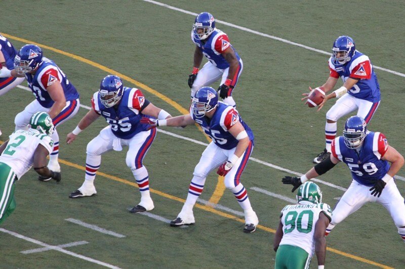
The return of the royal blue helmets. The Delta logo was back. A reminder of glorious days in the late 1970s when the Als were filling the new Olympic Stadium as a championship-calibre team. Love the stripes on the socks. Not a truly accurate throwback as the logo was not on the sleeves until the early 1980s. An upgrade over the busy primary home uniforms in 2010.
Thumbs Up
This is my favourite all-time look for the Alouettes.
Toronto Argonauts
Decisions need to be made about sleeves with football throwbacks. Sleeves are not the length they used to be. Disappointing how the Argonauts handled the sleeves here. They decided to keep the full-sized numbers on the sleeves. As a result, the 1970s sleeve stripes were not there. The Argos should have moved the numbers to the shoulders to allow room for the sleeve stripes.
Thumbs down
The Double Blue looking more like the “Single Blue” in these 1970s retros.
Hamilton Tiger-Cats
Amazing! We saw the Tiger-Cats uniform the way it should be. The helmets were the traditional athletic gold. Sure, they didn’t have the black masks in the 1970s but the more vintage logo was back. The Ticats were able to fit both the numbers and stripes on the sleeves with a little shrinkage. This look way better than the mono-black with all the random striping Hamilton was wearing in 2010.
Thumbs up
The proper colour helmets for Hamilton. The CFL uni-verse felt riight again.
Winnipeg Blue Bombers
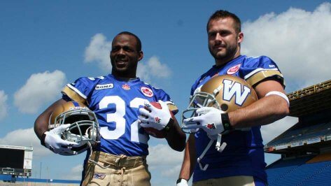
The throwbacks from the Blue Bombers were quite accurate to the 1970s uniforms. They had the grey masks, numbers on the shoulders, and proper sleeve striping. Was refreshing at the time to see the return of royal blue compared to the primary navy uniforms in 2010. The Bombers switched to navy blue in 1995. Of course, Winnipeg currently has returned to the royal blue as their primary look with the present uniforms being very similar to the old look.
Thumbs up
Good job for throwback accuracy and loved seeing the royal blue back.
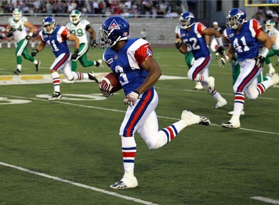
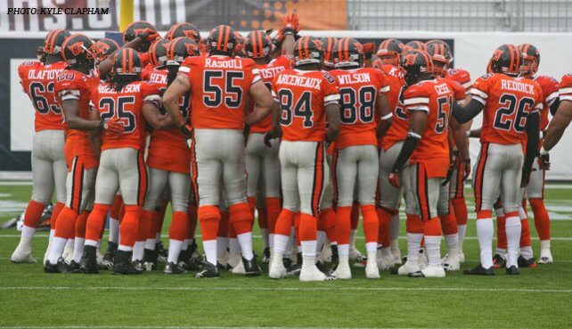
Saskatchewan Roughriders
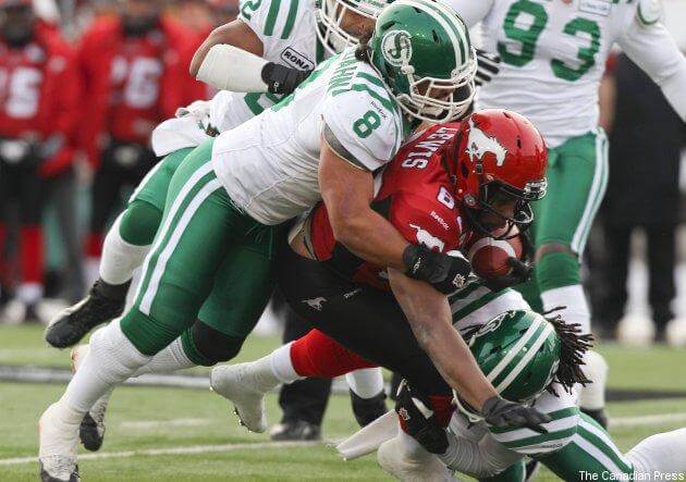
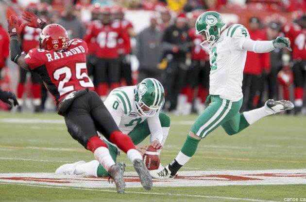
The Roughriders 1970s throwbacks have a different story compared to the rest of the league. They wore white 1970s throwbacks because their regular alternate uniforms at the time were the green version of this retro design. This allowed the option for the Riders to wear the retros on the road. Worn in Montreal when the Alouettes wore their 1970s throwbacks. These throwbacks became their choice for the road uniform in the 2010 Western Final. In addition, the uniforms stayed around after 2010 and were worn occasionally. The throwbacks were the road uniforms in the 2012 Western Semi-Final as seen in the photos above.
Thumbs up
The return of the vintage “S” logo with strictly green and white road version was refreshing. Back in 2010, the Riders were still wearing black trim for their primary uniforms.
Edmonton Elks

The return of the old school logo and nice uniforms. However, the retro uniforms of the team formerly know as the Eskimos were more a hybrid of the 1980s uniforms mixed with the 1970s. The sock striping is from the 1970s but much thinner on this throwback. The white masks were worn in the 1980s. The 1970s uniforms had 2 white stripes in the sleeves and not 3 as on the throwbacks. The 3 white stripes in sleeves started in the 1980s and featured the EE logo on the sleeves.
Thumbs down
Still, an upgrade to primary uniforms back in 2010 which had the unnecessary addition of a touch of black trim. However, this was supposed to be a look at the 1970s retros and Edmonton decided to throw in a 1980s vibe. Can’t give all thumbs up.
Calgary Stampeders

The Stampeders subbed out their black trim in favour of silver trim. The result are a thing of beauty. Great uniforms for the Stamps with the striping on the socks and silver pants. Added the red masks which appeared during that time.
Thumbs up
As compared to the styles most CFL teams were wearing for a primary uniform in 2010, the retro classic was an upgrade. CFL uni-verse also feels right when the Stampeders are not wearing black.
BC Lions
The Lions brought back an old school logo. They brought in the black helmets with orange masks. Though the Lions wear black helmets now, they wore white helmets as their primary look in 2010. The throwbacks were good-looking uniforms. The did sub in black socks in favour of the orange socks when this uniform was worn during 2010.
The throwback experience for the Lions was on another level. Their usual stadium (BC Place) was undergoing a major renovation. BC played the 2010 season at a temporary stadium (Empire Field). Empire Field was constructed on the exact site of their old home (Empire Stadium). The Lions left Empire Stadium when BC Place was ready in 1983. The throwback was two-fold. The Lions were wearing their 1970s throwbacks playing on the same spot were they played back then. The first time the Lions had played home games outdoors since 1982.
Thumbs up
The uniforms were great and this was throwback to an enhanced level with the stadium situation.
There you have it. A lot of thumbs up for the 1970s throwbacks. Even the ones receiving thumbs down were not bad uniforms. They were traditonal uniform designs that looked great. Especially in comparison with some of the primary Reebok-designed uniforms worn by teams in 2010. The retro uniform program a success and was a treat to see the throwbacks in action on the field. Rather than just seeing them in old photos and footage.
Now that we are in the 2020s, it is time the CFL considered wearing 1980s throwback. There are a lot of great CFL uniforms worn in the 1980s and it is time to see them on the field again!
miss those white BC helmets.
I really liked the look for the Lions from 2005 to 2015. The uniforms then with the white helmets were great. It has been a somewhat downhill look for the Lions since.
As long as the throwbacks are a little better constructed. I remember watching a game back then when the Ti-Cats numbers were peeling off the uniforms mid-game.
Saskatchewan’s throwbacks are a thing of beauty. When the CFL was (very) briefly on NBC during the 1982 players’ strike, a game between Calgary and the Riders was shown and I fell in love with those uniforms. It helped that that *exact* shade of green is my favorite color.
Thanks to the CFL being shown on ESPN Plus, I can keep up with the CFL every week and I think I can say my passion for the Riders is greater than for my favorite American teams.
Must be why they say Green is the Colour.
I am huge Riders fans as well as I was born and raised in Regina. However, there is a huge uniform dilemma. I love 2 throwback uniform designs.
I love the older, vintage look that they still wear as an alternate.
link
However, I absolutely loved the big uniform change in 1985. The 1985-89 version. The awesome wraparound helmet logo. The silver and black trim added. This uniform stellar and produced some great memories in Riders’ history.
link
link
I would agree that each one would be better than their current primary uniform as a primary look. However, the debate about which one is better exists among Riders fans. I would go with a modern version of 1985-89 uniform as the new primary in a heartbeat and keep the vintage as an alternate.
The Argos chose wisely taking sleeve numbers over stripes. If you have to choose, that is.
And the Ti-Cats should have stuck with the stripes and left off the microscopic numbers.
Love, love, LOVE those Alouettes and Stampeders unis!
Shoot, they all looked great. While I greatly preferred Toronto’s Zenon Andrusyshyn-Condredge Holloway-era unis, I’d be fine if the league looked like this ad infinitum.
I bleed Rider green, so it is tough for me to say anything positive about the Stamps. But the red and grey is such a timeless look, top notch then and would hold up today. They seriously need to ditch whatever it is they’ve been doing for the last 20 years and go back to that full time.
The Stamps using black is the worst decision in their uniform history…it has been amplified by the redblacks now having the exact same color scheme which is literally built into their name…go grey and red, it is more unique and looks amazing. Go Riders.
Shameless bit of self-promotion…CFL Uniform Database remains under ongoing construction and includes uniforms for 1945-77. 1978 will be added before Christmas.
Amazing how good these retro uniforms from 2010 still look today. Much better than the current sets of any CFL team.