Good Saturday morning, Uni Watch readers. I hope everyone has had a pleasant week.
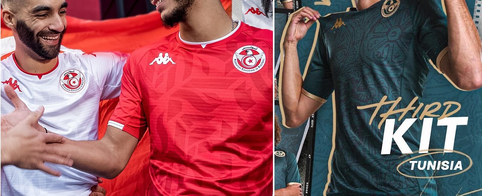
As you all are no doubt aware, the World Cup — this year taking place in Qatar — begins tomorrow, with the host country taking on Ecuador, and the United States beginning their Group stage (vs. Wales) on Monday, among other games. I’m once again joined by longtime readers and contributors Kyle Evans and CJ Fleck, who have returned to bring us their preview of this year’s World Cup kits. There is a LOT to get to today; so much so that the WC Preview will be broken up into two parts — the first part is below, and Part II will follow later this morning. Let’s get right to it. Here are Kyle and CJ with their preview of the …
by Kyle Evans and CJ Fleck
Thanks Phil! Happy to be back to preview the World Cup, which is generally held in the summer but will take place from November 20th – December 18th due to Qatar’s climate. This is the last tournament that will be held with only 32 countries, as the 2026 USA/Mexico/Canada edition will expand to 48 countries. There are plenty of kits to get to, so let’s jump right in and let us know your favorite and least favorite designs!
Qatar
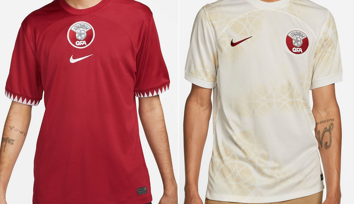
Primary: maroon with triangular pattern on sleeves based on country flag
Secondary: white with sublimated design based on pearls and sandstorms
Kyle: The hosts will look great as I’m almost always a fan of flag-based designs.
CJ: Not too shabby! I like the sleeve element from the flag as much as Kyle does.
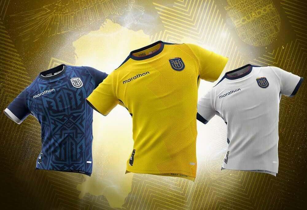
Primary: yellow with navy/red accents (flag-based) and sublimated zig-zag design
Secondary: navy with Incan-inspired geometric design
Third: white with subtle sublimated stripes
Kyle: I absolutely love these. Great connections to flag and history.
CJ: I’m not as enamored as Kyle, but I will say they’re solid and could be much worse.
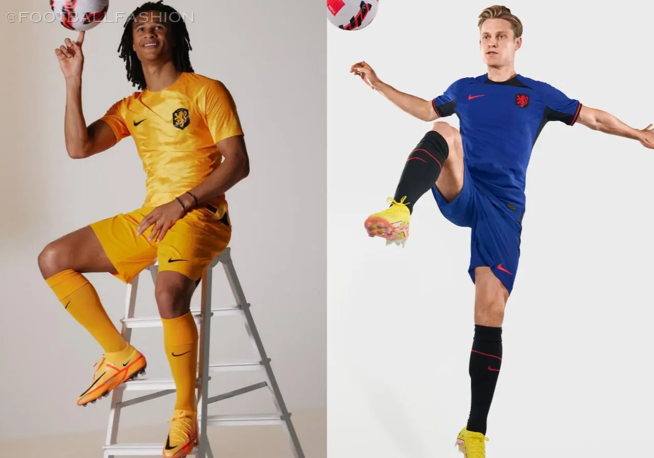
Primary: shiny orange
Secondary: purple (on new Nike template)
Kyle: No thanks to that shiny effect. Double no thanks to that Nike template (see USA).
CJ: The Dutch have a wonderful history of kits at major tournaments, in my opinion; these do not fit the history at all.
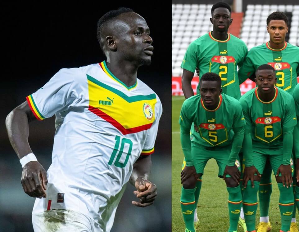
Primary: white with green/yellow/red chevron and sleeve/collar accents
Secondary: green with dark green center vertical stripe and Puma “shield” design
Kyle: The white kit is one of the top looks of the tournament for me. I’m not a fan of these “Puma shields” but the green design is arguably the strongest of them due to the way the colors pop.
CJ: Just copy and paste what Kyle said. 100%.
England
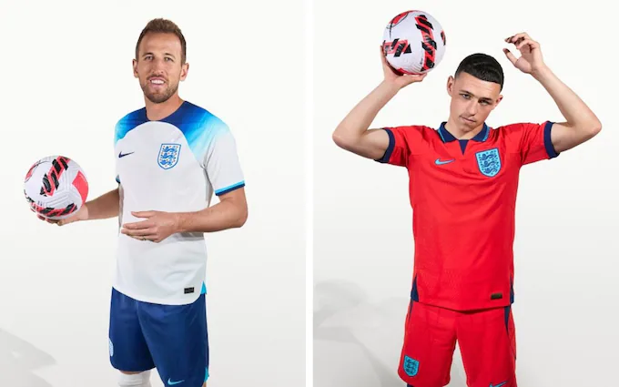
Primary: white with navy to light blue gradient shoulder design
Secondary: red with navy and light blue accents
Kyle: The white with navy shorts isn’t terrible? My eyes don’t appreciate the light blue and red combination and I’m not sure the collar will even save it for CJ.
CJ: I like the red kit, strangely enough. I don’t think it fits England, exactly, but I like it. The navy shorts though? No thank you.
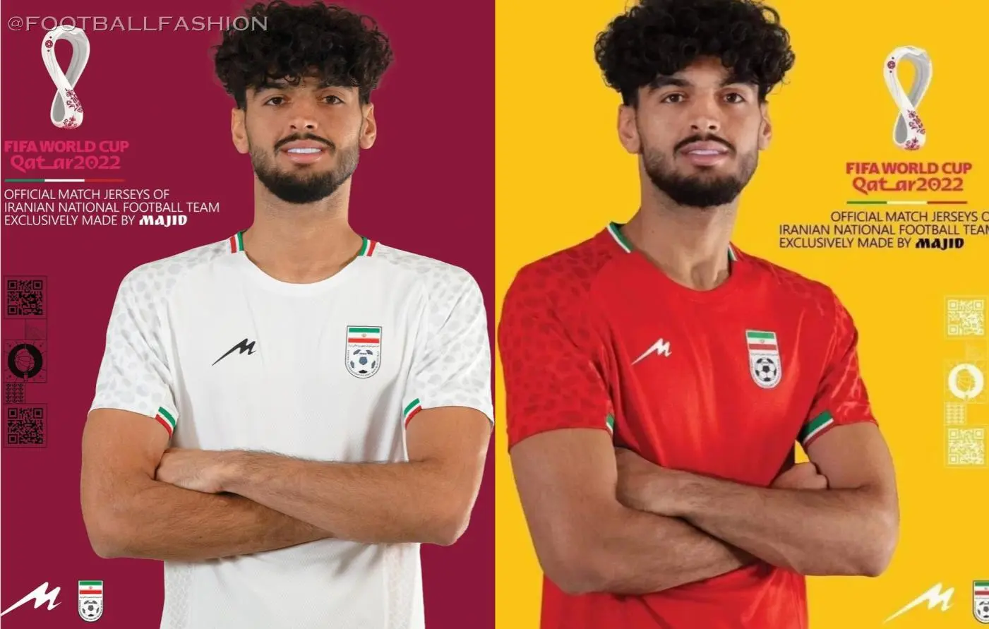
Primary: white with green/red collar and sleeve striping and cheetah print sleeves
Secondary: red with green/white collar and sleeve striping and cheetah print sleeves
Kyle: Identical designs, but the stripes pop more on the white. The cheetah design is subtle and a shoutout to an endangered species.
CJ: These certainly are a set of kits for a national team. This is a common criticism of mine.
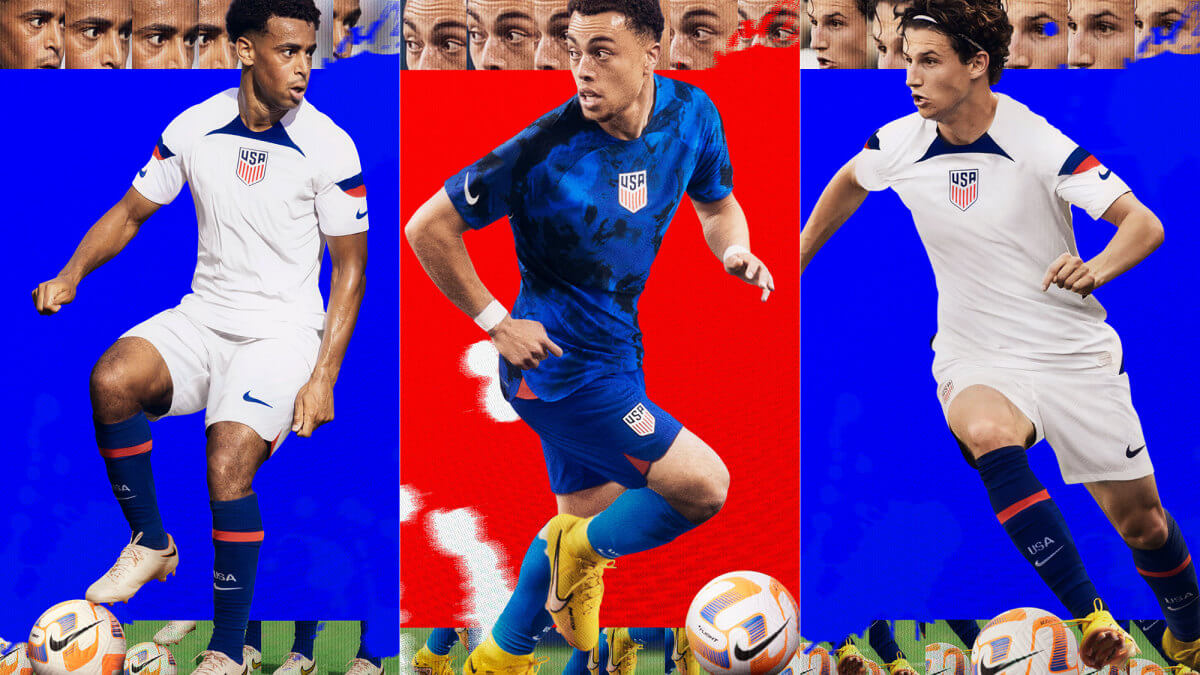
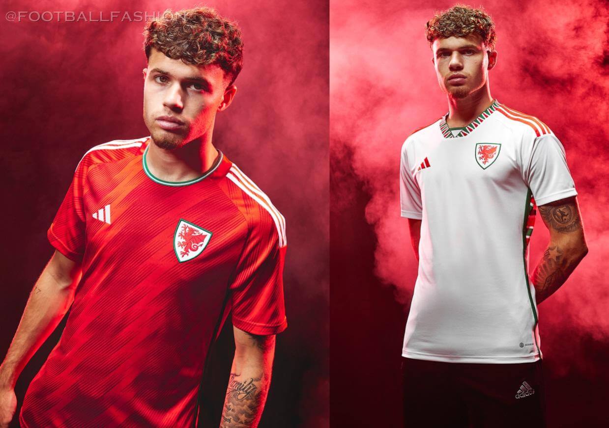
Primary: white with navy/red sleeve stripes and navy panel by the collar
Secondary: blue and navy tie-dye style pattern
Kyle: Centered crests still don’t feel right to me. Not a fan of this Nike template but the whites are alright with the balance of the accent colors, and the blue kit is a real eyesore.
CJ: I think the US does the Nike template best, and it’s because of Kyle’s point about color balance. Or I’m supremely biased and patriotic, who knows.
Primary: red with white and green accents and sublimated diagonal stripes
Secondary: white with red/green zigzag pattern on collar and side panels
Kyle: A great set of looks and a unique design element on the white.
CJ: Love these, especially the side panels! Probably won’t look great on TV but the design effort cannot be overlooked.
Argentina
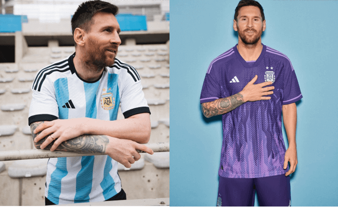
Primary: classic sky blue and white vertical stripes with black accents
Secondary: purple with purple gradient flame design based on the Sol de Mayo symbol
Kyle: One of the most recognizable and beautiful primary looks in the world and honestly I love the purple one too.
CJ: Some countries are classics that can’t take a wrong step with certain design elements and colors. That does not absolve them of their subsequent mistakes, such as this purple monstrosity.
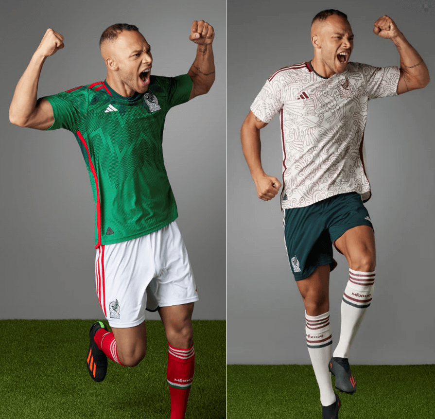
Primary: green with subtle graphic print inspired by Quetzalcoatl
Secondary: beige with red graphic pattern also inspired by Quetzalcoatl (“feathered serpent”)
Kyle: Love the green and the cultural tie-in, but the beige is too busy for me.
CJ: Simple, but a big fan of the socks here. More stripes, please!
Primary: white with eagle feather pattern on sleeves
Secondary: red with white accents
Kyle: Classy looks and the sleeve pattern is subtle enough to not be distracting.
CJ: Shield crest cannot save these for me. Nike has been all over the place.
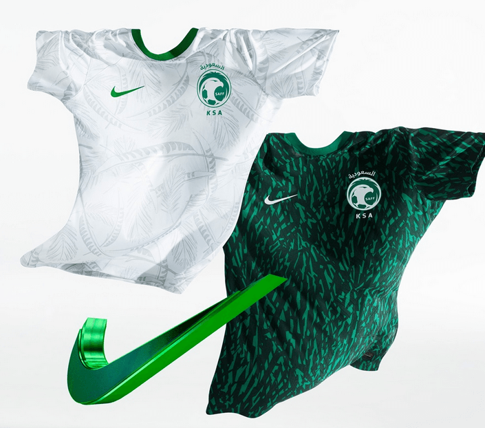
Primary: white with sublimated palm leaf pattern
Secondary: green and dark green mosaic style pattern
Kyle: I don’t buy the associated marketing speak, but as designs these are nice.
CJ: What did I just say about Nike? I’m not sold, but there was an attempt.
Australia
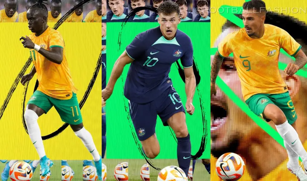
Primary: “splotchy” yellow with green accents
Secondary: navy with teal accents and front neck panel
Kyle: The secondary might be my least favorite of the tournament – makes me think of a generic Premier League third kit and certainly not the Australian national team.
CJ: See also: Argentina comments. Classic styles do not excuse experimentation gone wrong.
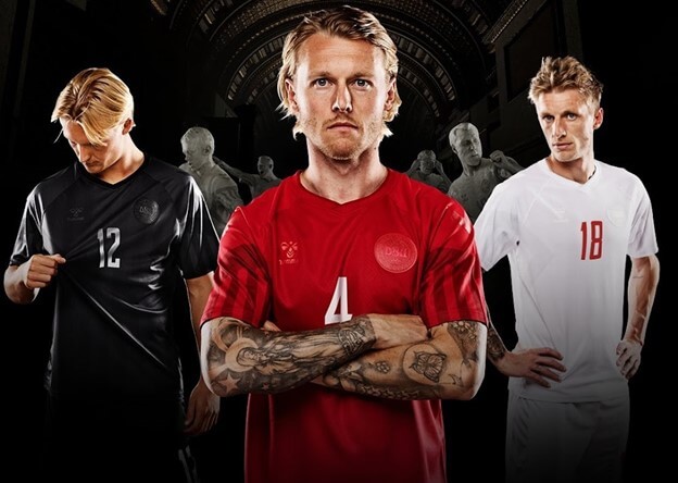
Primary: mono-red with subtle sleeve stripes from the 1992 kit
Secondary: mono-white with subtle sleeve stripes from the 1992 kit
Third: mono-black with subtle sleeve stripes from the 1992 kit
Note that the monochromatic kits are a form of protest against the human rights record of the host country.
Kyle: A unique form of protest that I fully support.
CJ: A striking look designed to turn heads.
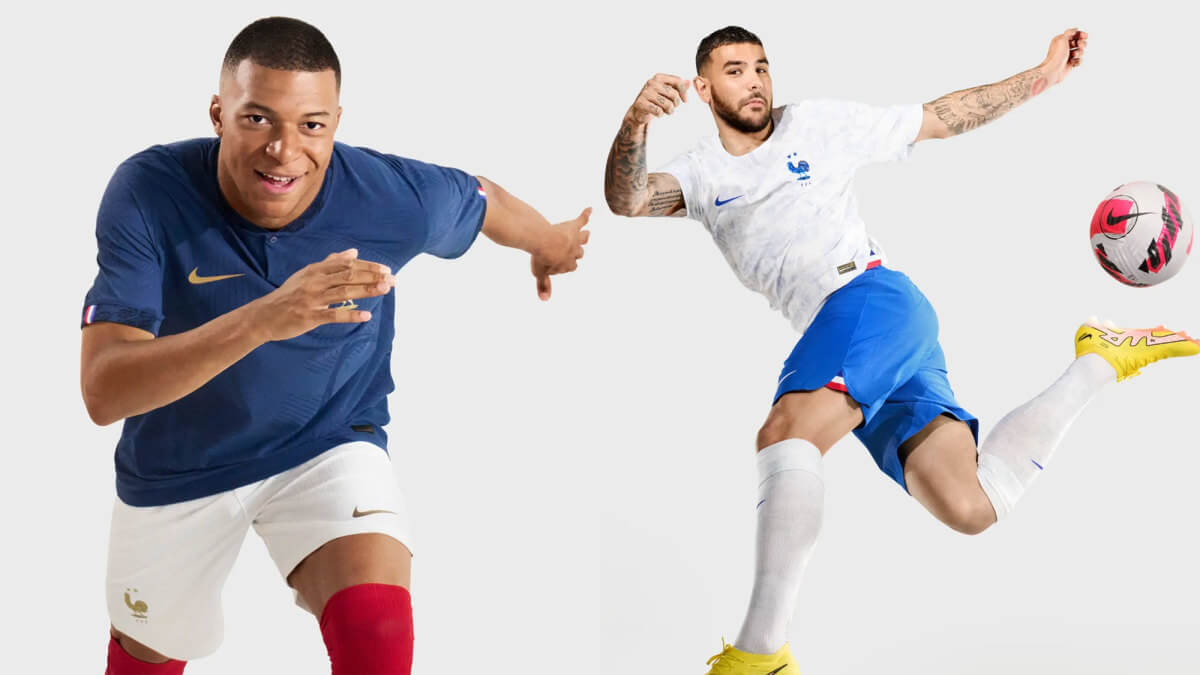
Primary: navy with gold accents (as defending champions), complete with white shorts and red socks
Secondary: white with sublimated design containing various French cultural symbols, moments, and landmarks
Kyle: The gold accents are the perfect touch to the classic primary look and fans will appreciate the cultural elements on the white if they purchase the jersey because they certainly won’t be evident on television.
CJ: Where are the gaudy Nike problem designs for the French? But, I’ll take a non-eyesore any day.
Primary: red with sublimated design based on the armor of Hannibal
Secondary: white with sublimated design based on the armor of Hannibal
Third: dark green with sublimated design based on the armor of Hannibal
Kyle: Consistent design and solid looks.
CJ: Consistency is key, I suppose. But just a touch too simple.
Readers? What say you?


Hasn’t England always worn white with navy shorts? I’m surprised there wasn’t more criticism of the England blue shoulders on the home whites. They should’ve done the simple white top blue bottoms. KISS
Yeah, I’m confused by the criticism of white over blue because they’ve worn that literally since ever, as well as of the red since that’s been second choice for the men’s team almost all the time since the ’50s.
Yeah that comment just reeked of lack of historical soccer knowledge. White with navy shorts is a quintessential look for England akin to Argentina in stripes with black shorts. Not to mention the Iranian kits posted aren’t even the kits that they’ll wear at the tournament.
Looks like they edited the Iranian kits. The ones shown earlier were the design with the swooping red and green stripe across the chest.
The navy shorts aren’t what’s wrong with that kit.
So the Denmark blurb states that the monochrome is a protest against the host country’s human rights record.
I’m for making this statement, I’m for pushing a change, I’m for protest. But…
What is the statement made by these unis? What is the connection between monochrome and human rights? What about this will bother the establishment in Qatar? What will the WC brass see in these that will cause them to be more considerate of these kinds of things in the future?
I am honestly asking because maybe there’s something I’m missing, and I AM all for a protest for this cause. It just feels like empty words to me. They could have had two tone kits and said the two tone is a form of protest and it would have meant as much.
Not showing up. That would be a good protest. Showing up, taking the field and refusing to play. That would be a good protest. I suppose ideally for Denmark: winning the whole thing and using the entirety of your press coverage to talk only about human rights issues would be a good protest (although Qatar would still cash in on the WC money). Wearing unis that have human rights issues referenced in words or images would be a good protest.
But I don’t know. Maybe the people of Qatar and the world at large will see an all red uniform and think, damn, this is a messed up situation.
I agree that boycott would be a more meaningful protest. Setting up a non-FIFA alternate tournament would be an even more meaningful protest, so if a team merely boycotted but didn’t organize an alternate tournament, then by comparison boycotting would be a weak protest. There’s always something more effective one could do. In the case of the shirts, in isolation it does seem like a “least they could do” gesture, except that every other team is in fact doing less.
The thing is, every meaningful social change starts with someone stopping the flow of polite conversation and saying something like, “Dude, that’s messed up.” That’s what the Danish muted kit does. It doesn’t do more, but everyone else is doing even less.
The protest is more by Hummel (the outfitter) than the team, they’ve publicly criticized Qatar as host and don’t want their branding visible at the tournament.
Not playing is not really an option because among other things it would come with the risk of expulsion from future competitions.
To all of the above point, I get it. I agree. But if I didn’t read that little byte on this blog I would never have known. That’s really the crux of my issue is that it’s not much of a protest if no one knows it’s happening. Absolutely, boycotting come with a risk of being penalized or banned from future tournaments. That’s the risk that comes with powerful protest. But someone taking that risk does so with the conviction that they are right and their actions will shine light on that. If it is effective then they get a symbolic slap on the wrist or no penalty at all when the powers that be see the error of their ways.
Comparatively, none of the other teams are doing as much if anything, but again, without the blurb I read here, doing nothing looks the same as what Denmark is doing. There are other teams with monochrome kits, which unfortunately for Denmark further obfuscates their effort.
I hope this effort gets a lot of publicity so that a lot of people actually become aware of it, but it just feels like an empty gesture to me.
Agree with others that a more intense protest would go further. And protest means accepting the consequences. Just ask Tommie Smith, John Carlos, Mahmoud Abdul-Rauf, Marco Lokar, Toni Smith, Colin Kaepernick.
Still, FIFA and Qatar are notoriously sensitive to protests. Promoting Denmark’s monochrome crests and makers marks as acts of resistance and having that reasoning carried forward through publicity, water-cooler talk, announcers mentioning it during telecasts, and online discussions (us, here, now!) is unsettling for FIFA and Qatar. Because of their sensitivities, this subtle act carries more weight than we think.
Or make the kit a pride flag or something. Or maybe add a little stripe or notch or something for every slave that was killed building the stadiums (granted there might not be enough room on the jersey for that though)
Make it something that can’t be so quickly ignored by the Qatari regime
Sorry this isn’t exactly a question about uniforms, but does anybody else wonder why in international soccer competiton England, Scotland, and Wales all have separate teams despite all of them being part of the United Kingdom? Wouldn’t this be like if California and Texas, etc, all fielded their own squads?
Along with Northern Ireland, they’re the oldest four national associations and predate FIFA and its modern rules for admitting members.
Also, not all FIFA members are sovereign states — for example, all the US territories, many of the British overseas territories, Hong Kong, etc., are members. Indonesia competed at the 1938 men’s World Cup as the Dutch East Indies. However, non-territorial parts of a country that might have their own associations, for example, France’s overseas departments, aren’t members of FIFA. I guess we can then say the four parts of the UK are grandfathered in.
The USA is a federal republic, a single nation comprised of 50 states. The UK is just like its name says, a United Kingdom comprised of 4 distinct nations. Equating an American state to a British nation is fully wrong and has less to do with being grandfathered in by FIFA. Other kingdoms have similar arrangements.
International football started with the “Home Countries” (England, Scotland, Wales, and Ireland, later Northern Ireland) playing each other, England v Scotland was the first international. For years, those countries wouldn’t play other countries because they thought they were so far ahead of the rest of the world, they were given a rude awakening in the 50s, both in international competitions and club competitions. The hubris of the Home Nations during the first 75 years or so of organized soccer is a fun chapter in the game’s history.
It isn’t like that at all.
California, Texas and the rest are states that make up our federal republic. We are one country, subdivided into 50 states and a few territories. England, Wales, NI and Scotland are considered countries united under one sovereign as a United Kingdom. Like how Aruba and the Netherlands are both constituent nations within the Kingdom of the Netherlands. FIFA allows territories to field their own teams.
I wish the World Cup uniform preview included the shorts and socks for all of them. Impossible to fairly judge without them.
USA kits might be the worst in the tournament. Yuck. The butterfly collar is so ridiculously ugly.
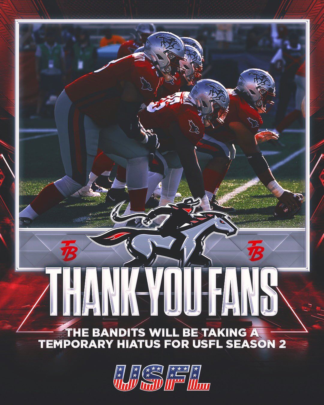
How shameful to bury the lede with that USFL news ; )
Wonder if there were venue issues in Tampa Bay.
Would have preferred to see a reimagined Jacksonville Bulls over the Showboats…I don’t care for this new color scheme or logo.
The host nation should’ve gone with this kit instead:
link
USA has the worst kit designs by a long shot. Just terrible. I hope Nike rights the ship by next year’s World Cup because even 4 stars won’t make those kits look better.
What are these Nike templates? They look like they have bibs on or something.
I’d argue the Dutch away is a dark blue, not quite navy, instead of purple, and point to the dark blue away kits Netherlands has had in the past (96-99) as something that does fit in their history
And France in navy isn’t “the classic primary look”. They Les Blues, they should be wearing the blue from the flag, like they did before Nike took over in 2010
Les Bleues used to wear a more royal blue during the time the kit was made by adidas, but that has nothing to do with the flag blue (which is navy).
the u.s white jerseys are a plain, fairly clean look….nothing special. the blue (with black print) just doesn’t very good at all and also not very patriotic, in my opinion.
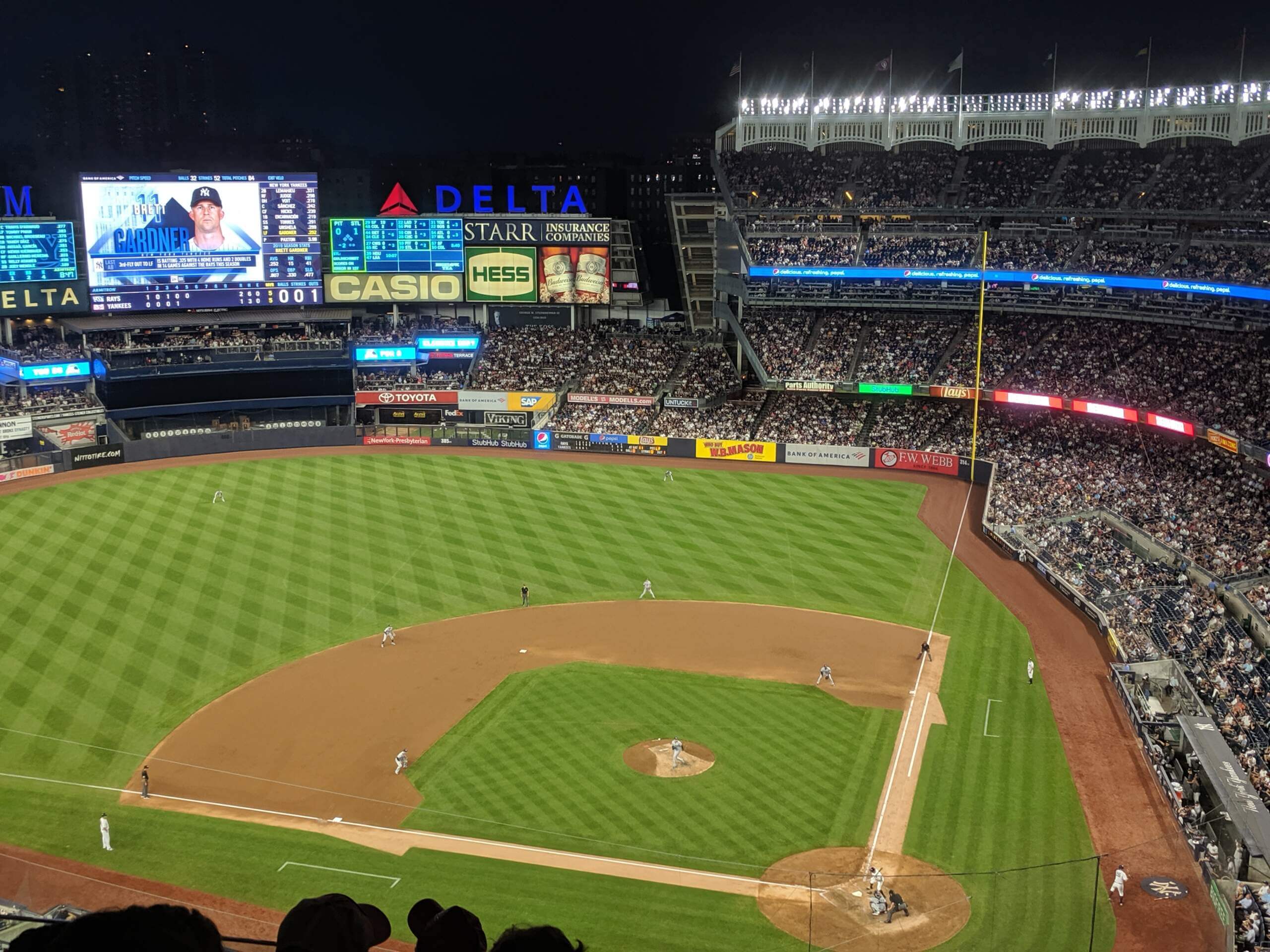
July 15, 2019. Tampa Bay Rays beat the New York Yankees 5-4, coming back from a three-run deficit in the top of the 9th.