
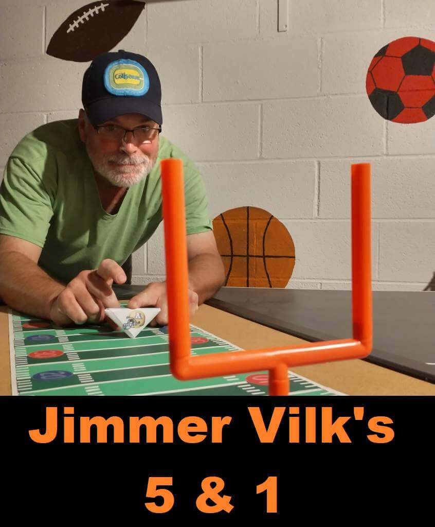
Jimmer Vilk’s 5 & 1
Welcome to the Five and One for 2022!
After more than a decade in hiatus, Jim Vilk (the original “5 & 1” decider) returned! And he’s back again for 2022.
The concept of the 5&1 is simple: Jim will pick five good matchups (not necessarily the five best anymore… he will have categories that will change from week to week) and one awful matchup.
You may agree and you may disagree — these are, after all, just opinions and everyone has one. Feel free to let him know what you think in the comments section.
If you have a game you feel is “worthy” of consideration for the 5 & 1, please either post it in the comments below or tweet Mr. Vilk @JVfromOhio.
Here’s today’s 5 & 1:
You have to admit, I’ve tried to roll with the times…with varying degrees of success. I don’t think every school should throw back to a previous look and stay with it, but there are times when I get nostalgic for a certain matchup. This weekend I hoped against hope that Purdue and Illinois would face off in early 70s uniforms so they would match my paper football.
If they had, it would have been All-Big Teen in my Big Five! So who took their place instead? Let’s get to The List and see.
5. The “Red (Pants) Alert!” Game:
Nebraska/Michigan
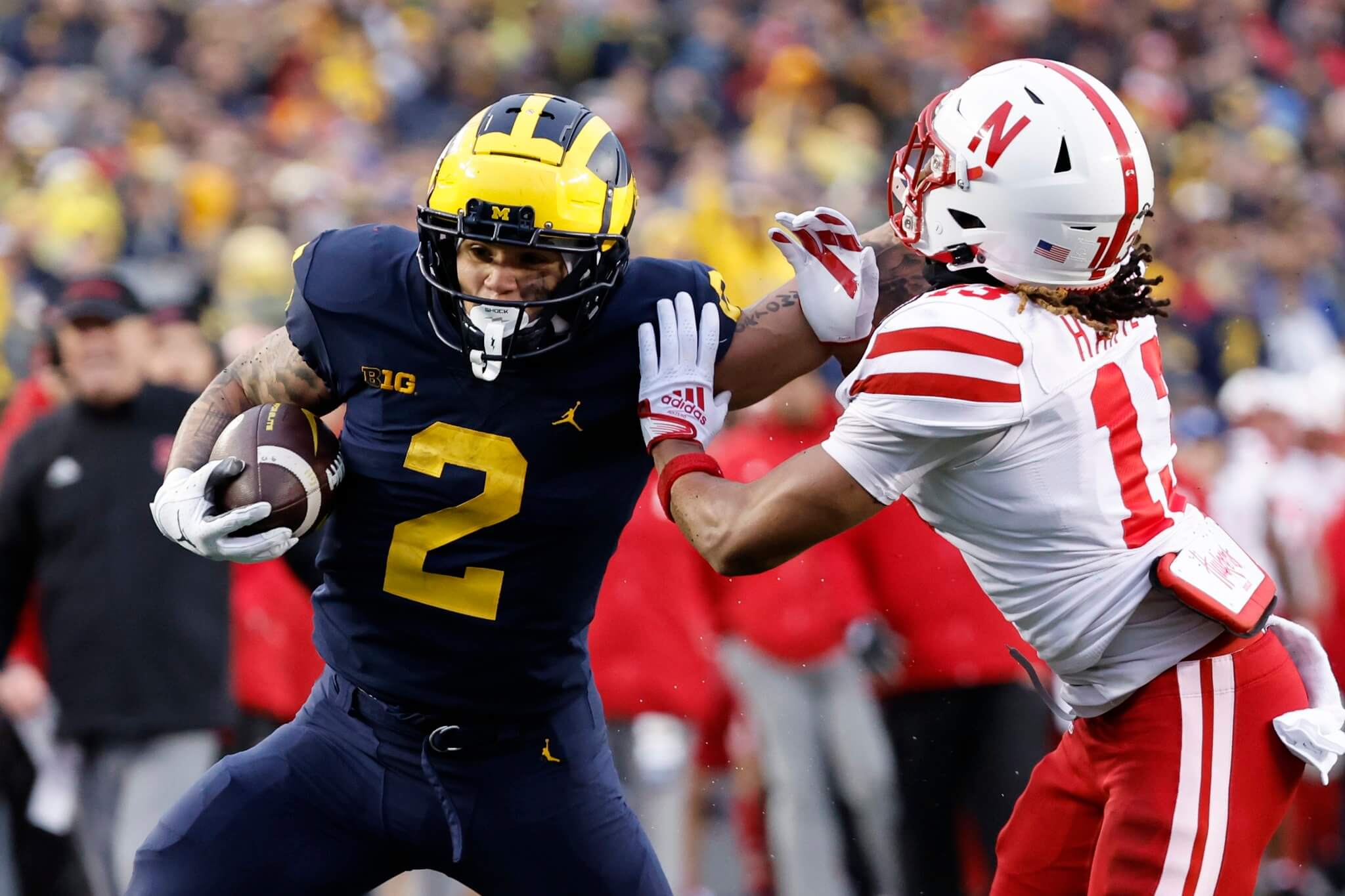
It’s amazing how bright, properly-sized numbers and one of the coolest helmets ever can take a simple blue uni and make it Listworthy.
4. The “Crimson (Pants) Alert!” Game:
Indiana/Ohio State
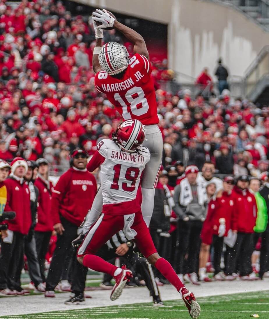
I usually highlight matchups with multiple blues, but this time I wanted to show off a multiple reds game.
3. The “You Knew The SEC Had To Muscle Its Way Into The List” Matchup:
Missouri/Tennessee
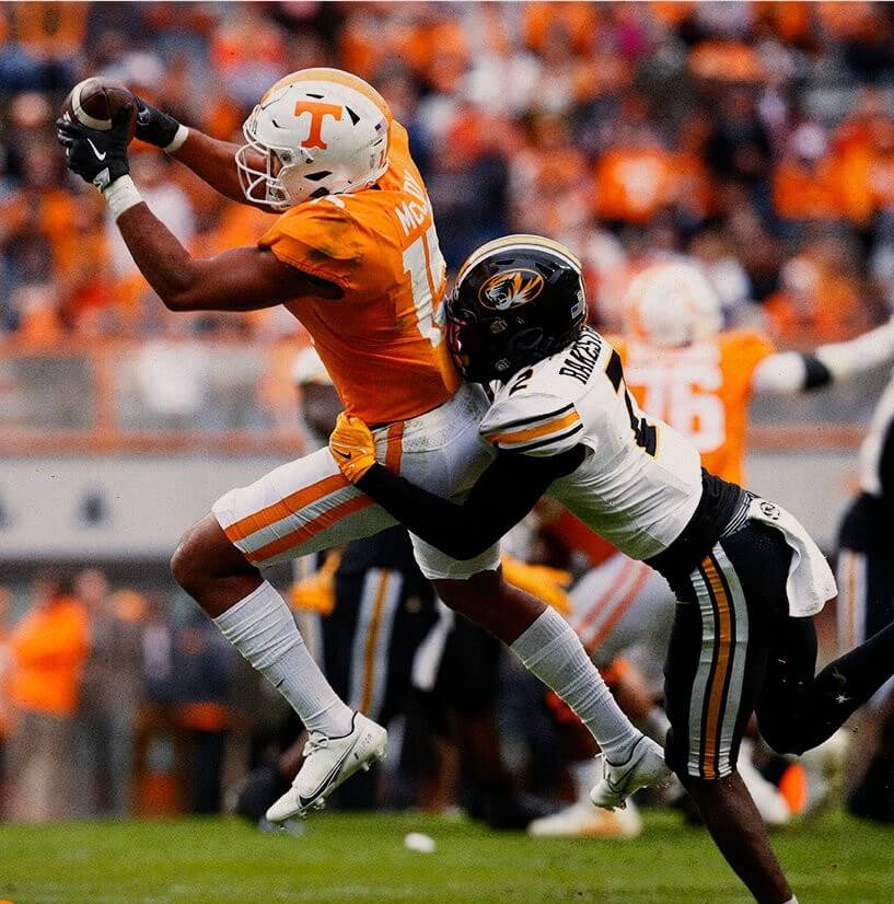
Nothing like a cloudy day to make those creamsicles pop!
2. The “Whoa! I Didn’t See This One Coming!” Matchup:
Northwestern/Minnesota
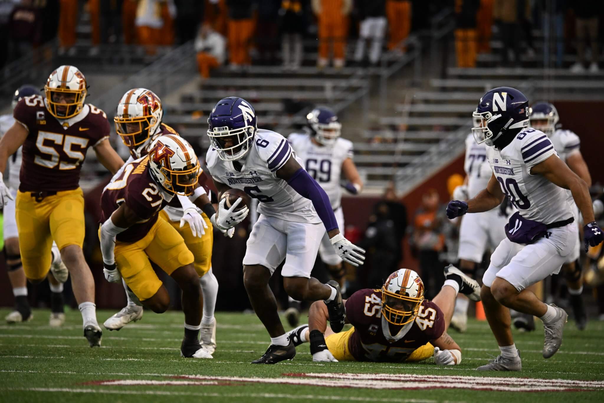
The Wildcats in actual team colors, and the Gophers in the best non-golden-helmet combo I’ve ever seen for them!
1. Simply The Best:
Maryland/Penn State
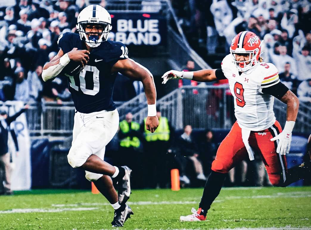
OK, the Terps are another team that should stay thrown back.
&1.
Tulsa/Memphis
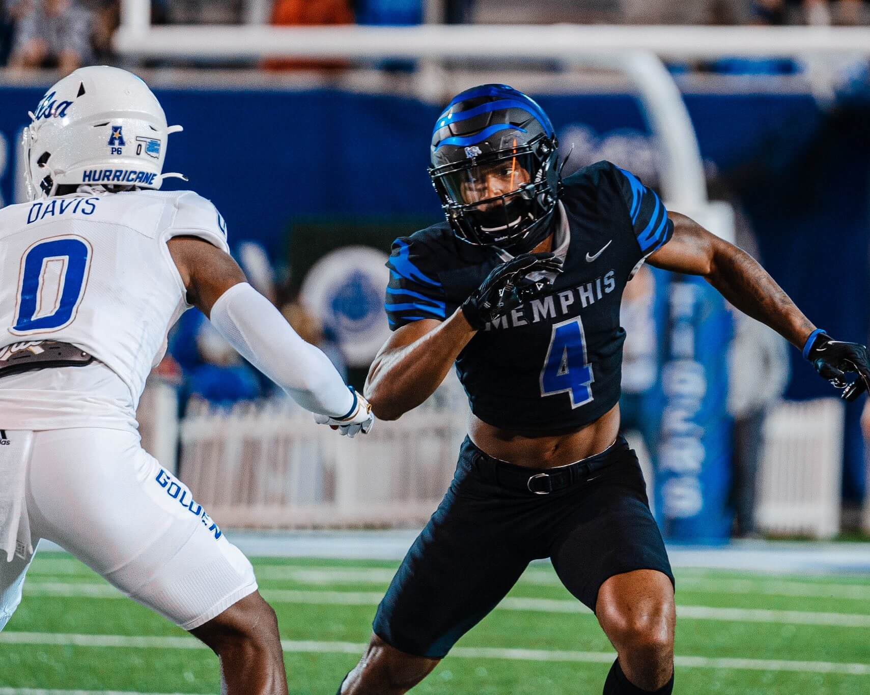
Coastal Carolina and Utah can breathe easy, because Memphis’ numbers were even harder to read than theirs.
See you next weekend!
Thanks, Jim! OK readers? What say you? Agree or disagree with Jimmer’s selections? Let him know in the comments below.
Jim, I have to throw in the Navy-Notre Dame game just because of the veterans and classic colors.
Way back, when Navy wore gold pants, I actually put this game in the &1 for looking like a scrimmage game. This was before the explosion of uniforms that we have now, so I’d never do that again.
The gold/blue/blue did look nice yesterday, I must say.
As for ND, if you’re going with a simple uni you have to have bigger numbers.
“Veterans” isn’t a jersey color or pattern.
It’s weird seeing my state school, not (Then Southwest) Missouri State – my alma mater, consistently showing up in the 5 & 1. I did like yesterday’s look, and I think Mizzou’s rear helmet bumpers are the best in the biz.
Almost wish we went there instead, eh Ben Traxel?
Those helmet bumpers, like your end zones, are top notch.
Wow! That’s the biggest Minnesota M I’ve ever seen!
Interesting look for Minnesota. Is that new? It does have a bit of a throwback feel to it. Some good-looking games in The Five.
Interesting insight on Michigan’s mono navy.
When I watched the game I was actually angry about it- how much better the game would have looked with the maize pants.
But Jim’s statement, “It’s amazing how bright, properly-sized numbers and one of the coolest helmets ever can take a simple blue uni and make it Listworthy.” Made me see the game in a new way— thanks!!
I think we can all (or most) agree, UM looks best when it’s wearing blue shirts over maize pants. However, the all-blue look can be improved tremendously when the team wears maize undersleeves and socks (link and link). When they wear all-blue everything, like yesterday (link), it’s not nearly as good looking (IMO). It’s amazing what a simple addition of a bright color to an all-dark uni can do.
Kind of shocked not to see the Tulane jerseys show up anywhere in the Sunday Uni Watch. Honestly my favorite combo of the weekend.
Indiana – Ohio State. Don’t break out red pants on the road against other red teams! This isn’t difficult.
I will never be on board with any Minnesota uni as long as they have that ENORMOUS contrast collar and that bad number font. They also mix in too much white where they should lean into the yellow. Most weeks they look mismatched to me.
Michigan seems like they are inching towards being a mono at home team. It certainly feels like they go all blue a LOT. I wish they would default to the yellow base layers if they insist on doing this. Actually, contrasting base layers would improve every mono uni in existence.
“Don’t break out red pants on the road against other red teams! This isn’t difficult.”
^^^THIS. ALL OF THIS.^^^
“I will never be on board with any Minnesota uni as long as they have that ENORMOUS contrast collar and that bad number font.”
^^^EVEN MORE SO THIS!!!^^^
The contrast collar is one of my favorite parts.
I wish Penn State still had theirs.
I’m not an Alabama fan, but I thought the ‘Bama – Ole Miss game yesterday looked really good.
That’s a good look for Maryland.
Stick to this style of uniform, Terps
I thought the Colorado State vs Wyoming game was also pretty nice. Both teams wen with their classic looks and I love the CSU helmet rams horns.
link
Almost put them on the list but CSU has tiny numbers. That’s a deal breaker for me sometimes.
Do you hate those Minnesota not-so-golden-gopher jerseys as much as I do… er no? The wide white collar neck, good God all Friday! Reminds me of the butterfly collar shirt my great-uncle Hiram has been wearing to Thanksgiving since 1975. It’s like fellas you’re primary color is maroon, which is actually a very nice athletic color. How’s about maybe you row the boat to the sports store and buy new jerseys, hey.
I loved this particular combination.
2nd best look ever, after the 1976 uni. Actually, Saturday’s combo might be tied with ’76.
Big contrasting collars, nice sized numbers, big logo…what’s not to like?
In all seriousness, to me they look tacky. The extra-wide white collar combined with the barely-there white/gold cuffs and the white on lighter than traditional athletic gold numbers. It gives the visual effect of lifting the maroon to a burgundy (cardinal) shade.
I can get behind the 1976 uni, though. They’re used an old gold – maybe like a Pitt gold – for the pants and the top color on the numbers. And the sleeve stripes, oh the glorious sleeve stripes! That’ll get you saying Ski-U-Mah!
I can generally see where you’re going on the 5&1 but there are 2 major fouls here.
1. Monochrome is a bad idea almost always, even stormtrooper white sets. Michigan monochrome is an abomination.
2. Minnesota has no business being anywhere in a Top 5 so long as they continue the a) gigantic helmet logos, b) awful number font, c) poor mixing of white as a trim color, d) underuse of gold (ya know, GOLDEN Gophers), and e) whoring out of the university’s look as a vehicle of the coach’s personal brand and campy mantra.
I’m with you on e), and a little bit on d).
I’d prefer the Golden Gophers to have a golden helmet, but the white is a nice second option, especially since they looked so good many decades ago with white helmets.
Not a huge fan of mono, but if one team is doing it in a game, I can roll with it. Actually, icy whites are my least favorite monos, especially in the snow or in the sun.
Absolutely the perfect #1 pick of MD vs Penn State. I saw those game highlights (or lowlights for the Terps) and it hit on all levels —- retro, color balance, no crazy logos, ultra clean. Well done!
Didn’t even know the Terps were throwing back til I saw the game. As soon as I did I knew I had my # 1.