[Editor’s Note: Paul is on his annual August break from site (although he’s still writing his weekly Bulletin column and may pop up here on the blog occasionally). Deputy editor Phil Hecken is in charge from now through the end of the month.]
Good Wednesday morning, Uni Watchers. I hope your week is going swimmingly.
One of (the many) things that first attracted me to this blog — aside from Paul’s outstanding writing, researching and attention to detail — was the fact that so many of you readers Get It™. I believe I’ve mentioned this before, but I have been diagnosed with a mild form of OCD, and I always enjoy articles and comments where others’ obsessive study of athletics aesthetics often more than satisfies my OCD. You guys pick up on sooooo many things I too have noticed, but haven’t really given as much thought to. It feeds my jones, man!
Today’s guest, Rob Van Nuise definitely Gets It™ — as you’ll see shortly. I’ve told you before I’m not a helmet guy…but I do appreciate symmetry. So when the newer (safer?) helmets began appearing on football fields, there was something about most of them that bothered me a bit. I wasn’t sure what it was, I just knew something was “off.” As soon as Rob pitched this piece to me, I instantly “got” what was off. It’s this obsessive attention to detail that makes me love Uni Watch.
I’ll let Rob take you the rest of the way …
by Rob Van Nuise
This all began for me with a Tennessee Titans game in 2018. I tuned in that Sunday afternoon, not because I’m a Titans fan, but because I wanted to see their new uniforms in action. I had already seen the “Corporate Titans” look, as I called it (so much dark blue!), from their unveiling event and media photos that off-season. How they looked on the field and in motion, was going to determine if I liked the change or not. I was distracted though.
What was going on with their helmets? Is that helmet decal crooked, or off-center?
Let’s back up a second. I’m going to assume that we are all for advancements in player safety. Yes? Of course!! If you’re reading this though, the look of the helmet is important to you as well. If you’ve been distracted recently by asymmetrical logo decal placement, then you are not alone.
What was distracting me that Sunday in 2018, was the latest wave of next generation helmets making it onto the field. Tennessee’s circular “T” shield decal, normally centered in the middle of the helmet, was now pushed towards the back. It looked awkward, sloppy, and I couldn’t unsee it.
These new helmets, compared to old models, have vents, creases, oddly shaped ear holes, and most importantly (for this article), new anchor points for face masks and chin straps. The smooth, rounded, clear space for the helmet logo decal had been encroached upon. What was once an occasional annoyance is now a big problem, as every year brings more players wearing these space-hogging helmet designs. Hopefully, by pointing out the problem, we can take a step closer to a design solution.
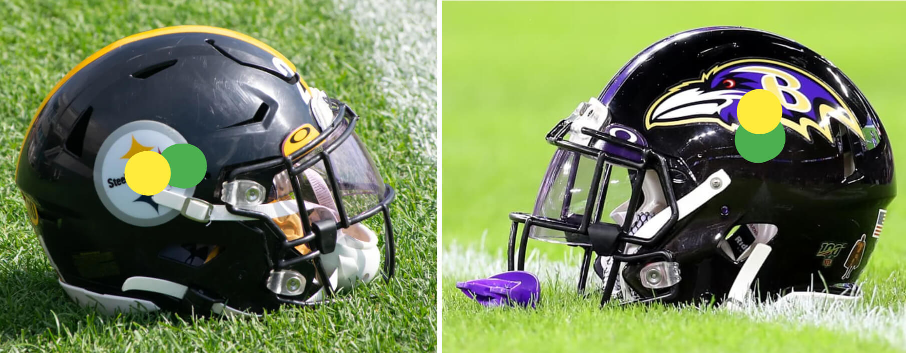
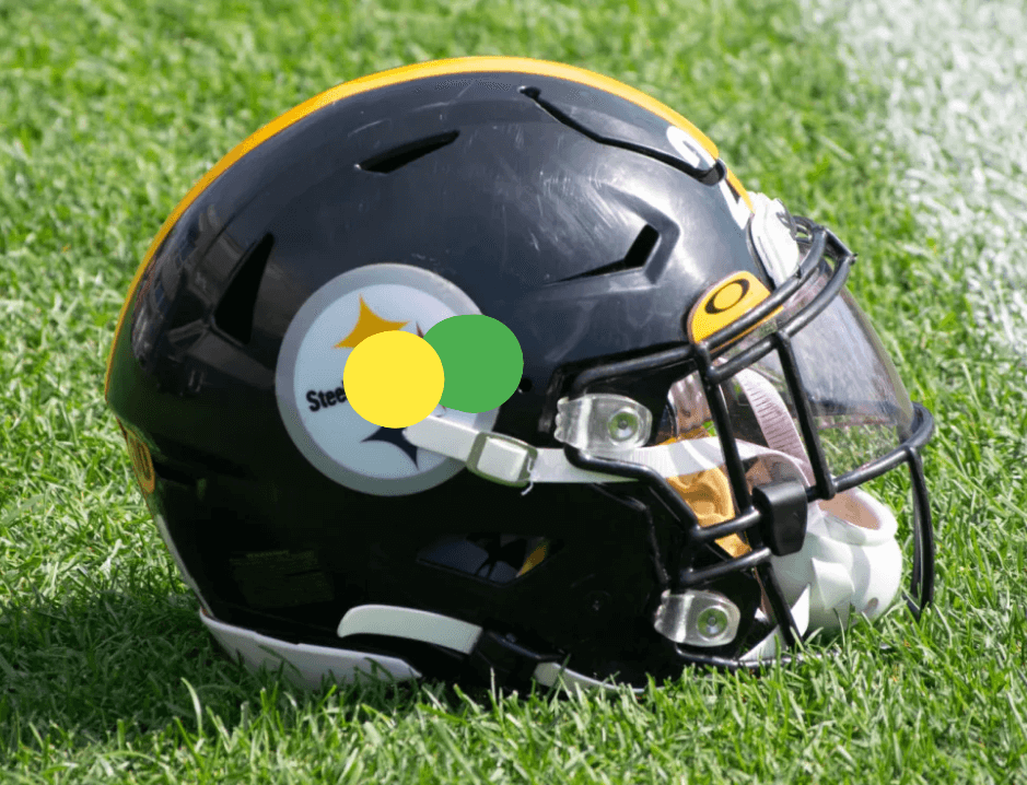
What’s that?! You need some visual evidence? So did I actually, so I marked up some example helmets to prove it wasn’t just my vision going. On these examples, you’ll see green and yellow dots. The green dot shows the “center” of the helmet. This should align with the center of the logo decal. Since it doesn’t in many cases, the yellow dot shows where the logo center actually is. Let’s take a look!
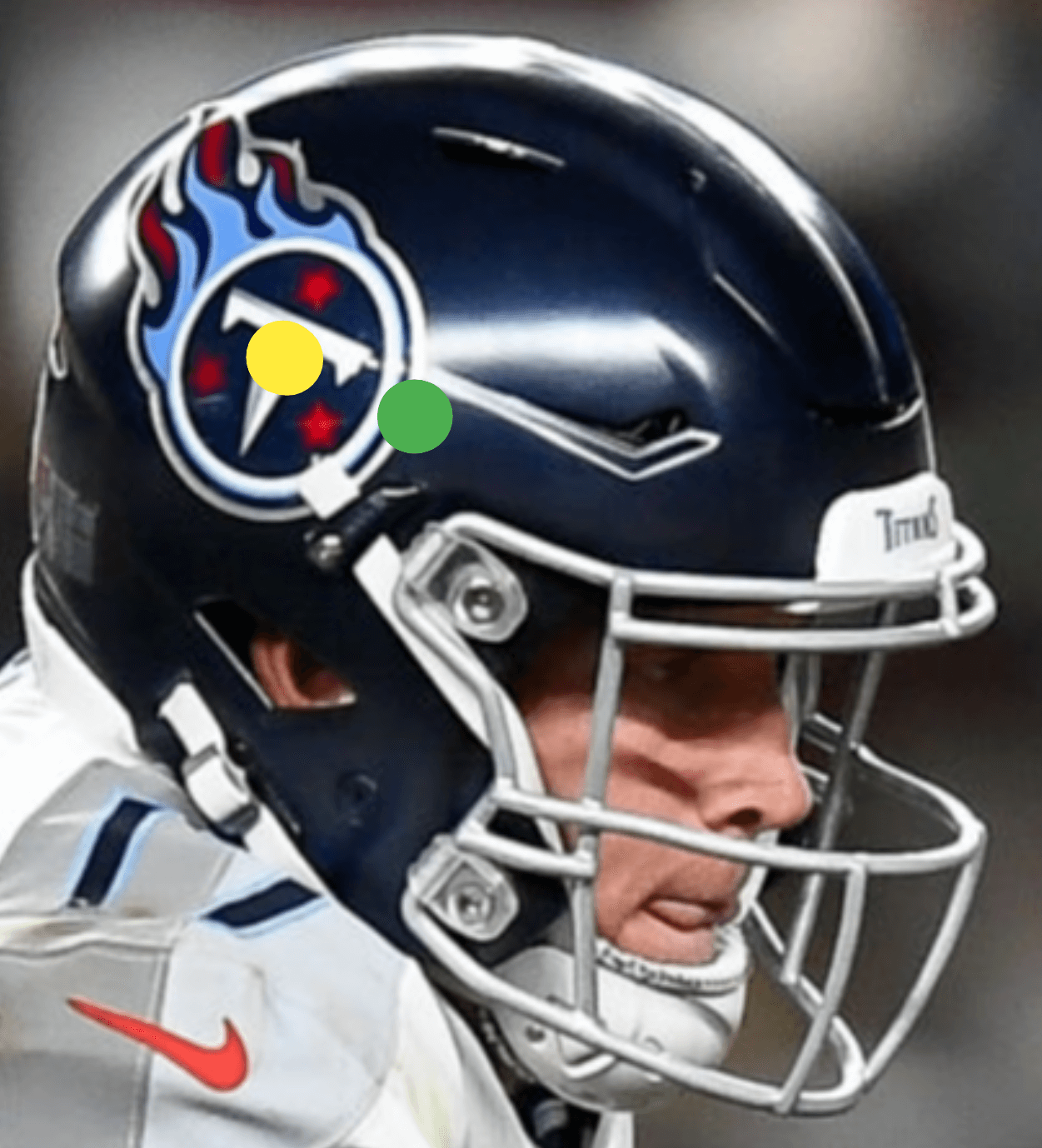
You know, it turns out that the Titans are actually a great “next generation” before & after example, so we’ll start with them. See it now?! Yikes! It looks like a kid just slapped the decal on there. It’s smashed to the back, leaving a vast, “corporate blue”, void.
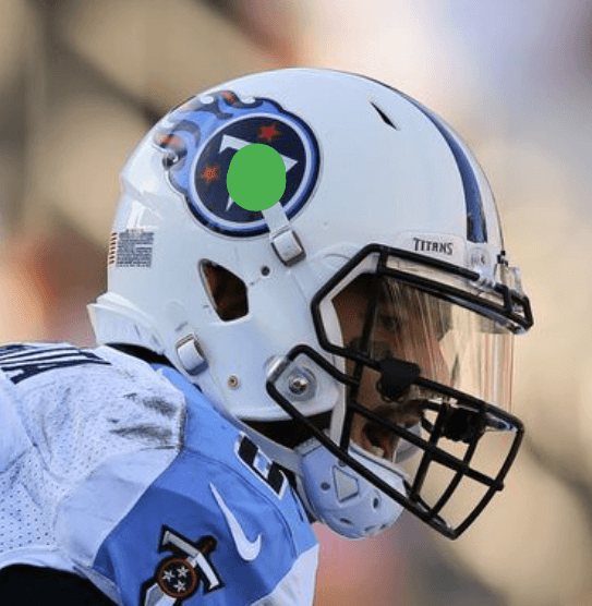
Here’s the Titans helmet before, and it’s very close! Those team equipment guys have a ton of decals to stick, so I’m not asking for perfection every time. This is good enough for me.
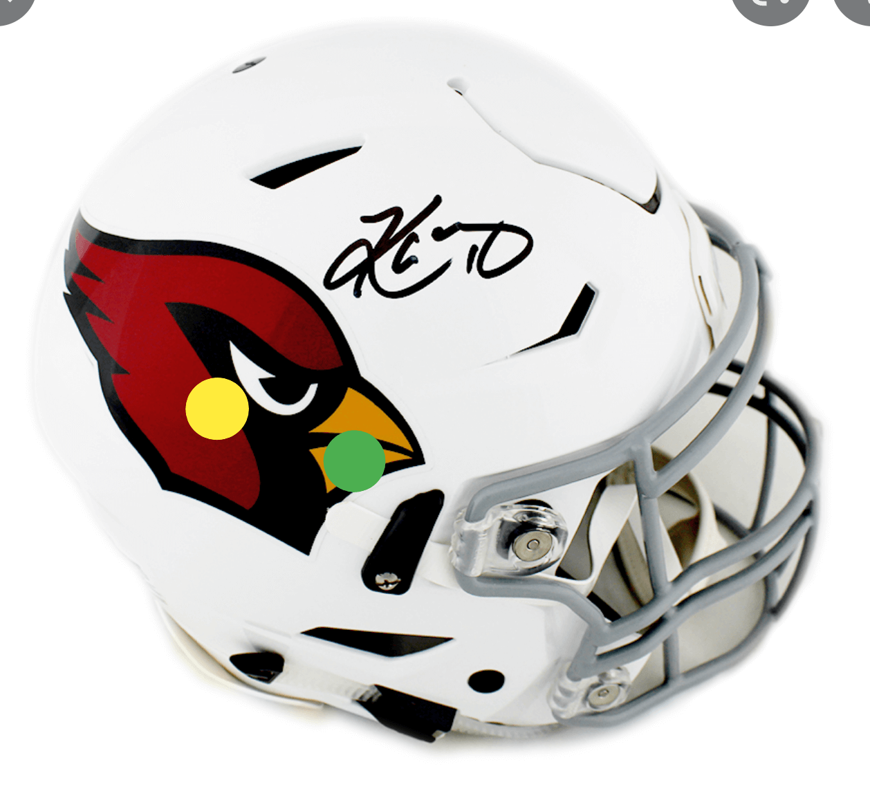
Taller logos have the most trouble, as they’re confined vertically. The Cardinals decal is deceivingly tall. Combined with the length, there’s no choice but to push it back until the feathers almost touch each other at the back. Awful.
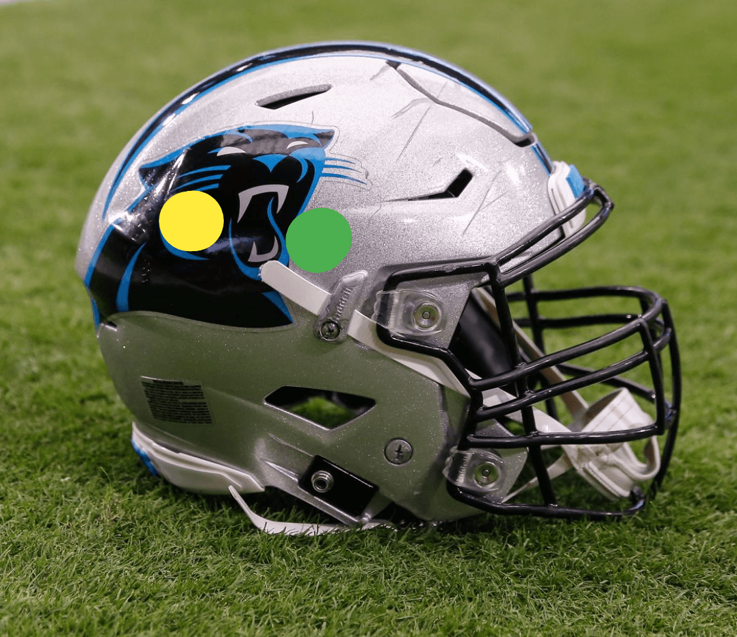
No helmet back has ever been more crowded than the Panthers! The necks of both Panther decals and their odd, curvy helmet stripes, all converging. Quite a mess. Meanwhile, the front-half is almost empty. Hopefully, Carolina addresses this on their long-overdue redesign. Please!
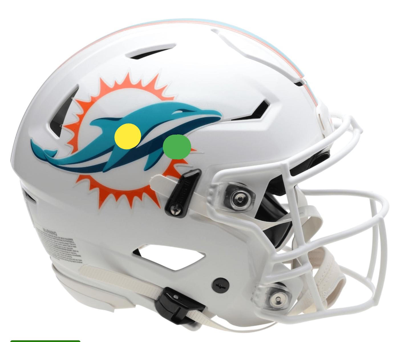
Round logos should be easier to center, of course. Symmetry! Concentric circles! The Dolphins sun is a circle, so it should be simple to just… never-mind.
Ok. If any team can get this right, it’s the team with only one circle to stick. Damn! Close, but still distracting.
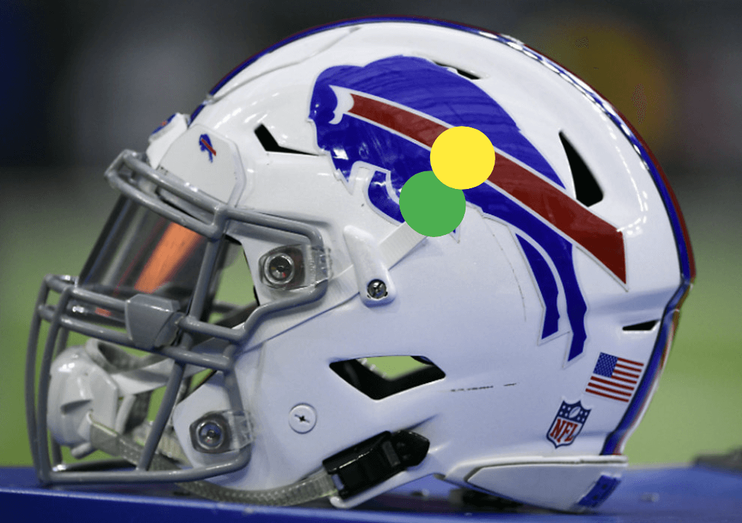
To my surprise, longer, sweeping logos often have an easier time with placement. Moving the decal up doesn’t damage the look much, and for Buffalo, the only way to go is up. You pass.
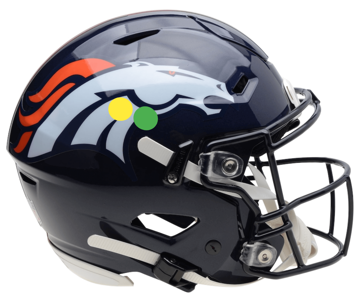
Similar to the Bills, the Broncos just have to raise the decal some. Note that in this example, the decal had to come back a bit too, due to the helmet vent near the horse’s nostril. A different helmet model could be a different situation.
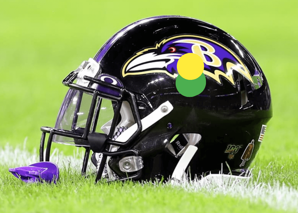
Baltimore is possibly the only team where you could argue an improvement. Moving the bird up (out of necessity) actually highlights the similar curves of the helmet and the logo. What luck! Looks good.
I hope you guys enjoyed this as much as I did. Let Rob know what you think in the comments below.

Fantastic post by Rob. It’s the number one pet peeve I have with these new lids. I know you focused on the NFL but the stuff coming out of D1 football is cringe inducing.
Thanks!
I hope logo design doesn’t respond to helmet design. That is a terrible case of the tail wagging the dog.
That said, the panthers did just that with their alternate helmet. The logo is much smaller and appears to be cowering in the top back curve of the helmet.
I know new helmets are designed with safety in mind (though aren’t all helmets designed for safety by… we’ll… by design?) but i really don’t think the sculpting and vents and anchor points are doing much in that regard. I tend to believe that most of that stuff serves to make the helmet look more “badass” in the sales pitch.
Think of a plain old-school helmet on a shelf next to a plain speed flex helmet. One looks kind of like a swollen toe and one looks like master chief from halo. Of course players will go for the space agey combat robot thing. Logo placement and decal application issues be damned.
I don’t believe for a second that the manufacturers can’t leave 10-15% more of the helmet’s side smooth and unadorned with extras to allow for proper logo placement. I surrender to the “collision panel” thing in front impeding the stripes. THAT is on the equipment team to cut and apply the decal with more pride and attention to detail.
I completely agree from an aesthetics point of view. And I would presume that there is at least a degree of overexaggerated badassery to give the helmet a distinctive contour. (This is no different than Nike wrecking NBA jerseys with the cuff striping and mid-hip notch, neither of which make the garment perform better.) But I would think there is a scientific argument that some of the Master Chief effects disperse the force of a direct hit peripherally rather than through the helmet into the skull.
100% agree. I know that there are “design elements” that are in fact functional necessities toward making the helmet more protective, and I will have to accept those, but I do believe there must be a way to create a little bit more smooth uninterrupted surface on the side of the helmet.
This article does a great job showcasing the fact that there isn’t really an easy fix though. Given that players can choose from a few different helmets and each helmet offers a slightly different surface area to fit the logo into (the NFL is the most fraught league in this sense with custom sleeve tailoring creating a similar issue, and with unique non-stripe pants trim, the bike shorts trend causes certain teams issues there as well).
Another issue is that some logos are just too big or not shaped in a way to be truly centered. I like the size and shape of the broncos logo and I think the placement is fine, but there’s no way it could be placed on true center on any helmet without running afoul of a helmet feature or two. And it looks better where it is anyway.
As for Nike’s blasted NBA sleeve trim: that is all Nike corporate stubbornness. No way anyone is noticeably more efficient on the court because their sleeve trim only goes 3/4 of the way around the hem.
Really good point here. You’d think they’d have to really sell the reason behind all of the vents and cracks and so forth that will alter or obstruct logos and appearance, especially to leagues where branding is so important. If they’re a necessary element though, I’d prefer new team designs to adapt to fit them.
I think it’s not just a desire to appear “badass” that is driving the trend toward placing a vent or ridge in every available square inch of shell space. I believe there’s an element of “maker’s mark” branding involved on the part of the helmet manufacturers. Coming up with a novel, funky shape/look for the latest helmet — whether or not it adds to safety — seems to be a priority. And, that’s not a good thing.
If the tradeoff for off-center helmet decals is improved player safety, that’s a deal I’ll make every time. To be honest, your article is what made me aware of it. We all have our different wheelhouses, you know.
I don’t think Rob’s arguing for less player safety, only that the decals can be better aligned on the helmets.
Didn’t notice this before today, and I have to be honest…it doesn’t bother me.
Hopefully they don’t start putting logos over the vent holes then slicing holes in the logos for the sake of centering them.
Agreed. Ultimately I think it looks better if the logos are placed around the vents and cracks instead of going over them for the sake of centering the logo
All these team logos will be replaced by (increasingly larger) helmet ads in the long run (say, within the next 10 years), just like the current helmet ads in the NHL (and future batting helmet ads in MLB). Team logos will be moved to the front, centered above the face mask in a much smaller size. The Browns have been unknowingly visionary in this regard: this space for rent! I know it sounds totally ridiculous but just wait and witness.
I hope you’re wrong on this.
One clear difference between football Henry’s and hockey helmets is that the helmet has always been one of the primary means of team identification. Some teams just used their helmet as their primary logo. Football teams never had large, gaudy logos or wordmarks on the jerseys like in the other major North American sports; the front of the jersey was a player number. And team jerseys were fairly standard without a lot of variation and the color palettes were generally similar. The hockey helmet was never the team’s primary ID. The crest on the front of the sweater does that, and still does.
Totally agree with you, but I am bracing myself for the worst. The NFL has repeatedly stated that there will be no ads on uniforms, but with the other pro leagues having ads (or preparing to have ads in the future) it will only be a matter of years before the NFL owners give in, I am afraid. And I agree, helmets are part of a football team identity, but I can somehow see a helmet ad come up, maybe inspired by NASCAR helmets. NASCAR fans buying tons of merch with corporate logos plastered over their favorite driver and his car is the ultimate dream of any pro team’s marketing department anyway.
The placement bothers me, but the methodology for suggested fixes doesn’t work for me. The “geographic center” of the helmet need not be the placement point for logos, especially non-round ones – you even mention that the Ravens’ logo looks better higher on the helmet. But too many are drifting back and up to avoid vents and, it seems, those chin strap attachments. Just move most of them forward a bit and then attach the straps. That seems to be at least a compromise.
Some teams are non-centered by design, like the Eagles. Maybe the Seahawks too. Not sure where to fit the Rams and Vikings on this.
Good examples of non-traditional designs, that I could see more teams contemplating on future redesigns.
Thank you for showing that particular side of the Ravens helmet. The slanted B sucks on that side. I’m all for removing the B from the logo and “toughening up” an already mean looking raven head.
Yep!
I’ve always liked their alternate Raven head so much more… sadly it’s a straight on look and doesn’t achieve the whole “it’s a raven flying forward” shtick.
Re: Cardinals –
I always thought the original/better logo was designed so the feathers were ‘supposed’ to be almost touching or at least visible from the rear(which I like):
link
link
link
That last link possibly explains why the logo had that crescent at the bottom…to paraphrase Dave’s comment above..”logo design responds to helmet design”?
Never liked whatever the dolphins have done once they got rid if the “dark teal” and the dolphin with a helmet on logo. That light teal was hard to watch on television, and I am not sure if that is a dolphin logo or a monorail!
I’ve been baffled that I haven’t noticed this discussed here before (maybe it had and I missed it), because it’s a uni element that absolutely drives me nuts. First noticed it with the “U” on Miami’s lids years ago and thought it looked totally derpy. I’m of the mind that the new helmet designs with all their holes will and should influence the aesthetics of the helmet. Think of how teams did that way back in the leatherhead days. I don’t expect entrenched designs to change, but any time there’s a redesign, I would think they’d take the holes and gaps in mind. Might be a good Uni Tweaks exercise…
I’ve noticed this placement problem the most with the Vikings. The horn front used to be closer to the temple but now, with some of the new helmets, seems to start right above the ear. Just distracting. As an aside, I think a lot of these slots, holes, bumps and other characteristics of the new helmets are not really for safety considerations as much as trying to make a helmet design distinctive, to help them stand out in the marketplace.
As much as the off center on the helmet is a distraction, the decals going over the holes seems to be a bigger one for me. Just will never not look odd when you see part of the decal hanging over an open hole, on the helmet, not attached to anything.
Preach. That’s on the equipment department.
Coincidence this topic was presented today as I just decaled a number of my HS football teams helmet’s and had some thoughts about decal placement. Here is what I can offer: There is a significant difference in ‘clean’ space between a size medium helmet and a size XL, that shouldn’t effect decal placement much, but it definitely changes landmark points of to give similar placement on all helmets. If I recall, there was a school (perhaps San Diego State) that tweeted a photo years ago, of two differently sized helmet logo based on the helmet model. I’m not sure if this ever became a thing in the industry but might be worth considering. A Speedflex and Axiom have greatly different surfaces areas and a ‘compressed’ logo might be a better option.
Great insider info! I can see teams taking this approach if they are inflexible about any other modifications.
Compressing logos may be the way to go with these helmets, I agree.
I will say, this doesn’t tend to bother me except for the Steelers because their logo is so small and circular that it is noticeable. But even then, it’s limited to just one side of the helmet. Also another reason I think the Bengals have the best helmets in the league, they are impervious to any cuts made in the helmet.
-Alex
The more I mull this issue over, the more I tend to agree with you.
Certain logos (broncos and bills off the top of my head) actually look better off center because, for example: the broncos logo is huge and has a clear uniform curve to it that looks better closer to the top curve of the helmet so that all the curves line up better (ditto: ravens). The bills logo has most of its “weight” up high and way forward and it has a lot of motion so it looks nicer if it’s “leaping” over true center. Other teams look like they absolutely could afford to move at least a little closer to center if they wanted. The most common issue seems to be placement of the extra chin strap material near the temple potentially obscuring part of the logo, as opposed to a surface area issue (which comes in to play mostly on the helmet with the mask mount way back on the temple as in the titans off-center example).
Long story short: some logos look better off center and some teams seem to be choosing not to place logos at least a little closer to center. But super interesting rabbit hole. Obviously we could all go in about this for a while.
Great article, Rob! Does anyone have insight into why the decals are decals at all? Can’t they be printed into the paint of the color somehow? I have no idea how this would work, but just asking. Also I realize the vents may produce some weird holes in the middle of the graphic.
Sorry to be pedantic but the centre of the Titans logo isn’t the centre of the shield containing the T, the silly flames coming off the top left mean you need to account for the weight of that to find the true centre. I’d say it looks like a kid designed the decal *and then* slapped it on the helmet
Not the NFL, but an especially egregious example is the CFL’s Ottawa RedBlacks. It looks from my POV that the logos on each side are so high up on the helmet that the tops of them almost touch at where the center stripe would go (the RedBlacks’ helmet doesn’t have center stripes.)
Especially odd about Ottawa’s logo, though, it’s that it’s *always* been unusually high, regardless of the type of helmet it’s on.