By Phil Hecken
Follow @PhilHecken
Good Saturday morning, UWers — I hope everyone had a good week. It’s Independence Day weekend (usually short on uni news), but not today, as the San Diego Padres made a “vibrant” splash yesterday as they unveiled their “City Connect” (CC) uniforms. They are the seventh, and final, team to introduce a CC this season. Mercifully.
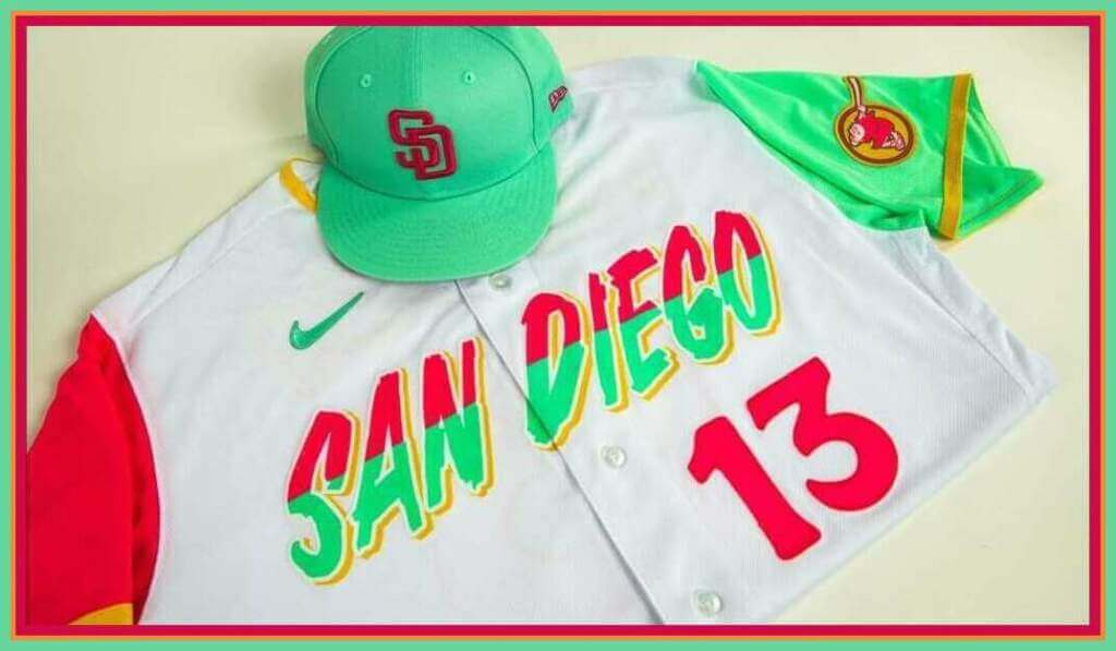
As you can see from today’s splash photo, the jersey (a white base with bright fuchsia, seafoam green and gold colors) and cap contain colors heretofore not seen on a Major League jersey. I can already tell this is going to be one folks either love or hate — and I don’t see much “in between.”
Normally, when I review a new uniform, I load you up with photos and details and then conclude with the “hype” video. Not today. I’m actually going to start with the team’s promotional video, so that you can get a good chunk of the storytelling out of the way. Get ready to get your Santana on!
Skateboard legend and native San Diegan Tony Hawk intones, “Oye cómo va: listen to the rhythm. That’s what San Diego is all about … and, of course, the Padres. It’s about the vibrant sunsets, the cresting waves, the colors of our combined cultures and the best street tacos you’ll ever eat.”
The “binational” or “combined cultures” Hawk is referring to are of course San Diego and Tijuana — two diverse cultures with residents from both cities daily trekking across the border to work and play.
Let’s take a closer look at the elements of the uniform.
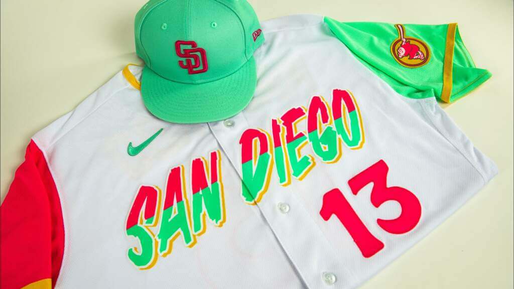
CAP:
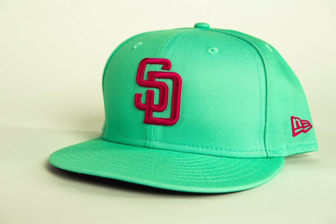
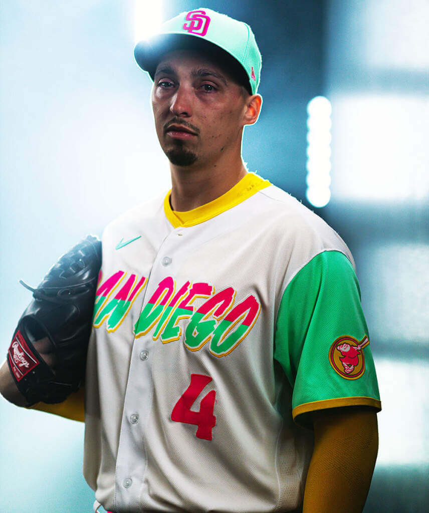
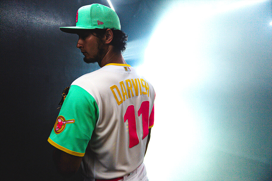
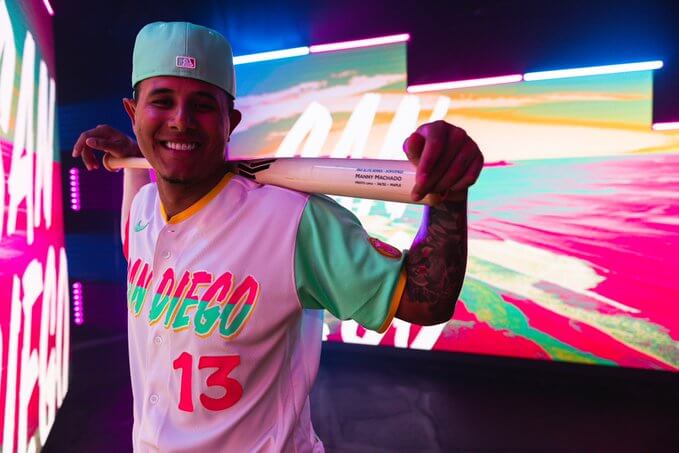
It’s seafoam green, with the team’s interlocking “SD” logo rendered in fuchsia. For a set of uniforms (CC in general), I’m wondering how “hot” a seller the cap will be. It’s certainly unique. And they have a matching helmet.
JERSEY:
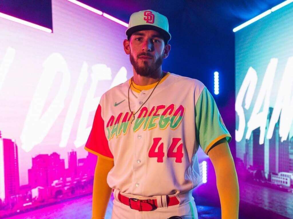
The jersey is white, with the right sleeve in fuchsia and the left sleeve in seafoam green. The sleeve also features the team’s “Swinging Friar” logo patch, with the friar rendered in gold and fushcia.
Here’s a closer look at the patch.
As you can see, both sleeve ends are trimmed in gold, and there is also gold around the collar.
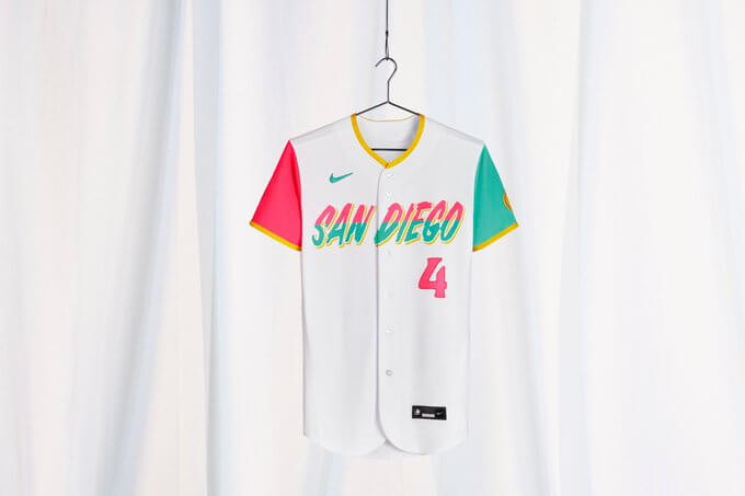
The words “San Diego” are in a bespoke font face, and rendered in fuchsia and seafoam, with a gold block shadow around a white outline. There is a front uni number, also in a custom typeface, on the lower left side of the jersey, and it is fuchsia as well.
If you’re curious about that “San Diego” font, the typography is intended to remind fans of “weathered beach signs,” the team said in a news release.
The back of the jersey features player NOB in gold, with the same fuchsia numbers as found on the front of the jersey.
PANTS:
In what is a MLB first (at least as far as I can tell), the pants feature different color striping: fuchsia running down the right side, with seafoam green down the left:
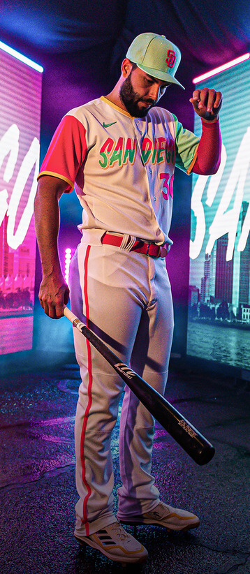
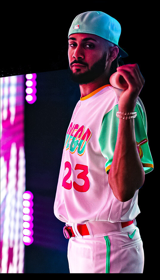
Players are pictured wearing fuchsia belts.
SOCKS:
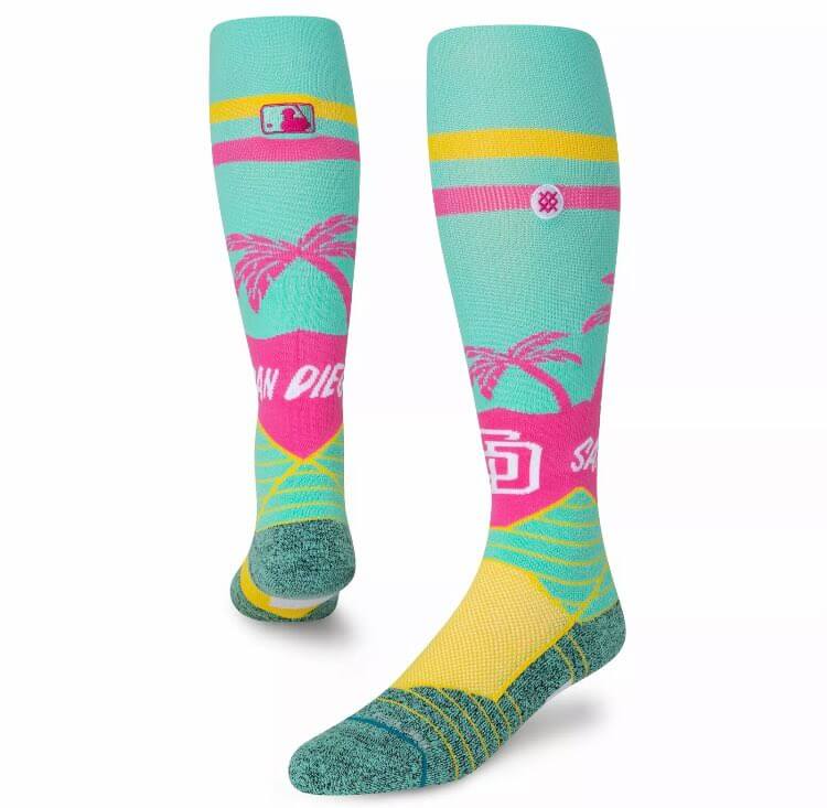
These were leaked back in March, and have been confirmed as legit now.
At the top, I mentioned that folks are probably going to either love or hate these uniforms. I’ll reserve final judgment until I see them on the field, but I fall into the former camp — I love these. But there’s also a lot not to like.
Throwing out the storytelling (which is nigh on impossible when dealing with CC uniforms, as they’re basically built on that entire premise), I try to judge the CC’s strictly as a uniform. What I like about these is simple — and it’s my primary driver when evaluating almost any uniform: the colors. Yes, good design is important, and if the colors are great but the design sucks, that won’t sway me towards liking a uniform. Conversely, if the colors are “bad,” but the design is good, that won’t consign my opinion to disliking it.
When dealing with CC uniforms, we have to scrap the concept of “team colors” completely. So, while a brown/gold uniform might have been a good way to go, it doesn’t matter here. What I love about the uniform IS the “vibrant” colors — and their uniqueness on a baseball uniform. I happen to LOVE fuchsia, and think it is a sorely underused color in all sports. Pair it with gold and seafoam green, and you have a fun-looking uniform.
Now for the dislikes — I’m not a big fan of the “weathered beach sign” font, and even less enamored with the top half in fuchsia and the bottom half in seafoam. The gold drop shadow isn’t really visible unless one is up close. Normally I would HATE HATE HATE the fact that the sleeves (and pants stripes) are rendered in different colors, but here (especially with the bi-color word mark) it works. I’m surprised the cap didn’t have either a fuchsia brim or crown to match. Maybe the powers-that-be thought that would be “overkill.” The whimsical number fonts actually look pretty good.
I’m also not a fan of the NOB rendered in gold, but only because I’m not sure it will be all that legible from the stands.
Here’s a couple more views of the uniform:
The team will debut these uniform on field next Friday (July 8), and will be wearing them every home Friday game for the remainder of the season.
And here’s one more video showing additional views of the uniform:
Blake's on the bump today, so we had to show off him rockin' the new City Connect threads.@snellzilla4 x @nikediamond pic.twitter.com/Xq5DRcFGyG
— San Diego Padres (@Padres) July 1, 2022
Mercifully, the CC program has completed its run for 2022. So far, 14 teams have been outfitted, which means that — if all goes according to the timeframe announced by Nike and MLB — next season sixteen teams will be getting new CC uniforms, so this is really just getting started.
Of all the CC uniforms unveiled so far, I won’t say this one is my favorite, but I can appreciate it as a uniform. While it “helps” that the team explained where the colors come from, it can still be enjoyed even if that were unknown. It’s certainly more “out of the box” than most (all?) of the other unis — whether or not that portends even more ridiculous far-out uniforms for the remaining 16 teams remains to be seen.
What do you guys and ladies think?


Guess The Game…
from the scoreboard
Today’s scoreboard comes from Christopher Snizik.
The premise of the game (GTGFTS) is simple: I’ll post a scoreboard and you guys simply identify the game depicted. In the past, I don’t know if I’ve ever completely stumped you (some are easier than others).
Here’s the Scoreboard. In the comments below, try to identify the game (date & location, as well as final score). If anything noteworthy occurred during the game, please add that in (and if you were AT the game, well bonus points for you!):
Please continue sending these in! You’re welcome to send me any scoreboard photos (with answers please), and I’ll keep running them.
And now a few words from Paul: Hi there. I have a few items I want you know about:
1. My Bulletin column this week looks at the best throwback options for each NFC team, now that the one-shell rule has been lifted. (My picks for the AFC will follow next week.) My premium subscribers can read the NFC piece here. If you haven’t yet subscribed, you can do that here (you’ll need a Facebook account in order to pay). Don’t have or want a Facebook account? Email me for workaround info.
2. Last year’s MLB All-Star Game uniforms were a bad joke, and the early hints are that this year’s won’t be much better. Obviously, the best solution would be to go back to having the All-Stars wear their regular team uniforms, but MLB and Nike have apparently turned their backs on that option. So our latest Uni Watch design contest challenge is to come up with some MLB All-Star unis that, you know, don’t suck. Full details here.
3. In case you missed it on Monday, we’re once again partnering with Grey Flannel Auctions to offer free, no-obligations appraisals of your sports memorabilia items. If you end up wanting to consign your items with GFA, you can do that as well, but that’s totally up to you. Full details here.
Okay — now onto the Ticker!
Uni Watch News Ticker
By Anthony Emerson

Baseball News: The Phillies honored the retiring Albert Pujols the other night, with former Phillie Ryan Howard part of the festivities, wearing an old Majestic jersey. Maybe it’s one from his playing days! (from Bob Novotny). … Root Sports depicted the Mariners scorebug logo in pride colors on Friday (from Nick Mueller). … First time ticker-submitter Simon writes, “my good friend Jorge Vargas just opened his own private counseling practice. In addition to being a therapist, he’s a talented poet and visual artist, and he designed his own logo, with obvious inspiration” (from the Dodgers).

Hockey News: A mechanical engineer has developed a new design for a goalie cage, inspired by bulletproof vests (from @wafflebored). … The WHL’s Everett Silvertips have unveiled a 20th anniversary logo (from Wade Heidt).

Soccer News: Here’s a fascinating story about how soccer shirt advertisements can chart the rise and fall of tech companies (from Jake Kessler). … Bundesliga side Werder Bremen have revealed their new home kit (from Mark Dziak). … The following are all from Ed Zelaski: New home and away for Polish side Raków Częstochowa new away kit for Sporting CP Feminino, and new home kits for Olympique de Marseille, West Bromwich Albion and Everton. … New home kit for Nottingham Forest (from @rindle247). … Manchester United were scheduled to unveil their new kits yesterday, but the unveiling has been delayed to next Friday. … Venezia, an Italian club known for their high-fashion-inspired kits, have a new club crest (from @texastrevor and Sy Hart).

Ukraine News: Ukrainian tennis player Lesia Tsurenko was allowed to break Wimbledon’s strict dress code with a blue-and-yellow ribbon in support of Ukraine (thanks, Brinke).
Uni Tweet of the Day
Just cuz they bolted (in 2024) to the B1G…Don’t hate…
I would like to remind you that USC and UCLA been wearing color vs color for their football rivalry games.
Their insistence on bringing this tradition back to the field in 2008 is what caused the NCAA rule to change.
So, again, all rivalries should be color vs color. pic.twitter.com/fZFk71hOxy
— Boiler Uniforms 🚂 (@BoilerUniforms) July 1, 2022
And finally… that’s it for today. Everyone have a good Saturday and I’ll be back (with a shorter post) tomorrow.
Till then,
Peace
PH
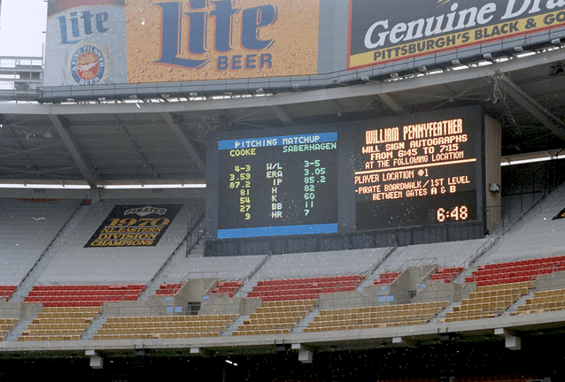
GTGFTS: June 20, 1993. Pirates 3, Mets 2. The Bucs scored two in the bottom of the ninth, with the winning run scoring on a bases-loaded single by Don Slaught.
GTGFTS June 20, 1993
Pirates 3, Mets 2 at Three Rivers Stadium
Don Slaughter walk off single — maybe significant since Friday was Bobby Bonilla day?
link
GTGFTS: William Pennyfeather only had 27 minutes remaining to sign autographs.
For me, the test of a CC uniform is whether it connects with a team’s fans and local community. Like, I personally hate the Red Sox CC uniforms, but Sawx fans seem to really dig them, so I grudgingly award a passing grade. Time will tell whether the Padres CC unis similarly gain fan or local community acclaim. As a very casual liker of the Padres, these unis don’t speak to me at all, but I’m not the intended audience. That said, I generally agree with Phil about the patterns of the jersey and pants colors. A team with three main colors like the Marlins or Rockies would do well to adopt this approach of contrasting sleeves and third-color trim. I really don’t like the Padres jersey here, mainly because of the jersey script, but I love the pattern of how the colors are applied otherwise.
Until we know how San Diego fans respond in the medium term, the Padres CC uniform is the opposite of the Brewers for me: San Diego has a terrific cap but an ugly jersey.
Rooting For Laundry Dept.: I’ve taken this to its logical extreme. I root for the Padres, but ONLY when they wear brown and gold. I’ve rooted against them in the dark blue duds, and in the camo tops. Brown and orange were okay, but I was pissed that combo replaced the tasty “Taco” uniforms.
As for the CC costumes, I like the loud colors, but the design is rather lazy; particularly the contempt for the placket. If ever there were a case for a pullover, this was it.
This well said. I am Sox fan and love their CC uniform even though I am a traditionalist that wishes teams just wore their classic white and road gray or blue uni. This Padres uni is the second CC I have liked. I suspect their fans will like it but you are correct that is what matters.
BFBS. Busy For Busy Sake. Zero restraint in any aspect of this design. Without San Diego and the friar, you’d swear this was a uniform for a South Beach Sunday Softball league. I have seen enough of the Nike square peg in a round hole to last me forever. Clown show stuff.
Speaking as a non-San Diegan, all I can say is it looks like the Padres brass watched a Heat game in their Miami Vice alts, called Nike, and said “Let’s do that!”
Not my favorite City Connect. The cap looks like one of the fashion caps New Era sells.
I’ve discovered that with these City Connect uniforms, my first reaction is, “Yikes!” but then they grow on me. Except for the Dodgers.I actually enjoy the storytelling aspects of the details.
The cap is the only part of this I do not like and that is mainly I think they should have put the swinging padre or something else on for a logo. Not sure why they stuck with the interlocking SD for this uni.
As a Mets fan I’m curious to see if they scrap the blue and orange for their CC unis whenever they get them. Could be difficult as they are so inherent to the team’s identity. I’d lean toward them doing an entirely different color scheme just to make things interesting. But only as long as it looks nothing like the Mercury Mets.
They will probably overblow the orange, white and blue of the NYC flag for the Mets CC uniform or go totally the other way with an all red with splashes of green thing mimicking the Home Run Apple.
I actually rather like the design and the colours! When your regular uniform colours are brown and yellow it makes sense to go to the opposite end of the dull-garish spectrum. As for the city connection, I remember when I was trying to come up with a name and colours for my Alt-History San Diego NFL team I struggled to find anything that was *totally* unique to the city. So the bright colours have Miami Vice vibes but that doesn’t mean Miami owns them. Overall second only to the Angels for me.
My only bugbear is the appalling way it fails to #RespectThePlacket! I mean come on Nike, a few millimetres and it wouldn’t be a problem. It’s almost like the designers haven’t even heard of the convention.
As a Surrey cricket fan I find it hard to believe people find brown to be a dull color…
And yeah, I was excited at first glance that Nike was *finally* going to #RespecttThePlacket . Then upon further review….NOOOOOO!
I swear they must do it on purpose.
Now that is a good reply! Brown is underrated as a team color, ask the fans of the Brown University teams or those of Sankt Pauli in Hamburg.
UNI TWEET OF THE DAY: I was chided by Paul for raising a topic apparently irrelevant to uni aesthetics(USC and UCLA bolting to the Big Ten), but I feel this is more of a macro-issue which has the potential to be a paradigm shift in sports. In place of the Power Five Conferences, The SEC and Big Ten will become Mega Conferences; practically the AFC and NFC of College Football. Bowl games will be swept aside in favor of bracketology. The man in the street now believes the Big Twelve and Pac-12 are pipsqueak conferences who are holding back their powerful members, and that can’t be good for college sports.
SEC and Big 10 are basically the NFL minor league teams. Next step is that every NFL team will adopt one or two college football teams from those conferences.
Correction on the baseball ticker: The rainbow-colored Mariner logo on the score bug was from Thursday’s game on June 30th, as that was when the team celebrated Pride Month. While I watched that game live, I did not watch last night’s game, so I had to double-check if the M’s ever had a 1-0 lead in last night’s game. They did not, so that clinched it. In the Pride Month celebration game, Julio Rodriguez wore an outstanding rainbow left arm sleeve.
GTGFTS:
Can’t say I recall ever seeing Three Rivers’ empty upper deck tarped off like NASCAR tracks frequently did/still do … wondering what other stadiums resorted to doing that, assuming it was not a common practice.
Oakland has done it for years.
Not that my opinion matters, but…
I think this is just bad design. I’m also of the opinion that what looks bad on paper looks just as bad on the field. I don’t see game action creating any salvation.
Asymmetry is difficult to pull off, and I am very particular when teams attempt to apply it. Other than the color, the cap looks pretty classic. This is a total clash with the rest of the uniform. Why not go full-tilt with an asymmetrical cap like the 1924 Bacharach Giants? It’s not like the overall design can get more gaudy. At least there would be more consistency.
link
Totally agree on the hat. The SD looks way out of place, should be in the wacky jersey font if they wanted to stick with an SD cap and guarantee they’d sell so many of those to the college, youth, beach bum, and surfer markets if they went with the new font. Either way put a white or yellow stroke around the logo to make it pop, please. But yeah any sort of interesting addition of color (panels, piping, vents, squatcho, brim) would also have helped. That new font though, I like it very much, but the storytelling: reminiscent of weathered beach signs? Like the shit you can buy at tj maxx? Those kind of signs don’t really exist in the wild. They are corny ass interior design commodities. Give me a break.
The Padres whiffed on the music for that video. They trotted out Santana and “Oje Como Va,” which is Latin music (written by Tito Puente, who was Puerto Rican), and not the more culturally and geographically appropriate southern California Chicano/Mexican-American sound. Could have gone with “Viva Tirado” or “Viva la Raza” by El Chicano, maybe even “Suavecito” by Malo, maybe even “Low Rider” or “Summer” by War before “Oje Come Va.”
“Oye Como Va,” sorry.
The Padres also could have done a solid for a local San Diego group, introducing their sound to their audience.
Awww…. This is how I met Bernard 10 years ago.
It was his critique of the T-Wolves using JZ instead of the myriad of Minneapolis hip hop artists at that time.
To make a new (and good) friend in such a way is pretty gnarly.
Great!
The game was 162 in 1992 .. last game of the year. Before the buccos got into the playoffs. Was on October 4th.
Buccos won 2-0
Padres CC unis remind me of tri-color sherbet, and not in a good way.
As a Pittsburgh fan for all three teams, I’ll consider the CC program a success if they stay connected with the city and stick with black and gold. Deviation in that town, with that team, would be (have to) a walking of the plank.
As a fellow Pirates and Steelers fan I have to agree, black and gold is the very definition of the *city* colours. So any storytelling would have to come up with a pretty good reason if they don’t go for them!
(porting this comment over from Facebook, with minor tweaks I slept on)
They are effective in being intensely “Tijuana” to me (speaking as someone who has never been there). And I like the numerals.
I also realize, as garish and inappropriate they strike old farts like me as “baseball uniforms” its part of, if not all of, the point.
Maybe the fact that, our dads and grandparents grew up when “unis were unis” and we (meaning like Paul, Me, Phil, not to speak for you guys)– we were revolutionary in *our* way, which was to exhaustively examine and dice up and review and immerse ourselves in this thing we inherited, in ways our dads never thought to do. And now that that’s a thing, where does the next generation go when it is their moment to challenge the conventions of their dads?
This particular uni–as with most City Connect–seems to me to be gimmicky and destined to be best in *very* small doses, but they might also be tapping at the window of disruption for the young people they’re obviously aimed at–demonstrating there’s a big opportunity for today’s young woke rebel baseball fans, to awaken to the ideas that many of us hold sacred, like “teams should wear the same color schemes ALWAYS” is just a convention they could, or might at least try, to completely topple.
Not really sure what “woke” has to do with the rest of what you said…
Just trying to adopt/lampoon the “cranky old man” term for “rebel” is all
What is the deal with this supposedly “woke” blog promotiong color vs. color and ignoring the problems that come from colorblindness?
Athletes, referees, coaches, and fans may all suffer whle you get to enjoy your totally subjective opinions.
Missed opportunities once again in this Padres CC outfit: hat monogram should match the jersey font, otherwise it is a run of the mill fashion cap (as stated by others before), not sure if the Tijuana connection is served with these slush puppy colors (as happy and popping as they look) and the gold NOB is impossible to read from a distance over 10 feet. The wordmark not lining up properly is very lazy (as stated by others before).
I do like the fun colors and the asymmetric aspects, but overall it is clear that not enought time and attention was spent on details while creating these and that is too bad.
I love these uniforms! These cc’s are my favorite, so far. So beachy. Especially love the socks and caps. Also really liked San Francisco’s. Being a diehard Cardinals fan, can’t wait for theirs to hit the streets.