By Phil Hecken
Follow @PhilHecken
A good Saturday morning, Uni Watchers — I hope everyone had a good couple of weeks.
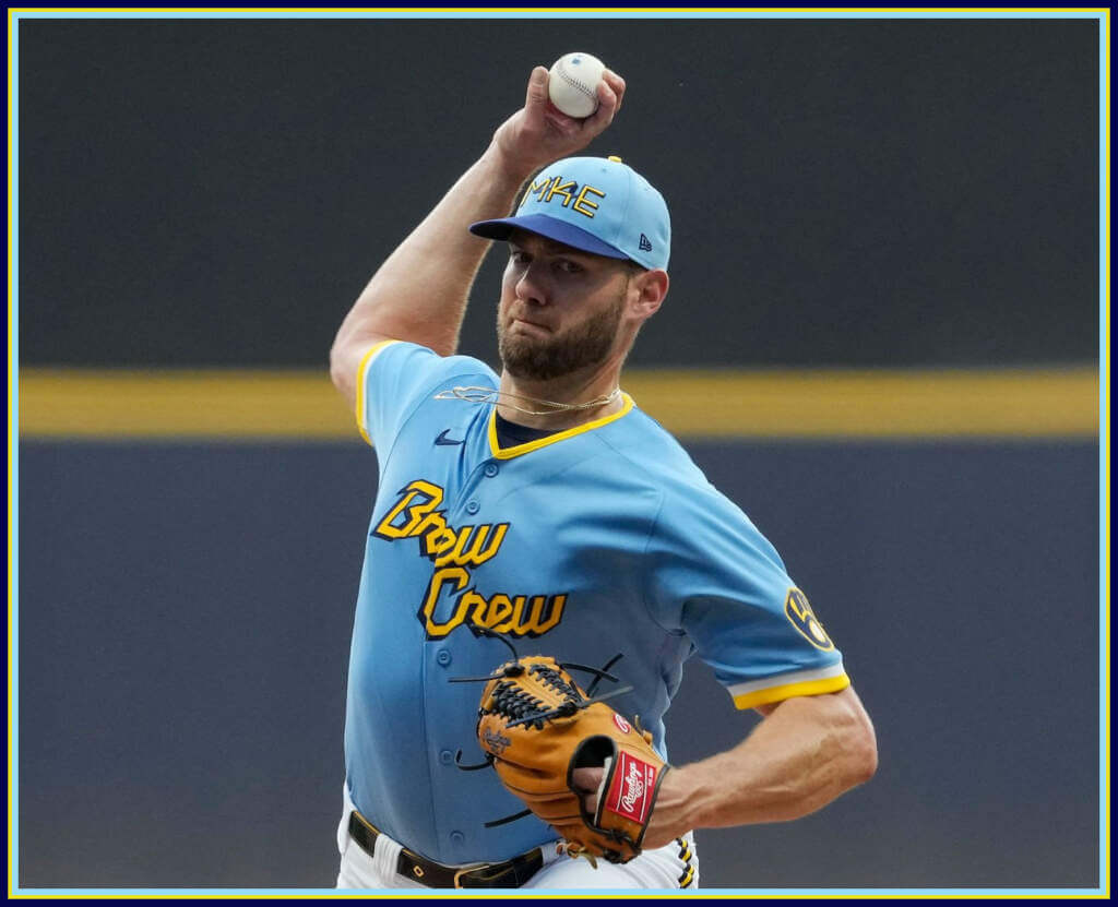
Last evening, the Milwaukee Brewers became the sixth team this season (and 13th overall) to debut their City Connect (CC) uniforms. I don’t want to say the program is getting tedious, but as the whole City Connect concept has gone forward, each uniform seems to be more forced, with ever more ridiculous “storytelling” accompanying each new release. And after the Brewers unveiled their CC’s a week ago (and having thoroughly enjoyed Paul’s take on Monday), I was prepared to really hate these uniforms once they took the field. If the hype video was going to be any indication, it didn’t help — it felt more like a long commercial to sell $46 caps, $192 replicas, $435 authentics, and a host of other gear…
A gesture of love to our favorite season in our favorite place.#BrewCrewConnect pic.twitter.com/1UeGid5dSj
— Milwaukee Brewers (@Brewers) June 17, 2022
Here’s the thing, though. It’s always good to see the uniforms on the field of play before rendering a final verdict on the full uniform.
Let’s get a couple things straight first. I absolutely HATE the cap. I’m in complete agreement with Paul’s assessment. When it was first leaked, I “saw” the “414” embedded within the “MKE” and thought it might be the worst CC cap yet. I get the appeal (and I’m sure there are a boatload of people who love it), but the logo is terrible. Neither the “MKE” nor the “414” are particularly easy to read, and the royal (?) brim doesn’t seem to match the shade of navy which forms the navy/gold/navy pants stripe.
I also am not a fan of the “Brew Crew” (which reads more like “Bnew Cnew”) wordmark. But (unlike some uni details), it’s only really noticeable up close. At any distance, the gold lettering across the powder blue jersey is actually a good combination (note the team got matching CC helmets):
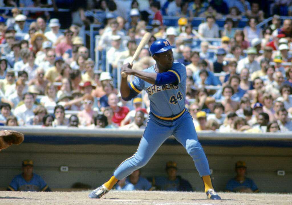
I absolutely got a 1970 Brewers road jersey vibe from the combination (a jersey I loved). I really liked the 1970s Brewers road uniforms, so maybe that’s why I liked (relatively speaking) the CC look they sported last evening. The jersey (at least) reminded me of the look worn by Henry Aaron — I was particularly fond of the gold sannies under the royal stirrups.
And I like the back of the jerseys, both the NOB treatment as well as the team’s custom number font.
It’s time.#BrewCrewConnect pic.twitter.com/k78Dgx9OXS
— Milwaukee Brewers (@Brewers) June 25, 2022
As far as the overall uniform: while I prefer monochromatic looks for baseball, and especially when the jersey is powder blue, I didn’t hate the powder over white look the Brewers sported.
Sure, MLB isn’t selling pants, so the focus is on the jersey and cap. And I want to stress that while I found the Brewers’ CC uniform to be one of the bottom in the rankings, it looked a lot better than I feared. That’s probably damning with faint praise, but both in stills and in action, the uniform performed well enough.
The whole CC program really needs to be in a separate category when it comes to uniform assessments. It’s hard to design a “city” identity that is kitschy enough for the target market but which nonetheless can have some larger identity that can be appreciated by all fans — while at the same time selling telling a story that explains all the uniforms’ quirks.
It seemed like the fans loved the uniforms, and that’s at least a few bonus points in favor of them. Even Bernie Brewer got into the spirit, donning his own custom cap and jersey (at the end of this clip):
Tyrone goes yard for the second night in a row! 💣@Brewers | #ThisIsMyCrew pic.twitter.com/uAXAWCPcgP
— Bally Sports Wisconsin (@BallySportWI) June 25, 2022
All in all, definitely not the worst CC uniform released to date, and certainly better looking on the field (which is all that actually matters) than I had expected. Mercifully, only one more team this year (San Diego Padres) will be getting a new CC uniform — and that should be released shortly. If the leaked socks are any indication of what’s to come…we could be in for a doozy.
You can see more photos here.
Your thoughts on the Bnew Cnew unis?


Guess The Game…
from the scoreboard
Today’s scoreboard comes from Chuckie Sullivan.
The premise of the game (GTGFTS) is simple: I’ll post a scoreboard and you guys simply identify the game depicted. In the past, I don’t know if I’ve ever completely stumped you (some are easier than others).
Here’s the Scoreboard. In the comments below, try to identify the game (date & location, as well as final score). If anything noteworthy occurred during the game, please add that in (and if you were AT the game, well bonus points for you!):
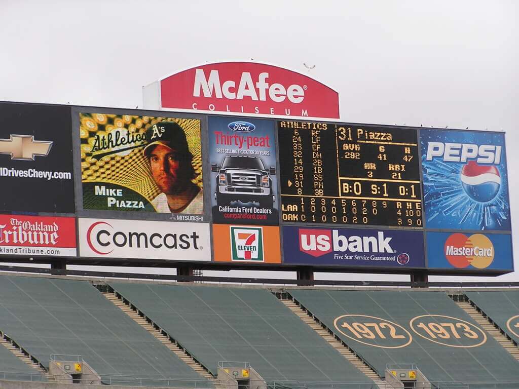
Please continue sending these in! You’re welcome to send me any scoreboard photos (with answers please), and I’ll keep running them.
The GOAT Gets It™
Not sure if you guys saw this the day the Patriots announced the return of their Pat Patriot throwbacks, but I lol’ed…
https://t.co/E18tYLXLrC pic.twitter.com/7N9SpTNYtd
— Tom Brady (@TomBrady) June 22, 2022
What Phil Did Last Weekend…
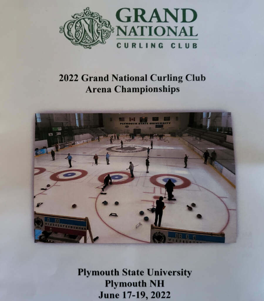
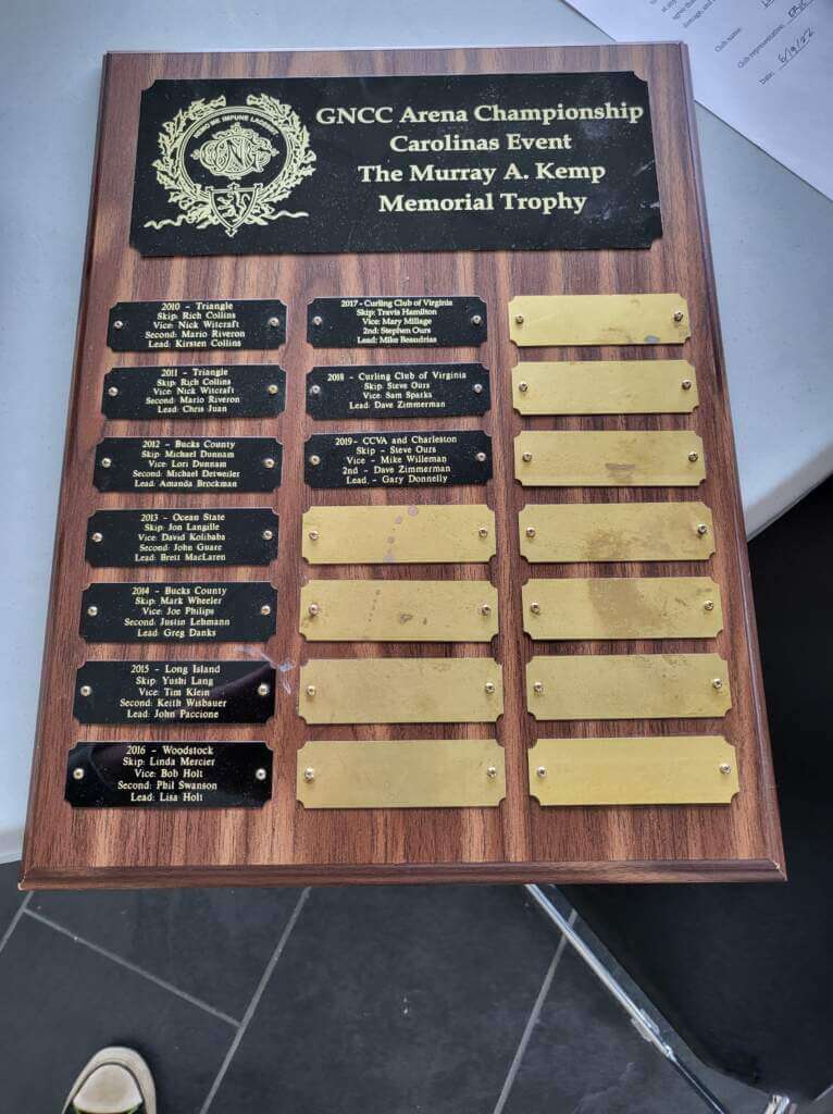
As you guys (at least those of you who read on the weekends) are aware, last weekend I was away at a bonspiel curling tournament up in New Hampshire — while it wasn’t “technically” a bonspiel, for all intents and purposes, the set up and format was the same: a 24 team draw, with a guarantee of at least three games. The last time the GNCC Arena Championships were held (2019), I went 3-2, eventually losing in a semi-final; this time, my rink and I were determined to rectify that.
And so we did…although I was playing with three different players, we brought a good team and our best game with us, going 4-1, and winning the “C” bracket. For those not familiar with how bonspiels work, all teams begin play in the main (“A”) bracket; those who lose in the first round are put into the “B” bracket, and those who lose in the second round go into the “C” bracket (most bonspiels will also have additional brackets for teams who keep advancing in the A bracket but who do not make the finals). My squad won our first match, but lost a close second match — to the team that ended up winning the entire tournament. After our second round loss, we were placed into the C bracket, and won three additional games (one close, two blowouts) to win the “C” tournament! There were actually two Long Island Curling Club teams in the tournament, and our other team went all the way to the “A” final, losing to the same team that knocked us out in the second round. So, as a club, we represented very well. I won’t go so far as to say we were the third or fourth best team there, but we probably were.
As is tradition at a bonspiel, the final teams are piped in — I’ve played in a total of 10 bonspiels in my life, and have been in two finals besides this one, and it’s a pretty cool experience. However, in those finals, I went 0-2, so by winning the “C” bracket, this was my first “win”. Unfortunately, the GNCC Arena Nationals didn’t have a bagpiper (they said he was “sick”), but they did have recorded bagpipe music to walk on the sheets to, so it was almost as good. And it was great to finally win one.
For winning, my rink was awarded this plaque, which we get to keep for a year, and our names will be engraved in the first blank spot:
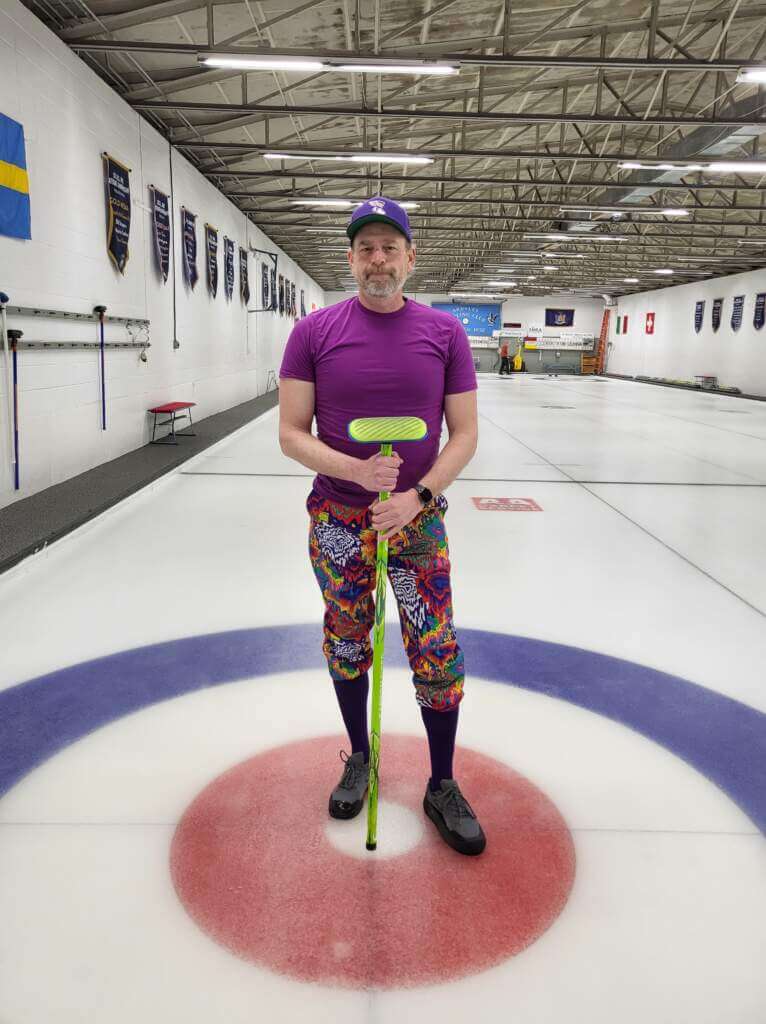
Here we are after the match holding the plaque and medals we all received for winning. Of course, I brought five pairs of wacky pants (and wore one for each match), but we only took one team photo after winning the C final — and it was a terrible photo (I’m the one on the right…obviously). I realized after the fact that I’d worn that “uniform” once before, in a bonspiel back in March — and it could charitably be described as Paul’s worst nightmare: purple socks, crazy pants, purple shirt and Uni Watch Purp Walk cap (unfortunately, I lost wearing this outfit in the March bonspiel), but made up for it in this one. Here’s the photo from March:
It was a great time (bonspiels with club members/friends are always awesome) and it was nice to finally bring home some hardware. Can’t wait for the 2023 Arena Nationals!
Uni Watch News Ticker
By Anthony Emerson

Baseball News: Level heads have prevailed at New Era and/or MLB, as the Blue Jays’ 4th of July caps have removed the stars and red stripes, making it look less like the American flag (thanks, Phil). … MLB 22: The Show has the incorrect font on the Brewers’ City Connect unis. The Brewers’ CC unis feature the team’s standard font. Makes me think that perhaps the number font was changed late in the design process, after the design had already been modeled into the game (from @bullyday). … The Somerset Patriots, Double-A affiliates of the Yankees, wore Captain America jerseys during last night’s game, which also featured an Aroldis Chapman rehab appearance (from John Cerone).

Pro Football News: The Winnipeg Blue Bombers wore white at home last night, and more notably wore white over royal blue for the first time in their history.

Hockey News: A Colorado news anchor wore a 2007-2017 Avalanche jersey with the 2022 Stanley Cup Final patch ironed on during a broadcast last night (from Casey Hart).

NBA News: The Thunder have officially unveiled their rookie numbers (from @hardchargindaddy).

Soccer News: England’s home shirts are white and the Netherlands’ is orange. But England women wore orange at home against the Dutch, who wore white, in what can only be described as blasphemy against the soccer gods (from @texastrevor). … Our own Jamie Rathjen writes in: “Scottish club Aberdeen released new shirts. The crest has commemorative text for the 40th anniversary of the 1983 European Cup Winners’ Cup win, and the two stars that would go above the crest are on the sleeve. Also, because of supply chain issues, the men’s team is wearing the second kit for all games until the end of July, which is probably six or seven times but is more than an entire normal season.” … New tattoo-inspired kits for Forward Madison (from Scott Rogers). … New ball for the Polish Ekstraklasa (from Ed Zelaski). … The following are all from Kary Klismet: Scottish side Rangers have released their new home kits. … Premier League side Crystal Palace have unveiled their new away kits. … New away kits for lower league English clubs Milwall and Rochdale. … New kits for German sides VfB Stuttgart, Sandhausen, 1. FC Magdeburg and VfR Aalen. … New kits for Belgian clubs Cercle Brugge, KV Mechlen and Anderlecht. … New kits for Nîmes Olympique of France’s Ligue 2.

Grab Bag: Here’s an article on the history of pirate flags (from Jon Vieira). … The following are all from Kary Klismet: Atari has unveiled a 50th anniversary logo. … New athletics logo for Red Deer Polytechnic, a college in Alberta. … The U.S. Army and Air Force will offer free maternity uniforms to pregnant servicemembers.
Uni Tweet of the Day
Tom O’Grady is all of us…
Saints bugs on the helmet.
Jazz reversible uniform designs.
MIKE Brewers cap.I'm going to get a cold beer and call it a week.
Next week will be better… has to be right? pic.twitter.com/RrXo20e4Fq
— GameplanCreativeCHI (@GameplanChicago) June 17, 2022
And finally… that’s it for today. Everyone have a good Saturday and I’ll see you back here tomorrow.
Peace.
PH
On the Brewers’ CC, a hidden gem I like is how the legs of the grill form another M. I’m surprised MLB/Nike is going to pack mall the remaining teams into next season. CC/storytelling fatigue will certainly set in!
The M41K4E logo just looks like MiKE to me. That was my first impression and it continues through all the different angles, lighting, and context we’ve seen since. But the most appealing thing about this is the storytelling to justify the subway advertisement. Talk about a LOL Wut? Moment. I heard they were going to sport patches promoting different local establishments as a way to support local business and tribute the “tavern culture” and instead they are simply advertising an international garbage sandwich chain? The novelty branding has its pluses for me and including some “storytelling” doesn’t bother me to a degree because modern branding has a heavy tilt toward borrowing familiar things and storytelling CAN just be a way to explain the inspiration. But this is just getting stupid.
I meant “the most appalling thing about this”
It’s a joke. Just like the local tavern patch was a joke that Paul and some of us got tricked on. It’s believable though! Well played high jinks.
The cap would have the opposite version (Wario or Bizarro version) of Mikey from the Life cereal commercial hating it. What an ugly forced pointless cluttered mess that cap is.
“Give it to Mikey he loves everything. He hates it. Hey Mikey.”
Congrats on the W, Phil!
Love the hat.
Cracks me up that the “Kemp Memorial trophy” is actually just a plaque. Can a plaque be a trophy? Was it an actual trophy at some time in the past? Congratulations nonetheless.
Forgive Phil and his tipple (and his mismatched purples.) Those Milwaukee uniforms are horrendous. Boston’s City Connect jerseys utilize the same color scheme and everything about them is markedly better.
GTGFTS: Completely forgot Mike Piazza played for the A’s. Somebody cue the story about how he was drafted in the 187th round and was the love child of Tommy Lasorda and Walter Alston.
The Subway inclusion is the first of many. Cheapens it to resemble those shirsey give aways to the first 15,000 walks up. Congrats on the win. A win is always good news!
Congratulations on the Grand National win, Phil!
Missing link on the Forward Madison alternate kit. The team’s press release is here: link
On the Brewers CC uniforms, I agree in the abstract with most criticism of the designs. But as a whole, the CC uni just works for the Brewers. I hate hate hate the cap, not just the logo but the whole design, but Milwaukee fans seem to be connecting with it, which is the point of CC. Personally, I’m a fan of the team but not the city, so the cap will never be for me. The jersey though, and the overall look, strike me as perfectly expressive of the team’s relationship with its fans and the culture of Brewers fandom.
Thanks, Scotty. Link now added.
I like the Brewers’ City Connect look. I was in Milwaukee last week and had the stadium tour the day the uniforms were introduced. I bought a cap and wore it the rest of the weekend, and a lot of people asked about it, so it seemed popular with the locals.
I’d say the Dodgers had the worst CC cap, and I’m glad they changed it.
I’m enjoying the City Connect looks more than I expected. Most of them….
GTGFTS:
Angels at A’s (but should be As, right?) – 8/5/2007
Not finding anything significant from that game. Am I missing something?
Phil – I’d recommend you change the link to the Twitter page with the Storytelling elements.
Everyone else – look at the game photos and if you can find a photo with a player wearing a Subway patch I’ll personally buy you any sub of your choice. You can even get double meat.
Yeah. I thought it was obvious it was a joke, but I guess not. Now removed to prevent any further confusion.
Prediction: March 2023- Brewers ink deal with Subway for sponsorship patch. Phil, please post some lottery numbers!
Congrats on the curling success Phil!
Interesting to note the new blue pants for the Winnipeg Blue Bombers were introduced as part of their new 3rd uniforms. However they made their debut on the field with the white regular jersey rather than with the new 3rds.
For the record, not a fan of MLB City Connect. This stuff belongs in minor leagues and should stay there.
Great update Phil. Thanks! I absolutely love the Brewers powder blue pullover 70’s jerseys. It’s their all-time best uniform. I appreciate that the CC jersey attempted to loop in some of its elements. I wish they would have gone with a pull over style and stayed closer to the font of the 70’s jersey.
ALSO, AN AD FOR SUBWAY DOES NOT PAY TRIBUTE TO LOCAL MERCHANTS! YES, LOCAL MERCHANTS OWN SUBWAYS, BUT COME ON!!! HOW ABOUT AN AD FOR THE BRAT STOP OR THE MARS CHEESE CASTLE. Sorry for the rant.
Per the Jesse Winker ’80s-style stirrups notes from earlier this week: Last night I was at an Eau Claire Express game (Northwoods League – summer collegiate), and for the first time on that team (I’ve been going to a handful of games each season since the team started in 2005), I noticed two players wearing shorter-cut pants that were fully-extended down to about 3-4 inches above the ankle…and after the elastic bottom of the pant, all you could see was the white sanitary and the strips of the stirrup. In fact, rather than ’80s-style like Winker’s stirrups, the two players reminded me of the ’90s look, when pants started moving down towards the ankle and covering more of the stirrup stripe/sanitary.
Could totally be a couple players doing a thing just for fun, but on the other hand, could it be a bit of a throwback for a ’90s-era baseball look (and I do believe college-age folks are getting more into the ’90s as a pure retro thing)?
So they snuck in one star on that Jays hat (straight up from the bird’s eye)…a subtle reference to some people calling Canada the 51st state?
Bnew Cnew looks pretty MKE Mouse.
QOTD
GTGFTS: 8/5/2007, LAA 4 at OAK 3
My process:
1. Looked at Piazza’s B-R page, he only played in OAK in ’07
2. Looked at Piazza’s ’07 game log to see when he had 3 HR
3. August 2-5 was the only LAA@OAK series during that stretch
4. August 5 matched the scoreline on the board
link
I live in a smaller city in Wisconsin, and I’ve always found the recent Milwaukee obsession with the area and airport codes to be a bit embarrassing. It has the energy of, “Wow! We’re a big city! Like, for real! We even have our own airport and area codes!”
That plus I’ve always found powder blue baseball to be campy and an unfortunate detour in the game’s unrivaled sartorial history that is best left in the 1970s.
I do find the grill logo to be whimsical and charming, though I realize lots of fan bases across sports take tailgating seriously.
There has to be a rule against this, right? link
Proofreading:
If the hype video was going to any indication
Waaaay too much Brewers content on this site.