By Phil Hecken
Follow @PhilHecken
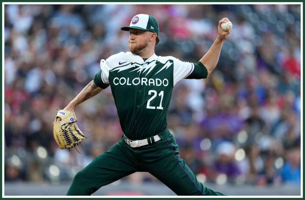
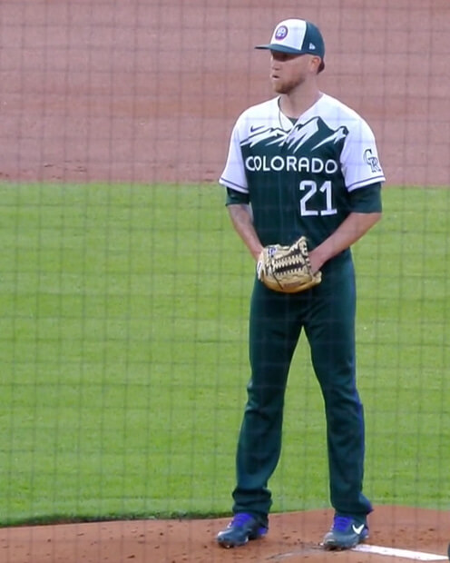
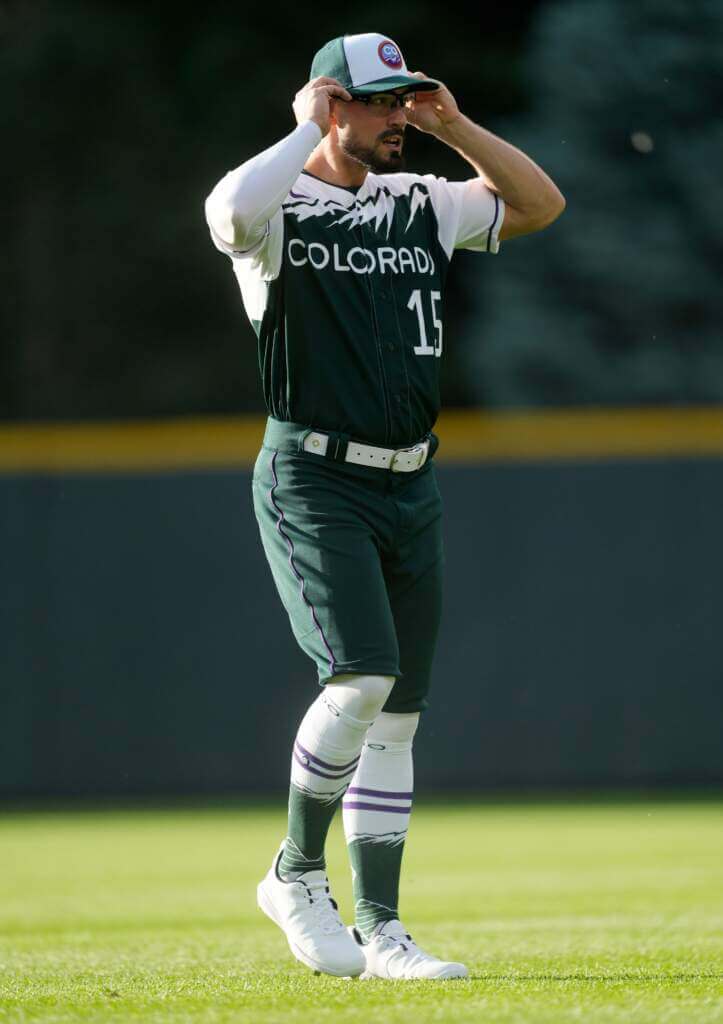
Last evening, the Colorado Rockies “City Connect” (CC) uniform made its on-field debut in a game against the Atlanta Braves. If you want to know all the storytelling details on how this uniform came to be, click here. Since that article basically explains all the doo-dads and extras on the uniform, I won’t rehash them here, save to highlight some of the features.
As noted, the CC uni features a custom jersey designed in the fashion of Colorado’s iconic green license plates, mimicking the “COLORADO” font as well as the numerals.
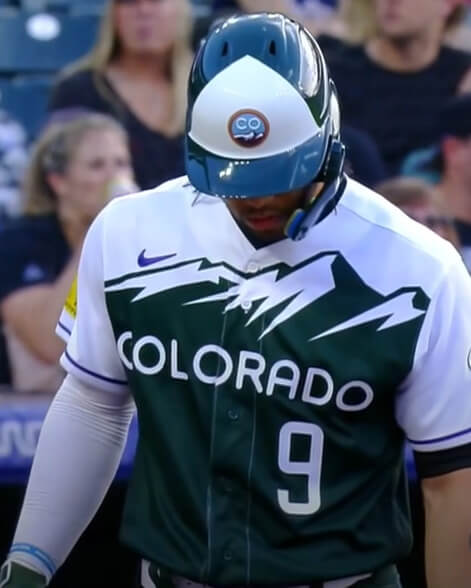
You’ll note the team had custom helmets created for use with the uniform. It looks like they had a raised, 3-D logo on the helmets.
Like the helmets, the caps were also specifically designed to be sold to pair with the uniform.
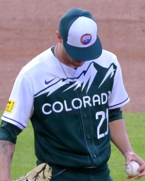
Here’s a closeup.
All players wore white belts with the uniform — I wasn’t sure how “good” this would look, but it actually looked quite good:
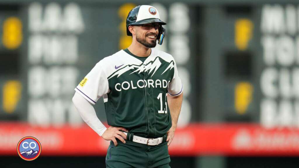
Unfortunately, most players wore the mono-green (with a slight purple piping) pants pajama-style.
The few who did not wore the pants with the CC socks — which looked better.
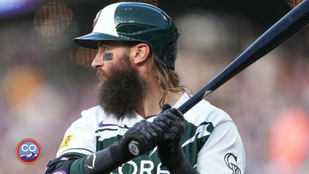
The greatest fear I had with these uniforms also played out — the back of the jersey features white numbers outlined in purple, but on a green/white background I was worried the rear numbers would appear “ghosted.” It was legible up close…
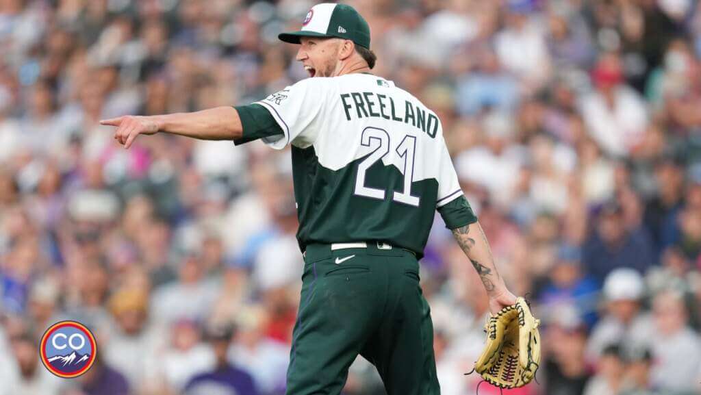
…but at any distance, not so much.
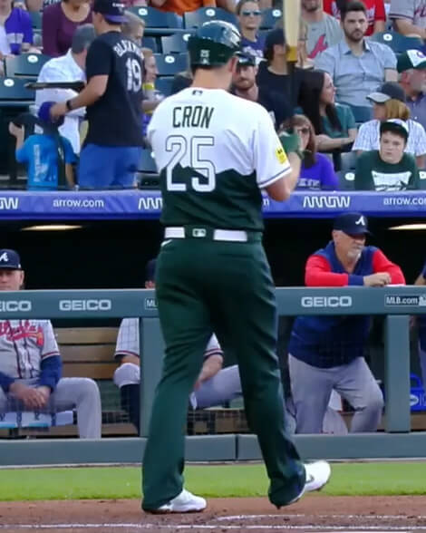
All in all, a sharp looking uniform, marred only by uncuffed pants and semi-illegible numbers on the back of the uniform. Despite those “quibbles,” I’m generally (and genuinely) impressed at how well this CC uniform turned out — certainly one of the better ones, and probably the best one introduced this season.
You can see more photos here.

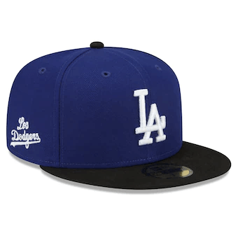
Dodgers Slightly Tweak Their CC Unis
If you look closely at the above photo, can you spot what’s different from the 2021 CC uni? Take a closer look at the cap.
If you didn’t spot the difference, this year the team has moved the “Los Dodgers” logo from the front to the side and replaced it with their standard white interlocking “LA” logo. The team also changed the brim from Dodger blue to black.
You’ll recall when the Dodgers introduced their CC uni last season, the sleeve ends had a black fade, and when the team wore long sleeves, they wore royal blue.
They also tweaked the uniform so that players who wear long sleeves will wear black sleeves instead of the Dodger blue.
This, combined with the new black brim, adds a small amount of BFBS to the uniform — which I would normally hate, but this uniform was/is so mono-blue, the additional splash of color — even if BFBS — actually works here.
Also, if you recall, last season the Dodgers wore their regular helmets with their CC uniforms (so their helmets did not match their caps). The team wore their regular helmets last night — and didn’t add the script “Los Dodgers” or a black brim to the side to match their new CC caps.
If you look at the photo above, you’ll see Mookie Betts is wearing regular (non CC) socks — but they too are almost entirely royal blue, so even players who actually take the time to go high cuffed, still look like they’re wearing pajama pants, although a late reliever for the Dodgers did wear proper white CC socks.
The Dodgers CC uniform is one of my least favorite CC unis, and these minor tweaks don’t really improve that standing, although they do look better than the 2021 versions. With these tweaks, the Dodgers have become the second team to tweak their CC unis from the prior season. The Arizona Diamondbacks went from wearing white pants in 2021 to tan/sand pants in 2022.
You can see more of the Dodgers uniforms here.
Rays Join the Pride
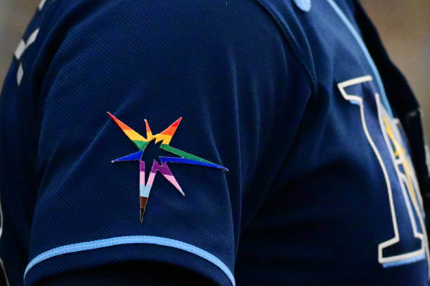
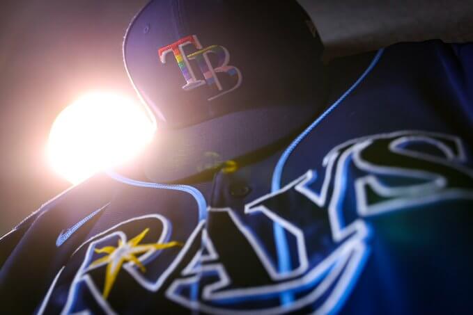
Following in the footsteps of the LA Dodgers on Friday night, the Tampa Bay Rays celebrated Pride Night at Tropicana Field on Saturday, an annual event with a new feature this year: Nearly every Tampa Bay player who took the field against the White Sox in the first inning did so with a rainbow-colored sunburst logo patch on his right arm and a rainbow-colored “TB” logo on his cap.
For the first time, the Rays gave their players the option to recognize Pride Night on their uniforms, and most players opted in on the opportunity to do so.
Like the Dodgers, the Rays put their rainbow Pride logo on the mound:
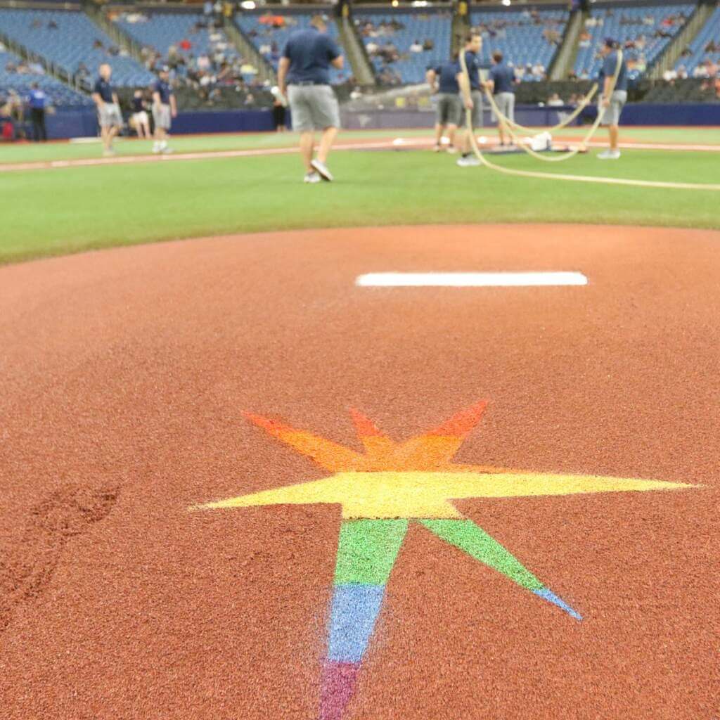
As with both the Giants and Dodgers Pride caps (and jerseys for the Giants), the Pride logo on the cap was almost impossible to discern at any distance…
And since the rainbow starburst logo was apparently glued (rather than sewn) on, I couldn’t find any photo of the patch on the right arm (with the exception of the top photo, which is a closeup and not game action).
More photos here.

Guess The Game…
from the scoreboard
Today’s scoreboard comes from John Muir.
The premise of the game (GTGFTS) is simple: I’ll post a scoreboard and you guys simply identify the game depicted. In the past, I don’t know if I’ve ever completely stumped you (some are easier than others).
Here’s the Scoreboard. In the comments below, try to identify the game (date & location, as well as final score). If anything noteworthy occurred during the game, please add that in (and if you were AT the game, well bonus points for you!):
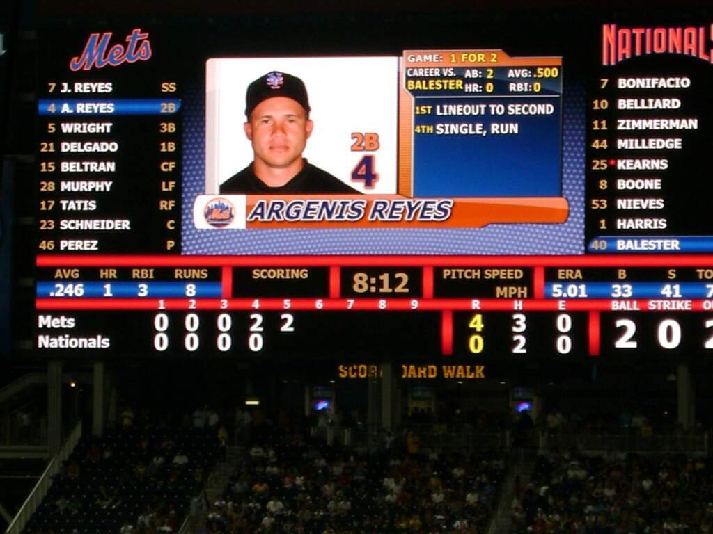
Please continue sending these in! You’re welcome to send me any scoreboard photos (with answers please), and I’ll keep running them.
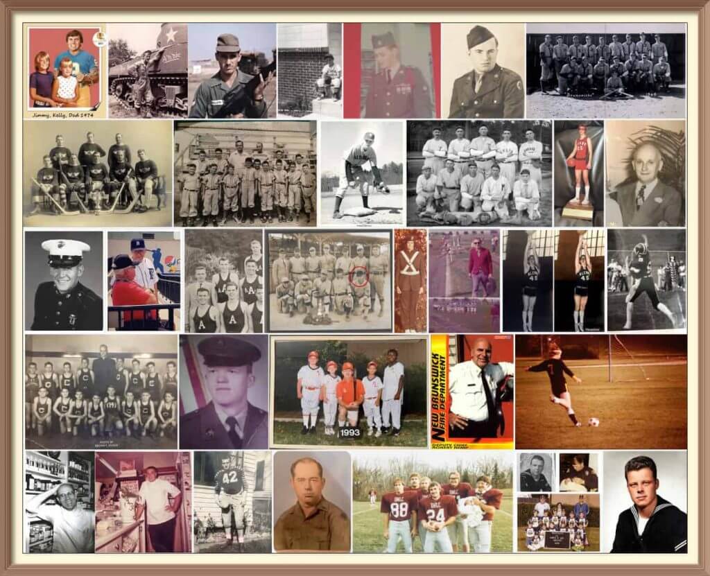
Calling All Sons (and Grandsons & Nephews)!
Father’s Day is coming soon (June 19), and I’ll once again be posting photos of Uni Watch readers’ “Dads In Uniform,” a tradition that began in 2013 (and has continued every year since then). This is always a very special day, and I’d love for as many readers as possible to participate — especially those of you who haven’t done so before. A few of you have reached out to me saying “I’ve run out of photos of my Dad” (from years’ past), so if you want to resubmit a photo used before, please do so! Because Flickr terminated my account without explanation a few years ago, any photos sent in before 2020 no longer exist on UW, so if you had sent in something before then, feel free to re-send!
To take part in this annual tradition, select one photo of your father (or grandfather or uncle) in uniform (it can be sports, military, work — as long as it’s a uniform) along with a short description of 100 words or less. Then email the photo — again, only one, please — and text to phil.hecken@gmail.com with the subject line “Uni Watch Father’s Day 2022” by TUESDAY, JUNE 14, midnight Eastern. I’ll run all of the submissions on Father’s Day. Thanks!
What is wrong with the kerning on Zamora’s jersey? #mariners pic.twitter.com/lGUQIUJOUf
— Richard Brodie 🤫🦁 (@QuietLion) June 5, 2021
And now a few words from Paul: Hi there. In case you missed it earlier this week, my latest Bulletin article is a deep dive on the NOB font used on the Mariners’ navy alternate jerseys, which over the past 20 years has provided a steady stream of kerning issues and other typographic glitches. In an effort to get at the root of the problem, I interviewed the team’s equipment staff, the guy who created the NOB font, a team exec, and more. Proofreader Jerry Wolper, who usually maintains a very even keel while performing his duties, calls this “peak Uni Watch,” and I don’t mind saying I’m pretty pleased with the article myself.
My premium subscribers can read the article here. If you haven’t yet subscribed, you can do that here (you’ll need a Facebook account in order to pay). Don’t have or want a Facebook account? Email me for workaround info. Thanks!
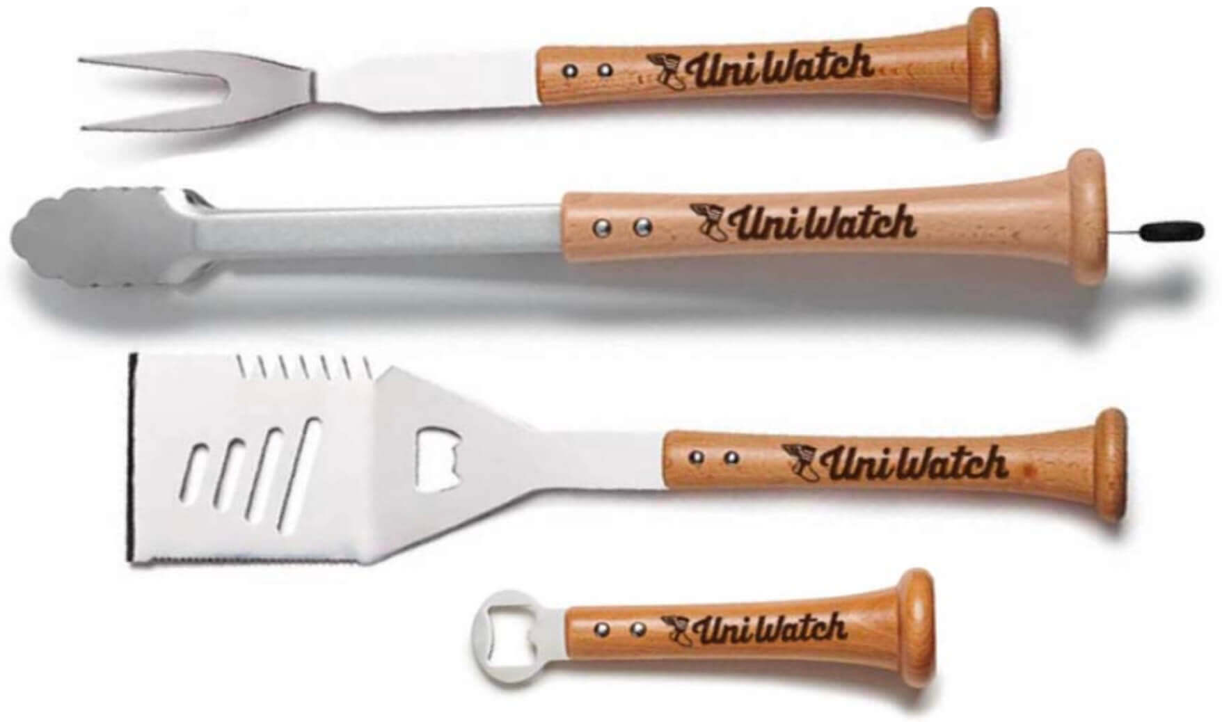
Meanwhile, with Father’s Day approaching, the folks at Baseball BBQ tell me that if you want any of our cool Uni Watch grilling tools in time for Father’s Day delivery, you must get your order in by this coming Monday, June 6. The products, with handles made from real baseball bats, are available here.
That’s it from me. Now back to Phil with the rest of today’s content!
Uni Watch News Ticker
By Phil

Baseball News: Great spot by Brian Spiess who writes, “Caught an episode of Cheers (Manager Coach, 1983) and couldn’t help but notice the dreaded mis-matched purple uniforms. Even fictional little leaguers on the set of a hit TV show are not immune.” … “Foreshadowing”? writes Harry Higgins. “Just wondering if anyone else has pointed out that the opening shot in the baseball movie classic Major League is of one of the Guardians of Traffic?” … Cody Harrington was watching the Oregon vs SE Missouri game, and noticed SE Missouri had stripes on their pinstripe pants. He notes, “They are way wider than the pinstripes but go only down to the knee level.” Ugh, that’s a horrible look. … Here’s a good article on how now-unaffiliated MiLB teams are using “local branding” to survive (from Tom Turner). … The demolished first home of the San Francisco Giants (Seals Stadium) sold its seats to a Tacoma ballpark in 1959, and they’re still there (from David Hayes). … Saturday the A’s had a 50th Anniversary reunion with members of the 1972 World Championship team wearing the gold jersey. They got the NOB wrong with arched and not straight as worn in the 70s (from Richard Paloma). … The San Antonio Missions, the Padres’ Double-A affiliate, have reintroduced their “Henry the Puffy Taco” costumed mascot (named after a popular local Mexican restaurant chain) after a three-year hiatus (from Kary Klismet). … The University of Tennessee has unveiled renderings of its planned upgrades for its baseball stadium (also from Kary). … Via Paul, looks like the Miami Marlins (wearing their CC unis!) now have a walkoff helmet (or something similar). Anyone know more what the helmet is for? … The Round Rock Express players’ and coaches’ caps now have this special embroidery to honor the victims of Robb Elementary School in Uvalde, Texas.

Football News: I’m pretty sure this is a photoshop, but check out this potential throwback if Buffalo gets a red alternate helmet (from Josh Elia). … Here’s another article about NFL players who are in the “wrong uniform” (usually at the end of their careers). … Lee Wilds asks, “Anybody know why USFL Pittsburgh Maulers head coach Kirby Wilson tapes an X on his shirt? Not covering up any manufacturer logo.”

Hockey News: Bonus points to you if you knew this: Valeri Nichushkin is wearing a different glove on each hand: Left — Vapor 2X Pro and Right — Vapor 1X Lite (from GearGeek.com).

Basketball News: Here’s a retrospective of the Cleveland Cavaliers’ logos over the last 50 years (from Kary Klismet). … ICYMI: Kentucky has teased new uniforms for the upcoming season (also from Kary). … One more from Kary: New court for Stillman College, an NAIA school in Tuscaloosa, Alabama. … The Celtics wore black and orange “We Are BG” shirts ahead of today’s practice, in support of Brittney Griner. … Jayson Tatum dressed for practice exactly like Kobe did for his Celtics workout (from Taylor Snow)

Soccer News: Pretty funny story in The Onion poking fun at soccer ads entitled, “FIFA Increases Revenue By Requiring Brand Tattoos For All Players” (from Sharon Lin).

Grab Bag: Daniel Ricciardo has explained the meaning of the ‘F.E.A.’ message that featured on his helmet in Monaco. Yeah, it’s what you thought it was. … The following four (4) items are from Kary Klismet: 1) Here’s an interesting article on military uniform designs that were so poor as to be deadly; 2) Lurleen B. Wallace Community College in Alabama has announced that its first-ever costumed mascot — a Saint Bernard — will be named “Blue”; 3) A uniform worn by one of Poland’s most revered generals from World War II is being returned to his home country for display at the Polish History Museum by his London-based granddaughter; and, 4) The new Vel Phillips Middle School in Oshkosh, Wisc., has unveiled its mascot and logo. … There are jersey ads, and then there are jersey ads (from Christophe Davy).
Uni Tweet of the Day
PREACH!
Daily reminder that the Miami Dolphins have one of the greatest uniforms in the history of sports and they choose not to use it full time, despite 90% of their fanbase begging them for it. pic.twitter.com/TGylhTQO20
— MAKE THROWBACKS PERMANENT (@THROWBACKS4EVER) June 3, 2022
And finally… that’s it for today, and for me for the week. Everyone have a great Sunday and I’ll catch you next Saturday.
Last evening, the sunset gods shone brightly…
Nice.
Peace,
PH
Regarding the Rockies last night, I’m pretty positive José Iglesias was sporting a purple belt, at least in the later innings. May have to try to see a replay to catch a screen grab when I get the chance.
You’re right!
link
Also, the scorebug is using the City Connect logo, rather than usual CR one.
I like postal abbreviatons for teams named after states. In fact, p.a.’s would make fun accessories for all teams (MA for the Red Sox, OH for the Blue Jackets, &c.)
I can already hear the arguments over what postal abbreviations you assign the New York NFL teams…
Thursday August 14, 2008. A very forgettable Nationals lineup.
Yes, but tickets were cheap and bountiful.
Not so much uni-related, but in that article about the Cavs’ logo history, it’s pretty funny that Larry Nance Jr. (a great guy I really appreciate) gets a mention but his dad (whose number is retired by the franchise) does not.
More like a State Connect uni in this case.
This might be a new subject for Paul or Phil but look at the two pictures of the helmets. One has the white panel with a straight line (like the hat) the other has a curved line. I have noticed this before on other teams with a different front panel. The helmets tend to be not always “uniform”.
Good catch! Two-toned helmets in the ’70s started with the spinnaker-shaped white triangle at the front; with the exception of Montreal, because they had those additional red triangles at the sides.
The Brewers’ front panels had straight lines as well.
Minor persnicketiness: It’s Fathers Day, not Sons Day. Daughters, granddaughters, and nieces are just as likely to have a father, grandfather, or uncle who wore a uniform as are their brothers. And, for the last 50 years, almost as likely to have been coached in youth sports by their fathers.
I second this. Why only solicit stories from men?
Definitely weird
That’s a young Corey Feldman second from left among Coach Ernie Pantusso’s (Nick Colasanto) little-leaguers. And the uniforms look pretty well-matched to me.
Apropos of nothing, if you have the opportunity, binge-watch Cheers again. It holds up amazingly well. Maybe the last great stage-comedy sitcom.
The jerseys appear to match to my eyes, and the caps appear to match each other as well. But the jerseys and caps appear to be slightly different shades of purple from each other. Good catch on Corey Feldman!
Mookie Bettts wasn’t wearing City Connect socks. Those are the normal home socks. The CC socks are mostly white with graffiti elements
Ah. That makes more sense, although I’m not sure why he’d want to go high cuffed and look like he was wearing pajamas. Text adjusted to reflect the “normal” socks.
I wondered if the cap I’ve been seeing in MLB The Show was the correct one for the Dodgers. They’ve had them wearing the LA cap in the game since it came out. Thought it was odd at first, but never thought to send in a pic.
We should call it a Colorado Connect uniform then!
I still think the cap is letting down the Rockies’ CC set a bit. Little things like the mountains on the jersey/license plate are green and on the cap they’re purple.
That said, they’re are absolutely stunning compared to the Dodgers’…
The “pride” uniforms more clubs are occasionally sporting makes me wonder what the UW community thinks of teams have players wear uniform elements that are political statements even if individual players may not agree with them.
And for the record, I am a strong supporter of LGBTQ rights. But I can relate to the problem it might cause players who have a different take on the matter, or for players who simply would rather not make a public statement on any issue even if they agree with it.
I really appreciate that Tampa Bay gave the players the option of displaying the pride marks/logos instead of forcing it on them. A lot of teams/leagues, women’s soccer especially, seem to make it mandatory.
Agreed. I only wish MLB would extend the same courtesy to players instead of forcing them to wear camopander/GI Joke caps for three straight days in May. Or any of the other specialty caps they force league-wide on teams. I would hope/assume you feel similarly.
Imagine choosing not to wear something that supports the rights of some of our citizens.
Also, uniform means uniform. Either everyone wears it or everyone doesn’t wear it. Very disappointing
I think any and all “message” or special events should stop in sports, to include the Anthem, America the Beautiful, military appreciation, gay pride, all of it. Can we just have SPORTS without some agenda pushed into our face? Is that really too much to ask?
I’m waiting for the first player to object to the ad patch of the team that employs him. Surprised it hasn’t happened yet (to my knowledge). But as the numbers of teams that get into bed with companies continues to (sadly) grow, it seems like only a matter of time. The odds ever increase …
And, what then, will be the outcome? If you’re conscientious enough to take a personal stand on social trends and popular opinions you disagree with as the Rays players did with the team’s approval, it stands to reason teams should not force a guy to promote a company whose practices they don’t agree with as well.
Stay tuned, I guess.
-C.
Fun couple of notes on the “Los Dodgers” and other Spanish-language uniforms. If the Angels did the same, they would say “Los Angeles.” Also, both home and road uniforms for the San Diego Padres have always been in Spanish.
City Connect = Merch Dump. I don’t like any of them. Get off my lawn.