By Phil Hecken
Follow @PhilHecken
Good Saturday morning, Uni Watchers. I hope everyone has had a good week. Memorial Day weekend is upon us, beginning the “unofficial” kick off to summer.
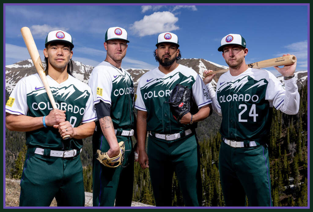
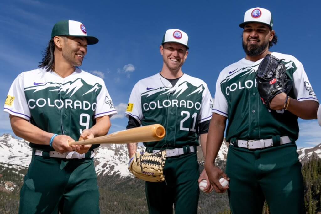
Yesterday, the Colorado Rockies unveiled their City Connect (CC) uniforms, becoming the fourth team to do so this season, and the eleventh team overall. Before we get into any of the myriad details/Easter eggs contained within the uniform — or more specifically the jersey — and with the usual caveat that we need to see how these look on the field, I have to say, these might be the best CC uniforms yet released.
On Thursday, I asked Colorado Uni Watch stalwart Kary Klismet (who had much to say when the Rockies CC socks were leaked) if he’d like to impart his thoughts on the unis, and he has done so…in spades. That commentary will follow.
The details/storytelling with these are, as with most CC unis, over the top, but bear with me here: there is indeed a method behind the madness. I always try to ignore the (sometimes invented) backstories that go along with modern uniform designs, but as I’ve mentioned before, divorcing the deets from the unis is often difficult, as the CC uniforms are almost purpose-built: the uniform tells a story. Usually that’s to its detriment, but somehow, it all seems to work here. Let’s get started:
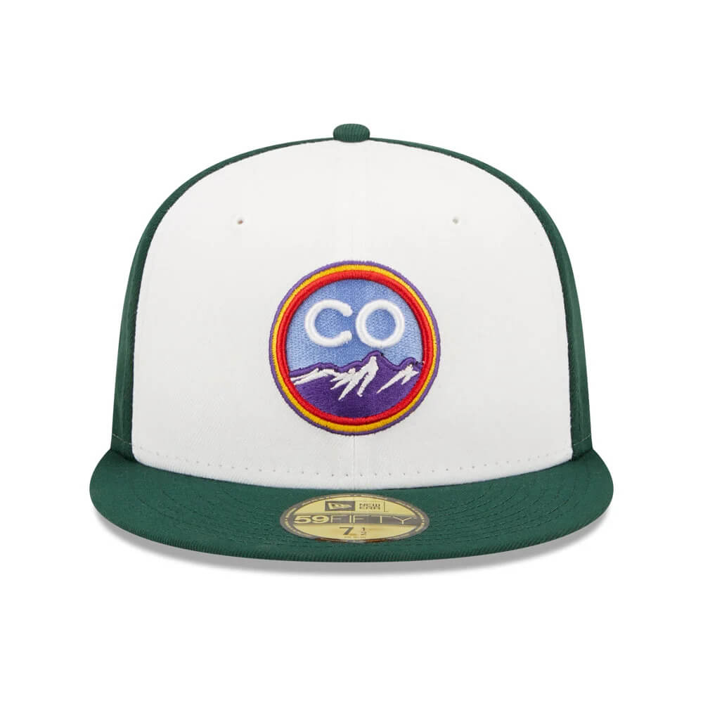
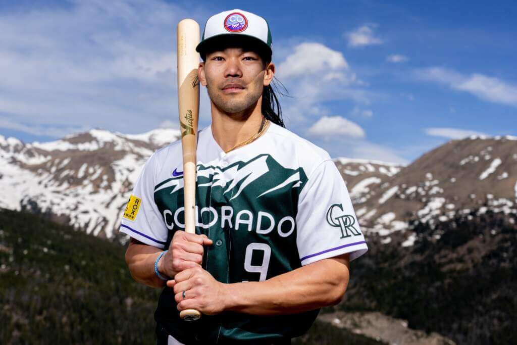
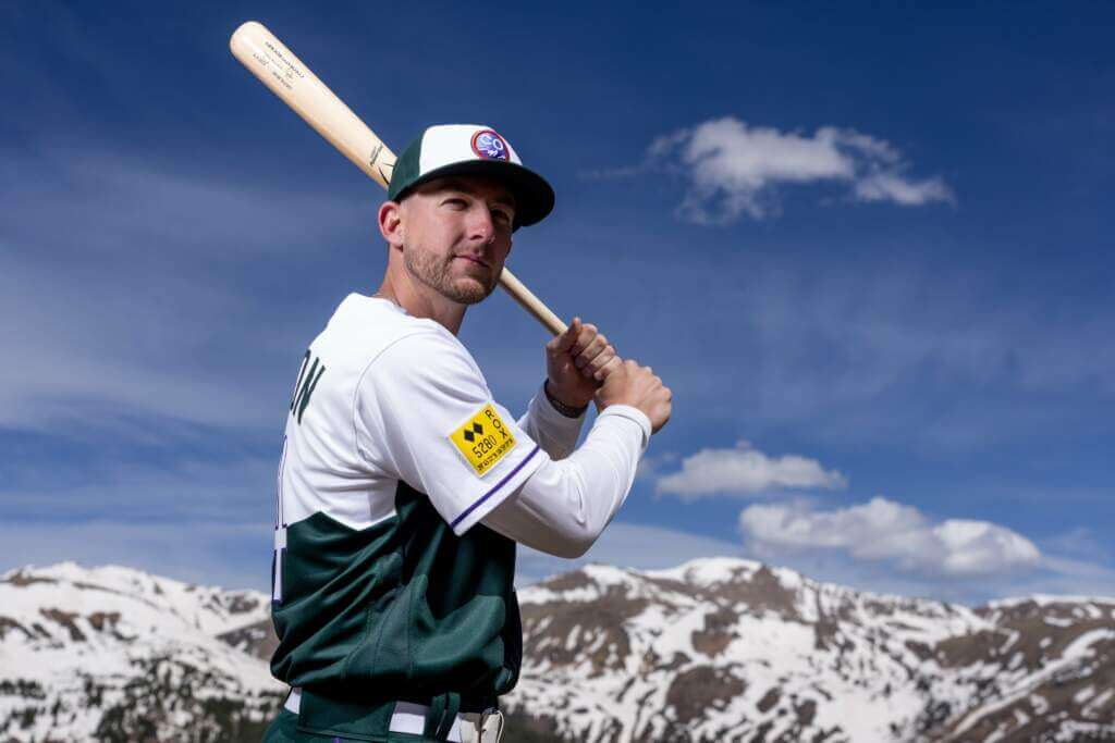
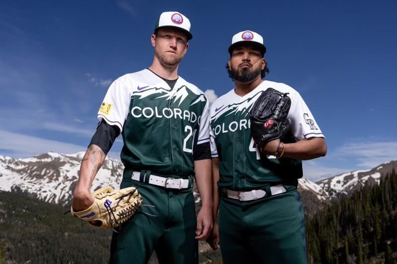
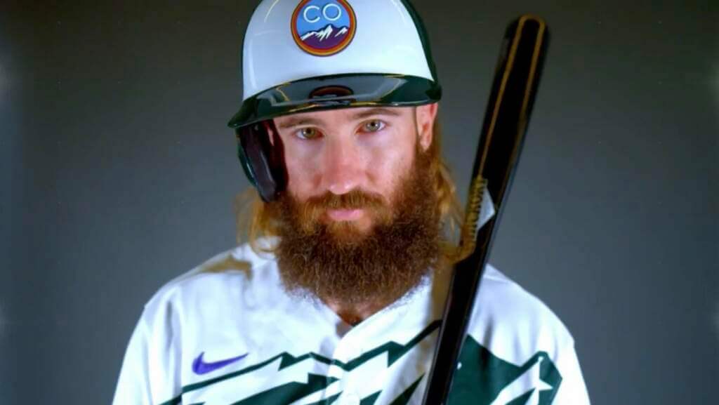
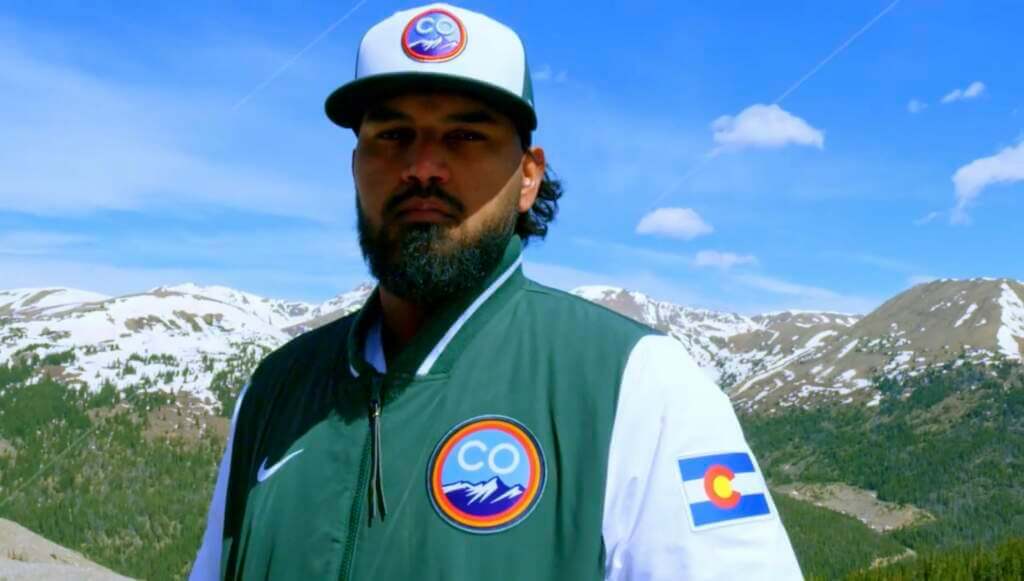
CAP
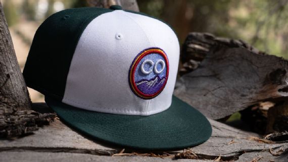
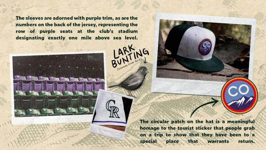
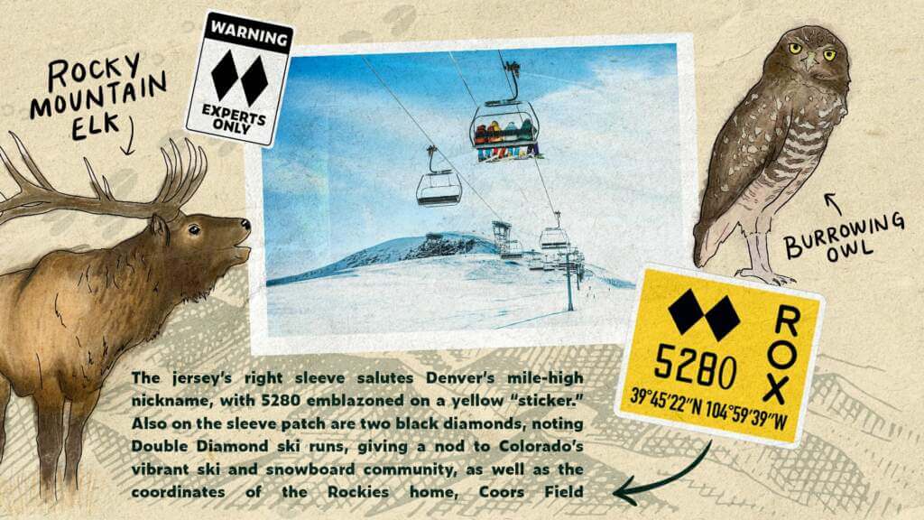
The cap has a green deep green hue, with a green visor and back panel, and a contrasting white front panel. The cap logo uses the “CO” postal abbreviation, and features purple mountains, blue sky, with rings of red, gold and purple. Blue, red and gold are the colors of the Colorado flag and the Denver City flag.
JERSEY

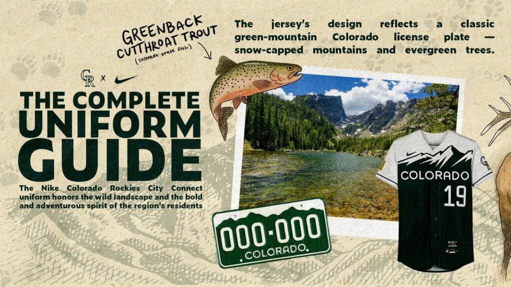
In case it wasn’t readily apparent, the jersey takes its inspiration (and design) from the iconic green Colorado license plate. Jim Kellogg, the Rockies’ vice president of community and retail operations, explains: “We modeled after the Rockies license plate, because obviously wherever you’re at in the United States, if you see that plate, you know where it is. That’s Colorado. It represents the mountains.”
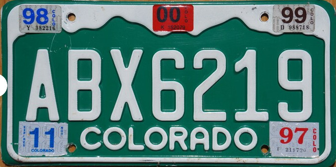
But it wasn’t just modeled after the license plate, “(T)he font on the jersey is the font on the license plate. Even the numbers on our license plates are a little unique. The zeroes are a different type, so are the ones and the nines,” Kellogg added.
If you look at the last two digits on that license plate, as well as the “COLORADO” imprint, you’ll notice the team basically copied the typography:
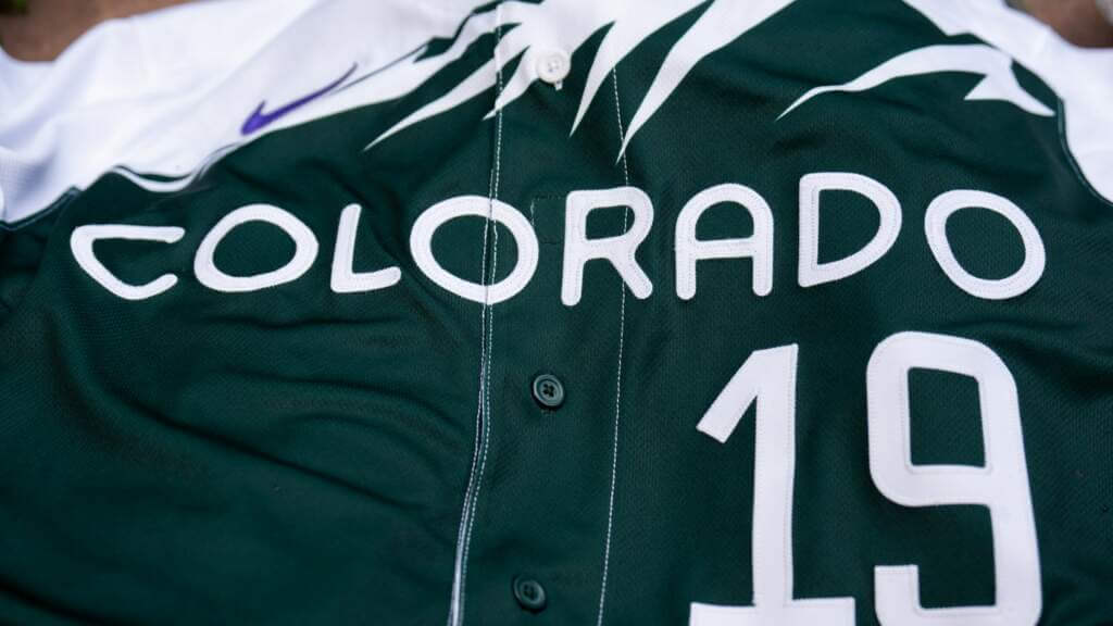
The jersey itself is mostly green, but mimics the license plate motif by having white at the top and sleeves, with a snow capped mountain atop a green base. As noted above, the “COLORADO” wordmark and uniform number are almost identical to the fonts found on the state plate.
You’ll note the right sleeve contains a yellow patch (meant to mimic the registration sticker found on the license plate):
Here’s a closeup:

There are several “features” here: two black diamonds, the numbers “5280,” the letters “ROX” aligned vertically down the right side, and a longitudinal/latitudinal designation. Most people can probably figure out that the 5280 refers to the number of feet in a mile (Denver is known as the “Mile High City”), “ROX” is shorthand for “Rockies,” and the degrees/minutes/seconds represent the coordinates of Coors Field, where the Rockies play. If you’re not a skier, you may not recognize the double black diamond is a designation for an extremely difficult trail.
Here’s where the storytelling gets a bit out of hand. According to Kellogg, “It represents the most difficult ski hill that you can go down, but once you get down to it, it’s quite an accomplishment.” The Rockies (the mountain range, not the team) are famous for skiing, no doubt, but I’m not entirely certain why this design feature was included on the patch. The double diamond relates to the team how?
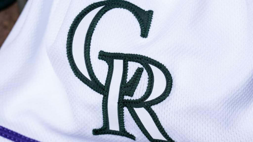
Anyway, back to the jersey. The left sleeve features a “CR” patch in the team’s current logo design, rendered in green:
You’ll note that the sleeves themselves feature purple piping slightly above the hem.
That’s not just a random design feature. Oh no. Wait for it: The purple piping around the white sleeves represents the purple row of seats at Coors Field, which is measured at one mile above sea level. No seriously. It’s not just purple piping. It’s a tribute to the mile high row seats.
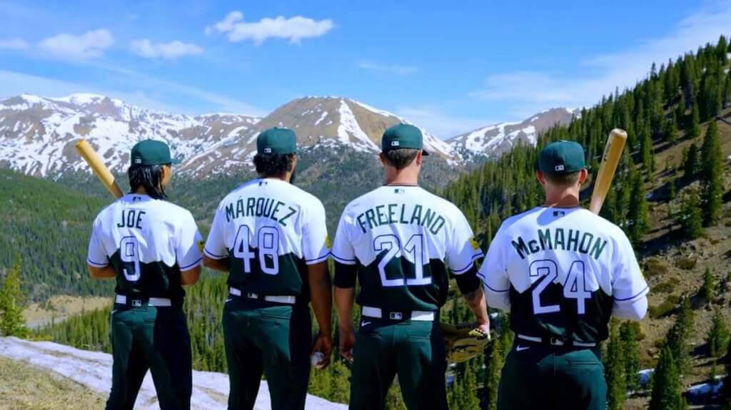
The back of the jersey is similar to the front, with a white top/green bottom (and mountain motif). NOB is rendered in a block font in green and numbers are white, outlined in purple.
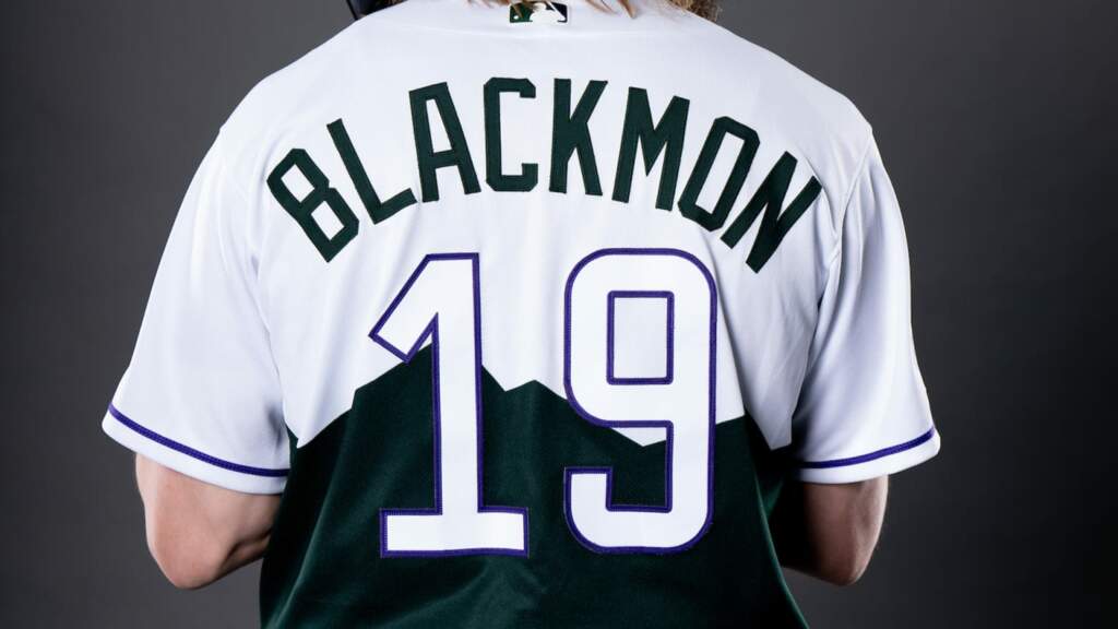
I get what the team is trying to do here, but I have to think the tops of the numbers are going to appear ghosted when seen at any distance — a problem that affects the San Francisco Giants as well. Did Nike/Rockies designers learn nothing from trying to be too clever by half?
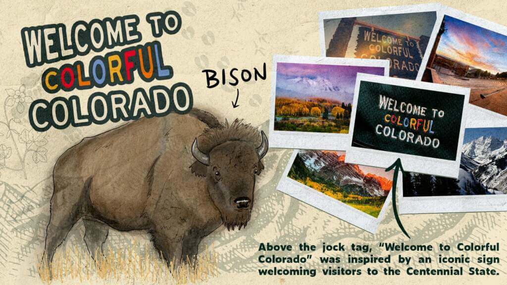
If you thought the jersey was done with symbolism, you’d be wrong. If you remember the retail jersey I showed above, you’ll see there is a jock tag on the front left tail. It’s not visible when the jersey is tucked in, of course, but it’s there. Here’s a closeup:
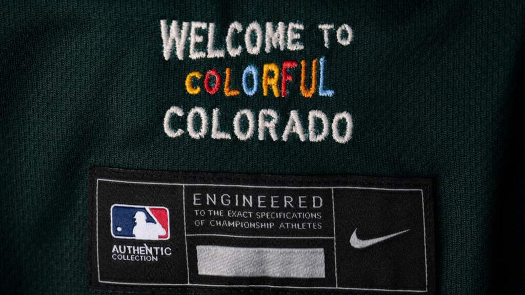
That’s not just some whimsical saying — it actually is an ode to the “Welcome” signs visitors and residents see when crossing into the state.

PANTS
Pants are solid green in the same shade as the jersey, with a thin purple stripe running down the legs. They are accompanied by a white belt.
Unfortunately I did not see any full-length photos showing the pants (this may have been intentional). The team produced a helpful hype video to accompany the unveiling, in which you can see additional views of the uniform, including a matching helmet and a dugout jacket; however, none of them show lower leg stylings (one would assume some players will go pajama-style, while others will wear cuffed pants).
‘Colorado’ is more than our namesake.
It’s all of .We are the fabric of our state ️#Rockies / @nikediamond pic.twitter.com/1PoECFOPqc
— Colorado Rockies (@Rockies) May 27, 2022
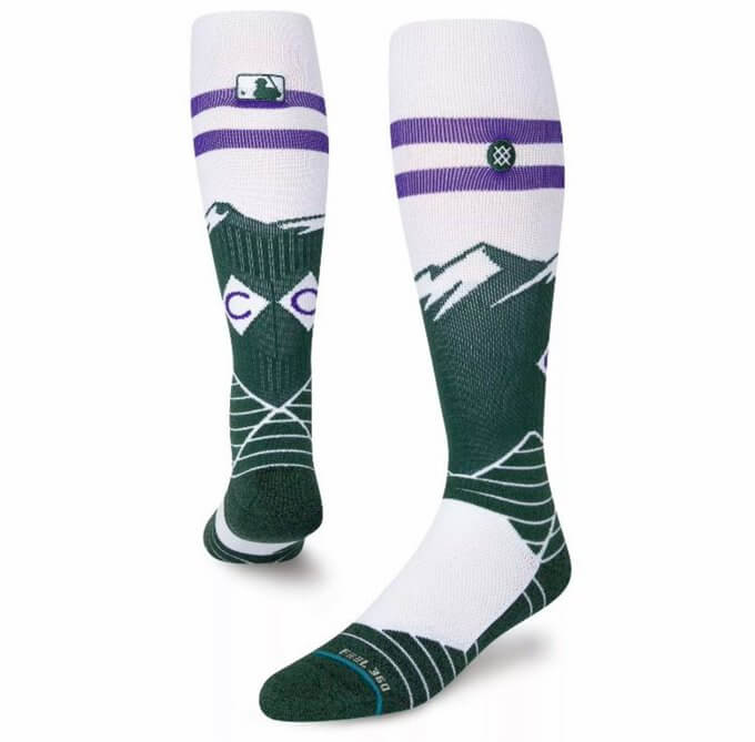
SOCKS
I didn’t see any mention of CC socks, but we can safely assume now that the leaked CC socks from a couple months ago will be worn with the new CC uniforms. They absolutely match up with the newly released threads:
I’ve given a few opinions of the uniform (and will have a couple more) but I now want to turn this article over to Kary Klismet, who has provided an outstanding review of the uniforms (he included many links in his writeup which I’m going to include here, for your easy reference). Here’s Kary:
My Rox Initial Reaction
by Kary Klismet
Like all editions of this Nike-created artificial phenomenon, my first reaction to the Colorado Rockies’ City Connect uniforms is that they are unnecessary. But evaluating them solely on their merits as much as I can, these uniforms have quickly jumped to the top of my list of favorite City Connect uniforms.
My speculation back in March proved correct that the green used on the leaked socks suggested the Rockies would be using the states’ iconic license plates as inspiration for their design. The Rox have left nothing to subtlety here; there’s no mistaking the connection, from the shade of green, to the font used on the “Colorado” wordmark across the chest, to the sleeve patch designed to look like a license plate tag. (And extra kudos for making the patch yellow to match the 2022 iteration of the tags, which change color annually.) Regardless of what you think of the unis, you have to admire the all-out commitment to the concept.
Normally, my disdain for mono-colored baseball uniforms would mean I wouldn’t like this set’s forest green pants. And I admit I wouldn’t mind seeing how it would look with white pants. But in this instance, the green pants work to further the license plate theme. And the white belt and jersey shoulders and sleeves provide enough contrast to keep the uniforms from looking like unitards.
The restrained use of purple adds just enough of a different color to complement the generous use of green. The way it references the Rockies’ stadium’s famous mile-high purple row of seats is also a nice touch, and it allows the uniforms to double as an homage to the ballpark’s green and purple color scheme (another possibility I speculated about back in March).
I also appreciate the inclusion of embroidery inspired by Colorado’s well-known highway welcome signs, but I find its location head scratching. It’s just above the jock tag near the hem, which means it will be invisible on the field when the jersey is properly tucked in. What’s the use of including a welcome message if no one can see it? Oh, right! It will be plenty visible to multitudes of retail purchasers. Never mind!
Similarly, the inclusion of the blue, red, and yellow on the cap logo as a nod to the state and Denver city flags works okay when the hat is viewed as a piece of merchandise. In terms of on-the-field uniform design, however, I think it would have looked better if the team had stuck with the green and purple theme.
The one part of this uniform that is a total swing and miss for me is the white numbers on the back. They get lost as they rise from the green mountains on the lower half of the jersey to the white shoulder yoke above. The purple outline doesn’t create enough definition to save the top of the numbers from looking washed out against the white background. It would have looked better if they’d moved the mountains up to just below the NOB and placed the numbers fully below the green peaks.
Aside from those few specific criticisms, however, I’m generally quite pleased with the Rockies’ City Connect look. It does as good of a job as any of it predecessors (and better than most) of tying themes that mean something to local residents into a reasonably coherent uniform design.
Thanks, Kary! I was hoping to have a resident’s take on the new uniforms, and yours certainly is well thought-out. I’m basically in agreement with you on the whole.
It’s quite understandable that very few uniforms in any sports make use of both dark green and purple (and probably with good reason: they’re not complementary colors, and they tend to drown each other out when used next to each other). But I think the Rockies have actually done the two justice here. Yes, that purple stripe on the pants will barely be visible, but otherwise the restrained use of purple is well done. And of course, Wimbledon has done purple and green about as well as can be done.
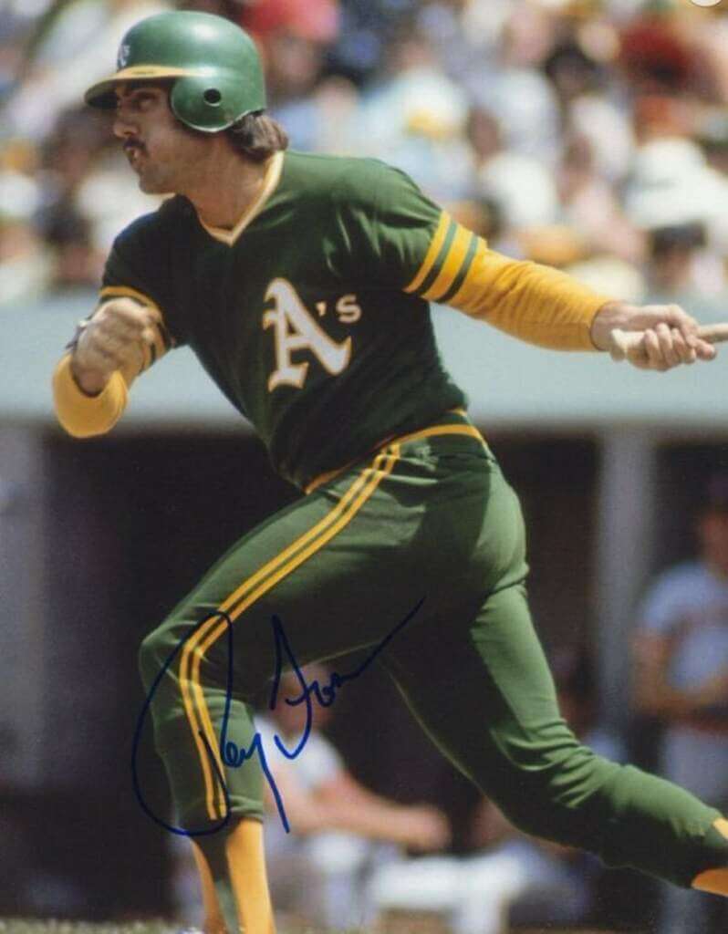
Unlike others who frequent these boards, I am fond of baseball uniforms where the pants and jersey are the same color (not always, but mostly). So when I saw the Rockies going basically mono-green, I was pleased. It’s a sorely underused color in baseball, and when worn properly (that is, with cuffed pants and hosiery), it can look really good — like the rarely worn Oakland A’s mono-green of the 1973 season:
Aside from the few quibbles I expressed above (particularly the chance for ghosted rear numbers and over-the-top storytelling), I think this is one of the better — and possibly the best — CC uniforms released to date. The real test will come when we see them on the field. The squad will wear them for the first time on Saturday, June 4 when the team takes on the Atlanta Braves, and then again on every Sunday home game through the remainder of the 2022 season.
POST SCRIPT
On their social media, the Rockies really took the storytelling to the extreme, making sure every detail of the uniform was explained down to the last stitch. I’m not sure if this is the greatest or the worst thing I’ve ever seen (and I hope it’s a one-off), but you gotta admire the moxie:
Your thoughts?
Did the Angels City Connect Uniform Leak?
[Editor’s Note: The original tweet was removed, but it can be found here. Below is a second tweet also showing the purported Angels’ CC unis — PH]
Here's a look at the Los Angeles Angels Nike City Connect uniforms. What do you guys think? pic.twitter.com/w445VSSqFK
— Talkin’ Baseball (@TalkinBaseball_) May 28, 2022
Late last evening I happened to catch the above tweet. Obviously, I can’t vouch as to its authenticity, but those are clearly real Angels players shown (Syndergaard, Walsh, Lorenzen, etc.). Paul notes we’ve seen a few merch leaks, and he’s pretty certain this is consistent with what those showed.
Again, this isn’t confirmed (at least not by Uni Watch), but there are certainly signs it’s legit. As far as City Connect uniforms go, the Angels are next in line after the Rockies, (theirs will make its on field debut on June 11, just a week after the Rockies debut theirs), so it would make sense that a photoshoot for the new uniforms has taken place.
Stay tuned!


Guess The Game…
from the scoreboard
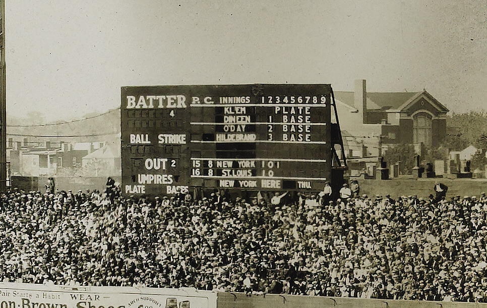
Today’s scoreboard comes from Robert Crowley.
The premise of the game (GTGFTS) is simple: I’ll post a scoreboard and you guys simply identify the game depicted. In the past, I don’t know if I’ve ever completely stumped you (some are easier than others).
Here’s the Scoreboard. In the comments below, try to identify the game (date & location, as well as final score). If anything noteworthy occurred during the game, please add that in (and if you were AT the game, well bonus points for you!):
Please continue sending these in! You’re welcome to send me any scoreboard photos (with answers please), and I’ll keep running them.

Threads of our Game…
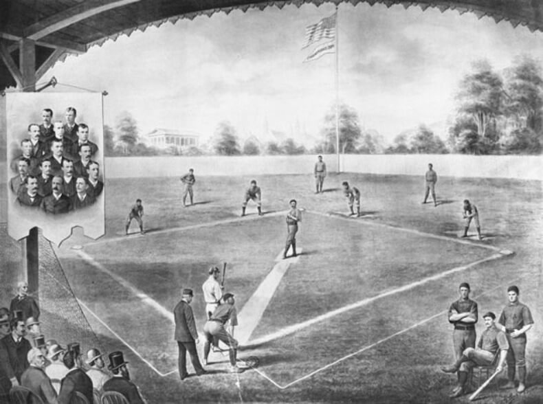
Got an e-mail the other day from the great Craig Brown, who runs the fantastic Threads Of Our Game website. If you’re not familiar with it, the primary focus is on pre-1900 baseball uniforms and related ephemera.
He wrote:
The 1884 Athletics — both real, and not real.
Hello baseball historians,
When is art a depiction of reality? And when is it artistic license? A closer look at a print of the 1884 Athletic team of Philadelphia examines the blurry lines between the two.
Take a deep dive here.
See all posts on the Threads feed here.
Thanks for your time,
Craig
Thanks, Craig! Great work (as always) on this!
Uni Watch News Ticker
By Anthony Emerson

Baseball News: The Washington Post has an excellent article on what motivates people to buy jerseys, especially when your team is struggling on the field (from Tom Turner). … Rangers P Martín Pérez handwrote “4 Uvalde” on his cap during yesterday’s game (thanks, Brinke). … The Dodgers will retire Gil Hodges’ No. 14 in June (thanks, Phil). … Penn State’s “Nittany Lions” script seems positioned a bit too high, especially relative to their front number (from Michael Galante). … All Western Canadian Baseball League umpires wore the No. 3 on their sleeve in honor of the late umpire Mitch Ball (from Wade Heidt).

Hockey News: No confusing which team these 1973 Maple Leafs practice jerseys belonged to (from Dave Buchanan).

Soccer News: CF Montréal have unveiled a new crest, for use in 2023 onward (from Moe Khan). … Crewe Alexandra of England’s fifth tier have launched their new home kit (from Ed Zelaski). … All four Texas MLS/NWSL teams (Houston Dash/Dynamo, FC Dallas, Austin FC) are wearing a Uvalde shooting memorial patch this weekend (from our own Jamie Rathjen). … Also from Jamie, the NWSL’s Washington Spirit came to tonight’s game wearing T-shirts that say “Enough” while the Orlando Pride are wearing rainbow numbers for a pride game.

Grab Bag: Here are two more designs for Australia’s Super Netball’s First Nations Round, for the Melbourne Vixens and Sunshine Coast Lightning (thanks, Jamie). … McLaren F1 is adding a logo to their carsin honor of the late, great Ayrton Senna. Senna won three championships with McLaren before moving to Williams for the 1994 season, where he would be killed in a wreck at Imola. Williams had previously displayed the Senna logo on their cars until this season.
Uni Tweet of the Day
Those Elks unis (which I wrote about last week) look pretty good!
Fresh clip out of Winnipeg… your first look at the new uniform in action 🔥🔥🔥#RepFromSectionX #GoElks #CFL #Edmonton #AntlerUp #YEG #JoinTheHerd 🦌 pic.twitter.com/9MN7jRosSQ
— The Elks Herd (@TheElksHerd) May 28, 2022
And finally… that’s it for today. Big thanks to Kary for sharing his thoughts, as a fan of the team and resident of the State, on the Rockies CC uniforms. I’m really hoping those Angels unis aren’t real…but I’m not holding my breath.
You guys have a great Saturday and I’ll catch you tomorrow.
Peace,
PH
Great post. It looks like the Angels tweet was deleted, though.
I like the Rockies uniforms and the uniform guide with the animals. Nice job!I don’t know if these are the best of the CC uniforms, but definitely among the best.
The animal guide brings up a real missed opportunity for this team.
The state bird is a bunting.
When MLB gave Colorado a franchise, players still bunted.
Why not call the team the Buntings, instead of using a recycled name from a different sport?
As for the uni, if you have to ask if the numbers will appear ghosted, it’s a fail.
Fun fact that nobody but me will care about:
The Lark Bunting is actually misnamed, as it isn’t a true bunting (family Cardinalidae) but a sparrow (family Passerellidae). The “bunting” name presumably arose from its striking coloration, which is more typical of buntings. (Sparrows typically come in more muted shades of brown and gray.)
Meh cap aside, the Rox did a pretty good job. These are my favorite CC uniforms thus far.
Agreed. Looks like something you’d get at a truck stop.
Twitter yanked the post of the Angels CC leak, but the Wayback Machine snagged it before it disappeared.
link
Great catch! Can’t wait for the narrative on these because they’re out there. But I am not from Anaheim, so I don’t grasp the concept here.
Thanks for digging that up.
I found another tweet (now replacing the original) which shows the same picture.
As a recent Colorado ex-pat, I still have an affinity for the Rockies. If this were a lycra bike jersey, I’d wear the shit out of it. But as a baseball jersey, for the team that OWNS purple, it feels like some marketing folks at Nike wrote down all of their cliched ideas about the state (leaving out any pot-related ideas, of course) and slapped them together. Purple represents the Purple Row? Is that a nod to Ouroboros?
My big fear was they would lean in hard with a Colorado state flag motif, which is a great flag, but would have been way worse as a uni. So, crisis averted.
At least we don’t have to see the ugly black KISS vests for the rest of the season, so I guess it’s not all bad.
Scoreboard is Game 4 of the 1926 World Series, Wed Oct 6
Yankees 10 Cardinals 5
Cards would go on to win in 7
The famous Grover Cleveland Alexander game
Seris ended with Babe Ruth thrown out trying to steal second!
As a CC uniform, this is meh-plus for me. In the upper half of CC uniforms, but not in the top bracket of uniforms that the team ought to just adopt as a home or alt uni. But as a color test bed, this is perfect. It shows how good the Rox would look with a color scheme of purple alongside a secondary color of green and a tertiary color of anything other than black.
My only real gripe is that the numbers on back should have been purple with a thick white outline.
As a longtime Colorado resident, these uniforms capture a lot of Colorado history. The standard Colorado license plate hasn’t been green since 2000. The seats at Coors Field are also dark green with one row of purple in row 20 of the upper deck, so the uniforms mimic that too. The homage to the “WELCOME TO COLORFUL COLORADO” signs along the state borders is terrific, but should have been more prominent on the uniform. It is true that no other MLB team uses purple and only one other uses green, so it is nicely unique that way.
The Rockies management has done well with the stadium, uniforms, party decks, pre-game party areas, etc. But bottom line, it is another Colorado Rockies distraction from the team is arguably the least successful on the field team in MLB history despite being massively supported by the fans pouring into Coors Field every summer.
The Colorado plates were supposed to switch back to green with white lettering a couple years ago… COVID, maybe? Who knows? The reason was the reflective white backgrounds were too bright in photo radar/red light images, and changing it would make them easier to read. Source… Hey, that’s me! link
“All Western Canadian Baseball League umpires wore the No. 3 on their sleeve in honor of the late umpire Michael Ball”
The late umpire is Mitch Ball.
————–
Appears the Edmonton Elks are leaving the numbers off the backs of the helmets in preseason. The space below the helmet centre stripe on the back is where the number will go. The unis did look good. A good looking game all around considering the home uniforms for the Winnipeg Blue Bombers are fantastic.
The late umpire is Mitch Ball.
Thanks, Wade. Ticker now adjusted.
Was wondering about that space on the Elks’ helmet – thanks for the explanation!
As a side note, I’m going to make an effort to tune into the CFL…very disappointed that play in USFL: TNG is underwhelming(though the uniforms generally are good to great).
It is a developmental league, so I’m giving the USFL some slack. Besides, they got the important part right…the unis!!
Seems like the Rockies’ new uniforms should be “State Connect” as the team is named Colorado and the uniforms seem to “connect” much more with the state than the city of Denver.
Yes, the Rockies wanted to create a regional following so Colorado is obviously more regional than Denver and the Rocky Mountains go from Mexico to Canada for that matter. The name of course was stolen from the original Denver NHL franchise, which was an overwhelmingly losing team, like the baseball Rockies have usually been as well.
Ironically the the most popular team in the Rocky Mountain region is the Denver (not Colorado) Broncos, who have actually had great and winning teams. The Colorado Avalanche have done the best at using the Colorado label with 2 Stanley Cups and a good shot at another going on now.
Is it not possible that the purple refers to Purple Mountain Majesty, which is why they may have chosen purple as team color (hence, the row of seats) in the first place??
According to the materials the Rockies have themselves put out to explain the symbolism behind their City Connect uniforms, the purple is a reference to the purple row of chairs (Row 20) in Coors Field that sit at 5280′ in altitude:
link
Now, the decision to make those chairs purple was of course because it’s a team color. And purple was chosen as a team color back in the early ’90s when the franchise was first being formed because of the line in America the Beautiful about “purple mountain majesties.” So, in that sense, the purple on the City Connect uniforms might be considered to reference America the Beautiful, but only indirectly.
The scoreboard is from Game 4 of the 1926 World Series on October 6 at Sportsman’s Park in St. Louis. Babe Ruth hit three home runs that day, leading the Yankees to a 10-5 victory. Ruth’s luck ran out (pun intended) when he was caught stealing in Game 7 (with the Yankees trailing by a run) to end the Series.
Colorado Rockies are unique in that it’s named after the State so it’s not really a city connect uniform but rather a State connect uniform. So do we call this the Rockies State connect uniform? CO on the hat, license plate frame jersey. The diamonds for a ski slope when Denver isn’t in/on a mountain. Tho a break from the flag C is nice. Anyone from the area tired of the 5280? Great flag but over used. Maybe I’m all wrong here but just thinking out loud about how minor league baseball this is all become.
While I think the whole CC Connect is a scam to sell poorly and lazily designed junk, the Rockies’ effort is the first one that actually works for me visually. Just spare me the justifying lame backstories, Nike. As for the one Angels picture, I realize it’s just one picture, but that appears to be the laziest effort yet. I can’t wait…
Being inspired by a license plate. How wonderful is that!
Maybe the double black diamond sleeve patch is Nikes nod at how difficult it is to understand their marketing speak. That or it’s a jab at how hard it is to be a Rockies fan, lol. Either way, AWESOME uni.
That’s a really interesting scoreboard; I’ve never seen the umpires’ names given so much attention! Bill Klem and Hank O’Day are famous (the latter umped the famous Fred Merkle missed-base Cubs-Giants game in 1908) and I think Dinneen is former pitcher Bill Dineen.
As for the Rockies uniforms, I like the fronts (and love the green pants), but the backs are terrible. The NOBs stand out way too much and the numbers are barely readable.
And what’s with the weird zero on the sleeve patch? It looks like it comes from a different font.