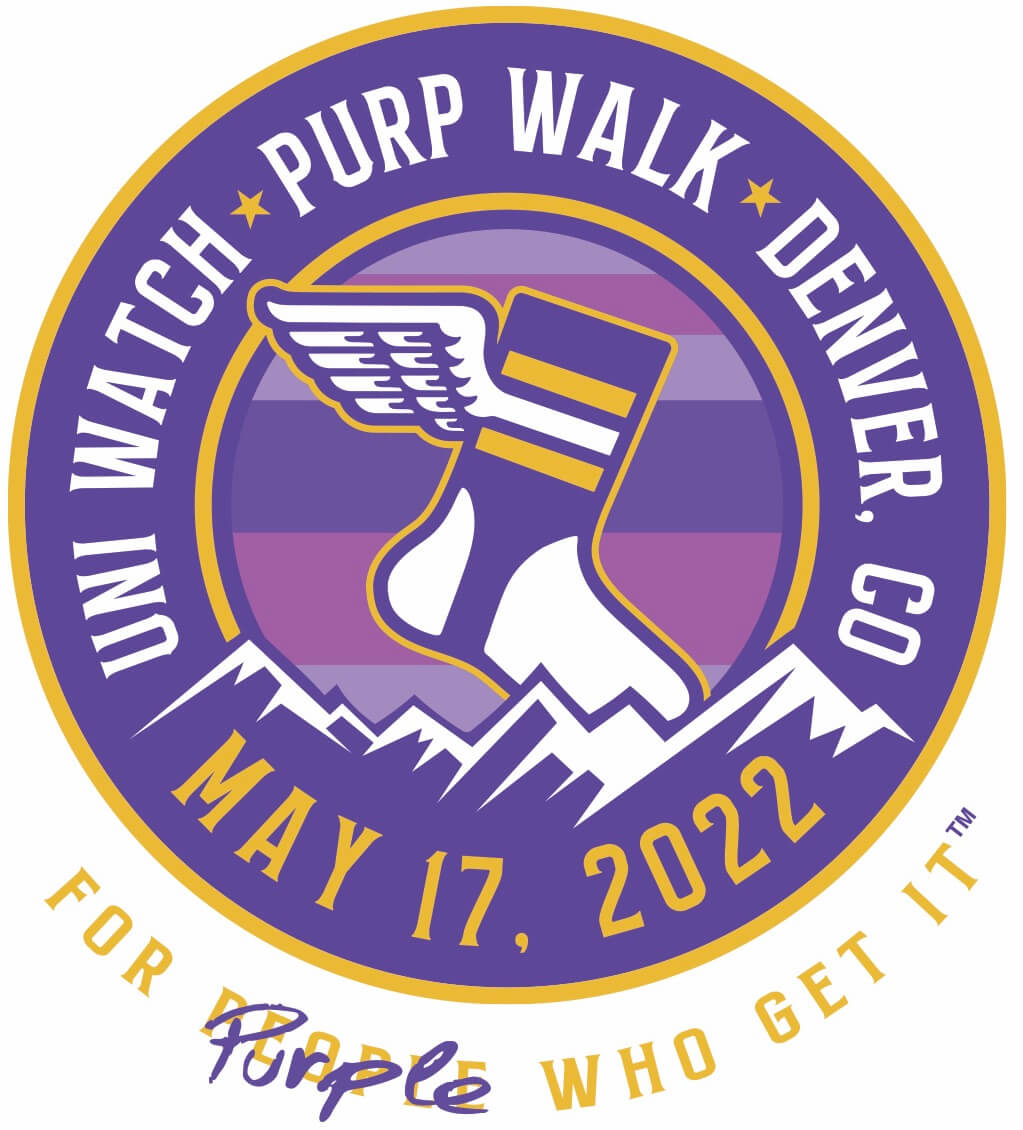
Hello! As many of you are already aware, today is the 16th anniversary of the very first post on this website (not to be confused with the very first Uni Watch column, the 23rd anniversary of which is coming up next week). By longstanding tradition, that means today is also Purple Amnesty Day — the one day of the year when I grudgingly acknowledge the world’s most accursed color.
The usual ban on purple-inclusive Uni Watch membership cards has been lifted until midnight Eastern tonight (you can order yours here), plus we have some special purple content and merchandise today (I’ll get to those in a minute). Meanwhile, if you’re posting any purple content on social media today, feel free to use the hashtag #PurpWalk2022 so we can all see what you’re up to.
Some quick historical background: The idea for Purple Amnesty Day came from reader Tim Cox, who lives in Denver and is a big Rockies fan. On the blog’s fourth birthday — May 17, 2010, 12 years ago today — Tim posted the following comment:
Congrats on 4 entertaining years, Paul & company. I’m a daily reader but not a member because I can’t do a Rockies membership card without purple. The 4th anniversary seems like the perfect occasion to grant amnesty to all the Rockies, Vikings, LSU, Northwestern, etc. fans out there.
I then responded:
[Y]our idea for a one-day purple amnesty program is a good one. If anyone wants to sign up for a purple-inclusive membership card, today — and only today — I will honor all such requests!
And just like that — very informally — Purple Amnesty Day was born. It has continued to evolve since then:
• A few years later, in 2015, membership card designer Scott M.X. Turner came up with the ingenious slang term “Purp Walk.”
• 2015 is also when designer Bryan Molloy and I began collaborating on Purple Amnesty Day merchandise (all available for only 24 hours, of course).
• I believe 2015 was also the first year that I changed all of the website’s green elements to purple for the momentous day.
• In 2020, reader Kary Klismet — who, like Tim Cox, is a Denver-based Rockies fan — began what has become his annual habit of writing about teams that have worn mismatched shades of purple. (We’ll get to this year’s installment in a moment.)
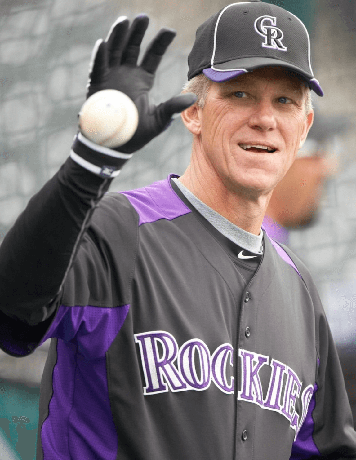
• And today, for the first time, we will have a live Purp Walk event in Denver, featuring a gathering at the Blake Street Tavern and attending the Giants/Rockies game, where we’ll sit in the famous mile-high purple row of seats. I myself will be dressed in purple, from head to toe, for the festivities.
I love how the culture of the annual tradition has continued to grow and take on a life of its own. It’s now one of my favorite days on the Uni Watch calendar, even though I hate looking at all that purple!
Speaking of which: People sometimes say I have “purplephobia.” But as I always explain, that’s not accurate, because “phobia” means fear. Folks, I don’t fear purple; I loathe purple. If anything, purple should fear me.
People often ask why I detest purple so much. As I always explain, I think purple in nature is quite nice — violets, plums, eggplants, etc. But purple as a human-imposed design element almost always strikes me as tasteless and tacky. It’s the diva of colors, the Celine Dion of colors — loud, grandiose, never content to do just enough when it can do way too much. There’s a darn good reason why you rarely see a purple house or purple car. Now if we could just eradicate purple from the rest of the built environment. Grrrrr.
And what’s worse than a team wearing purple? A team wearing more than one shade of purple. Kary Klismet is here with his latest report on that unfortunate phenomenon. Take it away, Kary!
Rockies Horror Picture Show: Colorado’s History of Mismatched Purples
By Kary Klismet
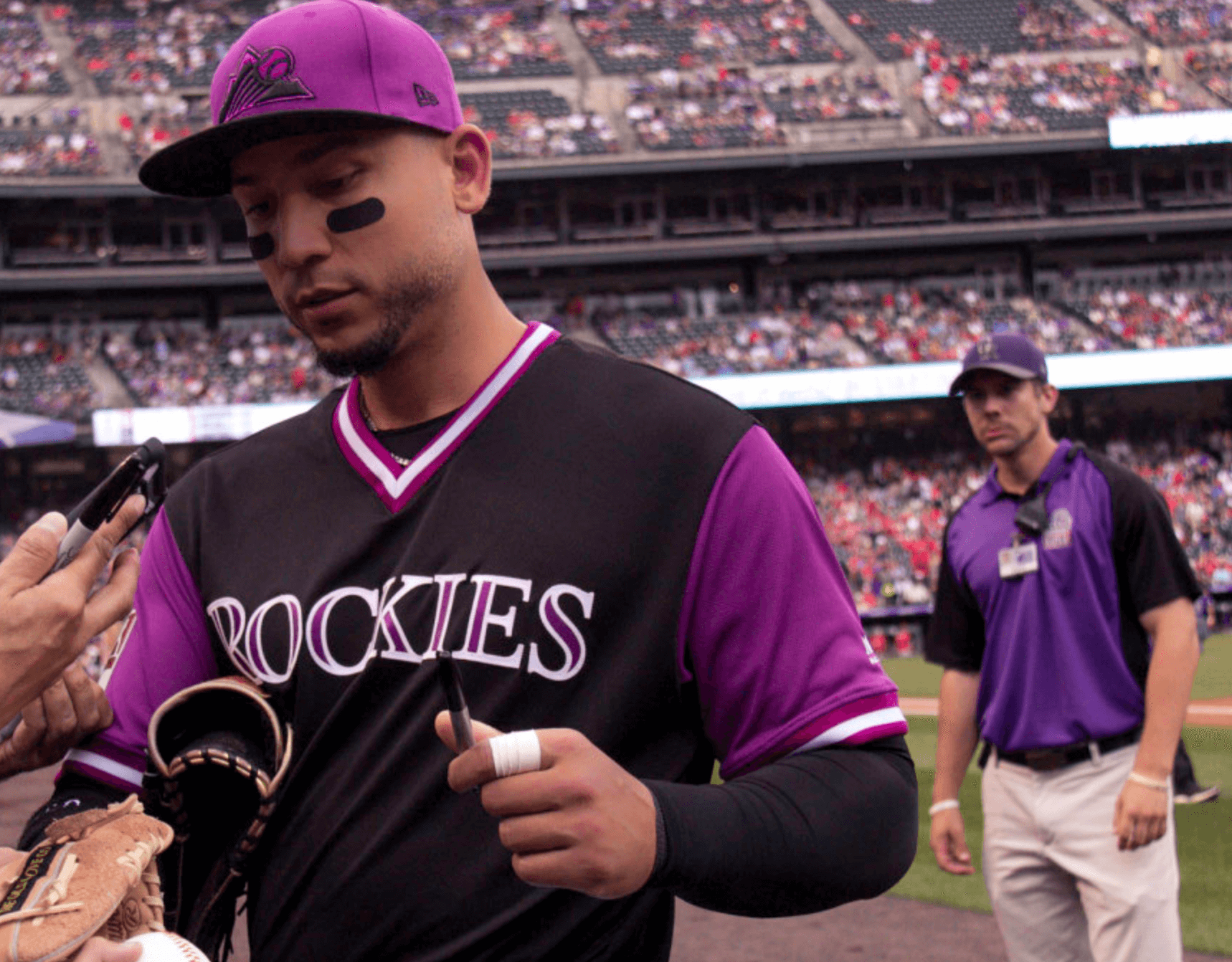
For the previous two Purple Amnesty Days, I’ve looked at the Los Angeles Lakers’ notorious mismatched purple uniforms and how it was a fairly common phenomenon — not only for the Lakers, but around the NBA. With Paul attending a Colorado Rockies game for Purp Walk 2022, this seemed the perfect time to ask the key question: Has scourge of mismatched purples also affected the visual history of our national pastime? I see you shiver with antici… pation, so follow along to learn the answer.
Let’s start here: Only four MLB teams have worn purple as a main color. One of them, the 1998-2001 Tampa Bay Devil Rays, appears to have worn a consistent shade of purple across their various uni elements. Another, the 1913-17 New York Giants, is hard to assess because we have nothing to go by except Marc Okkonen’s mock-ups, so we’ll have to back-burner them for this discussion.
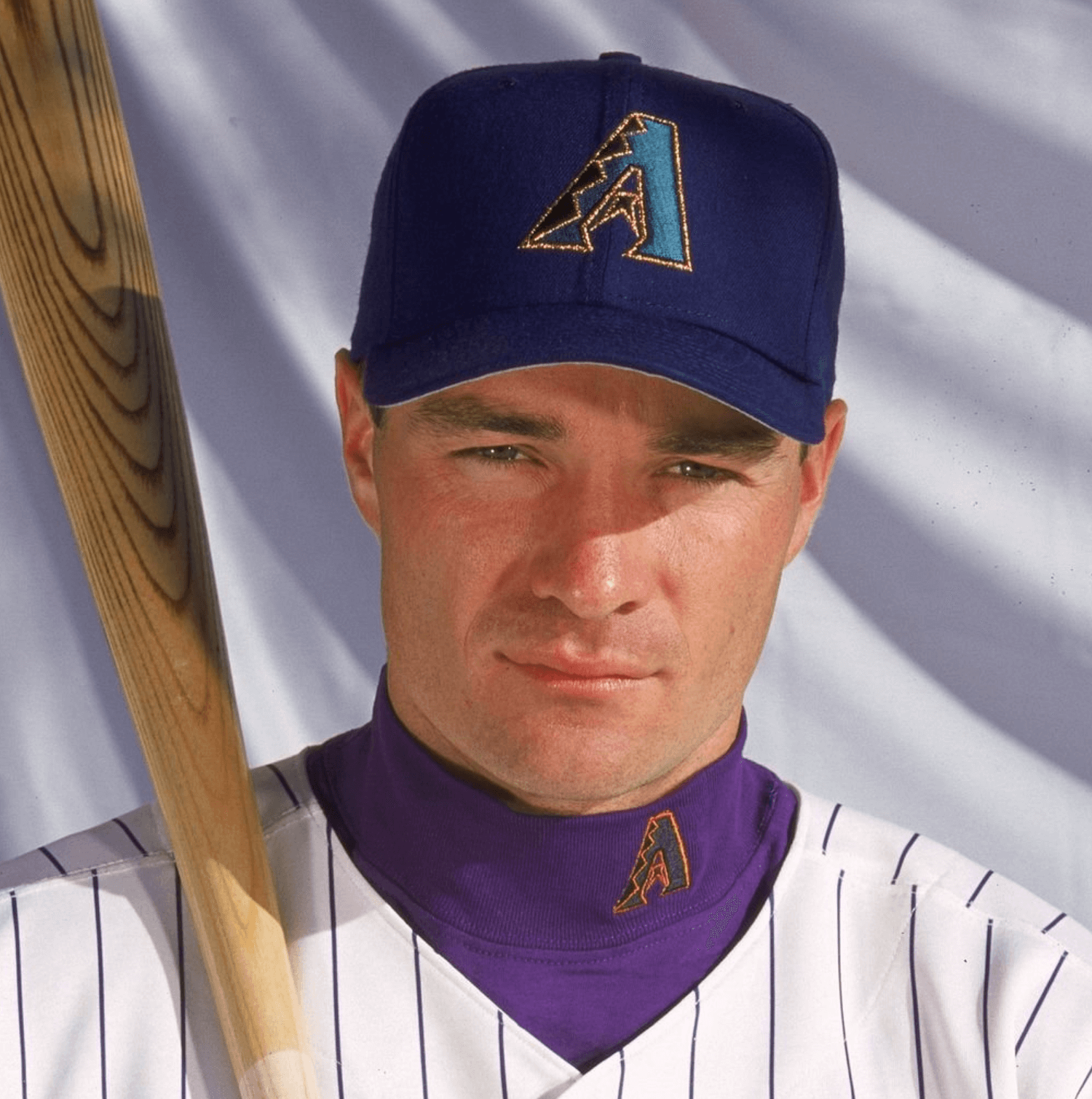
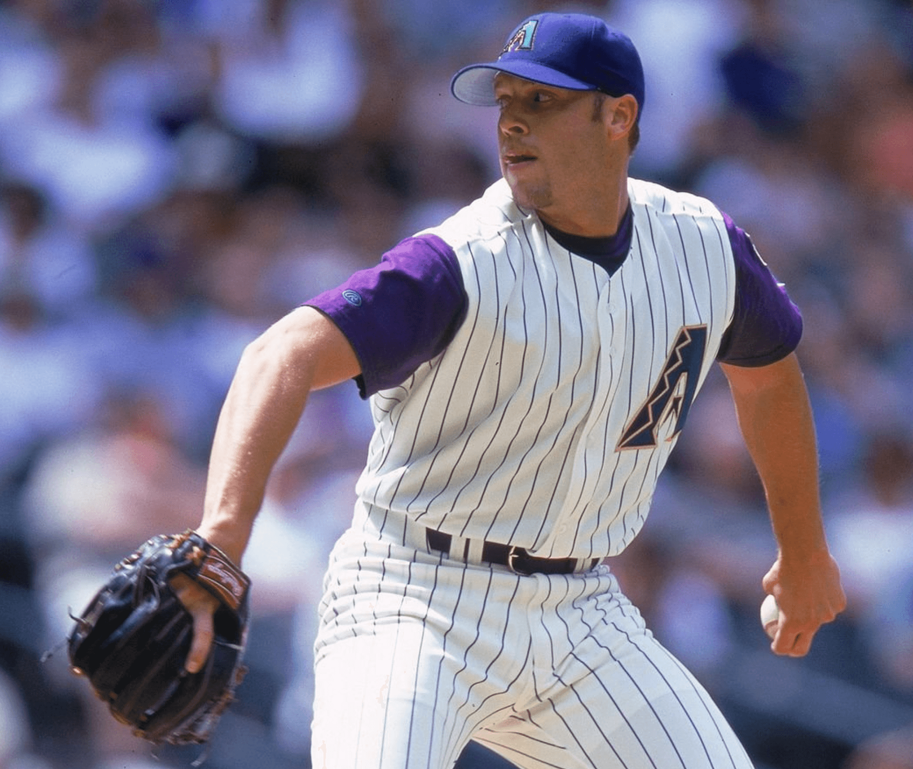
Moving on, let’s examine the 1998-2006 Arizona Diamondbacks. This was definitely a team that had a hard time maintaining the same shade of purple. You can see a small sampling of their violet violations here [for all photos, you can click to enlarge]:
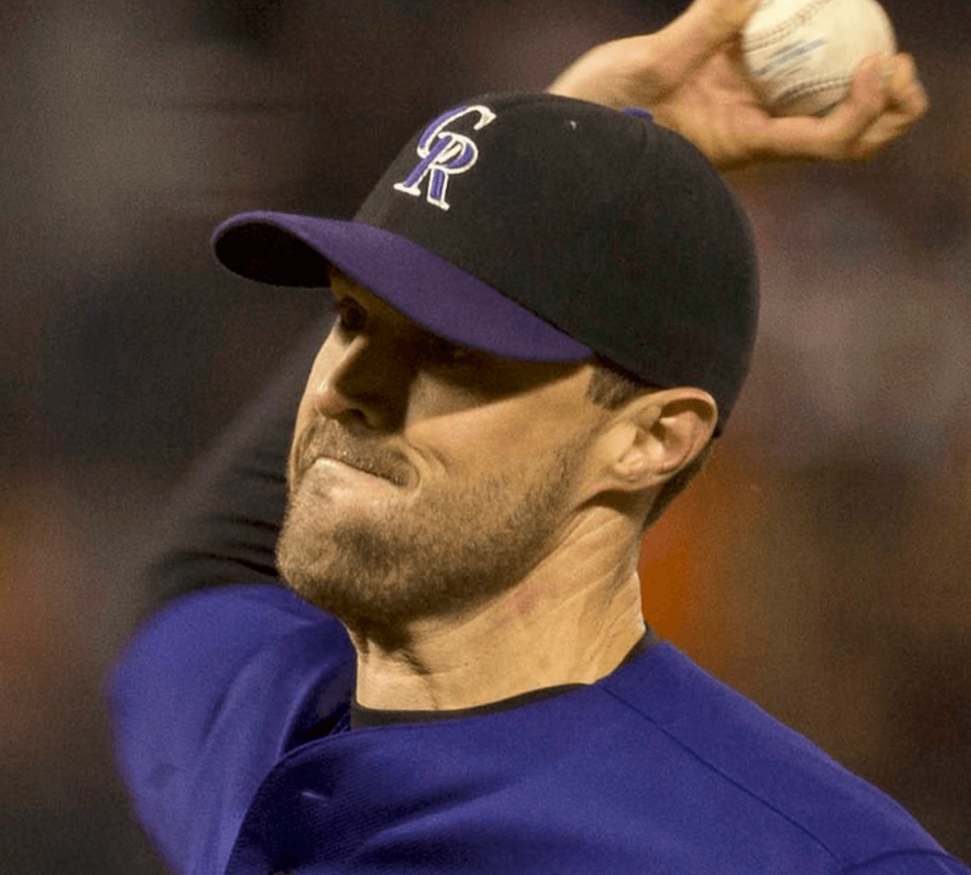
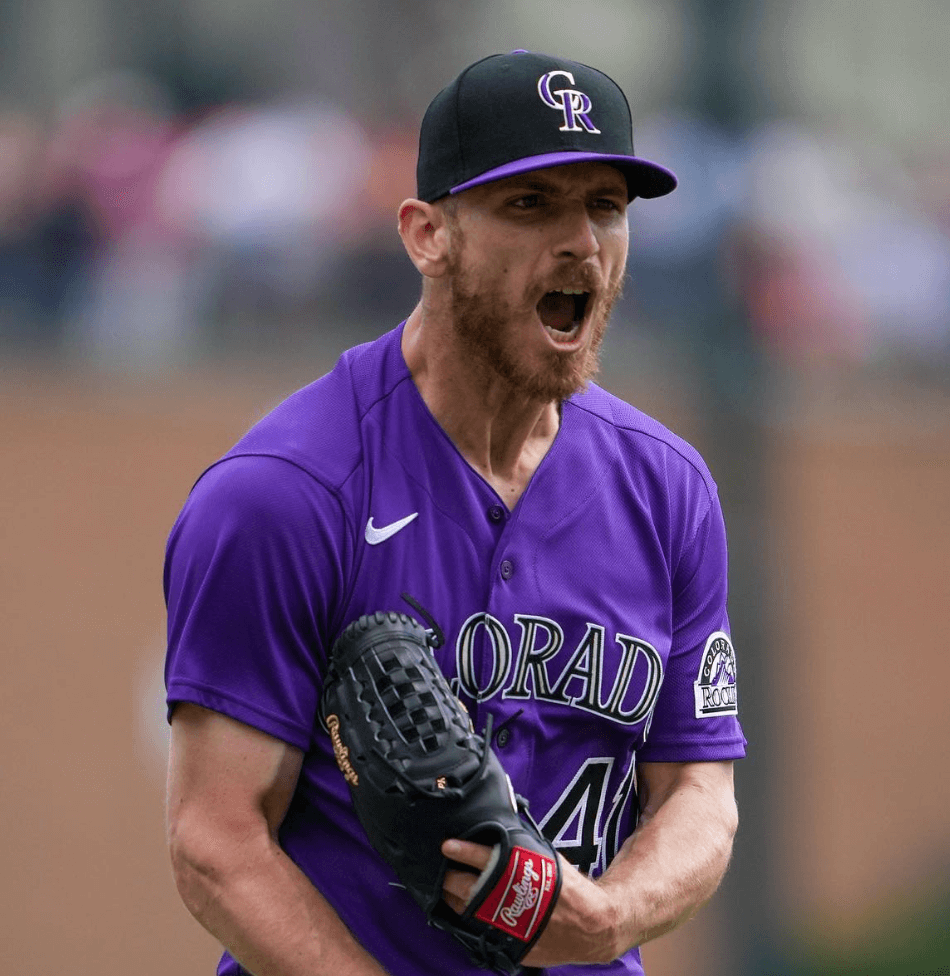
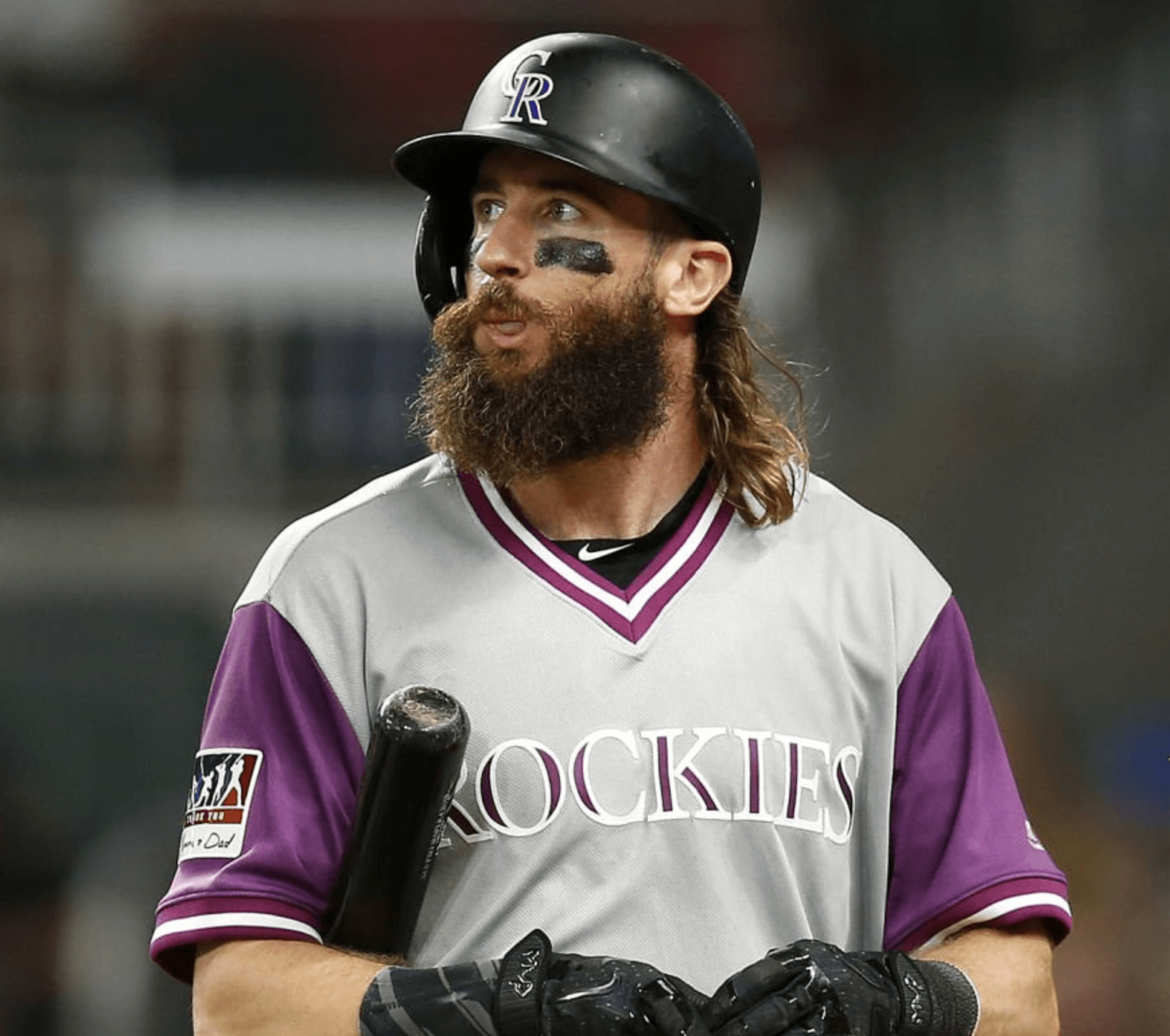
But MLB’s undisputed champions of mismatched purple are the Colorado Rockies. The Rockies’ chromatic calamities have been so profound that they rival those of the Lakers.
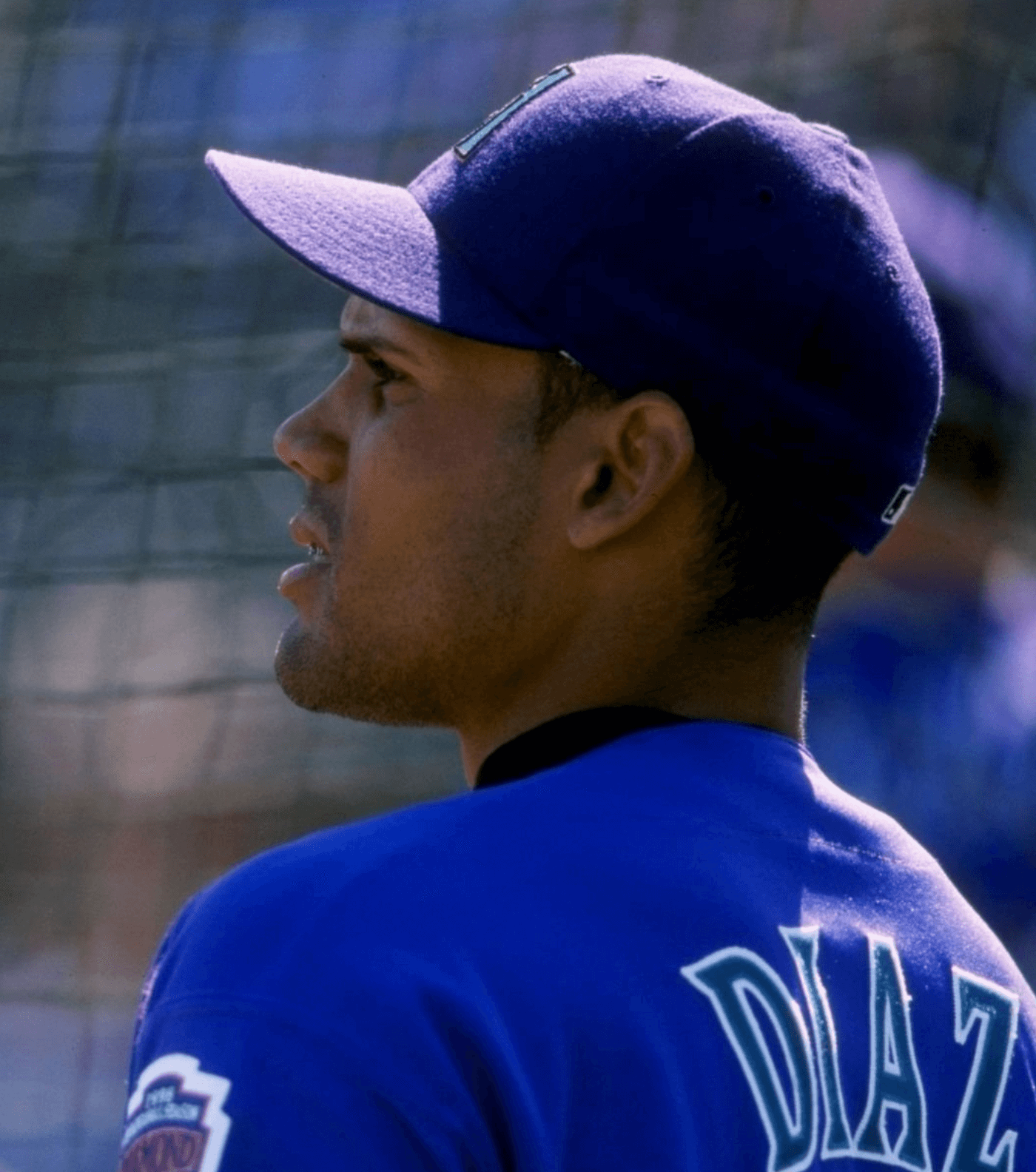
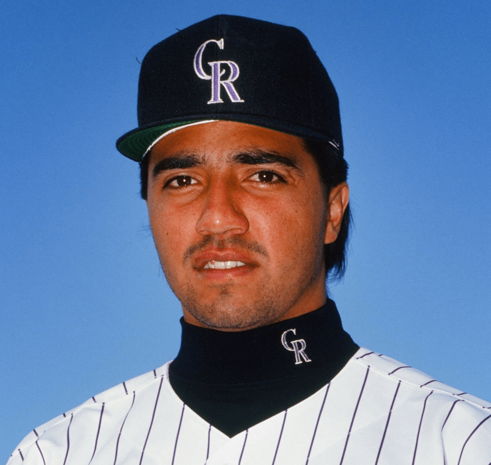
The Rockies’ differing shades of purple date to the franchise’s earliest days. Photos from their debut season in 1993 show distinct shades being used on their pinstripes and cap logo [to be fair, I think many teams may have slightly mismatched pinstripes — Paul]:
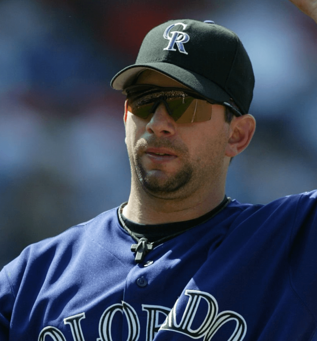
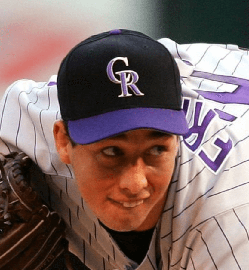
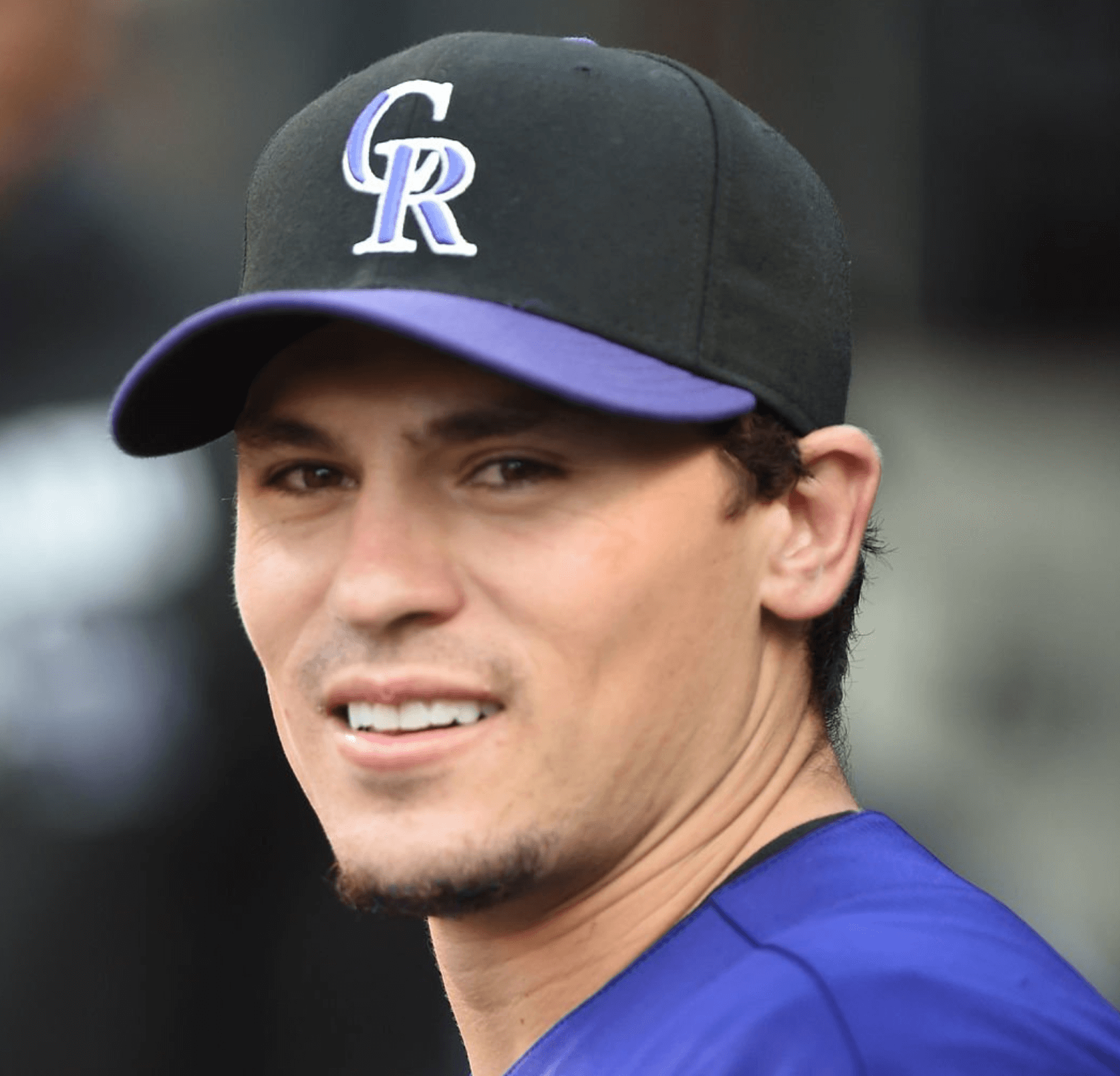
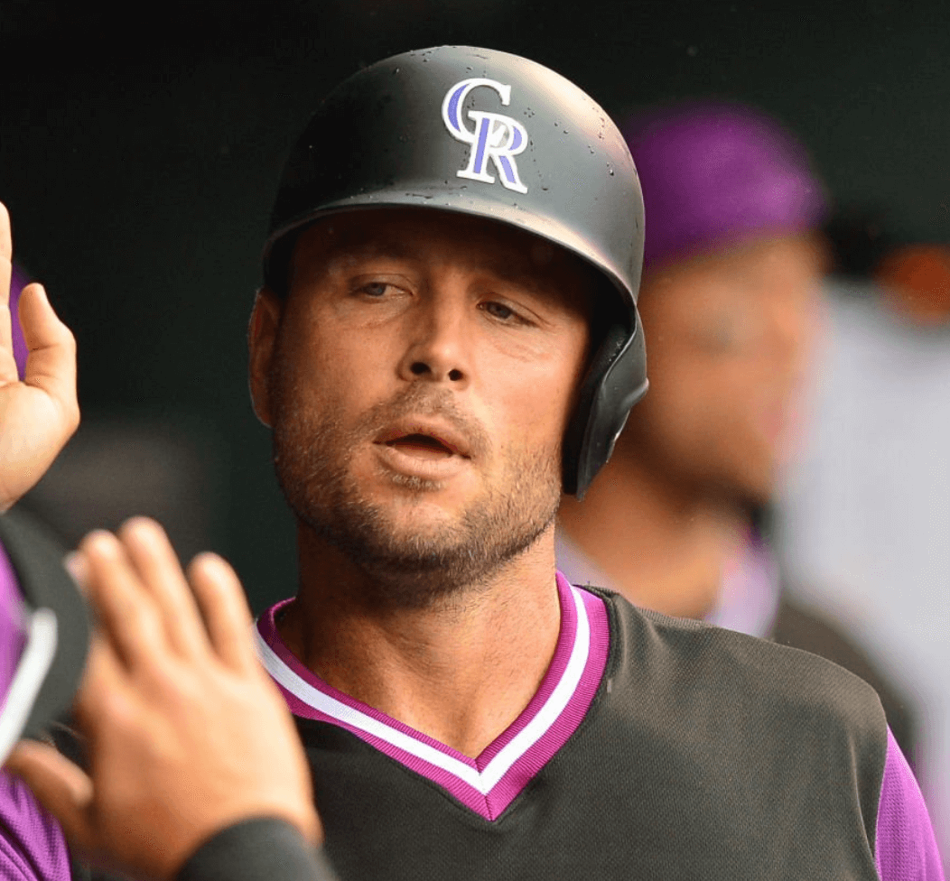
The discrepancies became even more apparent when the team incorporated greater amounts of purple into its visual program in 2000. The cap logo was often visibly lighter than other purple elements:
Perhaps the most obvious mismatches involved the purple-brimmed road caps. The brim often didn’t match the cap logo and/or the alternate jersey:
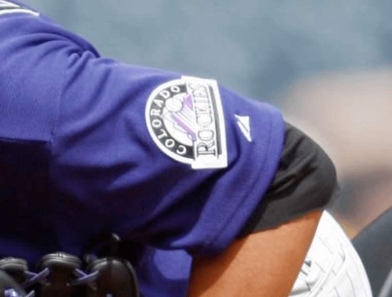
And there’s more. For example, the purple of the sleeve patch hasn’t always matched the rest of the uniform:
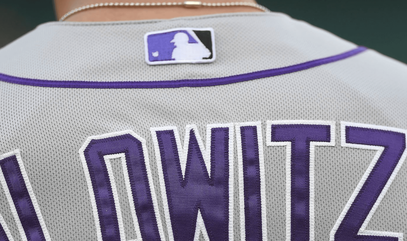
Similarly, the MLB logo on the back of the jersey has sometimes appeared in a distinct shade of purple:
And we can all be thankful that these batting practice eyesores never saw game action:
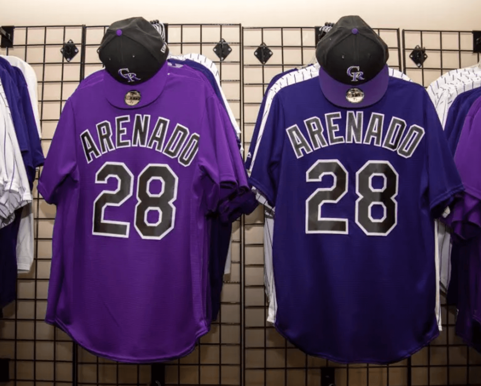
The Rockies tried to address all these problems by brightening and standardizing their shade of purple. The move has largely been successful, with the cap now matching the jersey:
With this newfound commitment to color consistency, one would think the Rockies’ days as perpetrators of a plethora of purples would be behind them. But old habits die hard, as we saw with the team’s Players Weekend uniforms in 2017 and ’18:
Finally, there’s one last bit of mismatched purple yet to be corrected: the famous row of mile-high purple seats at the Rockies’ ballpark. When last I checked, the armrests had a different shade of purple than the seats:
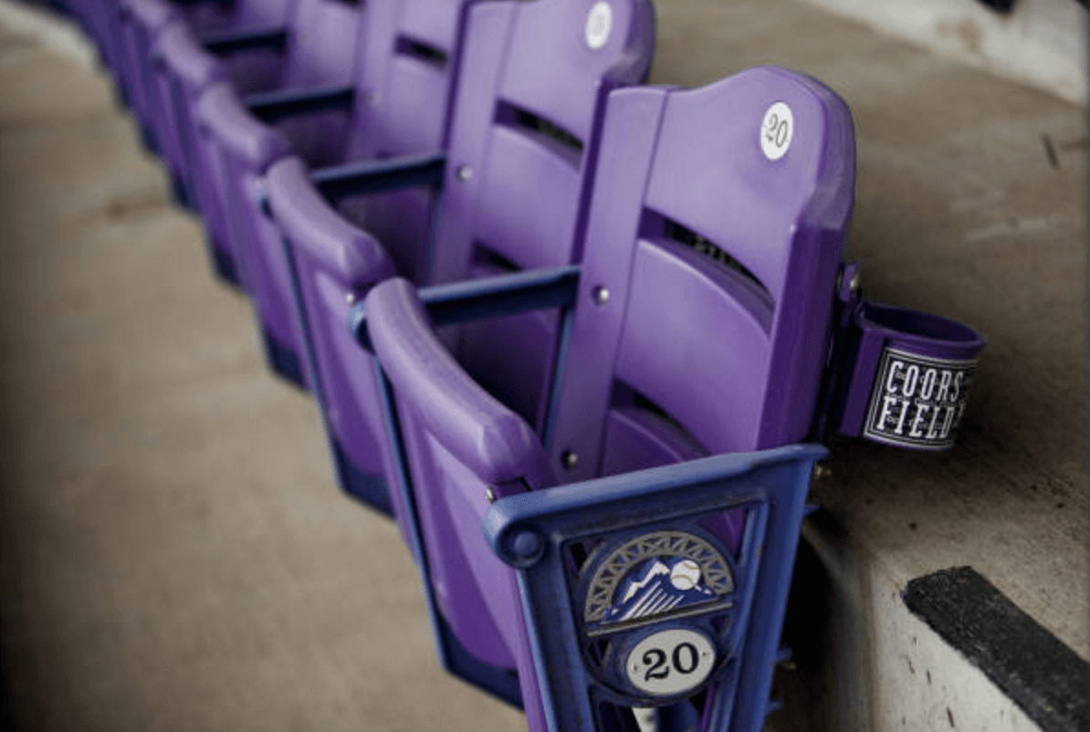
Does this mismatch still exist? I intend to check on that tonight when Purp Walk makes the scene at the Rockies/Giants game. Stay tuned!
Click to enlarge
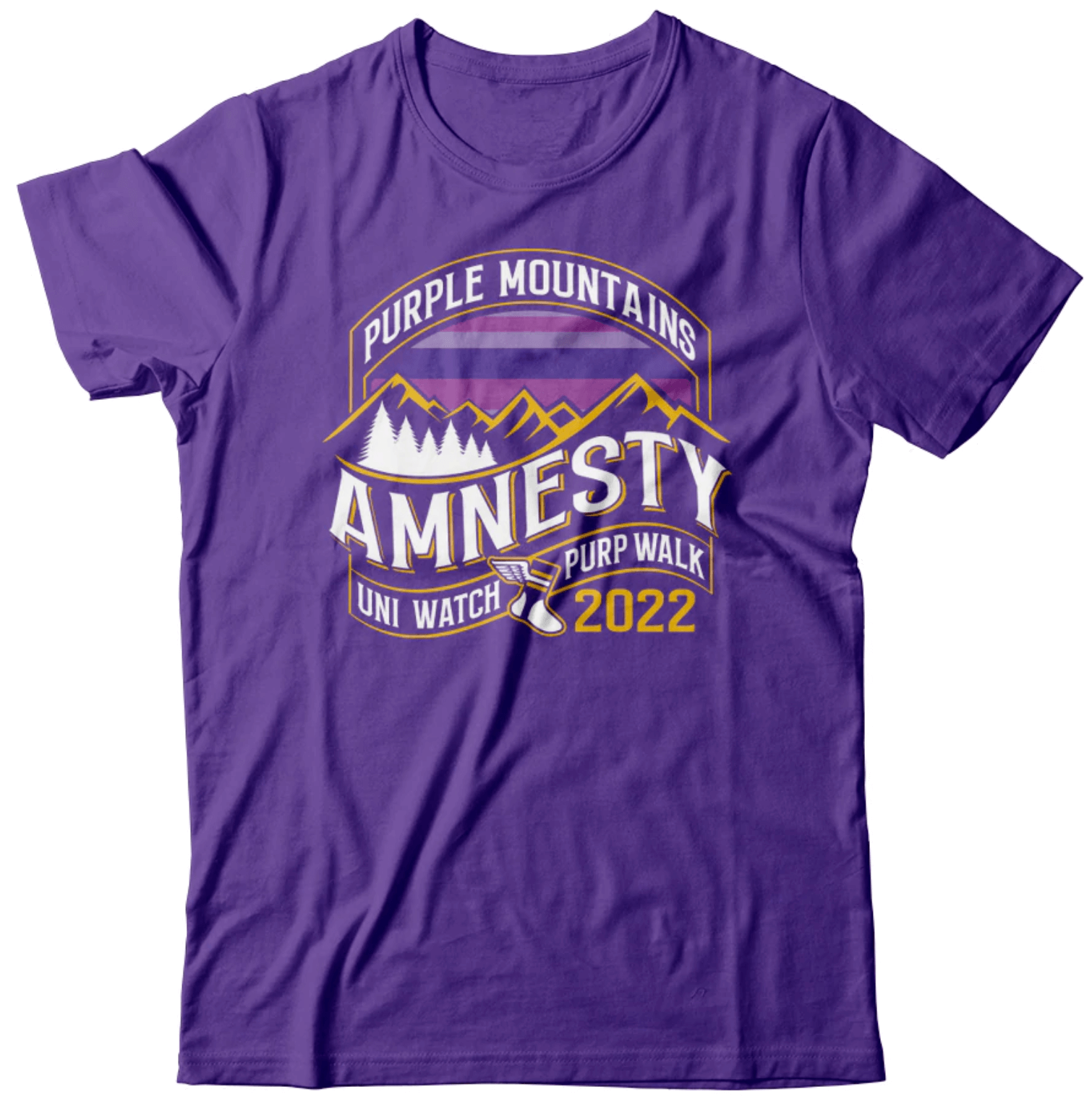
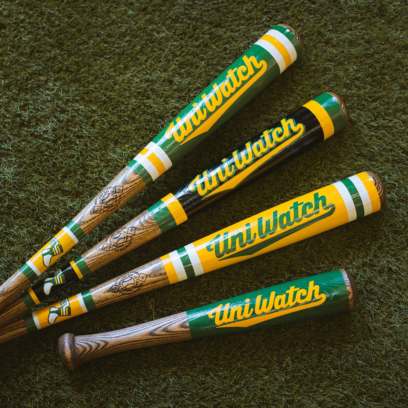
ITEM! 24-hour merch offerings: Designer Bryan Molloy has created a doozy of a T-shirt (shown above) for this year’s Purp Walk. As usual, it’s available for only 24 hours — you can order it here.
In addition, the great Pillbox Bat Co. has partnered with us to create a sensational purple Uni Watch baseball bat. Check this out:
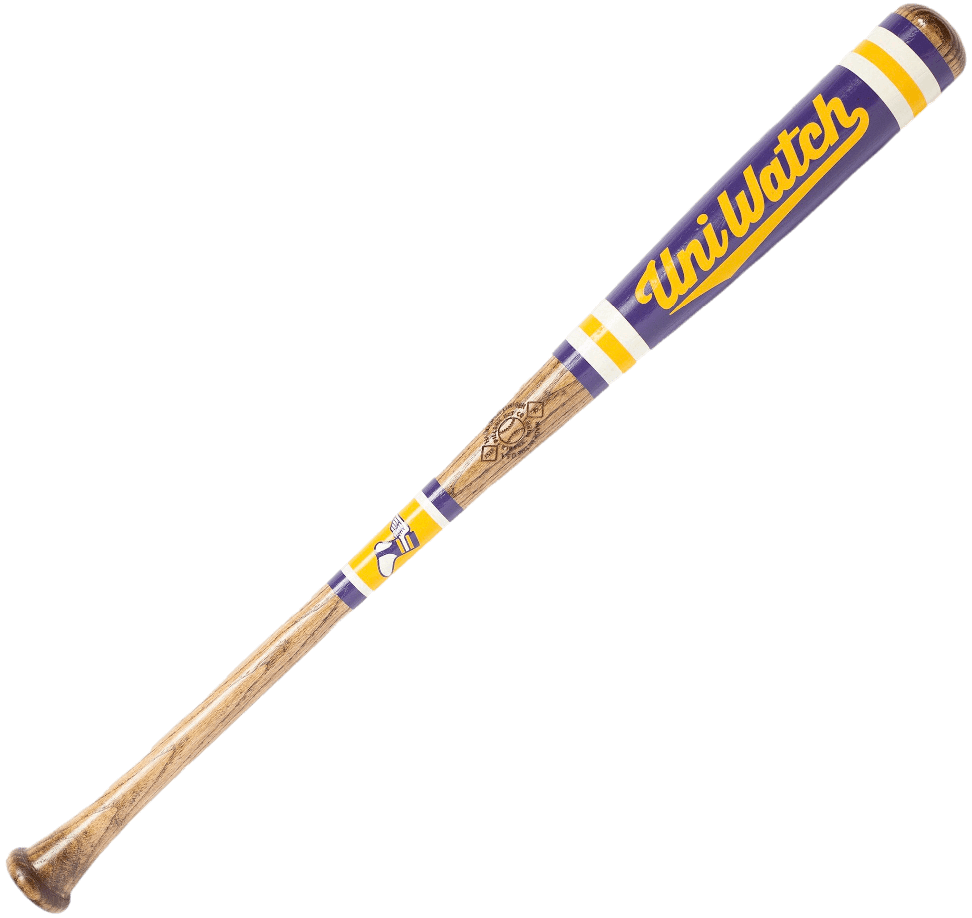
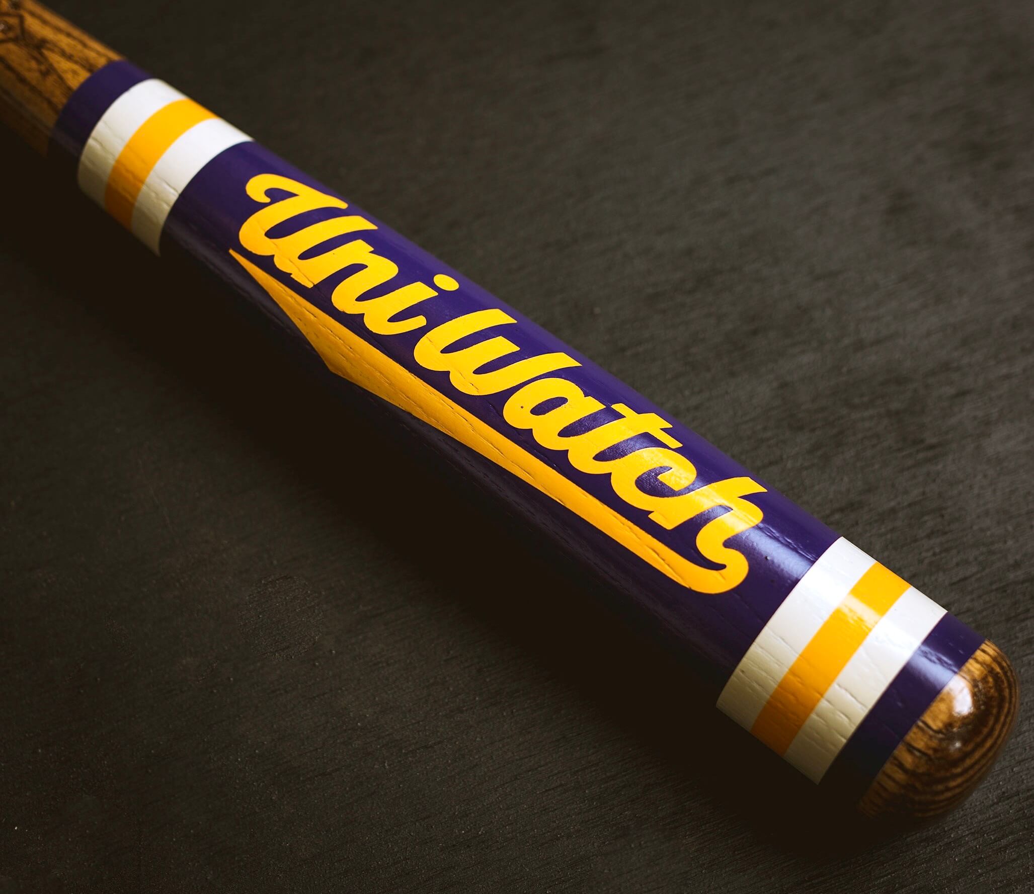
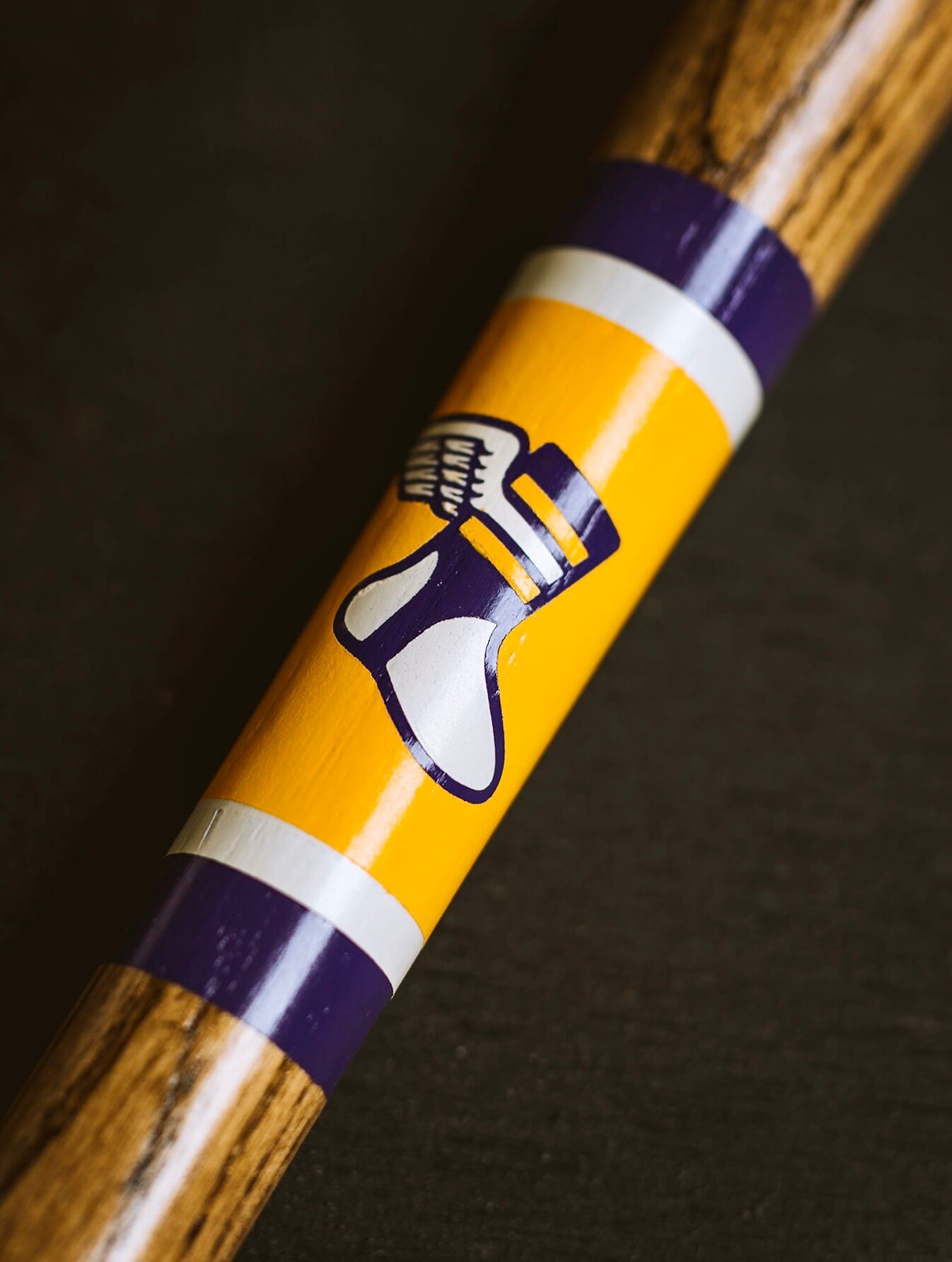
The bat, like the T-shirt, is available for only 24 hours. You can order it here.
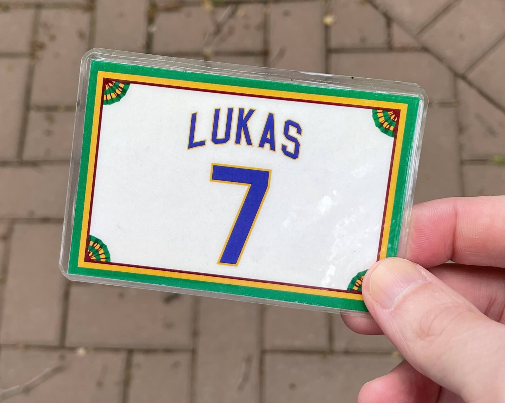
And of course, today is the one day of the year that you can order a purple-inclusive Uni Watch membership card. You can do that here.
Important: I usually try to acknowledge membership orders as they come in (“Got it — thanks for your order!”). But I’ll be very busy with Purp Walk activities in Denver today, and I also have a complicated day shaping up on Wednesday, which means I may not get back to everyone until Thursday or Friday. So if you place a membership order today and don’t hear back from me right away, please be patient — I promise that I will acknowledge every order (and will also go over any details that need to be confirmed, etc.), but I’m going to need a few days to get caught up. Thanks for understanding.
Sorry, no purple Uni Watch cap this year — supply-chain issues. We’ll bring it back next year.
Click to enlarge
Collector’s Corner
By Brinke Guthrie
Follow @brinkeguthrie
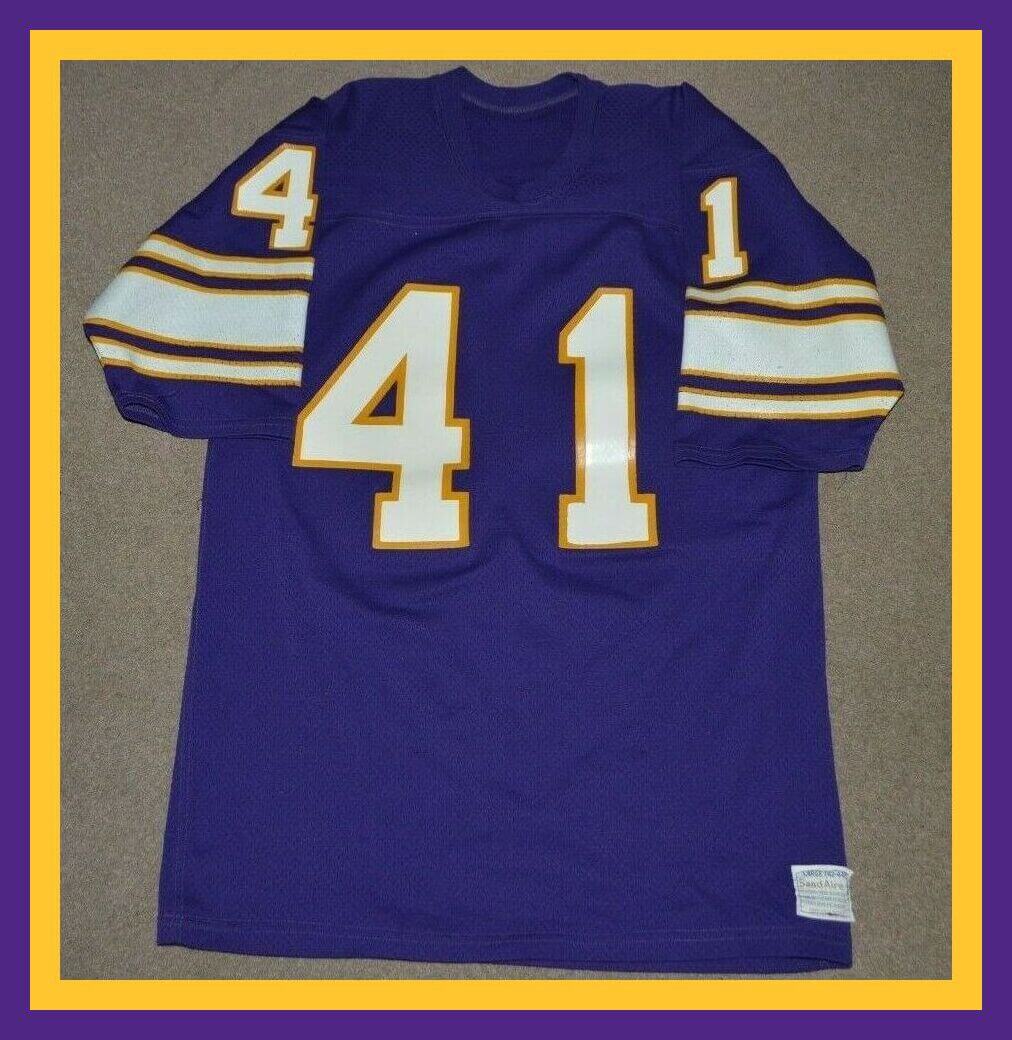
Today is Purple Amnesty Day, so Collectors Corner is on board with a full slate of purple items, beginning with this Vikings Sand Knit jersey for running back Dave Osborn. A beauty!
Now for the rest of this week’s purple picks:
• Another great Vikes player from the 1960s was defensive back Karl Kassulke. Such a terrific name, period-immortalized on this “Karl Kassulke Kickoff” button.
• Minnesota fans will always know how long it it ’til kickoff with this great Vikings helmet clock.
• You just don’t get more purple than this Colorado Rockies windbreaker from DeLong.
• And for the Colorado fan who wants to get a bit more formal, we offer this Rockies necktie.
• Got a nice-looking Los Angeles Lakers Starter sweater here. What I particularly like about this is the NBA logo matched with the Starter logo on the cuff.
• More Lakers! How about these quarter-length purple socks?
• The great Pete Maravich sported this purple New Orleans Jazz jersey.
• Kids, before the NHL’s Los Angeles Kings went with the silver/black in the late 1980s, they wore purple/yellow, as shown on this 1970s jersey for Don Kozak, No. 24.
• If you think the Toronto Raptors’ original “Barney” uniform was garish, check out these shorts with the dinosaur sublimated across the entire garment!
• And finally, we have one non-purple item on the menu today: this Blake Street Tavern cap, because that’s the location for today’s Uni Watch event!
IMPORTANT Father’s Day deadline: Sorry to intrude with some non-purple news, but the folks at the Pillbox Bat Co. tell me that if you want one of the custom-painted Uni Watch bats in time for Father’s Day, you must get your order in by next Monday, May 23, so I wanted to pass that info along.
The Ticker
By Alex Hider

Baseball News: It seems like the Cardinals are using a strange version of their alternate logo on their press conference backdrop. Instead of using their normal solo bird-on-bat alt logo, the version on the backdrop appears to be a wordmark version but with the lettering removed (from @Cards_PINdejo). … With the White Sox calling up P Johnny Cueto, 3B coach Joe McEwing is switching to No. 99 so Cueto can have his longtime number, 47 (from Cameron). … Speaking of Cueto, he cut his hair! … Pirates P Bryse Wilson faced off with Cubs C Willson Contreras yesterday, meaning Contreras’s full name was allllmost visible on the scorebug during his at bat (from @JeepinBen). … This tweet from the Diamondbacks raised eyebrows yesterday, as it appeared that the team was planning to wear white pants on the road in LA this week. The team later clarified that they would be wearing grey and the inclusion of white pants was an issue with the team’s graphics template (from @aetk28). … This blog offers a look at Rockies uniforms that have since been mothballed (from Kary Klismet). … With Pennsylvania holding its primary elections today, CNN anchor and noted Philly sports fan Jake Tapper ran through an election night rehearsal yesterday while wearing a Phillies Pete Rose throwback jersey (from John Muir). … Both the Frisco RoughRiders and the Tulsa Drillers wore Negro Leagues throwbacks over the weekend (from @txmitch_). … In an apparent reference to the fantastic Netflix sketch show I Think You Should Leave with Tim Robinson, a Yale baseball player was recently spotted celebrating on the field in a fedora with safari flaps (it’s not a distraction).

Football News: The 49ers have unveiled the number assignments for their new rookie players (from Brinke). … The CFL’s Edmonton Elks will unveil new uniforms on Friday (thanks to all who shared). … Here’s a look at Iowa’s helmet designs through the years (from Phil). … Here’s a blog that digs into football’s early days, when coaches wore the same style pants as their players (from @FoFStrife).

Hockey News: Hurricanes coach Rod Brind’amour’s son, Skyler, plays college hockey at Quinnipiac University, which explains why the elder Brind’amour was spotted the wearing Quinnipiac skate guards the other day (from Jerry Pemberton). … Michigan has unveiled a 100th-anniversary center-ice logo (thanks to all who shared).

Basketball News: After the Suns lost in Game 7 Sunday, the team tweeted out a letter to fans. But they quickly had to delete and re-issue the letter because they misspelled an advertiser’s name (from Timmy Donahue).

Soccer News: When PSG MF Idrissa Gueye missed Saturday’s match, coach Mauricio Pochettino said it was for “personal reasons.” Now it turns out that he didn’t want to wear the rainbow numbers that the team was wearing to mark the International Day Against Homophobia, Biphobia and Transphobia (from Phil). … Three Burnley fans were arrested on Sunday after allegedly displaying a Nazi salute during the team’s match against Tottenham (from @walbergLines). … Top-level Dutch club SBV Vitesse will have new home kits in 2022-23 (from Kary Klismet). … New match ball for the J-League (from Ed Zelaski).

Grab Bag: Tiger Woods missed a belt loop yesterday and had to fix his mistake while playing a practice round (from Ted Taylor). … A new gadget called CapSpot turns a car’s sun visor into a place to store a ball cap (from Jon Vieira). … Sunday’s episode of Last Week Tonight with John Oliver featured an appearance by Reddy Killowatt, the mascot Paul featured in a post a few years ago. … Pennant-philes will sure have a ball checking out the College Sailing Team Race National Championship scoreboard website (from Shawn Hairston). … A rugby fan went all-out on this deep dive into the numbers behind player sock height in Australia and New Zealand’s National Rugby League (from @LeagueEyeTest). … Here’s an article about Italian cycling team Drone Hopper–Androni Giocattoli and the 38(!) companies that have purchased ads on their uniforms (from Mark Smith).
By the time most of you read this, I’ll be on my way to Denver. If the WiFi on my flight is good, I’ll try to process membership orders as they come in. (Again, if I don’t acknowledge your order today, don’t worry — I’ll get to it later this week, promise!)
Our party at the Blake Street Tavern will begin at 4:30pm. If you pre-ordered a shirt and/or won free tickets to the Rockies game, you can claim your shirts/tix at the party. I’m excited to meet all of you!
Because of the time difference, tomorrow’s post may be published a bit later than usual. Also, considering how busy I’m going to be today and tonight, I’m not sure how much of a Purp Walk party report I’ll be able to put together for tomorrow morning. But I’ll definitely have at least few photos to share with you (assuming I survive the ordeal of being dressed in all-purple), and then I’ll try to put together a more complete report later in the week.
One last thing: The unsung hero of all of this is reader Tim Cox. As noted at the top of today’s entry, he’s the one who came up with the idea for Purple Amnesty Day back in 2010, and he’s also the one who urged me to do a Purp Walk event connected to a Rockies game in Denver. He’s also done all sorts of behind-the-scenes work and been extremely generous in various other ways. Thanks so much, Tim — you’re the best.
That’s it. Happy Purp Walk 2022! — Paul
Happy Purple Amnesty Day! May the Purp Be With You.
Happy Purple Amnesty Day to you, too, Brinke! I loved the all-purple Collector’s Corner today. Great stuff!
thank u!
Happy Purp Walk 2022 All.
Safe travels Paul.
Excellent article Kary.
Thanks, Jason! Glad you enjoyed it! Happy Purple Amnesty Day, everyone!
Very good article! Have lived here my whole life and all their inconsistencies drove me nuts as well but never thought to chronicle them. Will be nice to see ya’ll later tonight!
Thanks, Glenn! Likewise, looking forward to meeting in person tonight!
Purple and green actually match quite well: look at the Wimbledon tennis tournament logo or the 90s-00s Milwaukee Bucks. Paul might think it is a match made in hell, but I beg to differ. Happy Purp Walk 2022!
Check out a vintage minor league Augusta GreenJackets cap. Forest green crown with purple visor and A/insect logo. Some mid ’90s on-field snapback caps in brand new condition currently on eBay.
Yes, Wimbledon is a good example. I like purple; (don’t tell you know who.)
As a Northwestern U. and Minnesota Vikings fan I will enjoy this day (and order the fantastic T-shirt).
Thanks for the note about Reddy Kilowatt. I wondered why that strange character was familiar! Maybe someone on John Oliver’s staff is a Uni-Watcher! (Reply if so!)
Happy anniversary, Paul! And thanks for the Rockies writeup, Kary! Honestly, my first reaction to all those Rox photos is not that I’m seeing a team with mismatched purple, it’s that I’m seeing a team with too much black. Purple is a uniquely difficult color to match across various media – print versus fabric, different types of fabric, etc – but black is the least forgiving color with which to pair purple.
As much as I like road pinstripes, the Rockies’ purple-on-gray was not a good mix.
Thanks, Scott! I tend to agree on the Rockies. For a team that owns purple at the Major League level, they sure wear a lot of black. It’s a combo that can be pulled off effectively, but it’s difficult on sports uniforms because there needs to be a good mix of white or some other color to provide contrast between the black and purple, which can easily blend together, especially at distance.
The Rockies have actually had purple caps in their rotatoin for a few seasons:
link
I wish they’d bring them back (at least as an alternate) as I think they do help mute the black and establish their identify as a purple team more thoroughly.
Thanks, Scott! I agree abou the Rockies wearing too much black, especially for a team that owns the color purple at the Major League level.
The Rox used to have a purple cap in their rotation:
link
I wish they’d revive it – at least as an alternate – because it helps mute the black and more thoroughly establish their identity as a purple team.
Agreed on the cap. It’s the Rox cap I own and sometimes wear. I don’t mind that the Rockies have black in their color scheme, but I wish it would be a tertiary color behind primary purple and secondary silver/gray. Though if I were emperor, the Rockies would switch out the black entirely to either sky blue or green. Anyway, the amount of black in the cap logo relative to the purple of the body of the alt cap is the appropriate amount of black, if the Rockies are going to have black in their uniforms at all.
As a lover of purple, I have to say that purple / yellow Uni bat is a gem.
Currently living in a college town where the school’s primary color is purple – and they’re more than a little proud of it – I empathize, Paul.
I wear NO purple, either … not even for Purp Walk Day. But I’ve enjoyed hockey games in Denver … took in a CONCACAF qualifier in Commerce City once. Can’t say enough good things about my time in Colorado. Enjoy … and that goes for everyone at the Rockies game.
Happy Anniversary Paul and the Uni Watch staff. Hope you all have a very enjoyable day in Denver! Can’t wait to read all about it.
Happy Purp Walk to all those who celebrate! Have a great time in Denver. Excited to hear stories and see pics.
P.S. The Purp Walk bat looks amazing…
Happy anniversary Paul and Happy Purp walk to All Who Get It!
I love purple and all those different shades on unis makes me cringe. It seems to be a less forgiving color in that regard than say the different shade of gold I see around Pittsburgh.
Safe travels Paul and I can’t wait to see the highlights of today’s activities!
Nice mistmatched purple feature today. I’ve always noticed the Vikings can never seem to get their helmet to match the rest of their uniforms, but never noticed that the Rockies have had a similar problem, let alone those seats. One wonders if there is something about purple that is especially difficult to render the same shade across multiple types of materials.
The Vikes’ matching is certainly better today that, say, it was in the ’70s (helmet always looked much darker, somewhat like the issue the Giants used to have).
I always think the Ravens have a purp mismatch issue too. The purple on the helmets may be the same shade as the jerseys, etc., but against the black lids, it looks almost blue to me. I would guess the Rockies have similar issues. Something about black against the color purple makes it appear off (on TV anyway). I find black similarly renders other colors also, but not usually light ones (i.e., yellow). But black against say red or blue seems to visually alter the hues. A trick of the eye perhaps.
I went to NYU and when I went through the brick and mortar store one day, I was amazed by how many shades of “violet” were represented. For a school who’s nickname is literally “The Violets,” they have been unable to control the shades of of their merchandise. It drives those of us who Get It™ crazy when we want (need?) to purchase only the official shade of violet.
Thanks, Greg! I appreciate the kind words. Glad you enjoyed today’s piece.
I’m not someone who wears a lot of purple, but I do like it as on a playing field. My favorite Premier League team, Tottenham Hotspur, have a history of wearing purple as a second or third kit option. Some of my favorites:
94/95 Away: link
15/16 Third: link
17/18 Third: link (This one is the inspiration for one of my Uni-Watch membership cards: link)
19/20 Away: link (More like navy with purple accents)
They have a few others that aren’t quite as good–including this year’s third kit that pairs a lilac shade with lime green in a way that’s surprising and not particularly pleasant.
Anyway, happy anniversary Paul, and Happy Purple Amnesty Day!
Good stuff, AJ! Thanks for sharing! I love your membership card!
Thanks!!
Happy Anniversary, Uni Watch!
A tip of my purple UW cap to Paul and all!
Enjoy the day, especially to those attending the party and game.
Cheers…and Purple Reign!
This Purp-Walk-appropriate quote was in a fantasy book I just read, “At the round table of color, orange sits supreme. Orange is sublime. Orange is ablaze. And seated across from Lady Orange, we have Sir Purple. I ask you, is any color more vulgar? The word alone emerges like something from a lavatory. Purple. Plopple. It’s all prunes, liver spots, and ink stains. If I ever utter a word of praise for that wretched hue, please snatch my pen away and gore me with it.” Ha!
Excellent find!
OK, purple people.
Is it “purple mountain’s majesty” or “purple mountain majesties”?
Wow! According to Wikipedia, the lyrics have always been “purple mountain majesties” from the song’s inception:
link
I’ve always sung “purple mountains’ majesty.” Mind slightly blown…
Formally, it’s “mountain,” singular, but it’s almost ubiquitously sung as a plural possessive, which would be transcribed “mountains'”.
WAHHHHHH. Wow, you learn something new every day. I have always sung “purple mountains’ majesty.”
Going to have to listen to it extra careful next time it is played.
Happy Purple Amnesty Day!
I have a purple Northwestern membership card that was made a few years back.
Northwestern football has had trouble maintaining a consistent purple over time in their uniforms, as well. Sometimes the helmet and jersey are different purples at the same time. And the purple has shifted and drifted over time — some years appearing much more blue-ish.
A good image that shows this shifting over time:
link
And more history and context on the purples:
link
If they would eliminate the black (bfbs, as it is not a school color), they would look great. A bit of silver trim could be tolerated. Advice: check out Kansas State FB.
I believe the school color is purple — just purple.
Historically, the colors used to be black and gold. So maybe they should look more like the Steelers?
When I was in law school, one of my classmates was a TCU alumnus. Every single day, he had to wear something purple. Could be a purple tie when he had a job interview. Could be a purple t-shirt (he had some odd combinations for the t-shirt). Could be purple socks. He always had something purple on for the Horned Frogs.
Happy anniversary, Paul. Thank you for the many years of great content. Have a wonderful Purple Amnesty Day!
Power to the Purple!
So I’m stuck in Austin Texas right now because my flight got canceled. The flight that eventually will get me to Denver would get me to the game around the eighth inning. So I’m going to miss everything. Paul give away my tickets to someone else if they need them. Also, if someone else sees this message and is going to the party, please let him know that I left this in case he’s not checking messages. Sorry to miss it.
Wow! Super bummed to hear that, Ron! I was looking forward to meeting you. I’ll let Paul know.
Thanks. I was looking forward to meeting you too. If you get a Facebook message from my girlfriend, she was just trying to reach out to see if we could get someone who might be there. Hope you have fun tonight.
“[to be fair, I think many teams may have slightly mismatched pinstripes — Paul]”
Point taken. I will say, however, to my eyes, the Rockies’ current pinsripes appear to be the brighter shade of purple they switched to in 2017, which matches the rest of the uniforms’ purple elements (including the logo on the headgear) better. Compare these:
link
link
link
…to this shot from 2012, before the color switch:
link
I’m a lifelong Lakers fan, and I look forward to this day every year. I just ordered my shirt. Thank you for being a great sport about this, and turning it into something that is so much fun.
One more note on the Rockies’ mismatched purples: I spotted an example in the wild on Friday evening on my way to the Rockies/Royals game. You can definitely see the difference in shades of purple link.
re: the purple row of seats — is that a mismatched attempt at a purple armrest, or is it just that the armrests are the exact same dark blue as all the other seats in the stadium? It looks to me from the photo (and from checking out the stadium photo) that they just ordered the plastic parts of the seats in purple but painted the fixed metal parts the same as on all the other rows.
The rest of the seats in Coors Field are green, not blue, and the armrests for those seats are the same shade of green as the seats:
link
As for the armrests on the purple seats, I’m quite certain they’re purple. Here’s another photo where the differences in shade aren’t quite as sharp:
link
In any event, I intend to confirm tonight and report back. Stay tuned!
Is this a case of the plastic seat color fading over time faster than the metal/painted arm rests and supports?
Great detail and good job in the article Kary! Didn’t realize the number of discrepancies with the Rockies and was not aware of them with the Diamondbacks.
Have fun people at the party tonight.
A new teaser today for the Edmonton Elks. Looking not bad but they are not switching back to yellow numbers on green jerseys. That is the traditional Edmonton look but they are sticking with the white numbers that they switched to starting last season.
link
Thanks, Wade! I was hoping you’d like it, especially after your comments about mismatched purple last week!
Can I use Google Pay to order my membership card? I’ve used it before but don’t see that as an option on the membership page.
I prefer not to use that option. Sorry.
Got it. Used PayPal instead. Enjoy the game and festivities!
I’ll meet Paul halfway and agree that purple sucks as a primary color but can work really well as a secondary color.
I mean, have you ever met anybody who doesn’t like the Charlotte Hornets color scheme?
Raises hand.
link
Start wearing purple.
link
Paul,
Congratulations on 16 years! Wishing you many more.
Jerry Reuss
Purple lovers who are annoyed by the Rockies’ different shades will be even more annoyed if they start following J-League soccer club Kyoto Sanga (until recently, Kyoto Purple Sanga). Inspired by the city’s official color, they started out with a very reddish purple and at one point had link, while retaining the link.
Then in 1997 they went with a nice Rockies-like link, and since then they’ve gone back and forth but have mostly stuck with the link.
And while looking for Purple Sanga variations, I spotted this link.
(I really wish they’d bring back that number font. It looks so much more distinctive than what most of the J-League uses now.)
I love the fact that Uni-Watch’s anniversary lands on a uni-significant day. As Ernie Harwell relayed many times, Lee May wore number 17, meaning he wore both his name and birthday on his jersey.