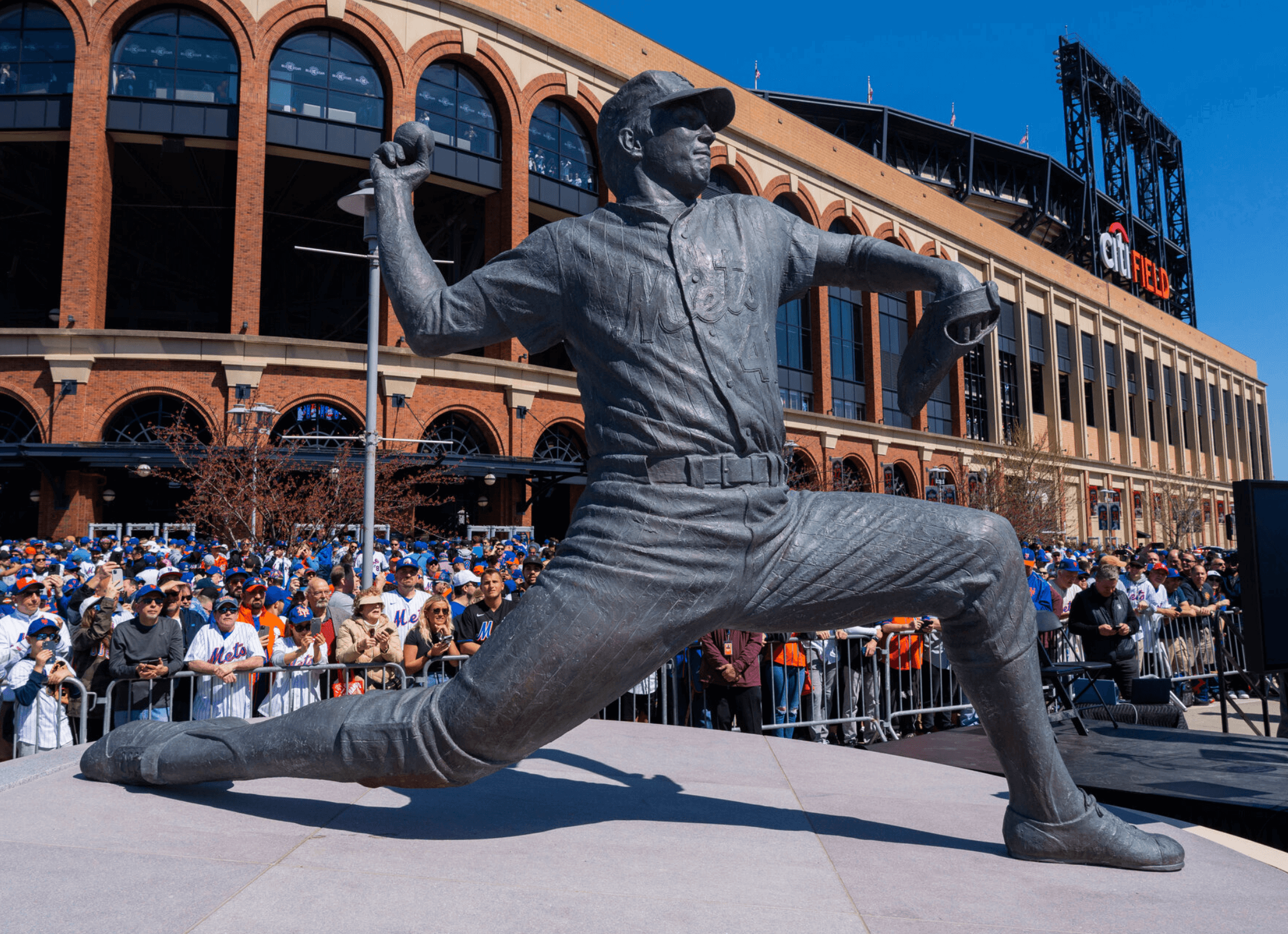
Yesterday I published my scoop on the surprising uni-related design flaw in the Mets’ Tom Seaver Statue. (If you haven’t already read it, I urge you to look here — it’s definitely peak Uni Watch.) As I expected, it garnered a decent amount of attention and reaction. That reaction fell into three primary categories.
First, there were the people who reacted positively. Several people told me that this was their favorite Uni Watch article ever (thank you!). Several others said something akin to, “This is really interesting, and it’s definitely making me think” (always the highest compliment). And a bunch of people just said something akin to, “This is really great work” (again, thank you!).
Second, as the story began spreading beyond the usual Uni Watch audience, there were also a lot of responses — including one, amusingly, from my brother — that could be summarized as, “Who cares?” That’s neither surprising nor problematic. Uni Watch’s slogan, after all, is “For People Who Get It™,” which means there are lots of people who Don’t Get It™. The article actually mentions, multiple times, that most fans probably won’t notice or care about the statue’s design flaw, and that was borne out by some people’s responses. (I’m sure there are even more people who expressed their indifference to the article by not responding to it at all.)
What I didn’t expect — but in retrospect, I should have — was that there was a third category of responses, coming from people who were angry. Angry about the article’s existence, angry that other people liked the article, angry at me. Lots of “GET A LIFE!” and “Give me a freaking break. MOVE ON!” and “This is ridiculous. Talk about nitpicking!” and “What a loser!”
Obviously, those people Don’t Get It™ either (although I wonder how they would feel if the same design flaw on the statue showed up on a jersey they purchased). But for whatever reason, they weren’t content to just shrug their shoulders and move on — they got riled up about the article.
I thought about all of that while I was out for my daily bike ride in Prospect Park yesterday. I came to a few conclusions:
1. People get angry about things they don’t understand. This is nothing new — almost all of us have reacted this way at some point (or at least I certainly have), and I’m used to encountering it in my work. Back in the early days, Uni Watch’s very existence made some people angry! They couldn’t understand why someone would want to write about uniforms, why someone else would want to publish it, and how an audience could possibly exist for it. It challenged people’s entire hierarchy of what was and wasn’t relevant, and that can be a very confusing, scary, threatening thing. And when people feel that way, they lash out.
I haven’t had to deal with that kind of response in a while, I guess because writing about uniforms is a more accepted thing now (and also because it’s been a while since I had such a big article about such a small detail that spread beyond the usual Uni Watch audience). The angry response was a good reality check — a reminder that what I do here, what we all do here, is still just a small niche thing. Obviously, I already knew that, but sometimes it’s good to get a real-world sense of perspective.
2. People are wedded to their narratives. In the three-ish weeks since the statue was unveiled, my impression has been that the Mets fan base has been very emotionally invested in two overlapping narratives: First, the statue is Perfect, because of course it is; and second, the statue’s Perfection symbolizes the departure of the Wilpons and the arrival of the team finally “doing things the right way” under new owner Steve Cohen.
Pointing out the design flaw punctures those narratives, and several people got really pissed off about that. It reminded me of how I broke the story back in 2008 that the MLB silhouetted-batter logo isn’t actually based on Harmon Killebrew, as many people, myself included, had long believed. Twins fans were irate, because the reality didn’t match up with the long-established narrative. (At least that narrative was many years in the making, not just three weeks old.)
On some level, I can understand fans’ emotional response to anything that threatens a cherished narrative (as I’ve written dozens of times over the years, sports rooting loyalties aren’t rational, which is why they’re so powerful and special). And sure, we all want to believe in certain storylines, certain myths, certain certainties — but sometimes reality has other ideas. As someone who’s in the information business, the facts business, the reality business, it’s always a bit disconcerting to see people get so riled up just because reality turns out to be emotionally inconvenient.
3. Our comm-uni-ty is special. Seeing all the responses from people who Don’t Get It™ really made me appreciate the passion, intelligence, and shared understanding that we have here at Uni Watch. I’m proud of the Seaver article, but I’m more proud of what we’ve all built here over the years. Thanks for that, and thanks for listening to me think out loud today. We’ll get back to more conventional content tomorrow.
Click to enlarge
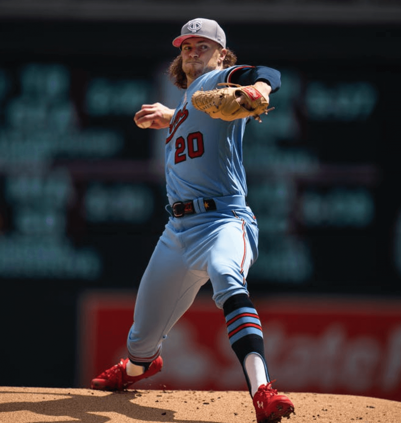
More hosiery heroics: In my recent interview with Twins pitcher Chris Paddack, he mentioned that he’d ordered a bunch of new stirrup designs from Twin City Knitting, including one that he planned to wear with the team’s powder blue uniform. Those have apparently now arrived, because Paddack was resplendent in his new ’rups on Sunday. Magnificent!
If you look closely, you can see that these stirrups actually have light-blue edging along the contours of the opening. Here’s another view:
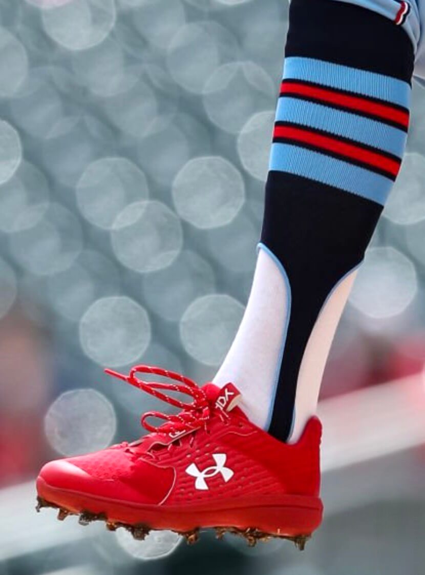
Very nice!
Unfortunately, Paddack had to leave that game with elbow inflammation, so it may be a while before we see his stirrup stylings again. Here’s hoping he has a speedy recovery.
Click to enlarge
Collector’s Corner
By Brinke Guthrie
Follow @brinkeguthrie
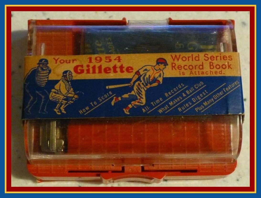
Check this out, campers — a Gillette razor and blade set that also includes a 1954 World Series record book! You get an unopened set with a sturdy old-school razor and six “Gillette Blue Blades™,” along with a booklet featuring topics like “What Makes a Ball Club” and “Hints on Winning Baseball.” (And as you know, the 1954 Series is famous for the greatest catch in baseball history.)
Now for the rest of this week’s picks:
• This is just a bit quaint — a 1950s Philadelphia Eagles draft questionnaire. They sent this to college players with questions like “If you are interested in professional football, how many years do you plan on participating?” It’s a long way from that to the Wonderlic test, eh?
• Here we have a menu from the great Johnny Unitas’s restaurant, The Golden Arm. The menu has a predictable football-jargon theme to it: Appetizers are part of the “Pre-Game Warm-up,” and the menu “Line-up” features “Junior Prime Filet Mignon” at left tackle — “smaller, but every ounce a pro.”
• This 1970 San Francisco 49ers 25th-anniversary record album includes “highlights of 25 exciting years!” And note how nice that “NFL 50” patch looks on John Brodie’s jersey!
• Staying by the Bay, this 1984 San Francisco Giants jacket includes a patch for the 1984 MLB All-Star Game, which was held at Candlestick Park.
• Put some new speed in your swing with this 1963 Elston Howard On-Deck Bat-Weight, for ages 12 and over.
• Boy, howdy. This 1960s San Diego Chargers bobblehead is in great, great shape. But the bolt on the helmet is a little dark, no?
• What’s better than a Reggie bar? A 36-count box of Reggie bars, of course!
• Wide receiver Raymond Berry wore No. 82 for the Baltimore Colts back in the day, and his signature and number (along with some stars, stripes, and one funky facemask) adorn this youth football helmet made by Kent.
• In this 1966 print ad, Packers quarterback Bart Starr urges you to get down to your local Goodyear bike tire dealer to get these N.F.L. team emblems (yes, the ad includes the periods). These look a lot like the Chiquita NFL stickers that would surface four years later.
• For Paul’s next cookout at Uni Watch HQ, here’s a bottle of New York Mets hot sauce.
The Ticker
By Alex Hider

Baseball News: The Dodgers and Giants will make history in June, when both teams will wear rainbow-patterned pride uniforms in the same game (thanks to all who shared). … Paul’s article about the Seaver statue reminded Kasey Ignarski about the time the Cubs initially used the wrong font on Ron Santo’s number retirement flag. The Seaver article also prompted Brice Wallace to send along photos of statues depicting the 1972 Reds at the team’s Hall of Fame and Museum that contain incorrect number fonts — note the 2s worn by Tony Perez and Cesar Geronimo, the bottom seriffs on the 1s and 4s — and vertically arched NOBs instead of the proper radial arching. … The Angels wore green ribbons last night for mental health awareness (from @cmduncan8). … MLB’s At Bat app still shows the Royals’ old road jerseys (from @ReallyNotOnHere). … The Rays won five straight last week while wearing their navy alternates. The Mariners attempted to break that streak Saturday when P Marco Gonzales selected Seattle’s navy jerseys, forcing Tampa to wear traditional road grays. The Rays won anyway (from Tim Dunn). … Taiwanese club CTBC Brothers have announced a theme night celebrating Pili, a local TV puppet show (from Jeremy Brahm).

Football News: Giants rookie DE Kayvon Thibodeaux will wear No. 5 (from Scott Turney and @uniformnerd). … Speaking of numbers, the Steelers have unveiled number assignments for their rookie players (from Phil). … The Commanders’ rookies are pretty jazzed about the team’s new helmets (from Dell Michaels). … This blog looks at Notre Dame’s current apparel contract with Under Armour and other options the Irish might have (from Phil). … BYU will change their royal blue helmets this season to give them a glossy finish. The royal lids had a matte finish in 2021 (from Phil). … With the school adopting a new logo, Akron will have new helmets and a new field design next season (from Jacob Farrar).

Hockey News: The Capitals gave away rally towels that included a map of the city’s Metro system (from our own Jamie Rathjen).
.

Basketball News: I don’t think I’ve ever seen this photo of former Celtics G Gerald Henderson wearing a neck brace during a game in 1980. Wild! (From Dickie Savickie.) … Tom Nelson, a Senate candidate running in Wisconsin, is airing a campaign commercial in which he wears a Bucks jersey (from Randy Koehn).

Soccer News: San Diego Wave FC, NWSL’s new expansion club, have unveiled their home uniforms (from Jon Vieira). … New inaugural-season shirts for Altitude FC, which plays in pro-am League1 British Columbia in Canada (from Wade Heidt). … New third kit for Scottish side Rangers FC (from Ed Zelaski).

Grab Bag: Cross-listed from the football section: The University of Akron unveiled a new athletics logo yesterday. It’s a fine enough design, but count me as those disappointed that it the school is shying away from kangaroo logos (thanks to all who shared). … IndyCar driver J.R. Hildebrand will race in a stars-and-stripes livery during the Indianapolis 500 (from Tim Dunn). … More Aussie rules football teams with Indigenous guernseys, this time for Sydney Swans and St Kilda FC (from @BluesBrother95). … Here’s a first look at the patch for the Army’s newest Airborne Division, the 11th Airborne (from Timmy Donahue). … The CEO of New Era is facing a charge of felony reckless endangerment for allegedly trying to run over his girlfriend’s ex-husband during a dispute (thanks to all who shared). … New uniforms for Oman’s national volleyball team (from Jeremy Brahm).
HTML Tag is broken in the link to the interview with Chris Paddack.
Thanks. Fixed!
link
Excellent write-up, Paul. Might I add a fourth?
4. People are freer to trash people online. People fee emboldened to spout off from behind the safety of a keyboard than in real life. If I trash you to your face, I am going to have to deal with the reaction – anything from a shrug to an argument to tears to a punch in the face. But in the anonymous safety of the internet, I can say whatever with relative impunity. It doesn’t affect my day, because I don’t deal with the fallout like I would if you were my sibling, neighbor or co-worker. You’re not even a person; you’re a handle or avatar. Part of the general coarsening of society and rose in uncivil behavior is exactly these reactions. To me, this is the equivalent of a group of us having a private conversation, and having someone kick in the door and scream “NERDS” at us. You weren’t invited to this but since you barged in, now you’re here.
TL, DR: keep doing what you do. You’ve found your niche and your people and we’re all happy you did. There is room for debate or even criticism but let the rest stay away.
Very well said MJ–I confess I am guilty of forgetting the person behind the avatar at times, and seeing commentary like this is really important context.
I would agree with this completely. That article, along with much of the content here lately, is peak Un-Watch, the kind of stuff that always kept me coming back. It was an enjoyable read. I always like getting the insight from the artists and designers who create these wonderful elements of the Uni-verse.
Re: Your 3 conclusions
*nods head*
*stands up*
*starts slow clap*
I would love to see a breakdown of the top five or ten most controversial Uni-Watch articles ever along with a brief description of what the fuss was all about.
Personally, I loved the statue article yesterday and was really impressed with how open the sculpter was.
Agreed on the Seaver sculpture story. It’s exactly the kind of attention to detail that can get me interested in any topic, no matter how far outside my existing knowledge or interests. The interview gets into fascinating details of the artistic and production process, and I appreciated the sculptor’s openness as well as his reference to a similar error or quirk on a famous ancient statue. Reminds me of when the MLK Memorial was unveiled circa 2012, an error was discovered in one of the quotations etched into the monument. Mistakes happen! It just seems weird to me to hear people express anger at a mistake being pointed out or explained.
There is something strange when a disparate group of people are angry about the existence of an article, or are angry that some people like said article. I can’t quite put my finger on it, but it is a bad thing.
Hi Paul,
Lifetime Mets fan here. Big fan of your work. I admit that I too had an uncomfortable emotional response reading your report on the Seaver statue, although I think I mostly felt empathy for the sculptor realizing that he had made a mistake. Of course, that’s not a good enough reason not to report on a topic. But it made me feel for him! It sure seems like he’s a perfectionist who let an error slip. With that said – it’s certainly a fun fact to know about the statue and is a reminder of the human-ness in its creation. Thanks for all you do!
The article would not be nearly as good if not for the incredible openness of Will Behrends, the sculptor. He totally owned his mistake, wasn’t the least bit defensive, and even contextualized it in the bigger picture of human fallibility. I feel bad for him too, but tried very hard to interact with him in the spirit of curiosity (i.e., how did this happen?), not judgment, and I think he understood that.
Honestly, that was my only concern. I was worried that Mr. Behrends would take the inquiries as just pointing out an error. However, knowing how you handle these situations put me at ease trusting that he would understand the interest wasn’t negative. Loved the article! I would have looked at it and if I had noticed the error, I would have wondered all of the things you covered. Was it intentional? Was the actual jersey like that? Was it a casting mistake? Can you fix it? I also love it being the beginning of a fun “Did you know?”. Your breakdown of why people get angry at things like this should be required reading for everyone. It serves as a great reminder to self evaluate why something makes you angry. I had to do that a lot with the Cleveland Guardians name change way back at the beginning of the process before the team even committed to changing the name yet. I was really able to process the topic because of all the things you mentioned here and have brought up before. These topics were all covered perfectly by you, Paul. Thank you and keep ’em coming!
I agree. To err is human. To admit it and be forthright about it is rare but welcome. The first lesson I ever learned as an artist, (besides “learn how to print! Your writing is illegible, you’re not a doctor!”)was to be absolutely honest with your work. I do not mean being overly critical to gather false praise, but an honest appraisal of technique, only then can you begin to improve.
Mr. Behrends was forthright about the work, the error, owning it all. He stands as tall as the Seaver statue in my estimation of his effort. And he got paid. So, there’s that.
For the denizens of the Uni-Verse, this is a learning moment for us all. Paul saw the work and from an aesthetic perspective, pointed out a flaw in the design. By the way, that’s his job. So you don’t have to.
It’s a wonderful article and some of his best work. Well done sir.
I really enjoyed the statue article, especially as the artist mentioned Okkonen’s uniform bible. Anyone mentioning the seminal piece of uniform research is going to be a fun interview.
My first assumption when reading today’s article was that people were angry because of nitpicking an amazing piece of artwork. In the vein of; “how dare you come along and be critical of such a talented artist, let’s see you do better.” And in certain cases I think that is a valid negative response to articles that are critical of various pieces of art (be it paintings, poetry, film, etc.). In a world where all of our voices can now be heard the world over, and when fandom is becoming increasingly toxic and possessive, you get a lot of critical commentaries that are nitpicking and bitter because an artist played with the toys you like but didn’t play with them how you want to play with them.
I don’t think any of that applies to your article. But I think that since many don’t GET IT, they can very easily interpret the uniform detail obsessiveness of Uni-Watch as some sort of 21st century bitter fan commentary.
“Obviously, those people Don’t Get It™ either (although I wonder how they would feel if the same design design flaw on the statue showed up on a jersey they purchased).”
I’ve seen enough people wearing knockoff jerseys with incorrect fonts and the like to know that many of the people who Don’t Get It™ really don’t care, and I can imagine that many of them would be offended if someone were to point out the flaws.
I’ve made fun online (and in the abstract, never referring to any actual individual person, which I would never do even online) of the idea of people who wear JETER 2 on their backs, and I’ve encountered people who take it seriously and personally and get very angry about it.
I came down to comments to say the same thing Greg just said. I thought the article was great, loved the details. Also loved to hear about how the replica was correct. And wow props to Mr. Behrends for being so open and for being human. I did have an uncomfortable reaction to that. Felt like you were being too harsh. I am sure you edited the interview (you usually say; I didn’t check) so maybe the actual conversation went more smoothly, but I feel empathy for this guy. Its a lovely statue, and I don’t want this guy to feel sick to his stomach when he thinks about it, or hesitant on details on his next project, or trouble sleeping at nights… I didn’t say anything yesterday because I thought you were human, and in my opinion, made a human mistake that you were too focused on being right about a detail than the effect you would have on another human. I only respond today because it seems to me that today’s article double-down on that.
Thanks for the feedback, Jason. I have nothing but respect for the way Will Behrends handled the interview. As I’ve said in another comment thread, I tried to approach him in the spirit of curiosity, not judgment. If you go back and re-read the article, I think you’ll find that our conversation was indeed very smooth and friendly, and also that I mentioned several times that the statue is wonderful even with the error.
I appreciate your empathy for Will, but with all due respect, I think you may have been projecting something onto the proceedings that wasn’t really there.
Paul, reading the interview it seemed to me that Will was very gracious in it. It did not appear he was bitter that you caught a mistake in his wonderful and laborious artwork. Rather that he was almost like “Man, how did I miss that?!?” because he very much did care enough to do the research, knowing that there is a commUNIty that really cares about the details.
I am sure it is often hard to accurately reflect the tone of a verbal conversation in written form (like texting a sarcastic comment to someone who won’t obviously know it is sarcastic). So my guess is that plenty of people just read the interview the wrong way, if they thought you were picking on Will throughout it.
That Chargers bobblehead must be from 1966 – they did have the dark blue bolts on the helmets that year, plus that was the first year for yellow pants.
Maybe a fourth reason for the backlash: The headline, email subject line, and the tweet all said “EXCLUSIVE,” which of course it was, but many folks probably took it as a signal that you were reporting a big news story (as in, interpreting “EXCLUSIVE” as “BREAKING NEWS”).
And then the story was about a granular detail that could have gone unnoticed for years. We live for this stuff, but casual uni watchers, and other sports fans who saw your tweet, might have felt like this was undue hype.
Welp, at least this whole kerfuffle ensures the correct number font on a future Buzz Capra statue.
Also, I kind of like to think the guy who froze the Reggie bars in 1978 said to himself he would sell them 44 years later, for Reggie’s #44.
I do not understand people that actually take the time to comment on a story with “who cares?” If you don’t really care, move on. It’s really saying, “you shouldn’t care about this” or “I don’t like that this matters to you.”
To all the folks who respond to this post with “who cares,” have a great day.
My biggest takeaway from the piece is that I just have so much respect for the sculptor. Absolutely owned the mistake even when he had opportunity to shift blame. We’ve all made mistakes (even in our jobs), and most of us are fortunate that our mistakes are not eternalized like this one.
Enjoyed the article, as I do all of your work. The reactions don’t surprise me. Even within your readership I would imagine there is a broad spectrum of how much each of us “gets it”. I have never owned a jersey and rarely notice most of the quirks you and many of the readers point out. I admit to not really caring about those details, despite loving the overall look of some jerseys, like the Cardinals or the Yankees.
I’m most interested in how uniforms help tell the story of a sport or franchise over the years. I loved the stories about the Rams helmet, or learning that a given team had a totally different color scheme in its past but I didn’t know it because all of the photos were in black and white. I love how Chris Paddock or Jerry Reuss “get it”, because when I was a Little Leaguer I wanted to wear my uniform the “right way”.
This is a long-winded way to say that you should keep writing about what catches your eye or piques your interest. We all fall into subsets of what we “get”. There is plenty of rooms for everyone here under your umbrella.
Staying by the Bay, this 1984 San Francisco Giants jacket includes a patch for the 1984 MLB All-Star Game, which was held at Candlestick Park
I’m reminded of the time I saw the Starter jacket for the Giants in Paragon Sporting Goods, in 1983. Apparently the uniform colors that year were black, orange and grey, judging by collar/sleeve/waist trim. Grey and orange have different hues but the same value, creating an interesting, vibrating effect. The 1983 uniform is my favorite Giants’ home uniform, but my favorite road uniform is 1977’s, with the orange jersey and Fancy Block “San Francisco” lettering.
The article from yesterday and today’s response opens a lot of different paths for discussion for me. First of all, the existence of statues and monuments in the first place. They seem to have become problematic, at least in my lifetime for any number of reasons. Columbus, the Civil War, Penn State, George Floyd, to name a few topics for discussion. Maybe they have outlived their usefulness.
The kind of backlash that you have received for something so seemingly benign is why I no longer have anything to do with social media (except this, I guess). Also, it’s why I took months to decide to send you pics that I drew when I was a kid and sometimes send uniform redesigns to Phil. I can take the criticism but no one sees the flaws in my work more than I do. I could really feel bad for the artist and understand how he must feel, although I don’t think that you were hard on him at all.
Also, how cool would it be to own one of those clay models?
Good, solid, interesting article about the statue of Seaver. Your interaction with the sculptor was totally open and honest, his response was likewise. A pleasure to read. People who blast you for pointing out this flawed detail should really question their own human qualities and find them severely lacking. Go Mets, and most of all, Go Uni Watch!
I agree with every word of this…except the “Go Mets” part.
I can see how a Mets fan who doesn’t “Get It” could be in the OK/who cares camp with an article that says hey there’s a mistake on this statue the 4 isn’t right, but a little upset with the next step saying how “LOLMets” this is and it’s in the team’s DNA, etc. They might see that as a cheap shot after a knit pick or a knit pick because the author has an agenda.
Just to be clear: I myself am a Mets fan; I grew up watching Tom Seaver pitch. So I have an emotional stake in all of this as well. Believe me, I would prefer that the statue did not have this design flaw! But it does.
LOLMets is a meme for a reason, and to my mind the statue error definitely fits into it. That’s not an “agenda”; that’s just reality. I didn’t bring any of that up until the end of the article, and I ultimately tried to turn it into a positive thing, because sometimes all you can do is shake your head and smile.
I love how Will Behrends owned the mistake and rather than give excuses, he gave explanations for how this sort of thing happens. It’s an eye-opening look into the creative process. My guess would have been that there were several reference photos where the tab on the 4 was obscured by a fold and seeing more than one instance of that seemed adequate proof. For every 99 things that go perfectly, an artist will eventually dwell on the one little thing that could stand fixing after it’s finished.
As the person who first noticed the font error on the statue, I’d like to say a few things.
1) Tom Seaver was a hero of mine. I met him, he was very gracious and I attended several of his important games – including the day he returned in 1983, the day he struck out his 200th batter for the 8th straight season (setting a record) and his “Imperfect Game” as he called it…I was only 4 at the time but do have vague recollection of it. That game put the Mets on the map in 1969.
2) As Paul pointed out, the Mets have not changed their home number font for all their 60 years. Give them kudos for consistency. Not too many teams can say that. Knowing all this, how could I not see this tiny error immediately? I was taking in every bit of that statue. The sculptor actually called it a “significant” error.
3) The statue is still magnificent. I was stunned by the facial expression, which I feel captures Tom’s determination, exuberance for the game and impish nature. He was a practical joker and needler.
4) Tom always wished he was an artist…he said pitching was his art. As the author of the “Imperfect Game”, I am sure he would have the utmost admiration for the gracious way Behrends has handled himself. They are truly linked by this in a cosmic way. I never dreamed Paul would reach out to the Behrends, but that’s why he is the GOAT of uni writers.
All things considered, if there was going to be something on a statue that wasn’t quite right, it’s not bad. It would drive me crazy personally, but it is a small thing. And after seeing the nightmarish Lucille Ball statue from a few years back, it really puts this minor issue in perspective.
I’ll add my “point 4” to the list already piling up in the comments: I think it has at least something to do with people getting the news from articles which have the headlines like “The Mets Screwed Up Tom Seaver’s Statue Because Of Course” (which appeared 3rd in the list of articles when I googled “Seaver Statue” just now). To an extent it is picking up on a point you made in the article re “LOLMets” etc. but obviously bumping that aspect up to top billing, minus the context provided in the rest of the article is just being intentionally antagonistic.
One of the more unpleasant aspects of the online, eyeballs and outrage economy is how susceptible a vocal minority are to shit stirring outlets repackaging everything as somehow a personal attack on them and their most deeply held beliefs.
As I was reading today’s lede, I couldn’t help but think how dumb it is for people to get so upset about this sort of thing. In fact, I found myself getting angry! And that I suppose is the point. It really did make me stop and think about times I may have gotten myself upset in a similar manner. I try to adhere to the principle of not “yucking someone else’s yum”, but I’ll admit I don’t always succeed in that goal. Thank you for the thoughtful perspective and prompting a bit of personal introspection this morning.
And also, thanks for the great article on the statue. The perspective from the sculptor was so inspiring to read. His thoughtfulness and enthusiasm really came through in the interview. If I were he, I’d probably be beating myself up a lot more than he seemed to be. And the “reveal” at the end which proved the font was correct in an earlier iteration was a fantastic finale to the story. Great work all around, Paul!
RE: Seaver
Loved watching Seaver growing up in LA, even as a Dodger fan. I’ve always been a fan of a good 1-0 or 2-1 game with awesome pitching, and Seaver never failed to deliver.
What’s happening with all the commentary is the shield of anonymity allowed by our social media and the mobs in the streets we’re now seeing. If we all had to use our true identities and make comments as ourselves (rather than our fake ID of Twinkie455), stuff like this wouldn’t be happening.
I agree, many people would say in person what they would post online. That was a terrific post yesterday and it seemed to me Will is a professional and understood that sometimes that sort of thing happens and wasn’t hurt or felt attacked by.
Regarding Gerald Henderson’s neck brace – this was during the 1979-80 season, Henderson’s first. He had broken his jaw the previous game and wore the padded brace to protect the area. He was afraid that if he sat out Boston would cut him.
Reader Chris Hickey informs me that Fox News has picked up the Seaver statue story on their website:
link
It would be fair to say that the comments on that story fall into their own category!
The comments I’ve seen on Fox seem to fall into the same categories from above…
-Who Cares/Who would notice?
-Seaver was a great pitcher
-Sculpture actually captures his form.
But then, yes, there are some “other” categories (which one might classify as more in line with the societal problems of the past two years)
RE: The ad with Bart Starr.
Is it unusual for all three of the Steelers hypercycloids to be in yellow?
As a Midwesterner, looked odd, but I wouldn’t know for sure.
Love that someone put cash in Pete Rose’s statue’s hand!
I think those outside of the community will read the piece on the Tom Seaver statute and interpret it like this classic Simpsons clip:
link
To be clear, I don’t agree… but I do love the Simpsons.
In Detroit today, game one of a double-header finds Oakland as the “home” team wearing kelly green tops over gray pants. Tigers wearing road jerseys.
Yup. This was covered/reported in the MLB Season Preview!
link
Detroit actually wore their home whites in game 1 even though they were designated the away team.
link
A couple of thoughts:
1. I am very much aligned with other commenters in that, upon reading the article, I felt awful for the sculptor (knowing how I would personally dwell on such a mistake), but I was also incredibly impressed by the grace and dignity with which he owned the error. That is sadly lacking in so many contexts today.
2. I felt that you, Paul, handled the story with just the right balance of inquisitive questioning and humane touch. I’m sorry so many seem to have read your approach differently.
3.It is very unfortunate when a uni-centric aspect of a sports honorific is handled in error. I remember how appalled I was as I watched Scott Niedermayer’s #27 getting raised to the rafters of the Prudential Center, to join the other legends of the Devils’ dynasty years, and the font was COMPLETELY wrong. It was bad enough that the Devils use a very distinct font, and this just wasn’t it, but to make matters worse, the names and numbers that had already been retired were rendered in the correct font! It almost felt intentional, like someone was being passive aggressive about the fact that Nieds left the Devils for the final years of his career. Then again, in true Occam’s Razor fashion, the banner was probably just produced by someone who “doesn’t get it.”
I don’t have a whole lot to add, but I do appreciate both the Seaver article and this response to it. I had some of the same misgivings that others have had about approaching the topic, but the sculptor was incredible and, Paul, you were your usual gracious and inquisitive self. Thanks as always for providing fun and interesting content on these niche topics and interest stories! I find that in my daily life I have a tendency to think on a very large and broad scope, and I appreciate that the nuance and detail involved in Uni Watch and surrounding discussions grounds me.
Calvin Murphy played basketball with a hockey helmet??
link
“I got a concussion. You know what they did to me? They gave me a hockey helmet and said, ‘Here, go play (true story).’”
From link
Great article today. These people that get so “angry” about these types of things—SMH.
My parents took me To Johnny Unitas’ Golden Arm Restaurant when I was a kid. Don’t remember for sure, but I probably got a burger.
Worth noting, maybe, that the Mariners did, in fact, break the Rays’ streak in the navy blues after the road grays game – they lost the next game, on Mother’s Day.
A day late, but still compelled to add…
Unbelievably impressed with both Paul’s approach and Mr. Behrends attitude and openness. Fantastic read.