For all photos, click to enlarge
Good morning! My favorite team’s in first place and on pace to go 162-0. How’s yours?
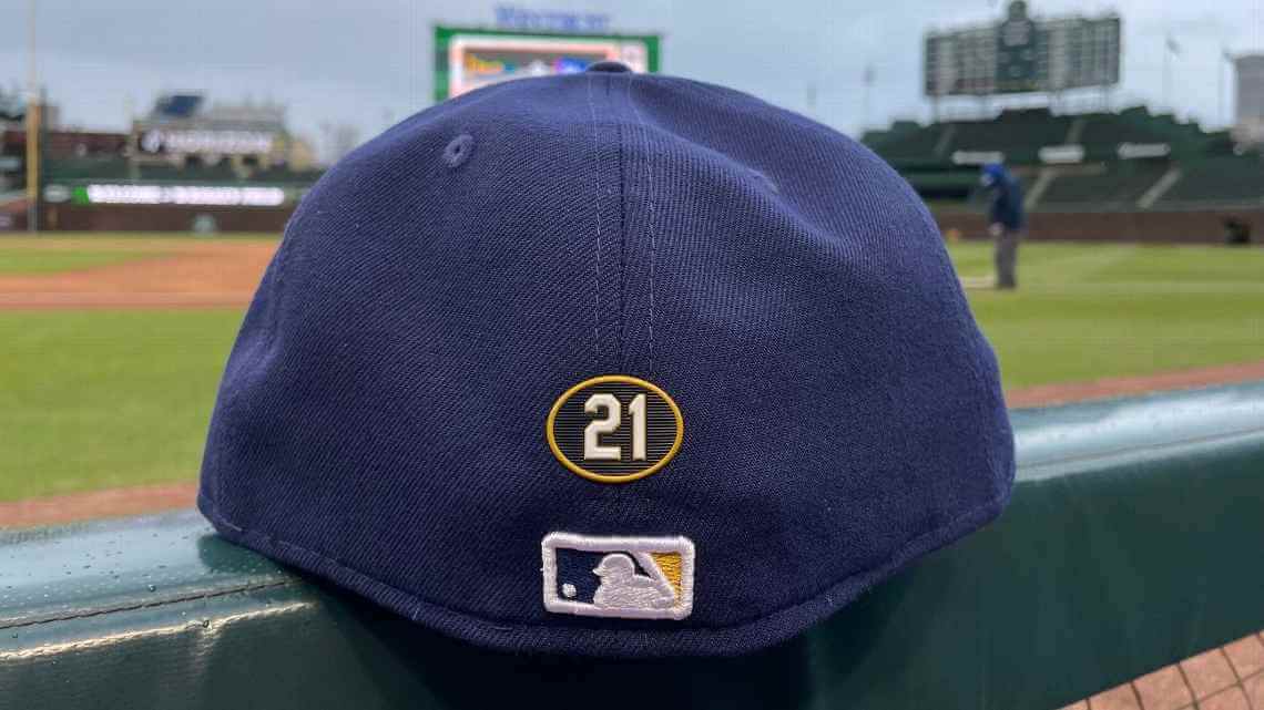
Anyway: Surprise move yesterday by Major League Baseball, which waited until Opening Day to announce that active players who’ve previously won the annual Roberto Clemente Award, which is given on the basis of philanthropic efforts, community engagement, and sportsmanship, will get to wear a “21” cap patch for the rest of their careers. The idea is obviously analogous to (or, if you prefer, poached from) the NFL’s Walter Payton jersey patches, which have been worn by Payton Award winners since December of 2017.
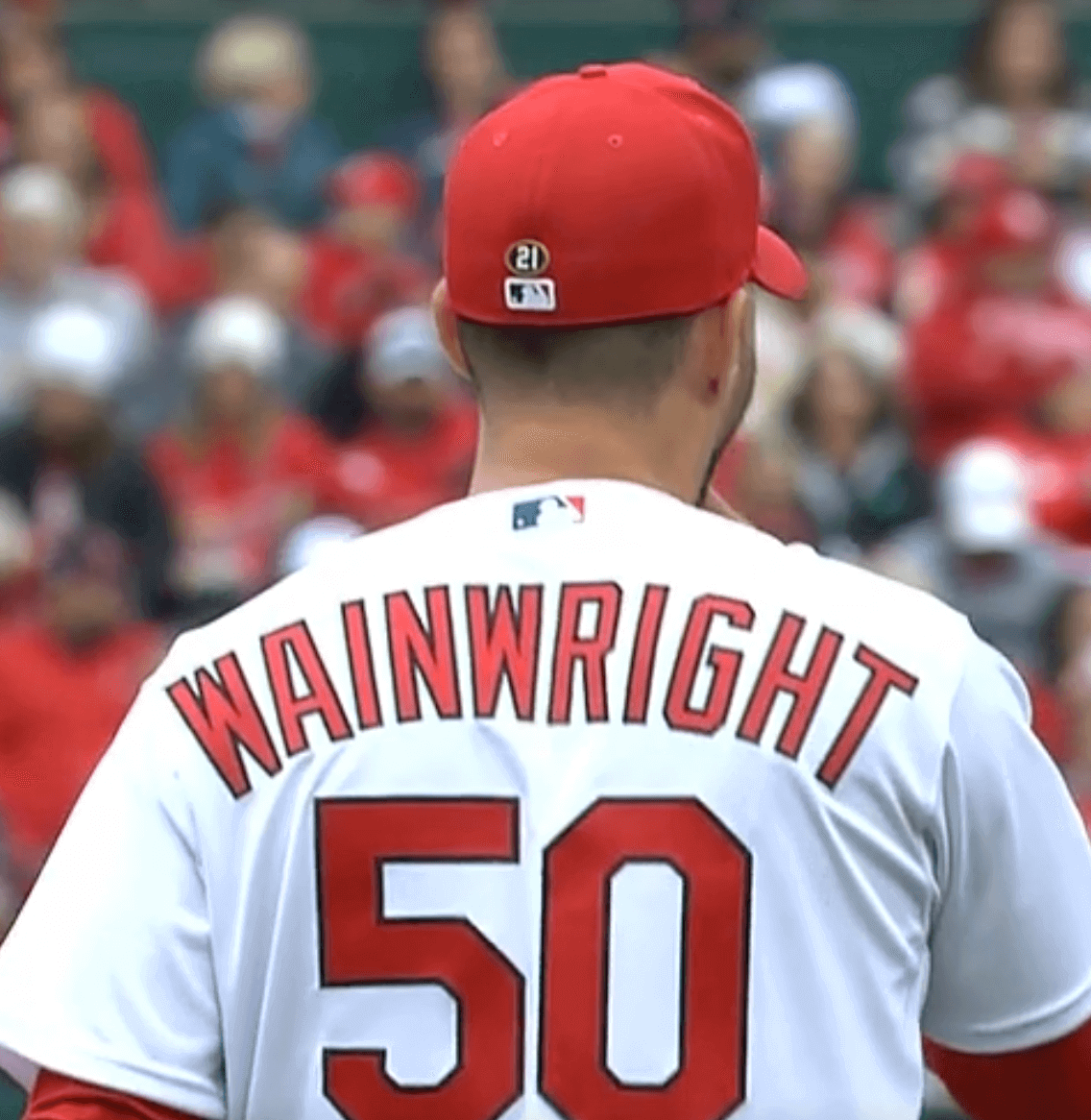
At present, there are eight active Clemente Award winners. Oddly, three of them are on the Cardinals: pitcher Adam Wainwright, catcher Yadier Molina, and DH Albert Pujols. The other five are Nationals DH Nelson Cruz; Mets pitcher Carlos Carrasco; Yankees first baseman Anthony Rizzo; Dodgers pitcher Clayton Kershaw; and Brewers outfielder Andrew McCutchen (that’s his cap shown at the top of this page).
Here’s how the cap patch looked yesterday on Wainwright:
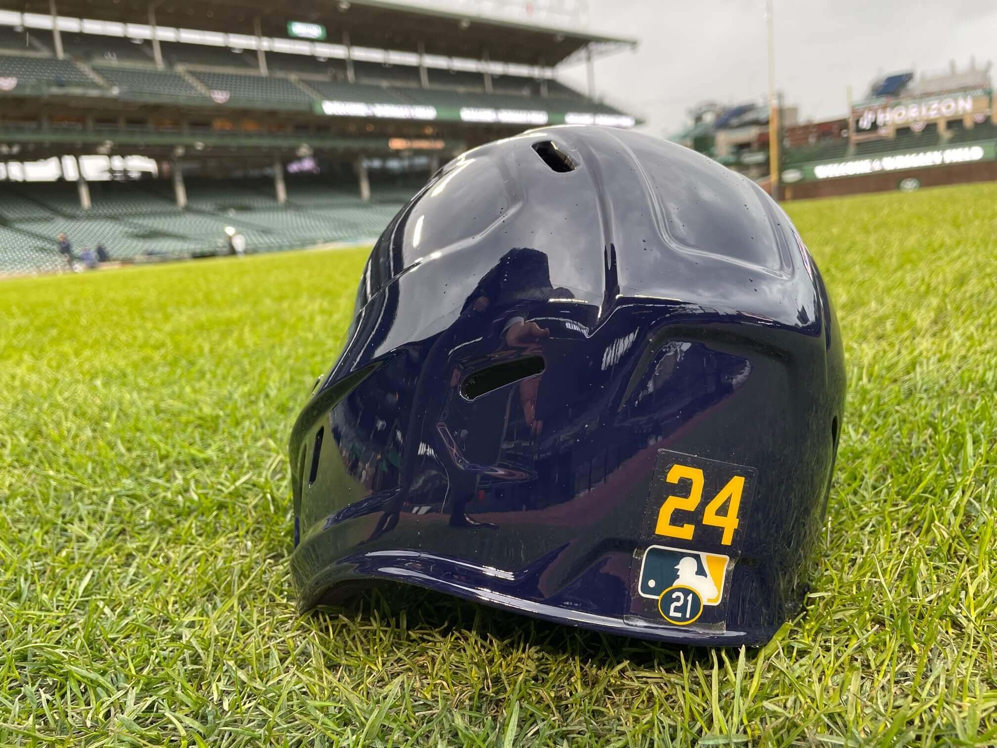
Those eight players will also get to wear a decal on their batting helmets if they want (well, except for the three pitchers, obviously):
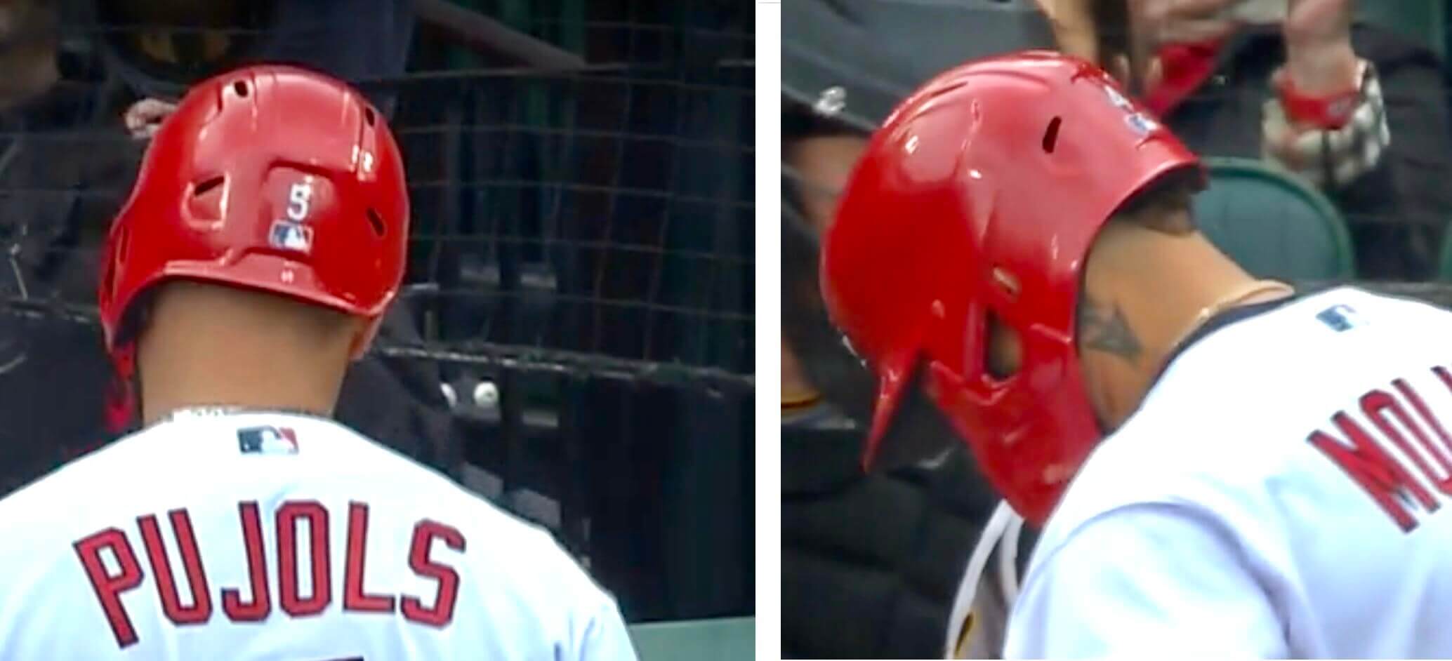
I wasn’t able to check every Clemente Award winner’s helmet, but I did notice that the two St. Louis players — Pujols and Molina (Wainwright doesn’t count because he’s a pitcher) — were not wearing the “21” decal:
In other uni-related developments from yesterday’s games:
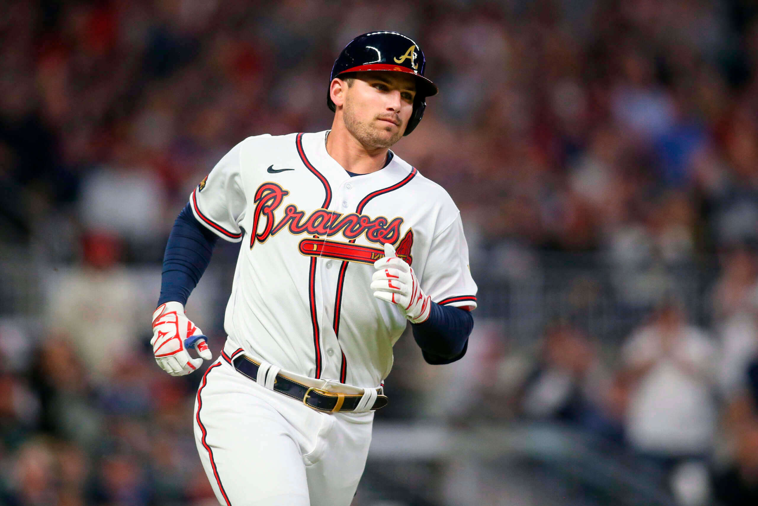
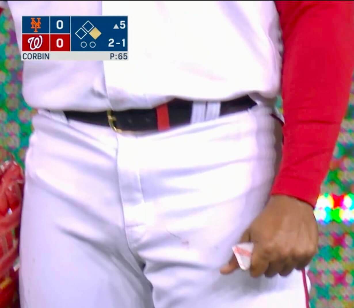
• Atlanta debuted their gold-trimmed uniforms, including two elements we hadn’t seen before — gold batting helmet logos and gold-trimmed belts:
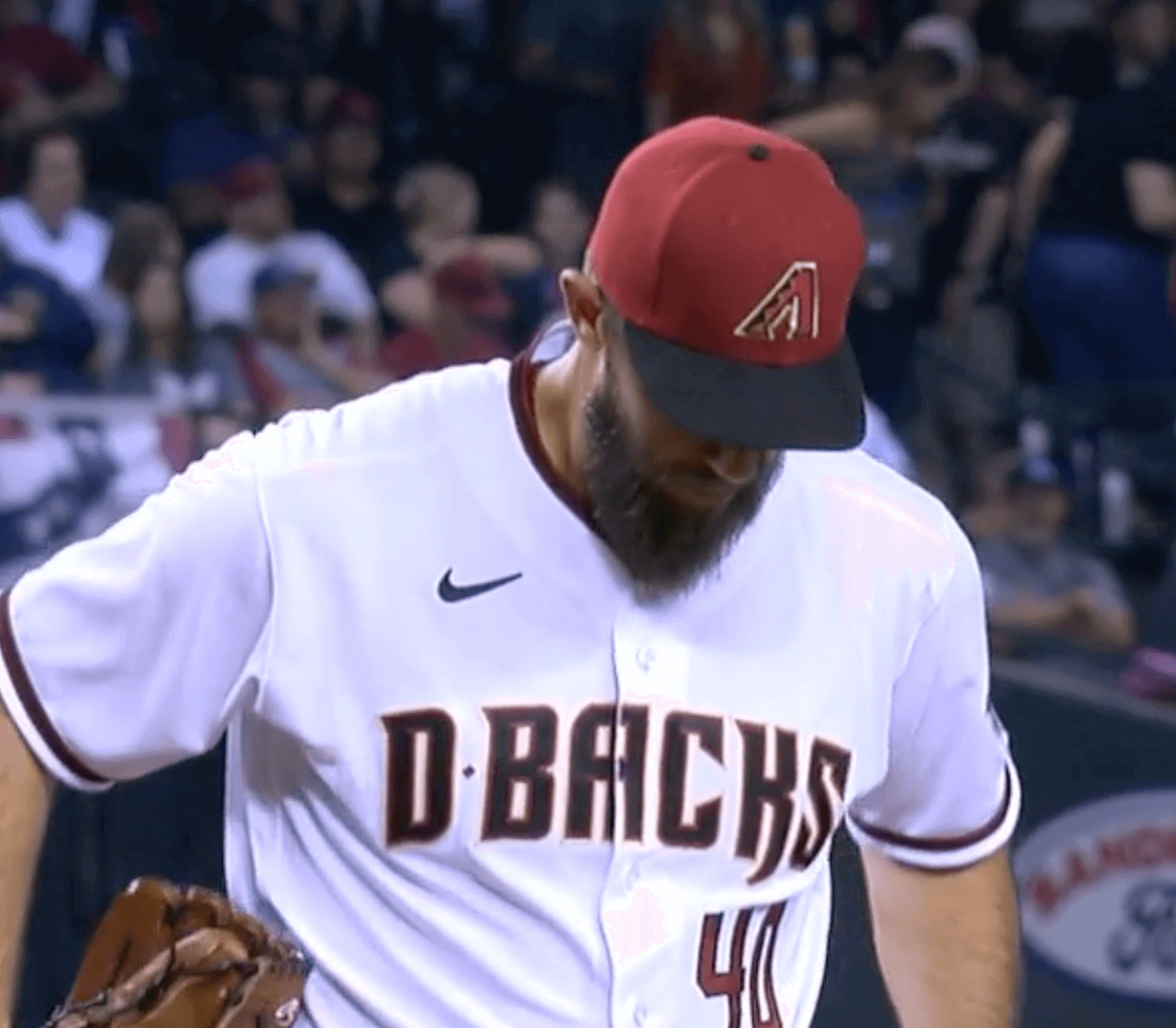
• The Diamondbacks debuted their new red alternate caps:
• The Astros’ two Cuban players — first baseman Yuli Gurriel and shortstop Aledmys Díaz — wore pregame T-shirts advocating for an independent Cuban team to play in the next World Baseball Classic:
Yuli Gurriel and Aledmys Díaz are wearing these shirts pregame. Díaz said they’re pushing for an independent team of Cuban players to compete in the next World Baseball Classic. pic.twitter.com/y3lnL9jdsj
— Chandler Rome (@Chandler_Rome) April 7, 2022
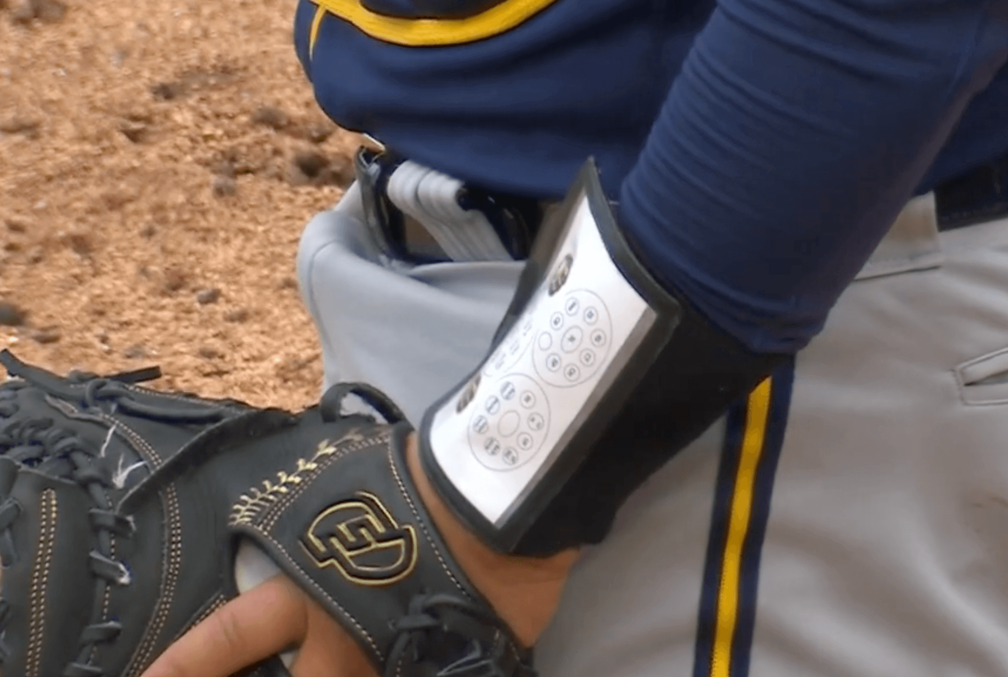
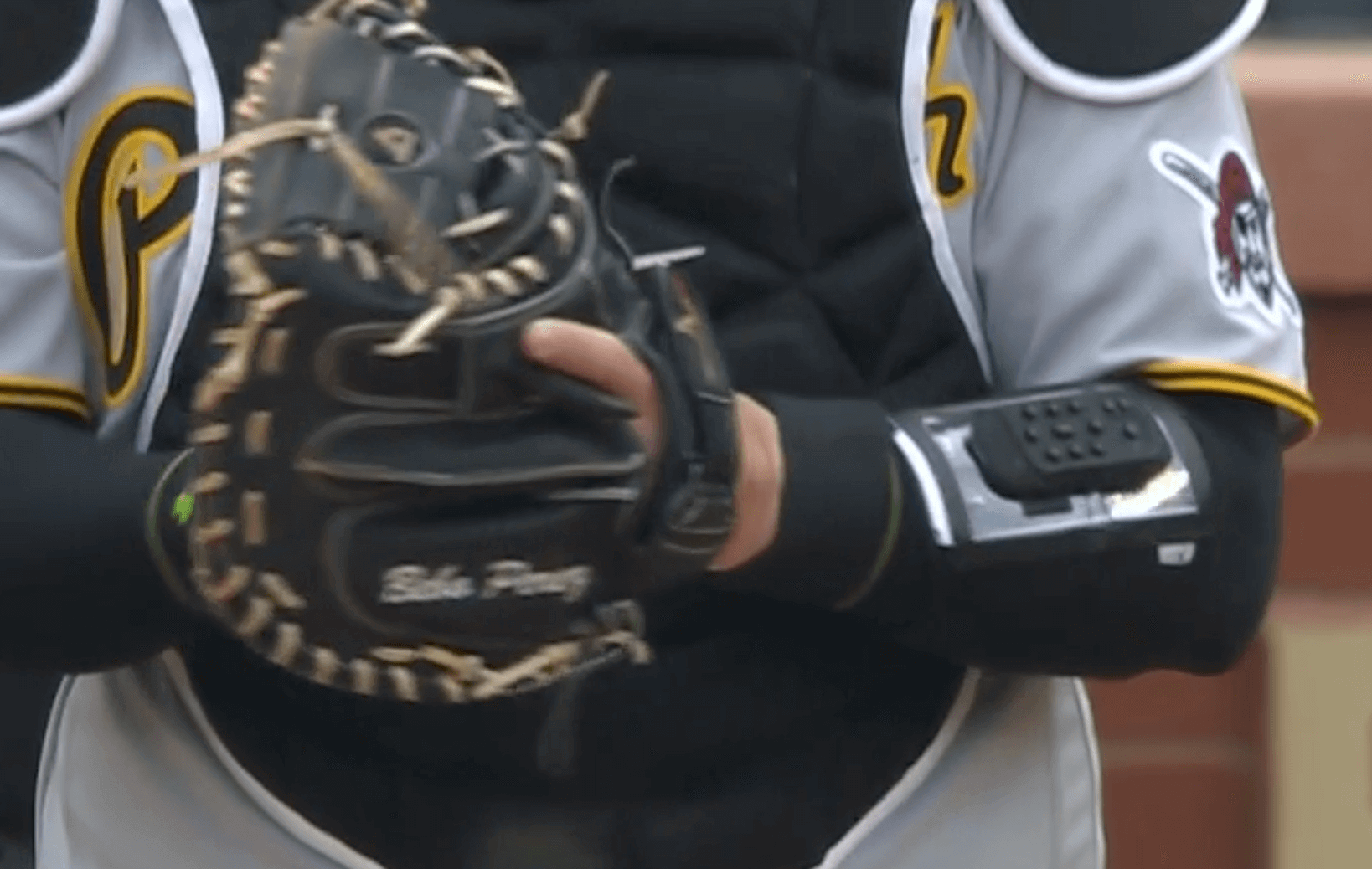
• Brewers catcher Omar Naváez and pitcher Corbin Burnes became the first battery in MLB history to use electronic pitch-calling in a regular season game. The catcher calls the pitch by pressing button on his wristband and the pitcher hears the call via a little speaker located under his cap. (They’re calling it an “earpiece,” but I don’t think that’s the appropriate term if it’s not lodged in his ear.) This screen shot shows Naváez’s crib sheet for his buttons, which are on the other side of the wristband:
And then here’s Naváez pushing the buttons to call a pitch (not a very satisfying view but it’s the best I could get):
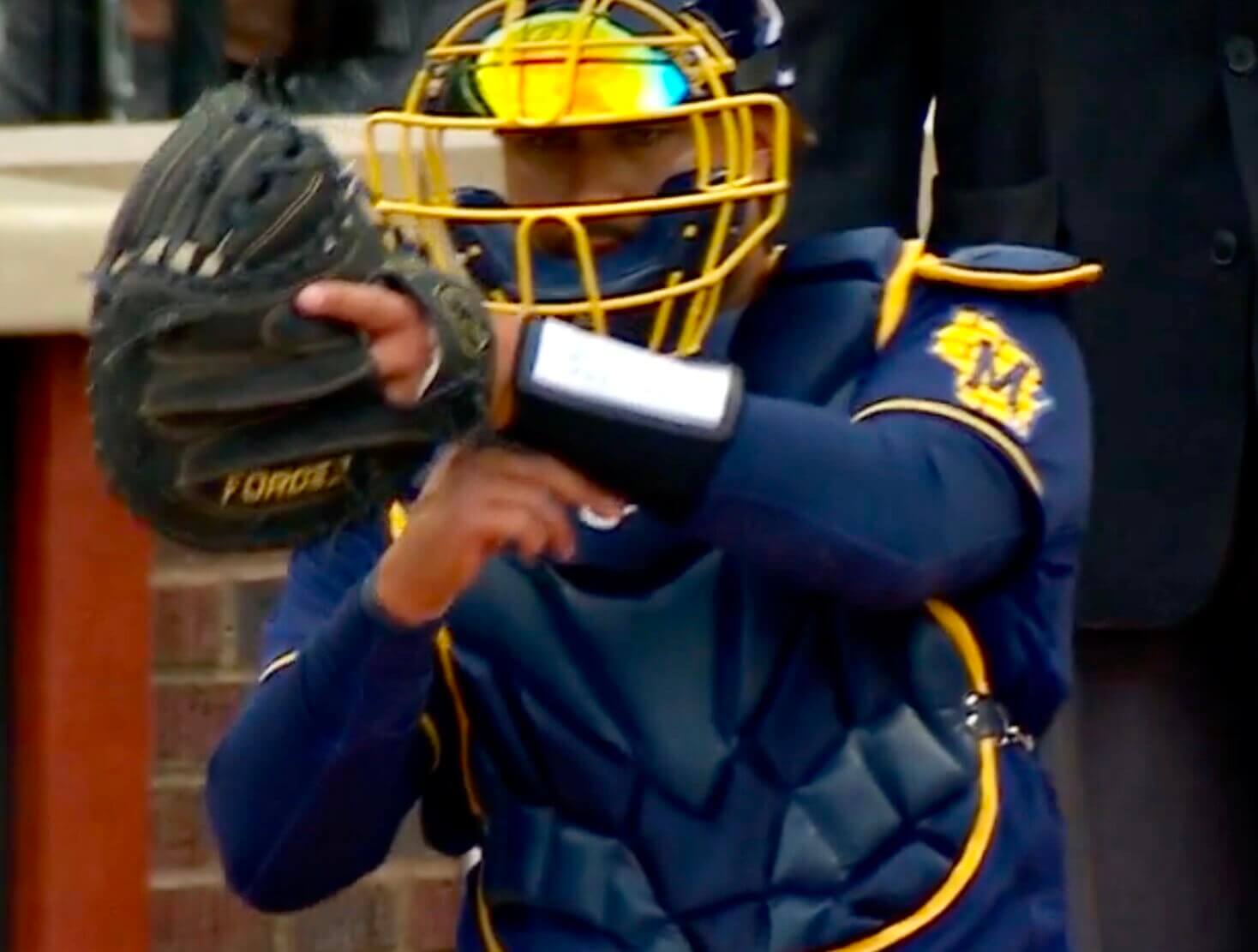
Here’s a better look at the push-button console, as worn yesterday by Pirates catcher Roberto Pérez:
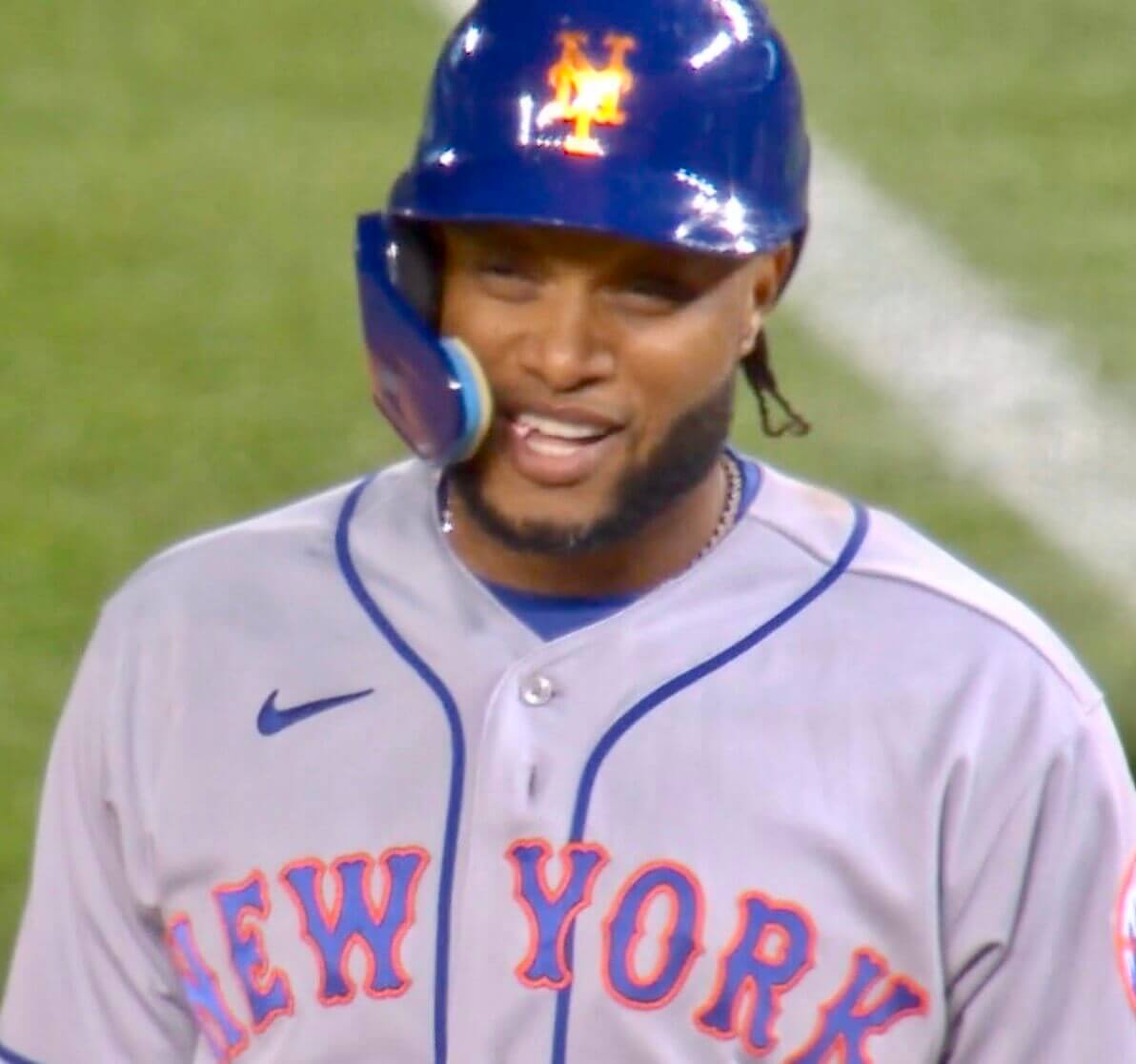
• Mets second baseman Robinson Canó, back after being suspended for all of last season due to steroids, was in midseason form with his signature Pedro porthole (if you’re new here or don’t remember, that means he had his top jersey button buttoned but his second button unbuttoned, a phenomenon we first noticed when Pedro Martinez routinely did it years ago):
• Not sure I’ve seen this before — Nats outfielder Juan Soto was using a hand-warmer thingie on the field:
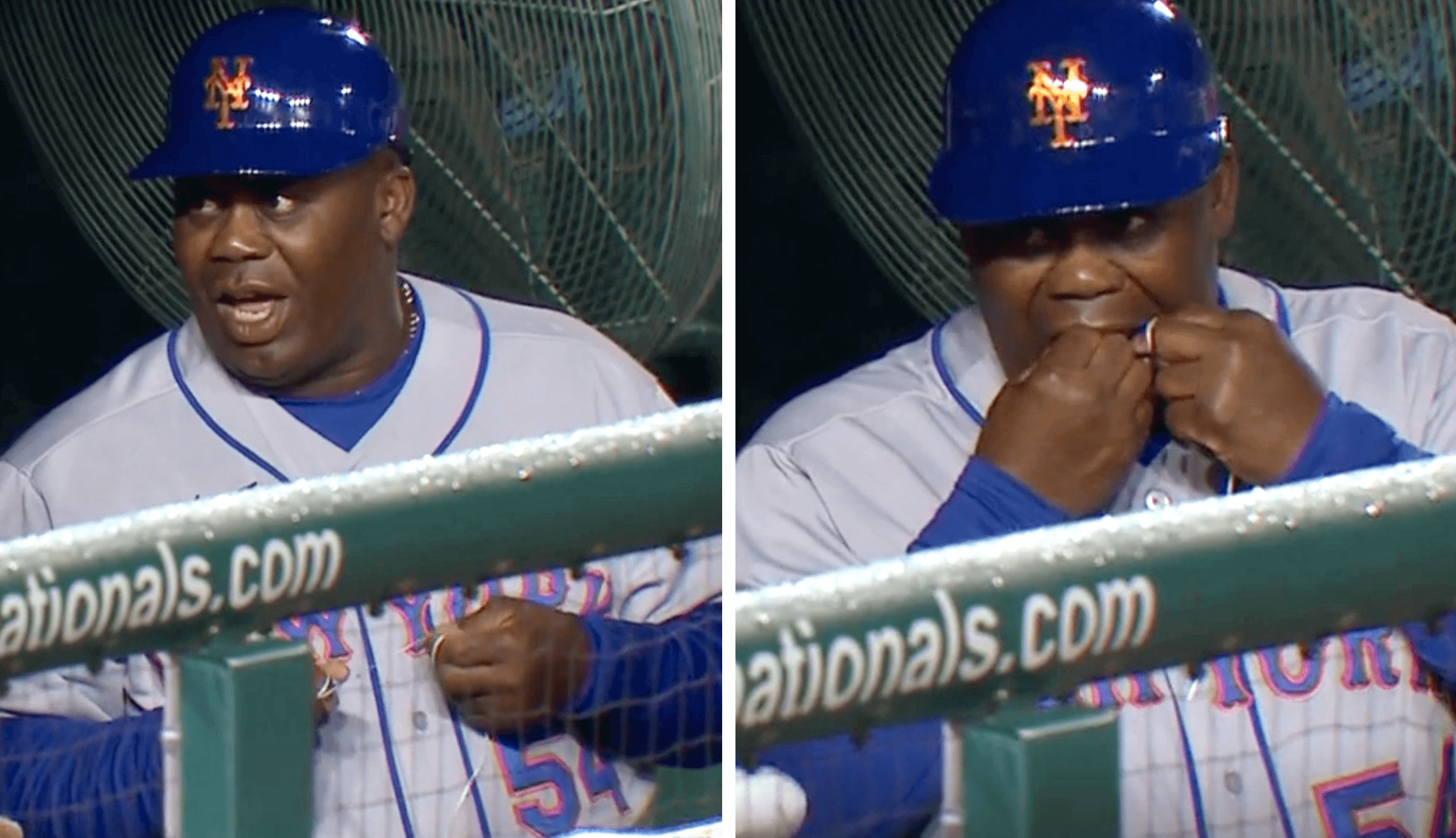
• Here’s something I know I’ve never seen before: Mets first base coach Wayne Kirby was flossing his teeth in the dugout during the bottom of the ninth inning. Ewwww:
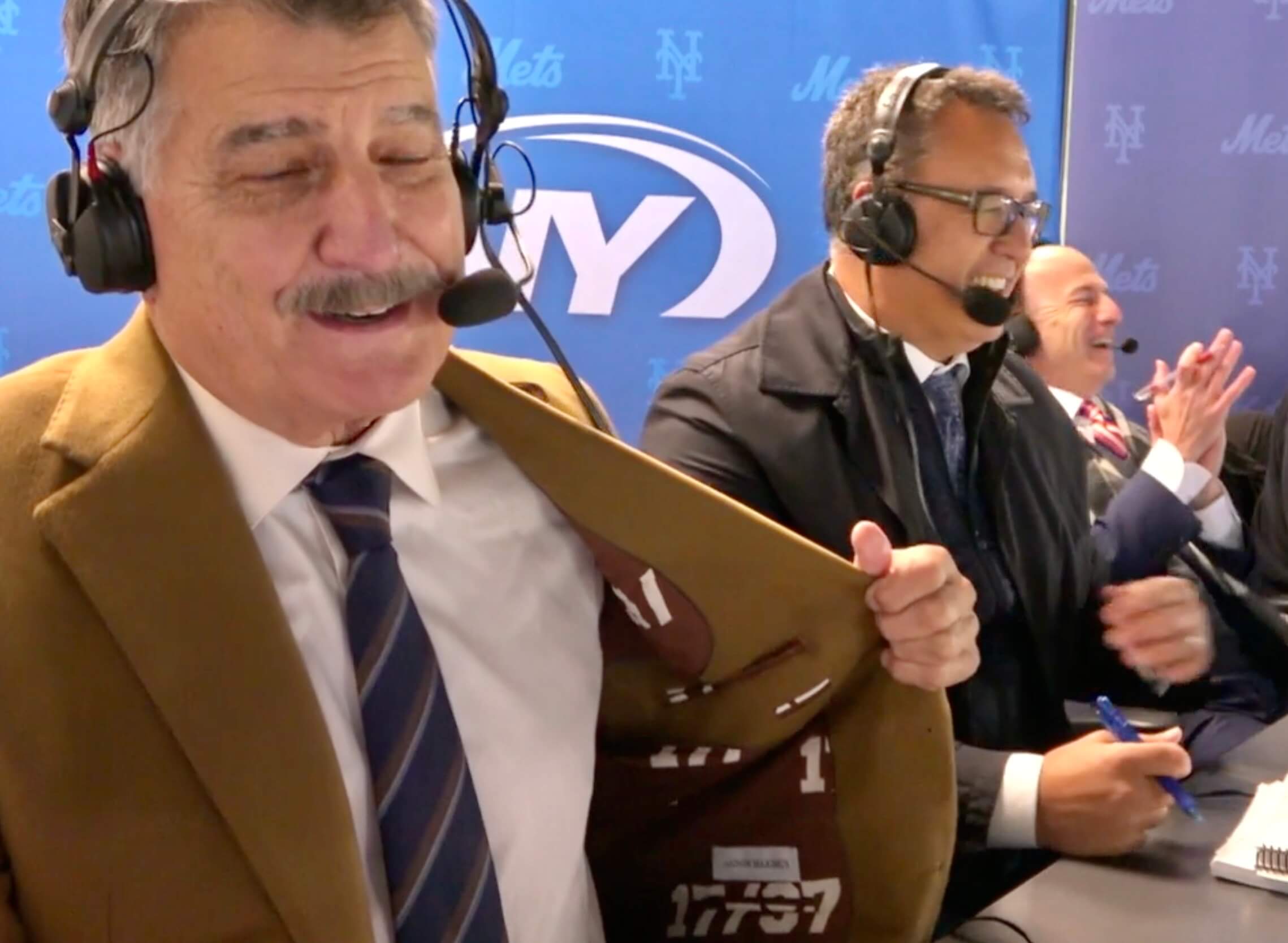
• Mets broadcaster Keith Hernandez revealed that the lining of his new blazer is emblazoned with the two numbers he wore for most of his career — 17 and 37:
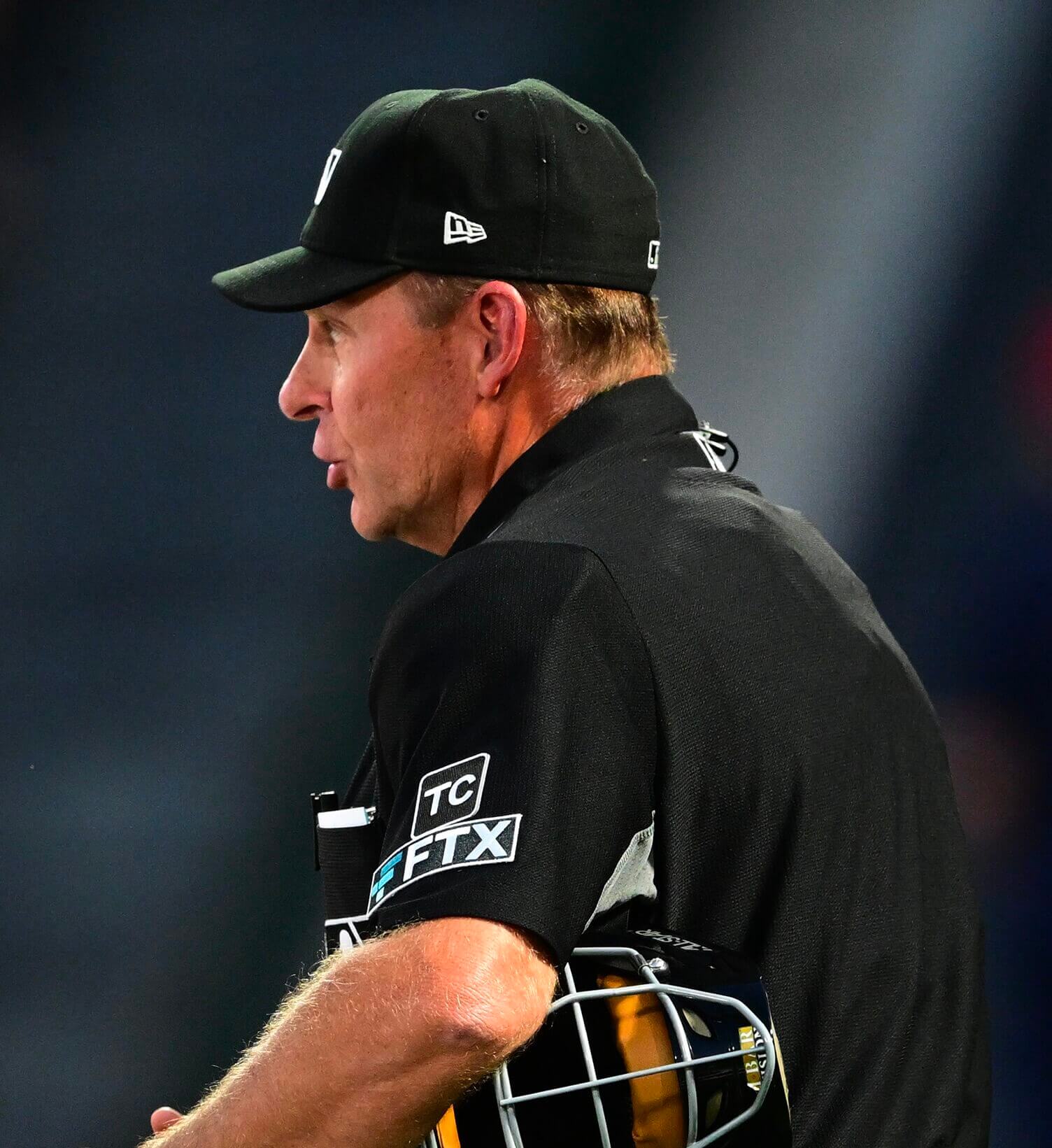
• Umpires are wearing “TC” memorial patches for former American League ump Terry Cooney, who died last month (or at least most of them are wearing it — I noticed a few who didn’t have it):
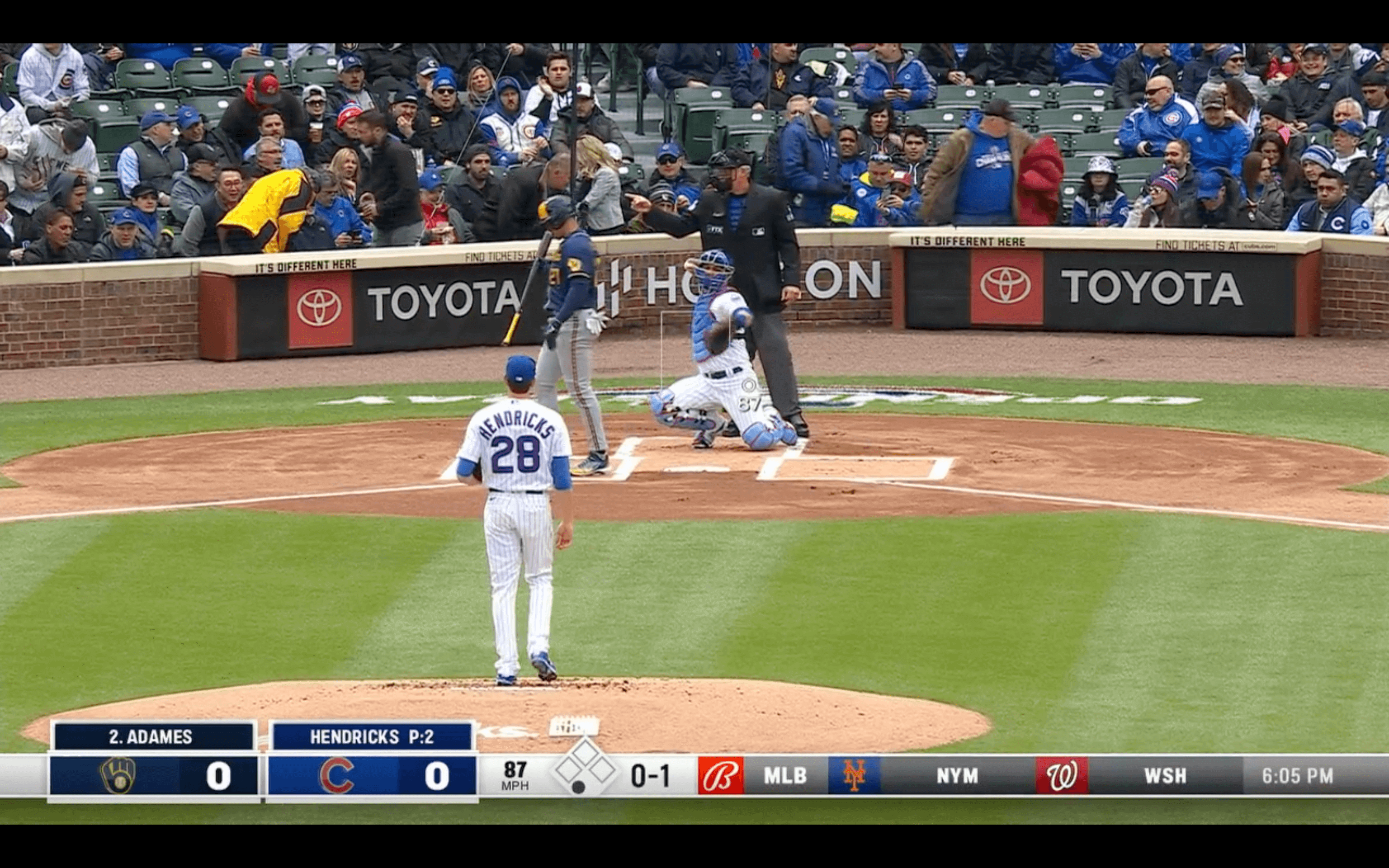
• Kudos to the folks at the Brewers’ regional sports network, whose new scorebug conveniently blocked the unsightly ad on the back of the Wrigley Field mound:
• Speaking of mound ads, the one in Anaheim was very, uh subtle:
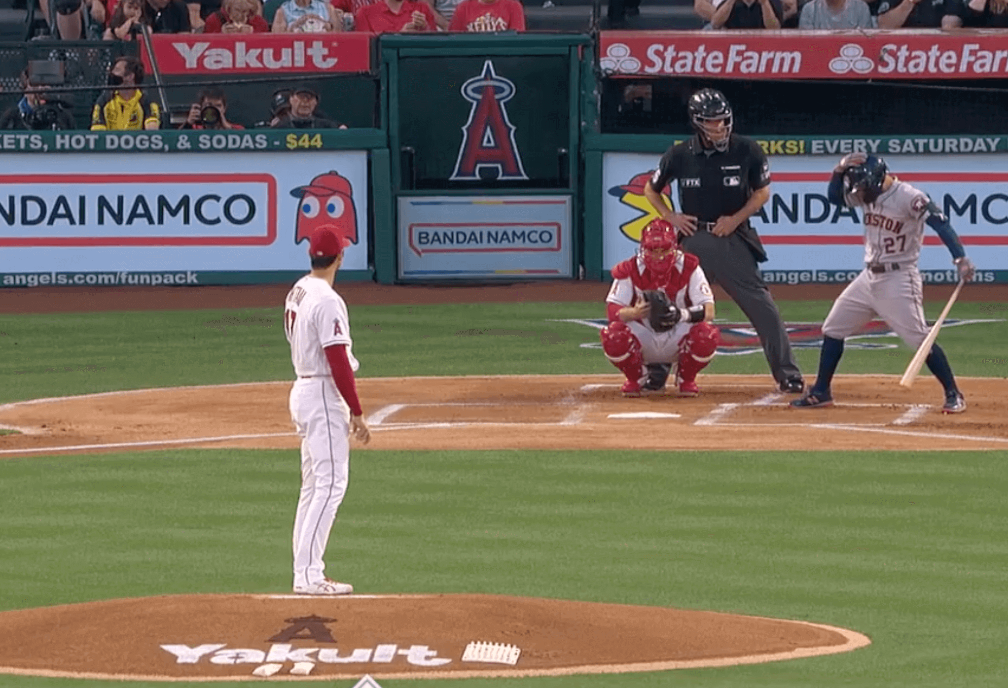
(On the plus side, some mounds yesterday were ad-free.)
• Apparently nobody told ESPN that the team in Cleveland has a new name this season:
@UniWatch ESPN2 broadcast puts Cleveland Guardians logo with “Cleveland Indians” team name. pic.twitter.com/Fsl6Jbn0oc
— Mr X (@SASSshow) April 7, 2022
Click to enlarge
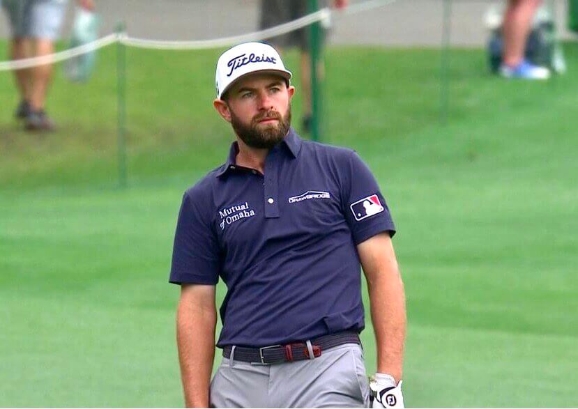
And speaking of MLB: Baseball was even in the air yesterday at the Masters, where Cameron Young wore the MLB logo on his sleeve. That’s not a new thing for him, but it seemed particularly notable on Opening Day.
And that wasn’t the only Masters/MLB crossover yesterday at Augusta. Check out the shoes on this security guy:
Former or current MLB umpire working security at Augusta? #themasters pic.twitter.com/Dan42XFo8M
— (@lt4kicks) April 7, 2022
(My thanks to Preston Feller for the Young screen shot and to Joseph Guzman for bringing the security guy’s footwear to my attention.)
One last time: In case you’ve somehow missed my previous plugs, the 2022 Uni Watch MLB Season Preview is an epic compendium that’s by far the most obsessively completist document I’ve ever produced — really! I’ve also been updating it over the past two days, so it’s even better now than when I published it on Tuesday morning.
The MLB Preview is available to my Premium Subscribers here. If you’ve been waiting for the “right time” to subscribe, believe me when I say the time is now (Facebook account required). Don’t have or want a Facebook account? Email me for workaround info. Thanks!
City disconnect: I just wanted to say that.
(Very nice work by by Twitter-er @mtblanks.)
Click to enlarge
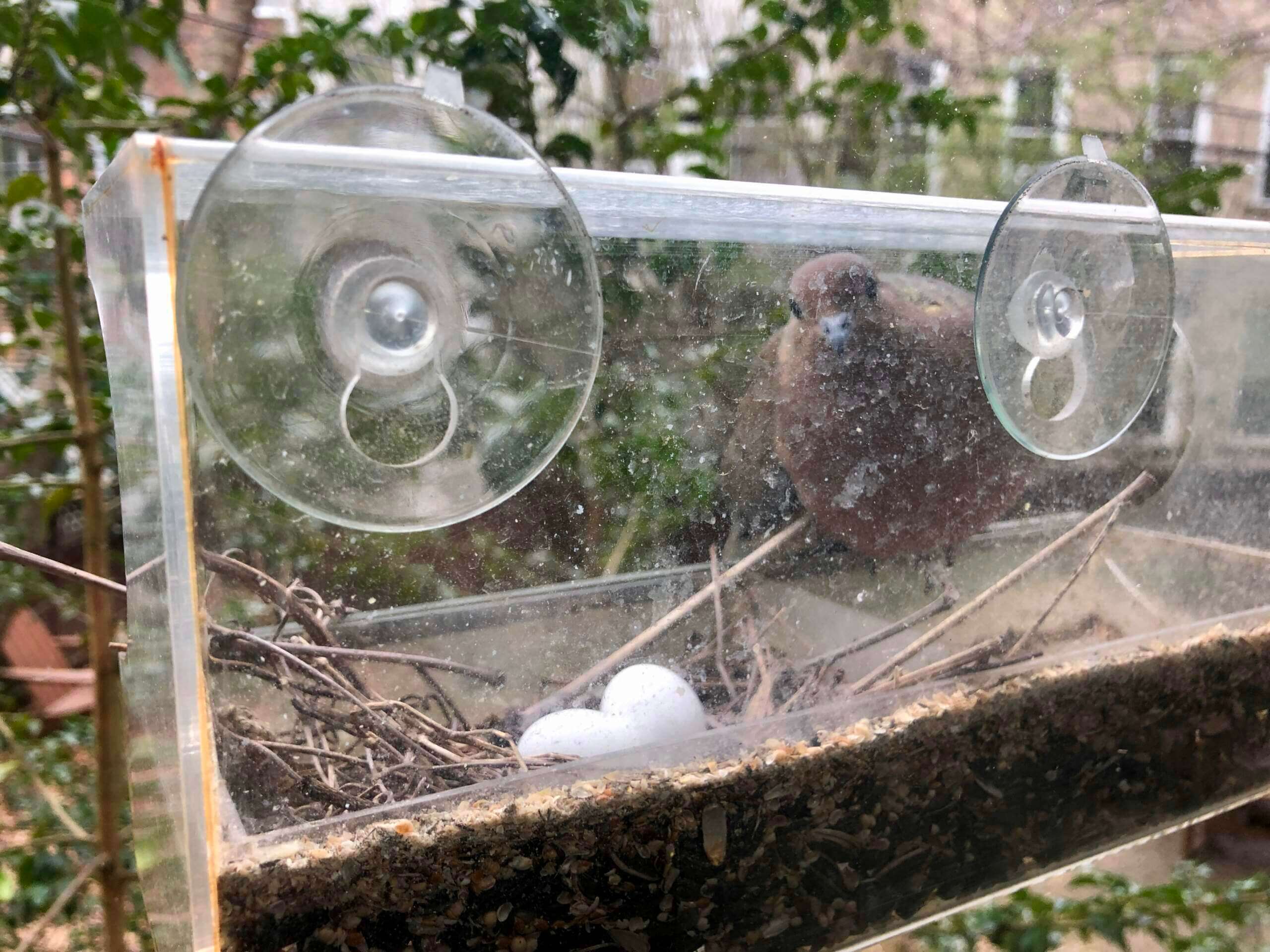
Dove update: As it turned out, Opening Day was not opening day for the baby doves. But everything seems to be fine in the nest. Mary took this shot sometime around noon, during a “shift change” (i.e., when one of the adult doves leaves the nest and is replaced by the other one). It was our first look at the eggs in about a week, so we were glad to see that they both appear to be okay.
The Ticker
By Anthony Emerson

Baseball News: The Reno Aces, Triple-A affiliates of the Diamondbacks, have unveiled a new uni set. … The Cardinals have updated the photos and design of their uni number retirees on their left field wall (from Kary Klismet). … Oh man, this c. 1915 quilt is gorgeous, and not just because of the baseball player felts on the perimeter (from @acustom19). … The Kalamazoo Growlers of the Northwoods League have unveiled a new alternate logo (from Brad, who didn’t give his last name).
College Football News: For their spring game tomorrow, UNC will wear a helmet decal supporting WR Tylee Craft, who is battling cancer (from James Gilbert). … Utah has unveiled custom hand-painted helmets that honor deceased players Ty Jordan and Aaron Lowe (from Kary Klismet). … Also from Kary, Utah State is replacing its football stadium’s artificial turf and selling off pieces of the old turf to the public.

Hockey News: For the first time ever, the Hurricanes wore black helmets, gloves, and pants with their standard red home jerseys last night against the Sabres. The effect was very Devils-esque (thanks to all who shared). … Three NHL teams wore one-off pregame sweaters on Wednesday night: the Golden Knights to promote organ donation; the Ducks for the Orangewood Foundation, which works with foster system kids, and the Blues for LGBTQ pride (from Wade Heidt). … The Blackhawks will retire Marian Hossa’s No. 81 next season (thanks, Phil). … New Coyotes G Harri Säteri is still wearing his old KHL pads, featuring the logo of Sibir Novosibirsk. … This couple took frankenjerseys to the next level at the Men’s Frozen Four (from Ben Karnish).

Basketball News: The Chinese search engine Baidu has a whole bunch of fake logos in its NBA standings section (from @Ulankhad). … Idaho State University will make old seats from Holt Arena available to the public as they are replaced during ongoing renovations (from Kary Klismet).

Soccer News: The NWSL’s Houston Dash have unveiled a new alternate shirt, inspired by the Flag of Houston (thanks to both Jamie and Phil). … Adidas unveiled the jerseys for Northern Ireland, Germany, Belgium, Spain, and Sweden with a Spice Girls-inspired photoshoot (thanks, Phil). … The following are all from Kary Klismet: Swedish side IFK Göteborg’s new pre-match warm-up shirts feature a design commemorating the 40th anniversary of the club’s 1982 UEFA Cup title. … Brazilian side Coritiba wore multicolored numbers in recognition of World Autism Awareness Day last weekend. … New home kits for Norway’s men’s and women’s national teams. … Club Nacional of Uruguay’s Primera División has unveiled its new kits. … New home kits for Vélez Sarsfield of the Argentine Primera División. … New away and third kits for FC Edmonton of the Canadian Premier League.
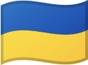
Ukraine News: The Ukrainian Armed Forces have established a Russian volunteer battalion, and they’re wearing uniforms with the white-blue-white flag of the Russian opposition. … Aston Martin F1 driver Sebastian Vettel wore wristbands in the colors of the Ukrainian flag while preparing for the Australian Grand Prix this weekend.

Grab Bag: Another day, another DC sports team unveiling a cherry blossom uni. This time it’s Old Glory DC of Major League Rugby (from multiple readers). … Back in the 1970s, the city of Pontiac, Mich., attempted to lure the Tigers and Lions out of Detroit with a “twin stadium” proposal — separate facilities for baseball and football, but with a shared retractable roof (from Brice Wallace). … The following are both from Kary Klismet: Here’s a feature on the history of the team name and mascot for Loyola University of Chicago. … This story looks at the most significant uniforms in the history of UTEP sports.
That’ll do it for me for this week. If your favorite MLB team is playing its first game today, please accept my best wishes for a fun and successful season. Meanwhile, enjoy Phil’s weekend content and I’ll see you back here on Monday. — Paul
The Hurricanes need to keep the mix and match rolling here. Time to wear the red equipment with the black alternate uniforms!
On a serious note, I am not a proponent of the Hurricanes wearing black equipment with red uniforms. We have enough teams wearing red and black in the NHL. It is looking too similar to the Blackhawks and Devils. The Hurricanes have a more distinct red and black look that is their own when they wear the red equipment with the red uniforms.
I am curious as to why they are doing that however. Especially because they did the same with their whites the other day
Would love it if the Devils went back to their original colors and ditch the red and black altogether.
While I like the concept behind both the Payton and Clemente award recognition, the execution on both is about as bad as it gets.
In football the jersey patch just creates a cluttered look (say nothing for the Darth Vader design) as does the hat patch in baseball. Realistically they’d be better off swapping locations. In football it would work better as a helmet decal, on the rear of the helmet. In baseball it would work better somewhere on the jersey, perhaps above the NOB.
Not a fan of the logo placement on the back of the hat. Putting it on the side would have been better. I get that it would be harder to see, but it clutters everything. I feel the same way about the Walter Payton patch on the NFL jersey.
As a Cleveland baseball fan, it’s been taking some getting used to with the new moniker. It’s getting to be more “normal” and really the only problem I have at the moment is what to call the team for shorthand (Indians were the “tribe” – so much that I rarely called the team their actual name). Do we call them the Guards? Just doesn’t sound right yet. Hopefully something organic pops up.
Anyways, I came here to say that the “new” uniforms actually look better than the previous. Guardians is longer and looks smoother going across the front of the jersey. The underline from the S looks better smaller than it was with “Indians”. Further “Indians” script started to look dated, the top part of the d was too small (lol) next to the i, and the underline was too wide.
I don’t like the logo too much but it makes the jersey look better having something on the sleeve. These changes are making the home white and the red alt way better IMO. I am still unsure if I think the road lettering looks better or worse on the new uniforms compared to last year’s.
I have also come around to the “diamond” C on the hat but MOSTLY because when compared side to side the block C is very drab and the lack of an outline makes it look even more bland whereas on the new Diamond C the white outline really makes it pop.
I know not many out there care that much about the team as I do but does anyone else think the actual uniform is a big upgrade aesthetically than the old one? (removing the fact that the old team name was highly unpopular and just talking strictly from a looks perspective)
I’m not a Guardians fan, but I concur with your analysis.
I didn’t agree that completely re-branding was a necessity, but I like the new identity; the lack of a short-hand is small potatoes. I really like the overall uniforms…redesigned cap C (if I was a fan, I’d probably purchase one) and chest script/number font are upgrades, and I hate the sleeve logo.
As an aside, the Braves gold batting helmet A is 100% terrific. I hope that they keep those applied all season!
I’m with you. Former Twins season ticket holder so I saw a lot of Cleveland over the years. The new uni set shows good effort to be attractive while respecting the long tradition. Like the number on the back, yes, slightly odd, but the sort of thing that could have been around for 50 years. The nickname itself, meh, but the “branding” if you will, just right.
I’m looking forward to when the “G” logo is put on a hat.
I didn’t catch any spring training games, so yesterday was my first look at the new uniforms in action. I was kind of expecting to hate the new number font, but I actually like it. And while I liked the block C, the new C has won me over.
“does anyone else think the actual uniform is a big upgrade aesthetically than the old one”
They had great uniforms in the 1990s and it feels like endless tinkering since then, continuous downgrades bit by bit. As a non-fan I couldn’t tell you what their hat logo or primary colour was in recent years because of all the tinkering.
Are they an upgrade over the 1997 set? Wash. Are they an upgrade over 2020? Absolutely 100%.
“Apparently nobody told ESPN that the team in Cleveland has a new name this season”
– I still call the stadium Jacobs Field and I still call my team the Tribe.
One may interpret the Hurricanes’ uniform futzing as a preview of permanent changes (see 1996 Sabres and 1998 Islanders). Interesting that they’re making the same changes their former AHL affiliate (Charlotte Checkers) just made for this season. Odd.
Apparently there’s no guidelines for how low or high the logo is placed on the hat. The patch for Cutch looks higher than the one for Wainwright. I don’t have a problem with the logo in principal, I just wish they would’ve planned it out better. Something similar to what the Yankees did when they built a logo around the MLB logo on the back.
link
I like the execution of the Clemente patch on the batting helmet better than on the hat.
Perhaps more importantly–I love how the dove is looking RIGHT at the camera in the nest photo!
That proposed Detroit stadium project looks almost exactly like the early renderings for the Truman Sports Complex (Kauffaman and Arrowhead Stadiums) in Kansas City, sliding roof and all.
link
I think the same architect was involved on both projects.
Watched the Cleveland/KC game yesterday, and they talked about the electronic pitch calling. I did not know that the signals can go the other way and the pitcher can tell the catcher what pitch is coming. According to the KC broadcasters, the home plate umpire will be obligated to tell the catcher if the volume is too loud (if the ump can hear, the batter can too).
Also, the broadcast team were talking about not saying “Indians.” The play by play said that he has been “training” since the announcement by almost exclusively referring to the team as “Cleveland.”
*decals UNC will wear in its spring football game on 4/9/22.
Fixed.
To be technical, the LF wall retired-number display at Busch already had photos; they did change them, and the overall design, this year in the course of adding Ted Simmons to the display.
Thanks for clarifying! Text now adjusted.
“Cardinals DH Albert Pujols” has me feeling a bit reflective.
Yes, like todays’ references to “obviously pitchers don’t have batting helmets”.
Indeed, 1-0 and 161 to go. Go Mets and hopefully the 60 seasons patch will at one point be on (at least) the home uniform. I suggest the right sleeve.
Being born in Cincinnati, encouraging to see the ol’ Reds at 1-0 with 161 to go.
USA Cycling announced the winner of a public design contest (3 finalists were selected and the winner was based on fan votes)
link
I’m uninspired, but just that’s my opinion!
I’m almost always a fan of helmets that don’t match the primary jersey color in hockey. I think that’s an aesthetic concept that more teams should explore.
Hit “Post” too soon…
Even if it’s as simple as just wearing a colored helmet with the white jerseys, it adds some extra pop that I find refreshing.
I don’t think it’s asking too much that teams carry three sets of helmets. That way, the NHL could have color-on-color games and still use contrasting headwear: Say, red helmets for the Canadiens vs. blue buckets for the Rangers.
So the Clemente award will effectively bestow a Stargell Star.
Makes me wonder/dread whether the league will eventually market player-specific caps with the 21 on them, as they market player-specific shirseys/jerseys.
Is it too banal to point out that the renovations – including replacement of the seats – in Holt Arena also falls under College Football News?
Kind of a general question for any Uni Watchers: am I the only one who has complete fatigue for patches/stickers in general on sports uniforms? I feel kind of bad saying this because I don’t want to sound like I don’t value the accomplishments of Jackie Robinson, Roberto Clemente, Walter Payton, or anybody whom teams feel should be remembered, supported, or honored…but after a while I just miss the old days of clean uniforms that didn’t seem to be in a competition to catch people’s eyeballs.
Thoughts?
The Apple Plus broadcast of the Mets/Nationals game just did a segment about the Nationals’ City Connect jerseys, and analyst Chris Young enthusiastically shared that when he and his teammates got their City Connect jerseys, they would want to wear them all season.
I’m not saying he’s being dishonest…but Chris Young last played in 2018, and the City Connect program started last year.