Click to enlarge
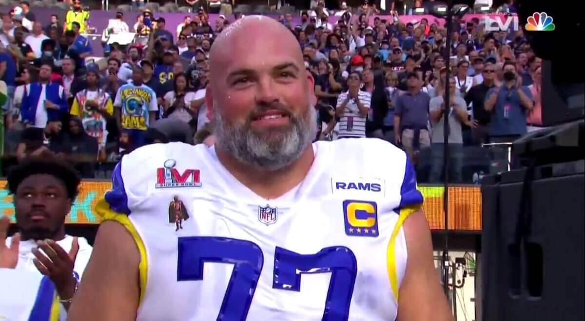
Good morning! As we speculated back on Friday, Rams offensive lineman Andrew Whitworth, winner of this season’s Walter Payton NFL Man of the Year Award on Thursday night, did indeed wear the Payton patch for the Super Bowl yesterday. When combined with his captaincy patch, Super Bowl patch, and “Hi, My Name Is Rams” patch, I’m fairly certain that set a Super Bowl patch record, and I’m thinking it’s also probably the most patches ever worn in an NFL game, period. How’s that for uniform history?
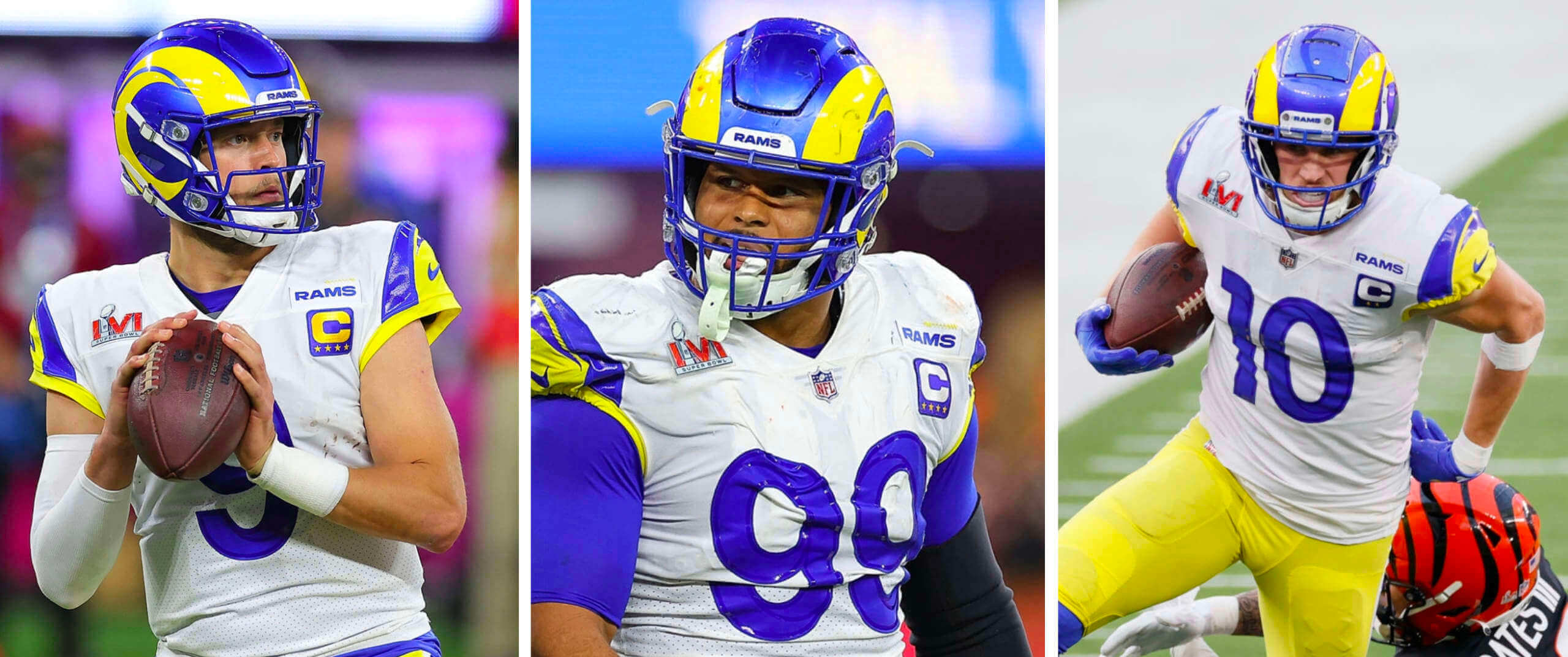
Speaking of patches: As I also mentioned on Friday, promo photos showed most of the Rams’ captains wearing their “C” patches above the “Rams” patch. (Whitworth, whose promo photo showed him wearing the “C” below the “Rams” patch, was the exception.) But in the game, it turned out that all of the Rams’ captains wore the “C” below the team patch:
In yet another patch-related development, Rams defensive lineman Aaron Donald’s Super Bowl patch was coming loose during his postgame interview:
Add Aaron Donald postgame championship interview to the all-time best pic.twitter.com/gwVfaUVMNZ
— Rob Lopez (@r0bato) February 14, 2022
Aside from that, I didn’t notice anything uni-notable in the game. Admittedly, I wasn’t playing super-close attention — we had company over, so I was busy hosting, yakking, etc. Was there anything I missed?
Update: Reader/commenter John Steinhart notes that the social justice messages we’re used to seeing on helmet neck bumpers were not worn in yesterday’s game. Bengals players all wore “Bengals” and Rams players wore “Los Angeles.”
Additional update: Reader/commenter Dave Dahl says the Rams have worn “Los Angeles” bumpers, with no justice messaging, all season long. I hadn’t been aware of that, but some preliminary photo research suggests that he is correct. That got me wondering about the Bengals, and it looks like their players have worn “Bengals” all season. So we had a Super Bowl matchup of two teams that have eschewed the bumper messaging — an interesting uni-related storyline that totally flew under my radar!
Yet ANOTHER update: It now turns out that the Rams did indeed wear the bumper messaging as recently as the Wild Card game, as seen here and here. Hmmmmm.
In any case: Congrats to the Rams and their fans, and my thanks to everyone who made this such a fun NFL season from a Uni Watch perspective. I look forward to seeing which teams add a second helmet color next season!
Click to enlarge
Happy V.D.: I’ve never much cared about Valentine’s Day, but I do like that Hallmark has these uni-based cards. Seems like the NOBs on that first card would be hard to read, but it’s the thought that counts, right?
That reminds me: Back in 2012, I did a blog post featuring dozens of sports-themed vintage Valentine’s Day cards. Really fun stuff, even if you think this is a silly holiday!
Click to enlarge
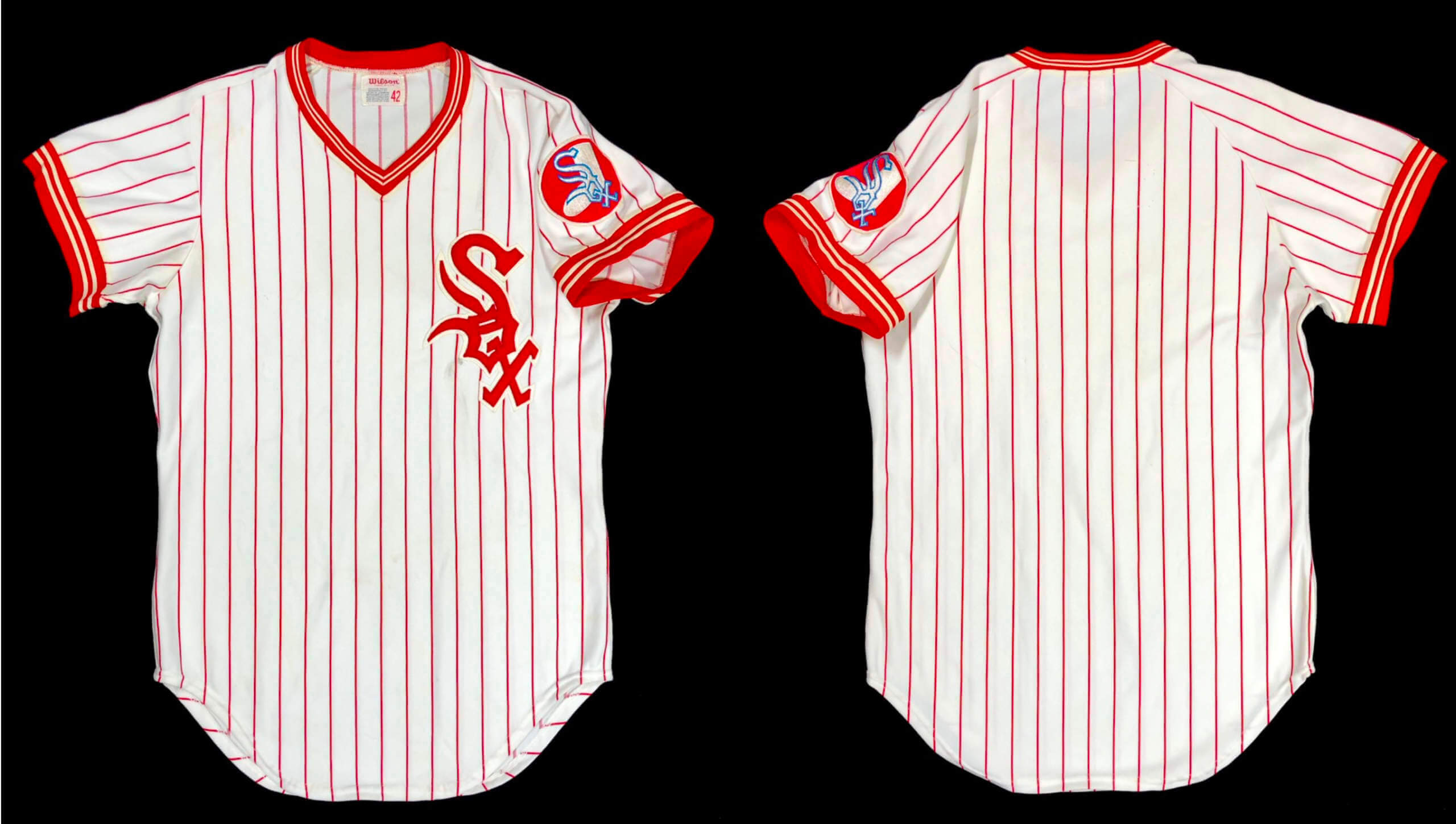
Fun find: Reader Steve Kraljic found this jersey on eBay. It appears to be a prototype White Sox pullover from the early 1970s, when the team was wearing a similar design but with a zippered jersey.
Here’s a comparison between a 1972 Dick Allen gamer and Steve’s apparent prototype:
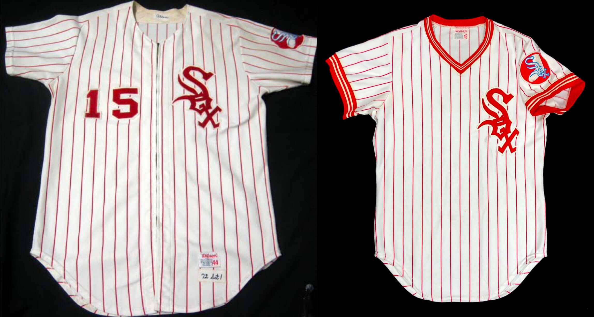
Steve reports that even the great Bill Henderson had never seen this particular prototype design before. A major find!

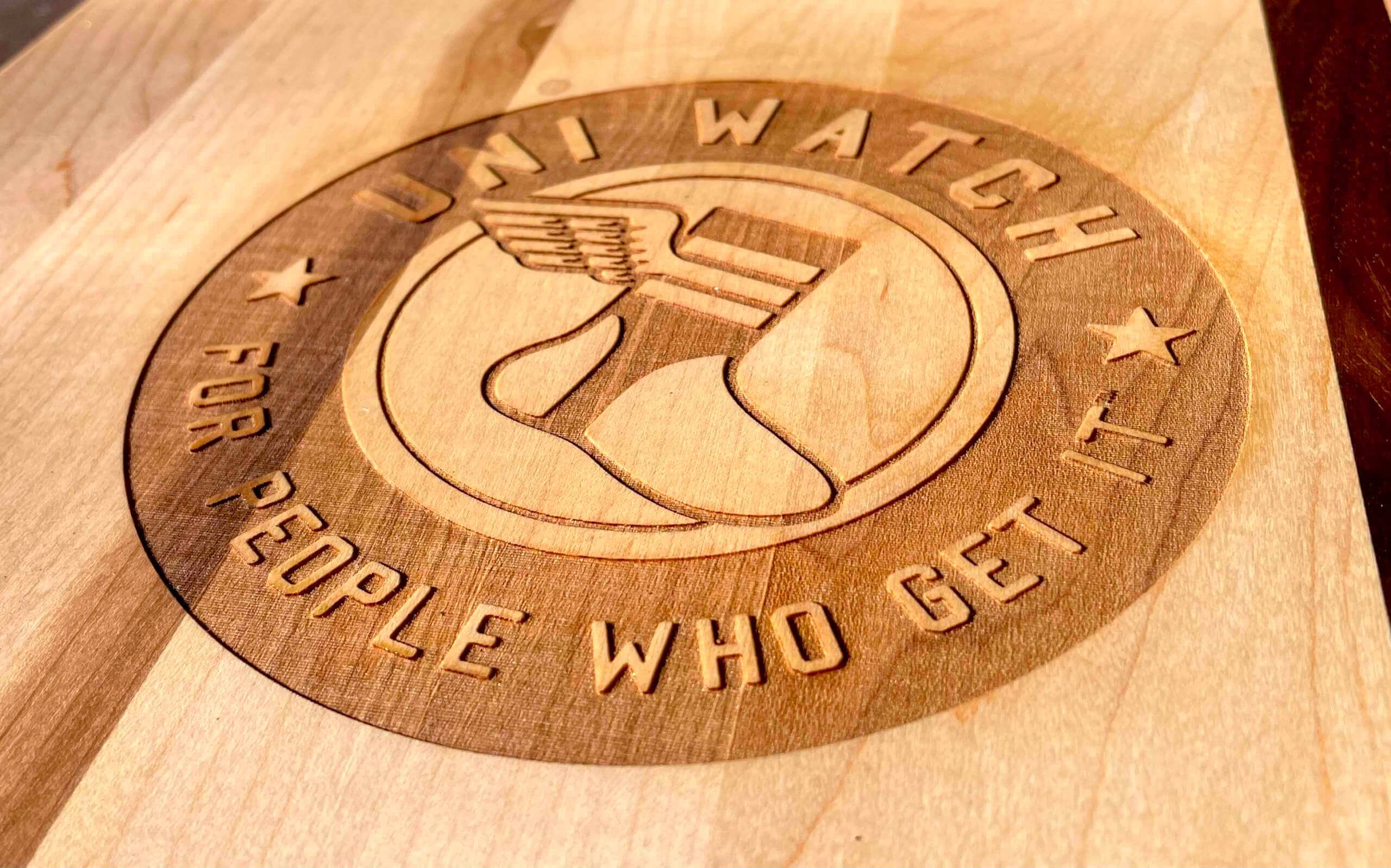
ITEM! New product launch: I’m periodically approached by various folks trying to pitch me on the idea of certain Uni Watch products. Most of the time, I turn them down. Uni Watch notebooks? Nah, doesn’t feel quite right. Frosted pint glasses? I don’t really like the frost. Trucker’s caps? Eh, I don’t much care for trucker’s caps.
Every now and then, however, someone comes to me with a product partnership proposal that totally makes sense. That was the case when I recently heard from the folks at Baseball BBQ, a company that makes grilling tools (tongs, spatula, serving fork, that kind of thing) with handles made from baseball bats.
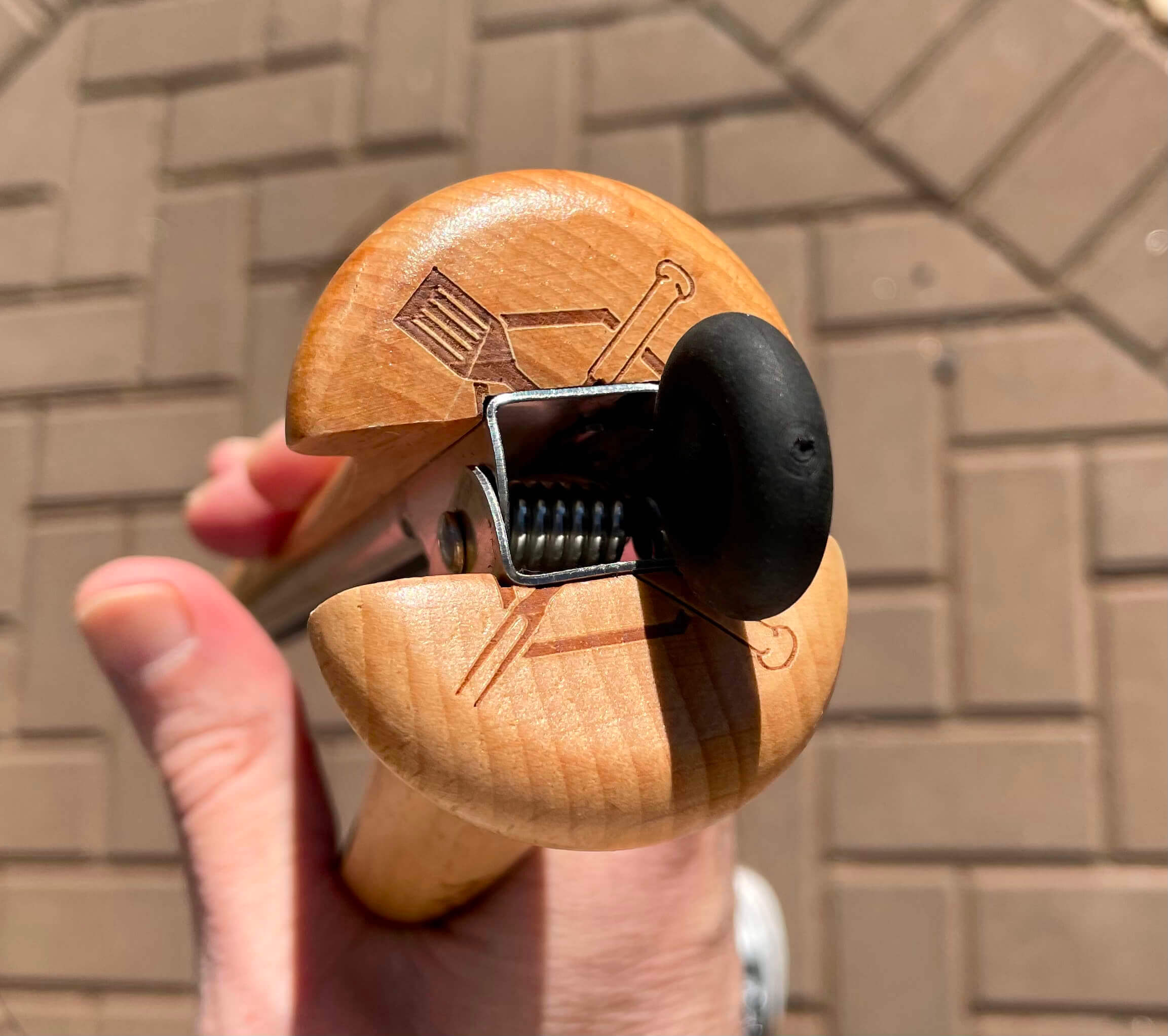
Obviously, I like grilling and I like baseball. So behold the official Uni Watch grilling tools collection (for all photos, you can click to enlarge):
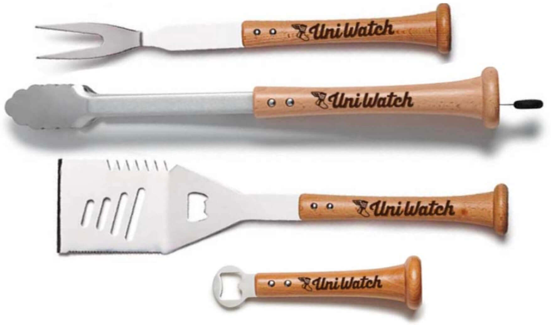
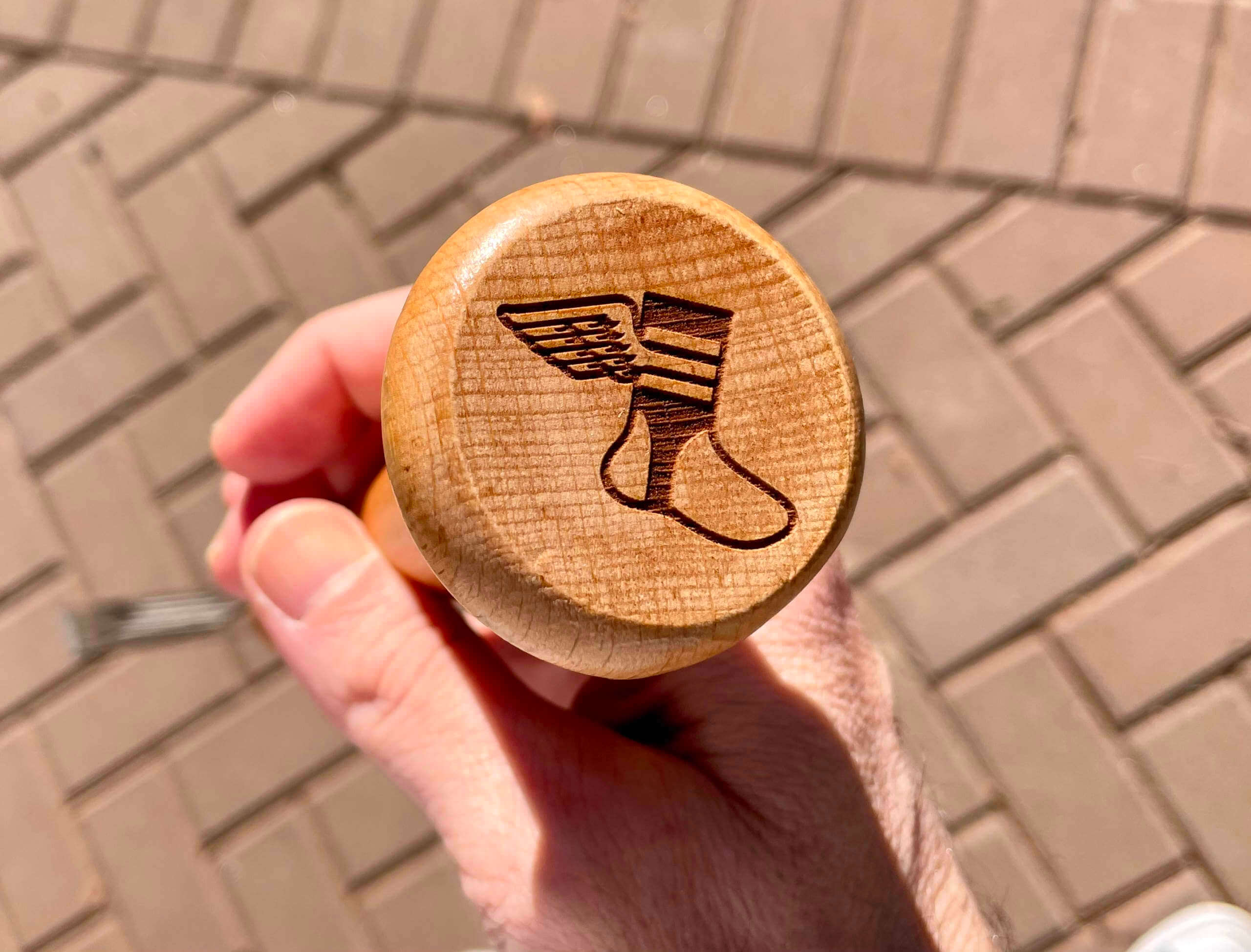
Pretty cool, right? In each case, the Uni Watch script is laser-etched directly onto the handle. And for good measure, for every product except the tongs, the winged stirrup logo is etched onto the knob:
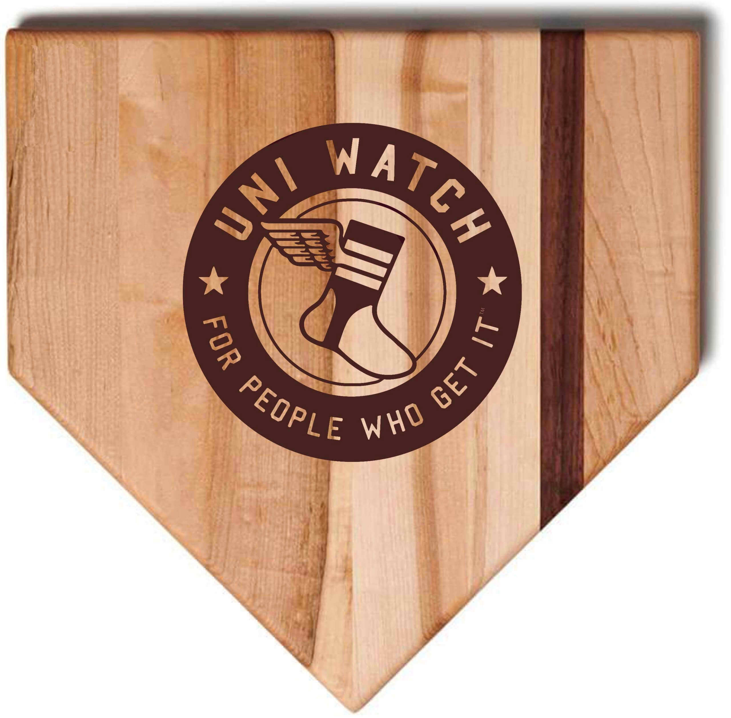
There’s also this home plate-shaped cutting board, with our round logo etched into the surface (the first image is a digital mock-up; the second one is the real thing):
Let’s shift into FAQ mode:
Does the script appear on both sides of the product handles, or just one side?
Just one side.
Based on the photo, the Uni Watch script will look good if I use these tools with my right hand. But if I use them left-handed, the script will be upside-down. Is it possible to get the script orientation reversed on the handle?
As a lefty myself, I’m very attuned to this issue, so I asked the Baseball BBQ folks if we could offer a southpaw option with the script oriented for lefties. Unfortunately, they said it’s not possible due to the way their production process is set up. Sorry.
You mentioned that all the tools have the winged stirrup on the knob, except for the tongs. So what’s on the tongs knob?
Here’s the deal: As you all know, I don’t like to have visible maker’s marks on Uni Watch products, so I asked the Baseball BBQ folks to eliminate their logo from all of these items. They graciously agreed to do so whenever it was possible, but there were three items — a grill brush, a “pigtail” turner, and the tongs — whose knobs were already pre-etched with their logo. I opted to skip the brush and the pigtail for this reason, but I decided that we could go ahead with the tongs because the knob is split into two sections, rendering the maker’s mark pretty innocuous:
Isn’t it sort of weird to be launching a line of baseball-themed grilling products in February, when there’s no baseball and not much grilling?
Definitely! But we figure there’s no harm in launching the products now. They’ll still be here when the the weather warms up and the lockout is settled.
Okay, where do I order?
———
If you have any other questions, feel free to post them in the comments and I’ll do my best to answer.
I’m super-grateful to Baseball BBQ exec Brett Mandel for approaching me with this idea, and for being so patient with all my picky requests. Thanks, Brett!
The Ticker
By Jamie Rathjen

Football News: The Commanders tweeted a graphic showing our first official look at their burgundy-over-white uni combo (thanks to all who shared). … Reader Rich Gagliano saw some Super Bowl team-colored bagels at his bagel shop on Long Island, one day after the Ticker featured doughnuts with the same idea. … Marshall is apparently planning to wear mono-black for the next anniversary of the team’s 1970 plane crash (from @Marshall_FQ). … A team in the British American Football Association’s second tier, the Nottingham Caesars, had their equipment eaten by mice during the winter offseason (from Kenneth Traisman and Matt Beahan).

Hockey News: The Canucks teased parts of a ’90s-era throwback at practice yesterday, but different parts of the gear had different amounts of white in the logo. Goalie Thatcher Demko also had a matching mask (from @brianspeaksnow and Wade Heidt). … Shortly before becoming queen, then-Princess Elizabeth visited Toronto and went to a Maple Leafs game. “What caught my eye was the stitching pattern on the number of the player’s sweater. Haven’t seen that before,” says Brandon Weir. … Reader Wade Heidt has two items from the Junior A British Columbia Hockey League: The Victoria Grizzlies wore white jerseys supporting a local charity, the Help Fill a Dream Foundation. … The Powell River Kings wore their BCHL 60th-anniversary throwback-inspired jerseys for the first time. “The opponent Nanaimo Clippers wore their dark uniforms so we had an old-time yellow as light colour at home game,” Wade says.

Basketball News: Reader Willard Kovacs found some 1978 TV footage on YouTube mentioning the 76ers’ then-new red uniforms. … Women’s college teams that wore pink or pink accents this weekend included Baylor, both Duke and NC State, George Mason, James Madison, Kent State, Providence, both Tennessee and Vanderbilt, Tulane, and both Virginia (again) and Wake Forest. Some of the resulting games were color vs. color.

Soccer News: Washington Spirit coach Kris Ward teased the first piece of team gear with a championship star added, and which is also a lighter shade of blue than the team has ever used. I will say, though, that training gear isn’t necessarily in team colors. … Manchester City goalie Ellie Roebuck got a commemorative shirt yesterday for making 100 City appearances. … Scottish club Partick Thistle wore blue and white 1921 throwbacks for what I think is the third time in the Scottish Cup on Saturday. Bizarrely, two of those games have been Scottish Cup losses to Dundee United, in each of the past two seasons. … Australian club Adelaide United’s men’s and women’s teams will become the first Australian professional sides to wear Pride Game uniforms on Feb. 26 (from @BluesBrother95).

Olympics News: WaPo has a story on the extremely orange costumes worn by Canadian ice dancers Piper Gilles and Paul Poirier. … The Royal Dutch Skating Federation got permission for its short track speed skaters to wear a memorial patch for world champion and 2018 bronze medalist Lara van Ruijven (from emailer Timmy the Cop). … Here’s a look at some of the creative helmet designs in the women’s skeleton event (from Jeremy Brahm). … Lots of fun bobsled designs, too (from @jmanker).

Grab Bag: The North Carolina/Colgate men’s lacrosse match yesterday was color vs. color (from James Gilbert). … The NLL’s Philadelphia Wings and Halifax Thunderbirds played in Hamilton, Ont., where the Toronto Rock play, because of Nova Scotia’s Covid restrictions. They also used the Rock’s turf (from @PhillyPartTwo).
One SB uni note…I didn’t notice any social justice decals on the neck bumpers of the helmets. They were present for the conference championship games.
Good spot! Some quick photo research indicates that you are correct. I’ll add a note to the text (and give you full credit, of course).
My wife pointed that out to me during the game. All I heard was “words, words, no twitter, words, words, more chili.”
I totally missed it. No team wore the social bumpers. On the shields biggest stage. Odd.
On a personal note, I am happy that the LA Rams finally won a Super Bowl. First time since 1951 that an LA team not owned by Al Davis was a football world champion.
Further to the Hockey Ticker item, here is an action shot from the Nanaimo at Powell River game. Yellow at home.
link
The Kings logo was a nod back to the days when the team played as the Abbotsford Flyers and Delta Flyers. Prior to the move to Powell River.
Correct me if I am wrong – Rams had no social justice rear bumpers all season in favor of “Los Angeles”
Really? I didn’t realize that, but some very preliminary photo research indicates that you are correct!
Not only that, but some additional research indicates that the Bengals may have skipped the social justice messaging all season long as well!
Wait, yet another update: The Rams *did* wear the bumper messaging as recently as the Wild Card game:
link
link
About the clip from 1978 with the Sixers playing in red for the first time, at MSG against the Knicks: these short shorts made the players look at least half a foot taller.
Ingmar,
Agreed. And the lack of advertising, TV graphics, perpetual score bug etc. really made this game a joy to watch. So clean and easy on the eye; something I think we’ve all forgotten since computers effects have become so overwhelming on the screen. As a lifelong Sixers fan, this was a great clip to start the day.
-C.
Another uni-centric item about this.
Note that the zero on Maurice Cheek’s uniform is round, while the zero on Doug Collins’ jersey is squared-off. I think this goes to the fact that these were hand-applied (I think) by Mitchell & Ness when it was an actual sporting goods store.
Regarding Marshall: I can’t think of a better reason to wear mono-black. Normally I hate that look, as I’m sure many do, but this feels right.
Paul,
Did you happen to catch the odd Steelers helmet they used during the broadcast to remind fans about the city of LA’s connection to the Super Bowl? A white facemask. So bizarre. You’d think the production crew would know better.
-C.
I did not! But NBC’s graphics team has featured odd uni anomalies like that all season long. Very strange.
I noticed that! I believe they changed the color because the graphic itself was so dark that the face mask would have blended in and the helmet would have turned into a dark blob.
I noticed too, and was not fast enough to take a photo. I appreciated the nod to the rams previous SB appearances, however.
Washington really dropped the ball with their uniforms and it’s more evident with every new picture they share. The only consistent uniform element each set shares is the complete lack of pants stripes. Just such a shame that a team that once had some of the best pants and sock striping in the league now has solid pants and solid socks. What an absolute train wreck uniform. There honestly isn’t one part of the uniform that you can point to and say it looks nice. Easily one of the worst sets in the league, up there with the Titans, Falcons, Rams and so on.
Agree. I don’t know how you can look at the maroon over white combo and not say to yourself, “yellow pants idiots, yellow pants!” Pants stripes or not (although they all need them for f$%&’s sake). That photo also shows again how shittastically bad they are going to look.
They dropped the ball with EVERYTHING about this rebrand. The whole thing is such a complete disappointment. Why did they need to add black? They didn’t need to mess with the burgundy and gold. It was perfect.
If there’s a home pinstriped prototype of the early 70’s White Sox, there must be a powder blue road jersey in that exact template.
It must be found.
Snoop Dogg’s outfit seemed Rams-inspired, complete with yellow shoulder hornlike stripes
link
I took it to be a play on the blue bandana pattern that the Crips are associated with. Snoop was a Crip in his younger days.
It can be two things! :-)
Thatcher Demko has throwback pads as well, complete with vintage CCM logos.
link.
The gear is a tribute to former Canucks goalie Kirk McLean.
link
Back of the mask depicts this famous image of Linden and McLean at Pacific Coliseum in 1994 Stanley Cup Final. Survived and moving on to another game in New York.
link
Another, and perhaps more plausible explanation for the pullover Sox jersey is that it very well may have belonged to one of the Sox low-level minor league affiliates in one of the rookie leagues.
For years many major league teams passed along hand-me-down uniforms from the big league club, but at the lowest levels of the minors teams often wore cheap knock off versions of the parent club’s uniforms. (Often the originals didn’t last long enough to make it all the way down through several levels of the minor league ladder.)
If not a prototype, perhaps this was a uniform for the Gulf Coast White Sox, Florida Instructional League Sox or another affiliate in the 70’s.
Unfortunately these low-level affiliates were (and still are) rarely covered by the local press, don’t sell programs or card sets, and rarely even have team photos distributed so it’s tough to find photos from the “complex leagues”.
Here’s an example of Mariano wearing a Class A Tampa Yankees jersey similar to the one I’m describing:
link
…and an NY-P League Little Falls Met wearing a pullover of a jersey the big league club never wore:
link
Just a theory…
Doubtful. This jersey has virtually no wear on it that would indicate game use.
Oddly, I felt otherwise. The tag shows signs of multiple washings, there is yellowing on the sleeves and collar, stains on the front and rear.
This was definitely worn on multiple occasions by someone, somewhere, sometime.
The lack of a number is the only thing that would make me believe it wasn’t game used, but that would not have been unheard of in the complex leagues, where there were no fans, no press, no need for numerical rosters, and no game programs.
It could also have simply been a practice jersey for low-level prospects in the complex.
Again, just a possible alternative explanation since we’re never seen or heard of this as a big-league Chicago prototype.
The White Sox were an extremely frugal team. They re-used jerseys for multiple years at the big league level before sending them down for use at the minor league level. For example, you can see some of their 1978 farm teams using their 1972-75 era big league jerseys.
So it would not make sense for them to create a fancy new template like this for a minor league team. They would have simply sent their used big league jerseys to their minor league clubs for repurposing. They probably would also not have the Sox logo patch on the shoulder similarly to the way the big league club did it. Also, no photo evidence at any level of these jerseys have existed, as you noted yourself.
When the White Sox went to the red template in 1971, their minor league clubs continued to wear the big league team’s blue and white template that dated back to the 1960s, for several more years until the used red pinstriped jerseys were ready to be recycled down to the minors.
Further, the only other example of this jersey I’ve personally seen (I’ve seen two) also had no evidence of no wear and was also a size 42. Size 42 was what Wilson used when creating prototype jerseys for teams during this era.
You never know. Like you, I’d prefer to believe it’s a new discovery of a prototype no one ever knew existed! I’m good with that!
As late as 1978, the Class AA Knoxville Sox were still wearing the repurposed pinstripe versions from the early 70’s… it’s anybody’s guess what lower level teams were wearing.
link
If Bill Henderson wasn’t aware of this jersey, it is a lost treasure that has been shared.
The thing I thought was interesting about the Canadian ice dancers in orange is they opened their routine to “I Guess That’s Why They Call It The Blues.”
I mean, I get it — they went loud for the sake of Elton John, and it’s not like he has any songs about orange — but still, it was a tad incongruous.
Now that the Rams have won the Supe in their current unis, will it lead them to keep this set longer than they would have otherwise? You know, now they’re “good luck, Supe winning” unis?
Maybe it will lead them to keep the white and scrap the dishwater!
#ScrapTheDishwater indeed!
Wouldn’t #DumpTheDishwater be more appropriate?
#DrainTheDishwater?
My thought was on the plus side this probably locks in that the white jersey will replace the dishwater as their primary away/white look. But on the negative perhaps also locks in this design (new horns, etc) in some way long term. Perhaps they’ll at least dump some of the really bad stuff like gradient numbers on the blue jerseys, name tag patch, etc. With a few minor tweaks this set isn’t awful, even if it still isn’t as good as their classic look.
Agreed. Just drop the worst elements of this set and they become not so bad. The shade of blue has grown on me.
Another thing to scrap is the shiny blue numbers and shoulders on white/bone and shiny yellow in blue- so tacky!! And the Nike tv numbers- horrible elevating of brand over team.
What I wouldn’t give for baseball teams to begin wearing zippered jerseys again!
Walter, why do you like zippered jerseys?
I’m not saying there’s anything wrong with them. I’m just curious to hear more about why you like them!
Well, we seem to be in an era where pullovers don’t offer the level of detail one expects in a major-league jersey. Buttons cause an overlap of material which fudges the artwork on the front. A zipper ought to solve those issues. How expensive are they, opposed to buttons?
Good question — not sure.
In any event, seems unlikely to happen because I don’t think fans want to buy zippered jerseys (tail, dog, etc.). Admittedly, however, I have nothing concrete on which to base that assertion.
I am on this bandwagon too. I’ve always thought zippered jerseys looked cool. There’s a certain crispness to them that you don’t get with buttons, and I’ve always found zippers very satisfying in general. Plus, playing any sport in a jersey that literally has openings in the middle (e.g., a button-front jersey) just seems a bit absurd and impractical, as evidenced by those few occasions when baseballs have ended up inside players’ jerseys.
Rams WR Van Jefferson wore Florida Gators gloves last night. Don’t know if it’s something he normally does.
link
Typo in the first paragraph:
“who was won this season’s”
As an aside – the photo of Ted Kennedy meeting the Queen – this would have been the Leafs first game back, as defending Stanley Cup Champions, after Bill Barilko’s disappearance.
Captain’s patches have been dumb from the moment they arrived.
I watched some of the pregame interviews with Bengals players and loved the B logo in the background with football stitching enhancing the B.
This logo would be great for them instead of their current bubbly B.
Listening to Sharon Farren on KFI lose her mind over LA Mayor Eric Garcetti wearing a Rams throwback jersey with Marshall Faulk’s number and the words Los Angeles where the name plate should be. Faulk never played in LA. It might be because of the Olympics, but considering Garcetti once looked forward to “return of the sports games,” it’s not a great look. link
Charlotte’s new MLS team unvieled its (assuming) away shirt. The adspeak buries the needle on the “Oh come on!” meter.
link
Nice to see Charlotte finally unveil this shirt!
The MLS really needs more teams so it’s always exciting to see another step for a new team.
Very early chatter starting about Dan Snyder possibly being forced to sell team: link Snyder to be forced to sell and the franchise comes under new ownership, would the new owners be obligated to keep the Commanders branding & uniforms for a minimum of 5 years per NFL policy? Or would they be afforded to the opportunity to rectify the travesty?
Please please please please please let it be so. Please. Pretty please.
“The NLL’s Philadelphia Wings and Halifax Thunderbirds played in Hamilton, Ont., where the Toronto Rock play,”
Still really not on board with the Rock playing in Hamilton and being called Toronto. This is not going to fly if it is for the long term. Made so much sense to change the name to Ontario Rock considering their situation with their fan base.
I feel like both these teams will have white helmets next year. The Bengals are almost a lock to do a white helmet, but I think Rams will add white pants, yellow jersey, white helmets.
Anyone agree?
I can absolutely see Tampa Bay, New England, Tennessee, Dallas and Cincinnati rolling out white helmets. That’s a lot, but if Cleveland and Jersey B go that route too it would be overkill. Might as well issue white helmets to every team.
The Rams? Nah, they’ll probably roll out a dark blue (or similar) one to wear with Dickerson-era duds. Give me a Fearsome Foursome throwback or something inspired by them…with white facemasks.
Totally agree on the teams you said. I think Tenn’s white helmets were pretty bad, but maybe they’ll want them for an Oilers-inspired look.
Come to think of it.. is it ONLY a secondary color or can they just have different shells? I only thought white for the Rams because they said they’re gonna do a 4th uni and yellow makes the most sense. They don’t have white pants, so that also makes sense.. and white/yellow/white seems plausible.. but so does navy/yellow/white even if it’ll feel a little Chargers-y.
The stitching on Ted Kennedy’s Leafs number while greeting HRH isn’t unusual to see on jerseys from that era. I’ve always loved how it looks.