By Phil Hecken
Follow @PhilHecken
Good Sunday Morning, Uni Watch readers, as I greet you from frigid and snowy Long Island. Friday/yesterday’s storm was pretty bad, but we’ve had worse, and all in all I can’t complain. It’s still brutally cold, but we never lost power and spent the day hunkered down. I did get outside in the elements a few times, and dug out my car (which was semi-buried). Hope any of you in the storm’s path fared well. And I hope the rest of you had a great (or at least good) Saturday.
We’ve reached the penultimate games for the NFL season today — the Conference Championships — with the winners going on to Supe 56 in a couple weeks. I’ve always felt this was the best football day of the year — the Supe is overblown and often not even a good game — but the Conference Championships have always (or most always) been awesome. I hope today’s games don’t disappoint.
Both sets of teams have rich histories playing each other, dating back to the 1950s for the Rams/49ers, and to the late 1960s for the Bengals and Kansas City. SF/LA (and St. L.) in particular have dozens (hundreds it seems) of games played between them, while KC/Cincy don’t have quite that deep a set of matchups. Today, I wanted to take a look back at their uni histories (thanks to the fantastic work of the GUD) and spotlight a few of the games played between each of the Conference Championship teams. There’s actually a lot to get to, so let’s get to it!
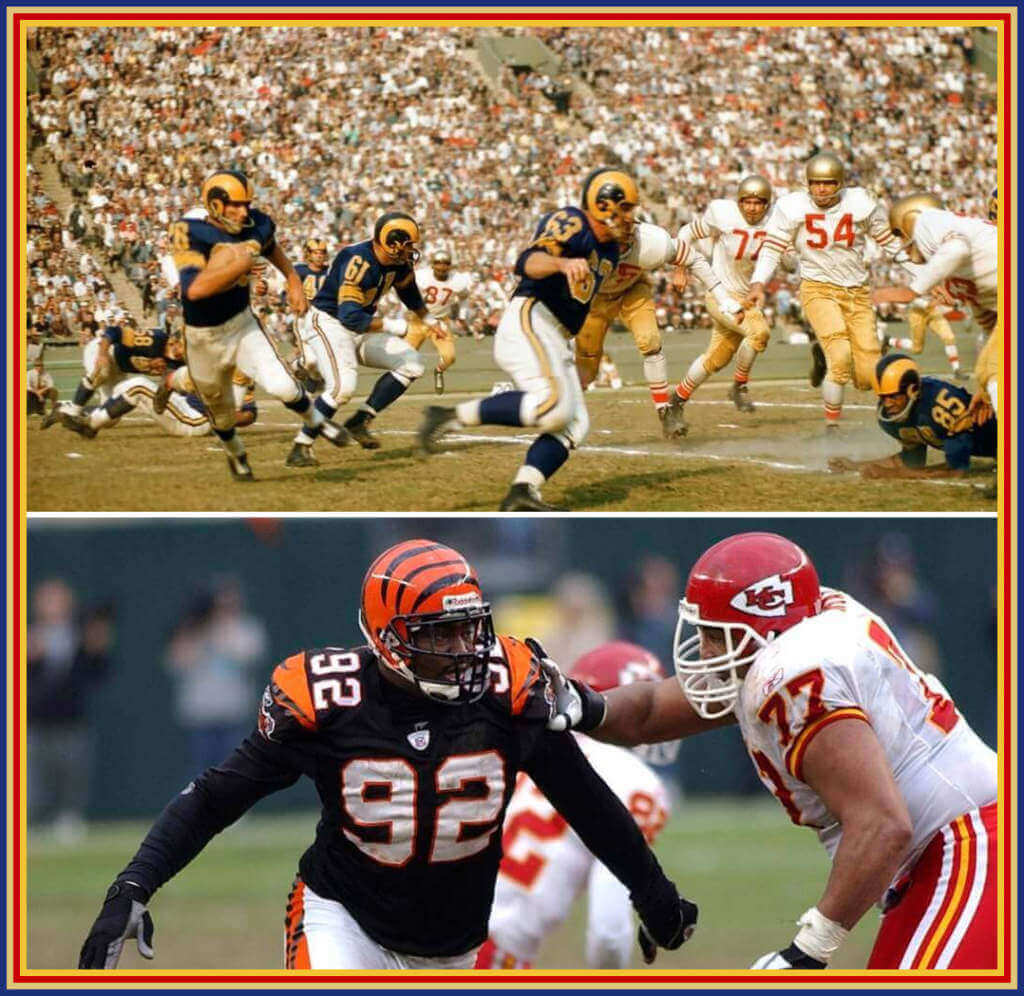
Cincinnati Bengals vs. Kansas City
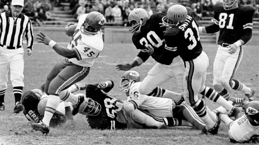
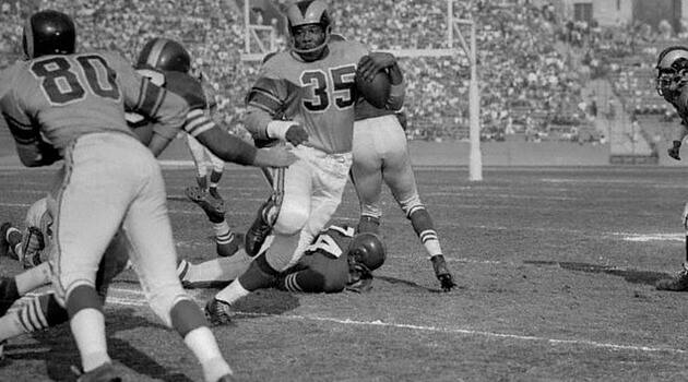
The Bengals and Kansas City have been playing each other over the years, starting in the late 1960’s. Their first matchup was in 1968, and most of their early matchups featured the Bengals wearing their “first generation” uniforms (simple, with “BENGALS” on the side of the helmet), and Kansas City going red/white at home, or white/red on the road. Here are their matchups from the 1960s and 1970s.
1960s & 1970s
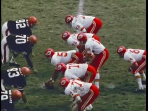
During the 1980s, the teams met a total of seven times, all but one of which featured the Bengals in their “second” generation uniforms, featuring the now-iconic tiger-striped orange helmet. In those second generation uniforms, it was almost always KC in red over white vs. the Bengals in white/white, with one game featuring the Bengals in black/white and KC in white/red.
1980s
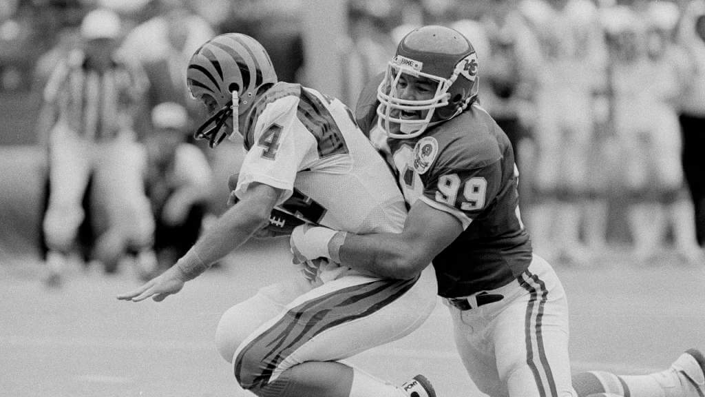
Not much changed as the teams played in the 1990s, and in fact, they only met one time during the decade, in 1993, and that game again featured KC in red/white vs. mono-white Cincy.
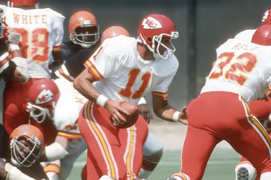
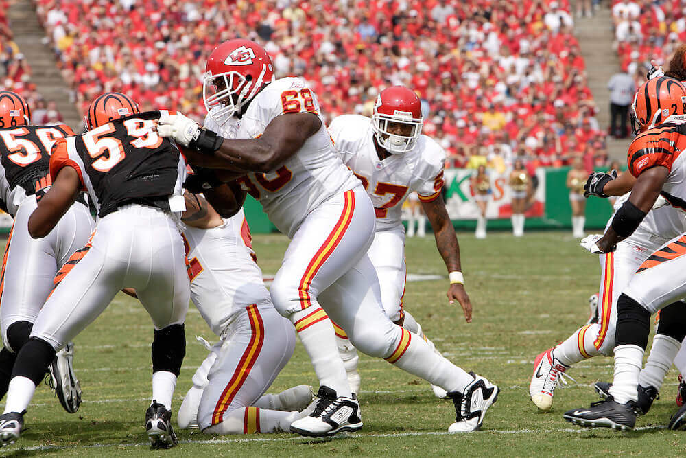
The teams would meet six times in the 2000s, with only their first matchup occurring while the Bengals were still in their second generation uniforms. That was 2003. That was probably the best looking matchup in series history. The Bengals would get their second uni makeover following that 2003 game (third generation), which most people would agree, were their worst uniform set — a set they would keep until 2020. Their 2000 games had KC in red/white, white/red and white/white, while the Bengals would go black/white, white/white, white/black and orange/white.
2000s
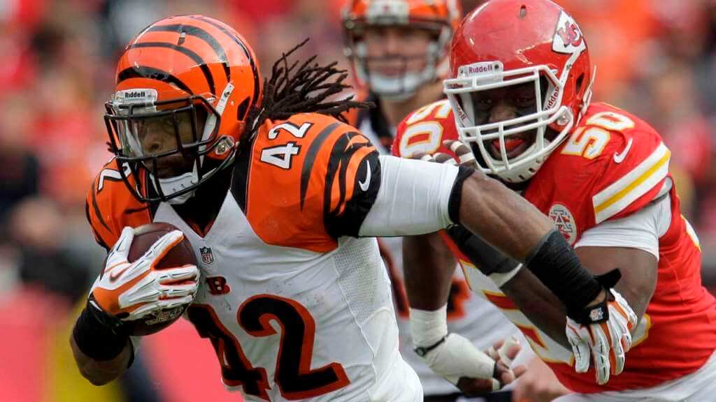
Surprisingly (at least to me), the two teams only met three times in the 2010s, once with a white/black vs. red/white matchup, one with white/red vs. orange/white, and finally a mono-red KC vs. white/black Cincy. Suffice it to say, these were not very pleasing uni matchups.
2010s
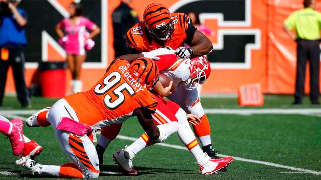
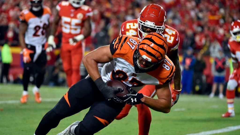
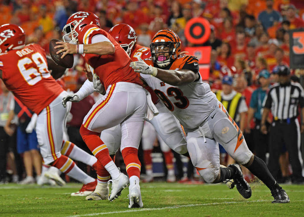
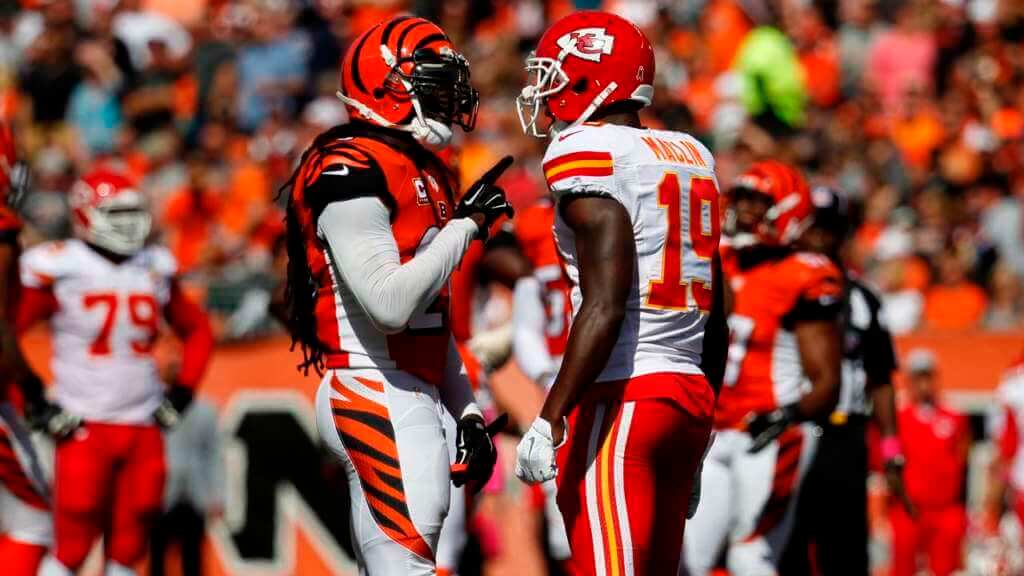
This decade, the two teams have met only once, and it was earlier this season, with what may have been the worst all-time uni matchup: KC in white/red, vs. Cincy in orange/black. Cincy of course, got their fourth-gen unis this season.
2020s
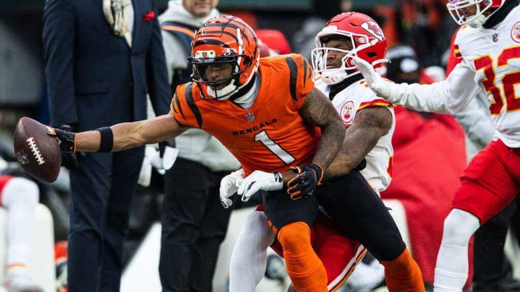
Today’s game will feature the Bengals in (arguably) their best look of white/white with black socks while KC will be in their standard red/whites. It’s certainly not a uni matchup for the ages, but it’s still going to look a lot better than anything we’ve seen between the two teams in decades.
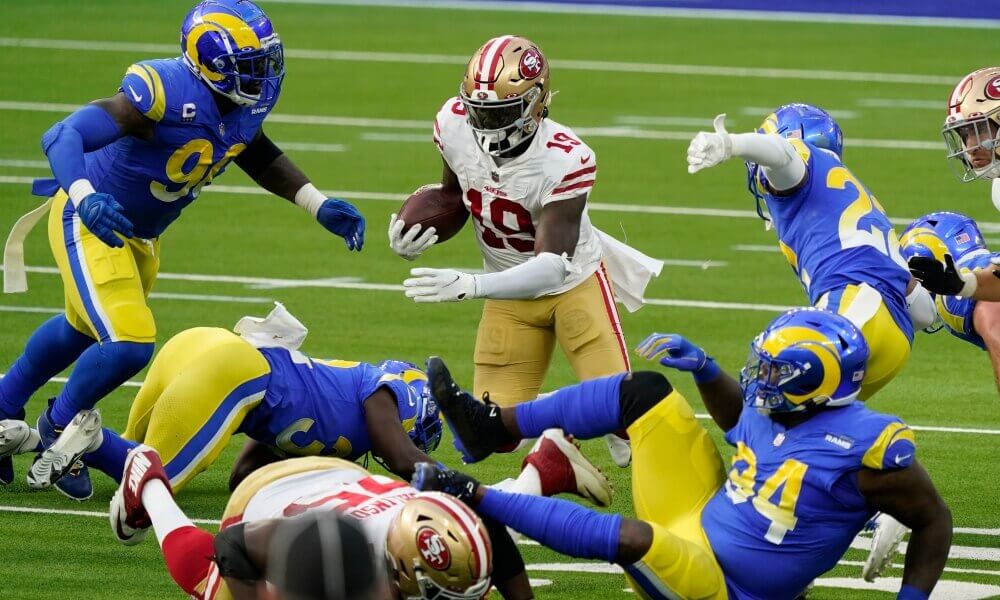
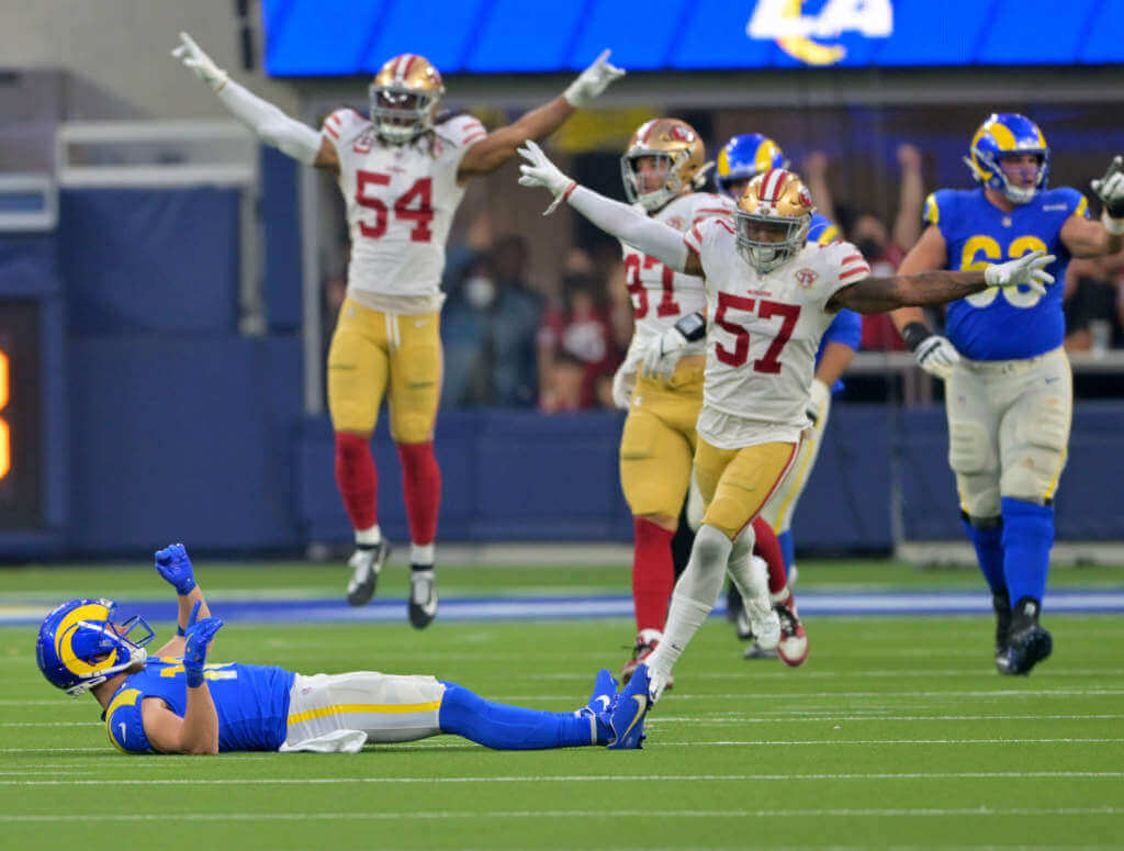
San Francisco 49ers vs. Los Angeles/St. Lous Rams
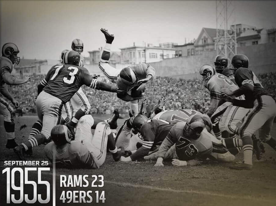
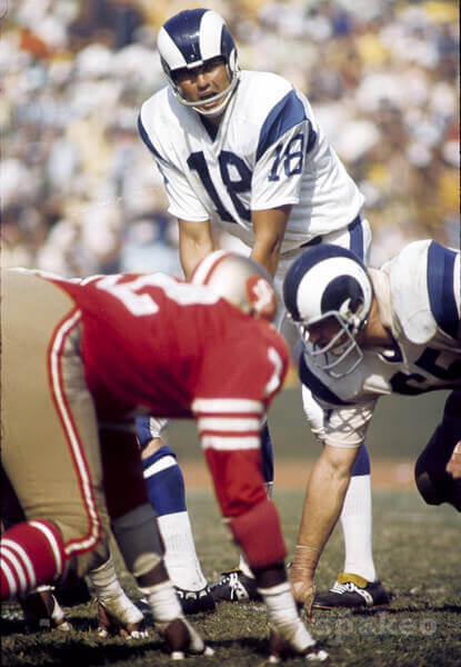
The Niners and Rams have a DEEP and rich history, playing each other (in many seasons) twice a year, and those matchups have ranged from the outstanding to the horrible (and those horrible looks have come in the more recent years, as you might expect). Their first meeting took place on October 1, 1950, and they’d play each other 20 times during that decade. Most of the early meetings were color vs. color, with the Rams in yellow vs. the Niners in red. These were quite attractive games; once 1957 rolled around and the NFL mandated color vs. white (for TV), we saw the Niners in white or red, and the Rams in blue or white.
1950s
By the 1960s, both teams’ unis were still changing, and the early part of the decade featured the Rams in either blue/white or white/white with yellow (gold) elements. The Niners unis in the early part of the decade still featured silver and red as primary colors. By the middle and end of the decade, the Niners would move to uniforms they’re basically still wearing today (gold hats and pants, with red or white jerseys), while the Rams eliminated their own gold in favor or a blue/white color scheme. Once the Rams changed to blue/white, they wore white both at home and on the road.
1960s
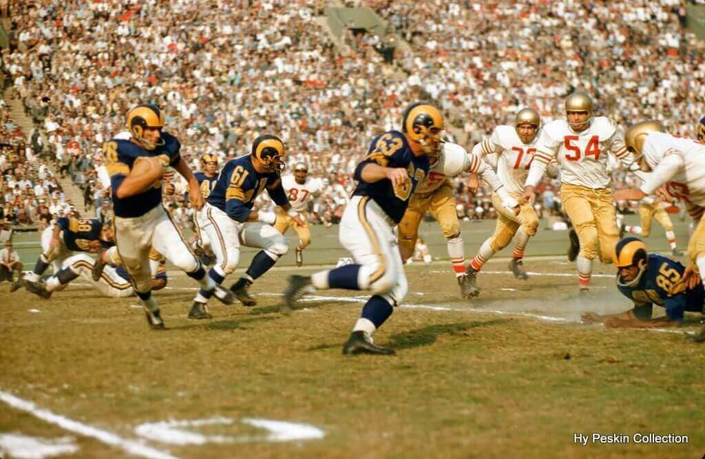
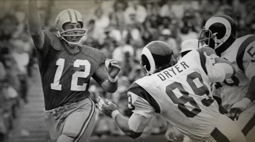
The early part of the 1970s would continue the late-60s motif of red/gold vs. white/white. In 1973, the Rams returned the gold elements to their uniforms (their classic look), and wore their blue jerseys at home, so the majority of the games played in the 1970s featured the beautiful red/metallic gold (or white/metallic gold) vs. blue/gold or white/gold.
1970s
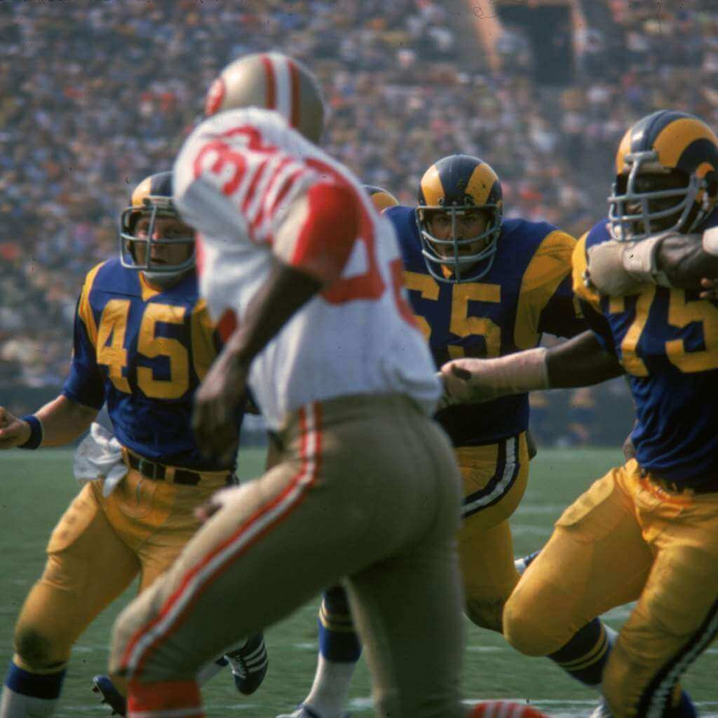
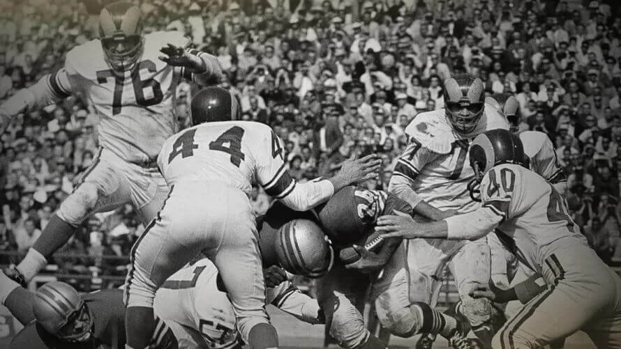
The 1980s continued the classic uni-matchups from the 1970s, with basically no uniform changes: Niners in red/metallic gold and Rams in blue/gold. Only the jerseys changed according to venue.
1980s
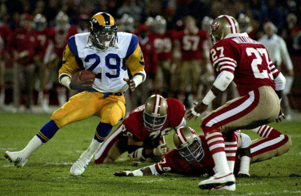
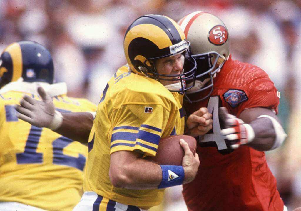
The 1990s would basically be a repeat of the 1980s, uni-wise, but in 1994 both teams wore throwbacks for the NFL’s 75th Anniversary. Even with the Rams move to St. Louis, they kept the same basic uniforms from LA. The Niners would borrow elements from their throwbacks to redesign their unis towards the end of the decade, adding drop shadow to their numbers (and black to their helmets).
1990s
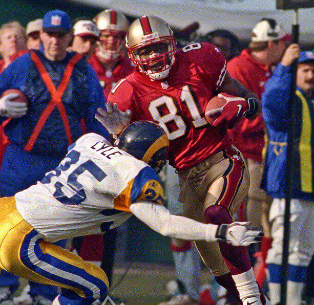
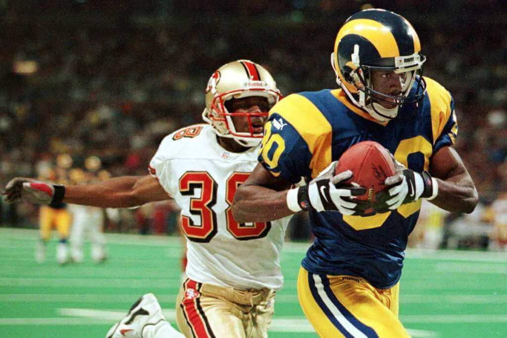
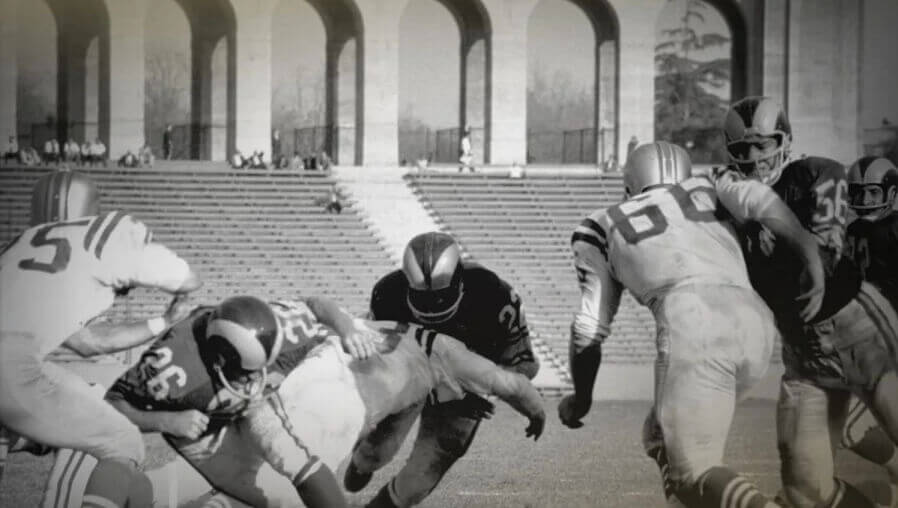
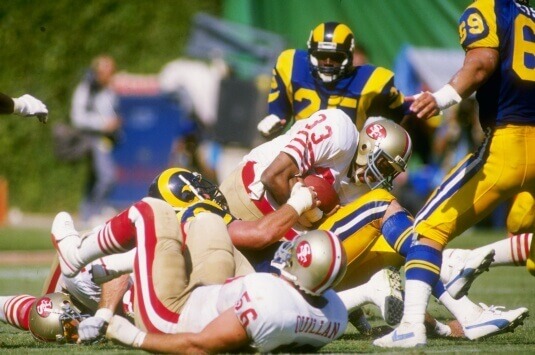
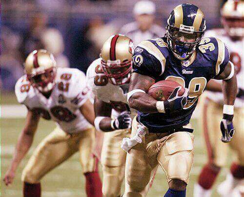
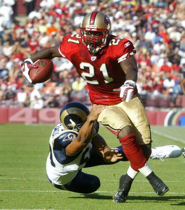
The 2000s would yield big uni changes for the Rams, who darkened their blues and changed their athletic gold to a metallic gold (almost the identical shade used by the 49ers). The “St. Louis look” would be mostly blue/gold or white/gold, although the Rams did add blue and white pants later in the decade. The Niners kept their 1990s look for most of the 2000s, but did return to their more traditional look towards the very end of the decade.
2000s
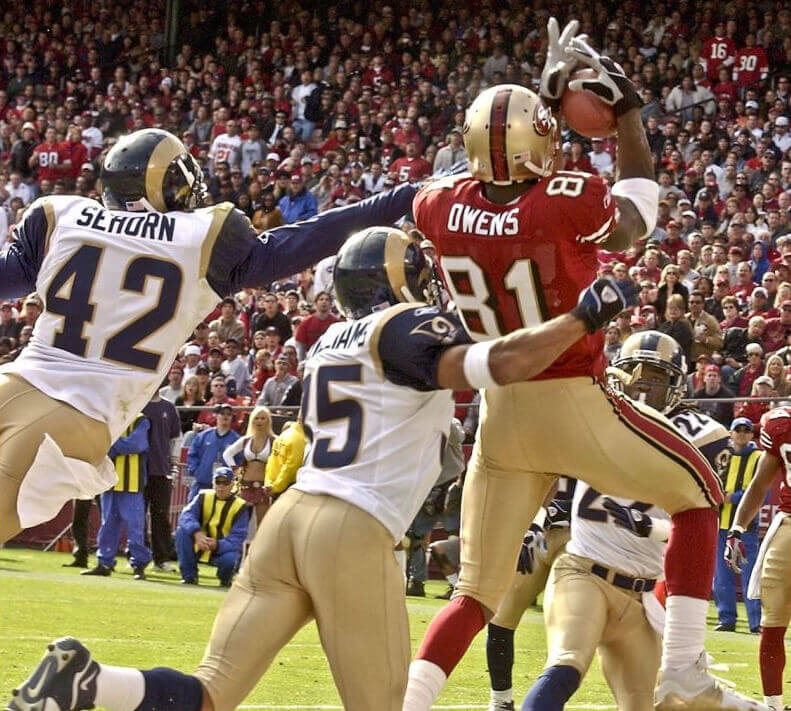

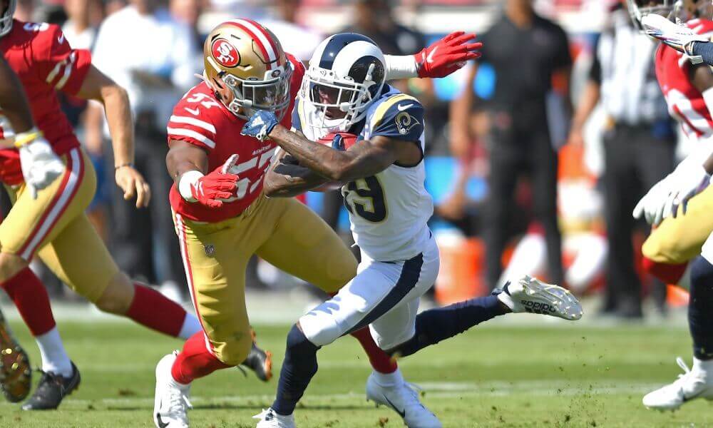
The 2010s would be a uniform free-for-all between these two clubs. The Rams would add throwbacks, move back to LA (and go through several awful looks in their early years), as well as the all gold color rash unis. They would also remove almost all the yellow/gold for several games, which was a half-ass attempt to throwback to their royal/white years. The Niners would also add an all-black color rash uniform (as well as an all white 1994/1955 throwback), but for the most part stayed true to their “traditional” look. Too many different matchups to show them all here, but check out a few.
2010s
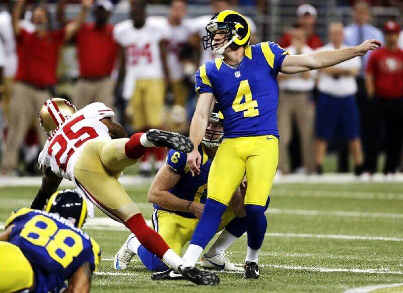
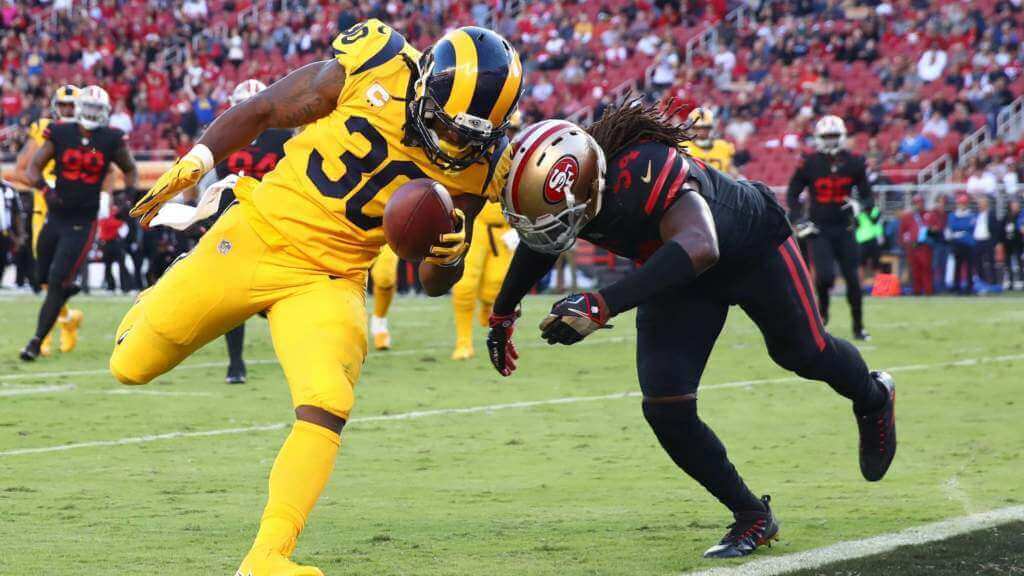
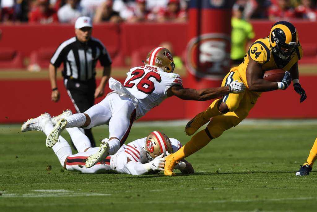
In this decade, the Rams redesigned their uniforms to the “modern” look they sport today — you know the royal/sol/dishwater kits. The Niners, too, have added two 1955/1994 throwbacks, and of the four games they’ve played in 2020 and 2021, not one has repeated a uniform combo.
2020s
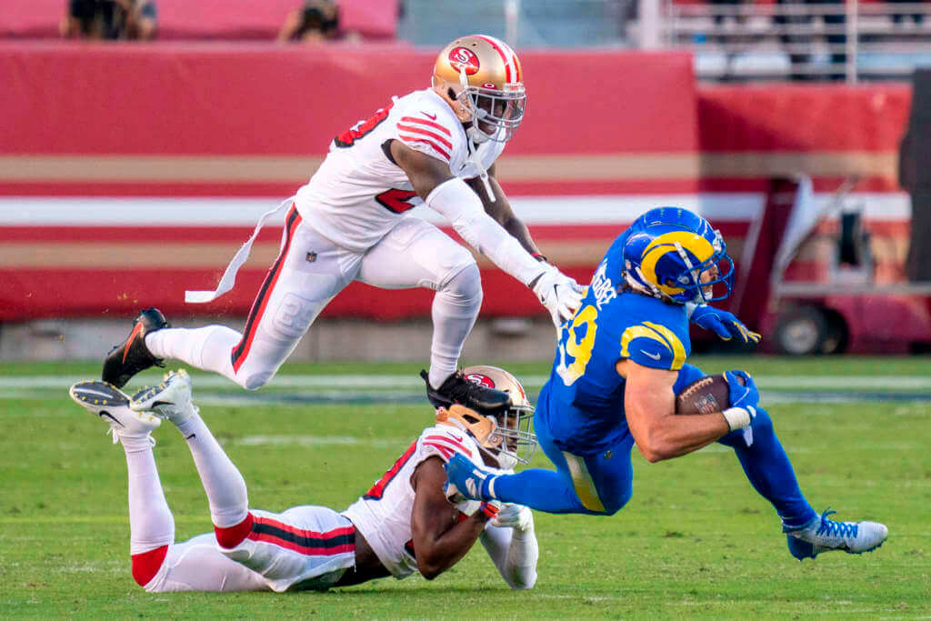
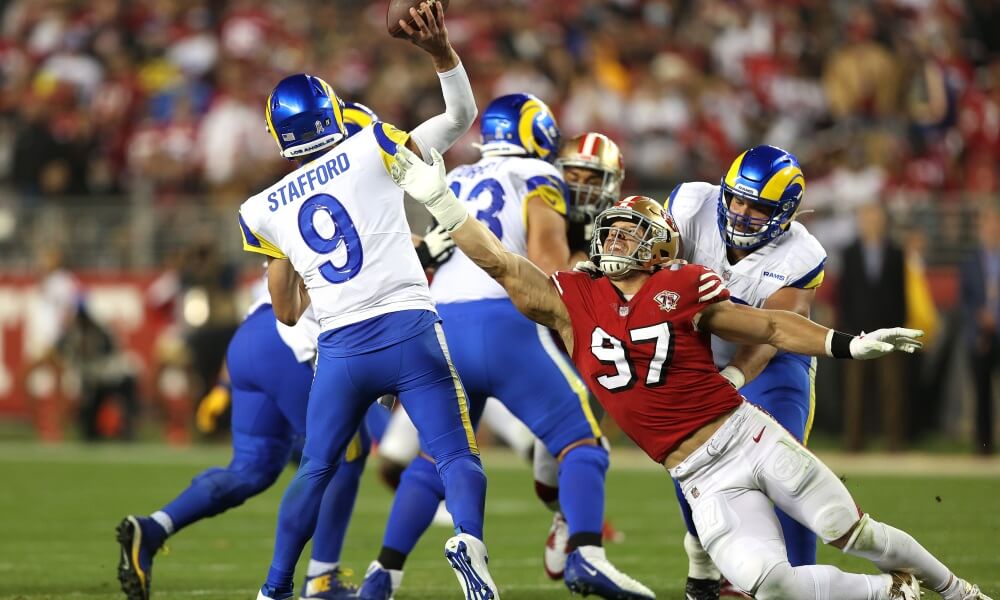
As of late yesterday evening, the Rams still hadn’t announced their uniform combo, but with the team having worn and won both playoff games this winter in royal/sol (yellow), I’d expect that’s what they’ll be wearing today. The Niners, of course, will be in their traditional white/gold road unis.
And there you have it. A fairly comprehensive look-back at many of the uni matchups of today’s combatants. Hope you enjoyed.

Picking the NFL Conference Championship Winners…
… by better uni
Today we have the best weekend in the NFL — at least in my opinion — and we’re down to the final four teams, two of which will advance to Supe 56. I’ve been picking the winners (against the spread) “by better uni” for the playoffs, and as I fully expected, my record stands at .500 (5-5). After the Bengals shocked(?) the Titans, I was actually 5-2, but the three remaining (and fantastic, all decided in the last minute or overtime) games didn’t break my way, so I stand at 5-5. I could just as easily have been 8-2 as 4-6. With that said, let’s take a look at today’s uni matchups and I’ll pick my winners ATS.
SUNDAY, JANUARY 30
Cincinnati Bengals v. Kansas City
Time: 3:00 pm (Eastern)
Channel: CBS
Spread: KC -7
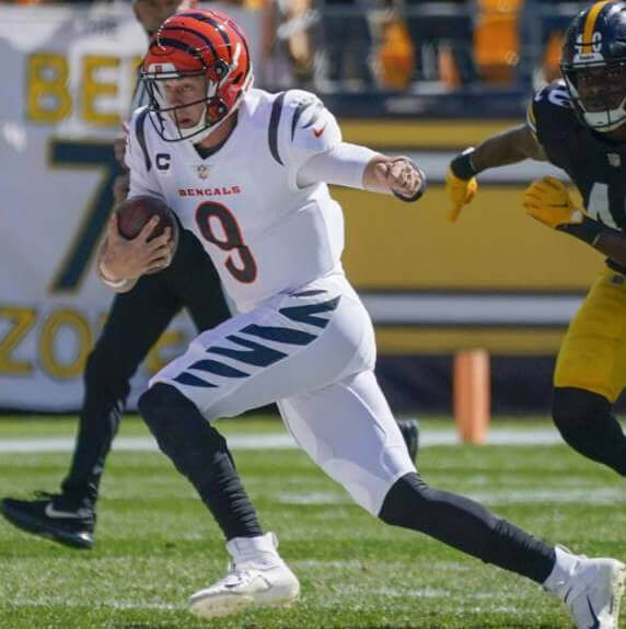
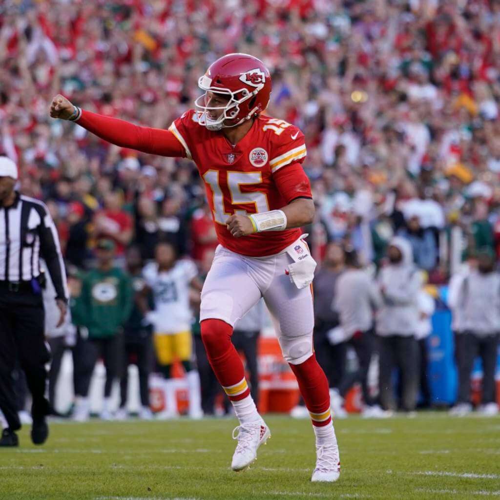
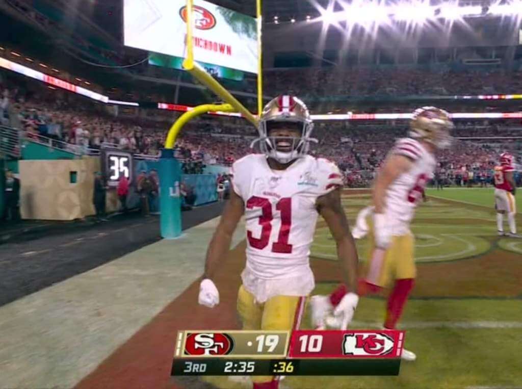
Both teams will repeat their uniform combos from the prior week, with KC in their traditional home kits, and Cincy going with their “white tiger” combo (probably their best combo). The two teams met earlier this season in Cincy, and that was a BRUTAL looking contest (Cincy won 34-31). Thankfully, both teams will be sporting much better unis today. I keep picking against KC, and they keep kicking me to the curb, but maybe the third time’s the charm. That’s a lot of points too. White tigers to the Supe!
The Pick: Gimme the Bengals and the seven points
San Francisco Giants vs. Los Angeles Rams
Time: 6:30 pm
Channel: FOX
Spread: Rams -3.5
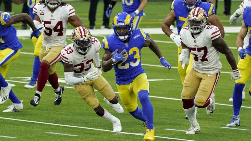
As of yesterday evening, the Rams still hadn’t announced their uniform combo (we know they’ll be in royal jerseys), but given that they’ve won their previous two playoff games in royal over sol (yellow), I’d pretty much guarantee they’ll repeat that. The Niners will wear their standard (and beautiful) road combo of white over gold. Despite the royal/yellow being the Rams best look, it doesn’t even come close to the uni greatness that is the 49ers roads. The fact that the Rams can’t seem to ever beat the 49ers doesn’t factor into this pick — and we know it’s hard for any team to defeat another NFL squad three times in a season — I’m picking solely based on better uni. No doubt here.
The Pick: 49ers getting the FG and the hook.
And there you have it. I’d love to go 2-0 this week, and I’m rooting for a Bengals/49ers Supe. But I’ll just settle for a great pair of games; anything even approaching the greatness of last weekend’s divisional games will be just fine.

Guess The Game…
from the scoreboard
Today’s scoreboard comes from Rupert Everton.
The premise of the game (GTGFTS) is simple: I’ll post a scoreboard and you guys simply identify the game depicted. In the past, I don’t know if I’ve ever completely stumped you (some are easier than others).
Here’s the Scoreboard. In the comments below, try to identify the game (date & location, as well as final score). If anything noteworthy occurred during the game, please add that in (and if you were AT the game, well bonus points for you!):
Please continue sending these in! You’re welcome to send me any scoreboard photos (with answers please), and I’ll keep running them.

Uni Concepts & Tweaks
Time for more Uni Tweaks from the UW readership.
I hope you guys like this feature and will want to continue to submit your concepts and tweaks to me. If you do, Shoot me an E-mail (Phil (dot) Hecken (at) gmail (dot) com).
Today’s concepts come from Bryan Flynn:
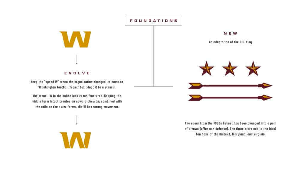
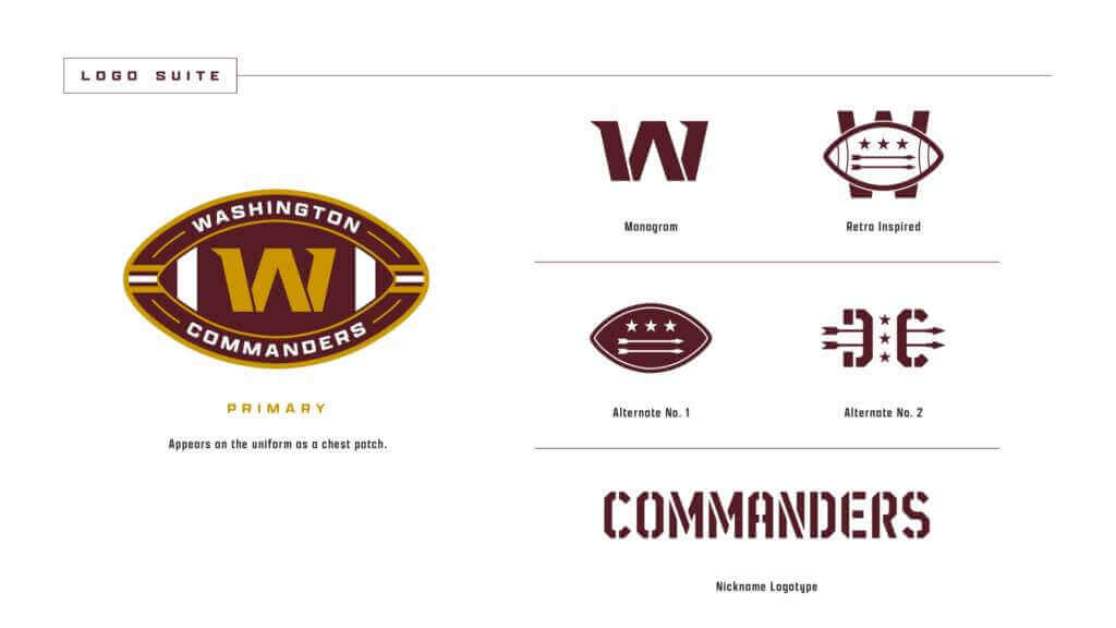
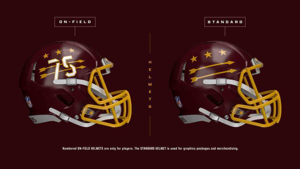
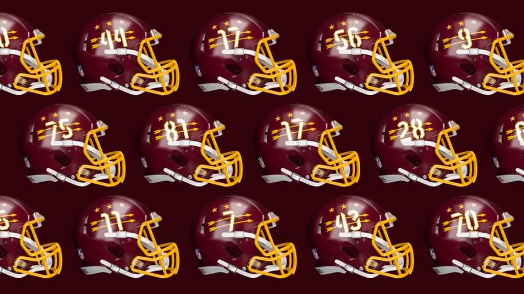
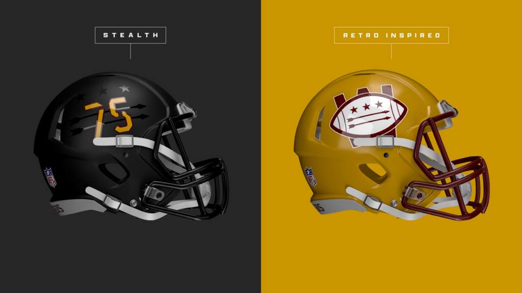
This week I wrapped a personal concept for Washington (NFL). I had done a quick sketch for a WFT idea last year that I revisited when the speculation around “Commanders” flared up a few weeks ago.
While there are military undertones (due to the name) I thought it was worth a share.
Bryan
One of the images of the helmets, though historical, contains Native American imagery; per protocol, it will not be shown on this blog but you can check it out here — PH
OK readers (and concepters). If you have some tweaks or concepts, shoot ’em my way with a brief description of your creation and I’ll run ’em here.
And now some words from Paul: Hi there. In case you missed it on Thursday, my latest article on Bulletin assigns grades to teams that changed their names after moving to a new city. You can check it out here (and don’t forget my earlier Bulletin articles about teams that moved but didn’t change their names and teams that changed their names but didn’t move.)
Also: As I recently mentioned, this will be my last Bulletin article that’s publicly available to all. Starting with next week’s article, my Bulletin content (including my annual season previews for the Big Four pro leagues) will be accessible only to paying subscribers. The price is $4 a month or $35 for a full year. This revenue will also help support operations here on the blog. If you want to order a monthly or annual subscription, you’ll need a Facebook account in order to pay for it (I know, I know). You can sign up for your paid subscription here, and you can learn more about what you’ll get for your money here.
Finally, don’t forget that all Uni Watch pins are now available at a discounted price, with deeper discounts for multi-pin bundles. Full details here, or just click on this graphic:
That’s it from me. Now back to Phil. (And Go Niners!)
Uni Watch News Ticker
By Phil

Baseball News: Major League Baseball, as you’re probably all aware, is still in the midst of a lockout, so there’s not much uni news on the pro level. But on the college level, the Texas A&M Aggies have a new set of uniforms for the 2022 season. … The Astros Triple-A affiliate will rebrand as the Sugar Land Space Cowboys, and of course there will be new unis (described, but not shown). Here are some looks at the unis. And the hype video. … As of now, no one is sure if Tom Brady has officially retired from football, but did you know he was drafted by the Montreal Expos? (from Marcus Hall). Also posted in football. I’m pretty sure that pic is a photoshop, but he was in fact an Expos draftee.

Pro/College/High School Football News: Looks like #75 on offense is wearing a hoodie underneath his jersey (from Baron_twt). Paul points out this was briefly a thing in the NFL. … Not sure where the concept comes from, but James Gilbert wants folks to weigh on this potential new Kansas City football team helmet. Obviously it’s an attempt to rid the team of Native American imagery without changing the name (or perhaps modifying it to “Fire Chiefs”). … As of now, no one is sure if Tom Brady has officially retired from football, but did you know he drafted by the Montreal Expos? (from Marcus Hall). Also posted in baseball.

Hockey News: The NY Rangers retired Henrik Lundqvist’s jersey Friday. Reader Andres observes, “Interestingly enough the Rangers retired numbers all have radially arched NOBs, which is obviously different than their vertically arched jerseys. Although for the MSG promotional giveaway, they did it how it’s on the Jersey.” … Speaking of sweater retirements, the Dallas Stars honored Sergei Zubov with a retirement ceremony as well. … As Paul confirmed earlier this week, the NHL “Reverse Retro” program will start up again next season. There were some very good ones…and some truly awful ones. Let’s hope the Canucks can come up with a better design going forward. … The following four are all from Wade Heidt: (1) The Texas Stars wore special uniforms for Star Wars night on Friday. “These more creative than the usual type of Star Wars unis that get worn. Not looking like Storm Troopers,” he adds; … (2) The Stockton Heat had a Turn Back The Clock Night on Saturday, wearing uniforms celebrating the old ECHL Stockton Thunder. … (3) The Windsor Spitfires traded for G Mathias Onuska in early January. He is still wearing his mask and gear from the London Knights. … It was 90’s Night in Prince George on Friday. The Prince George Spruce Kings wore 1990’s throwbacks featuring their vicious tree logo. (Thanks, Wade!). … With the Carolina Hurricanes throwing back to their Whalers roots, here’s a good look at the Hartford/New England Whalers uni history. … NY Post writer Larry Brooks argues, “It’s past time for NHL to retire Willie O’Ree’s No. 22 jersey league-wide.” O’Ree was, of course, a pioneer, and rightfully deserved to have his number retired by the Bruins (which Paul covered here), but I’m not sure about a league-wide retirement. That’s an honor reserved for Wayne Gretzky (and it’s arguable even he shouldn’t have his number retired league-wide). What do you guys think? … Check out this great photo of the 1977 Australian Ice Hockey National Team (from The Hockey Samaurai). … More from Wade Heidt: Some notable color vs. color in the the WHL Friday night. Swift Current Broncos at Red Deer Rebels. … Also from Wade, Clarkson has been wearing different uniforms this year celebrating 100 years of hockey for them. Here’s what they wore Friday night. … Cool! Suited connectors: 89-90-91 on the front line for the Blues (from Mr. Michael). … Another from Wade: Another green & yellow beauty sure to be Uni Watch approved: The SJHL Humboldt Broncos unveiled their alternate throwbacks. … Check out awesome video featuring WHA sweaters, but the real gem is aa fascinating conversation with the creator of the Nordiques logo and sweater: Submitter Matt Sammon adds, “He wanted all blue because that’s the color of Quebec… AND he didn’t want to mimic the Canadiens!” … OK, this is just bizarre: Dominik Hasek once poked fun of himself in practice during the 1998 playoffs by putting tape on the back of his jersey and writing “Swiss cheese” and “Kramer” (from Jerry Wolper).


NBA/College Basketball News: Duke legend Mike Krzyzewski will be retiring from coaching at the end of this season. As part of his farewell tour, Krzyzewski is receiving gifts from some of his longtime foes and Louisville was the latest to join in on that Saturday, with gifts that included a Louisville slugger bat (from Douglas Ford). … Reader Sion Fawkes asks, “have you ever looked closely at the Phoenix Suns’ secondary logo? The purple flame in the very back is shaped like an actual phoenix. (Y)ou can clearly see the head, beak, and wings when you look closely.” … Marques Green was inducted into the St. Bonaventure HOF yesterday, but the Yahoo caption is clearly wrong: definitely not the same pants (from gina radja). … Real nice color v. color matchup between Villanova and St. John’s yesterday (from James Ballow). Here’s another view (from James Gilbert). … Arizona wore red at home yesterday (from James Gilbert). … Dear Lord, there was a very neon looking game the other day between the T-wolves and Suns (from Dom 2K).

Grab Bag: Auburn uses this machine to make 3D digital images of all their athletes so the can perfectly form fit uniforms and equipment (from Jeremy Brahm). … With the Olympics fast approaching, Mike Styczen picked up this gorgeous dish with an awesome curling motif as an inlay.
To All The Lucky Vilkmas Winners…

The ubiquitous Jimmer Vilk has been a busy beaver of late, but he’s finally back to a semi-normal routine, and he wants the five lucky “Merry Vilkmas” winners to know that their prizes will be shipping out this week!
So, if you were one of the lucky few selected, keep an eye on your mailbox over the next several days for your special treat.
Thanks, Jimmer!
And finally… that’s it for today and for me for this winter weekend! Enjoy the games today (Go Niners & Bengals!) — and it’s hard to believe the Olympics will be in full swing next weekend. Everyone stay safe and healthy and have a great week. Till next Saturday,
Peace,
PH
Great detail on the uniform histories. Just noting two Cin-KC uniform pictures in your SF-LA discussion. Also a word missing in the Tom Brady Expos item.
Thanks, Tom — both issues should be fixed now.
What’s the name of the NFL team in Kansas City? I must have missed that in this write up.
You’re so clever
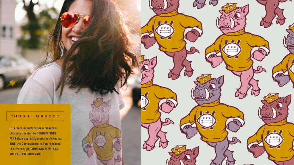
The WFT submission with the old school hog is amazing. If only that was what we could expect on 2/2. Take my money!
Totally agree! I don’t make a habit of wearing NFL gear, and the WFT is not my team by any stretch, but I would wear that hog logo! My only gripe is nothing to do with this design effort. I’m not a fan of the “half serif” W they’ve been using and I’d ditch it here as well. Not only am I not a fan of the look of it but it doesn’t really fit with this otherwise great design package.
I LOVE the arrows through the numbers helmet treatment. I get the point that for this team and the branding history, arrows might be a little close to the line. But I’ll allow it for this. Give me that hog logo on anything, please!
Put a commanders or some type of military style hat on the head and slap the W logo on the hogs shirt and you have a secondary logo and mascot. FedEx field could be the pigpen, kids would be fans doing to pink pig sound. So many marketing possibilities I’m sure the organization didn’t think of. I’m a ‘Skins/WFT fan, and don’t buy anything because Snyder is a jerk, but this hog would be perfect.
Same here, I’m sure Bryan’s concepts are much better than whatever WFT will announce for real.
The best possible Rams vs. 49ers matchup never happened – LA in yellow (the color rash jerseys) over white with SF in red over gold. Black shoes all around.
The Rams current uniforms are great.
A huge upgrade from the navy/metallic gold sets.
Not changing the jersey when they switched back to blue and white helmets and pants was an awful look.
Man, I am glad that at least one guy here agrees with me about the Rams. I think once people get used to them they will get ranked higher on most lists than they are now.
I mostly agree with you guys. Although I also really like the falcons new unis so take my opinion for what it’s worth. I have a few issues with the rams unis though. Some I can overlook, some I’ll get used to in time but some tweaks could be made. Firstly the helmet horns. File them under I’ll get over it. But I like the old ones better than these. The new ones are too perfectly circular and compact for my taste. I wish they had landed in something between the old and new. Second is the bone white. All the way or no way if you ask me. I like the idea of it, and I think it’s a cool do noting between the ultra clean, ultra modern, precise look of their other uni elements but when you see it next to pure white, both options are spoiled. The pure white makes the bone look dirty, and the bone makes the pure white look like a missed opportunity for a totally clean modern uni. I’d be fine with them keeping the bone but the white tag on the front needs to be yellow, and the pants striping and socks should not include white elements. Let it be a fully yellow, blue, and bone uni set. The pants striping bugs me as well. I’d prefer no stripes at all or a single contrasting stripe. I have an issue with the general inconsistency of the designs across all of their uni options as well. I prefer the sleeve cap tv numbers on the half arch, to the full arch and shoulder numbers. Partly I prefer it because the full shoulder arch looks like the St. Louis arch, rather than a horn. And while I hated the unis they wore with the full horn that curled onto the sleeve, I can’t unsee the St. Louis arch on their current jerseys and it’s weird because of their history with the city.
Now all that sounds like I hate the unis but I do in fact like them quite a bit. I just would love to see a few tweaks.
Love the Commanders concepts, but I don’t get how arrows would not be considered Native American imagery, especially with this team.
It’s a fair point and one I considered, but arrows by themselves are certainly not unique to Native Americans. And yes, considering the roots of WFT, it’s pushing it (I would NOT be in favor of this treatment, just as I’m opposed to KC’s helmet logo). But it’s a reader concept and with WFT finally getting a new name/identity on 2/2/22, I thought one last redesign concept deserved at least a view.
What’s so derogatory or offensive about the word “chief”?
Definition of chief from Merriam-Webster Dictionary
1: accorded highest rank or office- chief librarian or the company’s chief executive
2: of greatest importance or influence:
the chief reasons or their chief accomplishment
3: the upper part of a heraldic field
4: the head of a body of persons or an organization: LEADER
chief of police
5: the principal or most valuable part
would never rest till she had read the chief of the letter to him.
People can’t use words that are part of the everyday English language?
Not to mention arrows have been used since ancient times on all continents.
Is this rhetorical or can you not infer using context?
I’m saying there’s nothing derogatory or offensive about the word “chief” regardless of context. Saying someone can’t use that word is nothing but censorship.
Phil made a choice not to use the team name, that doesn’t mean nobody is allowed to say that word. That’s not censorship in any way.
You can refer to the team as “They-Who-Must-Not-Be-Named,” if you have to mention them at all. Why you would want to talk about a sports team on a sports website, I have no idea.
Consider the word “boy.” Is it offensive?
As AJ Kane pointed out, context matters. There’s a reason why TV censors will let hosts say pussy cat and not a women’s p****. Phil is self-censoring and not at all telling other ppl what they can or can’t say/think. If you don’t think that Phil or Paul should not be allowed to say or not say something, then perhaps you are the person who is trying to restrict someone’s else’s freedom. Feel free to start your own uniform blog if you don’t like the ppl in charge here.
Language and mentality evolve, and if racist ppl or organizations co-opts words, phrases, symbols or even songs then it’s sad that others would have to abandon their usage but that’s just a few bad citizens ruining a good thing for the rest of us. Remember the “okay” sign after a made 3-pointer? It’s weird what some ppl find offensive and others do not. It works both ways; I am sure there is something that you find offensive but Phil does not, but that’s the way life goes.
I need to get my eyes checked. When looked at most of the 49ers vs Rams history pictures I see 49ers gold pants vs Rams yellow pants. Not gold vs gold.
I think your eyes are fine. I was about the post the same comment.
We’ve been through this before. What you call “yellow” I refer to as athletic gold. Metallic gold is what they wore in their St. Looey years. I apologize if I don’t always specify “athletic” gold (I try to at least the first time). It’s what the Packers and Steelers wear. They are referred to, respectively as the “green and gold” and “black and gold.” Yellow is the color of the NEW Rams pants (“sol”) or what Oregon wears. Anything that is basically the shade of the Packers or Steelers, I refer to as (athletic) gold.
GTGFTS: Super Bowl LIV. Niners go up by 10 in the 3rd, right before 21 unanswered point from KC
Enjoyed this article on the remaining playoff teams uniform history vs each other Phil.
There is an error in the 1980’s Bengals/Chiefs section. It says in all 7 games the Bengals wore their second generation uniforms with Bengal striped helmets. However, the 1st of those matchups in 1980 still featured the Bengals in their original uniforms with Bengals on side of helmet not in their second generation uniforms.
Also, sports talking heads always say how hard it is to beat a team for a 3rd time (it’s hard to beat anyone in playoffs regardless of how many times if any they played in regular season). Since 1970, the team that won prior 2 meetings went on to defeat their playoff opponent 14 out of 22 times. Nearly 2/3rds of the time the allegedly hard to do feat occurs.
“There is an error in the 1980’s Bengals/Chiefs section. It says in all 7 games the Bengals wore their second generation uniforms with Bengal striped helmets. However, the 1st of those matchups in 1980 still featured the Bengals in their original uniforms with Bengals on side of helmet not in their second generation uniforms.”
Good catch. I actually meant to edit that to read “all but one of those…” and forgot to do so. And you caught it :). Now finally fixed.
I was a kid when the Rams debuted the blue/yellow uniforms in 1973. I thought that they were a revelation and I still think that they are the best NFL uniforms that I’ve seen. I was glad that the Rams kind of went back to that look, although the gradient fad cannot die soon enough for me. Also, the dirty-gray uniforms are baffling and pointless.
I’m still amazed that the Bengals tiger-stripe look has lasted for 40 years. I thought that it was a fad when it was introduced. I think the fact that they have embraced it kind of limits what they can do. Their current uniforms are not bad but I think they missed an opportunity to do something different.
Did not know Brady was drafted by Expos. I bet the Photoshop is Pete Rose.
Great Call!
It was link based off Rose.
The KC logo/helmet concept is my “artwork” prompted by this article: link
“…actual phoenix” Ummm…
“The SJHL Humboldt Broncos unveiled their alternate throwbacks.”
Since the WHL’s Swift Current Broncos are in the Ticker today as well we will refer to a fun fact. The original 1970 Humboldt Broncos jerseys were hand-me-downs from the WCHL’s Swift Current Broncos. Humboldt was originally affiliated with Swift Current though of course there has been no affiliation at all for years and years.
Regarding the league-wide retirement of Willie O’Ree’s number, I think it’s a bad idea. In 1958, O’Ree was the NHL’s first black player. 1n 1974, Mike Marson was its second. That hardly signifies the unleashing of a flood of untapped talent to the major hockey league. It wasn’t until Grant Fuhr broke in, in 1981 that a black man played regularly in an NHL lineup.
To retire a number league-wide requires a metaphorical supernova of circumstances and talent; it is wholly appropriate this has happened only once in history. This is taking nothing away from Mr. O’Ree, who must have seen more than his fair share of abuse climbing the ladder to the NHL. But his talent and effect on the league falls short of the standard set by Jackie Robinson.
The Bengals’ photos make me want them to go back to the original striped unis from 1982. They got it right the first time; everything since just seems a mess.