Photo by Elsa/Getty Images; click to enlarge
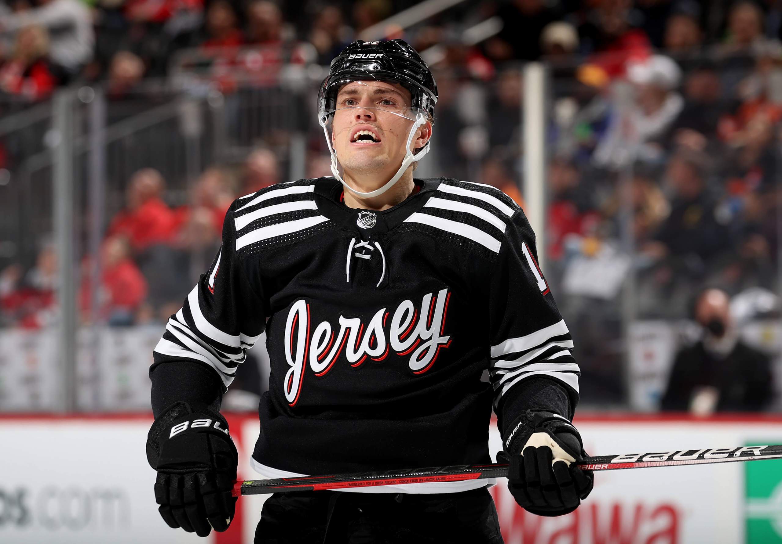
It feels like New Jersey’s new “Jersey” jerseys have been with us forever, but they didn’t actually make their on-ice debut until last night, when the Devils hosted the Flyers. Lots of additional photos here.
Not so bad, right? Here’s how they looked in action:
Here’s a tip: Mercer for Calder.#NJDevils | @PSEGDelivers pic.twitter.com/TtZFEDTuAn
— New Jersey Devils (@NJDevils) December 9, 2021
In keeping with the spirit of all the meta-jokes that have been floating around since the design was released a few weeks ago, goalie Mackenzie Blackwood had a decal strategically added to the backplate of his mask:
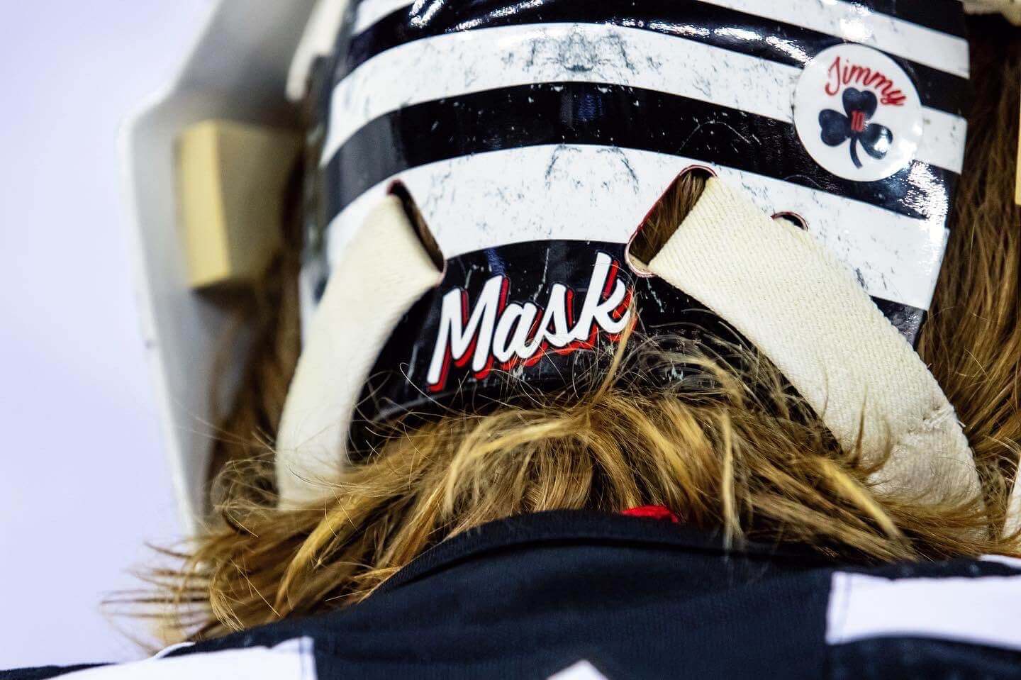
That kind of joke will soon start to feel played-out and rote, and soon after that it’ll become annoying and insufferable. But for now, it’s pretty funny — kudos to Blackwood.
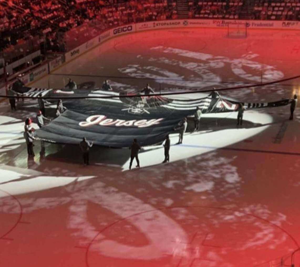
Just in case anyone was missing the point, the Devils displayed a massive “Jersey” jersey on the ice prior to the start of the game. Interestingly, the stripe was missing — tsk-tsk:
They also gave away “Jersey” T-shirts:
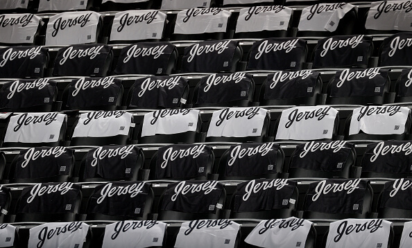
Giveaways are always nice — but shouldn’t the shirts have said, “Shirt” instead? (See, that’s what I mean about the jokes getting rote and then insufferable. I’m part of the problem!)
Update: I’m now told that these were actually towels, not T-shirts. Insert “Towel” joke here.
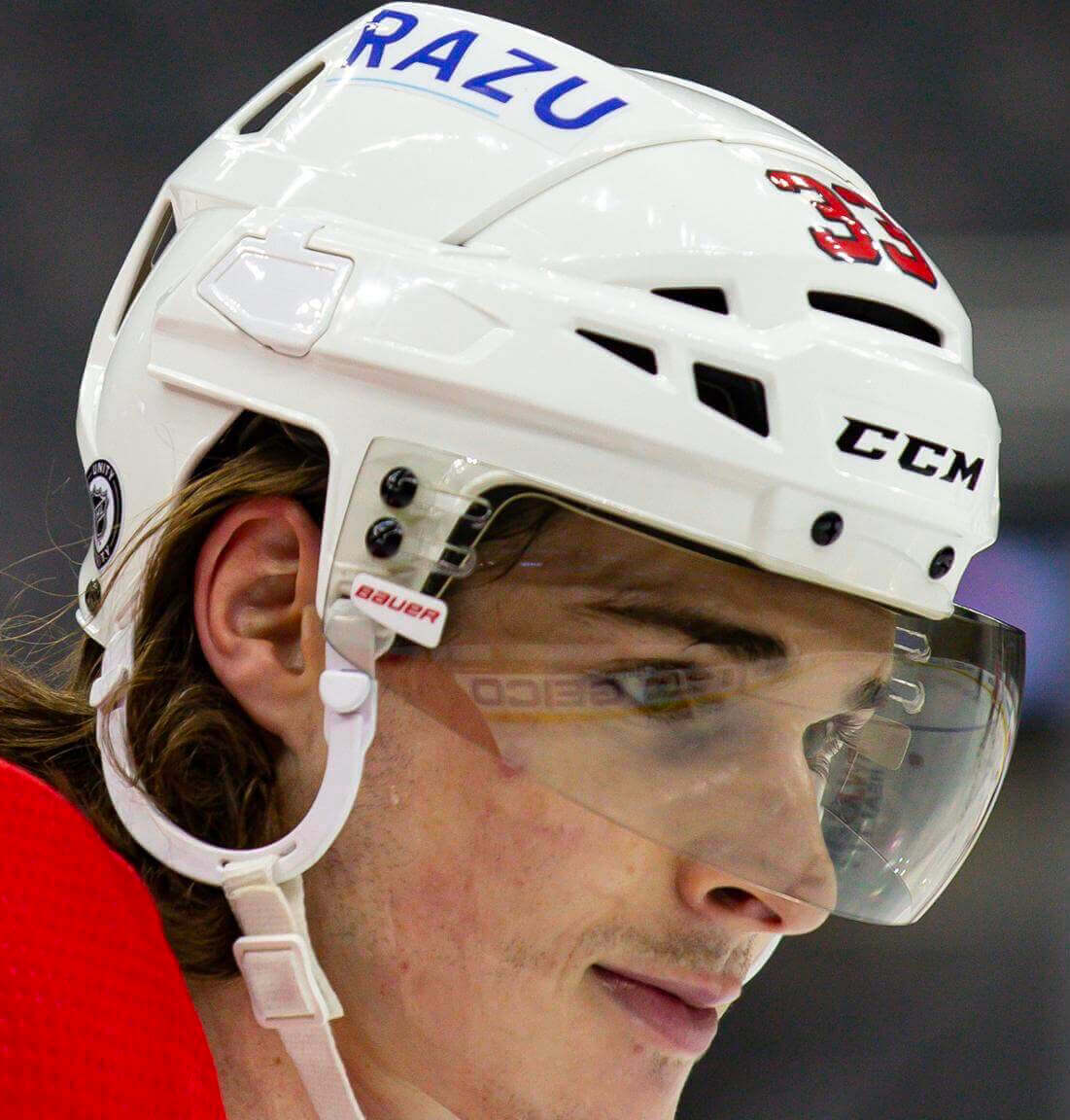
Speaking of the Devils: As you may recall, back in October they announced that their usual helmet advertiser — a giant insurance company — would be replaced for 13 home games by a local Black-owned business. They’ve now chosen Razu, described as “a networking and collaboration digital platform for musicians,” as that business.
In addition, the terms of the deal have been adjusted. Instead of appearing for 13 home games, the Razu ad will be worn for 30 road games, beginning this Saturday. I’m sure the Razu folks are happy about the increased exposure, and I also realize a digital platform can be used by anyone, anywhere, but the whole point of choosing a local business seems diluted if you’re not going to wear the ad at home.
Ultimately, of course, all uniform ads suck. But I’m disappointed by how this one had a slight mitigating factor that’s now been excised. Pfeh.
(My thanks to @stevenwoj for the photo of the giant jersey.)

ITEM! New “Ask Me Anything” column: My latest piece for Bulletin is a new installment of “Ask Me Anything.” Big thanks to everyone who submitted questions!
Those of you who’ve subscribed to receive my Bulletin content via email should already be seeing this piece in your in-boxes. Everyone else can read it here. Enjoy!
Click to enlarge
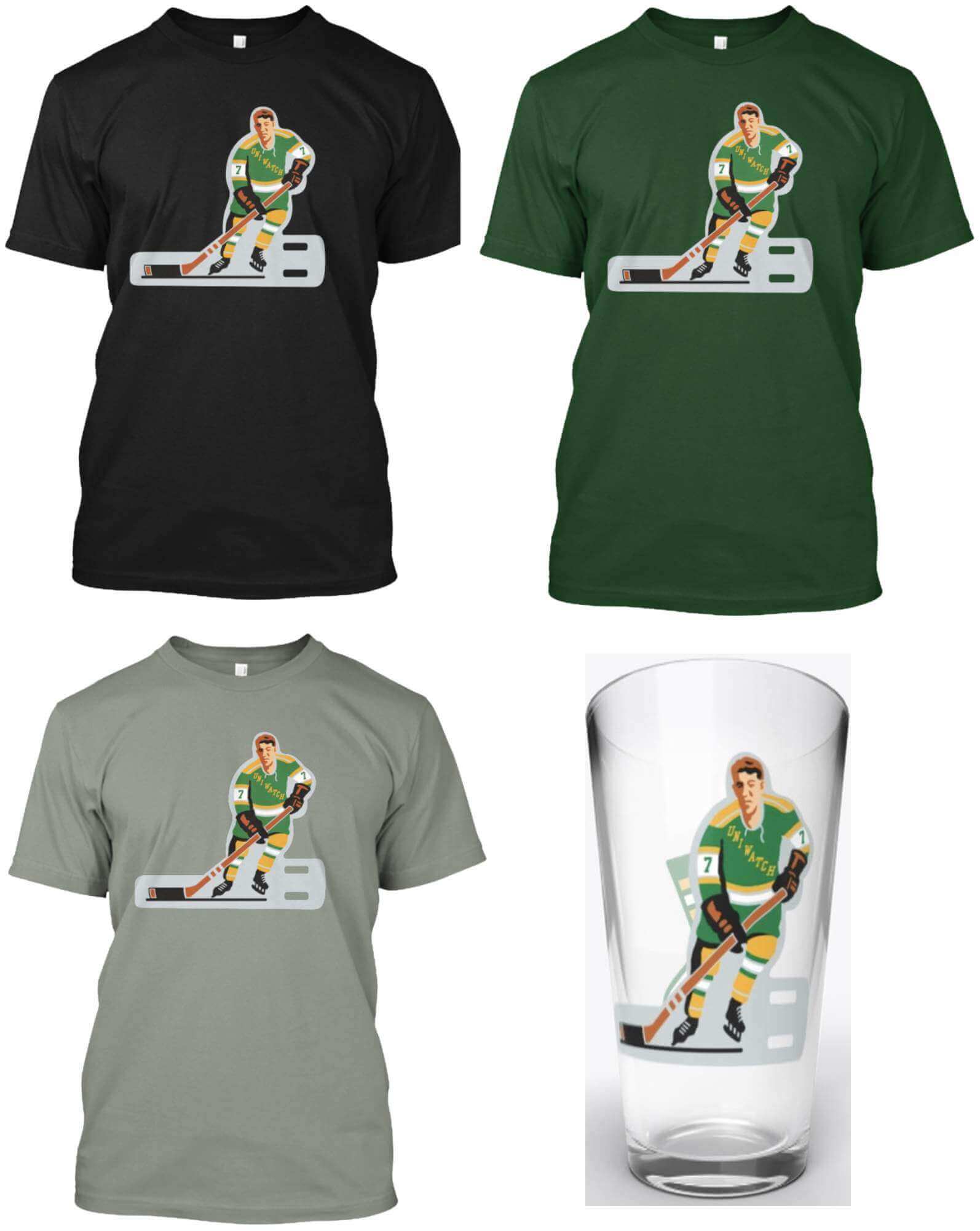
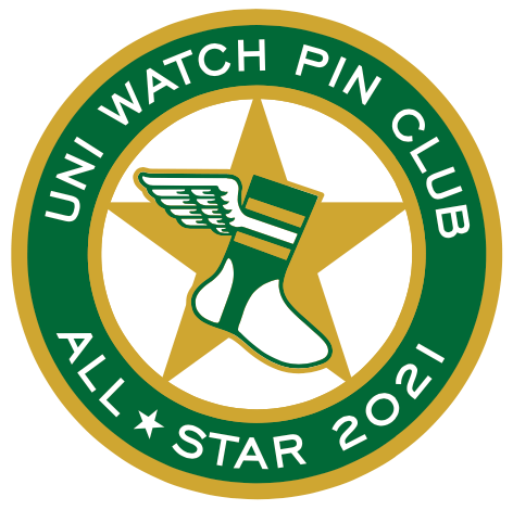
ITEM! New shirts featuring pin designs: Our “Swinging Santa” T-shirts, based on the Uni Watch Pin Club’s December design, have been a big hit, so Todd Radom and I thought we could repurpose a few of our other pin designs, starting with our table hockey player (which originally appeared as the March 2021 pin). We changed the sleeve numbers from 21 to 7 (my favorite number and also a nod to the late Rod Gilbert), but aside from that the design is unchanged from the pin version.
All of the T-shirt colors are also available as long-sleeve tees and hoodies, plus we’ve done a pint glass (with the hockey player on one side and the winged stirrup on the other). Here’s where you can order these in black, green, grey, and the pint glass.
We’ve also rolled out this same assortment of products for our baseball bobblehead design (which originally appeared as the July 2020 pin):
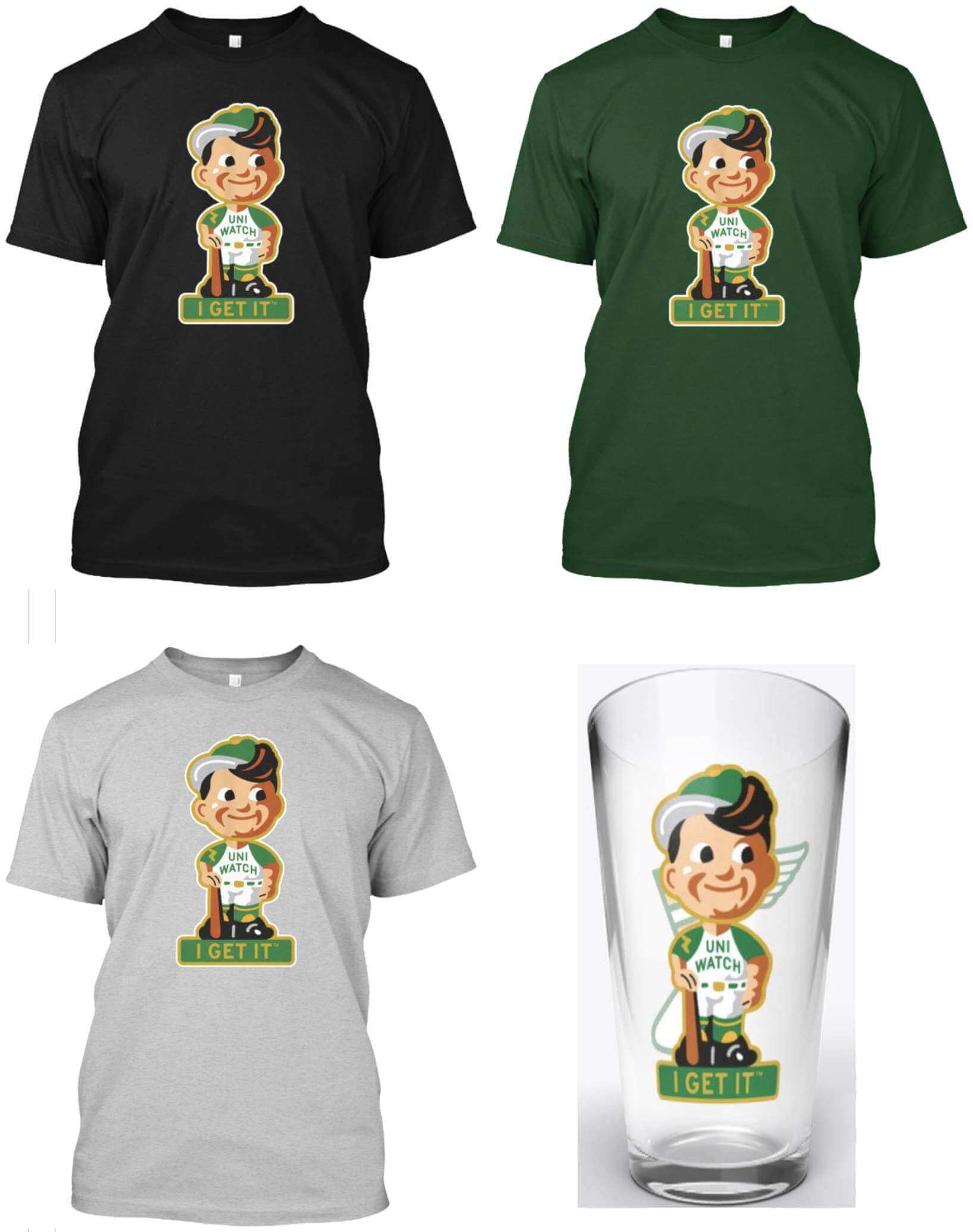
Here’s where you can get this one in black, green, grey, and the pint glass.
Finally, we’re also doing the football bobble (which originally appeared on the September 2021 pin). We changed the number from 21 to 64 — the year that both Todd and I were born:
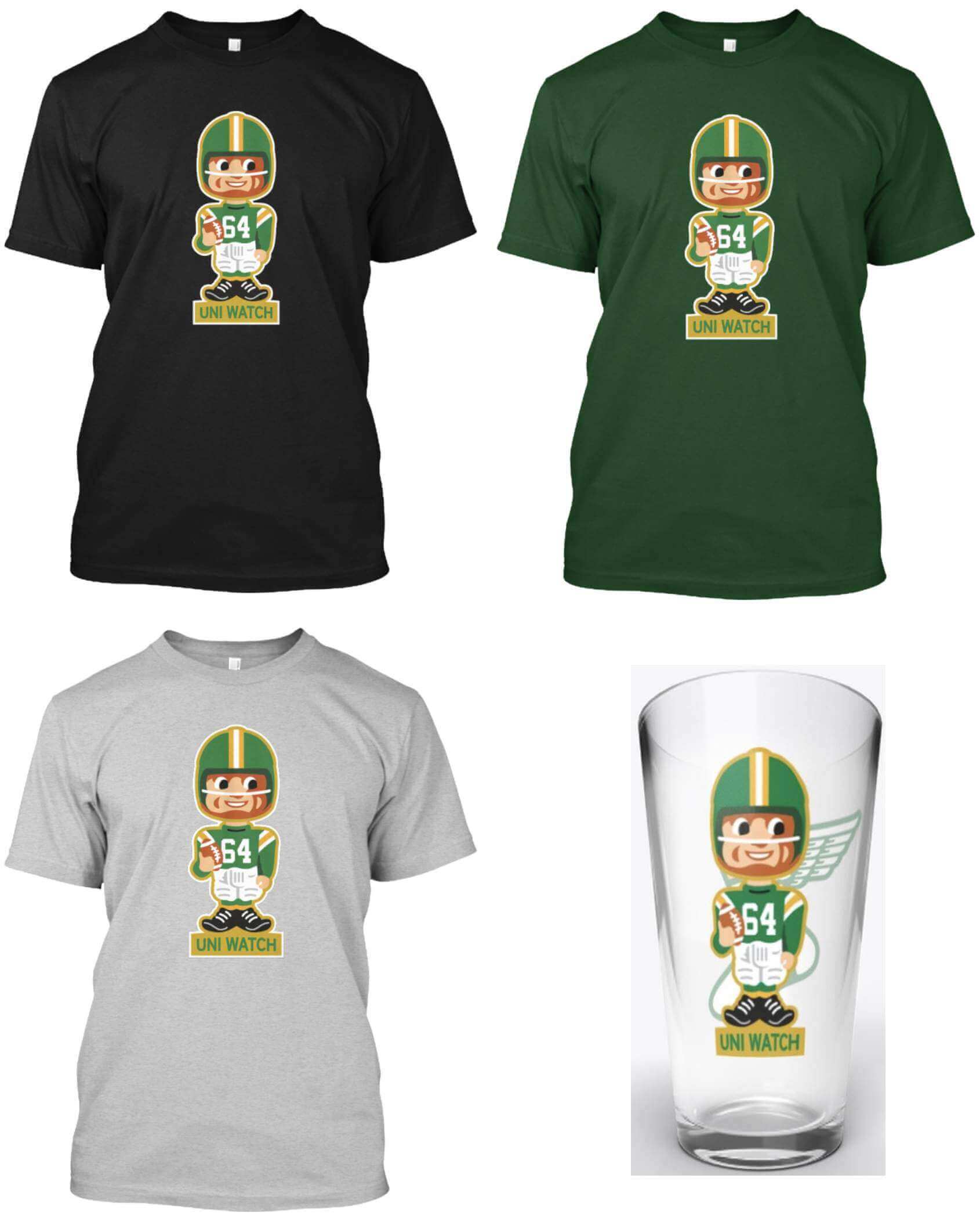
Here’s where you can get this one in black, green, grey, and the pint glass.
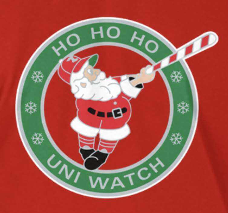
Meanwhile, here’s where you can get Swinging Santa in green, red, and grey. (I haven’t done a Santa pint glass, but I’m happy to do so if anyone wants that.)
For all of these, if you’re interested in other shirt colors, other shirt styles (women’s, tank top, V-neck, etc.), or other products (posters, canvas prints, etc.), let me know and I’ll do my best to take care of you.
My thanks, as always, for considering our products.
LAST CALL if you collected ’em all: Later today I plan to place the order for this year’s Uni Watch Pin Club bonus pin, which will be given to everyone who collected all 12 of this year’s designs. I need to know how many of the bonus pins to make, so if you’ve collected ’em all, you must email me ASAP with (a) your name and address and (b) proof that you’ve collected all of this year’s pins. The proof can include photos of the pins themselves and/or order-confirmation emails from Teespring.
I’ll order a few extra pins to cover the inevitable stragglers. But if there are too many stragglers, someone will be left bereft. You don’t want that to be you, so send me your proof of purchases now.
The bonus pins will ship out early next year. Thanks for your support of the pin project!
The Ticker
By Paul
Indigenous Appropriation News: The New York State Dept. of Education has ruled that the Cambridge Central School District may no longer call its teams the Indians (from Jace McKeighan). … The school board in Glastonbury, Conn., voted last year to stop calling the local high school’s teams the Tomahawks, but a new hearing will be held next week to reconsider that decision.

Baseball News: Here’s a 1943 article about the Cardinals meeting Allie May Schmidt, who designed the team’s original “birds on the bat” insignia (great find by the equally great Todd Radom). … The new Guardians sign at Cleveland’s ballpark was adjusted after fans noticed that it was originally off-center when it was installed (from Kevin Seekely). … Newly signed Cubs OF Clint Frazier says he’s happy to be a Cubbie because, among other things, their uniforms “are soooo sick!” (From Trevor Williams.) … One nice thing about the MLB lockout is that MLB.com is now doing historical pieces, like this one about the Boston Braves becoming the Boston Bees (thanks, Brinke). … The Mets plan to expand optional facial-recognition ticketing next season. … Kurt Rozek spotted Yankees SS Phil Rizzuto with gum on his squatchee during Game Seven of the 1952 World Series.

NFL News: Here’s an article on the first woman to wear a Dallas Cowboys cheerleader uniform (and no, her name wasn’t Debbie). … Did you know that the NFL auctions off the coins used for pregame coin tosses? (From David Firestone.) … The Bengals will wear black jerseys with orange-striped white pants this week.
College Football News: With the anniversary of Pearl Harbor having passed earlier this week, here’s an interesting thread about how college football was impacted by World War II. … A state senator in Oklahoma has proposed renaming three inches of highway as a petty, sour-grapes potshot at departed Oklahoma football coach Lincoln Riley, who recently left OU to coach at USC.

Hockey News: If you scroll through some recent tweets by former Flyers D Joe Watson, you’ll see some old Flyers and NHL letterhead (from @kodywiddak). … New “chocolate brown” pads for Hershey Bears G Phoenix Copley (from Adam Marcus). … Devils D P.K. Subban appears on the package of a probiotic supplement in a generic jersey (from Ewan Williams). … The Golden Knights wore purple Hispanic-themed pregame jerseys for Hispanic Heritage Night (thanks to all who shared). … We already knew that the Coyotes’ lease was up at the end of this season, but now it turns out that they could be locked out of their own arena in 11 days due to unpaid bills. … Next time you hear someone say that NHL teams need uni ads to cover revenue shortfalls (like, say, in the Uni Watch comments section), keep this in mind: The Rangers just became the first NHL team to be valued at over $2 billion and the average team value is now $865 million — a 32% jump from last year and the biggest increase since 2013.

NBA News: The Lakers have retired No. 13 for Wilt Chamberlain. But the number is in circulation for their D League affiliate, the South Bay Lakers, which looks kinda weird because South Bay’s unis look a lot like L.A.’s. … Wizards SG Bradley Beal has a new personal logo.

College Hoops News: The North Carolina Dept. of Transportation is renaming two stretches of highway to honor former UNC coaches Roy Williams and Dean Smith (from James Gilbert). … Kansas State and Marquette went lavender/purple vs. yellow last night (from Carson Schroeder).

Soccer News: For today’s Europa Conference League match, Tottenham Hotspur planned to wear a message encouraging people to donate to a local food bank. The match was postponed due to a Covid outbreak, so it’s not clear when or if the message will be worn (thanks, Jamie). … Also from Jamie: Here’s a Twitter thread on a “kit clashing” option in the video game FIFA 98, where it would attempt to solve color clashes by altering the teams’ kits. “I’m not sure any other version of FIFA ever did that, but I’ve always thought it would at least be nice to be able to swap around shorts and socks to avoid color clashes,” says Jamie. … And yet another from Jamie: “English club Charlton Athletic’s women’s team is changing its name from ‘Women’ to ‘Ladies,’ which, well, is not going over well. Most of the top English women’s teams have gone the opposite way in the past few years, and now there are only a few ‘Ladies’ left.” … New uni set for the MASL’s San Diego Sockers, who are now being outfitted by Flite. Blue is home, white is road, yellow is 1982 throwback, and red is keeper. … Ukrainian side FC Shakhtar Donetsk promoted their charitable foundation on their shirt (from Ed Zelaski).

Grab Bag: The Natural History Museum in London has outfitted its animatronic Tyrannosaurus rex in a Christmas sweater. … The police chief in Waterloo, Iowa, said the costs associated with swapping out the department’s old griffin logo, which was scrapped due to perceived ties to racism, were much less than some officials were claiming. … The U.S. Air Force has made lots of uniform and appearance rule changes and has also made maternity uniforms more accessible. … About 150 German companies changed either their logos or their advertising to encourage people to get Covid vaccinations (thanks, Jamie). … Ewww: The Color Mafia’s color of the year for 2022 is a new shade of “periwinkle,” but it’s really purple.
Damn it, Paul! Just when I say that I don’t need any new Uni-Watch merch, you pull me back in! It’s going to look pretty meta to have a pint in my Uni-Watch hockey jersey pint glass while wearing my Uni-Watch hockey jersey!
The article linked for the Waterloo, Iowa griffin issue, while saying a lot about Waterloo, doesn’t quote the police chief and provides only the original claim for the cost of the change. Unless there is a big part of it I missed.
Thanks for catching that. Wrong link! Here’s the proper one:
link
Anybody know what brand the UniWatch store t-shirts are?
If those give away towels had been actual shirts, shouldn’t they have read “shirsey”?
Re: the soccer ticker–Tottenham’s match today has been postponed due to a COVID outbreak on the squad. Not sure if the message will be worn at a later date.
Yep. COVID related postponement. Here’s Spur’s official statement. link
They’ll probably postpone this weekend’s EPL match at Brighton, too. Unfortunate.
but the whole point of choosing a local business seems diluted if you’re not going to wear the ad at home.
Unless you think of it as being directed at TV/streaming viewers watching away games.
Yeah as much as I hate the helmet ads, if you’re trying to advertise to your local fans it makes more sense to have them on the road helmets where they’ll see them on tv. As the saying goes, “Every city has 20,000 hockey fans and they’re all season ticket holders.” Fans in the arena can’t really see the ads.
The Sharks only have helmet ads for away games, I suspect at least partially due to this reason.
Griffin
OMG, the new shirts, glasses, etc. with the bobbles and hockey guy are awesome. Please take my money.
Re the Devils’ alts, I really like the striping and overall look but would much rather have had the full “New Jersey” as the script instead of just Jersey. Not necessarily because of the obvious, but great jokes (and, “You from Joisey? I’m from Joisey!”), but does anyone really say “Jersey” anymore? I grew up in that area, and don’t recall too many people not saying “New Jersey”. Perhaps “Jersey” is still the thing and I don’t know it.
Great choice to add a few other pins to tees! Will definitely be picking one of those up.
The players should have replied the helmet add with a sticker that said “Ad”.
Phil Rizzuto was well-known for sticking gum on top of his hat.
I worked in Newark for most of 2015 and 2016 and passed a restaurant named “Soul Food Chess House” every day. It’s very close to the arena. I never ate there, but always loved the name of the place. I was kinda hoping they’d make it onto the helmets!
Well, that’s gotta be the most roundabout way anyone’s ever made into the ticker. I’ll take the win. Haha
I stand by my argument that some NHL teams genuinely need ad revenue. (Sure sounds like the Coyotes do.) But the Rangers are obviously not one of those teams.
The Coyotes need to move to a town that actually has fans who will go to the games and a General Manager who isn’t incompetent.
Quebec City has an open arena…only 6 years old, seats 18K+, and we could see the resurrection of the Quebec Nordiques…
link
How weird would it be for the franchise that was the original Winnipeg Jets to assume the identity of another former WHA team whose original franchise is still extant?
Genuine question – who owns the Nordiques IP? Is it the Avalanche?
The new Jets got lucky when the Coyotes (including the old Jets IP) ended up being owned by the league. Not sure the “Nordiques” are quite so lucky.
According to the US Trademark Office
link
it’s the NHL that owns the Quebec Nordiques wordmark until at least 2024.
The Coyotes get the same cut of TV and expansion money, right? Certainly they could generate revenue independent from what deals the NHL has negotiated for their bottom line through unsightly ads, but there’s solid evidence that the franchise is simply poorly managed and marketed and ‘Arizona’ doesn’t “need” them. A new ownership group wasn’t the answer, and I doubt a new arena anywhere in Arizona will be a problem-solver either. Relocating to a market better-equipped to embrace ice hockey makes sense to me (as does retaining their history as the WHA Jets and their time spent as the Coyotes…assuming they re-brand).
I don’t think the market is the issue. Teams like the Predators and the Lightning have proven that the NHL can thrive in non-traditional markets that are much smaller than Phoenix. Besides, I think it stretches common sense a bit to think that a metropolitan area of over 4.5 million people in the United States can’t find a big enough fan base to support an NHL team. I don’t know all the ins and outs of the Coyotes’ management situation, but I suspect the blame for their failure lies there, not in their geographic location.
And for what it’s worth, this franchise has never been economically successful at the NHL level. The original Jets didn’t get great fan support either (despite what the Canada-or-die partisans will try to get you to believe), although at least they could use the excuse that Winnipeg is an unusually small market for a major-league franchise.
The original Jets had great fan support. It just didn’t translate into $$.
The biggest issues were the arena (old, in a somewhat remote location, and zero private boxes), ownership, and most of all a terrible exchange rate to Canadian $. There was also an issue with the public subsidy the team got but that’s a bit complicated.
As I understand the Coyotes situation, the arena location is terrible. The market is huge but the arena is incredibly far from population centres where the fans are located. 4.5 million people doesn’t matter if they’re an hours drive from the arena.
*made it into
Damn.
Those brown goalie pads on the Hersey Bears goalie are sweet!
Loved the Bulletin Article today, as always.
I love your idea of the Mets in a World’s Fair inspired uni. Just take their classic white pinstripes and add the Unisphere to the left chest and it’s an instant classic and connected to Queens without all the ad speak BS.
Hahahahahaha… Debbie.
“Third Down and a War to Go” is a fantastic look at how World War II broke up a potential championship contending Wisconsin team. It’s worth a read just to get a sense of college football at the time. link
Paul, was the Trevor Williams who sent in the Clint Frazier tweet the one who plays on the Cubs, or just a coincidence?
Coincidence!
It feels like I’m starting to like the Devil’s new alternate jersey a little more now.
I soooooo want to hate New Jersey’s new “Jersey” jerseys, but I just can’t. I mean, I wish the Devils didn’t wear black at all, but so long as they stick with their second-best color scheme, a black uni is perfectly appropriate, and darn if the new “Jersey” jersey isn’t a sharp-looking bit of uniformery.
I guess the joke escapes me. Hockey players wear “Sweaters” not “Jerseys”.
The Pantone 2021 color of the year “very peri” mentioned in the Grab Bag is pretty much the ABA Denver Rockets’ color from the early ’70s, Columbine.
link
Paul,
Love that hockey pint glass .
Will be ordered for a few