By Phil Hecken & The SMUW Crew
Follow @PhilHecken
Greeting and good Sunday Morning Uni Watchers!
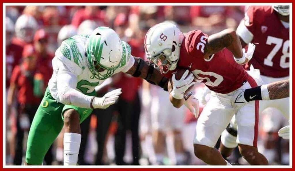
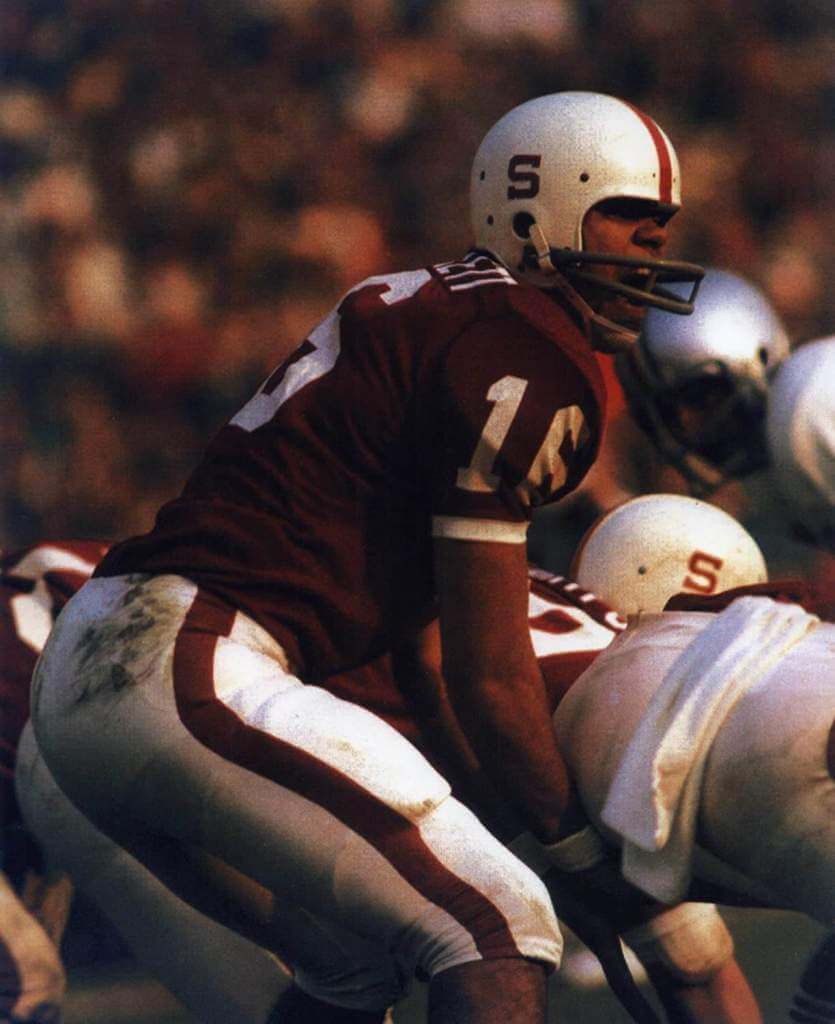
The Stanford Cardinal upset the #3 ranked Oregon Ducks yesterday in a pretty decent looking uni-matchup. Now, if that Stanford uniform doesn’t look quite right, that’s because the team was throwing back to the 1970-71 Jim Plunkett years (when the team was still known as the “Indians” — a rather ironic twist). For more information about the throwback, here are all the details. And here’s Mr. Plunkett wearing said uniform:
Stanford (Nike) did a pretty good job of replicating the uniform, but as is often the case, the devil was in the details. The helmets the team wore didn’t quite match what was worn back then.
You’ll note the “S” is thinner than the original, and it appeared to be positioned slightly higher above the earhole (or what serves as an earhole today) than the original. Also, the pants stripes worn in the throwback appeared to be thicker than the original as well.
The uniforms also were a deeper cardinal red than their current uniforms, which better matches the original. I can’t fault Nike for not being able to replicate the giant TV numbers on the sleeve, as uniforms today don’t really have sleeves, but instead are reduced to what we call “caps.” But overall, the throwback was pretty well done, and it was nice the Cardinal were able to pull off a big upset over one of their major rivals while wearing them.
Now, let me turn this over to TJ and the rest of your…
Sunday Morning Uni Watch
by Terry Duroncelet, Jr.
So my friend Sean messaged me Friday about these bass drum pedals by one of our favorite companies. At first, I was stoked (these pedals are drip, and no one can convince me otherwise), but then I unfortunately learned which organization will ultimately benefit from this. This intro serves more purpose than just an excuse for me to talk about drum gear: it’s also a reminder that Pinktober is here once again. If I’m being perfectly honest, I find that teams seem to have toned it down over these last 10 years, but who knows what lies around the corner in the college landscape? At any rate, let’s get into Week 5, shall we? Also, even though I shouldn’t have to say this, I think it’s best if I cover my bases: my condemnation of K*men and Pinktober demonstrations on the field =/= condemnation of breast cancer awareness as a concept.
From Thursday:
• The block numbers returned for one night, as Miami (FL) wore throwbacks/retros against Virginia in honor of Howard Schnellenberger, the first ever coach to be inducted into the Hurricanes’ Ring of Honor. Schnellenberger died back in March.
From Saturday:
• Contrast Matters: Something Old, Something New Edition. Such a good-looking matchup. Also:
• Remember those cursed navy pants that Michigan wore in Week 2? They brought them back this week against Wisconsin, this time with white jerseys. I don’t hate ’em as much in this context.
• Neat helmets worn by Boise State (closer look). Also:
• Have you ever looked at a matchup that made you want to eat glass? OOF.
• Time for a palate cleanser. Noice.
• Miami (OH) wore their Fight Against Cancer helmets (a tradition at this point for them) against Central Michigan (more here).
• Kent State can look fun when they want to. Another looker.
• Welp, going all-white is one way to avoid the whole “Mississippi State Aggies vs Texas A&M Bulldogs” thing.
• Shout-out to the helmets and pants in the UNLV/UTSA tilt for being the absolute MVPs in this matchup, for obvious reasons. This is why it makes no sense for people to look at an entire uniform and call them “new jerseys”, because this is proof that there’s much more to a uniform than just a jersey.
• ASDFGHJKL IS EVERY TEAM CHOOSING VIOLENCE THIS WEEK??? I’m all for going completely feral with the unis during the 31 days of Halloween, but at least talk to the teams beforehand so things like this DON’T HAPPEN. Something-something, rhymes with “Comcast Blathers”. At least the trou paired well against each other.
• NNOB alert from the Florida/Kentucky game.
• It’s always nice to see Gruff Sparty make an appearance. Closer look (via Blaise D’Sylva).
• Not many pics, but I LOVED Arizona State’s helmets that they wore against UCLA. Very reminiscent of LSU’s lids from three years back. Closer look (Blaise, again).
That’ll do it for Week 5. A massive thanks to Blaise D’Sylva for being on top of the helmet game, as always. Hope you have a great Sunday, an excellent start to October, and I’ll see you next week.
Thanks, TJ! OK, now for the 5 & 1 and the remainder of the SMUW.

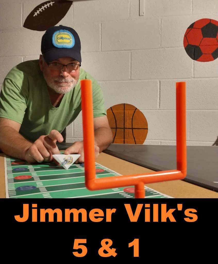
Jimmer Vilk’s 5 & 1
After more than a decade in hiatus, the original “5 & 1” decider, Jim Vilk, has returned! Jim began doing the 5 & 1 many years ago, followed Catherine Ryan, Joe Ringham, Michael “Memal” Malinowski, and several guest pickers. Once again, Jim will pick HIS 5 best looking/1 awful matchup, and occasionally have some honorable mentions (both good and bad). You may agree and you may disagree — these are, after all, just opinions and everyone has one. Feel free to let him know what you think in the comments section.
If you have a game you feel is “worthy” of consideration for the 5 & 1, please either post it in the comments below or tweet Mr. Vilk @JVfromOhio.
Here’s today’s 5 & 1:
Just a quick note on why I’m not a huge fan of mono, especially the whole icy clean white trend. I grew up in the golden age of electric football, and if your players looked like this…
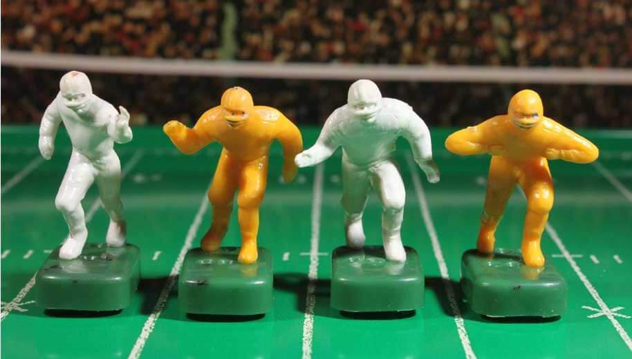
it means your parents got you the cheap game and you were too lazy to paint them. So when I see some of the current whiteout and/or mono y mono games, I see a lazy uninspired matchup. Expand your palette, people!
Honorable Mentions to:
Virginia/Miami (FL)
You don’t need *much* paint to make your little players look as good as the Cavs.
Minnesota/Purdue
Even though I prefer both teams in gold lids, I liked this.
5. Oregon/Stanford
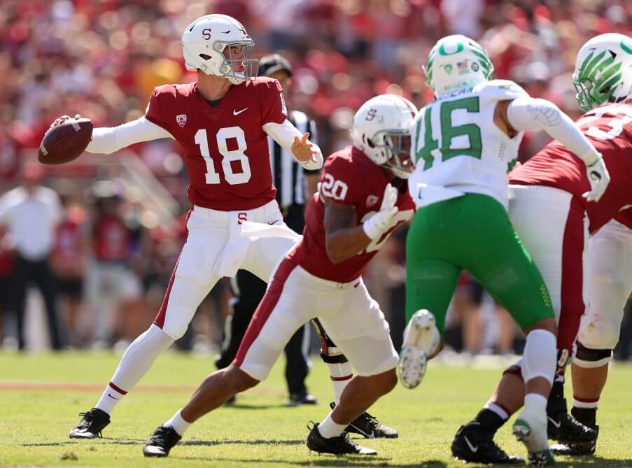
Accurate throwback, yes, but this might have ranked higher with a bigger S on the helmets.
4. Memphis/Temple
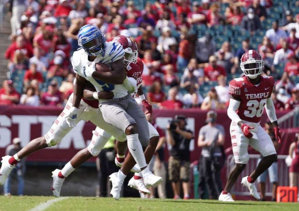
The Owls need to fill in those tile stripes on the britches.
3. Cincinnati/Notre Dame
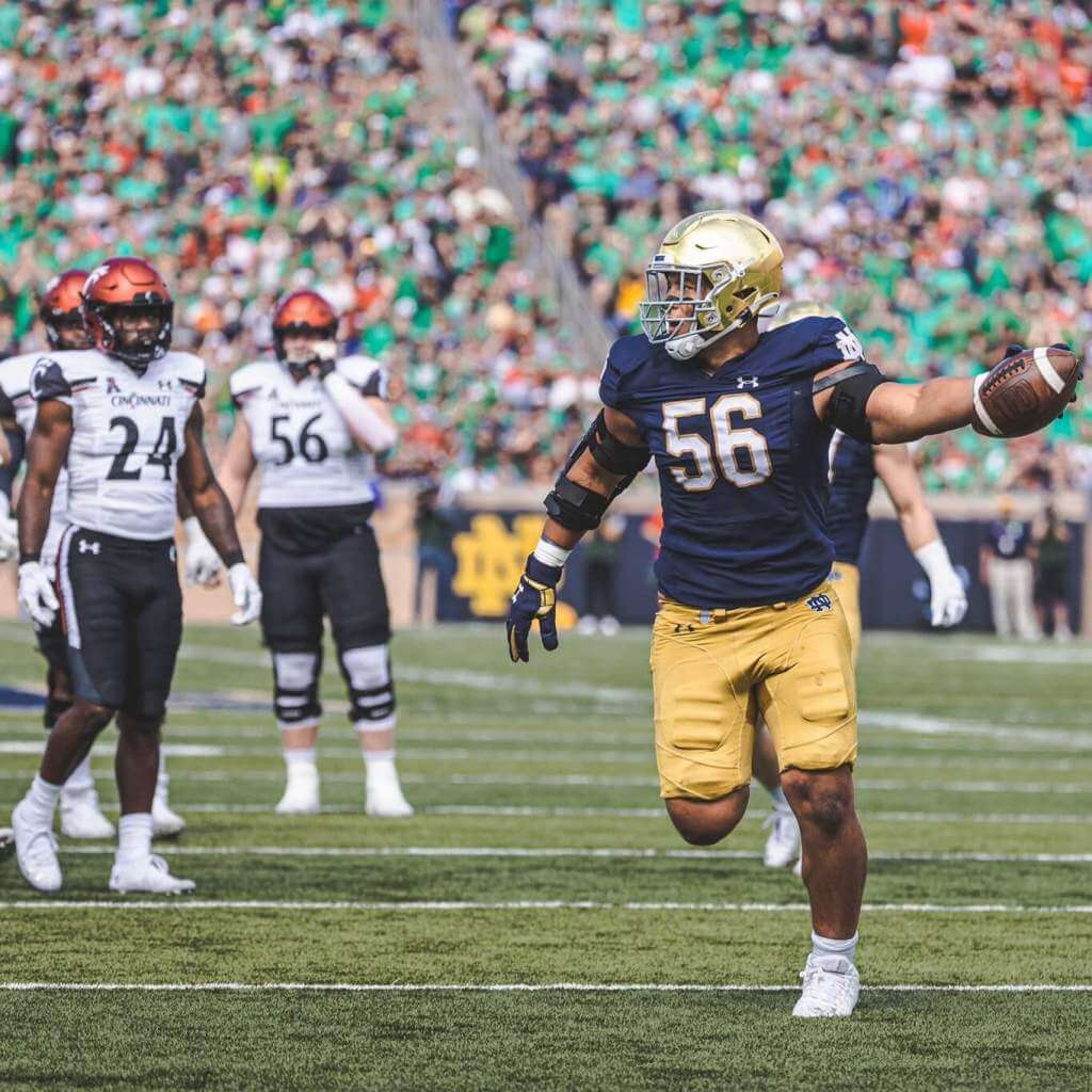
I was thinking of this game early in the week, and once I learned the Bearcats chose the red buckets they rose up my chart.
2. Michigan/Wisconsin
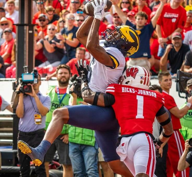
Pleasantly surprised by those road (and only road, please) pants.
1. Auburn/LSU
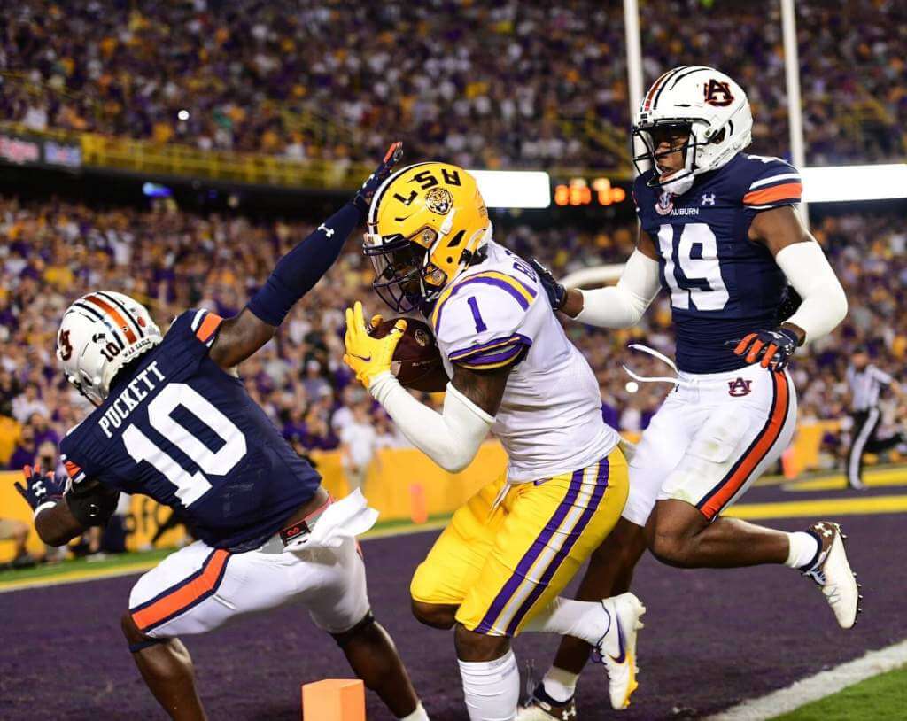
Two very safe bets coming into this game: the Tigers were going to win, and this stripe-a-licious matchup was going to top my list.
&1: UNLV/UTSA
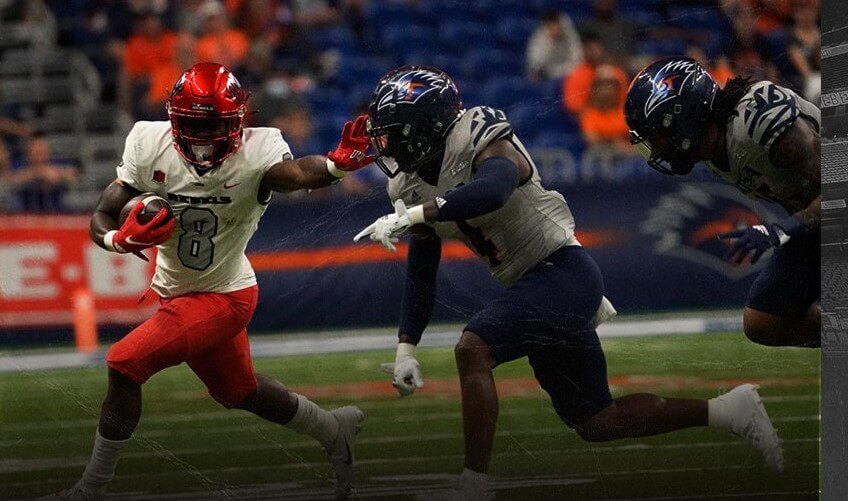
Remember the Alamo but forget this gray vs white matchup from the Alamodome
Thanks, Jim! OK readers? What say you? Agree or disagree with Jimmer’s selections? Let him know in the comments below.
NCAA Uni Tracking
Uni Watch will again track the uniform combinations worn by the “Power 5” conferences. All of the 2020 trackers are back!
We’ve got Rex Henry (tracking the ACC), Dennis Bolt (tracking the PAC-12), Kyle Acker (tracking the B1G), and Ethan Dimitroff (tracking the Big XII AND the SEC). Rex, Dennis, and Kyle and are all returning from 2015, and Ethan is back after joining the NCAA Uni Tracking a couple seasons ago. Ethan will continue to track the SEC, and has swapped the B1G for Big XII (with Kyle).
Here are the Uni Trackers for the Power 5 Conferences (along with each tracker’s info):
Rex is up first today (ACC):
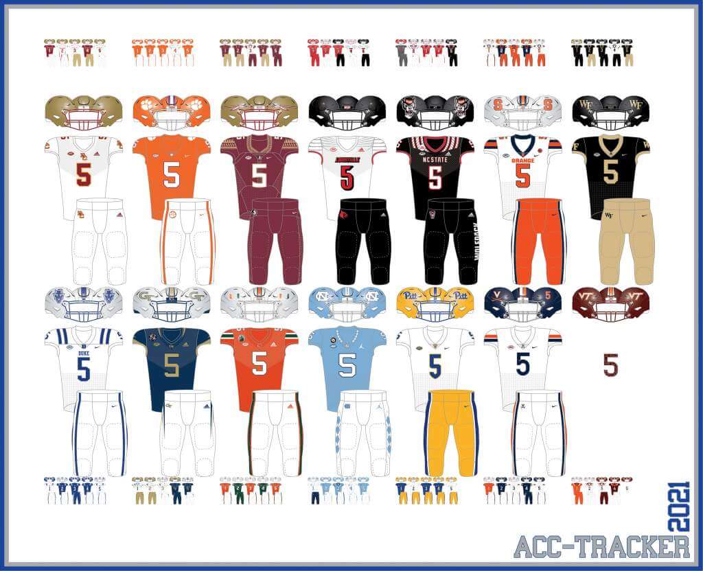
ACC
More Here.
Follow Rex on Twitter here.
And now, here’s Dennis with the PAC-12:
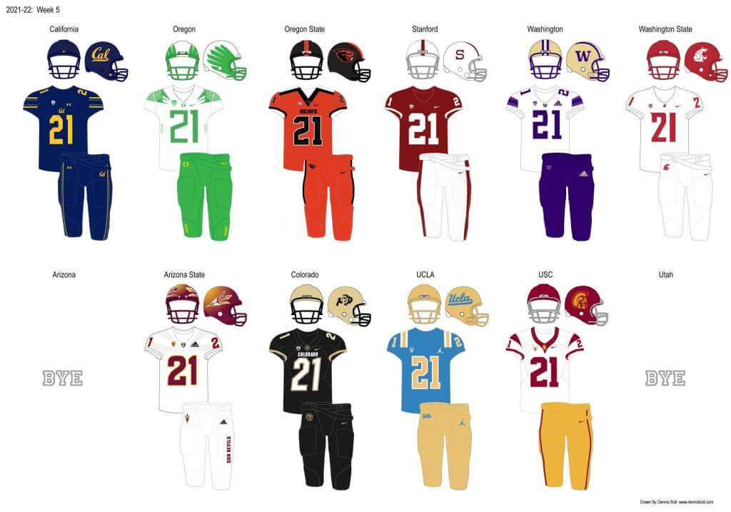
PAC-12
More here.
Follow Dennis on Twitter here.
And here is Ethan, with the SEC:
SEC
And be sure to check out Ethan’s WVU Mountaineer Tracker.
Follow Ethan on Twitter here.
And here is Kyle with the B1G
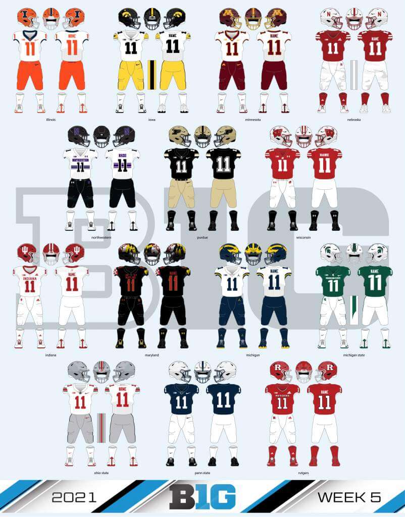
B1G
Follow Kyle on Twitter here.
And here’s Ethan with the Big XII:
Big XII
Welcome to the 2021 Oregon Ducks Uni Tracker. This little project was originally begun way back in 2008-09 by Michael Princip, who retired after several seasons, whereupon the project was continued by Tim E. O’Brien. He, too, retired from the tracking, but the project has been ably kept up by the man who also tracks the Pac12, Dennis Bolt.
Here’s this week’s Uniform Combo for the Ducks (you can click to enlarge):
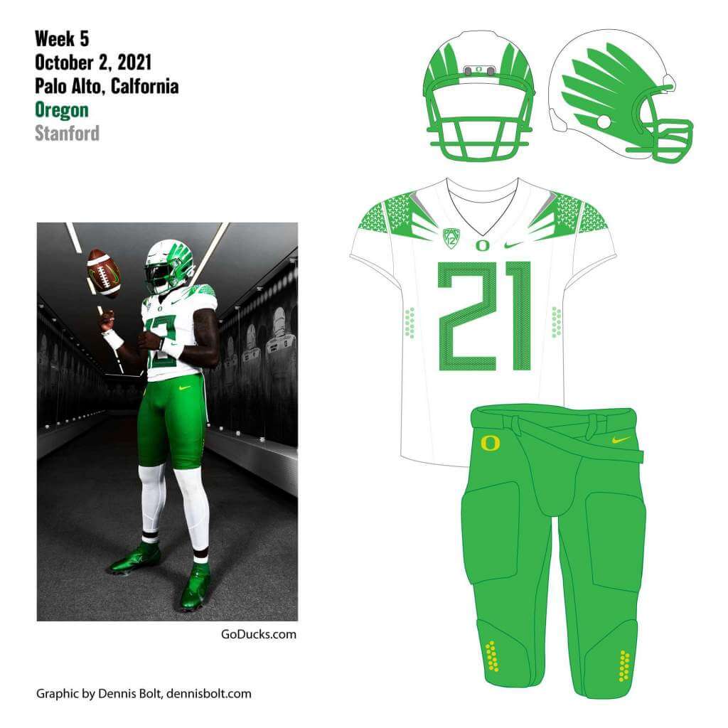
You can read about this uniform, and MUCH MORE, by checking out the Duck Tracker here and the color combo spreadsheet here!
Thanks Dennis!
Click to enlarge
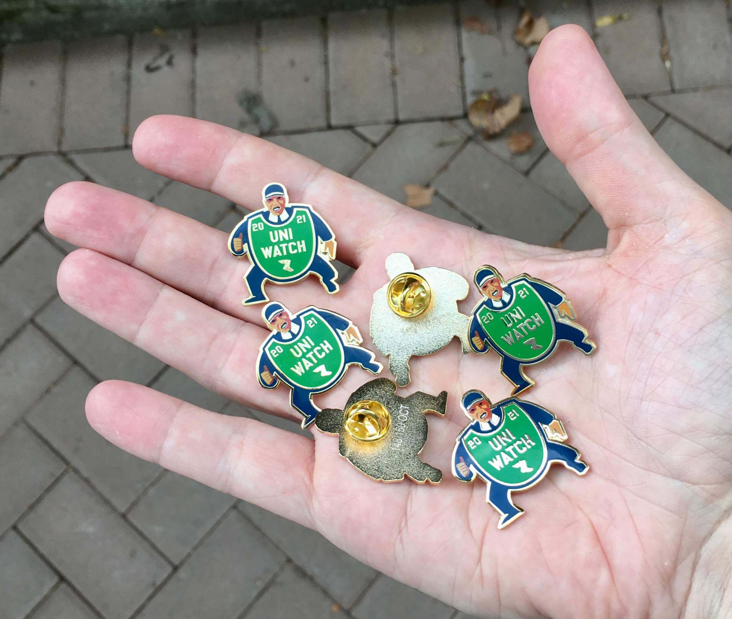
October pin reminder: Paul here. In case you missed it on Friday, the Uni Watch Pin Club’s design for October is a fantastic depiction of a baseball ump with an old-fashioned balloon-style chest protector. You can almost hear him yelling, “Yer out!” Perfect for the playoffs and World Series.
Here’s a closer look (click to enlarge):
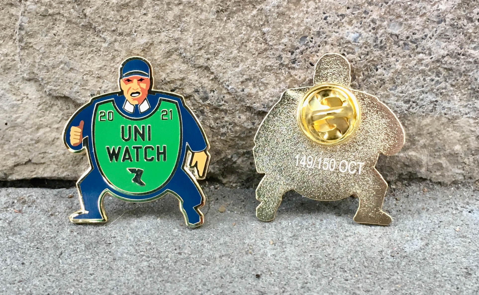
Sensational, right?
This pin was produced in a numbered edition of 150. You can order yours here.
We’ll also have our annual Uni Watch Press Pin later this month, so stay tuned for that!
My thanks, as always, for your consideration of our products. Now back to Phil for the rest of today’s content!
Uni Watch News Ticker
By Phil

Baseball News: Check out this pink/purple/blue jersey being worn by the CTBC Brothers, a Taiwanese team (from Jeremy Brahm). … Neat picture of Sixto Lescano, likely from his big 1974 season with the Sacramento Solons — check out how the pinstripes go through the sleeve logo (from Dan Pfeifer). … “After 30 years of being a J-League team, Gamba Osaka changes their logo to a shield combining, many things Red heart, Goal net, G and O” writes Jeremy Brahm. Here’s a better look at the logo. … The Iowa State University Archives website has a cool story about a silver bat trophy contested among several Iowa colleges in the late 19th and early 20th centuries. Be sure to click on the photos of the bat to expand them and see the intricate engraving work (from Kary Klismet). … The Puerto Rico Summer Collegiate Baseball League appears to have “borrowed” its logo from the NHL’s Columbus Blue Jackets (also listed in Hockey). From Kary. … Red Sox catcher Christian Vázquez wears a shiny belt, much shiner than his teammates (from bryanwdc). … Speaking of belts, looks like Jonathan Villar was wearing Dom Smith’s belt (from Michael Raskin). … Reader Dave Kuruc writes, “While searching for something else – I came across these two finds: Love this Oriole script I hadn’t seen before. This Cubs media guide cover is the cutest.”

NFL News: Many folks tweeted out this new Tom Brady returns to Foxboro video, noting several wrong Super Bowl logos and/or scores. … Today the Buffalo Bills will wear white/royal/white whilst their opponents, the Houston Texans, will go navy/white/navy. … The Browns will be wearing orange/white/brown against Minnesota. … With the Chicago Bears contemplating a move from Soldier Field to a yet-to-be-built stadium in the distant suburb of Arlington Heights, Chicago’s NBC affiliate has put together a feature detailing how far away from their namesake cities several NFL teams play (from Kary Klismet). … Einzelgänger 666 “would have legitimately bought his jersey had he made the team.”
College Football News: Next week when the Campbell Fighting Camels visit the Gardner-Webb Runnin’ Bulldogs, it’ll be for the East/West Barbecue Bowl trophy (from James Gilbert). … Also from James, UNC had an interesting towel giveaway for the student section at yesterday’s game. … The latest Heisman House ad has Barry Sanders with a swoosh on his jersey but the others have removed the branding (from Joe Waltasti). … BYU has worn five different uni combos in five games this season, so naturally someone had to rank them. … Following up on the item in yesterday’s Ticker about Iowa wearing green ribbon decals for mental health awareness on Friday night, Maryland also wore the same decals in the game. Here’s how they looked on the field (from Kary Klismet). … One more from Kary, who writes, “For those of us who stayed up late Friday night watching Iowa’s win over Maryland, these photos of Iowa logos in coffee foam are just what we needed to get going the next morning.” … Whoa, check out this Clemson-themed fighter pilot helmet (from Mark Johnson).

Hockey News: The Vegas Golden The Knights remembered the aftermath of the Route 91 Harvest festival shooting by holding a moment of silence and putting “Vegas Strong” decals on their helmets on Friday. … Check out this sweater which could best be described as a North Stars/Capitals mashup (from General Soreness). … The Lethbridge Hurricanes tweeted this on Sept 30. A hint we would be seeing new uniforms (from Wade Heidt). … The Puerto Rico Summer Collegiate Baseball League appears to have “borrowed” its logo from the NHL’s Columbus Blue Jackets (cross-listed from Baseball). From Kary Klismet. … More beautiful wall art from the amazing Kevin Cearfoss, this time for the St. Looey Blues. … Check out this awesome new center ice logo for the Brandon Wheat Kings as seen at home opener Friday night. The center ice faceoff circle is filled with wheat (from Wade Heidt). … Oops! Looks like the Prince Albert Raiders won’t be wearing that third sweater they unveiled two days ago.

NBA/College/High School Basketball News: Idaho has released photos of its newly completed basketball arena (scroll down on the link for a slideshow). From Kary Klismet. … There’s also a new basketball floor for the Delta Charter School in Louisiana (from Kary).

Soccer News: Check out this absolutely gorgeous graphic promoting Torpedo Moscow’s upcoming match at Volgograd (from Ed Żelaski). … New logo for Gamba Osaka of the J1 league (from Football, Bloody Hell). … FC Ryukyu shows off their 3rd uniform of the sea, which Okinawa boasts of its beauty (from Jeremy Brahm). … Borussia Mönchengladbach’s keeper Yann Sommer wore the home white kit while the rest of the team wore the black third kit at Wolfsburg yesterday (from Shane Bua). … Here’s a look at the new logo for the Bracknell & District Sunday League, a regional league in England (from Kary Klismet). … Also from Kary, FC Tucson of USL League One has new alternate kits inspired by “El Jefe,” a wild jaguar that has been frequently seen in the area.

Grab Bag: Not sports uni related, but the traditionally nomadic men of the Sahara wear lots of blue (from Kenneth Traisman). … Max Weintraub saw this “Just Farm It” Nike shirt at a local farmer’s market. … Pretty cool parking garage elevator naming system at Chicago’s O’Hare Airport, featuring the names/fight songs of Chicago’s teams (from James Gilbert). … Here’s a look at the Japanese women’s volleyball team Ligare Sendai with their 2021-2022 uniforms for the second division of the V. League (from Jeremy Brahm). … New uniforms for the Southern Arkansas University marching band, and also the Papua New Guinea Defence Force military brass band (from Kary Klismet). … There’s a new costumed mascot for Patrick Henry High School in Ohio (also from Kary).
And finally… that’s a wrap for this week! Thanks (as always) to the SMUW Crew: TJ, Jimmer, Rex, Dennis, Kyle & Ethan. Every week these guys do a great job — give them a thanks in the comments, why dontcha?
Everyone have a great Sunday and a good week, and I’ll catch you back here next Saturday.
Peace,
PH
Oh Hell Yeah! Time for some College Football Uni Tracking – Canadian Rules Style!
This week we will do a sprinkling with a game from each conference from coast to coast. Moving east to west.
-In Halifax, the Saint Mary’s Huskies went with the all maroon combo from head to toe. The Acadia Axemen wore white over grey.
link
-It was a soggy one in Montreal. The Montreal Carabins going with the blue/blue/black combo. Visiting Sherbrooke Vert & Or wearing their gold/white/white combination.
link
-It was also mono-maroon in Hamilton for the McMaster Marauders at home. The visiting Waterloo Warriors went with yellow as the light uniform instead of white. Warriors wearing their yellow over yellow combo.
link
-The hosting Regina Rams went with a gold over green combo. Thinking this jersey would be better as a road look rather than home dark. Not a fan of this beige jerseys from my alma mater. The visiting Calgary Dinos showed off their new white jerseys and red pants. Going red helmet with this combo.
link
link
A better still photo look at new Calgary Dinos white jersey/red pants.
link
Purdue/Minnesota would be my &1, not my Honorable Mention.
The champagne gold jersey Purdue wore provides too little contrast with Minnesota’s white. The black yoke and sleeves look more like they belong on a hockey jersey than a football jersey. And as long as Minnesota allows its uniforms to be a canvas for PJ Fleck’s “row the boat” mantra, the look can’t ever be considered good. Who the feeque is PJ Fleck to think he is that big a deal to put a boat oar down the middle of the helmet? What has he won, that his brand belongs front and center on a Big Ten school’s helmets?
That Sixto Lezcano photo is mysterious on multiple levels. I can’t find any other photos of the Sacramento Solons (or Shreveport Captains, Sixto’s ‘73 squad) in those ChiSox-esque pinstripes. The Solons had an old English S at various times in their different incarnations but it wasn’t a perfect match for this one.
As for the sleeve patch, wow, it does look a lot like the old Eastern Airlines logo. The poster on Twitter suggested a bird thinking that a Solon is a bird, but the name was a reference to the ancient politician with Sacramento being California’s capital.
It could be that this was a rarer Solons uni with odd S. But I wonder if the photo is from an exhibition game like the Pacific Coast League all star game. Maybe winter ball? Would an Eastern Airlines ad patch be that unheard of in these contexts?
That certainly is not the ’74 Solons – I saw them play a few times that year.
Don’t forget the possibility of this being from a winter ball team in Puerto Rico. The script S on the the jersey could be from the Cangrejeros de Santurce.
link
While I can’t find any reference to Lezcano playing for Santurce, I did find a tweet from the team showing a player in a similar uni – script S, pinstripes and black arm band.
link
As for the patch, it does look like the Eastern Airlines logo, which would make sense given that Eastern was the major carrier in the Caribbean at that time.
Nice work! Although the Santurce S doesn’t match the one on Sixto’s jersey, the jersey you linked to is right on the money. That’s a strong theory.
Santurce Cangrejeros jersey
link
The photo of Sixto Lezcano and the uniform he is wearing (and the Eastern logo ad patch) appear to match up with cover photos from a 1982-1983 program for the Santurce team, viewable as an eBay listing. Lezcano’s SABR biography notes that he played for the winter ball team that season until breaking his hand.
Ding ding ding!!!
That also explains why Sixto looks older in that photo.
To borrow a phrase when it comes to the Electric Football guys, “I feel attacked.”
I adored the game as a kid in the 80’s, but yes, I had this generic version — link — and while it came with an order form for actual NFL teams, no, Mom was not having getting the Packers or any other team, nor do I think she would have let me get a paint kit to turn the red & white guys into something cooler. I wasn’t that good at art stuff, anyhow, until I could start doing computer graphics.
I actually still have that electric football board and, being a grown-up, I could order the players (and the fancy bases you can adjust, too) now. However, I have come to the sad conclusion I do not have the time in my life to play electric football, nor the people in my life to play it with, at my current age. I was hopeful about my father-in-law, but he says he far prefers Pro-Foto Football.
While I love the idea of the loser having to buy BBQ for the winner, that Campbell v. Gardner-Webb trophy is a direct copy of the best trophy in college football, Floyd of Rosedale.
link
There was NNOB on the Kentucky player because the #65 jersey has become a tribute to o-line coach John Schlarman, who passed away from cancer during the season last year. 65 was Schlarman’s number during his playing days at UK.
That Campbell v. Gardner-Webb trophy is a direct copy of the best trophy in college football, Floyd of Rosedale.
link
ASU has looked great 2 weeks in a row.
I feel like y’all missed Iowa State/Kansas yesterday. I thought this was a beautiful uni-match-up.
link
Would have to agree. Iowa State/Kansas – FYI happy to see BYU joining to keep that conference relevant, congratulations Oklahoma, you’ve gone from big fish in a good size pond, to just another football team in a bloated conference
Not sure if uni-tracker takes a fairly liberal interpretation of what a team wore, but Purdue definitely didn’t wear their black tops yesterday.
More than a few people for the Prince Albert Raiders must work in a very secure bubble to be that tone deaf. Unbelievable.
Correction: Neither Arizona nor Utah had a “bye.” It could be said that those teams were “off,” “idle,” or that their schedules were “open.” But they decidedly did not have a “bye.”
– The navy Michigan pants are an abomination. As much as I despise the Wolverines, their yellow pants look great. Maybe stripes down the sides could save them, but I doubt it.
“(Stanford) was throwing back to the 1970-71 Jim Plunkett years (when the team was still known as the “Indians” — a rather ironic twist).”
– Ironic? Maybe in an Alanis Morissette type of way I suppose.
You don’t find it ironic that the team threw back to a time when they were known as the “Indians” to honor a man who is part Native American?
Specifically they wore the throwbacks to honor “the 50th anniversaries of both the 1970 and 1971 Cardinal teams who won the Rose Bowl. The program will also honor the 51st Anniversary of Jim Plunkett’s 1970 Heisman Trophy-winning season, the only Heisman Trophy winner in school history.”
I give Stanford credit for dumping “Indians” long before it became de rigueur. Still, there’s a certain irony there.
Re: “bye”. You’re technically correct, but seeing as how the English language is constantly evolving, we may be at the point where the word “bye” is so commonly used to describe a team’s off week that dictionaries could include that as another definition.
Re: Stanford – its kind of more interesting that the school wrote that the throwbacks honor the 1970-71 “Cardinal” teams when there were no 1970 and 1971 Cardinal teams. I don’t know if the Plunkett-Indians connection is necessarily ironic, remember at the time Native American nicknames were considered a way to honor them, even if that practice is out of favor today.
I don’t think it was ever honorific, though I won’t go so far as to say it was racist in intent. It only became honorific when it came time to defend such practices. We’ve come a long way as a society, but we still have a ways to go.
I’m the one who does the pac tracker, I have used the common US vernacular “bye” to describe the “bye week” that is used in College and NFL. You may be correct that typically “bye” is used more in playoffs and tournaments. But in US football (compared to Canada/UK) it is commonly used by NFL/College to describe an off week. Wikipedia: “Each NFL team has one “bye week” during a normal season” Cambridge dictionary says: “in sports, especially football, a week during the playing season in which a team does not play a game.” Webster: “In sports, bye refers to a team automatically advancing to the next round of tournament play without competing and bye week refers to a scheduled off week for a given team.” I’m glad someone looks at my work in detail and cares to comment.
I completely believe that the powerful Michigan booster-alums will kill the blue pants by next year.
Speaking of Stanford, I’m appalled at the lack of effort shown in their helmet “S” logo. It looks as if they simply chose a sticker with a font that was “close enough.” There’s not anyone on campus that can use a vector drawing app to match exactly the “S” used in 1970? “Well, it’d be too hard to cut each logo by hand…” There isn’t a computer guided machine on campus that can cut things exactly the way they’re drawn on say, Adobe Illustrator? “Well, Stanford can’t afford Adobe’s new subscription system…” (Ha!)
Of course, I’m the one who’s old fashioned in his thinking. People at Stanford making the “S’s” for the helmet? “Sure, Pops…” The whole uniform is contracted out to Nike. Whatever they slap on the throwback helmet is “good enough.”
I agree. In drawing the uniform for the pac-12 tracker I had to trace the photo of the helmet and then compared it to their source material and scratched my head.
I don’t think the Gamba Osaka’s logo update belongs in the Baseball ticker.
A couple of other details on Stanford’s throwback unis: grey facemasks, NNOB, and black cleats with white laces.
Yes, the S wasn’t quiiiite right (and should have been closer to the earhole), but I think extra credit is in line for these small details.
A couple of other details on Stanford’s throwback unis: grey facemasks, NNOB, and black cleats with white laces.
Yes, the S wasn’t quiiiite right (and should have been closer to the earhole), but I think extra credit is in line for these small details.
The Purdue uni in the Big Ten tracker is wrong.