It was quite a day in the uni-verse yesterday, as MLB and the NFL both made bombshell uni-related announcements.
We’ll begin with the news about the MLB All-Star Game. The game itself is a largely meaningless exhibition, of course, but I’ve always loved it. And one reason for that is that the players wear their regular team uniforms instead of a distinct All-Star uniform. I love the crazy quilt of different unis out there, I love team portraits like this one — such a cool spectacle. The NBA tried something similar in the late 1990s, but only for a few seasons. Aside from that brief experiment, baseball is the only major sport that handles its All-Star uniforms in this manner, and as a result I’ve always had a soft spot in my heart for the Midsummer Classic.
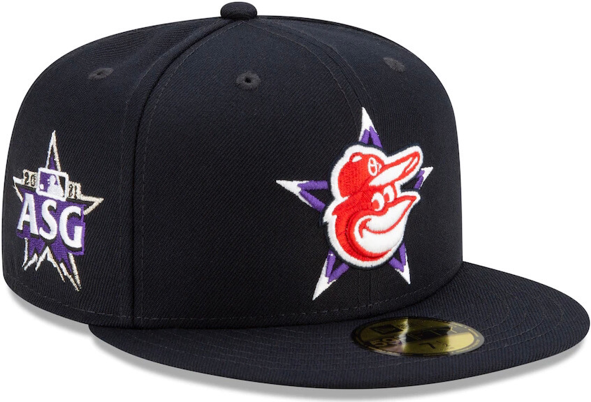
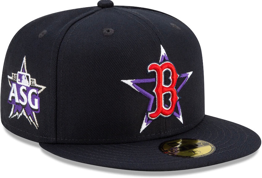
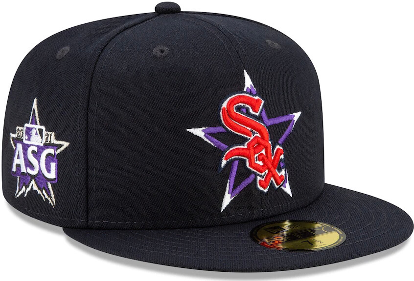
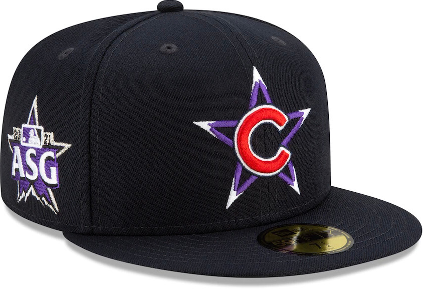
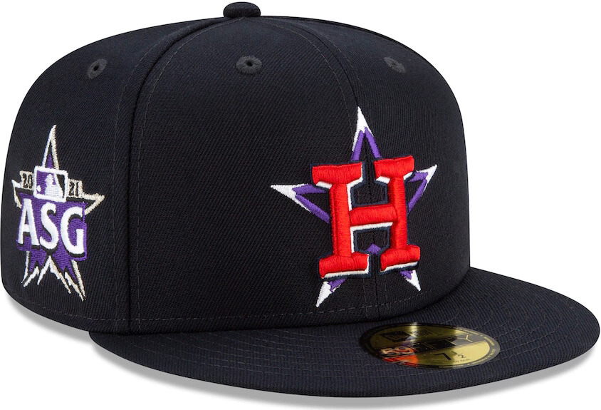
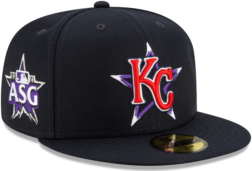
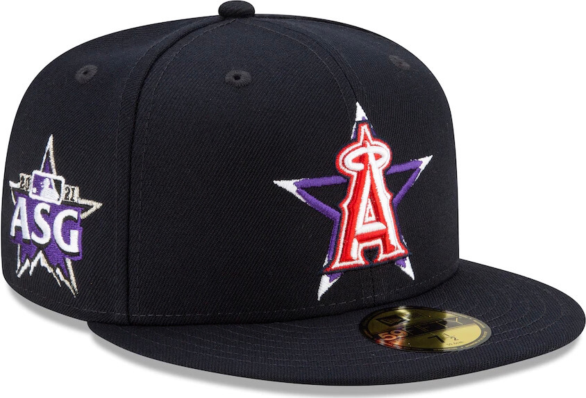
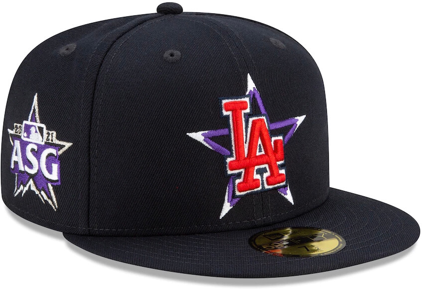
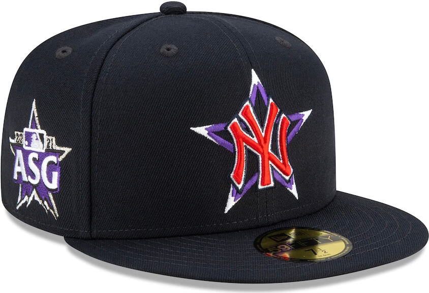
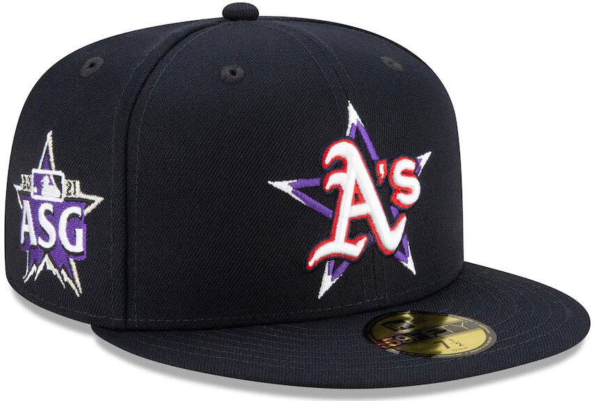
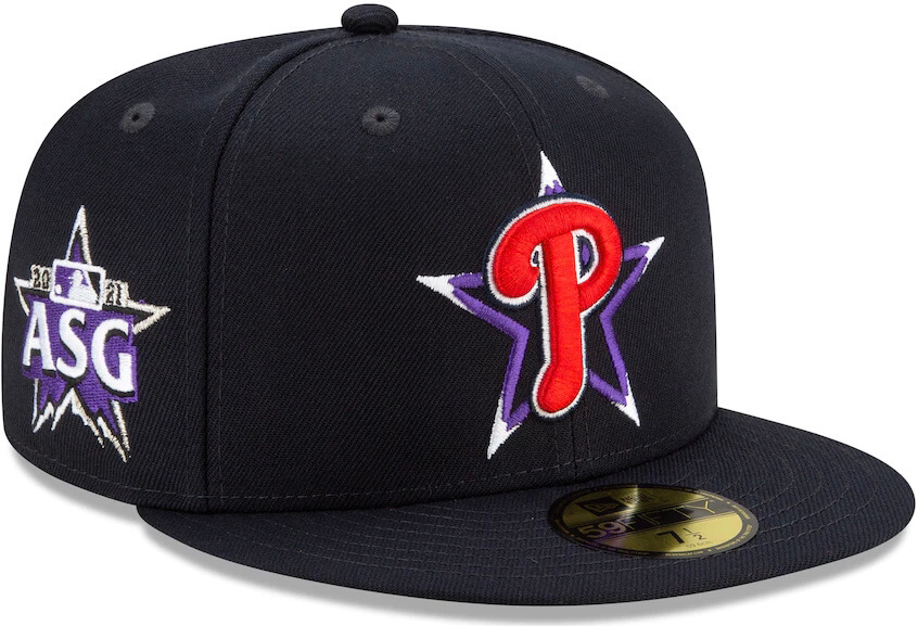
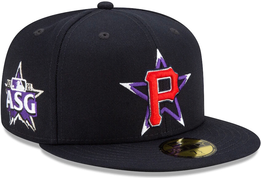
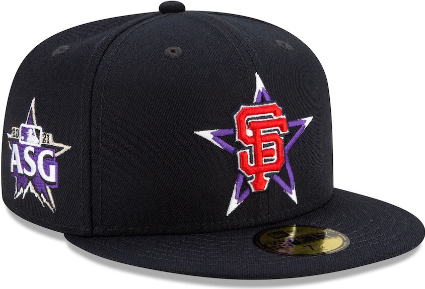
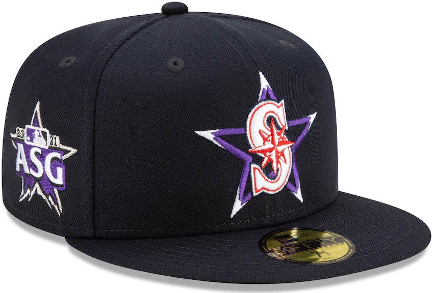
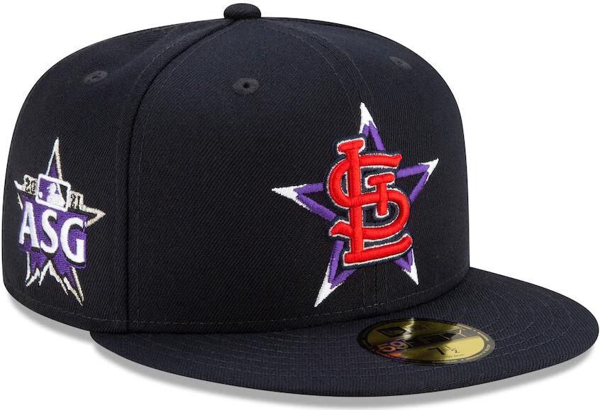
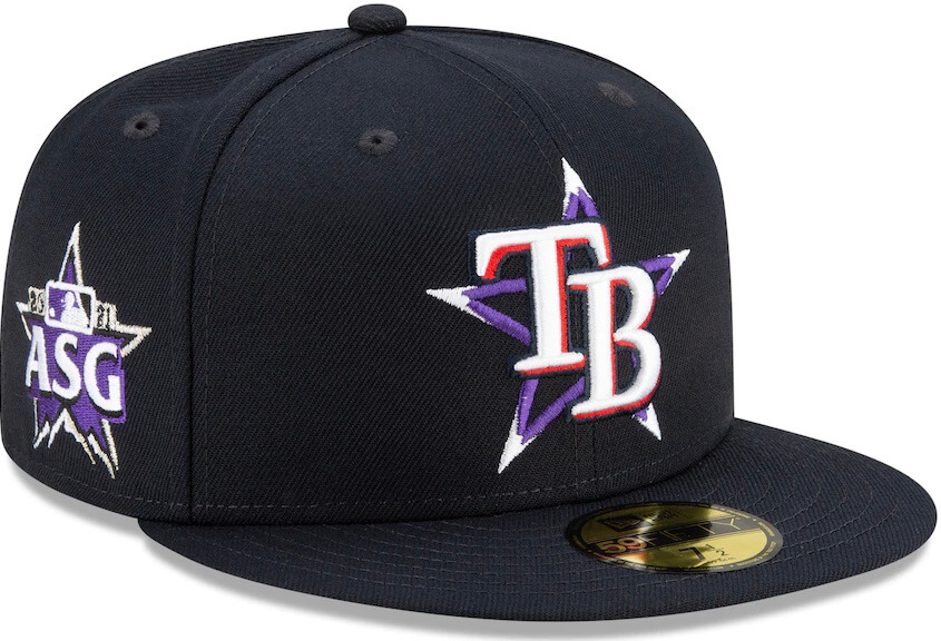
But those days are now gone. MLB yesterday released the jerseys and caps for this year’s All-Star Game, which will take place on July 13 in Colorado. For the first time since 1933, players will not be wearing their regular team uniforms. Instead, they’ll be wearing new jersey and cap designs that have been created specifically for this game.
And boy do they suck. Even if you like the idea of separate All-Star uniforms (a defensible position to take, although not one that I happen to share), it’s hard to imagine anyone liking the execution they’ve come up with, which looks like something from a junior high design project.
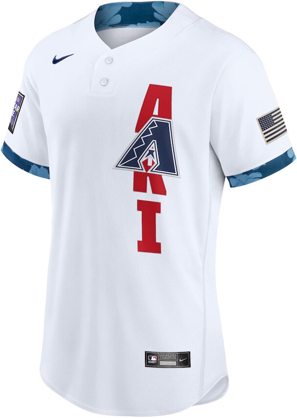
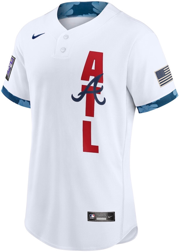
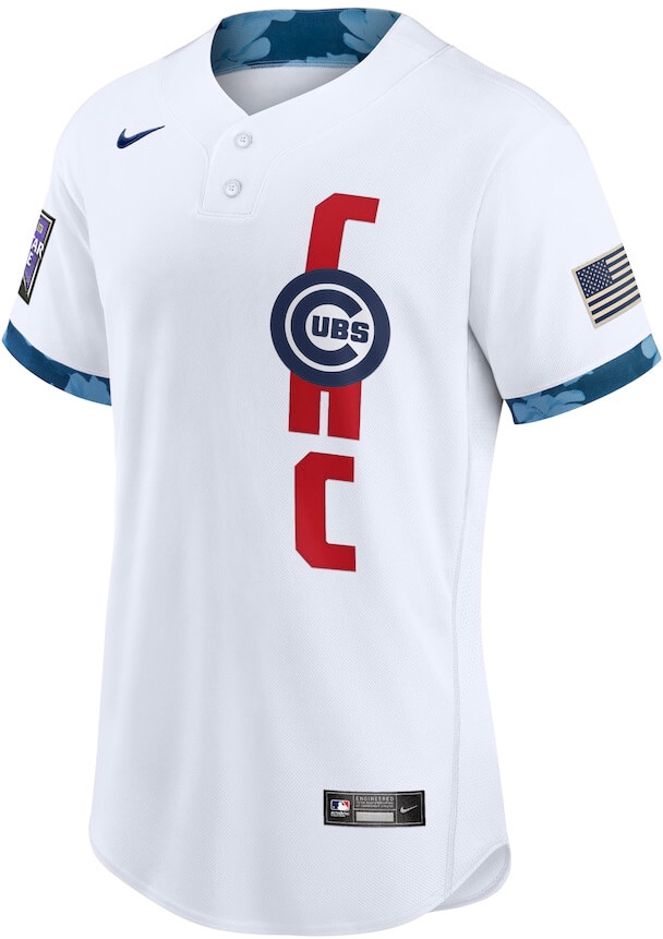
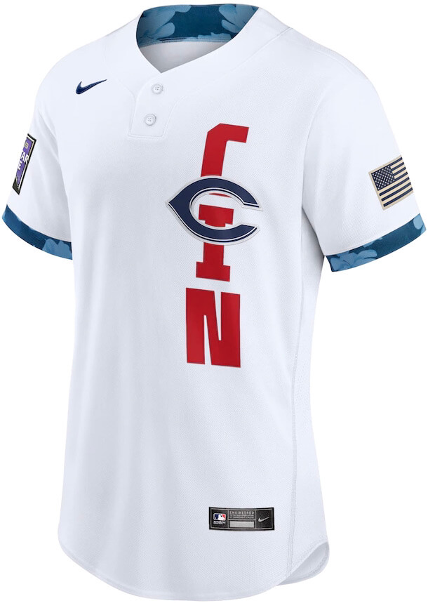
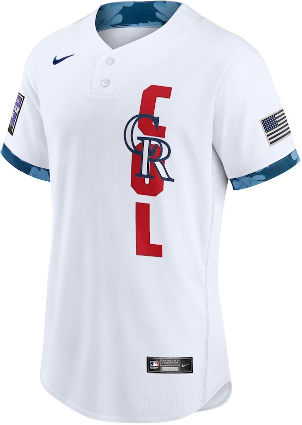
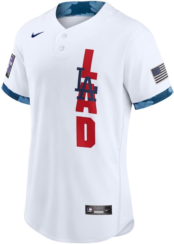
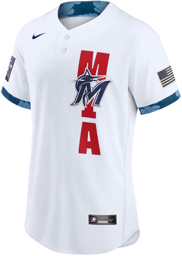
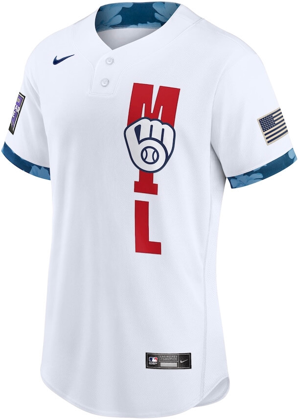
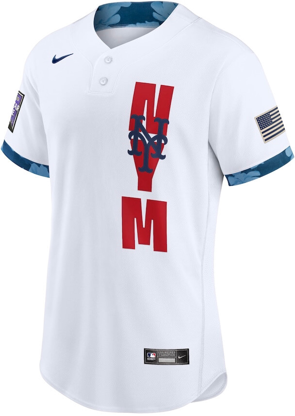
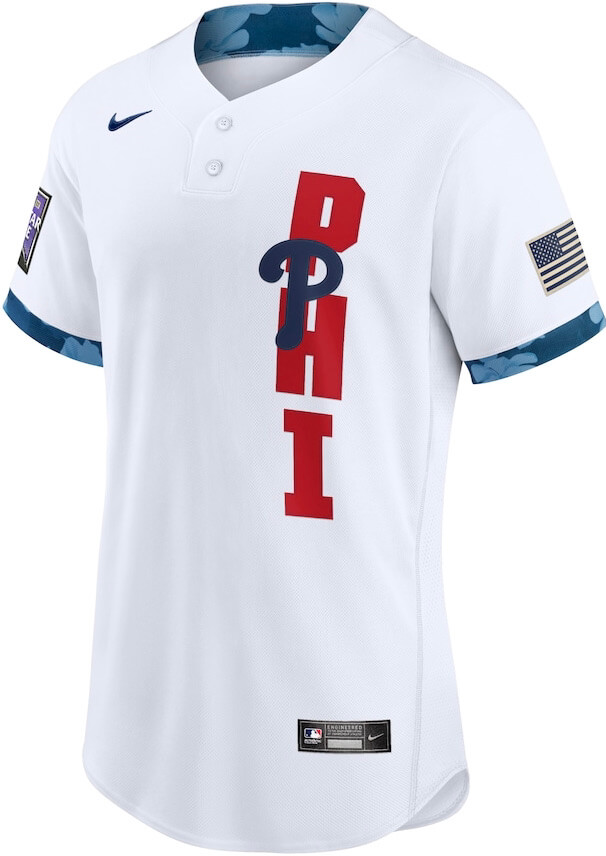
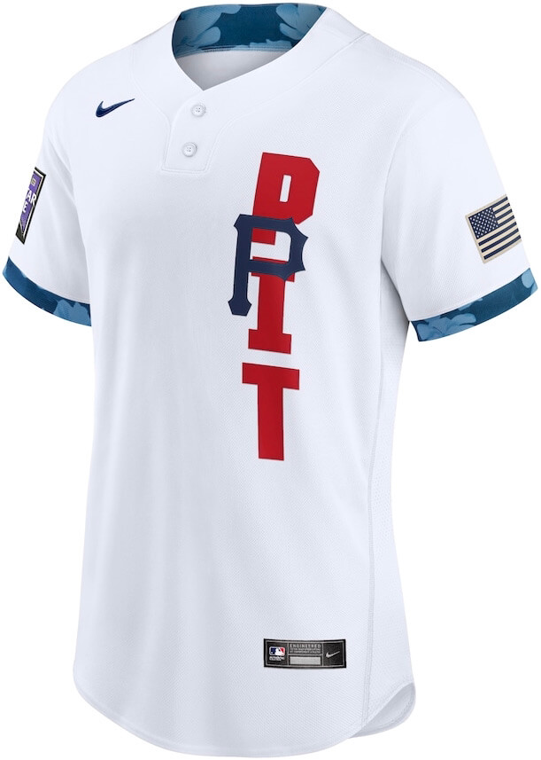
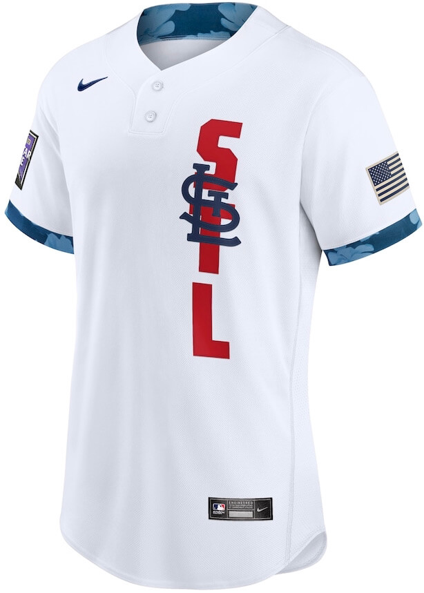
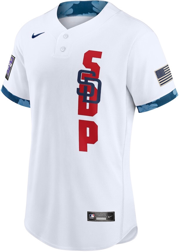
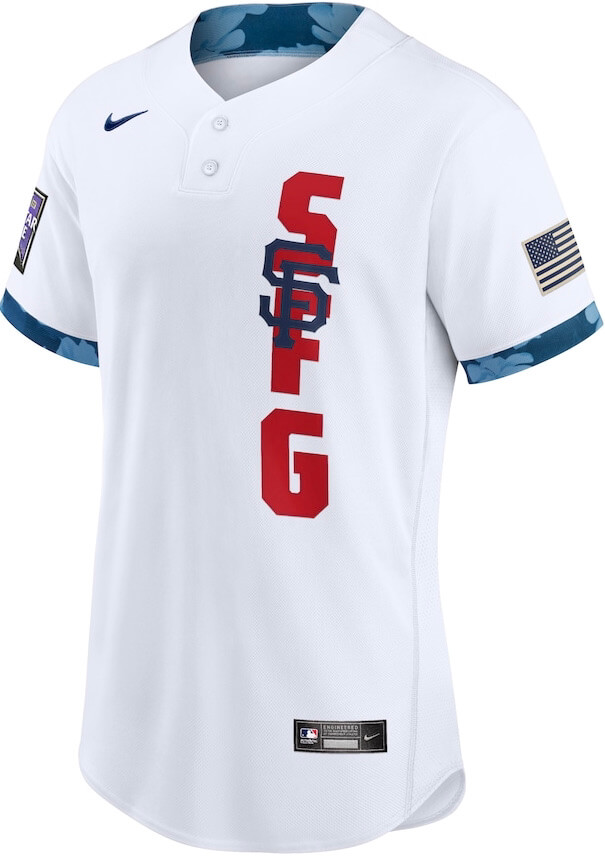
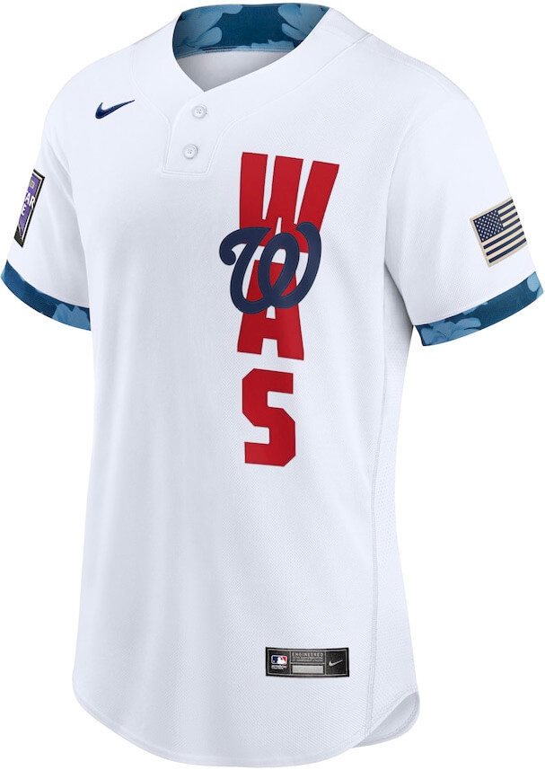
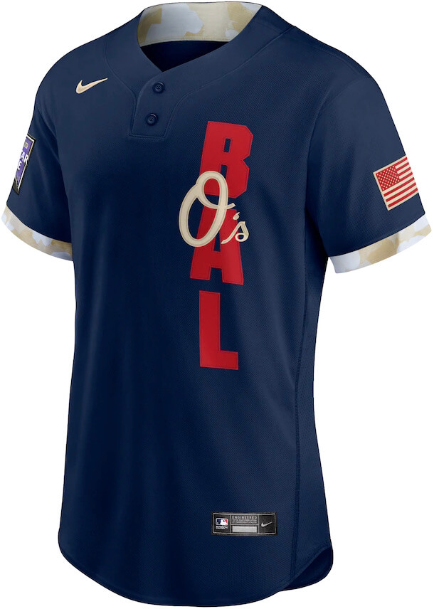
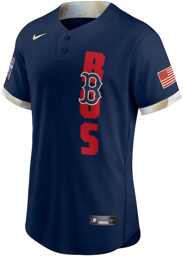
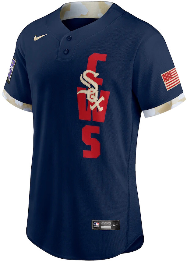
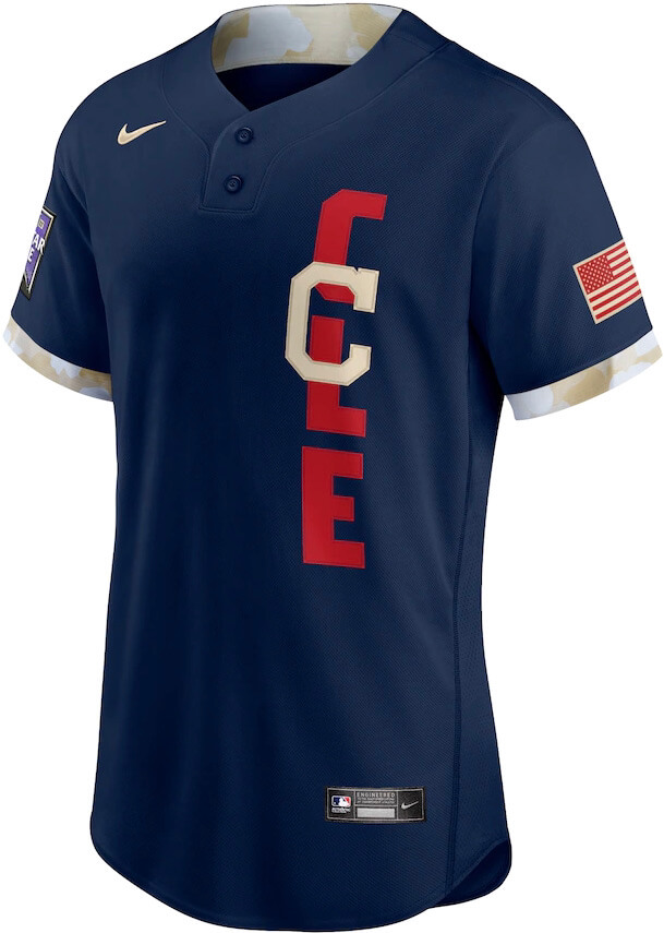
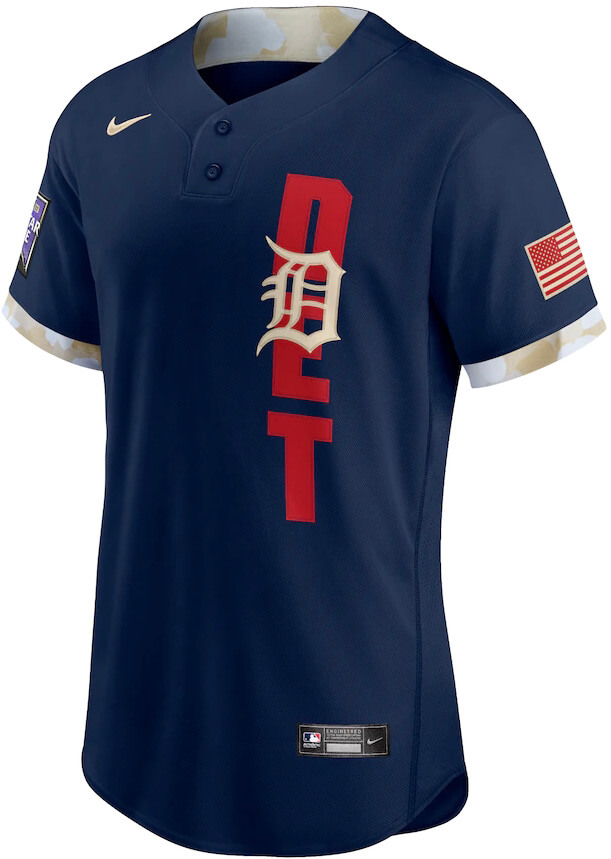
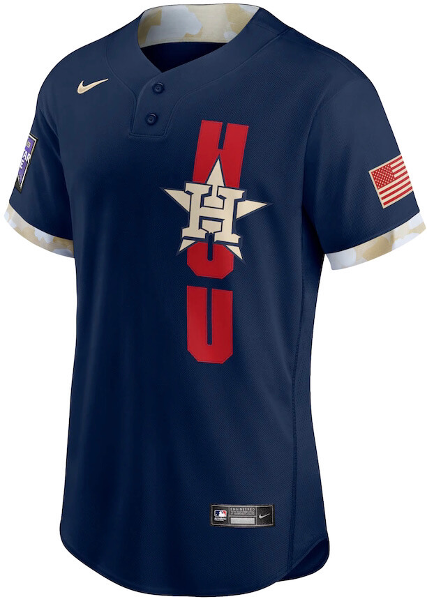
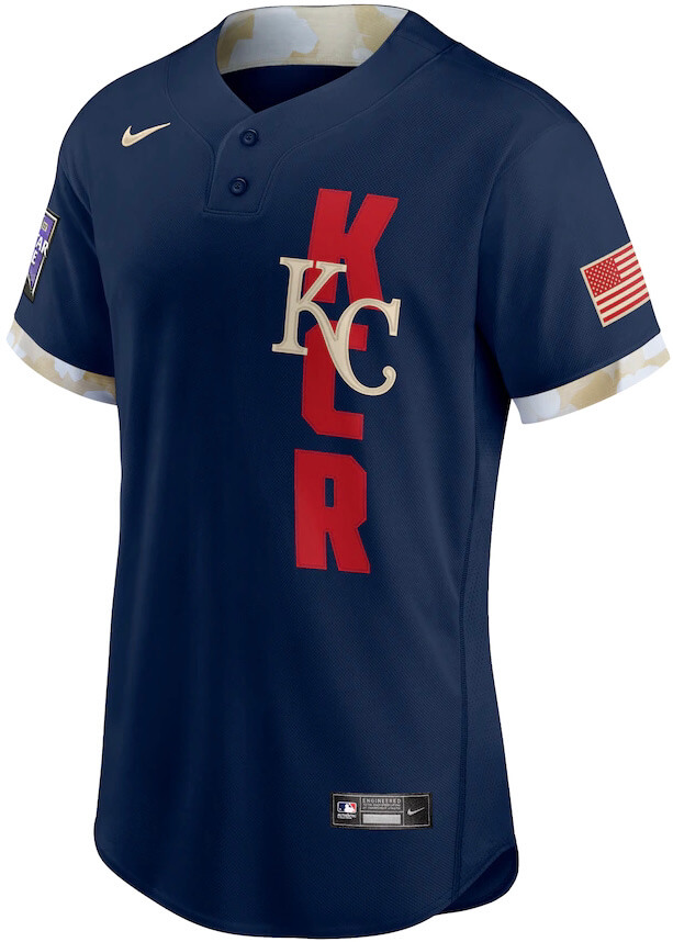
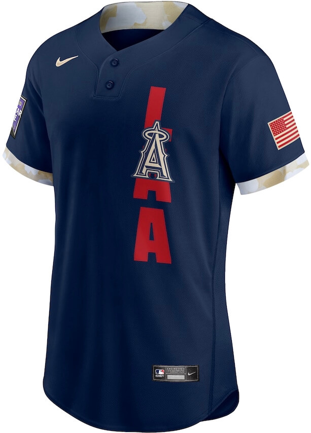
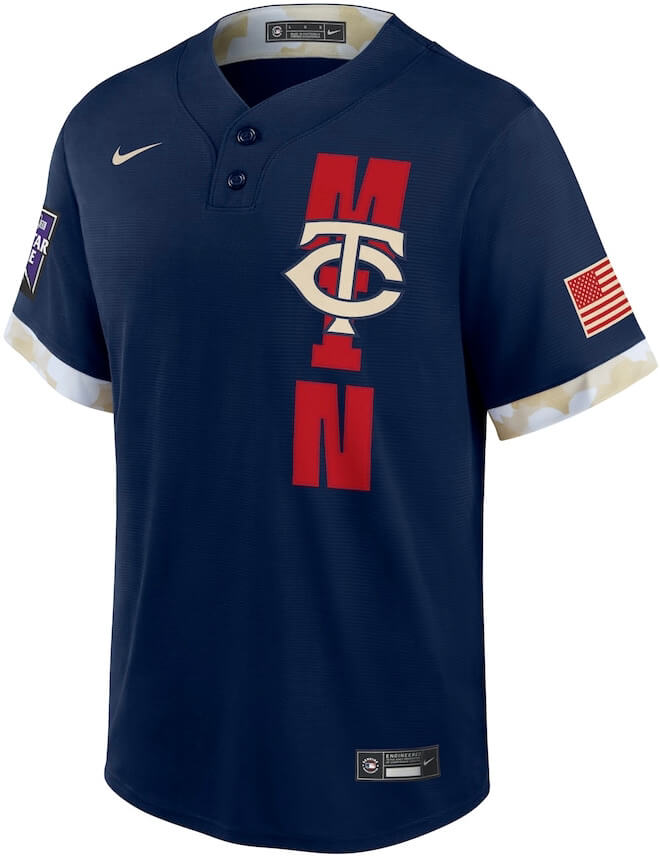
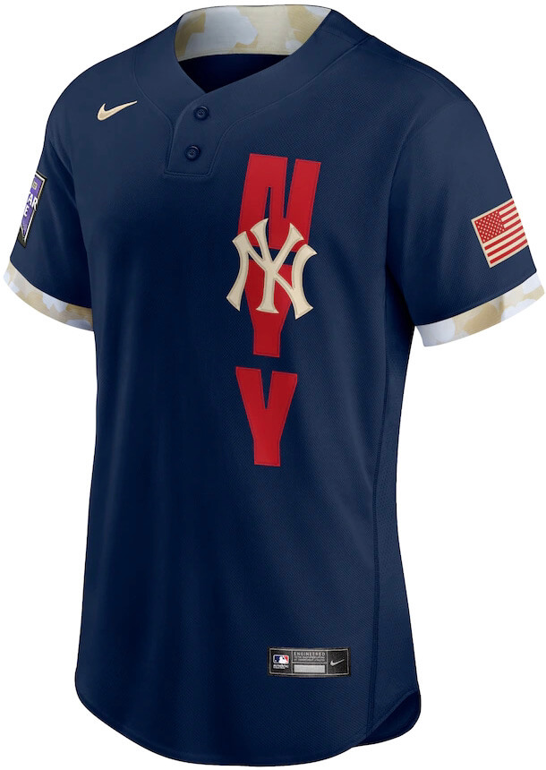
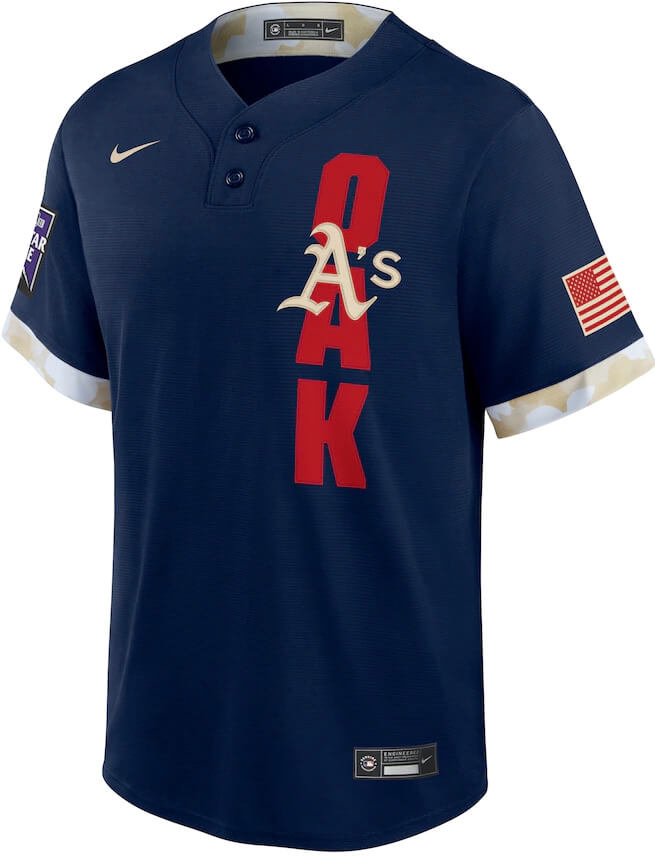
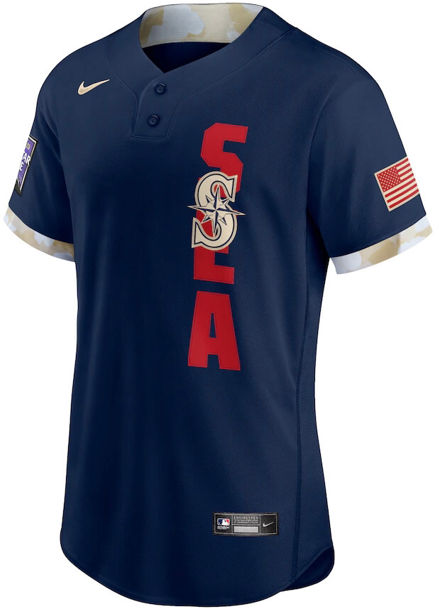
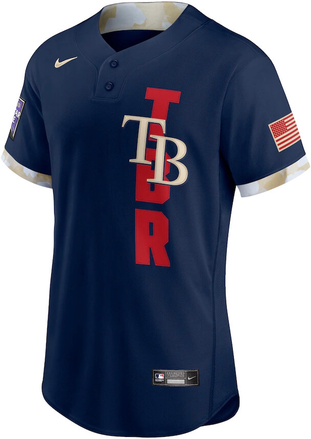
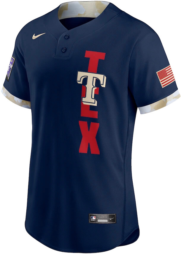
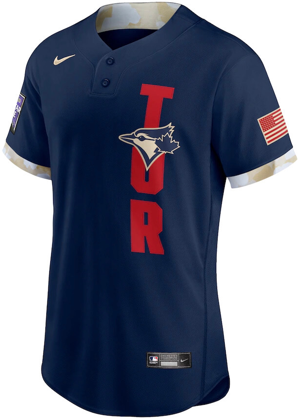
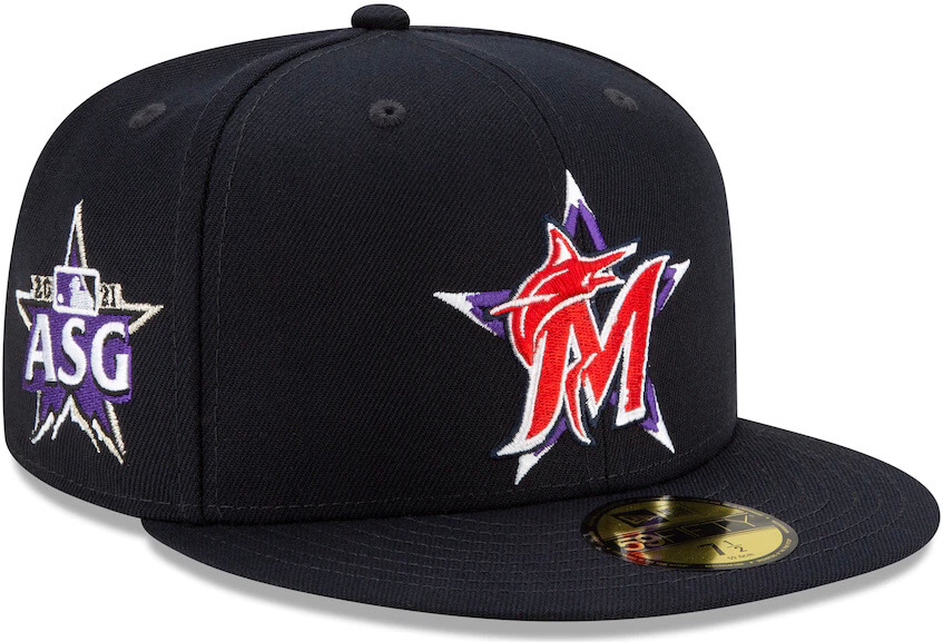
Let’s start with the jerseys: All players will wear pullovers with a two-button collar (in other words, a 2008 BP jersey). Each jersey will have a three-letter vertical monogram indicating the player’s team — “NYM” for the Mets, “BOS” for the Red Sox, and so on — with a team logo (usually the team’s cap logo) superimposed over the monogram. There’s an American flag patch on the left sleeve and an All-Star Game patch (the same one that the Rockies have been wearing lately) on the right sleeve.
The National League is the home team, so their jerseys are white (for all images, click to enlarge):
Yeesh. The American League is the visiting team, so their jerseys are grey navy (again, for all of these images, you can click to enlarge):
Let’s shift into FAQ mode:
Are they really wearing these during the game?
Yes.
Were these same designs going to be worn when the game was originally slated for Atlanta?
Unclear. I guess you could say that the color scheme is somewhat Atlanta-ish, but the overall design template doesn’t really reference any MLB team. It’s its own thing.
What’s with the floral-print trim?
I’ve yet to hear an explanation for that (which is probably for the best, since any such explanation would likely involve cringeworthy “storytelling”). Maybe they’re going for that lucrative Boogaloo market?
Why does the Blue Jays jersey have an American flag?
Good question.
For that matter, why do any of the jerseys have the American flag?
Even better question.
Are you sure they’re wearing these during the actual game?
Yes.
They all look bad, but some of them look worse than the others and I can’t put my finger on why.
The ones where the team logo is comprised of thin, open letterforms (Mets, Royals, Dodgers) are slightly less awful, because you can still read the three-letter monogram beneath the logo. But the ones with solid logos (Brewers, Cubs, Astros) are the worst, because the monogram is obscured to the point of illegibility.
Any other details worth noting?
As most of you presumably know, the Yankees use slightly different “NY” logos on their cap and their jersey. They’ve chosen to use the cap version on the All-Star jersey — maybe the first time it’s ever appeared on a jersey instead of a cap.
What about the back of the jerseys?
We don’t have any visuals on those yet, but Chris Creamer tells me that they’ll have stars — indicating the number of times the player has been an All-Star — below the uni numbers.
Why do the Minnesota and Oakland jerseys look a bit different from the others?
I couldn’t find photos of the authentics for those two teams, so I used replicas instead. Close enough.
What about the Home Run Derby?
Players will wear their regular team uniforms for that, like they did in 2019. (There was no Derby last year.)
Do you think we’ll start seeing two-button pullovers for regular team jerseys?
It seems like this could be a test-drive for that, yes, especially considering the increasing number of players who are choosing to have their jerseys sewn shut. When people are essentially hacking your system, it’s often a sign that the system needs to adapt — form follows function and all that. I could see a situation where a CC alternate is a two-button pullover, or even where players have the option of going with a pullover or button-front for any/all of their jerseys.
What colors will the pants be?
Good question. No sign of those yet, because this is being handled like a merch dump, not a uniform unveiling.
Are they really wearing these during the game?
Yes.
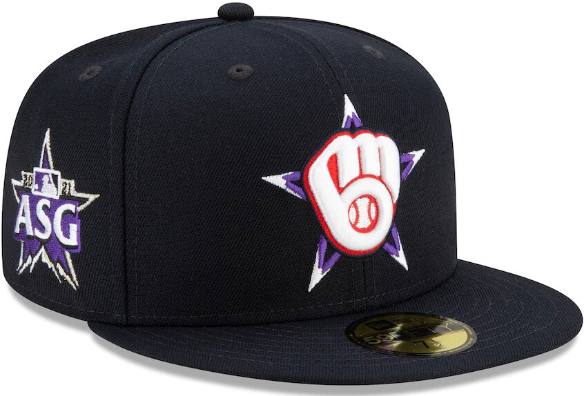
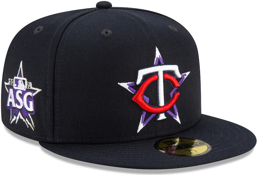
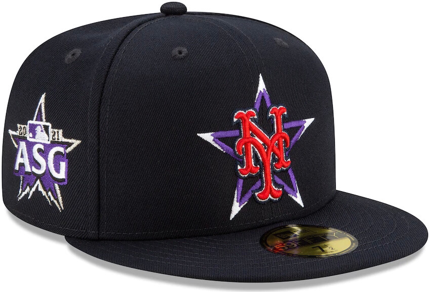
Okay, now let’s turn our attention to the caps: All players for both leagues will wear black caps. The crown will feature the player’s team logo, rendered in red and white (which works out extremely well for the teams like the Twins and Reds, but not so well for lots of the other teams), superimposed over a purple star (which works out well for the Rockies but not for anyone else) with white “snow-capped” tips. The All-Star Game patch will appear on the side:
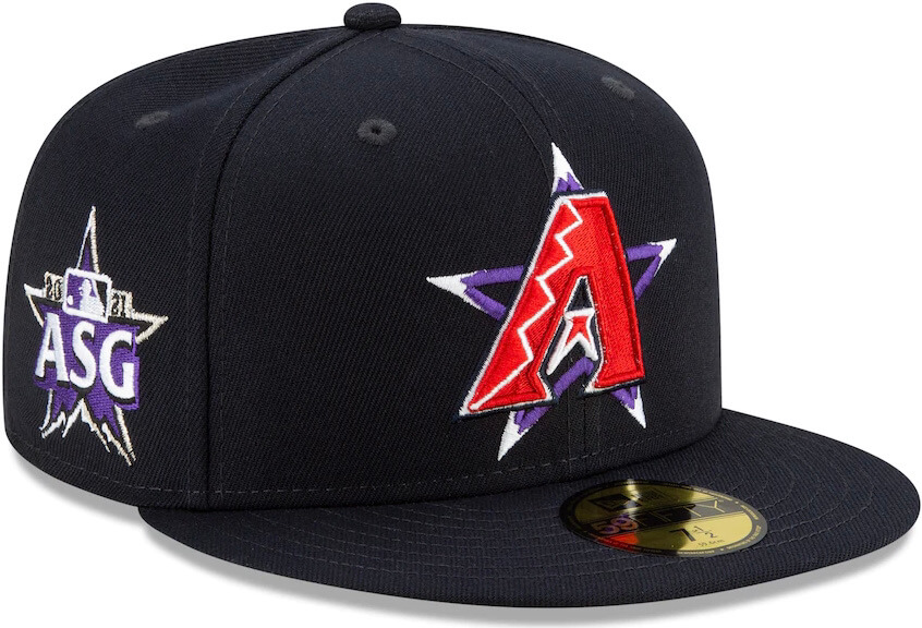
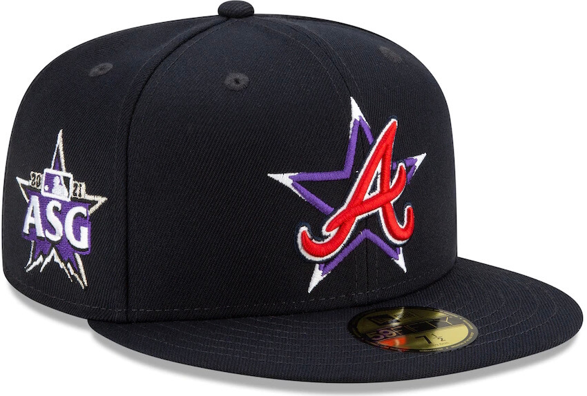
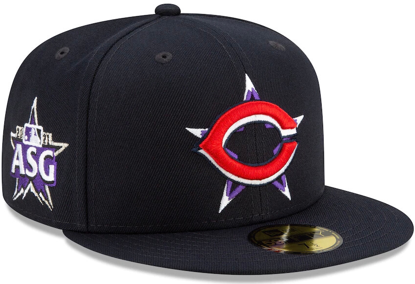
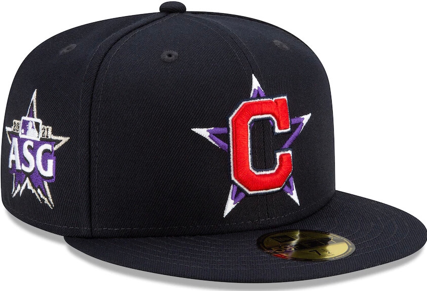
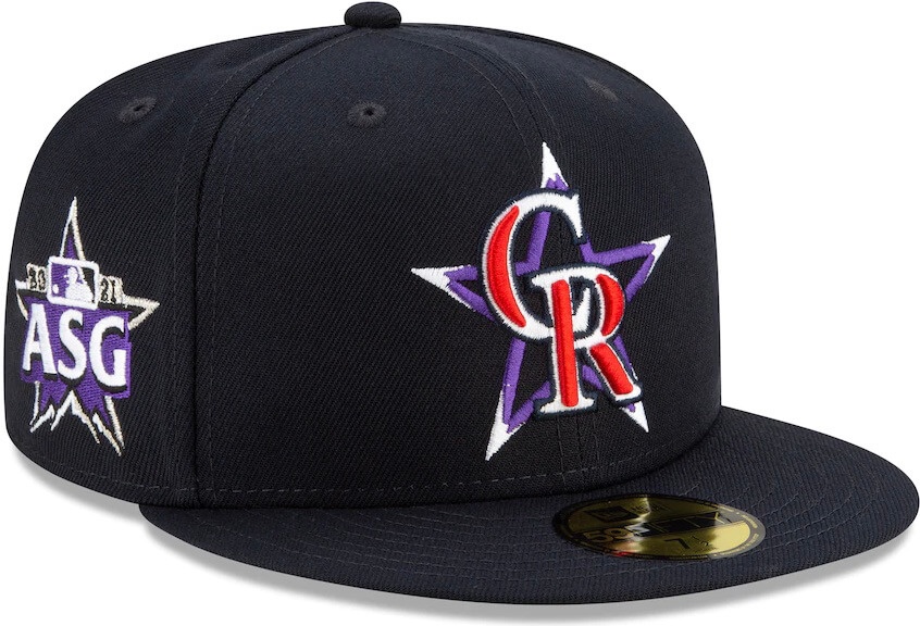
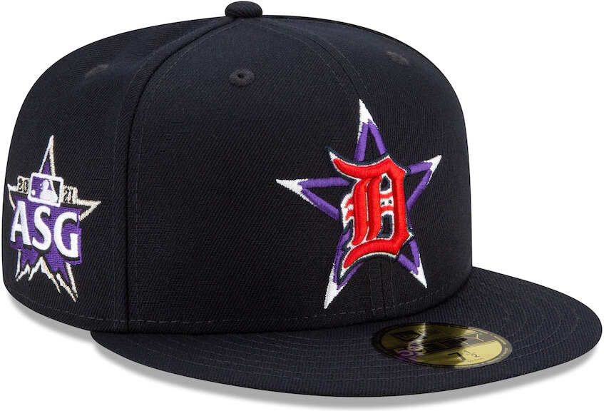

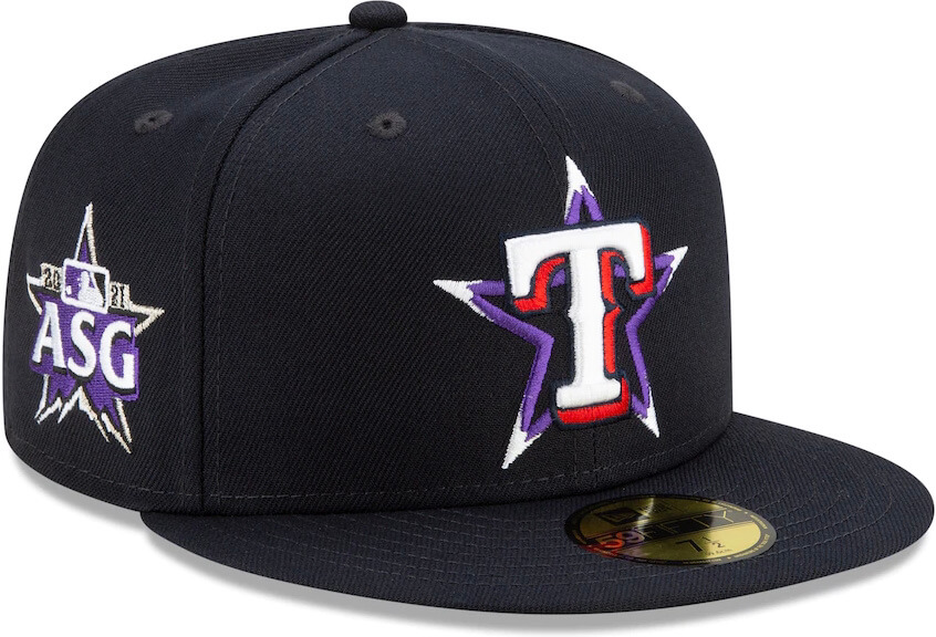
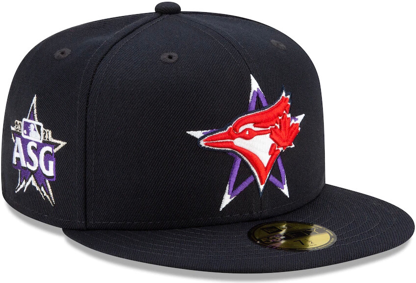
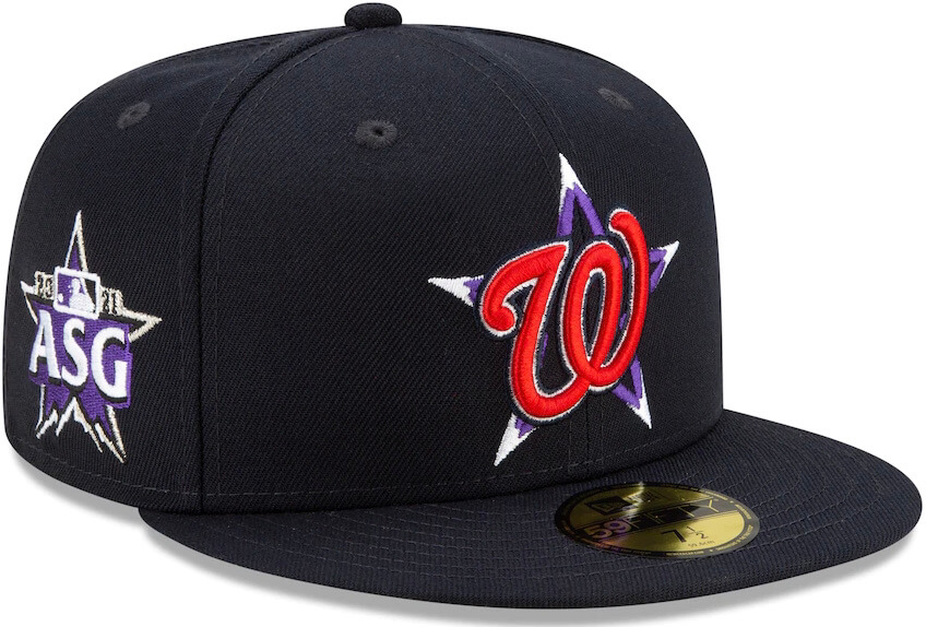
I don’t have much to say about these except that most of them are self-evidently awful, and that using the same hat color for both leagues makes no sense.
So MLB is now treating its All-Star unis as merch-dump costumes, just like all the other leagues. That’s really disappointing, and it eliminates a genuine point of difference between baseball and the other sports — an odd strategic move to take at a time when baseball is supposedly worried about its cultural relevance. Are the merch sales really worth tossing that unique All-Star heritage in the shitter? Apparently they think so.
Sadly, this is the second consecutive day I’ve had to say that this is just the latest in the long run of uni-ruinous actions taken by MLB commish Rob Manfred, who continues to cement his position as the worst thing that has ever happened to baseball uniforms. To put that in perspective, I’ve compiled a running list of the negative uni developments that have taken place on his watch. I fear that I’ll be adding to it quite a bit in the months to come.
Here we fixed it, MLB. pic.twitter.com/k22CHOemvy
— The Seven Six | Apparel Co. (@SevenSixApparel) June 25, 2021
One-shell rule officially on its way out: Yesterday’s other big development came when Pro Football Talk broke the news that the NFL is finally scrapping the one-shell rule — but not for this coming season.
Starting in 2022, teams will be able to have a second helmet shell, which they can use with any alternate, throwback, or Color Rash uniform. There are some additional details in this NFL.com article, including the following tidbit: “Teams must inform the league office of their intent to use an alternate helmet in 2022 by no later than July 31, 2021. So, we’ll know this year which teams plan to utilize throwback/alternate helmets in 2022.” (I think the better way to look at this is that the league office will know which teams are adding a new helmet. The rest of us will know only if the teams choose to tell us, and it’s entirely possible that some teams may prefer to keep their uniform plans under wraps for a bit.)
Like most fans, I’m happy that this will allow the return of Bucco Bruce, Pat Patriot, and lots of other fun throwbacks. (The Seahawks are already hinting that they could wear their 1970s design.) But I worry that it may also open a Pandora’s box of gonzo alternate designs. Be careful what you wish for, people — within a few years, it’s possible that we may be pining for the one-shell era.
(My thanks to our own Brinke Guthrie for the NFL.com article.)
Click to enlarge
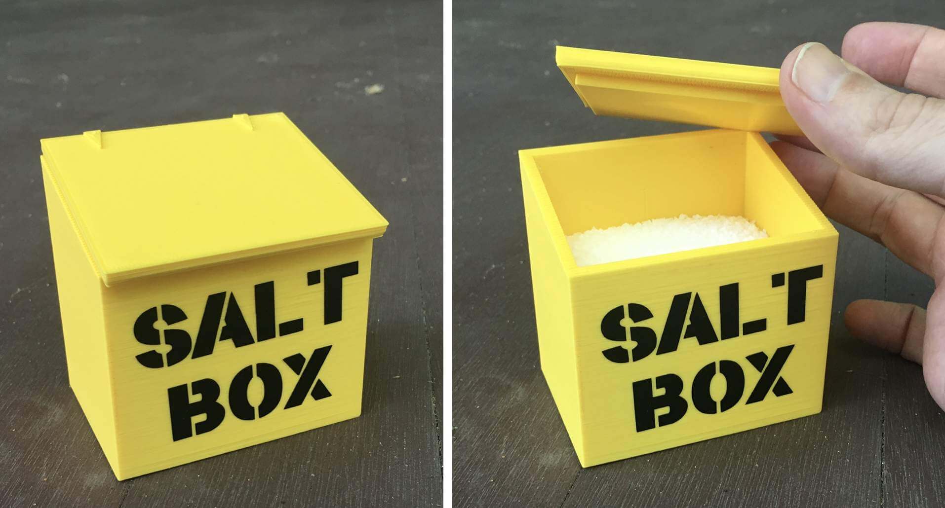
Salt box update! Remember my post back in February about the amazing community art project to redecorate the salt boxes of Baltimore? The artist behind that initiative, Juliet Ames, has been selling little 3D-printed salt boxes, one of which unexpectedly showed up at Uni Watch HQ the other day, courtesy of longtime reader/pal and Baltimore booster Jack Krabbe. As you can see above, we wasted no time filling it with salt, and it now resides on our dinner table. Thanks, Jack!
If you want one of these for yourself (or the slightly pricier version that comes with a hinged lid), Ames sells them here.
The Ticker
By Anthony Emerson

Baseball News: Reader Bud Parks stumbled upon this YouTube channel showing off what it alleges will be 2022’s Spring Training and St. Paddy’s Day caps and new apparel. Linked in the description is a sharepoint file that looks legit enough, but you never know with this stuff. …To advertise their 1989 batting helmet giveaway, the Red Sox produced a really fun commercial with pitcher Rob Murphy. … Here’s a fun article on the man behind Obvious Shirts, a company that sells shirts with boldface Helvetica statements like “Javy Báez is good at baseball” and featuring no other design elements. They’ve become something of a phenomenon among Cubs fans (from Kenneth Traisman and Eric Bangerman). … Mental Floss has an article about why baseball players wear stirrups (thanks to all who shared). … Little Leaguers in French Lick, Ind., will wear uniforms inspired by Negro Leagues teams the French Lick Plutos and West Baden Sprudels (from Patrick Barnett).

NFL News: New England radio station 98.5 The Sports Hub has ranked every primary uniform in Patriots history (thanks, Phil and Kary Klismet).

Hockey News: The Kraken have unveiled their expansion draft logo (from Wade Heidt).

Soccer News: Celtic’s home and third kit have been leaked. The third kit marks the first time ever that the Scottish giants will wear red as a design choice, a color traditionally associated with their crosstown archrivals Rangers (from Ed Żelaski). … Also from Ed, new home kit for recently promoted EFL Championship side Blackpool . … One more from Ed: New home kit for Bundesliga team Arminia Bielefeld. … Every MLS team will get July 4th warm-up shirts based on an old USMNT design (from our own Jamie Rathjen). … Juventus’s away kit has been leaked, featuring a weird sort of iridescent effect on the Adidas sleeve stripes. That advertisement logo is dire.

Grab Bag: Here’s a Twitter thread that’s right up my alley: What if every U.S. president had a modern campaign logo? The project is through Rutherford B. Hayes so far, with more on the way (from James Gilbert). … The Guardian has a fascinating article on the wheeled suitcase and how gender stereotypes held back design innovations (from Akul Nishawala). … Police officers in Schenectady, N.Y., will wear 1950s throwbacks, for lack of a better term, in honor of the department’s 150th anniversary (from Steven Cook). … Take-and-bake pizzeria Papa Murphy’s has launched a new logo and restaurant design (from John Cerone). … Alexandria (Va.) City High School, which recently changed its name from T.C. Williams High because of its former namesake’s segregationist past, has unveiled its new school logos (from Kary Klismet). … A hotel where Kevin Coy was staying in Charleston, S.C., has a “Wet Floor” sign shaped like a banana peel! … Edina, Minn., Public Schools have received a cease-and-desist letter from the designer of their “Hornet” logo, a former student who won a logo contest in 1981 (from Jimmy Lonetti and Paul Allan). … The cycling team Alpecin-Fenix wore these purple and yellow jerseys in memory of cyclist Raymond Poulidor for yesterday’s formal presentation of the teams for the Tour de France. Poulidor died in 2019 but his grandson, Mathieu van der Poel, is riding in his first Tour. They said they can’t actually wear these for the race itself (from our own Jamie Rathjen).
Our latest raffle winners are Chris Hickey, Rob Liebhart, and Jesse Holt, each of whom has won a Uni Watch T-shirt. Congrats to them, and big thanks to Tyler Kulasza for generously making this raffle possible.
That’s a wrap for this week. Enjoy Phil’s weekend content and I’ll see you back here on Monday. — Paul
Are they really going to wear these during the game?
Guessing teams will wear home white (or pins) and road gray pants…
The *only* good thing about these jerseys, and this is damning with faint praise, is that at least they’re henley (style) vs. straight pullover. But still, complete shite.
Would it not be sufficiently great if the players simply refused to wear these ridiculous tops?
It’s obviously not my place to speak for Paul, but my first thought when I saw the MLB jerseys was that he might say ok I’m done with this whole uni thing. We’ve officially gone too far.
A Baltimore booster named Jack Krabbe? Douse him with Old Bay!
Kind of like the Dutch actor and artist Jeroen Krabbe, famed as the evil Dr. Nichols in THE FUGITIVE.
Also, great day to mention Jack Krabbe [sic] as today is the anniversary of Little Big Horn.
#LittleBigMan
Nothing… NOTHING is too obscure in the UniVerse…
That pattern on those awful ASG jerseys looks like it could be magnolia blossoms, which makes sense for Georgia. Not so much for Denver lol.
You could pass them off as columbines.
Possibly the worst jersey design I’ve ever seen. MLB, you have lost your way.
Exactly.
Even if they had come up with a halfway decent design, this is simply awful. Each player wearing their team uniform was one of the great things about the ASG.
I like many are looking forward to seeing many NFL throwbacks make a comeback now that the one-shell rule is gone.
But I would also love something else. The Cowboys having separate helmets when they wear their white jerseys and navy jerseys. An opportunity to get the silvers and the blues on the helmet to match with the pants.
“An opportunity to get the silvers and the blues on the helmet to match with the pants.”
That could be done simply by having the same silver and blue colors throughout both uniforms, rather than their inconsistent design standards currently in place.
I would be all for that. Going back to this:
link
“Every MLS team will get July 4th warm-up shirts based on an old USMNT design”
Not the 3 Canadian teams though right?
Cue Natalie Portman Star Wars meme
Sorry, no, but they did include Charlotte as well.
Those MLB designs represent why I cannot stand Nike and the merch dump nature of one off uniforms.
And I think it is fair to say that while there are always trends in uniform design that push the envelope, they ebb and flow, and we always sort of end up back somewhere pretty close to classical design standards for each sport, it is different now. With uniforms that are designed for merchandise sales rather than actual aesthetics, it makes me question if we ever get back to a point where classical design will become the norm again, that instead we’ll forever be in a cycle of one off merch dump uniforms that are different simply because they need a new product to sell.
“KCR” and “TBR” are horrible abreviations for the Royals and the Rays. Out of context, I would have never guessed what those stood for. I can understand BOS or LAA or TOR etc. Those uniforms are weird.
Ditto for “SDP.”
Tritto for SFG.
abbreviations*
Profootballtalk is reporting that the deadline to announce a new uniform for the 2022 season as passed. So teams like the Pats (red), Bucs (creamsicle) and Titans (columbia blue for the Oilers) would need a “new” jersey to pair with their throwback helmet would have to wait for the 2023 to inform the league of their “new” jersey. Unless the possible demand ($$$) for the throwback jerseys is so great the league waives this.
Only caveat to this (in my mind at least) is that there have been rumblings on the one shell being lifted for a while, and teams may have already announced, to the league, their intent to have a throwback once it was lifted. Certainly we know there are 2021 alts we have not yet seen/confirmed, so it remains a strong possibility that the groundwork may have been laid here.
You should do a flash design contest-you get 24 hours to design a better ASG uni (including pants/stirrups). I bet you could get literally 100 better ideas.
I am one of the probable minority that likes the idea of NL/AL ASG jerseys, ever since seeing the Cracker Jack Old Timers Game in the early 80’s and thinking “They should do that for the real ASG!”
But these “uniforms” are shit. Full stop.
I’ve already got a better idea, which is that they keep doing what they were doing and have each player wear his team’s uniform. I didn’t even have to open MS Paint!
Why wouldn’t the Blue Jays have the US Flag; their home stadium is in Florida?
Well, Buffalo now, but yes, it’s in the US of A
I’d go so far as to say that Rob Manfred is doing significant harm to the game of baseball, and the way he’s treating uniforms is only one small part of that. Yeesh.
100%
I think back to Paul’s feature on the unwritten rules. And it seems like Manfred is part of the group that think the way to “fix” baseball is all the theatrics, the flash that will trend on social media for a day and then be forgotten.
It is amazing to me that they don’t get that a large part of the appeal of baseball is the pastoral, timelessness of it. If you start actively trying to make it trendy you may end up losing as many eyeballs as you gain.
Say nothing of the fact that most obvious problem is pace of play, which is easily fixable if you just tell the umpires to enforce rule already out there, like not letting the batters step out so often. For some reason they don’t want to do that.
I think you hit the nail on the head. Every single one of the things Manfred has done to make baseball better has made it worse. A little bit at a time. The bad decisions range from stupid (this kerfuffle about sticky substances) to out of left field bizarre (these All Star Game uniforms and 2019 players weekend).
There are plenty of things about baseball that should change–I, for one, am supportive of the players showing more personality on the field–but the way Manfred tries to manufacture these changes in an unnatural way, and each new thing being so, so misguided, has left me really sour on all of it.
This says “All players for both leagues will wear black caps”, but I think the caps are dark navy blue. It’s hard to tell from the pics, but the MLB website has them all listed as navy. Gonna love how well a navy cap + red logo + purple star and patch will clash. Blehhh.
They sure look black in the photos.
Chris Creamer is reporting that they are a dark navy blue.
Odd that Orioles ASG set has the O’s abomination as a uni logo (which has never been used there before) but the standard cartoon bird on the hat.
Why would MLB use a black cap with navy jerseys? And What’s the point of having the purple accents on the hat if it’s nowhere else on the uniform. This is just awful all around.
What’s with the red stripes on the flag on the blue uni? Sheesh.
OOPS I mean the red stars.
I have loved the All-Star game since I was a kid precisely because of the colorful array of uniforms on display every year. (Heaven knows it was rarely for the quality of the baseball being played!) By turning the game into just one more hideous, greed-suffused ploy to wring every last nickel they can out of the hands of fans and (most importantly) “lifestyle brand”-obsessed non-fans alike, Major League Baseball has finally lost me.
With this year’s All-Star Game almost literally in my backyard, a friend of mine and I were seriously entertaining the notion of going. Having now ruined the one thing that always drew me to the ASG, there is no way I will pay money to watch this eyesore of a game in person. I won’t watch it on TV, for that matter. The event holds nothing for me any longer.
What about going for the HRD, Kary? At least then you’ll see team unis…
Maybe. It’s not quite the same thing as seeing all those different uniforms on the field of play at the same time. But seeing one player up to bat at a time wearing his team’s regular uniform is better than nothing, I guess. I’ll give the idea some thought.
I loved the All-Star game as a kid because it WAS an example of excellent baseball played by the best players. The players cared who won, we cared who won, and there is a great deal of baseball lore that has come from things that happened during All-Star games. But that began changing in the 1990s, precipitated, I believe by John Kruk making a mockery of an at bat against Randy Johnson and everyone laughing along with him demonstrating they didn’t care either. The tie game in Milwaukee continued the slide, and I rarely watch any of it any longer. Tell me I’m old, but I doubt I’ll even see those new shirts other than in this blog today. Taking All-Stars out of their uniforms is just another confirmation that it’s all nonsense and show now.
That’s a really good point about Kruk acting like a clown, best one I’ve ever seen on this site.
“I loved the All-Star game as a kid because it WAS an example of excellent baseball played by the best players. The players cared who won, we cared who won, and there is a great deal of baseball lore that has come from things that happened during All-Star games.”
Fair enough. My comment was definitely directed more toward the games from the 1990s on, when it seemed like the players took it less seriously, like you said. A more accurate reflection of what I meant would be, “Heaven knows it *wasn’t always* for the quality of the baseball being played.”
I am sincerely curious about what Nike values in terms of uniform design. Almost literally everything they’ve ever designed themselves has been hideously ugly. These ASG uniforms; the Browns, Bucs, Rams, and Falcons; too many college football monstrosities to count. It’s almost like they’re intentionally avoiding principles of good design. I understand they want “edgy”, and the whole point of quantity is $$$, but who is going to buy one of these ASG jerseys? Maybe a fervent uni-completist, but even then, it’s guaranteed to be the least-favorite item in their collection. You could get a good enough graphic design education on the internet to do better than this just in the time it took me to write this comment.
SDP? SFG? KCR? TBR?
WTF?
And when have the White Sox ever been CWS? The Chicago teams should be CHC and CHW.
GTFO!
And let’s not forget about the recent discussion of altering flag colors. They really mucked it up here in two different ways. And the worst part of the Toronto… sorry, TOR jersey is the maple leaf on the chest logo isn’t red!
SMDH…
“CWS” is not an uncommon abbreviation for the White Sox. I’ve seen it on tv broadcasts, webpages, etc.
But it also stands for College World Series.
Interesting, I prefer “CWS” since, in my mind, “CHW” stands for “Chicago White.”
Similarly, “CHC” bothers me because it feels like it is “Chicago H-something Cubs.”
Weird.
We need to send Chris Sale and his scissors out to Colorado for the ASG.
Tyler Kulasza:
Thanks so much for offering up those items!
Totally agree with 98.5’s Top 10 rankings, though the Bonus section should have put the red facemask look at the top of the list.
Oh my, the Seahawks 1970’s helmet gets a mention. I wonder what comment will be made about that ;)
There is no need for ASG uniforms. Baseball, unlike the other sports, can be played by teams wearing nearly identical uniforms. You aren’t going to accidentally throw the ball to the runner going to third base because you mistook him for a fielder.
I get they were reacting to concussions and CDT, but what was the specific rational behind the one shell rule?
How would a different color helmet be unsafe in the NFL, but not in the NCAA?
Correction: CTE
Here, read this: link
I have been an avid Yankees fan for 40 years and I must say, I never knew the NY was different on the cap and jersey. Blew my mind!
These uniforms really answer the question, “How do we get even fewer people to tune in for the All-Star Game?”
Wait, so the American League teams will be wearing black caps and navy jerseys? What the heck?
So the jersey color scheme is a hat tip to the Braves since the ASG was supposed to be there, but also to the defunct Hawaii pro bowl? And the caps clearly to the Rockies, but why the red logos…what a mess.
I think Uniwatch needs to start a Twitter trend that the players will take notice of.
#weartheregularjerseys
Interesting that our opinions of which of these are least bad are exactly flip flopped. My brain is trying to recognize the logo so those thicker logos that better obscure the abbreviations work better. I don’t need to read the abbreviation.
The kerning on the salt box triggers me more than it probably should. Cool nonetheless.
It makes sense if you think of the letters as part of a stencil set that slide together. The letters would not get that aesthetically pleasing overlap of the “LT” in a stencil setup.
Although, the SA in Salt look pretty good. Hmmm.
Agreed.
It’s only year two of the Swoosh and they have already jumped the shark. The implementation of their new template (next year?) is going to be a disaster. Just terrible.
Nice correction in your copy to “St. Paddy’s Day” on your link to the video description which incorrectly uses “St. Patty’s Day” — all of us at Shamrock Watch — link — thank you Uni Watch!
I had been bracing for MLB’s uniform future to emulate the leagues in Japan and Korea (being MLB tradition plus ads) but with the news these last two days, really seems like they’re redirecting toward European soccer.
Having read about the 2 botton ASG jerseys, I had a flashback to 1978. That was,the year that the Mets became the first team to wear that style jersey. During a Game of tbe Week broadcast, Joe Garagiola noted the new Mets jersey and mentioned that it was the idea of M DONALD GRANT. Yes, the man who ran Tom Seaver out of New York invented the 2 button pullover jersey. According to Joe, Grant got the idea after putting on a 2 button golf shirt at his country club. Joe might have been a member of the same country club as Grant as they both lived in Westchester County at the time. I swear that I heard this. Interestingly, Grant never appeared at Shea Stadium unless he wore a jacket and tie. I didn’t think of this until this morning. I suppose that I consciously removed as many M. Donald Grant stories from my mind as possible.
Didn’t Atlanta bring henleys to MLB when they switched to the feather-sleeve design?
That was a few seasons before the Rangers adopted the look for their mid-’70s road tops(eventually used for home jerseys as well)…both before the Mets started wearing them.
You are correct.
Yesterday is feeling like an epochal day to me. Like, big historical change rarely actually happens on a date, but there’s often one discrete thing where it becomes visible that the change has happened. Since sometime between 1986-1991, MLB has to me been by far the best-uniformed league in American sports. A few teams released clunkers in that period, but the average new-uniform design, as well as the average special-event uniform, which used to be pretty rare, have been at least in the B range for me. Lotta grade-A uniforms, a few B or C unis, rarely a D. Whereas during this era, the NBA dropped off an aesthetic cliff and the NFL’s average quality-of-design has been pretty low.
The NHL in the post-strike era has been nipping at MLB’s heels, and to my mind generally outperforming MLB in terms of uniform design. The average NHL new-uni or special-event-uni has been more like an A-minus to me. Consistently excellent, and even the very rare clunkers have mostly been middle C unis, not like D or F failures. MLB, meanwhile, has been seeing a decline in the average quality of new team unis and especially special-event uniforms, which have gotten both worse and more frequent. These have been long-term trends, not any single big event. And of course MLB has had some winners of late too, such as the Astros current uniforms.
But then yesterday, seemingly suddenly but also clearly as an inevitable culmination of long-term and accelerating trends, MLB dropped some of the worst, most mid-2000s-NBA, uniforms we’ve seen from any sport in living memory. The era of MLB quality-of-uniform-design preeminence is clearly over. It ended some time ago, but if we need to put a date on the tombstone, it’s June 24, 2021.
Simultaneously, the NFL announced the end of a rule that did more to hold back the quality of NFL uniformery, especially with regard to special-event uniforms, than any other factor in the league. So on the same day that MLB announced the official time-of-death of its aesthetic relevance, the NFL cleared away the biggest barrier to its own potential aesthetic resurgence. As it stands now, the league-wide design-quality rankings for me stand at:
1 by a mile: NHL
2 and probably catching up soon: NFL
3 due to consistent adequacy: MLS
4 (tie, and way way behind 3): MLB & NBA
Honestly, I’d put USL & USL League One ahead of either MLB or NBA.
I think you are overestimating what will come of the end of the one shell rule.
While it prevented throwbacks, it also limited absurd designs, and sort of held the line of how many “alternate” uniforms a team could have. Which I think is a strong part of good uniforms, that there are basically only a home and road, with a rarely used alternate if you must have it. It kept the visual identity consistent. Especially in the NFL. You recognize the helmet so you know who is playing.
Just wait for the neon green Seahawks helmet, or any other nonsense Nike rolls out. The ending of the one shell rule will be more of a blessing than a curse, mark it down.
This is fair, but I expect a couple of things. Either or both of which may disappoint me! 1) In the short term, like through 2026, lot of teams will unleash throwbacks, and in almost all cases this will be the best-looking uniform a given team wears. Fan feedback will likely lead some teams to push the league’s limits as to how often to wear the throwbacks. 2) We’ll also see some non-throwback innovation, such as neon green Seahawks helmets with some kind of alt uniform. No, I don’t like the Seahawks in neon green at all, but it’s a team color now, and the test of good design isn’t whether I think the color looks pretty, it’s how well the uniform holds together and conveys a clear sense of team identity. I have a lot more faith in the NFL’s design approach, even with Nike behind the curtain, than I do in MLB or the NBA.
I’ve been losing interest in the All-Star Game and home run derby for years. I guess I finally have an excuse to not watch. I wish I had a Neilsen box.
The StatCast broadcast of the Home Run Derby is worth watching.
MLB is committing slow ,painful suicide. Destroy the minors. Ruin the only decent All-Star game. Screw with the baseball and the strike zone. Adds adds to the umps’duds. Rich men who don’t know what they’re doing and don’t care. Suffer the children.
Would love to have a “like” button so you could receive more affirmation for this comment, so instead, +1.
+2
I have been reading this site for many years and have never left a comment before, but for me this is the worst uniform news of all. I have been a huge baseball fan for all of my 54 years, and one of my favorite moments of the year is seeing all of the players at the ASG lined up in their own uniforms, it is such a beautiful site. Seeing one of “my” MN Twins standing with all the other teams just always felt so great. With these horrible shirts I won’t even know when one of my favorite players enters the game. If baseball can chase me away they will have lost everyone.
These jerseys are so awful, so plain, so unimaginative but they didn’t hurt my eyes and make me want to turn away. These hats on the other hand… I’m pretty sure these hats murdered my parents. Purple and red are a horrendous combination. Let alone the inconsistent design of the team logos. Team logos in white with red accent are passable but teams like Toronto are just a mess of colors fighting for control. Also the repetition of the star as the patch is redundant and unnecessary and way too big. Does anyone like these at all?
Rather than BOO, they should have used SUX.
Any chance MLB will come to their senses in the next couple of days and only use the unis for HR Derby and BP as in previous years or are they too locked into Nike?
What particularly drives me crazy about the All Star jerseys and caps is that the logo coloring isn’t consistent. On the NL jerseys, each logo is blue except for the Brewers; those colors could be inverted. On the AL side, the logos are cream except the Red Sox and the Angels. (Maybe cream pants?) On the caps, I initially thought after a quick glance that the NL logos were red and the AL logos were white, but that’s not consistent either. Also, why are the AL logos cream on the jerseys but white on the caps?
If you’re going to do something, do it fully. Otherwise, it’s amateur hour for what you want to be one of your showcase events.
“Amateur hour” – oh how I hate this phrase. I submit that no reasonably design-conscious amateur designer or team of amateur designers would produce a uniform program this poorly conceived or this maladroitly executed. Bad design doesn’t look like amateur work, it looks like bad work. You have to assemble pros to create uniform designs this thoroughly and irredeemably bad.
Haven’t scrolled all the comments so maybe it’s been raised, but wondering if players will be wearing their own regular season team helmets to the plate or will there be ASG helmets?
Oooohhhh — good point. Well, they don’t really sell MLB helmets as fashion accessories, so I’m gonna guess they’ll muck the *uniformity* up even further by making the players wear team helmets.
I would buy that “Boo” Manfried T-shirt in a second…where can I get it?
Probably from the Seven Six Apparel Co., who sent out the tweet and whose website is accessible from the hyperlink in the embedded tweet above.
The 2022’s Spring Training and St. Paddy’s Day caps and new apparel link is dead – did anyone get a screencap?
I gave up watching the video partway through – I can’t stand this type of slow-roll unboxing video, and also hey you kids get off my lawn – and I believe the dude only showed one example cap, a D-Backs BP/Spring Training cap. It was a trucker-mesh back fitted 59Fifty in all black with the alternate snake-head D-Backs logo in black with a red outline and, I think maybe?, some white details. Looked like absolute crap, not even a good fashion cap, so you know, imagine if the same team that designed and approved the 2021 All Star package designed 2022 special event caps, and you’ll be in the right ballpark. I think it might have been a mercy that he didn’t have a St. Patrick’s Day example to show us.
ASG jerseys are bad. Using them in the game will be an eyesore. Nike has gotten generally favorable reviews for their City Connection. The corporate brains figured they had a win with the CC, so lets see how far we can push it. Big mistake. Big mistake.
The ASG jerseys and caps both totally suck, but in different, seemingly unrelated ways. Astonishing.
The Obvious Shirts article reminds me of a time I was in Chicago and saw a guy in a shirt that said “WHITE SOX NEED TO BRING BACK OZZIE AS MANAGER” in large print on the front.
We saw it with the corruption of the Arizona flag. Now Nike shows us how they view the American flag. Nothing has any meaning to Nike. Except to sell execrably-designed product.
I’ve written the following email to Major League Baseball. I doubt anyone will read it but I want them to know that they’ve made at least one fan unhappy. I acknowledge that some of the things I’ve shared in this email are not consensus opinions, but nevertheless, here’s what I wrote:
Good Afternoon,
I imagine nobody will see this, and if anyone does, I recognize that my opinion on this matter is insignificant next to the millions and millions of dollars that MLB and Nike are making in merchandise sales, but I write today to share my continued disgust with the repeated bad decisions made regarding the on field uniforms of each MLB team, culminating in poorly designed and unnecessary All Star Game Uniforms.
The trend of league wide hats and colors on special days and holidays has been going on for a number of years, and in each case, it weakens the unique identities of each team, many of which have been in existence for over 100 years with little changes to their on field identities. The decision, for example, to dress every team in all black or all white with illegible jersey logos and invisible cap logos in 2019, gives a fan the impression that the teams they care about are less important than a league-wide initiative. If these uniforms were in any way well designed, I might understand it, but they weren’t. The same is true for camouflage hats, which are so clearly designed so that fans of a certain political ilk will buy a $40 hat.
These All Star Game jerseys, to me, are the culmination of years of bad design choices. Who are these jerseys for? Is there really a market for something that has nothing to do with anyone’s favorite team, looks bad, and is unrecognizable to a non-fan? The All Star Game has featured players in their regular home and away uniforms for 75 years, so in addition to looking bad, it’s also a change that nobody was asking for. Stop the madness, MLB. Stop trying to fix the parts of the game that aren’t broken and focus on making the game a better, fairer, more entertaining experience for the fans.
There are plenty of special uniform programs that are successful, and should be repeated across the league:
–Throwback games, especially those celebrating the Negro LeaguesTurn Ahead the Clock Night (one or two teams per season could do this on a rotating basis)
–Teams having alternate jerseys and hats fitting within their team color scheme that are occasionally worn–this could easily be expanded. The Red Sox could wear a red cap on Sundays at home, for example.
–Even some of the City Connect uniforms are well designed and interesting. I would’ve preferred the Red Sox continue to have some red in their City Connect uniform, but that’s just me.
That said, these uniform programs where every team looks the same are unnecessary, poorly designed, and an attempt to fix something that isn’t a problem. I implore you to reconsider these All Star Game uniforms. Enough is enough.
Respectfully,
Adam Kane
Cambridge, MA
My goodness is MLB circling the drain big time this week. First it was the “sticky situation pitcher inspection”. Then we moved on to the umpire ad patches. Coincidence? I think not. Hopefully Leader Dogs will step in here. And now today’s abomination. That makes three strikes. Sorry but I just cannot abide them anymore. Is it football season yet?
Just saw Aaron Nola struck out 10 straight, and my first thought was “I wonder which hat he’s wearing.”
As a Braves fan, I can say I feel a whole lot better about the ASG now.
For a few years prior to also adopting a one-shell rule, a bunch of CFL teams had separate road and home helmets. Stampeders had red on the road, black at home; Argos had blue helmets at home and white on the road.
I wonder if any teams will do road and home helmets instead of an alternate to be worn with throwbacks or colour rush. Or match the helmet to the jersey if they are a white-at-home-sometimes team.
We have seen how this can go off the rails as CFL fans. I hated the road helmets for CFL teams. They weren’t the usual helmet colours for these teams and didn’t sit right with me. Especially Roughriders’ white helmets, Stampeders’ black helmets, Edmonton’s green helmets.
There was one CFL team that I would have loved to see doing this and they didn’t. Could have seen the Tiger-Cats back in the yellow helmets and they didn’t do it.
Stamps were red helmets at home. Black helmets on road.
The ASG jerseys have strong early 00s videogame energy – the inability to render different jerseys on the same side, plus the complete lack of taste and bland, sad design EA has plagued the world with for decades.
The Manfred era cannot end soon enough, one just hopes his replacement isn’t worse.
My favorite facet of the ASG was having to pick one player for every team, meaning the only appearance on a national stage for an Angel/ Astro/ Blue Jay/ Brave/ Brewer/ Giant/ Indian/ Mariner/ Padre/ Ranger/ White Sock. It was fun to finally know what their uniforms looked like, and who was their best player.
Get off it.
“Be careful what you wish for, people — within a few years, it’s possible that we may be pining for the one-shell era.”
Hell no. The one-shell rule has been utterly stupid from day one and the only negative to the NFL’s announcement is that it wasn’t consigned to the dustbin of history this season. Because we’ll all have missed out if we never get to see Tom Brady wear that sweet, sweet creamsicle and give Bucco Bruce a post-TD celebratory slap to the head.