By Phil Hecken
Follow @PhilHecken
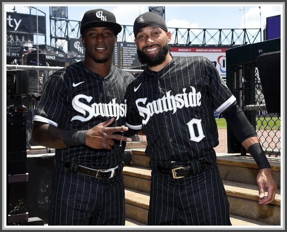
Yesterday afternoon, under some sultry Chicago skies, the White Sox debuted their “City Connect” uniforms, the third (of seven) team this year to do so. If you’re interested in the “story” behind these uniforms, please click here for more details.
As I mentioned in that article, I was a big fan of the uniforms, but wanted to see them on the field. Despite a few minor quibbles (which I’ll detail below), I was a big fan. As I expected, despite the uniforms being “dark gray” (more like anthracite), I thought they would look black on the field of play, and sure enough, they did.
There weren’t many surprises from what was already unveiled, but a couple things about the uniforms were unknown, such as whether the team would create a uni-specific helmet based on their City Connect cap, which they did (this helmet was probably a lot easier than the Red Sox or Marlins to create, as they simply had to replace their current “Sox” decal, and replaced it with a raised-letter “Chi” logo).
What also wasn’t know at the time was whether the team would indeed wear white socks. Sadly, for those who chose to go high-cuffed, the Stance socks provided were about 99% black. So, even for those who showed some hosiery, the effect was long pants/leotards. That would be disappointing in any event, but for a team named WHITE SOX, this was a perfect opportunity to live up to their nickname. This goes double when their pants were black, so the contrast would have been perfect. Instead, everyone appeared in head-to-toe black.
Very disappointed to see the socks are black. This was the moment! Black pants would allow for white socks so easily. Cuz, you know, you’re the White Sox! @UniWatch pic.twitter.com/DcpJJmjlL3
— Yours in Sport (@jamesesiddall) June 5, 2021
Most players simply chose to go long-pantsed anyway. I’m wondering if there were a white sock option whether more players would have gone the high-cuffed route.
It was also unknown how players would treat the belt, as teams now seem to have several options for different colors, and if there is any kind of equipment rule on belt color (I don’t believe there is), it certainly hasn’t been enforced. With this uni, there were basically two options: white or black, and both were used, although I think more players wore black belts than white:
Shoe options were likewise unlimited, but again, white and black were the only options players chose. In this case, it seemed more players wore white shoes than black. Interestingly, there was no “matching” white belt to white shoes (or black to black) per se, but player preference.
Fortunately, the solid black side panels (common to all jerseys, but only noticeable on pinstriped jerseys) did not really detract from the uniforms at all, although they were noticeable.
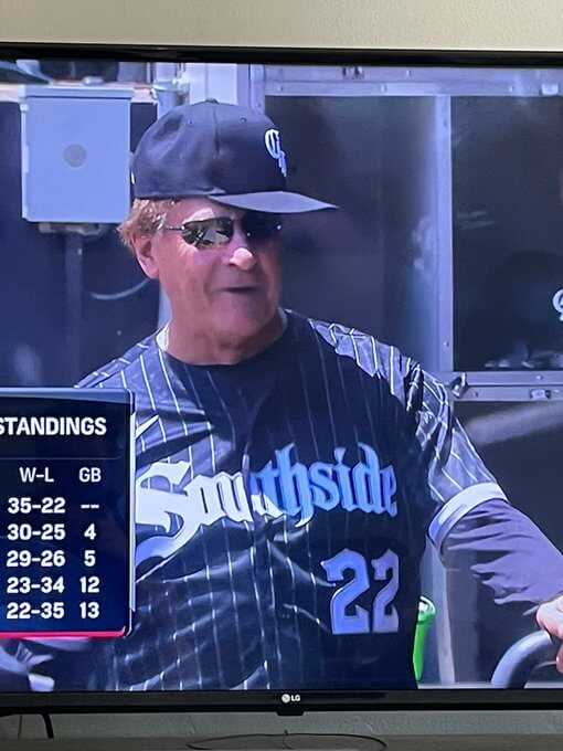
And speaking of skipper Tony LaRussa: about a million people on Twitter posted this screen shot showing him … decidedly … unhip:
Overall, it was a good look for the Sox Southside(rs)…
…who will wear the uniforms a few more times this year. Hopefully when it’s a bit cooler.
Gonna feel like 🔥 wearing all black in Chicago in the summer pic.twitter.com/p1VGd6vPIM
— …!!!… (@PippiNatTalking) June 5, 2021
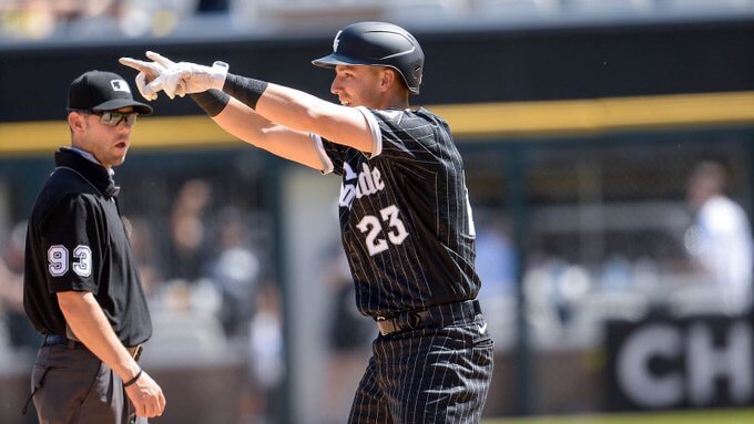
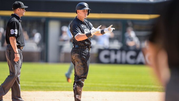
Here’s a couple videos so you can see the uniforms in action:
Jake Lamb is having a resurgence. #WhiteSox close the gap 4-3. pic.twitter.com/wKmD5ygZXq
— White Sox Daily (@dailywhitesox) June 5, 2021
Built different. 😤 pic.twitter.com/dpWwqtWO6q
— Chicago White Sox (@whitesox) June 5, 2021
You can see lots more photos here.
So far, I’ve liked these “City Connect” uniforms the best of the three we’ve seen, although not going with actual white socks was less than pleasing.
Your thoughts?

San Francisco Giants Show Their PRIDE
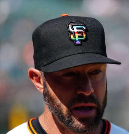
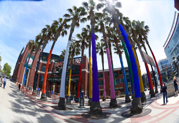
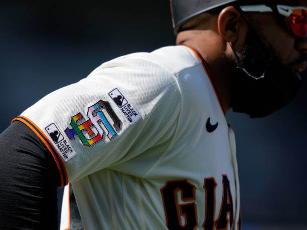
Yesterday the San Francisco Giants hosted their 2021 “Pride Day” and in so doing, became the first team to alter their uniforms to reflect the colors of the rainbow flag on their uniforms. You can see the cap treatment above.
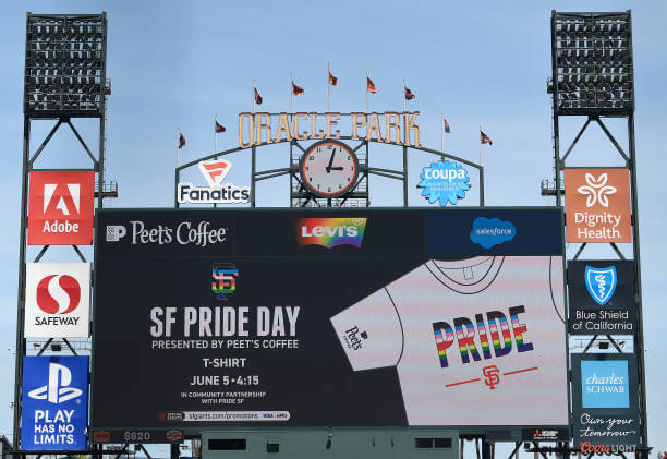
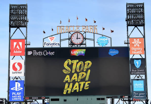
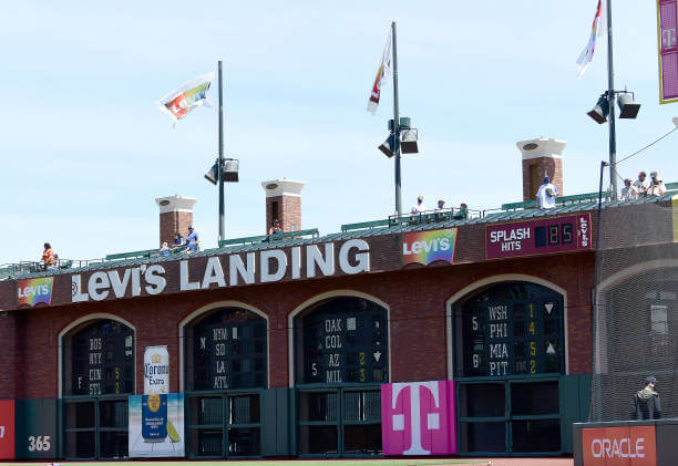
But as San Francisco is wont to do, the park and its surroundings were also decked out in pride colors, and their video boards were full of anti-hate messaging and even the Levi’s ads were rainbow colored:
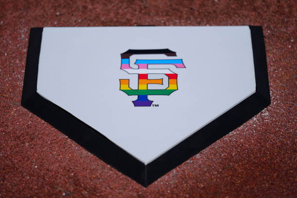
The team didn’t stop there: a ceremonial home plate with the Giants’ interlocking “SF” logo was also rendered in rainbow colors prior to the start of the game:
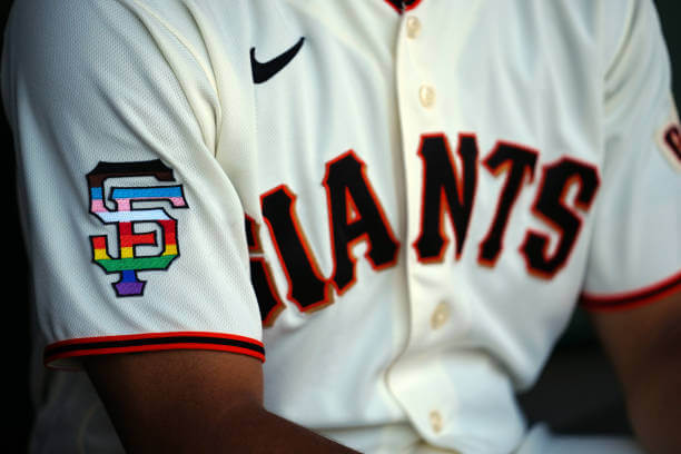
Aside from the cap patch, the Giants also wore their SF logo in pride colors as a patch on their right sleeve:
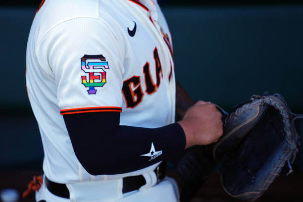
Here’s a closer look:
Some players, including First Base Coach Antoan Richardson, wore additional “Black Lives Matter” patches on either side of their SF logo:
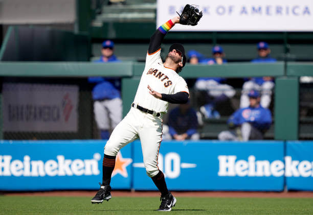
While the rainbow affects on the uniforms were limited to the cap and jersey logo patches, a few players embellished the look by wearing wrist bands on their forearms with rainbow colors:
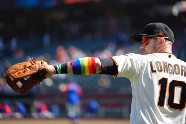
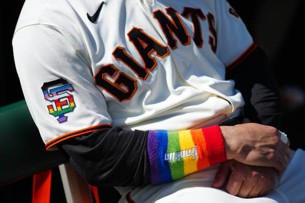
Needless to say, I love this — not just because of what the pride colors represent, but the rather organic way the team went about it: just subtle rainbow colors on the SF cap & sleeve logo (and a few wristbands). They could have gone over-the-top and made their “GIANTS” wordmark and/or uniform numbers/NOBs in rainbow colors as well, but chose the less-is-more route. And San Francisco, with its large LGBTQ population, was the perfect place for a team to show its “PRIDE.” And while I’d like to see more teams acknowledge the LGBTQ community in more visible ways, I think this tribute was just perfect. Well done, SF, well done!
Walter O’Malley’s LA Coliseum Ballpark Plans
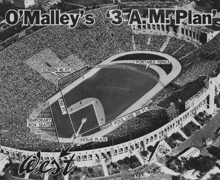
As many of you know, I love old baseball stadia almost as much as I love unis, so when UW stalwart Kary Klismet sent me the following e-mail, I was enthralled!
It’s all self-explanatory, so I’ll turn it over to Kary here:
by Kary Klismet
I recently stumbled across an excellent article on a website run by the family of longtime Dodgers owner Walter O’Malley that does an in-depth examination on why O’Malley chose the Los Angeles Memorial Coliseum over the Rose Bowl and Los Angeles’ Wrigley Field as a temporary home for his team before Dodger Stadium was built. This sent me down a rabbit hole that led me to discover that O’Malley was likely influenced by two earlier feasibility studies to promote using the Coliseum for Major League Baseball conducted in 1952 and 1953 by business and community interests in Los Angeles. I put together a photo gallery showing the various stadium diagrams from these different studies, along with the plans that O’Malley eventually decided on in 1958. And if you’re interested in what it would have looked like if the Dodgers had played in the Rose Bowl or Wrigley, those were covered in recent Ticker submission that you can find here and here.
Regards,
-Kary Klismet
Nice work Kary — and thanks for putting together that Flickr album!

Threads of our Game…
Got an e-mail yesterday from the great Craig Brown, who runs the fantastic Threads Of Our Game website. If you’re not familiar with it, the primary focus is on pre-1900 baseball uniforms and related ephemera.
He wrote:
Examining the baseball uniforms of the Western League of 1899
Hello baseball historians,
We should say thank you to Charles H. Meyer. Meyer was a baseball fan, an entrepreneur, a team official and the ballpark superintendent of the Kansas City franchise of the Western League in the late 1890s. Between 1898 and 1900 Meyer arranged for multiple photos of visiting teams to be taken on the field at Exposition Park in Kansas City. At the end of each year, Meyer sold his photographs in albums as an “attractive souvenir” of the season, with each album offered up at one dollar. Today, these remarkable images show us the gritty life of the minor-league ballplayer of 1899. We see the forlorn expressions worn on their faces and the mismatched uniforms worn on their backs.
“Threads” has examined these often overlooked images, pinpointing the dates when each picture was likely to have been made, and providing a snapshot view of the changing baseball fashion at the end of the century.
Click here to see the uniforms.
Thank you for your time.
Craig
Threads Of Our Game
Thanks, Craig! Great work (as always) on this!

Guess The Game…
from the scoreboard
Today’s scoreboard comes from Martin Nash.
The premise of the game (GTGFTS) is simple: I’ll post a scoreboard and you guys simply identify the game depicted. In the past, I don’t know if I’ve ever completely stumped you (some are easier than others).
Here’s the Scoreboard. In the comments below, try to identify the game (date & location, as well as final score). If anything noteworthy occurred during the game, please add that in (and if you were AT the game, well bonus points for you!):
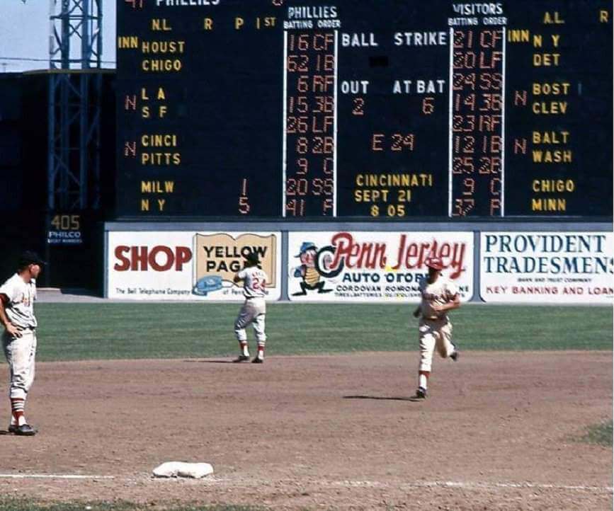
Please continue sending these in! You’re welcome to send me any scoreboard photos (with answers please), and I’ll keep running them.
Uni Watch News Ticker
By Phil

Baseball News: “Think you guys may be aware of this but it has not made the Ticker,” Wade Heidt writes. “The Spokane Indians debuted their new alternate Operation Fly Together uniforms on Friday night. The uniforms will be worn for all Friday night homes games. It is modelled after the Air Force dress blue uniforms. … A new survey has declared “Clark the Cub” as the most popular costumed mascot in Major League Baseball (from Kary Klismet). … The new White Sox ‘City Connect’ jerseys have been commemorated with a Jose Abreu bobblehead. … Check out this great photo of the NLB New York Black Yankees (from SABR Bio Project). … Minor league teams were sporting some pretty colorful looks yesterday (from Minor League Promos). … Looks like a member of the NC State Wolfpack lost his helmet logo (from Chris Mycoskie). … Tweeter In God’s Country writes, “Interesting uniform matchup in Fort Worth. @TCU_Baseball with… snaps instead of buttons? And looks like @DBU_Baseball has a solid B making their top a pull over.” … Kevan Smith was wearing injured Travis D’Arnaud’s gear (from Sander Bryan). … Al Goldberg notes that at the end of yesterday’s Giants game, 2B Donovan Solano “Didn’t wear Pride cap. Might have been oversight, came in top of 9th after Longoria injured running into Crawford.” He wasn’t wearing the shoulder patch either.

Football News: “This article prompted a thought (which maybe you’ve already investigated): who’s had the biggest swing in numbers they’ve worn as a pro (regardless of league)?” says Chris Ode “I’m thinking Carlos Dunlap (#96 in Cincinnati, #43 in Seattle, and now #8 — a swing of 88 ‘points’) has to be a contender?” … Green Bay Packers President Mark Murphy has a monthly mailbag column and the answer to the last question indicates that the Packers will wear a third jersey with “a shade of the color green” this next season. Throwing back to the lighter shade of green from the ‘50s? (from Geoff Poole). … Here’s another article about how prospective players love all the alternate uniforms college football teams (Central Florida in this case) wear these days, how it makes recruiting easier, et. cetera. Does anybody that writes about this stuff seek out any actual empirical evidence, or do they just take it as a truism that “kids love all those crazy uniform combinations”? (from Kary Klismet) … Also from Kary, Texas A&M has unveiled its Orange Bowl championship rings. … ICYMI: the Philadelphia Eagles gold/blue throwback uniform has been named the NFL’s worst jersey. … If you’re a DIYer (or just cheap a spendthrift), you might want to look into buying “irregular” jerseys (from Steve Sher). … Why do players cover their helmets in decals? It’s what makes the Shrine Bowl the Shrine Bowl. Submitter Brett Baker says it’s “A fun read and some great photos.”

Hockey News: Not much hockey news these days, but this is interesting: Jase Greenberg tweets: “Photos credited to u/DolePears on Reddit, but apparently the Hurricanes Stadium Series jersey from supposed to be this season was released?” I’d love to see the full uni, but just from the looks of it, I can say I’m a fan.


NBA/College/Basketball News: Interestingly, the UNC Tar Heels use the same wordmark on their court for both men’s and women’s basketball, but they are rendered differently (from James Gilbert. … For those interested, here is the full uniform tracking for the Los Angeles Lakers for the 2020-21 season (from Lakers Uni Tracker). … New Uni Watch hoops hero? Bruce Brown was the only Nets player on the floor without an advertisement on his jersey (from Eli Behar).

Soccer News: These are English League Two club Walsall’s shirts for next season (from our own Jamie Rathjen). He adds, “The green shirt also serves as the ‘home’ goalie shirt. Usually you only see them overlap like that as a solution for color clashes.” … Soccer club Forward Madison is celebrating Pride Month by releasing rainbow-themed jerseys.

Grab Bag: In what may be one of the most Uni Watch things ever, a new book called Buttons Parade has come out that examines the history of military buttons in Malta from the 18th through the 21st centuries (from Kary Klismet. … The Olentangy Local School District in Ohio has unveiled new logos for its high schools’ sports teams (from Kary, again). … The next FIVE items are also from Kary Klismet: Trinity Valley Community College in Texas has unveiled a set of new athletics logos. … Here’s an article looking at the history of Qantas Airline employee uniforms in the 1980s. … Alaska Airlines has been accused of discrimination against non-binary and gender non-conforming flight attendants because of its distinct uniforms for male and female employees. … High-dollar corporate naming rights deals are creeping into the world of esports, as the Hong Kong-based cryptocurrency exchange FTX has paid the well-established Team SoloMid (TSM) $210 million to change its name to TSM FTX (NYT link). … New uniforms for the Branford (Conn.) High School marching band (thanks Kary!). … L.J. Sparvero notes, “this is the start of the Belmont Stakes on Saturday on NBC, the letter spacing looks odd in “Belmont” but not “Park”. The “E” looks more like a backwards “3” and doesn’t really fit the block capitals elsewhere. What’s interesting the logo in the small white sign below has a similar “E”, so maybe this is a deliberate bit of branding? I don’t know, still think the letter spacing above it was an ‘oops’.” … He continues, “and it gets even more weird, attached is a sign they just showed on TV from somewhere undetermined, this sign has a normal E.” As a PS, he says, “instead of the metal peacock logo paperweights, the outdoor broadcasters use horseshoe shaped ones.” … Interesting article here on how female athletes may be put off from competing since they are required to wear white and light-colored uniforms. … The Navy has quietly rolled out their first maternity Flight Suits. Submitter Timmy Donahue notes, “The service issued the 1st suit to LCDR Jacqueline Nordan, a mobilization program manager in the Naval Air Force Reserve, as part of an early distribution program.” … In FIVB VNL Men’s action Poland and Slovenia went dark on dark. White sleeves are Poland, while the jagged lines is Slovenia (from Jeremy Brahm). … Jeremy also asks, “How about the 7 on the Slovenian men’s volleyball team?” … Also from Jeremy, in Women’s FIVB VNL Poland and Turkey also went dark on dark. Poland (dark blue, far side) and Turkey (black).
Uni Tweet of the Day
I don’t know. In the words of the immortal Jim Vilk, “I’d wear that.”
When fonts go wrong! pic.twitter.com/XUig040oqO
— Giles Paley-Phillips (@eliistender10) June 5, 2021
And finally… that’s all for today folks.
Everyone have a good week and I’ll catch you back here next weekend!
Peace,
PH
GTGFTS – Sep 10, 1964. With 22 games to go in the season, the Phillies were leading the East by 6 games – ace Chris Short pitched a CG for his 16th win against the Cards 5-1.
The Phillies ended up losing 10 of their last 12 games, losing the division by one game, and continued to re-set the bar for futility for all Philly fans.
That number 62 for the Phillies’ first baseman got me wondering; turns out it’s Vic Power, who was acquired that day and was playing in his first game there. He had never worn such a bizarre number before, and I imagine the Phillies gave him whatever was in the closet when he arrived.
All six runs came in the second inning. Mike Cuellar picked off two Phillies runners. The game only took 2:13.
There were no divisions in 1964.
The Phillies blew the National League, period.
Absolutely! Let’s go Phils! ;-)
That’s Johnny Callison rounding the bases after hitting a two-run home run off Ray Sadecki in the second inning. Here’s the box score: link
Bud Elliott, formerly of SBNation, was always very tuned in in the recruiting scene and he definitely spoke to many (elite) recruits who echoed that sentiment. It’s definitely not just conjecture
This may be the case, but reviewing the recruiting rankings for 2020, I don’t see too many programs dabbling in a ridiculous number of alternate uniforms:
1 Alabama
2 Ohio State
3 LSU
4 Georgia
5 Clemson
6 Oregon
7 USC
8 Texas A&M
9 Notre Dame
10 Oklahoma
In fact, outside of Oregon, I would consider all of these programs as having a downright traditional, classic aesthetic. I think recruits mostly like winning.
Nah bro, that is absolutely not accurate. Quite the opposite, actually:
1 Alabama -> true traditionalists, 2 jerseys, 1 pair of pants, 1 helmet
2 Ohio State -> TB unis for 60s, 20s, BFBS uni, grey wolf uni, etc
3 LSU – semi traditional, usually only one look but had some alternates in past years
4 Georgia – BFBS, dawg jersey, alternate helmets
5 Clemson – have only three sets but do purple out, among other things
6 Oregon – the OG uni monster
7 USC – see UA
8 Texas A&M – almost an alternate/year, plus recent redesign
9 Notre Dame – have you SEEN the hideous offerings for the shamrock series?
10 Oklahoma – Wood alternate in both home and away version
And the list goes on. Man, even UM had that terrible all maize uni against UF in the opener a few years ago. You must not watch a lot of NCAAF
I didn’t say these teams don’t have or wear alternate uniforms. I said, in general, they have traditional looks and don’t DEPEND on alternates as their aesthetic or constantly push the boundaries.
There’s a difference between having three or four combos over the course of the year (Oklahoma, Clemson) and a different one for every game (UCF, Oregon).
Alabama – 2 Combos in 2020
Ohio State – 3
LSU – ONE Uniform in 2020
Georgia – 4
Clemson – 4
Oregon – 7
USC – 2
Texas A&M – 2
Notre Dame – 2
Oklahoma – 4
Hmmmmm which team is the outlier here?
who’s had the biggest swing in numbers they’ve worn as a pro (regardless of league)?
Italian soccer, both men’s and women’s, has a thing for high numbers.
Gianluigi Donnarumma wears No. 99 for AC Milan. He also played for Italy’s under-21 men’s team in 2017, when he was well established at Milan, and link.
GTGFTS: This is September 10, 1964, the last win at home for the Phillies before an epic collapse. The 8:05 Sep 21 game advertised in the middle began a 10-game skid in which they were swept in three consecutive series, including at the hands of the day’s opponents, the Cardinals… who would go on to steal the pennant and win the World Series.
Chico Effing Ruiz. Happened the next day. That’s all there is to say.
That looks like Charlie Chaplin in the Qantas Airline image from 1935 (standing on the far left).
My first thought when I see a jersey that says “Southside” is that it looks a movie where the producers didn’t want to pay licensing fees.
My second thought is that the lettering on baseball and basketball jerseys should be either the city* or the team name. City nicknames or neighborhoods don’t work for me, nor do abbreviations of the city name or team name. (I’ll make an exception for the 76ers, since “Philadelphia” is difficult to fit on a jersey.)
*-If the team is named for a state or region, the same rules apply.
Agree with all points (especially the Southside uniforms looking like something from Eastbound & Down) but I don’t absolve Philadelphia of its need to spell out the full city name. It’s only 12 letters, with 2 Is and 2 Ls. Los Angeles is 10 plus a space. San Francisco is 12 plus a space. The Dodgers and Giants manage just fine. Pittsburgh is 9 letters, and “PITTS” would look terrible on a Pirates uniform.
PITT, on the other hand, would look fine.
But Nike will probably give them a “The Burgh” jersey instead….
Pitt only looks good on the University of Pittsburgh.
Agree with MJ, I’ve always wanted to see a sports jersey with “Philadelphia” spelled out. I really like long city names spelled out, such as with “Washington,” “San Fransisco,” “Cincinatti” and “Los Angeles.” For me, having a detailed uniform that reveals more information as you get in closer is a plus.
I’ve been thinking about the wording of “City Connect.”
On the one hand, it could be city themed. You find something about the metropolis and use it as a design motif. That’s fine as an approach and we’ve seen it produce some really great results.
The White Sox uniforms, don’t really have a theme. They are referencing their own uniforms. However, as a result, they connected to the fan base like nothing I’ve seen since the original black jersey came out in 1991.
The are in a literal sense “City Connect” uniforms since they touched a genuine emotional nerve with the city and fans.
Which is really cool.
Not sure where I read it, but it seems as though the White Sox took their uniforms, recognized how they were adopted and “modified” by rap culture, and designed them accordingly.
On a related note, their normal batting helmets have 3-D raised decals, just as yesterday’s did (even the 83 faux backs they will presumably wear today are 3D).
I was thinking about the Belmont sign, I’m not a horse racing fan but is Belmont the third race in the triple crown? Maybe that’s why it looks like a 3
That makes a lot of sense. Good catch!
From the diagram/pic of the Rosa Bowl in a Dodgers baseball configuration, one can see it would have worked much better. Likely the fact it was (1) a hallowed college football stadium and (2) in Pasadena, not LA, just might have had a little to do w/the decision to use the Coliseum.
O’Malley would have had to work with the Pasadena City Council to get around the restrictions as to how many events the Rose Bowl can host per year (recall that it’s located in more of a residential neighborhood than the Coliseum, and uses the next door golf course for parking during the football game, which would be impossible during baseball season).
The E that looks like a backwards 3 appears to me as if it is two stylized horseshoes next to each other, which would be appropriate for Belmont Park.
The White Sox unis looked better on the field. I’d prefer if they would go with black belts, white socks, high cuffs, and black shoes. The white belt does not look that bad. The black socks really do not add anything. I do not want the earth to split open if I say this, but they might look better with long pants. Eeek!
but for a team named WHITE SOX, this was a perfect opportunity to live up to their nickname
*EVERY GAME* is a perfect opportunity for them to live up to their nickname.
Other than that EGREGIOUS error, they looked fantastic.
Putting aside how ridiculous and unnecessary I think the “City Connect” program is and how much I roll my eyes at parochial uniform representations like “Southside” across the front of the jersey (or things like airport code abbreviations, too, for that matter), I’m surprised out how much I like these uniforms. The pinstripes on the black uniforms work better than I would have expected. And they’re not overdesigned, which I felt like Boston’s and Miami’s City Connect uniforms were. I’d still prefer if Nike and MLB scrapped this promotion altogether, but seeing the White Sox in these uniforms a couple times a year doesn’t offend my eyeballs nearly as much as I feared it might.
I absolutely love Craig Brown’s work on those 1899 Western League uniforms. His website is definitely a must-visit for uni-watchers.
I really do like the White Sox “City Connect” uniform, which has echoes of one of my favorite designs ever, the all-navy road uniforms of Bill Veeck’s ’70s Sox. I do think for this latest design, high-cuffed with white socks, white belts and white undersleeves would optimize the look. And I hope this opens people’s minds regarding dark monochrome uniforms like this one and the Veeck unis — a look that was common in the 19th and early 20th centuries and an important part of White Sox tradition.
Football recruits love alternate jerseys. How else has Nick Saban racked up a dozen straight recruiting titles?
Green Bay Packers President Mark Murphy has a monthly mailbag column and the answer to the last question indicates that the Packers will wear a third jersey with “a shade of the color green” this next season.
I love Green Bay’s everyday uniforms, but I’ve always wondered what a solid green home jersey with two-color numbers would look like. Perhaps a bit like the Edmonton CFL squad.
Three games in a row that the White Sox have worn a different uniform. Today it was the 1983 throwback. If they wear their white jerseys on Tuesday night against Toronto they’ll go 4-for-4. A good day at the plate!
Question about the CC unis: are teams allowed to mix and match throughout the season? Would the Southside jerseys look good with the white pants? How about white jerseys and the CC pants? Food for thought.
Although they currently do not exist, plain white pants (or with a black stripe) would look really good with those CC jerseys.
And everyone needs to give up on the White Sox wearing white socks or stirrups – it ain’t gonna happen.
I’m going to go on record here and say that the White Sox “Grand Theft Auto” uniforms are the worst in the history of MLB.
Re: minor-league drip (not my term; stolen from Twitter)
The Omaha Storm Chasers aren’t the only team to go Tequila Sunrise this weekend. This evening, the Frisco Rough Riders are wearing an out-of-this world cancer awareness jersey that has multiple varieties of horizontal stripes. It’s glorious.