By Phil Hecken, with Kyle Evans & CJ Fleck
Follow @PhilHecken
Good Sunday Morning — hope everyone had a good Saturday. I’m back today with Kyle Evans and CJ Fleck, who are bringing you their annual MLS uniform preview, which we’ve broken down by conference. Yesterday, the lads tackled the Eastern Conference, which you can check out here, and today they’ll preview the new kit tops for the Western Conference. Let’s get started!
2021 MLS Uni Preview — Western Conference
by Kyle Evans & CJ Fleck
Thanks Phil! We’re glad to be back to preview yet another MLS season which kicked off Friday night. Here’s the basics: the league is now up to 27 teams with the addition of expansion Austin FC this season (with Charlotte joining next year and St. Louis in 2023), Austin and the two Ohio teams (Columbus Crew and FC Cincinnati) will open brand-new stadiums this season, Columbus are the defending MLS Cup champions, and the Philadelphia Union are the defending Supporters’ Shield winners.
In terms of the uniforms, the biggest news is that MLS is bringing back third kits for the first time in 5 years…well sort of. Third kits disappeared due to lack of sales and their return is contingent on jersey sales and as a result of meeting a quota, Atlanta will be the only team with a third kit this season. Sleeve advertisements return for the second season and as always, the uniforms are (for the most part) on a 2-year rotation with teams alternating new kit reveals between their primary and secondary options each season.
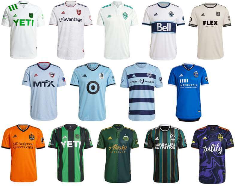
Western Conference
Austin FC
Primary: Thick black and green vertical stripes
Secondary: White with green accents
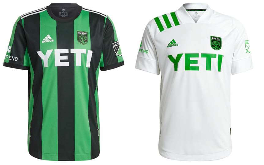
Kyle: It’s obviously important for an expansion club to establish their visual identity right away and I really like the black and green stripes (despite the Atlanta resemblance).
CJ: Green Atlanta and a boring white change kit. Pass.
Colorado Rapids (secondary)
Very light green with green accents and sublimated topography lines of Colorado mountains
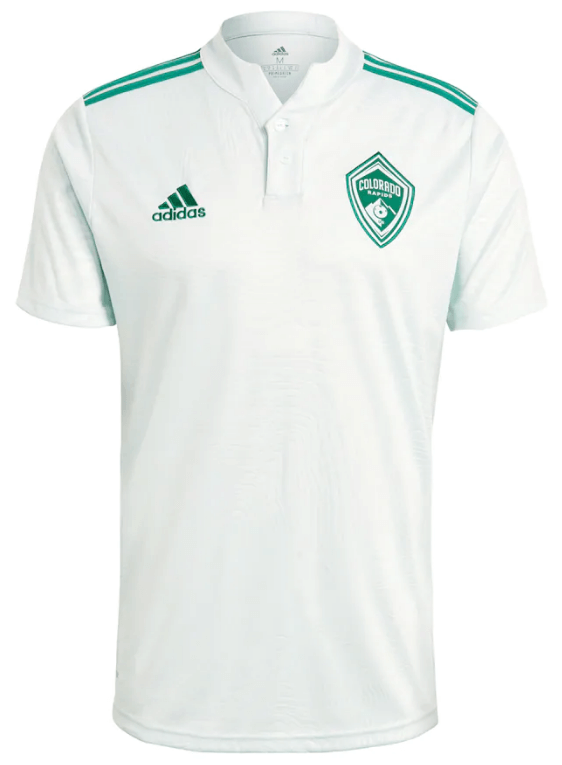
Kyle: Nice light throwback reference to the green used by the team back in the 90s and early 2000s. And another mini collar!
CJ: Love me some collars but can’t make up for the overly basic white template design.
FC Dallas (secondary)
Powder blue with red and blue “sprinkles” (Texas flag) on jersey
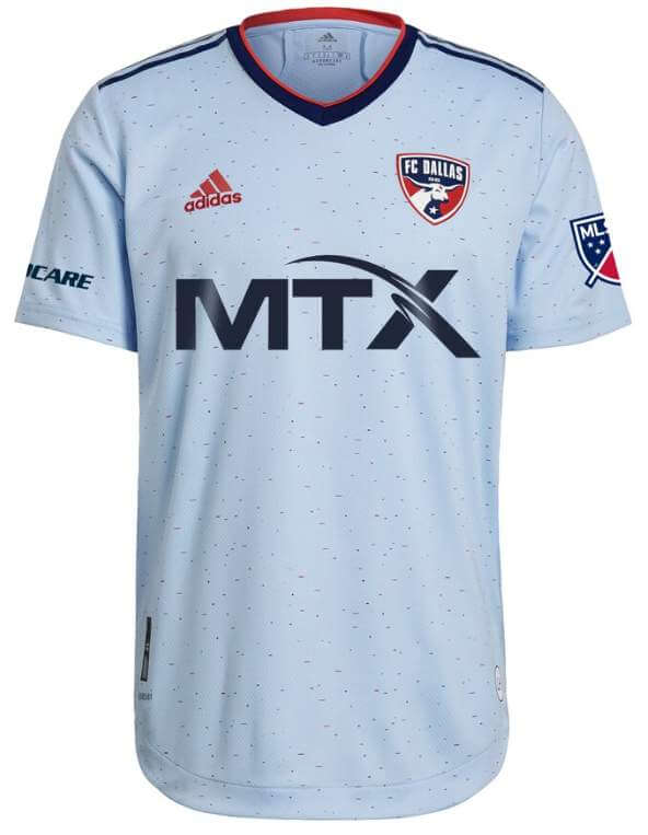
Kyle: For me secondary kits are the place to play with new colors and designs and in that spirit the powder blue works.
CJ: Points for originality! I like it.
Houston Dynamo FC (primary)
Orange with black accents
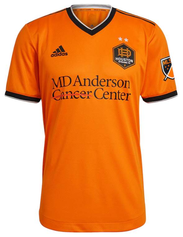
Note: The Dynamo added “FC” to their official name and have a new crest to go along with it.
Kyle: A nice simpler look that seems to match their new crest.
CJ: I miss the chevrons, but they own the orange look in MLS. Logo is a wash for me.
Los Angeles FC (secondary)
Light beige with city name on black sleeve stripe
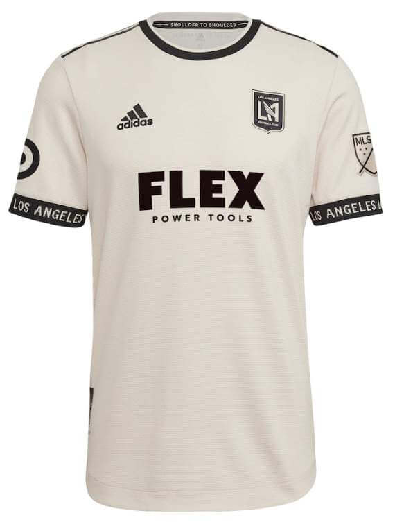
Kyle: I really like the color as it’s unique and matches their logo, but I don’t like the way my eyes are drawn to the “Los Angeles” on the sleeves.
CJ: I get the training top vibe from the sleeves, I agree with Kyle here.
Los Angeles Galaxy (secondary)
Throwback-inspired (1997) black and teal vertical stripes separated by thin gold stripes
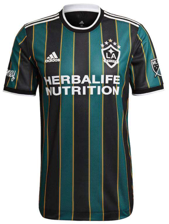
Kyle: Wow this is a home run (or should I say hat trick?) for me, I love the modern take on a retro design.
CJ: Acknowledging the past in MLS? More please.
Minnesota United (secondary)
Sky blue with black accents
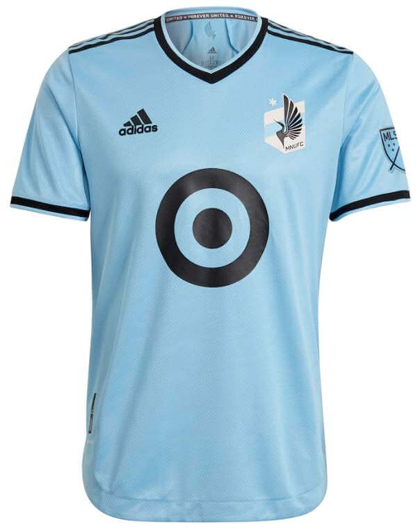
Kyle: Yes! I’ve been calling for a sky blue jersey for Minnesota and I’m glad to see it’s finally in their rotation.
CJ: While this does make for a lot of light blue designs in the league, their usages will be different, so I’m okay with it.
Portland Timbers (primary)
Green and dark green “halves” design with buttons and a collar
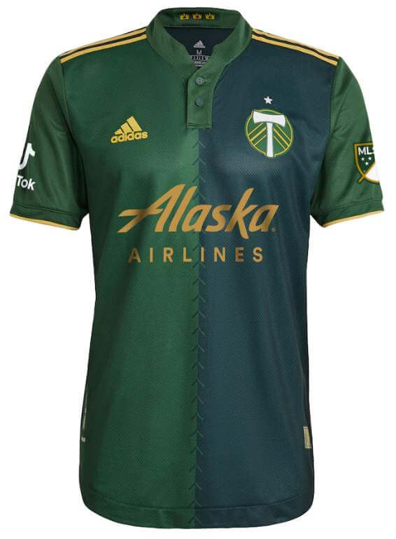
Kyle: Solid execution on a classic soccer design.
CJ: Portland can’t seem to go wrong on their designs, year after year.
Real Salt Lake (secondary)
White with a sublimated pattern of a mixture of team identity elements (lion head, stadium, etc.)
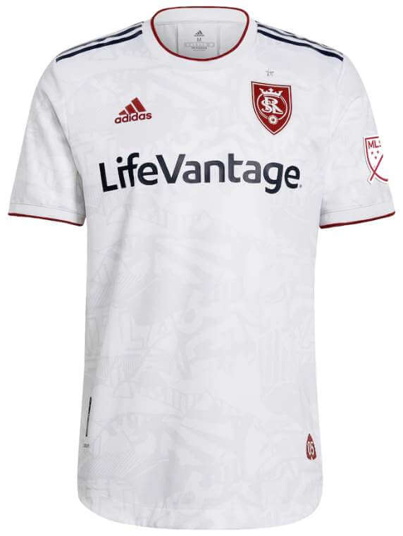
Kyle: I’ll pass on the random background elements but it’s refreshing that there’s not an overabundance of basic white kits this year.
CJ: Another white with sublimation. Got it.
San Jose Earthquakes (primary)
Blue with black and white accents
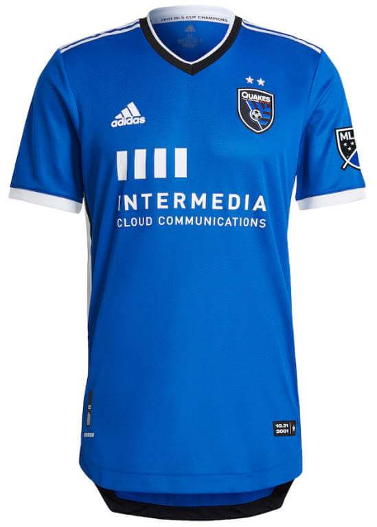
Kyle: This certainly works, but I feel like something’s missing?
CJ: You know exactly what’s missing, Kyle? A nice collar.
Seattle Sounders (secondary)
Jimi Hendrix-inspired purple “psychedelic” pattern with yellow and orange accents
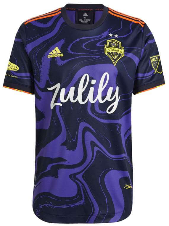
Kyle: Easily the most unique of this year’s designs. I’m sold on the narrative and I’m coming around on the design.
CJ: Can’t wait to see this on the field. Oddball, but trying things is welcome after so many dire kits in the past.
Sporting Kansas City (primary)
Light blue with navy blue “hoops”
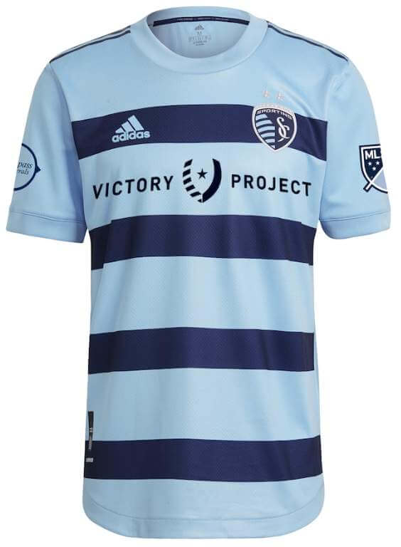
Kyle: Love this particular hoops look for SKC as they continue to be one of the best looking teams in the league.
CJ: There’s something off about the hoops for me, not sure what exactly. But, it looks good, and Kyle is correct about SKC in general.
Vancouver Whitecaps (primary)
Effectively a continuation of their current primary jersey inspired by 1979 NASL championship team; white with thick navy horizontal stripe and thin sky blue stripes, collar removed
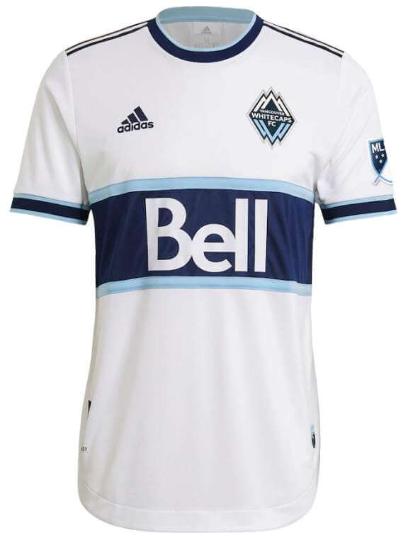
Kyle: If it’s not broke, don’t fix it. A beautiful jersey.
CJ: Elegant and classic. A wonderful choice.
Thanks, guys! Another great set of reviews. Looking forward to doing this again soon.

Ladies and Gentlemen…
…Your Boston Yellow Sox

The Boston Red Yellow Sox broke out their “City Connect” uniforms yesterday (they’ll also wear them again today). We knew well in advance what the unis would look like (Paul had an excellent run down a few days ago, so please read that for the uni details). One thing we didn’t know however, at least based on promo pics, was how the team would handle the hosiery. Now we know.
We also hadn’t yet gotten a really clear shot of the rear uni number treatment. Again, now we have:
First off, in a vacuum, this is a really nice looking uniform.
I love the combination of light blue (yes, there is definitely a UCLA vibe there) and yellow. It looks like a baseball uniform, albeit in colors we don’t normally see on a diamond. I’m not in love with the “BOSTON” font (but of course that’s a nod to the finish line of the Marathon), but I dig pretty much everything else about it. Not everyone went high cuffed (showing off those gorgeous yellow socks), and Marwin Gonzalez immediately pine-tarred up his helmet…
… but it really worked well as a uniform. The powder blue caps paired beautifully with the blue sleeves and pants stripes, so the two pastel(ish) colors worked well together.
Lots of players wore “matching” (or at least complementary) cleats, and the team of course had powder blue helmets and belts, so everything synched up nicely. Even catcher Kevin Plawecki had matching gear:
Now, while I love this as a uniform, I’m not as keen that Nike is taking us down this road of creating a “city specific” uni for every team. However, if they keep it to just a couple games per team per season, and dump the ridiculous “Players Weekend” softball tops (and those gadawful black/white unis they wore in 2019) and replace those with the “City Connect” uni, then I’ll take it. And anything is better than those TATC jerseys worn a couple decades ago. We know there are six more of these City Connect uniforms coming — if they’re all as good as the Red Yellow Sox one, it might be a concept I can get behind. I just fear we are possibly heading down an NBA-type uniform road — and I don’t think anyone wants that. But let’s see how this all plays out. So far…so good.
You can see lots more game photos here.
Still Nothin’
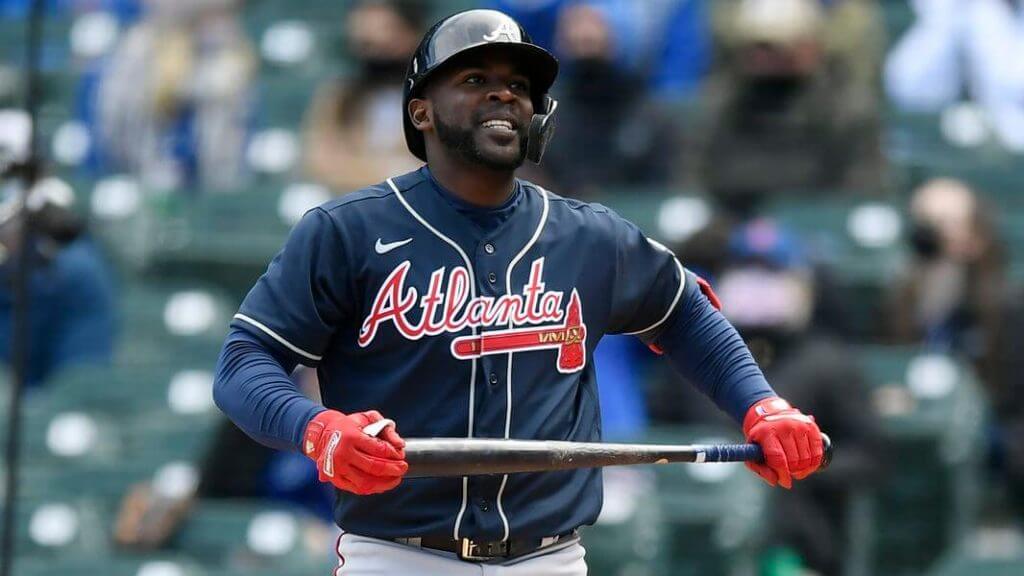
I don’t know that we can say 100% for sure that the answer to the “will they or won’t they” (add memorial sleeve patches for Henry Aaron and Phil Niekro) is “they won’t,” but yesterday Atlanta wore their blue alternate jerseys, and the right sleeve (which had at one time contained the All-Star Game patch) remains vacant. There was no patch covering the old ASG patch (as we’d seen before on their road grays), so I think we have our answer.
I don’t always agree 100% with Paul, but he nailed it:
Atlanta still going with the Aaron/Niekro rear-cap memorials. Right sleeve now blank (no ASG patch, of course, and also no cover-up). So there will apparently be no sleeve memorials. Surprising and disappointing.
cc: @PhilHecken pic.twitter.com/r3F9n07pcm
— Paul Lukas (@UniWatch) April 17, 2021
I, too, am both surprised and disappointed the team apparently won’t add memorial patches to the sleeve. Do better, Atlanta. You still have time.

Guess The Game…
from the scoreboard
Today’s scoreboard comes from Alex Cheremeteff.
The premise of the game (GTGFTS) is simple: I’ll post a scoreboard and you guys simply identify the game depicted. In the past, I don’t know if I’ve ever completely stumped you (some are easier than others).
Here’s the Scoreboard. In the comments below, try to identify the game (date & location, as well as final score). If anything noteworthy occurred during the game, please add that in (and if you were AT the game, well bonus points for you!):
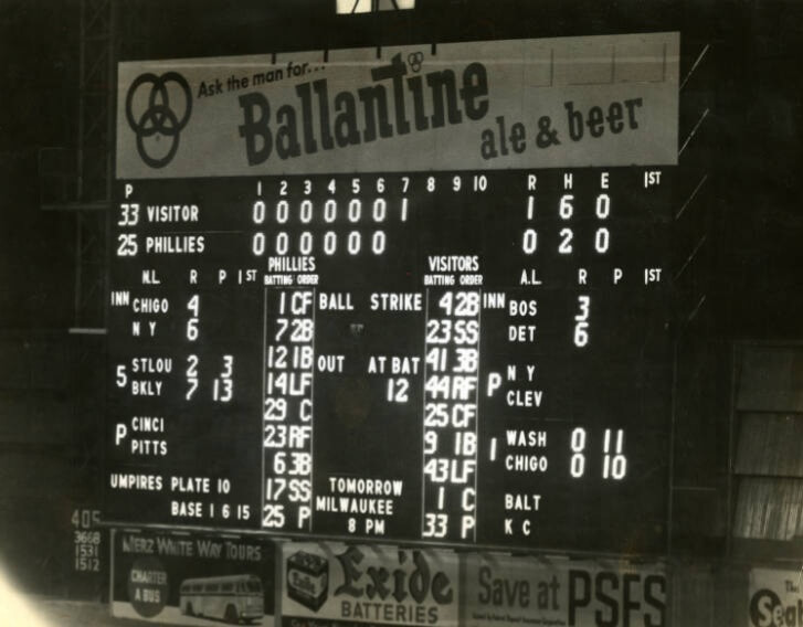
Please continue sending these in! You’re welcome to send me any scoreboard photos (with answers please), and I’ll keep running them.
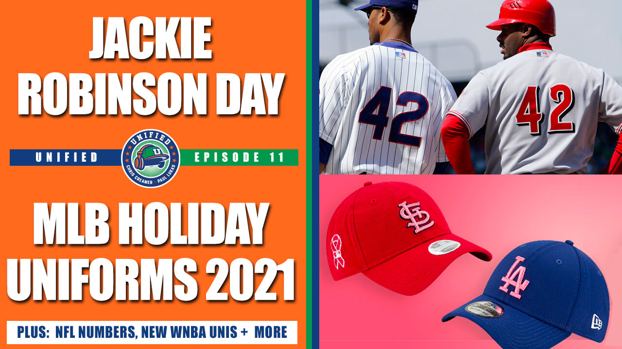
Podcast reminder: Paul here. In case you missed it, Chris Creamer and I discussed a bunch of things for this week’s episode of Unified, including:
• MLB’s new holiday caps
• The history of Jackie Robinson Day, and how it should be handled going forward
• The proposed changes to the NFL’s uni number rules
• The new WNBA uniforms
• The ongoing saga of the Braves, the MLB All-Star Game, and all the related issues
• Our favorite uniforms from fictitious teams in movies
As always, you can listen to us on Apple, Google, Stitcher, TuneIn, and Spotify, or just use the player below:
The show notes for this episode, which include photos of many of the things we discussed, are available at the podcast’s newly redesigned website. Those photos (and some additional ones) also appear in the video version of the episode, which you can see here:
We have great deals from this episode’s advertisers: Streaker Sports (get 20% off any order with checkout code UNIFIED), Ebbets Field Flannels (10% off, except on NFL items, with checkout code UNIFIED), and Homefield Apparel (15% off with checkout code UNIFIED).
Enjoy the episode, and thanks for listening.
Uni Watch News Ticker
By Phil

Baseball News: “This is the first time I’ve noticed that the Marlins home white pants have two different piping down the sides,” writes Michael Rodriguez. “The right leg doesn’t have the “Caliente Red.” I don’t think I remember this from last season.” I did some quick looking and something is definitely up — perhaps they have two different pairs of pants (see the stripe on the player in the bandana). You can also see what looks like a different stripe pattern on Don Mattingly (center of photo). Anyone know more? … Check out this classic uni moment at Wrigley Field yesterday in 1987 (from Bruce Menard). … Also from BSmile — footage of the opening of Shea Stadium, which occurred on April 17, 1964. … In case you missed it, here’s what NC Dinos (Korean Championship) championship rings look like (from Dan Kurtz). … Last night, Mets Pitcher Joey Lucchesi wore a white belt while the rest of the team wore the standard blue (from Keith Olbermann). … Although the Red Sox wore special unis yesterday, they had their batboy in a regular road uni for the White Sox (good spot by Kenny Kaplan). During the pandemic, home teams have been “supplying” bat boys for the road teams, outfitted in the home team’s road uniform. … ICYMI: The Kansas City Monarchs, an independent baseball team with the American Association of Professional Baseball previously known as the T-Bones before forming a partnership with the Negro Leagues Baseball Museum earlier this year, have unveiled their inaugural uniforms under their new name (from Kary Klismet).

Football News: Ohio State has revealed its Big Ten championship rings (from Kary Klismet). … Also from Kary: Durango (Colo.) High School has unveiled its rings for winning the Class 3A state championship last fall. … And one more from Kary: Alabama has moved a 7-ton elephant sculpture from another part of campus and given it a new home in front of Bryant-Denney Stadium.

Hockey News: The Elliot Lake Wildcats took a leave of absence from the Junior A NOJHL for 2020-21. The team announced when they return for 2021-22, they will be known as the Elliot Lake Red Wings. The new logo features a 3D version of the Winged Wheel (from Wade Heidt). … Also from Wade, The Utica Comets president Robert Esche registered “Utica Devils” as a trademark with the U.S. government’s Trademark and Patent Office earlier this month. He adds, “This is leading to speculation that Utica will no longer be the affiliate of the Vancouver Canucks. Saturday morning, it was indicated by the Binghampton Devils that the parent New Jersey Devils will be moving their AHL team to a new city next season.” … More from Wade: the Arizona Coyotes will wear special jerseys to honor 9-year-old Leighton Accardo who passed away in Nov. Leighton being inducted in Coyotes’ Ring of Honor. … In what should probably come as no surprise, NHL jersey advertising could begin as early as 2022-23 season. … Whoa. Check out what looks like Quebec Nordiques (inspired?) breakfast cereal (from Jeff Bryniarski).

Soccer News: Both Minnesota United FC and the Seattle Sounders wore black armbands during their game in Seattle on Friday night. The armbands were worn to honor and acknowledge the death of Daunte Wright (from Wade Heidt). … The Richmond Kickers will have a new jersey advertiser (from TMuss). … Scott Rogers saw this “Distracting, somewhat confusing blue-v-blue in the Chelsea vs Man City FA Cup semifinal match (yester)day.” … Argentine legend Diego Maradona’s debut World Cup jersey is up for sale, if you have some extra scratch lying around.

Grab Bag: Reader Ron Ruelle writes, “CNN had an article about the dress code for royal funerals (yester)day. Somewhat uni-related, maybe?” … Syracuse Men’s Lacrosse wore throwbacks yesterday (from Jakob Fox). Here’s another look (from Michael MPH). … Black uniforms to go with chrome helmets for UNC who were playing Syracuse in men’s lax (from James Beattie). … Here’s a cool story about an artist who has painted the shields on thousands of firefighter helmets across the country (from Kary Klismet). … Here’s another one from Kary who writes, “I appreciate this clear-eyed piece about the history of corporate names sports venues in South Florida.”
And finally… that’ll do it for this weekend. Big thanks (again) to Kyle and CJ for the MLS Uni Previews the past two days. Great stuff, lads.
Everyone stay safe and have a great week, and I’ll catch you back here again next Saturday.
Uni Tweet of the Day…
I don’t know who needs this, but here is my nephew and his besties in baseball uniforms pic.twitter.com/iOQV7kKexc
— Jose Rene ATC,LAT (@J_ruiz5) April 17, 2021
Peace,
PH
Did the UNIFIED promo code expire on Streaker Sports? Just tried it and got a “Enter a valid discount code or gift card” error message.
As a Red Sox fan I think that the (Yellow) Sox uniforms are not bad looking, but they aren’t Red Sox uniforms. But there were quite a few people in the stands wearing them at close to $500 a pop on Fanatics, so they served their purpose. The NESN announcers at least three times made what sounded like a scripted read that “The Red Sox today are wearing the new City Connect uniforms from Nike.” They then talked about how they liked them, with the most telling comment coming from Dennis Eckersley, who said “GOTTA love em.”
Scoreboard: Tuesday, May 15, 1956. Phillies score 2 in the 7, 1 in the 8th to win 3-1. Stu Miller with the complete game early in his only season with the Phils.
I am a life long Red Sox fan. I actually like these uniforms and think they are one of the better “special” uniforms I have seen. I would be OK if they wore these every year. For me, the main thing is that they be limited. They make sense to wear on the Marathon weekend. If they stick to that and never wear them any other weekend, then they are great. They are certainly better than the Memorial Day, Mothers Day, July 4th uniforms that have been trotted out in the past.
Regarding the yellow sox uniforms, something seems ‘off’ with the cap – with the B being the same color as the cap they lost an opportunity for better cap logo contrast, which is such a key part of a good baseball look. If it were yellow, with white outline, it might have looked better, or just yellow (on light blue).
Those Red Sox uniforms ARE the definition of softball tops. Baseball jerseys and pants are supposed to match, and when they don’t the jersey becomes a softball top. So these are no better and no worse than any other time a team these days breaks out a dark jersey without the corresponding dark pants.
I’ve seen plenty of softball uniforms where the jersey matches the pants.
If you don’t like colored baseball jerseys I don’t think it’s necessary to bring softball into it.
can’t make up for the overly basic white template design.
A little boring, yes, but no large advertisement on the front…so it’s the only current MLS shirt I’d wear.
Yellow Sox vs the Black Sox.
Absurd.
Not to be too pedantic but the “victory project” logo looks a lot like an inverted AAF logo
Another detail about the new Vancouver Whitecaps jersey. It still has a red number. However, the hoop does not continue around the back like it did with the previous jersey. This is an improvement because the previous jersey numbers were hard to read from a distance.
New jersey back:
link
The previous one:
link
Which would now make it more of a 1981 inspired design. The fact the ad replaced the team name on the hoop still makes me dislike this jersey.
These uniforms would be great for UCLA. Just remove “BOSTON” and replace it with the “”UCLA” script. Even the hat with the “B” works.
I love the look of those new Rays fauxback jerseys we saw in Fenway yesterday. My only question is, Why do they say “Boston” across the front, and not Tampa Bay?
Kidding aside, it’s a really nice uniform design in the abstract. Nothing that looks like this should come within three states of any Red Sox player’s locker, but it’s a very well designed uniform. Except the cap. The low-contras logo barely works for the Angels, it barely worked for the old Boston Robins, and it doesn’t work at all here. The regular Red Sox cap logo is just too thin for the blue-on-blue treatment, and the double outline and un-smoothed corners are all wrong. The rest of the uniform offers several alternate approaches, from yellow or white on blue with no outline to a white or yellow block shadow. Or even a block, stencil-styled thicker B. Almost literally any other treatment would have been better than the cap the Sox wore, including a plain blue, no-logo cap, which is effectively what the cap looked like.
No mention of the Dakota Marker game? Don’t forget there’s DI ncaa football going on right now. How about a uni preview of FCS playoffs? Bracket unveiled today.
I like light blue and yellow.
Just not on the RED Sox.
Huge fan of the scoreboards of yesteryear that listed visiting teams not by the team name, but by the word “visitor”.
I believe the Phillies were the only team that did that.
No one is going to mention that they brought back the Expos number font?
Single best thing about the Yellow Sox.
It’s the UCLA Bruins legacy Font. Because the uniforms were something that Nike pitched to UCLA. (sarcasm)
Looks like the “last stand” for the Braves putting memorial patches on the sleeve will be when they come back home on Fri., Apr. 23rd vs. Arizona.
Anyone else think the Sox City Connect unis would look AMAZING as new Tamp Bay uniforms? It’s all wrong for a Red Sox team, but if this was done for Tampa they’d be a home run.
pretty sure the Marlins white pants stripes are all black/blue/red, and any anomalies seen are due to manufacturing issues(stripe widths, misorder), laundering, or lighting/camera issues.
Of all MLB uniforms, the Marlins striping is hardest to see. Even on HDTV, I have trouble distinguishing the three colors; Caliente Red is close in value to Cyan.
I find it hard to hate on the Boston “City Connect” uniforms. I’m at work on a similar project, myself; I LOVE me any team in yellow uniforms, and unlike the previous seasons’ Player’s Weekend suits, these were actually *designed* rather than having a universal template applied.
the Marlins pants striping is so on the sleeve cuff. but I can see where the red might be faded to turned in such a way to be barely visible, or the blue in the middle also being turned, difused, or washed out so the black and red stick out. But on every pic, it’s consistently there in the appropriate order
the last Marlins unis did have separate pants with different piping, one with black and one with orange.
I’m not a fan of the “Boston” font either, but I can live with it. I think they should have stuck with McAuliffe/Red Sox numbers in blue and white on the back. It would’ve provided a connection between this ridiculous commercial design and the actual Red Sox baseball team.
The Sox catcher’s gear is powder blue. The helmets, undershirts, and belts are a light royal. Also, why is the Korean Champions ring in English? Finally, the Eagles are my new All-Star team.
I’m not a soccer fan but am a huge fan of heavy metal icons Iron Maiden. I’m just gonna leave this here…
“Iron Maiden have teamed up with West Ham for new away shirt” link
I fear that “City Concept” is just the beginning of th “Nikeazation” of baseball uniforms and this is exactly what the commissioner and owners want….more revenue streams.
I get it; it’s a business and last year they claim to have lost lots of money. Maybe yes; maybe no (wonder whether the MLB has some sort of catastrophe insurance).
It’s also a generational thing. For those of us over a certain age, we prefer traditional and classic looks, but our demographic is not what the major sports leagues are seeking.
So, let’s cherish those (rare) days when the both teams wear: white at home v. grey/powder blue on the road at the same game.
RE: Uni Tweet of the Day – it says, “I don’t know who needs this..” but the answer is Everyone! That pic of the little guys is just terrific!