By Phil Hecken
Follow @PhilHecken
Good morning Uni Watch readers! I hope everyone is still doing OK and staying safe (and getting vaccinated if possible). Spring has sprung (at least in my nape of the way), and with the weather getting warmer and innoculations increasing, hopefully we can return to normalcy in the near future.
If you missed my piece on the NFC options if the NFL revokes the “one shell rule” (see last weekend’s post here for all the set up), this week I return with a look at the AFC. If you didn’t read last weekend, please read at least the first few paragraphs, where I set up the parameters. There’s a lot to get to today, so let’s dive right in.
AFC East
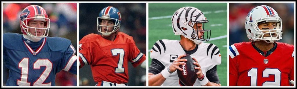
Buffalo Bills
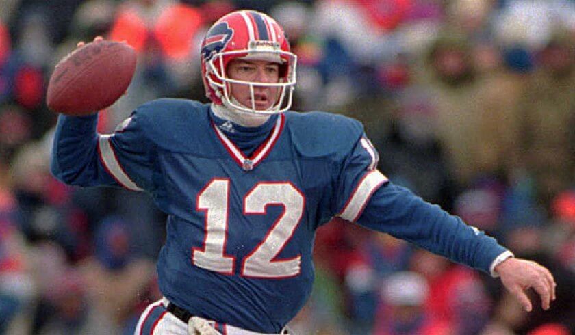
Right off the bat we have an excellent candidate if the one shell rule is lifted. The Bills wore these helmets (with the above uniform) from 1984-2001, and while they never attained the ultimate prize, did go to four straight Supes (a record which will probably not ever be equalled); unfortunately, they went winless in all of them, leading to the joke: “What’s Buffalo’s new area code? 0-4-4.” All kidding aside not only could they bring these unis back as throwbacks, they could, at least in theory, sport red shells with their color rush — or even better (and something I’ve hoped they would do since they introduced the CR), wear white hats/red jerseys/red white pants or (even better still) go red/white/red. I never really liked the Jim Kelly-era uniforms, but I wouldn’t mind seeing the team throw back to them, at least for one game. And a red shell would definitely make their CR unis work a lot better.
Should they? You betcha.
Miami Dolphins
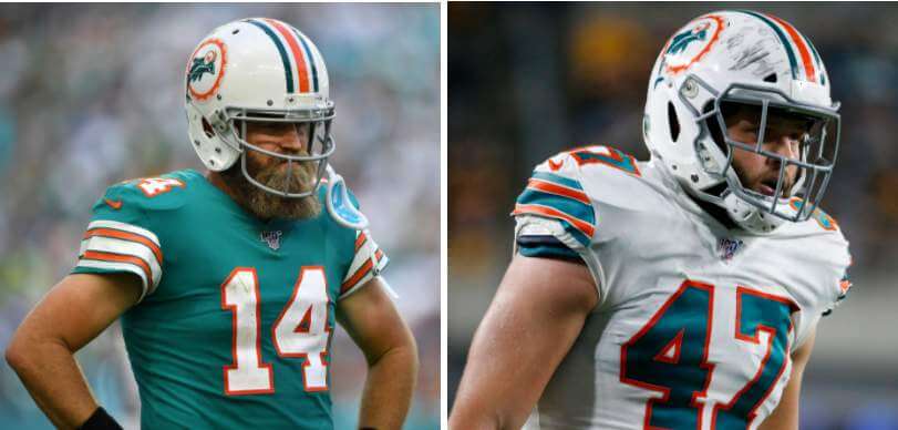
The Dolphins have always had a white shell, and even if the one shell rule were lifted, there’s no need for anything but white. And they already have the perfect throwback unis (as seen above) — they really just need to make them the official home/road (or color/white) unis and we’ll call it a day. There is absolutely no need for an aqua shell nor an orange shell. None.
Should they? Keep the white shells, make the throwbacks their regular unis. Done and done.
New England Patriots
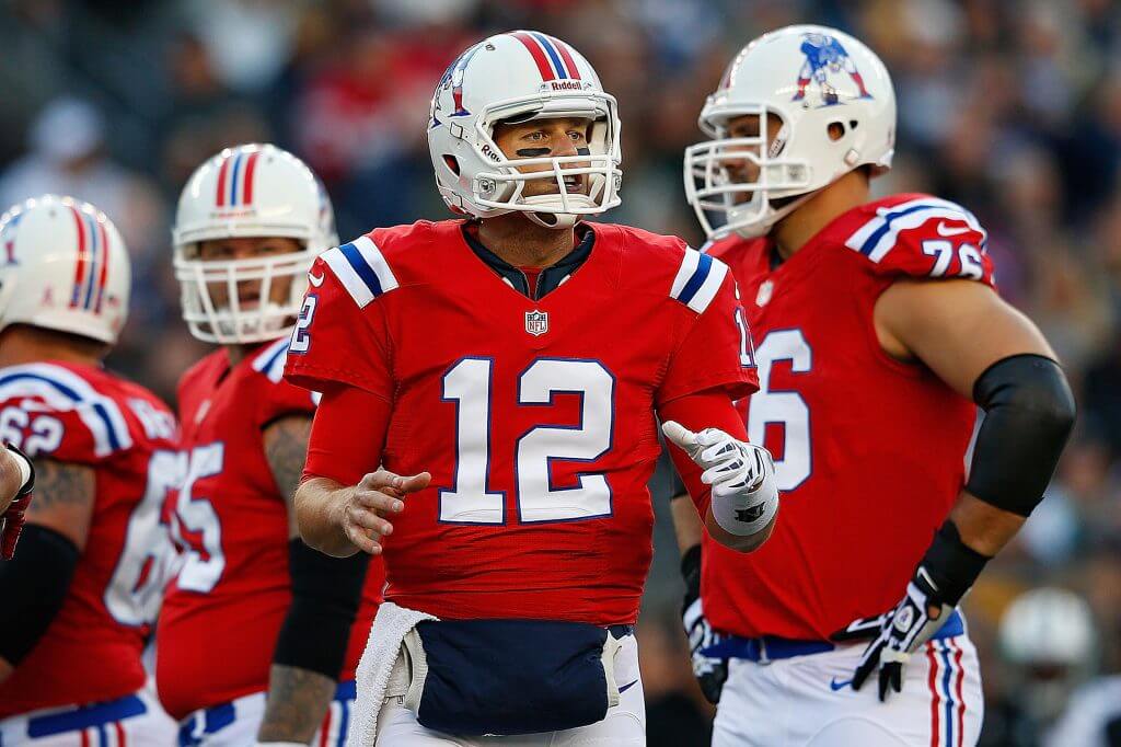
Aside from the return of Bucco Bruce, there is probably no other uniform that deserves a throwback return more than Pat Patriot (who became one of several victims of the one shell rule). I mean…c’mon. We need to see these on the field two or three times every year.
Should they? Indubitably.
New York Jets
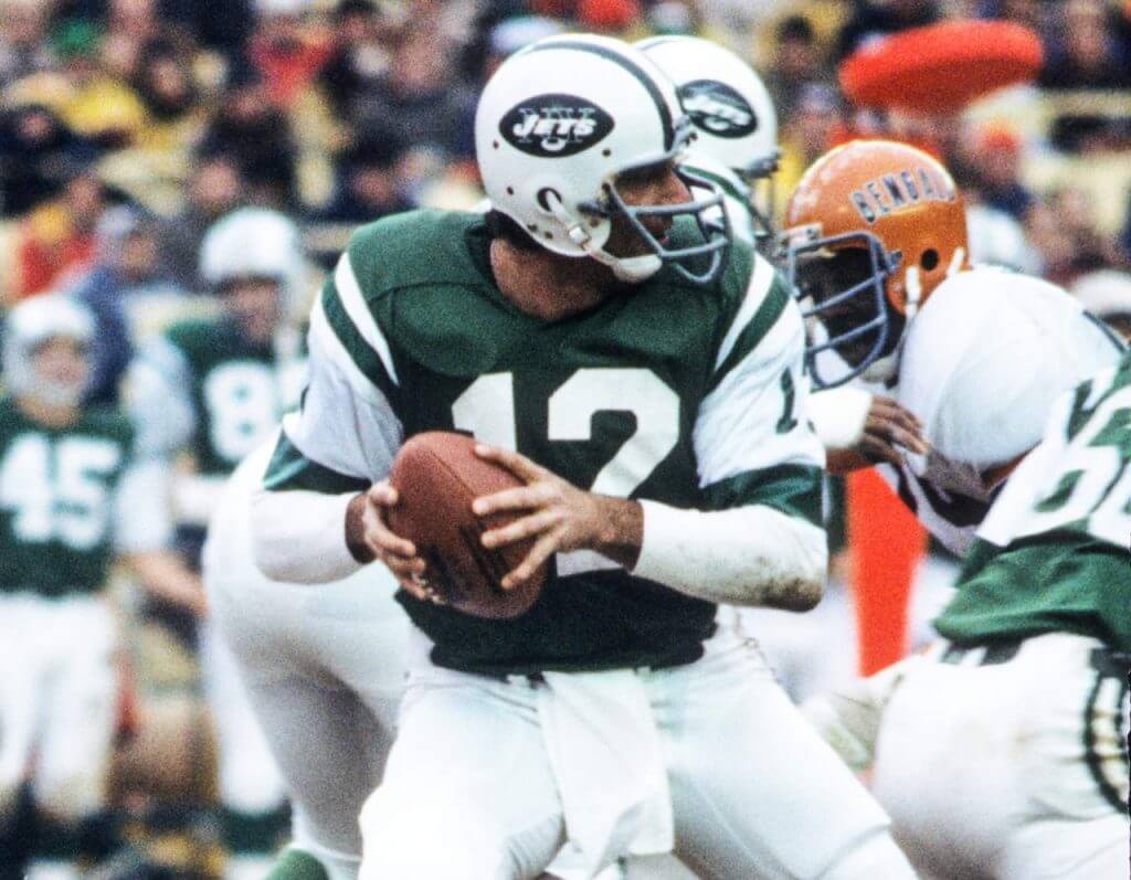
I’m sure many of you are saying, “wait, didn’t they just wear something like this a few years ago?” and while it was similar, the color green Namath’s Jets wore was more of a kelly than the almost-olive worn more recently. In fact, the Jets original CR unis got it pretty perfect, except of course for the mono-kelly pants and socks. Just wear white pants with this and it’s a winner. Alternatively…and definitely NOT something I’d advocate for…would be to add a black shell to wear with their current black alternate unis. The shiny kelly green hat atop monoblack looks awful, but giving them a black shell would at least make it less awful.
Should they? Yes to the white/kelly Namath throwback; no to the monoblack.
AFC North
Baltimore Ravens
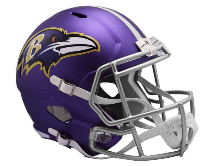
Since their “birth” in 1996, the Ravens have only ever had a black helmet, so a second color shell option could be to add a purple one — one that would match their CR uniform. But that’s waaaaaay too much purple, so my thought would be to modify the CR uni to wear the purple shell with the white jersey/purple pants, and pretty much no other combos. I don’t think the team needs an additional shell option…but purple/white/purple might be the best.
Should they? No.
Cincinnati Bengals
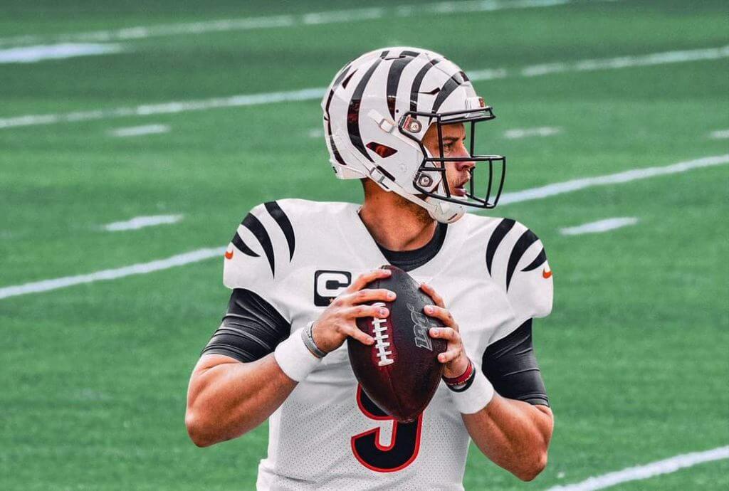
We know the Bengals will soon be unveiling new uniforms, and they’ve already said the current helmet (which is orange) won’t be changing. But the lifting of the one shell rule would be a great opportunity for the team to complete the whole white tiger look their current CR unis evoke. I’ll admit when I first saw their CR set, I didn’t like it, but it’s really grown on me. Add in a white shell with stripes and you’d have a really sharp looking uniform.
Should they? Absolutely!
Cleveland Browns
Assuming the leaks are correct (and there’s no reason to think they’re not), the Browns will be wearing a 1946 throwback this year (for their “75th” Anniversary), and of course back in 1946, the Browns wore white shells. Granted, those were pretty much leatherhead days, but a blank white shell would really make the 1946 throwback about as authentic as one could get.
Should they? Indeed, they should.
Pittsburgh Steelers
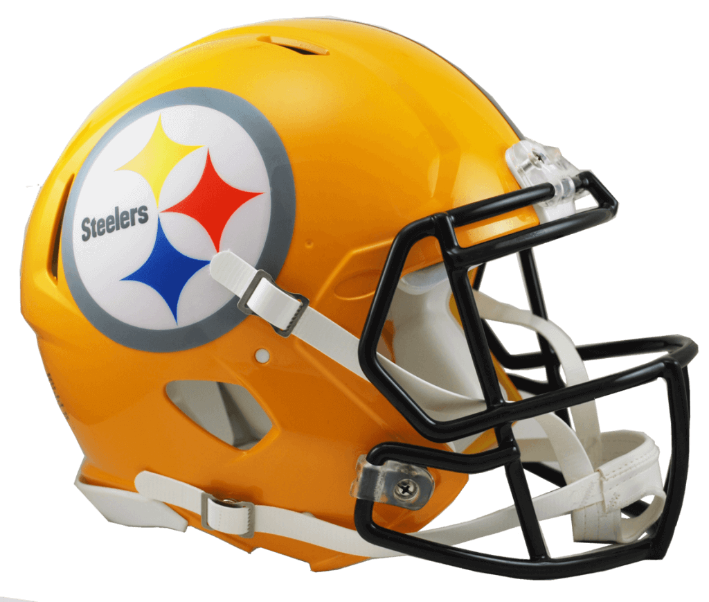
The Steelers have worn a gold helmet before — both as a throwback and as a regular shell pretty much from 1933 through 1962. I didn’t love the throwbacks, so I wouldn’t necessarily want them to wear those again if the one shell rule were lifted, but I’d love to see the team pair it with their current black/gold jersey/pants set. In fact, I’d also love to see the team try a gold jersey with their current black CR pants, giving a gold/black/gold & black/gold/black option.
Should they? Sure, why not.
AFC South
Houston Texans
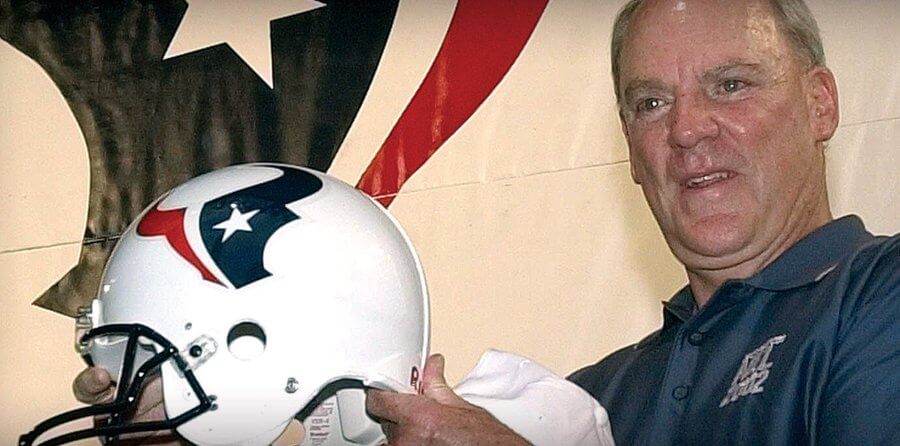
When the Houston Texans’ franchise name and logo were unveiled in 2000, team and league officials posed with a white helmet. That was changed to the current blue shell by the time the team began play in 2002. Since entering the league, the team has made no significant changes to their original uniforms, so even if the one shell rule were to change, they have no throwbacks to well, throw back to. But, they could finally add the original white helmet to the current blue one, giving them more uni options. I’d love them to wear the white had only if paired with white pants, but that would work well with their white/white, blue/white and/or red/white unis.
Should they? Sure, why not.
Indianapolis Colts
The Colts wore these uniforms, with two horseshoes on a blue helmet (ostensibly a throwback to 1955) in 2010. I love the idea of bringing back a blue helmet, but not necessarily the throwback — and ideally I’d love the blue helmet to essentially mirror the current white one. Now that the team has blue CR pants, how great would they look going blue/white/blue? Pretty great, right? But that’s the only combo where I’d want to see the blue hat worn — their uniform is too classic otherwise to change.
Should they? Love to see it at least once.
Jacksonville Jaguars
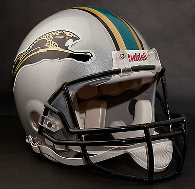
As many of you likely know, the Jags’ original uniform design wasn’t what they ended up wearing on the field in their first year. They had planned on wearing a silver helmet (pictured above) and a white and teal jersey, but some legal issues with the car company of the same name resulted in them going in a different direction. And damn if those first year uniforms weren’t damn near perfect. Rather than attempting to resurrect (in some fashion) that silver lid, I’d rather the team just repurpose their current black helmet and wear 1995 throwbacks for three games a year.
Should they? No to the silver helmet. YES to the first year throwbacks!
Tennessee Titans
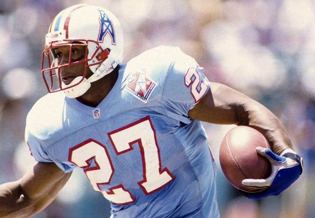
When the Oilers left Houston for Tennessee, they didn’t become the Titans right away. For two years, they played as the Tennessee Oilers. And ever since they became the Titans, the team has failed to even acknowledge their awesome uni roots, save for when they wore early 1960’s throwbacks. But never did they throwback to the best ever set (which is very similar to their 1997-98 Tennessee Oilers uni). It’s time to fix that. Bring these unis back as a throwback, and think about making them the full time unis, Oilers Titans!
Should they? Of course. That uni looks as good today as it did 20+ years ago.
AFC West
Denver Broncos
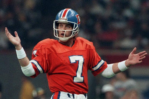
Much like Pat Patriot uniforms, Broncos fans unfortunately often equate these gorgeous uniforms (with the royal blue helmet) with a lack of success. Sure, they went to a bunch of Supes, but never got across the finish line while wearing them. Once they switched to the current(ish) unis, they immediately won two Supes, and with some minor changes along the way, still wear those dated unis. What better time than if the one shell rule is dropped to bring back the Orange Crush? They keep trying to, albeit in odd ways, from bring back orange jerseys to breaking out CR unis that fauxback (somewhat) to that look. Time to do it right and bring these back.
Should they? YES!
Kansas City
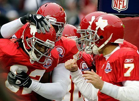
Whether they played in Dallas or Kansas City, the team has always worn a red helmet, and until the team changes the name and rebrands, there’s no reason to switch to any other color. And really, unless the team broke out a white helmet, what other color could they wear? Gold? No. Best leave this one alone.
Should they? No.
Las Vegas Raiders
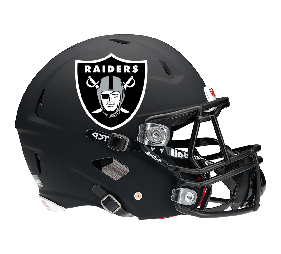
I’m immediately going to put the kibosh on this one. With one caveat — the Raiders originally wore a black helmet — and in fact, their colors were black and gold. But since 1963, when Al Davis took over the team, the Raiders have always been silver and black, and have never acknowledged their original color scheme since that time. Even in 1994, for the NFL’s 75th anniversary, and again in 2009 (for the AFC/AFL’s 50th year), the team wore silver/black throwbacks. Even their current gorgeous CR uniforms harken back to the silver/black period. So, while a black helmet could actually qualify as a throwback, I don’t see it happening. The team needs to remain silver/black.
Should they? No way.
Los Angeles Chargers
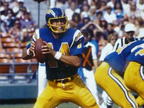
I never honestly liked the Chargers in a blue helmet, but I know a lot of people did, and if they were to wear any color besides white, this would be it. That set was worn between 1974 and 1984 and would still look good today — in fact, with all their current combos, they could basically do that now (except for the helmet). It would be great if the team could dump the dark blue entirely, pair up the royal jersey with the gold pants, and add the royalish-blue throwback helmet. That would make the best uniform set in the league (fight me!) even better still. This one is a gimme.
Should they? YES YES YES!
And there you have it — just a few suggestions for (mostly) throwbacks if the one shell rule is lifted. It’s time.
What say you?

All That Glitters…
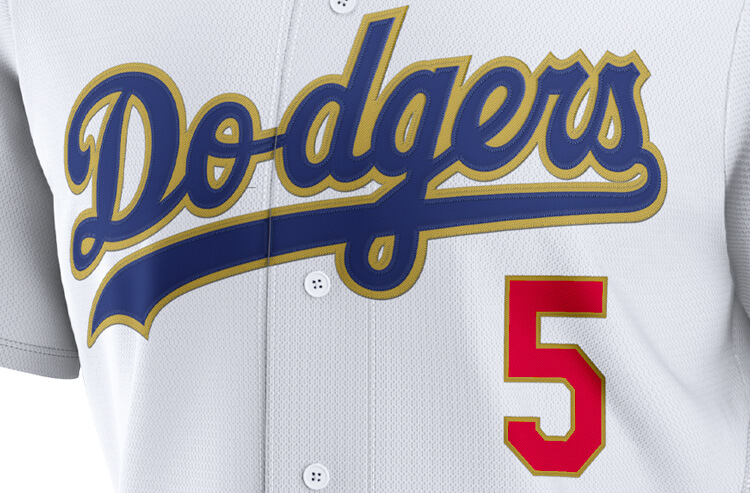
Yesterday the Dodgers broke out the now traditional “gold outline” World Series champs jersey — we’d known about this for a while, but it’s still nice to see it on the field. As you can see, the “Dodgers” wordmark was outlined in gold, as were the red numbers. The team also received their WS rings:
Icy. 💍 pic.twitter.com/8US1gxZchb
— Los Angeles Dodgers (@Dodgers) April 10, 2021
You’ll note a few things about the uniform from that video. First off, on the left sleeve, in place of their normal interlocking LA logo, the team had the following:
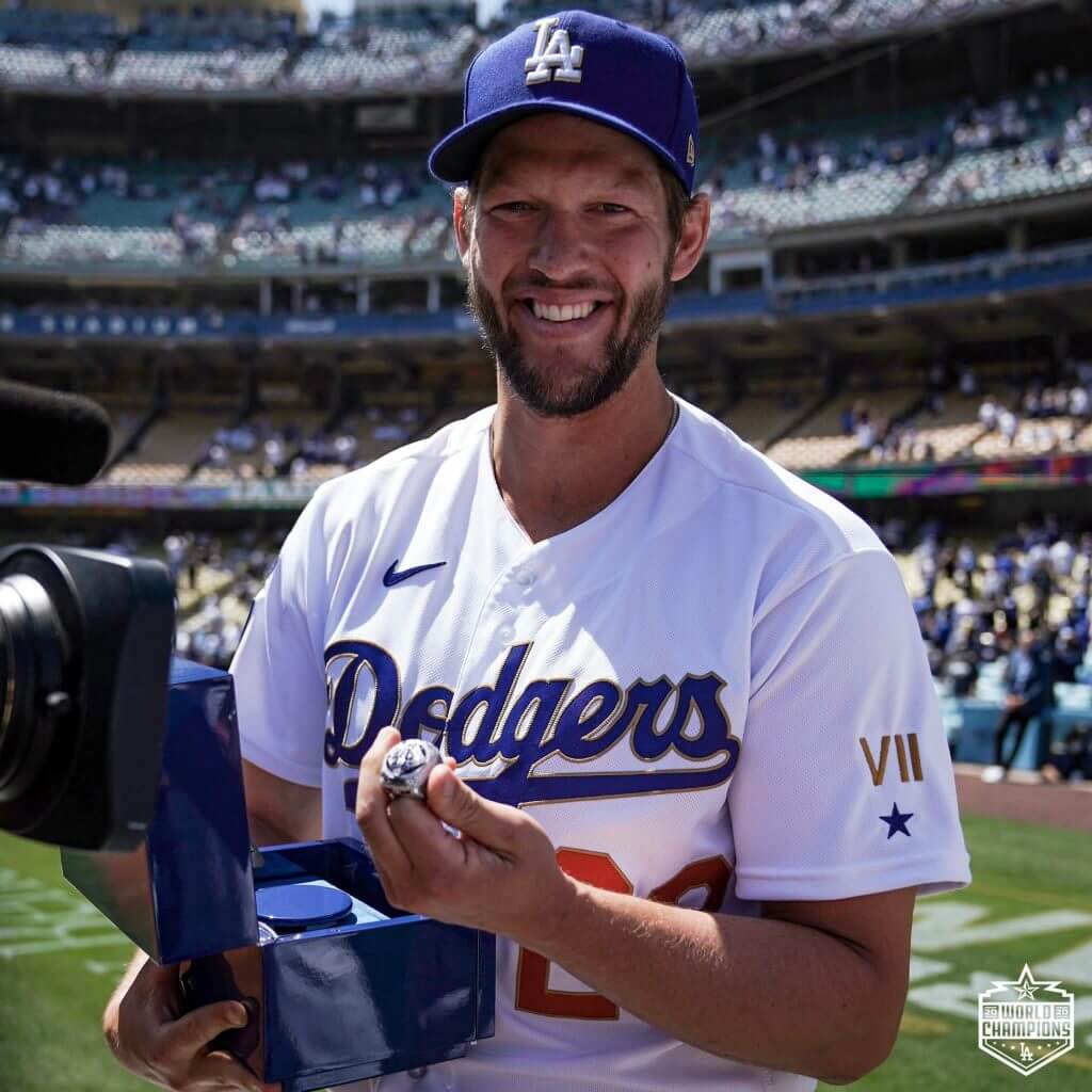
The roman numeral 7 (VII) refers to the number of World Series the franchise has won. Six of those have happened since the team moved to LA, and one of those (1955) happened while the team was located in Brooklyn. There was a single blue star beneath the VII — I put out some feelers but was unable to ascertain what that symbolizes. If anyone knows, please feel free to post it in the comments.
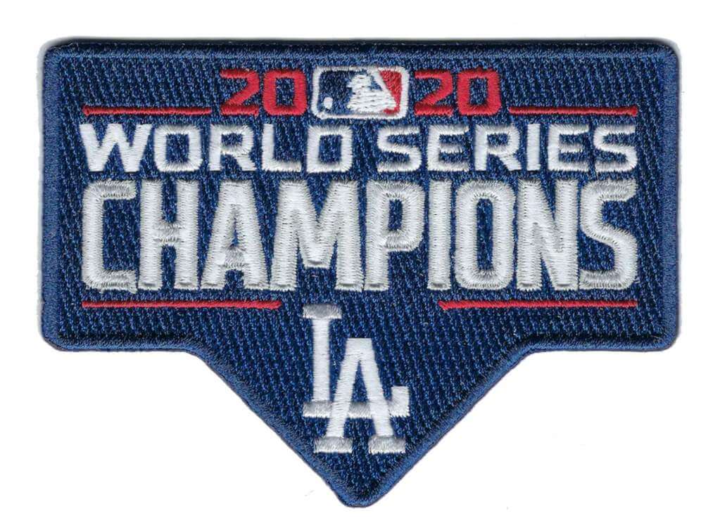
You’ll also note from that video the Dodgers right sleeve is now quite crowded — “patch overload” I believe Paul calls it. Not only does the right sleeve contain the 2020 World Series Champion patch, but also two smaller memorial patches for Tommy Lasorda and Don Sutton. Previously those patches were stacked vertically on the sleeve.
Here’s a closeup of the World Series patch:
Finally, the backs of the jerseys also featured gold outline: both NOB and number received the treatment. You can also see the special gold outlined “LA” logo on the cap:
Nicely done. Sure, every team since 2004 (when the Red Sox started the whole gimmick) has done this — with the sole exception being the 2010 Yanks — but it’s still fun to see the World Series champs from the prior season strutting their stuff!
Atlanta Honors Hammer & Knucksie
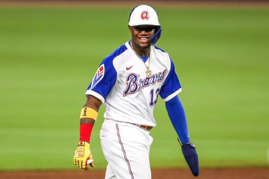
This is also not new news, but yesterday Atlanta (in what we believe was a pre-planned event) honored Henry Aaron and Phil Niekro by wearing throwback uniforms (both players wore many a Brave uni over the years, and both Knucksie and Henry Aaron wore the 1974-75 uniform [the one in which Aaron famously broke Babe Ruth’s home run record on April 8, 1974]).
The team did a pretty good job with the uniforms — including going NNOB. Both helmets and caps were period-correct. Unfortunately, while the players were pleasantly high cuffed, the hosiery was quite inconsistent:
I’m not sure which is worse — solid royal blue socks (not period appropriate) or faux stirrups. But aside from that the details, including the raglan sleeves and proper pants, were spot on.
Obviously, since the team will no longer be hosting the All-Star Game, there was no patch — and they wouldn’t have worn one on these jerseys in any event. So that’s a non issue. But since the team was honoring Aaron and Niekro with the uniforms there was no need to have memorial patches on these. How did the team handle it?
Well — they added their uniform numbers to the backs of their throwback caps:
Atlanta wearing throwbacks for first homestand, still have their Aaron & Niekro rear-cap memorials.
Sleeve patches wouldn't work with this jersey – would conflict with the feather.
Remains to be seen if they'll switch to sleeve memorials after this homestand. pic.twitter.com/rmPerlsG72
— Paul Lukas (@UniWatch) April 9, 2021
I guess we’ll need to wait until their next series to see if they move those memorials to their now vacated right sleeves.

Guess The Game…
from the scoreboard
Today’s scoreboard comes from Bill Moss.
The premise of the game (GTGFTS) is simple: I’ll post a scoreboard and you guys simply identify the game depicted. In the past, I don’t know if I’ve ever completely stumped you (some are easier than others).
Here’s the Scoreboard. In the comments below, try to identify the game (date & location, as well as final score). If anything noteworthy occurred during the game, please add that in (and if you were AT the game, well bonus points for you!):
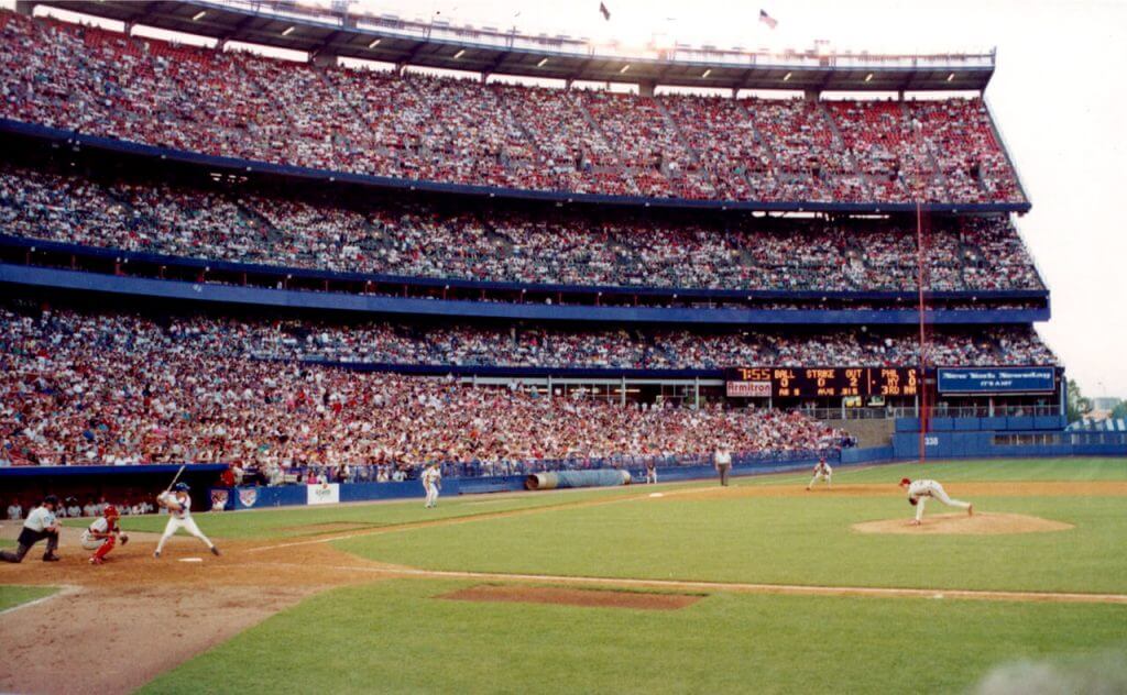
Please continue sending these in! You’re welcome to send me any scoreboard photos (with answers please), and I’ll keep running them.

Uni Concepts & Tweaks
Time for more Uni Tweaks from the UW readership.
I hope you guys like this feature and will want to continue to submit your concepts and tweaks to me. If you do, Shoot me an E-mail (Phil (dot) Hecken (at) gmail (dot) com).
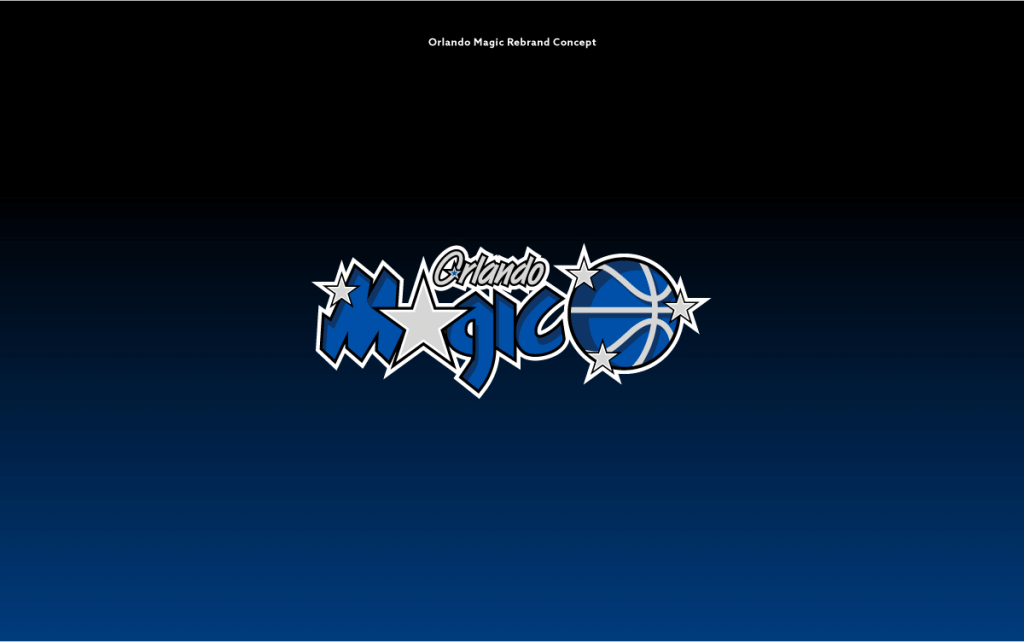
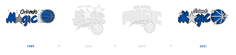
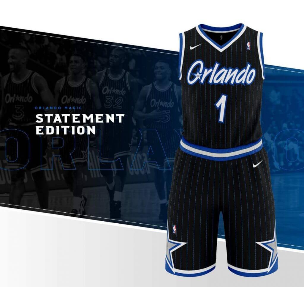
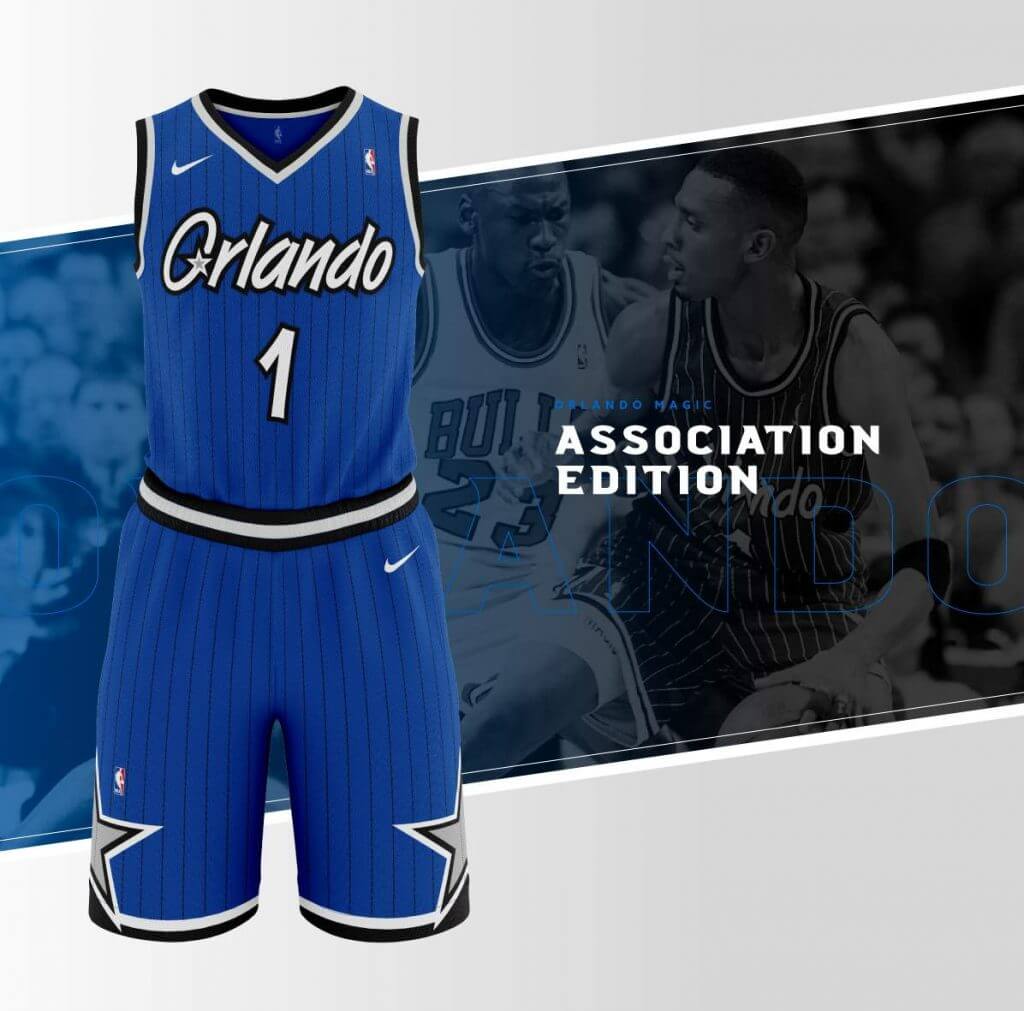
Today’s concepts come from Adam Marks, who has a redesign for the Orlando Magic.
He writes…
Hi Phil,
Here is a rebranding of the Orlando Magic. I wanted to embrace the franchise’s “golden years” of the mid-90’s, while also modernizing for today’s NBA. Simple changes like more subtle pinstripes and some dimension to the classic type styles really make it feel new and fresh. Those great teams with Penny and Shaq are some of my all-time favorites—why they deviated from such an iconic look is beyond me.Hope you enjoy. Thanks!
Adam Marks
And here are his designs:


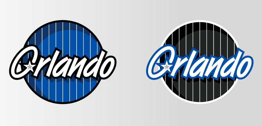
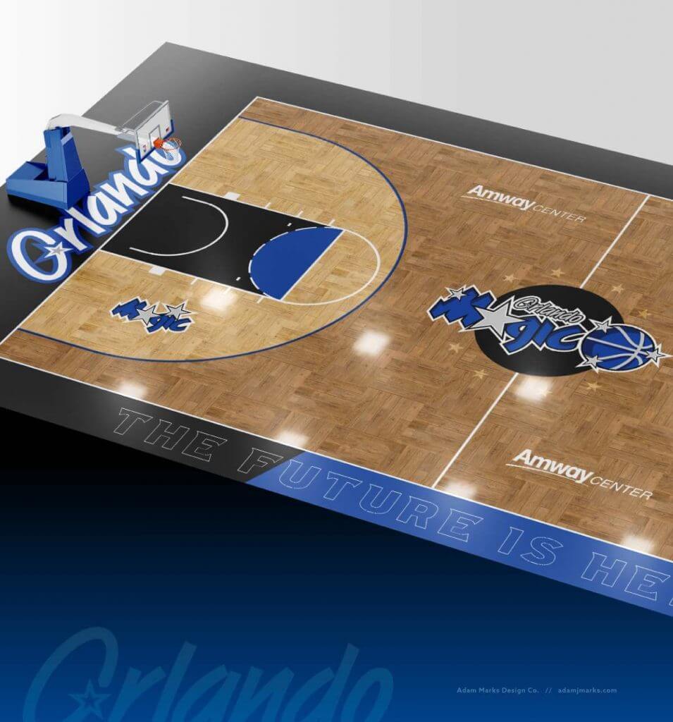
Thanks Adam!
OK readers (and concepters). If you have some tweaks or concepts, shoot ’em my way with a brief description of your creation and I’ll run ’em here.

Podcast reminder: Paul here. For this week’s podcast episode, Chris Creamer and I talked about the Red Sox’s new yellow “City Connect” uniforms, plus we have the second and concluding part of our interview with Dodgers senior design director Ross Yoshida, who gave us a scoop about how the Dodgers almost ended up wearing purple in the late 1990s!
In addition, we discussed the situation regarding the 2021 MLB All-Star Game patch now that the game has been relocated from Atlanta to Colorado, plus the question of the week and more. It’s a really good episode!
As always, you can listen to us on Apple, Google, Stitcher, TuneIn, and Spotify, or just use the player below:
The show notes for this episode, which include photos of many of the things we discussed, are here. Those photos (and some additional ones) also appear in the video version of the episode, which you can see here:
Please consider supporting this episode’s advertisers, Streaker Sports (get 20% off any order with checkout code UNIFIED), Ebbets Field Flannels (10% off, except on NFL items, with checkout code UNIFIED), and Homefield Apparel (15% off with checkout code UNIFIED).
Enjoy the episode, and thanks for listening. Now back to Phil.
The Ticker
By Anthony Emerson

Baseball News: One of yesterday’s subledes featured this newspaper clip talking about Al Cowens and Gary Roenicke’s 1979 adoption of protective bars on their batting helmets. This led Matt Edwards, the original submitter of the newspaper clipping, to dig even deeper and ind a better look at Cowens’ helmet. He sent along these screengrabs from this YouTube upload of a full 1979 Royals/Yankees game. Further digging revealed that Cowens was still wearing it in 1987, for the Blue Jays! … Here’s a cool pic of Al Hrabosky pitching for the White Sox in Spring Training in 1983, with a blank nameplate (from @NFL_Journal). … Here’s a close look at the Dodgers’ World Series rings. … The Buffalo Bisons, Triple-A affiliates of the Blue Jays, will temporarily relocate to Trenton, N.J., and take the home of the Trenton Thunder due to renovations at Sahlen Field in Buffalo. In an odd move, the Bisons will wear the Thunder’s home unis when playing in Trenton, but still officially be called the Bisons and will continue to wear their regular road unis on the road. Official statement here (from Patrick McQuillen and @freydaddy4). … NC State wore special ALS jerseys last night (from Timmy Donahue). … Tennessee is now using 3D batting helmet logos (from Bronson Black). … No logo on the batting helmet last night for the Reds’ Tejay Antone, a reliever who doesn’t get a lot of ABs (from multiple tweeters).

NFL News: Brad Eenhuis found out that former RB Mike Adamle wore No. 1 in the NFL from 1971-1974. The NFL adopted its current numbering rules in 1973, and Adamle was grandfathered in until he left the Jets in 1975. … The Draft caps were officially unveiled today, and this year they seem to be especially dumb (from multiple readers).

Hockey News: Charles Pelletier noticed that Capitals RW TJ Oshie has the back of his collar cut out. Compare that image to this one of his teammate. Odd — does anyone know why he does that or if any other players do something similar? … ESPN has a good piece on the Cooper SK 2000 helmet, an instantly-recognizable design that has fallen out of favor with goalies in the last decade or so (from Nicklaus Wallmeyer and Wade Heidt).

College/High School Hoops News: During renovations at IUPUI’s Ball Hall, an old basketball floor was discovered beneath the flooring, making it without a doubt the coolest residence hall at IUPUI (from Erik Spoonmore).
.

Soccer News: Basically every UK soccer team is going to wear black armbands in memory of Prince Philip, and the England and Wales women’s teams wore them in friendlies yesterday (from our own Jamie Rathjen). … Also from Jamie, yesterday marked the 24th anniversary of the time when Chelsea turned up in Coventry without their away kits, and had to wear Coventry’s aways for the match. Further info here. … Inter Miami’s stadium has a new corporate advertiser (from Wade Heidt). … There’s taking inspiration from one team, and then there’s outright thievery. Bulgaria’s Vihar Slavyanovo is a case of the latter (from @smtcsilverfox). … A scorer for FC Karpaty Halych in Ukraine whipped his shirt off in celebration — something we see pretty frequently in soccer. The difference is, he threw it into the stands, where a fan attempted to steal it before reluctantly returning it (from Ed Żelaski). … Also from Ed: Russian third tier side Znamya Noginsk have unveiled a new jersey that pays tribute to legendary Soviet soccer star Grigory Fedotov, a Noginsk native. It features a big ol’ hammer and sickle, but no Soviet red.

Grab Bag: Following the death of Prince Philip, all UK television presenters are required to wear black until the day after his funeral. … Speaking of the UK, what’s the deal with this not-quite-Helvetica font the Royal Air Force has going on? (from WB Young).
And finally… that’s it for today. Everyone enjoy your Saturday and I’ll catch you back here tomorrow.
Peace,
PH
Two points:
1. What I’d like to see the Pats do (besides bring back Pat Patriot), is to put Flying Elvis on a blue shell (matching the uni color).
2. The guess the scoreboard is Mets vs Phillies, June 23, 1990. Mets won 3-0.
I’d like to see Pat Patriot on the current silver bucket. Why wait for the one-shell rule to be lifted?
I’ve just never been a fan of the silver.
I loved the original helmets,but give me this look
link
with Pat instead of Elvis, and I’m good.
Robert Kraft’s stamp on this team is blue uniforms, but what I’m seeing is envy of the Cowboys. At the same time, the NFL embarked on a purge of illustration-influenced logos, claiming they enlarged/reduced poorly. (Think of the difference between Jonny Quest and Teen Titans) The lone survivor is the Raiders’ shield.
Adopting the CR uniforms full-time suggests even the six championships couldn’t make anyone love the Tom Brady suits. Bet on a full-retro makeover of New England in about five years.
There is absolutely no need for an aqua shell nor an orange shell. None.
It’s rare when it happens, but I’m in total agreement with Phil. The Marlins definitely need a teal cap/helmet, but the Dolphins need nothing more than their original white lid. So it is written, so shall it be done.
But never did they throwback to the best ever set (which is
very similar to their 1997-98 Tennessee Oilers unitheir 1972-74 blue- helmeted glory years).So much for total agreement…
I think the link are their link.
I’ve grown to love those too.
I’d even rank them over the original 1960 blue helmets that had no red trim.
Let’s face it: Tennessee’s rebranding of the Oilers is a flop. I’ve never met a football fan who doesn’t want the return of the oil derrick. It’s the most valuable unused piece of NFL property. There’s a reason the Adams’ are so reluctant to surrender it to the current Houston NFLers.
Steelers:
My pet peeve is how the color black gets a pass when it comes to uni superstition. When Pittsburgh reached its first ever postseason game, the Playoff Bowl against Detroit, they switched from their perfect yellow lids to black. And then they lost. And yet they kept the black buckets from then until now. Had they started as a black-helmeted team and switched to yellow for the Playoff Bowl and lost, you would NEVER see those lids again. Bring back the yellow helmets and keep them.
Texans:
Ask KC for permission to use those old Dallas Texans helmets. They’d go great with your blue jerseys.
Broncos:
I care nothing for superstition. Go back to your “unlucky” uni (but only with orange road pants). NOW.
Chargers:
Royal blue helmets twice a year, yes!
There’s enough clamoring for the Titans to surrender the Oilers colors they ‘own’ to the Texans. And now you suggest the Chiefs give up a piece of their history too? Madness!
However…
Hypocritical at it may be, I wish the Houston expansion NFL team had obtained the USFL Gamblers identity lock, stock and barrel. Could have incentivized the Falcons to revert to the red helmets, as they cribbed the Gamblers’ black/black/silver look after the USFL demise.
Today’s concepts come from Adam Marks, who has a redesign for the Orlando Magic.
One thing that’s always bugged me about the Magic…a star can be an A, or it can be a dot over an i. It can’t be both at the same time. this isn’t Adam’s fault, it’s Orlando’s.
I see Qrlando…
The Jets also had a WR around that time named link, who wore link.
Kansas City RB link wore link.
Ah…RBs with single digits or numbers in the teens, or kickers in the 20s and 30s…the late 60s/early 70s were the golden years of the National Football League!
That second Al Cowens video is from August of 1979, not 1987.
I apologize if my emails were confusing!! The
Braves:
Just go back to these unis. Full time.
I’ve turned a corner on these…as great as their traditional uniforms are, these are a terrific replacement.
Assuming you are ok with the Atlanta Braves continuing to use the feather on the sleeves, would you also approve of the Washington Redsk…err, Football team using their ‘59-‘64 interpretation for a throwback helmet ?
I see no problem with a feather. Especially for Washington. If they want to call themselves the RedHawks (not my first choice but it could be worse), that helmet would be great.
The views expressed here do not reflect the views of Uni Watch, Inc. or it’s subsidiaries.
*its
I see no reason to use Indian iconography in a Washington NFL reboot, but I’d rather see the team called the Riders than the Redhawks (hell, call them the Artificial Hat Mongers before slapping the “Hawks” fig leaf over the “Skins”). Let Philadelphia be the only birds in the division. And put a big oval “R” on the helmet.
I’d like to see two red versions of this jersey: White with red sleeves, and red with blue sleeves.
1. I’d like the Bengals to throwback to their original orange helmets that say “Bengals”.
2. Per the 1950’s reference picture, can the Browns return to wearing Chuck Taylors for games?
3. Aren’t there enough uniforms for Basketball? We need more tweaks? SMH.
we can look at who could/should wear whatever helmet when the rule is lifted, but the reality is in 6.5 seconds everybody will have a shell in every team colour that is mix and matched as often as every other element. certain games will look good, others like shit, but either way they will water down their visual identities.
the atlanta bseball club: okay, the socks are not stirrups, but that’s a battle as silly as arguing the uniforms should still be double knit. if these games were in the least bit special or rare, i would agree, make it special. but with every other game seemingly featuring a throwback, it’s a little silly to expect players to give two snots about this on an every day basis. it’s not going to happen, and that’s okay. do we expect them to wear old school cup and jock styles?
Great article today! Love the one shell rule ending discussion ! Please get rid of that rule!! And love those Orlando Magic concepts!!!
I always pictured the Raiders switching to a silver/chrome helmet with the usual logo at some point for their move to Vegas.
Tho I am not a fan of the mono black look; I’d love to see that on the Ray-duhz. Helmet, facemask, jersey, pants, socks, shoes. All of it. Just win, baby.
No thanks!
General observation: there seems to be a near-consensus that the NBA has gone overboard with the number of uniform sets they use, and quite often what is blamed is the league (and Nike’s) desire to sell more merchandise.
But on the other hand, there is a near-consensus that we’d like to see the NFL revoke the “one helmet” rule so teams would be able to wear more throwback uniforms. But wouldn’t their primary motivation also be to sell more merchandise? Nobody seems to mind in this case.
Not saying the situations are exactly the same, or that we all don’t sometimes hold opinions that are at least a little contradictory. It’s just interesting to me.
The NBA has gone totally bananas with the # of uniforms. So have some teams in MLB.
I’d be all for one home….one road…and one alternate in the NFL. That’s it. And use the new helmet for the alternate.
Same for NBA MLB and NHL. three total. The NBA is just out of control.
Logic flies out the window when there’s $$$ to be made. But in a perfect world teams would top out at three uniforms, including throwbacks.
I’ve loved this series, Phil! Great job! I agreed with everything you said last week. This week, my only quibble is that I would like to see the Jaguars in those silver helmets, if only once, just to know what they would have looked like on the field. But they should definitely bring back the mid- to late ’90s uniforms, too. They’ve never topped that look.
Well, since it seems that the Jags change uniforms every five years, it’s entirely possible. Especially since their current ones look like practice jerseys.
As far as the star on the Dodgers’ sleeve, I’m thinking it might be like the stars some European soccer teams use.
For example:
– In international play, national teams wear a star for each World Cup title.
– Italy and Scotland give a star for every 10 championships.
– Germany, you get a star for your 3rd, 5th, 10th, and 20th Bundesliga championships.
The White Sox did not wear gold trimmed uniforms after winning in 2005.
They also don’t wear white socks, so they’re not exactly poster boys for doing what’s expected…
“I’m not sure which is worse — solid royal blue socks (not period appropriate) or faux stirrups”
I am… those 2-in-1’s are THE worst and are team inappropriate (the Astros were the only team to make them standard issue with the rollout of the Rainbows).
Some One Shell Rule thoughts…
Bills: Yeah, they *almost* Won in That, but I say no (if they had make it to 4 SB’s with the ’84-’86 blue masks, I’d consider it). Current helmet, occasional standing and superior(?) buffalo. Done.
Dolphins: Keep the throwbacks the throwbacks; maybe I’m one of the few who likes their modernized look…I’m ok with that.
Jets: They’ve gotten enough mileage out of the SBIII look. I long for a Sack Exchange set (will settle for a fauxback using the current lids), so no need to add the white hats back into the mix.
Ohio’s NFL Teams: Double No. They are terrific with what they’ve got. Don’t change a thing.
Colts: Ditch the gray facemasks on the white helmet for blue, re-purpose them for the blue rear-shoes helmet to change things up 2x a year.
Jaguars: The black/flecks o’ green helmet was inspired. Bring those back.
Titans: What Jim Vilk said, but with a non-gray mask (white preferred, will settle for red).
Chargers: Air Coryell 2.0? Nah…stick with those white and bolted beauties.
Restore Pat Patriot to New England and Luv Ya Blue to Tennessee!
I believe the 2005 White Sox also refrained from the gold trim trend. They had prototypes made but never wore them
“they (the Bills) could, at least in theory, sport red shells with their color rush — or even better (and something I’ve hoped they would do since they introduced the CR), wear white hats/red jerseys/red white pants or (even better still) go red/white/red”
Making the Buffalo Bills theTexas Rangers of the NFL?
I honestly thought the Cooper SK goalie helmet was illegal! Nice surprise to find out that it’s still able to be used. Someone needs to work on a better design to bring it back in some way.