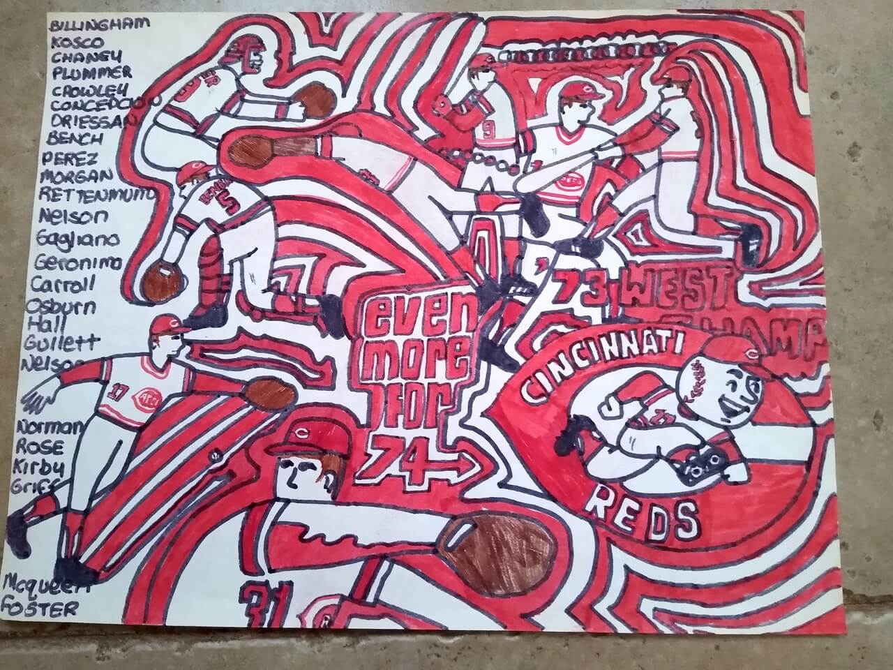
Click to enlarge
In 1973, the Cincinnati Reds — the Big Red Machine — won the National League’s Western Division title for third time in four years. They soon unveiled a new marketing slogan: “Even More for ’74.” And somewhere in the wilds of Cincinnati, a 14-year-old Reds fan named Brinke Guthrie felt inspired.
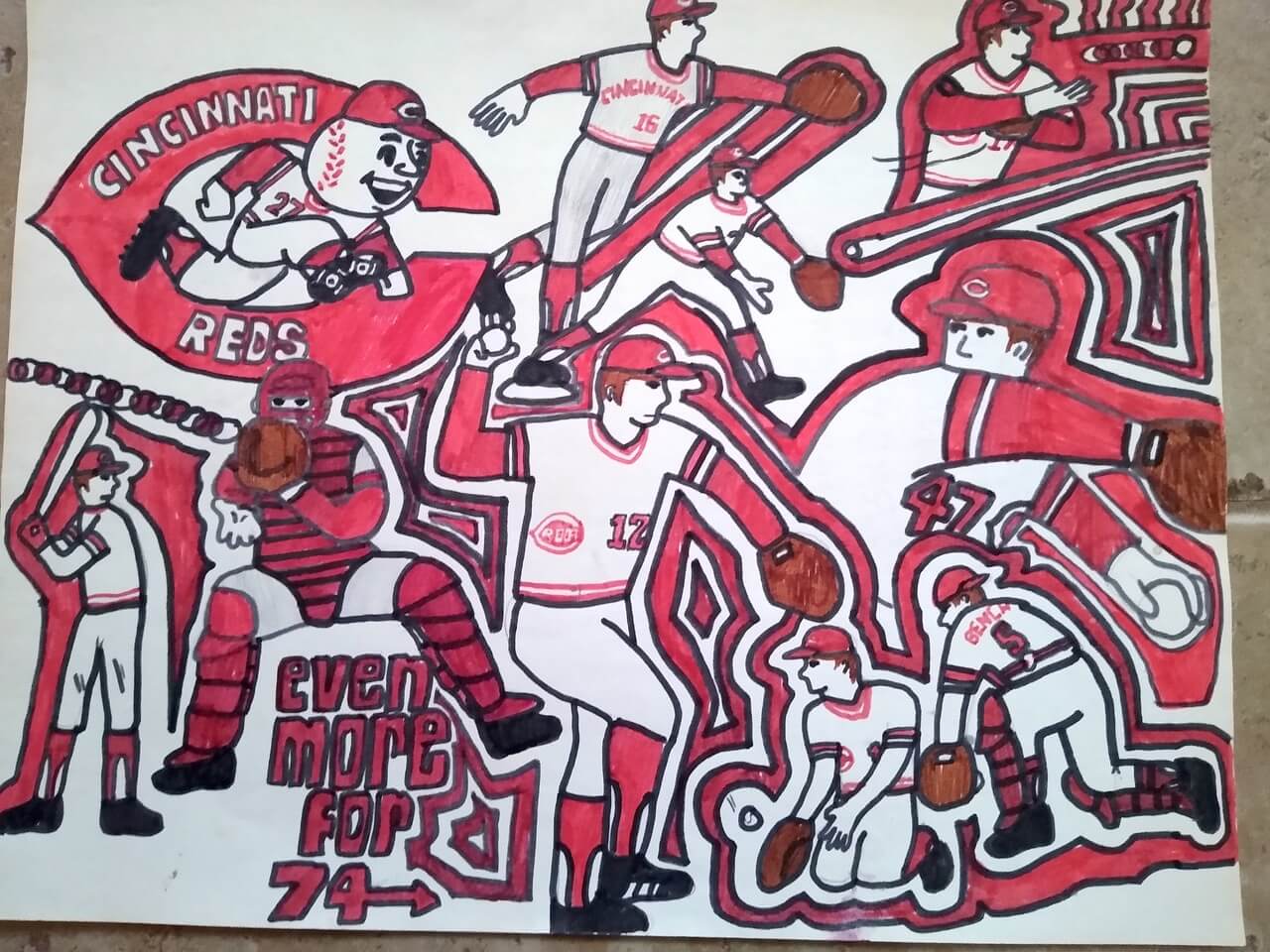
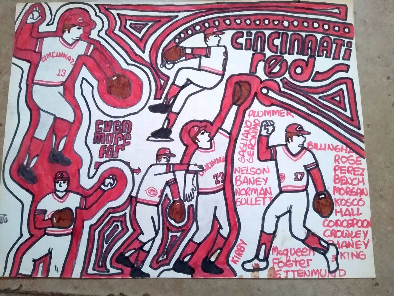
The spectacular poster shown above is one of several that Brinke — Uni Watch’s longtime “Collector’s Corner” columnist — created back then. (I’ll show you the others in a minute.) He hadn’t seen them in decades until his father recently rediscovered them and sent them to him. I love the psychedelic art style, the little hand-drawn imperfections, and — of course — the uniforms.
Here’s a very quick email interview I conducted with Brinke regarding his artwork:
Uni Watch: Did you do these for a school project, or just for yourself?
Brinke Guthrie: Just for me.
UW: Were any of these copied from an existing poster, or was the whole composition (the arrangement of the players, the positioning of the words, etc.) entirely yours?
BG: As I recall, the composition was merely my interpretation of advertising styles at the time, like those motion graphics like you saw at the beginning of the ABC Movie of the Week, or maybe Monday Night Football.
UW: It seems like you depicted the Reds wearing higher-cut stirrups, with more white showing, than the team actually wore. Was that intentional, or just how it turned out?
BG: Just how it turned out. I don’t believe I noticed much of a difference.
UW: In one of the designs, you show a player wearing white shoes, and another one of the designs shows a couple of players in red shoes. Were those supposed to be from an All-Star Game?
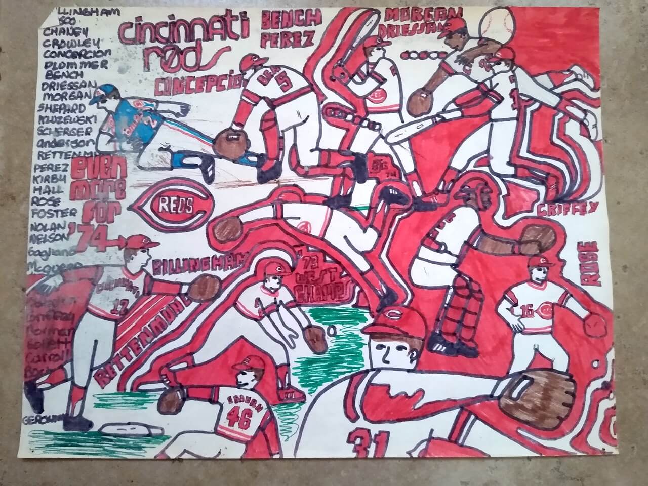
BG: I would guess so. I always liked how they’d “stick it to the man” and wear red or white shoes at the All-Star Game.
UW: I see that one of the posters has your initials at the bottom, in the form of a little “BJG” icon. Is that something you were tinkering with for a while on your artwork?

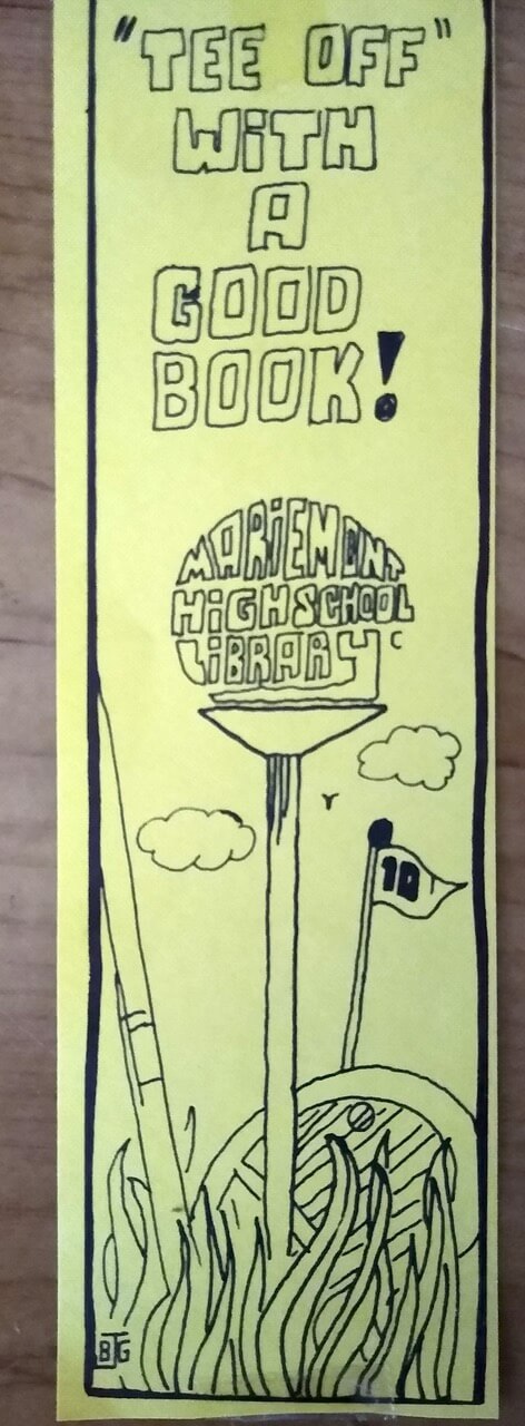
BG: Yes. The “J” was for my middle name, James. You can see that I also used it for this bookmark I made for my high school:
———
As I think you all know by now, I can’t get enough of this type of childhood uni artwork. For all the imperfections, there’s more inspiration, craft, passion, and love in these drawings than in the work of most teams, leagues, or professional designers. No surprise that Brinke turned out to be a Uni Watch reader and then a member of the Uni Watch team. (Although the news that he didn’t notice the difference between the Reds’ real-life stirrups and the way he depicted them is a bit concerning!)
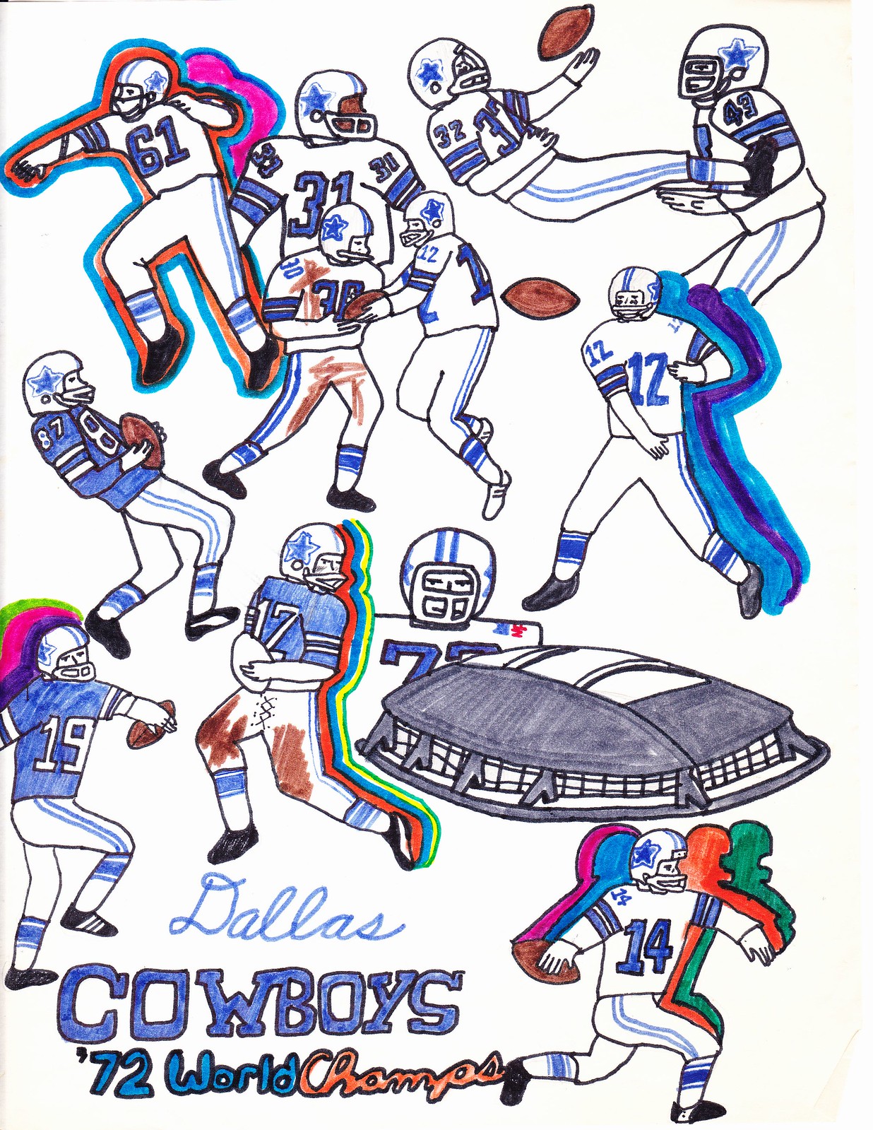
Incidentally, Brinke’s artistic endeavors during this period weren’t limited to the Reds, or to baseball. Here’s some other illustrations he’s saved:


You can see even more of Brinke’s childhood artwork here. Meanwhile, since today is Tuesday, that means it’s time for “Collector’s Corner,” scroll down to the next section for more Brinke-driven uni goodness.

Click to enlarge
Collector’s Corner
By Brinke Guthrie
Follow @brinkeguthrie
Check out this 1974 Cincinnati Reds AM radio. It’s still sealed in the original plastic wrapping, and how about that fantastic box artwork! I also found the same model for the Phillies, Cubs, Pirates, and Brewers. Just in time to listen to radio broadcasts of spring training games! (Not sure that 47-year-old “Whiz” brand battery has stood the test of time, though.)
Now for the rest of this week’s picks.
• Everyone in Green Bay in a Packers fan, right? That includes the Brown County, Wisconsin, Sheriff’s Department, whose uniform patches back in the 1960s included a little Packers helmet icon.
• Nice graphics on this 1993 Los Angeles Dodgers coffee mug.
• New York Giants quarterback Fran Tarkenton said, “If you like to carry the ball, you could be Dodge material” in this 1970 advertising postcard for the Dodge Monaco station wagon. (Fran, the star QB is supposed to drive a Porsche or Ferrari!)
• Here’s a “Riddell: Protecting Great Teams Since 1929” sign for the 1950 New York Football Giants. This looks like a new item, made to resemble vintage.
• J-E-T-S Jets Jets Jets! This late-1960s/early-1970s NFL Jets Booster Pack includes a bobble, pennant, football, and helmet-shaped pencil sharpener.
• From a different Jets franchise: Great cover art on this 1983-84 Winnipeg Jets media guide.
• Baltimore Colts fans, we know you’re still out there. Fire up the record player with this 45-rpm copy of The Colts Songs, described as a “rousing rendition of both Baltimore Colts songs, “Let’s Go You Colts,” and “Go You Fighting Colts.”
• In March of 1957, David Boston of Detroit wrote to his hometown Tigers about a job of some type. PR Director Neil Fenkell replied in this letter, “Thank you for your interest in the Detroit Baseball Company. We fully appreciate the value of your services, but we are unable to make any additions to our staff.” (Maybe they thought Mr. Boston was a Red Sox fan!)
• Speaking of the Tigers: Super cover artwork on this record album, The Year of the Tiger, 1968, which chronicles their World Series-winning season.
Got an item to include on Collector’s Corner? Tweet submissions to @brinkeguthrie
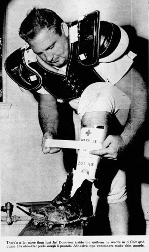
Too good for the Ticker: What’s going on here? It’s a photo of Baltimore Colts defensive lineman Art Donovan taping adhesive tape containers to his leg to create a makeshift shinguard!
That photo comes from a 1955 Baltimore Sun article about the Colts and their equipment. It includes a photo of running back Buddy Young (who would later author the explosive memo about Black NFL players that I wrote about in 2018) wearing hockey pads, which he preferred because they were lighter than football pads (click to enlarge):
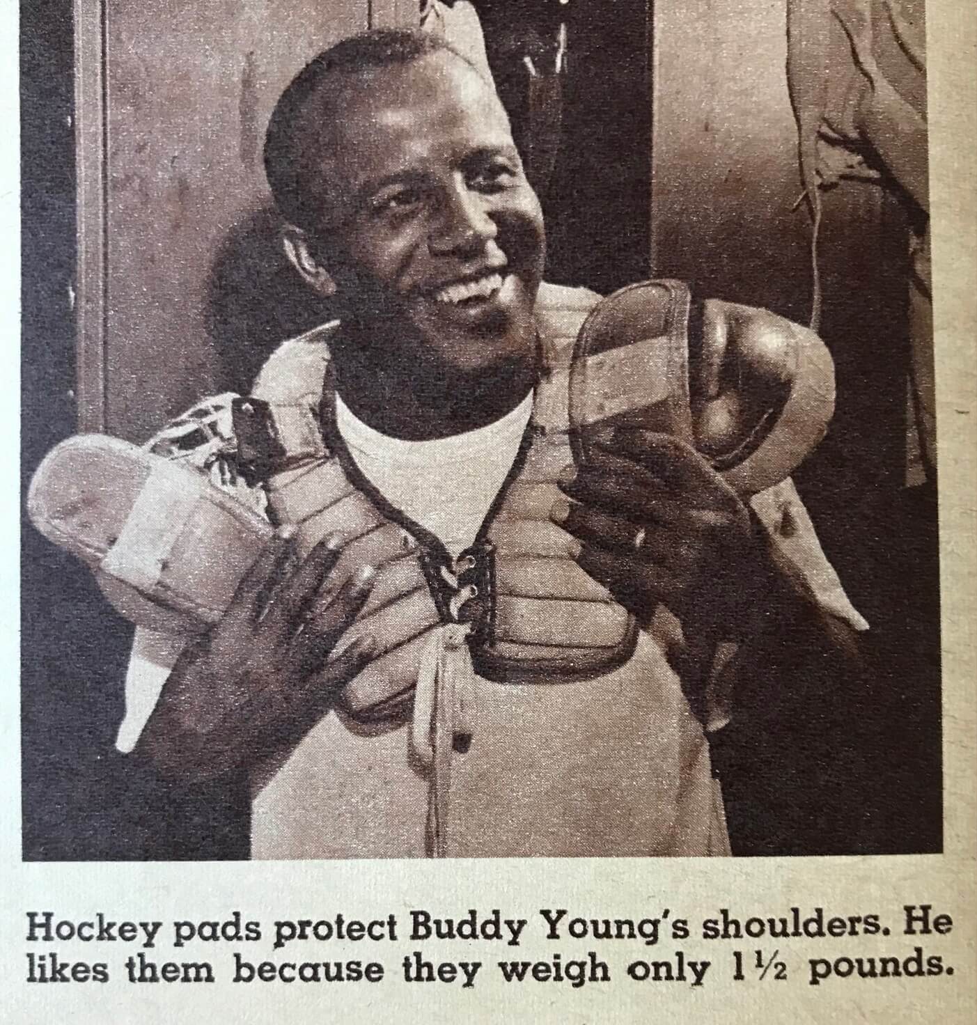
There’s also this photo of a player’s typical set of uniform components and equipment (click to enlarge):
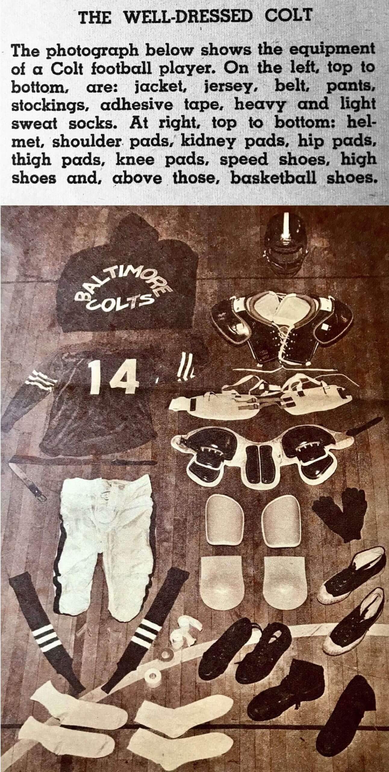
Pretty great stuff! You can read the text of the article here.
(Mega-thanks to reader Will Shoken for sharing this article with me after his brother Fred sent it to him.)
LAST CALL for the winter hat: With spring on the way, we’re going to stop taking orders for our Uni Watch toque/beanie/etc. at the end of this week. So if you want one, you know what to do.
After this week, this item will go on hiatus, and then we’ll probably bring it back sometime in the fall, when the weather gets chilly again.
Also: If your headwear preferences run more toward ballcaps, the Uni Watch Classic Cap remains available year-round. All fitted sizes plus adjustable currently in stock!
Click to enlarge
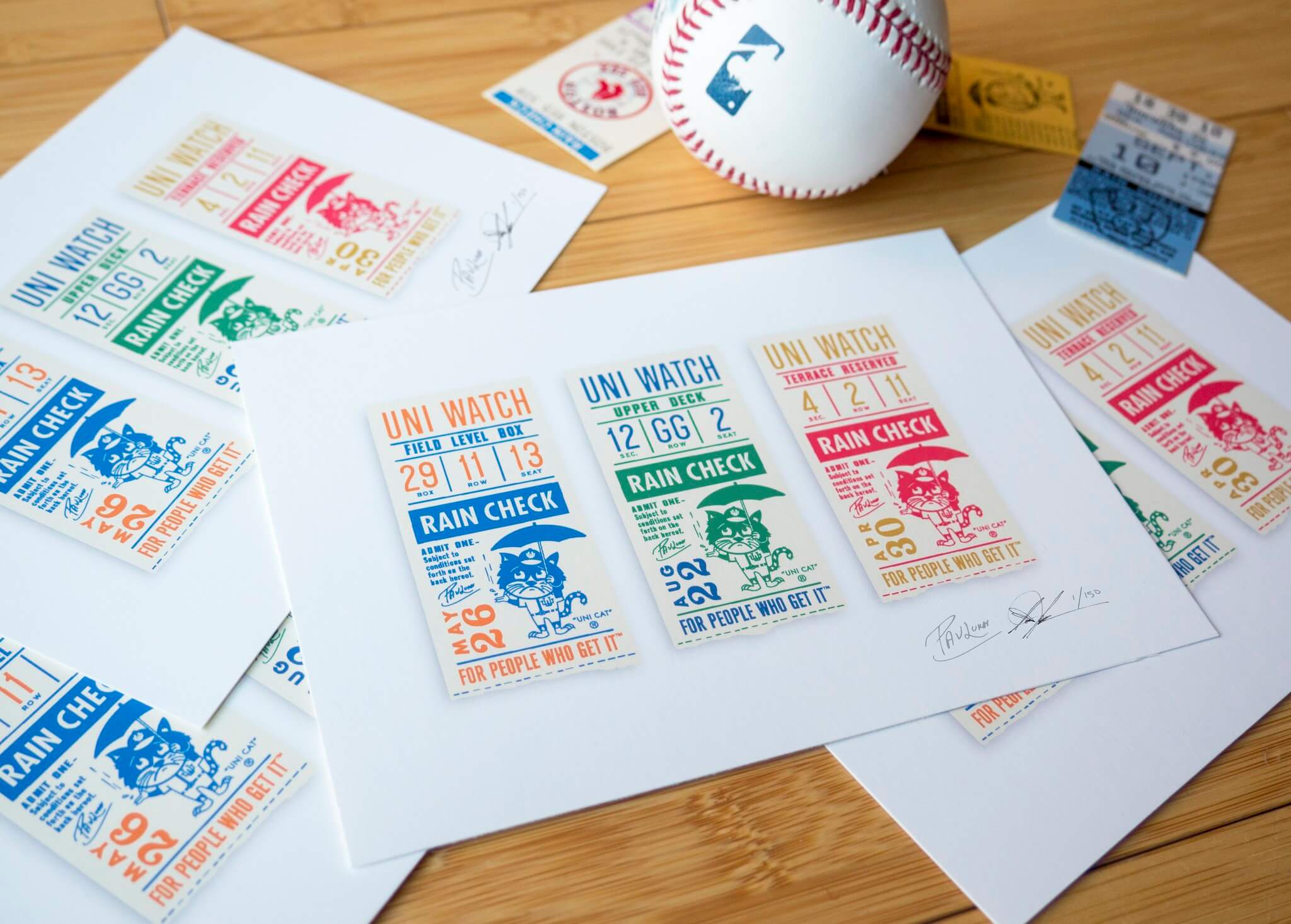
ITEM! Signed/numbered prints available again: Remember these? Todd Radom and I created these museum-quality “Rain Check” prints, produced in a numbered edition of 150 and signed by each of us at a Brooklyn diner, back in 2018. We thought we’d sold out of them but recently discovered a small stash that we’d put aside from promo purposes and then forgot about. If you want one, they’re available on Todd’s website.


ITEM! New membership raffle: As part of last week’s membership drive, reader Jarrod Reich purchased three cards — one for himself, one for his partner, and one for me to raffle off, which I’m going to do today. Before I get to the raffle, I want to share some incredibly kind thoughts that Jarrod included in his order:
I apologize for being a freeloader for more than 16 years. I have been a fan of yours since reading your column on Page 2, and have been reading the Uni Watch blog daily since 2006. Many people cannot fully start their day without their morning coffee; I cannot start mine without perusing Uni Watch.
I came to your work because of my love of the aesthetics of sports (my most indelible memory from my childhood is my first glimpse of the Yankee Stadium field in the mid-’80s) but have stayed with the blog because of not only the general content, but your writing style as well. You have opened my eyes to the beauty of the banal in ways I never expected, and for that I am grateful. And I appreciate your approachable, passionate, and empathic prose on topics both mundane and impactful. While I have not agreed with every one of your opinions, I respect that the thought and sensitivity you bring to them. Further, the site is just fun.
How nice is that? Thanks so much, Jarrod — hearing that I’ve helped you appreciate “the beauty of the banal” is about the best compliment I could ever hope for! Made my day.
Now then: This will be a one-day raffle, with no entry restrictions. To enter, send an email to the raffle in-box by 8pm Eastern tonight. One entry per person. I’ll announce the winner tomorrow.
Big thanks to Jarrod for sponsoring this one. We’ll have more raffles later this week.
The Ticker
By Alex Hider

Baseball News: The Phillies announced that they will wear a memorial patch for Dick Allen, who died in December. No word yet on the design (from Matt Breen). … Squatchee-averse David Price sat out last season but is finally set to make his Dodgers debut this year, meaning one of MLB’s strangest uni quirks would have been even more noticeable, given LA’s white squatchees. But Price pitched yesterday with his “ouch button” (as he calls it) still intact. We’ll see if it stays on into the regular season (from Mario Garcia). … The Padres and their stadium-name advertiser have extended their deal through 2027 (from Timmy Donahue). … White Sox OF Eloy Jimenez has his own personal logo on his cleats (from Erik Johnson). … This blog walks through the best Brewers players to wear every number (from Geoff Poole). … This graphic shows the jersey worn by every College World Series winner dating back to 1975 (from Kyle Hardee). … Elizabethon High School in Tennessee will wear throwback uniforms this season to honor the Elizabethton Blue Grays, a Negro Leagues semi-pro team that played in the city between 1935 and 1955 (from Timmy Donahue). … Lendsey Thomson sends along this photo of the 1976 Kansas City Kansas Community College baseball team. “I absolutely love the simplicity of the tops, the shoes, the hair, and the guy with no shoes on the right,” Lendsey says. … The Yankees’ final season wearing flannel uniforms was 1972. Prior to the team’s game on Aug. 29 of that year, Yanks OF Bobby Murcer apparently modeled one of the double-knit unis that the Yanks would be switching to in 1973, and broadcasters Frank Messer and Bill White talked about it during one of Murcer’s at-bats in this radio call (great find by Ferdinand Cesarano).

NFL News: Yesterday, Paul mentioned that the Browns should pair their leaked 1946 throwback jerseys with white helmets — like the white leather helmets they wore during that era — in the event the one-shell rule is lifted. Here’s how that uniform might look on the field (from @RussellGFlynn).

Hockey News: The Lightning will host fans for the first time this season on Saturday, and will officially raise their 2020 championship banner before the game (from Mike Chamernik). … The Leafs broke out their St. Pats practice uniforms yesterday (from Anthony). … Cool move by the Flames, who used the boards during Sunday’s game to give players an opportunity to give a shoutout to women who inspire them ahead of International Women’s Day (from Wade Heidt). … Speaking of IWD, the Canucks added “Hockey Is for Everyone” helmet decals yesterday (from Wade Heidt). … Technically speaking, bandy isn’t hockey, but it’s close, so we’re putting this next item in the hockey section: Will Scheibler found an Finnish online database of bandy uniforms from 1907-2020.

Basketball News: The league unveiled the logos for the 2022 All-Star Game in Cleveland yesterday. … Blake Griffin will wear No. 2 with his new team, the Nets (from Mike Chamernik and Etienne Catalan). … I love the Big Ten basketball tournament logo. But Sam Angell makes a good point — it looks like the model of a certain deadly virus. “Maybe rethink it this year?” he asks. … This Twitter thread reimagines Clemson’s basketball jerseys as every NBA team’s jersey (from Joseph Young). … In this photo of the 1955 NBA champion Syracuse Nationals, the four players in the back row have four different jersey scripts (from @NFL_Journal).

Soccer News: New jerseys for Sporting Kansas City. Notably, the shirt ad is for a charitable fund started by Children’s Mercy Hospital, whose ad appears on the sleeve (from Germán Cabrejo and our own Jamie Rathjen). … Also from Jamie: The NWSL’s Challenge Cup was the return-to-play tournament last year, but it’s now turned into what sounds like a permanent cup competition, so the league has released a new logo for the cup’s second edition (from our own Jamie Rathjen). … Inspired by yesterday’s note about Syracuse’s new navy shirts, Max Weintraub sent along this shot of the 1983 squad. Note the striped sleeves and point collars! Max himself is somewhere in that photo, although he didn’t say where. “I was a young scrawny freshman! That seems a lifetime ago,” he says. … Norddea Hokkaido, a second-tier women’s soccer club in Japan, has a new mascot that wears No. 38 in honor of March 8’s International Women’s Day (from Jeremy Brahm).

Grab Bag: Two notes from Kary Klismet: The University of Rochester’s student newspaper has a feature about the history of the school’s mascot and how the current design included input from Georgia Tech to ensure their yellowjacket logos weren’t too similar. … Auzzie the Eagle, the live mascot for the West Coast Eagles of the Australian Football League, had to be “gang-tackled” and recaptured after “going rogue” and frightening fans before an AFLW match against Fremantle on Sunday. … John Muir was watching Metallica’s performance on The Late Show last week and noted the band’s set included various custom sports-themed speaker cabinets that included New York Yankees, San Francisco Giants, Golden State Warriors, and X Games designs. … This opinion piece says it’s time for the Orange to honor more female athletes with retired numbers. … The Green Bay Press-Gazette published a delightful piece yesterday about the small-town water towers of Wisconsin and how they can provide a community with an identity (from Ray Barrington). … An U. of Arkansas-produced graphic for International Women’s Day featured inverted images of two athletes, making the wording on their uniforms illegible (from David Wiechmann). … A police officer in Australia is being investigated for wearing a “Thin Blue Line” patch while on duty. That symbol has been linked to far-right groups in the country (from Timmy Donahue). … Piggybacking off a topic that came up in the latest episode of Unified, Brandon Weir spotted a Facebook post that proposed unified color schemes for Detroit sports teams.

Regarding the Metallica item, if I recall correctly Metallica played a brief set at Yankee Stadium to honor Mariano Rivera (cue Enter Sandman) and they had Yankee-themed amps.
That is correct. And they have done the anthem for the Warriors and Sharks at various points, and the Giants had an annual Metallica Night for a while (one of which I attended and had a blast).
I’ve always thought the B1G basketball tourney logo looks like a barn quilt.
That Colts article is fascinating. They wore red vs the Lions because of a clash- assume it was a night game because no white jerseys? Has this been mentioned on the site before Paul? Also Weeb Ewbank not allowing water during games and practices, imagine a coach trying that psycho stuff today.
I don’t think we’ve written about that, no. Interestingly, they played the Lions twice that season — Colts wore red for one game and the Lions wore red for the other!
link
According to the Gridiron Uniform Database, the Colts wore red jerseys 5 times: at Detroit in 1953-54-55 and at Green Bay in 1954-55.
Small typo in ticker: “one of the MLB’s strangest uni quirks”
MLB does not take an article.
Fixed.
I’ve seen the graphic of College World Series winners jerseys before, and still wonder why Miami’s 1985 championship isn’t represented. They won in a different jersey than the 82 team, an orange one with Miami spelled out in green.
Gotta love the fact that the ’81 team won the title in the Rainbow Guts!
I’ve always wondered when reading the name, how is “Brinke” pronounced?
“Brink”?
“Brink-e”?
Also, is it a nickname or a full first name?
It’s ‘Brinke’ which rhymes with “drink,” “pink,” “fink” and “stink,” witch kids in elementary school were always kind enough to remind me of. That’s my first name in its entirety, and was my grandmother’s maiden name.
Did you refer to them as “witch kids” back then because they made fun of your name? ;)
always thought it was brink-e. gonna have a hard time relearning that. great art!
Me too!
Brinke is basically a pseudo-celebrity around here, and I never even contemplated that it wasn’t pronounced “Brinkey”. Shame on me.
RE: Sporting KC jersey sponsor:
The Victory Project was created by Sporting KC after the end of their relationship with Livestrong. It’s designed to help children with cancer in the KC area but also make soccer more accessible to children. Childrens’ Mercy is one of the groups Sporting works with in the area.
Great artwork, Brinke!
Didn’t realize/didn’t remember that the Movie of the Week used the Mary Tyler Moore font (I know it has another name but that’s what I’m Calling it).
Baltimore Colts defensive lineman Art Donovan taping adhesive tape containers to his leg to create a makeshift shinguard!
I’ve heard of kids using National Geographics in the same way for soccer.
Basketball News: The league unveiled the logos for the 2022 All-Star Game in Cleveland yesterday.
*The NBA.
Or “The Association.” ;)
The Mary Tyler Moore font is Peignot (pronounced PEN-yoe).
Nice clean logo for the 2022 NBA All Star game in Cleveland. As a Clevelander, it’s nice to see our city’s true landmark, The Terminal Tower, represented instead of the seemingly ever-present guitar, which I personally can do without.
Brinke’s pictures are amazing, and show what kids are capable of when they witness a gap in the depiction of their favorite team/sport/avocation. Necessity is the mother of invention!
adorable brink! but wade blasingame is going to get a fine for that little happy accident on a two colour shoed lefty.
Thanks for including the link to your Buddy Young memo piece. I somehow missed that back in 2018 and it was a great read. Always amazing to realize how far we’ve come/how far we have to go.
Love the artwork, Brinke! I love the attention to detail and the vibrant colors. Great stuff! Childhood uni artwork is the best!
But not enough attention. Notice; I flip-flopped the number and the C-Reds logo. Unforgivable, even at 14 years old.
While we’re on attention to detail, I chuckled when Paul wrote he was disappointed you didn’t notice the Reds’ stirrup length. That paled to not noticing Steve Carlton is left-handed. :-)
Regarding the article on yellow jacket mascots in the grab bag. Pretty good article that makes us (Georgia Tech) out to sound like jerks. But…you gotta protect your trademarks and copyrights or you can lose them.
I love this passage:
But Rocky has a doppelganger: Meet Buzz, Georgia Institute of Technology’s mascot, who debuted in 1980. Buzz is also a yellowjacket. Buzz is also a very intimidating yellowjacket.
To quote the song about Shaft: “You damn right! Can ya dig it?”
Now I don’t much like this passage:
The team’s lawyer, Gregory D. Phillips, commented on the suit to the Chronicle of Higher Education.“Georgia Tech might think their mascot is famous, [but] no one here has ever heard of them,” he said. “No one ever showed up at a game out here expecting to see a Georgia Tech game, and no one ever showed up out there looking to go to a Salt Lake Buzz game.”
Well, let me tell you something, Mr. Phillips. I would take our chances on recognition against a minor league baseball team. Bobby Dodd. Three national football championships at the time (though in 88 we sucked). A basketball team that was a national contender at that time that two years later made it to the Final Four. And one of the best engineering schools in the country. Give me the Georgia Institute of Technology over the Salt Lake City Buzz any day.
BTW; new feature for Collector’s Corner which is a super under the radar Easter Egg; the colors of the featured photo are rendered in the exact Hex color of the team.
It’s what you do if you Get It™.
Put the Browns, 49ers and Colts in true throwbacks to 1946. Make ’em wear appropriate colored leather helmets. :-P
And since the AAFC team was called the Buffalo Bills, the Bills should fauxback to the 1946 AAFC Bisons (renamed the Bills in 1947) kit.
link
As a Buffalo fan, I would lose my mind (in a good way) if they wore these. Well, I could lose the back pants stripe on the grey pants. But keep those pre-season stiped socks!
What a gorgeous uni!
Great artwork Brinke! As someone who writes in all caps, I quickly noticed that in some of your drawings you start writing in all- caps then switch. Is there a reason? I started writing in all- caps at around age 14, and remember I would sometimes forget and start writing in “normal” handwriting. I’m guessing that something similar happened to you. Or is there a deeper explanation?