Click to enlarge
Membership card designer Scott M.X. Turner recently gave me an idea for a really fun topic: uniforms or uni elements that were originally intended to appear for only one season but ended up becoming long-term or even permanent fixtures.
The most notable example of this is probably MLB’s familiar silhouetted-batter logo, designed by the late, great Jerry Dior. It was created as a centennial logo to be worn as a sleeve patch during the 1969 (see above) but was considered so successful that it was retained and repurposed as a new MLB logo.
Scott and I came up with a bunch of additional examples:
The Pirates’ Pillbox Caps
Lots of National League teams wore pillbox caps in 1976 as an old-timey nod to the league’s 100th anniversary. The Pirates liked theirs so much that they decided to keep wearing them in 1977 … and ’78 … and all the way through 1986!
———
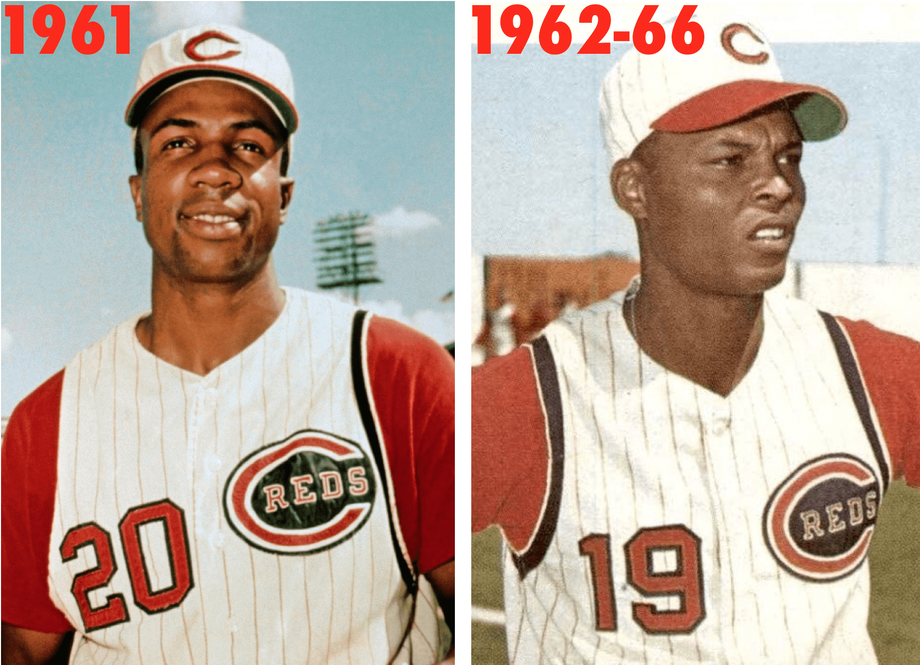
The Reds’ 1960s Armhole Stripes
In 1961, the Reds added black piping to their left vest-jersey armholes as a memorial for owner Powel Crosley. They apparently thought the piping gave the vest a sharper look, because instead of removing the left-side memorial the following year, they kept it and added matching piping on the other side, which they ended up keeping for five seasons.
———
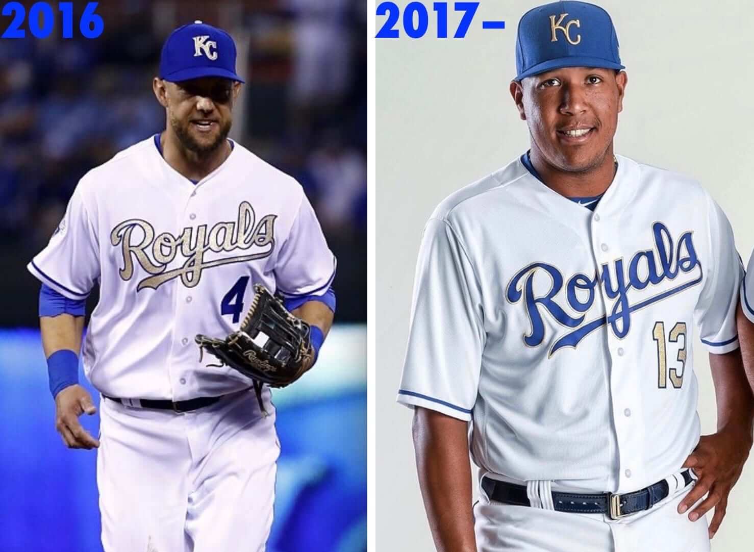
The Royals’ Gold-Trimmed Uniforms
After winning the 2015 World Series, the Royals, like most recent MLB champs, opened the following season by wearing gold-trimmed uniforms. They ended up requesting and receiving permission to keep wearing the goldies as a Friday alternate for the rest of that season, and then they came out with a similar gold-trimmed design as an official alternate in 2017. That uniform is still in their rotation today.
———
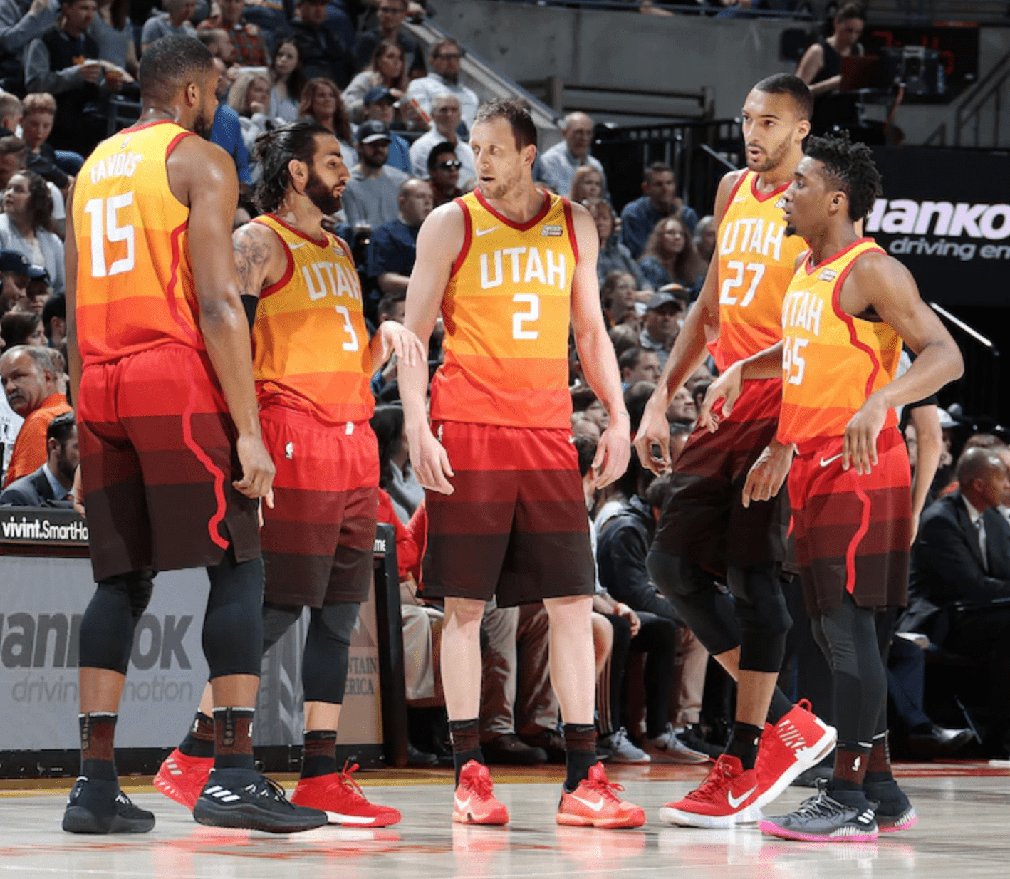
The Jazz’s “Red Rock” Alternates
When the NBA’s “City Edition” alternate program launched in the 2017-18 season, the idea was that each City design would be worn for only one season. But Utah’s “red rock” design was such a hit that the Jazz chose to stick with it for 2018-19 (they were the only team to keep their first City design), and then they kept it again for 2019-20.
———
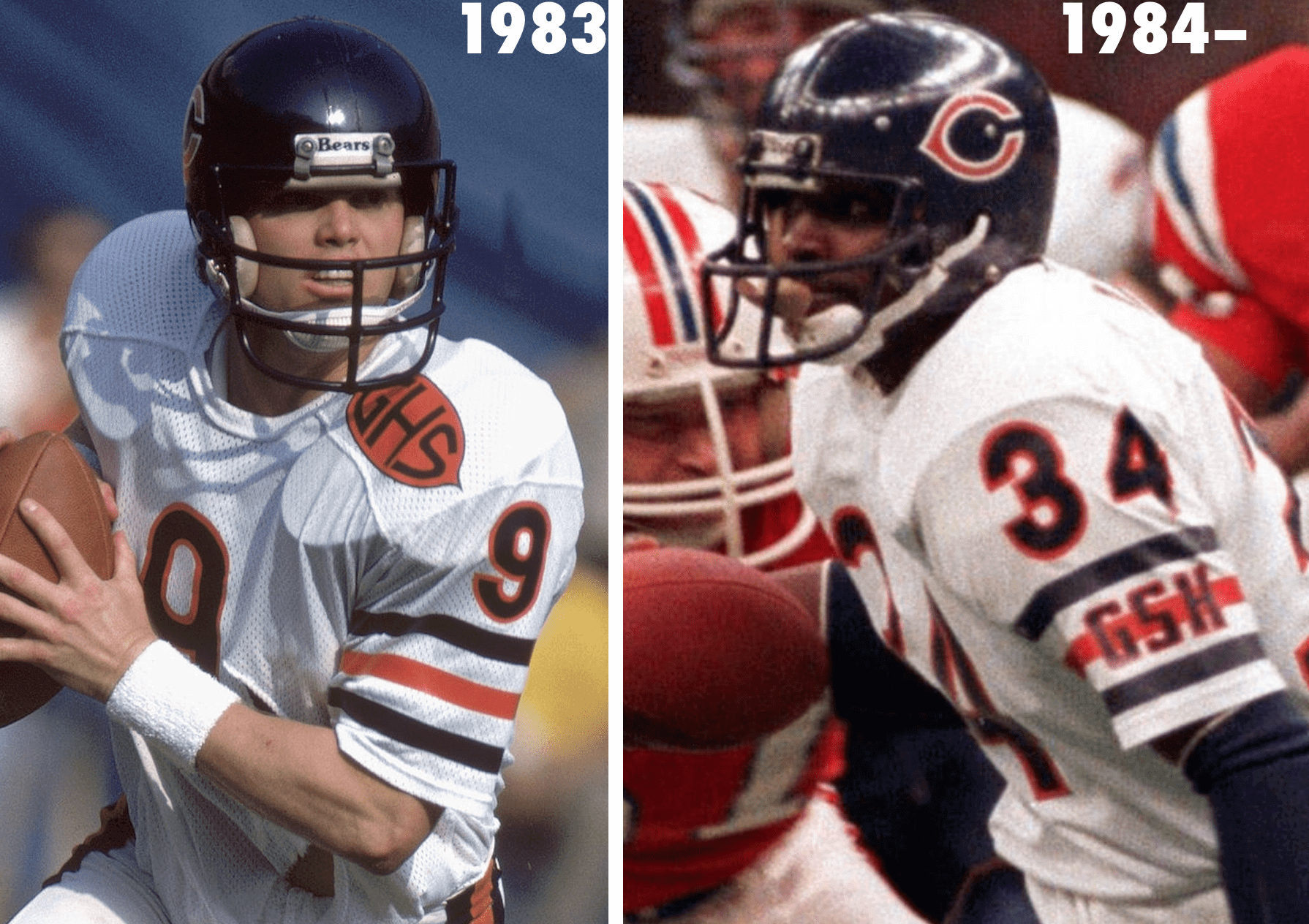
The Bears’ George Halas Perma-memorial
After Bears founder George S. Halas died during the 1983 NFL season, the team added an enormous monogram-style memorial patch for him. The following year they decided to memorialize Halas permanently by adding his initials to the left jersey sleeve, where they’re still worn today. To my knowledge, this was the uni-verse’s first perma-memorial.
This raises the question of whether other perma-memorials (such as those for Al Davis, Lamar Hunt, Al McGuire, William Clay Ford, and Bob McNair, for example) were originally intended as one-year gestures and then got extended, or if they were intended from the start to be long-term uniform elements. Honestly, I’m not sure. Anyone..?
———
I’m fairly certain there are other examples that I’m not thinking of. If you know of any, feel free to post them in today’s comments. (Remember, we’re not looking for alternates that got redesignated as primaries — we’re looking for things that were originally supposed to be for just one season but ended up being extended or repurposed for additional seasons.) I look forward to seeing what you come up with!
(Big thanks to Scott M.X. Turner for coming up with this topic.)
Too good for the Ticker: I don’t care about soccer or video games, and I actively dislike advertising on uniforms. And yet I love this video by Uni Watch reader Justin Simmons, which takes a detailed look at the history of video games being advertised on soccer jerseys. Such a specific sub-category! I love the obsessive niche-y-ness of it. Nicely done, Justin!
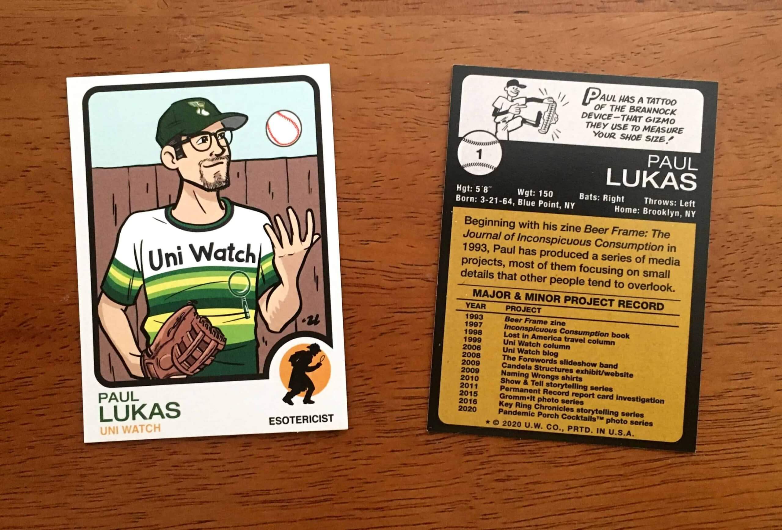
ITEM! Trading card price break: I still have about 150 of the Uni Watch trading cards — including three or four of the numbered/signed ones. These originally sold for $5.99 apiece, but as of today I’m reducing the price to $3.99 for the first card and $2.99 for each additional card.
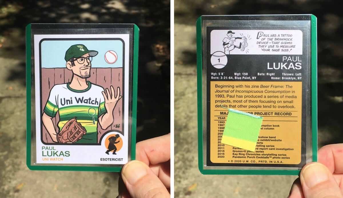
Just like before, each card comes in a green-bordered toploader and includes a relic swatch of the Uni Watch jersey I was wearing for the photo shoot that served as the basis for the card illustration:
Full ordering details here.
The Ticker
By Lloyd Alaban

Baseball News: Recently, former Red Sox P Rich Hill was on The Bradfo Sho, a podcast about Boston sports. At about the 19:30 mark, Hill and the host started talking about Hill’s 2015 shutout win against the Orioles after a long injury recovery. Hill says he would have loved to wear the team’s home whites for that game instead of the red alternates the team wore (from Devin Clancy). … The Braves have a new sesquicentennial logo. No word yet on whether it’ll be worn as a patch, but that seems likely (from Austin Perry). … The Twins recently decided not to renew their partnership with their Triple-A affiliate, the Rochester Red Wings. So the Red Wings posted a video of their staff removing all Twins-related grapihcs from their ballpark (from Andreas Papadopulos). … Nats OF Victor Robles, currently playing in the Dominican Winter League, has been wearing a surgical mask on the field (from William Yurasko).

Football News: Steelers WR Chase Claypool has had his helmet fitted with one of those lower-face screens on his helmet (from @MrBudziszewski). … ESPN compiled a visual history of Patriots head coach Bill Belichick’s hoodies (from multiple readers). … The Falcons posted an animation of LB Foyesade Oluokun in the team’s old uniform. … Idaho teased their new uniforms this week (from Braden Erickson). … University of Buffalo DE Eric Black usually wears No. 94. He wore No. 41 last night in honor of late teammate DE Solomon Jackson, who died in February at 20 (from Moe Khan).

Hockey News: As part of their 100th-anniversary celebration, the University of Minnesota will wear throwbacks this season featuring gold pants and white sweaters with diagonal lettering across the front (from Kary Klismet). … Also from Kary: Sports website theScore has ranked its top 50 NHL logos of all time. … The Kraken aren’t able to participate in this season’s “reverse retro” program, but that doesn’t mean Seattle doesn’t have a long history of retro uniforms. … The Avalanche released their 25th-anniversary logo, which will be worn as a patch. That article also includes this news: “The home and away sweaters will now feature the primary color of blue for the shorts, gloves and helmets, while the alternate sweater will have slight modifications to the pants and gloves” (from Andrew Doran). … Here’s something you don’t often see: orange Cooperalls! … Flyers mascot Gritty won the internet yesterday.

Basketball News: The NBA draft will be held remotely tonight. Top prospects have been provided with gear from 30 teams, so they pose with the proper accessories once they’ve been picked. … The Nuggets have been teasing a red skyline alternate that will apparently be revealed today. … New jersey advertiser (thanks to all who shared). … Georgia State has broken ground on its new basketball arena (from Kary Klismet). … Also from Kary: Kentucky is now letting fans buy cardboard cutouts to be placed in their arena. … Houston Baptist is adding a “Love Your Brother” patch to its uniforms. Also, the school’s “Hustlin’ Husky” uniform will be back for one game this season. Date not yet finalized. … Looks like coaches in the ACC will be going Casual Friday every day of the week this season (from James Gilbert).

Soccer News: New crest and colors for the Houston Dynamo and Houston Dash. New alternate shirt for the Dynamo, too. More details here (from multiple readers). … New crest for Louisville City FC (from Josh Claywell).

Grab Bag: New kits for Major League Rugby (from Wesley Eustis). … New two-liter bottle design for Pepsi (from Graham Block). … The new Fort Worth National Lacrosse League team has announced its name and logo (from Wade Heidt). … New mascot logo for Southwestern Michigan College (from Kary Klismet). … Also from Kary: Japan has a new cartoon mascot to encourage mask-wearing to fight the coronavirus. … Sinclair is considering selling the naming rights to Fox’s regional sports networks to a betting company (from our own Alex Hider). … Pictures of the first soldiers to graduate from basic training wearing the Army’s new “pinks and greens” uniforms have been published (from Timmy Donahue). … NASA spoke with Richard Danne, the designer behind their “worm” logo (from Joe Gagosian). … Douglas Freeman High School in Virginia has changed its team name from Rebels to Mavericks (from Kary Klismet again). … New racing uniform for the Japanese Ski Federation (from Jeremy Brahm).

Our latest raffle winners are Samuel Woolard and Brent Wilson, who’ve each won a Uni Watch membership card. Congrats to them and thanks to Chris Pedersen for sponsoring this one. — Paul
The Dodgers made jerseys with their signature red numbers in anticipation of playing in the ’51 World Series, but then lost to the Giants and didn’t make it to the World Series, so they decided to use the red number jerseys as their standard home design the following year, and have remained that way ever since.
Could we say this falls into the “When a One-Year Thing Becomes a Long-Term Thing” category?
Good one! Not quite what I had in mind, but it’s definitely close enough!!
The cool thing about that batters logo patch is you can’t determine if he’s hitting right or left handed.
I’d say yes – it’s a close parallel to the Royals. KC originally intended the gold to be a literal one-time thing, for either a single game or a single homestand, then extended it to a full season, then made it permanent. And like the Dodgers, the eventually permanent uniform change is the best thing the team has ever worn.
When I saw the start of this entry, I assumed that the Dodgers’ red numbers would have been one of the examples that Paul gave.
The Seattle Mariners used to have that trident logo on the hat. Then they hosted the 1979 all-star game, and that all star game was the M trident logo in front of a star. That star logo then became the new permanent hat logo by 1981.
I love the Braves sesquicentennial logo. It’s understated by recent standards for event logos, but understatement speaks louder in a case like this. And the almost heraldic inclusion of the little Boston and Milwaukee cap logos is such a nice touch. My only complaint is the awkwardness of the “th” sticking out into an expanded outline layer. The ordinal lettering is correct, but I’m not sure it’s necessary here. The word “anniversary” on the banner makes the ordinal “th” implied.
Agreed! The patch is very nice and the B and M nod to the team’s history is well done.
The University of Evansville men’s basketball program wore orange at home in the 1993-94 season as a tribute to Hall of Fame head coach Arad McCutchan who passed away in the summer of 1993. At the time the color scheme was purple and yellow but after the positive response the color scheme changed to purple and orange full time, still in use today.
McCutchan had his team wear orange on the road as it was easier to pick out against the dark backdrops often found in gyms during the 50s, 60s. He also pioneered sleeved jerseys, which Evansville was already wearing at the time. Today orange is used as an alternate on occasion as the primary road uniforms are purple. Orange sleeved jerseys have made rare appearances over the years as well, most recently during the 2018-19 season.
I never knew that story! Thanks for sharing.
Also as for football permanent memorials, we should not forget Lamar Hunt. I vividly remember the Chiefs originally had their jersey logo (LH in a AFL logo) as a one year tribute. Then, they petitioned for that to be a permanent change. The NFL let the Chiefs have this permanent change, but considered it a “uniform change” so they’d be stuck with it for 5 years at least. As all NFL uniforms have to be kept for 5 years. So far, so good.
Well seeing that the Chiefs never really changed their uniforms in 60 years except for replacing the Dallas Texans logo on their helmets to the “KC” arrowhead when they moved in 1963, its a safe bet they’re sticking with their current uniforms for a while.
Of course, being the defending Super Bowl champions helps, too.
The “new Pepsi” link is not working in the Grab bag section.
Fixed.
This is kind of pedantic (and probably debatable) but I wouldn’t consider Victor Robles’s mask to be a “surgical mask.” I work in a hospital and what I think of as a surgical mask is exceptionally form-fitting around the nose and has two pairs of ties in the back rather than ear loops. (This is not to be confused with the horrors of the N-95, with its tight elastic and giant metal nose bar. These are required for direct patient contact in the Covid sections of the hospital. I’m lucky to only have to enter these zones once or twice per month.)
Covid is surging in my area and we recently received a memo that all staff need to be wearing “surgical masks” at all times, and they made a specific distinction between the tie kind and the blue ones available at a gas station near you – the kind that Robles was wearing. I was glad to hear this because the better quality surgical masks are the most comfortable kind for me to wear for many continuous hours and was already wearing them daily. I think some hospital staff—like maintenance or marketing people—blanch at having to give up their cloth mask or disposable blue ones. I’m just glad people aren’t wearing neck gaiters like they were in the spring and summer.
To put it another way – I shudder at the thought of a mask like Victor’s being used for surgical purposes.
The Bears white throwback from the 30s was supposed to only be for the 100th anniversary season, but they’ll be wearing it again later this year (after they already went on clearance and I was able to snag one for $30 at Ross).
Also, not exactly a ‘1 year’ thing, but there’s been Winter Classic jerseys that went on to be re-purposed as regular alternates. The Hawks added shoulder patches to theirs that was worn in the 2009 edition.
Hi Paul. Typo in Grab Bag. The Fort Worth lacrosse team is in the indoor National Lacrosse League, not the outdoor Major League Lacrosse.
Thanks. Fixed!
I could see Sinclair coming up with some “national” name for the regional sports networks then, as ESPN does, add “powered by” or “driven by” to the name. Could customize for each market. Or just add an advertiser name to the “national” network name. WEEI radio in Boston does this for the Red Sox, always referring to the “Shaws – Star Market – WEEI – Red Sox – Radio Network. It’s a mouthfull.
The porch cocktails are going to continue through the winter?
That’s been the plan all along, yes.
Warning, soccer ahead:
In 1967 Dundee United became the Dallas Tornado in the United Soccer Association for one summer and wore orange and blue, instead of their colors at the time of white and black.
After a two-year gap, in 1969 they permanently began wearing orange (with black). That’s longer-lasting than any of the examples in this piece.
That article about Seattle’s hockey uniform history is great, but I’m afraid I didn’t submit it. I hope whoever did can get proper attribution.
The Padres Ray Kroc RAK sleeve memorial. Not sure the original intent, but they wore it for 3-4 years and then took is off, so it wasn’t one season and it wasn’t permanent.
Hey Paul,
Since Uni Watch is steadfastly opposed to uniform advertising, and because nobody really cares whose corporate logo is defacing which NBA uniforms, as a rule let’s stop mentioning changes in the ticker every time an NBA team gets a new uniform advertiser.
Why give them the free plug, and why acknowledge these changes as newsworthy, unless we want to arrange a boycott of any and all uniform advertisers?
I find it difficult to believe any UniWatcher actually cares which company logo is on NBA unis, and if they do I hereby propose to have them permanently excommunicated from the UniWorld.
I endorse this, with the exception of cases where a team goes from no ad to having an ad, or from having an ad to having no ad.
Same for other sports, like soccer. Worth a ticker mention only when a team switches from among the binary ad/no-ad options. (Or from paid to charitable advertising, such as when a team drops its prior gambling website ad and place a UNICEF ad on its chest.)
Just because you don’t like the news or the topic doesn’t mean it’s not news … and those certainly count as uni news.
At least that’s my take.
I’m fine with the proposal to not mention changes to uniform advertiser, due to Uni Watch’s opposition to uniform advertising. I also oppose uniform advertising and don’t want to give them the free publicity. However, I would disagree with your last statement that “I find it difficult to believe any UniWatcher actually cares which company logo is on NBA unis”. There are many people who regularly read Uni Watch. Paul probably has the numbers, but I would assume that it is at least in the thousands. I often see people post in the comments issues where they disagree with Paul’s position on a given issue. I have seen comments discussing the specific uniform advertisers, including the aesthetics of a particular logo, whether the advertiser was a locally based company associated with the team’s city, and which industries are more likely to advertise on uniforms. I would not be surprised at all if there were Uni Watch readers who do care about this, even though Paul and many others do not.
Perhaps not exactly one-year to long-term, but pretty similar I think: the 49ers’ throwbacks in 1994 with black letter shadowing and white pants meant to be worn for only a few games, which turned into being worn for the rest of the season all the way to the Super Bowl, which turned into a new uniform set clearly inspired by that throwback set being debuted in ’96.
As a kid I remember how hugely popular those Pirate pill box caps were back in the late 70’s and early 80’s. I had the black cap and my buddy had the yellow.
Would the Penguins 2009 blue throwback/fauxback jerseys count? Debuted in the 2008 Winter Classic, then became the official alternate the following November and was worn for 3 seasons. Same could be be said about their 2011 Winter Classic jersey, but that one becoming a permanent alternate seemed a bit more calculated.
Buffalo’ Eric Black was actually wearing #41 last night to honor his late teammate (the ticker item says #44).
Fixed.
I think the Browns’ “Al Lerner” patch was intended for one year before it was left on for ten which, as a Steelers fan, I never understood because Al Lerner actually HELPED Art Modell moved the original Browns to Baltimore. Randy Lerner officially removed it because “it had been ten years”, but I’m sure him selling the team to Jimmy Haslam (who would have no attachment to the “AL” patch) like a month later played a factor in removing it, too.
I had the same thought. Wasn’t it Al Lerner that provided a private jet to shuttle Modell back and forth to Baltimore while he was making the deal to move behind Cleveland’s back?
Something like that. I think he was one of Modell’s investors in the original Browns if I’m not mistaken. Not sure how he ended up with ownership, but then again I think the only other serious bidder was an ownership group that included Bill Cosby–in hindsight, perhaps best that Cosby didn’t end up with ownership. Even the Browns (in typical Browns fashion) knew not to have a rapist as an owner.
The Cleveland Browns wore a memorial “AL” patch for owner Al Lerner, which continued while his son Randy owned the team. Once he sold the club the new owner had the letters removed.
The name for the new lacrosse team in Fort Worth – “Panther City Lacrosse Club” – is another sign of the continued Euro-fication of American sports team names. It was bad enough when the phenomenon took root in American soccer, a sport that already had a distinctive culture of its own in this country that used team names that largely followed established American naming conventions.
To see it start permeating a sport native to North American (truly Native, since it originated among indigenous people on either side of what is now the U.S./Canada border) feels… forced. It’s like someone in marketing ran some numbers and decided the same demographic that likes “alternative” team sports like soccer is the target that professional lacrosse leagues should be going for. Never mind that the sports have very distinct histories and cultures…
I didn’t know we were getting a lacrosse team. I like lacrosse. I don’t like the name though. Should have called themselves the Fort Worth Panthers.
Agreed. I’ve been to Fort Worth, and I never knew that panthers were a big thing there until I read the press release about the team yesterday. It’s actually an interesting little tidbit about Fort Worth’s culture and identity, and I don’t mind it being incorporated into a team name.
But it would be more effective if the team’s name were the Forth Worth Panthers, as you suggest, since that then it would tell me, you know, where the team is from. I mean, does anyone know what “Panther City” is? Does anyone in Fort worth even call the city that?
Was surprised about the name as this sort of name style is more like soccer and not what we are used to seeing in NLL.
I was hoping for a different name. I would have liked Texas Rattlesnakes or something like that.
Umm, I have a question.
If the National League’s centenary was in 1976, and it is the senior circuit, what was the MLB centennial patch for in 1969.
what happened in 1869 that MLB celebrated 100 years later?
There’s some murky, corrupted, “not quite right” pre-history that MLB is stuck with as official canon, recognizing the 1869 Cincinnati Red Stockings as the first iteration of any current MLB team.
I’m pretty sure it’s the establishment of The Cincinnati Red Stockings as the first professional “base ball” team. link
Thanks to you both
I’m assuming that Braves 150th Anniversary logo was designed by Todd Radom, am I correct?
Rich Hill’s comment is interesting. The red alternates for the Red Sox aren’t exactly a gimmicky cash grab, but I’m sure there are players across pro and college sports at this point who have had their big moment occur while wearing a goofy one-off and wish that they’d been wearing a more traditional uniform.
San Francisco Giants ownership (Peter Magowan, I think the name is? Is he still in charge?) jettisoned the black jerseys because they were sad to see Barry Bonds hit his 71st home run of the season in that, instead of a classic home white look. (Or, you know, as white of a uniform as the Giants have these days.)
Reminds me the Cleveland Cavs achieved immortality wearing black T-shirts.
Wasn’t Derek Jeter Day on the day of the Mother’s Day pink-accented uniforms? I could be misremembering.
Unfortunately you’re right and not misremembering.
Here’s one that might count: the first home game after the Boston Marathon bombing in 2013, the Red Sox wore white jerseys that said “BOSTON” across the front instead of the usual “RED SOX;” if I’m not mistaken they’ve worn it every Marathon Day (Patriots’ Day, to the natives) since.
Yes — good one.
This doesn’t quite meet the criterion of being a “one-year” thing that lasted longer, but maybe the Mets’ two-tone black cap, which was designed and intended to be an alternate worn with the black alternate jersey, becoming the de facto road cap by the end of 1998 and the de facto primary home cap beginning in 1999 along with the pinstripeless white “alternate” uniform becoming the de facto primary home uniform at the same time, is along those lines.
Or maybe “alternates that became primaries” (or, “alternates that became de facto primaries without/before being designated as such”) is a different category worthy of separate consideration.
The Providence Friars mens’s basketball team wore a Dave Gavitt memorial patch on the left side of their jersey shortly after his passing during 2011-12 season. Since then, they have placed a permanent memorial patch underneath their collar.
So many NHL Winter Classic/Heritage Classic/Stadium Series uniforms have been brought on permanently:
Boston – 2016 WC
Calgary – 2009 Anniversary, 2019 HC
Chicago – 2009 WC
NY Islanders – 2014 SS
Ottawa – 2017 CC
Philadelphia – 2010 WC, 2012 WC, 2017 SS
Pittsburgh – 2008 WC, 2011 WC
St. Louis – 2017 WC
I have an example of a temporary uni detail that has turned permanent – the “ANF” decal on Iowa’s football helmets. The sticker made its debut when Iowa played at Ohio State on November 2, 1985. Iowa had been ranked number one in the polls for five consecutive weeks at that point (its first time being rated so highly in 24 years) and had played several games on national TV – a rarity at the time, especially for Iowa’s program.
Coach Hayden Fry decided to use Iowa’s sudden rush of national publicity to promote the state’s agricultural sector, which had been devastated by the farm crisis of the mid-’80s. Even though Iowa lost to Ohio State that day to ruin its hopes of a perfect season, the ANF (“America Needs Farmers”) stickers the team wore that day were a hit, garnering every bit as much attention among fans and the media as Coach Fry wanted them to if not more. They not only lasted the rest of the season, but became a fixture of the team’s visual identity until 1992, when the NCAA cracked down on “excessive” helmet decals.
After the NCAA loosened its helmet decal restrictions, current Iowa coach Kirk Ferentz revived a version of the sticker ahead of the 2011 season and they’ve remained on the helmets ever since. The ANF logo can now be found across a variety of Iowa’s sports teams, including on the baseball team’s batting helmets and on some wrestlers’ protective headgear.
Unfortunately, it’s hard to find written sources indicating that the ANF sticker was intended for a limited engagement. I can tell you as a kid who grew up in Iowa in that era, however, none of us expected it to last past the last few games of that 1985 season. The timing of its debut – in Iowa’s eighth game of a twelve-game season – also suggests that it was conceived of as something meant to be a short-term thing.
Temporary becoming permanent. 1991 and 1992 Saskatchewan Roughriders.
The Riders wore silver pants both at home and on road up to 1990. They did not have green pants.
1991 marked the 25th anniversary of the team’s first Grey Cup win in 1966. The Riders retired the silver pants in 1991 to wear green pants both at home and on road.
link
IIRC, this was to be just for 1991 to pay homage to the Grey Cup win anniversary. 1966 Riders wore green pants both at home and on road. So 1991 Riders went mono-green at home (which was a downgrade compared to silver pants) and green pants on road.
When 1992 rolled around, the silver pants were back. However, just silver pants were worn just at home. The Riders elected to keep the green pants to wear with their road white jersey from 1992 forward as it was noted to be a good look.
I appreciate that that was a throwback move to honor that season, and at the same time I chuckle at the irony of commemorating a silver anniversary by mothballing the silver!
Ha! Never thought about that before.
Anyone know where the team gear ends up after the NBA prospect gets drafted? Is it all returned to the teams?
How about the American Flag on the back of MLB jersey’s after 9/11. Pretty sure that was supposed to be just for the day after and it’s remained ever since.
The Mets wearing first-responder caps was supposed to be a one-off thing, and only for pre-game, but they wore them in game play for the balance of the 2001 season.
Also, along these lines, at the end of the 1990 season through the playoffs and Super Bowl XXV — as the first Gulf War was ramping up — NFL teams link. They’ve been there ever since.
Does anyone have any more information on why the Army uniforms are called “pinks and greens’? I get the green, but seem to be missing the pink aspect.
Paul, what happened to your inclusion in the Topps 2020 Allen and Ginter baseball card set? I’d been looking forward to seeing you in that since you wrote about it. when the set came out, i looked at the checklist and, alas, you were nowhere to be found. thanks for sharing!
Explained here:
link
Does anyone have info on why the Army refers to “pinks and greens”? the green is clear, not so much the pink.
There are lots of articles online about the origin of the name, but this story provides as good of an explanation as any:
link.
The gist is that the khaki pants that were part of the World War II-era uniform set had a slight rose-colored tint to them, thus “pinks.” You can really see it in this photo:
link
thanks!
The 1984 Padres had “RAK” on their uniforms to honor owner Ray Kroc, who died before they made their first trip to the WS. In 1985 they unveiled new uniforms-home and road pinstripes-and the RAK was still a part of the uniform.
Not sure if it fits but the Pittsburgh Steelers put logo on one side of helmet to see if they liked it. Plan was to put on other side the next season but they liked it as is so kept it.
The Padres added Ray Kroc’s initials (RAK) in 1984 when he passed away. They kept the RAK for many years, even with their redesign for the 1985 season
“The home and away sweaters will now feature the primary color of blue for the shorts, gloves and helmets,…”
That was the actual wording on the Colorado Avalanche website. WTF Avalanche for not editing this and allowing “shorts” on the website article? They are hockey pants (or can be called breezers in certain regions).
I somehow missed this whilst scrolling too fast through the Ticker on my little phone without my morning coffee.
OMG YES I hope the Avalanche finally get blue equipment!
I always thought it looked rag-tag, short order, fly by the seat of your pants minor league that the Avalanche wore black helmets, breezers, and gloves. As if the team got sweet new jerseys in totally rad colors, but then realized that the colors don’t match any available in-stock equipment and had neither budget nor time for a special order, so they just said “Fuck it, black goes with everything.” And by “always,” I mean, from my earliest memory of being aware of the NHL, which would be about 1998, when I was 9.
I’m so excited for the Avalanche! They might actually look like a legitimate NHL team now!
Couldn’t find a direct link to the brains at Naming Wrongs… but would a shirt saying “It’s Still White Hart Lane” be out of mine?
Way ahead of ya, David!
link
Why does the Bears 1983 patch say GHS and the new memorial says GSH?
I’ve seen that convention before, of having the last name initial centered, and larger than the other two. Seen it on rings, especially.
Yup, that’s why I described the patch as “monogram-style.”
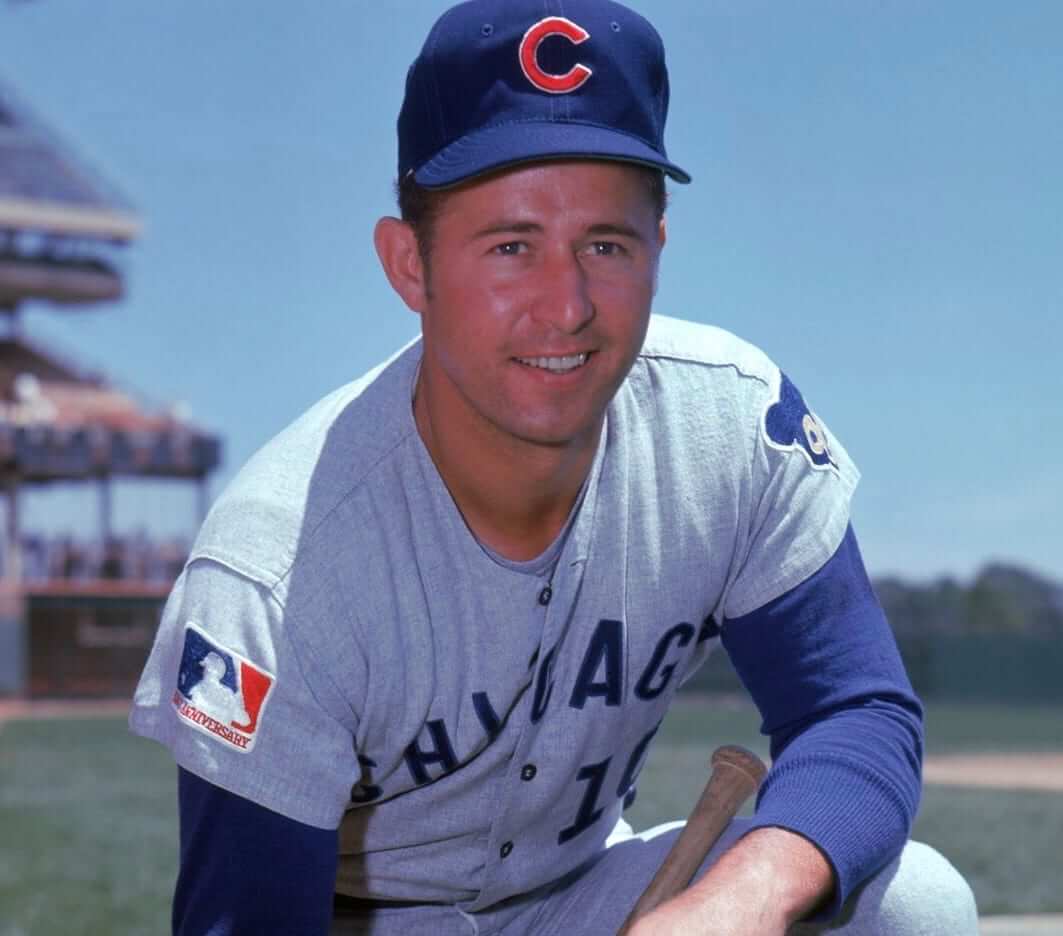
Thanks for using the photo of Ron Santo. not only my favorite Cub, but wearing one of my favorite Cubs’ jerseys – the 1969 road grey. Very simple, just two color: light bluish grey with royal blue lettering. Interestingly, the Chicago White Sox road uniform that year had a similar/same(?) base jersey color with royal blue lettering.
Reference: (1969) The Greatest Uni Year in Baseball by Phil Hecken, August 12, 2015
Ron Santo was smiling then. It must have been early in the season. :) LGM
Ever notice how many player photos in that era were taken at Shea Stadium?
Photos were taken at Shea (and also Yankee Stadium) because so many wire service and Topps photographers were based in NYC.
Belichick’s “mock” sweatshirts are crew necks. Mock is a half turtleneck. I hated hoodies when I was younger. I cut the hood off my HS track sweatshirt and did the parital rip down the neck for more room. Eventually I cut the sleeves after they got shorter than my arms. I wish I still had it.
A little late on this topic.
Not a uniform element, but something you see at NASCAR Cup events…
The ‘Polish Victory Lap’.
Alan Kulwicki is credited ‘inventing’ it after his first win, and I think only did it one other time (after the race where he won the Cup Championship).
For the season following his death, winning drivers took up the practice to pay tribute to Kulwicki; it’s still performed today as the more subtle method to celebrate a win (unlike the burnout or any number of “signature” displays, like the backflip, bow, headfirst slide, etc…)
It just dawned on me that the Washington Football Team is no longer using the Redskins name or logo, which is good. Mission accomplished. However, Uni-watch still is with ‘Skins Watch. Is it time to change the name of the section or target a new team until that team changes its name?
As ’Skins Watch continues to document, there are still many high schools that call their teams the Redskins. Also, the very first ’Skins Watch item today is about Daniel Snyder. The section name is still very relevant.