For most photos, click to enlarge
When the truncated MLB season got under way in late July, many of the uni-based promotions that had been on the original schedule (throwbacks, holiday uniforms, etc.) had already been scuttled. I didn’t think they’d bother to reschedule them, in part because I figured they’d try to keep things simple during the pandemic, and also because a major reason to have a uni-based promotion to begin with is so you can attract more fans to the ballpark, which is obviously a moot issue this year.
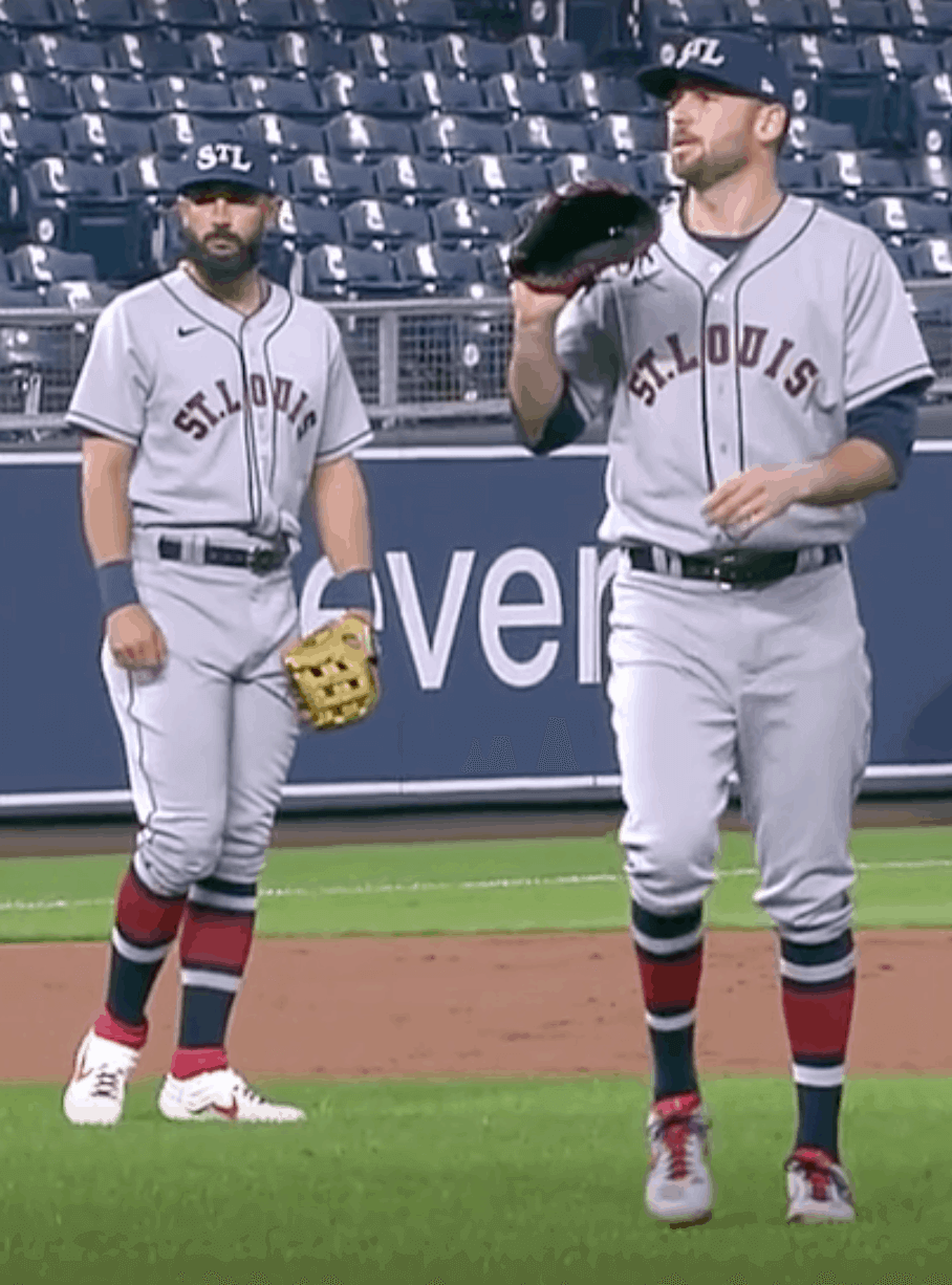
Happily, I was wrong, as there have been a handful of throwback games. One of them took place last night, as the Royals and Cardinals wore Negro Leagues uniforms for a very nice-looking game in KC.
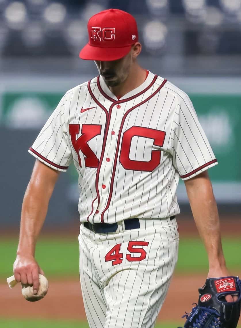
The Royals dressed up as the 1945 Kansas City Monarchs. The jersey featured giant “KC” chest lettering, navy pinstripes, red buttons (a nice touch), a sun collar (ditto), and a very annoying maker’s mark (eww):
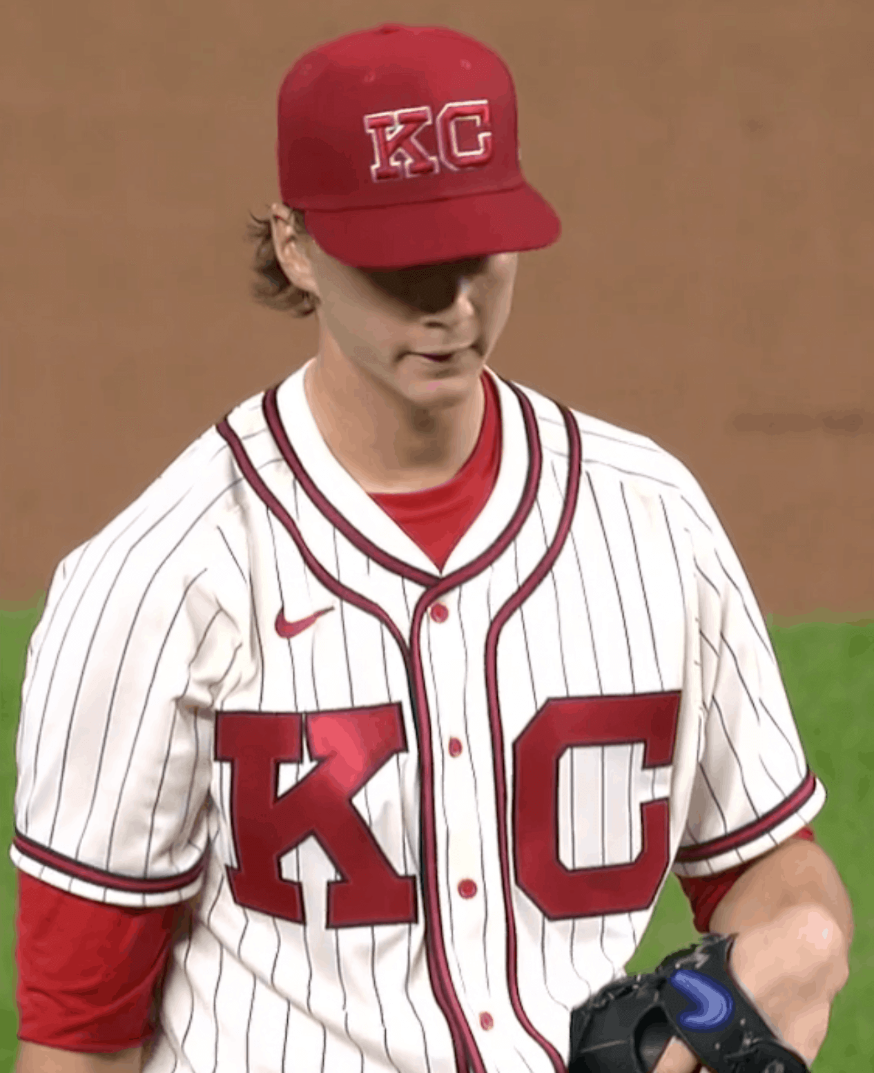
On the plus side, the back of the jersey did not include the MLB logo, resulting in a nice, clean look:
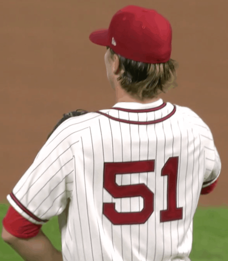
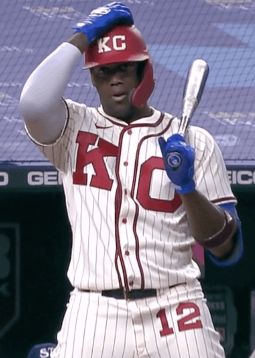
There were no batting helmets in 1945, so the Royals got a bit creative and went with a matte shell and a 3D cream-colored “KC” logo:
I’m not 100% positive, but I think this might be the first 3D MLB helmet logo we’ve seen that’s two separate pieces (instead of one solid logo or one set of connected/interlocking letters). Twice as much work for the equipment staff!
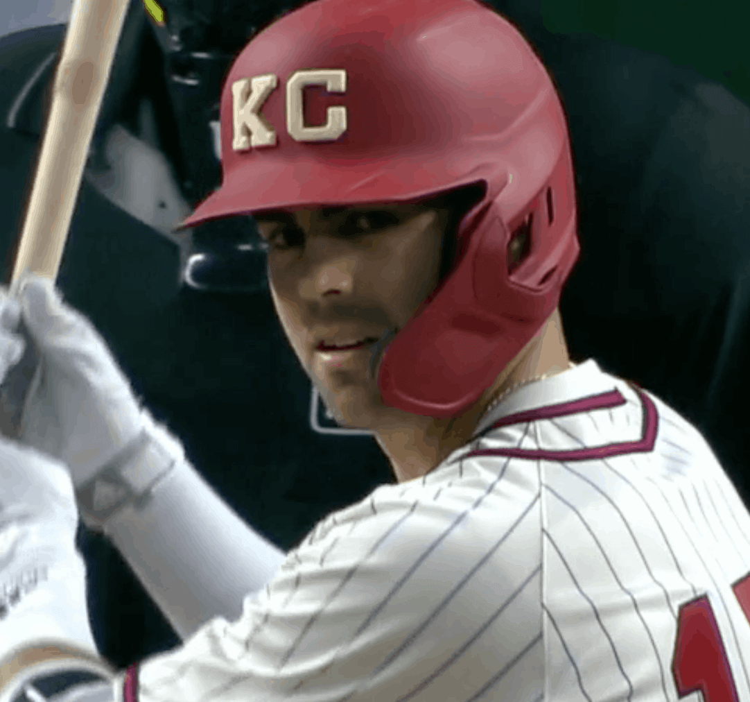
The real kicker for this uniform is that the Monarchs wore uni numbers on their upper-left thigh (just as the Astros and White Sox would do decades later). Such a hoot to see that element on the field last night:
All in all, a very nice retro uniform. Of course, certain concessions to modernity were necessary:
According to Bill Henderson’s uniform guide, the Royals dressed up as the ’45 Monarchs once before, in 2004, but that throwback didn’t have the sun collar, the red buttons, or the pant numbers (although they did put a belt loop at 12 o’clock — a very authentic old-timey detail).
How cool would it be if the Royals wore this uniform in the postseason? Unfortunately, they’ve had a lousy season and won’t be playing in October.
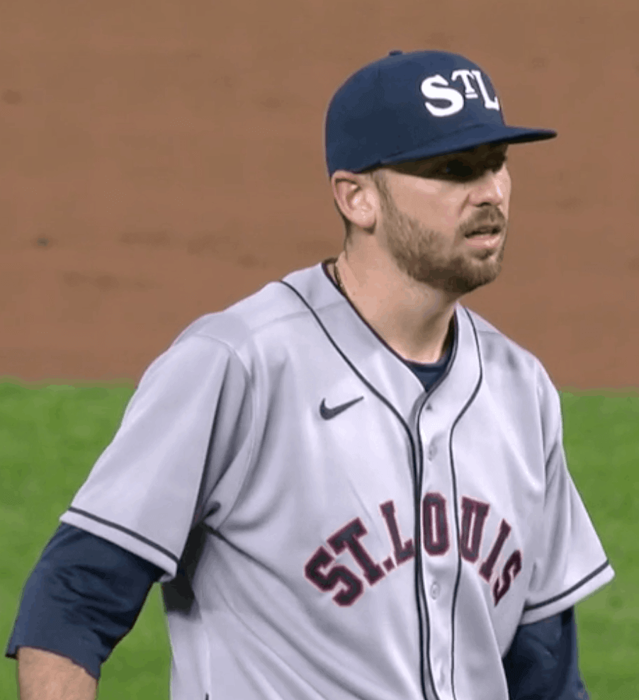
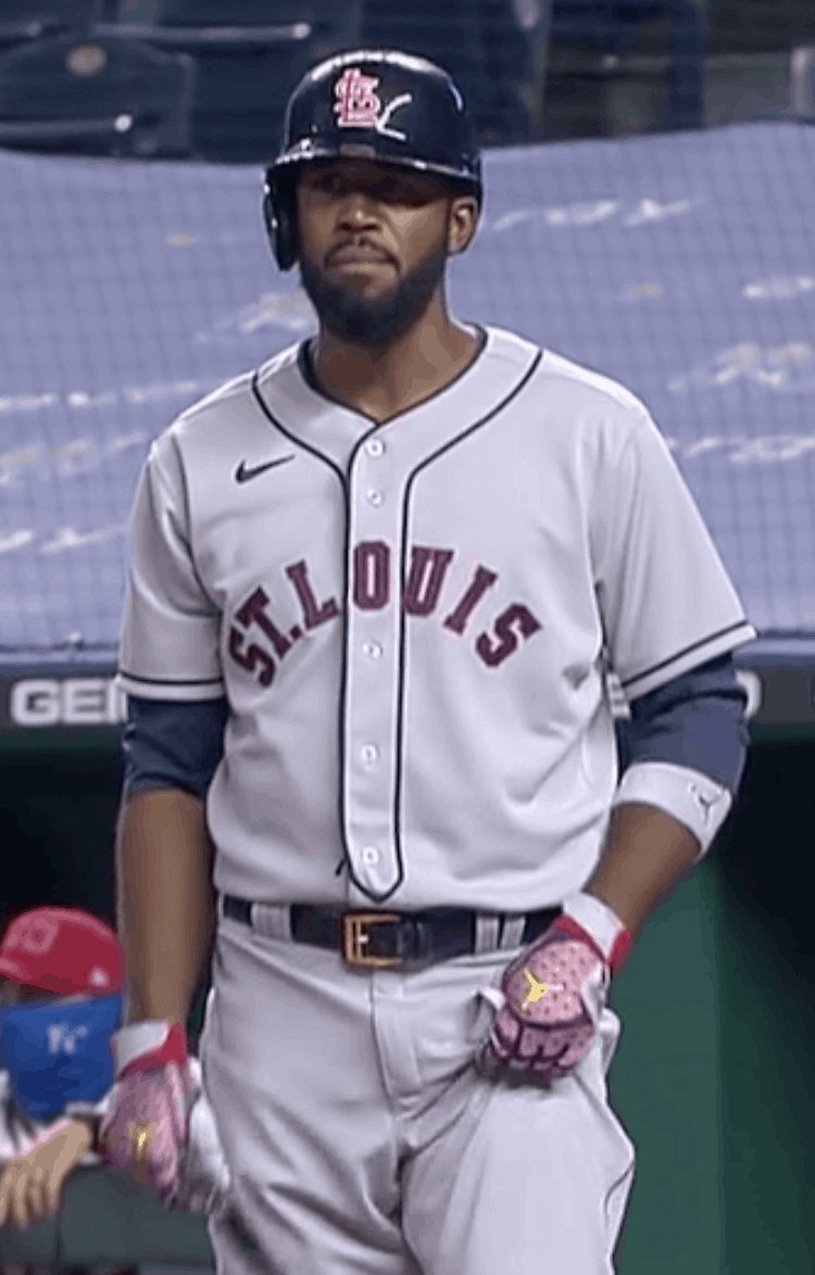
As for the Cardinals: They dressed up last night as the 1930 St. Louis Stars. Their uniform featured a very cool “StL” cap and a very simple grey jersey with no space between “St.” and “Louis”:
Note that the headspoon piping was included on the front edge of the placket and around the edge of the collar. That’s an unusual detail — most headspooned jerseys don’t have that extra line of piping.
Just like the Royals, no MLB logo on the back:
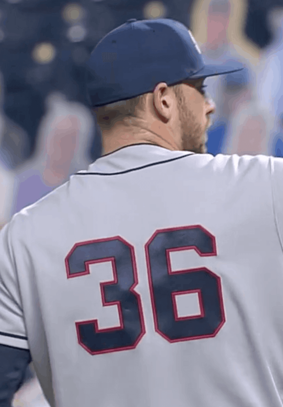
Very few Royals went high-cuffed, but quite a few of the Cardinals did. They wore socks that looked very Braves-ish:
No throwback batting helmets for the helmets for the Cards, unfortunately:
If you look at that photo, you can see why they included that extra line of piping on the edge of the front jersey flap: The headspoon actually terminates in a little point, instead of just having the usual two lines of piping disappearing down the shirttails. That’s my favorite detail of this uniform. Here’s another look:
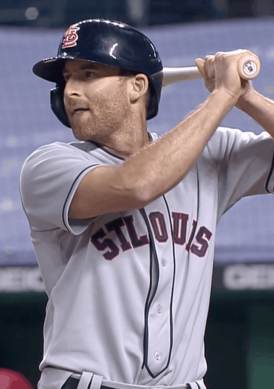
This appears to be the first time that the Cardinals have dressed up as the 1930 Stars. But the Henderson guide indicates that they wore throwback road greys based on the 1928 Stars in 2003, 2006, and 2007, and it’s essentially the same uniform. As you can see in those links, those uniforms were made by the manufacturer AIS, and the headspoon point was situated much higher on the jersey.
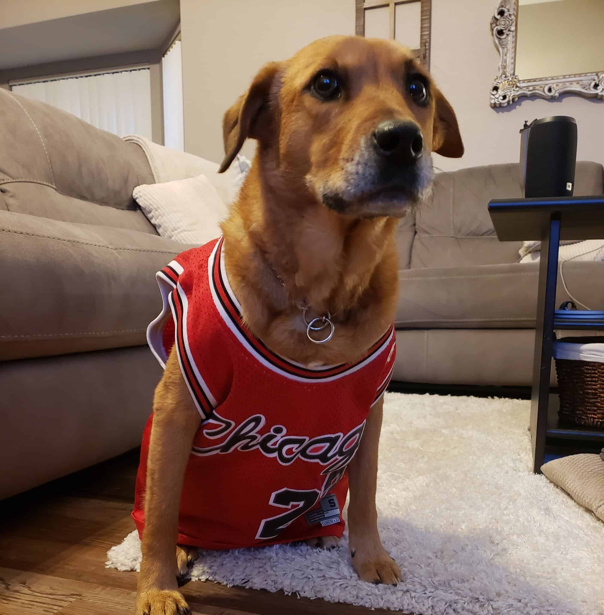
Click to for maximum cuteness
Awwww: Meet Mia, who’s apparently a big Chicago Bulls fan. She’s part of a great Twitter thread featuring lots of pets wearing jerseys — just the thing to bring a smile to your face, even (or especially) in these trying times. You can check out the full thread here.
Click to enlarge
ITEM! Uni Watch Pin Club makes the big time: Got a really great note yesterday from reader Aaron Telecky, as follows:
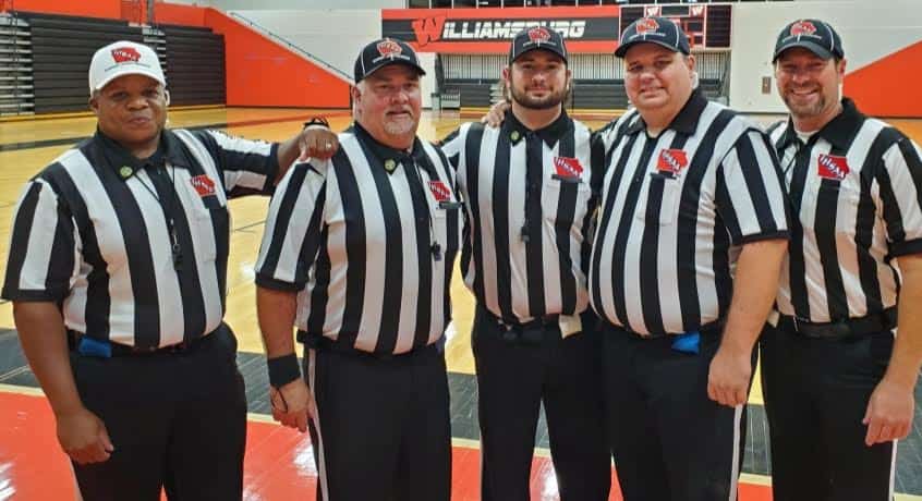
When my brother (who is a sometime Uni Watch reader — I’m working on him!) saw this month’s referee-themed pin, he immediately asked me to order one for each of the guys on his Iowa high school football officiating crew. Prior to their game last Friday night, they donned the pins on their uniform collars for a group picture that I thought you might enjoy seeing. I forgot to ask whether they wore them for the game, but either way he said that when he presented them to his fellow refs, they were really impressed with the pins and proud to wear them. Who knows, maybe you’ll end up with a few new readers through it!
My brother, Kyle Telecky, is the one at far right. The rest of the crew, from left to right, is John Morgan (captain), Mike Pond, Dylan Pond, and Joel Murphy.
How great is that? You can see the pins on the guys’ collars! Todd Radom and I have both gotten a big kick out of this — thanks so much, Aaron, and please thank Kyle for us as well!
If you want to wear the same pin as genuine Iowa high school football officials, it’s available here.
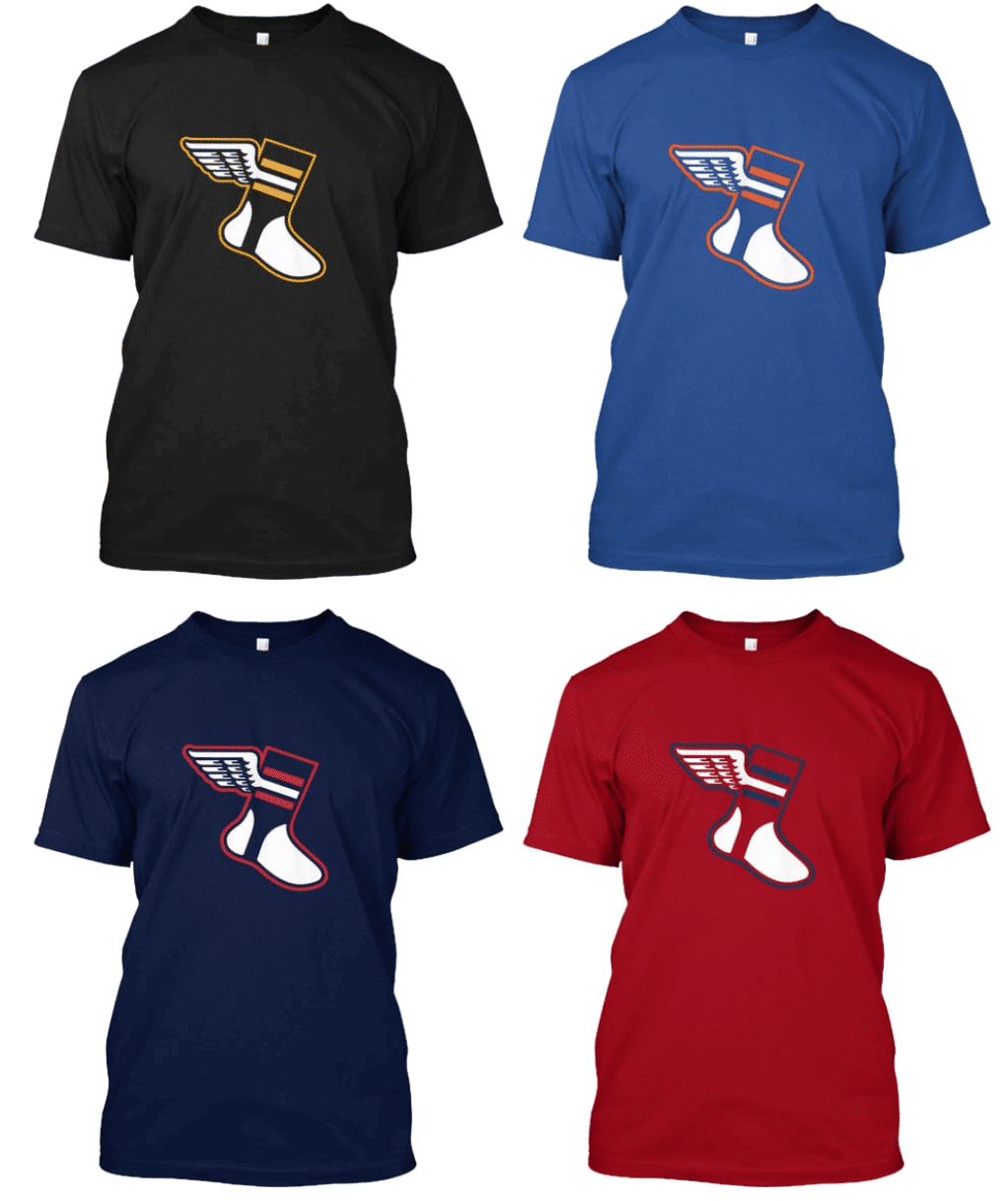

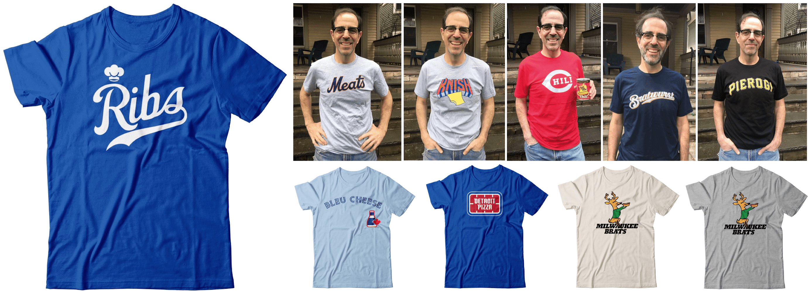
ITEM! Color Remix raffle: Reader Ron Heerlyn has generously covered the cost for me to raffle off one of our new Color Remix T-shirts, so that’s what we’re going to do today. The winner will get to choose any of the four designs shown above.
This will be a one-day raffle. USA mailing address only — sorry. To enter, send an email with your mailing address, choice of shirt, and size, to the raffle address by 8pm Eastern tonight. One entry per person. I’ll announce the winner tomorrow. (And if you want to purchase any of these shirts, they’re available in the Uni Watch Shop, plus the corresponding four caps are available here.)
Meanwhile, our latest raffle winner is Ridgeway Burns, who’s won himself a Uni Watch membership card. As you may recall from yesterday’s post, the sponsor of this raffle, Collin Lehman, had specified that the raffle should be open only to essential workers. Here’s Ridgeway’s description of his work:
I’m a librarian at the Hinsdale Public Library in Illinois. I’ve been working using the library’s 3D printer to make PPE for the local hospital and have been delivering books to patrons via bike. The library has also been open to the public since July.
We’re big into branding. Check out the lead picture in this NYT article my library was featured in — I’m the librarian wearing the library-logo helmet. We also have hats (but no full unis, to my dismay).
Is that awesome or what? Here’s a larger version of the photo, showing Ridgeway with his book-delivery cart (click to enlarge):
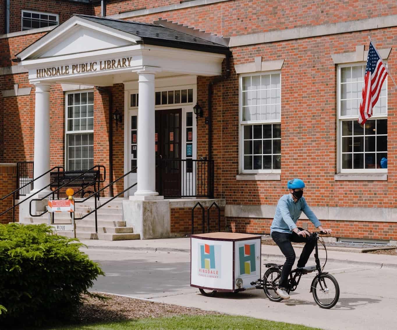
Congrats to Ridgeway (and also big thanks for the important work he does), and thanks again to Collin Lehman for sponsoring that one.
Click to enlarge
Theoretical menu update reminder: In case you didn’t see it on Monday, the menu of theoretical T-shirts has a new addition — Ribs.
Wouldn’t it be fun — just, you know, hypothetically — if these shirt actually existed and were available for purchase? If you agree, shoot me a note and we’ll have a theoretical discussion.
The Ticker
By Lloyd Alaban

Baseball News: Twins 3B Josh Donaldson gave his teammates plush Twins bathrobes, complete with numbers and NOBs, prior to last night’s game. Some players wore them in the dugout (from multiple readers). … Mets OF Guillermo Heredia wore a Pirates-logo glove last night. Heredia played part of this season for the Pirates before being picked up by the Mets (from Kevin Ross). … Speaking of the Mets, P Jacob deGrom will honor late P Tom Seaver this week by wearing Seaver-themed cleats (from our own Brinke Guthrie). … A page on the online retailer Eastbay is selling 2018 Dodgers World Series champions caps and 2019 Astros World Series champions caps. Both teams lost their respective World Series matchups in those years (from Cody Van Ryn). … The Old North State League announced a new team in Reidsville, N.C., named the Reidsville Luckies. The team identity borrows the name of the original Luckies that played from 1935 to 1940 and again from 1947 to 1955. The name “Luckies” is a reference to the Lucky Strike cigarettes, and the new team’s logo is loosely based on the cigarette brand’s logo (from Logan Booker). … Reader Brandon Weir came across a display about a U.S. Army baseball team that played at Fort Mackinac, Mich., while visiting the fort. The gift shop there sells shirts with the former team’s logo on it. … A Chunichi Dragons pitcher wore the wrong cap last night. … Here’s a thread about players whose baseball cards show them wearing windbreakers under their jerseys. … Here’s how the MLB Postseason logo patch looks on the Padres’ caps.

NFL News: The Jaguars will go mono-teal for the first time in team history tomorrow night (from multiple readers). … Left over from Sunday: The Colts still have their old wordmark in their end zones, despite having changed their wordmark in the offseason (from @coledrinkswater). … Retired TE Vernon Davis wore a bedazzled Broncos-themed jacket during his performance on Dancing With the Stars last night. Davis played one season of his 14-year NFL career with the Broncos (from Griffin Smith). … Reader Tony Kellogg’s friend Adam and Adam’s father George are big Steelers fans. Adam and George are painting a Steelers-themed mural near George’s home in Edinboro, Pa. The new mural is replacing one that they made together in the 1990s. The father/son duo is raising funds to help complete it.
College Football News: We previously reported that Ole Miss will wear powder blue over white this Saturday. Now the grounds crew has painted the end zones and field markings to match (from Griffin Smith). … Oklahoma State will wear 1987 throwbacks to honor alum and former RB Thurman Thomas (from multiple readers). … UTSA has quietly unveiled new uniforms (from Jacob Gibb). … South Carolina will wear a helmet decal this season honoring Dolores “Dodie” Anderson, a fan who passed away in July at 92 (from Jason Rapp).

Hockey News: The masks and pads the University of Minnesota men’s team is wearing to advertise their NHL prospects have the Minneapolis skyline on them (from Frank T.). … Boston’s Logan Airport hangs banners in one of its terminals for the Boston sports teams that have won championships. They just added the NWHL’s Pride, who weren’t there even though they won the Isobel Cup in 2016. They also got a banner for being the best team in 2019-20, but the Isobel Cup wasn’t awarded that year (from our own Jamie Rathjen).
.

Soccer News: Here’s a thread showing Formula One liveries redesigned as soccer kits (from Mark Robbins).

Grab Bag: Google is teasing a new logo for Gmail. … A legal battle is brewing over the origin and ownership of Nirvana’s famous smiley face logo (from Timmy Donahue). … New logo for the Conservative Party of Canada (from Ted Arnold). … Coca-Cola is pulling out as the title sponsor advertiser for the National Hot Rod Association Drag Racing Series. … New logo for the magazine The Nation. … Cross-listed from the soccer section: Here’s a thread of Formula One liveries redesigned as soccer kits (from Mark Robbins). … Following complaints of racial stereotyping, Uncle Ben’s rice is getting a new product name and logo (from Timmy Donahue).
the sleeve construction on KC’s throwbacks seems unusual. Raglan on the back and a normal set sleeve on the front. Is this common and it only stands out because of the pinstripes?
It’s fully raglan. (Not sure how something could be both raglan and set-in!)
Same as the Yankees, complete with the pinstripes.
on a typical raglan sleeve the seam would run diagonally from the underarm to the collarbone. KC has this seam running along the shoulder. The seam on the back is much more typical of a normal raglan sleeve.
Again: It’s exactly the same as a Yankees jersey.
link
you’re right – it is exactly like the Yankees jersey and obviously it isn’t a particularly new style. It also is not a traditional raglan sleeve. Although the sleeve extends to the collar, the seams do not run diagonally from the underarm to the collar (at least not on the front).
This construction appears to be actually called a saddle shoulder. I was able to find that out thanks to Google, MLB Style Guides from the early 1980s, and a website devoted to Athletics Aesthetics – link
‘If you look again at those Yankees specs, you can see that they refer to the jersey having a “saddle shoulder.” That’s the term used in the guide for raglan sleeves (except for one or two entries that do say “raglan sleeve” instead). I had never heard of the term “saddle shoulder” before, but it’s apparently a raglan variation.’
That entry from 2016 does not actually include a picture of the Yankees uniforms that are described, but based on some of the other screenshots the Style Guide is not using saddle shoulder to describe raglan sleeves. It is making a clear distinction between the 2 styles.
Mono teal – uggh, almost as bad as that musty yellow outfit of a few years back. Sorry only saw yesterday’s blog this morning, if the Dallas Cowboys uniform was a new uniform, I’m pretty sure it would be described as a mess of poorly matched colors.
Seems like it is becoming a Thursday Night Football tradition in the NFL dating back to Color Rash. A tradition of trying to make your team look the worst they can for this game that is nationally televised.
It seems teams just can’t help themselves now. If you have a set of teal pants that look good with the white jersey (or black jersey too), you do not have to also wear the teal pants with the teal jersey. Same goes for other NFL teams using the same practice. Pro football uniforms should have some dignity. This is not high school Friday night football.
The Jags seem to be needing some help figuring out their wardrobe. Even last week with the black jersey/white pants/white socks. You can’t wear white socks with this combo. It looked really off-balance. Black socks were a must with this combo.
link
A tradition of trying to make your team look the worst they can for this game that is nationally televised.
Perhaps it’s the teams just acknowledging the fact that the Thursday night games are complete dogshit anyway so you may as well look the part.
“ if the Dallas Cowboys uniform was a new uniform, I’m pretty sure it would be described as a mess of poorly matched colors.” That would be an interesting premise, covering long-standing uniforms as if they were brand new. Agree that the Cowboys would not be looked upon favorably, but that they have potential. Maybe the Steelers would be criticized for having only one helmet decal.
Same thought with the classic Raiders logo. Of course you can never change it, but if the Raiders were introduced as a new team today this logo would not be considered. Really, it is just a calm looking guy with a closed eye wearing an eye patch and football helmet.
A bit more detail about the new logo for the Conservative Party of Canada.
link
It has been noted the new logo appears to be influenced by the Royal Canadian Air Force logo. Brand new party leader Erin O’Toole used to serve as a Canadian Helicopter Navigator for RCAF.
Which in turn means it looks a bit like the Winnipeg Jets’ logo!
I was going to say the crooked maple leaf is highly symbolic and totally appropriate, but I guess that would be political and therefore discouraged.
Pretty good logo, by the standards of a Western political party. Though if the Chicago Cubs and the Winnipeg Jets ever had a love child, would it really be a right-of-center Canadian political party?
But nothing will ever beat the initial attempt at branding when two Canadian parties on the right merged and announced the new unified name as the Conservative-Reform Alliance Party. That unfortunate acronym lasted less than one day before the party renamed itself to reverse the order of “conservative” and “reform.”
The ticker link about the Pirates-logo glove doesn’t seem to be the right photo. It looks like a partial screengrab from a Twins game.
Thanks. Will fix. Here’s the proper link:
link
No maple syrup on the link?
What else you gonna put on your link?
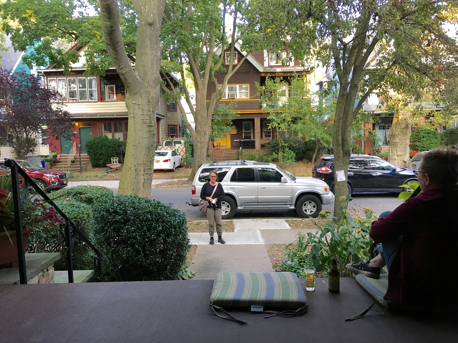
Interesting with no text for the Pandemic Porch Cocktails™, I’m left to guess what is happening each time. Today, I’m hoping that’s not Karen getting mad at the Tugboat captain sitting on the porch. I’d like to think that person is a passerby who is asking about whether beer is better in a glass (Paul) or bottle (Mary) … or who put the social distancing sign on the tree on the right but not the tree of the left.
I’ll be honest, I imagine more issues than pleasant conversations. Damn TV…
It’s our friend Alyssa. We were talking about her and then, literally at the moment we were talking about her, she walked by! So she stopped and talked for a bit.
Why would anyone be mad at us for sitting on our porch??
Because reasons.
Yeah, because it’s 2020 and people just seem angrier and I could just see someone chiding you for being on the porch. It’s a silly world these days.
Nah, things are fine here. Nobody ever gives us shit — on the contrary, people sometimes stop and say how nice our porch/flowers/etc. are!
I don’t understand why several NFL teams seem to try to match the colors of the their opponent. You would think they would try to wear whatever combination they had that was as far away from the other team’s colors as possible. Like Cleveland wearing as much orange as possible when they play Cincinnati, or in this case Jacksonville wearing all teal when they play Miami.
Those Twins Powders are gorgeous.
If the Chiefs want to shed their Native American imagery but keep their colors, they should seriously think about adopting the Monarchs name and logos. It would be hard to complain about that change.
RE: The Kansas City Monarchs’ uniforms. Can we pleasepleaseplease have a team with both pinstripes and soutache trim? It looks amazing.
Yes, the St. Louis Stars’ treatment of the headspoon is rare, but the 1982 A’s home jersey, 1983 Giants’ road jersey, 2012 Padres’ home, road, and alternate used double soutache, but not the terminating point. The A’s and Giants’ trim actually terminated high up on the side concealed by the placket, creating more of a head question mark than a headspoon.
Are we just ignore the fact that those refs aren’t wearing masks or social distancing? Yuck.
That’s a great point, David — I’m embarrassed to admit that it hadn’t occurred to me. Thanks for the reality check.
Yesterday in the comments UWer Gerry Dincher posted:
“Baker Mayfield, Ben Roethlisberger, Lamar Jackson, and Joe Burrow are the starting quarterbacks in the AFC North. What makes them unique?
Their numbers are in numerical order 6, 7, 8, 9.
I am not sure if this has ever happened within an NFL division.”
In 2003 there were weeks (i.e. weeks 13 and 16) when the AFC East starting QB’s were Jay Fiedler (9), Chad Pennington (10), Drew Bledsoe (11) and Tom Brady (12).
Chris, that’s some awesome work. Did you just know that off the top of your head (or at least know most of it and then confirmed the rest)? Or did you research it somehow?
Thanks!
I knew Bledsoe, Brady and Pennington (often injured) all played around the same time, but figured it was a rabbit hole as Dan Marino (13) was long gone.
That’s where pro-football-reference.com comes in…do you really think I’d (or anyone) would remember Jay Fiedler? ;)
NFC North just missed. Cousins(8), Stafford(9), Trubisky(10), Rodgers(12)
How about a Poutine t-shirt? I’d buy that! Also, how long has that vehicle been parked in front of your house? Perhaps it only makes an appearance when you snap the daily photo.
Very cool tid bit on the Hinsdale librarian. That is only a few towns over from me and one of my daughters was born at the hospital he makes the PPE for… there used to be a old wooden bridge that was like 35 or so feet over train tracks and it was super scary as a kid going over because it was only wide enough for one car so you had to go slow and sometimes had to hit the reverse. Fun, but scary.
Also noticed in the twitter thread of mlb guys wearing windbreakers on their cards… Mike Schmidt sans-mustache. Weird, but interesting.
If I may be allowed to vent a little… I am beyond frustrated with all the special favors being given to essential workers during the pandemic. (I guess I should clarify at this point that I am an essential worker myself, so I don’t say this from a position of sour grapes.)
Some of the people who have been affected most by the pandemic are the non-essential workers – especially those on hourly wages – who have lost work time (= money) or have lost their jobs all together because of the various economic shutdowns. As a university professor, I’ve lost no work and no income as an essential worker, and perhaps I feel some guilt over that. But it doesn’t seem remotely fair that I’m being offered all kinds of breaks and special deals in various contexts while the guy who used to wait tables and is now out of a job gets completely ignored. Just doesn’t seem right.
No offense, but I don’t think university professor is what most people have in mind when they use the phrase “essential worker.” Your employer/state may call you “essential” for legal and/or employment reasons, but colloquially “essential workers” are health care providers, grocery store workers, truck drivers, etc.