Click to enlarge
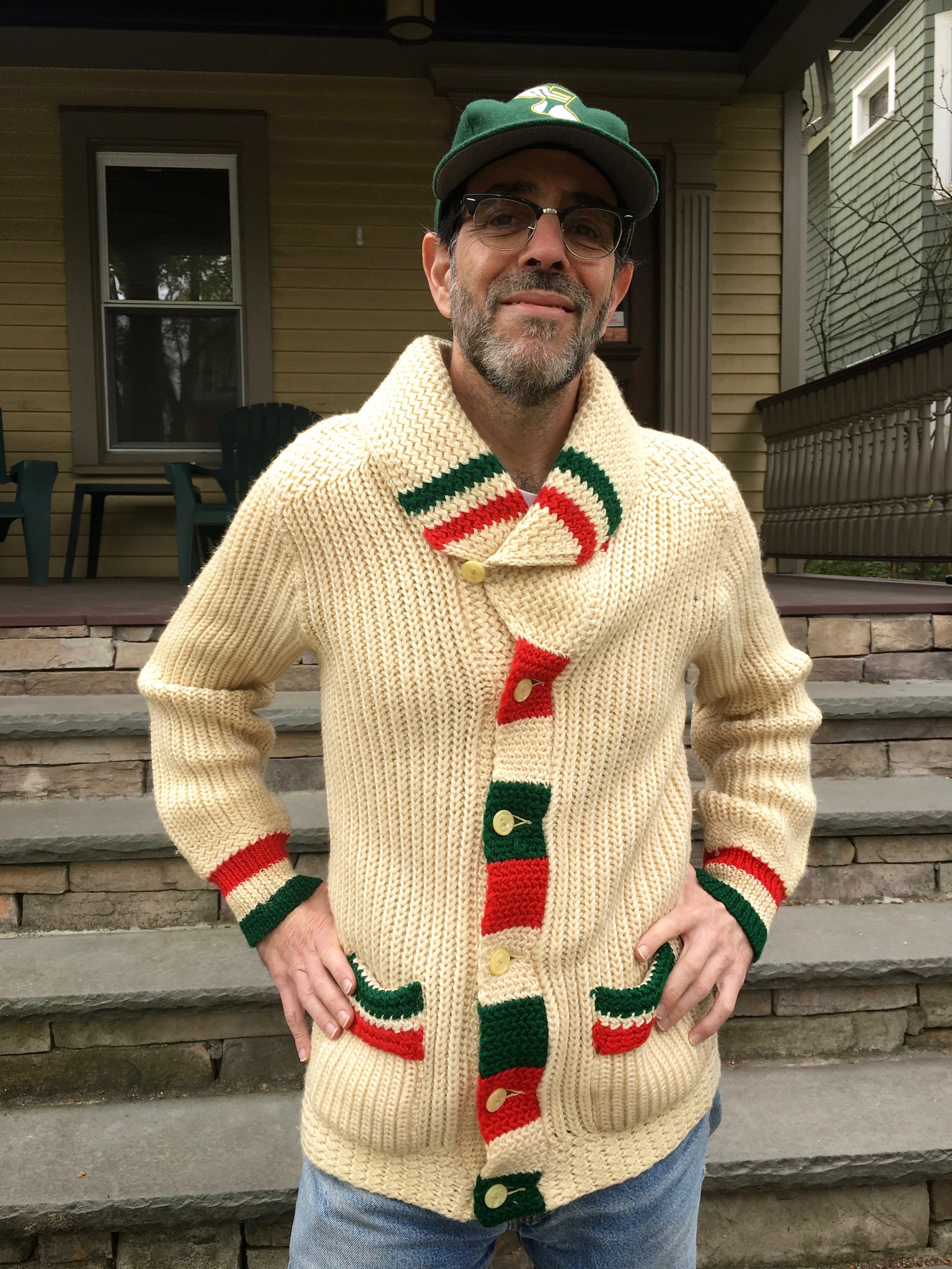
On April 15, I received an email from longtime reader Will Scheibler, who lives in Thunder Bay, Ontario. The subject line was “Belated birthday gift” and the email read, “Came across a thrift shop purchase from earlier this year while doing a bit of spring cleaning. Too small for me but I hope it fits you (or if not, someone you know). It’s off in the mail.”
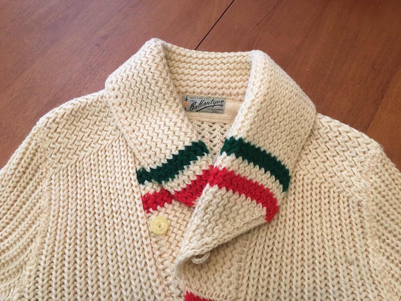
I thanked him for whatever he was sending me and then forgot about it. A week later, a package arrived, containing an absolutely spectacular vintage curling curling sweater (which, as you can see above, does indeed fit me quite nicely). I love everything about it — the shawl collar, the offset top button, the block-striped placket, the striped cuffs and pockets — magnificent!
Here’s another (admittedly silly-looking) shot, which provides a better view of the pockets (click to enlarge):

That’s quite a gift! Now, Will knows a thing or two about curling sweaters, as you can see from his Uni Watch membership card, which is based on this amazing sweater. So when I emailed him to thank him for the wonderful gift, I also asked if there was any story behind the sweater. His response: “Found it at my local Value Village thrift shop earlier this year. Not very often you see a sweater of that style there — the vintage curling ones aren’t too common, even up here. Having the colours not too far away from the Uni Watch colours was a bonus.”
Speaking of the colo(u)rs, when I posted a photo on Twitter the other day, several people said, “It must be from the Italian curling team!” And sure, while it’s true that the sweater’s colors match those of the Italian flag, it also mirrors the Bulgarian and Hungarian flags. (Plus, of course, it could just be a Christmas theme.) In any case, it’s gorgeous! And since things are still on the chilly side here, the sweater is perfect for our early-evening Pandemic Porch Cocktails™ sessions. Yesterday it was 48º at porch o’clock — sweater weather.
Here’s the label — not as much fun as some other curling sweater tags I’ve seen, but still nice (click to enlarge):

The label style looks 1950s to me. Too bad about the two holes, which were presumably from the thrift store’s price tag. The “Stratford on Avon” notation momentarily threw me, because of course that’s the birthplace of William Shakespeare (the playwright, not the football player). So was this a British curling sweater? But then I realized that there’s an Ontario city called Stratford — and it’s situated on the Avon River! So that’s where this sweater is from.
Was Ballantyne a popular curling sweater brand? Apparently not, because my search for other Ballantyne specimens turned up only a few examples:
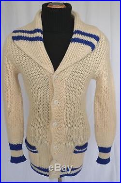
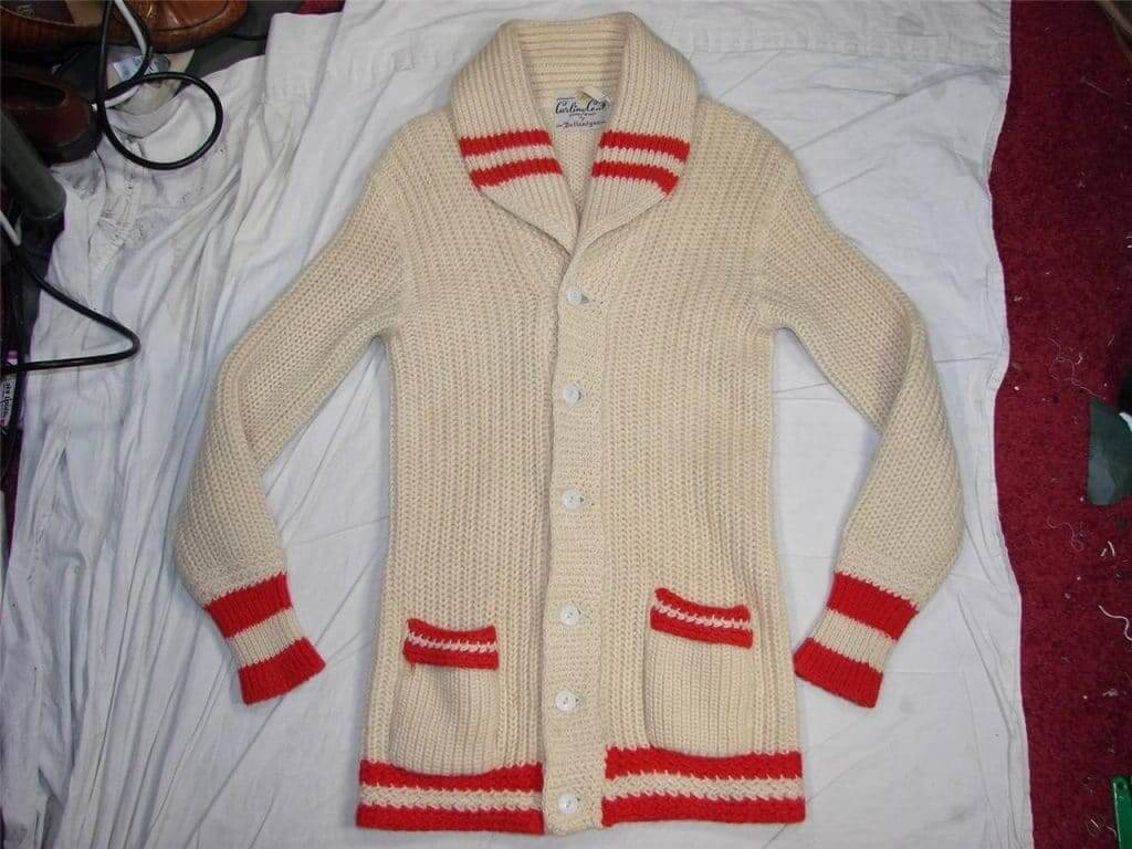
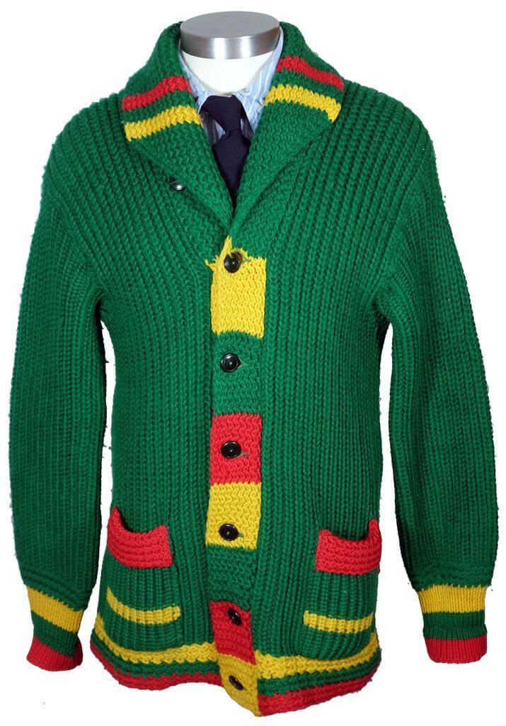
If you click on that last one (which is a real doozy, eh?), it’ll bring you to a vintage clothing blog with more photos/info on that particular sweater.
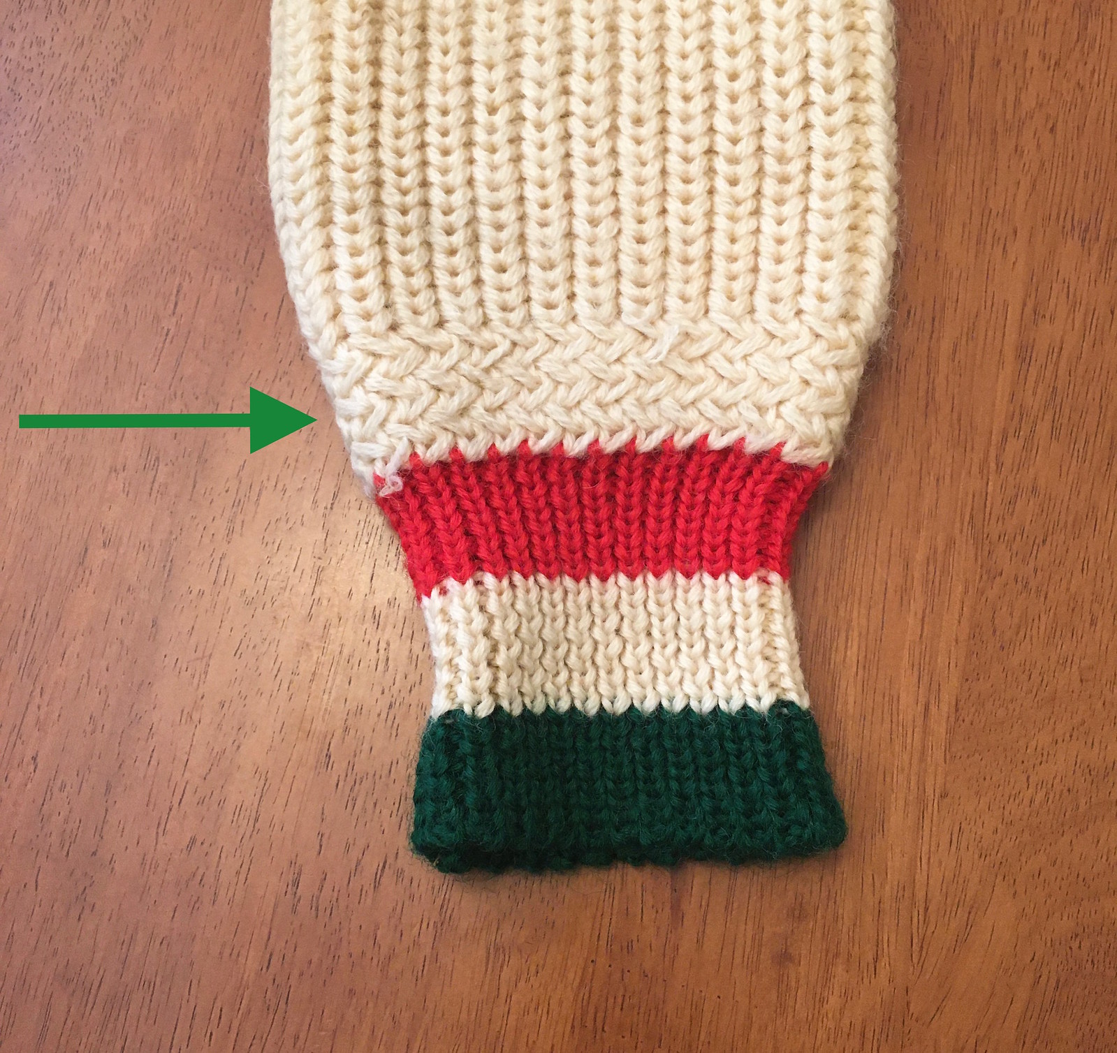
Meanwhile: I don’t know much about knitting, but the Tugboat Captain does, and she says my new sweater has some very interesting features. First, she could tell right away that it was knitted by hand, not on a machine. Second, she said this row of stitching that transitions between the sleeve and the cuff — in between the main sleeve and cuff ribbing — is unusual:
She was also impressed by the separate stitch pattern used on the shoulder yoke:

One last detail worth noting: There’s a tag, perhaps from a dry cleaner, safety-pinned into the right sleeve cuff. I was going to remove it, but then I decided to leave it there. It doesn’t cause me any discomfort and it feels like part of the sweater’s story, so why not?

Of course, the biggest part of that story, at least from my perspective, is Will Scheibler’s incredible thoughtfulness and generosity. He’s a longtime reader and has contributed plenty of times to the Ticker and also to Collector’s Corner, but our relationship isn’t at the level where I’d expect a birthday gift from him! Will, thanks so much — you really made my day, and provide fodder for a fun blog entry to boot.
Back to the future: If you’ve heard about MLB’s crazy “futuristic” uniforms from 1999 but are too young to have seen any of those games — or if you just want to a reminder of how bizarre it all was — the clip embedded above provides a good look at an Angels/Orioles game from that promotion (plus it’s a classic sequence from the inimitable Albert Belle). Definitely worth your two minutes.
(Big thanks to James Huening for this one.)
Click to enlarge
Collector’s Corner
By Brinke Guthrie
Follow @brinkeguthrie
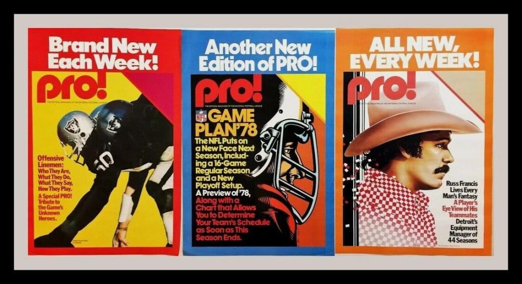
Leading off this week’s edition of Collector’s Corner with this set of three Pro! NFL game program posters from the 1970s. Back in the day, Pro! was the official game program for all NFL teams. I always looked forward to getting my copy when I’d hit the gates at Riverfront Stadium for the Bengals game. At one point, they also came out with a companion yearbook called Prolog, which was totally cool, too. That was available at the local magazine rack.
Here are the rest of this week’s picks:
• When you win the Super Bowl, you get killer endorsements. Joe Namath’s image (but no Jets logo) can be seen on this 1974 Hamilton Beach Butter-Up Corn Popper. “Perfect for T.V. Sports, Snacks, Parties and Movies!” This one is still MIB (that’s “mint in box,” kids), and 16 bucks is a steal!
• Ken Boyer, Duke Snider, Ernie Banks and Stan the Man are featured on this 45rpm record, Baseball Tips from the Stars (Vol. 1: How to Hit). This was released in 1962 and sponsored by the folks at Mars candy, who helpfully note that you can “take this record jacket to the ballpark and have your favorite stars give you their autographs in the spaces provided below!”
• To quote the late Steve Irwin, Wow, just look at this beauty! This is one gorgeous-looking Chicago Bears varsity jacket, with the chain-stitched C on the front, Bears script on the back, and a Super Bowl XX patch on the sleeve. Made by DeLong, naturally.
• The eBay seller says this 1995 New York Mets Organization of the Year blanket is from an MLB executive’s office.
• Here is a 1979 Miami Dolphins calendar/pennant set. The calendar is 23″ x 11″ and has some nice artwork, though it could use a bit of TLC.
• Baltimore Colts Hall of Famer Art Donovan autographed this 1970s Colts helmet buggy, which shows a bit of fading on the decal.
• Ron Johnson was a 1970s running back for the New York Giants. That meant, among other things, he got emblazoned on a wooden card. No team branding shows, so probably unlicensed. Did you “swap ’em and collect ’em,” just like Topps?
• It seems in the 1990s, Minnesota Twins owner Carl Pohlad gave team employees this onyx stone Twins baseball for Christmas. It’s regulation size and comes with baseball seams and a facsimile Pohlad signature. Weighs in at two pounds!
• This Willie Mays alarm clock says “Copyright 1958 ‘Greatest Living Player,’ Willie Mays — Right Field.” Mays was only 27 at that point. Were people really referring to him as the greatest living player at that point?
• When Willie wasn’t keeping time with his alarm clock, he could keep track of time with this wristwatch, which included his signature and also those of Mickey Mantle, Sandy Koufax, and Roger Maris.
That’s it for this week. Next week: CC X — the ten-year anniversary of Collector’s Corner! We have something special planned. See you then!
Uni Watch Haiku: Here’s the latest from the Uni Watch haiku studios:
Signature styles, like
Pistol’s socks and Brooksie’s brim
Make my world go ’round
And there’s more where that came from.

Membership update: Another batch of cards has been added to the membership card gallery. That includes David Swingle’s card, which is based, of course, on the Reds’ unusual mid-1960s road vests — one of my favorite eccentric rear-jersey treatments of all time (plus there’s the rare white helmet!).
Ordering a membership card is a good way to support Uni Watch (which, frankly, could use your support these days). And remember, as a gesture of comm-uni-ty solidarity, the price of a membership has been reduced from $25 to $20 until further notice.
As always, you can sign up for your own custom-designed card here, you can see all the cards we’ve designed so far here (now more than 2,600 of them!), and you can see how we produce the cards here.
Uni Watch reader Alan Topolski looking sharp in assorted UW apparel! pic.twitter.com/d6DbAbqwxl
— Paul Lukas (@UniWatch) April 28, 2020
Hockey jersey reminder: Want to look as sharp as reader Alan Topolski? Get yourself a Uni Watch hockey jersey! Available in three color options, two tailoring options, and with your choice of number and NOB. You must order by this Friday to get in on our current batch — full details here.
While we’re at it:
• Hankering for a nice, tasty brat? Let’s discuss.
• Pinheads and melonheads rejoice! I still have Uni Watch caps available in sizes 7 and 7-7/8 (all other sizes and adjustables currently out of stock while our factory is closed), and the price has been reduced to a pandemic-friendly $35.99.
• You can get 15% off of everything in the Uni Watch Shop and the Naming Wrongs Shop by using the checkout code COMMUNITY.
• Our latest Uni Watch Pin Club edition will launch this Friday. If you want to get caught up, here are the January, February, and March pins. (Sorry, April is sold out.) These qualify for the 15% COMMUNITY checkout discount.
• I don’t often mention this, but you can get lots of cool Uni Watch stickers from our friends at StickerYou.
Okay, end of sales pitch. My thanks, as always, for your consideration.
The Ticker
By Alex Hider

Baseball News: Bruce Bochy, the recently retired manager of the Giants, has a famously large head — hat size 8-1/4. He told ESPN’s Tim Kurkjian that during his playing days, he would bring his batting helmet with him when he was traded. “My new team had to spray-paint it with their colors because they didn’t have a helmet that would fit me” (from Andy Chalifour). … The Giants were close to moving to Toronto in the 1970s — so close that a Toronto ownership group had a uniform in the works (from Gabriel Hurl and Colin). … Former Royals P Bret Saberhagen was on The Price Is Right yesterday wearing a Royals jersey tucked into his jeans (thanks to all who shared). … Speaking of the Royals, lots to like in this photo they tweeted of the team’s first minor league affiliate in Corning, N.Y. — batboys in vintage flannel, an old football jersey, tinted glasses and striped stirrups (from @LendseyT).

NFL/CFL News: Newly drafted Patriots K Justin Rohrwasser, after initially saying he would cover his tattoo of the logo of a far-right extremist group, now says he will have it removed altogether. … Lots of speculation that a Photoshopped billboard welcoming Bengals first overall pick Joe Burrow to Cincinnati was based on a photo of current Bengals QB Andy Dalton. Burrow did not wear that helmet model at LSU (thanks to all who shared). … There aren’t many downsides to the Browns’ new uni set — except the way the 7s are rendered in the new typeface (from Ross Hazlett). … @GashouseILM has been building wooden 2D helmet signs at his home. His latest project was an old Bills lid. … Florida State shared a time-lapse video of its graphics team making a jersey swap image for RB Cam Akers, who was drafted by the Rams last week (from ACC Tracker). … Speaking of jersey swaps, a Giants graphic designer held a tutorial so fans can do their own (from Jakob Fox). … Now that the draft is over, expect to see lots of teams announcing uni number assignments for their new draftees, as the Bucs have done here (from Wayne Koehler). … The CFL’s Calgary Stampeders published a history about the live horse that runs on the field after the team scores a touchdown at home (from Wade Heidt).
College Football News: With Virginia set to introduce new logos and wordmarks, Will Lawson notes that the last time the football team got an overhaul in 2018, the school made sure to note the number typeface would “stand the test of time.” Guess not. … Nate Mueller has been 3D-printing college football helmets of certain players from specific games. His latest project was the helmet worn by Virginia Tech FB Sam Rogers during the Battle at Bristol game against Tennessee in 2016. … Cross-listed from the NFL section: Florida State shared a time-lapse video of its graphics team making a jersey swap image for RB Cam Akers, who was drafted by the LA Rams last week (from ACC Tracker). … Here’s the backstory of a bizarre set of “rivalry” hats sold at a bookstore on the campus of Northwestern (from Jason Boullioun and Jared). … A Syracuse blog ranked the team’s best uniforms in “modern history” (form Kary Klismet). … Also from Kary: Notre Dame football podcast One Foot Down released a “Uniform MEGASODE” last week covering all kinds of uni-related topics.

Hockey News: GM is repurposing factories to produce masks amid the pandemic, but they first need to sanitize the area. The company’s first call was to NHL teams to ask if they could borrow machines that sanitize hockey equipment. … Check out these vintage Kodachrome photos that Kevin Vautour found the other day. Awesome color shots of some Original Six squads. … Any hockey players out there will probably relate to this: The dumbest items in your hockey equipment bag (from Wade Heidt). … Here’s a history of the Penguins’ “Pigeon logo,” published as part of The Athletic’s “Uniform Week” (thanks to all who shared). … Speaking of ’90s redesigns, The Boston Globe published reader-designed submissions for new Bruins logos when the news broke that they would have new uniforms in 1995-96 (from Kolin Schmidt). … It appears this Polish hockey player has a captaincy patch made out of tape in this photo (from Jeremy Brahm). … Speaking of captaincy patches, it’s not often you see a goalie wear the “C,” but Adrianna Brehm has worn it for two separate teams in different leagues (from @TeebzHBIC).

NBA News: Last month, Howard Finkelstein made a joke on his Instagram that he would wear a different ’90s NBA jersey each day of the pandemic. As the movement spread, he decided to add up all the numbers on the jerseys he had worn and donate that total to the NYC Food Bank. He’s inviting others to donate in the amount of a basketball number that means something to them (favorite NBA Jersey number, a high school number, etc.). So far, he’s raised more than $3,000, and the current goal is now set at $5,034 (David Robinson and Hakeem Olajuwon). Way to go Howard! … Here’s a great story — with an interesting twist at the end — about how some Suns jerseys were cut up to make protective face masks. Go ahead and read it all the way to the end — it’s worth it.

College Hoops News: On this weekend’s SNL, Keenan Thompson wore a Georgetown Hoyas hat while playing O.J. Simpson (from Max Rosner). … This listicle from the NCAA has some great old photos: The 11 oldest active college basketball arenas in Division I (from Kary Klismet).

Soccer News: Since he’s been working from home due to the coronavirus, Donnie Kwak has been wearing a different soccer jersey to his Zoom meetings and sharing them in a Twitter thread. “I’ve been more of a collector than a regular wearer of my soccer shirts, but I feel like working from home (while still having to be presentable to others via webcam) has been a good opportunity to show off my collection,” he said. … The American Outlaws, a supporters’ group for U.S. soccer, is holding a design-a-kit contest for fans, and they’re down to the final four (from @Wilds_Lee). … In the ’90s, Mika Lehkosuo, a MF for Finnish club HJK Helsinki, wore No. 96.2 as part of an ad deal with a local radio station. UEFA eventually put the kibosh on that (from Josh Billman). … Virginia has unveiled its new crest, featuring the athletic program’s new logos and typeface (from our own Jamie Rathjen). … New kit outfitter for Scottish side Partick Thistle (from Ed Zelaski).

Grab Bag: Washington Post sports photographer John McDonnell shared some of his favorite photos from his 40+ years of work at the newspaper (from Andrew Hoenig). … With NASA’s revival of its 1970s-’80s wordmark — nicknamed ‘The Worm” — here’s a fascinating look at that mark and also NASA’s official logo, nicknamed “the meatball” (from Michael Kent and William F. Yurasko). … Cisco Brewers of Nantucket, Mass., has an updated logo and new packaging for its 25th anniversary (from Kary Klismet). … Also, from Kary: Here’s a history of the Ford Mustang logo. … A father in Oklahoma built a backyard bowling lane so his son, who’s a competitive bowler, could continue to practice during the pandemic (from Alex Shirley). … Dirt track racer Donny Schatz is letting the public submit designs for a future helmet (from Greg Enkers).

Click to enlarge

What Paul did last night: New car in front of our house yesterday evening. We were intrigued by its shiny chrome gas cap. “You could check your makeup in that,” said the Tugboat Captain, which is funny, because she doesn’t wear makeup.
Bud for me, water for her, peanuts for both of us. We talked about how the city is likely to be transformed for the foreseeable future by the pandemic, and whether it makes sense to live here (or in any city) if it’s going to be as static and dull as we think NYC is likely to be when we finally come out the other side of this. But where would we go? Other cities will face the same problems, and we’re not cut out for the ’burbs. So that leaves rural — intriguing, but I’m not sure we’re cut out for that either. Hmmmmm.
Fortunately, this line of discussion was interrupted by the appearance of a new dog, named Bear:

I love that itsy-bitsy bit of white at the tip of his tail. Always blows my mind that the genetic whatsis knows how to do that.
As always, you can see all of the Pandemic Porch Cocktails photos here.
Our latest raffle winner is Matt Cannon, who’s won himself a Uni Watch membership card. Congrats to him, and thanks to Jay Palmer for sponsoring this one.
I have something big scheduled for tomorrow. See you back here then. — Paul
Card instead of Car in the porch chronicles item.
Fixed.
“Speaking of the colo(u)rs, when I posted a photo on Twitter the other day, several people said, “It must be from the Italian curling team!”
The Italian curling team link like every Italian national team. I’m legitimately not aware of any that don’t wear blue. The specific shade is the color of the House of Savoy.
Interesting — thanks for that, Jamie!
One thing I learned from the video of Albert Belle in the TATC jersey; Camden Yards used to have box-style seating with the rails.
Plenty of large-ish cities (actually every other one) that were not hit by the virus the way New York was.
Yes, but most cities will still have their retail landscapes decimated by countless businesses shuttering for good, will have to enforce social distancing for the foreseeable future, and will likely be significantly transformed as a result.
NYC especially, given how densely populated it is, will seem so different at first. The retail places that do manage to survive will have some sort of reduced capacity requirements. To me other cities never feel the same amount as “crowded” on a continuous basis as NYC. It is going to be far more noticeable there.
Call me an optimist, but I think people’s behavior will return to normal quickly (but hopefully everyone learned to permanently practice proper hygiene and how to properly mind everyone’s personal space). My hunch on human nature is we quickly return to our habits. It is really a question of how long are large events postponed for and how long are capacity restrictions held in place? People might not rush to get to crowded bars or into concerts at first, but after a few weeks with (hopefully) no bad news, they’ll return.
It doesn’t matter if people want to “quickly return to our habits.” You can’t return to a restaurant that’s no longer there; you can’t support your favorite business that’s no longer there; you can’t feel the same sense of vibrancy in a landscape full of shuttered storefronts; you can’t see art at a museum that had to close; you can’t see music when the clubs have shut down; etc., etc.
If you didn’t already read the article linked toward the very end of today’s post, I suggest doing so. Interesting and informative. Here’s the link again:
link
It is a good article, and I couldn’t agree more with its point about accelerating the death of retail shopping, or that chain bars and restaurants are best suited to survive and will pop up like weeds in the aftermath.
The shuttered store fronts are a scary reality, I live near Atlantic City, which had only barely started recovering from the last great recession, the potential loss of any of the summer season here (let alone what will surely be a slow return of people to casinos post pandemic) will absolutely kill this community.
I think my point was just that people will still want to go out, even if where they are going to changes. But I agree with you too, if where you had been going changes so much in the aftermath of this, that the culture and flavor of the places that drew you there is gone, you’d certainly feel like you lost part of your former life, and wonder about staying in that place. And like the article said, that will be even more apparent in cities that had so many places where you could find a home whatever your vibe was.
I think the most interesting part of the article was where it talked about the “accordion” effect — that after the down period, there will be an up period, as the depressed real estate market inevitably lures creative artists, entrepreneurs, and immigrants back to urban spaces. That’s basically what happened here in NYC after the city’s mid-’70s fiscal crisis — a flourishing of all sorts of creative freaks and misfits, basically.
I can see that happening again as the current situation unfolds through its various stages — but I’m 56 now, so I’m facing the reality that the city I knew/loved is likely to be gone, and a new version of the city I might like to get to know may not arrive until I’m too old to really enjoy it (or at least not to the extent I’d be able to now). It’s something I’m just beginning to wrestle with.
Many cities/areas in the US have yet to be hit with the full extent of the pandemic. Part of that is the positive benefit of the restrictions but there’s no psychologically comforting before/after.
It will be a long time (if ever) before the risk is in the past. The best hope we have is if those who get the bug are able to develop immunity. The re-infection factor has been especially concerning lately. Let’s hope for the best but prepare for life to be drastically different.
You mean to tell me that I’m not the only Thunder Bayite that gets it (or tries my best to anyway)? I wonder if I’ve ever curled against Mr. Scheibler.
Hey curling buddy!
I spent most of the 90s in NW Ont. Curled a lot at Port Arthur and at the regional spiels. If you curled against the Clark rink from Atikokan, we curled together.
(Whenever I mention that I curled in Thunder Bay, everybody wants to know if I curled against Al Hackner. The answer is yes, and he absolutely murdered us)
oh I’m far too young to have curled against you then. I only started curling a few years ago. And Hackner could probably murder us as well…so at least we have that in common.
There are a few of us 807 folks lingering ’round here, Coney burgers and Persians in hand or in spirit!
Jordan: Odds of me having curled against you are zero. It is one sport that I have as yet to try playing. Only sports I’m still playing at this stage of my life are hockey and slo-pitch.
I have spent more than one occasion at the Chinese restaurants/bars at both the local curling rinks. The Walleye magazine has more on that connection here:
link
Gak: Fairly recently stopped at Nippers during a walk and grabbed a coney dog, fries and a coke.
Might stop off at the Holland Bakery sometime soonish to grab a Persian plus wife wanted some of their cinnamon twists.
Paul: you were correct about the holes in the label – they were from the thrift store price tag.
Paul,
Sorry bud, but once you donned that T-Bay curling sweater, you became an honourary (note CDN spelling) Canuck eh?…lol
Go rural – bring the Mascot – get a dog! Seriously….
Thinking about it!
FSU’s graphics team goes through all the work of changing their guy into an NFL Ram, then leaves him carrying a college football.
In terms of the “Stay in More” daily picture, being part of the chromatic wing of Uni watch can’t help but notice the colorful nature of the houses across the street, not quite St. John NFLD colorful
link
and-labrador/st-johns
but still pretty good, is there a personal favorite? I would assume based on the four we see, it would be the cream, maroon, and green house?
Yes, that’s one of many favorites. It’s an interesting neighborhood with lots of really nice houses!
Ken Boyer, not Clete, on the Mars candy 45 rpm vinyl.
Thanks. Fixed.
Another spell check faux pas:
Here’s another (admittedly silly-looking) shot, which provides a better view of the pockets (cilck to enlarge):
All in all, though thanks for the reminder video for how strange and bizarre those MLB “future” outfits are…and how thankful we should be that they, fortunately, did not become the future
Fixed.
Interesting to note in the Albert Belle clip that the umpires shirts were supplied by Logo Athletic. I had no idea that they sold official gear.
This is unrelated to anything in today’s post but I’ve been watching episodes of the “Last Dance” and … was there ever a change made to the Bulls font on their uniforms? I vaguely remember there were some minor changes made on the Joakim Noah / Derrick Rose teams when they moved away from the shiny shimmer fabric.
It’s only Tuesday (I think) and this is shaping up to be an epic week of Uni Watch. I love this curling sweater, it’s a real beauty. Bear’s owner also has a really nice red plaid wool coat on too.
I wonder if the Ron Johnson card might have come from a woodburning set? Where kids would use a white hot soldering iron looking device to burn the red outline on the card dark. Oh
how I miss the dangerous toys of the 70’s.
Right, who’s up for some JARTS?
OK, sorry if I missed this… but what makes it a ‘curling’ sweater?
Combination of factors: Shawl collar, offset top button, but especially the design/pattern down the placket. Classic midcentury curling style.
If you google “curling sweater,” or search for that term on eBay, you’ll see a lot of similar designs (but good luck finding a nicer one!). Some, like this “Kurl King” sweater, even have curling-themed brand labels:
link
Love the guy wearing a different soccer jersey to every Zoom meeting. I’ve been wearing a different jersey every day on my daily jog but haven’t posted the pictures anywhere public. May just have to share with everyone.
I own the Redskins version of that DeLong varsity jacket. SB patches on the arm, etc.
It always gets compliments.
Yeah I saw one on the Reds Chris Sabo at the 1990 World Series celebration in Cincinnati and said, “I must get that,” and I did find one. A red wool body with (unfortunately) white leather sleeves, red and white chenille running man logo on the back, and a C-Reds on the front. Just stunning, but way way hard to keep clean. deLong also made a BFBS parka with arched CINCINNATI in red/white on the back and a C-Reds on the front. Really comfortable.
I remember the Bruins logo submission contest from when it happened. I imagine the logo depicting the spoked “man with his arms crossed” isn’t quite as funny to non-Bruin fans of the time. It’s Harry Sinden, the notoriously hard line GM of the Bruins back then. Many fans in Boston believed he thought that highly of himself!
Regarding the “Toronto Giants”:
I know there are a few prototypes of “Tampa Bay Giants” gear floating around out there, and also some (probably less-than-official) fan merch out there.
the green senegal/barcelona dragons cowichan is waaaaaaay over the top, the FC Augsburg version is simply dynomite!
You mentioned the somewhat non-descript sweater label and it got me to thinking. Do you still have the line of T-shirts with the cool clothing labels depicted on the front? Or was that just a prototype? Did you ever have any copyright issues?
It was just a prototype. No copyright issues, but I couldn’t find a way that reproduced them in all their true glory. I tried several different ways to do it, but nothing quite captured the detail of the embroidered labels. Dang.
That Uni Watch alt cap that Alan Topolski is wearing pairs well with his hockey jersey.
Grrrr… Missed my chance to score one!
The “2” in that 96.2 soccer jersey seems to be a reversed-and-upside-down 5; look at the sharp point.