
For all photos, click to enlarge
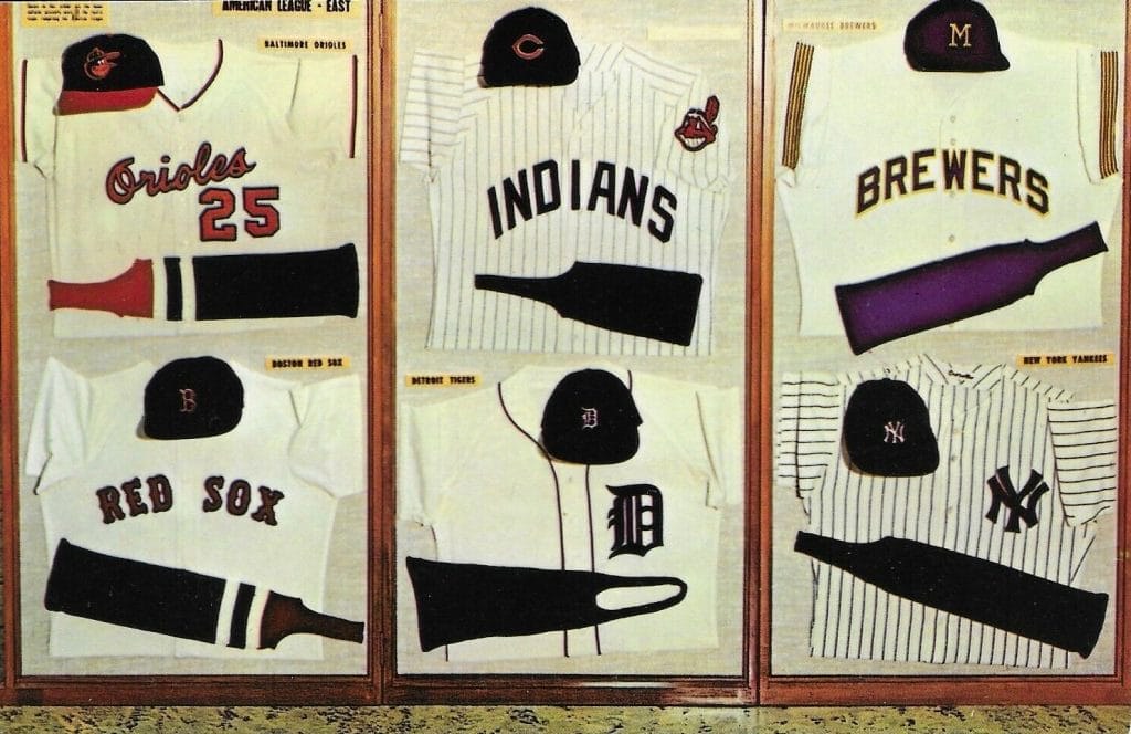
I was poking around on eBay a few days ago and saw listings for something I’d never seen before: a series of four 1969 postcards (or at least that’s when the seller said they were from) showing a jersey, cap, and stirrup for each then-current MLB team, broken down by division. The National League East postcard is shown above, and here are the ones the N.L. West, the A.L. East, and the A.L. West:


The back of each postcard had basic info identifying the publisher as the Hall of Fame:
It was immediately obvious to me, as I’m sure it is to most of you, that these postcards could not have been from 1969 (I’ll get to that in a minute). But whenever they were from, I’d never seen them before, so I emailed Hall of Fame curator Tom Shieber. He said he’d never seen either the postcards or the display cases depicted on them.
There are so many odd things about these postcards. One thing at a time:
• The display cases appear to have been propped up against a wall and photographed — nothing fancier than that. This is most evident in the A.L. West card, where they didn’t bother to crop the photo very well, so you can see a radiator and two windows in the background. Not exactly the most professional presentation!
• Are those actual caps in there? The display cases don’t look that deep, but they’d have to have some depth in order to accommodate a cap without it looking smushed, right?
• The N.L. East and A.L. East cases appear to have an additional label/caption/etc. at top-left. Unfortunately, the photos aren’t sharp enough to read them.
• The home jersey is shown for each team — except for the Padres and A’s, which are represented by road jerseys (a vest, in Oakland’s case).
• It’s so great to see little stirrup details like the Astros’ star and the Padres’ three stripes.
• Speaking of the stirrups, it’s funny how some of the stirrups are positioned to show the open loop and others are shown to show just the strip.
• The White Sox display includes a sanitary sock in addition to the stirrup, presumably because the Chisox had colored sannies. But the A’s also had colored sannies at the time, and those aren’t shown. Hmmmm.
• As a Mets fan, it’s striking to see a No. 14 jersey. That number has been retired for Gil Hodges since 1973.
• It’s a bit odd to see a Yankees jersey with set-in sleeves, instead of their current raglan sleeves with the pinstripes running across the shoulders.
———
Now then: There are all sorts of clues indicating that these postcards are not from 1969. So when are they from? It’s surprisingly inconsistent. Consider (all date citations based on Okkonen):
• There’s a Texas Rangers uni in there. They didn’t even exist until 1972.
• The aforementioned White Sox uni with the blue sannies was last worn in 1970.
• The sleeve striping on that Brewers jersey was a carryover from their Seattle Pilots uni and was worn for only one year — 1970.
• The Indians jersey was another one-year design, from 1971.
• The Angels jersey debuted in 1971.
• There’s at least one uniform that could only be from 1969: That would be the Padres’, because the triple-striped stirrups and San Diego bicentennial patch shown in the postcard were only worn in that year.
So: Based on the Rangers jersey, the postcard couldn’t have been produced prior to 1972. But it nonetheless included quite a few uniform designs that were outdated by that point. It would be fair to say that the Hall wasn’t doing the best job of keeping its uniform displays up to date! Still, that’s part of what makes this historical find so much fun.
If anyone knows more about the postcards or the display cases, please enlighten us. Thanks!

Uni Watch Haiku: Here’s the latest from the Uni Watch haiku lab:
Player’s name on back
Straight, radial, vertical
Except the Yankees
And there’s more where that came from.
Click to enlarge
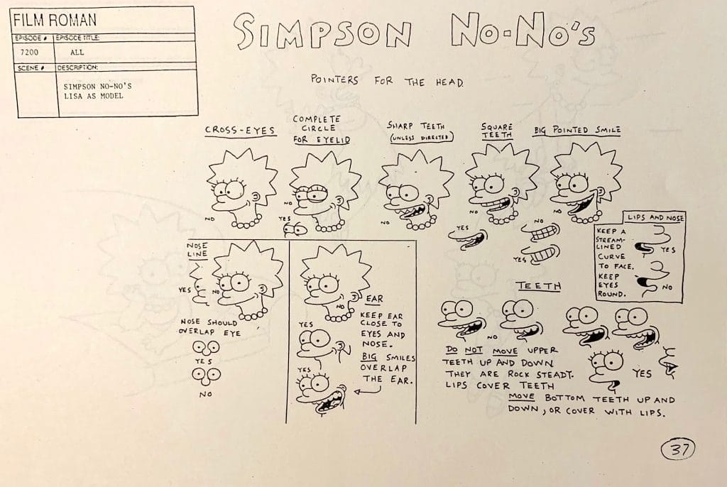
Too good for the Ticker: Style guides aren’t just for sports uniforms. Case in point: Check out this great page from an early style guide for The Simpsons — so good!
(Big thanks to Twitter-er @fv_rob for pointing me toward this one.)

Click to enlarge
ITEM! Hockey jerseys redux: Nathan Haas of Adelph Wear and I are taking orders for another batch of Uni Watch hockey jerseys. Just like before, you’ll have your choice of three different colors (green, gold, white) and two different tailoring cuts (standard “fan cut” and roomier “game cut,” which will fit over pads for on-ice use).
To get in on these, you must order by next Friday, May 1. Full details here.
While we’re at it:
• I still the Uni Watch Classic Cap in sizes 7 and 7-7/8. And remember, the price has been reduced to a pandemic-friendly $35.99. (If you’d like to be notified when other fitted sizes and adjustables are back in stock after our factory reopens, email me.)
• As of this writing, I have one — one! — green gumball helmet remaining. Who wants it?
• Uni Watch memberships, which usually cost $25, are reduced to $20 until further notice.
• You can get 15% off of everything in the Uni Watch Shop and the Naming Wrongs Shop by using the checkout code COMMUNITY.
• You can also support Uni Watch by making a donation.
My thanks, as always, for your consideration.

Click to enlarge
Hypothetically speaking: I ask you: Who doesn’t enjoy a nice, tasty brat? Wouldn’t you like to have one right about now?
If you’d like to discuss those questions with me, feel free to drop me a line. I’ll bring extra napkins.

Membership update: More than a dozen new designs have been added to the membership card gallery, including Mike Boyce’s. Do you recognize the design?
Answer: It’s based on this Harlem Globetrotters jersey! Honestly, I’d never even seen that design before, and it’s obviously no great shakes compared the classic-era ’Trotters uni, but it looks really sharp on a membership card. Nice choice, Mike!

We also have a new card from Paul Ricciardi, who’s become the first member to base his card on the Uni Watch hockey jersey! (Have I mentioned that we’re taking orders for a new batch of those?) I know I always say the ugliest jerseys make for the best cards, but this is a case where a really good-looking jersey makes for a sharp-looking card. I love how it turned out!
Ordering a membership card is a good way to support Uni Watch (which, frankly, could use your support these days). And remember, as a gesture of comm-uni-ty solidarity, the price of a membership has been reduced from $25 to $20 until further notice.
As always, you can sign up for your own custom-designed card here, you can see all the cards we’ve designed so far here (now more than 2,600 of them!), and you can see how we produce the cards here.
The Ticker
By Paul

’Skins Watch: “There’s an annual gravel bike race in Kansas — one of the top gravel races of the year — called Dirty Kanza,” says Bernie Langer. “Apparently, some groups have been upset at the name, calling it racist against Native Americans. In response, the race organizers issued a joint statement with the Kaw Nation saying it’s not disrespectful, and that the ‘Dirty’ moniker is meant positively (which, being a gravel race, it clearly is).”

Baseball News: All of these are from Kary Klismet: Here’s one writer’s pick for the best facial hair in the history of each MLB team. … Some fans recounted which signatures were stamped into their childhood baseball gloves. For the record, I had a Pete Rose model and then a Tom Seaver model, but of course neither of them was left-handed like I am, so it always felt a bit unsatisfying, or even like cheating, to have their signatures on my glove. … New costumed mascot for the Fredericksburg Nationals. … Man, the 1981 National League All-Star team was powder blue-o-rama (from @OldTimeHardball).

NFL News: New England’s uni-numerical annexation of the Buccaneers continues: Bucs TE Jordan Leggett is switching to No. 81 so newly acquired TE Rob Gronkowski can wear No. 87. It’s similar Bucs WR Chris Godwin changing from No. 12 to No. 14 to accommodate newly acquired QB Tom Brady (from many readers). … Washington’s equipment staff just launched its own Twitter feed (from Joe Brooks). … Some new uni number assignments for the Broncos, Bears, and Panthers (from Kary Klismet and John Stark). … Great find by the Gridiron Uniform Database’s Bill Schaefer, who discovered this 1964 photo of Broncos RB Billy Joe with FNOB. … What is it about football coaches thinking they’re some sort of drill sergeant and field general rolled into one? In this article about how Washington coach Ron Rivera is preparing to participate in the NFL draft from his home, he says, “It’s teamwork, just like in the military.” “Riiiiiight,” says Willard Kovacs, “because scratching names off a list is the same as losing a limb to an IED.” For the record, Rivera has never served in the military.
College Football News: Here’s a look at the evolution of BYU’s uniforms since 1965 (from Kary Klismet, who was really on a roll with the Ticker submissions yesterday!).

Hockey News: The NWHL has announced a Toronto expansion team, which will begin plan next season. “No name, logo, colors, or uniforms yet, but they’re letting people submit ideas for all of those,” says our own Jamie Rathjen. … If you’re a hockey fan, you’ve probably heard of the Vezina Trophy. But have you ever seen this awesome photo of its namesake, Georges Vezina? (From @MrBudziszewski.) … Here’s a video discussion of the greatest goalie masks shown on hockey trading cards (from Dave Lucas).

College Hoops News: New court design for Texas Tech (from @TheVeaze). … If you’ve always wondered what Virginia Tech’s jerseys might look like if they were patterned after certain NBA team designs, wonder no longer (from @tdotflip05).

Soccer News: The Columbus Crew SC’s grounds crew has turned the team’s pitch into a pandemic-solidarity message (from Jared Sloan). … Here’s another look at Liverpool’s new home and away kits (from Josh Hinton). … Wanna read about the best mullets in MLS history? Of course you do (from Wade Heidt). … Chelsea’s third kit has leaked. … Scottish side Hibernian released their new first shirt for next season. “It has ‘Thank You NHS’ [for the National Health Service] on the front instead of an ad, though they were already wearing their charity’s logo instead of an ad last season,” says our own Jamie Rathjen.

Grab Bag: Chicago mayor Lori Lightfoot is encouraging the city’s residents to hang their favorite jersey in their windows. … The new Xbox Series X logo was quietly revealed yesterday. … Canada may end up having a big say (NYT link) on when U.S. sports are reactivated. … Olympic gold medalist gymnasts Nastia Liukin and Shawn Johnson donned their Team USA leotards to watch a replay of the 2008 Olympics all-around women’s gymnastics finals (from Kary Klismet). … Golfer Rory McIlroy says he’d rather scrap this year’s Ryder Cup than stage it without fans in attendance. … Congressman Jamie Raskin has asked the Commandant of the Marine Corps to relax grooming standards due to the pandemic (from Timmy Donahue). … Also from Timmy: There was a bit of online controversy when the U.S. Navy added a surgical mask to its logo. … Classic pandemic filler: the five best uniforms in Detroit sports history (from @zenojones). … Good article about a new Facebook group devoted to one of my favorite subjects: old Wisconsin bowling alleys. … Oklahoma State is now selling officially licensed facemasks (from Matt Wilson). … ESPN is apparently planning to air a segment tomorrow about people wearing masks with sports team logos on them (from Randall Sanders). … In a related item, Minnesota Gov. Tim Walz wore a Twins mask yesterday (from Adam Stillman). … The Ohio Association of Track and Cross Country Coaches will no longer require athletes to wear numbers. According to that memo, this leaves New Jersey as the only state that still requires them (from Kyle Sutton).

Click to enlarge
What Paul did last night: By now you’re used to seeing the Tugboat Captain all bundled up in these photos. I too am all bundled up. That’s because the temperature is usually in the mid- to high 40s by the time we hit the porch at 6pm-ish each evening. I for one am really tired of it — I am so ready for warmer weather, even if my enjoyment of it will largely be limited to the daily porch session.
Anyway: We talked about some good stuff, some sad stuff. Mostly sad stuff, honestly. We met a new dog, a really nice-looking cocker spaniel named Archie. Archie’s person, an entertainingly demonstrative Russian woman, liked our tulips so much that she took a few photos of them, which was sweet. My oatmeal stout was great.
Raffle results: The 10 winners of our special raffle for people are who out working in the real world while the rest of us are sheltering in place are Ken Alimento, Jeremiah Allyn, Christian Berumen, Jordan Bonham, Giovani Corona (“Yes,” he says, “that’s my real name”), Jeff Jensen, James Richardson, Bill Riley, Scott Thomas, and Mark Zrebiec, each of whom has won a Uni Watch membership card. Congrats to them (and, more importantly, big thanks for the important work they’re doing), and a heartfelt thanks to the anonymous reader who made this possible.
Everyone: Sorry about the initial problems with today’s post. Had to take it down, rebuild it, and start over. Should be good to go.
It’s doubled-up now… FYI…
In the 1981 National League All-Star team photo, One player is wearing a Braves road jersey with an Milwaukee cap and in the back row an Atlanta powder blue jersey and Atalanta cap.
Warren Spahn – honorary All-Star that year.
Other way around.
Right. Fixed.
If you offered goalie cut jerseys I would buy all three.
I agree with this! I would love to support Uni Watch, but I want to wear these in goal.
We can do that! Agor, please email me: link
King of the Hill also had a style guide online too. Pretty cool to look at and makes you realize how much work they put into this show.
I tried to name all the players in the photo of 1981 NL all stars. I got all but three. Interestly, they identified Felipe Alou as Dick Williams.
“The Astros jersey with the navy lettering and the Astrodome sleeve patch is yet another one-year style, worn only in 1971.”
This is incorrect. The Astros jersey swith navy lettering and Astrodome patch shown in that postcard was the original Astros jersey. It debuted in 1965 and was worn through 1970. A flannel jersey with no striping and ORANGE lettering was the one-year style worn in 1971. The jersey picked up collar and sleeve striping in 1972 and kept the orange lettering.
Yup, my bad. Will fix.
Beat me to it. :)
Unless I’m missing something, they wore that jersey from link, with the MLB anniversary patch supplanting the Astrodome patch in ’69.
Paul, it’s supposed to top 100 degrees by tomorrow here in Phoenix, and I would switch weather with you in a heartbeat.
Fair enough!
Unless I missed it that Pirates uniform debuted in 1971.
July 16, 1970, when Three Rivers opened.
BurghFan is correct!
That’s right! I was there! Still have the scorecard.
Got my glove with S&H Green Stamps in the early 60s. It was a Rawlings Bob Cerv model. Great glove with a great pocket. At the end of each season I wrapped a ball in it, oiled it and kept it my closest until the next season. It was in such good shape that my daughter used it playing PeeWee League in 1991.
If you have never ordered a hockey jersey before, be prepared, the sleeves are huge. I’m swimming in them. I got mine this week. Not sure how to advise when you use the sizing chart.
I ordered the game cut in large because I wasn’t sure if the fan cut would be roomy enough in the stomach area (gut), lol.
That said, the jerseys look great and are well worth the price.
The UW jersey in particular runs large. I typically wear M in hockey jerseys as casual wear, and the one I received fits like an L. I could dress for the ice with full padding under mine, comfortably. Which is fine; some of my minor-league hockey jerseys fit about the same way, and the sleeves don’t cover my hands. But be forewarned to consider ordering a size down with these if you’re not wearing them on the ice.
Or: Just follow the sizing guide on the ordering page!
I did use the sizing guide. Again, my own inexperience buying a hockey jersey.
I used the sizing guide, knowing how my other hockey jerseys measure, and it fit exactly as expected. As has been pointed out, a Large in these is equivalent to and XL in Reebok premiers.
The sizing guide is accurate.
Seeing that awesome Harlem Globetrotters membership card design the first time, I thought it was based on Bewitched!
Speaking of “wrong-handed” signature baseball gloves, mine was a Lou Brock model. Lou was a lefty, but the glove was righty. It did bother me slightly.
Which for some reason reminds me of my nephew’s “Dwight Gooden Pitching Machine”, which was a device where the batter stepped on a plastic pad, producing enough pressure to launch a plastic ball from a little plastic juggs-gun, back toward the batter. Of course it featured a photo of Dwight Gooden on the box, but it was of Gooden *batting*, not pitching, and batting left-handed at that.
My nephew still laughs at the weirdness of it.
Ironically, Doc Gooden really was a lefty batter growing up, and by all accounts could have been a switch hitter. The Mets made him give up the left side, because they didn’t want the star pitcher exposing his pitching shoulder to a beanball.
link
I’m just tickled that a pitching machine features a namesake pitcher at the bat! Only thing weirder would be a Jose Canseco fielding machine.
Awesome stuff on The Simpsons! I love that attention to detail, now I’m going to try and find an episode where Lisa was directed to have sharp teeth!
On that ’81 NL all-star photo, “batboys”. I’ll take an educated guess the one in Phillies gear is Pete Rose’s son as there is some resemblance. Any guesses to who the one in the Pirates gear is?
link
The picture of Billy Joe could be from one of the first games that the former Dallas Texan franchise played as the Kansas City Chiefs. Farrington Field was in Fort Worth, Texas, so this might be an exhibition game from 1963. It could also be an exhibition game from 1964 as that was Billy Joe’s last year in Denver. Either way, it is interesting that the Chiefs would play an exhibition game so close to their former home in Dallas.
I don’t play ball anymore, but when I throw a ball with my kids in the part I wear my Robin Yount model glove from high school. Been hanging on to that thing forever.
I don’t have any extra information on the postcards but I do know I love the Padres jersey and that font, it actually look perfect to me! Sooo much better than their latest release.
The daily porch cocktail update is quickly becoming a highlight of my mornings. I’m always curious to see what Paul is drinking. It’s been too long since I’ve had a Sam Smith’s Oatmeal Stout.
I noticed that, too! I loved the choice! I just had a Samuel Smith’s organic cider the other night. I find their products to be nothing particularly flashy, but solidly consistent.
Ebay sellers are always fudging the dates of their stuff to make them seem more ‘classic’.
Trying to appeal to those fans of the 1969 Texas Rangers.
A list of Greatest Facial Hair for each team that doesn’t include Al Hrabrosky or Rollie Fingers? No thanks.
No Al Holland either.
Rollie could have made the list link.
Technically, four?
link
I’ll allow it.
>bangs gavel<
Samuel Smith Oatmeal Stout! Nice to see you drinking a real beer for a change ;-)
As an Angels’ fan it is also very odd to see a jersey with number 26 on it. It’s been retired for a long time to honor founder of the the team Gene Autry for a long time, not sure when it was retired though.
#26 wasn’t retired by the CALIFORNIA Angels until 1982.
Joe Rudi wore it during his stint with the team.
He was part of the Rollie Fingers-to-Boston trade…the one where he and Fingers were introduced and issued Red Sox uniforms that they never wore on the field, as the trade was voided by MLB days later.
I had two signature gloves: Jim “Catfish” Hunter (that was how his signature was presented) on my Little League glove, and George Brett, even though I could not play third base as I was left handed.
I have almost exclusively signature gloves.
My best glove to this day, that I got when I was 13, is a Rick Monday model Spaulding glove.
I also have a Piazza catchers mitt, a McGwire 1B mitt, and a Tom Seaver model that I bought used on eBay.
Kinda shocking Rollie Fingers didn’t make the cut in the facial hair history of each MLB team
Here’s one writer’s pick for the best facial hair in the history of each MLB team.
Rollie wuz robbed. Must have link.
Oh man, that picture of Fingers with the A’s is gorgeous!
Lee
Don’t get it, why would The Ticket (Detroit’s top sportsradio station) assign a color-blind (or maybe just blind) intern to determine Detroit’s top five uniforms? Those could just as easily be Detroit’s five worst uniforms. Tigers with the racing stripes? Pistons in TEAL? Lions in black? Had to check the date to see if it was leftover from April 1.
Lions in black never made sense to me. Just like the Mets in black. Especially when these teams already look great most the time. Why mess it up by trying to look trendy?
Yeah, that post was crazy.
Taste is subjective, of course, but Detroit is chock-full of excellent, classic uniform history. Red Wings, Tigers, Lions, Pistons–they all have great looks.
Hypothetically speaking, I would enjoy seeing a design of the Kansas City Royals’ script word mark that said “Kansas City Ribs” or just “Ribs”.
Hypothetically speaking, of course.
YES. Or Burnt ends?
Ribs.
Lee
Porch time is a great reminder I’ll likely never be prepared for weather of that nature. My wife and I have both grown up in the Southwest. We always long for four distinct seasons. But I’ll be honest, once this time of year hits and we are back in the low 80s I’m glad for it. I want a perfect world where we get a good fall and winter until the day after the Super Bowl. I’ll be hating life from July to September in this desert heat.
Stay warm!
Social Distancing, or as those of us in the southwest call it: Summer.
I grew up in the upper Midwest, and live in Wisconsin now, and I get less prepared for our lingering cold springs every year. It’s mainly been in the 40s here, down around freezing at night, with lots of rain and high wind, and I’ve become sooooooo impatient. When we get real spring, it’s glorious, but some years that happens in March, other years June.
Unfortunately, we can’t all live in San Diego or Maui, two American places with basically perfect weather 12 months of the year.
San Diego is a five hour drive for us. Only reason we don’t live there is the real estate is untenable. Vegas will have to do for now. We went on a long walk at 6:30 last night. Was 72 degrees when we got back. It’s nice now but it’ll be miserable in a few weeks.
September is the hardest. Watching football the rest of the country is bundling up and it’s still 95 degrees here!
Hoo boy, that Detroit “best uniforms” post.
That writer’s choices were downright strange, considering how great Detroit teams have looked over the years.
My first glove was a lefty and had the signature of Bobby Shantz on it. Dad got it with several books of S&H Green Stamps.
Dwight Gooden Spalding model was my third glove but first one with a player facsimile signature on it. Thieves took it and my first Rawlings catcher’s mitt.
The uniforms that jumped out at me as not 1969 were the Rangers, which you addressed, and the Phillies – according to Okkonen and “Dressed to the Nines” they didn’t start using that design until 1970.
I don’t recall what signature was stamped on my first glove, but it also had the real-life signature of John Wathan, a Royals player who was born in my hometown and in offseasons would come back and host youth skills clinics. That autograph was still just barely visible when my kid brother inherited the glove 9 years later.
And how about them Red Sox stirrups? It kinda looks like the bottom portion is navy rather than red. Probably just a dark photo, though.
Posts about quirky uniform minutiae like today’s lede are such a big part of what make uni-watch great.
And yes, the lack of Spring weather in the Northeast this deep into April is depressing. Given the mild winter we had it is surprising we aren’t getting any of those beautiful warm days yet. Here is hoping it isn’t one of those years we go from the 50s right into the 80s come May. Given the lack of sports to watch indoors I’m dying for a nice night when I can sit outside and read a good book.
Which color sold the most hockey jerseys? Green, gold or white…
I’m not sure (Adelph Wear has the sales data, not me), but will find out.
Is it officially gold or yellow? I don’t see it gold, I see yellow. Saints have gold and Penguins have yellow.
Is gold the new yellow?
I still call it yellow.
Saints, 49ers et al. – “old gold”, “Vegas gold”, “metallic gold”.
Penguins, Packers, Pirates et al. – “athletic gold”, which is yellow for people who associate the color yellow with being cowardly. Thus, “athletic gold”.
Totally fair! Yellow.
It’s not just about not wanting to use the word “yellow”. link.
Just as sky blue and teal are both shades of blue, but are most definitely not the same.
@chance…
Well okay they are different. If so then, call it “athletic gold”. If you don’t but do call it “gold”, then I will correct you and call it “yellow”.
Lee
They look more like bulletin board tha cases. There’s no evidence or glare from glass in front of the unis, and note that the Braves’ jersey overlaps the frame a bit. I think they’re also real caps too, just collapsed in the back and pinned to the board over the jersey. You can see shadows for many of them against the jerseys. Maybe these were a sort of “this is how the league will look when the Rangers join.”
That was my thought, too. Doesn’t look like any glass.
I was also wondering how often the Hall would update their display, if it wasn’t uncommon for a three- or four-year old design to be displayed next to the newest relocated team.
The Hall of Fame postcards are promoting the use of Pete Rose’s #14 Reds jersey?
I understand the perceived irony, but Pete Rose is actually already well-represented by memorabilia in the Hall of Fame:
link
He’s banned from being enshrined as a member of the Hall of Fame, but not from being acknowledged for his role in baseball history.
Could be so many greatest goalie hockey masks on cards. If Ken Reid has the 1977-78 O-Pee-Chee set would have needed to include Curt Ridley. One of the greatest Canucks masks of all time. A design that has been acknowledged and honoured in more recent Canucks goalie masks from Cory Schneider and Roberto Luongo.
link
Holy crap! Iain Fraser, an old roommate of mine from Hartwick College, made it in The Best Mullets in MLS History article. For the record, my mullet put his to shame.
I tried to name all the players in the photo of 1981 NL all stars. I got all but three. Interestly, they identified Felipe Alou as Dick Williams.
The A’s uniform from the postcards appears to be from the 1970 season when they introduced the ‘s on the jersey and cap. In ’68 and’69 the cap had a single ‘A.’ Additionally, the solid green cap with “A’s” was only worn in 1970.
The all (Fort Knox) gold uni wasn’t primarily the road jersey. It was worn both at home and away, usually the first game of the series or game 2 of a doubleheader.
Great stuff today, Paul! I love the deep dive on these postcards and all the uniform inconsistencies that make it impossible for them to represent a single snapshot in time.
Here’s one more bit of evidence that hasn’t been mentioned directly yet:
The Milwaukee Brewers did not exist in 1969. They were still the Seattle Pilots that year (their only season as such). The carry-over sleeve striping that dates the jersey to 1970 is certainly telling, but not as much as the wrong city and nickname for the team!
The Washington Equipment Twitter doesn’t exist anymore…
I don’t recall my childhood baseball glove having a signature but my father’s glove had Tom Tresh on it.
Awesome irony: In the late 50’s my dad, to this day a huge Pirates fan, was given a baseball glove for Christmas. Signature model? Tony Kubek.
In 1960, he was in the bleachers at Forbes Field for World Series game #…..6.
NY 12 F
PIT 0
Game 7 turned out a tad better for him & the Buccos.
And significantly worse for Kubek.
Regarding Ron Rivera and the military quote. He was not in the military; but his father was. He grew up in military bases and understands a lot of the military life. No complaint—just an FYI.