
By Phil Hecken, with Chris Pirrone
Follow @PhilHecken
Hey guys! Well, we made it to (checks phone) … Sunday. Yeah, the days do kinda run into one another due to the COVID situation, but I can assure you it is the last (or is it first?) day of the week.
Last Sunday, I hosted the first of two sets of uniforms by reader Chris Pirrone — if you missed that you can click here. Here’s what Chris said to introduce the set last weekend:
Hi Phil,
Hope you’re doing well.
As I’ve been forced to spend time at home, I decided to finish up a project that I started back in 2016. Basically I took NFL branding and created a set of baseball uniforms for each team. Please see attached.
I tried to make designs pretty unique for each team without going too over the top, baseball uniform designs are usually pretty tame (or at least they should be). :)
I know you’ve featured reader uniform concepts on Uni-Watch in the past and I’d just like to submit these for consideration.
Thanks!
Chris Pirrone
Today we’ll take a look at the remaining teams from Chris’ MLB/NFL crossover concept.
Enjoy!
Jaguars:

This was one of the early concepts I did back in 2016. Back then the Jags had a gradient black to gold helmet. I originally had the front panel of the hat gold and the rest of it black as a call-out to that, but since then they went all black so I did here too.
Jets:

Since this is a baseball uniform, I started changing the football shapes to baseballs, but it just didn’t look much like the Jets anymore so I kept it.
Lions:

My hometown team, they’ve given me so much heartache over the years, but I do love the throwback Spring Training jersey!
Packers:

Pinstripes seemed appropriate for this classic team. Love the Acme Packers Blues too!
Panthers:

Kept the shoulder design similar to the football jersey. Not sure it would work well in real-life, but I like it in this illustration.
Patriots:

Couldn’t resist using the tri-corner hat logo from the 60’s on the Spring Training hat!
Raiders:

It’s strange seeing ‘Las Vegas’ emblazoned on the front of a baseball jersey.
Rams:

Incorporated the new wordmark. Made a white version of the new Ram head and kept the color palette for the spring training concept the same as they had in the 60’s, blue and white.
Ravens:

They busted out mustard colored pants a few years back, so I figured I could get away with a jersey in that color as well.
‘skins:

Made a new version of the logo, based on the one they had for a couple years in the early 70’s. The R inside the circle, only used the cursive R instead of the serif version they used back then.
Saints:

I’m not a fan of baseball pants in colors other than white or grey, but that pale gold color works as a road color I think.
Seahawks:

The neon green combo looks is pretty eye catching. It sort of has a ‘Turn Ahead the Clocks’ gimmicky look to it, but I figured if you’re gonna wear neon green, you can get away with it being a little more out there.
Steelers:

Tried to keep the look classic. I love the throwback logo, they should use it more often!
Texans:

I found a lot of underused secondary logos while doing this project, I really like the Texans HT logo.
Titans:

I had 2 grays to choose from in their color palette, I used the dark gray for the road uni’s, I kind of like the look of the darker gray for more contrast with opponents home whites.
Vikings:

I know the horns on both sides of a helmet make much more sense than on the sleeves, but I wanted to use it and it just looked odd only on one side.
Thanks, Chris! This was definitely a fun little project and thanks (again) for sharing it with us!
Readers — what say you?

Go Chargers Go!

The Los Angeles Chargers are scheduled to release their new uniforms this Tuesday (unless of course, a certain scribe leaks them early ;)). So, I have two sets of concepts for you today (one was planned, the other was sent to me yesterday), as well as a possible “leak” (although I don’t think there’s much validity to it — I’m certainly not ready to lend any credence to it, but hey, one never knows).
The planned set of Chargers concepts comes from Mike Joseph, who you may recall recently had some Arizona Cardinals concepts and Los Angeles Rams concepts run on here. In fact, we’ll be seeing many more concepts from Mike, plus a Q&A, in the not too distant future. But first, let’s take a look at some of his designs.
A quick note: Mike worked with former NBA designer (and UW friend) Tom O’Grady on a new Chargers logo — I’ll show those last, but in some of Mike’s writeups, he references “Tom’s logo” so that’s the gentleman and design to whom he is referring. You can see that logo in the lower left of most of these concepts.
I’ll also add in some of Mike’s descriptions.
Presentations: First off, I love working with the templates from Webpixum.com and I’m trying to get my own, custom template built so my presentations are truly unique. I spiced up the alternate presentation of Tom’s logo a little with some fun effects. I hope fans enjoy it. I hate using the standard template out of the box once the designs are done, so I try to make things interesting by placing the models in different positions and trying to zoom in close as often as possible to really let the details shine. The resolution on these things is amazing. I probably overdid it with the main display of lots of different models, but I do these things until the wee hours of the morning so some of my decisions are based in lack-of-sleep induced madness, but I roll with it. You’ll rarely see me play it safe.


Alternate logo: I really love this alternate LA Chargers logo by Tom O’Grady with Gameplan Chicago. So much cooler and more unique than the failed LA Dodgers lookalike the team tried. I think the bolt is especially unique (I followed his revision process posted on Twitter) and love that he has a different number of “zags” on either side. I like risks like that and Tom is a legend, so of course he would come up with something so cool.


Powder Outage set: Did this just for fun. I have no desire to see the Chargers wear black and I hope that fad has passed. The Raiders do black best, let’s just leave it alone with them and the few other teams that have used it historically. Adding it as a new option for teams was so forced and the whole “black for black’s sake” thing just wore on me. I just liked the idea of doing very little powder blue and calling it “Powder Outage” for the double entendre. Get it? Also really love the old school logo on the chest with the “H” as an old-style goalpost.

Grey sets: We’ve all heard the rumors, so I took a stab at what it might look like. I think losing the navy blue (if that’s certain) may force their hand with adding another color to the mix. When making my mock-ups I played with navy accents and it really helps things pop. I guess we’ll see.


Some additional notes:
Pant stripes: I tried a lot here. I really like the single bolt down the leg, but also tried some traditional stripes on some of the sets and an alternate pattern using the new mini bolt they’re using. I hope they don’t do traditional stripes, because I don’t love it with this brand, but some fans wanted to see it. Going retro seems to be in demand right now, as we’ve seen with the Browns, Bucs and the Falcons retro uni.
Helmet: Hard to really nail matte white in a render, but I’d want it to be matte and definitely have the numbers on the side and the yellow mask, Such a unique look. They already have the best helmets with the bolt. This would take it to another level.
Numbers on the sleeves: A must. More teams should do it. The top of the shoulder is overused. If you’re not a classic team that is never going to make big changes, try things like this. I love using sleeves for different things.
Number font: I stuck with the current font. It still fits and I am not a font designer, and I hate trying to find the perfect font. They should almost always be custom, and that’s not my strength. I did play with some other things, but they just didn’t look right and going to a basic block font just doesn’t fit with this brand. I hope they don’t go with the super big numbers like we saw with the Falcons. I don’t hate that look for Atlanta (I like the big numbers, not necessarily the font), but I don’t think it works for the Chargers.
Thanks, Mike!

Next up comes the set I received yesterday, and this one is from reader Chad Buley.
I’ll show his designs below, and then he’ll describe them.


And here’s how Chad describes these:
Hi Phil!
First off, thank you for keeping Uni-Watch running during quarantine! It’s great to have something new to look forward to every day.
With the Chargers planning on revealing their new uniforms in a few days, I drew up some concepts of what I hope they’ll look like (I attached the concepts below). Here’s the description:
The Chargers have some of the best uniforms in the NFL, so they don’t need to overthink it. For this redesign, I took away the navy blue in the primary uniforms, added an updated version of the old horse/shield logo as a patch, and used the rumored navy color for the color rush set.
Thank you for your time!
Best,
Chad Buley
Thanks, Chad!
And finally…
A Chargers Leak?
I’m not one to put faith in such things, but I got a note from reader Brad Belstock which reads as follows:
Found this image buried deep in an image search late Friday night. This would go against what many of us believe: the return of the golden yellow pants. I am not sure if this is a concept uniform that someone created or what, but it was labeled Los Angeles Chargers uniforms. What’s missing is the color rush uniform that was leaked earlier–it’s going to be navy.
–Brad

Thanks, Brad!
Interesting.
Guess we’ll have to wait till Tuesday to know for sure.

Guess The Game…
from the scoreboard
Today’s scoreboard comes from Barton Hall.
The premise of the game (GTGFTS) is simple: I’ll post a scoreboard and you guys simply identify the game depicted. In the past, I don’t know if I’ve ever completely stumped you (some are easier than others).
Here’s the Scoreboard. In the comments below, try to identify the game (date & location, as well as final score). If anything noteworthy occurred during the game, please add that in (and if you were AT the game, well bonus points for you!):

Please continue sending these in! You’re welcome to send me any scoreboard photos (with answers please), and I’ll keep running them.
The “BEST OF” Kreindler’s Korner
Hey guys & gals. You’ve enjoyed Kreindler’s Korner for several years now, mostly on the weekends, on Uni Watch, but with the recent coronavirus outbreak, Graig’s time is just too precious and he needs to tend to other things besides coming up with a new writeup each weekend.
So, going forward, for as long as the COVID-19 situation is bad in New York, I’m going to run a few “Best of’s” until Graig returns.
Here’s today’s offering (click to enlarge):

Title: “Jackie Robinson, 1945” (color study)
Subject: Jackie Robinson, 1945
Medium: Oil on linen mounted to board
Size: 5” x 7”
Jackie Robinson spent only five months with the Kansas City Monarchs in 1945. He had joined a squad that had come off of a sub-par year in ‘44, going only 35 and 51 for fifth place in the league.Robinson was signed at the recommendation of pitcher Hilton Smith, who had seen Jackie play at Fort Hood. Monarchs owner J.L. Wilkinson supposedly sent him a contract sight unseen, what with his team being decimated by WWII – Buck O’Neil, Hank Thompson, Ted Strong and Willard Brown were all still in the service.
The ‘45 edition sported Jackie at shortstop primarily, and at a salary of $400 a month, he made his debut with the club on May 6, 1945, going 1-4 with an RBI double in a 6-2 victory over the Chicago American Giants.
By the end of the season, Jackie was leading the team with a .345 average, complete with ten doubles, four triples and five home runs. He was even selected for the East-West All-Star Game. During that season, he had also began trying out for various Major League clubs, including that infamous workout with the Boston Red Sox. It was in August at Comiskey Park in Chicago that Jackie was approached by scout Clyde Sukeforth on behalf of Branch Rickey and the Brooklyn Dodgers. By the time Robinson had met Rickey in his office on Montague Street in Brooklyn on August 28, baseball would finally become the national game.
Here Jackie is pictured in his ‘45 Monarchs home jersey. This is one of 200+ such paintings of mine that will be on display at the Negro Leagues Baseball Museum in the spring of 2020.
Thanks, Graig! You can (and should!) follow Graig on Twitter.
And now a few words from Paul
Hi there. First and foremost, I hope you’re staying safe and (relatively) sane, as I’m doing my best to do.
Second, please join me in thanking Phil for the epic work he’s been doing during the pandemic. He’s been juggling some family stuff, some grad school stuff, and all the other stuff we’ve all been dealing with, but he’s still been doing a great job with the Uni Watch weekends — thanks, buddy.
Now then, a few merchandising notes:
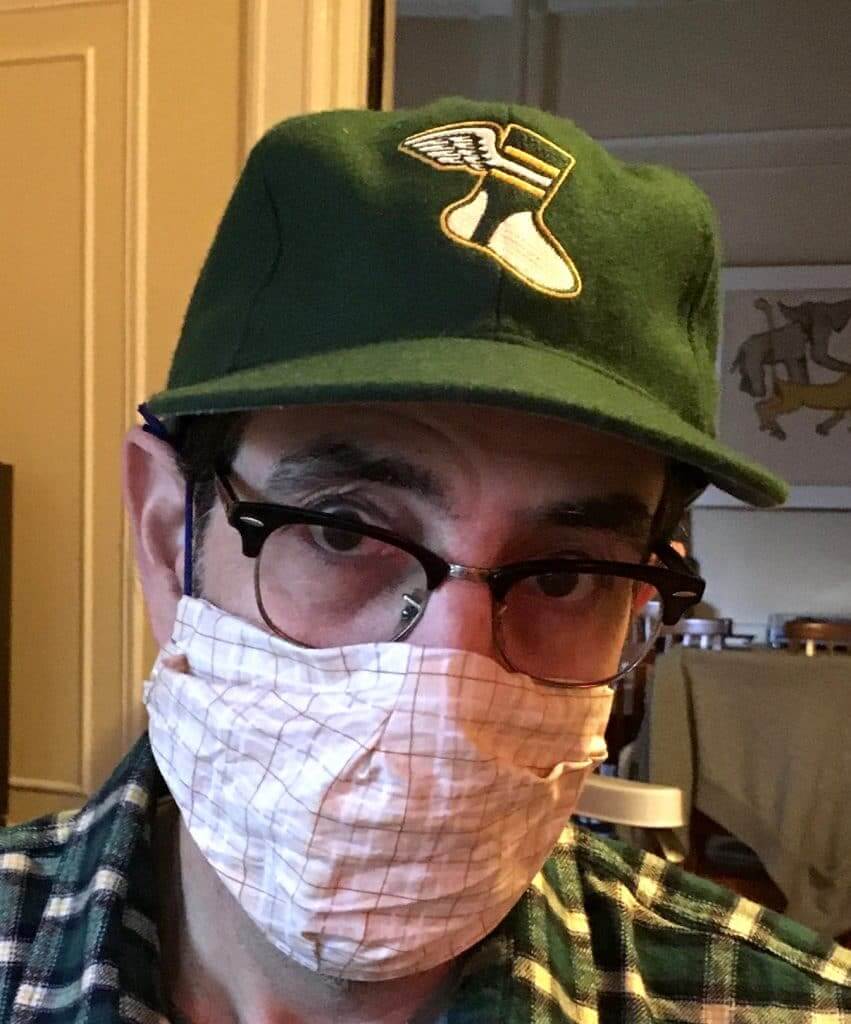
• If you want a Uni Watch Classic Cap (which, as you can see, pairs nicely with a homemade mask), I have ample supplies of sizes 7 and 7-7/8, and two of size 7-1/4. Everything else is sold out. I have orders in place for new inventory, but Ebbets Field Flannels’ factory is currently shut down, so there’s no telling when those orders will be filled. If you want one of our remaining sizes, you can order here.
• As of this writing, I have one white seam ripper remaining. All other colors are sold out. I ordered 100 new rippers a month ago, but they’re coming from China, so who knows when they’ll arrive. If you want one of the ones I still have on hand, you can order here. Seam rippers are now sold out until further notice.
On the plus side, Teespring continues to operate normally, so everything in the Uni Watch Shop and the Naming Wrongs Shop continues to be available. And remember, you can save 15% on anything in those shops by using the checkout code COMMUNITY.
And of course you can always support Uni Watch by ordering a membership card or making a donation.
Thanks, and stay safe! Now back to Phil.
Uni Watch News Ticker
By Phil

Baseball News: This is pretty awesome: My buddy, Graig Kreindler (who I’ve featured on here many times and whose Kreindler’s Korner runs almost every weekend), was featured in Sports Illustrated in a piece that ran yesterday. Congrats, buddy! … Some somewhat sad news to report: it was noted the other day that D.C. Mayor Muriel Bowser had worn a NE-logo-free cap. However, John Muir points out that “on April 16 she wore the big gold World Series Champions hat for a presser. Since it’s just merch it absolutely had a maker’s mark.” He adds, “Can’t find pics but she’s also worn a 51 (for Statehood) hat for announcements.” … “What in the heck IS this?!?!” read the e-mail from Mike Williams. Intrigued, I clicked on the link he sent. And boy, am I glad I did. … FS1 showed an old episode of “This Week In Baseball” from Aug ‘83. You can see the outline of the old name and number on the jersey of Julio Cruz who the White Sox traded for in June (from Erik Spoonmore). … ICYMI, here’s a great timelapse look at Artist Andy Brown’s greatest NY Yankee lineup. … The Mets just can’t seem to get enough of the damn black jerseys. … The mascot costume for the semi-pro National Baseball Congress World Series has gone missing, and police are asking for the public’s help in finding it (from Kary Klismet). … Also from Kary Klismet: Whenever the University of Virginia softball team is able to take the field again, they’ll have a new stadium waiting for them. … Here’s every Nats Cap worn by the Nationals since 2012 (via Paul).

NFL News: With the Cleveland Browns successfully completing their uniform makeover this past week, here’s a look back at the timeline of all Browns uniform changes. … ICYMI, the Browns are not done with the uniform reveals, and they may add a set of orange pants to their new look. … With the Chargers unveiling their new uniforms this Tuesday, there’s lots of Bolts news. Here’s a look at some of the best fan made concepts. … Speaking of the Chargers, their upcoming uniforms are receiving “rave reviews” from the players who’ve seen them. … The NFL Network’s Peter Schrager thinks the Chargers new uniforms will be the best in the NFL. … Also ICYMI, on Friday, the Patriots announced they will reveal their new uniforms tomorrow, which just also happens to be Patriots Day. Here’s a bit more on that. … And of course, there is rampant speculation as to what those new unis will look like (we’ll just have to wait till Monday to know for sure). … Seems as though at least one of those new uniforms (alternate perhaps?) will be a 90’s throwback. … With the apparent relaxing of NFL uniform rules, should the New Orleans Saints wear their color rash uniforms more often? … We may not have been big fans of the Falcons new uniforms, but their online jersey sales set a team record. … Interesting ‘7’ on this Browns fan jersey (from Kub) This was also spotted on another jersey by Cleveland Rocks. Wonder if the on-field jerseys will carry that font. … Check out this awesome photo from 1959, featuring Johnny Morris of the Bears at Soldier Field. Bob Gassel explains: “Now, you might be saying, “Hey, wait a minute…the Bears didn’t start playing in Soldier Field until 1971”, or “Why are the Bears wearing white at home?” The story is that in 1959, the Chicago Cardinals, in their last year before moving, played home games at Soldier Field, including one against the Bears.”
College Football News: I would argue (though not very strenuously) that the SEC have the best uniforms and helmets in college football, but here’s an article that thinks some SEC helmets absolutely need to be redesigned. … Yesterday wasn’t April 1, but that didn’t stop Rob Behrens from noting “Texas A&M’s 2020 football uniforms, originally scheduled to be released today, have leaked.”

Hockey News: Not a lot of hockey news these days, but the Hockey by Design blog has compiled a list of its top five fictional hockey sweaters of all time (from Kary Klismet). … And there’s always this: someone has ranked the Blackhawks sweaters from the 2000s. So there’s that. … But hey, at least those aren’t from 1996 (from Gershon Rabinowitz).

NBA/WNBA News: The NBA and WNBA selling team-branded face coverings (WaPo link), with proceeds going to charity, joining countless others in helping to fight the Corona Pandemic (from Tommy Turner). … Did you know His Airness once lit up the City of Lights (from Throwback Sports).

College Hoops News: Of all the sports to be affected by the COVID pandemic shutdown, right now college hoops are probably not at the top of our lists. But that doesn’t mean someone won’t assembly a list of the 15 best uniforms in college hoops. … This brings back memories, at least for me: here’s Pearl Washington in some sweet ‘cuse unis (from Throwback Sports).

Soccer News: Not much footy news on the pitch these days, but there is this: The 2020/21 AC Milan home kit has leaked (from Josh Hinton).
.

Grab Bag: When we think of Denver and/or Colorado professional franchises, we don’t always often think of terrible uniforms, but yet someone has put together a list of the 10 worst uniforms in Colorado history (from Jeff Moddelmog). … The US Army has redesigned its Arctic Tab. Timmy Donahue explains: “Originally worn below the unit patch, it could only be worn while assigned to Army Alaska. The new tab is worn above the unit patch & can be worn by pax serving @ all Army Pacific posts.” … Check out this video for a whole bunch of rugby players wearing letters instead of numbers, which was fairly common until the 21st century (from our own Anthony Emerson). … “How great is this sports stadium-related installment of the classic 1950s futurist comic strip Closer than We Think!?” asks Kary Klismet. “Interestingly enough, the prediction it makes about stadiums made up of movable, sectional seating modules partially came true (albeit without self-propulsion) less than a decade later when Montreal’s infamous but now-defunct Autostade (a former home of the CFL’s Alouettes) was constructed as a centerpiece for Expo 67.”
And that’s it for me for the weekend. Pretty big uni week on tap with the Patriots unveiling tomorrow and the Chargers on Tuesday, and of course Paul will have the best coverage on the Interwebs for both of those!
Everyone stay safe (and STAY HOME!). Remember: we’re all in this together and together we’ll get through this!
Peace,
PH
That link for Chris’ uniforms from last time is incorrect.
Should be fixed now.
GTGFTS: June 5, 1960. Dick Stuart, who’s batting against Jim Owens, hits a homer in this at bat for the Pirates’ only run in a 4-1 loss to the Phillies at Connie Mack Stadium. It completes a doubleheader sweep for Philadelphia.
link
June 5, 1960 for the scoreboard. Phillies 4, Pirates 1 at Shibe Park in game 2 of a doubleheader. Jim Owens with a complete game win. Cal Neeman and Ted Lepcio homered. Pirates would have the last laugh in October when they beat the Yankees in seven.
You cannot have a top 5 fictional hockey jerseys list without the Hamilton Steelheads. From the late 1990s Canadian TV drama. The most 1990s style jersey there ever was.
The name of the show was Power Play and the jerseys were … justifiably left out of the top 5
link
June 5, 1960 the Phillies sweep the Pirates. In game 1 Gene Conley, who also played in the NBA for Boston and New York, threw a complete-game shutout, allowing 10 hits (!) and two walks.
I’d be very surprised if those “leaks” turn out to be the new Chargers unis. The logo is different than the one they released a month ago.
Saints, ‘Skins, and Vikings were my faves!
I know this may sound sacrilegious, and with the understanding that lightning bolts are the motif of the Chargers’ uniforms, I think it’s time to eliminate them from the jerseys — or at least find a better placement. There simply is not enough room on the jerseys to incorporate the classic bolts of the original jerseys. Most of the designs I see may be okay in theory, but in reality the sleeves are shorter than those illustrated in the design concepts.
If the Chargers revive the numbers on the helmet, would they still ‘need’ TV numbers on the jersey?
Getting rid of those leave plenty of space for the bolts to remain on the sleeve(though I’d like to see them moved up to UCLA placement like the Mike Joseph concept).
The Jags look much better in baseball threads than they do on the gridiron! Great work. Also that Las Vegas Raiders concept looks outstanding.
Worst uniforms in Colorado history are anything the Avalanche has worn. Colors are muddy, sweater logo is cheesy, graphics are crooked (I know, I know: for mountains), black pants are out of place. It may be lazy, but I would put the team in old Rockies’ uniforms. Or at least something influenced by them.
Ravens would definitely have Baltimore on the away jersey, they have always made sure to include the city name in logos and merchandise.
Re the futuristic stadium item in the Grab Bag section of the Ticker: here’s a photo of Montreal’s Autostade for comparison proposes:
link
This photo does a good job of showing how the stadium is made up of a bunch of individual seating sections arranged in an oval. On the banks of the Saint Lawrence River with no wind break, it was apparently a bone-chilling place to watch a game.
The cold-weather conditions and open seating arrangement were apparently among the reasons the Expos never played there, despite being named after the very event that prompted the Autostade’s construction in the first place. Although Jarry Park, the Expos’ original home stadium, was always supposed to have been a temporary arrangement, the team stayed put until moving into Olympic Stadium for the 1977 season rather than try to make a go of it at the Autostade.
An unusual situation. The Montreal Alouettes left Molson Stadium in 1968 to play at the Autostade. In the late 1990s, the Als ended up moving back to the stadium they left in the 1960s. Still play at Molson Stadium today.
Shout out to the rock band U2 for this:
link
Chris, I really enjoyed your crossover uniform concepts. Thanks for sharing them! It’s interesting to see how well most NFL wordmarks and logos when themselves to use on baseball uniforms. Your concepts for the saints uniforms are particularly intriguing!
I’m glad Chris didn’t offer up an all-black option for the Saints.
The Redskins helmet logo looks so good as a sleeve patch…great choice going with the script R.
Paul hinting at a leak of the new Chargers’ Uniforms? Say it IS so, Joe.
Typical BS out of the Denver Post sportswriters. Same thing I got to hear from them over the 15 years I lived there. They wouldn’t know a good look if they tripped over it.
Odd the worst uniforms don’t show any of the hundreds of Denver Nuggets uniform variations or the Bronco Blue/Blue/White uniforms which replaced the classic Bronco Light Blue/Orange/White look in 1996, or the drunken kicking Bronco Orange helmet.
Not to impugn the artist in any way, as I lack the skills to do any better, but what I often wish someone would do when mocking up NFL-MLB “crossovers” like this, which is to say I’d really like to see it, is arch the chest wordmarks.
why not run those “powder outage” uniforms in the Chargers dark blue of recent years? no black required!