For all photos, click to enlarge
[Editor’s Note: Today we have another guest entry from baseball jersey restorer extraordinaire Bill Henderson and his business, the Dream Shop. Enjoy. — PL]
By Bill Henderson
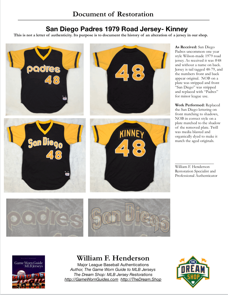
The Padres changed uniforms almost annually back in the 1970s. Collecting them is very difficult now, because after MLB use they were almost all sent to the minor leagues, stripped of their lettering, and reused, a money-saving step that seems unbelievable today.
This jersey we’re looking at today started out as a 1979 Padres road jersey — a one-year style — before it was sent down in 1980 and relettered. Collector Guy H. sent it to me for a restoration, and I accepted the challenge.
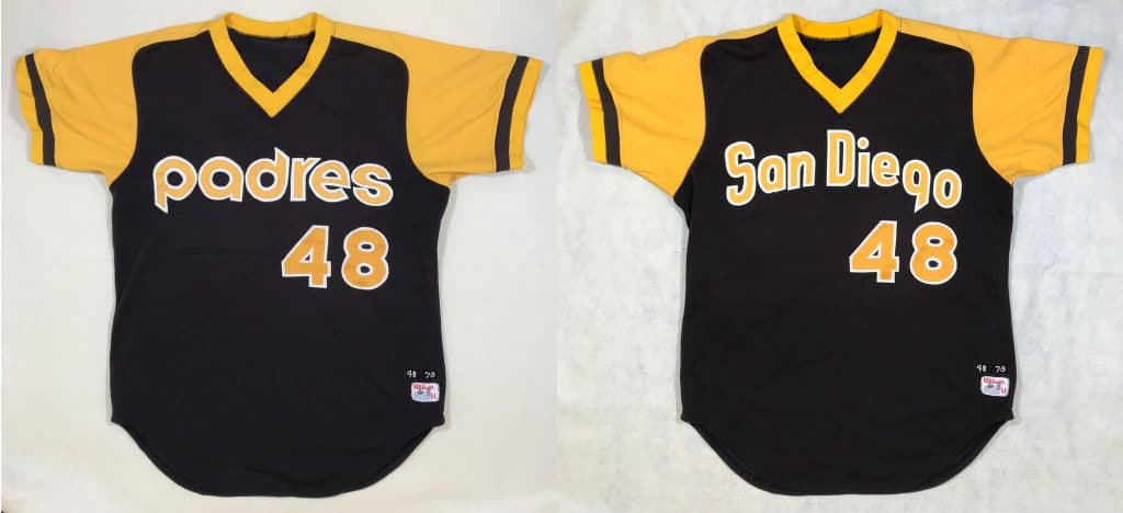
The photos above show how the jersey looked when I received it (left) and after I restored it (right). Follow along as we bring it back to 1979-era perfection.
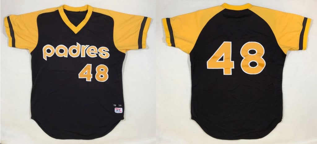
Here’s another look at the front and back of the jersey as I received it:
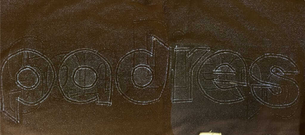
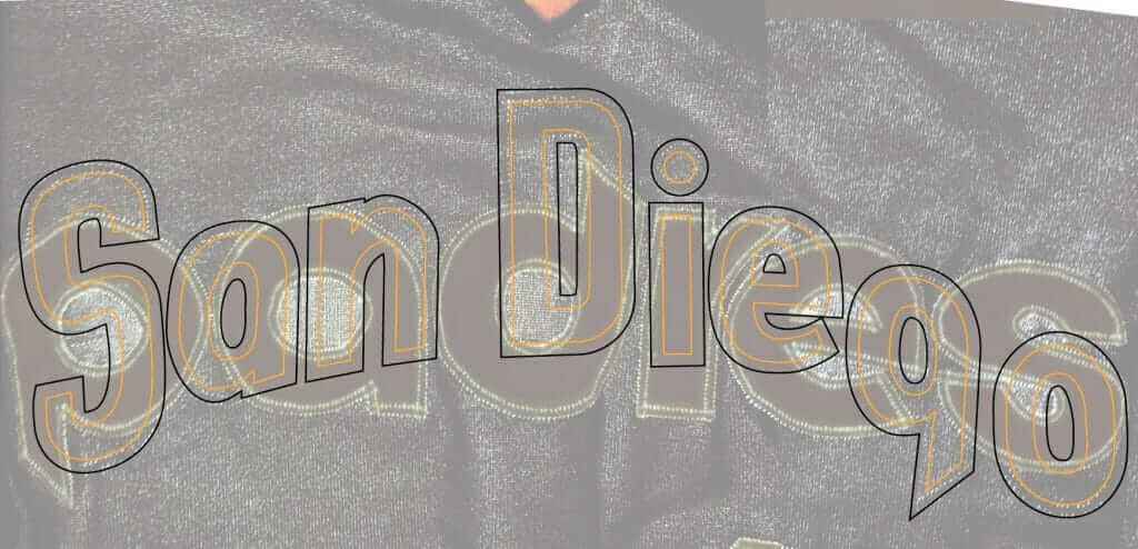
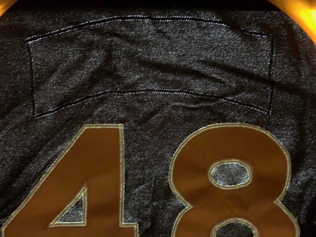
This jersey had “good bones.” It was not abused to death in the minors the way most jerseys were, making it an excellent restoration candidate. The colors are still bright and the twill lettering is actually still somewhat shiny instead of dull and flat. The team tag on the lower tail tells us that this jersey was originally issued as No. 48 in 1979 (which means it was worn by pitcher Dennis Kinney). A light table investigation indicated that the front and numbers are the original ones, but the original “San Diego” chest wordmark was replaced for use in the minors [you really need to click on this one to see the larger version in order to get the full visual effect — PL]:
We always begin with a proof. The bottom photos are of an original jersey from my files. The top image is a computer-generated mockup showing how the jersey should look when restoration is complete:
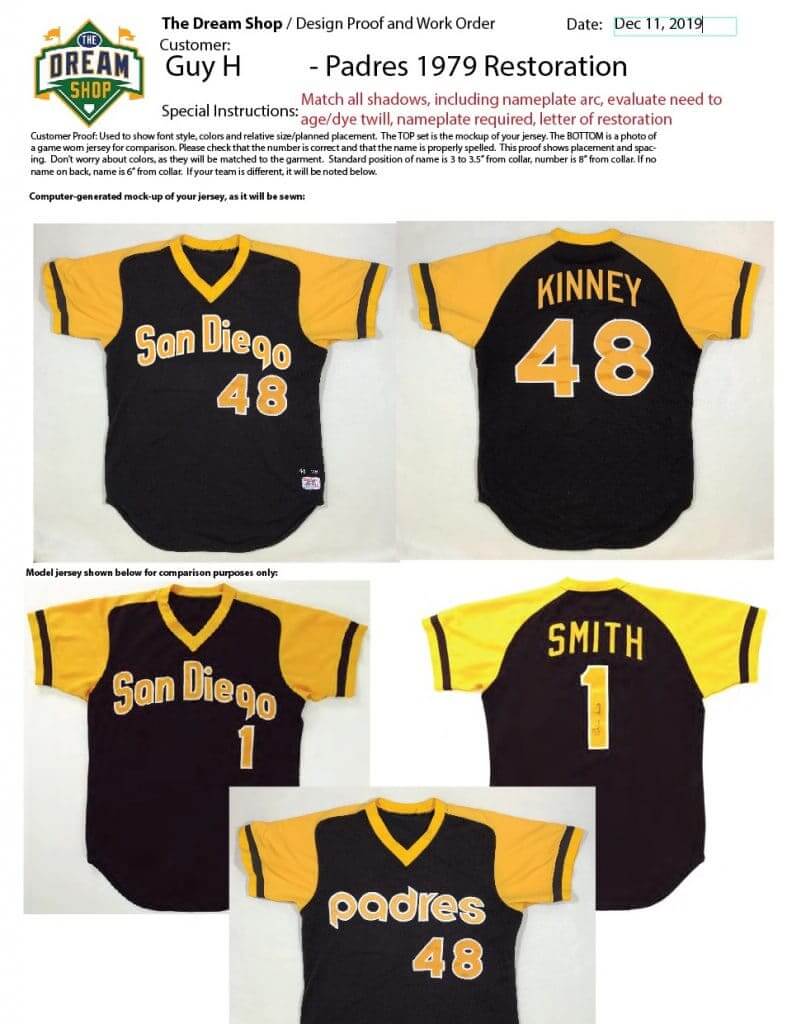
Any discussion of changes happens at this point. Doing things correctly the first time is a major concern for me. Too often in the past, when I was sending jerseys to shops to be customized, they didn’t turn out as I had hoped. Adding this step to my production process helps to eliminate that problem.
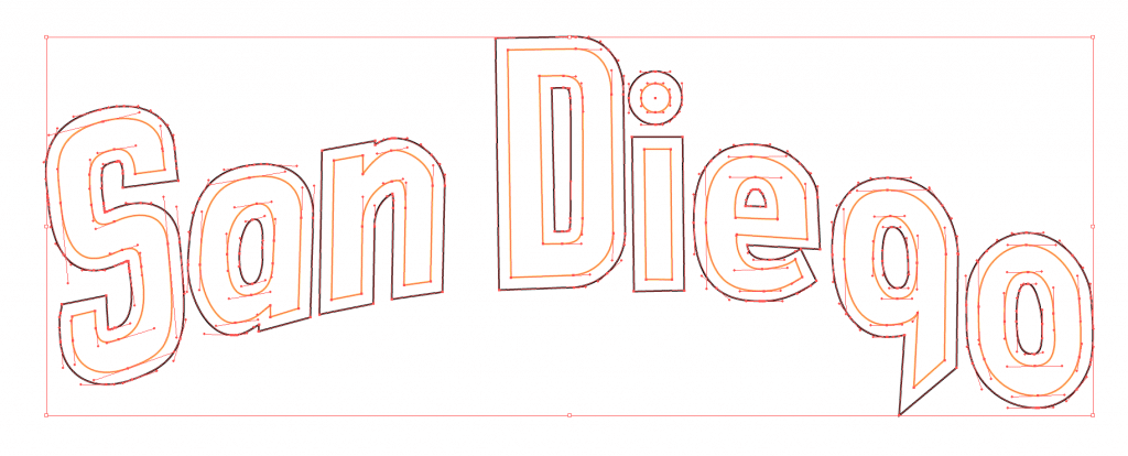
Here is my two color art, created on the overlay of the ghosted “San Diego” lettering, resulting in a digital pattern that will be sent to my computer-driven fabric cutter:
After cutting the two-color chest lettering, I lightly media-blasted it with baking soda in my blast cabinet to reduce the sheen slightly, so the new lettering would match the original numbers, and also gently dyed it in an organic concoction I’ve contrived, so the the bright-new colors will be dulled slightly to match the originals. Here, the lettering is placed exactly over the original ghosts on the light table but not yet sewn on:
You can see some of the fuzzy, softened edges on the white layer, caused by the media blasting.
For comparison, here are some bright, new tackle twill samples laid next to the “aged” lettering:
It’s funny — no one notices when things are done correctly, but you’d immediately notice the bright white outlines of the new lettering as looking out of place if I skipped the aging step.
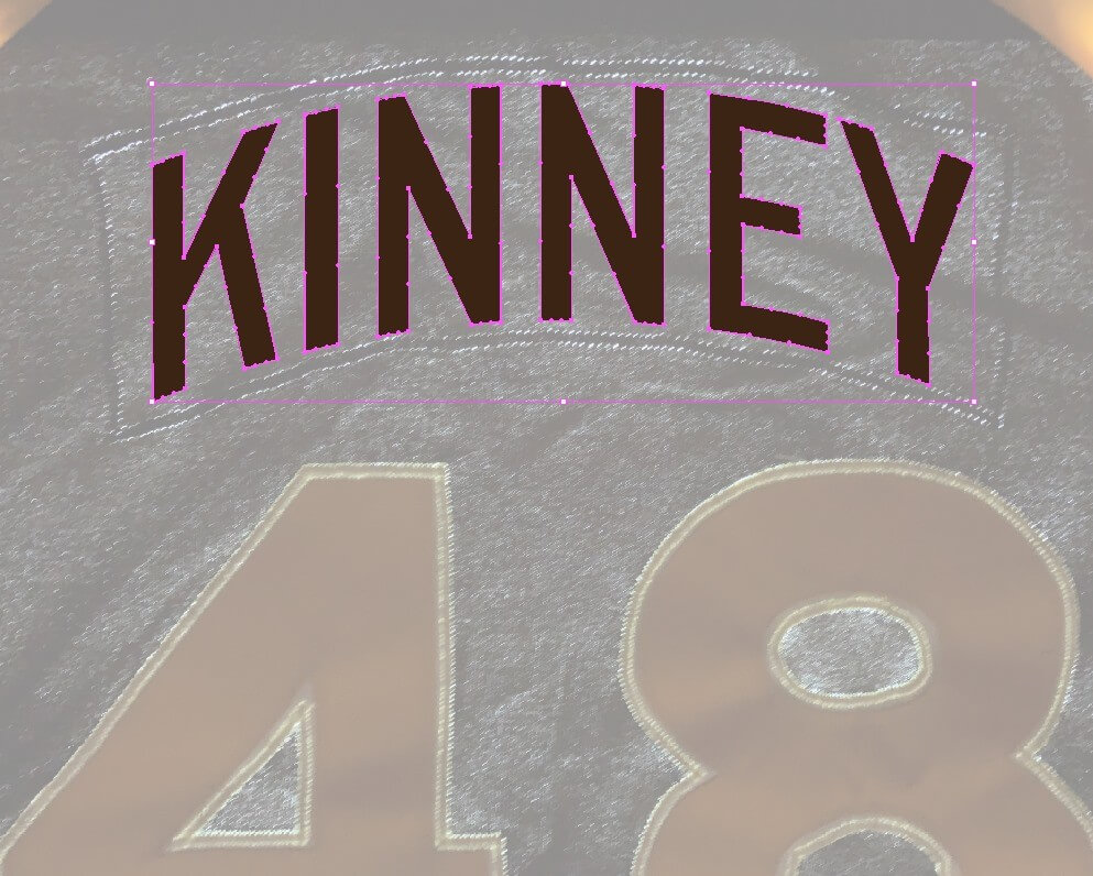
The light table also provided a ghosted view of the original nameplate outline, which helped ensure that I got the arch of the NOB just right:
Using Adobe Illustrator and the Padres’ old NOB font, I vertically arched the player’s name to look just as it would have have 40 years earlier. Back then, this would have been done by hand on a drafting table. How envious those workers would be of today’s technology!
When restoring a jersey that has been altered, I always recommend a letter of restoration be added to the order. Why? Because even though I steamed the fabric to close up the old stitching holes from the removed “Padres” on front, a future appraiser/authenticator putting this jersey on his light table will see only the outlines of what had been there in the minors. He will not see the outlines of the original pre-restoration “San Diego” lettering, because I’ve now sewn over those outlines. So the authenticator could mistakenly conclude that this had never been a Padres MLB issue and instead was a minor league jersey that someone tampered with, which would greatly harm the jersey’s resale value. Having a document like this one eliminates the chance of that happening.
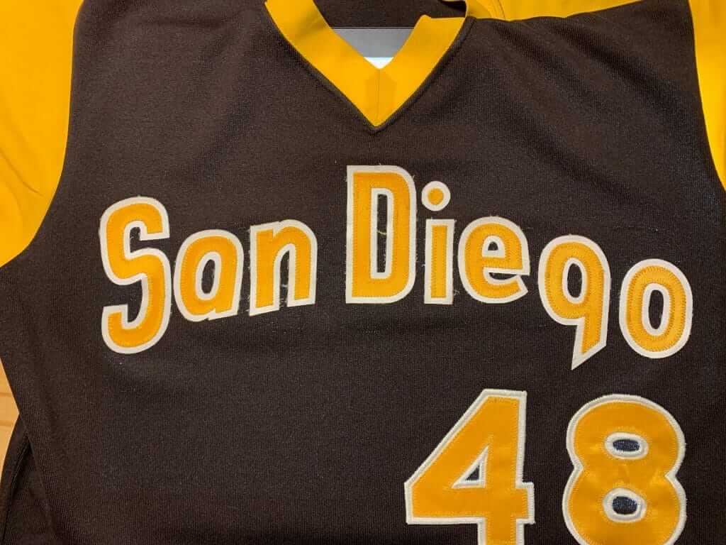
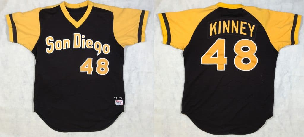
And here’s our final product. Boy, I wish I owned one of these — it’s one of the few game jersey styles not included in my own reference collection of almost 1,200 game-used jerseys.
———
Paul here. Let’s hear it for Bill for continuing to share these sensational step-by-step projects with us!
Also: I’ve created a new “Tales from the Dream Shop” category tag. So if you ever want to see all of Bill’s Uni Watch posts, you can find them here.
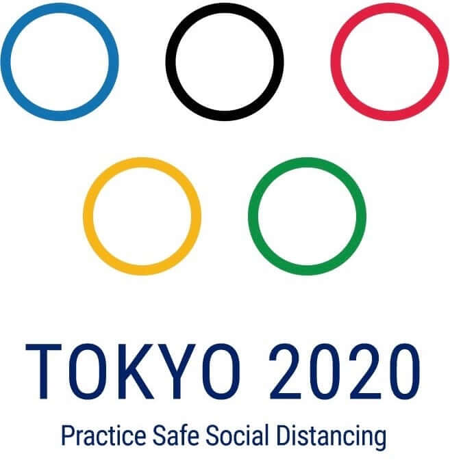
Pandemic-themed logo design: Officially, the Olympics are still on schedule to take place this July. Personally, I have my doubts about that, but in the meantime we can enjoy this brilliant adaptation of the Olympics logo that was tweeted a few days ago by Brands of the World. So simple, so good!
That raises an intriguing question: Which other league, team, or event logos could be modified to promote good pandemic practices?
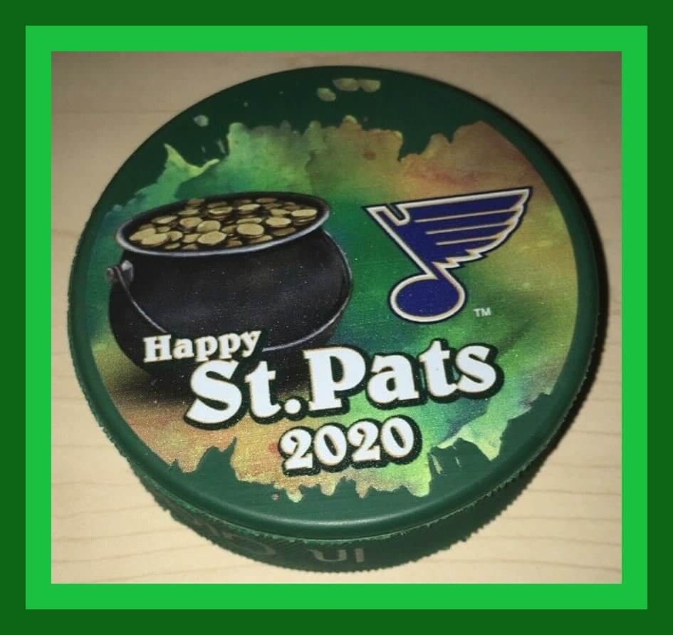
One possibility that immediately comes to mind is the Minnesota Twins’ logo with Minnie and Paul shaking hands, which could be adjusted to show them elbow-bumping or maybe just waving at one another. Another example: The Gateway Arch on this St. Louis Blues secondary logo could be adjusted to flatten the curve. And maybe teams whose logos feature two interlocking letters could have the letters separated and spread apart to a safe distance..?
If you want to whip up some concepts (including the ones I just mentioned) and send them my way, I’d love to run them on Uni Watch. Thanks.
(Thanks to Timmy Donahue for letting me know about the Olympics design.)

A small bit of good news: Although MLB’s Opening Day has now been pushed back until at least mid-May, it turns out that you won’t have to wait that long for the 22nd annual Uni Watch MLB Season Preview. It will be published on InsideHook next Thursday, March 26 — the date that was originally slated to be Opening Day.
I initially thought the Season Preview would be delayed or even scuttled. But after discussing it with the InsideHook folks, we agreed that it would be good to give baseball fans something to celebrate on non-Opening Day, even if it isn’t the start of the new season.
And hey, look at the bright side: The delay in the schedule means we won’t have to deal with pink caps for Mother’s Day this year!
Click to enlarge
Collector’s Corner
By Brinke Guthrie
Follow @brinkeguthrie
Top o’ the morning to you on this St. Patrick’s Day. I think we can all safely say it’s not a particularly “happy” one due to current events, but Collector’s Corner is still here for you. We’re starting off with this St. Louis Blues 2020 St. Patrick’s Day puck.
Now for the rest of this week’s picks, all of which have a St. Paddy’s theme:
• Here we have an excellent 2010 Boston Red Sox St. Patrick’s Day snow globe. You’ve got the Pot o’ Gold right there where it’s supposed to be, at the end of the rainbow. We’ve got a few more Boston St. P-themed items, too: a Celtics shamrock mug, a pair of green Red Sox Reeboks, and a Red Sox cap/beads/plush Wally mascot set.
• Ken Griffey Sr. autographed this Reds St. Paddy’s jersey. It’s not a gamer, due to the Majestic branding, but still pretty nice. (Note to Alex Hider: He signed it at Moeller High School a year ago.)
• Instead of green, this Minnesota Vikings St. Patrick’s tee went BFBS.
• America’s Team becomes Ireland’s Team for one day with this Dallas Cowboys St. Patrick’s tee.
• The Pittsburgh Steelers offer you a St. Patrick’s Terrible Towel, just in case you want to wave one while quaffing a pint of Guinness at O’Brien’s pub (assuming they ever open the pubs again).
• This green Chicago Cubs T-shirt borrows from Clint Eastwood to pose the question, “Feeling Lucky?”
• A Carmelo Anthony action figure wearing a Knicks green St. Patrick’s uni? Sure, why not?
• You can tie one on with this NBA logo St. Patrick’s Day tie. Note the shamrock where “NBA” should be.
• The Dallas Mavericks incorporated their team logo into a shamrock for this local St. Patrick’s Day parade T-shirt. The L.A. Clippers did the same with their then-current logo.
• There’s a leprechaun swingin’ for the fences on this youth-sized Philadelphia Phillies tee from Adidas.
That’s it for this week. And as Sgt. Phil Esterhaus used to say at the conclusion of daily roll call on Hill Street Blues, “Let’s be careful out there.”

Click to enlarge
St. Paddy’s reminder: Reader Greg Mitchell sure has a lot of green jerseys and hats! If you do as well, and if you’re wearing any of them today to celebrate St. Patrick’s Day, and/or if you’re wearing any green Uni Watch apparel, please send me photos of yourself. I’ll feature the best shots on the site tomorrow. Thanks!
Meanwhile: Across the country, all official St. Paddy’s Day parades have been cancelled. But revelers in some cities insisted and holding their own impromptu parties and parades over the weekend. Please-please-please do not do that today — not only for your own sake, but for everyone’s sake. It’s a drag, I know, but convening group gatherings at this point is flat-out irresponsible and dangerous. Don’t do it. Thanks.
Discount reminder: In case you missed it on Monday: I’m honored and humbled that so many people are choosing to keep Uni Watch as part of their daily routines during this stressful time, and I’ll be doing my best to be here for you. But Uni Watch could really use your support right about now. If you value the site’s presence and have the means, please consider making a donation or a purchase. As a gesture of solidarity, I’ve lowered a lot of our prices until further notice, as follows:
• You can get 15% off of anything in the Uni Watch Shop and the Naming Wrongs Shop by using the checkout code COMMUNITY.
• The Uni Watch Classic Cap, which usually sells for $39.99, is now $35.99 — a 10% cut.
• Membership cards, which usually sell for $25, are now $20 — a 20% cut.
• Seam rippers, which normally cost $6, are now $4 — a 33% cut.
My thanks, as always, for your consideration.
Virus Watch: One thing I’ve had a really hard time wrapping my head around during the past week or so has been the weather. Everything else is chaotic and falling apart, but the weather just goes on, unaffected. If I click on almost any of the bookmarks on my browser bar, I’ll read about something pandemic-related, but if I click on “Weather” I’ll get … the weather report.
I know, I know — like, “Duh, of course that’s how it works, what did you expect?” Right. But it’s still weird to see this one aspect of daily life that’s unchanged by the pandemic. When everything else feels dysfunctional, the mere fact of the sun coming up each day suddenly seems remarkable.
This feeling has been compounded by the fact that the weather here in NYC has generally been very nice. You look out the window and it’s a lovely day — except, of course, it isn’t.
Also: Since spring is approaching, trees are budding, plants are sprouting, birds are chirping. Lots of life amidst all the foreboding of death.
It’s all very paradoxical-seeming and confusing. At least for me.
The Ticker
By Alex Hider

Baseball News: Indians P Mike Clevinger wore a T-shirt reading “A Girl Is a Gun” during a pick-up game with other big leaguers and took to Twitter to explain the meaning behind the slogan (from Jason Hillyer). … Brad Eenhuis spotted these White Sox-style collared jerseys in the 1982 Corwith-Wesley High School (Iowa) yearbook. … This New York Times piece compares the Astros’ cheating scandal to cheating scandals in the chess world. … The Western Canadian Baseball League’s newest team, the Sylvan Lake Gulls, unveiled their team name and logo yesterday (from Timmy Donahue).

Football News: Did you know that there were once facemasks specifically designed to protect players who wore eyeglasses? You can see one of them in use here. But if you look closely at the second player from the right in this 1973 high school photo, it appears that he’s wearing the specs protector but nothing protecting his jaw! (Great find by Brad Eenhuis.) … David Murphy recently took a trip to Graceland and took some photos of the uniforms Elvis bought so he and his buddies could play games in the yard.

NFL News: The NFL announced yesterday that it will still hold the draft as scheduled, but without an audience or any related public events. … Workers at the Raiders’ new stadium had to re-install the “m” on the Allegiant Stadium sign because it was misaligned (from Kary Klismet). … Regarding yesterday’s item about AFL and NFL footballs: Jerry Wolper found this article from the 1/9/67 edition of the Pittsburgh Post-Gazette, which explains how the AFL and NFL balls would be used in the first Super Bowl. Note also that the article does indeed use the term “Super Bowl,” which had already become the vernacular term for the big game, even though it wouldn’t become official until Supe III. According to another article Jerry found, the NFL commissioner’s offices initially resisted the name. … In a related item, anyone who has ESPN+ can watch this piece about the evolution of the NFL football throughout the years (from Mike Perrin).
College Football News: USC CB Olaijah Griffin Instagrammed a photo of himself in a BFBS Trojans uniform the other day, prompting a heated debate about alternate uniforms among fans (from Phil).

Hockey News: Icethetics is reporting that many NHL teams will introduce a fourth jersey for the 2020-2021 season, described as “throwbacks as a twist” (from Kendrick). … Speaking of alternate jerseys, this would make a nice alt for the Preds (from @fromtapetotape). … When the Nordiques relocated to Colorado, they almost renamed the team the Rocky Mountain Extreme (from Glenn Chavez). … Lower-tier NASCAR driver Brian Keselowski ran a couple of Detroit Red Wings-themed paint schemes, including a BFBS one, back in 2009 (from Chris H.).

Pro Basketball News: Grizzlies G Ja Morant wore his full uniform at home and did mock introductions for a TikTok video yesterday (from Mike Chamernik). … This redesign concept for the Jazz reimagines the team as the “Utah Range” (from Jason Hillyer). … The Ottawa BlackJacks, an expansion team for this upcoming Canadian Elite Basketball League season, have unveiled their new mascot (from Wade Heidt).

College Hoops News: The New York Times published this article about how Butler is training its new live puppy bulldog mascot, Blue IV. … Brad Eenhuis found these early-’80s photos of Iowa players mixing and matching their home and road jerseys during a charity game.

Soccer News: Liverpool’s kit contract expires in May, raising the possibility that they could clinch the Premier League title wearing a new uniform from a different supplier (from Moe Khan). … This is what a Borussia Dortmund jersey would look like if it combined several different jerseys from different eras (from Patrick Lind). … DC United is holding a bracket-style tournament to determine the best uniform in club history (from @OlegKvasha). … New third shirt for Bohemian FC (from Ed Zelaski). … Also from Ed: The Russian sports magazine Championat has updated the Russian Premier Liga logo — which is normally a bear’s head — by putting a mask on it.

Grab Bag: Syracuse’s Carrier Dome roof was deflated for the final time yesterday. Here’s a great time-lapse video. The dome is currently undergoing a renovation that will replace the inflatable roof with a tension-membrane roof (from Rick DiRubbo and Michael MPH). … The Kentucky Derby, which usually takes place on the first Saturday in May, has been postponed until September. … A lawsuit alleges that an immigration attorney stole the concept and logos of a restaurant from his clients (from Max Weintraub). … Also from Max: Have we ever discussed Eddie Murphy’s and Arsenio Hall’s hats and jackets in Coming to America? … Photographer Dag Knudsen takes perfectly symmetrical photos of pets (from Jason Hillyer). … For uni-watchers interested in heraldry and vexillology, here’s a piece about all of the flags that appear on the city seal of Pueblo, Colorado (from Kary Klismet). … Attleboro High School in Massachusetts is considering a nickname change. The school’s teams are called the Blue Bombardiers, even though the city has no connection to the Air Force or bomb manufacturing (from Timmy Donahue). .. Stroh’s Beer has a new — and much worse-looking — logo (from Jim Vilk). … Two more police-related items from Timmy Donahue: The Connecticut state police are the latest law enforcement organization to loosen anti-tattoo regulations in an attempt to boost recruitment, and Quincy, Mass., is the latest police department to wear and sell autism-awareness patches. … The various TimeOut magazines and websites, which list things to do in London, New York, Chicago, Miami, and other cities, have temporarily rebranded themselves as TimeIn, for obvious reasons.
Happy birthday to longtime Uni Watch reader/contributor/pal R. Scott Rogers. Enjoy your special day as best you can, buddy!
Seeing Bill’s outstanding work always brings a smile to my face.
I agree. Beautiful work by Bill.
Ticker correction needed. Sylvan Lake Gulls are part of the Western Canadian Baseball League. The collegiate summer baseball league. Not basketball.
Got it.
Re: the original Super Bowl and the two league footballs.
The use of one league football when the league’s representative is on offense is exactly what happens these days in college football when, say, a Nike team plays against an Under Armour team. The footballs are switched for the offenses, meaning that the DBs would be trying to catch a different football from what they had been practicing with all week.
I’m also not surprised that the term “Super Bowl” was resisted by the NFL. The Super Bowl originally were the scholastic championship games for the Commonwealth of Massachusetts. Interestingly enough, this coming year’s Super Bowls will be statewide competitions rather than a guaranteed East-v-West final or North-South (depending on the year).
The use of one league football when the league’s representative is on offense is exactly what happens these days in college football when, say, a Nike team plays against an Under Armour team.
True! But those balls are supposed to be manufactured to the same official CFB specs, while the AFL and NFL balls had different shapes/sizes/etc.
That may be, but everything I’ve read about the first Super Bowls indicates that the owners resisted the name because they didn’t think it was sufficiently dignified.
I also found this piece, casting doubt on Hunt’s claim that he coined the name: link
I should think the NFL “winced” at the name because it was generally understood that Chiefs owner and AFL co-founder Lamar Hunt came up with it; dubious or not, the perception would have been enough. We forget the disdain the establishment NFL had for the upstart AFL in the 1960’s, even after the merger agreement.
I can’t locate it now, but yesterday in my FB feed I saw an ad for a t-shirt promoting social distancing by separating the two men in the KY state seal.
link
I’ve seen a couple variations. Unfortunately, I can’t find my favorite version. The frontiersman and the statesman are separated and the state motto is flipped on its head: “Divided we stand, united we fall.”
That shirt came from KY for KY.
link
In this unusual times, with nothing going on in the sports world other than NFL signings (why do all great QB’s end up in a forgettable uniform), I thought this may be worth sharing
Le Creuset who make kitchen ware stuff, everyone i suspect is familiar with their classic orange cooking pot, introduces a couple of new colors each year. We have a collection of 10 of their coffee mugs of different colors. This year’s colors I believe would meet Paul’s approval
link
Nice!
I have a bunch of their stuff (all in orange, or “flame” as they Nike-ly like to call it), so I don’t need more. But if I did, those new colors would be ideal!
Seriously considering picking up that honeypot. I do love the new colors.
Along the same lines, I collect Fiestaware which is known for their colorful lineup of dishes and cookware. Every year they introduce a new color; this year it’s butterscotch.
I found the most intriguing information in the article about NFL not on board with the “Super Bowl” moniker was the “Playoff Bowl”- a game that had the runner-up’s play. Can’t imagine there was a lot of energy and effort in that game.
This will probably sound strange, but I’ve recently re-discovered Stroh’s after not drinking it since the late 80s. I find it to be a perfectly serviceable, flavorful lager.
I’ll prepare myself now for comments from beer connoisseurs deriding my tastes. :)
However, for those of you willing to be a little adventurous, if you can find it, give it a try.
I never had Stroh’s until last year, so I can’t compare tastes from the old days. I enjoyed it quite a bit, but I think I’ll become a full-time Blatz drinker now. They still have a good flavor *and* a classic logo.
Great job, Bill, and Happy Birthday, Scott!
I still have six bottles with the old logo. Should I savor them on special occasions or put some on eBay?
“Stroh Me!”
“If you think of it…”
link
The only person I ever knew that drank Stroh’s was my best friend’s dad (a Detroit native). He’d drink it when he was driving us to the swimming pool.
Perhaps Paul’s amazement at the weather continuing as usually has something to do with forced isolation most often being weather related?
In the same vein as the Russian Premier Liga logo, The Draw Play did a series of NFL logos being quarantined. A few use the same motif of an N95 mask on the mascot, but there are also a lot more creative ones.
link
I’m partial to the Plague Doctor Ravens and the Self-Isolation Cardinals
Great stuff today from Bill Henderson! I love the Tales from the Dream Shop series and can’t wait for future installments! Thanks, Bill and Paul, for bringing these stories to us.
Happy birthday, Scott! I love what you bring to the Uni Watch community. Your combination of knowledge on a wide variety of topics and intelligent writing makes the Comments Section – and Uni Watch in general – a better place. Thanks for what you do and who you are! Have a great day!
Happy St Paddy’s Day everyone! (and Happy Birthday Scott)
Thanks, everybody! And happy St. Patrick’s Day to everyone! (The actually important celebration today.)
In honor of the holiday, I offer this beautiful uni-pic of Mike Schmidt:
link
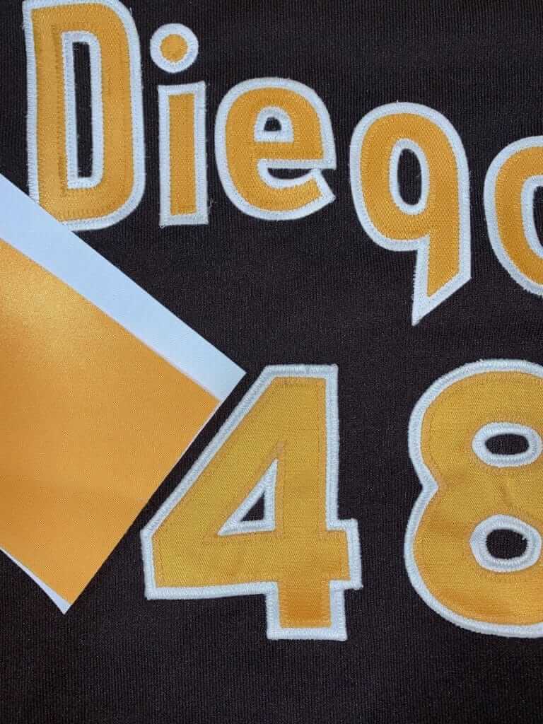
The Allegiant Stadium “m” isn’t the only misaligned letter in today’s entries. The “e” on that restored San Diego jersey is riding kinda high, too.
The lion on the new Stroh’s logo looks like it’s trying to claw its way off the box, out of shame.
Good call! That new logo is just horribly generic.
As the article said, Attleboro High School is the Blue Bombardiers without any connection to flying. Maybe it’s designed to be an answer to their rival, the North Attleboro High School, whose mascot is “the Red Rocketeers”? But NAHS doesn’t owe their name to rockets, either…
From a guide to North Attleboro:
“The high school’s official team mascot is the Red Rocketeers, a name which comes from North Attleborough’s unique red rocks found only in northern Bristol County and Cumberland, RI, and the school colors are red and white.”
I enjoy the Bill pieces so much. The skill and eye for detail is impressive.
I am really honored by Paul’s inclusion of my restorations as part of his Uni-Watch features, and by the many kind and positive comments you folks leave. As you can imagine, I am a regular reader here- and have been since the beginning. How lucky I am to be doing every day what I love so much. Glad to hear from anyone, and especially those with projects to test my skill.
Bill, we’re lucky that you share your work in such detail with us. The quality and skill of your work, and the integrity you bring to it, are inspiring. If only I could figure out what I wanted to do with my 2000 Brewers jersey with a 2001 player’s NOB …
Great job Bill, always love your entries. I do have a question though, the dot on the i seems off a bit towards the left, was that done on purpose? Or is it just the way the fabric lies when photo is taken?
That is clearly exactly how it was stitched originally. There is always the temptation to correct original mistakes and inaccuracies when restoring vintage pieces. This is the second one of these I have restored, and I keep templates of everything. The arc of the curve of the San Diego is slightly different on this one than that other one. These were surely laid out by hand and “by eye” back in the day. Part of the charm of an era long gone by.
Perhaps one of my favorite uniforms, ever. The first saddle-shouldered Padres’ jersey was the 1976 road uniform, and the “San Diego” was gracefully lettered in a Windsor condensed typeface; the same font used for the titles in Woody Allen movies. I appreciated how the raglan sleeves carried over the spinnaker panels of the cap. The vertically-arched player name and curvy gothic numerals came after the Windsor type was dropped, but at least the gaudy brown+gold color scheme was carried over. A great period in the appearance of the Friars!
On the topic of the Super Bowl name not becoming official until Super Bowl III…
Super Bowls I and II were retroactively renamed. It’s time to retroactively rename Super Bowl 50 to Super Bowl L.
Great job as usual Bill! Your old buddy Steve here. I am intrigued about the “light table” you mention. On your next writeup, can you include a picture of it and describe how it works?
Hurry! Someone Photoshop Tom Brady in the Buccaneers uniform that he’ll never wear.
A dozen media outlets have already done it.
Happy Birthday, R.Scott Rogers!!
Cheers!
ESPN currently has Tom Brady photoshopped in Tampa Bay’s old uniform.
Actually, *everyone* currently has that.